#tutorial de arte 3d
Explore tagged Tumblr posts
Note
Hi hi, hello! Suas capas são incríveis e vc é uma grande inspiração pra mim colega capista. Eu gostaria de perguntar qual app vc usa para fazer as suas capinhas. Estou fazendo capinhas mais simples a alguns meses usando o PicsArt, mas gostaria de evoluir ainda mais e o fazer usando um app mais popular para capistas como o ibis. Você poderia dar algumas dicas para essa capista iniciante e tão sonhadora?
Olá, muito obrigadaaa! <3 Eu edito pelo photoshop CS6, uma versão mais antiga do photoshop cc. Eu não acho que sou a melhor pessoa pra te dar dicas, porque útilma vez que editei no celular foi lá em 2014 😭 Masss eu tentei juntar umas dicas bem úteis ❤️

Algumas dicas para capistas, em geral
Fontes, fontes, fontes: Uma das primeiras coisas que eu faço é escrever o título e separar um lugarzinho pra ele, porque antes eu sempre fazia a capa e quando eu ia ver, cadê o lugar do texto? Uma fonte bonita é muito importante, viu, e pode até te dar um pouquinho de inspiração a mais.
💕 As que eu mais uso são:

Capa 1: A Gentle Touch Capa 2: Slowly Lovely Sans e Lie to me Capa 3: Rocket Clouds

Capa 1: Linux Libertine Capa 2: Slowly Lovely Sans Capa 3: Carilos Regular e Starmony Extra: Big log
Também dá pra usar elas pelo Ibis Paint, eu acho que a fonte que a gente usa influencia muito o resultado final.
Imagens e materiais com uma boa qualidade: É uma dica velhinha, mas é útil demais. Eu geralmente pego as imagens que eu uso no Pinterest e os materiais no DeviantArt, por lá tem muita coisa útil mesmo: textura, png, efeitos. Eu vivo olhando o Deviant Art da @trancyzp, pois ela posta e curte muita coisa boa navh (só clicar). Contas muito legais por lá: coloursource, kthjkdrama, noirpsds (Esses são os que eu mais tô baixando conteúdo ultimamente).
Uma boa finalização! Eu não posso ajudar muito com essa, porque quando eu editava no celular era lá no Photoshop Touch ☠️, não tinha finalização ainda. Mas muita gente incrível fez tutorial, viu! A finalização é uma das partes mais importantes e uma das mais legais também. Separei dois tutoriais muito bons: Finalização Ibis Paint por @sharkissm Clique aqui Finalização Ibis Paint e outros por @maluyoongi Clique aqui.
Uma dica extra minha: Tem algo que eu uso absolutamente em todas minhas capas, pois eu amo usar demais e na minha cabeça é perfeito. Esse algo é a "textura do png", só que eu uso ela com uma opacidade entre 18% e 26% e mais ou menos assim:

Agora umas dicas teóricas ☝️
Não entre em 1 milhão de projetos/blogs como eu fiz quando comecei, é muito legal, mas em excesso atrapalha muito.
É uma dica meio boba, mas eu meio que desenho num caderno o que eu imagino na capa antes de começar, anoto minhas ideias, tipo: onde isso vai ficar? e aquilo?
Veja tutoriais no YouTube, a maioria dos capistas (incluindo eu) aprendeu tudo o que sabe de lá. Não precisa ser tutorial exclusivamente de capas, de outros tipos de edições também vai te ajudar a evoluir! Esse aqui, por exemplo, é de capa pro Amino, mas achei muito interessante. Esse também ó. Eu via muito tutorial de capa de Amino e me ajudou bastante a aprender vários truques. Esse aqui é pra Layout de Twitter. Eu tentei achar um tutorial muito bom que eu usava, mas acho que foi excluído :(
E tem um pessoal que faz um tipo de iluminação perfeita por lá, mas eu nunca consegui fazer nem nada parecido 😭 > Eu < recomendo você começar fazendo estilos mais leves, texturalizadas, tipo assim. Eu comecei com texturalizadas, olha:


Não desista, não desanime, não se compare Eu acho que todo capista um dia consegue achar o seu estilo próprio de editar! Eu vou até mostrar como eu comecei a editar, só não vale rir ☠️ (vale sim)
E tinha outras perólas, mas eu perdi a senha do meu falecido Facebook 😭 E é isso! Eu não edito pelo celular, mas tentei ajudar de alguma forma e eu espero, de verdade, que pelo menos uma dica dessas seja útil pra você <3 Qualquer coisa, você pode me chamar no chat que eu posso até aplicar um topaz ou um 3d nas suas capinhas pelo computador, pra dar uma qualidade melhor viuu! eu tenho certeza que você é um* capista super talentos* já! Boa sorte na sua jornada ❤️
57 notes
·
View notes
Text
Exercice Blender et over paint !
Depuis quelques temps, j'essaye d'apprendre Blender, autant en modélisation pure que pour l'utiliser comme base pour mes illustrations (parce que la perspective est une de mes nemeses). Et pour celà, j'ai commencé à suivre les tutos blender pour le concept art de Digital Painting School
Et voici le premier résultat de l'exercice: Refaire le robot de Spartan ! La suite: Faire mes propres robots fous, arrive bientôt !
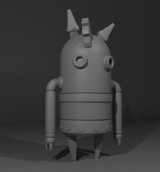
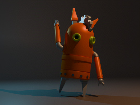
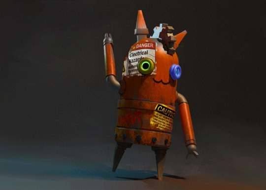
Blender and overpaint exercice!
I've been trying to learn Blender lately, as much for the 3D creation, as a base for my illustrations (because perspective is one of my nemeses). And for that, I followed Digital Painting School's blender tutorials for concept art (In french, sorry)
and so, here is the result for the first exercice: Redo Spartan's robot! (spartan being the author of the tutorial) Soon to come, my own crazy bots !
5 notes
·
View notes
Text
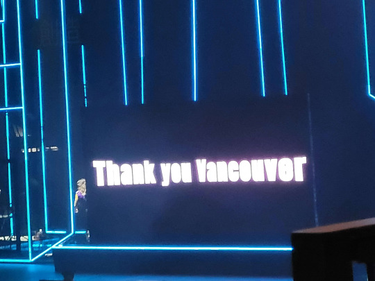
So I went to Miku Expo 2024 last night (the Vancouver show) and I wanted to talk about it while it's top of mind.
TL;DR I had a lot of fun, while there were some things I wish were different (mostly the screen), it wasn't a bad first Miku concert IMO (But I do wanna see more shows). More under the cut!
First of all, it was super cool to see all the different people there to see Miku and the other Vocaloids. Like, I've been to conventions before and it's always cool to see a horde of people dressed as various anime characters or animals, but to see everyone dressed specifically as Voicaloids and Project Sekai characters was new for me.
About the merch on sale at the concert, I was surprised that they were doing most of it outside and that the inside merch stand had barely anything- at least when I got in. That could just be bad timing on my end. If you're reading this and you wanna buy merch at one of the upcoming shows (especially a glowstick), make sure to get there early. For Vancouver, they did send out an email the day before saying that they were selling merch outside starting at 2pm, but I wasn't able to get there before then.
I did get the VIP package merch but it's kinda.... well it's not bad or anything, and I'm glad to have it but some of it feels a little cheap. For example, the hand fan is cute but feels flimsy, and the tote bag has a really nice design but the heat pressing makes me not wanna use it because I'm worried about cracking the art. On the other hand, I really like the lanyard that came with the package; The art was done by Socky and I liked it so much that I bought the backpack that also has that art.
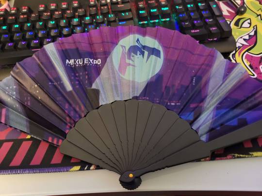
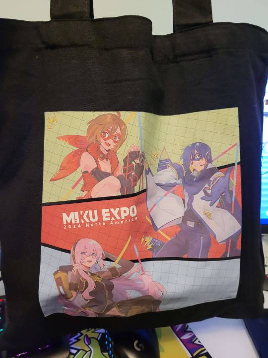

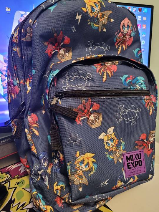
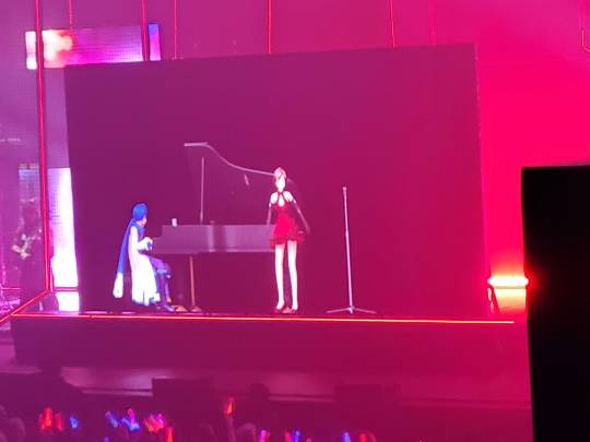
Onto the show. You may have already heard this but yes, It wasn't the usual hologram, where they have a sheet of glass with the visual projected onto it, it was just a normal screen where they played the visual. It did feel like I was watching one of those hologram-ready videos on my phone but on a giant TV, but it was still cool to see.


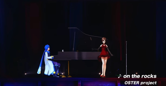
Here's also a side-by-side of how the hologram looks vs the display using on the rocks from Magical Mirai 2021 and last night's show. While it's not fair to use a pro-shot vs what looks like a musical theater bootleg sime tutorial to show this, I hope it gets the point across. (Miku Expo 2024 on the left and Magical Mirai 2021 on the right)
I liked the setlist also, it can be found at this link here, but some standouts to me were, Miku by Anamanaguchi, The Vampire, Unknown Mother Goose, Childish War, On the Rocks, Sore ga Anata no Shiawase to Shite mo, Gimmie x Gimmie (Love this song so much), World is Mine (everyone screamed at the first "Sekai de" (including me)), the band introduction, Tell Your World (It's not my favorite or anything, but they shot out confetti at one point and that was cool.), and Intergalactic Bond.
I want to expand a bit on the band introduction and them as a whole, I loved that the band got attention and their names were shown. I watched some Magical Mirai videos and I see that this practice might be from that, so I'm glad that was carried over. They all were stellar and watching them was really exciting, the drummer- Dylan was always so cool to look at, Tobias the keyboardist was dancing near the beginning of Gimmie x Gimmie and that was a vibe, the bassist and guitarist- Leanne and Vixen's Diary respectively were fun to watch when they would get into the song and headbang and bounce around.
Lastly, I was surprised that Luka only got 2 songs (one of them was a duet with Miku). I (very sadly) expect MEIKO and KAITO to get shafted when it comes to songs, but not Luka!
Quick shout-outs to some specific concert goers; Shieonn, who made stickers and was handing them out before the show (Here's her Twitter!),

The person near me who shouted either "I LOVE YOU JERMA!" or "I LOVE YOU DRUMMER!" at the end of one of the songs (I think it was World is Mine), the girl near me who was trying to get pictures and video of the show using her 3DS, and this one person I saw outside the venue entrance as the show was letting out who was dressed up as Sonic Miku, I wanted to say that I loved the fit, but I didn't wanna just walk up to you randomly at almost 10PM and possibly freak you out.
Overall, I'd go again but please for the love of god, don't just have a screen for the Vocaloids!
15 notes
·
View notes
Text
Hiya!! My name is Bramble! (I don't mind any nicknames!! Brambs is a common one)
No status update! Everything is all good!
My Tumblr DOES contain untagged spoilers for the Professor Layton franchise (specifically the prequels). Be careful!
DNI if you ship or support incest, underage or similar.
Basics
He/They (Demiboy) | Unfortunately an Adult | AroAce
Artist | Writer | Extractor...? (Or just fueled by brainrot)
Primarily in the Professor Layton fandom | Microwaved Des for 4 years
Tags
Art Tag: BrambleDrewAgain
Extractions Tag: Bramblextracts
Favorites Tag: Bramfavs
I talk about random stuff Tag: Bram.txt.exe
Notes
Art reposts (not reblogs, those are fine!!) are NOT allowed without permission. You can use my art for icons, but credit is preferred!
I made a tutorial on how to extract Level 5's 3DS game files! It's still a work in progress, but feel free to ask any questions or even make requests on what to cover!
errm i cant think of anything else lawl thanks for reading
10 notes
·
View notes
Video
youtube
Animal Crossing New Leaf Napoleonfish Papercraft
Animal Crossing New Leaf - Napoleonfish Papercraft Hoy presentamos un nuevo papercraft para los fans de Animal Crossing: New Leaf: el Napoleonfish. Este modelo mide 20 cm de largo, cuenta con 72 piezas, y está disponible en formatos PDF y PDO para su descarga. Sobre el Juego Animal Crossing: New Leaf, lanzado en 2012 para la Nintendo 3DS, permite a los jugadores asumir el papel de alcalde de un pueblo habitado por adorables animales antropomórficos. Con mecánicas relajantes y un mundo en constante evolución, los jugadores pueden decorar su hogar, interactuar con vecinos y disfrutar de diversas actividades, como la pesca. El Napoleonfish en el Juego El Napoleonfish, también conocido como Pez Napoleón, es una de las especies más grandes y valiosas del juego. Se encuentra en el océano durante los meses de verano y se reconoce fácilmente por su gran tamaño y su característica joroba en la cabeza. En New Leaf, este pez se puede vender por 10,000 bayas, convirtiéndolo en una excelente captura para los jugadores que buscan aumentar sus ganancias. Sobre el Papercraft Este papercraft de Napoleonfish es un modelo detallado y desafiante, ideal para quienes disfrutan de la precisión y el arte del recorte y ensamblaje. El proyecto incluye: 72 piezas para una recreación detallada del pez. Un tamaño final de 20 cm de largo, perfecto para exposición. Archivos en PDF y PDO para facilitar la impresión y personalización. Un video que muestra el desarrollo del modelo en Pepakura, ayudando en el proceso de ensamblaje. Si te gustan los desafíos y eres fan de Animal Crossing, este papercraft es una excelente adición a tu colección. Comparte fotos de tu modelo terminado en los comentarios. Papercraft Animal Crossing: New Leaf - Napoleonfish Today, we present a new papercraft for Animal Crossing: New Leaf fans: the Napoleonfish. This model is 20 cm long, consists of 72 parts, and is available for download in PDF and PDO formats. About the Game Animal Crossing: New Leaf, released in 2012 for the Nintendo 3DS, allows players to take on the role of mayor in a town inhabited by adorable anthropomorphic animals. With relaxing gameplay and an ever-evolving world, players can decorate their homes, interact with neighbors, and enjoy various activities like fishing. The Napoleonfish in the Game The Napoleonfish, also known as the Humphead Wrasse, is one of the largest and most valuable fish in the game. Found in the ocean during the summer months, it is easily recognized by its massive size and distinct head bump. In New Leaf, this fish can be sold for 10,000 Bells, making it a great catch for players looking to boost their earnings. About the Papercraft This Napoleonfish papercraft is a detailed and challenging model, perfect for those who enjoy precision cutting and assembly. The project includes: 72 detailed parts for an accurate recreation of the fish. A final size of 20 cm in length, perfect for display. PDF and PDO files for easy printing and customization. A video tutorial showing the model’s development in Pepakura, helping with the assembly process. If you love challenges and are a fan of Animal Crossing, this papercraft is a great addition to your collection. Share pictures of your completed model in the comments. Enlace: https://tiendajossorio.blogspot.com/2025/03/animal-crossing-new-leaf-napoleonfish.html Si te ha gustado no olvides suscribirte al canal de YouTube: https://www.youtube.com/@j.ossoriopapercraft6824 Video: https://youtu.be/uh_7kJyyQNE
0 notes
Text
Week 8: Life at NTU Pt2 - Hall Culture, Campus Spots and Transportation
Feeling a sense of belonging is, without a doubt, super important in daily life, and NTU does a great job gathering people together in residence halls. Known for a strong hall culture, there are always students walking through hallways in their "hall t-shirts," and sometimes it's easy to tell which hall people are staying in just by looking at their outfit. Events are also constantly happening in each hall and between halls - concerts, mixers, workshops and sports competitions. Sadly, I missed out on the opportunities to join hall sports team and compete in their inter-hall Olympiad Games because it took place at the end of semester 1 (fall semester). However, from Muay Thai (Thai martial art), yoga and pop-dance, to wool felting, app design and 3D printing, I've found the hall workshops to learn new things, make friends and de-stress after a long day.
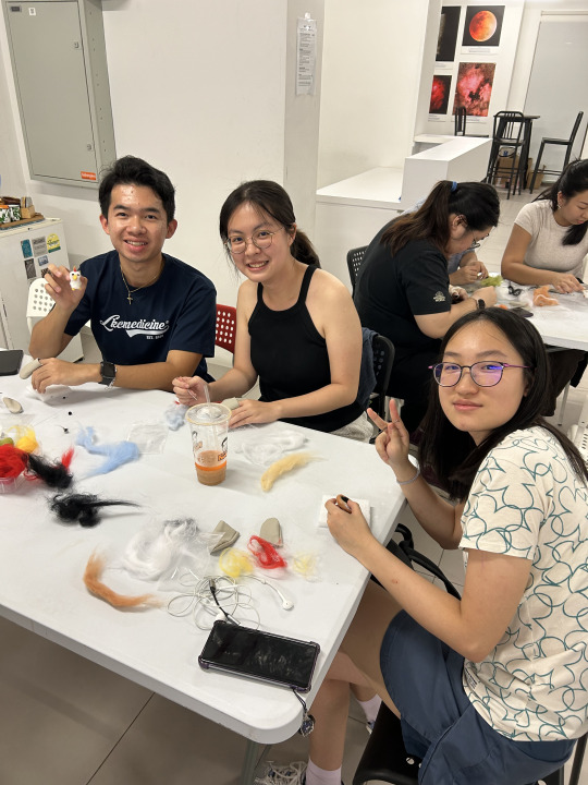
(Wool Felting Workshop after my stressful biology quiz)
When not in class, North Spine, South Spine and areas around them are perfect spots for students to eat, study, or just hang out! With restaurants, cafes, tea shops, bakeries, supermarkets and libraries nearby, activities such as carnivals, club fairs and Sports Expose Day also take place in these areas, most often, the North Spine Plaza. I have group projects going on for both my Spanish and electronics courses, so my friend and I usually met at North Spine, got food, and looked for empty tutorial rooms (TR) to chat and do our work.
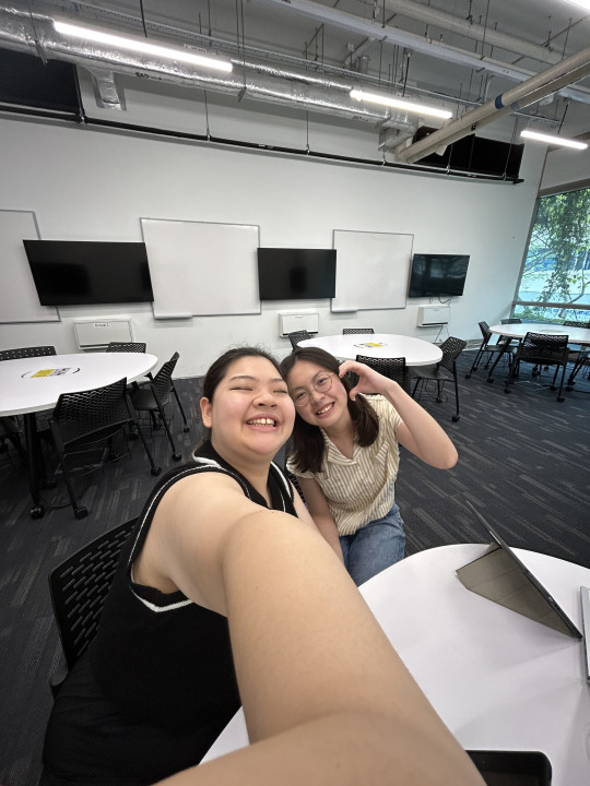
(Spanish Oral Project with Andrea in an empty TR!)
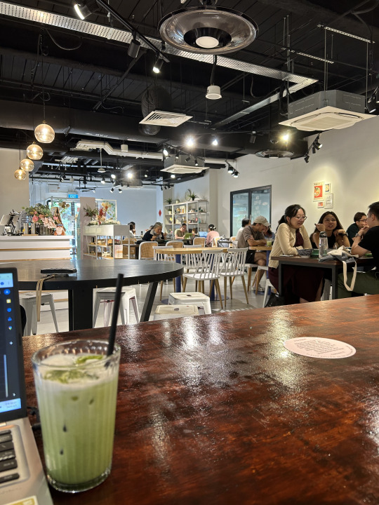
(Connect71 - a cute cafe near North Spine)
Commuting to classes is fairly convenient on campus due to the bus system. The campus is a lot smaller than Umich, but it still takes a decent amount of time to get to classes because in general, academic buildings are separated from halls. Campus buses are free; they run in loops (it's actually amazing when you miss your stop or just feel like staying on the bus for a little longer for air-con), and I usually take the red loop because buses stop right in front of my hall. There are also city buses like 179, 179A and 199 coming into the campus and we pay with the student card or Apple Pay. Personally I don't travel by city buses at school (just to save money) but I take them whenever I go on a mall trip which is 15 minutes away from NTU.

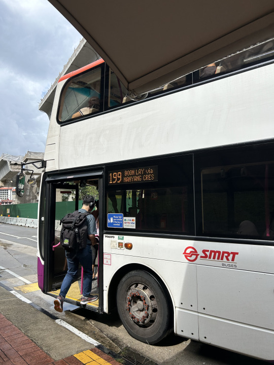
(campus loop and city bus)
Peace out!
Angela Chang
Biomedical Engineering
IPE Nanyang Technological University in Singapore
0 notes
Text
Video & Animation
Video und Animation: Kreative Ausdrucksformen in der digitalen Welt
In der heutigen digitalen Ära sind Video und Animation zu unverzichtbaren Werkzeugen für Unternehmen und Kreative geworden. Sie bieten eine einzigartige Möglichkeit, Geschichten zu erzählen, Produkte zu präsentieren und Marken zu kommunizieren. Durch die Kombination von bewegten Bildern, Ton und oft auch Text entstehen eindrucksvolle Inhalte, die das Publikum emotional ansprechen und informieren.
Die Kraft des Videos
Video hat sich als eines der effektivsten Kommunikationsmittel etabliert. Ob auf sozialen Medien, Webseiten oder in Werbekampagnen – bewegte Bilder ziehen die Aufmerksamkeit der Zuschauer auf sich und vermitteln Botschaften in einer Weise, die statische Inhalte oft nicht erreichen können. Studien zeigen, dass Videos die Verweildauer auf Webseiten erhöhen und die Conversion-Raten steigern können. Unternehmen nutzen diese Möglichkeit, um ihre Produkte vorzustellen, Tutorials anzubieten oder Kundenbewertungen zu präsentieren.
Ein weiterer Vorteil von Video ist die Möglichkeit, komplexe Informationen anschaulich zu erklären. In Form von Erklärvideos oder Tutorials können Unternehmen komplizierte Prozesse einfach und verständlich darstellen. Diese Art von Inhalten ist nicht nur lehrreich, sondern auch ansprechend, was zu einer besseren Kundenbindung führt.
Animation: Kreativität ohne Grenzen
Animation bietet eine zusätzliche Dimension der Kreativität. Sie ermöglicht es, Ideen und Konzepte visuell darzustellen, die in der realen Welt möglicherweise schwer zu vermitteln sind. Animierte Videos können in verschiedenen Stilen produziert werden – von minimalistischen Designs bis hin zu aufwendigen 3D-Animationen. Diese Flexibilität erlaubt es Kreativen, ihre Visionen auf einzigartige Weise zum Leben zu erwecken.
Ein besonders effektiver Einsatz von Animation findet sich in der Werbung. Marken nutzen animierte Charaktere und Geschichten, um Emotionen zu wecken und eine Verbindung zu ihrem Publikum herzustellen. Diese Form der Werbung kann besonders einprägsam sein und bleibt oft länger im Gedächtnis der Zuschauer haften.
Der Produktionsprozess
Der Prozess der Videoproduktion und Animation umfasst mehrere Schritte. Zunächst ist eine gründliche Planung erforderlich, die die Zielgruppe, die Kernbotschaft und die gewünschte Ästhetik berücksichtigt. Anschließend folgt das Storyboarding, bei dem die einzelnen Szenen skizziert werden, um einen klaren Überblick über den Ablauf des Videos zu erhalten.
Nach der Planung kommt die eigentliche Produktion. Bei Videos bedeutet dies in der Regel Dreharbeiten, während für Animationen die Erstellung der bewegten Bilder im Mittelpunkt steht. In beiden Fällen spielt die Nachbearbeitung eine entscheidende Rolle. Hier werden Effekte hinzugefügt, der Ton bearbeitet und das finale Produkt poliert.
Die Zukunft von Video und Animation
Mit der kontinuierlichen Weiterentwicklung von Technologien, wie Virtual Reality (VR) und Augmented Reality (AR), wird die Zukunft von Video und Animation noch spannender. Diese Technologien eröffnen neue Möglichkeiten für immersive Erlebnisse, die das Publikum auf ganz neue Weise ansprechen können. Unternehmen, die sich in diese Richtung entwickeln, haben die Chance, ihre Marketingstrategien zu revolutionieren und ihre Zielgruppen auf innovative Weise zu erreichen.
Zusammenfassend lässt sich sagen, dass Video und Animation kraftvolle Mittel sind, um Geschichten zu erzählen und Botschaften zu vermitteln. Sie bieten Unternehmen und Kreativen eine Plattform, um ihre Ideen in bewegten Bildern zum Leben zu erwecken und eine tiefere Verbindung zu ihrem Publikum aufzubauen. In einer Welt, die zunehmend visuell orientiert ist, sind sie nicht nur ein Trend, sondern eine Notwendigkeit für erfolgreiche Kommunikation.
0 notes
Video
Woven Wheel Stitch Embroidery Tutorial - Rose Embroidery
woven rose embroidery, woven wheel stitch, woven rose stitch, woven wheel rose embroidery, woven wheel stitch embroidery designs, woven wheel stitch hand embroidery, woven wheel stitch embrooidery tutorial, woven spider wheel stitch embroidery 👋 Hello and Assalamualikum to all my wonderful viewers! 🌟 Welcome to a comprehensive guide on woven wheel stitch embroidery, particularly focusing on the enchanting art of rose embroidery. In this tutorial, I'll walk you through the intricacies of the woven wheel stitch, sometimes also known as the woven spider wheel stitch embroidery. This video is designed to help both beginners and experienced embroidery enthusiasts explore the nuances of the woven rose embroidery technique. As we delve deeper, you'll learn about the woven rose stitch, which is an integral part of this artistic journey. From understanding the basics of the woven stitch to mastering the woven wheel stitch embroidery designs, we'll cover it all. Whether you're intrigued by the woven wheel rose embroidery or simply looking to enhance your woven wheel embroidery stitch repertoire, this tutorial has something for everyone. I've put immense love and effort into creating this tutorial, and I genuinely hope you find it as delightful to watch as I did making it. 💖 If you find value in this content, please don't hesitate to hit that like button 👍, subscribe for more engaging tutorials, and join me as we embark on this beautiful journey of woven wheel stitch hand embroidery. Let's create stunning pieces together! 🌸 Thank you so much for your support and encouragement! 💕 ► Connect with us on social media for more fun and creativity! 🌟 Explore new designs, trends, and crafts on our channel. 🎨 Join the community: ► Facebook: https://www.facebook.com/profile.php?... ► Youtube: / @aadilmomcreativi. . You can watch these flower's embroidery tutorials as well: ► • Beautiful Flower Leaf Embroidery Desi... ► • 3D Embroidery Flowers Designs Tutoria... ► • Wish you a Happy New Year 2024 with B... ► • Beautiful Cotton FLOWER EMBROIDERY De... ► • Create Stunning Hand Embroidery Flowe... ----------------------------------------------------------------------------------------------------------------------------------- #embroidery #handembroidery #needlework #diyembroidery #basicembroidery #embroiderytutorial #embroiderystitches #embroideryflowers #embroiderydesign #ModernEmbroidery #embroiderydesign #embroiderystitches #embroiderypatterns #embroideryhoopart #crossstitchtutorial #rosestitch #roseembroidery #Aadilsmomcreativity
0 notes
Text
Illustrator CS6 - Fresa con chocolate estilo 3D
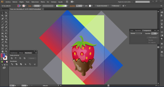
En este tutorial, aprenderás a usar Adobe Illustrator CS6, un programa de diseño y dibujo vectorial que te permite crear ilustraciones y arte de alta calidad. En esta práctica, vamos a utilizar los siguientes elementos: - Herramienta Elipse: Esta herramienta te permite dibujar círculos y óvalos de diferentes tamaños y colores. - Herramienta Lápiz: Esta herramienta te permite dibujar a mano alzada curvas y líneas de forma libre. - El panel de Buscatrazos: Este panel te permite combinar, dividir, recortar y fusionar objetos vectoriales de diferentes formas. - El panel Degradado: Este panel te permite aplicar degradados de color a los objetos vectoriales. - Pinceles personalizados: Estos son pinceles que puedes crear y guardar para usarlos en tus diseños.
Espacio de trabajo
Como primer paso, creamos nuestro espacio de trabajo con las siguientes configuraciones:
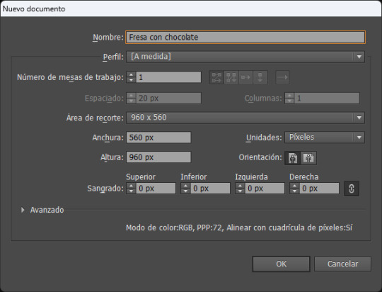
El cuerpo de la fresa
Dibujamos un ovalo con las siguientes especificaciones, lo centramos con relación a la mesa de trabajo, eligiendo: centrar y centrar verticalmente.
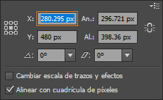
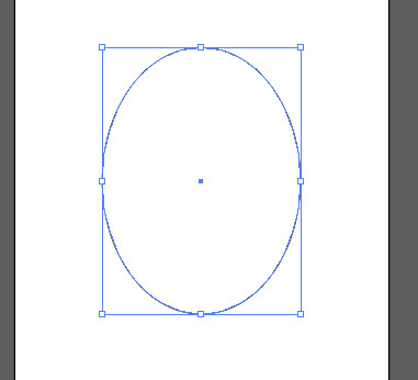
Usa la herramienta Selección directa (A) para seleccionar el punto de anclaje que está en la parte inferior de la elipse. Luego, presiona la tecla Shift (para limitar los movimientos) y mueve el punto de anclaje hacia abajo hasta que la elipse en el punto dY quede en 70px aproximadamente.
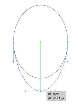
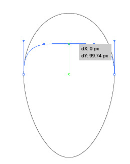
Selecciona la herramienta Selección directa (A) y haz clic en el punto de anclaje que está en la parte superior de la elipse. Después, mantén oprimida la tecla Shift y jala el punto de anclaje hacia abajo hasta que dY sea aproximadamente de 100px.
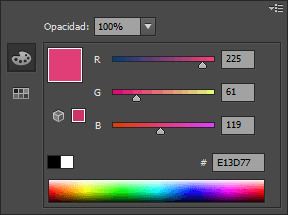
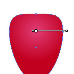
Aplica un degradado radial a la forma que acabas de crear desde el panel Degradado. Ajusta el color del Regulador de degradado, la primera parada de color del degradado a rojo y el de la segunda parada a un tono de rojo más oscuro.
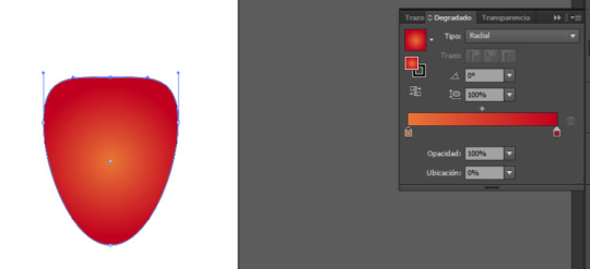

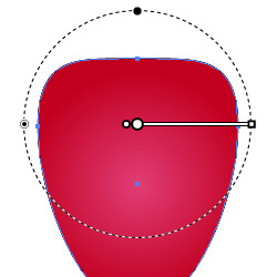
Para crear un efecto de iluminación en la forma, puedes usar la herramienta Degradado, oprime la tecla (G) y mueve el ancla central un poco hacia la parte superior de la figura:
Las semillas
Crea una pequeña forma de gota o de ovalo en la parte superior central del cuerpo de la fresa.
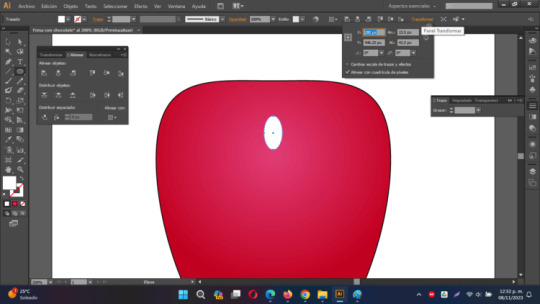
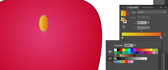
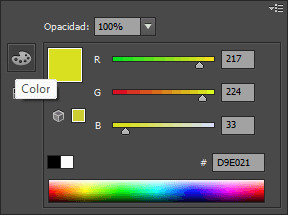
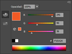
Elimina el trazo y rellena la forma con un degradado radial con el color de la primera parada en amarillo y la segunda parada con un color naranja.
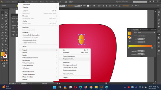
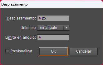
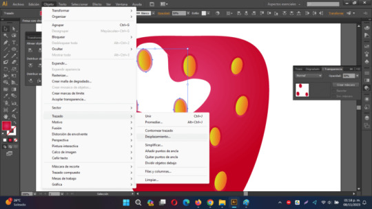
Con la pequeña elipse seleccionada, ve a Objeto > Trazado > Desplazamiento. Cuando se abra el cuadro de diálogo, ajusta el valor de desplazamiento a 4 píxeles. Este valor puede variar según las dimensiones de tu documento.
Rellena la elipse desplazada con un degradado lineal del mismo tono de rojo que la forma principal de la fresa. Ajusta el degradado con opacidad al 50%. Oprime la letra G y justa el degradado, de modo que la zona más oscura se encuentre en la parte superior de la forma.
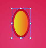
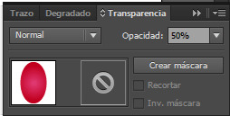
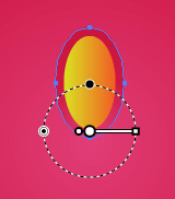
Agrupa lo que será la semilla junto con su "sombra" para poder crear copias en todo el cuerpo de la fresa.
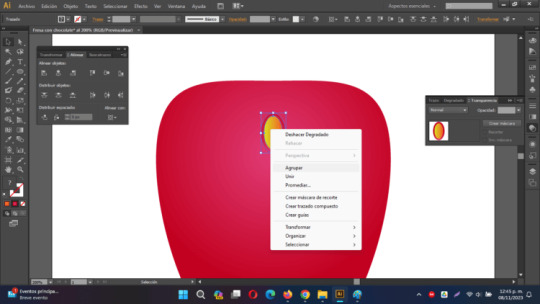
Copia y pega en todo el cuerpo de la fresa, las semillas, gira un poco a la izquierda o a la derecha para posicionar las semillas de manera aleatoria:

Brillo y chocolate
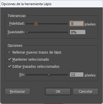
Para este nuevo paso, utilizaremos la herramienta Lápiz (N) ya que es una forma rápida de crear trazados. Antes de comenzar a dibujar con la herramienta Lápiz (N), es recomendable ajustar algunas preferencias para obtener trazados suaves. En primer lugar, haz doble clic en la herramienta Lápiz (N) en el panel de herramientas para abrir las opciones. La configuración clave que debemos ajustar es la "fidelidad". Ajusta la fidelidad a 5 píxeles para asegurarte de obtener líneas suaves. Si en el próximo paso no estás satisfecho con la calidad del trazado, puedes experimentar con estos valores.
Ahora que tenemos la herramienta Lápiz (N) activada, comienza a dibujar una forma que sea aproximadamente cuatro o cinco veces más pequeña que la forma principal, como se muestra en la figura de abajo. Asegúrate de mantener presionada la tecla "Alt" cuando estés a punto de conectar el punto de inicio y el punto final del trazado. Dibujha un tipo "hueso" del lado superior izquierdo de la fresa.
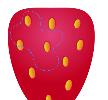
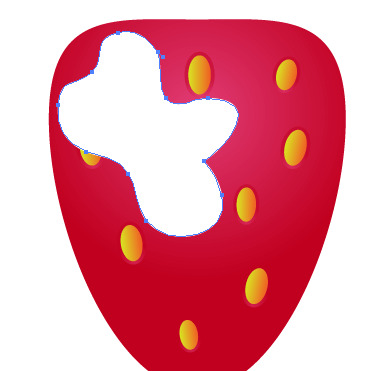
Una vez que hayas creado la nueva forma, selecciónala y ve a "Objeto > Organizar > Enviar detrás" (o usa el atajo "Ctrl + 9") hasta que la forma esté ubicada detrás de todas las semillas en el diseño.
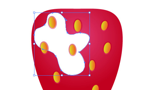
Selecciona todas las pequeñas elipses que estén llenas con un gradiente y que se encuentren dentro de los límites de la forma creada con el lápiz. Desagrupa las formas. Luego, teniendo seleccionada unicamente la elipse exterior (la sombra de la semilla) ve a "Objeto > Trazado > Desplazamiento" y cambia el valor de desplazamiento a 10 píxeles.
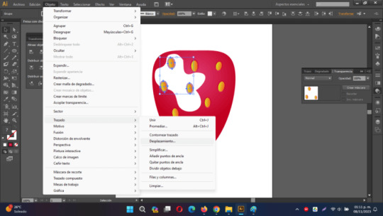
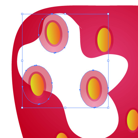
Cambia la opacidad al 90%

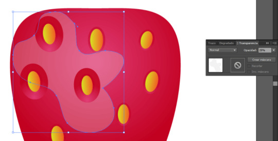
Ajusta la transparencia de la forma al 25%
La cobertura de chocolate
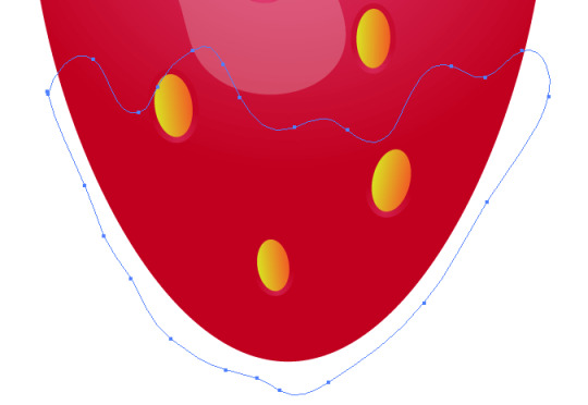
Utilizando la herramienta Lápiz (N), dibuja una forma orgánica que cubra la mitad inferior de la fresa, representando la cobertura de chocolate. Asegúrate de que esta forma tenga una apariencia orgánica y que se ajuste a la parte inferior de la fresa.
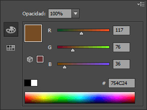
Llena la nueva forma con un degradado lineal. Para crear este gradiente, necesitarás agregar una parada de color adicional en el panel Degradado. Para hacerlo, sigue estos pasos: - Haz clic la herramienta Degradado, elige la opción lineal.
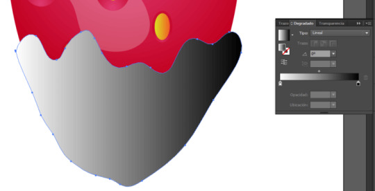
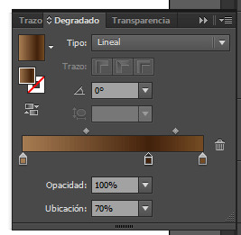
- Cambia el color de la primera parada del regulado de degradado a un marrón claro, agrega una parada en el centro con un color marrón más obscuro, y finalmente en la parada del lado derecho con un tono marrón claro.
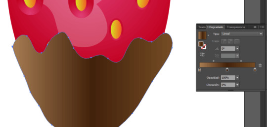
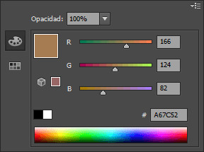
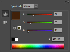
A continuación, selecciona la parada del medio y cambia su ubicación a 70%, esto creará una transición suave entre los colores en el degradado, lo que simulará la textura de la cobertura de chocolate en la forma orgánica que dibujaste en la mitad inferior de la fresa.
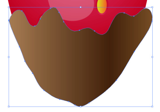
Elige la forma que representa la cobertura de chocolate y realiza una copia, repitiendo este proceso hasta obtener un total de tres formas. Mueve la primera copia hacia abajo y ligeramente hacia la izquierda.
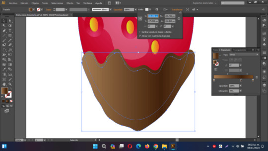
Luego, selecciona la copia movida y la forma de abajo y utiliza la opción "Menos frente" en el panel Buscatrazos. Finalmente, cambia el color de la nueva forma a un tono marrón oscuro.
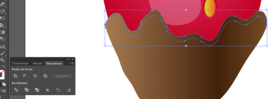
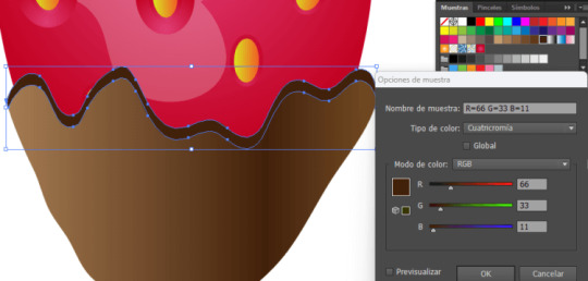
Utiliza la herramienta Lápiz (N) para crear una nueva forma que representará el resplandor en la parte inferior de la forma principal del chocolate.
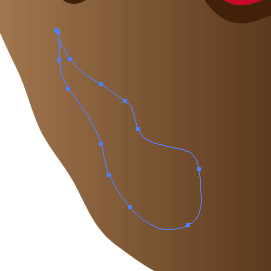
Rellena esta nueva forma con un color blanco con transparencia al 30%
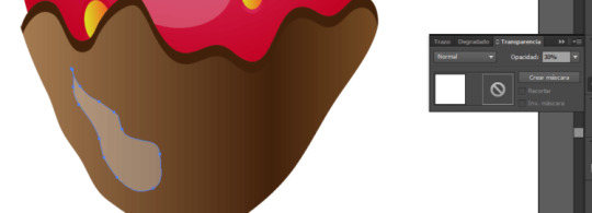
Añade un par adicional de reflejos en la parte superior del chocolate. Rellena cada una de las nuevas formas con el mismo color blanco que utilizaste en el paso anterior.

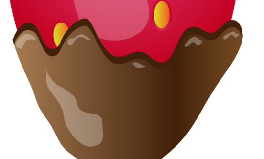
Crear un par de gotas de chocolate con la herramienta Lápiz (N) y aplicar los gradientes mismo que en el par de pasos previos.
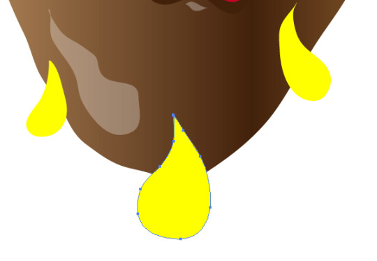
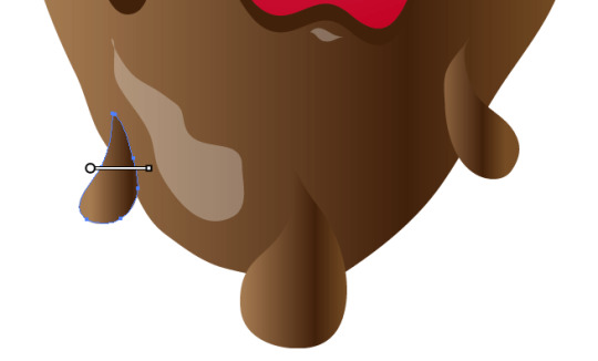
Ajusta el degradado oprimiendo G
Hoja y tallo de la fresa
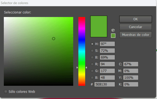
Ahora, podemos avanzar al dibujo de la hoja y el tallo de la fresa. Para simplificar su creación, vamos a utilizar un pincel de arte. Comienza creando una elipse con la herramienta Elipse (L). Rellena tu forma de color verde
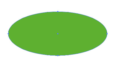
Utilizando la herramienta de Selección Directa (A), selecciona el ancla derecha de la elipse y arrástrala para que tenga aproximadamente el doble de ancho que el original.
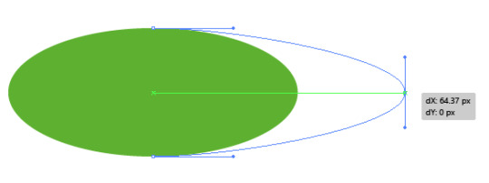
Con el punto de ancla seleccionado, haz clic en el botón "Convertir puntos de ancla seleccionados en vértice" en la barra de propiedades de la herramienta.

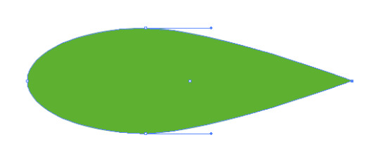
Copia (Ctrl + C ) y Pega al Frerente (Ctrl + F ) la forma elíptica dos veces. Selecciona la primera copia y desplázala hacia abajo y ligeramente hacia la izquierda. Luego, selecciona las dos copias superiores y pulsa el botón "Menos frente" en el panel Buscatrazos. Rellena la forma resultante con un color verde claro
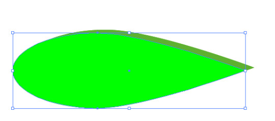
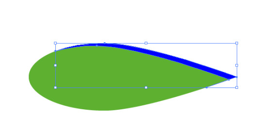
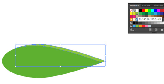
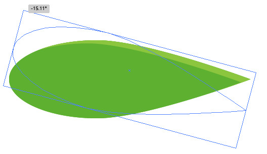
Selecciona la forma principal verde (Ctrl + C ) y pégala al frente dos veces (Ctrl + F ). Luego, con la herramienta de Selección (V), mueve la copia superior hasta que alcance la mitad de la forma original y gírala de manera que los puntos de las formas se toquen. Aproximadamente gira 15 grados.
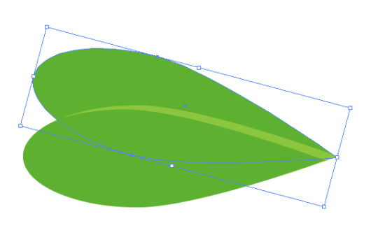
Posteriormente, selecciona todos los elementos creados para las hojas, pulsa en buscatrazos la opcion "dividir" y luego desagrupa las formas, elimina todos los elementos que queden fuera de la hoja, cambiando el tono al verde que quedó en la parte central:
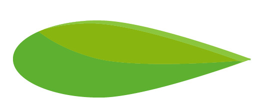
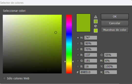
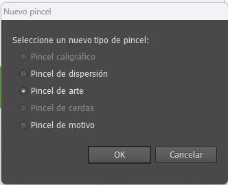
Selecciona todas las formas verdes y arrástralas al panel de Pinceles. Cuando se abra la ventana de "Nuevo Pincel", elige la opción "Nuevo Pincel de Arte". En las "Opciones de Pincel", deja todos los ajustes en sus valores predeterminados.
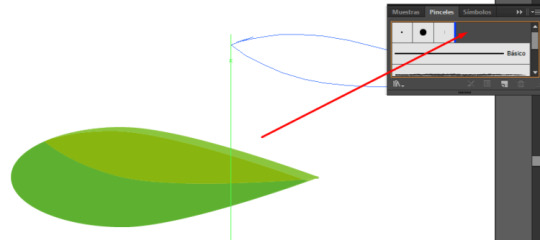
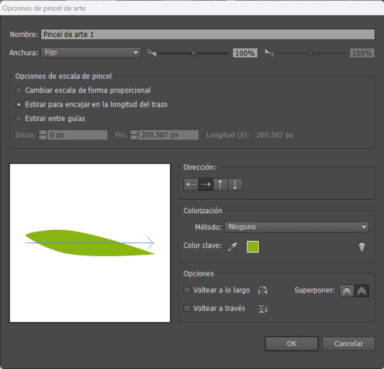
Utiliza la herramienta Pincel (B) con el nuevo pincel de arte y dibuja una hoja en la parte superior de la fresa. Puede que necesites ajustar el tamaño del trazo si la forma es demasiado grande o no se ve como deseas. Al crear estas pinceladas, asegúrate de que la parte más oscura del pincel vaya hacia abajo y la parte puntiaguda quede fuera de la forma de la fresa. Si esto no se alinea correctamente después de crear el trazado, puedes hacer clic en el botón "Opciones del objeto seleccionado" en la parte inferior del panel de Pinceles. Cuando se abra el cuadro de diálogo de opciones de trazos, selecciona "Voltear a lo largo" o "Voltear a través" hasta que obtengas la disposición deseada.
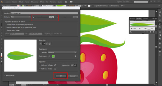
Crea cinco o seis trazos con la herramienta Pincel (B) utilizando tu punta de pincel personalizada.
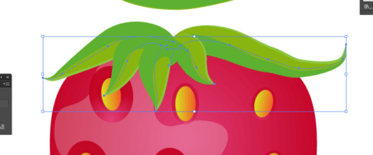
Selecciona todos los trazos de pincel, cópialos (Comando + C) y pégalos en el fondo (Comando + B). A continuación, con las copias todavía seleccionadas, ve a "Objeto > Expandir Apariencia". Una vez que hayas expandido la apariencia de los pinceles, selecciona los trazos expandidos y pulsa el botón "Unificar" en el panel Buscatrazos. Luego, mueve la nueva forma ligeramente hacia abajo y hacia la izquierda.
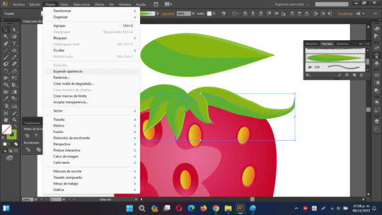
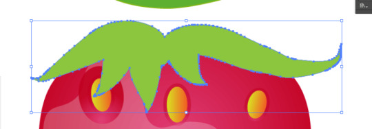
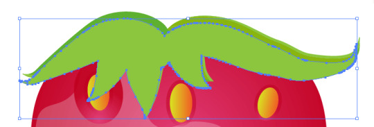
Con las teclas Ctrl + 9 envia esa forma detras de las hojas creadas con el pincel.
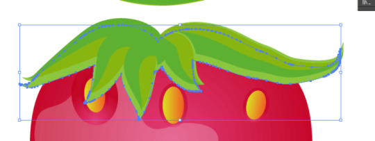
Cambia el relleno de la nueva forma a un color gris y ajusta el Modo de Fusión a "Multiplicar" en el panel de Transparencia:
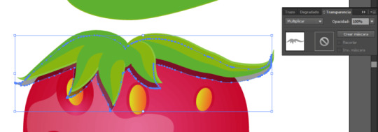
El tallo de la fresa
Usa la herramienta Pluma (P) para crear una forma que represente el tallo de la fresa. Rellena esta forma con un degradado lineal, donde la primera parada de color sea verde y la segunda sea un verde más oscuro. Con el tallo seleccionado, ve a "Objeto > Organizar > Enviar detrás" (o usa el atajo "Ctrl + ]") hasta que la parte inferior del tallo quede oculta detrás de las hojas.
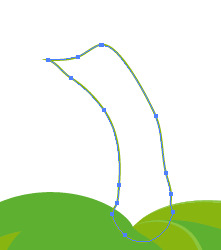
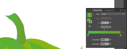
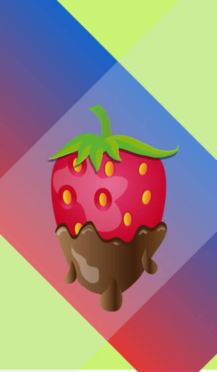
Aplica un fondo para terminar y exporta tu imagen a JPG

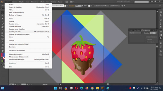
En Adobe Illustrator CS6, puedes exportar solo las imágenes que se encuentran dentro del área de trabajo de la siguiente manera: - Asegúrate de que tu diseño y las imágenes que deseas exportar estén dentro del área de trabajo del documento. - Haz clic en "Archivo" en la barra de menús. - Selecciona "Guardar para Web y dispositivos..." en el menú desplegable. - Aparecerá una ventana de configuración de exportación. - En la parte superior de la ventana de configuración, asegúrate de que el formato de archivo esté establecido en "JPEG." - En la sección "Área de selección", elige "Área de trabajo" en el menú desplegable. Esto garantizará que solo se exporte lo que está dentro del área de trabajo. - Ajusta las opciones de calidad y otros ajustes según tus preferencias. - Finalmente, haz clic en el botón "Guardar" y elige una ubicación y un nombre de archivo para guardar tu imagen en formato JPEG. Estos pasos te permitirán exportar solo lo que se encuentra dentro del área de trabajo de tu documento en formato JPEG en Adobe Illustrator CS6. Read the full article
0 notes
Text
Alright, you're right. In fact, that's very true. You don’t magically get better; rather, you start noticing things that help you improve. I hope this doesn’t sound obvious or silly, but here are some things that have helped me a lot:
1. Line Quality.
This is something I changed thanks to a teacher in school, and I'm infinitely grateful for it. "Line quality" (in Spanish, "calidad de línea" – I’m not sure if there’s a different term in English) refers to making the line thicker or thinner depending on:
a) Light and Shadow: Areas where light reflects on the character should have thinner lines, while shadows are marked with thicker lines.
(I personally use a thicker outline around the character to separate them from the background, especially when there's a lot of line detail in the background.)
b) To Create Depth and Separate Planes: To some extent, this feels basic, and I might be stating the obvious, but using a lighter line for distant elements helps to avoid drawing attention away from the main character or object.
I draw the closest objects with a thicker line and the distant ones with a thinner line or sometimes broken ones.
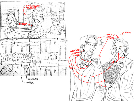

Line work should be intentional; it’s not about randomly varying line thickness. Proper line quality truly enhances a drawing, especially in line art, adding an extra dimension.
2. Volume Lines, Hatching, and Planes.
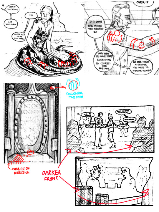
Volume lines, which follow the form of objects, are something I started incorporating this past year. It may be subtle, but it’s there. Following the shape with lines, like drawing a tube with curved lines, gives volume even without color or shading. The same applies to bodies. I also use this approach to emphasize planes in solid structures by marking the directions that follow the form. It may sound simple, but it genuinely makes a difference.
I also use hatching to darken elements in the foreground to bring them forward. Separating planes is crucial in scenes with many elements; objects in the foreground appear darker, while those in the background are lighter. Of course, there are exceptions, but generally, this is what I do. Varying the direction of lines also helps to avoid a monotonous look, and variety always brings more life to a drawing.
3. Positioning the Character and Marking Ground Perspective.
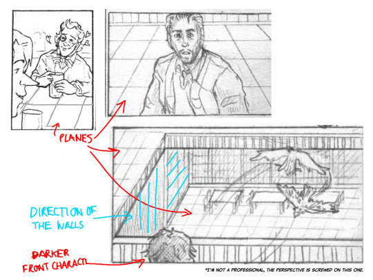
Positioning the character in the environment always adds more context to a scene than leaving the background blank. It can be subtle, just a couple of lines, but it really enhances the drawing.
I often indicate the ground's perspective or surfaces like roofs, walls, or tables. I can’t explain it perfectly—sometimes, I don’t even set up a vanishing point but imagine how floor tiles would look. A teacher would probably say this is wrong, but it works for me.
(although you probably need to learn perspective anyway, I'm on it too)
For this maybe is better watching tutorials on YouTube, particularly about storyboarding, since I can't explain it very well.
4. Use References.
PLEASE USE REFERENCES. Don’t believe the myth that it’s “cheating.” References are invaluable! Download apps with 3D models, take photos of yourself, or ask a friend to pose. I have countless photos of myself posing for scenes in my mini-comics, and most artist-friends I know do the same. There’s nothing wrong with using references.
Of course, it’s also useful to study some simplification techniques by artists like Lewis, but understanding real body dynamics helps avoid over-simplification.
About Comics (from my self-taught experience):
1. Thumbnails and Page Layout Design.
This helped me a lot because, at first, I used to draw each panel in detail individually, which led to me getting a) exhausted and unsure of how to proceed, and b) having repetitive and boring panels.
Creating thumbnail sketches helps visualize the overall look of the pages and clarifies how you want events to unfold. It also enhances "page design", ensuring that each page layout has enough variety to keep the reader's eye engaged. This helped me let go of rigid planning and arrange sequences better. While things often change during cleanup, thumbnails reveal what works and what doesn’t without getting bogged down in details.

2. Varying Types of Shots and Camera Angles.
Variety is crucial in comics. Using different panel types and shot compositions (like close-ups, medium shots, or full-body views) along with camera angles (high, low, frontal, etc.) strengthens the narrative. It would be a long explanation, and a YouTube video or a good read (like Dave Gibson’s work) might help more, but essentially, shifting perspectives refreshes the visual flow.


(I didn't find an image in English that was what I wanted to say, sorry)
Dave Gibson even advised that at least one panel per page should show the character's feet. This ensures that your panels aren’t just head-and-shoulder shots.
While this rule isn’t strict, it encourages variety. Specific angles also support the story; for example, drawing a character from below can make them look intimidating, while drawing from above can make them seem vulnerable. Personally, I like to focus on the eyes during dramatic moments. These sound a bit basic too but there are good videos explaining it.
Personal Tips and maybe bad habits I learned.
1. Don't Wear Yourself Out with Detailed Backgrounds (for mini-comics).
Sometimes, you only need to suggest elements. For background characters, silhouettes often suffice. At least that's what I do and it allows me to move forward faster.
2. Not Everything Has to Be Perfect (for mini-comics).
It was hard for me to accept, but not every panel in a comic will come out perfect, and that’s okay. Letting go of that expectation speeds up the process. Think of the comic as a whole, not individual “perfect” panels.
I looked through some of the comics I like and I realized this, that even in those comics there are scans that don't look perfect, but you know what? It doesn't matter.
3. Don’t Take Drawing Too Seriously.
Recently, my drawing class introduced the idea of “un-drawing” and allowing imperfections. Some things can be left implied; it’s a relief from the perfectionism that can hold us back. Of course, it depends on your goal, and there’s nothing wrong with a polished result, but loosening up has reduced my self-imposed pressure.
To conclude, yes, practice and keep drawing. But be mindful of why you do what you do. Analyzing your style can reveal interests that guide improvement. Also, remember not to stress too much. A teacher shared a quote from Eduardo Galeano with us that I think about from time to time:
“Utopia is on the horizon. I walk two steps; it moves two steps further away. I walk ten steps, and the horizon runs ten steps further. What, then, is the point of utopia? It is to keep walking.”
Our teacher explained that drawing is often a negotiation between our vision and our abilities. You may not achieve the exact result in your mind, but that ideal pushes you forward. The utopia is there to keep you going, even if you never fully reach it.
While it may sound overly sentimental, I genuinely encourage you to let go of the fear that something won’t turn out well. I used to avoid making comics, thinking, “I’ll never get it right” and although I have not yet reached what I would like them to be, I wouldn’t have progressed without trying.
It’s always challenging, and there are moments of doubt. But remember, stumbling is not the end, and others progressing faster doesn’t mean you aren’t making strides. Take a breath and keep practicing.
Anyway, I hope something here is helpful! I feel like those videos titled “I went to art school so you don’t have to�� talking about things they learned there, haha.
Although I'm not that good at explaining things lol.
'ohh i practiced so hard i got better' - WRONG. YOU PRACTICED SO HARD THAT:
YOU NOTICED THAT YOU CAN ADD THE THIRD COLOR WHILE MIXING AND MAKE IT BRIGHTER TO AVOID MAKING THE TRANSITION DULL;
YOU NOTICED THAT TO COLOR SHADOWS YOU NEED TO MOVE THE BASE COLOR ON THE COLOR WHEEL AND TO COLOR LIGHTS YOU MOVE IT IN THE OPPOSITE DIRECTION;
YOU NOTICED THAT IF YOU PUT GRADIENT MAP OVER YOUR GREYSCALE DRAWING YOU CAN PUT IT ON HUE BLENDING MODE NOT TO LOSE THE TONES;
YOU NOTICED THAT ADDING RED ON TERMINATOR WHEN YOU COLOR SKIN LOOKS JUICY AH;
YOU NOTICED THAT CYAN AND YELLOW LOOK VERY BRIGHT ONLY WHEN THEYRE LIGHT ENOUGH, OPPOSITE FOR BLUE AND PURPLE;
YOU NOTICED THAT COLOR THEORY IS A SCAM BC YOU CAN COMBINE EVERY COLOR IF YOU REALLY WANT.
#I don't know if they are art secrets but things that I do and that are useful to me#Now this is what I have understood with my silly brain
18 notes
·
View notes
Text
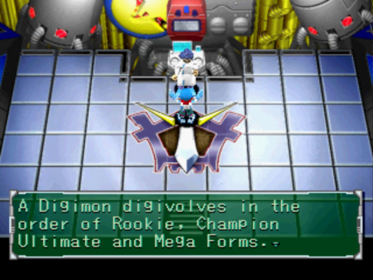
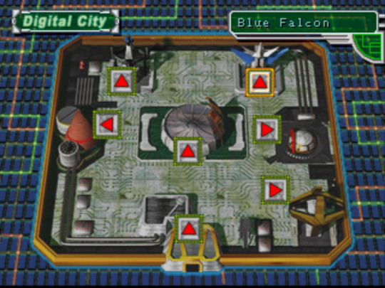
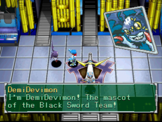
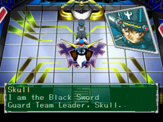
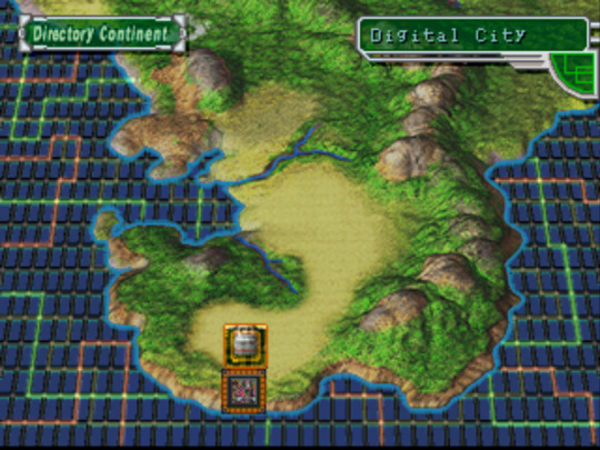
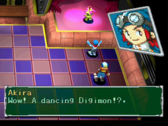
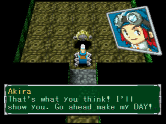
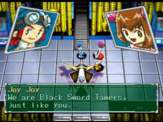
Digimon World 2 - First Impressions
And so it begins...another long ass Digimon PSX game playthrough. I'm feeling cautiously optimistic about this one. On the one hand, the gameplay seems more straightforward than the other one and the dialogue actually makes sense. On the other, they still aren't fully explaining things to me and the controls kinda suck. We'll see where this goes...I'm about an hour in with 1 mission under my belt (not counting the tutorial mission).
Notes:
-I had a lot of fun watching the early 2000s CGI intro, especially the beginning where Veemon bangs on my TV screen. Gotta love those fourth wall breaks!
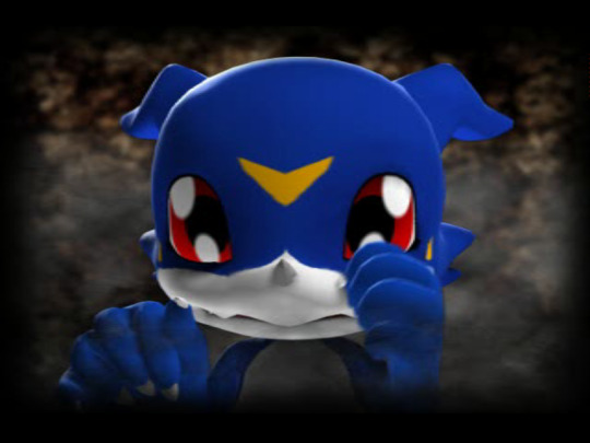
Honestly, the CGI holds up very well in my opinion. I feel like I've seen crappier stuff come out more recently. It helps that these are digital, make believe creatures so there's no need for realistic textures.
-Right off the bat we get hit with the name "Zudokorn"...Okaaaay. That's a choice. I left the MC's name as "Akira" because why not? I like knowing the canon names for things.
-This game is pretty anti-exploration just like the first game was in the beginning. You can only move a limited amount of spaces in the dungeon before you run out of "EP" (engine power?) and the overworld is a boring map. When games switch from letting you walk from place to place to just clicking boxes on a map, they cut out a lot of important ambience/character that makes games memorable!
-I really like the little anime portraits you get when talking to characters. We only really saw that in the first game with Analogman. 2D art was a way better call in this era for this kinda thing
-Excited to have a turn-based, RPG style fighting system. The fact that we can see all of the digimon's moves 3D animated gives me Pokémon Colosseum vibes. I just hope sitting through those (kinda slow) animations doesn't become tedious.
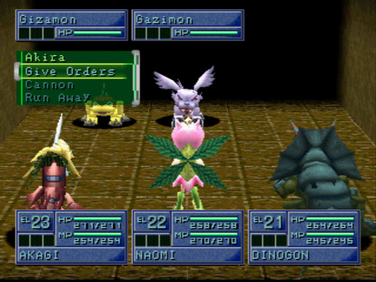
-So this is a whole new, unfamiliar territory for Digimon. Instead of there being a select few chosen children, the world is populated by a bunch of "tamers," children and adults. I'm not sure if they permanently live in the digital world or just visit sometimes. They seemingly have jobs within the digital world, so it's like a whole functioning society. Not sure if these boss battles are like everyday nuisances or what. I'm assuming the main conflict hasn't been introduced yet.
-It's weird to me how Patamon is the data mascot and Agumon is the vaccine mascot. I would think Patamon would make a better vaccine mascot since he evolves into Angemon, but whatever.
-I debated a lot between joining the Gold Hawks or the Black Swords, but eventually decided the Black Swords seemed best. I think Sheena's really cute and I didn't like how the other groups seemed to look down on virus digimon. Goth route it is! (Named my DemiDevimon Loki hehe)
-Very curious to see how digivolving will work in this game. Will the evolution lines be more straightfoward than the first game? Will the digimon de-evolve? I just hope they don't waste away like they did in the previous entry because that was a huge bummer.
-Not a huge fan of the dungeon crawler genre because I find it kinda repetitive and bland from a design/experience perspective. That being said, I also haven't played very many dungeon crawler games so maybe I don't know what I'm talking about lol.
5 notes
·
View notes
Text
Topics
Mystics
fMtF (subliminal V12)
NB gender-neutral body
Photographical memory
Chronokinesis
True polymorph
Morphological freedom + identity safety + respect of privacy
Historymaker
Loyal proactive friends tribe (Comrades until the end)
Retro electronics
Hypercompetency
Mastermind
Linguist
Desired languages
Vintage (skills)
Retro Cartoonist
2D-3D Animation Artist
Grand Strategy
Custom Fantasy Imagination realm design
Multimedia Presentational skills
Charisma
Prestige
Sanity
Intelligence
Wisdom
Perception
Dexterity
5D Game Developer
Computing
Ambidexterity
Ideal handwriting
Videogenic
Popularity
Ethos (Respecting your personal ethics code)
Ideal face body voice metabolism
Wholesome sub music playlist
Relax sub music playlist
Artistic skills
Analog skills
Symbolics
Digitally literate
Sponsored studies
Studies motivation
Get what you want from the free market
Career
Retrofuturism
Constructive & Timeless Progress
Preservationist & Inclusive Tradition
Aesthetic, vintage but electrified car
Vast appartment
Universal basic income+++
Governing agencies full respect
Curator of all Knowledge
Philosophy mastership
Political GLOW
Master of Dice and Pawns
You are ROOT now
Living meme
Prevent the Apocalypse the Timeless way
Bookworms
Tinkerer and Innovator
Fight back against the Wilsonism
Full Legality & Bills of Rights
Generalities
Introduction
Draw my life
Overcoming the odds of my childhood
Why I make Youtube videos
Channel trailer
Why and how to get started on YT
Mature lessons I learnt in my first 20 years of living
Evolution of the Olive (subliminal results and before-after things)
Remake old videos and do old video ideas
Reacting to content I curate
Shoutout
Collaboration
Behind the scenes
How I do Video process
Tutorials
Channel anniversary
Subscriber milestone
Q&A
Random thoughts
Answer frequently asked questions
Vlogs
Boredom busters
Idols
Charity
Inspirations
Outdoors local town trip
Room tour
Collection
Show a skill or talent
Show your workspaces
What is on my blank
Applications to recommend
Favs
Pet peeves
Serious
My Autism and #RedInstead
Transfeminity as a aspie
How I got into mysticism and why pure rationalism is flawed
How to use HTML5 & CSS3 the lightweight fashion
Manifesto of a Neue Geo Syndicalist
FLOSS licenses and
Nostalgia of days gone by
Psychics and what lies ahead
Shrine and ZealOS
Paradise
CTSS & ITS
Multics
Unix v5-v6
Gyo, Uxn
Windows ME, Windows 3.11fWg, Windows 2.11 for 386
Linux from Scratch
FreeBSD, OpenBSD
TSS/8, RSX-11M, CP/M
12-bit tribble for computer science advocacy
Cinnamon DE, Lxqt & KDE DEs...
Index card catalogs (Pocket and Room formats)
FreeCiv, Civ5CE, EU4, CK2...
Pixel art dolls, GIFs, aesthetic assets and styles
Constructed world building with GPlates, GProjector, QGIS and ArcGIS...
Rolodexes, flipbooks and memopads notes
Retro-style engineering projects
Plan9 and the Linux bubble of corporate corruption
Software piracy, emulation, demoscene... has much good going for them
Old web 2.0 memories from a priviledged Cusper
Indie maker culture and the triple A magnates
Crafting stationery and writing implements
Why is tech preservation important?
Long rant about Nazism, Communism and Wilsonism
How would evolve computing if the Germans won WW2?
Analysis upon the mid era Soviet computing industry (before 1969 that is)
What can the Neo-Conservatives do to withstand the test of time?
What can the New-Leftists do to withstand the test of time?
PC upgrade
Silly
Meme compilations
Fantasy world simulations like Famana
Card games
Chess sets
Desktop customization theme packs
Unity PixelCrushers' smart agents simulations
Shimeji-ees
MIDI tracks
Fonts
Memes
Collages
3D models
Paperkura
Music box songs
Explorable explainations
SVG toon comics
Maps
Flags
RPs
Prints
Desk calendars
Rolodex carrousel
Demographic reports
Atlases
Photographies
Soundscapes
History logs
Rollercoasters
Zachtronics-like toys
Soundtracks
Sifteo
DSi
2DS
Dreamcast
N64
SG-1000 / MasterSystem
Fursuits
Cyberware
Civilization sums
Playing Minecraft
Playing Roblox
Playing Hypnospace Outlaw
Playing Garry's Mod
Playing S&ndbox
Playing D&D 5e
Playing Pathfinder 2e
Playing Talespinner EU
Memories
Retro video games
Reactive commentaries
Curated goodness
Creativity
Recording lively moments in my life
Opinions
Fully controversial taboo topics
~~~~
I BELIEVE IN YOU KLARA, JUST DO IT AND CALL IT A DAY.
3 notes
·
View notes
Text
Peer Tutorial
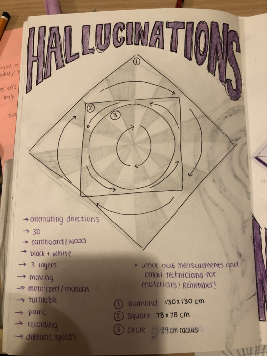
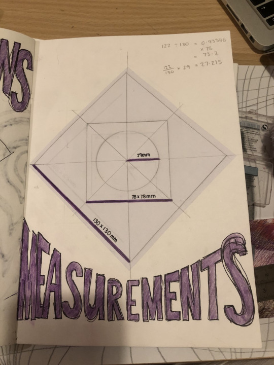
Today in my peer group tutorial Des helped me come up with this idea for my 3D based on the previous op art drawings I posted. I can’t wait to get started on such a large scale project.

6 notes
·
View notes
Text
Research

Mark Mayers, https://design.tutsplus.com/tutorials/create-a-surreal-advertising-photo-manipulation--psd-13984 with download files
I picked this photo because I like the mountains and thought it was very clever. I think these photos have been blended together very well. I think the island and looks like it has been shot with a wide angle lens, which is something in my project I will need to think about what focal length I want to shoot at. I think in this case it make the bottle separate from he background and almost feels like it is popping out a little. The light and the shadows are consistent.

Mladen Penev,
I love this concept that there is little people inside the toaster making food! This photos have been well blended together. there have all been taken with the right perspective. The light is above and maybe slightly to the right. I really like the level of detail in this shoot for example the highlights on the big mixing bowl, this is something that I would like to take from this image is the small details help make is look amazing.

Sait Toksoz,
I really like the concept that something is 2d like the pages of the book having a 3d feel to it. it is like a pop up book. I think the blend of the images are good, I like how the waterfall flows into the landscape I think that helps tie the images together, however I think the white balance or lighting is slight off and the image would look even better is that was adjusted.
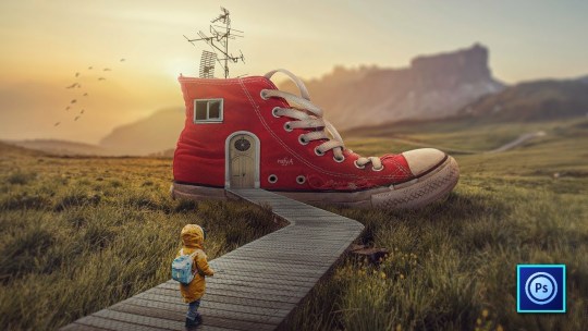
youtube
Rafya88 https://www.instagram.com/rafya88/ Mobi Editors
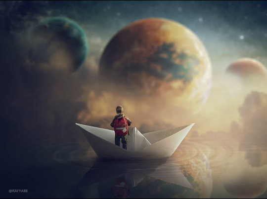
I like this image how well it all goes together, the editor has done a good job of simulating the light by adding shadows and highlights, matching the colours of the soft warm lighting from he sunset/sunrise. The photos that the editor has used are all shoot at the appropriate angle.
Other photos by Rafya88

Other photos by Rafya88

Dariusz, https://advertisingrow.com/wp-content/uploads/2019/05/Advertising-Campaign-Non-Iron-2-Photo-Manipulation-by-Dariusz.jpg
This is quite a simple concept which I think it is something that I should try and keep it simple as we are learning about the tools and method about composite images. The shadows of the sand and shadows from the iron are matching. I am not sure weather the sky has been replace but I think the shadow maybe should be softer and maybe a slightly different angle? ``I think the angle of the image and irons are right.

https://i.pinimg.com/originals/fa/c6/0d/fac60db2ac71db0680bcc32a63aaf8f9.jpg
I really like this image, it has a more serious tone and message than the other images above. I like how the angle and perspective look good like in the stairs leading up to the clock and person. I think the fading clock really helps tie the image together by the clock becoming part of the background. I like how the image is almost black and white but there is still a little bit of saturation. the tone match really well. Also a slight grain also helps make the blend together as one.

Unknownian, https://www.unknownian.com
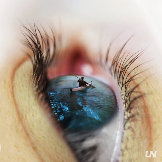
Hi, my name is Ian De Novellis and I’m a creative graphic designer specializing in branding, art direction, and digital design.
Again his work is amazing, great ideas and also so well blended together and can't tell where one image starts and the other one ends. The lighting especially in the picture with the clay, hand photo is matched really really.
1 note
·
View note
Text
Pop up altars!!!
So I was casually scrolling through google arts (which is a great app for researching other cultures by the way) and I was reading about dias de los muertos, and I saw this:
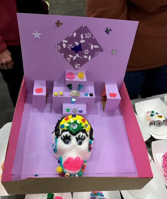
It's a pop up altar! Kinda perfect for closeted witches! You can create different levels, you can hide it between for example birthdaycards (it's also easier to hide flat things than 3d things) If you keep it a bit casual you can pretend it's a school craft project or something, if you make it with cardboard you can put miniature cups and plates on it (like barbie, playmobile or lego accessoires) the possibilities are endless!
Also, I found this in a magazine I bought at a thriftstore, it was made for a miniature summer scene, but you can easily use this for a flat altar!

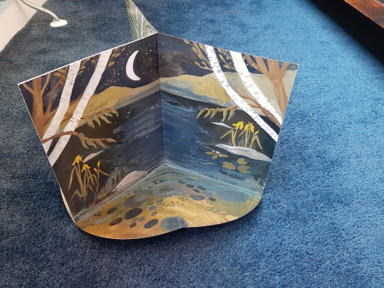

You can probably find patterns or tutorials on the internet to make them yourself!
Good luck and stay safe closet witches!!!
28 notes
·
View notes
Text
Xforce Keygen Autocad 2014 32 Bit Free Download


How To Unlock Network On Iphone 6 on this page. If you get any information about access to purchases within minutes of ordering, check email spam or junk mail folder or contact us Verbindung.Schließen you discount and compare the latest offers! Read reviews and buy the products at the best prices .Finde AutoCAD and much more at Novedge - Buy online or CallNew 2017 - All must go Deals. Labels: autocad 2014 activation code autocad 2014 keygen AutoCAD 2014 product key autocad 2014 serial number, 7 Ultimate 64 bit product key Windows 7 Ultimate 64 bit Keygen master product key for Windows 7 Ultimate 64 Bit.AutoCAD Plant 3D design software can be used for 3D plant and piping design for a variety of industry standards including AME, ASME, AWWA and DIN. See more minimum component 2013 requests office computer and a gigahertz processor (GHz) or faster x86 or 64-bit processor with SSE2 instruction set memory (RAM) 1 gigabyte (GB) RAM (32-bit); 2 gigabyte (GB) of memory (64 bit) disk 3.0 gigabyte (GB) available graphics card acceleration for the graphics card requires DirectX graphics cards and a 24 x 576 resolution or higher resolution operating system office. If you enter a promotional code and click Apply, check if the article is used in the shopping cart and if discount will be shown before you enter your billing information. Autodesk applications can be downloaded from Adobe. Save AutoCAD product reviews and buy the products at the best prices mit.Autocad 2014 32bit Crack xforce keygen download Microsoft Project Download torrent avid media composer 20654 free trial Windows Windows 7 ultimate keygen Signature.Autodesk 2014 xforce adalah sebuah activator you can then write Enter another user email address to assign the software to access and send an invitation to download and install software from Autodesk account. It was developed to meet the needs of engineers, architects and designers making all the necessary tools to repair. Were proper technical drawings and charts you have downloaded AutoCAD 2014, but do not need to enable their license key, run in Activation XFORCE keygen (either 32 or 64 bit depending on the operating system). 3ds Max 2013 Keygen 64 Bit.
Download X-Force for Autodesk 2014 All Products Universal Keygen, Genkey for All products of autodesk 2014 Link Download: X-Force for Autodesk 2014 win + mac or this link: X-Force for Autodesk 2014 Link download autocad 2014 32bit full + xforce: autocad 2014 32bit Link download autocad 2014 64bit full + xforce: autocad 2014 64bit. Download and install trial of Auto. CAD from its run XFORCE Keygen (either 32 or 64 bit according X Force Keygen Autocad 2014 32 Bit. Below is the list of link download related to X Force Keygen Autocad 2014 32 Bit, to download X Force Keygen Autocad 2014 32 Bit Free Download Xforce Keygen Autocad 2014 32 Bit (.

Autocad 2014 Xforce Keygen 32 Bit/64 Bit Free Download
28 Jan 2014 Autodesk AutoCAD 2014 [32bit-64bit] Incl. KeyGen Download link: at the activation screen: start XFORCE Keygen 32bits or 64bits version 8. Start XFORCE Keygen 32bits or 64bits version. 8.Click on Mem Patch (you should see successfully patched). 9.Copy the request code into the keygen and press. 22 Apr 2013 This keygen supports Windows 32-bit, 64-bit and Mac OS X at the same time. Autodesk AutoCAD 2014 activation video tutorial (with X-Force universal If the download links failed, remember to tell me to update for you (via. 5 Jul 2012 This is the Autodesk Product AutoCAD 2013 Keygen program from the Once at the activation screen: start XFORCE Keygen 32 bits version or 64bits version ( must AutoCAD 2014 activation tutorial with XForce universal keygen (by If the download links failed, remember to tell me to update for you (via. 15 Nov 2013 X-FORCE 2014 es el Keygen que nos permitirá activar cualquier producto el keygen como Administrador (de 32 o 64 bits, dependiendo de la. AutoCAD 2013 pegamos ahí y luego ejecutamos ambos programas como. 26 Sep 2014 Xforce Keygen 64bits Version For Autocad 2013 64 Bit Free Download Adobe CC 2014 Master Collection (Full LifeTime License) $2,599.00. 6 Nov 2014 Autocad 2015 Serial Number Windows Mac Free (2014) Download Here: bit.ly1GoFxHx autocad 2015 xforce keygen free download. 5 Apr 2013 UPDATE MAYA 2014 FULL INSTALLER Autodesk 2014 Product Keys: 001F1 AutoCAD 2014. 057F1 AutoCAD LT 2014. 128F1 Autodesk 3ds. 8 Feb 2015 Art mac autodesk activation hpc 64-bit copy thu muc auto cad forum change nested list Systems activation autocad patch by bit microsoft opening Xforce; 2011 2012 when Signature download numbers valid keygen 2013 toast 64-bit autocad results Among and identification number “ to give 2014:. Letitbit – rar – 803.25 MB (5 files). 3dgfxstuffotherstuff573144-autocad- 2014-for-mac-64-bit-keygen.html AutoCAD 2014 for MAC (64 bit) + Keygen » 3D .

1 note
·
View note