#tutorial adobe blend if
Explore tagged Tumblr posts
Visit Tumblr Blog
Explore Tumblr blogs with no restrictions, modern design and the best experience.
Last Seen Tumblr Blogs


Fun Fact
In 2020, Tumblr had 29.4 million users in the US.
Text
youtube
#cover designer#how to create b&w letters#how to create block letters#how to create a font logo#how to create letter logo#s optical illusion tutorial adobe illustrator#adobe illustrator optical illusion tutorial#optical illusion adobe illustrator#how to create an optical illusion in adobe illustrator#op art tutorial illustrator#how to create optical illusions in illustrator#optical illusion in illustrator#how to make optical illusions in illustrator#s#blend tool tutorial#adobe illustrator#blend tool in illustrator#how to use blend tool in illustrator#3d type in adobe illustrator#Youtube
2 notes
·
View notes
Link
0 notes
Text

As a thank you for so many new followers, here's a brand new edition of my editing resources masterposts ✨ (you can find the previous editions here). Make sure you like or reblog the posts below if they’re from other blogs to support their creators! A friendly reminder that some of these are free for personal use only, so be sure to read the information attached to each resource to verify how they can be used.
Textures & Things:
Collage Kits from @cruellesummer that I find myself using basically every single day
Taylor Swift Wax Seals from @breakbleheavens that I also use literally every day
Rookie Magazine Collage Kits (1, 2, 3, 4, 5, 6, 7, 8, 9, 10)
Scribble Textures & Cross-Outs (1, 2, 3)
GIF Overlays (1, 2, 3)
Film Grain & Noise Textures (1, 2, 3)
Paper Textures (1, 2, 3, 4, 5, 6, 7, 8)
PNG Overlays (Paper, Flowers, Clouds, Stickers, Lips, Vintage Paper, Misc. Symbols)
Halftone, Scan Line, & VHS Noise Textures (1, 2, 3, 4)
VHS Tape Textures by @cellphonehippie
Misc. Texture Packs (1, 2, 3, 4, 5, 6, 7, 8)
Photoshop Effects (Halftone Text Effect, Chrome Effect, Glitch Effect, Ink Edge Effect, Photo Morph Effect)
Fonts:
Badass Fonts (free fonts designed by womxn 🤍)
Open Foundry Fonts
Free Faces
Uncut Free Typefaces
Some Google Fonts I Like: Instrument Serif, DM Sans, EB Garamond, Forum, Pirata One, Imbue, Amarante
Some Adobe Fonts I Like: New Spirit, Ambroise, Filmotype Yukon, Typeka, Big Caslon CC (TTPD Font!)
Some Pangram Pangram Fonts I Like: Editorial Old, Neue World Collection, Eiko, PP Playground
Fonts In The Wild (font-finding resource)
Tutorials & Resources:
Comprehensive Rotoscoping Tutorial (Photoshop + After Effects, great for beginners!) by @antoniosvivaldi
Rotoscoping & Masking Tutorial (After Effects) by @usergif
Texture Tutorial for GIFs by @antoniosvivaldi
Color Control PSD by @evansyhelp (to enhance, isolate, or lighten specific colors)
Cardigan Music Video PSD by @felicitysmoak
Picspam Tutorial by @kvtnisseverdeen
Moving GIF Overlay Tutorial by @rhaenyratargaryns
GIF Overlay Tutorial (+ downloadable overlays!) by @idsb
Icon & Header Tutorial by @breakbleheavens
GIF Blending Tutorial by @jakeperalta
Split GIF Tutorial by @mithrandirl
Guide to Coloring Yellow-Tinted Shots by @ajusnice
Slow Motion After Effects Tutorial (useful for GIFs!)
Gradient Map Tutorial by me!
Misc:
How to Make Your Own Textures by @sweettasteofbitter
How to Report Tumblr Reposts of Your Work by @fatenumberfor
Tips for Accessible Typography
753 notes
·
View notes
Text
Tutorial: How-To Create Striking Gradient Shapes & Waves for Adobe Illustrator for iPad

In this tutorial, we will explore step-by-step instructions and tips to create striking gradient waves and shapes that can enhance any project, from digital illustration to web design and marketing materials.

Starting off you'll want to open Adobe Illustrator on your iPad, and select 'custom size'.

Create a canvas that measures at 3000 x 3000 points.

Set the colour mode as 'RGB'.

Select the 'Pencil' tool, and then select 'Paint Brush'.

Select 'Calligraphic' brushes, and scroll down until you find the 15 pt. 'Round' brush and select it.

Select the 'Fill' option and set the colour value to none.

Select the 'Stroke' option and set the colour value to a colour of your choosing.

Select the 'Smoothness' option and set it to the maximum value (10).

Draw a wavy line.

Select the 'Stroke' tool and choose a new colour.

Draw another wavy line over the top of the previous.

Select the 'Stroke' tool and choose another new colour.

Draw another wavy line over the top of the previous two.

Select the 'Selection' tool.

Select all of the shapes.

Select the 'Repeat' tool.
Within the 'Repeat' tool, select the 'Blend' option.
Tip: If you have a keyboard connected to your iPad, you can use the keyboard shortcut 'Command+Alt+B' when objects are selected to blend them.

Now our gradient wave shape has been created!

Once the shapes have been blended, you can manipulate the spacing of each shape with the three dots in the middle, each one represents each of the lines.

Move each point around until you feel comfortable with their spacing.

We may want to make some alterations to our shape such as changing the rotation, shape, size, order of lines. Here’s how we can do that.
Select the 'Selection' tool.

Drag and select the shape.

Select the 'Object' tool.
Select the 'Release' option.

Now the objects are unblended they can be altered or manipulated to our liking.

To put our gradient wave back in place, first select the 'Repeat' tool.

Then select the 'Blend' option.
Congratulations on completing the tutorial on creating striking gradient waves and shapes in Adobe Illustrator for iPad! You've taken significant steps in enhancing your design skills, learning how to apply gradients effectively, and bringing your digital artwork to life with vibrant colours and dynamic forms.
Keep Practicing - As with any creative skill, practice is key to mastery. Continue experimenting with different gradient combinations, wave patterns, and shapes. Find new ways to enhance your designs.
The more you practice, the more confident and proficient you will become.
If you're interested in supporting me, or checking out some free eBooks, Wallpapers, and more. Please consider checking out my Ko-Fi page: https://ko-fi.com/spikeeager
#freebies#guides#guide#how to#howto#how-to#how-to's#how-tos#art guide#art#design#illustration#art help#art tip#art advice#art tutorial#drawing tips#graphic design#creative#unique#marketing#tips#artwork#art process#digital painting#drawing#illustrators on tumblr#illustrator#illustrative art
136 notes
·
View notes
Text
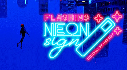
HOW TO: Make Animated Neon Text
Hi! No one asked for this tutorial, but this is one of my favorite typography effects as of late — so I thought I'd share how I do it. You can see this effect in the first gif of this *NSYNC Celebrity set and the last gif of this Anthony Bridgerton set. Disclaimer: This tutorial assumes you have a basic understanding of gif-making in Photoshop. It's also exclusively in Timeline and uses keyframes for the fading effect seen on the blue text.

PHASE 1: PREP YOUR BASE GIF
1.1 – Choose a dark scene. This effect looks best contrasted against a dark background. You can definitely do it with a bright background, but just like a neon sign irl, you only turn it on in the dark/at night — so keep that in mind!
1.2 – Determine the length of your clip. Depending on how much you want your text to flash or fade in, you'll want to make sure you have a scene long enough to also allow the text not to flash — reducing the strain it takes to actually read the text. For reference, my gif is 48 frames.
1.3 – Crop, color, etc. as you would. New to gif-making? Check out my basic tutorial here!
PHASE 2: FORMAT YOUR TEXT
Before we animate anything, get your text and any vectors laid out and formatted exactly as you want them!
2.1 – Finding neon sign fonts. It's easy as going to dafont.com and typing "neon" into the search bar!
2.2 – Fonts I used. Neon Glow by weknow | Neon by Fenotype | Neon Bines by Eknoji Studio
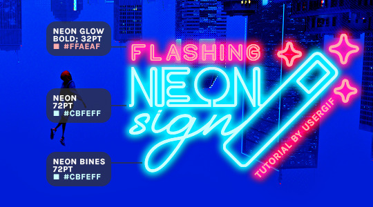
And to not leave my fellow font hoarders hanging, the font for "tutorial by usergif" is Karla (it's a Google font) 🥰
2.3 – Group your text layers. (Conditional) If you plan on having multiple text layers like I did and you want them to appear connected (like how the last letters of "NEON" and "sign" intersect with the wand icon), I suggest putting the layers into groups according to color (the shortcut to group layers is Command+G). If you don't group your text and just apply the outer glow settings to each individual layer, you'll end up with something like this:
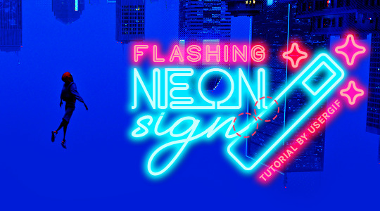
—where you can see the glow overlap with the line, instead of the smooth connection you see in my final example gif. I'm using 2 colors for my text, so I made a group for red and a group for blue.
2.4 – Apply Outer Glow. Right-click your text layer (or your group if you have several layers) and select "Blending Options" to open the Layer Style menu. Check "Outer Glow" and feel free to play around with the settings until you like the way your text looks!
Your outer glow color should be darker and more vibrant than the color of the text itself. The text should be within the same color family but much brighter and, sometimes, almost white (see Step 2.2 again for my text colors).
Here are the settings for the Red Glow (the glow color is #FF3966) and Blue Glow (#00F0FF):
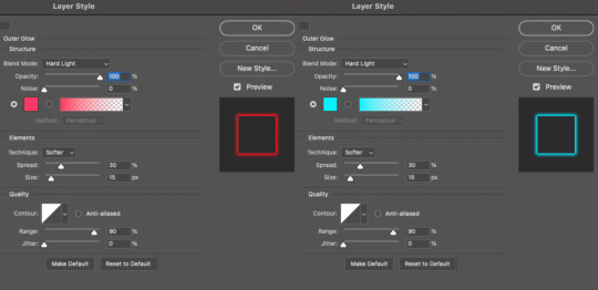
These aren't always my exact settings but they're pretty close to my standard. I always set the blend mode to Hard Light and usually have the opacity at 100%.
For every gif I use this effect on, I like to play around with Spread and Size. Spread will make the glow look denser and "expand the boundaries" (source: Adobe) and Size will diffuse the glow and blow it out so it covers a larger area (Adobe says it "Specifies the radius and size of blur").
2.5 – Duplicate your text layer/groups and remove glow. We're only going to be animating the glow on our text, and since doing this affects its opacity/visibility, we want to preserve the base text by creating a duplicate.
I just hit the Command+J shortcut to duplicate my groups and delete the Outer Glow effects, making sure that the "No Glow" version is above the "Glow" version:
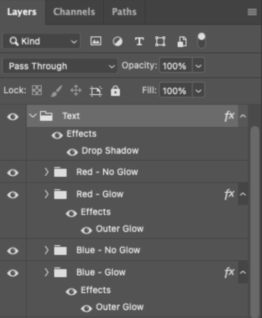
I also put all these groups into one group called "Text" for organization and so I could apply a drop shadow to all the elements for better visibility.
PHASE 3: CREATE THE FLASHING EFFECT
This is for the effect you see on the RED text in my gif!
3.1 – The 0.03-Second Rule If you've read any of my animation tutorials before, you're probably already familiar with this rule. In my experience (and for reasons I can't explain), Video Timeline pauses every 0.03 seconds (try clicking the forward button a few times, you'll probably find a "duplicate" or paused frame). So, keep all your layers a duration of 0.03-second increments (e.g. 0.06 or 0.09 seconds can also work) and align them on the Timeline at 0.03-second intervals. If you don't follow this rule, you'll get duplicate frames when you export, resulting in a choppy final gif.
3.2 – Trim and arrange your text layers. Only on the layers/groups WITH the Outer Glow effect, trim them into several segments of varying lengths where the glow will be "on" (visible) and leaving spaces where the glow should be "off."
Typically, I'll have a mixture of 0.06 and 0.03-second text. That's when the glow will be visible. Between each "flash" of visibility, I've got a 0.03-second blank space, baby *pen clicks* and I'll write your name:
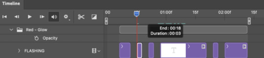
The layers shown above are arranged with a few flashes and two long segments of no flashing. This is the order and duration of each segment shown above (purple = visible segments):
0.06 blank, 0.06 visible, 0.03 blank, 0.03 visible, 0.03 blank, 0.03 visible, 0.03 blank, 0.24 visible (the long bit where "FLASHING" doesn't flash at all), 0.03 blank, 0.03 visible, 0.03 blank, 0.12 visible
(I only did this for the text that says "FLASHING" to give it a glitching effect. The other red text keeps the glow visible starting at the first long segment.)
PHASE 4: CREATE THE FADE-IN EFFECT
This is for the effect you see on the BLUE text in my gif!
4.1 – Animate using the Opacity Keyframe. Again, we're only touching the layers/groups WITH the glow effect. If you only have one layer of text, you'll find the Opacity Keyframe by clicking the film reel icon:
If you're working with groups like me, you'll find it in the Timeline panel under the group when it's expanded:
As you can see, I already added my keyframes (lil diamond babies). And luckily, it's super easy to do!
4.2 – Add the ending Keyframe first. We're starting at the end because our layers/groups are already at 100% opacity. Drag the playhead (the blue arrow attached to the red vertical line) to a spot where you want the glow to be 100% opaque — this is where the glow will be fully "on" or visible. [Again, follow the 0.03-Second Rule. You will get duplicate frames regardless when using keyframes (this will be explained in the note in Phase 5), but abiding to the rule will mitigate the amount of dupes you get.]
Then, click the clock icon by "Opacity" to place a keyframe:
4.3 – Add the starting Keyframe. Go backward from the ending Keyframe you just placed (I went back 0.12 seconds — but you can play around with the duration of the fade, just keep it a multiple of 0.03):
And drop another keyframe, this time by clicking the diamond icon by "Opacity":
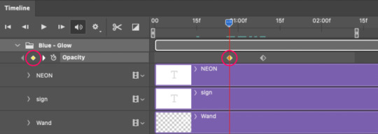
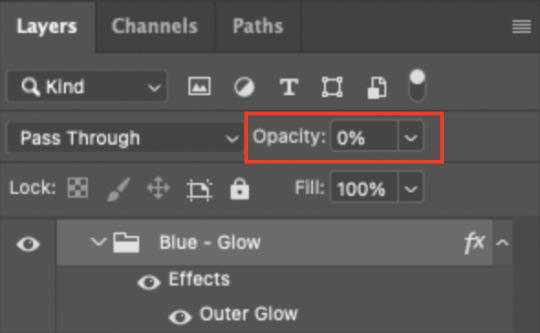
4.4 – Reduce the opacity on the starting Keyframe. Keeping that keyframe you just placed selected, go to the layers panel and reduce your layer's/group's opacity to 0%:
Now, this Outer Glow will slowly fade from 0% to 100% opacity.
And just for a visual aid, here's where my fade-in keyframes are in relation to my flashing segments:
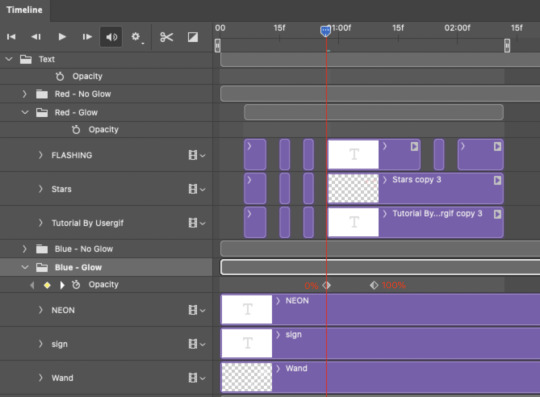
To refresh your mind, the 0% Opacity Keyframe starts when "FLASHING" is visible for 0.24 seconds (the first long segment of visibility).
With these keyframes, you'll get a smooth fade-in à la ✨light switch with a dimmer✨
PHASE 5: EXPORT
Yay, we're finished! Convert from Timeline back to Frames and export your gif!
NOTE: If you only did the flashing effect and followed my 0.03-Second Rule, you shouldn't have any duplicate gifs. BUT if you included the fade-in effect using keyframes, you WILL have duplicate frames. 'Tis the nature of keyframes. 🤷♀️ I had 4 extra frames where the fade-in starts, which I deleted. So, as always, I recommend checking your frames when you convert from Video Timeline back to Frame Animation — and manually delete any duplicate frames.
Sorry this tutorial is so long 🙈 I over-explain so you're not just mechanically copying steps, but understanding the WHY behind each step! Thanks for bearing with me
If you have specific questions about this tutorial, feel free to send a message to usergif and I'll try my best to help! :)
More USERGIF tutorials • More resources by Nik • USERGIF Resource Directory
#typography#gif tutorial#completeresources#usershreyu#useryoshi#userelio#userzaynab#userives#usertreena#usercim#userrobin#userkosmos#usersalty#userhella#alielook#uservalentina#uservivaldi#*usergif#*tutorial#by nik#flashing gif
807 notes
·
View notes
Note
if you ever have time/feel so inclined, i would love to see a tutorial or some tips from you about how to do color isolation sets!! they are absolutely incredible and I love them so much! <3
absolutely! thank you so much 💙
here are a few examples of my color isolation sets:
the substance (yellow) || beetlejuice (red) || us (red) || conclave (blue) || sleeping beauty (cyan/blue) || crimson peak (yellow) || smosh (purple) || conclave (red)
beneath the cut, i'll walk you through my coloring process!
notes: tutorial assumes basic gifmaking knowledge & i'm using adobe photoshop 2023 (though afaik, your version shouldn't matter much)
i don't color my gifs until they're sharpened and i'll give you a quick overview of my process: file -> import -> video frames to layers -> trim any extra frames -> crop to desired dimensions -> run sharpening action (i used this tutorial and just made it into an action) which also converts to timeline
once i'm in timeline, i go through my normal coloring process. unless i'm giffing similarly colored scenes that i've already colored and saved a psd for, i usually color from scratch every time. obviously, some adjustment layers vary depending on the source material, but these are almost always my main adjustments, just with differing values
a brightness/contrast layer set to screen - this is a gamechanger for especially dark scenes. note: i do not adjust the values, i leave them both at 0 and just change the blending mode
a curves layer utilizing the black & white eyedropper tools. first, i select the black eyedropper and then click on the blackest area of the gif. i do the same with the white one, using it to select the brightest/whitest spot. this can help a lot if you're dealing with heavily tinted scenes!
a selective color layer (set to absolute, not relative) where i adjust the blacks usually anywhere from 1-5 notches higher and the neutrals either up or down the same amount depending on the scene. be careful with the neutrals when giffing poc as lightening them can result in whitewashing. if need be, i will also adjust the whites, making them slightly whiter with the black slider. selective color is by far my fave adjustment layer and i use it in every single coloring.
after this, i sometimes add a black & white gradient map adjustment layer set to soft light. i'll play around with the opacity, leaving it anywhere between 5-100% depending on the scene. i think this adds depth to your colors and adds some contrast, but i don't use it in every psd.
occasionally, i'll mess around with vibrance/saturation, and that'll be my final layer, but oftentimes i won't actually add this layer until i've finished the rest of the coloring. this is just where the layer will go.
these are the main 5 layers i almost always start every single coloring with and they act mostly as a base and to color-correct any weirdly tinted or exceptionally dark scenes.
now, let's talk about scene selection. i try to set myself up for success by choosing scenes that either already have a very noticeable pop of color or have a color i know can easily be manipulated. you'll want to pick scenes that aren't drenched with the color you want to isolate though, or you won't have the contrast of the black & white.
here are a few examples of good scenes:

the only red here is the covered bridge and it will be easy to adjust only that and not the blue, green, or yellow.

same as above, apart from ralph fiennes's face, which obviously contains red undertones. i'll go more in-depth on this in a bit, but because this scene doesn't have a lot of movement, this will be able to be fixed with layer masks.

again, here we have one bright occurrence of yellow surrounded by blue that we'll easily be able to neutralize.
and a few of bad/less than ideal scenes:

while this scene is an absolute dream for making super vibrant sets or color palettes, it's no good for color isolation. this yellow covers basically everything, leaving no other colors to cancel out.

while i definitely did try this one out, the scene is ultimately too dark and too cyan-tinted to properly isolate the red of the blood or the cyan in her eyes and on the walls.

just like the first one, this scene is fully just. color drenched. would make a great base for a vibrant or color palette set but not useful for color isolation.

bad and wrong!! coloring this movie, however beloved, was a test of my sanity. you have this yellow/green filter over everything and so much of it that isolating or changing one or the other is pretty much impossible.
with all that being said, play around! the best way to learn what does what is to try it out yourself. selective color, though there are other ways of getting the same or similar effects, will be your best friend. it's how i'm able to make sets like this & this!
let's look at this adjustment layer using a scene from conclave:

truthfully, you could either isolate the orange of the wall or the blue of her outfit. i'm going for the latter at the moment.
add a selective color layer by clicking this button:

i like to really emphasize the color i'm going to isolate, make sure it's as consistent with the other scenes i'm using and that it pops. from the dropdown in the layer properties, i select blue.

each color from the dropdown will look like this. you have adjustable sliders for cyan, magenta, yellow, and black. the more to the right, the more you're emphasizing that color in any blues in your image. the further to the left, the more of that color's opposite you'll adjust. each opposite pairing is as follows:
cyan + red magenta + green yellow + blue black + white
if you're struggling with this (i did at first), visualize it. pull up one of those "bad" examples. say we take the yellow scene from the gorge. add a selective color layer to it and select yellow from the dropdown. play with the sliders to see how AND how much each adjustment changes the coloring. decreasing the yellow slider all the way to -100% is adding blue to anything ps identifies as yellow. because yellow and blue are opposites, it pretty much neutralizes the scene. instead, if you use the magenta slider and push it all the way to the left, you make any yellows become green. if you move the magenta slider all the way to the right, you'll add magenta to any yellows, making the scene orange. it's all about knowing the color wheel and experimenting!
back to the conclave gif! i want to bring out the blue as much as possible, under the blue dropdown, i crank the cyan slider all the way up and bring the yellow all the way down.

is it a massive difference? no, but you can definitely see the difference between the left (with the adjustment) and the right (without).
depending on the scene and color i'm working with, i'll play around with other layers from the dropdown. but i prefer to do each color in a different layer and i right-click on the box with the eye in the layers panel and change it to the applicable color. that way, it's easier to adjust something later on. you can also rename your layers, but this is quicker and easier imo.

with this particular scene, this is the only adjustment i want to make to the blue for the time being. now, it's all about getting rid of any other colors. to do this, add a hue/saturation layer and select every color, one at a time, EXCEPT the color(s) you're isolating and bring the saturation all the way down to -100. in this case, it's everything but the cyans & blues.

and this is what i'm left with:

from here, you can leave it, but a lot of the time, i'll add a vibrance layer or even another blue/cyan selective color layer and crank that shit up.

this is after adding a vibrance layer (increasing both vibrance & saturation to 100) AND a selective color layer (decreasing the yellows to -100 in the blues).
i would consider this finished, but this can also be super fun to mess around with, again, using selective color:


and if the way her hair changed colors is bugging you, toggle your layers on and off until you find which one(s) changed it and add a layer mask, coloring over her hair with a soft black brush:

once you're happy with everything, save your gif in your preferred way. these are my save settings just for shiggles:


et voilà!
overall, the best advice i can give is to try. experiment! if you're not sure a scene will work, give it a shot. even if it doesn't, you've still learned something. i know it can seem confusing at first, especially if you're not super familiar with these layers or the color wheel, but please feel free to ask any questions. also, let me know if anyone wants another tutorial(s) where i go more in-depth on other colors. i'm happy to do it!
#answered#daynascullys#my tutorials#gif tutorial#gifmakerresource#completeresources#dailyresources#emilyblr#usercats#userholloway#tuseruta#usertina#userrobin#uservivaldi#userchibi#userbunneis#userbambie#useraljoscha#tusermira#userelio#userscourt#userishh#angelblr#heymaur#elwintersoldado#tuserhol#usermaguire#useraashna
53 notes
·
View notes
Note
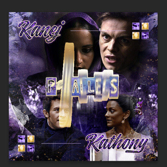
Oh I’m sorry I have GOT to ask! How did you do the text animation in the first gif of 718688291365502976/pscentral-event-15-favourite-ships-kanej?? It’s just. It’s so beautiful
Hi anon! I've used After Effects to create the text animation in the first panel of this post. I'll show you the basic idea of how I've created the animated text effect here :D
What you need:
A cutout font (the font that I've used is Trouble Child Outblack by @justlikethistrain)
Adobe Photoshop with Video Timeline feature
Adobe After Effects
Supplementary files: gif prep action pack / golden outline layer style / assorted textures
Difficulty: advanced; knowledge in gifmaking with the video timeline interface assumed
Note: This tutorial assumes that you're working with all of the composite gifs in a Photoshop composition file and using the video timeline interface
Other useful tutorials to refer to: Text overlay effect / After Effects text animation / clipping mask vs layer mask
Tutorial under the cut. Like / reblog if you find this useful!
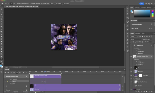
1) Photoshop: Preparing your gif panel
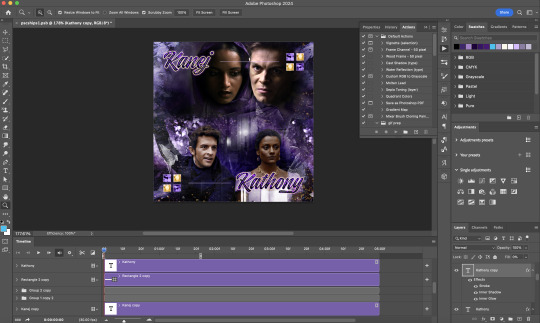
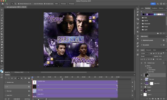
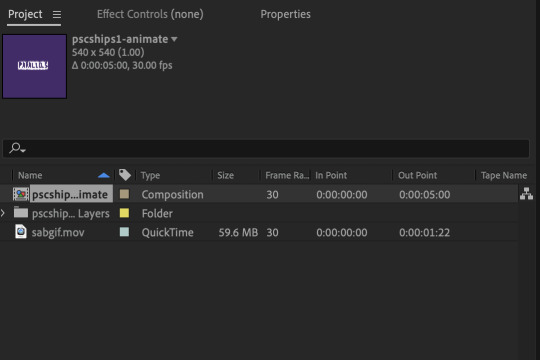
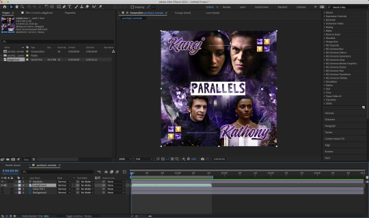
Setting up your PSD composition panel: Create a blank PSD file and set it to Tumblr dimensions (540px x 540px in this particular gifset)
Enable Video Timeline and drag all of the component gifs from your folder to the PSD composition file. Resize / move these gifs around until you're happy with the placements.
Trim the timeline work area so it's the same length as the shortest component gif you've added to the PSD composition file. You can also add some textures & additional adjustment onto this panel.
2) Photoshop: Exporting your base gif
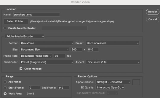
I highly recommend exporting the base gif right now, to ensure a smoother experience scrubbing through the video timeline when adding finishing touches later on in the workflow.
My preferred method is to render the composition as a video clip from File > Export > Render video.
To get the optimal export quality, I use the following settings:
3) Photoshop: Preparing your text layer
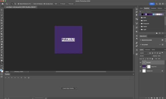
Make a new Photoshop composition file of Tumblr dimensions

Drag in the video clip that you've just rendered (the base gif) to this composition file
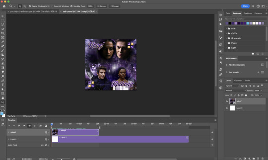
Add a new text layer in your PSD composition file and set the colour to white then tweak this layer until you're happy with the text placement.
For performance optimisations on After Effects, I duplicate the PSD composition file and delete all other layers. This PSD file contains only the text layer that will be animated.
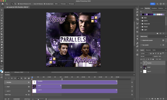
4) Photoshop: Adding overlays & decorations on the text layer
This step allows you to preview the text effect without the animations (i.e. allows you to tweak the texturings & colourings)
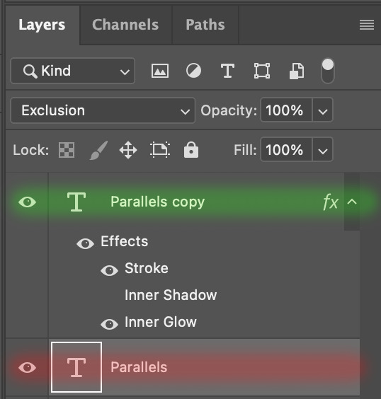
Duplicate the text layer. Set the bottom layer's (highlighted in red) blend mode to Exclusion and apply the gold outline layer style to the top layer (highlighted in green). Make sure the Inner Shadow is disabled!
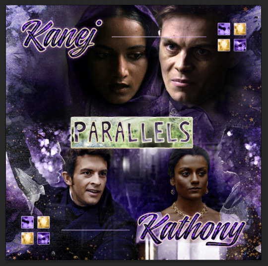
The panel now looks like this
I want to have the liberty to use different colours & textures on the bottom text layer with animation, so the next thing I do is to right click on the bottom text layer and select "Group from Layers"
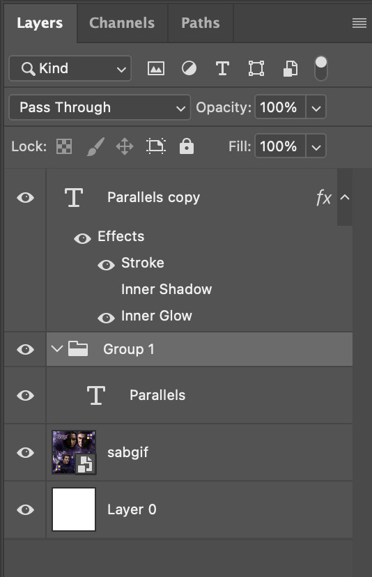
To change the colour of the filled text layer to purple:
Collapse the Group that you've just created
On top of the collapsed Group a purple Colour Fill layer,
Set the Fill layer's blend mode to "Colour"
Right click on the Fill layer and select "Create Clipping Mask"
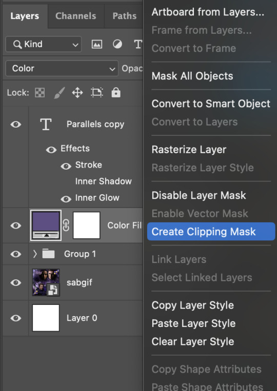
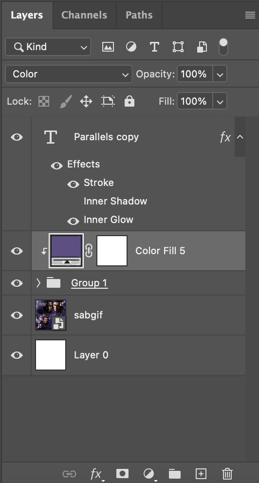
Now the colour of the filled text layer is purple
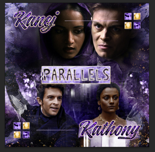
After adding more textures & decorations on the text layer (with photo negative effects) I get the following:
5) Photoshop: Adding overlays & decorations on the text layer
To avoid performance issues on After Effects, I make a new PSD file of the same dimension. With both the PSD files open, I select the text layer (highlighted in red) while holding Shift, I drag this to the blank PSD file (see the green arrow)
Holding Shift ensures that the layer's placement is preserved when it's copied to a separate PSD file.

In the new PSD file, I set the text layer's blend mode to "Normal"
6) After Effects: Animating your text layer
Make a new project on After Effects and drag in the text layer PSD file. Import this file as a Composition

Also drag in the base gif video clip to the AE project.
While we won't be exporting anything with the base gif visible, having this file in the project file is useful if you want to have a better picture of how the animation will look in tandem with the gif.
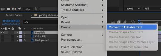
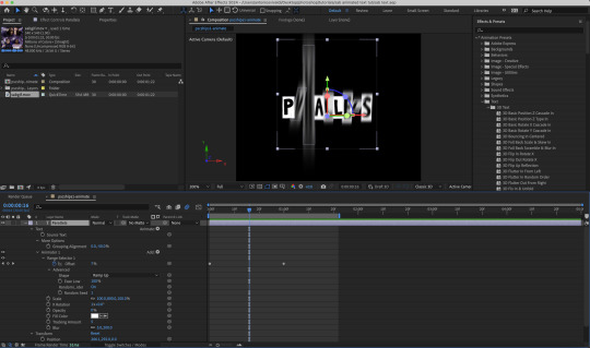
Double click on the composition. Hide the colour fill and background layers. Then right click on the text layer, go to Create > Convert to Editable Text
To be able to preview the animation with the base gif, drag the video clip to the composition file and below the text layer. The visibility of the layer can be toggled on / off anytime in the After Effects workflow
Now we prepare the text layer to be animated. Because the final animated effects is 3D & has motion blur, right click on the text layer and select "3D layer" (highlighted in green) and Switches > Motion Blur (highlighted in red)

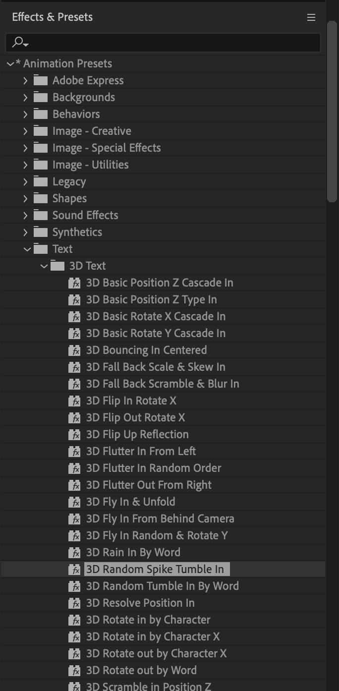
Go to Animation Presets > Text to browse through some presets that you could use to animate the text layer. For this gifset, I've used a preset within the 3D Text folder called "3D Random Spike Tumble in".
While selecting your text layer, press U to view the keyframes and you can adjust the position of these keyframes until you're happy.
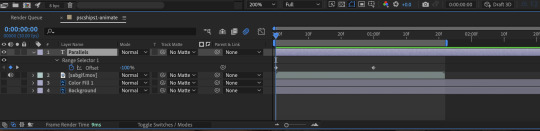
For more finishing touches, press U again to tweak more options in this preset. In this case, I do to Animato 1 > Range Selector and changed the Colour Fill to #fff (the default colour is light yellow)
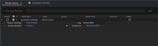
Then do you File > Export > Add to Render Queue
Click on the Output Module and use the following settings to render the text layer as a video file with transparency
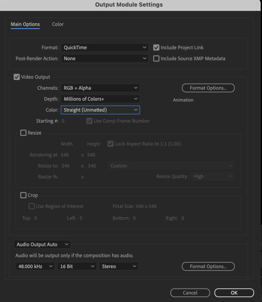
Then after specifying the folder in which you'll export the video to, click "Render" to render the video file containing your animated text layer.

7) Photoshop: Adding the animated text & finishing touches
On Photoshop, drag the rendered clip containing animated text, to the PSD composition file with the static text layers.
Duplicate the animated text video layer
Drag one of the layers inside Group 1 and set the blend mode to "Exclusion" (Highlighted in green)
Move the other layer to the top and apply the gold outline layer style with Inner Shadow disabled (highlighted in red)
Hide both text layers (highlighted in yellow)

By scrubbing through the timeline, I've noticed that the animation didn't look clean enough, so I'll add some finishing touches
By selecting the upper text layer containing layer styles, go to the timeline and add opacity keyframes going from opacity 0% to 100% a few frames apart
Once you're happy with the finishing touches, flatten / render your PSD composition file, change the frame delay to 0.05s and export your gif and voila!

I hope this helps 💖
#tutorial#gif tutorial#photoshop tutorial#after effects#chaoticresources#dearindies#userriel#useralien#userraffa#usershreyu#user.tee#useryoshi#usernik#userjoeys#usersole#arthurpendragonns#userhallie#*#my tutorials#my resources
143 notes
·
View notes
Note
your icons are soooooo so cute honestly!!! i wanted to ask if there's any way you can make a tutorial on how to make them? of course if you want, if you don't want to, that's okay :)
Hi! I really appreciate that you like my icons, thank you so much! 💖💖💖🥹
It's been a long time since I've done a tutorial so I hope I can explain it well haha
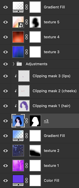
So I will explain how i go from the original picture and the final icon below:
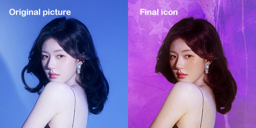
I'm using Adobe Photoshop 2024 but you can use other versions too!
First, I create a 250x250px document and apply a random color fill layer to be the background color of the icon, you can do it by going on Layer > New Layer Fill > Solid color (the color in this moment doesn't matter because I change them later according to the picture I choose to edit).
Then I place the picture I want, adjust the size to make the subject on the center and apply some smart sharpen:
I apply some adjustments to try to color correct if the original picture using Levels, Selective Color and Color Balance to get something like this:
If you want to know the exact adjustments settings I used on this picture you can download the psd here.
To remove the background, I do the hack where I go to the Properties panel (Window > Properties) and click on the "Remove background" option. It's not always that I will get a perfect result but I think it makes easier for me to adjust the little details such as hair and accessories, etc. And I do that using the Lasso tool (shortcut L).
Now, with the background removed I pick a color that I think will match the icon in the Color Fill layer that I created before. To make the background more "fun" I like to add a Gradient Fill layer (Layer > New Layer Fill > Gradient) with a color that might go well with the one I picked earlier to make a smooth and light gradient.
My result until now:
Now it comes the fun: adding textures! I like to add some textures to make the icon more lively and I usually download them on deviantart or on resources websites. You can download some cool textures here, here and here. On this part I really test a lot of textures with different Layer blending. There are a lot of different blending options so you can try as much as you want.
Other thing I like to do is add a clipping mask above the subject layer when I want to color something specific in my picture such as the hair, the clothes or even applying some "fake" blush on the cheeks. I do this adding a new layer, then using the shortcut option (or alt) + command (or ctrl) + g to make it a clipping mask and then using the Brush layer to color what I want. For the blending mode I usually use Soft Light and sometimes Color if I want the color to really stand out.
And in the end I will have something like this:
And my layer tab will be like this:
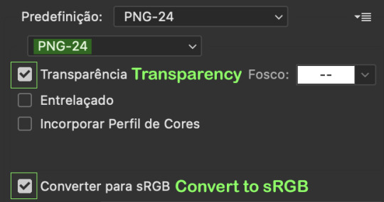
For using on the dashboard I usually resize it to 100x100 to make it look more sharper and defined but it's really a choice, you can already start making your icon using the size you want, I just prefer doing on 250x250px because i'm used to.
To save it I use the shortcut shift + option (alt) + command (ctrl) + s to save it for web with these settings:
And that's it! Sorry for not going to deep in each step but I guess you can get the feeling when you try making your own icons! Is really about trying different methods and things until you became satisfied with your result.
95 notes
·
View notes
Note
if it's not too much trouble, can you give a tutorial on how you did the scream magazine thing ( like the spilt with your username and stuff ) & the gif cus it highkey eats !!
thanks 🥰
thank yew !!!!! basically for the magazine cover all i did was use adobe to edit things / font in the text like “screampied” and “vegas” and the silly credits at the end. it’s the real poster from the meta version of scream but i played with it a little bit !!!!!! if you don’t have adobe you can also use phonto which is a good app for adding specific fonts. i use that to make my fic dni banners also
this video is good at explaining how to make the word dividers, but i just import the picture over the diver + blend it and make it transparent so it matches the color coordination 🙇♂️🙇♂️ to split them, you can use a website like this
and for the gif, i used cap cut !!!!
7 notes
·
View notes
Note
Sorry if this has been asked before, but which program do you use for digital art? I love watercolors and want to do them digitally, but I'm having a tough time finding a program that does them well. I've been using Adobe Fresco since they have an actual water color brush but it feels off...
Fun fact, I've been trying to emulate watercolors digitally for 2 years and only now I've come to satisfying results. It's gonna be a little hard to explain since my software is in Spanish but I'll try. And also don't be sorry to ask, it hasn't been asked before, and if it was so what.
The software I use is Clip studio paint. I think some time ago they implemented some fucking bullshit subscription service that didn't affect people who bought the one time purchase for like 50 dabloons. If they have a bullshit adobe style subscription service I very much encourage you to "acquire it unconventionally".
For the brushes I use, I use the normal G pen that comes with the program, and downloaded a square pen from the clip studio asset website (ID: 1714783) to block in the big masses of color. I simply start with low opacity (like 10 to 30%), emulating the transparency of watercolor, and then pull it up and build up the values. For the texture, I use a layer on top with a paper texture I downloaded (ID: 1711824) and set the layer to blending mode "Superponer" (I can't find the translation lol, I guess something close to "overlay"?) and lower opacity, this making the magic:


There's other methods that aren't this one. I really like this artist for example
And this tutorial
One day I may upload speedpaints since lately I'm becoming a little more confident with my art.
Anyway cheers, hope it helped. It's a pain in the ass to figure it out but it's doable. Best of luck <3
15 notes
·
View notes
Text
adobe products I know how to use from easiest to hardest to learn. really interesting stuff I know
acrobat pro - easy, intuitive, helpful. -1 point for being very hard to download illegally.. something about the software makes it only stay cracked for a few days so I download/crack it once a year when I really need to edit a pdf
lightroom - haven't used for anything very complicated but used it to compile high def photos of flies from a microscope for a whole summer. straightforward
dreamweaver - had to use it for website design in college once.. totally useless application, but not too difficult. could figure it out in a few hrs
audition - ive used this to edit podcasts for a school project... not too bad, but have never used it for actual music purposes, so hard to judge
indesign - I love you adobe indesign, so good for poster design, definitely easier to use if you come in with prev. experience from other adobe applications. kind of a learning curve if you haven't though. started using it middle school for a journalism class and now use it for making figures and posters— blends super well with illustrator
premiere pro - starting to get into the ones that have driven me to tears. I came into it with 0 experience from any other video editing software. I still don’t understand how to truly use keyframes. that said I have successfully edited and captioned videos multiple times with it, useful app
photoshop - by far the most experience with photoshop. I love you adobe photoshop but definitely takes practice. spent weeks watching tutorials when I was 11 just so I could make some horse edits and use it to this day all the time
illustrator - what’s a vector, really, and why does the pen tool never work like I think it should. what do you mean that didn’t form a path. extremely powerful software that is truly top of the line for figure making but requires more study than I ever have time to give it since i’m always using it super rushed
after effects - homer simpson am I disabled meme. like all the difficulties of photoshop combined with all the difficulties of premiere pro and then you also have to check every frame. total nightmare that I spent a solid week trying to learn one summer
7 notes
·
View notes
Text
3d Y2k in Graphic Designing
Trends come and go in the world of graphic design, but some are hard to forget. Among them, 3D Y2K design is a trend that has caught my attention over the last few years. It's an aesthetic that takes the nostalgia of early 2000s internet culture and the futuristic appeal of three-dimensional digital artistry to a new level. As graphic designers seek fresh ways to captivate audiences, 3D Y2K has emerged as a common trend that speaks to both nostalgia and innovation.
What is 3D Y2K Design?
3D Y2K design is a renewed take on the early 2000s digital aesthetic but with a twist. It has shiny metallic textures, bubble-like typography, neon gradients, and cyber-inspired elements. Imagine a shiny, future-like interface in early computer advertisements, video game graphics, or sci-fi movies from the late '90s and early 2000s. Often, these feel dreamy, surreal, and hyper-digital, with over-the-top lighting effects, smooth curved surfaces, and an overall look of futurism.
Key Elements of 3D Y2K Design
• Glossy and metallic finishes – Reflective, liquid-like surfaces that give a smooth, futuristic look. • Bubble and chrome typography – Thick, shiny letters often thought of as old-school WordArt or futuristic sign billboarding. • Neon and holographic gradients – Bright, high contrast colors giving off the feel of digital aesthetics. • Cyber-inspired motifs – Grid background, wireframe items, and pixelated details • Soft, rounded edges and inflated shapes, such as balloons. Such is the aesthetic blending elements of historical digital culture along with modernistic 3D rendering techniques: bold and graphic.
Why is 3D Y2K Interesting?
The most obvious reason why 3D Y2K design has been quite popular among graphic artists is because of its powerful nostalgic value. Millennials and Gen Z audiences grew up in an era where the internet was born, and so they are heavily attached to visual aesthetics of those times. Retro-futurism reminds them of the first websites, computer games, and advertisements they used to see as kids, thus emotionally attaching itself to them. At the same time, 3D Y2K design is also fantastically futuristic. With cutting-edge techniques used in rendering and lighting effects and digital textures, it's like this design breathes fresh air of forward thinking. It's old-school with digital charm yet matches current innovation, setting it apart from other minimalist and flat designs in the pack.
The other point of attraction would be its high visual drama. A 3D element naturally brings depth and reality, making the design more immersive and engaging. When used in branding, web design, motion graphics, or advertising, the glossy, hyper-digital style of Y2K 3D immediately turns heads.
Why is 3D Y2K a Common Trend in Graphic Design?
The emergence of 3D Y2K as a strong contender for the trend in graphic design can't be far from the following major reasons:
1. Advancements in 3D Design Software Modern AI software such as Blender, Cinema 4D, and Adobe Substance 3D are now giving graphic artists the ability to create stunning 3D graphics more easily than ever before. Simple-to-follow tutorials and an AI-assisted rendering workforce allow only the most brave of artists to try their hands at this aesthetic, no heavy lifting/professional experience needed in 3D modeling at all.
2. Rise of Y2K Aesthetic in Fashion, Culture, and Somewhere in Between The revival of the Y2K aesthetic: it is back and in your face in fashion, music, and media. Celebrities, influencers, and brands affordably sport early 2000s looks, thus allowing themselves to be embraced by digital and graphic design currents.
3. Digital Realism and the Metaverse As the hyper-realistic requirement is growing for digital cinemas, especially in metaverses, for high-end NFTs and digital spaces, the futuristic yet nostalgic appeal of 3D Y2K design establishes its relevance in the dynamic digital world.
4. Social Media and Virals 3D Y2K designs are the definition of viral due to their splashy aesthetics. Many graphic artists express their Y2K vibes on Instagram, TikTok, or Behance, giving rise to more trends.
All in all, 3D Y2K design is not just a fad; it's an active blend of nostalgia and digital postmodernism. It attracts attention and evokes emotion, therefore making itself versatile to be integrated into any creative field-and is for this reason chosen by many graphic designers. As technology grows and the need for immersive digital experiences increases, the 3D Y2K aesthetic will likely be around for decades to come in the graphic arts. This is worth investigating if you're just a designer who would like to take a shot at new stylings and wonder about digital art and 3D Y2K in itself-a fascinating field to look into!
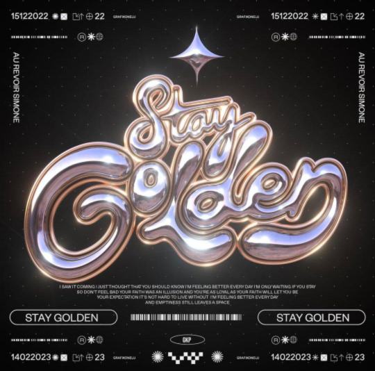
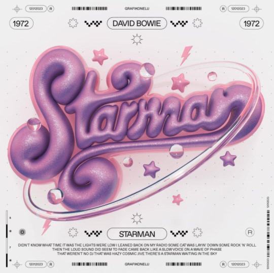
** Stunning 3D Y2K graphic design by @grafikonelu on Instagram, beautifully crafted! Check out their work for more amazing visuals!
4 notes
·
View notes
Text
Abstract wireframe designs in Adobe Illustrator using the Blend Tool! This short and easy video tutorial.
.
.
.
.
.
.
.
.
.
.
#AdobeIllustrator #WireframeDesign #AbstractDesign #BlendTool #GraphicDesign #DesignTutorial #CreativeProcess #DigitalArt #VectorArt #DesignInspiration #LearnDesign #ArtCommunity #ModernDesign
5 notes
·
View notes
Note
Your art is freaking amazing! I am so shocked and awed every time I see it and remember that one of my mutuals is so talented and creative 💕 How did you learn? What mediums do you usually use? Semding yiu happiness today 😄
Aaah omg, thank you! What a sweet ask 😭💗 I'm blushing now, but I'm very happy to hear you like my art!💕
I've been drawing my whole life, ever since I can remember basically, and I did go to an art-focused school (for graduation, I had to paint a series of self portraits and it nearly drove me insane 😅). Then life got in the way and I didn't draw or paint as much anymore for years (and only traditional art if I did), but I've always wanted to try digital art, so getting sucked into the Silm fandom and having an urge to draw blorbos (plus some work-related stuff) finally made me buy a graphic tablet. And ever since I've just been trying to get the hang of it, watching tutorials, experimenting with different styles and ways of doing things etc. For my digital art, I use Adobe Photoshop because that's what I'm most familiar with, but I'd also like to try out Procreate one of these days (I have a friend who uses it for her art and she loves it). I use a lot of the brushes that already came with my version of Photoshop, plus a bunch of custom ones that I downloaded from all over the place, often watercolor and charcoal type brushes over solid base layers of color because I like the way they blend.
Anyway, sending lots of love and happiness back your way! And thank you again for the lovely ask, you made me smile and I needed that today! 💕
6 notes
·
View notes
Text
Unveiling the Artistry: Exploring the Intricate World of Graphic Designing
Begin with an engaging introduction that captures the essence of graphic designing as a blend of creativity, technology, and visual communication. Highlight the importance of graphic design in today's digital age and its impact on various industries.
Body:
Evolution of Graphic Design: From Print to Digital
Discuss the historical evolution of graphic design, starting from print media to the digital era. Highlight key milestones, movements, and influential designers that shaped the field. The Power of Visual Storytelling
Explore how graphic design enables powerful storytelling through visuals, typography, and color schemes. Showcase examples of impactful visual storytelling in branding, advertising, and digital media. Trends Shaping the Future of Graphic Design
Analyze current trends in graphic design, such as minimalist design, bold typography, and immersive multimedia experiences. Discuss how emerging technologies like AR/VR are influencing graphic design practices. Mastering the Tools of the Trade
Provide insights into essential tools and software used in graphic design, such as Adobe Creative Suite, Canva, and Sketch. Include tips and tutorials for beginners to enhance their design skills. Ethics and Responsibility in Graphic Design
Delve into the ethical considerations of graphic design, such as copyright issues, cultural sensitivity, and environmental impact. Discuss the role of designers in creating inclusive and ethical designs. Case Studies: Inspiring Design Projects
Showcase real-world examples of successful graphic design projects across different industries. Highlight the creative process, challenges faced, and the impact of these designs on their target audience. Conclusion: Summarize the key takeaways from the blog, emphasizing the creativity, innovation, and storytelling aspects that define graphic designing. Encourage readers to explore further and stay updated with the ever-evolving world of graphic design.
By incorporating these elements, your blog can offer a comprehensive and engaging exploration of graphic designing, appealing to both aspiring designers and enthusiasts of visual communication.
#GraphicDesign#DesignInspiration#CreativeDesign#DigitalArt#Typography#Illustration#LogoDesign#BrandIdentity#UXDesign#VisualCommunication#ArtisticExpression#DesignTrends#ColorPalette#VectorArt#LayoutDesign#art
6 notes
·
View notes
Text
Progress Update #5
Not that much has happened since the last update, but I still managed to hit some major milestones.
First of all, I got *almost* all of the preliminary sprites done. I actually forgot to make sprites for the markers, though this is because the markers themselves were not part of the original plan. Other than that, I did all the sprites for Sasha, the firewalls, the servers, and the buttons. That being said, I’m going to have to redo them. I will explain why pretty soon.


Besides the sprites, I also made some sound effects. I made them with the help of a website called jsfxr, where you can generate various sound effects for video games. For most of the sounds, I just fiddled around with jsfxr and then downloaded them when I was satisfied with them. However, I did a bit more editing for the sounds that play when you take down a server and run into a firewall. For those, I made two different sounds in jsfxr and then blended them together in Adobe Audition. I am mostly satisfied with the end results, but I ran into an issue with the firewall sound effect.
Now, remember how in the last post, I mentioned that I was going to do a playtesting session? Well, I wanted to get all the sprites and sound effects into the game so that the students who would be playing it wouldn’t have to just look at squares; even if the sprites weren’t perfect, they would still be a step up from what I had in the first build. So, the day before the session was spent importing all the sprites and sound effects into the game. This is when I found some issues.
First of all, Sasha’s sprite is super small compared to the play area (see the picture below - this is before I put in the other sprites; fortunately, their sizes were fine). Her sprites’ current resolution is 22x22, so I’m thinking I’ll have to increase it to make it easier to see her. Besides that, the firewall sound effect sounded different when I put it in GameMaker. Specifically, it sounds less like an electric shock (which is what it’s supposed to be) and more like a really loud and annoying grinder. I don’t know why the sound changed, especially since the others didn’t. Unfortunately, I didn’t have time to fix those issues, so I just had to leave them as is in for the playtesting session.

As for the session itself, it went rather well. A lot of the kids had fun playing it. They also provided a lot of good feedback for the game. While they provided some suggestions that I do not think I can do (such as adding more levels), they also had some that I will try to do this month. They include:
Polishing the graphics
Recoloring either the servers or firewalls so they look more distinct (most likely, I’ll make the firewalls yellow instead of orange)
Adding a working tutorial (fun fact: the old tutorial still used the squares, and I didn’t have time to add the new sprites in it, so I completely removed it from the build the students played. As a workaround, I did demonstrate the game in front of the class. Regardless, I want to get the tutorial done since I obviously can’t do that for all the people who play it).
Try to implement numbers into the grid (to make it easier to see where the coordinates are)
Fixing the firewall sound effect
This is quite a lot to get done. I am a little nervous about redoing the graphics; I'm not 100% sure if my skill is up to par to make something better than what I have now. Still, I’m going to try my best.
Also, here’s the link to the game; you can now try it out with the new graphics: https://aliyah-burruso.itch.io/capstone-sneaker-first-build. (Yes, the url says “first build.” No, this is not an April Fools’ prank. I just didn’t want to change the url and confuse the teacher who let me playtest with her class. I’ll definitely change it later).
That’s all I have for this update. For the next couple of weeks, I’ll focus on revising the sprites. Once I’m done with that, I’ll do the tutorial and add some more things I’ve been wanting to do for the game. Let’s see how things go.
5 notes
·
View notes