#trying to experiment with a more painterly style..
Explore tagged Tumblr posts
Text
um ummm yeah


pretty self explanatory
#trying to experiment with a more painterly style..#drew star hill by memory!! would’ve added the star door thingymajiggly but it didn’t fit into the composition ;___;#smrpg on the mind hhhrrrhh#i might draw something for the remake’s anniversary dunno#yapatron 3000#smrpg#super mario rpg#geno#my art#tags r embarrassing ok gn
69 notes
·
View notes
Text

I was gonna wait to post this tomorrow, but I was excited to show you all. I was trying to experiment with a more painterly style and this is what happened. Emma, my little witch, as Eve after eating the apple, and leaving the rotten Adam for the serpent, which is way more fun.
214 notes
·
View notes
Text

“I always knew I’d die, in the snow…”
I’m experimenting a bit with a more painterly style, it’s actually been kinda fun to try.
177 notes
·
View notes
Text

(Click the image for better quality)
Yipeeee that Keiki and Mayumi fanart I posted the WIP of is finally done woooo- This piece was a very experimental one that I'm kind of OK on. Maybe because I've just gone insane looking at it for so long and I'm my own worst critic lol.
Artist's Notes;
So I've once again been playing around with my rendering style, mainly because I have been wanting to improve my lighting for a while now and as I was just scrolling through Tumblr, I saw some of the official art for that one webcomic-turned-animated-TV-Show Lackadaisy and was immediately inspired. I also have seen a technique a few times in the past where the lineart and shading are merged together, so I've been meaning to try that for a little while.

I did some experimentation on this one sketch of Keiki I posted in my sketch dump and I really liked the results of it, so I carried those over to this piece.
I ended up scaling up Keiki and Mayumi from the original WIP because I felt like they were both getting lost in the composition, and I'm glad for that because I think it works a lot better. I'm not a fan of how Mayumi's sword turned out at all, but it's not really meant to be the focus of the piece so eh. Overall, I think I could do better with my colours, probably because with Keiki and Mayumi's colours, I did them flat in greyscale and then used a brush on the overlay blend mode to colour all of them over, after which I changed the base layer for their colours from white to yellow and then lowered the opacity so it all went together better. I also decided to use gradient maps for a lot of the background elements, mainly to experiment with getting in my values first to make them pop out more. I ended up finding a really nice sky gradient on Clip Studio Paint that I really liked, and that kinda helped to establish the colour scheme of the background a lot. I think the whole "start in greyscale then colour" thing really works better with painterly styles rather than more illustrative ones, and while it is good at making sure your values are more readable, I honestly don't think I have the skill level to pull that off yet. Honestly, I think I've been looking at this drawing too long or maybe I added too much to it, but I wish I could've made the colours less monochromatic, but I'll just save that for the next piece I do.
I do love how the flame (...well it's more of a weird space rift than anything in this piece) and the lighting turned out, those were fun to do. I was initially struggling with the flame and how Mayumi is positioned in front of it before realizing "Oh wait! This is a weird abstraction of a weird creature! I don't have to follow the laws of anatomy!" and just dislocated it's flamey bottom jaw from the main body. I also changed the colours of it since I was really not liking how incredibly bright it was when it had lighter colours. Again, the gradient maps served the more painterly style of the flames well.
I also love how Mayumi turned out. I could do her sleeves better but that's more of just me needing to study how those types of sleeves fold in that position more. I'm also very happy with the posing, the technique I used for that was taking photos of myself in the positions I wanted, blocking in the silhouette and then modifying that by adjusting it to my lines of action that I drew on top of the original photos, and then sketching over the silhouettes and drawing in the shapes of the hands overtop of the photo if I needed to get the fine details right. As for what I do to take the pictures myself, I use a tall chair I have, prop up my phone with a phone stand, put on a ten second timer and scramble to get in position. Yes, I did have to use a bunch of thin markers I had to try and get the hand positioning on Keiki's pose right, yes I do have a fake sword that I used to get the positioning of Mayumi's arms and hand right, the sword was for an old Halloween costume from several years ago. I really like how both Keiki and Mayumi turned out in this drawing, I'll have to play around with these designs for them more in future drawings.
Also, if you wanna know why I draw buildings like that, when I watched Fantasia 2000 as a kid (One of the Disney movies where they make really beautiful animations to classical music) the way they drew the buildings in the first few sections Rhapsody in Blue segment (the jazz one with the cities) changed my brain chemistry and now whenever I need to draw buildings really quickly, I refer back to that. Since the buildings aren't really the main subject, I didn't put much thought into them.
As you can tell I am very tired of this piece, mainly because I made things harder for myself by overcomplicating the process compared to what I usually do, mainly with the whole "starting in grayscale then adding colour." I'd honestly just prefer having a black layer set to colour that I can just toggle on and off when I need to see the values, but it was good to experiment. And that was mainly the point of this whole drawing, to experiment. I'm definitely going to have to play around with this new style I'm going for, mainly because I liked how it turned out a lot in the augmented Keiki sketch, and also because I want to find ways of making it suit my style more. I also really want to keep experimenting with my lighting like this, it's very fun. Last but not least I am never starting in greyscale again because dear god I do not like the workflow it forced me into. I don't have a problem with the method itself it's mainly just a skill issue lol.
If you wanna read my headcanons for these two, I put them in my WIP post, so you can read them there if you want to. The more I look at this the more I prefer the simplicity of my WIP. I might go back to this and just take away the fancy colours and effects to see what it looks like without all of that stuff and reblog this post with that drawing, but for now, I don't think I can look at this drawing again for a while.
#touhou project#art#fanart#touhou fanart#touhou 17#wily beast and weakest creature#keiki haniyasushin#mayumi joutougu#haniyasushin keiki
116 notes
·
View notes
Note
hello it's me again! Your biggest fan (LMAO) The one who asked for tips on coloring...
Another question has came up on me while I was coloring (finally aughhh). How do you shade hair? Without it looking unnatural?
Thank you for your help before!!! 😊
Hello and welcome back! I'm glad my previous advice helped! That is a difficult question as I do admit it is a bit challenging to me as well. It is guesswork + studying references, adjusting tid bits until it looks right, my own process relies on a trial and error approach.
Therefore, I suggest you pick some pieces you like where you find the hair gorgeous, and figuring out how the artist does it, or how might they do it, per active learning principles. Try to deduce it. While the following guide can be good for your starting concepts too, it's important to adapt it to your style and preferences. And I even encourage you to go against it, as creativity thrives on experimentation.
That said, I'll guide you through my own thought process, however. (With a quick Ratio sketch, because I really love to shade his hair; fluffy hair is very forgiving.)
Let's start off here (I'll be skipping the black and white part for simplicity's sake from the previous guide. I'll also be using a white environment with a pale overlight):

For highlights, I begin laying down a Glow Dodge layer with a hard brush that doesn't have full opacity, and draw a halo-like shape. After that, I refine the shape by erasing parts of it with a rough eraser to get the desired effect.
Alternative to the Glow Dodge layer, you can use pure white, or other layer types such as Lighten, Screen, Add and Overlay, etc.
In the following pictures, note that I adjust the layer's opacity freely.


Above, I simply blended it a bit to my own liking.
With an airbrush I softly start introducing shadows (Multiply layer, dark purple/blue color).

Then, I start introducing sharper shadows in a separate layer.
You can use a lasso tool for this to map out a jagged like shape which should remind you of mountains. You can blend this out too at certain segments.
(Sidetrack: if you feel like, I suggest reading up on the balance of hard and soft edges in painting, the topic is very interesting and I am still trying to grasp it as well, yet I find it immeasurably useful. This can come in handy upon rendering principles. A very skillful master of it is the artist Yuming Li.)

Furthermore, I add reflections. I've used a Lighten layer with a subtle blue color. As this is subtle, I want to point it out that it appears on the lower parts.

For a final touch, I pick out the skin's color and airbrush, shift the picked color to a more saturated one and apply it near his face/to the bangs, with an airbrush.

For the fundamentals of hair shading I usually wrap it up here and go off to rendering. I use a painterly brush to do this and pay attention to the jagged shape I mentioned earlier. The brush I use is already tilted, so it's easy to manipulate to make such shapes.

Additionally, I experiment with Overlay, Multiply (or any!) layers with either airbrushes or hardbrushes— as I said there isn't a specified way of doing this. Go wild; for such is the nature of hair. Add any shapes or lines you find appealing, introduce new colors from the environment nearby too to make it moredynamic and interesting as well.
EDIT: An addition! On Rendering tips and advice
(apologies on leaving this out initially! I only realized I should include this now )
Including astray curved lines to simulate how hair flows also builds to the hair-like quality. I also prefer to use it closer to the silhouette of my character as it adds further detailing and a fluffier look in the end!
Attempt to render each strand according to this diagram in mind, note the parabole-like(?) shape for the light, and note standard 3d spheric shading for shadows.


#also!! watch speedpaints! slow them down and follow them#do i even tag this with ratio. no i'll spare you ratio fans the art guide#art tips#art guide#thanks for the ask!#asks#art tutorial
102 notes
·
View notes
Note
hi broski ummmm what programs do you use for art and what brushes
I use procreate! For lineart/sketching I usually use a slightly modified version of the Shale brush in the default procreate “calligraphy” section- just w/ the streamline feature turned down to zero and more like…size variation? (Idk I modified it a year and a half ago I don’t completely remember what I did lol)
Then for my grayscale comics, like these,

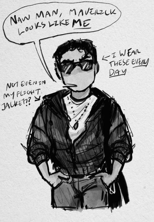
I use this Copic marker brush w/ just straight up black and varying levels of opacity. Usually I don’t use blending brushes in these, but in my most recent one I did.
For my colored stuff tho I use a lotta this pencil brush for everything (shadows, highlights, base flats, etc) and then depending on whether I want something more painterly (like the ocs on the left) or more cell shaded (like stevepop on the right), I either use soft texture brushes or a chalk brush (I cannot for the LIFE of me find where this chalk brush came from?? I’ve been digging but idk I can’t find it outside of my duplicate??) for highlights
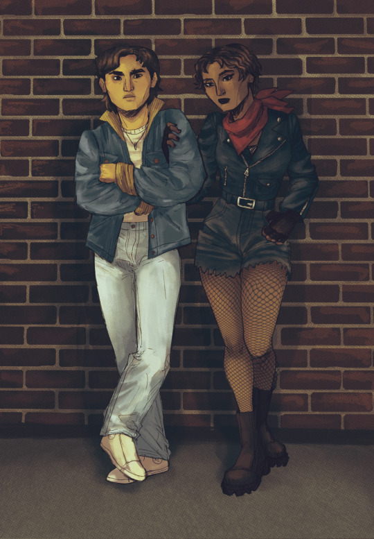
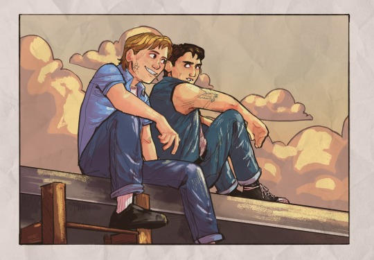
Some other brushes/brush sets I use (all of them are free as of rn ‘cuz I’m broke):
Habook Brushpack (specifically the rectangle one- it puts down flat colors nice and fast but also doesn’t annoy me the way most “ink” brushes do!)
Laurenillusrated Brushpack- I use these mainly for skin, they’re really nice. (Also, @laurenillustrated is on tumblr- her art is so pretty, it’s like a storybook istg. Check it out if you haven’t it’s AMAZING)
I’ve recently started using @loish’s brushpack too, and I ADORE these brushes. I used them a TON on the Christine poster. You can get them by signing up for Loish's Digital Art School, which is a great collection of art resources as a whole, and it’s totally free. Would absolutely recommend
And finally, for the halftone texture I like to put on everything, I use the Halftone Hospital Basic Tone Kit. All of their brushes are fantastic, definitely check them out if you like the look of traditional art but also like the lower supply cost of digital art lol. Or just in general, ‘cause they’re great
(Then for the paper texture overlays I love so much, I usually use stock photos tbh.)
Anyhow, these are some of my favorites. But I do use others too, and this all came from years of playing around and finding what I like! I had this phase about…1 1/2-2ish years ago where I hated my art style and nothing was coming out right. It pushed me to try a bunch of different brushes- in retrospect I don’t think the brushes were what made it better, I just improved over time, but I had a lot of fun trying out different brushes. So definitely try ‘em out and experiment, because it really is a fun time :))
(As for my workflow, I talk about that here if you wanna know more about how I draw!)
28 notes
·
View notes
Note
Hi!! I was wondering if its okay to ask what brushes u normally use in krita? I love your art!!
Thank you so much!!! I only use the ones available in Krita by default and I tend to jump around based on what I think will work best for each piece, but I can give a little rundown on which ones I use the most and what I use them for :)
Here's an image guide with each of the brushes I've used and that I recommend checking out:
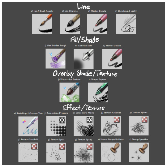
I'll highlight my favorites as well with some examples where they were predominantly used! (though in some cases multiple or even all of these brushes were used)
Marker Details:


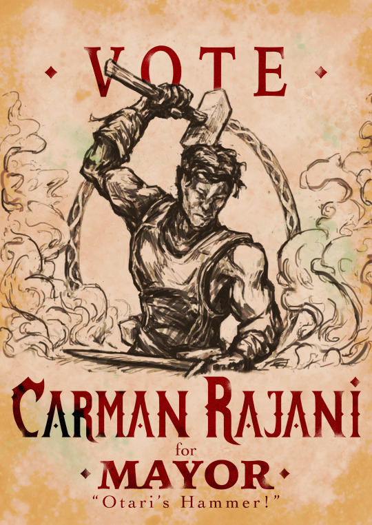
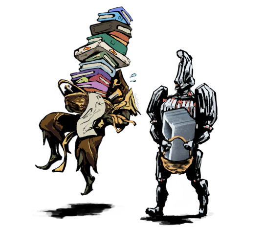
Varying opacity and size makes this one my favorites for sketching, especially since it can easily be nearly transparent or fully opaque which helps with value range.
I also like using it for silhouette sketches!
It can also be used for final linework, but it takes more work to get to a full opaque and its lack of texture makes it a little less interesting than Ink-7 Brush Rough imo.
Ink-7 Brush Rough:
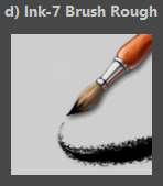
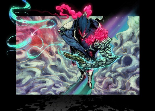
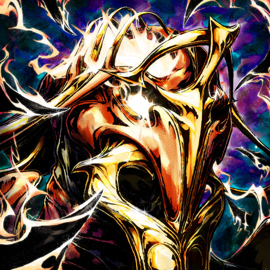
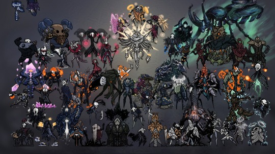
Really good for linework, especially for comic styled drawings with it's slight texture, varying weight, and opaqueness.
Also good for just filling in entire areas with a single color as well as non-smoothed shading!
Wet Bristles Rough:
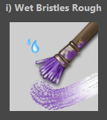
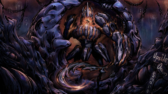
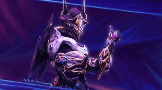
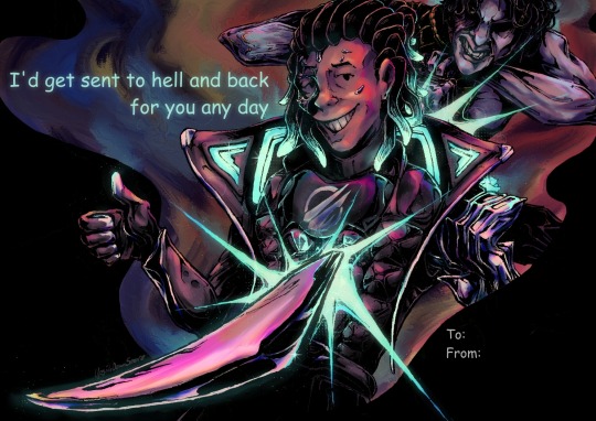
Actually just an amazing brush, its pressure sensitivity is crazy.
Blends strokes like paint and can vary in size and opacity.
Also has a nice subtle texture!
Amazing for smoother coloring and shading, especially if you want a more painterly style.
Watercolor Texture:

(hard to show examples of this, just assume that I've used it in any piece that has smooth shading lol)
Not the best for painting/drawing on its own, however I've found it to be really useful when set to white or black on an overlay layer for adding extra shading and/or highlighting on top of the shading I've already done.
I usually shade individual figures, objects, and parts separately, but using an overlay layer with Watercolor Texture (or even Shapes Square) on top of everything helps make the entire piece feel more cohesive.
Also adds a hint more texture!
Another thing to note is the importance of layer modes!
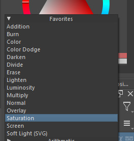
I know that you asked about brushes specifically, but many of these brushes (particularly those to do with effects and textures) work best when experimenting with different layer modes other than Normal. Overlay is generally a safe bet and most of the best for, well, overlaying multiple layers for interesting effects. But please try out all of them at any given opportunity, sometimes things like Burn, Color Dodge, Soft Light, etc can have more interesting effects!
In addition, mess with filter masks! You can even edit where they apply by drawing on the mask directly! HSV/HSL Adjustment (also accessible with ctrl+u) in particular is INSANELY useful for fiddling with the colors and balance of a piece, from individual layers to whole groups and drawings. I also really like blur filters, often times I'll duplicate a layer and make the bottom one blurred to add a glow affect to something without losing its definition.

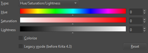

While this latter stuff isn't about brushes specifically, its generally very important to how I use and experiment with all these different brushes!
Anyways I hope this helps!! I kinda went overboard with this post, but I had a lot of fun writing it! Thank you again for the wonderful ask!! :)
#krita#krita art#warframe fanart#art#artists on tumblr#my art#UpsideDownSmore's art#art tips#art guide#art reference#long post#ask#didn't mean to spend so much time on this but ngl i'm actually so thrilled to talk about my art processes#like man i'm so grateful to be in the position where i can make an art guide like the ones made by people i look up to#sorry if this response is a bit long winded i just had to get a bunch out there lol#love asks like this :)#scheduling this 9 hours from now cause it is currently almost 1am lmao
37 notes
·
View notes
Text

I want to experiment with what i do so here's a try of a more painterly style with yuuji as the subject!
#itadori yuuji#yuji itadori#jjk yuji#jjk itadori#jjk#jujutsu kaisen#jjk fanart#jujutsu kaisen fanart#jjk art#mine#rosemary art
12 notes
·
View notes
Note
Something about my drawing feels off , i only got into digital drawing few weeks ago and I'm stuck at the same point and lost .. any advice?
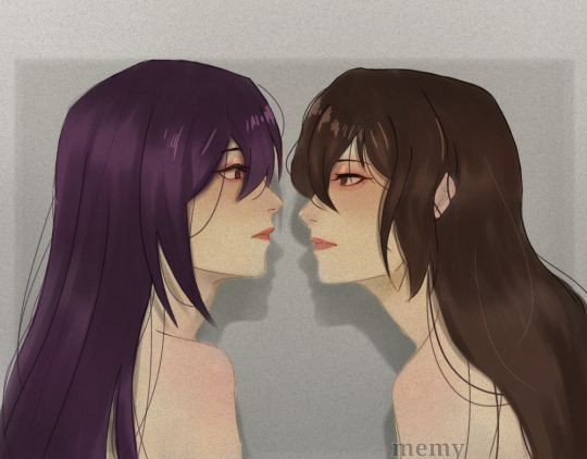
mmm okay first of all this is really good- first impressions-wise, the proportions and anatomy look very solid so there are no major glaring issues so to speak
if you were to ask me, what i think this artwork needs is that sort of 'volume' or depth that most beginner digital artoworks lack. You can achieve this sort of volume in two ways depending on the style you are going for: either by improving the lineart, or by treating the lines just as part of the sketch and painting over them for a more.. ''painterly/rendered'' look if you want to keep the lineart in, what i suggest is adding some "line weight" so that the artwork doesn't look so flat. What i mean by this is to thicken the lines where body parts would naturally overlap (like the neck and shoulder, the nostrils area, the corners of the mouth as well as the tip of the lips etc) and where shadows would normally be for the illusion of volume. After that, i'd also add more shadows and color variation in the colouring layer so that the skin looks more lively and again, for that volume. You can do it with some dark blue or orange on a multiply or an overlay layer, just experiment a bit with colors and blending modes. If you want a more messy/painterly look (which is more down my alley or in line with my artstyle), what i'd personally do is i'd create a new layer on top of everything and just paint over the lines with broader strokes and a darker color in an attempt to add some volume to the shapes and to make the artwork look more cohesive and less "digital" because at the moment, i can tell that it is made up of a Lineart layer, then a Colouring Layer below, that very religiously follows the lineart layer and then maybe a layer on top of that for the other colors and the hair. This is a very common digital art process and a good one to keep in mind but a little secret i can give out that i've noticed in 80% of the artists who have this sort of drawing process is that they will always, always merge everything in one layer at the end and adjust things as they go. They will not keep the layers separated and just never revisit them in the process, despite what it may look like. There will always be something that needs fixing and they will fix it as they go so i suggest doing the same and being a bit more "freeform" with your layers
Anywayss, besides that, I'd also introduce some color variation like in the previous method. As a general tip, try to move the color slider around and don't just shade with a darker variation of the base color. I like how the hair is painted and the shine and everything, it looks very good and everything is pretty much set in place, i'd just render it even more, make it More voluminous. It's just missing a little pop a color: i'd add some blueish gray hues in the brown hair and for the purple hair i'd make it more rich by adding some deep dark blue hues and some faint yellow highlights (bc purple and yellow are complementary colors blabla) As for the shape, think of the hair as chunks of volume that reflect light and that are also affected by gravity.. or as spaghetti if u like flat hair like me bsjsjd That's all i could think of; Again, it's very good and promising considering you started just a few weeks ago, so keep going at it! I hope it was at least somewhat helpful and that i wasn't being too technical with the wording (and that it made sense)
#i hope it didn't come across as mean or something#i have a bad habit of being pretty blunt with my words#and upseting people#the artwork is really nice and pretty but i was asked for critique so i pointed out some parts that could be improved#you don't even want to know what my art looked like a few weeks into digital art lmfao#this is 10x better#keep at it op!#and again hopefully i didn't offend with anything don't take it to heart you don't have to listen to me do what u want#ask iztea#if there are any typos no there aren't
52 notes
·
View notes
Text
This month marks the one year anniversary of our successful Kickstarter.
The time has come, a very large and exciting update…
Let's not waste time.
The new Cat Creator update is LIVE!
And on top of that, it's coupled with our first ever live BREEDING PREDICTOR!
Currently, we only feature the three starter breeds. Over the next few months leading up to beta release, we will be adding new content to this demonstration, with Longhairs and Moontails coming first.
Few things of note!
We chose to keep the frontend UI of this demonstration page very limited so as not to distract our small coding team from the important development tasks. While we wanted to deck it out with bells and whistles, keeping it simple meant less time spent slowing down production of the more important bells and whistles that will be present at beta.
Pages like the TOS and lore will make a return in the near future! With everything overhauled, we wanted to “start fresh” with rolling things out.
We also chose to keep the mobile UI temporarily simple for the sake of prioritizing time and resources. Building out the more optimized mobile setup is on our development map.
Night mode will return! We’re currently finalizing the theme colors.
But we’re very excited to show you what we have so far. A lot of nitty gritty technicals went into this base functionality.
From there, the biggest behemoth we faced was our commitment to better quality assets.
The original demonstration was a prototype. One where we experimented, learned the ins and outs of the project, and used our resources to pitch the concept of an indie build-your-own-cat RPG experience. Early on, we received quite a bit of criticism on the visual development.
Once we had wind in our sails, we resolved to take that criticism seriously and come out the gate stronger, more professional, and far more confident than our concept pitch. The team committed to making something out of this world. We love this project, and wanted to put our all into it.
Our patterns now sport a painterly style, which better aligns to the original vision that we were trying to achieve with our first iteration.
After taking over as lead of the project, I learned and improved at giving artistic direction, and we as a team set out to unify the style. I could not be happier with the stunning work the cat artists have produced. What we now have is strong, unique, and cohesive.
It's all thanks to the masterfully skilled artists who worked hard to present what we are delivering today.
I want to shout out every artist who has worked on the assets seen in this demonstration. Without these people, we would not be here.
Thank you to:
Amelia (@ Pixus.art on Instagram)
Hydde (@ Nettlenest on Twitter)
Fulemy (@ Fulemy on Instagram)
Tybaxel (@ Tybaxel on Twitter)
Irene (https://irenehuang.com/)
Remmie (@ Hybridremmie on Instagram)
Emma (@ Missbluefrost on Instagram)
Eli (@ Nightly.art on Instagram)
and Asp! (@ Aspidal on Furaffinity)
For working on the cats!
Thank you to
Jerso (@ YerLAKAR on Twitter) for work on the current header!
And a big hand to our developers!
Wade
Sam
Harvey
Eric
And Jess!
All from CKCollab!
What's new in the Cat Creator?
Now let’s go over every change you will. Some of these new aspects will be an adjustment. To help keep clear communication, we want to lay out our thought process behind each choice.
1. The Color Wheel
The benefit of a limited color wheel is care and attention to aesthetic fine-tuning. Having every color predetermined for a cat means that there is no unfavorable color-blending between two parents. With preselection, we get more aesthetic appeal. However, historically this system has been limited for two reasons.
We have gone over this previously, so this is a quick summary:
Randomly generated cats with no prior breeding history end up unfavorably mismatched more often than not.
Breeding with so many color selections needs an alternative accommodating system for such a large catalog.
It was for these reasons that we previously wished to keep the wheel small. However, this was at the cost of a great deal of color diversity and representation. As a game about design, we returned to the drawing board to solve these problems rather than just working around them.
To refresh and summarize our solutions:
Generation 1 cats will generate from a selection of color pools, with totally random RNG being one of the pools so as not to lock out combinations. Example: a “gothic” pool of saturated reds and monochrome colors. We plan to have many of these so new cats still sport many different outcomes. And Shufflestones will still organically scramble colors!
We updated our breeding to focus around hue, saturation, and luminosity (also known as “lightness.”) Depending on the categories of the two colors you mix, your outcome will be picked from the same categories.
With these solutions in place, we could think more freely about user demand for color variety and utility. We expanded to a final total of 234 colors.
There are, and this is not an exaggeration, nearly 10,000 hand picked hex codes available in this demonstration; including both pattern colors and custom shadow colors. This was no small feat! It's work that pays off, as these colors can be consistently repurposed for new patterns, which we are mighty proud of. The color wheel was a long term labor of love that we poured our hearts into, discussing every aspect of cohesive design, color theory, namesake inspiration, variety, user demand, and wider aesthetic appeal. We feel that the work paid off!
2. Undercoats
We started with an Overcoat/Undercoat/Accent system which gave equal patterning opportunity to each section of the cat. While this allowed for some pleasing combinations when strategically applied, Undercoat patterns were frequently busy with very little leeway for tasteful design. It was a setup which, while neat in concept, was doomed to fail from the get go. Putting a flat illustration with curves with the body directly over a technicolor pattern was simply a challenging system to make visually work. We dummy illustrated quite a few undercoat patterns and were hitting a wall while making transitions. With a system which expects us to always be adding new patterns, we didn’t feel we could sustain this.
So we revisited the design. We removed undercoat patterns, but added two accents to allow for equally large customization opportunities. This helped to concentrate customization, letting us confidently hone in on and focus on large and small accents for more variety in options.
As previously discussed, one of our goals was to make sure colors worked together with different patterns. With our original system, we had frequent anxiety and strenuous workshopping with patterns like tiger, where darker or same-color undercoats would absolutely decimate the visual. As well, lowering the value of "double-color" cats.

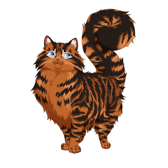
We wanted to keep the beauty of more detailed cat markings, but it felt impossible with the color restrictions. It felt punishing to have so many incongruent combinations to the intention of the design.
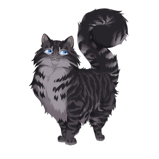
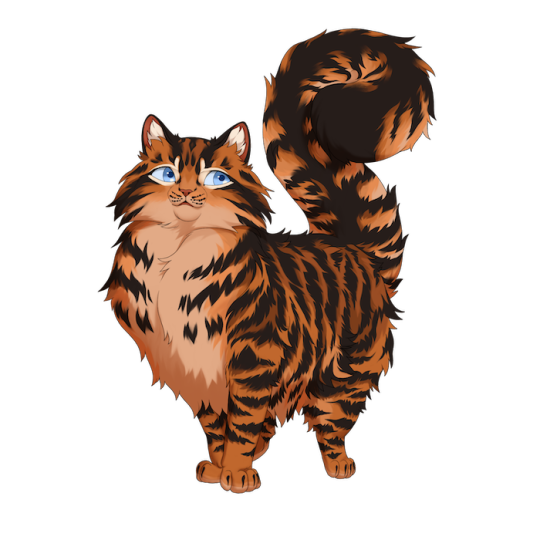
A definite improvement!
This is our most radical change, and one we know will take the most adjustment. It comes with pros and cons, but the decision saved many patterns from looking unsalvageable over half of the time due to the nature of designing pattern transitions.
There are and will be overcoat patterns which do not alter the undercoat, and we intend to experiment further with how to best utilize this mechanic.
In general, we try to take risks when they’re necessary for the betterment of visual cohesion and meeting the appropriate expectations for a pattern. We hope you all can understand and accept this change!
3. Line-breaking Accents
We also are introducing consistent line-breaking accents. We’ve made the decision to distinguish line-breaking accents with accessories by distincting worn items with biological modifications.
In short, if something is separate from a cat’s body and can be worn, it’s an accessory. If something is part of a cat’s body, like fur, fins, or claws, it’s an accent.
Overgrowth was created before this distinguishing, so it is an outlier. But this is the rule we will follow going forward!
Line-breaking accents will be available to toggle the layering of in your cat’s outfit editor!
* Note: currently Overgrowths generating together clips and we intend to fix/limit this in the future.
4. White Coverage
White coverage is functional and ready for testing! This is our first live rendition of the real thing, so we’re open to feedback. We changed the “percentage” UX to something much simpler. We feel this is all around a better, more intuitive system.
One thing of note is that Calico as it has been known is not here, intended to be replaced with white coverage and bi-color patterns. We received early feedback that this was potentially frustrating, and are noting that going forward.
Another thing of note is that we are actively working on redundancies and ones which look poorly together. If you see an awkward shape with broken seams, we are probably going to fix it!
Overall, it’s a very cool mechanic!
5. Missing Patterns
Not all the patterns or genes from the old demo are here. Don’t panic!
While simple patterns like Cheeks and Lollipop are coming back soon (we just have to space out our work), patterns such as Cloudy/Day are on the backburner for now.
We want to re-illustrate this concept, but tackling it in our new style is a challenge best left for when we can better spread out our time and resources. Right now, artists are busy busy busy with everything necessary for beta and launch, and these challenging patterns take up precious time and resources best used to get the game in a playable state.
We apologize! It wasn’t easy making this decision, and this pattern is not gone forever. We simply opted for a smaller number of complex illustrations at this beginning stage.
6. New Eye Format
Eyes have now been split between Borough, Eye Type, and Eye palette! This allows you to change physical characteristics while customizing colors! For example, you can now create duo clouded eyes!
To summarize the major changes:
The color wheel was massively beefed out
Undercoats no longer have selectable patterning
Undercoat colors dynamically adjust to the overcoat pattern
There are two accent slots instead of one
Accents can now be significantly line-breaking, and will be inter-layerable with accessories
White coverage is functional
Patterns are missing. Some are coming back very soon, others are shelved to come back at a later date
New eye system allows for more customization
Wahoo! A lot of changes, some more drastic than others, but hopefully all around a competent design experience! Everything we have here is far more strongly in-line with our vision. We sincerely hope you enjoy!
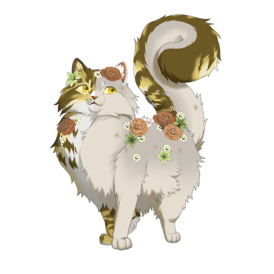
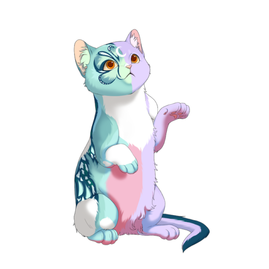
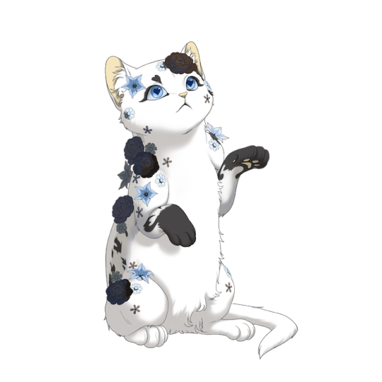
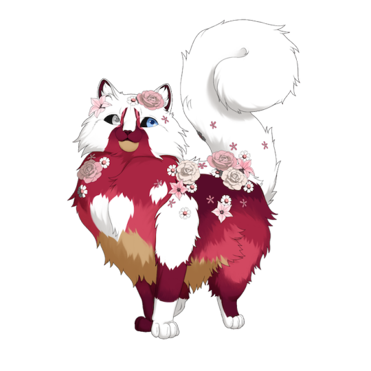
P.S If you see any colors that look broken: let us know!
So how does breeding work?
This is the 1.0 version of our new breeding system. Most notably, things like rarities can and may be tweaked.
We encourage you to try it out for yourself!
Simply design two cats at the top, then click the “view offspring” button to load the cats into the breeding predictor. From there, you can view their color ranges and randomized outcomes. You will have to click this button again if you change the two cats.

Luminosity is determined by if the sun is clear (light), half full (medium), or filled in (dark). Colors with a paint drop are saturated, and colors without one are desaturated.

Is red, light, and saturated.
By mixing these three categories, you will receive differing outcomes dependent on adding the categories together. Think of it like so:
What hue is each color? The color selection will be picked via available hues. If both colors are the same hue, your results will only include that hue. If the colors are two different hues, you will get multiple results depending on the two. Refer to this chart to help make sense of the combinations:
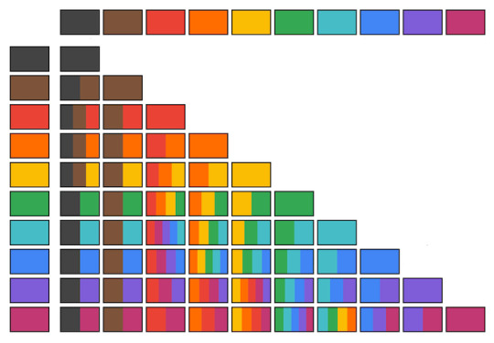
Are both colors saturated, desaturated, or both? If one color is saturated and one is desaturated, all your results will be both saturated and desaturated. If both colors are saturated, all your results will be saturated. If both colors are desaturated, all your results will be desaturated.
Are both colors different luminosities? If one color is light and one is dark, the outcome colors will be light, medium, and dark. If one color is light and one is medium, the outcome colors will be light and medium. If one color is medium and one is dark, the outcome colors will be medium and dark. If both colors are the same luminosity, the outcome colors will be that single luminosity.
Using this logic, we can determine that a few examples:
A red saturated light color and a blue desaturated dark color will yield all colors which fit any of the following: Red, pink, purple, or blue hue Saturated or desaturated Light, medium, or dark luminosity
A purple saturated medium color and a purple saturated dark color will yield all colors which fit any of the following: Purple hue Saturated Medium or dark luminosity
As an added feature, we hear that users wish to intentionally pass down similar colors to that of the parents, to make copies of their pretty combinations. So:
If both parents are the same color, that color has an 80% chance of passing down.
This can be workshopped based on user feedback.
Overall, it’s a very fun system!
Name Generation...?
All cats will be generated with a name which can be freely changed at any time. The first iteration of this concept is seen in our breeding demo.
We’re aware the current beta state of our name generator makes some… very silly names! It’s become an internal source of entertainment to laugh at what we get. We’re working on a more polished version that outputs less consistently doofy combinations.
So, what else is new?
As massive as this drop is, we have some other little fun things to share!
Banks, Storage and Safekeeping
We have functionality for a core game mechanic and that is… inventory management!
Items are kept in your storage, with the ability to move your items to safekeeping as a way to remove them from everyday use!
This is common functionality. Nothing exciting. But we have something new to share!
Introducing… banks!
“Banks” are pockets of currency you can keep in your storage. You can create, name, and delete as many as you like! We hope this functionality will be a welcome quality of life for players who organize currency for customizing certain cats, for exchanging items and services, or for saving up for a specific purchase.
Overall, managing your on-site currency just got easier!
Take a look at the functionality.
Scene Building
Scene Building has hit a breakthrough! We have the functionality for the “stickerbook” customize feature. This one tickles me a lot, because it’s so fun to play with.
And as a final check-in, we’ve started on Guild functionality. We have UI designs built out and are moving into the meat. After that, it’s just markets, cooking/crafting, and forums as far as getting the big stuff laid out. Wahoo! Very fun!
To Summarize: We shared a demo drop AND a breeding simulator, resource organization functionality—namely a new feature called banks—and a look at scene building functionality.
What to expect next month: A look at Team and Guild functionality, further assets and mechanic development.
48 notes
·
View notes
Text

Space eyes!! :DDDD @O@
I love space sm aaaa^^ trying to learn more about the goblin planet and eyeball planets which has been very interesting :DDD
this is my oc (idk what her name is yet) and she really likes space and here she is w/her eyes reflecting space :DD (little does she know she can see all of the universe and secrets of it through her eyes^^) (also my current pfp :D)
wanted to basically experiment w/a more painterly like art style and a new eye technique :DD
#my art#oc artwork#oc#oc art#art#artwork#digital artist#artists on tumblr#illustration#illustrative art#space#own character#own art#oc artist#galaxy#original character#original art#stylised art#digital illustration#digital painting#drawing
12 notes
·
View notes
Note
I really like your style. Was it intentionally designed, or did you just sort of fall into it over time?
I wouldnt say I intentionally designed it, as in I haven't sat down and Engineered a specific style, and instead it was more of me finding what I liked and wanted to incorporate into my style.
You could probably trace my style back to its influences. I used to draw really round shapes (I still do but like they were just ovals and circles...I guess i just like that shape) until I started watching How to Draw Anime tutorials in middleschool T-T (shoutout to Mark Crilley lol)
But when I first joined social media back in 2016, I found all these crazy artists with really unique styles that really influenced me. I was drawn towards artists like star_bite/prince_canary and rawrgyle/grassflu who have very dynamic expressions and character poses :0 (also they ended up working on a Batman and Superman project respectively and how wild is it that my icons from forever ago now work on projects aligned with my current interests!!!) And as you get exposed to different artists you get exposed to the many ways you can Draw things and along with your natural affinities towards certain things (such as me being attracted to Bright and Bold colors and Shaped styles) you kind of naturally build a style.
And part of that is also just having fun Trying things out? Sometimes I wouldnt even try to emulate their style as much as I tried to just...do what they were doing? As in making my ocs and putting them in fun poses, and doing color palette trends and such etc.
I hope that helped! If you're curious I can break down some of my style checkpoints over the years. As you can see there was still some major anime influence in my style back then when I first joined social media around 2015/2016
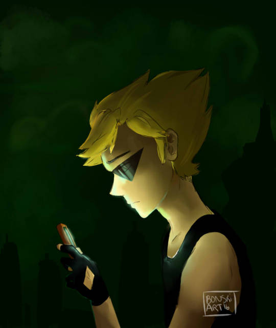
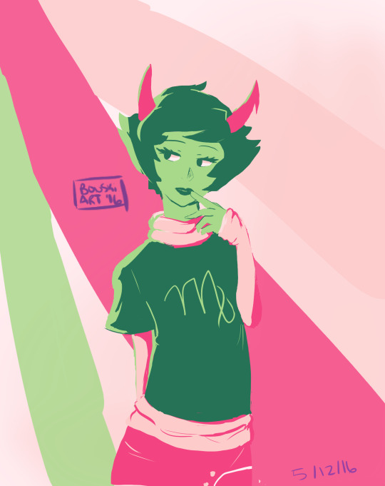
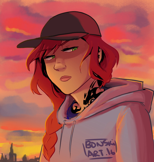
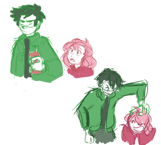
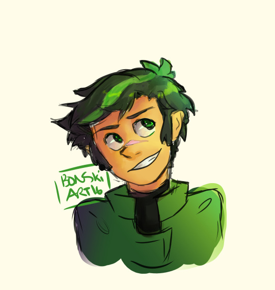
Around that time, I also discovered the fandom around the Cartoons popular at the time, so I drifted away from anime and drew things like gravity falls/steven universe/otgw etc etc so it got Rounder I guess. I really liked how stylized characters looked and got obsessed with Shape Language and assigning characters distinct Shapes (box vs triangle vs circle etc). I also read a lot of webcomics and stuff like that so those played a part I guess
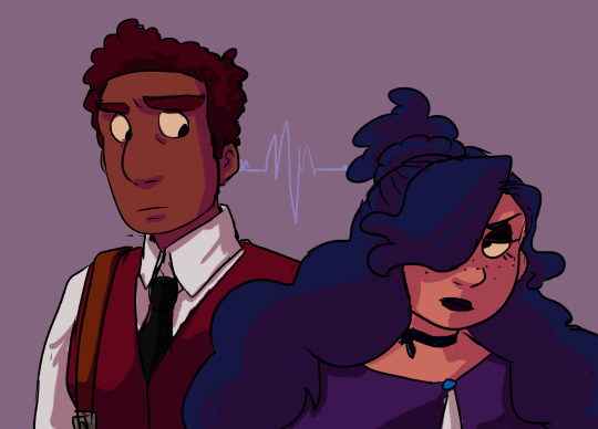


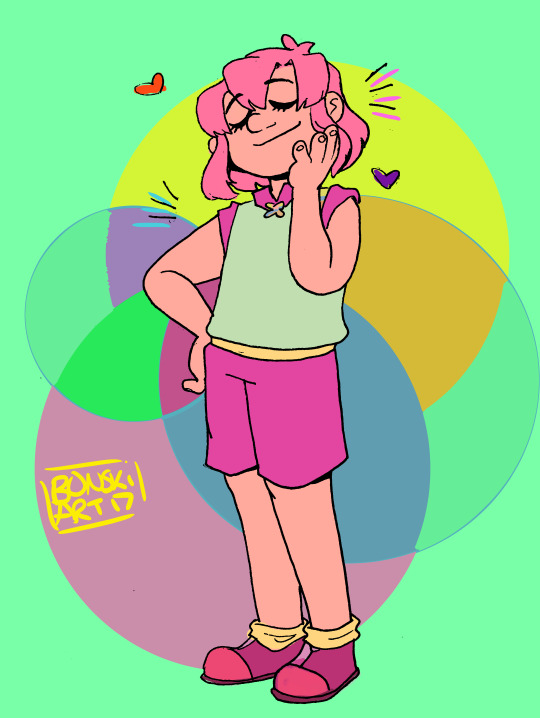
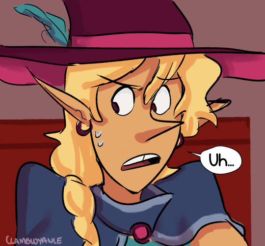
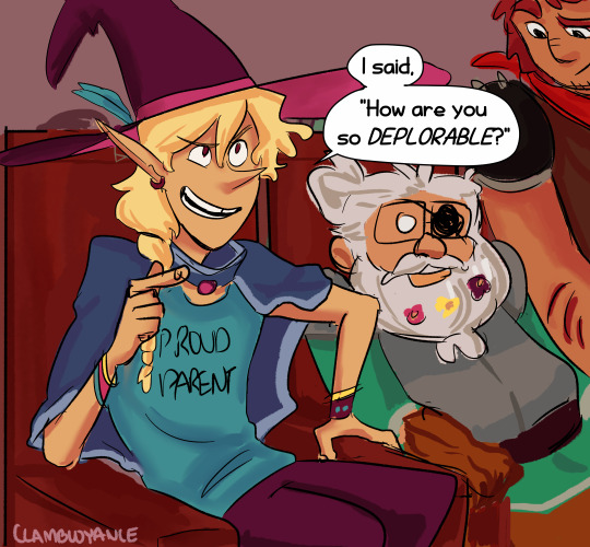

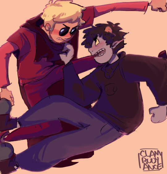
And then around 2019 I saw more artists drawing anime fanart with really sharp angles, which was completely different but so cool to look at so I tried to incorporate more angles into my art. I still had that very cartoony style but tried to push the Sharpness a tad bit more if you can tell. (I think the name of the artist I liked was jeluto?)
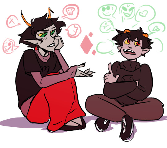
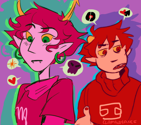
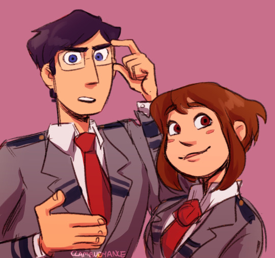


I think around this time I also focused a lot more on color as well and did a lot of paintings then and whenever I did more Painterly stuff I tended to switch Styles into something Less Cartoony T-T

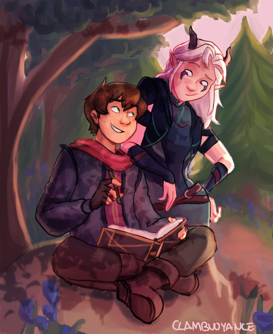
Then by 2020, I revamped my ocs, actually tried to break down and study my own style and how I would draw them, and my style kinda fell into a mix of round vs sharp edges I guess. I tried to give myself Rules which I would follow when stylizing a character to keep it more consistent and intentional.

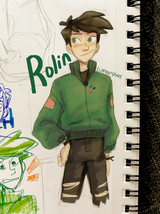

Then in 2021 some of that Fun Part of stylizing characters into something more Cartoony kind of took a backseat as I focused more on Pose Work and Body Expression instead which I think helped a lot :0
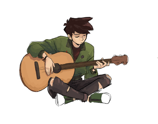
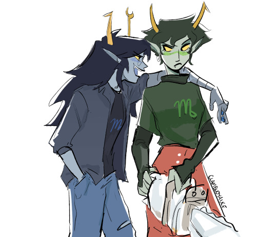

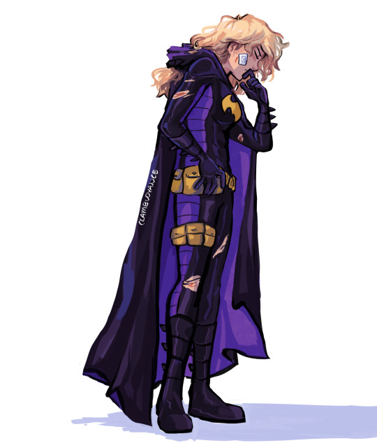
And here's some recent stuff from the past year! Still very cartoony, but less so than 2016 I'd say, and still using really bold colors!! Still love my Soft Vs Hard angles B]
And overall have stronger pose work :) I'm sure my style will evolve as I learn more and experiment more, because one thing I want to focus on is backgrounds and environments :0


63 notes
·
View notes
Photo
Saturn’s Free CSP Brush Recommendations, Across the Web Edition
I may sell (sorry, obliged to shill) brushes now, but I still love me some free brushes & love to share them with people. These are a bunch of cool brushes made by other people that you can use to build up a nice library of tools without having to spend any cash on, perfect if you’re new to CSP or are on a budget. If you do download these, be sure to like them & give some love to the artist if you enjoy them. :D
All of these are on different sites, like Gumroad, Deviantart, Artstation, etc.. They’ll be organized by source on this post since most brushes posted are general packs with multiple different types of brushes (very nice). Feel free to reblog this with your own suggestions, there’s many brushes out there I missed. :D Check defsiarte’s suggestions too, and if you want to see my recommendations for stuff on the Clip Studio Asset Store or other places, check this tag.
Gumroad
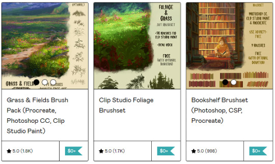
Tamberella’s Brushes - Fur, Foliage, Bookshelves, & northern lights, all nicely formated and easy to use for CSP. Good variety.
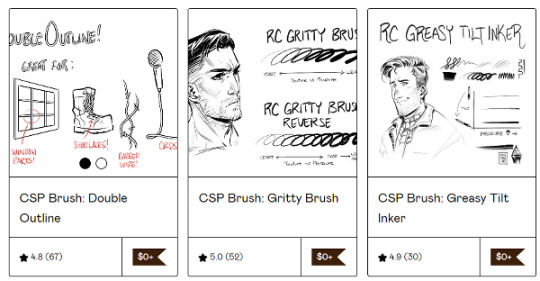
Ronchan’s Brushes - he makes a lot of neat little brushes, great for illustrations, sketching, & art in general. High recommend!
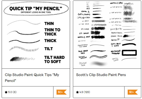
Scott’s Clip Studio Brushes - I mostly use the grease pencil from the big pack, but all of them are pretty good if you’re looking for a more traditional inking experience.
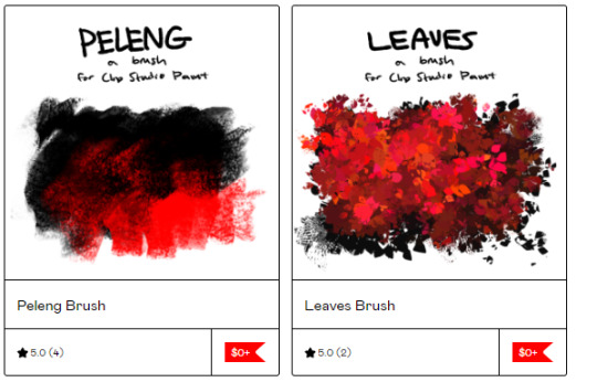
Cae’s Brushes - they’ve released a variety of cute painterly brushes that are fun to use. You can either download the ones you want or all of them at once. :)
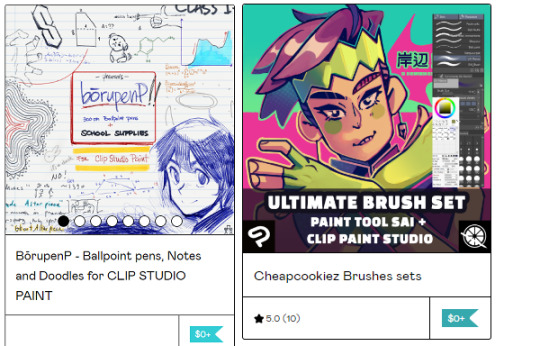
@pharanbrush‘s BorupenP - a really nice set for doodling. If you enjoy the free set, check out their pencils & other sets if you have the spare cash. :D
Cheapcookiez Brushes Sets - I really like the blender in this set. Comes with Sai brushes as well.
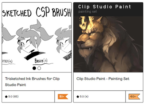
Trisketched Ink Brushes - 3 fun rough inkers for inky pieces.
CSP Painting Set - I like the gentle use of texture on the painting & sketching tools. A real nice rounded out basic set.
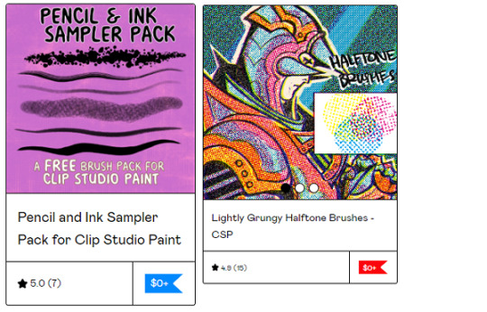
Jason Piperberg’s Free Samples - It’s a nice sample pack of his bigger pack. He likes using a lot of halftones in his art and it gives a fun bold look to his illustrations. If you like drawing comics, I do suggest checking out his paid sets too.
Vierdz’s Brushes - I like the Halftone, clouds, & fish brushes the best, but all their brushes are nice.
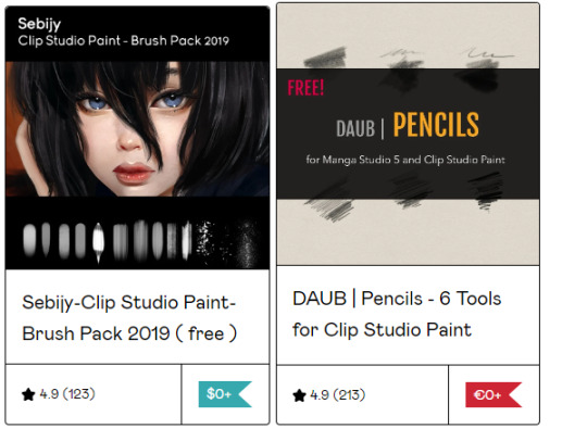
Sebijy’s Clip Studio Paint Brush pack 2019 - It’s been a bit since I downloaded this pack but I remember I really enjoyed using the airbrushes. Has some good painters & textures. Also has a nice paid set if you enjoy the sample.
DAUB Pencils - A decent set of pencils.

Scrapefiend’s Free Brushes - There’s some real cool inkers Scrape released for free, I used them a bunch even before I purchased his bigger pack (also recommend). Great ink looks that are fun to use & whip around!
“...Of the Wild” - A brushset based of the Breath of the Wild/Tears of the Kingdom Legend of Zelda games. Great for copying the style or just painting in general (then again I might be biased because they used my public domain textures, bless).
Art Station
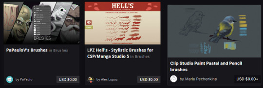
PaPauloV’s Brushes - he was nice enough to optimize his brushes for both Photoshop & Clip Studio, as CSP sometimes has a weird time importing PS settings. Another nice basic set!
LPZ Hell’s Stylistic Brushes - Fun for messy looks! IIRC you can also find it in the Asset store.
Maria Pechenkina/ Mothka's Brushes: Artstation | DA - I love the pastels in this set. Lovely little dry set.
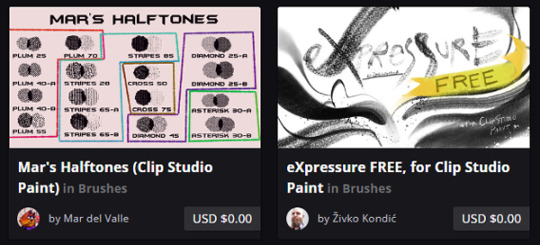
Mar’s Halftones ( & other brushes!) - Halftones with fun textures, now avaliable away from the CSP Asset store too!
Expressure Free Sample Sets: ArtStation | Gumroad | Ko-Fi - ZH has put a ton of effort into his sets, both the first & second. Worth a try & even the free brushes are full of effort!
Deviantart

Awanndus Brushes: Oil Metal Painting, Indian Ink, Fantasy Background, & Pencils - all neat brushes that are worth a look if you need any of these.

Roastedstix's Painting Sets - Really enjoy the green Goauche Brush Set. Great addition to the already lovely CSP default Gouache.
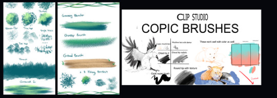
Yettyen’s Sets - All her free Enviormental & decoration sets are great. I also like her painters & scale Sets. She has a Gumroad she releases brush sets for a dollar for, they’re also worth checking out along with her Ko-Fi!
Clip Studio Copic Brushes: Deviantart | Google Drive - These are some of my favorite marker painters out there. Nice and easy to use with wonderful results, good blending.
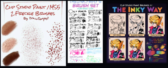
Freckle Brushes - A nice varied set for freckle lovers.
The Inky Way’s Sets - TIW has been making brushes for clip for years & they’re all nice, honed sets that are fun to use. Very high recommendation!

SerketXXI’s big set & their Danganronpa/Hetalia Brushes - A nice basic set with some nice decorators, as well as two good sets for making Danganronpa & Hetalia styled illustrations (obviously). The brushes are also good for general useage.
FnF Brushes - For those who need a Friday Night Funkin’ Style Brush!
Hearts Emoji Brush - something I forgot to get a preview for, just a fun brush taking basic emojis and scattering them around. Always need a few fun brushes here and there. :)
General Around the Web (twitter, tumblr, ko-fi, etc)

Pufuu’s Splatoon Brushes (Imported to CSP) - Splatoon artstyle lovers rejoice!
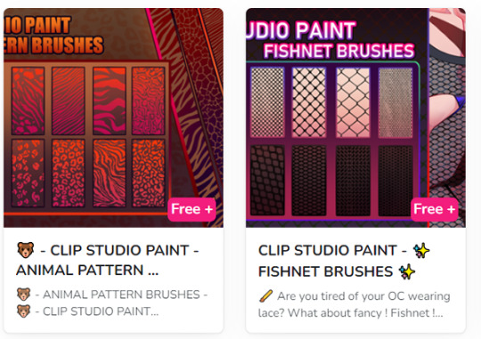
Rai’s CSP brushes - Currently releasing a bunch of pattern brushes, but she has a lot planned in the future brushes. Try ‘em out!
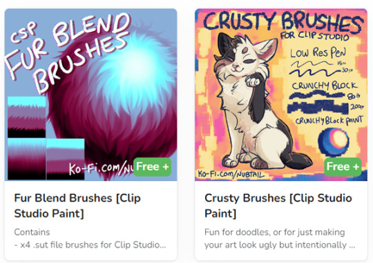
@nubtail ‘s CSP brushes - The fur blender brush is fantastic! And the crusty brushes are a nice crunchy organic look. :)

@kriztelpixel’s Brushes - She explains the instructions in English in the linked tumblr post, some lovely oil brushes.

Bunabi’s Brushes - She’s got some really great decorating brushes, I’m very fond of the fun arcade rug decorators! And of course, since it’s patreon, you can always donate to support her or unlock more from her if you enjoy her stuff.
A few others I forgot the preview for:
Palette Knife - swoosh around some fake palette knives with this set!
Timcanpy-shaped brush - A cute D. Gray Man themed brush c:
Xerox Pencil - a pencil with a bold texture that’s fun for recreating old lineart.
Again, feel free to respond with some of your recommendations & favs as well, free or paid for. :)
#clip studio#clip studio paint#clip studio paint brushes#clip studio paint brush#csp#recommended brushes for csp
126 notes
·
View notes
Note
Hi hello, just wanted to say i’m so impressed with your style (it’s so painterly!! i love it) and your posting streak. How do you do it?? 🤔🎤
AAA TYSM THAT MEANS SM TO ME <3 I feel like i just recently got more comfortable experimenting with the more painterly style and im so glad ppl like it :D
How do i do it i neglect my responsibilities and cram for my quiz the day before i mean what
Idk how my motivation is just not dying tbh I look forward to drawing them every day XD and mostly i try to limit myself to only spend around 2 hours on each one!
39 notes
·
View notes
Note
🌜🐡 🃏
Wildcard question: this one ambitious project you keep dreaming about but do not have the energy to attempt yet
Thanks for your questions! 😘 I love reading your answers to ask challenges
-
🌜 How would you describe your style?
Painterly, vividly coloured, horny, semi-realistic
🐡 What is something you worried about a lot when you first started, and why don't you worry about it any more?
Funnily enough, I worried a lot about not having a style! I constantly saw IG posts from big artists about "How to develop your style" or answering questions from beginners who were feeling insecure about it, and so I felt I had to be insecure about it! I also fell into the trap of trying to pass off errors in my work as 'just my style' rather than something I could improve upon.
After a few months, I decided my end goal was to have my art featured on a Magic the Gathering card, which informed the genre of my work going forwards (semi-realistic to realistic fantasy) and that helped to give me some direction.
Much like learning any discipline, "style" is really just how you apply the principles you've learned. For me, it developed with time and as I experimented with studying other artists' work and learning techniques for things like anatomy or lighting.
Here are some of the styles I've tried below. Would love to improve in all of these, but they're each their own discipline that require a lot of commitment to do properly!

🃏 Wild card: ambitious project I haven't had the energy to attempt yet
I'd really like to do an action illustration of an original character for an original setting! This would involve having to practice the following (very rusty) skills:
- Prop and clothing design
- World building and visual development for the background
- Active poses (my subjects are usually 'holding' a pose for the viewer)
One day!
X
Take care of yourself, and keep an eye on your own inbox haha
10 notes
·
View notes
Text

And here’s the finished version of my art for @strawberrystepmom! Kenken friendship warms my heart.
I was fiddling and experimenting with how i’d like to color digitally and it’s certainly been a learning experience. In the end i sort of did a combination of cel shading and a more painterly style to try and give a softer texture to the clothes. I almost patterned Nanami’s belt like his tie but that felt like it was going to make things a little too busy so i just went with a more plain approach.
(And since I was asked throwing a tag @nanamikentoseyebags so you don’t miss this one!)
#jjk#jjk fanart#jujutsu kaisen fanart#nanami kento#nanami kento art#self ship#jjk x reader#kento nanami#nanamin#rossi art
34 notes
·
View notes