#trying to do some practice with limited-ish color palettes
Explore tagged Tumblr posts
Text
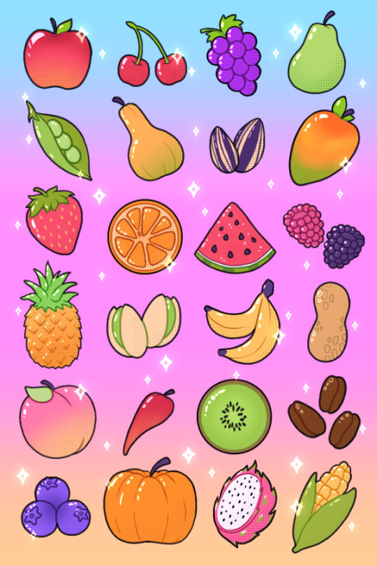
feelin a lil fruity
189 notes
·
View notes
Note
how do you get your colors in your art to look so good?
gonna resist the urge to say my colors aren't that great, and i'm gonna try and think about how i do color seriously.... also thank you for the compliment! i've always felt like i struggle with color but maybe i can still be helpful :B if this stuff is all super basic, apologies in advance
ig i already love bright colors, especially warm colors, but i feel like a lot of making visual art is bringing out the contrasts between colors, light and dark, textures, movement, saturation, curves and straight lines, etc., so that just means i usually try to think about the relationships between the colors a little more than the colors individually.
i also don't usually start with a solid color palette defined beforehand. i usually know the basic colors i want, but i don't typically choose them before i start bc that's too rigid for me, and i want to be able to adjust things or throw things out without worrying that i'm messing up the balance of a palette i already committed to.
so for this one
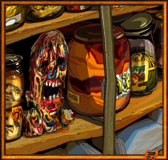

i used a lot of warm colors bc i loove earthy yellows and oranges, but i think it can make colors feel more vibrant if they're next to colors that contrast w/ it (warm and cool, or complementary colors).
the "gray" metal parts of the picture like the shelf stile coming down vertically, and the jar lids behind it, are green to contrast w the oranges and reds in particular, and there's some blue popping up in the zombie head and the shadows on the bottom shelf for the same reason, altho the blue is a touch on the greener, cooler side of blue (as opposed to the purpler, warmer side).
usually if i use a color in one place, i try to pull it into the rest of the picture for better balance unless maybe if it's the focal point. so i'm doing that with the blue, and the orange stickers to spread the bright orange from that big jar around more.
also i don't usually use straight gray/white/black, 99.9% of the time i'll use something tinted like that green metal stile, or the pinkish gray in the jar on the far right.
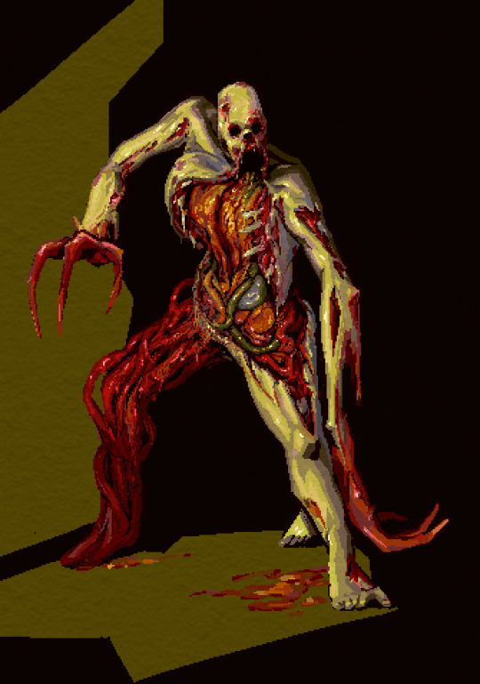

same here: it's mostly green and red bc i like that combo & they're complementary, but i did try to pull a little blue in as well through the shadows on the right ribcage and that one mystery organ under the green intestine, nd in the back of the leg.
that being said tho, it's not really "blue", it's more like nearly gray-purple that looks blue bc it's next to such bright warm colors. that's the magic of gray lol, it's very useful bc it's easy to make it look as if it's warm/cool depending on what colors it's surrounded with.
ig color for me is mostly about color relationships and saturation... the gray can look like blue if it needs to, and it can make the colors next to it look even more vibrant so the skin of this necromorph dude looks sickly and dead but the organs look pretty lively.
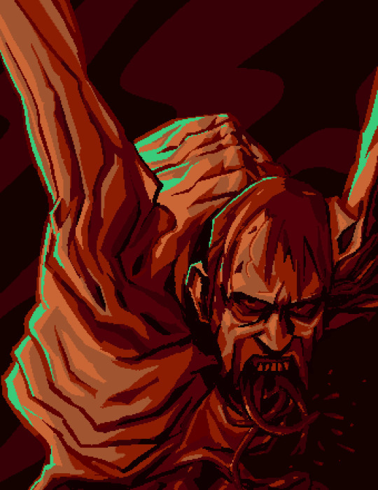

when i shade something i always try to use a color that's at least a little bit different from whatever the base color is. so in this case the base color was that kind of pale orange and the orange-ish gray, but the shadows are both super saturated & one is leaning more toward a sienna/orange (on the left side of the pic on the arm and ribs) and the other one is leaning a lil more toward a berry purple/red & i think that usually adds some nice depth to the color. also don't be afraid to add reeeally dark darks and really light lights, but imo the darks give colors the most life by contrast.
since this was a limited palette & not that detailed, i didn't worry about pulling that aquamarine anywhere else.
other than that, i just try to be bold with colors, and go for something exciting & not worry too much about whether it looks naturalistic. plus there's tons of colors you can pull out from regular objects/lighting/whatever else. this isn't specific to color, but the other thing i try to do is practice seeing what colors/forms are really there, not what i expect to be there.
a super basic example would be if i want to draw a banana, i don't want to just automatically reach for yellow bc bananas are yellow, i want to either look closely at the real banana i want to draw, and really try to see what colors are really there (which can be surprising tbqh), or if i'm not actually looking at a real one, then just try to pull in more color for the fun of it, like shading it with purple or blue maybe idk go nutso!
tl;dr i think i usually try to keep in mind
warm/cool color balance
complementary colors (altho tbh you can make any color combo look good, esp if you mess with warm/cool balance)
saturation (i keep a lot of things saturated, but also the contrast between saturation/desaturation can make the colors look more intense)
light and dark contrast
using tinted grays to imply a warmer/cooler color that contrasts with the main palette
color depth (shading with cooler and/or warmer variations of similar colors)
go nutso
#ask#anonymous#cyrsed art#i hope this wasn't completely unhelpful lol i don't know how much of this is just super common sense stuff#but ty for asking it was interesting to try and actually put the process to words
3 notes
·
View notes
Text
...What do you mean by "LA 2019 and EoW have the same game title font"? They're... they're clearly different? Not as drastically as, say, WW fom SkSw, but still noticeable enough. One of them is literally a serif font while the other one is not??
Typeface nerdery aside, the general aesthetic of a flat, monochrome logo is just the general trend for minimalism popular in modern logo design, for better or for worse. It's a good thing in general! A well-designed logo should be easy to reproduce and recognise in all sizes, colors and contexts, that's, like, a core principle. I haven't looked into official LoZ merchandise or whatever other peripherals, as I wasn't exposed to the franchise at all until 2019-ish, but I am more than certain that Nintendo already made the simplified versions of some logos to a degree, maybe printed on some sort of a limited-edition console or boxart. That being said, I find TFH's stylized embossing look would've made for a perfect middle ground between the two styles.
Keeping the creativity of the lettering for the game titles would be nice and help the overall logo readability, that much is true. Sharing the font for sub-series, like BoTW/ToTK duology, is actually good in that regard IMO, it's a clever bit of branding, in the same vein as changing the series title color is/was. I wish FS, FSA and MC were all green tbh.
Even outside of its practicality, I personally find the new logo style appealing in its own right. My favorite part is probably the tendency to make the Master Sword or the main gimmick object understated and distinct in their silhouette, and also uniform in their placement. Otherwise the whole logo gets too busy and slips into Final Fantasy territory, and by god do I hate (most) FF logos. I'm looking at you, TP and the Oracles; ToTK is also on thin ice, but it's at least saved by the limited palette - imagine if this logo had shading and gradients. On another note: the choice to make the series title weathered that was a nice shoutout to BoTW's story still kind of makes sense for the whole series, given its long legacy; maybe not for every game - again, that's where TFH's logo style would come in handy, - but in general it still spirit tracks, so whatever.
To be fair, I'd love to try and redesign old game logos in this modern style sometime, maybe even include some choice spin-offs! That sounds like a fun challenge to tackle, especially drawing the simplified silhouettes for the gimmick objects - I don't think I can personally improve on the laconicity seen in the artwork for the Spirit Train much; ST has a very tasty logo overall, even the concept logo was pretty.
Oh, and also! It'd be super interesting to have this discussion in regards to the Japanese logos, as those have to pack twice as much info in the same space. I wish I had enough familiarity with Japanese to fully appreciate the typefaces, but even then they make the difference between LA 2019 and EoW's logos way more pronounced than in English. And don't get me started on how WW's Japanese logo has the beautiful lettering that carries the swirl motif present throughout the game! No offence to the modified version of Sherwood font seen on the English logo, but I am a huge sucker for WW's swirlies. If it wasn't for the fact that KoRL blends a little with the already red series title, I'd call it the best Zelda logo. But then again, I am biased.
Let's talk about the Zelda logos!
Like many others, I noticed that we are heading into a new direction with zelda logos. The days of shiny red zelda logo are over. Solid-colour, weathered zelda logo is the new standard. I like it a lot! My only complaint is: the game title font doesn't stand out like before.

After Majora's Mask, you start to see that every zelda game has the standard red logo, but the game title has a drastically different font that matches the game's aesthetic. BOTW and TOTK are fine as they are since they are sequels, but what about EOW?
I was always imagining the next mainline zelda game to have a new font. It was subconscious and I only realized it after seeing the new title. I was *slightly* sad. I will get used to the new direction. It's not a big deal, but I did find the unique game titles to be charming.
Thoughts?
351 notes
·
View notes
Text
Cause at least two people have asked me directly to talk of how I design clothes (in fantasy at least) I will try to break my mental process down (do not take this as a tutorial though)
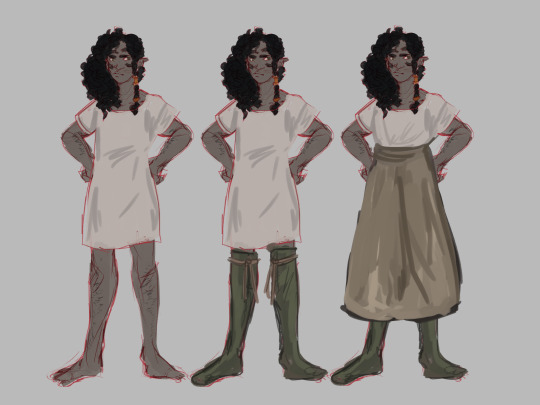
Let's use my girl Alheya , a dwarf from an island that contains a fair amount of elven interaction and has elven ancestors. Let's break this first bit down.
Thinking of the character, their personal taste is the main focus however thinking what outfit they can affor and is practical to them is also good. Alheya loves fashion and crafting, lives in the "warm" region of an ice wasteland, not particularly rich but doing well enough on her own, so her outfit has to reflect that. She won't have the fanciest of things but some nice green stockings are a luxury she can allow herself, next to the standard undergarments.
Layering, not necessary to draw all layers though it can help with understanding the garment so it looks wearable, in my mind it goes: chemise > stockings > petticoat. That is for this character. You can adapt this to whatever order and whatever clothes you wanna give your character. The more layers the more bulk.
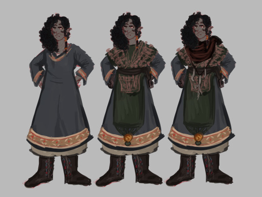
What makes sense for the world. Not that you have to make an elaborate worldbuilding doc or whatever, just going back to the first part of what makes sense for the character. Alheya lives on a colder region so classic thick dwarven attire and boots will do, though I did use patterns common in elven dresses for her. You can take inspiration from all sorts of places (mine was the cliche fantasy viking trope), references are always good, consider this the base of the outfit that you can leave alone if you want.
If not, add the accessories. Maybe another piece of clothing (layers upon layers help in fantasy), some jewelry, coats, cloaks, shawls, whatever you think will fit well.
Color palette? You can generate one (there are plenty of sites for that), pick it from an image, make it on the spot, if you like it and it works well then go ahead, while color theory does help (another can of worms) who am I to stop you from ignoring it?
While yes you normally should avoid tons and tona of details since it makes it confussing and hard to draw, don't pretend as if minimalism is your only option. If you are drawing the same character over and over again (like animation or comics) you may wanna lose some of the details, you'll have more free range in single illustrations, though if you have a deadline it'll take extra time if your character has tons of elements to draw.
For historical stuff. Look at fashion plates of the era, photos if they had them, any real record, then you decide how much you wanna keep from them, if you want it to be historically accurate or vaguely inspired.
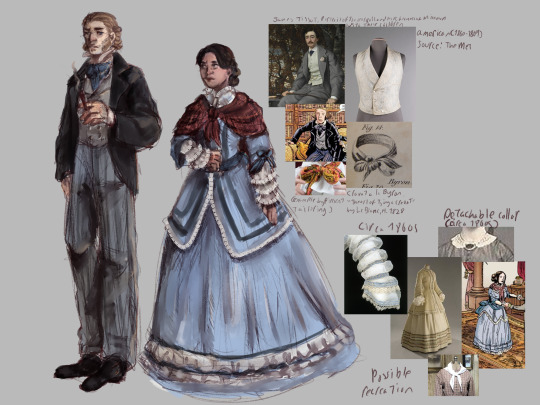

First picture is me trying to adapt the outfits mote accurate depictions (on my limited knowledge), the second is an overall 1850s-ish looking dress yet sea themed and probably wouldn't have been made back in the day.
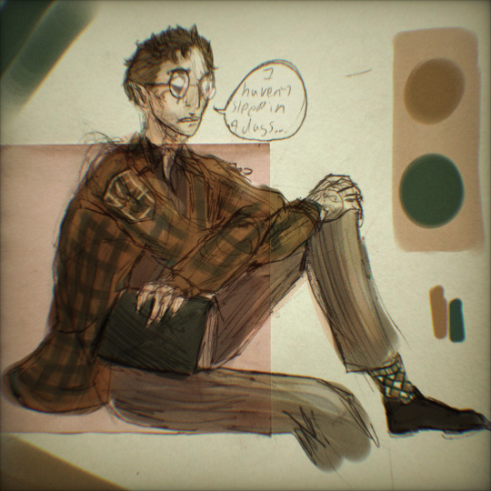
Contemporary stuff? I literally copied the outdit from two photos on pinterest, you can get away with almost any fashion choice.


Fanart but don't wanna copy the outfit the character already has? Look for references to figure out their style and how people dress in that universe.
At least that's how I do these stuff
19 notes
·
View notes
Text
Brothers in the Human Realm
No one was a demon to begin with (maybe luci though but-). You meet the brothers as human in the human realm. How would you meet them?
Lucifer:
Apparently some schoolmate of yours have done some violations in the school grounds and they used your name
You were sent to the Principal's office where you were questioned by Principal Diavolo about your wrong doings
You were trying to defend your innocence, but it was no avail
Coincidentally Lucifer was just dropping paperwork to Diavolo
Lucifer is your strict and scary and handsome college professor
He overheard the conversation and he defended you since he knew that you weren't lying
"Mr. Diavolo I must say, MC is one of my exceptional students, they would not do something as idiotic as that, and I clearly observe the behavior of my students"
Your H E R O
The next day, someone gave Principal Diavolo evidence of those who did wrong
Your name was cleared
Apparently you saw Lucifer giving those schoolmates detention, threat, and punishment. You may or may not seen a hint of killing intent in his eyes
You decided to thank Lucifer
"No worries, I just clearly observe the actions of what is mine"
H O L D U P
"Wha-" you replied
"Ah MC I have to go to my next class, take care"
Mammon:
Is a famous model, often the cover and centerfold of the monthly Majolish
For you Mammon was okay? I mean he is famous and many people likes his face
You were going to buy a limited edition sunglasses that have hint of yellow and orange
You went to a sunglass store and asked the attendant if they they still have it but apparently the one on the display is their only stock
You decided to buy it
Apparently, Mammon also came to that specific sunglasses store looking for sunglasses that is the same as the one you bought
"I'm sorry sir, but apparently it was already bought and we have no stock" the attendant said
"Who bought it?"
"They did, sir" the attendant said as they point to you
"Oi! Can I buy the sunglasses from you? I'll pay double, no one can refuse the great Mammon"
"I'm sorry but I have to refuse. I really wanted it." you said
"Don't you know who I am? I'm-"
"The Great MAMMON, who is a famous model and often seen on Majolish magazine" you cut him off. "R-right! Now can i buy-"
"Nope sorry" you replied as you rushed to the exit
"Oi! What's your name? And contact details" he asked
"the name is MC, thats all you can get from me" you said as you rushed to the crowd
He was swarmed by the number of fans who saw him
He managed to find you and he chats you "Can I buy the sunglasses now?"
In the end it wasn't just sunglasses you talked about, you also talked about his struggle of being a model and your life
Leviathan:
Your username DestructoSheep is well known in the realms of Obey them
You always rank 2nd in pop quizzes
However no matter what you try, you can never beat your enemy, L3v1
Today, you got a letter from obey them, acknowledging the top players and giving them limited edition items
Ofc you have to go (there are limited items after all)
So you arrived early at the meetup place, no one was there yet so you played some obey them
A purple haired male entered the room, he looked fidgety, nervous, and he was mumbling something about normies
Cue giving of merch
The purple haired male tripped on the tiles and he dropped his phone in front of you
You helped him up and picked up his phone only to see his player name is L3v1.
"You.... You are L3v1." you sai
"Y-Yeah?W-Why?" he said as he was going to grab his phone away from you
"Waaaah! I'm DestructoSheep nice to meet you, oh but you can call me MC" you said as you reached his hand for a handshake
"I-uhhh I'm sorry I'm not used to touching, thats very normie-ish" he said as he averted his eyes
"My name is Leviathan, levi for short"
"I've always thought that the top player is always prideful and such but here he is being shy" you said as you chuckled
"H-hey! I'm still the best one in obey them mind you! I got every event cards at lvl 150 and skill lvl 10 and-"
"Yeah yeah I know" you said
After both of you received the merch, you both talked nonstop about obey them, other games, and anime
It was more like Levi bragging the amount of games and anime he played and watched
It was almost dusk till both of you notice the time
"Ah i got to go early, need to cook dinner. Chat me sometime!!!" you said as you gave him your contact details
Expect no sleep cuz both of you kept chatting till dawn
Satan:
He saw a kitty in a box in an alleyway near his apartment
Everyday, he often stops by to give the kitty enough food for the day
Is often disgusted by the fact that most people dump their pets in trash because they don't have anything to feed it
Saw you going to the alleyway
He suspected the worst and he thought that you were gonna harm the kitty he was feeding
"Hey don't harm-" he stopped
He saw you feeding the kitty
"Ah I assume you thought that I was gonna harm it?" you asked
"Well I thought the worst, humans are naturally scum anyways, but even so I do apologize"
"Ah it's alright, it's not a big deal anyways" you replied
"You come here often? I mean to feed the kitten that is" he asked
"You can say that, but not as often as you do" you said
"How did you know?did you perhaps-"
"Ah I happened to saw you feeding the kitten, I was just shy to approach you" you said
"Well I come to believe that people who are close to cats are not necessarily bad"
"I have to say I have to agree" you replied
"Ah I have to go, let's chat here again next time" you added
The alleyway became your meeting place to chitchat about cats
Asmodeus:
The famous M.A.D. Company released a new and limited edition Devil Set makeup and you were dying to get a hold of one
You spent a day looking at different stores but it was either unavailable or sold out. However, you were lucky to find another store that has one last stock.
You didn't notice someone else was also going to get it and so both of you grabbed the last set
"Uh... I'm sorry I have been looking this for the whole day, may I have it?" you politely asked
"Awww sweetie, I have been doing the same thing! Can you be a dear and let go of it?" the male with champagne-colored hair replied
Cue 1 hour of both of you saying "let go" or "it's mine"
"I have an idea! Let's just buy the set and divide it" you said
"Ohh! Good thinking! I will take the lippies, Devil shadow palette and the foundation!"
"That's literally EVERYTHING IN THE SET"
Cue two more hours of bickering.
Both of you didn't notice someone took it while the two of you are bickering
You noticed that it was gone
"Um... Someone already bought it while you two were... fighting" the saleslady explained
Both of you left the store empty handed and sad and you decided to break the atmosphere
"Pffft I'm sorry for fighting because of a Makeup set, btw my name is MC" you said
"I'm also sorry dear, although I wanted it I still didn't get it. I even missed my appointment to the salon!"
"And my name is Asmodeus, perfect name for a perfect being!" Asmo added
"Alright Mr 'Perfect' " you rolled your eyes
Let's just say that both of you talked about makeups on your way home.
Beelzebub:
Beel is your classmate during Physical Education class at college
Is a famous football player in your campus and he is also known for his handsomeness
His practice hours were often morning to late lunch and late lunch til dusk
During late lunch you saw him in the cashier by the cafeteria, asking if they still have cheeseburger available
But to his dismay, the cashier said "I'm sorry you already bought the last cheeseburger, and that's the last quota for the day"
He seemed sad and still hungry
You still have a cheeseburger to eat, but when you saw the time you knew you weren't gonna make it on your next class
When no one was looking, you decided to approach Beel and gave him your cheeseburger
"Are you giving this to me?"
"Yeah, I was going to eat it but I don't have much time for my next class" you replied
"Thanks, I owe you one"
You saw how happy he was when he got the cheeseburger
You were shocked how fast he ate it
Did he like inhale it or something
After your class, you noticed that he texted you saying "Thanks for the cheeseburger, I'll repay you next time you get hungry"
Let's just say you both got closer after that
Belphie:
It's your first day of online class, and your first subject has a 4 hour lecture
You forgot to disconnect your meeting link and you didn't notice until you were about to do homework
As you were about to disconnect, you saw that you weren't alone and you're classmate is still connected
You didnt want to leave him so you tried your best for your classmate to notice you. You tried spamming and saying " hello"
After 1234 attempts he finally noticed you
"Ah I'm sorry I slept during the boring lecture, thanks for waking me up"
"Ah it's no problem" you replied
"My name is Belphegor as you can see, but you can call me Belphie"
"My name is MC" you replied
"Say... How are you still here after hours after the lecture?"
"I forgot to disconnect" you replied
"Uh idk if this is too much of a favor to ask, can you wake me up again next time? After lecture that is, I don't want to be late for other classes"
"Sure, I don't mind I guess" you replied
After that, both of you got to know each other and you forgot to do your homework and you became a personal alarm clock
#obey me#otome game#shall we date#obey me headcanons#obey me masterlist#obey me mammon#obey me lucifer#obey me leviathan#obey me satan#obey me asmodeus#obey me beelzebub#obey me belphegor#lucifer x mc#mammon x mc#leviathan x mc#levi x mc#satan x mc#asmodeus x mc#asmo x mc#beelzebub x mc#beel x mc#belphegor x mc#belphie x mc#obey me belphie#obey me beel#obey me levi#obey me asmo
344 notes
·
View notes
Text
Day 2 of my December art challenge! The prompt today (from here) is “cool colors” which is right up my alley.

So, because yesterday I talked about need to get better at backgrounds, I decided to do something without a figure at all today. There are things I like about this, but overall I don’t really like how it came out. There’s no rhyme or reason to the lighting angles, and I had some of those dark, wet cityscapes with neon lights and reflections in my mind but I didn’t actually look up a good reference or even really try to get some details in any way that makes sense. So it’s a mess.
BUT! I did draw out some perspective lines and I kinda sorta drew some kinda sorta straight-ish lines - I do not understand how people are detail oriented enough to do any linework, much less industrial straight lines all the time. Definitely need to practice that.
I also really really like the idea of a limited color palette, I’m just not experienced at utilizing that sort of thing yet. I think the color palette itself is nice though, and I at least attempted some atmospheric kind of fog and fading into the background, and then i attempted to splatter some raindrops everywhere to middling effect.
If I were to redraw this, I’d definitely put some time into finding a good reference, actually putting thought into the composition of the buildings, and ADD SOME DAMN LIGHTING THAT MAKES SENSE. That’s really the biggest thing that I’m like wtf was I thinking? I was just tired (it’s late) and didn’t want to put in the work to research, I just wanted to get started with the pen on my tablet immediately, so I ended up with this mess. It took maybe 45 minutes with some trial and error.
Ugh, this one is just frustrating because I love the concept and I did not achieve what I wanted at all. But I got some perspective practice in, and some building and atmosphere practice in. Let’s go with some more organic shapes tomorrow, lol.
5 notes
·
View notes
Photo

Mon Cher
Oh look, more painting stuff! :D After resisting the urge to break into them for over a week because I had other projects to work on, I finally broke into the 60 set of Arteza watercolors that I'd ordered, and after swatching and a little testing, this was where I went with them. But I'm not going to focus on a review/first impressions of the paints here, as I want the focus to be more on the piece itself since I'm really happy with how it turned out. (If you're more interested in my thoughts on those paints, I'll link to the piece I have coming up that I made more specifically to talk about those as soon as it's up.) This piece was also inspired largely by Leonidafremov, one of my favorite artists here on deviantArt who passed away recently, which is a large part of which I ventured further outside my comfort zone to make it. I may make another piece inspired by/dedicated to him at a later date now that I'm dipping my toes into acrylics, but I'm not sure yet. As for the here and now; I went with the Effiel Tower as my main subject of choice partly because of the reason above, and also partly because I have dreams of visiting Paris someday and thus it has become a sort of default artistic subject for me. After browsing through Pinterest for a bit for some extra inspiration, I couldn't decide between doing a more dreamy, sakura-tree surrounded tower, or a more "realistic" cityscape surrounding, and in the end I more or less combined the two with the trees poking in on the left and the city poking in on the right. Once I had a plan, I did a little practicing sketching and painting to think about how I wanted to paint and shade the tower as well as how much thought/sketching needed to go into this before I brought the paint to the paper. Thanks to that, I did end up doing some light sketching for the tower, the tree branches, and the outlines of the city buildings, but I tried not to be too fussy about it--no rulers allowed!--since I didn't want to spend super long on the sketch and really wanted to be a little looser in my watercolor technique overall. My main concern was that I didn't want the tower to look like it was drunk and/or you were looking at it through a kaleidoscope, and I think I managed to accomplish that, even if it is a little off in some places. I was also working with a limited color palette because I fell in love with the six colors I used when I saw them all lined up in my swatches, and I did have white and black on my palette just in case, but I didn't touch the black at all and I was pretty sparing with the white. (Which is a highly unusual thing for me to say.) I had a really pastel yellow, a peachy pink, a muted lavender, a darker true blue, a dull teal-ish blue, and a very pale pastel blue. Since I'm very often a stickler for color matching or using a more realistic palette, it was fun to experiment with something more centered around a particular palette that gives a much different look for more realistic/natural color choices. I started by going in with the yellow on the tower, as I'd decided in my planning I wanted to go with a light-to-dark side shading on the tower, starting with the yellow and transitioning across the colors into the blue, using the pink to make a prettier transition. Using the dark blue was the trickiest part since I didn't want it to spread too far and start making green with the yellow, but I did want it to be noticeably present and not blended out to a pastel blue and/or purple. Especially since I had plans to bring the blue up in the background later. I also tried to keep the shading simple but still sensical, meaning I tried to shade the little ledges and stuff properly, but again I tried not to be too fussy about it. While the tower was drying, I moved on to the trees. I start by dabbing on the pink that I had unaltered and without much water so that the paint would be more opaque, then I added some water to pale it out and let the petals "bloom" and float a little, and then I started adding on layers in the same way with a lighter pink I made by mixing in the white, some white the yellow, and some with the purple and a little bit with the blue that ended up getting mostly covered by the branches later. My goal was to add a little more depth & dimension but still keep it pretty abstract. Then while that was drying, I moved on to using varying amounts of water to create the buildings on the right, and I did mix in a little purple and pink just to "blend" the buildings into the rest of the painting a little better. This was a bit of an exercise in patience and experimentation as far as that goes because I have had minor struggles with that in the past, but I think it worked out as well as I needed it to here. And I did end up adding a couple of extra buildings beneath the tower that I hadn't sketched in because I felt like the colors were a little off balance and I wanted to try and remedy that. With the buildings filled in to my satisfaction, I went back to the now-dry trees and took the teal-ish blue I hadn't used yet and started lining the branches. And again, I tried my best not to be too fussy or particular about them, especially since once I added the petals most of my sketched-in lines disappeared because they were hiding behind the paint. By that point, the buildings were dry enough that I was able to go in and do the lines of the tower (as you can see some of the buildings are basically touching parts of the tower), and at first I wasn't sure if I was just going to do the more noticeable/necessary outlines and leave the bulk of the tower with just the sketch lines, but as I went it became kind of a no-brainer to me that, as trying of my patience as it would be, I needed to go over pretty much all of the lines to "complete" the tower look. And I do like the emphasis the outlines place on the colors/shading of the tower, especially since it's lighter than the darkest blue, so in person, you almost expect there to be some sort of shimmer when you move the paper. It's a pretty interesting effect if you ask me. After all of that, I waited what felt like ages for everything to be dry so I could go in and add a light wash of color for the background. (Which admittedly in hindsight I should have done first before I did anything else with the paint, but I didn't think about it until it was too late.) And I did try to get a transition from just a hint of the yellow to a hint of the pink to a hint of the purple, while still blending the edges of the colors against the trees, tower, and buildings as best I could without disturbing the paint that was already there. I had to do a couple of layers to try and build up the color I wanted, and on the scan, it still looks too pale (though in person it is paler than I was going for, it's just enough that it works to my eyeballs), and unfortunately despite my best efforts I did end up with a few pretty obvious water lines/spots from that. Though on the scanned version they're less noticeable. I think. Then while my faux-background was drying, I went back to the buildings and layered on some spots to indicate windows and on the slanted one, what I imagine to be a kind of giant glass-terrace for very fancy upper-class soirées. And admittedly my windows aren't terribly nice in share and aren't as opaque as maybe they should be, but since I was going for loose, I'm not going to count that too hard against myself. Finally, that upper right corner felt very empty compared to the rest of the drawing, and though I debated on it at first, I ended up adding a moon and very few small stars just to give it a little something and round out the painting a little. And of course I had to add my signature, but I'm trying not to look at/think about it because that pink gel pen came out way more pinky than I expected it to. Overall, I know there are a lot of mistakes and learning hiccups here, but I really am happy with how it turned out in the end and I really had a lot of fun getting lost in the artistic process with this one. At one point, I looked and the time was 2 am, and then I looked up again at it was 4 am! Two hours had passed in what felt like maybe thirty minutes. And despite its flaws, this is one of those pieces that has boosted my confidence in working with the medium used to create it, and so I say the experience was very much worth it, and thus I am looking forward to trying more larger watercolor pieces like this going forward. (I am especially eager to try a larger one on canvas, between this and my experiment with watercolors on canvas I did a while ago, so maybe look forward to that in the future?) ____ Artwork © me, MysticSparkleWings ____ Where to find me & my artwork: My Website | Commission Info + Prices | Ko-Fi | dA Print Shop | RedBubble | Twitter | Tumblr | Instagram
3 notes
·
View notes
Text
Cutie Reviews: Doki Doki Feb 19
I’m really slowing doing again <3< I blame summer laziness. But while I was putting this off (just didn’t feel like doing it, it happens.) I came up with an idea!
After every Doki Doki crate I review, I’ll be putting up a “summary post” about my opinions. Like my rank of the months boxes, which ones pulled off the theme, etc. I’m not sure I’ll remember to do it for every month’s set but I thought it would be fun to try out.
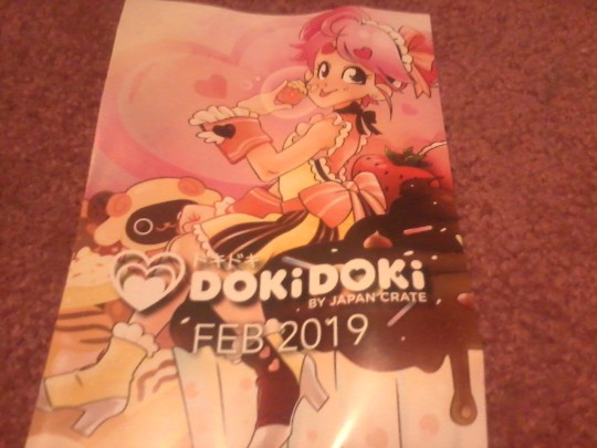
Theme of the Month: Sweet Valentine
“Whether you are celebrating Valentine’s Day with your sweetie, closest friend, or for yourself, you can enjoy the treats from this month’s theme, Sweet Valentine. We’ve brought to you items that are inspired by delicious, fluffy sweets you might receive on Valentine’s Day, from chocolate to marshmallows.“
This month there was a prize for taking a picture with the contents of the crate, this item being a Fujifilm Instax Mini 70.
Suteki Crate
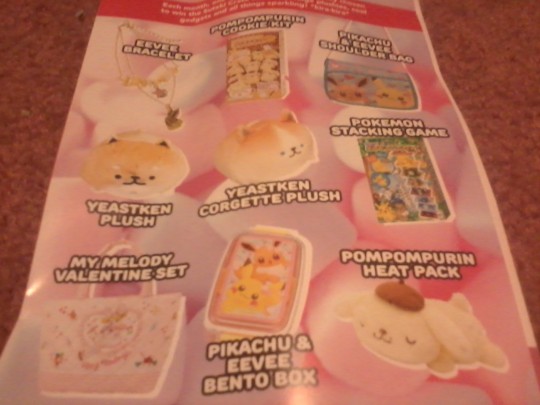
To go with the theme, this months Suteki Crate is very fluffy-sweet. We have a lot of adorable Pikachu and Eeevee, Pompompurin, and Yeastken adorableness~
Okay! So let’s get on with the review!
Marshmal Park Plushies
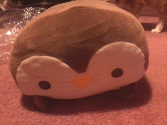
Our first item is this kawaii plush animal with the texture of marshmallows and a limited edition color palette inspired by Valentine’s Day chocolate ♥ There was a handful of different animals we could get; each with a cute heart design on its side:
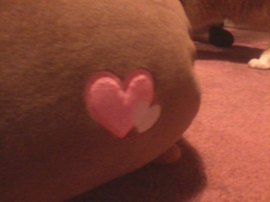
I got a penguin, and the booklet only shows a sheep, but usually in this series they have a lot of varieties. I really wish they would have shown the others.
Rating: ♥ ♥ ♥ ♥ ♥
As much as I love all animals, I actually don’t have many bird items; as a cat lover that might just be subconscious ;3
But anyway, I love these types of stuffed animals. I’ve gotten a bunch of them over time from the various boxes, and I was happy to have a brand new one due to one of my cats messing up the fluffiness of my kitty, which I slept with every day until I was forced to put it away. I assume this will be a repeated case but I’ll enjoy my time I have with it for now.
The texture is very soft and fluffy, and it’s fun to squeeze and pull on. It feels a lot like a marshmallow; it’s just too bad it’s not chocolate scented for the holiday.
Chocolate Stickers
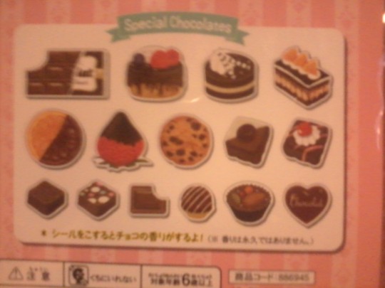
As of late these flake seals seem to be pretty popular. So this time we have a set of various chocolate sweets; from cakes to fruits, cookies, and just straight-up chocolate!
There are 30-per pack, with several of the smaller stickers and 2 of the larger. It also turns out they are scented like chocolate, which the booklet doesn’t mention. I’m not sure if the packaging does though.
Rating: ♥ ♥ ♥ ♥ ♥
These are very cute and sweet stickers, featuring semi-realistic designs and detail. There’s all sorts of opportunities to use these, so I like that we get so many. These would also make a great present for a chocoholic.
Pompompurin Fluffy Socks

Next up we’ll be drifting back to fluffy sweetness, but this time it’s in the form of pudding; Pompompurin to be exact. At the time of this box’s release, some socks are pretty handy while waiting for winter to pass- my, doesn’t this sound familiar?
You guys might recall that just recently in the Kawaii Box we got some of these; different style and all, but isn’t the coincidence funny?
Besides the cutesy design featuring Pompompurin and his little hamster friend on a stack of pancakes, take a look at their paws. They have a slight puffiness to give them a 3D-ish look. These are 5 Sanrio Points.
Rating: ♥ ♥ ♥
Okay so like the last ones, I have the toe seam bugging me, and these just barely fit and have little stretch. The issue is, I’m pretty sure I don’t have big feet, so I can imagine others having difficulty with these. There wasn’t a size listed on them as far as I know I feel like they look a lot cuter off and in all honesty the color scheme is very unappealing to me. They might look cuter during fall/autumn though...
However, I will say that they deliver what they promise; comfort and coziness. But only for a few minutes before my feet were like “get them off get them off get them off!”
Pompompurin Plush Charm
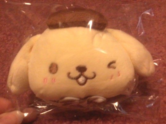
We’re not done with Pompom just yet, but I feel like we’ll get better results this time. This is a Plush Charm featuring Pompompurin wearing a cute chocolate striped bow-tie. It also has a light blue ball chain for easy attachment to your favorite purse, keys, or strap. Then you’ll always have a cute friend by your side~
Rating: ♥ ♥ ♥ ♥ ♥
It’s a simple plush but it’s very sweet. The plush is firm, but soft, especially in the ears, and the quality is good, I notice some very tiny threads but nothing annoying.
I could see putting it on my purse, and I’m sure the Pompompurin fans would find it irresistible.
Yeastken Memo Pad
This item severely bothers me; not because it isn’t cute or anything, but because I feel like I saw it before. I’m not sure if I already have this pad or if I just remember when I first saw it though...
Anyway, Yeastken is an adorable, fluffy dog that resembles a baked loaf of bread. A very cute series for anyone who loves animal - food combinations. Yeastken also has a twitter page apparently.
There was a few different styles of Memo Pad subscribers could get this month, each with a clear cover and 2 different page types, one vertical with lines, the other horizontal (and pink!).
Rating: ♥ ♥ ♥ ♥ ♥
It might be small so you can’t really write down a lot, but for a quick note or memo it’s the perfect size to fit into probably everything from pockets to purses to pouches. The designs are really cute, and I like the 2 different page style feature, not many of the notepads I get do that.
Pokemon Figurine
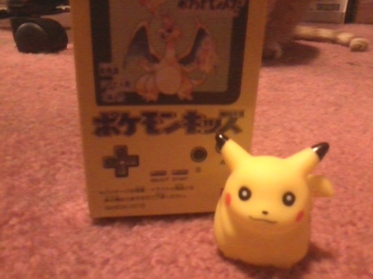
(and a cat in the background :P they always like to interrupt me these days.)
This ones for all the old-school Pokemon fans; myself included. I love all generations of Pokemon, but my very first Pokemon game was Pokemon Yellow (I know its ironic because of how much I hate the color) so this hit the nostalgia button hard. I was little when it came out, and my mom bought me the one that included the special half yellow half blue gameboy with Pokemon images on it that you could get.
I still have it tucked away in my room now, along with all of my other really old Pokemon merchandise~
Anyway, each pack includes 1 of 10 first generation Pokemon (Pikachu, Charizard, Raichu, Eeevee, Gengar, Mewtwo, Metapod, Jigglypuff, Lapras, and Magnemite), a little paper card, and a piece of (ramune) gum; it loses flavor after a minute but I like the chew.
Rating: ♥ ♥ ♥ ♥ ♥
I found it to be very befitting I got Pikachu... although considering I got Let’s Go Eeevee, that would have been acceptable too. I also love how they used the retro Pikachu look, in comparison to his newer, slimmed down look. But both of them are cute, I don’t have a preference. The figure is simple but pretty cute, and the paint job is spot on.
Now the booklet says the figurines are squishy like gumdrops, which is adorable but... I don’t agree. Mine just feels squishy like thin plastic with a big hole in it. It also says the card is corresponding, but I got Gengar, not Pikachu, so I don’t know if that’s an error or if the booklet is wrong. I love Gengar so I got no complaints though.
♥ Cutie Ranking ♥
Content - 4 out of 5. I like all of the items, the quality of each item is really nice, mostly on the simple side but cute. I feel like the practicality is pretty low though, at least for me personally. As much as I love keychains and stickers I don’t always use them, and you can’t do much with a figurine other than display it. The variety was right in the middle on this box.
Theme: 3 out of 5. As simple as the gimmick of this box is, I was left conflicted because it is Valentine’s Day oriented, but it isn’t what I think of when it comes to the holiday. I like how they did that, but at the same time because I love the normal Valentine’s elements I find it a little... too yellow and brown for my taste. They could have easily called this a Chocolate and Pudding themed box because that’s what it makes me think of. In terms of how well they followed their theme I kind of feel like a few of the items were sort of a stretch, but acceptable. Like I can see what they were going for, but they probably could have done better? The Suteki Crate was spot on.
Total Rank: 6 out of 10 Cuties. I really liked the quality of the items, and not counting the theme or practicality I like each of them individually. I had no problem with them, but I was left feeling like I wanted more. I don’t love the box I don’t hate the box, I just feel really conflicted over it as a whole. I would recommend it if you don’t care about the things I listed though, you’re still getting cute quality items.
♥ Cutie Scale ♥
1. Marshmal Park Plushie - Even though I’d have preferred a different animal, I still think my chocolate penguin is very sweet~ I love to squeeze and squish it, and I already got tons of cute names in mind. Maybe Chopengu? Chocopen?
2. Yeastken Memo Pad - I love all the adorable little bread doggies covering it~
3. Chocolate Stickers - They sort of have an elegant look to them, and I love how they’re scented. For the theme I was kind of disappointed that none of the other items were.
4. Pompompurin Plush Keychain - This is way cuter than the socks, and I like its pastel hues. I love how soft his ears are too~
5. Pokemon Figurine - I love the cute packaging and nostalgia from it, but I don’t know, to me the Pikachu I got just looks kind of... unsettling for some reason.
6. Pompompurin Socks - I feel guilty about this for some reason, but I just can’t like these. They barely fit and they make my feet uncomfortable, and they just look muddled to me.
0 notes
Text
Creedy Rambles-
So this is just gonna be a new thing I do on occasion when I can’t focus on drafts or messages, where I’m going to talk about stuff related to TSP, fandoms, tumblr and roleplaying in general. I’ll be tagging these specifically, and they’ll all be under a read more. So if you don’t want to see them, just blacklist the tag.
REGARDING OC’s:
THIS IS NOT MEANT TO OFFEND ANYONE OR THEIR CHARACTER, SIMPLY IT IS TO HELP PEOPLE WHO WANT TO IMPROVE AND EDUCATE PEOPLE ON WHAT IS ORIGINAL IN A CHARACTER AND WHAT ISN’T- BASED OFF OF HOW MANY OTHER PEOPLE DO IT.
Before I start in I’ll quickly identify what an OC is-
OC or Original Character, is a person or entity developed entirely with the creative mind of one person and does not stem from an existing copyright/franchise.
Essentially- it is a being that you made up. You made up their personality, backstory, appearance- all of it. Yes, you probably got inspiration from other places or characters, but it is still your own character. They can be set in a specific game/movie/book or any franchise, or you can make up your own world for them.
Now unfortunately on Tumblr, Oc’s face A LOT of criticism and backlash. Not necessarily because Oc’s are bad.. but because of the stereotype that they’re bad.
And even worse, this stereotype is often very true, in the sense that- people do NOT understand how to make a character.
People make a character, but its not really original. Because it conforms to ALL the stereotypes that other people’s OC’s have. Thus negating its originality in the first-place. Making it ironically an UNoriginal character.
And it kills me, because those Oc’s ruin it for the GOOD Oc’s out there.
I’ve been on Tumblr for only around 2-ish years and I’ve seen HUNDREDS of Oc’s. Some AMAZING and others horrid.
And It hurts me that the good Oc’s aren’t given a chance because of the negative association with stereotypical ‘bad’ oc’s.
Now I bet you’re asking- ‘Creedy, what are some of the things people do that make BAD Oc’s? Surely it can’t be that bad, that people on tumblr sometimes won’t even consider writing with them, right?’
Sadly, that is completely correct.
Disclaimer: Sometimes people won’t write with your OC simply because they don’t like them, and thats THEIR problem. Not yours.
So let me give a quick rundown and reasoning as to what people do that give Oc’s (GENERALLY) a bad name-
1. Mary Sue / Gary Stu
Okay, we’ve all heard these ones. But if you haven’t- A Mary Sue is basically a stereotypical OC with NO FLAWS. She’s often described as ‘smart, pretty, honest, kind, and amazing at everything she does’.. okay.
That is already a HUGE red flag.
And even moreso- the only ‘flaw’ these characters will sometimes have is ‘clumsiness’ or some other attribute that doesn’t directly negatively effect the character’s personality, and is usually used as a trope to get that character closer to what they want... which is NOT what a flaw is supposed to do.
And if you think that your character is somehow unique in spite of all this- the FIRST instance of a Mary Sue goes as far back as 1973. In a Star Trek Fanfiction
Mary Sue stories—the adventures of the youngest and smartest ever person to graduate from the academy and ever get a commission at such a tender age. Usually characterized by unprecedented skill in everything from art to zoology, including karate and arm-wrestling. This character can also be found burrowing her way into the good graces/heart/mind of one of the Big Three [Kirk, Spock, and McCoy], if not all three at once. She saves the day by her wit and ability, and, if we are lucky, has the good grace to die at the end, being grieved by the entire ship.[7]
If your character matches this description, I’m sorry but- they are NOT original. If they’re good at basically everything with no flaws (especially at a younger than normal age) that character is by all means considered a Mary Sue. A Gary Stu just being the male counterpart.
How to fix this:
Now there IS a line in the sand. Your character can be young and good at things, nothing wrong with that. But make sure you add in some flaws such as- ‘unintelligent, rude, brash, liar, insecure, boring, cruel’. And make it so that there are things they hate in the world, and people that hate them. Mary Sues are also often depicted with everyone liking them, but as we all know that is simply not realistic. Create enemies or rivals for your character- or Hell, even someone they just plain dislike.
2. DO NOT COME UP WITH EVERYTHING ON THE SPOT
This^^^ Is important
Do not force your ideas. Do not try and just pull a character out of your ass, because then that character will be shit.
Take your time, no pressure.
You do not have to come up with their favorite color immediately- or even finish their backstory.
Somedays you may like an idea but later on you might realize it was stupid or unfitting, and vice versa.
Be patient and pace yourself
But lets say you’ve already kinda rushed it with your character, no biggie.
How to fix it:
Again, take your time. Don’t immediately go deleting everything you dislike about your character. Put it on the backburner and give it time to boil, slowly but surely- it will come to you.
3. Do not LIST things.
Unfortunately I’m also guilty of this one, as is most Tumblr rpers.
When you make an about page for your character- listing the name, age, birth. Thats okay. But why do it that way when you can show off your writing skills a bit?
And don’t make giant random pointless lists of likes and dislikes. Place them in relevant categories.
How to fix it:
Instead of doing the following:
Likes: Swords, rock, fighting, snow.
Do this:
Aya lives outcast in the snowy tundra nearly 20 miles from the nearest city, but it suits her just fine. The harsh snow is actually quite comforting and she can’t imagine living anywhere else. Additionally she has a fiery passion for sword-play, and practices as often as she can in her own private training room. The adrenaline of fighting keeps her fit and on her toes, and it drives her to do the best she possibly can each day. Aya also has a great taste in music, hard rock to be specific. She enjoys rocking out to AC/DC while battling her training dummy.
Is it a bit long and drawn out? Maybe, but it’ll give that person a better idea on how you write and how descriptive you are. Its not a cookie-cutter sort of process anymore.
4. No Eye-bleeding color schemes.
Dear sweet baby Jesus.
Look, sometimes it works. But a good 99.9% of the time- using every color of the rainbow WILL NOT WORK.
When you do that, it looks like someone crushed the color out of every sharpie that exists and dumped it on your character.
Its not pretty or cute or creative, because everyone has done it and it hurts to look at. Especially if you choose NEON OVER BLACK. You will burn someone’s eyes out, don’t do that.
Here is a basic read-up on Color Theory and some beautiful Color Palettes, to give you an idea.
How to fix it:
Now look, rainbow coloring in itself isn’t bad. But instead of just choosing the brightest colors you can find. Go to google and search for a color palette and use that. A good chunk of canon characters generally have a set of 5-6 colors in the same moodset that they stick to.
Also tacking on this: generally make your character’s clothing simple. Don’t add too many crazy patterns or random hats and glasses and wings and tails just.. unless you can justify it in their backstory properly- stick to a standard set of clothing and then maybe tack on a maximum of 3 accessories. A bracelet, a fancy hairtie and glasses.. okay done! Simple but cute!
5. Do not base that character entirely on a character that already exists (especially if you intend them to be in the same fandom)
It does not take skill or originality to take Elmo and turn him blue and then call him ‘Omle’
That is not an ‘original’ character and its not ‘inspired’ off of Elmo- yet I see people do this all the time.
Now look, this one is hit or miss. Sometimes it works and its cool, but most of the time it doesn’t. Especially if they’re in the same franchise.
Inspiration =/= Copying
How to fix it:
Unfortunately if you’ve done this you may need to make drastic changes with your character. But that doesn’t mean you HAVE to take away everything, you can just add new stuff. A change of clothes, skin color, eye color, maybe body shape, swap out some personality traits and boom- you’ve already got something more original than what you’ve started with!
6. Simple, my God.. simple
Meet Simplicity, no- they’re not an OC. But they’re gonna be your new best friend.
Simplicity is what you need. No over amount of accessories, powers, positive OR negative personality traits. Just a nice SIMPLE amount.
How to fix this:
Again if you’re not comfortable putting your character through drastic changes. Then this won’t be for you. Try and limit yourself with a set number of general stuff about your character. Like top five positive traits, and top five negative traits. Okay-
Compassionate, Goofy, Hilarious, Bubbly, Kind
Airheaded, nervous, panicky, oblivious, naive.
Notice how all of these traits generally have something in common or similar to the ones next to them? That is what a character is supposed to be like. Different enough to be their own thing, but similar enough to still ‘blend’ with that character. They OVERLAP each other.
7. I...I’m not sure what to call this one?
But basically- if your character is lets say.. ‘the sonic oc’. Make sure they look as though they’re from the sonic universe, but also doesn’t look too similar to a character already in that universe.
ALSO DO NOT USE BASES.
Any art you do will be SO MUCH BETTER and IMPROVE YOU SO MUCH MORE than ANY base you use.
Bases are actually proven to make your art skills WORSE.
Here is a POSE sight used to help artists draw, this is better to use.
Disclaimer: Using bases as references is fine. Do not copy it pose-per-pose. But maybe you just want to get a general idea of that character so you look at a base- thats fine. But do not copy it.
How to fix it:
Again you may need to redesign your character if this is the case.
Can’t draw? Thats alright, a detailed description can generally be enough for an OC. And even if you feel like your art sucks, practice makes perfect. I promise you.
8. Fit the personality with the appearance.
A character in a dark hood with circles under his eyes that look soul-crushing probably won’t have the personality of a six year old girl.
When you make a character who has a sad or depressive general mood or personality, match that with colors and clothing articles. Like blue or fluffy sweaters.
Think of the emotions in Pixar’s Inside Out. Their appearance directly correlates to their personality and the emotion they give off. That is what makes them good characters.
How to fix it:
Again, a redesign might be in order.
9. Long V.s Short Backstories
Alright so theres a huge doublestandard on Tumblr that I CANNOT STAND.
On one hand- people reprimand you if your backstory is too short. Alright, fair enough. Its their life story, I’m supposed to make it long and specific right?
WRONG!!!!!!
Because then people will get lazy and not even bother to read your character’s backstory because apparently 7 pages is ‘too much’.
How to fix this:
So, what do?
You make both.
You make a small summary of your character with something like ‘Very brief history’ and then you expand upon it under the summary with a title like ‘detailed/specific history.’ At least that way people can’t piss on you for your story being too short or too long.
10. The stereotypical ‘Tragic backstory’
Okay. I’m guilt of this. I’m SEVERELY guilty of this.
However, a tragic backstory isn’t bad.. as long as there is reason behind it.
When you have a character- having sad or horrible things happen in their life is good. Otherwise they’d just be another Mary Sue. But you don’t want to completely make your character miserable unless they call for it.
Lets say your character is blind- it makes sense that they could’ve had a tragic accident that blinded them.
But if your character was bruised or beaten for...seemingly no reason and it had no effect on them personality wise.. why is it there? What was the point in throwing it into their story?
A smiley, bubbly character who is constantly happy and has nothing wrong with them is not going to have ‘Macbeth’ as their backstory. And vice versa.
How to fix this:
Add happier or brighter moments in their life, intervals where things weren’t so bad. Role models, hobbies and when they learned them. Things like that.
On the other end (if they’re too happy) Add some sad parts. Struggles they’ve had, confrontations they won’t forget etc. etc.
11. Research.
I’m not saying you have to write a book report, but looking up on google about real-world locations, how certain jobs and processes (such as being arrested, giving birth, whatever is relevant to the character/your thread) will do you some good in an rp. And you might learn something!
And this is not meant to offend anyone.
Alright. Now I want to say that yeah- you can get away with some of this stuff. I list things, sometimes my characters are over the top, or their color scheme isn’t great. And people still think the character is good.
But it IS highlighting the things literally EVERYONE ELSE HAS DONE, therefore making these tropes unoriginal and making your character unoriginal. This is meant to give tips on how to make your character more original.
Do you have to change it if you don’t want to? No.
Is your character so awful it’ll make me vomit if you don’t follow these rules? No.
But if you want to improve upon your creativity, these steps will do nothing but HELP you in the long run. I promise!
#[ 📌 :: OOC: ͨʳᵉᵉᵈʸ ʳᵃᵐᵇˡᵉˢ ]#[ 📌 :: OOC: ºᵘᵗ ºf ᵇᵘᵗᵗºⁿˢ ]#((These are my own personal opinions and experiences))#((Although there is joking it is not purposefully poking fun at anyone))#((But it irritates me when bad Oc's make it worse for good Oc's..))#((I will also not judge your character if they have anything considered 'unoriginal' in the oc world. No character is perfect))
8 notes
·
View notes
Text
Project 2: Poster Series

Digital version

Printed version
Brainstorm and First Iterations
This is my second project in Design for Change. The prompt is to create a 3 poster series reflective based on a theme of my choosing. It started with brainstorming about 20 topics from daily life that rubbed me the wrong way. In the image below, it’s obvious that I had a wide range of ideas. At first, my topic was going to be people being on their phones when with other people. I didn’t get too far with this, however, since I have a stronger passion for more environmental and global challenges. So, I went with the topic of deforestation. In Boulder, we are privileged with the ubiquity of trees and nature but we rarely see how we get our products that are made from trees. It’s important to keep in mind that our procurement, use, and disposal of paper are all significant actions.

My first iterations of this project all had a similar theme of “destroying mother earth”. I was also compelled to make my three posters go together with cohesive imagery that followed through each poster instead of doing individual images for each. My initial idea was to take the shape of a woman laying down and incorporate mountains and forests into her shape. There are also text pieces to this project. While I didn’t have it all hashed out in this stage, I went with Peace, Love and Joy as my titles to juxtapose the message. Below are samples of this phase.

After presenting the first phase of my project and seeing it printed out, I realized that the “Mother Earth” idea was creative in concept, but it threw me off in practicality. A poster needs to be instantly compelling in order to be effective and this image just took too much away from the message. Also, the play on “Peace Love Joy” didn’t go over well. With this feedback, I had a renewed sense of creativity. I didn’t have to stick with this idea just because I had already pursued it. Some designs just need to be scrapped so I detached myself from this one.
Final Design
In one of our classes, we learned about early styles of design like Russian Constructivism.

Russian Contructivism
These designs made heavy use of strong diagonals and a limited color palette. They weren’t afraid to use bold text and thick lines. My design style tends on the side of delicate forms and soft tones, so I saw this other style as a challenge to pursue and a valuable tool in graphically constructing my message. I took a simple triangle and created a wood texture to overlay it and encourage the feeling of a splinter. I used a monochromatic scheme of a woody orange. The black is really dark orange and the white is really light orange. Doves represent peace, but the dove on my poster is fleeing its home. The cow head in the second poster is mostly a eye-catcher and the upside-down tree in the last poster represents a diseased lung.
Instead of keeping “Peace Love Joy” as my juxtaposing text, I switched it up to “Peace Love Destroy” to really emphasize the destruction of the earth and its resources. For my supporting text, I gave three different blips about deforestation, three immediate actions we can take, and three supporting websites. Initially I didn’t have the calls for immediate action, but these small actions can create a lot of change which is really the point of the poster.
Distribution
I went to campus for my distribution. As students, we go through tons of notebook paper, computer paper, paper towels, etc every year. It matters where that paper comes from, how well it’s used, and how it’s disposed of. I posted a couple of series in high traffic areas. These places don’t necessarily have to do with deforestation, but a lot of people will see it. One was at a bus stop and the other was on a poster wall on campus. I made sure that as many of my series faced South-ish so that the light would hit them.


Although the posters are meant to be viewed together, I thought it’d be interesting to split them up for one series. The first poster has a call to action (CTA) to reduce paper towel use, so I put on the inside of a bathroom stall. If I put it above the paper towels, it may have been taken down right away. The second CTA is to reduce red meat consumption and I put this poster up in a dining hall. The last one simply state to recycle so I put this one on a paper recycling bin outside. Initially I wanted to put the last poster on one of the oldest trees on campus, but tape doesn’t really stick to trees. The designs surprisingly made sense by themselves.


I decided to experiment with my last series. I found 3 consecutive pillars with a paper recycling next to the last one. Each poster had its own pillar and could be read as someone is walking.

Reflection
I’m overall proud of my final design. It was difficult to stretch beyond my typical design style but it’s important to practice that. Thinking about the composition between 3 posters was also a valuable experience. It’s much different than a single poster series, website, or booklet.
The most difficult part of this project was picking a topic. At first I wanted to pursue misuse of phones in social situations, then I wanted to do a man missing his dog’s life because he was always working, then I wanted to do a compilation of multiple environmental topics. It was too much to try to pursue many topics in one series. I knew I needed to narrow it down, but it was difficult. I ended up forcing myself to stick with deforestation because Boulder is surrounded by trees.
Once I picked my topic, figuring out what to say and how to say it was difficult. There is so much I’ve learned about deforestation that I wanted to share, but had little room to do so. My blips of info will hopefully spark curiosity and encourage people to learn more about the cattle industry, where paper comes from, why recycling is important, and how to take small steps to create a ripple effect.
0 notes