#trying the csp toning stuff for the first time
Explore tagged Tumblr posts
Text
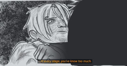

what if uhm what if zosan were in tenet?
#brahhhdfbghsfkbj#trying the csp toning stuff for the first time#i might delete this and this is like soo self indulgent no one gaf#but yesshhahahhehahheh#protag zoro neil sanji#nami ives too#my art#drawing#fanart#one piece#roronoa zoro#sanji#tenet#zosan#can i add#protagoneil
87 notes
·
View notes
Text
thought i’d make a post showing/teaching my animation process for my most recent finished project!!! animation is really fun, it’s my absolute favorite form of art in the world and i love sharing how i approach it! without further ado, let’s get into it!
1. roughs

the goal here is to establish the big things in the animation. what are the main movements? what is the timing? what’s the general layout of the space the animation is occurring in? in my roughs, i like to use multiple colors to keep things separate and clear. you should also not be focusing on the details either!!! you are trying to get the most basic, fundamental forms down and moving before adding ANY detail. trust me, no artist on earth can crank out a finished animation without first taking this messy, less-than-pretty step.
2. tie downs

at this point, once the movement is down, you can start adding more details and clarifying things. in the tie down stage, you’re refining things— medium details, faces, character clothing, etc. you’re not trying to make it super clean. THIS IS SO IMPORTANT DO NOT TRY TO MAKE A CLEAN ANIMATION STRAIGHT OFF OF THE ROUGHS YOU WILL MAKE MISTAKES THAT ARE INSANELY ANNOYING TO FIX THAT LATE IN THE PROCESS!!! worry about perfect cleanliness in the next step!
3. final lines/cleanup

NOW i start worrying about how clean i want it to be. this stage sucks i am not going to lie. it is tedious and slow and agonizing because every single line has to move in a way that makes sense. DO NOT JUST INK OVER THE TIE DOWNS. if you do that it will look terrible and wobbly. you have to make sure everything is on model, that forms and lines move in a way that makes sense, and that there is no jitter or “sticking” (happens when lines are drawn over lines from the previous frame, which makes the line appear to “stick” in place). additionally, you’ll notice the red lines— these are color separation lines that will not be visible in the final animation. i use these for sappha’s stripes and hair highlights, as well as her two-tone irises. while not visible here, there is also a separate animation layer for final shadows.
4. coloring
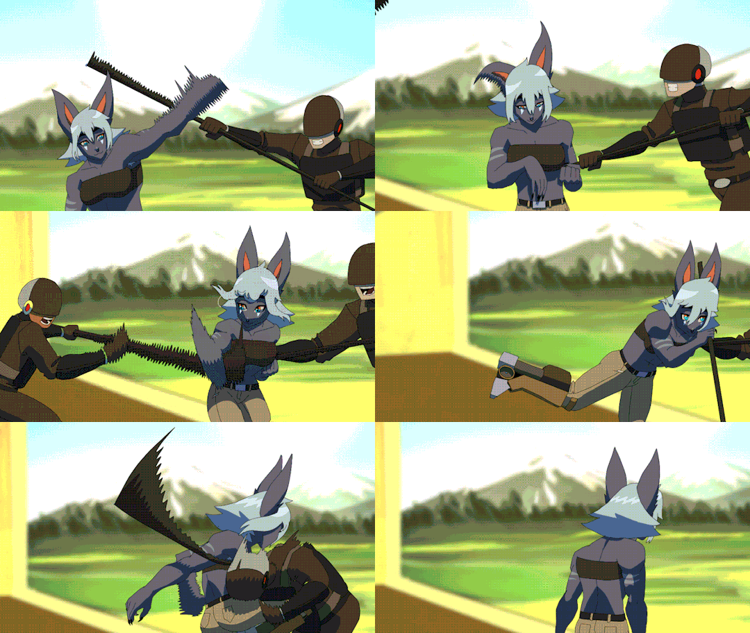
and then comes color!! I do my cleanup and coloring in clip studio paint. If you’ve done everything correctly and there’s no gaps between lines, CSP’s fill tool will allow you to pretty quickly and easily fill your cleaned up animation. for this animation, i also threw together a shitty messy background in about 20 minutes and then gaussian blurred it (im not good at painting lol).
5. compositing

once the coloring is done, i move into my fully legal copy of After Effects, and begin compositing. this entails taking the animation elements (cels, backgrounds, etc) and combining them, color grading them, and adding effects like blurs, gradients, and light bleed. your two most important effects in AE are fast box blur and gradient ramp— honestly, you don’t need much more than those two to make a well-composited animation (besides some color stuff like gamma/pedestal/gain). once that’s done, i export it as an MP4 and a PNG sequence, import the sequence into CSP or Toonsquid (my favorite animation app for the ipad), and then use that to export a gif of my final animation!
and that concludes the most basic rundown i can give without writing wayyy too much. if you’ve got any specific questions, please hit up my inbox, i love talking about art and animation with people interested in learning!
24 notes
·
View notes
Note
Nudges you
Hi I love your work your colours are so. Colourful. It makes my brain tickle in a good way
Okay onto questions!!!!
one: where the hell did you get the references slash ability to draw iron man mech suits. like. if you just doodled that in a meeting??? what????? you didn’t have a reference???????
second question: what brushes do you use?
third question: how you anatomy (good grammar yes)
ok thank you goodbye have a. Lovely day
lkdfghlkdjfhlgkj hey THANK YOU YOU'RE VERY SWEET i did look at him to see what he looked like first, but mark 1's all rectangles and messy bits he's very nice to draw!!! i highly recommend it. clunky little guy
all other iron man suits i learned to draw by simply drawing iron man 1000 times. i learned to draw in general by drawing iron man i love him very much :) but looking up pictures of hot toys figures/those cool model kits of the suits is super helpful for refs! nice clear shots and fun poses.
secret: my art is very easy. here are all of the base colours i use

taken from an old timey comics colouring guide palette thing because i love old timey comics and i hate colouring <3 for skin tones/shading i'm usually adding overlays and fiddling with the colour wheel though
for that iron man, i used the "real g-pen" brush that comes with clip studio paint; for most of my other art i use this little dude that i made!
I colour with the default "milli pen" brush that also comes with CSP, and then the speckle shading stuff is with. the tone scraping thing in the airbrush tool that also comes with CSP......tone scraper my beloved how would i get through the day without it......
anatomy is really hard and i am constantly fighting for my life, glad it's looking successful i will tell you when i figure it out lkdfjhgkj i try to do studies breaking bodies down into shapes but gosh people are just shaped so weird. iron man suits are easier. let's just draw iron man suits
have a lovely day!! 💛❤️
#i use like 3 tools i am very tired i make things easy for myself :)#how did i draw him: gazed at him lovingly while my boss was talking until he was scanned into my mind & then drew him :)
27 notes
·
View notes
Note
hi i just saw your art for the first time and i am blown away by how beautiful your coloring style is! if you don't mind me asking, how did you get that dithering/halftone effect to look so good? fantastic stuff, keep up the good work! :D
Thank you so much!!! I'll just show my process in clip studio, but the general method is applicable in any program!
What helps to give it a more unique look is to change the blending more of the layer with the halftone, and experiment with textured brushes to apply it. I use a darker base color and turn my halftone layer to glow dodge to bring out highlights:

This works the best with csp tone layers- editing layer information will manipulate the size and density of the halftone (e.g, lowering the opacity = smaller dots). Halftone brushes are useful for adding colored halftones quickly- however, these textures are rasterized and not editable in the same way. Coloring a tone layer takes extra steps but you can draw on them with any brush, and you can adjust the tone size/density/shape at any time!

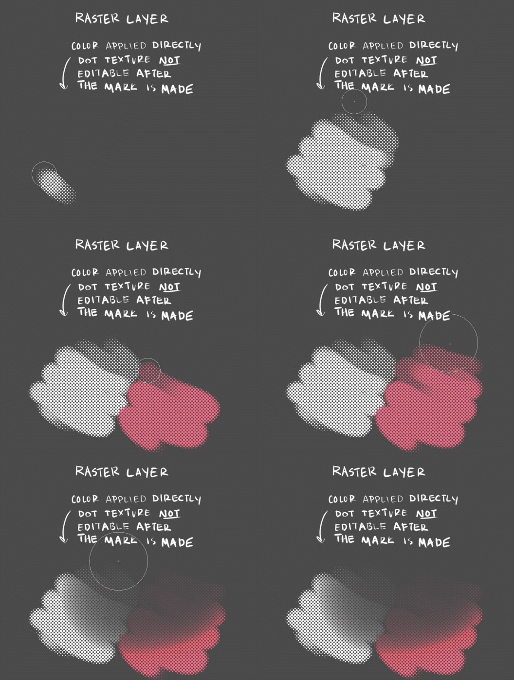
I personally use both methods depending on the circumstance. Try out different brushes, blending modes, and colors for different effects!
This is just how I've been doing it, not a perfect process by any means... regardless, i hope this helps!!
184 notes
·
View notes
Note
hi!! Your art is incredible and awesome... not sure how to say it otherwise but it's super tasty looking lol 🫶
I was wondering if you have ever posted what brushes do you use ? I am always on the lookout for nice brushes! Also if you've got any tips for inking, I'd appreciate it enormously. No worries if not! 💕
hi, thanks so much!
i mostly just use whatever defaults came with clip studio paint. for inking, my go-to is the the default marker pen brush (under the marker tab in pens), but sometimes i'll swap to the calligraphy one (should be in the pen tab), or this brush but with the pen pressure turned off. just depends on how i'm feeling about whatever i'm inking. when i want to add some texturing when toning, i use stuff like the spray or diagonal line brushes (again, should be included in CSP), i just make an eraser version of them so i can also use them on layer masks.
as for inking tips ... i don't have any hard and fast "always do x for y" advice but i rambled a little about how i approach it.
this first point is actually pretty straightforward, it's just to look at inking techniques by artists you like, think about what makes them work so well in their context, and try them out for yourself. this isn't about plagiarizing art styles but more about understanding how other artists choose to stylize certain things in their work, and seeing what works and what doesn't for you personally. sometimes it's through looking at other people's stylizations that you get a better understanding of how you want to approach translating this actual 3d object (people, clothes, background details, whatever) into your own art as well. as you try out various techniques, maybe you find that some of them work well with your own style, and some of them don't and you stop incorporating those. it's all a constant work in progress. over time you can adjust how you use them in a way that fits your own drawing methods and workflows and they just start to come more naturally to you. of course, they may and should change a lot along the way because now it's something that's part of your own style. work on developing a good eye for these things and be thoughtful about what you want to convey and how.
just as an example, daiya no ace by terajima yuji definitely has to be up there for me in terms of influences, the way he approached body lines and clothing folds as a way to convey movement and posing made a lightbulb turn on in my head back when i was still reading it.

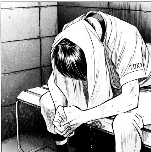
not a comprehensive list, but other manga i just like looking at off the top of my head - rookies (morita masanori), anything by yamashita tomoko but i really recommend the night beyond the tricornered window for something that's easily accessible, anything by asada nemui (please check for content warnings for their works first though!), all-rounder meguru (endo hiroki), urasawa naoki's works, dungeon meshi (kui ryoko), witch hat atelier (shirahama kamome), yotsuba&! (azuma kiyohiko), a bride's story (mori kaoru), i recollect love (moegi yukue), the later works of tojitsuki hajime (unfortunately a lot of is now out of print and not accessible online but i managed to get all their books bc their commitment to crosshatching shaved heads each time impressed me so much LMAOSJDsd) etc, etc.
this second thing is much vaguer and harder to quantify but ... honestly just draw a lot and see what feels good to your hand. inking and art styles in general are fluid things. so much of what inking comes down to, to me, is just drawing the lines that in a way that feels good to me. that only really comes from doing it a lot (not saying i'm a hardcore artist or anything lol just that i've been drawing on and off for a while now) and, well, getting a sense of what you like doing. sometimes you might look at a detail you finished that looks really good but feels like a happy accident, and it kinda is, but it's also just as much of the things you've internalized over time. combining the first point (developing your eye and a sense of thoughtfulness about inking) and the second (getting experience through developing your muscle memory) is basically it.
idk if any of this made sense lol but hope some of it helps!!!!!
31 notes
·
View notes
Note
would you be willing to make a tutorial, vid/ speed paint or step by step, on how you color? i'd love to know how you approach coloring, b&w or in color! you don't even have to explain, of that's difficult, i'd just like to see how you color & if you use multiple layers. or if you have any tips/ tricks for CSP or procreate? sorry, trying to study your art since i really love how you draw & color all of your pieces. ;w;
thank you so much 🥺💕 I actually share step by steps and videos over on my patreon but ive wanted to make a speedpaint video for some time now!! Since I haven’t been finishing any illustrations lately i don’t have anything new but!! I can share some old stuff below:
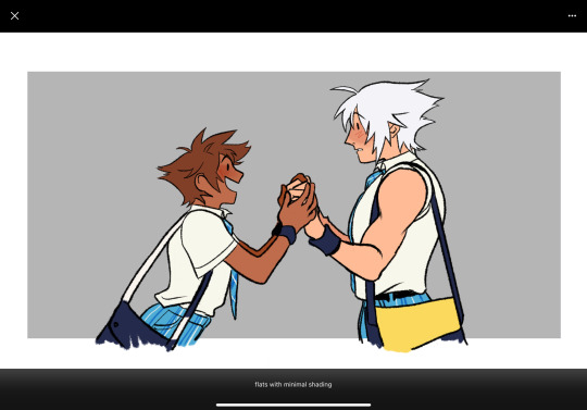
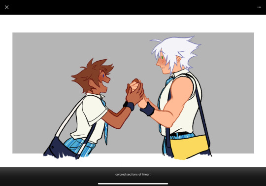
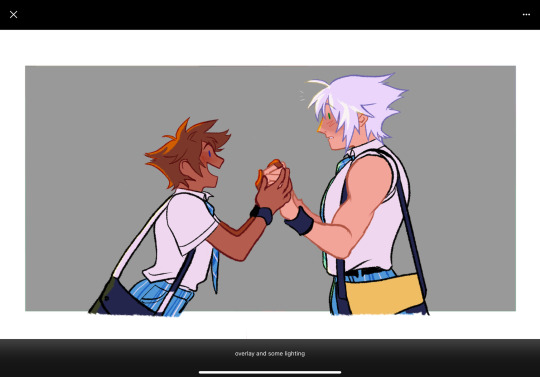

While i tend to change things up depending on the piece, I do tend to follow certain steps. If it’s line art, i’ll sketch -> lineart -> block colors -> shade -> usually multiply a cool tone -> add color accents on top of that and if i do a more flats heavy piece it’s basically the same minus the line art.
I tend to (try) to approach stuff with values first so i usually go for greyscale, maybe a gradient map (i’m trying to figure these out lol) and then mess with colors after

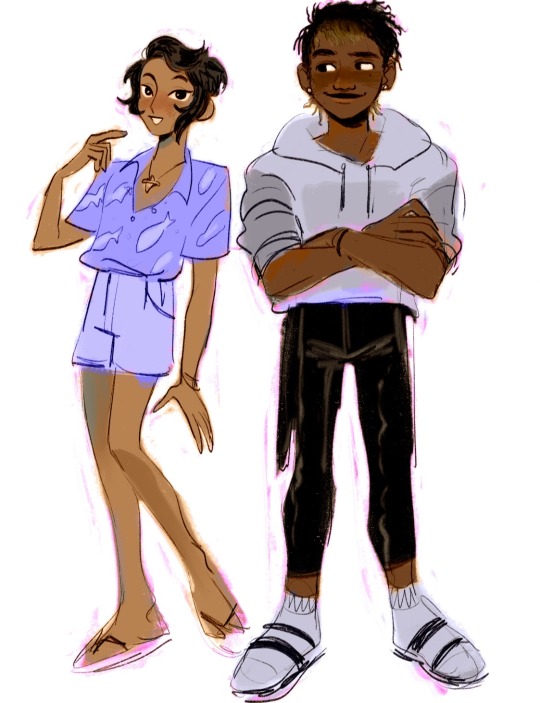

sometimes that leaves things more saturated or a little flat and it really depends on what i’m going for.
I do the same for when i block colors in first.


I feel that i’ve actually been struggling with trying to get my colors just right recently but! I do try to think about how i can improve them when i’m working. For example, having warm vs cool tones to create focal points. Trying to keep palettes cohesive so there’s only one or two accent colors. I also like to add pops of complimentary colors to line art/accent spots to bring more attention to them. At the end of the day I kind of just… do things at random though and it’s all about working with a piece until it just feels right. Sorry the information is a bit more vague then anything but studying other artists is a thing I do a lot, as well as just doing general studies! It helps teach your eye what colors go together, why you like certain color combos, and how to focus on the shapes more than anything 👍
Also here’s a time-lapse if you’d like to take a look! There’s a lot of flashing at the end as I swap through colors so be warned but! the general gist of my workflow
hopefully that at least answers a question or two but if you have more feel free to ask! thanks for reaching out !!!
19 notes
·
View notes
Photo

Okay so I generally have two styles for doing shaded stuff Painted and then my “holographic sticker” style with the dots and that one swishy dotty gradient pen. This is for my painted style!!! Long story short here’s a tutorial on how I do that for some friends on discord hehe.

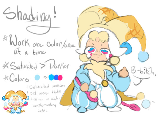
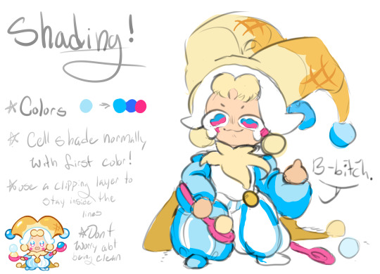
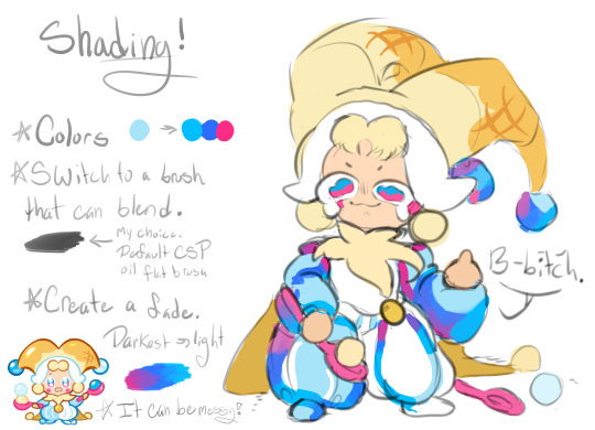
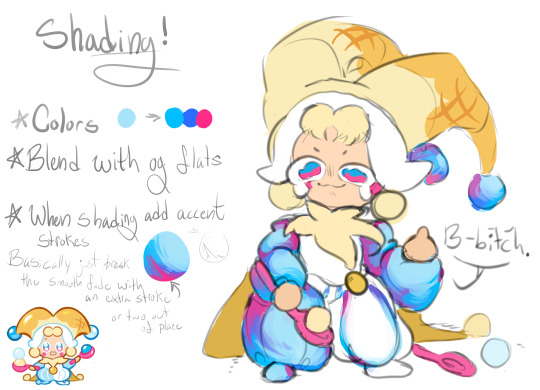


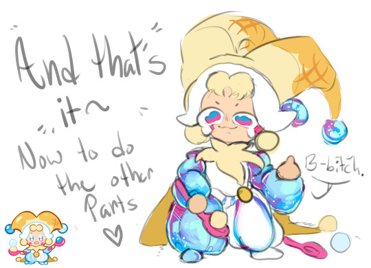
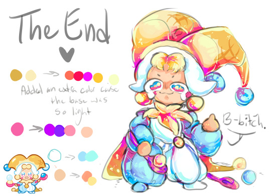
AND TADAAAAAA THATS HOW I DO IT~~ cant read my absolutely ADDHORENT handwriting? No worries!!!! Captions/Transcript + some extra notes below !!!
TRANSCRIPT! Step 1: Lay down your flat colors! I always color drop everything to make sure its as close as possible. The only time I don’t color drop is if I’m adjusting a red to a more pinkish color!
Step 2: Shading time! The first step is to choose what color you want to work with!! Remember that when you’re shading that SATURATED IS BETTER. Don’t darken the color unless you really need to. Just make it more saturated and/or cooler. Cooler colors are darker than warm tones. So if you need to adjust go saturated - cooler - and then lastly darker if needed!! For the sake of the tutorial make 3 colors.
The first one a saturated color / A DARKER saturated color / a complimentary or contrasting color. This is our lightest to darkest scale!
To start off take your first color and cell shade ONE FLAT COLOR or SECTION with it!!!! Do NOT use this for the ENTIRE drawing!! Work in pieces!!!
Step 3: Add a gradient to that cell shade~~ So you just used 1/3 colors to cell shade with. Now take your other two colors and create a gradient with it!!! You’ll want a blendable brush for this. I like CSP’s oil flat brush! Make sure your contrasting color is in the darkest spots! Step 4: Blend with the flat color bordering your cell shade!! AKA just make the border that meets the cell shade softer.
Honestly, dont worry about making it clean. Really all you need to do is take a few strokes of the flat color and put it into the cell shade a little and youre good to go. I like doing little dashes. Also when you do this feel free to take that yummy contrasting color and make it bleed up towards the lighter color!! It’s not accurate with like how shading works or whatever, but it looks super fucking cool.
Step 5: Highlights!! Its time to add some highlights!! Basic rule for highlights.
Warm flat color = cool toned highlight!
Cool flat color = warm toned highlight!
Literally just put this color anywhere you want a shine and then take that color and OUTLINE the cell shade like riiiiiight up against the lineart. Trace your lineart with this color where its darkest basically. This counts as your “backlighting” and all that nonsense, but more importantly it just looks cool. If your highlight is too bright for the shadows you can also outline with your flat color!!
Step 6: Details!! Add sparkles and shit. I also like little lines. Draw diamonds, fish, stars, planets, flowers, etc etc. Whatever the fuck you want! I use the highlight color or I use a slightly lighter version of it to do this Aaaaand youre done!!!!!
I don’t do all of these in this order obviously, usually I wait until I do EVERYTHING with cell shading before I add my highlights and details, but for the sake of doing one section of the tutorial I figured it would be easier to see how its done. If you wanna try drawing this way just know that with time you dont need to plan out your colors and eventually youll just know what to do as you go along and you’ll probably jump around a bunch.
My tips are make it messy, have fun with it, dont worry about all the little details until the very END (i.e lines or patterns on the clothes. You’ll just cover it up otherwise), and feel free to fuck with your glorified cell shade as much as you want!!!
Dont over think it either~ Its literally just a cell shade with a gradient + highlights that outline the lineart where its darkest. Thats alllll it is~
Hope this helped and have fun drawing guyssssss
#im actually shit at drawing tutorials#but i hope this explained some of it lmfao#if this made even a little sense ill be happy#art tutorial#shading#my art#cookie run#lmao tagging that anyways
166 notes
·
View notes
Note
hello! do you have any advice for switching from traditional art to digital? (i recently ran out of supplies so im relegated to my computer lol) i hope youre having a good day!
i sure do!
first off i really recommend clip studio paint, but i also recommend u wait for it to go on sale. it goes 50% off a few times a year, so imo it’s worth waiting, but it also is usually on sale for only a few days so u have to stay on top of it. they usually announce on twitter etc. the tools don’t make the artist and obviously it doesn’t Really matter what program u end up settling on, i’ve just been really pleased with CSP and i wanted to recommend it
second: nothing that u can do with digital art programs/tools is cheating and it took me way too long to really internalize + understand that. copy-pasting stuff instead of redrawing it, using symmetry rulers, using transform/ctrl+T to stretch or squash slightly off anatomy instead of starting over -- when i was first getting into digital i A. didn’t know u could do this stuff and B. felt weirdly guilty doing it once i figured it out, as if i was a worse artist for using the tools that are literally built into the software or that it was lazy or dishonest to do so. that, it turns out, is bullshit. any drawing is just a constant series of decision-making and a lot of digital tools just help u make or retract or edit those decisions faster than traditional does. it’s not better or worse, it’s just different, and it’s worth ur time to figure out which of those differences are the most convenient and useful. this stuff exists for a reason! use it! save ur wrists and ur patience and ur time!
figure out file organization early, because it’s something u don’t have to deal with irt traditional art and so it probably won’t come naturally, but it also makes ur life harder to have a desktop swarming with wip files that are all titled “kjsrhrfgdhgj.psd” or whatever. some ppl sort into folders by date; for me it works better to sort by content (i.e. i have folders for tvrn stuff, patreon stuff, different fandoms, dnd/ttrpg stuff, “misc ocs” for characters i don’t draw much and “misc fandoms” for one-off fanart that doesn’t merit its own folder, etc etc; this is what makes it easiest for me to find stuff, but ur system might end up different.) i admittedly still name my files keysmashes if it’s personal stuff rather than work/commissions, but at least it’s all sorted into a category where i can quickly find it again anyway
also, u can hybridize traditional and digital! i frequently like my traditional pencil lines better than what i can do digitally, so i often scan them in, turn them into lineart, and color digitally (here’s a tutorial on how i prep that). but even if u don’t have a scanner, a carefully taken phone photo with high contrast can still be used the same way. i tend to lay my sketchbook flat on the floor in front of a window, squat down and hold my phone as level as i can while i’m taking the pic, and then i blast it in my phone’s built in gallery editor (highlights/shadows and contrast) before sending it to myself and doing the same thing w tone curve/levels in csp. it’s not perfect, but it’s presentable, and it can be a good way to ease urself in if ur feeling frustrated w the learning curve on digital draftsmanship.
oh, and this tip is really small but it’s ended up being rly helpful for me: resist the urge to zoom in way past 100% scale view just bc u can. if there are times where u absolutely need to, sure, whatever, but there’s no point in regularly tweaking tiny things pixel by pixel at 250% zoom bc nobody who looks at ur art is gonna see that and ur just bloating ur own time spent on things and creating unnecessary stress for urself!! if 100% zoom doesn’t give u the control u want, that may just mean u need to work larger to begin with.
set up a comfortable workspace with a Good chair. look up proper posture and try to stick to it. i know we’re all gay and it sucks to sit in a chair properly but otherwise ur gonna hurt urself. take even more frequent breaks than u do when drawing traditionally! screen bad!
also, if ur tablet has a way to calibrate pressure, try that out. a lot of them are set in a way where you have to press really hard to get full line width and over time it can really seriously strain ur wrist; u can’t manually set pressure in traditional tools (besides like. using softer lead i guess lmfao) but u can with tablet pens and u should try it, bc if u can use a lighter touch overall it really goes a long way towards preventing injury in the long term.
this is all the stuff that came to mind immediately; i’m sure there are tons of basics i haven’t covered, depending on how much of a transition this is for u, but there are a lot of tutorials out there written by ppl more patient and more educationally-oriented than myself so you’d be doing a better service to urself seeking those out than if i were to try to clumsily emulate them lol. good luck + have fun!
221 notes
·
View notes
Note
hi!!! i really like your art,, and i was wondering if you had any tips for digital art??
Thank you!!
This is gonna be so scatterbrained so I'm sorry in advance, I'm bad at advice stuffs hnnng
The key to digital art in my opinion is to understand the basics of your program! I work in Clip Studio Paint which is an absolutely FANTASTIC program that has many different settings and panels that can be kinda overwhelming at first, but are super fun when you get to know them. (It's also a paid program but it's a one time payment and they do sales pretty often so keep your eye out). I suggest looking up basic begginers tutorials on YouTube for whatever program you use, there are soooo many out there for all kinds of artists.
I also think experimenting with all brushes available to you is super important too! CSP's asset store has a lot of free brushes and sets you can download and experiment with! Most of the brushes I use come from the CSP asset store (and were completely free hell yeah). If you have CSP and wanna try out my go-to brushes my main few are:
ID 1833521 for line art and flat shading
ID 1835931 for tone dot shading and other fun screentone elements (I usually just use the basic tone dot brush from this set but the others in it are pretty cool too)
ID 1846662 which is a set of a whole bunch of super cute shape scatter brushes (they have stars, hearts, ribbons, triangles, flowers and other fun shapes which I find add life to more boring backgrounds)
ID 1764984 not a brush but I use this auto-action religiously. It can add a lot more contrast to your work and give it a glowy vibe
ID 1751433 again, not a brush, but this is what I use to get that tv-screen rgb shift effect... it's funky
I really suggest you look around and see what's best for you!!
For me personally though, I find using hard-edge bumpy brushes to be the most helpful for me. I use the airbrush and other softer tools more sparringly cuz I feel like if I go crazy with them my art feels kinda unfocused and muddy.
Also filters!! Gotta love messing around with effects layers and auto-actions. Slapping a pink overlay layer at 10% over your art can really unify a piece sometimes haha
Another thing that helps me with digital art is to still keep up with traditional art actually. I usually keep a sketchbook for doodles and experimentation which is a lot less stressful than opening up an art program and thinking you gotta make something fancy cuz you have access to all the tools available. A lot of people tend to line or paint over their traditional sketches digitally as well which helps with that too!!
Again, this is kinda all over the place, but I hope it helps!! If you have any more questions, feel free to ask! Artists gotta support each other!!!
6 notes
·
View notes
Note
Heya Cranberry, Love your Work I've been following your art for quite a while now on DeviantArt and I'm about to start working on comic paneling on an OCT I'm in and im a lil rusty on comic makin, I notice you use CSP as I do but I was curious about the resolution you were using in your SCOCT rounds (im using 600dpi I think and I was unsure if that was an appropriate amount to use at 800x10k) as well as if you were using the G-pen for your line art bc i really like how smooth your linework was!
Hiya! Thank you!
Usually one would use 600dpi for black and white comics for smoother lines and tones (and especially if you later want to print it, bw needs higher than colour for some reason I’ve heard),
but for my SCOCT stuff I have been using 350 or 300 because I want to keep the file size smaller and load/save times fast! It helps me not focus too much on small details when theres no time for that during OCTs, as well.
Another thing to note is that at 600dpi, some of your more textured brushes tend to lose a lot of their textured look!! (And brush sizes become naturally smaller looking on the canvas). It can be weird to get used to compared to other resolutions you may be used to.
To line I have been using this Trisketched ink brush [ https://trisketched.gumroad.com/l/MMuOF ] , and all I’ve changed is just customising the settings a bit to suit the way I hold/move my pen. The lines probably appear smooth because I resize my pages down after they are finished, but close up they are a little rough haha.
As a final note, I did put a lot of effort into my lines, but I cannot recommend always doing that during such short OCT deadlines. I hurt my wrist/shoulders doing that in my last round bc I had a lot of pages. (Luckily the break between rounds, and results to matchups, was long enough for me to recover)
The OCT I’m in doesn’t actually require you to have polished work (i just got carried away), so next time I’m going to try be more sensible and find a balanced way to have readable sketches. Remember to put your health first, even though its easy to get super excited during any projects like this! It isn’t worth inadvertently getting injured!
I hope this answer helped some! Im a little sleepy so hopefully I covered everything haha! And have fun making comics!!!
8 notes
·
View notes
Note
you randomly made me remember you when randomly liking stuff i rbed! had to say the way you paint is SO GOOD! inspiring even and making me want to return to my older projects to continue proper painting in digital! if you have any tips, can i have some please? if not, that is okay. i hope you have a nice day!
Oh my, thank you so so much for this! I’m all flustered haha!
Glad to hear you’re returning to trying digital painting, I gurantee it’s the most fun one can have with working digitally (at least..for me)..
I’m probably not the best person to give out tips due to me forgetting to use my own rules from time to time, but there are three things that come to mind that have helped me to get better!
1. Inspiration/references. While yes, refs for drawing are important, what I mean by this is that I look at how other people paint. At one point I was super inspired by this cheesy and colorful fantasy artstyle so when I didn’t draw, I was looking at how people with that style did! Then when I try out to replicate say for example the way someone does rim light it can help me understand how I want to do rim lighting in future….if that makes sense.
2. Brushes. Really depends on what look you want for the painting, but getting to know what you can achieve with what brushes can set the tone. There are some great brush packs I can recommend for photoshop (they should work for CSP too) such as Kyle T Webster’s watercolor pack (I use Fat brush a lot), Iben Krutt’s traditional media brush pack and Jens Cleassen’s brush packs. These brushes are great for very textured painterly style! However, the greatest discovery that made me level up with my digital painting was that sometimes the defaut round brush is the best way to go. Nowadays I do 90% of my stuff with it, and use other brushes for specific things!
3. B&W. Well, this is just a helpful way to prepping honestly! If I’m doing a bigger piece especially, i like to do the initial phases of the painting in black and white first. This means sketch paint, quick refining, mapping out lighting and big shadow areas etc. It helps to piece out work with lots of elements in it when you don’t have to worry about colour at all! I wish I had done this all the time when I started out…
+4 do what feels best for you! If something everyone else does just doesn’t suit you, don’t force yourself. I for example couldn’t do comprehensible sketches for the life of me so I just stopped and started painting process right away! Now years later I’ve started to learn how to sketch properly and it’s fun! Also, I can’t do cleans lines, never have…. soooo…I don’t. If you see lines in my works, it’s something I do as last touch up after painting to make some parts pop out etc. Maybe one day I will learn, but right now I rather skip the hassle..
#ask#long ramble#lol sorry I’m bad at expressing myself so it just becomes wall of text#i hope these tips can give some ideas at least#also wow what a compliment…#to ask little ol me stuff like this#makes me super super happy ahhhh ty ty#<3
3 notes
·
View notes
Text
• General art advice/ how to get started in digital painting •

First of all, thank you for the ask and the opportunity to spread some tips regarding how I got started in digital art and how I learned. Please note that I don’t consider myself a professional, this is just pure self-taught “skill” I gathered over the years. Let’s get started!
1. Your canvas and settings (I will use Photoshop CC as an example because it’s the industry norm for digital art and that’s what I use daily). • Sketch and lay out your drawing on a slightly gray/darker canvas so you don’t hurt your eyes! Staring on a white background for a long time tires you out and gives you headaches. • If you plan on drawing a portrait or human, use a brown/dark reddish color to sketch out the shapes on a separate layer, so it’s easier blendable with the skin tone later on and you won’t have black spots. If you established a base tone for your portrait, use “Overlay” or “Multiply” on the sketch layer to blend in the sketch. This is a method I use very often for quick portraits. • Size your canvas appropriately: I used to draw on 72 DPI which was fine for smaller applications/emotes but as soon as I started posting stuff online or sent it out for printing, the needed size is 300-450 DPI. Brushes will show up differently as well depending on your canvas size. Remember: It’s much easier to size your canvas down than to enlarge it once you’ve finished a drawing. 2. Drawing & learning • Besides learning anatomy and the structure of the face, I wanted to share some tips regarding values and shading since that’s a topic I struggle most with. Also, there are plenty videos on how to draw anatomy and how to simplify a face on Youtube! (My favorite art teachers on youtube are Marc Brunet, Atey Ghailan, Adam Duff and Ahmed Aldoori). • Refrain from watching too many speed paint videos, rather watch in depth lessons in real time and draw alongside with them! • Before you start with color, learn how to use values. The easiest way to do that is by drawing only in black & white.
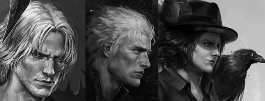
• Doing fan art to learn anatomy, values or color is great! My obsession with white haired video game characters (*looks at Vergil & Dante*) got me started in digital art. • DO NOT BE AFRAID to experiment, to fail or to try again. • Also don’t delete any of your sketches, old drawings, they are all beautiful and one day you will go back and see how much you’ve progressed even if it’s just one tiny aspect like a button or a certain shape. • DO NOT overload yourself with learning EVERYTHING at once. You cannot master them all. Focus on one thing and split it up into groups. For example: You want to learn how to draw humans more realistically. Pick one part of the human body, e. g. the face. Focus on that. Now, you have to pick again. What do you want to learn/need to improve about the face? Maybe it’s the nose or the eyes, and then you solely focus on that. This way, you will train your brain to memorize the shapes. • Nobody expects you to draw perfectly! Improve for yourself instead for others. • Something that probably many others have told you: Just draw. The more you use a skill, the better you get at it. It’s like a video game in that sense lol.
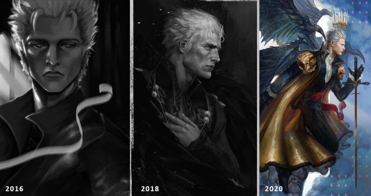
3. Technical equipment • I use a Wacom Intuos Pro M tablet and for a few weeks now I’ve been practicing with a Wacom Cintiq 24 Pro. Both tablets are great. Cintiq is a display tablet which allows you to directly draw on the screen. The biggest difference for me tho is the price. In my personal experience, it doesn’t matter if you have a display tablet or not. It’s all about the brain/hand coordination anyway. • Photoshop is annoying with its monthly payment, but it is the digital art industry standard program. Some professionals also use Clip Studio Paint, which is also a great option! I’m currently learning how to set up CSP properly so I can make the transition one day. • Make sure your monitors are calibrated correctly! That will impact the values, colors and overall look of your drawings. I used to draw a lot darker because I messed with my monitor’s brightness too much. Also google for gamma tests, they are pretty useful and very simple to apply. Hope this helps a bit. If you have any specific questions, let me know. ♥
312 notes
·
View notes
Text
Interview with AlvhOmega
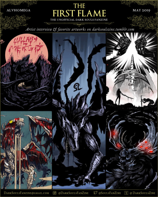
Today we interview AlvhOmega! One of our contributors in THE FIRST FLAME.

Q: How did you get into making art and for how long have you been doing it?
If I’m not wrong, I’ve been drawing since I was a little kid, I started to draw thanks to Rayman, and all this time my style has been changing quite a lot, but there are still things that remains, like doing comics, I still have all the comics I’ve drawn during my childhood.
Q: What traditional media or digital program do you prefer to use and why?
I personally like CSP (Clip Studio Paint), for me it’s the perfect all-in-one software for drawing/comics/animation. It has plenty of tools and plugins and also, it’s easy to learn. Regarding traditional media, I always like to draw with ink in my toned sketchbook. If you ask me, I’d prefer digital because I can do clean drawings, and I don’t need to spend a lot of money in new materials. But I can perfectly understand why traditional feels more “organic” and “real”.
Q: Do you mostly make fan art or are there original works you are also passionate about?
I do both, years ago I was afraid of making my own content but on 2017 I decided to create my own OCs, and even started my own webcomic. It feels really good when people enjoys something created 100% by you.
Q: Is there any artist or art movement that inspires you? Which ones?
Aside from Tenebrism, the art of video games give me inspiration. For example the Soulsborne saga (obviously), Alice Madness returns, NieR: Automata, BioShock… regarding artists, it’s hard to say because there are too many choices, but for example, Kentaro Miura (Bersek creator), Echiro Oda (specially when I was teenager), and HR Giger (Alien artist).
Q: What would you say to someone who is willing to dedicate their life to art, but doesn’t take that step because of the risks?
I’d say: I understand you, living for art is quite hard, hard but not impossible. I’m not gonna be like “If you keep believing the dream that you wish it will come true uwu” because I prefer to be honest with you, reality is tough for us and maybe only 1 among 10 artists reaches this goal, but you can be that one among 10.
Being artist for me is 50% art/creativity skills, and 50% social skills, in order to sell your content, engage with the public, and create a fanbase who is willing to support you.
Don’t expect getting popular in 24h, just work hard, don’t give up, accept criticism in order to improve, SHOW your stuff and promote yourself, and above all, most importantly, ENJOY doing art. I would be here hours talking about this tbh, but I think you get my message.
Q: What do you like about being an artist?
We artists have something special, and that’s the skill to create something new from scratch… concepts, ideas, characters, environments… that’s something I love about art, creating your own stuff and see people enjoying it.
Q: Show us some of your favorite artworks that you made and tell us why.
That’s quite a hard, because Twitter don’t have gallery and Tumblr is pretty outdated, but I’ll do my best.
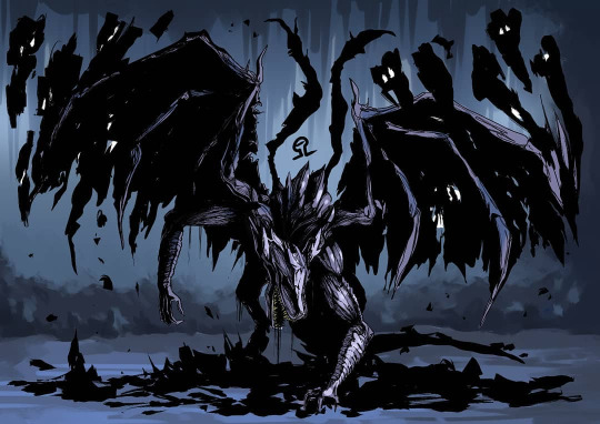
This is Midir, I personally like this drawing because animals aren’t my strongest point, and this one I’m, pretty happy how it turned out.
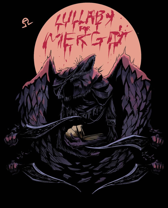
This gives me heavy metal cover vibes, I like how the colors looks.

This is from Monster Hunter, when I saw this buddy I wanted to draw him so hard, and there is. I’d say this is special because is an hybrid, between traditional and digital art.

I made this like 2 years ago and still today it looks fantastic, and that’s something really weird, from someone like me who see a drawing from 3 months ago and thinks looks old and shitty (haha).

tbh I feel like all my Nier Automata pieces were a bit underrated. If I had to choose one I’d say this, because I felt totally inspired and the execution is cool to my eye.
Q: Where can we find more of your work? Are there any personal projects you would like to share?
My Twitter where I post all my stuff. https://twitter.com/Alvh_Omega
My instagram where I post exclusively my inkings and soulsborne stuff. https://www.instagram.com/alvhomega/
My webcomic where I write stories about silly goth girls doing silly things. https://twitter.com/BS_Gothventures
I have a print store where you can buy prints. https://society6.com/alvhomega I’m currently preparing a patreon page, but still needs some fixes. Follow me and stay tuned.
Q: What order did you play the soulsborne games in? Which is your favorite?
Dark Souls > Dark Souls 2 > Bloodborne > Dark Souls 3 I haven’t played Demon Souls because I don’t have ps3, sadly. My favorite one is Bloodborne, the art, the boss designs and the crazy story is really my jam.
Q: When you got eaten by a mimic for the first time, what did you yell out loud?
I honestly don’t remember, but I think I was already aware of mimics in my first playthrough
Q: Any memorable Dark Souls gaming moments you’d like to share?
The Taurus Demon, that son of a… witch. The first time I played Dark Souls this was the reason I left the game and started to hate it. But one day a good friend suggested me trying it again because the game is worth it, aaaaaand here I am, drawing art for a zine.

Get the zine at: 🔥 [ THE FIRST FLAME ] 🔥 info page
𝐅𝐨𝐥𝐥𝐨𝐰 𝐮𝐬 𝐟𝐨𝐫 𝐮𝐩𝐝𝐚𝐭𝐞𝐬 𝐨𝐧 𝐩𝐫𝐞-𝐨𝐫𝐝𝐞𝐫𝐬 & 𝐫𝐞𝐥𝐞𝐚𝐬𝐞:
on tumblr @darksoulszine
on insta @DarkSoulsFanZine
on twitter @SoulsFanZine
#thefirstflamezine#interview#alvhomega#darksouls#dark souls#fanzine#dark souls fanzine#art#artists on tumblr#illustrators on tumblr#gaming
10 notes
·
View notes
Text
August 10th-August 16th, 2019 Creator Babble Archive
The archive for the Creator Babble chat that occurred from August 10th, 2019 to August 16th, 2019. The chat focused on the following question:
What is your process for planning out the paneling/layout of each comic page?
kayotics
I’ve finally gotten my process down to a process that works for me. For Ingress Adventuring Company https://www.ingress-comic.com/ I start with scripting the whole chapter out. Step two is thumbnailing the whole chapter out, so I can figure out pacing and paneling. I started to do thumbnailing on sheets of printer paper, which has been easier to figure out my drawings and to see how the comic flows on paper. Once that’s done it’s pretty straight forward. Panel borders in pencils > rough sketch & balloon placement > letters and tight sketch in pencils > ink letters > ink bubbles and borders > ink the rest of the page. Then I scan it and do the colors. With the thumbnail process I kind of do the chapter twice in pencils but it ended up being way easier in the long run, since I hate doing panel layouts and doing that work in the beginning is way easier.
Steph (@grandpaseawitch)
Afraid there's no scripting for https://oldmanandtheseawitch.tumblr.com/. It's all pretty much in my head but I go over it literally every day, and I have a few roleplays archived to keep things on the right track, but that's about it. Thumbnails are done in big batches. Last batch was about 20+ pages done at once. Thumbnailing is also where I figure out composition and such. Just detailed enough to give me the idea of what I want, with enough leeway to do as I please on the page itself. Thumbnails done, I make a batch of empty pages, and go in and make all the panels for the 20+ pages. Since I already know the composition from the thumbnails and I have digital guides set up on each page, that's super easy. With all of those done, then I just go back in, do rough sketches for each page. Cleaner than the thumbnails but not too clean yet. Once the rough sketches are done, this is actually where I'll add text and balloons, so that I know what the bubbles will be hiding and don't have to waste extra time. After that, I do as much in large batches as I can, usually cleanup sketches, then inks, maybe flat colors. But after that point, I just have to sit down to work on individual pages until they're done. And voila!
authorloremipsum
http://signsofthreecomic.webcomic.ws/comics/ For Signs of Three, I always start with the script, get the basic idea of what I'm going for in the page. Then panel layout and gesture sketches of people and the environment. THEN! BEFORE I START DETAIL SKETCHING! I LAY IN THE SPEECH BUBBLES. Seriously speech bubbles are critical to controlling how readable your page is and so so many people don't seem to see that. They must lead from one bubble and panel to the next in an easy to understand way or your reader will get lost and confused. So I always make sure to put bubbles in during thumbnailing. After that it's just basic refining the sketch, lining, coloring, and shading.
AntiBunny
Typically in AntiBunny http://antibunny.net/ I thumbnail a page first to decide what needs to happen. After that I look at those event and decide panel layout based on how best to depict them, factoring in what needs to fit, who needs to be there, and how time will pass. I'd say time is the most important aspect, followed by emphasis, and then content. Typically bigger panels depict more time passing, but that's not a concrete rule. A big panel can depict a very short moment in time. The amount of population has a big play in that as well. A lot of action in a big panel can be a short moment in time that's just heavily emphasized. A big panel with very little movement depicted is great for dwelling on a single moment, which is great for slowing down the pace of reading.
heroesofcrash
I used to not have a script at all, but now I tend to write out scripts in advance. I keep a four-panel format in mind (2x2) when I write a strip, but I'll sometimes combine or split panels depending on the flow of the story. (I'll place some sample strips below, showing a "default" 2x2 strip, and a few that combine or split panels based on that structure) I then draw guidelines in Manga Studio (I have the CD, not the digital version that became Clip Studio Paint) for where each panel will be. I put the dialogue in each panel, sometimes editing for space or to fit it nicer in a speech bubble. I can usually visualize how a speech bubble will generally fit in a scene; it's easier for me to draw around the bubble than to draw first and add the words later. After I sketch out the panels, I may move the words around to fit in the scene a little better. I may even tweak it a little when I draw the speech bubble around the text, if I don't like how the text fits in the bubble or how the bubble fits in the scene. As I mentioned earlier, here's two strips. One has four panels (which is the most common for me), the other has six. The latter is made by splitting the upper right panel into two skinny panels, and breaking the bottom half into three panels rather than two. Not only does it give me enough panels to do a complicated visual gag, but having panels with a similar layout next to each other makes the action easier to follow, and thus makes the gag flow better.
Desnik
For http://ask-a-warlock.tumblr.com/, I make tiny thumbnails to quickly go through layouts. I tend to have a few different ideas and doing small/quick is a lot easier on the revisions
LadyLazuli
For Phantomarine (http://www.phantomarine.com/) I've gotten into the habit of thumbnailing each chapter extremely roughly in a sketchbook, then bringing the pages into Photoshop and shifting the panels around to improve the flow throughout the chapter. I put in rough dialogue bits to anticipate balloons, then I get going on rough sketches and color placement in Procreate, then clean up and paint the sketches, then bring them back into Photoshop to finalize the page. It's honestly really haphazard, just because I tend to change details and dialogue around a lot, depending on what I feel is working/failing - but that core chapter flow doesn't change too much, just so I don't get caught needing more pages in one part. So... I keep the roughs very rough, but I adhere to them quite strongly? The details are where things get experimental (edited)
JUNK
I am a fool who hasn't been doing thumbnails lately, so my process is the typical script>sketch>inks>tone.
MJ Massey
I start with my storyboards, which are just skethcy first drafts of the pages in a sketchbook. I have a vague genreal story outline, but this is where I really figure things out--both the layouts and the script.
In my head, I tend to see things as if they were an animation, so I am usually trying to catch that sense of movement in the comic panels. I try to keep things interesting and thinking outside the typical grid layout, usually resulting in some pretty crazy stuff. It's easier with action scenes, but I try to mix up everything. I do my final pages on 9x12 bristol (I used to work on 11x14 but that was...too big for markers), but there are many times where I will scrap the storyboard and do something totally different for the final page, or add or take away things. But it's good to have that first draft down as an idea, it's easier to adjust from there if I need to
FeatherNotes
@LadyLazulii love your process ahhh!!!
LadyLazuli
@FeatherNotes MERCIIII
Nutty (Court of Roses)
For Court of Roses http://courtofroses.thecomicseries.com/ I mostly sketch out thumbnails, scan them in, and lineart/color. Like most of y'all, I have a general story outline, and specific scenes get more detail as I work closer to them. If there's a scene that has emotional hits and I want the right dialogue for it, I'll script it. If there's lots of exposition and detail, I'll script it. Just, largely winging it on my end!
Tuyetnhi
I usually work from loose script dialogue for a chapter, to get the feel for the page, then start thumbnailing. After thumbnailing tho, I redraw the thumbnails on csp, sketch, then change/define panel layout or render till finish. Often, my thumbnails don't give me enough info till I start the page. And that's good for me since it's still under a set guideline but I don't feel rigid on "Oh gotta make it exactly like this" or some sorts. Same goes with dialogue/scripts too since I tend to go back and correct panel layout if i don't think it was strong enough on the first go. Idk, I treat it more of a fluid process that I can go back and fix due to how I digitally paint/render things. Still the process depends on the page i'm working on, how strong the thumbnails are, dialogue, and color scheme theme I had with certain pages. Most of it is 40% gut feeling tho. Images shown here how I got OIYD! Ch. 2 - Page 15 to be to its finished form. [thumbnail-> Rough sketch -> add with color -> final render with dialogue]
ErinPtah (Leif & Thorn | BICP)
I took scans/notes about each step of the BICP page-making process back during chapter 5: http://www.bicatperson.com/comic/step-by-step/ ...and then again, seven years later, during chapter 28: http://www.bicatperson.com/comic/the-webcomic-page-making-process/ The art has gotten better, but the actual workflow...basically hasn't changed. (If it ain't broke...)
snuffysam
First I have the script for the entire book, which I'll have finished ahead of time. At the start of each chapter, I'll divide the upcoming script into pages based on how I want the comic to be paced - e.g. making sure the setup and punchline to a joke aren't on different pages, making sure there's not too much dialogue to read on a single page, etc. Then, when it comes time to do the page, I'll split things up into panels. That's pretty easy - I generally want to keep things to one line of spoken dialogue per panel, or one "action" per panel. Sometimes there'll be beat panels, sometimes two people will talk in one panel, but that's the general rule. Next I... put together the panels. I don't really use thumbnails to work this stuff out - important panels or panels with more dialogue are bigger, less important panels or ones with less dialogue are smaller. I try to make sure panels don't intrude on each others' vertical space, because i've always found that complicates things in a web medium - but that just means there's less for me to worry about. I make sure the panel layout is different from the previous page, and if there's an action I need to emphasize I'll do something weirder than just a rectangle. If there's not enough space on one page for the panel sizes I want, I'll make it a double-length or triple-length page. As for the actual artwork - I try to make sure the reader's eye line is led along the page. So panels on the left would have the characters generally facing to the right, and panels on the right would have the characters generally facing downward and to the left. I try to leave enough space for word bubbles - and in general, the characters on right panels will be placed lower than characters on left panels, because i want the speech bubbles to move downward as you read across a row. And, well, that's basically it!(edited)
authorloremipsum
finally someone who considers the eyeflow (am joking, mostly)(edited)
snuffysam
i didn't always, but a reviewer once told me how one specific action scene was really difficult for him to parse because the eye flow was just completely in the wrong direction, nearly every panel. so since then i've been making a conscious effort about it :p it's tough when there's two characters up against a wall and you need the page to flow the other direction from how they're standing though, lol.
#ctparchive#comics#webcomics#indie comics#comic chat#comic discussion#creator interview#comic creator interview#creator babble#comic tea party#ctp
0 notes