#tried more of a painterly style here
Explore tagged Tumblr posts
Text

autumn date
#tried more of a painterly style here#kazuhei#heikazu#my art#shikanoin heizou#kaedehara kazuha#genshin impact
616 notes
·
View notes
Text

Suffocating with this sweet, effervescent love.
They make me ill (affectionate).
For this exercise I tried a more painterly style of coloring. I don't think I succeeded to portray the image I had in mind, but I've looked at this illustration I for SO LONG I have no idea if any change I make looks good or bad anymore, so yeah... xD
Here's the version without the bubbles:

#yazawa nico#nishikino maki#kazzart#nicomaki#love live#I've been rereading Karuha's doujins#they're so so sosososo good I don't think I will ever recover
356 notes
·
View notes
Text
Here ye here ye, another breaking down processes post from yours truly!
For this animation, my plan was to make something I'm proud of AND also something to force me to take my time since with all previous animation works they were all rushed. I normally tend to speed through work as someone whose illustrations are painterly and I like to keep them rough. Also lets be totally honest my other plan for this animation was to animate Mizrox being so sickeningly sweet.
Fun fact, this animation was going to be longer. I had tried to plan out Olrox climbing on top of Mizrak during the kiss to lay on his chest. There was an attempt trying to rough that out and several ref videos It was scrapped because for the life of me I could not figure it out. Also hypothetically if I was going to keep it, I would cut to another angle (perhaps Mizrak's face close up) and then cut to another angle that would make it easier to see that climbing over the top. OR, consider Olrox already sleeping on his chest (im just rambling now but this is basically 'if you were able to do this again' section).
I wish I actually went through a more proper tie-down process because the jump from going from my rough straight to clean was rough (badum tsk) for the first few seconds. Defintely learnt my lesson ALSO Olrox is surprisingly really fun to draw from behind.
I challenged myself to see if I could get the idea of "bigger movements, less in-betweens, smaller/slower movements, more in-betweens." Though the effect of Olrox rubbing his face against his arm may be a little too jarring and I steered quite a bit away from my rough and self-reference video in hopes of making the face rubbing more apparent because I thought the character acting was too subtle and wanted a contrast to the other half of the scene. I reconfigured my CSP animation workspace for this too so it definitely made the process less tedious when cleaning up the animation.
(Which by the way I do record a lot of self-references depending on the section! For things I can't do/uncomfortable doing, I'll end up looking up videos. It's the easiest for me to catch subtle things in body language and also get a feels for the motion.)
Also I'm really satisfied with Olrox's anticipation before his smooch and the shoulder roll at the end even though technically the arc doesn't complete itself. MIZRAK THOUGH, when cleaning up I realised my rough wouldn't make sense because he's already looking at him so there's no need for a turn, and then the lack of a shoulder movement felt jarring, so all of that was done without any thought, wish I did think about it more though.

Now compositing was a monster in its own right and basically me jumping back and forth between turning on and off different layers, but here are all the new things I did; I duplicated and blurred the lines of the lineart, beveled the shadows so it was lighter on the inside, and added a rim of blur so the focus drew towards the couple. Also will absolutely admit that my fanboy ass went "... be crazy and try to mimic the show." The final did not go that route because I thought it was more important to emphasize the mood/atmosphere (Also Olrox is intentionally stylized differently because i wanted him to be softer here and I had to give him eye highlights for plot HELP). THOUGH to say I did not try to mimic the style, the #2 lighting test was my 'attempt' LOL 😭 I can never consume media normally.
Here are the lighting tests I went through. I definitely knew I wanted to go with a morning vibe, though I tested out a night ver for fun and did some edge lighting which led to mixing both version #2 and #3 to make #4.
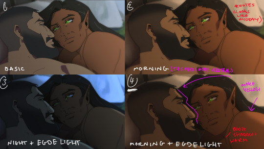
Fun fact, I almost went with #2 due to fear of getting too heavy-handed with compositing and therefore losing the animation (even though I really liked #4 at the time). Thanks to a friend, they also shared the sentiment of liking #4, though pointed out it felt like midday and encouraged me to make the colours warmer and deepen the shadows. It is a really tough balance but I think for a softer scene like this, the more additional layers of comp worked out in the end.
The edge light was a last minute thing because someone told me to add sound and to have light stream in. Also at this point I deadass forgot that you know, Olrox, is a vampire, but hey rule of cute overrules. We can pretend its light not from the sun LOL

Also yay I got to show off my own style a tad, I love paintingggg. It's not as completely fully rendered coz I knew that it would get covered up but I still made sure it was quite clean regardless. I didn't realise how much of it would be covered up even though I did make sure they would fit/make sense for bg LOL
Now we are done!
If you've gotten this far thank you! There's gonna be less frequency of these animations due to the semester starting back up soon and I don't get many opportunities to actually 2D animate (despite it being an animation degree RAH). Also I remembering cringing and laughing a lot when I immediately started putting colour down going "oh i can see the end of the horizon, i have too much power as an artist, people will see this i cant let them see me be crazy"

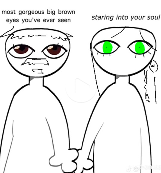
[Here's some memes I drew over while my friend was reviewing my work]
#mystery talks#castlevania nocturne#artists on tumblr#castlevania#castlevania fanart#fan animation#olrox/mizrak#i still keep going “oh no people who worked on the show will see this theyre gonna see im insane /lh”#its ok coz being crazy pushes you to achieve things
83 notes
·
View notes
Text
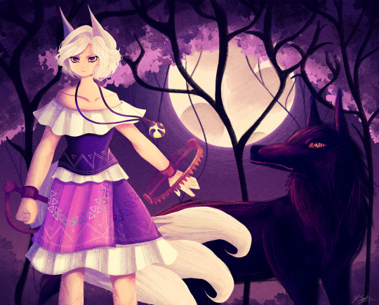
Ok the WIP I posted a little while ago is no loner a WIP yipeeeeeee I am so tired of looking at this drawing.
Artist's Notes:
THIS DRAWING IS FINALLY DONE YAAAAAAAAAAAAAAAAAAY!
Ok so this drawing was a WIP that I had had sitting around for a while, and so because I wanted to do a test run with the new face style I'm trying out, I decided to pick it back up again. Now you may notice that compared to the other version of the WIP, the shading is different, and that's because I had to change all of it to match the light source of the moon, which was.... not exactly fun (especially cuz I stayed up late at night to finish this which was tiring), but it was worth it because I am a lot happier with the shading now. Also, when I initially redid the shading on the white trim of her outfit, I ended up making them look like indiscreet white blobs that just looked... bad, so I had to fix that and I think it looks a lot better.
My favourite parts of this drawing have to be the face and the hair, though I'm not surprised about how much I like the hair since hair is my favourite thing to draw. Also the wolf, I really like how the wolf turned out, since I also love drawing animals from time to time. I also like how the background turned out.
Also, Enoko's design was a hit hard to get right, and I decided to add the white trim separating her shirt and skirt mainly because I didn't like how abruptly it changed in the original design. Also, for some reason her dress makes me think of 1800s-y southern/western clothes, which has given me the headcanon that Saki gave her these clothes when they first met. Makes me wanna draw the two of them together in very western styled clothes, I think it would be cute. I also changed up some of the colours on her original design to fit in more with the palette that I was going for with this piece. Also, I like how her tails turned out, mainly because when I was working on some of the sketch for this I tried to make them smaller, but they didn't look right so I just went "fuck it" and made them big and poofy. Also drawing her wolf ears was fun, I like drawing simplified wolf ears like that. Overall, I'd say I did a good job incorporating elements (like the bear trap hands, the tails, the gem) in a way that didn't feel like they were out of place in the piece (something I was concerned about with Enoko's design).
All in all, I wouldn't call this my best work, but I do like a lot of aspects of it. I've also noticed that I'm kinda getting a bit frustrated with certain parts of my style like the lighting (mainly the lighting), so I think I wanna try and branch back into that more painterly style that I started out with when I first started posting here while still mixing in some elements of my lineless style. Also, I need to get better with my colour values, mainly just for clarity since I kinda think that's where this drawing falls flat a little.
106 notes
·
View notes
Note
Your art is so pretty!! I especially love the way the thinner, more subtle lines work with the light colors! It makes everything look very soft and dreamy in a really pleasant way.
I also adore the painterly style in some of the illustrations accompanying the Finnish poetry. You also did a great job with the translations, Finnish is my native language and I know how hard it can be 😭.
Anyways this isn’t really an ask im just excited and glad to find another cool person. Also, suomi mainittu is just a plus.
Thank you! I originally started to use the chracoal/soft pencil like brush for my digital art because I wanted to teach myself to focus on bolder shapes rather than very tiny details (that took a lot of time!!). The texture of it is much more forgiving than sharp line art pens' and I also really like how it looks 🧡
And, tbh, English is bit harder to me than Finnish because another native Finnish speaker here! I tried to study to be a translator, but switched to just studying English literature. I do still enjoy translating things for my own amusement, but oh boy translating is harder than it looks! There're some small things I would change in those translations from Moonday Letters but oh well, those have already circulated kinda far.
Ja kiitti myös suomeks! 🧡🦢

#torille 💃🏼#also the texts from Moonday Letters/Kuunpäivän kirjeet are very poetic but it is actually and entire novel!#ask
68 notes
·
View notes
Text
Ashei x Shad
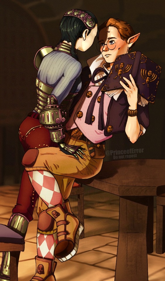
Any other Shad x ashei shippers out there?!
Commission info | Buy a Print! | portfolio | twitter | insta | Discord server
Progress pics below!
Sketch:
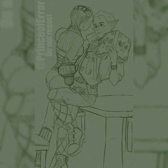
Oki so first up I found a reference I liked off Pinterest which had some interesting vibes I wanted in my piece. While drawing the two in these poses I realized just how many oocca faces Shad has on his design, it's actually awful. Shad I love you but this is disturbing.
Line art:

For the line art Ive tried adding more detail here just as I'm still playing around with what I want my art style to be. I think this part turned out rly well, I got the line weights down nice and the details really work.
Flats:
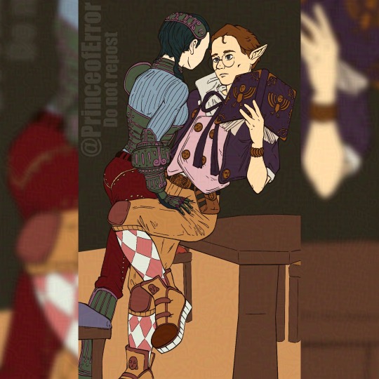
The flat colours do look a bit strange on their own, if I was planning to leave this piece at this stage I would move the colours over to be warme. I planned to do a lot with the rendering so it's not an issue here.
Finished render:
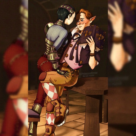
I didn't initially plan to return to my more painterly style, I was going to cel shade it like the pieces in my recent posts, but I'm so glad I randomly decide to. The high contrast of shadow, especially the cast shadow Ashei is making, really adds some depth I think my art hasn't had for a while. The details of the brush strokes add more visual interest to the piece and can imply more form than just flat cel shadows. The background also turned out really nicely being lineless I think that helped to not steal any attention with unnecessary line art.
This is my new favorite piece I think this shows some really nice progress in my artistic journey. I can't wait to immediately use this style for putting master kohga in a banana dress but unfortunately you will have to wait til next Saturday for that so make sure you're following as to not miss it.
Thank you so much for reading if you did! If you'd like to buy this as a print it'll be up on my inprnt, I also have commissions open if that's something you're interested in
Oki bye!
#zelda#The legend of Zelda#twilight princess#Zelda twilight princess#Loz#The legend of Zelda twilight princess#zelda fanart#Zelda art#Twilight princess fanart#Twilight princess art#Shad#Ashei#Shad x ashei#Ashei x Shad#zelda ashei#Zelda Shad#twilight princess Shad#Twilight princess ashei#art#illustration#digitalart#procreate#artwork#fanart
51 notes
·
View notes
Text

[id: a digital bust drawing of marin from link's awakening. the art style is different than usual, using varying line weight, softer brushes and painting. the thinner brush allows for more detailing. end id]
evil art style! here's the traits y'all pointed out:
thick marker brush (with cell shading)
controlled lines + curves
color holds
ahoge + floaty eyebrows
the eyes and noses
bright colors
i decided that going for a soft, painterly look was my best bet! i tried to use more pastels and used less color holds. i knew i wouldn't be able to change my shape language w/o challenging myself too much, and i wanted this to be chill so here lol
#doodles#loz#legend of zelda#link's awakening#la#marin loz#this drawing kinda scares me. feels uncanny valley 😭#i rlly rlly love how it turned out but it feels Weird#someone did say i use more pastel colors but i think thats bc my tablets display was on the wrong settings#i love saturation#12/25/23
82 notes
·
View notes
Text
was talking about it the other day but its sad how we are never going to get really big budget games w/ funky artstyles again. like if you look at the majority of big budget releases lately, they are all kind of going for the same thing as far as actual modeling goes- hi fi, super detailed complex models that try to portray as much detail as possible. which is fine for certain games, but it makes me miss the big swings devs used to take.
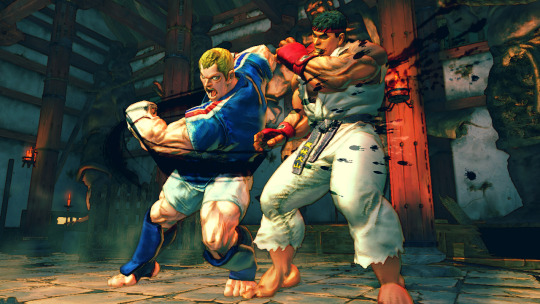
take street fighter 4 for instance- despite being over 10 years old at this point, it still looks REALLY good. great art direction, has a weird painterly look so everything has a cool watercolor style to it, models are expressive, etc. and this was a BIG release, its not some indie game (where most big stylistic swings tend to be made nowadays).
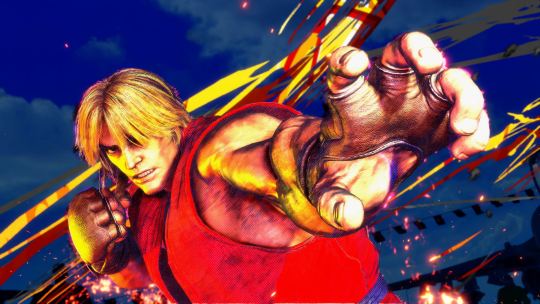
compared to street fighter 6, which is going for photorealism (with strong choices made as far as animation and color goes) it looks dated in the context of graphics generally, but looks WAY better than its contemporaries from the same time period. my fear is that street fighter 6 wont look that great in 10 years time.
side note, its also why street fighter 5 was really only loved by hardcore fans. it does nothing particularly well! its a halfway point between realistic and artistic to the point where it feels like a side-grade rather than an improvement or even its own original idea!

whatever leaps were made in lighting and texture quality are essentially irrelevant here. fucking gross!
the thing is, i dont think this is a deliberate choice that devs are making right now. from what i can tell, recent rendering tech has made it way easier to achieve a handful of lately- hi fi LIGHTING, increased TEXTURE DETAIL and HI POLY COUNTS come to mind. these are cool, but if youre a dev who wants to make a triple A product, you kind of have to use whatever tech is on the table to make a product look cutting edge. none of those encourage taking wild stabs at cool art directions. devs used to use those cool art directions because it was the ONLY OPTION THEY HAD.
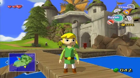
classic case being windwaker right. the gamecube was a huge graphical leap from the n64, where even getting a model to look like something was a challenge. compared to ocarina of time, windwaker looks absolutely fucking incredible. it got a lot of pushback at the time for being too kiddy, but really the strength of its style is a result of doing as much as they possibly could with the platform they were working on. no high poly counts, the shading tech was relatively simple, and the textures (while a huge improvement over the n64!) are still basic compared to what we have today. windwaker still looks impeccable to this day, and even the HD remaster they made which, ahaha, improved WHAT

LIGHTING and TEXTURE DETAIL. but without a real consideration for the original artstyle (or why it even existed... which was the gamecubes limitations) it just looks worse.
in response to this pushback (i think, idk i didnt work at nintendo at the time) they gave twilight princess a way more "realistic" look. but given the rendering restrictions of the time, it still has a fairly robust artstyle
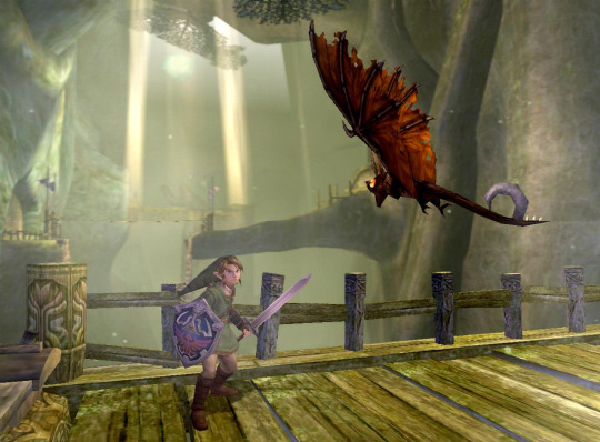
proportions are more realistic obviously, but in order to achieve that realism without the kind of lighting tech we have now the "lighting" is BUILT Into the textures. look at links sword, how it kind of darkens near the hilt, or how the shadow on the keese's wings is just kind of painted in specific areas. i would argue that twilight princess looks a LOT like street fighter 4 in that area-
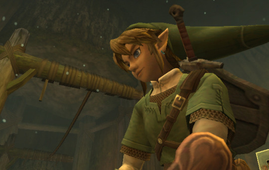
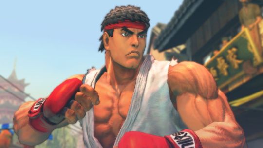
damn! they almost look like theyre from the same game! but twilight princess was celebrated for being "realistic" while sf4 was noted for having a funky watercolor style (thats built into the focus attacks even!). its so so smart, because the devs knew they couldnt go for photorealism (like so many games of the era tried at and completely failed at!) so they went for a mix of cool stylistic decisions that allowed a game to look GOOD in a subjective, artistic way.
Not that games don't try and apply artistic principles now, but its a lot less unique. look at mario odyssey
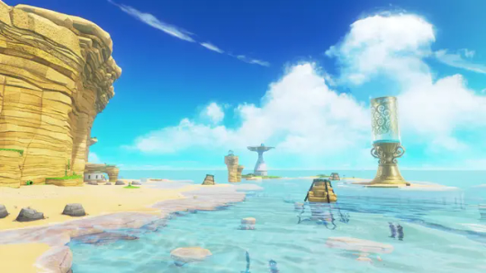
its just a beach. and it looks great, its well rendered, but its just a beach. colors are clearly intentional and very pretty, but it's nothin that special right now, probably will look even less special in 10 years even compared to levels in the same game.
what im curious about is when are we gonna get back to that kind of artstyle meets rendering tech! if ever! current tech makes it so devs are kind of forced to go down the same boring path. look at mortal kombat 1:
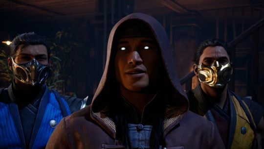
im sure there are some leaps in texture and lighting, but they keep taking shortcuts. all the faces are modeled after REAL peoples faces and they mocap for expressions/conversation, which gives a really boring look to it. the fact that mk11 and mk1 look so similar so many years apart (4 i guess isnt that much but there have been leaps!) is disappointing to me.
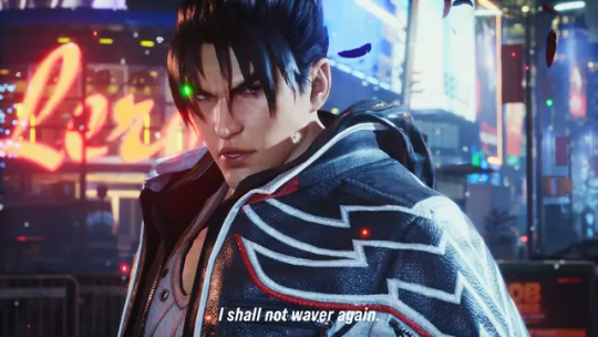
then you have tekken 8, which is like the best looking game ive ever seen. for a while i found it hard to put my finger on why, but my brother said something really smart i feel- they made all of these models by hand. theyre essentially digital statues. they didnt pull actual face models, they just worked on their features until it looked correct. on top of the lighting and texture work, it creates a look not unlike the renders tekken has been using for years. which is convenient for them, because they can finally match the kind of real-time fidelity they've been chasing for like 30 years

hell it looks BETTER than that. so what im trying to say is im hopeful that art direction will catch up with the kind of rendering tricks/strengths we have.
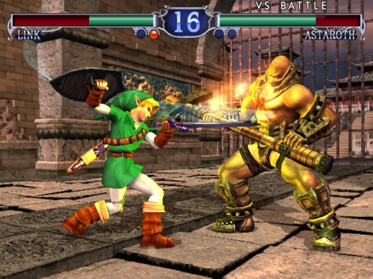
i think tekken 8 feels like how soul calibur 2 probably felt at launch. does a lot of the same things given the time period
i still think hi fi rendering doesnt make for a good looking game, but rather where the focus lies for the player. for tekken it makes sense that they would focus their horsepower on detailed models and stages- youre gonna be lookin at that forever. look at elden ring

texture wise, SUPER low res for 2022. maybe even 2020. but what they do with the horsepower is genius- they focus on scale to translate locations of objectives to a player while also reinforcing the feeling of adventure, on top of extremely strong choices in color and lighting. i hope, going forward, games focus on how they can use this kind of tech to reinforce a games "gameplay mission statement" while keeping strong artistic choices present rather than focusing on being able to wow someone with a couple of screenshots at the cost of BOTH of those things. im just ranting though french press got my ass
133 notes
·
View notes
Note
Since you're on the topic I have genuine question about AI art designs from a non-artist.
In your opinion would using an AI tool to generate a reference for a commission (whether it be for character design or pose) be an appropriate use of said tools?
I thought about this as well and I gotta say, personally I don't think so.
Barring for the purpose of this ask the whole "AI art is stolen art" thing (which I stand by fiercely), AI generated images are really janky, especially reference sheets. There are details everywhere that make no fucking sense, anatomy is deformed, they have a lot of nonsensical parts to them so its just one big jumble of nothing.
And, it's pulling from designs created by existing artists and warping them to fit your prompt. It's work that another artist already made, used by an AI that's trained on a specific dataset. It also pulls from popular things that people enjoy: tried and true color combos, the most popular shapes that big artists use, theres a LOT of waifus, and a lot of the art genuinely comes in the same painterly style that's really hard to color pick from. some even come with color swatches that don't match the colors on the reference
In short, it's just a machine generating something that looks neat at first glance, and then is actual hot garbage when you just... look at it closely. Not to mention that an AI prompt can be iterated, and the AI pulls from everything it has, for every prompt, so what you end up getting is completely samey designs with small changes. Good for concept art assistance, but not if you want to create a Legit Character. The AI will give you something that it has already spit out a thousand times over and then some, with no regards to composition, design technique, color theory, because all it knows is what it has been fed and what the artists its ripping off of know (meaning if they have mistakes, the AI will as well. But in a far less human way)
Meanwhile, when you commission someone you are likely to go for someone whos art style will actually fit what you want to get, or someone whos art style you enjoy. Usually these artists will be people you've followed for a while and you at least know them enough to know what they can do. And they are also reactive, you can tell them to actually change and tweak details of what they're making for you. And not taking into account the bad actors out there (as there are always bad actors in every discipline) you will have something that has been made specifically FOR you, not just what a machine thinks you would perceive as eye candy.
As for poses... just draw it badly in ms paint. The AI will not give you the pose you want for the aforementioned reason: broken anatomy (and also because it will pull from its dataset of poses it can warp features onto. It's a lot more limited than you think.) If you want a pose prompt for a commission just draw it really badly in ms paint or on a napkin and write annotations for the artist (arm goes here, this guy is grabbing this thing, etc etc) Most of us if not all of us will GLADLY interpret your pose for you and draw whatever you want us to.
And like. Literally if you're going to get commissions anyway, why not commission a design first thing of all?? Or buy an adoptable from people who already make them by hand? It will genuinely be so much better than just hoping a machine does all the work for you. Please support artists
#ask#anon#AI literally destroys peoples livelyhood btw like just dont use it its really easy#artists get their styles stolen and sold off as things they didnt draw. voice actors get their voices stolen to say things they never said#we live in an actual fucking hellscape of generated content because it is not regulated and we NEED regulations because it gets sm worse#the best thing you can do with AI is just not fucking touch it at all. my final message goodbye
89 notes
·
View notes
Text
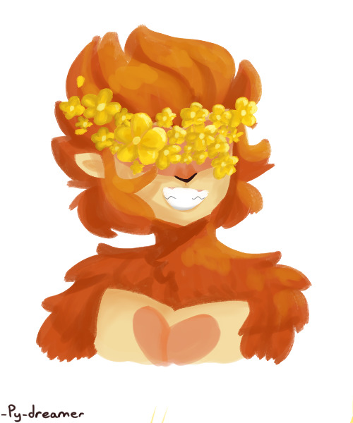
U'know that one trend of drawing flowers over a character's scars? Well I haven't seen any yet with our favourite lego Bois so here we are!
Tried to use a more painterly style, pretty proud with how it came out honestly!
Also anyone getting flowerfell flashbacks?
That's honestly one of the main reasons I chose buttercups and I thankfully had MANY references to choose from
Like this is literally flowerfell frisk with monkey. I had a lot of fun with it of course but still-
So the flowers around the head would kinda be expected right? Circlet scars and all
But why the eyes?
Well, as we know Wukong's eyes weren't always blood red. They were made that way via the trigram furnace. Permanently.
And idk bout you but since its a part of him which was permanently changed via something which damaged him, I consider that a scar!
There would most definitely be scars and flowers on other parts of him but I just got bit lazy and didn't know where to specifically put them. 😅
And on that note:
I feel like Wukong gets put through a lot of smack in the fandom.
Like A LOT.
Some of its deserved but then I see all he's been through and...yikes
But that's a rant for another day...
I do have some sketches for some other characters ie Nezha & Macaque (obviously) but actually don't have one for mk cause idk what scars he has exactly...
So if anyone has any ideas pls let me know! I'd love to hear about more ways I can decorate our favourite legos in flowers!
And what do you think what flower corresponds with what character
Reblogs > likes
#art#lmk#my beloved#lego monkie kid#pog champ#py's_art#lmk monkey king#lmk sun wukong#sun wukong#scars#i feel wukong gets the short end of the stick in most arguments#wukong's eyes count as scars I will die on this hill#buttercups#lmk fanart#this bad boy can fit so much trauma#circlet#like srsly#he's been through so much#pls give him a break#and therapy
46 notes
·
View notes
Text

OKAY! Day one of OC-Tober was to draw your favorite OC. And here he is! His names Katsu and this is him in his non-demon form. I looovee him so much! I've had him for a few years now and his design has changed so much over that time! (its probably because I draw him more than I drink water LMAO). For this day I decided to try to and do a different type of coloring style and I tried to render him in a more painterly fashion. I'm super happy with how it came out! even if i uh.. completely ... gave up on giving him a body and a hand..
#artists on tumblr#digital art#my art#my oc art#my ocs <3#oc-tober#oc tober#october art challenge#bweirdOCtober
8 notes
·
View notes
Note
I really like your style. Was it intentionally designed, or did you just sort of fall into it over time?
I wouldnt say I intentionally designed it, as in I haven't sat down and Engineered a specific style, and instead it was more of me finding what I liked and wanted to incorporate into my style.
You could probably trace my style back to its influences. I used to draw really round shapes (I still do but like they were just ovals and circles...I guess i just like that shape) until I started watching How to Draw Anime tutorials in middleschool T-T (shoutout to Mark Crilley lol)
But when I first joined social media back in 2016, I found all these crazy artists with really unique styles that really influenced me. I was drawn towards artists like star_bite/prince_canary and rawrgyle/grassflu who have very dynamic expressions and character poses :0 (also they ended up working on a Batman and Superman project respectively and how wild is it that my icons from forever ago now work on projects aligned with my current interests!!!) And as you get exposed to different artists you get exposed to the many ways you can Draw things and along with your natural affinities towards certain things (such as me being attracted to Bright and Bold colors and Shaped styles) you kind of naturally build a style.
And part of that is also just having fun Trying things out? Sometimes I wouldnt even try to emulate their style as much as I tried to just...do what they were doing? As in making my ocs and putting them in fun poses, and doing color palette trends and such etc.
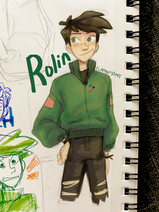
I hope that helped! If you're curious I can break down some of my style checkpoints over the years. As you can see there was still some major anime influence in my style back then when I first joined social media around 2015/2016
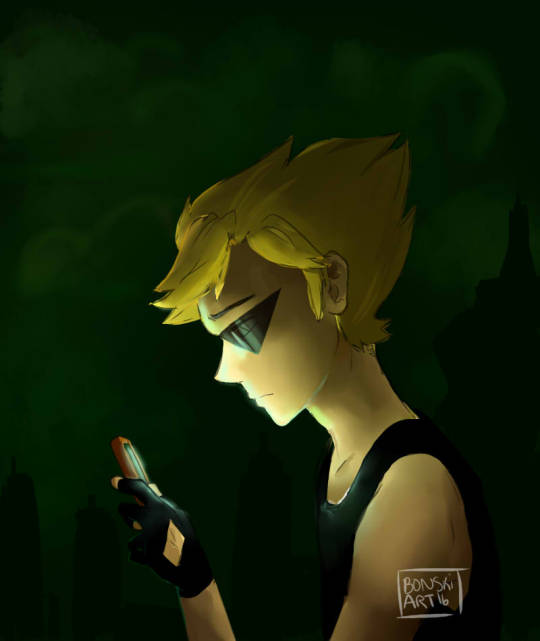
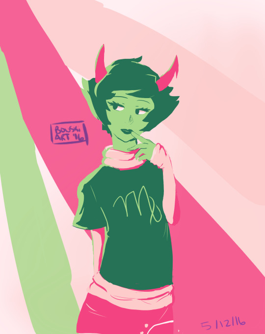
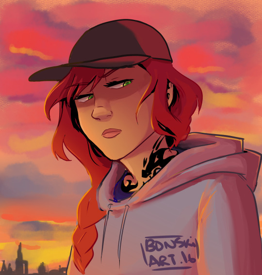
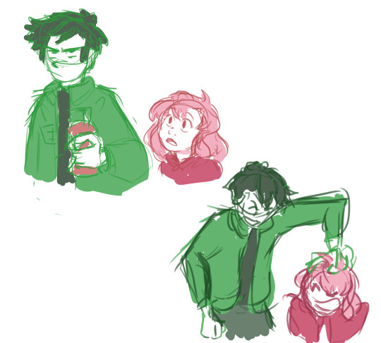
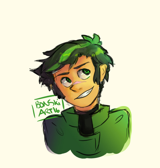
Around that time, I also discovered the fandom around the Cartoons popular at the time, so I drifted away from anime and drew things like gravity falls/steven universe/otgw etc etc so it got Rounder I guess. I really liked how stylized characters looked and got obsessed with Shape Language and assigning characters distinct Shapes (box vs triangle vs circle etc). I also read a lot of webcomics and stuff like that so those played a part I guess
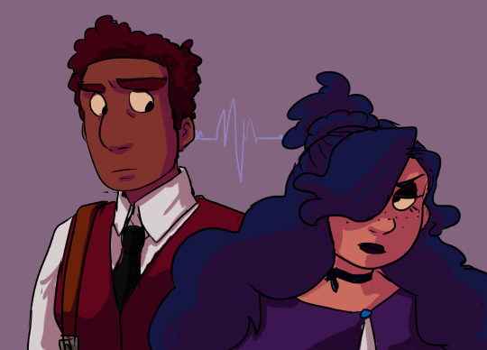



And then around 2019 I saw more artists drawing anime fanart with really sharp angles, which was completely different but so cool to look at so I tried to incorporate more angles into my art. I still had that very cartoony style but tried to push the Sharpness a tad bit more if you can tell. (I think the name of the artist I liked was jeluto?)
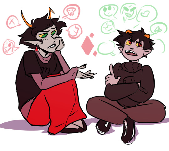
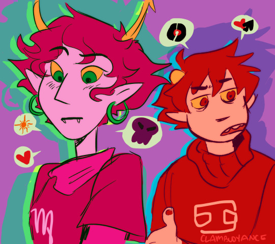
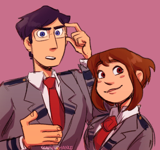


I think around this time I also focused a lot more on color as well and did a lot of paintings then and whenever I did more Painterly stuff I tended to switch Styles into something Less Cartoony T-T

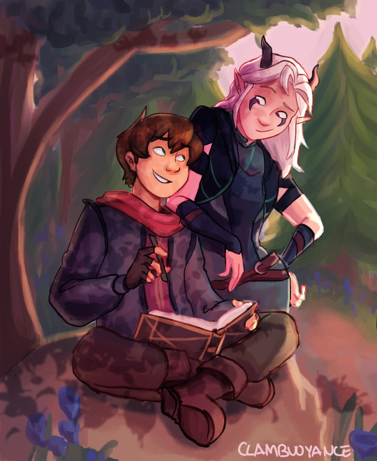
Then by 2020, I revamped my ocs, actually tried to break down and study my own style and how I would draw them, and my style kinda fell into a mix of round vs sharp edges I guess. I tried to give myself Rules which I would follow when stylizing a character to keep it more consistent and intentional.


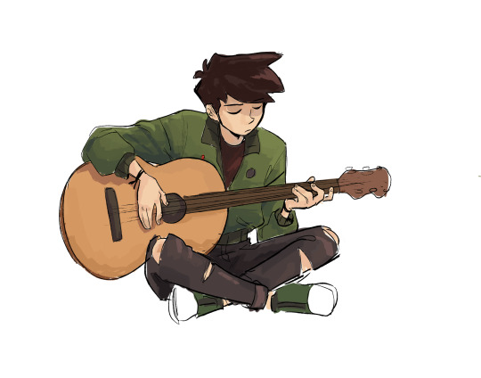
Then in 2021 some of that Fun Part of stylizing characters into something more Cartoony kind of took a backseat as I focused more on Pose Work and Body Expression instead which I think helped a lot :0
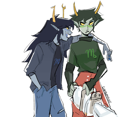

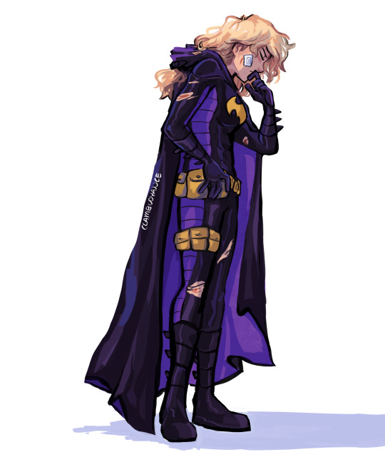
And here's some recent stuff from the past year! Still very cartoony, but less so than 2016 I'd say, and still using really bold colors!! Still love my Soft Vs Hard angles B]
And overall have stronger pose work :) I'm sure my style will evolve as I learn more and experiment more, because one thing I want to focus on is backgrounds and environments :0


62 notes
·
View notes
Text

Here's the preview for the upcoming chapter of Falling into Darkness. Keeping with the grey theme, because apparently all my illustrations for a while are in Robotropolis.
This chapter just has one illustration, and our first proper full-body look at roboticized Sonic. I drew some inspirations from the design for Mecha Sonic (roboticized Sonic) in the Archie comics, such as with the gold elements, but also wanted this design to be its own thing (and needed certain design elements to be present for...reasons). I also really like how the shape of his curled hand became so much clearer to read when I colored some of the incidental lines to be closer to his "skintone."
As for Sally, her overall design is inspired by a lot of things. I'm not great at drawing her SatAM incarnation, and have honestly been a lot more influenced by how she looked through the bulk of the Archie comics (thanks to reading that for a while in college, and from the sheer amount of fanart of that version I've seen). I tried to tweak her look my way to have her fit in with the Sega-styled characters, without just resorting to her post-reboot look from the comics. I'm pretty happy with it.
I didn't originally have a background sketched in for this picture. It was just Sally and Sonic facing off against each other. I started painting random fog around them, which looked fine, but then decided I wanted to take a stab at painting the scrap yard behind them instead, very roughly with a painterly brush. (By the way, I cannot recommend Jazza's digital brushes enough; I'm very happy with how they feel to work with, and they're what I'm primarily using for all the shading and effects and the like, save for the edges of these illustration blocks.)
Anyway, see you Monday with the chapter link!
18 notes
·
View notes
Note
🌜🐡 🃏
Wildcard question: this one ambitious project you keep dreaming about but do not have the energy to attempt yet
Thanks for your questions! 😘 I love reading your answers to ask challenges
-
🌜 How would you describe your style?
Painterly, vividly coloured, horny, semi-realistic
🐡 What is something you worried about a lot when you first started, and why don't you worry about it any more?
Funnily enough, I worried a lot about not having a style! I constantly saw IG posts from big artists about "How to develop your style" or answering questions from beginners who were feeling insecure about it, and so I felt I had to be insecure about it! I also fell into the trap of trying to pass off errors in my work as 'just my style' rather than something I could improve upon.
After a few months, I decided my end goal was to have my art featured on a Magic the Gathering card, which informed the genre of my work going forwards (semi-realistic to realistic fantasy) and that helped to give me some direction.
Much like learning any discipline, "style" is really just how you apply the principles you've learned. For me, it developed with time and as I experimented with studying other artists' work and learning techniques for things like anatomy or lighting.
Here are some of the styles I've tried below. Would love to improve in all of these, but they're each their own discipline that require a lot of commitment to do properly!

🃏 Wild card: ambitious project I haven't had the energy to attempt yet
I'd really like to do an action illustration of an original character for an original setting! This would involve having to practice the following (very rusty) skills:
- Prop and clothing design
- World building and visual development for the background
- Active poses (my subjects are usually 'holding' a pose for the viewer)
One day!
X
Take care of yourself, and keep an eye on your own inbox haha
10 notes
·
View notes
Text

Halfway through draw everything June! Tried out making a new brush and a more painterly style here. I think it’s my favorite background I’ve done so far.
7 notes
·
View notes
Text


EEE thank you @l3o-lion !! To answer your question, most of the animations I post on here are tweening, specifically with Live2D.
I like using it for gentle looping animations & backdrops. (Character animations are a whole different beast? I usually only keep them to a couple functions like 'HandMove' or 'HairGoWoosh'" but this is the VTuber-making software so it's totally possible to make more complex characters. )
I made a tutorial for how I animate with L2D below the cut, if you'd like to see the details! :D
This is the file for that Artfight attack. (quick disclaimer for anyone reading out of context: THIS IS NOT MY CHARACTER DESIGN, they belong to Finchstick over on Artfight!)
I drew the image itself in Krita - for this one I tried to go for more of a fuzzy, painterly style because I wanted to make it look like a muppet. L2D can handle fuzzy textures and gradients without too much trouble most of the time which is something I really like about animating with it.
______________
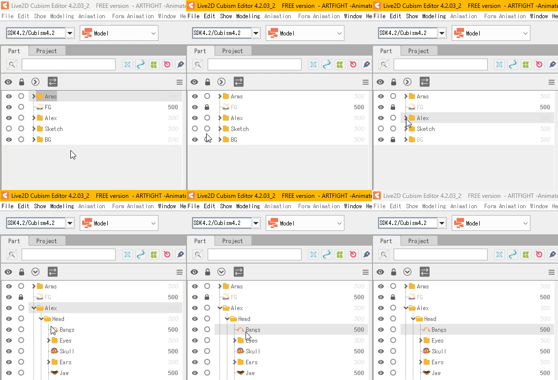
So! Each different moving piece has to be its own layer. Naming and organizing them into folders helps a lot once I export it into L2D. The finished image needs to be saved as a .PSD file.
After it's done, I'll open the .PSD file in L2D and it'll look something like this:

Once the file is open I find the moving pieces of my character and select them. (I also lock the static layers before doing anything )
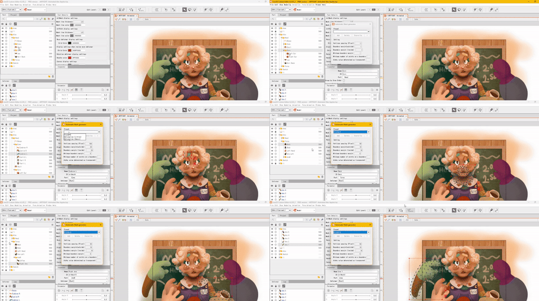
_______ M E S H E S ________
Once I have my piece selected, I open the automatic mesh generator ( located above the image, to the left ) and automatic mesh it.

(Keep the mesh generator window open and select / apply mesh to each moving object.)
______ D E F O R M E R S _______
Once the pieces have a mesh on them I apply warp deformers for each part. (I try to apply the deformer for each body part to the largest piece making up that part. For example, the part being used for the head deformer here is the upper part of the head.)
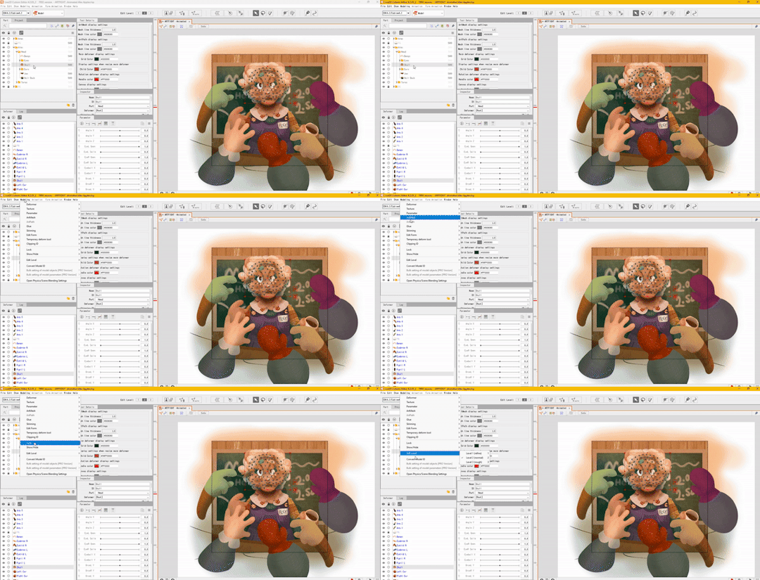
Each part of the face also gets a deformer - each eye, the mouth, etc - and those get shoved into the parent "head" warp deformer.
The deformers allow for parts of the face to move with the head, but they also allow for you to set more parameters per part and make your model look more dynamic. (There's a 3 parameter limit in the free version but if I need to make another parameter work I'll just brute force it and make a 'head deformer deformer' etc)
_____ P A R A M E T E R S ______
Once the deformers are set up, I start setting the parameters.
The program opens with these default parameters which are all intended for rigging a face, you can make your own custom parameters at the bottom of the window.
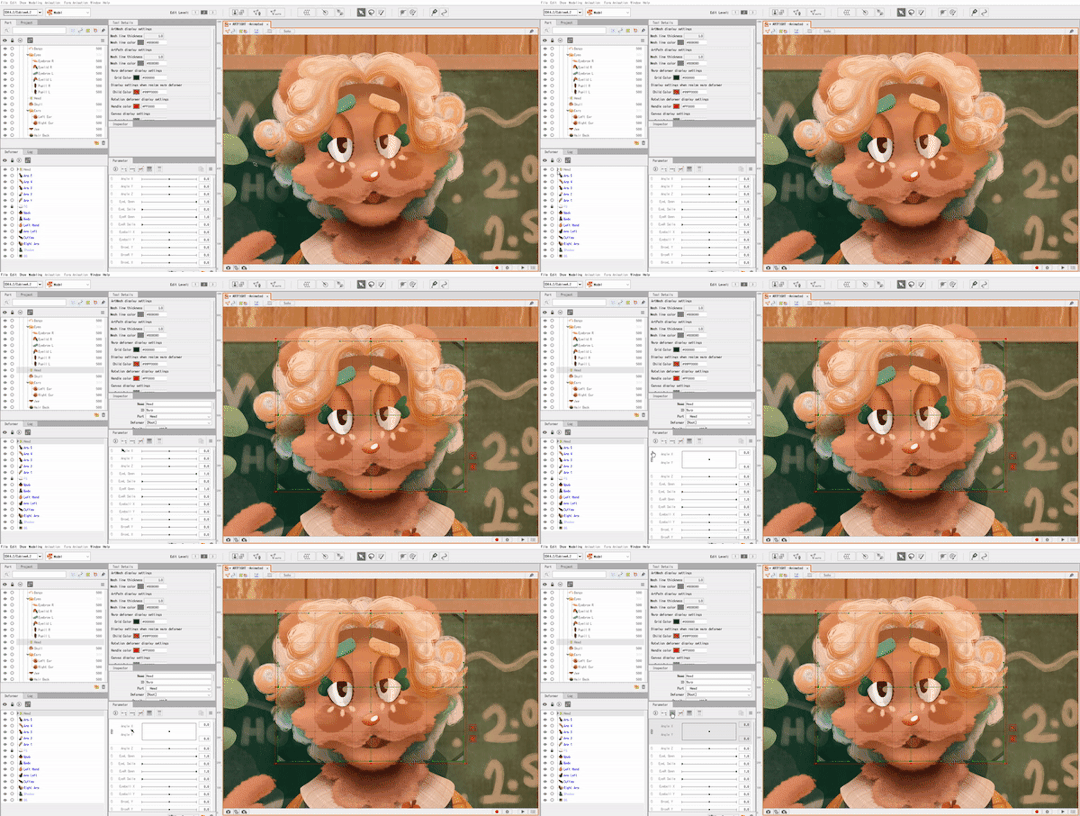
As for the green dots here, they represent points of extremes on the parameter! You can change what these are by moving the slider over the green dot, and moving the mesh on the selected object.
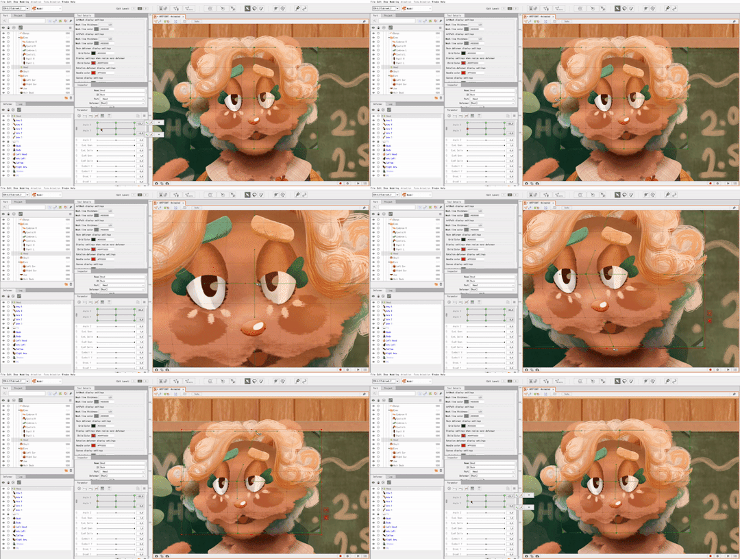
This can be a bit tedious, but it's fun to watch the model look more alive the more parameters you finish.
______ A N I M A T I N G _______
After I save my model as a .CMO3 file I open a new animation file in L2D, and drag and drop the .CMO3 into the window.

The model shows up much larger than the window. You can resize the window in the bottom left, (third and fourth fields from the top,) and shrink the model to fit inside.
(The free version has a limitation on how big your image can be in order to be exported. It usually takes me a bit of trial and error to get the right size for the image.)
The window below your image shows your tracks. You can have multiple models per animation, I usually just use one. The purple track represents the model while the orange represents the duration of the animation.
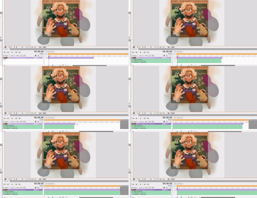
With that out of the way, it's time to set the keyframes! Under the purple model track there's a green drop-down window called 'Live2D Parameters'. Here, you can adjust your parameters in order to move your model to the right position.
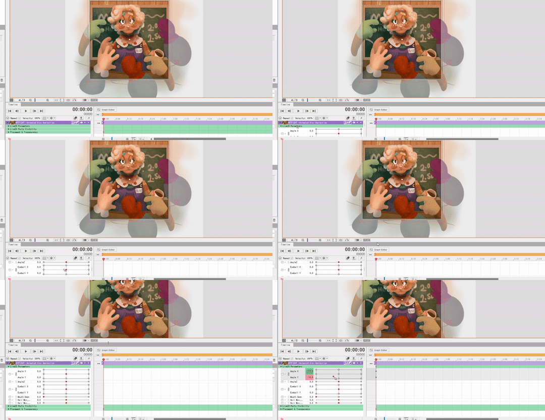
(In order to make a looping animation, you can copy all parameter values in the first keyframe by left RIGHT clicking the dot on the green Parameters track, and then paste them to the last rendered keyframe.)
I adjust the parameters and keyframes until I feel satisfied with the result. Once I'm done, I just go to File > Export Image/Video > GIF animation or Video.
I make sure my image is sized correctly, and save! And that's about it. ( For this specific animation I also put some effects over it in Clipchamp. )
19 notes
·
View notes