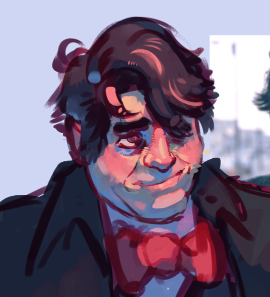
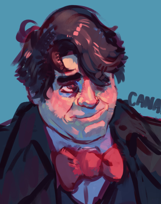
#to make it a fully rendered shaded pieces + background and everything
Explore tagged Tumblr posts
Visit Tumblr Blog
Explore Tumblr blogs with no restrictions, modern design and the best experience.
Last Seen Tumblr Blogs


Fun Fact
The “We are the 99%” Tumblr blog became the slogan for the Occupy Wall Street movement.
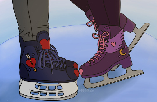
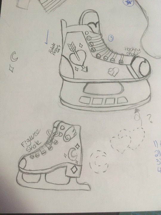
Text
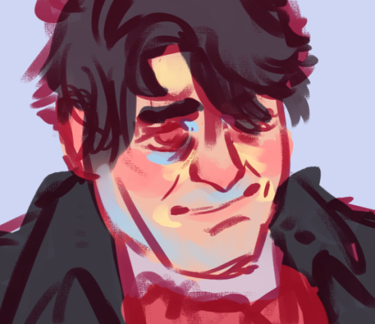
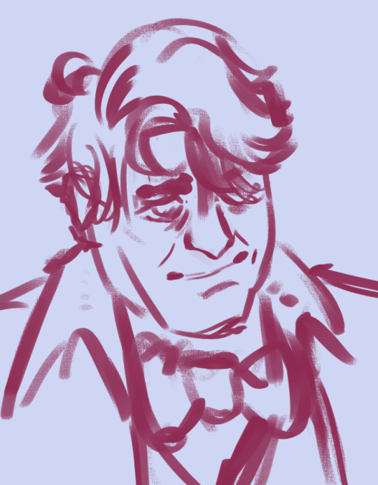
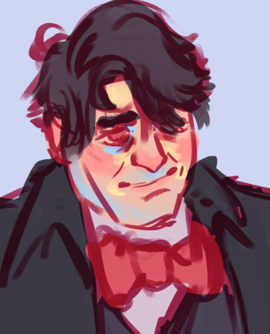
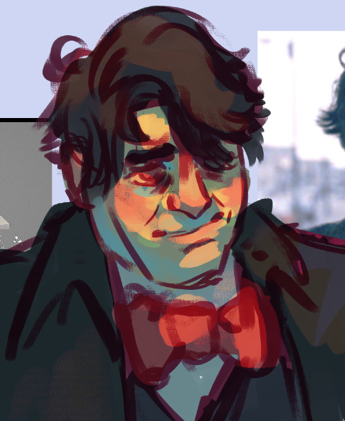
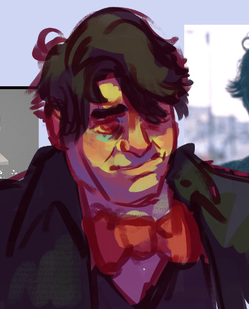
#it's been weighing on my mind lately haha#you know the pressure to only post finished pieces#it's been preventing me from drawing actually now that i think about it#like i don't have art block (yet) but everytime i open a new canvas i've been pressuring myself#to make it a fully rendered shaded pieces + background and everything#oh no#is this a felt cute might delete later post#i guess it is azejbrmkjf#clou post
14 notes
·
View notes
Note
Your art is wonderful!!!
A constant inspiration to my own creativity and art work. Could you explain some of your art style to me? I’m interested in looking at a bunch of different ones to try and finally find one for me.
Goodnight!!🌙
Thank you so much! That means the world to me! I’d be happy to share some of my process with you 😄
Keep in mind I’m completely self-taught, so this is just the process of how I make my drawings and not any sort of professional advice 😅 apologies for the long post ahead 😪
Starting with the basics, my biggest influences are Jin Kim and Ami Thompson. Both are amazing character designers and I really admire their stylization and expressions. Whenever I feel stuck on something, I always go back to their drawings for inspiration.
I typically start in Procreate with a canvas size of 3300px x 4200px or 11” x 14” with a DPI of 300.
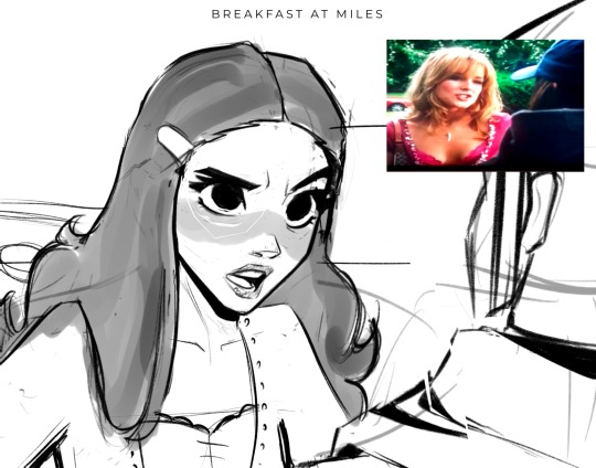
I put my reference in the corner of the canvas (in this case it’s a screenshot from the movie She’s the Man) and I start my rough sketch (emphasis on rough). Sketching is probably the longest part in my drawing process because I’m focusing on expression, composition, proportions, etc. This usually has about two to three passes before I move on.
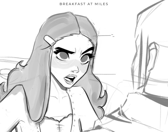
Then I lower the opacity of the sketch and clean it up with some lineart on a new layer. Lineart doesn’t play a huge part in my style, but I still like to play around with line weight. Since I knew this was going to be a fully rendered piece, I didn’t spend much time on lines that I knew were going to be removed later in the process.
Underneath all of that, I use the skin tone and color the base of the character. I make sure that I color ever so slightly past the lineart, for reasons that will be important later. This part can be tedious, especially because I use a textured brush, so there are a lot of gaps that I fill in later.
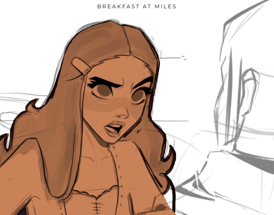
Then using new layers with clipping masks, I start the flat colors. Nothing too crazy here.
I’ve made color palettes for characters and backgrounds that I typically draw, so this way it speeds up the process and maintains style consistency. If I need a color that I don’t normally use, I’ll just play around with the colors until I find something that fits well with everything else.

Next, on a multiply layer, I add some basic shading (with the skin tone color) and blush (with an orange-pink color). I also move onto the background. Some are more complex than others. If I’m going for a more cinematic look, I’ll fill the background in with some basic shapes and blur it slightly. Thankfully the background was pretty simple in this reference.
I start checking proportions now that everything has basic colors. Then I duplicate my lineart layer and change it to a pinkish-red and put it on multiply mode and turn down the opacity. This is why the base color layer needs to line up with the lineart, otherwise there’d just be gaps underneath. Instead of erasing my black lineart layer, I put a mask on it and just keep the eyes and eyebrows.

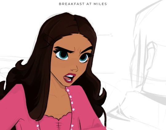
Then I start working on the shading and hair, which is an entire process in itself. Maybe I’ll make a tutorial on that one day 😅
I also use some vivid light and soft light layers and put in some subtle colors for extra pizzazz.

Then I add a hard light layer to the eyes for that glossy look and on a normal layer add some white details just to make some things pop more (like the nose, lips, eyes, sometimes hair, etc.)
I did make an eye tutorial a while back, but my process is still the same!
Lastly, I spend a lot of time playing with different blending modes (multiply, add, soft light, vivid light layers) and really focus on the lighting. I used to focus on adding a lot more details and make the coloring more realistic, but I found that the more simplistic coloring was easier for me to do and fit my style better. Sometimes I still tend to go too far with the details and realize that it looks better when I tone it down a bit.
That’s pretty much it! Let me know if you have any questions! Hope this helps. Have fun making art!
#art#digital art#procreate#art process#danny phantom#fanart#danny fenton#my art#paulina sanchez#tutorial
42 notes
·
View notes
Text
Commissions are open! (direct pricing examples in alt description)
I do a little bit of everything! I mostly stick to humanoids, but I was a furry for years many moons ago so I have that experience. I will absolutely do full NSFW for an upcharge (no minors!). There's pretty much nothing I won't do for the the right price, so please ask! Here’s some more painterly rendering style examples these are $60+ dependent on bust/halfbody/full body +$30 for each additional character upcharge for background dependent on complexity, I will work within your budget


Here's some things that are fully rendered, but with line art these start at $40 no upcharge for basic background +$20 for an additional character (+$15 for each after the first addition)
and some line art with basic rendering- $35
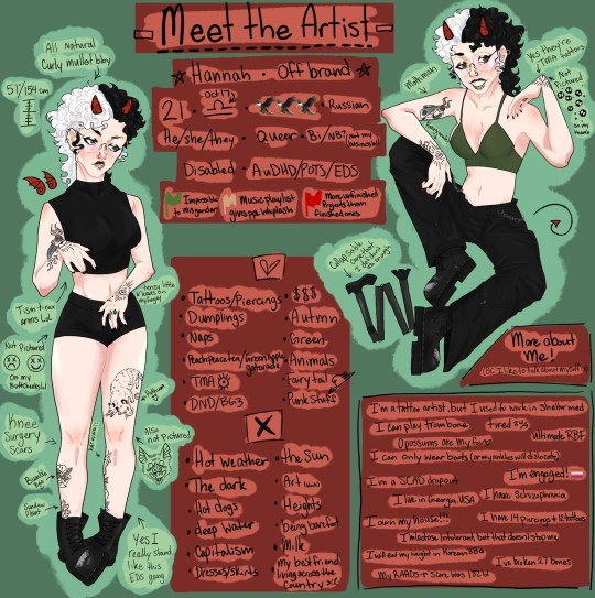

If you're interested in just line art it starts at $25, $30 for flat colors +$15 for additional characters (+$10 for any after the first addition) ye olden sketchy style no color- $15 (bust/halfbody) $20 (fullbody) color- +$5 basic shading- +$5 add character- +$10 (+$5 for each after the first addition)
I'm also make tattoo designs! (price varies depending on design but range between $20-$40 generally)
add $10 for any finished traditional drawing, sketch prices stay the same (+$20 for painting, no canvases, but good paper, i have examples) that price includes lamination if you want it as well as shipping within the US (outside US just covers any upcharge). I AM WILLING TO WORK WITH BUDGETS PLEASE MESSAGE ME!!! i greatly appreciate your time for looking over this, if you can commission me please share because I'm really freaking out about not having a job. If you have any questions I'm happy to answer :) 20% discount if you buy 2+ pieces!
#offbrand art#commissions#tma#bg3#dnd charcter art#dnd#please commission me#I need to pay my rent#except it’s actually my mortgage#furry art#furry commissions#furry community#furry comms open#art comms open#comms open
14 notes
·
View notes
Note
You have any advice on how to color your work, your art is amazing!
After two years I finally reply to you hi anon hi <3 <3 now I think that this was sent when I was more active with using Rebelle (still love it, but don't use it as much these days!) - back then it was a lot of pure colour theory and eyeballing which I've honestly since forgotten a lot of lol but bear with me here. I'll throw down a step by step as to how I do my stuff nowadays in the latter half of this post.
first off this video is a super helpful watch.
youtube
also read james gurney's colour and light, even if just skimming through it.
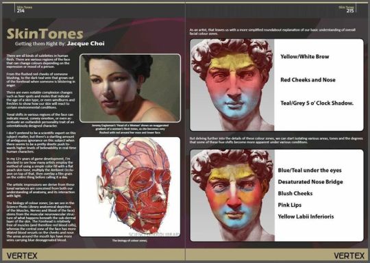
also also get familiar with the different colour zones of the face lol
also also also get familiar with the planes of the face, they'll help a lot when it comes to rendering out shadows and light. Love using this reference tool here.
now, for the things I keep an eye out for...
knowing your basic colour theory, complimentary colours, etc etc
playing around with colour, not being scared to make mistakes because hey I can just start a new layer lol not the end of the world if some colours end up looking ugly. Don't be afraid to copy/paste your sketch and play around with different rough colours to get a good idea of what you're looking for.
going into it with a few colours in mind that I'd blend everything from to make it all cohesive. choosing 4 or 5 specific shades and blending everything from that, typically avoiding pure black or white. In rebelle I'd typically blend those colours myself to get all the other hues and tones I needed just using the palette mixer, just like real paints
lots of flipping between grayscale and full colour to get a good sense of values, not being scared to darken or lighten areas as needed
I have a tendency to only focus on rendering one side or the other, so to speak -- leaving the shadowed parts fairly detail-less and focusing all of my rendering in the light side, or vice versa
I tend to designate one colour to be 'the dark' or 'the light'-- typically a dark teal or light yellow with most of my stuff lol -- and use that base colour in all of the shadows/highlights on a piece
keeping in mind the way different colours and lights will reflect off of surfaces and hit other surfaces? not the best with this one admittedly but never be afraid to take some colours from the hair and brush it onto the face, colours from the face and brush it into the hair, colours from the background and brush it onto everything, etc etc
I'm still using a lot of saturated colours even in the shadows ; I'm typically not introducing a lot of grays or blacks into a piece, even in the shadows. While of course my shadows are darker than the lights, I mostly distinguish them by colours -- once again, one colour being the 'dark!'
remember that the areas of highest contrast are where your eyes will be drawn to. i tend to tone down the contrast away from parts that aren't quite as vital to the drawing
most people seem to like to add shadows selectively over the piece, but I instead like to carve out the light. Cover the whole image in shadow using a multiply layer, and then erasing where the light is hitting.
layering layering layering, playing with undertones! colour in large swaths of the face with a colour that you want to have show through, building up layers of colour on top of that.
whenever I mix a new colour for something -- i.e to darken part of the eyes -- I try not to only use it in only one spot. I add a hint of it into some strands of hair, a subtle touch of it into some of the shadows. Otherwise I feel like the colour stands out too much and looks disjointed, like it doesn't belong.
don't feel like everything has to be fully smoothed out! Feel free to keep parts of it rough! Keep raw texture showing through!
When I'm adding in undertones, I go for yellow around the nose, forehead, and corner of mouth ; blues around the jaw and under the eyes ; reds over the cheeks, nose, and ears. your character is gonna look like a clown but i promise just trust the process lol
I also like adding in darker or more saturated colours around the edges of hard transitions between light and shadow to help really distinguish the values.
NOW FOR THE ACTUAL STEP-BY-STEP... GUIDE? PART OF IT.
In CSP I've got it down to more of a formula than anything. I start off with a real rough sketch, chunky brush, just trying to figure out where everything is going ; I refine any facial details but I'm not too worried about having the likeness spot on exact at this point. Lots of lasso tooling things around. Typically I do this all on one layer, but sometimes I'll let myself have a second layer with a more refined sketch that I work from instead. At this point I do one of two things
I make a layer below the sketch layer and fill it with local colours - the 'pure' colours of the objects. I set the sketch layer to multiply, lower the opacity a tad, and merge it down; or
I make a layer above the sketch layer, fill it with local colours covering the sketch, lower the opacity of the layer, and use a colour that's a shade or two darker than the local colours to roughly refine the outlines of the sketch. Bring the opacity back up to normal, merge down.
I've added in the undertones of the face at this point -- those yellows, reds, and blues -- and I'm working with only one layer. I'm still tweaking the features, lasso tooling things around, carving out edges that don't sit right, filling in any gaps in the painting with colour to hide the holes.
and then, once everything's roughly where I want it, I'll start playing around with multiply & overlay layers. Sometimes I use soft light instead of overlay, I just go by feel. I mess around with colour schemes to see what I like best, and sometimes I'll completely erase the lighting and shadows and try different lighting angles.
I make a new multiply layer, mess with the opacity to my liking, clip/mask it to the layer below, and go to town. I'll typically fill the whole layer with a colour I want for the shadows, carve out the lights, and then come in with an overlay layer that I selectively fill in where the light hits the character's face. Don't be scared if it overlaps the multiply shadows, it adds more colour variety to work with.
Merge the multiply layer down into the base layer. Merge the overlay layer down as well. And then I just... start going to town.
I ended up using a light blue multiply layer and pink overlay layer. I take the colour I used on the multiply layer, and directly apply it to different parts of the shadows to help the colours pop ; same with taking the colour I used on the overlay layer and the highlights. I like to put special focus around the eyes when I'm bringing in said colours.
99% of the time at this point I'm just colour picking from different parts of the painting, not bothering to select new colours from the colour wheel unless I've gotta start pushing my values a bit should details get muddy ; typically done by colour-picking an outline colour and dropping it in value a little bit. I take colours from the highlights and mix them into the shadows and vice versa, help harmonize the colours a bit. I'll colour pick from the face and add those colours into the hair even.
After that it's sort of just... rendering it all out. Paint the rest of the owl?
Sometimes I'll hit the highlights or shadows with another correction layer to try and push the value contrast further if I feel like it isn't quite enough.
I use the same brush throughout the whole thing -- I'm using CSP's default thick oil paint brush, that's had the dual brush mode enabled and the colour jitter toned right down because I found it lagged my computer ✌️
------
p.s don't be afraid to reference the methods that traditional artists use! Look at how they do brush-strokes, lighting, colours, layer things all together!
p.s.s also don't be afraid to fuck up lol. experiment with new colours and lighting schemes. play with colours that you don't like playing with. push yourself even if you think it's gonna suck. sometimes pieces need you to take multiple passes to it before you get something that sticks
also this is not the be all end of all advice do whatever your heart desires lol this is just how I do things ✌️🐛
0 notes
Text
This is the thing I'm talking about with modern comics, too, and I think it has to do with the prevalence of digital photography (and now AI art) where creating an image with a lot of details can be very fast in certain circumstances, whereas writing uses generally the same historical methodology, so people think of it as harder.
People expect not just a background, but a detailed one. They expect fully rendered shading instead of the block shading that actually gives comic/cartoon style its signature look. They expect far more detailed expressions and physical features and all that. And they expect it done in the same amount of time, regardless of how much more time it takes to do all of that.
So I think the parts of this are: most people have produced a complex image by themselves, very quickly, by snapping a picture and putting one or two basic filters on it, included with their phone or free image editing software they have. There's also the various dressup games and image makers that craft something like that from premade pieces, where they don't see how long those pieces took to make, just that it only took them a few minutes to make the choices and create their final picture.
And then the fact that, if you read something quickly or slowly, it can take about twice as long. So people can skim something, or they can savor it, but there's only so much time difference devoted to reading. But with an image, the difference is huge. You can see the whole thing in a few seconds, but you can spend hours looking at a single static image and still be finding new things, depending on the complexity of the image. So there's something that both feels faster about it, as if it were easier to create, and like something is missing if, say, there isn't a background.
I'm just going to blame this on doomscrolling and FOMO again and the urge - not really in the reflex way, but in the social pressure way - to view as many things as fast as possible, regardless of what type of thing they are. Where there's only so fast you can read, but you can look at a hundred pictures a minute if you're not paying any attention to any of them.
Anyway, my point is that I think it's a more widespread issue about how people view visual art and it sucks fandom is getting dragged into it when fandom's supposed to be the place we don't do everything based on marketing techniques.
Comparative splashes, to illustrate what I mean.
*rubs face* I'm so tired of modern bangs having low word counts like 2.5-5k and still expecting fully rendered art. It's just not fair.
I say this as a writer AND an artist, it's just not fair.
#look i said something#I'll delete this if my ramble is bothering you I can make it its own post. I just very much have noticed this is a trend
25 notes
·
View notes
Text
COMMISSION INFO - Putting a cut here because I'll be real I'm sick of having to scroll past my own post HRKKGSK


COMMISSIONS ARE HERE AND OPEN!
Please contact me through direct messages if you're interested :)
Also, feel free to browse my #traditional and #digital tags for more examples of certain coloring styles!
I look forward to working with you all!
Typed version of commission info (and more specific info) under the cut:
LONG LIST OF INFO :
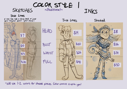
🖍 Coloring Style 1: Traditional art done with pencil, ink, and watercolors. Final images will be scanned for best quality. For sketches, I can use either red and blue lead or your regular standard pencil- it's up to you!
✒ Coloring Style 2: 'Cel' Digital art, with hard colors and ink.
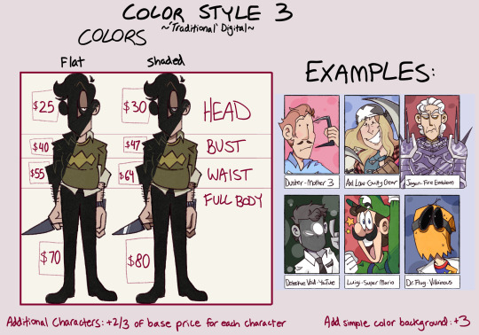
✍ Coloring Style 3: 'Traditional' Digital art, made with brushes to give the pieces the look of traditional work despite being made digitally.
The prices for every coloring style goes as follows:
SKETCHES - JUST LINES
• Headshots - $7
• Busts - $10
• Waist Up - $13
• Full body - $20
SKETCHES - SHADED
• Headshots - $9
• Busts - $13
• Waist Up - $17
• Full body - $25
INKS - JUST LINES
• Headshots - $14
• Busts - $20
• Waist Up - $26
• Full body - $40
INKS - SHADED
• Headshots - $18
• Busts - $26
• Waist Up - $34
• Full body - $50
*Note that I will use 1-2 colors for the shading in SKETCHES and INKED pieces, and these colors are up to you!
COLORED - FLAT
• Headshots - $25
• Busts - $40
• Waist Up - $55
• Full body - $70
COLORED - SHADED + FULLY RENDERED
• Headshots - $30
• Busts - $47
• Waist Up - $64
• Full body - $80
SKETCH PAGES/REFS
Prices depend on what is included, and the level of rendering. You can request any number of drawings, how much of the character is drawn, and how far rendered it is- and these requests will adhere to the listed prices above, but with a 10% discount on everything.
For example, a piece with INKS that are JUST LINES that includes one full body ($40), two busts ($20 X 2, so $40), and four headshots ($14 X 4, so $56) would be $136- but with that 10% discount, the total will come to $122.
Add simple background: +$3
*Note that I'm not opposed to adding simple background + foreground info, like simple chairs, nature, props/items, etc. Inquire about this if needed!
Add extra characters: +2/3 of base price for every character added. For example, a full body SHADED INK piece with one character is $50, but with two characters it would be $83.
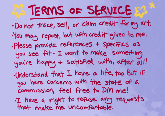
🌟 Terms of Service 🌟
�� Do not trace, sell, or claim credit for my art.
• You may repost, but with credit given to me.
• Please provide references + specifics as you see fit- I want to make something you're happy and satisfied with, after all!
• Understand that I have a life, too. But if you have concerns with thr state of a commission, please DM me!
• I have a right to refuse any requests that make me uncomfortable.
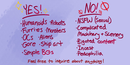
👍 YES! (THINGS I WILL DRAW) ✨
• Humanoids
• Robots
• Furries
• Monsters
• OCs
• Aliens
• Gore
• Ship Art
• Simple Backgrounds
🚫 NO! (WILL NOT DRAW) 👎
• N S F W (s*xual)
• Complicated machinery + scenery
• Bigoted Content
• I*cest
• P*dophilia
Feel free to inquire about anything!
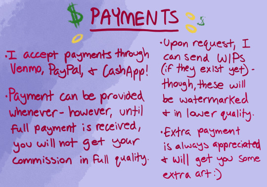
🪙 PAYMENTS 💸
• I accept payments through Venmo, PayPal, and CashApp! My specific info to deliver payments will be provided in DMs.
• Payment can be provided whenever- however, into full payment is received, you will not get your commission in full quality (you will only have watermarked and lower quality images until full payment is received)
• Upon request, I can send WIPs (if they exist yet)- though, these will be watermarked and in lower quality.
• Extra payment is always appreciated, and will get you some extra art :)
Thank you for reading, and I look forward to working with you!
53 notes
·
View notes
Text
Vamptober Week 4 Reflection & Final Thoughts
Week 1 Week 2 Week 3
Its complete! Its done! I am overjoyed to rest my eyes and hands- and I’m ecstatic I have one hell of a portfolio! Of course, I have my Ko-fi for donations. Working on getting that set up to take other payments besides paypal for donations. Donations are always optional.
And HERE WE GO! Vamptober Days 22-31
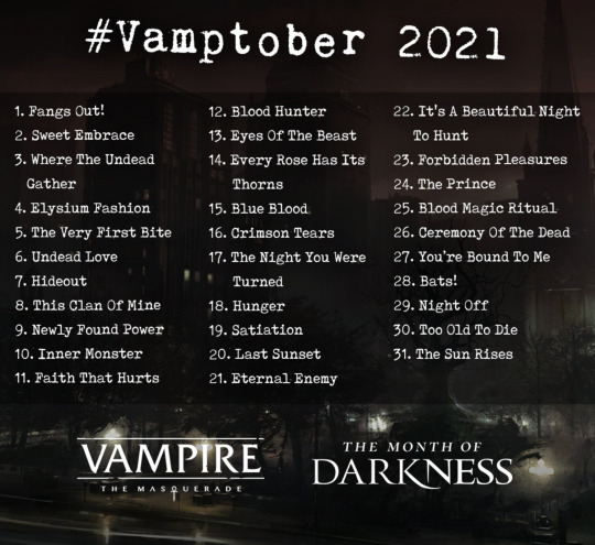
Vamptober Day 22: It’s A Beautiful Night To Hunt
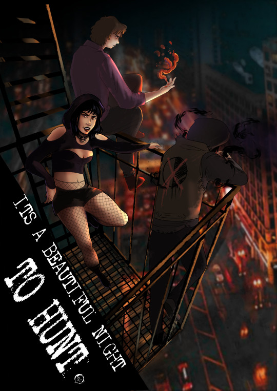
After Day 21, I needed to have some fun. I wanted to depict my Tampa!verse thinbloods, prowling and poaching. What could possibly go wrong with two Lasombra and a Tremere with thinned blood?
The background is actually a photo I took in Chicago. I tried to look for anything from Tampa online or in my own travels, and found nada. I started by utilizing the Auto-color features, where the program renders a set of colors and lines from the images. I usually have this setting set to low, for ease of my RAM and Graphics Card. But for this, I set it to High Quality. I was a little disappointed by the results after waiting 5 ish minutes for it to render, but I noticed the colors were bolder. I then got to work blurring. I actually painted a large portion of the building blur, and auto-rendered the street below.
Next came the thinbloods. This part was easier, aside from the perspective. I had set up some perspective guides, which I found somewhat helpful. I’m certain that tool will come in handy when I attempt to do comic work soon. I am proud that im getting much better about my color choices. Pulling tones from backgrounds is really paying off to help make everything look in in the same place.
The note I have for myself is that I needed to “pop” Damien’s silhouette a bit more. Both Hazel and Tommy have enough lighting (or too much). Damien just needed a little rim lighting and on his shadow manipulations to separate him from the background to the foreground.
Vamptober Day 23: Forbidden Pleasures

I really wanted to make this prompt non-sexual. Being horny for vampires or vampires being thirsty is certainly part of the fun of the monster- but I didnt want to depict another “forbidden romance.” So I latched onto the forbidden aspect of the prompt. The desire for knowledge often leads vampires along paths that are far from savory- paths that plenty would consider forbidden.
So boom. Got to work on drawing a new House Carna Tremere. I laugh at my labeled Book of the Grave War- as if Carna got an ISBN for that. But I could not really think of a clever way to clearly depict what was so forbidden in this image without plain text.
I really like the stipple shading of this person- but I realized one major problems with this piece. When finalizing the rendering, I really need to make sure I give my devices ample time. I was incredibly frustrated when posting this piece that the shading on her legs looked pixelated and distorted. I am still not sure what I need to do with my output settings to assist with that- other than letting my devices take the time they need to fully load the image.
Vamptober Day 24: The Prince
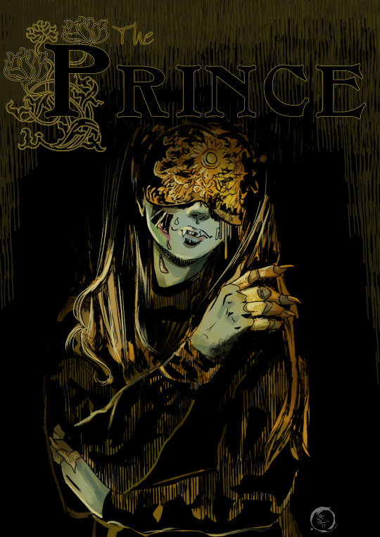
I had fun with this one. I absolutely love choosing unexpected clans to be Princes in Camarilla Domains. Everyone has seen the Ventrue and Toreadors in charge. A Malkavian? Absolutely bonkers. A Tremere? Oof! A Nosferatu? Now there’s something really fun! Gleam in decay you Horrid Prince!
I am really happy with the shading on this piece- and I had another breakthrough. I worked up from black on this piece. Working from a black background rather than grey or white has a number of challenges in traditional media. But digital? I was pleasantly surprised at how easy it was to get bold colors and let my washes show the dark tones underneath.
I then utilized this process for my Fall of London tokens and just ZOOMed through those. I continued working from a black background for a lot of pieces after this one.
Vamptober Day 25: Blood Magic Ritual

This one I took my time on. I worked up from black and layered my water color brushes and gouache brushes. I am so pleased with the color choices here- I really just....I impressed myself.
The technique I used here is something I learned from being a scenic artist. The term is called scumble, where you criss-cross your brush strokes to create a base texture. From there, I worked in digital washes. If this were a physical piece, I would absolutely soak it in paint and water, and leave it to dry for hours- possibly days before continuing with the next layer. To get the water color effect, I set the brush to paint as a multiply blend. So each time I went over a particular spot, it would get more saturated and darker. This more effectively mimics how physical watercolors work. I just kept playing with the wet blends and splatter brush until I thought it was enough.
The magic circles are from stock brushes from Clip Studio’s material catalog.
The figure is a depiction of Hazel’s adoptive sire, Mary Andrews. A fearsome Tremere of House Carna. Although Mary was known for Cauldron of Blood not Creatio Ignis- I do believe that Tremere would have that ritual in her arsenal if she could.
Vamptober Day 26: Ceremony of the Dead
HANDS! I pulled from a reference image for this one. I really needed it to see how wet fabric pulls across her body, and I really did a good job.
The lighting from all the hands was especially challenging- since each hand was modeled after my own- and I forgot to keep the lighting consistent. I ended up just trusting my gut and soft light layers.
I initially painted this piece to be far more saturated. In post, I actually used a subtract layer to dull some of the reds in the text and skin. This kinda creates this blue/green hue over the white highlights- as if we are under flourescent lights. Ceremonies of the dead do not need to be lavish. The notes I have for myself on this piece are: I definitely wish I could have manipulated this into something a little less like the reference- but its fine. I could have given the blood in the bathtub some more tones- indicating depth to the ceramic fixture. I should have also created a clip layer over my line art and pushed some highlights a touch further.
Vamptober Day 27: You’re Bound To Me

This one was much simpler than my other designs. I took photos of myself in the mirror to get the body postures correct. I like the body language of the foreground character a lot- I think I did a good job showing distress and an odd desire simultaneously.
If I was to redo this piece I would spend more time pushing highlights. I think the piece needs some more white tones to give it that dramatic lighting. Looking back at the layers it looks like I had toned these down- I should have left them bold. I think it would make the piece more dramatic. I also think both figures need an outline to push them forward from the background.
Vamptober Day 18: Bats!
BATS! Since creating Hazel as a character, I have had a lot more fun drawing and reblogging bats. I pulled my design from her jacket from 2020, with the thinblood mark and flowers, and a large flying fox. I redrew the piece, updating the design.
I streamed this one to my friends who play in the Tampa Verse or have role played with Hazel in the past. It was really nice to just chat and draw.
I think this piece is a little weaker than my other vamptober, but its certainly one of my favorites because I just had fun.
Vamptober Day 29: Night Off
I had a hard time figuring out what I wanted to do with this piece. I considered painting my Tampa Thinbloods in the blanket fort, but found the composition repeatedly not conveying a night off. So instead, I focused on what happens when you take a night off as a powerful vampire. Some one is going to break in and take advantage of your lack of vigilance.
I recall being rather tired when working on this piece and decided to only work in silhouettes. It was actually quite freeing to just work in black and white and then add in tones. The watercolor background is something I painted forever ago- I frequently use it as texture overlays.
My notes for this piece are that I think I got too dark and it is hard to distinguish figure from chain link fence from city. Had I toned things a bit more effectively, I think this would not be an issue.
Vamptober Day 30: Too Old To Die

*Cackles in artist* Hello old lady- lets make some artwork. This is one of my friend’s characters. Originally, I had planned to have this piece mirror day 15: Blue Blood, showing an opponent to Antonia Vicario. But my ambitious self had bolder plans and decided to not pit the Ventrue against each other tonight. Back in 2020 when I had just started using Clip Studio, I made a call for people to send me their OCs and I would just play with the new tools for an hour drawing them. I took that piece and redid it. A full year of artistic growth and knowledge to create this. I had so much fun making this. I forgot how much I enjoy my dripping paint effects. I used to do them all the time in fine arts classes. I think its gonna be one of my stylistic calling cards. I love the movement of the hair in the new piece. I did a good job with the soft glow to push her forward from the paint drips. I am proud of the subtle perspective that looks as if she looms over the viewer. I could have easily spent several more hours adding details and flowers.
The original:

Vamptober Day 31: The Sun Rises
I always let the final piece take as long as it needs. I spent 3 hours painting Hazel in a fiery red sunrise, knowing she will not burn. Utilizing my skills from the past 30 days, I try to incorporate all the techniques I learned. Although I didnt work up from black, I pulled and layered colors in the exact same fashion. I utilized pre-rendered tools for stones and bricks. I have a wonderful sense of depth from the alley to the sunrise. I think the fiery red tones were fun to paint. Whenever I tried to tone the piece to be softer, it felt off.
My only note is to figure out how to bold her thinblood mark on her back. Since it is in shadow, it is hard to see it. I think if i had used a purple tone or blue, it would pop a little more against the reds. I really like how her hair looks so fluffy in the breeze. The shading is really well done. Originally I had it the same color as the sun behind her, but I made the right choice to tone it to red to help enforce distance.
Lastly, the little bit of sun looks like a halo around her. We all know vampires are far from angelic, but oh its tasty.
Week 4 Reflection and Final Thoughts
I slept in almost to 11 am. I was so so so tired. I knew trying to juggle it all was going to be a lot- I knew that I needed to be kind to myself through this process. I tried so so so hard. But seasonal affective disorder is a bitch and my brain is a liar.
I think my final week was a resounding success. I had created a lot of beautiful pieces, and had a lot of fun with them towards the end. But there is one thing that kinda is a big blow to this entire thing. Sometimes- it stopped being fun. It was painful to get something on the screen. It was agony to find something I believed was Good Enough.
I think in Week 3 I struggled with that the most. I was repeatedly frustrated with what I wanted to create versus time and work obligations and scheduled games. There was a part of me that understood that I needed to cut myself some slack, it was very busy. There’s another part that demands perfection, and failure to meet it is simultaneously unthinkable and repeatedly experienced.
I usually treat this with rest and time away from my stressor. Bubble baths and hot chocolate. But I wanted really badly to do all 31 days. I pushed through it- despite my best judgement.
I am proud of myself. I really truly am. This work is beautiful. The repeated acknowledgement from World Of Darkness’s official accounts was sweeter than vitae. But if I am going to continue to create content- I need to address this internal battle. I often reach a state of “Fuck it!” when making these pieces that allows me to kinda have fun with it again. But I’m getting real tired of being in this cycle of 1. I got this! 2. I hate this 3. Its terrible 4. Fuck it who cares Not Me! 5. I love this and am unstoppable.
So what to do? I don’t know. I, understandably, feel rather drained after all of these. I’ve already decided I will be checking my finances to see if some light guidance through therapy is affordable. Because people don’t normally want to cry over things they want to do for fun. Because it isn’t healthy to drive myself to exhaustion over something I do for leisure. But theres also a confidence boost. I am going to start utilizing World Of Darkness’s Dark Pack for some of my content. I already do all this for free, why not be able to slap their logo on things? I feel like that is a good next step for continuing to make fan stuff.
The other thing is that I learned how I like to do digital art. I started utilizing techniques and tricks from my traditional mediums. And God I missed those. Its all just so fun to see how they translate to a digital canvas.
And from there, I recall a discussion I had with a local manga/comic artist I admire. She instructed me to practice getting loose and having fun. Because after all- if it isn’t fun what is the point? I think that is one of the most critical pieces of advice I have ever received. That and “stop using the fill tool its garbage.” The pieces I just let myself play and have fun are some of my favorite ones. The ones where I just let myself relax and move with confidence that I’m going to enjoy this process- and be excited to see what appears on the canvas. Going forward, I think I need to embody that attitude more.
Let the fun be the journey- not the final result.
And that’s where I am going to leave it for a bit. I need to take a few days if not a week to not draw vampires. I have a few non vtm commissions on my radar and can set up. The holidays are coming up and I need to prep a few slots for that.
But for now:
Just play. Have fun. Relax. Draw sexy lesbian vampires on the internet.

~Steph
Instagram Ko-fi
30 notes
·
View notes
Text
From planning to posting, share your process for making creative content!
To continue supporting content makers, this tag game is meant to show the entire process of making creative content: this can be for any creation.
RULES: When your work is tagged, show the process of its creation from planning to posting, then tag 5 people with a specific link to one of their creative works you’d like to see the process of. Use the tag #showyourprocess so we can find yours!
Thanks for tagging me @candicewright
I’m tagging @aikakuu and this piece
@italiansoda and this piece
I don’t have anyone else to tag on tumblr orz....
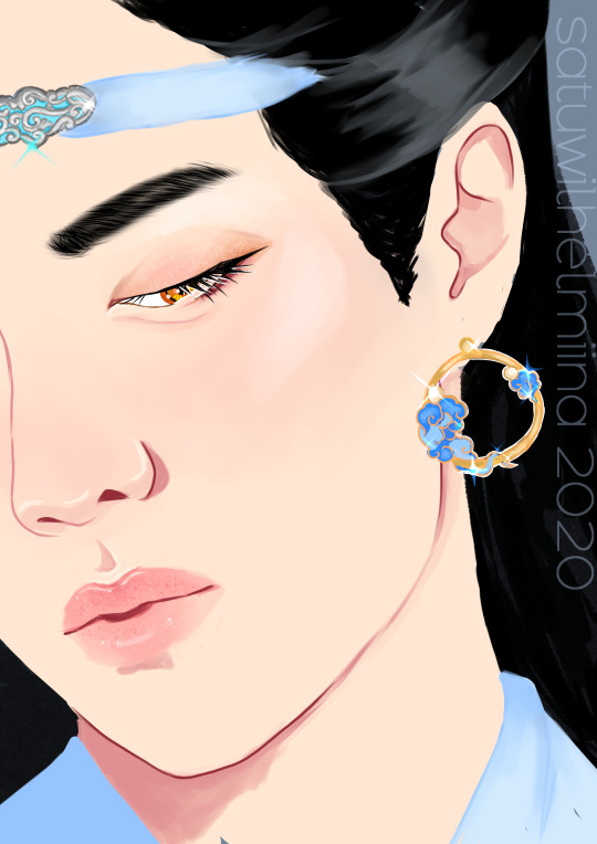
You can reblog the original Lan Zhan piece here
So the process for this started when I saw an instagram ad for these earrings. My brainrot went “oh. lan zhan” and I just decided to draw him with them.

I didn’t really have a pose in mind yet, so I just set out to search for images of Yibo I could use to kind of inspire me in that way and came across this one:

I thought this was perfect. It’s such a good closeup that will allow me to really just work on some of my favourite things in close-up portraits, and it will allow me to also showcase the earring. It’s obviously from a photoshoot for something, and the idea of earring model Lan Zhan was really delicious.
So with this image I started sketching in clip studio paint.

I like to use the default design pencil brush for sketching, just in case anyone wants to know haha. After the sketch I set about making a colour palette. I usually colour pick from images and then adjust them so that the colour is a bit more vibrant.

Usually when I start colouring I start with the skin. I tend to render most of it. I use the following brushes usually:

Every brush apart from the last one is a default brush in the software. I use the last one when I do “lineart”, so usually anything with a harder, non-blended edge in the image.
Obviously the skin here is after I’ve already fully rendered it. The shimmery eyeshadow and the shimmer on the lips was added last, after everything else had been finished. Other than that it was fully rendered before I moved onto other things.
The next step for me is always the eyes. When I’m drawing close-up portraits I use like 5000 layers for the eyes. The first one is the sclera and the colour of the pupil
After that I usually draw the lashes. In this case the upper and lower lashes are on separate layers.
Up next is the pupil and the effects. The pupil is on a separate layer between the upper and lower lashes.

Above the pupil layer, below the upper lashes is the effects layer, it is set to Add (glow)
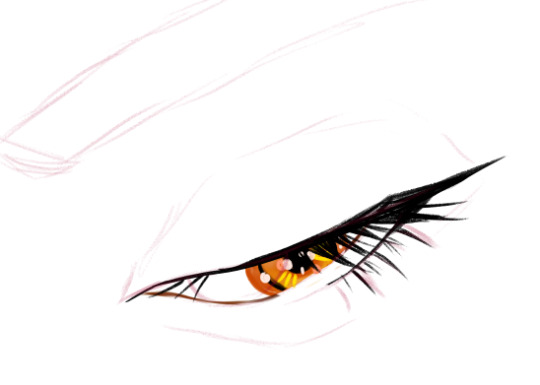
Usually for these effects I pick colours that match other bits in the drawing. In this case it is golden because of the golden earrings and the fact that lan zhan as amber eyes.
After this I add a layer of white lineart below the layer of upper lashes and on top of the pupil
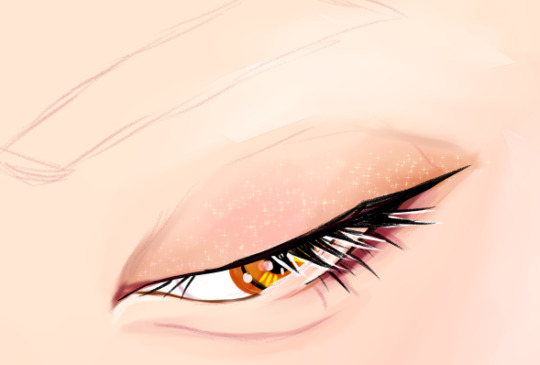
(You can see the “eyeshadow” look below in these layers as well. This was mostly done using the emphasise texture brush and I think the default oil paint brush. )
After that come the eyebrows and hair. For eyebrows I usually draw a black caterpillar that loosely follows the shape of the eyebrow and then blend it until the colour is a translucent grey. After that I use the brush I use for lineart to draw some individual hairs

For hair I usually do flat colours first and then add some variation with either the flat marker brush or an effects brush I got when I downloaded a massive pack of hair texture brushes. For this one I think I used the flat marker and strangely enough the fingertip blender.

After this I drew the headband and the earrings. The process for all of them is simple: flat colour first with the turnip brush and then shading with the emphasising texture brush and maybe some lines with the random brush that has a korean name (see the brushes I regularly use).

There is also a separate add (glow) layer on top of these that I’ve used to add some sparkles!


There’s also a layer of white lineart that I used to make sure the earring pops out of the background a bit

After all this I went and added the sparkle on the eyelids and lips.

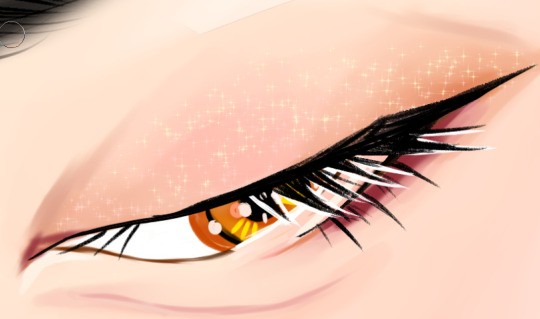
I think the brush I use for this is a default brush but I’m not quite sure anymore.
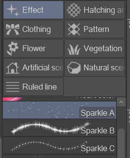
In any case, I use a combination of the sparkle a, b, and c brushes.
The last step is the background and the clothes. For this piece they were super simple, basically just flat colour.
And that’s it!!
67 notes
·
View notes
Text
Process Breakdown: Starfall
Since I got some positive responses to my question on process stuff I’m gonna do a behind the scenes breakdown for my most recent piece to help people see the process I use and how I problem solve. I didn’t plan to do this initially so I won’t have a ton of process shots but I did save a handful. There’s a few scattered hyperlinks to other pieces I reference too. Just a warning this is mostly train of thought so it’s super verbose.
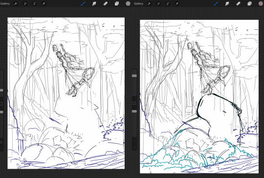
So base sketches were mostly focused around me defining the shape of the girl since she was the focal point and building the environment around her. Going in the things I knew I wanted were a girl precariously balanced on top of a massive capybara catching a falling star, while surrounded by smaller sleeping capybaras on rocks. I layered out a general forest scene surrounding it but didn’t really commit to much in the sketches. Messed with the angles of the large capybara a few times to make it feel less flat and more 3D in the space, used a lot of reference photos of capybaras and sorta simplified them to what I thought was cute/ what stood out to me as their defining features.

Skipping ahead a solid amount is midway through the initial lineart, with some areas just colored in to define them as separate. Initially this piece was supposed to be in a similar style as my “Stratosphere Dreaming” art, with a single uniform line thickness, bright colors, and no gradient shading at all, but I realized pretty soon after I finished the lineart and started coloring that I had done what I tend to do a lot and made it too complex to pull off successfully in that style so I had to pivot to using gradient shading and other non-cell style techniques (though you can see a lot of those methods still in the coloring of the girl). This caused an even bigger challenge as I was drawing on a large canvas with high DPI in Procreate which resulted in me having a cumulative 50 layers to work with at any given time (hell).
Now once I made that rendering style pivot is when the really hard part began, and why on top of my persistent arm injuries this took me about two months to finally finish.
1.) I had an extremely difficult time trying to figure out the color pallet for the piece. I had an idea of the values and general colors I wanted (you can see some pallets and random base color tests in the image above) but I just couldn’t get them to look right and I became extremely more aggravated as I kept trying new and different things. My biggest mental block was feeling like I was stuck trying to make the initial pallet idea work, but eventually I was able to bump it to a slightly adjacent pallet and it worked far better. Essentially a lot of angry experimenting and testing.
2.) I made the piece too complex for its own good when it came to the foliage and scene. After finding success with a very specific way to render foliage in one of my favorite pieces I started to use it as my standard, but that standard started to show cracks when I had foliage heavy scenes like in my Hollow Knight piece from last year. The rendering style became insanely too time consuming, and incredibly distracting when used in abundance, taking away from the focal point. I knew this but I still attempted to use the same style to render the foreground foliage MULTIPLE times in increasing states of frustration until I stepped back, evaluated it wasn’t working, and tested out a very similar style with the same effect but that I could throw together twice as fast without the aggressive distraction and minuscule details that were irrelevant in the scheme of the art. This frustration in the rendering not working was only exacerbated by the color pallet indecision making a lot of the attempts just look bad both color and style wise.

Due to the limited layers I had to finish rendering out the girl very early and merge her together to free up layer space, and couldn’t keep my lineart layers as separate as I would have liked to allow for quick line color swaps. She ended up being a key point in defining the rest of the color pallet of the piece. The dress shape was indeed inspired by the Lirika Matoshi strawberry dress, but with my own twist.
Once I got a more solid color pallet down the rest started to come a lot easier and I was able to begin filling stuff in and doing general color adjustments to make the backgrounds darker and give it more depth. I don’t have any more process shots beyond the initial color pallet exploration unfortunately, but the last hurdle I hit was at the very end once I was doing final touch ups. I found that with the only light source/ lighter color being the falling star that it washed out a lot of the rest of the pieces and made the details I spend so much time on feel unnoticed. I found though that adding the bright orange stardust specks into the trees, the girls hair, and falling from the star itself gave the last bit of color I think it needed without completely destroying the atmosphere. Originally (you may see it in some of the process shots) there were going to be jars with stars already in them illuminating the bottom of the piece, but after multiple trial and error iterations it just didn’t work out and ended up taking the focal point away from the girl and the star too much so I scrapped it.
Finally once I got everything done I made a copy of the entire art file to save as a backup, then with one of the copies merged all the layers together. Once all merged I made a copy of the fully merged layer, and went and adjusted the entire layer copy using a Gaussian Blur, reduced the opacity of the blurred layer to a super low percent, and put it on top of the original merged layer. This gave it that ethereal sort of feel that is difficult to notice unless you zoom in but really helps soften the piece and make it more dreamlike overall. Then I merged that blur layer down, and turned on about a 3% noise layer on it all to give it a bit of texture.

But that’s enough rambling from me, hope this helps give a bit of background to my process and decision making and it wasn’t just a wall of random musings.
My last piece of advice is if you’re looking to do art professionally, do commissions, or make a lot of pieces in a short period of time I would highly advise against directly copying techniques I use. Because while I’m always working to improve I do only do this as a hobby rn so I have the luxury of being able to invest a lot of time, energy, and details into higher complexity pieces that would take way too long in a professional environment. I can put a lot of time into making a single piece exactly as I want it since I’m not reliant on art as my sole income. As I improve I can make things faster, but it’s still an overall slow process and I just end up moving my quality standards up with any level of improvement anyway. Use stuff I do as inspiration but I cannot stress enough to learn as many shortcuts as possible (I’m still struggling with this myself).
If y’all have any questions about bits feel free to dm, if I do something like this again I’ll try to get better screenshots during the process n try to be less verbose.
52 notes
·
View notes
Text
you render me in a thousand details
Also on Ao3
00000
“Hey, Davey, can you grab me another can of paint outta the closet?”
Davey looks up at the sound of Jack’s voice. The man in question is perched precariously on top of a ladder, the latest backdrop for Ms. Medda’s new show set up in front of him
He places the book he’d been reading while Jack worked to the side. “What is it I’m looking for?” Davey asks, clambering to his feet.
Jack’s head turns in his direction but he doesn’t take his eyes off his painting, his tongue poking out of the corner of his mouth as he carefully adds a series of fluffy white clouds to a cheerful skyline. “The extras should be just inside the closet on the right—I need the dented can with the red stripe on the lid.”
Davey makes his way over to the tiny supply cupboard that Jack has claimed as his art closet. It’s a floor-to-ceiling collection of paint cans, canvases, brushes, and other supplies, and it never fails to amuse Davey how Jack can take one look at the mess and immediately unearth whatever item he needs for a particular project. Most of it belongs to the theater—requested by Jack but paid for by Ms. Medda—but Davey knows that Jack sometimes stores his personal pieces and supplies in there as well, if only to keep them safe from the daily mayhem of the Lodging House.
He reaches for the pull chain and a lone light bulb flickers to life. Davey takes a couple of tentative steps, squinting his eyes against the dust in the air as he scans the shelves for the can Jack had asked for, then lets out a squawk as he immediately trips over an unopened box of paint thinner.
His elbow knocks against something as he fumbles for balance and there’s a loud thunk and the flutter of paper as he sends a sketchbook full of drawings careening to the floor. Davey lets out a quiet curse, crouching down to pick up the scattered pages and tuck them back into place.
His movements slow as he suddenly understands what he’s looking at—what he’s discovered. Because this is one of Jack’s sketchbooks, but it’s not one that Davey’s ever seen before. And the drawings inside...
Dazed, Davey wanders back into the larger room.
Jack glances back at him, one eyebrow raised. “What, did ya get lost in there? What took so long?”
Davey swallows. When he finds his voice, it comes out tremulous. “Jack, what is this?”
“What is what?” Jack wipes his hands on a spare rag, then comes over for a closer look. He gets within a couple feet of Davey, then staggers to a stop, his face going alarmingly pale. “Where did you get that?”
“I, uh, I knocked it off the shelf by accident,” Davey says. “Why do you have— What is this?”
Jack lurches forward as if to snatch the sketchbook away from him, but stops himself mid reach—like he can’t bring himself to actually tear the pages out of Davey’s hands. He paces in place for a moment, then takes a step back, crossing his arms over his chest.
“What, that?” Jack says, and it’d be a passable attempt at nonchalance if not for the nervous waiver in his voice. “That’s nothing, really. Just practice sketches, and, uh, doodles and stuff.”
Davey looks at him. Then he carefully opens the sketchbook to the first page. There’s an inhaled breath, the tiniest twitch of the hand, but Jack makes no move to stop him and Davey takes that as permission.
He’s quiet as he flips through the assortment of pages. Or maybe it’s that he’s stunned into silence.
There are all types of drawings. Some are only outlines, vague sketches with just enough detail to be identifiable. Others are fully-worked—entire pages of careful shading and texture and blending. He’d caught a few glimpses in the dim light of the closet, and this closer look only confirms his suspicion: these are all drawings of Davey.
There’s one of him from the other day, where he’d gotten caught in a storm and came back to the Lodging House sopping wet, his clothes dripping and his hair curling up at the ends from the rain. There’s another of him on his building’s fire escape, hands curled around the railing and head tilted towards the stars. There’s a series of drawings that are just of his eyes, all done in various shades of blue and in a couple of different mediums, which are the only bursts of color in any of the drawings so far. Davey asleep at the table in the mess hall with his head pillowed in his arms, a pencil starting to slip from his fingers. Davey sitting on the corner of Jack’s desk at Pulitzer’s, studying his latest political cartoon. Davey with the other Newsies, their bodies drawn in hazy silhouette, Davey standing at various street corners, hawking newspapers to faceless passersby.
A few of the scenes depicted are things Davey recognizes, distinct instances that he can place in his memory. Others are more nebulous, ordinary moments in an ordinary life. He turns to a new page, this time finding a sketch of him reading an unlabeled novel, curled up in the corner of one of the dorm beds. Davey frowns, a little perplexed. Although it’s beautiful, as all of Jack’s artwork is, he can’t begin to imagine what inspired Jack to draw this particular scene. He’s not even really doing anything in it—it’s just Davey being Davey.
He turns to another page and his breath catches in his throat.
It’s a drawing of him caught mid-laugh with his head thrown back, the morning sun shining brightly behind him and a slew of crisscrossing lines in the background. Davey recognizes it as a moment from a couple weeks ago, when he and Jack had made the trek across the Brooklyn Bridge for a meeting with Spot.
Davey traces a finger gently along the broad strokes of charcoal. Jack had remembered this moment, had kept the image in his mind until he’d had a chance to commit it to paper, then rendered it in astounding detail. And Davey’s no artist, but even he can tell that this drawing must have taken Jack hours. Days even.
“This is what you think of me?” The question falls out of his mouth, so unexpected that not even Davey had realized he was about to ask it. “This is how you see me?”
“Whaddya mean?” Jack responds, shifting uneasily, his voice a little gruff in his discomfort. “‘S how you look.”
“Jack…” Davey trails off helplessly, unable to elaborate, unable to explain the fragile hope that’s blooming in his chest. He starts flipping through the pages again.
It’s a wash of ink and charcoal and lead, the occasional flash of blue, but all of him. Davey pauses on one particular page, which features a drawing of him from the shoulders up with his eyes rendered in vivid color.
Colored pencils are expensive. Paint even more so. Davey imagines Jack in an art shop, imagines him hunting through the rows of supplies for just the right shade of blue with the same determination that made him start up a strike, deciding that this color is worth handing over some precious amount of his hard-earned paycheck… Davey’s heart starts beating frantically in his ears.
“These are beautiful,” Davey whispers hoarsely. “The way you’ve drawn me… you’ve made me look beautiful.”
Jack’s eyes dart here and there. Davey gets the sense that he’s looking for the ‘right’ way to respond to this statement.
“...I don’t hafta make you look beautiful, Davey,” Jack eventually says, scrubbing a hand along the back of his neck. “You already are—I just draw what I see.”
Davey calmly sets the sketchbook down on the nearest bit of clean, flat surface. Then he steps forward, grabs Jack by the straps of his paint smock, and kisses him.
There’s a split-second where Jack freezes, startled. Then he groans somewhere deep in his chest, wrapping his arms around Davey’s waist to draw him even closer, and the press of his lips against Davey’s is deep and soft and wonderful.
It’s Jack who pulls away first, moving back all of a hair’s breadth, his eyes flitting across Davey’s face like he’s savoring every detail of his expression—like he’s perfectly content to just look at him.
It’s only now that Davey realizes the significance of that gaze: Jack looks at him like he can’t believe his eyes, like he’s something out of his wildest dreams, and he cups Davey’s face between his hands with aching tenderness, like he’s something to be cherished. Davey can only press up into that embrace, can only hold Jack close and hope that he understands, that Jack sees the emotion in his eyes the way he sees so much of Davey’s everything.
But there’s one question he needs answered. “Why?”
Jack leans in and presses a kiss to Davey’s temple. “It’s just… you have so much to you, Davey. No drawin’ could ever be all of you. But that didn’t stop me from tryin’.”
A kiss on the high point of his cheek. “And once I got started, I couldn’t stop. I would see you sittin’ somewhere, anywhere, laughing or sleeping or shouting and— and you just buzz behind my eyes and I can’t get it to stop unless I grab a pen and some paper and sketch out whatever picture of you I got in my head.”
A kiss right at the corner of Davey’s mouth. “And I couldn’t never show ‘em to nobody, couldn’t risk anyone seeing ‘cause there’s too much of my heart in ‘em and I couldn’t—”
Davey lifts up and kisses him again: slowly, reverently. He whispers into the seam of Jack’s lips, “I love you too.”
#newsies#javid#Jack Kelly#davey jacobs#*the writing desk#*editor's note#*final cut#this is so soft y’all#self-indulgent fluff for the win#(and now back to the smut...)#;)
74 notes
·
View notes
Text
5 Works Tag Game
Rules: it’s time to love yourselves! choose your 5 (ish) favorite works you created in the past year (fics, art, edits, etc.) and post or link them below to reflect on the amazing things you brought into the world in 2020. tag as many writers/artists/etc. as you want (fan or original) so we can spread the love and link each other to awesome works!
I got tagged by @tippenfunkaport and @caramelaire for this tag game!!
I’m not one to compliment myself on anything honestly. Recently I remember thinking about how I barely drew anything this year. There was a part of my brain nagging at me to check how much I had drawn last year. So, I uh did. Turns out I drew basically nothing?! I triple checked this in fact. My DeviantART, Tumblr AND my camera roll. Nothing . . . I drew 5 very basic pinback button designs and that was it. I couldn’t believe it; but, it made be feel so much better about what I did this year. Basically my whole instagram is all artwork from this year, since I am actually really new to IG. I got super close to 40 works this year!
Now onto the works! They are in order of when I drew them 😊
Glimmer Inspired Patterns
I wanted to teach myself how to make patterns on Clip Studio so bad! I watched a couple of YT tutorials, and I can’t even remember why I decided to make She-ra ones specifically; I’m glad I did though! The Glimmer one means so much to me. Just looking at makes me so happy! The fact that so many people have now called it ‘aesthetically pleasing’ makes me feel as though I actually created a work that others could relate to. That was enough praise for me; to create something for myself that everyone else loved as well 💖

Glimbow Cuddle
This was my first real She-ra artwork. When I saw there was a Glimbow Week again I knew I had to join this one. I don’t know if anyone knows this; but, drawings take me forever to make. I used to be strictly a traditional artist and still prefer to draw rough drafts on paper. I couldn’t decide if I wanted them on Glimmer’s window seat or in Bow’s dads’ library. I was afraid of doing backgrounds; so, both sounded absolutely terrifying. I decided to go for the fireplace even if it meant fancy lighting on top of the background aspect. I think I actually spent more time on the lighting that’s hitting Bow than on anything else in this picture. It was worth it though. I studied how the show did backgrounds and lighting for a while. I tried so many different attempts at how I wanted it to look and ultimately went with this one! I love it so much 🥺

Bow’s list with doodles
Ah, yes the drawings I did for Tippen’s birthday!! I knew I wanted to draw a scene from ‘Tuna Cans’, but I was worried to try something like this. You see, I’m somebody that likes to stay in a comfort zone and only uploaded fully rendered perfect artworks. This year was the first time that I let the ‘fun’ aspect overrule my perfectionism. I’m so happy that I stepped out of my comfort zone for this, because I love Chibi styles so much. I can’t even explain the absolute joy I had drawing these. I didn’t tell anyone what I was up to, so it was just me laughing at myself for being an absolute goofball. The end result and everyone’s reactions were more than I could have ever expected. I’ve decided I’m going to revive this style soon as well so please look forwards to it!!
Space Suit Squad
Okay, so I cheated a little with this one! I couldn’t just pick ONE of the squad. Honestly though, I drew these with the thought of making them into prints in the back of my mind. I taught myself how to draw a space background and I’m really proud of it! So much in fact that the one in the final pictures is the first and last one I ended up doing! If I had to pick my favorites I think I’d have to pick Glimmer, Bow and then Catra. I LOVE the way I draw Catra I don’t know why? Maybe the eyebrows I’m not sure 🤔 It took me a while to decide on expressions and poses; although, I figured these were the ones because I could look at them and go ‘yep that’s them.’
Winter Glimbow
This one took me soooo long; I actually had to tell myself that I should put my pen down because it was done and I should stop touching it!!! I was sketching pictures in my sketchbook to make more patterns for my Redbubble account, and of course I’m like 100% Glimbow brainrot. My brain went, oooo you know what would be cute? If this skate was actually Bow’s and not just generic. So, I ended up sketching Glimmer’s as well. The heart that their skates make is like the cherry on the top for me, it had to be done! I’m not sure I did the background justice on this one? It doesn’t matter to me though because the concept was worth the effort. It was snowing here and I needed this picture like I needed air, even if it wasn’t even December at the time I posted it 🤣 I liked this one so much that I have similar ideas for the other seasons sketched out as well 👀
I’m sorry that I ramble so often. I’m like this quiet person; yet, it’s hard for me to get out everything I want to say? I’m horrible at it actually my brain runs at a hundred miles a minute and I’m not good with words most of the time. This turned out as more of a thought process than my actual feelings on each one I suppose. SO, in conclusion. I drew A LOT, I stepped out of my comfort zone, taught myself digital art and patterns. I let myself come to terms with the fact that not every piece of art has to be ‘perfect’. I drew at least 5 FULL backgrounds and I never used to draw them! I’ve also always been one for simple shading and lighting, and I do think there’s a time for that type of style, while other times sometimes a more difficult one might be appropriate. I’m glad that I did both because now I know I can do both, and they each give a characteristic that I adore 🥰 Thank you to everyone that has followed me through this journey, or just anyone who read my rambling! I have an honorable mention under the cut and some originals for anyone that made it this far! 💖
I’m not going to tag anyone; but, if you want to do this PLEASE do it. It was so great to reflect on what I did this year, it really surprised me and I think what you have done will surprise you as well! It’s been a rough year, and in the end we have been here supporting each other and that’s one of the most rewarding parts of being in a fandom! 💜

Glimmer screencap redraw
Another picture where I really tested myself on drawing a background! I love it even if it killed my hand!! The background definitely took the longest on this one too. My sister literally said ‘Wait, you did the background? I thought you just drew her?!’ And that was the only validation I needed!! I ended up thinning out Glimmer’s outline so she matched the background better. If you use the vectors on Clip please use this feature! You can do the opposite as well, it’s super useful!
Oh hi! Remember when I said I couldn’t decide between the two locations? Truth is, I also couldn’t decide if I was going to make it traditional or digital. I ended up getting really mad at the traditional version unfortunately. I haven’t gotten the hang of traditional backgrounds. In the end, I should have also done it in Copic and not cheap pencil crayons 😫
Just some space friends! There is something so rewarding about traditional art. Yes, I can see the mistakes and the proportions are most likely off; yet, it doesn’t bother me? I wanted to also show these bonus drawings because nobody is perfect and I thought some of you might like to see some of my process. Being able to hold it in my hands is something I will never tire of, in a way it’s super rewarding. I keep all my art actually and sometimes I like the rough drafts more than the finished work 👀 Outlining artwork can actually ruin the charm every so often 😔 I do really love the final versions of these though!
Annnnnd the last bonus!! As you can tell the final version stayed pretty true to my sketches! I almost went with a more realistic look and made the symbols ‘stitched’ onto the skates. In the end it felt like it didn’t fit the rest of the drawing unless I wanted to add extra details to the clothing as well. The wings on Glimmer’s skates turned into ‘Shwings’ PLEASE tell me other people know what that is? I had a pair a few years ago and misplaced them. I was doing the rough draft and it popped into brain and I treated it as a joke at first, until I gave it a proper chance XD In the end I fell in love with it!!!
#she-ra#spop#fanart#tag game#billyboymiki#Miki speaks#long post#sorry#my art#I actually cried a little writing all of this 😱#the only thing I wanted to do really bad this year was make an spop amv#I might juggle art and making one so I can get one out at some point
12 notes
·
View notes
Text
Jim Henson’s Labyrinth: Masquerade #1
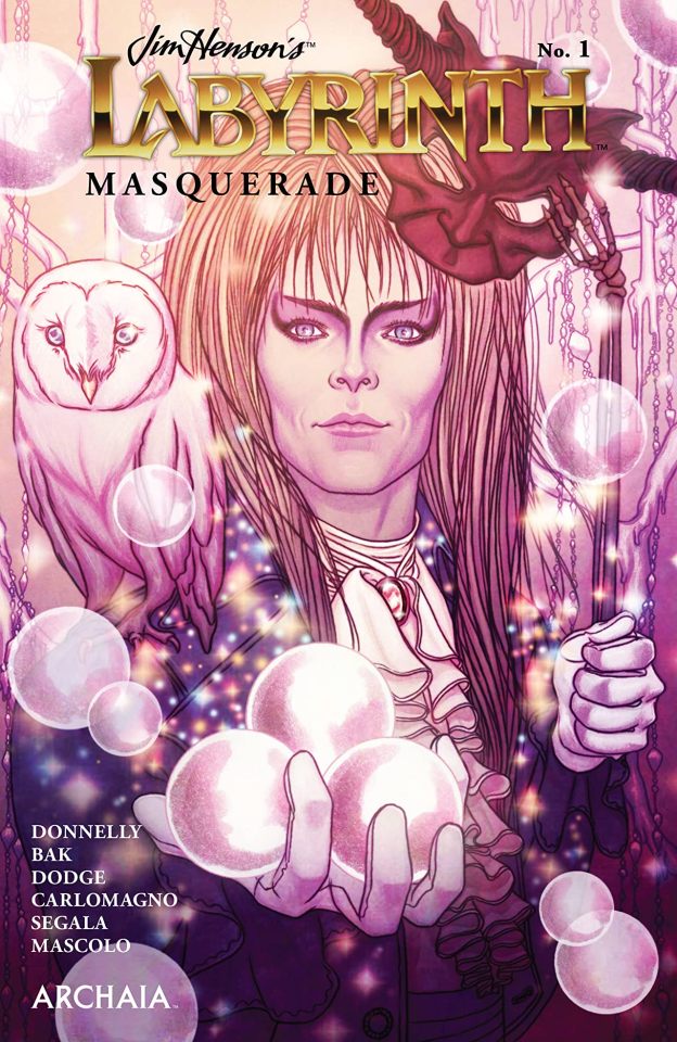
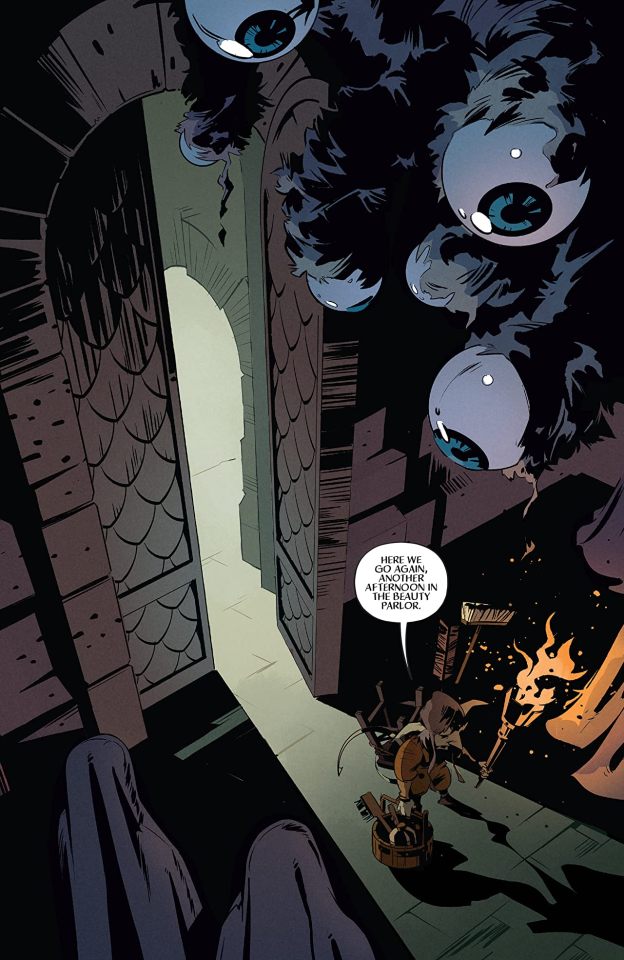
Jim Henson’s Labyrinth: Masquerade #1 Archia/BOOM! Studios 2020 Written by Laura Elena Donnelly Illustrated by Pius Bak, Samantha Dodge & French Carlomagno Coloured by Francesco Segala & Fabiana Mascolo Lettered by Jim Campbell All is not as it seems with the guests of Jareth's famous Masquerade, as one participant slowly awakens to the reality of her topsy-turvy existence in the Goblin Kingdom when Sarah shatters the glass mirrors during her escape. But as this mysterious participant puts together the pieces, her discoveries threaten to unravel everything! Well this is the franchise that just keeps on giving and giving. There are so many aspects to the beloved world that Jim created that have yet to be fully explored. I like the idea of this story and even more it’s execution as we see the unlikeliest of allies dare I say become friends. It is something that is both terrifying and sweet all at once and it isn’t that this is overtly horrifying but it is more how the reader is going to perceive that which is being told. There is power in words we’ve all known this our entire lives, including names as they have the most power of all. Still perception is everything and I have to say that the way we see this story unfold is utterly marvellous. I am enjoying the way that this is being told. The story & plot development that we see through how the sequence of events unfold as well as how the reader learns information is presented extremely well. I like how we are introduced to the characters in this story and how the whole plot plays out before our eyes. How we see the book being structured as well as the layers within playing their parts it is a huge in our enjoyment of it. The character development that we see is interesting and it really is done in such a way that really intrigues the reader and makes them want to see more of them. The pacing is superb and as it takes us through the pages revealing the twists & turns along the way we are delighted by this unique look as if we’d gone through the looking glass. I am also really enjoying seeing how everything works together to create the story’s ebb & flow which pulls you in and makes you forget how this is an oversized book. The interiors here are nice. They have this all-ages kind of feel to it and the linework that we see is laid down extremely well through its varying weights. The creativity and imagination that we see as we go from workshop to ball to outside and all the creatures and beings that inhabit it are beautifully rendered. The way that we see backgrounds throughout and how they act to enhance the moments and bring us that mood, tone and feel to the story at just the right moment is magnificent. The utilisation of the page layouts and how we see the angles and perspective in the panels show a beautiful eye for storytelling. The colour work is really lovely as well. How we see the hues and tones within the colours being utilised to create the shading, highlights and shadow work is rendered beautifully. Beautiful comes up here a lot and deservedly so because the work has this almost fairy tale feel to it and there are few descriptors that accurately match as that does. I want to see more, I want to learn more about the young lady with the chair who smashed the mirrors. I want to see more of this woman with multiple arms who tried to take Nettie under her wing as she woke. There is so much here that is introduced and is utilised in such a way that leaves the door open for further exploration and depending on what the readers’ ask for who knows what we’ll get. All I know is franchises such as this will never die or go out of fashion it encompasses everything we want to see more of in such a gorgeous fantasy setting.
2 notes
·
View notes
Photo

Howdy! Commissions are now open! As this is my first time doing anything of the sort, I'm keeping it to five slots so I'm not overwhelmed, on the chance I am commissioned. Also of note: I am open to discussion! If you're unsure about anything, please contact me via Discord, at Awauspic#3154. I will answer you as soon as I can, so feel free to ask!
A Few Things First
A few things you'll want to know before even considering commissioning me.
All In One Place. Since I'll be having a limited number of slots, I'll be leaving these available for checking. You can track these on my Trello if you want to see what I'm doing, though I will also state whether my commissions are open or closed on my dA profile & art Tumblr.
Full Payment Beforehand. I require full payment upfront for commissions. Pricing and Payments below will cover how I'll handle refunds and anything extra that may come up.
Communication is key! I will check with you for every stage of the commission, and request that you stay reasonably responsive; I want to make sure it looks as good as can be, but to do that, I need to know your thoughts!
On Uncertainties: If you think you might want to commission me but aren't sure where anything falls - contact me! I want to give you the best possible experience, which includes before you commission me. I'm perfectly willing to discuss what you want with you, regardless of whether or not you decide to commission a piece from me.
Referring to references... As a general, I will want a flat-color reference, with no or minimal shading, or an available color palette. If there isn't one available, I'll work with you to get the appropriate colors down and provide a swatch with the completed piece for future reference.
Cleaning up afterward. Post completion, you have one week to point out anything minor or easy to fix within the piece that bothers you; as long as it's within that week, and reasonable, I'll fix it. Past that, however, it's done and dusted, and I will not be altering it.
What Can I Do For You?
You're okay with the above? Great! Here's what will be accepted, what will be rejected, and a few things I'm a little iffy about. This isn't exhaustive, so if you're hesitant at all, contact me! I'm more than happy to clarify for you!
I will draw:
Furries! As visible in my commission post above, I will draw fursonas and general furry creatures, feral, to anthro, to 'taur.
Animals! In-line with furries, I'll also do general animals.
I might draw:
Fandom content! This is more so because I need to know where it's from, and have references available. Though by no means an exhaustive list, some fandoms that I'll cover are:
Undertale/Deltarune
Since this is AU heavy, please specify if Classic for standard, or give me the AU. I try to keep up but dear god.
Warriors, including OCs.
Light Gore. I am willing to draw bleeding/injuries/fights. See below for what classifies as too much. Again, this is case-by-case.
Body horror. I'm much more tolerant when missing chunks, extra mouths, broken shapes, and general weirdness is just part of the design. However, it is still case-by-case, and we'll need to talk it out.
Innuendo or Suggestive. Tasteful relative nudity, suggestive posing or behavior, and visual innuendo. Nothing too obvious, but I’m game to work with you on figuring something out.
I will not draw:
Mechs!
Actual Human People. Those who are real people. I’m not drawing a celebrity, I’m not drawing your cousin.
Humans, in general. This will change as I improve, but for now, humans are a firm no go.
Bugs. I am terrible with them. I will improve, but for now, these are no-go.
NSFW.
NSFW Gore is anything excessive; pieces being ripped off, clear abuse or painful deaths are hard no's.
NSFW Sexual is with visible genitalia, actual sex, etc.
Pricing and Payments
Having chosen what you want and the piece in question confirmed to be alright, here comes the rest of it; paying the artist. As a heads up, everything listed is in US Dollars.
Details, Extras, and Deadlines, Oh My.
Character(s)
Group Shots: I will do multiple characters for full-body pieces of any level, but not for sketches or mugshots. Each character will add seven dollars onto the original price, for up to five characters total.
Complications In The Making: Characters come in varying levels of complexity. However, if one is exceptionally intricate - either in having heavy, detail-orientated patterns or a lot going on, that will be ten dollars per intricate character, alongside the original pricing.
Backgrounds: With all pieces, I’ll include a simple mono-color background, as well as one without. In fully rendered, I’ll add an effect on top to make it special. However:
Funky Background on Non-Rendered: I'm happy to add background effects on a non-rendered piece. However, it'll cost you another two dollars.
Simple Scenery: Scenes are another beast entirely. For simple scenes, that's seven dollars.
Detailed Scene: Fifteen dollars flat for anything detailed; more requested features drive the price up by two dollars every two features.
Deadlines. If you want a piece done by a certain time, it may drive up the price depending on how quickly you want it, and if there is anything I will have to set aside to get it done. Naturally, I will reject deadlines that I know I will not have time for, or are otherwise unreasonable.
Start to Finish: For a single fully rendered body piece, it takes me approximately three days to complete, while balancing it between the rest of my workload, while sketches often only take minutes.
Sets: You can commission multiple works at once, and I'll bundle them together to be done along the same timeline, or at least with each other; excluding a deadline or real-life problems, I'll have them done and sent to you at the same time. Individual prices still apply.
Up-Front, And Returned
After alerting me to your intent to commission and getting the details worked out, so comes the green.
A Cuppa! Feel free to pay me through Ko-Fi! It takes in 3$ increments, so anything divisible by three is an option, and with less processing fees.
Paypal! After we've got everything settled, I'll hand over my Paypal.
Patreon! Still a WIP, my Patreon is available if you're feeling like you want regular doses of art, or just want to support me. I appreciate it no less. <3
In the event of a refund... I will refund for work not completed. If, for example, you commission a full render, but request a refund after I have completed the sketch, I'll keep the sketch costs, but return the rest to you; you also, of course, get to keep what work was done before the refund.
#Wauspdraws#Awauspic draws#commissions#commissions opened#commisions open#commision#taking commisions#read more#art#digital art#drawing#help a college student out
1 note
·
View note
Text
Relationship Tutor: (7) Critical Mural Analysis
relationship tutor masterlist
Summary: College AU. Bucky, a relationship novice, asks for your help in dating your friend. Unable to say no to him, you agree despite everyone and everything telling you not to.
Pairing: Bucky x Reader
Warnings: language
A/N: i really love this chapter-- not sure why. maybe steve? also, the gif below is not mine. if you’re reading this after may 7, 2020-- just know i’ve edited a part about the scrub because we should not be using scrubs on our faces, ladies! chemical exfoliation is the way to go.

The night of Bucky and Natasha’s first date, you spent hours in Steve’s bed— the two of you rolling around, tangling the sheets, and breathing heavily as you finally lay beside one another.
Of course, you were fully clothed, covered in different colors of paint, and the sheets were made of canvas so you could help Steve with a piece he had due for one of his many art classes— but it would be much funnier to tell Sam the first synopsis upon his asking of where you’d been.
You turned your head to laugh with Steve, your orange, yellow, and red paint covered hand set atop your stomach. You pinched the fabric of your equally colorful t-shirt, spreading and blending the paint to form brighter, deeper, and even murkier shades before lifting that same hand to brush the latex swim cap stretched over your hair. “This is getting uncomfortable.”
“Would you rather get the warm colors in your hair?”
You shrugged, wrinkling your nose upon noticing the blue, green, and purple spread on his skin brightening the baby blue of his eyes while the swim cap made him look like some sort of Olympian. “You’re very pretty. Cool colors and all.”
“Yeah? Set me up with Wanda.”
You snorted. “I’m not running a dating service.”
“You should.”
“Like Will Smith in Hitch?”
“Haven’t seen that.”
“Have you seen anything from this century?” you asked, carefully peeling yourself from the canvas to avoid any marks that Steve didn’t approve of. You stepped onto one of the many tarps, fanning your toes out to watch the color bleed over the fabric. “You’re in your twenties, you know, not your nineties. There’s no harm in watching corny popular films, and listening to corny pop music, and paying attention to corny pop-culture.”
You narrowed your eyes at him as you wiped your fingers onto the holey black leggings you didn’t mind wrecking. “And liking corny pop art.”
He gasped dramatically, lifting his head to meet your gaze with a playfully offended expression. “Pop art? How dare you?”
“There’s integrity in pop art, Steve.”
“There is,” he agreed with a nod. “I just subscribe to a more… meaningful style.”
“It’s a wonder you manage to stay upright with a head and superiority complex that large,” you quipped, laughing when he shot you a glare. “Relax, I know you’re joking.”
“I still hate pop art,” he added after a moment, managing to stand upright without so much as rustling the sheet.
“Just like you still have a bit of a superiority complex. Only a small bit,” you clarified with a single nod. You yanked the cap from your head and shook your hair out while very loudly sighing in exaggerated relief.
He rolled his eyes as he asked, “Was it really that bad?”
“No, they just always do that in the movies.” With a swirling motion of your index finger, you told Steve to turn around, pulling the stained clothes from your body and changing into the clean pair you’d brought with you.
Once you tied the drawstring at the waistband of your wide leg cotton pants and a plain t-shirt was slipped into place, you cleared your throat and smiled at Steve when he spun to face you. “What’s this for again?”
“Background of a mural I’m doing,” he shrugged with a dismissive wave of his hand. “You sure you didn’t want to shower before changing?”
You nodded, seeing color already smudged onto the cuffs of your sleeves. “I’ll just wash off what I can at the sink and have Sam deal with whatever paint gets onto these later. He’s a wizard with a spray bottle of Oxyclean.”
Steve frowned in consideration and motioned to the bathroom down the hall. “By all means.”
The bathroom was tidier than you expected. You’d never known Steve or Bucky to be particularly messy— they would spend the morning after a party they’d hosted scrubbing everything down and not minding it one bit, they actually kind of enjoyed it— it was just surprising that everything seemed to almost sparkle as soon as you flicked the lights on.
You scrubbed your forearms with a large glob of antibacterial soap, trying to scratch the paint off your palms if you had to. You then snagged the green tea cleanser you remembered Bucky bragging about and squeezed out a little, inhaling the matcha as you spread it over your cheeks and forehead.
The iciness of the cleanser tingled across your face, brushing your cheekbones, chin, and jaw with your fingertips and sighing contentedly. It suddenly made more sense to you why Bucky’s skin always looked like velvet, why the peach that had a tendency to flush constantly glowed.
You leant against the counter and found yourself imagining what he must smell like, if you could catch a whiff of mint and tea when you got close enough to press your lips to his cheek, his jaw, his lips, his—
You shook your head to yourself and patted your skin with the hand towel one last time, your hair smoothed well out of your features which looked refreshed and renewed once you’d stolen a bit of the matching moisturizer, too.
“Steven,” you called while stepping into the hall. “Are we ordering dinner or are you the type to take a tumble in the sheets and not feed a girl afterwards— Bucky.”
His head was tilted as he gaped at you, slate blue eyes wide and hair appearing as if he’d only just combed his fingers through it, left shoe halfway off. His eyebrows came together. He stared silently for almost twenty seconds.
You opened your mouth. “Uh, —”
“You and—” he paused and shook his head. “You and— Steve and you, you and Steve.”
You raised your own eyebrows, leaning your shoulder against the adjacent wall and biting down on your bottom lip to keep from smiling. “How was your date, Buck?”
He blinked a few times, his mouth fallen open. “My, uh— My— You and Steve.”
“Italian?” Steve asked, emerging from his room in all his blue, green, and purple glory. He smiled at you knowingly. “Or Thai?”
“I’m in the mood for Thai,” you replied, nodding at him once with a sly wink. “Could you call the place on Benton? I want to say it’s called Jasmine?”
“Sure. What’d you want?”
“Veggie pad thai— extra tofu, extra spicy.”
He nodded before sparing Bucky so much as a glance. “You hungry at all, man? Want me to order you—”
“The two of you?” Bucky interjected, looking between you and Steve. He threw his hands up in exasperation. “You two?”
“Buck, I want you to look at Steve,” you said, nodding towards the man you referred to. “Then look at my hands,” you held your palms out and rolled up your sleeves to show the paint you’d missed, “and my ears— which I’m very confused by.”
You grinned when Bucky began to stammer once more. “The jealousy was very cute, though. What was that? Twice in two days? First with Tony, now with Steve.”
“S’not jealousy,” he snorted, shaking his head unconvincingly. “I’m just— I’m attached to the fabric of our group.”
“The fabric of our group?” Steve repeated, holding the phone to his ear as he squinted.
“Yeah, you know, the quilt of our friendship,” Bucky nodded. “Our friendship quilt.”
You rolled your eyes. “Right, and our love blanket and kindness parka.”
“Our sensitivity comforter,” Steve added, leaving the two of you in the hall as he ventured back to his room to rattle off your joint Thai food order.
“I wouldn’t fuck Steve without telling you, you know.”
Bucky looked up from his own phone wordlessly.
“You two are practically brothers and you’re one of my best friends. Kind of makes Steve my brother by proxy,” you shrugged with a laugh. “It’d be like incest, or something.”
He quirked a single dark eyebrow. “Does that make you and I like siblings?”
You shook your head with a wrinkled nose. Had the two of you actually been like siblings, your thoughts of how snuggly he would fit inside you would render a need to take yourself to a mental health professional immediately. “You and I— You and I are like husband and wife.”
“Husband and wife?” he echoed, smiling in that soft way that flipped your stomach and ached your chest. “Old married couple?”
“Absolutely. So old and dull, in fact, that your wife is helping you bag a mistress.”
He frowned in consideration and pushed off the wall, walking towards you to seemingly reach his bedroom at the end of the hall. He stopped when his shoulder brushed yours, however, and leant towards you to whisper, “S’a good thing this husband-wife thing is metaphorical.”
You looked at him, your noses close enough to bump together. You could smell the mint and citrus on his skin. “Why’s that?”
He shrugged. “If we were married, even for fifty years, you’d never catch me so much as looking at someone else. Forget about having you bag me a mistress.”
You simply stared back, your lips parted. Your heart felt as if it had stopped altogether, your ribs aching. You managed a smile when reality forced a thumping that could have brought you to your knees and pushed him gently. “I hope you used some of that charm on your date.”
He started down the hall again. “You’re not gonna split as soon as your food gets here, right?”
“Depends on what you want me to stay for.”
“Dissect the date with me,” he told you, tossing his navy blue bomber jacket into his room along with the shoes he’d toed off earlier.
You laughed dryly, loudly, and very sarcastically. “Yeah, no thanks. I have to watch the paint dry in Steve’s room. There’s also some grass outside I wanted to watch grow.”
“Very original.”
“Thank you.” You tipped your nose toward the ceiling. “I’ll stay here on one condition.”
“What?”
“You tell me where the fuck you got that skincare shit in there. My face smells like a matcha latte.”
He chuckled and shook his head. “S’my sister’s. Stole it from a package she got from Korea.”
“Well, I guess I’m going to lose more than half my paycheck to Korean skincare this month.”
“Beauty is pain, Y/N.”
It was a half hour before the food was delivered, Steve’s head in your lap so your fingers could fiddle with his blonde hair while the two of you watched recorded, protected, and backed-up episodes of The Wire— something you only agreed to upon Steve’s promise that you’d get your fill of Idris Elba.
Bucky set the two brown paper bags onto the coffee table and collapsed beside you, hair still wet from his shower. He wiped his hands down the lap of his sweatpants, leaning his head back against the upper edge of the couch. “Can we talk about the date now?”
You nodded and hoped the deep breath you took was inaudible. You shook Steve’s shoulder and laughed when he grumbled and sat up with hair pointed in every direction. “You good, old man Rogers?”
He offered you a sarcastic expression. “Phenomenal.”
As Steve busied himself with his dinner, his phone, and any tidbits of The Wire he could pay attention to, Bucky handed you your container and a pair of chopsticks before pulling out his own food.
You rose from the couch only to sit on the floor, your back against the foot of the sofa and your legs folded beneath you. You smiled at Bucky as he joined you, his back against one of the large lounger chairs. “Tell me about the date.”
“Well, we got coffee.”
Your voice thick with an unswallowed bite, you quipped, “Call me psychic, but I already knew that.”
“D’you ever consider being a stand-up?”
“I did, but they get paid dirt and I’m worth more than that.”
He shook his head with a small smile, his eyes on the contents of his dinner. “We sat at the booth you said she’d like. Back corner, with the amber hanging light.”
You nodded for him to continue, adding a bit of Sriracha to your noodles.
You continued to add hot sauce to your food until the heat became a distraction, until you could no longer blame the warmth in your cheeks and the warmth creeping up your neck on what Bucky was telling you.
Just like Bucky, you were unable to admit to yourself that you were jealous.
The delight over his features, the nervousness in the faint tremble of his fingers, the simple laughter in his voice made you wish you could be in Natasha’s place— but how could you admit that to yourself when the noble portion of you wanted his happiness above all? Selflessness was a virtue, wasn’t it? And selfishness a sin?
You were above petty jealousy and selfishness, you wanted Bucky to be happy and wanted the tears in your eyes to be blamed on the chili sauce in your food rather than the aching in your chest.
“When’s the right time to text her?”
You snorted, using your sleeve to wipe your eyes when he pushed off the floor and walked to the kitchen. “That’s not a thing worth being concerned about.”
He cocked an eyebrow as he came back into the room, occupying the same space as before. He watched as you set your container aside and polished off half of your beer in one ago, a smile pulled at his lips. “They’re always concerned about it in the movies.”
“Because movies do mirror real life seamlessly.” You set your bottle onto the table. “Just text her, tell her you had a good time, and want to see her again soon.”
“What about a casual run-in?”
“A what?”
“A casual run-in. Do you just not watch romantic comedies?”
You frowned. “I watch romantic comedies. I’m a complex person, James. I just— The idea of a casual run-in makes me uncomfortable. Like, what? Are you gonna stalk her and wait for the perfect time to jump out and make it look casual?”
He wore a scowl of his own. “When you say it like that, —”
“So that was the whole date? Coffee, talking about your lives, and walking her to her place?”
He nodded. “Kept my hands to myself, too. Slow and organic.”
“Slow and organic,” you agreed with a small, maybe even relieved smile.
PART 8: TWENTY-FIRST CENTURY ROMANTICISM
TAGLIST, if you’re crossed off your tag isn’t working! (send me an ask to be added): @sweetstilesofmine @dugan365 @lowkeysebby @eufeme @marveling-at-marvel@anyakinamidala @spookyscaryscully @sighodinson @feelmyroarrrr @sarahp879@spidey-linquentimagines @mackenziesmarvelousgalaxy @aholland01 @lostinspace33@clairedycat1810 @softwhispers @apolleo @sebstancial @buckylovelybarnes@chrys-1029 @sheddingpounds @brooke-supernatural16 @seargantbcky@someonekindalikeyou@marvel-trash07 @chuckennuggets1213 @captainmisfit13@ailynalonso15@lilypalmer1987 @nasasoldier@snuggleducky @acebabe @melswolf19 @e-g-b-o-k @iamzion-therealhabesha @fancybasementpersona @hercrazyfandomobsession@ohmybuckybarnes @sarahp879 @lovely-geek @void-imaginations @mad-girl-without-a-box @stomachfilledwithbutterflies@joulien @followeroonieclassic @tomdarlingholland@rebelfuckingblack @bakerstgirl@starkxpotts @jimmyisfab @normalperson1351 @jehun-prouvaire @peachy-vixen @mcheung0314 @wowbarnes @thiccmillions@sumafamouxx @quinn-n-quill @amcrasnow @wheneggsymetbucky @krockszz @brokenanxiety @addictionmarvel @closerstars @captainradicalpassion @rockagurl @directionerfae @shawnsassymendes @irella-nyari @cadence-jeannette @rebel-emerald @blacwings-and-bucky-barnes @little-miss-headphones @winternatalias @iwishiwasnicki @writingcroissant @finallybreathee @saul-buttson @potterglory
#bucky#bucky barnes#bucky barnes x reader#bucky barnes imagine#bucky barnes x reader fluff#bucky barnes x reader angst#bucky barnes angst#bucky barnes fluff#bucky barnes au#bucky barnes college au#rt
890 notes
·
View notes
Photo
WELCOME TO XAVIER’S, HWANG MINO !
… loading statistics. currently aged twenty-three, entering first semester of xavier’s in seoul, south korea. decrypting files… mutant has the following records: strength +5, durability +4, agility +7, dexterity +4, intelligence +5. currently, he is classified under tier omega.
BACKGROUND.
O.
the cartography of his veins spread before his eyes: here, where he bruised in metronomes — here, where he fractured his vertebra — here, where he dissected his laments.
against the riverbed where stories run in rivulets of red, in the stream of incongruence, lies the corpse of a manmade construct. called it death. named it fear. at the end of the day, its soot is ripe and ruined in his fisted palm, leaving inked teeth marks in shades of dying black.
the night sky thinks about a carnage that dreams: in this story, the sequence wears a reverse order.
sometimes, he is a motel with a crooked figured chalked on the creaky floor. all those streaks of blood that they scrub so hard but the wallflowers still remember what they witnessed. all the wallflowers that wilted, when murder sprayed their dormant status with sins. also the bed where he thrashed, all simulated forms of unspoken words transferred into acidic non-verbal. and that bed sheet wearing new colors, the hue melting like waxwork with flames that attracted these fallen, falling moths.
he is also the thump. victim now on the plane; bloodshed is beautiful when you are made of this chaotic smoke, imprisoned by your glass ribcage. quite a vision, quite a beauty.
the wooden boards, the outline. and everything in-between.
( glass of half-full / empty water; tv playing static like sorrow. )
rest with me: i am an aftermath of this death, but i’m not in the coffin. ( i am the coffin. )
I.
out of soft violence he bloomed: marigold and cinnamon, seeping through the interstices of mama’s cusps. she sighed, milkflower petals of her skin dripping in vigilant white as she shared the space of a husband’s with someone else. he was three, he remembers vividly. other colors of the spectrum spoke on the concave and convex of her features; she splintered in ways that he never understood between the grips of a man that was not his father.
membranes of his unfinished bedtime spillage carved memories like no other. he was supposed to be fast asleep, lost in the depth of cocooned safety in his crib. a watchful, taciturn witness to the event that unfolded before him, he always pretended that this was not the guilt that marred her face years later — that this was not the shame that spun the partiture of her elegies. against the gossamer edge of time, she would always be reminisced, another sway of chandelier against the stark ceiling of their mansion. this was the first beauty that painted the inglenooks of his memories.
first and foremost, insanity is hereditary, and so is sadness.
II.
the child of threnody did not grow away from his mother; instead, he planted more seeds of lachrymose within the particles of his being, enveloped like chrysalis. the soothsayer across the street on an autumn day whispered to him little pieces of how to build a temple with his body, column per column, until he reached the sky shaped out of weary cultures and faded nebulas. spinal pillars stood against the horizon; he became acquainted with the after dark lullabies that ate away at his father’s core.
the difference was that his father was rotten with penumbra, while he soaked himself up in the act of liminal drowning. the similarity was that they both were too lost to be salvaged, feet tangled around the anchors.
he learned to love his mother in ways that she haunted his bones.
III.
the incisors: to love was to hurt. he had teeth marks inked on his skin, with his aching marrows to prove his dedication. wrought in a burial was his flesh burning with forgotten maggots, rigor mortis veneering his architecture. this was the universe’s design; this fruit of deathless christening, this flower of seared capillaries.
the boyhood museum inevitably let him rest in this catacomb where mourning became the norms. here, he fell in the charm of death, its brutal hands wrapped around his neck with the weight of affection. it claimed him; it claimed his mother, then it claimed him. he learned to love it, too, in ways that he loved his mother.
he, however, had always known how to love the anatomy, the bones — he had always known the blueprint of humane edifices by heart. from the gentlest to the harshest, pound by pound, it called for his name. and he held their ideas inside him for the longest time, until they were no longer the same. until they, too, clattered into the rush of dissonance.
open battlefields were ribbons of suffocation, wisps inside his knots of an esophagus. but violent streaks ran nowhere but in his bloodstreams, rhyming the overture of sleepless hours spent on the longing.
IV.
the revenants of revolution never skipped a heartbeat: there was always a lub-dub of life shivering underground. found himself stranded there before he, too, learned to love. and he loved, again and again and again, until he loved too much.
on the night three days before his eighteenth birthday, the moon hung itself like his mother did. stabbed and left for dead, their hatred mirrored his love — too much, too much, too much. he made a deal with the death for another paradox, promising that this time, he would learn to love better.
( in the end, he does not love better. death carved him into stalactites instead. )
V.
the turpentine of twilight lures the deaths back to its morgue, sometimes in ashes, sometimes in commas – sometimes a period of crawling with smokes in-between. tattered teeth with keyholes and keywords, all rattling keys and sentences caught between the fangs, chewed up and spat out on the concrete. the start is always silent, the voices contained. in a room for two: housed between the flimsy walls would be him, bare to the skin to the flesh to the bones to the marrows. he drinks the quiet and lets it soak his blood vessels, veins and arteries creating a map like corrupted city streets.
nights are craters of the moonless dreams, deep enough to be called canyons. against the core of the bases would be arrhythmia waiting to happen. clasped to the soil would be footprints of indulgence – this is an elegy to addictions. every cursive of a movement creates a dynamic that he yearns so much, too much. every victory in the battlefield fractures the wasteland where he usually closes his eyes. wear and tear of the muscles and sinews, but here comes the marching sound of tomorrow; almost furtive, almost invisible. he doesn’t die tonight.
MUTATION.
darkness or shadow manipulation enables him to perform various tricks as long as there is the provided source of said element, which would be aplenty during the day and night. he’s able to mimic the darkness itself, using it as a means of transportation by opening portals through shadows, as well as producing offensive and defensive measures by solidifying the element, mostly by constructing weapons and shields. he can only use what’s available and enlarge it instead of creating it from full-fledged light.
STRENGTHS.
teleportation through shadows is what he primarily relies on, although this means that the shadows must not be too far apart — at four to five meters at the maximum in the distance, degree varying to his current stamina and energy. at this point in tier omega, he has yet to be able to merge himself fully in the darkness, so the transport is done via creating portals that he can dissolve into.
he can see in the dark due to enhanced vision, and this can be applied as seeing during the day. his sight is almost as perfect as it is in the light, although it could use some more honing. when new levels are unlocked, it’s possible for him to eventually see better in the dark than light. also, this application doesn’t require any adaptation.
umbrakinetic property construction via solidification of the element, and this includes weaponry to attack and protect himself with. solidified shadows work in the light as if it’s a solid matter as long as it’s been created to perfection by him prior to launch. this can also be used to trap people into their places by producing tendrils around the said people’s ankles, immobilizing his opponents.
WEAKNESSES.
up until this point he cannot create darkness out of nothing; there has to be sources, as small as they might be, to aid him during the expansion of darkness. he can make a small, condensed shadow into something bigger, but in the rare chances there isn’t any darkness at all, it will render his powers void.
distance of travel is limited, as teleportation through portals deplete his energy. it’s just faster than running, but it also consumes his energy as much as running would, just slightly less. when he’s exhausted, he won’t be able to perform this correctly, and there’s a possibility for him to be trapped within the portal for a few seconds.
moving shadows also prove to be troublesome towards his ability since it means that he might have to follow the shadows’ direction than his own. his teleportation also relies heavily on creating portal to portal from motioned shadows, causing this to be a hassle when it comes to reaching his destination.
he might be on par with light manipulators, depending on the opponent’s expertise. might find difficulties in adjusting his powers if all the shadows are erased via the light manipulation, which ends where he cannot perform his abilities at all.
while maintaining the solid features of the well-constructed items might not be a big problem, processing the dark energy to solid mass has proven to be a trouble for him, and it can take from below a minute for small projectiles like bullets, to up to five minutes to bigger weapons.
in the vein of inability to create darkness, while he can combine shadows to merge them into a bigger mass, but passing one shadow to the other via well-lit plane might exert more energy than necessary unless the shadows have been modified to be more solid.
2 notes
·
View notes
Text
25 years of Frontier Developments
The 25 year tale of Britain’s most ambitious indie.
If there’s one thing that Jonny Watts has learned during more than two decades at Frontier Developments, it’s that the act of making the games is just half of the equation. As chief creative officer and longtime stalwart of one of the UK’s most inventive and ambitious studios, Watts has been at the forefront of many its most famous titles – from classics like Rollercoaster Tycoon 3 and LostWinds, to its most recent successes: Elite Dangerous, Planet Coaster and Jurassic World Evolution. But as he explains, the secret to Frontier’s success as a fully independent, self-publishing development house required the whole team to analyse, study and adapt to the changing industry in order to become the success it is today.
Based in the heart of leafy Cambridge, England, Frontier is one of the most eclectic video game studios in the development business, not just in the UK but the world over. Celebrating its momentous quarter century milestone this year, Frontier‘s games have featured everything from cute interactive animals to scientifically accurate black holes; death-defying theme park rides, to authentic recreations of prehistoric lizards. Now with around 30 fully fledged titles under its age-worn belt, this is a truly veteran studio, but one that exudes a passion and a verve that belies its age.
Perhaps more importantly, there’s an inherent intelligence to Frontier that comes across in its games. There‘s an artful comprehension for how interactive experiences need to make players feel; a mechanical understanding of the detail and depth required to create specific niche interest titles; and an operational rigour that allowed the studio to pinpoint how it wants to communicate with and sell to its players. This last bit, crucially, is what has made Frontier Developments such a shining case study for the many benefits of studio independence.
The rise to indie darling was never an overnight transition; in many ways, it was 25 years in the making.
Elite Dangerous, Frontier’s massively multiplayer space epic let’s players take control of their own starship. They can fight, explore and travel throughout an expansive cutthroat galaxy, consisting of more than 400 billion star systems.
The DNA of a startup For Watts himself, the game development dream begun back in 1987, when he would run home from school, leap up the stairs to his bedroom and get to work coding games on his own personal computer. Naturally, his mum didn’t approve of Watts’ creative flights of fancy, insisting there was no financial future in playing games. At the time, she was largely right, but little did she know that it wasn’t playing games that Watts ever dreamed of turning into a feasible profession – it was making them. “I got just as much enjoyment destructing how games worked, learning how to code, learning how to do art,” he says.
Watts did, despite his initial childhood dreams, follow his mum’s wise advice in the latter half of his education – at least through university, where he studied a zoology degree. He was still creating games while studying, though. It was something he could never escape from, and which sustained his creativity through his university career until he pivoted to study a masters in computer science. Back in those days, this was the main academic currency if you wanted to be a video game developer – there were far fewer routes into the industry then, so Watts capitalised on his opportunities where he could.
As an alumnus, he went almost directly to development, firstly at the fellow Cambridge studio, Sensible Software. “[They] were in the same location as where Frontier was founded,” he says, “they were just north of Cambridge and we were south of Cambridge. It’s a development hub, so we all knew about each other, and I’d known about David [Braben, Frontier’s legendary founder] from when I first got my Spectrum, playing Elite on it. Everyone at our age was influenced by that game but I was actually more influenced by another Braben game called Zarch. It was a polygon game but it had real-time particles, light source shading, real-time generated shadows. It was an absolute technical tour de force, so much so that it influenced me to do my masters in computer science, because I was just so interested in graphical programming.”
Little did Watts know that, only several years after he left university he would begin working with his development hero. He reminisces about the earliest days of the studio‘s history, when the studio was based out of a farm in the Cambridgeshire countryside with just ten staff to its name. “My first memory was going through the door – it was all open plan – and seeing David with a microphone doing chicken sounds for some of the proto sound effects in Dog’s Life,” he says, laughing. Braben’s chicken impression was just for the placeholders, but there’s no doubt it’s uncanny. “You saw a very human side to a very friendly company,” Watts continues. “It was very technologically advanced, but if something needed doing we’d all muck in.”
The expansion from ten staff to now over 400 has taken many years, but the studio still retains the DNA of that startup. Elite, co-developed by David Braben and Ian Bell, along with Zarch and Virus were created before Braben founded Frontier Developments. The studio was born out of a desire to make a wider range of games and to make them faster, rather than spend five or six years in a single development cycle. Establishing Frontier allowed Braben to hire like-minded individuals that brought ideas to the table, in order to create a collaborative space where, as Watts puts it, “the egos are left at the door”.
Fast forward 25 years and Watts is still sat just a short way from Braben’s desk at Frontier’s brand new office premises – a pristine multi-level labyrinth of glass and steel that houses the 400+ strong team, all of which are working on their own individual projects. From the talented group still developing updates and expansions for Elite Dangerous, to the developers that are still adding content and new ideas to Jurassic World Evolution. Frontier continues to update its existing games heavily with new ideas and content, but that’s not to say it isn’t busy at work on future unannounced projects that span far into the future. What‘s perhaps most impressive is that the team has retained the spark and soul that made it such a brilliant upstart back in the early nineties.
The highly acclaimed Planet Coaster gives players limitless freedom to build rides and scenery piece by piece, with advanced management simulation gameplay and a connected global village where everyone can share in the creativity of players around the world.
Fired up by new technologies It must’ve been an alien prospect to think about back in 1994, when Braben and his team were hard at work in their tiny studio on a Cambridgeshire farm. But the technological power of Elite and its resounding popularity paved the way for a studio that relied on powerful, advanced proprietary technology to create some of the most believable worlds in video games. “David is a man who, along with Ian Bell, built an entire galaxy on the comparably unpowered BBC Micro, before creating Zarch for the Acorn Archimedes,” Watts says. “It wasn’t a big gaming machine, at all, but it fascinated him because of how powerful it was and what he could do with it. He did similar with Darxide for the 32x, which wasn‘t really well-supported by third parties but he looked at the technology and thought ‘I bet I can do some really crazy stuff with the technology in here’ Sure enough, it‘s one of the most technically advanced games on 32x.”
You can trace this trend all the way through Frontier’s history – instances where the company just saw an exciting piece of new technology and got fired up about it, using the bleeding edge advancements in hardware to enhance the game experience. And not just doing it for visual‘s sake, but learning how to leverage the machines to make the experience even more visceral, real, believable and authentic. With time the games machines themselves have, of course, become more advanced, with storage space and memory reading capacity increasing to the point where games can render enormous 3D environments, improve graphical fidelity to resolutions like 4K, not to mention feature more voice work, deeper simulations and much more. Features like shadow technology all sound like obvious and even boring, unimpressive staples of modern games nowadays, but the team at Frontier has been one of those driving this technology forward for 25 years, always revolutionising and always innovating.
A galaxy like no other Elite Dangerous is perhaps the purest example of this, taking the core components established with the original Elite and using Frontier’s newly expanded, talented team to build a modern 1:1 recreation of the entire Milky Way galaxy. It is, at its very core, a natural evolution of the game created in 1984, its enormous scale and detail made technically possible by the many advancements that Frontier has made since then. At the heart of it is a team who bring untold levels of talent to the process.
“The guys who did the stellar forge – the way we calculate the galaxies from real scientific data – one has a PhD in astrophysics, and one did astronomy in university,” Watts says. “There’s maybe five people in the whole country, in the world, who could do that, who have the strange crossover between a degree in astrophysics and a degree in computer programming, an interest in video games, and an interest in Elite. And of course David has his Cambridge science degree. A lot of us have science backgrounds. We’re, at worst, amateur enthusiasts. At best we’re actually pretty clued up people who have an absolute passion for the subjects we work on. We’re still reading, researching, looking at articles, stimulated by it.”
Elite Dangerous is a wonderful melding of passion and intelligence, and one of the the largest video game worlds ever created. It boasts a scale unlike few others, but the magic of Frontier is that there is depth and detail to match the scale. Not only can you gawp at the macro features of the game; faster-than-light travelling across the galaxy, zipping close to distant stars, landing in space stations and rovering around the rugged, rocky surface of exoplanets; you can also invest hundreds if not thousands of hours into role-playing in an interconnected universe that rewards your intelligence. Players can communicate, trade and fight with one another; team up and explore distant star systems; invest and sell trading goods in an ever changing economic world; create clans that fight it out for territorial control of the many segments of this galactic world. There is politics, economics and real struggle in this universe. It’s not just huge – it’s believable. “It feels very real,” Watts says, “and when you’re in it you feel very vulnerable.”
Authenticity and real science The two other of Frontier’s most recent games – Planet Coaster and Jurassic World Evolution – follow similar trends, creating worlds that are believable despite being completely different to galaxy sized space role-playing games. Planet Coaster revels in a beautiful, charming and gentle aesthetic that welcomes you into its colourful simulations and lets you spend dozens of hours creating your dream theme parks. But hidden under the hood are complex codes and authentic simulations all based on the real life flow systems utilised in actual theme parks. Watts himself is an avid theme park enthusiast, regularly visiting parks across the UK and beyond to get his roller coaster thrills with his two daughters, and it’s an intense passion that clearly comes through in the finished games.
“My favourite theme park is – and this is really hard – Disneyland,” Watts says, explaining how the team had the chance to build a 1:1 recreation of the original Disneyland, in Anaheim, which happens to be the only theme park Walt Disney saw before his death. It was re-created for Disneyland Adventures and Frontier captured the sights and sounds of this original landmark down to the most minute of idiosyncrasies. “We were so committed to authenticity. When you feature a Disney princess from the 60s or 70s we had to use, where possible, the original stars. That kind of detail really did transport you into that magical world.”
“Disneyland is a strange place because once you go there, all your troubles just evaporate. I went there with my 18 and 20 year-old daughters and I‘m suddenly a dad again rather than the person giving them a lift back from the pub or something,” he says. “It‘s a wonderful place. And I really like the theming in parks. It transports me to another world. Again, it goes back full circle to another believable world.”
This hidden authenticity enforces the realism and believability of Planet Coaster, despite the otherwise cartoon looks. It’s an approach that allows Frontier’s game to further stand the test of time simply because the foundations themselves are built on real science. It’s not surface entertainment that relies entirely on the graphics or the characters, instead utilising the real world information that’s baked into the very code itself.
In Jurassic World Evolution players take charge of operations on the legendary islands of the Muertes archipelago and bring the wonder, majesty and danger of dinosaurs to life.
Dinosaurs and Kinect experiments As for Jurassic World Evolution, the real life science is less concrete simply because of the 65 million year old nature of the creatures in question, but it’s “unbelievably authentic to the films,” Watts says. “We’re using the original actors, the things that have been derived from the films and the books. There’s actually a bit of zoology in there; the genetics, going back to my zoology degree. We use science and reality and authenticity to make things believable. We have so much accuracy in our games, and everything we do we want to have this grounding. We had a guy called Dr Jack Horner, and he was a consultant paleontologist on the Jurassic films back in the day, actually working with Michael Crichton. We asked him to come over [to talk about the game] and I like to think he didn’t do it just because of the paycheque, but because he saw that we had a passion, and an intelligence, and a dedication to doing these things.”
Frontier doesn’t just limit that adventurous and authentic approach to scientific accuracy to its software. Many of its hardware experiments have similar traits, including the Kinect experiments that it embarked on in the mid noughties with the Xbox 360, when the team was still partnered with publisher Microsoft. What makes this all fundamentally possible is Cobra, the studio’s own game engine, which it has been consistently and steadily updating for many years. Rich Newbold has been the Executive Producer at Frontier for a while now, joining over 10 years ago. “Cobra is constantly evolving and growing,” he says. “It has a dedicated code team working on improving it as well as us generating new technology for each game and merging that into it. On Kinectimals, we developed technology to improve our animation system to allow a more usable way to use state machines and logic on a character. This then got developed more and more with Kinect Disneyland Adventures and again with Zoo Tycoon, Planet Coaster and Jurassic World Evolution. The constant improvements to the render system for each release feeds back into Cobra and we then use that in the new projects. We‘re always looking to develop and re-use the core technologies across our projects. It’s a huge asset to have such a flexible engine in-house.”
The entire brief for Kinectimals was to create animals that look, sound and feel alive to the players. It was a challenge that Frontier relished as it had the chance to bring its creativity into even more physical environments, connecting cute animals on the screen with players in the real world. It hadn’t really been done before – at least not in such a mainstream way – and Frontier was the mastermind behind the code and tech that would give Kinectimals a real sense of life to the players.
“Even though [the animals] are beautifully cute, the AI behind them is super sophisticated,” Watts says. “There’s something like 500, 600, 700 animations on there, all reacting to make that animal feel alive.” The expertise the team built up animating the animals in A Dog’s Life proved beneficial for the work on Kinectimals. “I remember doing a Dog’s Life lecture at Bournemouth university,” Watts continues. “One of the students came up with a question – he said, ‘are those animals alive?’ A few seconds later I realised it was the first time he’d seen an animal on a computer game screen that was reacting in an organic, non-repetitive way. There’s a lot of attention to detail that stands the test of time.
“The thing I was most proud of was the subtle things that we did; the way you move your head, the way you move your body, the animal would react and position itself to you,” he continues. “If you didn‘t do anything, the animal would try and get your attention. It was always monitoring you. It was always trying to stimulate you to do something and that‘s what I was quite interesting in with Kinect – we can obviously do the clever stuff where you throw a ball [but] it’s what we can do behind the scenes which made those animals come alive. To be honest, it‘s what Kinect did the best; interpret what you could do behind the scenes. We also did something which I thought was really cool in Zoo Tycoon with Kinect. We wanted to do animal enrichment with chimpanzees. And what was really good is that you could move your face and move and blink and the chimpanzee would come up to the screen and mimic you. That‘s what they try doing in real life. What‘s even better is when it didn‘t quite work, you thought – and this is the illusion of game creation – that the chimpanzee was being a bit cheeky even though it might not have recognised it. That was really subtle. It was really interesting to see people properly interact with human natural movement with essentially what is an AI ability.”
With Kinectimals Frontier succeeded in creating virtual animals that felt, sounded and looked alive to players.
Military doctrine and a DIY approach The same too goes for VR, which the studio invested in heavily for Elite Dangerous. Again, earlier work stood the team in good stead – Frontier had already worked in secret on software for Microsoft’s Hololens. The goal was to create one of the most immersive virtual reality experiences available. In many ways it was the perfect fit – a beautiful, expansive world in which you remain stationary as a player, controlling a moving vehicle without having to move your own body. It dodges the usual problems associated with VR – namely, the gimmicky tacked-on movement controls that mean virtual reality shooters or sports games are nigh on impossible to get right. In Elite, you control your spaceship from the cockpit, but are treated to the immense scale and scope of a space game.
“If you launch in a Lakon ship – they‘re with the ones that have a glass bottom – you come out of the station and look down and you almost have a sense of vertigo,” Watts says. “When I‘ve really got the lights turned down, I almost feel like I‘m insignificant in the world and I‘m just trying to make my way. That was really cool.”
“The second thing from a combat point-of-view; in combat you have an amazing competitive advantage. That‘s why all the canopies are glass – because when you are in VR, if a spaceship goes over the top of your craft, you can move your head and look at them. This is military doctrine – in dogfighting, he who sees first wins and really the absolute premise is that we wanted to get dogfighting to be absolutely as visceral as possible and as accurate. What‘s really interesting is in space, if we were really being super accurate, in space you‘d be going so fast that dogfighting wouldn‘t [really work]. All the best space games mess around with speed to make it more akin to World War Two. There was quite a lot of research in combat, which facilitated the use of VR and that‘s why it‘s an amazing experience, because it‘s not just a mechanism to make you feel part of the world, it gives you a competitive advantage in a very large component of the game.”
Kickstarting Frontier’s success Frontier has always had a DIY approach to its development, typically finding and hiring the right people for the job – rollercoaster experts, astrophysicists and more. It’s created a studio that has a wonderful camaraderie that encourages collaboration, and which allows them to go all in on projects. However, it was the transition to being self-published and fully independent that allowed them to take those risks to the next level, making decisions based on what the studio as an entity wanted to embark on, and not being beholden to outside influences. Digital distribution was the catalyst that made all of that possible.
“In the old days, you release your cassette or your 3.5“ disk and never update it,” Watts says. “Maybe, just maybe, you‘d get another disk as a cover disk on a magazine to do a critical flaw but now we‘re distributing digitally and being independent, we can make decisions and keep telling more stories. It‘s fantastic.”
It’s generally regarded that Elite Dangerous was Frontier’s first real self-published game, but in fact it was LostWinds that paved the way for Frontier’s future. “The beautiful thing about Lost Winds is it‘s highly acclaimed, won awards, people really liked it,” Watts says. “It had a beautiful vibe but it was a game that we started and finished without any publisher involved. But publishers can be very helpful. When you make a game, I think there needs to be a little bit of antagonism like in The Beatles, you need someone to critique what you have done to make it better and not settle for second best. We had to fulfill both roles and be our own harshest critics.”
The happiness clearly inspired the team to push further towards full autonomy over their own destiny. Toward the end of 2012, the team unveiled the aforementioned Kickstarter program for Elite Dangerous, which was one of the most successful crowd-funding projects of the time. It propelled Frontier forward and gave them an answer to the question that Braben, Watts and the other senior team members had been asking themselves: is Elite still relevant? Does it still retain the popularity to be a big hit?
Fast-forward five or six years and it’s a model that Frontier adopts for all of its games. “It’s good from a profit point of view, but we also engage directly with players,” says Watts. “We know what they want and it’s an amazing partnership. One of the things that people say that when you self publish it’s so good because you can do what you want and haven’t got this external producer – when we had the Elite Dangerous kickstarter we had 20,000 external producers. They were our conscience. We had exactly the same goals, obviously different ways of getting to those goals, but they really stimulated us to do better. What was really good about it was that it was sort of a validation for our idea. It gave us such confidence to make the game that we all wanted.”
Elite Dangerous is continually evolving, adding new features, narrative and in-game content with each new season.
A clear vision for the future The transition itself was made possible by learning from their excellent working relationship with major publishers like Microsoft, Sony and Nintendo. Frontier had always had a fantastic game-making ability from the beginning, but there’s a whole host of other things involved in releasing and selling a video game rather than just producing it on the creative side. Frontier learned a huge amount about maintaining quality, and all the nuances of how publishing works, from working with publishers in the decades prior. “We had such an amazing relationship that [publishers] were very open with us,” Watts says, “and we had insight into the other half of releasing a game. We spent thousands and thousands of hours understanding that and being exposed by these very gracious yet demanding publishers, and that really trained us.”
When the Elite Dangerous Kickstarter was launched, Frontier‘s publishing team was a team of no one. A few years later and that publishing team is over 35 people strong, complete with dedicated product managers, graphics artists, trailer editors, a dedicated community team and its own in-house PR and Marketing teams. The entire company approached publishing very seriously, and dedicated a lot of resources to making the publishing side of the business successful, ramping it up at such an incredible rate. Over the last 25 years the studio has gone from the Cambridgeshire farm, to a single space on the Science Park industrial park, to three individual offices on the Science Park, to its own space on the Science Park. It‘s remarkable.
“We‘re still really friendly with the people that we dealt with,” Watts says. “It‘s quite interesting that when we released Elite Dangerous on Xbox, it was like dealing with old friends again. Microsoft, Sony, whoever we work with knew that we were obviously super professional and hit our deadlines and our budgets, but our quality would always exceed. We exceeded it because we are so passionate about making games. In some way, it was never a development issue transitioning. Yes, we can develop games, but guess what: we can also sell them and we can communicate with our players, we can communicate with the world, we get our story out.”
“The relationships we have across every single component of what it takes to get a game out there has grown magnificently. We‘re a super professional company and I think we managed our transition so well on so many levels. Again, I just think that from where I am sitting, I think it‘s an absolute pleasure to be in the games industry. Between developers and publishers we all know how hard it is to make a game, we know how much passion we put into a game and we‘re all working together. It‘s just a really nice industry.”
As for the future, it looks very bright for Frontier. There’s still the passion and love for video games that existed 25 years ago, only now it’s distilled, straight from the makers themselves without any middle men. What you see is what you get, and it seeps into every aspect of the games – from development to PR and community events. “We still approach games in a very similar way,” Watts says, “and the passion that I put into Rollercoaster Tycoon 3 is 100 percent [the same level of] passion I put into Planet Coaster. We‘ve grown so much and over the last few years it‘s just this on-going process. Now we‘re relying on our own IP.”
The team are understandably tight-lipped on what’s next, not ready to reveal whatever creative, ingenious project they’re cooking up behind the scenes. No doubt it’ll be something packed with detail, and rich with a British soul. But Frontier is quick to reassure that there’s still an ongoing commitment to the many games they’ve already got out there in the world – Watts himself is still excited about all of them, and they fit exactly into the creatively unique, technologically challenging framework that they want to achieve at Frontier.
The timeline of Frontier Developments
1994 David Braben had actually been making games since 1983, so he was almost a decade into his development career by the time he founded Frontier Developments. It was a monumental time, with Frontier’s first actual game being the CD32 port of Frontier: Elite II. Braben’s own older games – Zarch and the original Elite (created with Ian Bell) – are considered archival Frontier titles. While they weren’t made under the Frontier name, they influenced the studio’s output and are part of its DNA even today.
2004 It was ten years into Frontier’s life and the team had a huge success with Rollercoaster Tycoon 3. It was a much loved theme park simulation game, and one that sold well over 10 million copies worldwide, making it Frontier’s best-selling game to date. Thanks to the studio’s hard work, it was also a technologically bold game with graphical settings that stretched the most powerful graphics cards of the era. That meant that the game itself had a very long shelf life and didn’t begin looking dated until long after release.
2008 LostWinds acted as one of Frontier’s experimental games, letting the team dip its toes into the water and see how self-published games could be made and marketed. Originally released on the Nintendo Wii, the popularity of LostWinds saw it later ported to iOS and later to PC for a wider player base to experience. It isn’t the most well-known of Frontier’s 30 or so games, but it’s arguably one of the most important in its transition to a fully independent studio.
2014 While 2014 marked the official release of Elite Dangerous, the game’s story starts much earlier. In 2012 the studio embarked on a Kickstarter project to fund the game’s development. It was a resounding success, with players desperate to get a new, modern version of the much-loved space franchise. It also marked the real turning point in Frontier’s history, launching the studio onto the stock market and capitalising on the upticking trend of digital distribution to create a fully independent studio. It’s a model that’s made Frontier and several other studios like it a great success.
2018 Jurassic World Evolution saw the many lessons learned with the success of Elite Dangerous applied to a widespread release across multiple platforms. Whereas Elite Dangerous had a staggered launch across PS4, Xbox and PC, Jurassic World Evolution was released on all three at once. While the team worked with Universal on several parts of the project, it was developed and published by Frontier themselves. When it released last year it fast became the team’s best launch of all time, selling one million copies in just five weeks.
Wolfgang Fischer
The post 25 years of Frontier Developments appeared first on Making Games.
25 years of Frontier Developments published first on https://leolarsonblog.tumblr.com/
0 notes