#this was mostly just me messing around with layer effects and modes again
Explore tagged Tumblr posts
Text

Colored one of the Nanami doodles digitally + fixed her up a bit :3
#BanG Dream#bang dream girls band party#bandori#Morfonica#Nanami Hiromachi#my art#my wips#bc I’m probably gonna do proper lines and shading on this at some point#this was mostly just me messing around with layer effects and modes again#i originally wasn’t gonna color and just shade it with the pencil brush but decided to go a little silly with it lol
24 notes
·
View notes
Note
how do you make your graphics? your style is so unique and beautiful!
Hi, thanks so much, that’s very kind of you! And I use Photoshop. If I’m being honest it’s not a super elaborate nor elegant process, I’m still learning and I mostly figured out what I like to do by just going in there blind and clicking around a bunch. I’ll put the more detailed steps under the cut if you’re interested, though!
Okay so generally speaking, these are usually the steps:
1. I take screenshots through either Premiere or the built-in Windows screenshot tool (but preferably Premiere). I try to use 4K remasters of the movies where I can these days, because it allows me to—
2. zoom in and crop the hell out of them and reframe them how I see fit without losing out too much on the quality. (these movies needed more close-ups, goddamn it) If there’s blank space left at the edges, I might duplicate the nearest edge area of the layer and try to blur it out + darken it with a gradient to fill that gap and still get the framing I want.
3. Then I adjust basics like exposure and contrast using the Curves function + boost saturation and vibrance—I try not to overdo it with the latter two because that step gets repeated later on, but I do need to do it at the start to even properly see what colors are in there since the MCU is so fucking bleak when it comes to color grading, and the 4k remasters tend to be even flatter. I also add Sharpen and Sharpen Edges filters here.
4. This is the fun part: go in and mess around with color. I usually use the Selective Color tool to figure out which parts I want to bring into focus by boosting like 2-3 colors and tweaking/evening out the rest of the tones to get some contrast. Hue/Saturation and Color Balance come in handy here, too. I’ll also sometimes use the Match & Replace Color tools to either neutralize, lighten/darken or entirely remove certain colors, and add Photo Filters to warm up/cool down the whole thing or certain areas.
5. When I have a decent idea of what I’m doing with color, I move to masking out what I don’t need—usually over-saturation in the skin tones, teeth, whites of the eyes, weirdly saturated pixel clusters, etc, and blurring out areas that might be too textured.
6. I’d say this is an optional step depending on the edit, where I might add any “special elements”—this is not the best quality example, but it has multiple:

I take the rectangle select tool—or Lasso or whatever select tool, depending on the shape—and then use Invert on that area (which I do a lot, lol. Big fan of my buddy the Invert tool). Here I also used a B&W adjustment layer, but if the inverted area’s in color I go in again with Selective Color or any of the other previous adjustment tools to futz around with the colors some more, such as here:
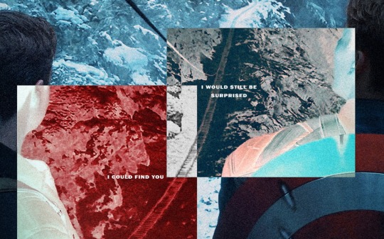
I kind of suck at remembering to use different layers for different adjustments, but if I’m adding any shapes or patterns with the Brush tool—such as the dots or the blood spatter on those BW posters—I make sure to always do that on a new layer. I do the same if I’m adding a duplicated area at a lower opacity to create that “ghost” effect at the edges of an object, like in this Sam edit here:

or if I’m adding a directional blur like in these:
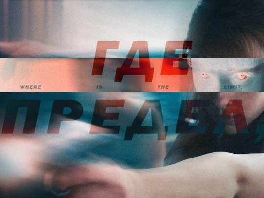

7. On a new layer, I add in color gradients at a very low opacity and then layer them up until I like what I’m seeing, usually radiating out towards the edges of the image or in spots that I feel might need a color change or boost. The red and cyan here are some of the more noticeable examples:
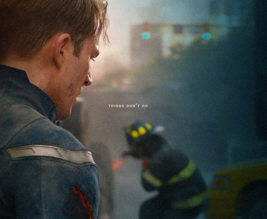

or the sepia-esque bleed through in these:


And I might do the same thing with a dark grey to darken the corners and edges a bit.
8. I add a text layer, write whatever it is I want on there and set font and size, pick a base color for it that is complimentary with the colors of the image, and then I go into Layer Style to adjust the opacity and blending mode. I usually use Difference or Exclusion for the latter if I’m trying to get that colorful text, and I might also throw in a lower opacity Gradient Overlay if I’m not a 100% satisfied with the colors that produces.
I might also mask the text so that I can make it appear to be behind an object, like in this:

9. Texture! I used to just add a noise filter directly to the base image but have since learned that’s not really the best way, so instead I:
i. create a new layer;
ii. set the mode to Overlay, and check “Fill with Overlay-neutral color (50% gray)”—you can also do this by just using the Bucket tool to fill this new layer with a neutral-looking gray color and then tweak the opacity;
iii. convert the layer to a Smart Object so I can go back in and re-edit;
iv. finally add a Noise Filter (set to gaussian and monochromatic) at around 3%-15%, depending on the image size and quality. I might also add a Gaussian Blur on top to make the noise a bit softer.
10. Final checks—this is where I might up the exposure, contrast, and saturation/vibrance again, or add another layer with gradients (always under the texture layer). I usually also export a test version to see how it translates online after it’s been compressed on upload, and then use that as a reference for whatever needs fixing or tweaking.
And that’s more or less it! Thanks for the ask—I never really thought too systematically about what it is I exactly do with these, so this was an interesting exercise. <3
4 notes
·
View notes
Note
Hello! May I ask how you draw? I'm currently learning how to myself and would be highly interested into a step to step process by you! Like from sketch to the done thing (no color necessary)
Hello there!
I dunno how I feel about showing how I work/giving advice to someone who’s learning (and I say it as a pro artist who went through years of traditional art education) because when I do the illustrations you see here on my tumblr I BREAK THE RULES you’d learn though life drawing routine, and give in to bad habits, and my methods are rather unplanned and chaotic which makes it difficult to pinpoint significant stages. But I used my portable potato to take some photos during working on my last piece, so I’ll throw it here with a bit of an explanation of what’s going on.
Before I begin - and because you’re about to look at a mess of a WIP - I’d like to give you some general advice that generally makes life easier when you draw (again, things that I learned in traditional arts education - another artist might advise you the complete opposite, dunno!)
Work holistically. Forget them satisfying-to-look-at clips on instagram showing someone produce a hyperrealistic portrait starting from an eye, with each and every element emerging being finished before they proceed to another part. It takes a lot of talent, yes, but these are ppl redrawing a photo in a kind of a mechanical manner. Most artists don’t work this way. Especially if you’re working without a reference, or if you’re doing a life drawing - your process will be layering and changing and finding what works best to give an impression of what you’re drawing rather than reproduce the exact image, and your artwork is likely to look messy most of the time.That said: don’t start with the details. Don’t spend too much time on a particular part while neglecting others. Your goal is to keep the whole piece at the same level of ‘finished’ (even though it’s unfinished - do I make sense?) before you’re confident that everything is where it should be and proceed to the details. So sketch out the composition first. See how things fit, what’s the dynamics. You’ll save yourself from limbs sticking out from the frame, odd proportions etc etc.
Because it’s a game of relationships between different parts of the picture/scene. I ask you not to worry about finishing a single element before laying out the rest because you’ll find that said element will look different once the other part appears! For instance - you might think that the colour you picked for a character’s hair is already very dark. But once you’re done with the night sky background, you’ll find that it’s in fact too light, and doesn’t work well with the cold palette. You’ll have to revisit different parts of the image as you go to balance these relationships and make the picture work as a whole.
Give an impression of something being there without actually drawing it ‘properly’- because details are hard, mate. You’ll see that my lineart usually has hardly any, and my colouring is large unrefined stains, but the finished thing looks convincing. Like, fuck, I can never focus on how Crowley’s eyes are really shaped. So I just turn them into large glowing yellow ellipses crossed by a line, and heard no protests so far.
Don’t panic if you messed up (you probably didn’t anyway). It might turn out to be a completely unnoticeable mistake - because, remember, things work together to balance each other, so another finished off prominent element will probably drown that badly placed line that looked so visible and out of place a second ago.
It might not look good before it’s finished. I’m mostly immune to it after years of drawing, and my recent illustrations all follow a specific method (ykno, my sunset glow effects and all that) so I can kinda predict the next stage. But I do my linearts on a specially picked crap paper, I don’t bother erasing the smudged graphite, and it looks messy af until I make the background white in Photoshop. Conclusion: you might have a moment of doubt as you work through a piece, but try to break through it - I often suddenly start to like what I cursed a minute before! - and try to finish it even if it’s meant to be bad. This way, looking through your past pieces, you’ll see the progress. And trust me, I can’t even look at my art from literally three months ago. It’s normal.
Now, pics! The sketches are paler in real life, but I increased the contrast a little so you can see something.
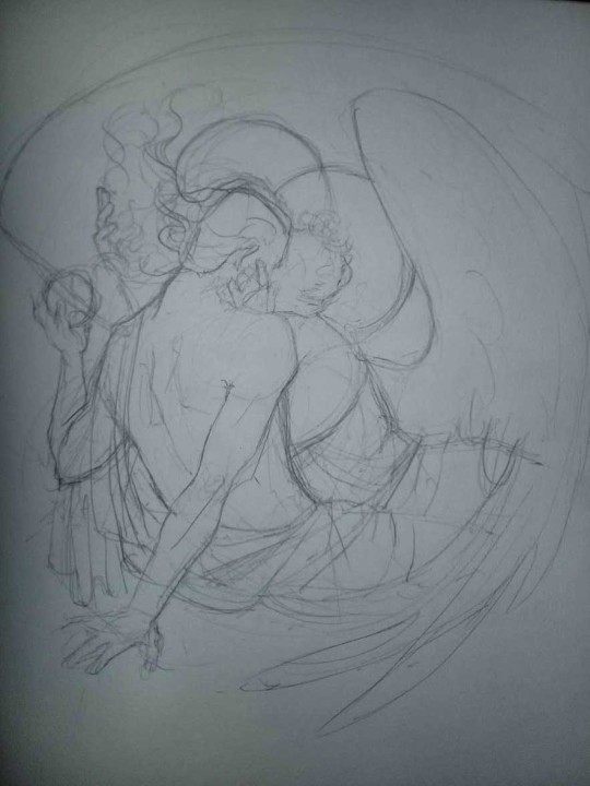
1. Laying out the composition!
I wanted to just show them kissing, but I got carried away due to some Art Nouveau inspiration. As you might have noticed, most of my illustrations are quite self-contained (ykno - they look like a sticker on a plain background). So I wanted a tight swirl bordered by Aziraphale’s wings creating a sort of rounded, yin-yang like bubble around them. Consequently I made the whole composition revolve around their heads.

2. Adding more details to the sketch. It’s messy af. It will be messy until I’m done. It’s fine.
3. These are the fineliners I use for the linearts! They are made by Uni-ball and come in light and dark grey. I also sometimes use the guy on the left - ‘Touch’ sign pen by Pentel, when I want more brush-like, wider strokes. I work in grey because when I scan it and do my usual boring trick with sunlight highlights - which is an Overlay mode layer in Photoshop - the highlights ‘burn out’ the lines too and make them vanish a little, and the lighting effect gets more striking. I also like to use the light grey ones to make something look pencil-y without actually using pencil, because pencil fucking smudges.
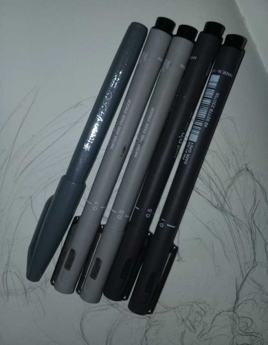
4. It smudges! So because I am right handed, I start inking from the right hand side, no matter how tempted I am to do their faces first.
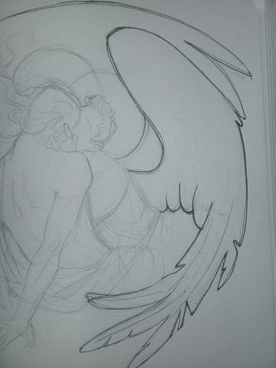
5. You can see the composition directions here. I made it intuitively, but ofc some ppl actually use grids etc to lay out their drawings.
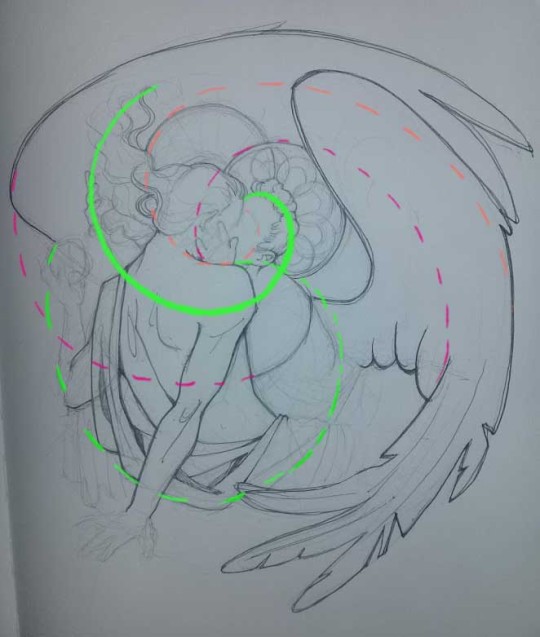
6. See how pale ans thin the lineart was at first? I kept adjusting it as new inked parts were appearing. It starts to look nice and consistent now!
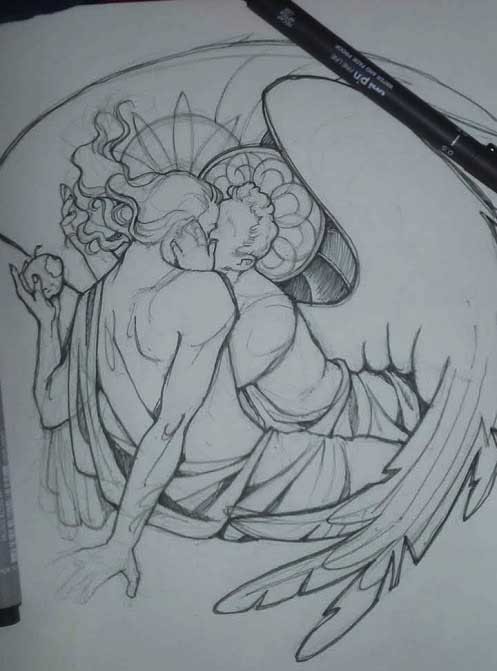
7. Finished lineart? There are some mistakes which I later corrected in PS. Notice that Aziraphale’s face has hardly any details on it - I tried to make the drawing suggest his expression rather than risk overdoing it.
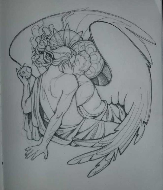
8. Photoshop time!! You can totally do what I did here even if you don’t have a graphic tablet. I used Curves tool to enhance the lineart, then Quick Selection Tool to select the background around around my sticker-like piece and filled it white (on a new layer ofc). I keep this white layer on top of the layer order so it works as a mask as I colour. I decided I did not like the hatching shading underneath Aziraphale’s halo, so I erased it with a Stamp tool (because I wanna keep the textured grey fill my crap paper naturally gives me!). It’s done roughly but won’t be visible once the thing is coloured.
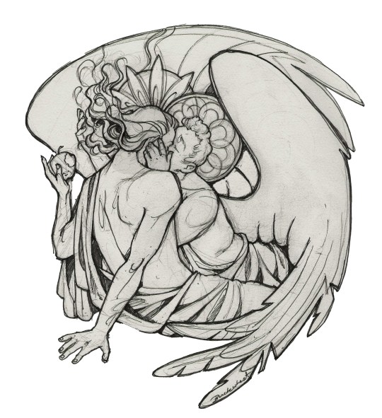
9. And the reason why I keep the grey shade instead of easily getting rid of it by using Curves/Levels is because when I set this layer to Multiply mode and colour underneath, it gives me this nice desaturated look like from an old cheap paper comic page. It works as a natural filter! But of course I can’t do bright colours this way, so all my glowing highlights happen ABOVE the lineart layer - on a separate layer in Overlay mode!
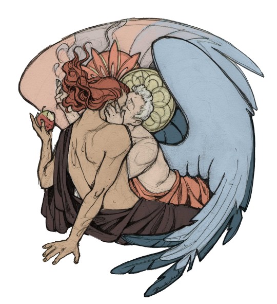
Finished thing here!
_____
Commission infoBuy Me a Coffee - help me with my transitioning expenses!Prints and stickers and things on my Redbubble!
#ask the buckwheat#long post#tutorial#drawing advice#drawing tutorial#good omens#ineffable husbands#good omens fanart#good omens art#my illustrations#doodles#toastedbuckwheat
1K notes
·
View notes
Text
how i color manga: a hopefully adequate tutorial.
i’ve had a couple of people ask me recently how i go about coloring manga panels, so i thought i’d share my process in case anyone wants to learn! it’s honestly not that different from coloring ordinary things, but there are a couple extra steps i have to take!
note: this is NOT an in-depth coloring tutorial and i don’t go into detail about how to color and shade; this is just a guide for people who want to know how to color manga and may already have a basic idea of how coloring works.

we’ll be using this panel as an example; i don’t have a panel on hand to color as we go, so i’ll just be walking everyone through my process using an already finished manga coloring from my blog. also, i use photoshop to do my art and am not sure how it translates into other art programs, but if you use something with a lot of features i’m sure you’ll have most of these already!
part 1: flat colors!

there are a couple of ways you can do flat colors. the first and easiest method isn’t the method i use in this image, but it is much simpler than the way i use, so explaining it normally should be fine.
let’s call this the multiply method: with this method, all you have to do is select the color you want, create a layer ABOVE the manga panel with the blending mode set to “multiply”, and start coloring.

in case you don’t know how to change the layer blending, this is the dropdown box at the bottom right. it’ll be set to “normal” by default, so all you have to do is change it to multiply. also, keep in mind that when you’re drawing on multiply layers, anything you draw over darker colors will appear a lot darker than it is, so make sure to account for that when you draw.
i would recommend this method if you’re just starting out with manga coloring because it’s a lot easier, and you have more flexibility with colors.
now for the second method; the “linear light” method. i tend to use this for all my coloring, but it is a little risky. linear light is a difficult blending mode to use because you have to use a color much darker than the one you actually need, and it requires a bit of trial and error to get right.
here is what the same color looks like in multiply...
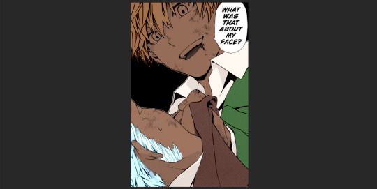
...and then in linear light.
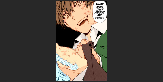
so why use the linear light method if it’s more difficult? mostly, it’s very advantageous to use if you want to color lineart, as it’s the easiest way to achieve that effect in manga coloring. lighter colors will color the lines more, while darker colors will provide a sort of “burnt” effect around the lineart.
remember: it’s most helpful to have each different object on a different layer! i have four base layers for this coloring; hair, coats, undershirts, and skin.
part 2: shading!

this is where we get to the fun part: clipping masks! you’ll want to make a new layer above whatever object you plan on shading, right click on that layer, and select the option “create clipping mask” what this does is ensure that nothing you draw on the clipping mask goes outside of the bounds of the layer under it. this is really helpful when you’re shading.
the easiest way to shade if you’re just starting out is to have the same color selected as your base color and set the clipping mask to multiply; this will just darken the color. presumably if you’re reading this you already know the basics of how to shade, so i won’t be going too in-depth on that.
make sure to leave a lot of space empty for the next step: highlights.
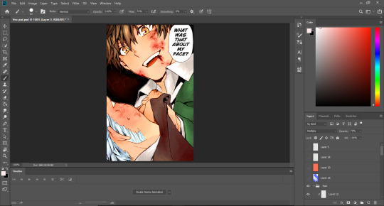
for highlights, i like to use light colors on one of two layer styles. the first is “screen” and the second is “linear dodge/add”. using screen generally means color is less saturated, but screen layers show up better on lighter base colors. on the other hand, linear dodge is VERY saturated, but doesn’t translate very well onto lighter base colors. with this, you can honestly just pick whichever you like best.
part 3: shadows.

luckily, shadows can be very easy when it comes to manga coloring. most manga styles have built-in shadowy areas that you can just follow with your shadows.
i do almost all of my shadows using a multiply layer, but again, don’t be afraid to try new things. most often, your shadows will probably have a blue tint, so just use a relatively light blue on your multiply layer.

this is the color i use for my shadows! also, please don’t be afraid to mess with the opacity of your layers. this goes for all of them, but especially shadows. if they look too dark, just crank the opacity down to half!
part 4: extras
the rest of the things i have to share are going to go at the very top of your layers and are mostly embellishments.
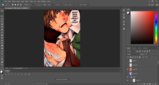
one thing i like to do with my colors is put a VERY low opacity flat color over the whole image, giving it a slight tint. this particular overlay is a peachy orange color on a linear burn layer at 25% opacity, giving the picture a warmer glow.
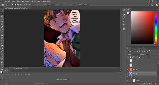
i also added shadows and highlights above all the layers to indicate that the light source for the picture is either behind or to the side of the focus character with a saturated blue shadow in multiply at around half opacity, as well as some yellow highlights using a vivid light layer.
things like these aren’t really necessary, but i find that they make my colorings pop more, so i just like to include them!
at the end of the day, my word is obviously NOT gospel when it comes to manga coloring and you should feel free to experiment however you like with any step of these instructions! this is just a basic rundown of my process coloring to get you started :D! thanks for reading, and i hope this helps at least a little bit.
25 notes
·
View notes
Text
OptimusPhillip Reviews 17: Transformers: Generations Starscream (WFC: Siege)
Jet Mode
Starscream’s alternate mode is, of course, based on the “tetrajet” design first seen in the pilot episode, “More Than Meets The Eye: Part 1″, and is probably the most accurate recreation. Of course, several designs have homaged the tetrajet, such as the Dreamwave “War Within” series, Galaxy Force, and the High Moon Cybertron games, but this is probably the least stylized tetrajet toy to bear the Transformers branding. It’s still a bit more angular than the animation model, but I honestly think it looks even cooler this way. It captures the aesthetic, without looking overly cartoony.
He has the Starscream colors: light gray, red, and blue, but there’s also a surprising amount of dark gray, mostly surrounding the clear orange cockpit. Why a Cybertronian vehicle would have a cockpit is beyond me, but it’s at least screen-accurate. And of course, his hull has multiple spots of battle damage. This is a particularly interesting case as, while it’s the same shade of silver as the other figures, the fact that it’s being applied to a lighter gray makes it look more like burn marks than paint wear. It might be unintentional, but it’s still a unique aesthetic.
Sadly, the vehicle design isn’t the cleanest of the series. The arms and legs are visible from almost every angle, and the robot chest is literally just stuck onto the rear of the vehicle. An unfortunate consequence of the tetrajet design. Even the Impossible Toys release had some pretty bad kibble issues. On the plus side, all five of his rocket boosters are blast effect compatible, meaning you can make him look like he’s going really fast. I also like how his chest fans are perfectly positioned like they could be extra jet engines, though this may be unintentional.
As far as accessories go, he of course gets his two null ray blasters, which have a bit more of a rifle look to them, though they still resemble the G1 versions. They can of course attach under his wings, but there are also extra COMBAT ports on the vehicle underside, which gives you a bit of extra play option.
Conversion
Starscream’s transformation is delightfully challenging. He’s actually one of the few recent toys that I’ve needed to consult the instructions for, and even after learning how everything works, he still is a lot of fun to mess around with. Though I will say, he is a bit of a shell-former. Again, natural consequence of the tetrajet design. That said, the shell actually integrates well with his robot mode, even if it ultimately doesn’t form the bulk of his actual form. Overall, it’s a fun process, with a satisfying result both ways, though be careful, as the chest plate is prone to popping off it’s hinge.
Robot Mode
Starscream is looking as beautiful as ever in his new body. Once again, we have a lot of sculpted detail that really gets across the mechanical elements. I like how they molded in some of the detail on the inside of his faux-cockpit window, creating a layered effect. The battle damage is still present, though here we see more of it on colored parts, which makes it look about the same as it does on other figures. Still, the detail on his legs still gives it that burnt look that I liked from jet mode, so it’s nice to see it carried over. The one oddity to his look is the head sculpt. Most Starscream toys opt for a smirking face, befitting of his character, but here he has more of a neutral, almost angry face. It almost feels more befitting to Thundercracker than Starscream, and wouldn’t you know it? Thundercracker has an uncharacteristic smirk. It’s like the molds got swapped somehow. Weird. Whatever the case, their heads are identically colored, and on ball joints, so they can be swapped around if you get both... like I probably will.
In terms of posability, Starscream is loaded with it. Ball-jointed neck, universal shoulders and hips, swivels at the bicep and thigh, double jointed elbows and a really deep bend in the knees, waist articulation, wrist swivels, and my favorite part: universal ankles. Not only do they tilt side to side, but they also have very wide forwards range, allowing him to stand in a variety of poses. Plus you get some play in the toe and heel spur, in case you need some extra movement there. He even has extra joints in the wings, allowing a dynamic range of visual styles. And if we really want to push it, the transformation joints in his shoulders allow him to move his arms in towards his chest. Basically, if you can imagine Starscream in a pose, this guy can pull it off.
In terms of gimmicks, he of course has the various COMBAT ports, meaning that you can mount his null rays or any other 5mm weapon basically anywhere on his body. There’s also several mounting points for blast effect parts, including the bottoms of his foot rockets, for flying poses. And like most Transformers these days, he has a mounting point for a flight stand... right between his legs... yeah
Final Thoughts
Siege Starscream is probably the best representation this character has had in a while. The only thing that may keep him from supplanting the Classics mold in most people’s collection is that he’s a tetrajet, rather than an F-15. That said, I still consider this the far superior version. He has his flaws, like the loose chest or the overall shell-based transformation, but even that isn’t enough to dissuade me. I’d highly recommend this figure to any CHUG collector, though if you plan on being a completionist with the mold... I wish the best to your wallet.
5 notes
·
View notes
Text
I’m still not entirely sure what to make of DEAD OR SCHOOL. At first glance, it appeared to be the love child of Senran Kagura, Resident Evil and Parasite Eve. After playing it for several hours, it’d be more accurate to call it a mixture of Senran Kagura, The House of the Dead series and any Metroidvania. In short, it’s a very ambitious game. Though I didn’t know this about it initially, it’s actually a crowdfunded darling by Studio Nanafushi, and it got published by the fine folks at Marvelous. (They probably appreciated the similarities to Senran Kagura.) It’s also a game that combines fan service, hideous mutants, and complex yet immersive combat in one package. The question then is were all those elements able to shine through the layers of awkward design choices?
This slideshow requires JavaScript.
At first blush, it’s easy to believe DEAD OR SCHOOL will be a poorly written, derivative mess. And it’s true, there are a fair share of grammatical errors, as well as some very odd choices of punctuation. Despite all that, there’s actually a really compelling story here. It takes the zombie apocalypse genre and mixes it together with Sukeban elements. (I hope I’m using that term correctly.) Basically, a game that shows women can be strong and independent, and not reliant on society or men to save them. And since this is a game inspired by Japanese popular culture, there’s also a good deal of fan service in DEAD OR SCHOOL, such as main character Hisako wearing a sexy school uniform that, when torn, magically increases her power in proportion to the amount of exposed skin. I know some of you are getting turned off already, but bear with me. Despite the silly and over-the-top elements in the game, and despite the aforementioned design problems, there’s a diamond in the rough here.
This slideshow requires JavaScript.
The plot of DEAD OR SCHOOL revolves around a cataclysmic war between humanity and horrible humans turned mutants, and the aftermath of that climactic war. Humans have been pushed completely underground, living in sewers and train stations, pretty much any large abandoned space. Things are calm until some silly young girls discover an elevator to the surface, and are attacked by mutants. They’re only saved thanks to the sudden and dramatic intervention of Hisako, who despite her unremarkable appearance is apparently a mutant killing machine. She rips through a horde of them bare handed like a little red-haired Hulk. While I suspect there’s perhaps a reason for her abilities, three levels into the game it hasn’t been explained. Regardless, Hisako is a total bad ass. Filled with her grandmother’s stories of the surface world and the paradise of the institution of schools, she ventures forth to discover the truth and establish a school of her own. Which might sound silly, but in a dystopian nightmare like, say, a pandemic, one starts to appreciate the stability a school represents.
This slideshow requires JavaScript.
With the basic concept out of the way, let’s move onto where DEAD OR SCHOOL is strongest: the gameplay. Though it definitely qualifies as a 2D beat ’em up, it’s also very much a Metroidvania. Each area you explore features a series of interconnected rooms, complete with a mini map display. Better yet, as you fight you level up, growing stronger incrementally. You also increase your parameters by fulfilling sidequests and rescuing survivors. Basic stuff like HP or stamina will get increased, but one of the more important categories is weight. Every weapon you have equipped (You can alternate between three different weapons at a time.) contributes to your overall weight. That weight is increased by modifying the weapons with gears, adding new abilities and even randomly changing the weapon’s inherent ability. Just keep in mind, if your overall weight ever exceeds the upper limit, you’ll be rendered unable to attack, so you’ll have to work within your capacity.
This slideshow requires JavaScript.
I love how easy it is to alternate between your three equipped weapons with a press of the shoulder button, and it makes combat fast and furious. The only limiting factor is your stamina. Most of the time I didn’t notice this at all, but when things got hot and heavy, I definitely did. When your stamina is depleted, it takes longer to recover. This is problematic, since stamina lets you do things like attack, jump, dodge, etc. When my stamina was depleted, I’d usually take a hit while trying to dodge, but not have enough stamina to do so. To help counter this, Hisako can crouch. While crouched her stamina recovers rather quickly, so you’ll need to balance your time between rushing, attacking, dodging and crouching. Again, normally not a problem, but when you’re facing hordes of mutants or one of the game’s intense bosses, you’ll need to moderate your actions efficiently.
This slideshow requires JavaScript.
If it all sounds stuffy so far, fear not. The combat in DEAD OR SCHOOL is actually really fun. All the weapons you use have ammo (even the melee weapons like swords, for some reason). Once out of ammo, your ranged weapons, such as flamethrowers, grenade launchers and machine guns, cannot be used at all. The saving grace is that once you reach a save point, all the ammo for your equipped arsenal is replenished. But sometimes it’s a long trek between save points, and the game loves to throw large groups of mutants at you. Often you’ll even be locked in a room until you’ve cleared them out. I worried I’d run out of ammo, and that does indeed happen. Thankfully, your bladed weapons can still be used once out of “ammo”. They just deal half as much damage as they normally would. As a result, I really came to rely on my katanas and axes more than my ranged weapons, though those can also help you in a pinch. Every time you level up, you’ll get a skill point, which can be allocated to a skill tree for each type of weapon. You can bet I poured a lot into my katana, making it deal more critical hits, inflict backstab damage to foes, and even unlocking a powerful whirlwind slash. That said, it’s important to deposit skill points in each tree, since you never know what passive abilities you’ll find there, such as increased stamina or extra durability for your weapons.
More School on Page 2! ->
This slideshow requires JavaScript.
Like I said earlier, DEAD OR SCHOOL has lots of Metroidvania elements, but I wouldn’t go so far as to call it a proper example of the genre. You don’t really get new abilities to help you explore. Instead, you’ll find key cards and such to unlock new areas, and you can use Hisako’s nimble acrobatics to get around. She can run pretty fast, double jump, and even cling to and swing from certain structures. You’re able to explore as much as you want to, and you are free to ignore optional sidequests. That said, it’s good to try a few, since each one will reward you with experience, and you’ll need to keep your level about even with the foes in your area. For example, when I got to the third level of the game, I quickly encountered a lot of foes at level 18, while I was only at 14. I was able to do okay initially, but then I wandered too far afield and found some level 21 foes. Suffice to say, they walloped me. Thankfully, the game is generous, and you don’t lose any experience or progress when you die (and I died a lot). The only downside is you do lose some cash, which isn’t that big a deal. All you use cash for is to buy parts and weapons, which are randomly populated in the shop you can access through the save points. Usually there’s a lot of items you can totally ignore. That said, I strongly recommend you either buy a weapon with a drone, or equip a part that provides a drone. Those little bastards saved my ass more than once, since they hover around you hitting foes with lasers. They’re not fast or super powerful, but they can hit foes from a distance, and they have unlimited ammo. Whenever I found an irritating section in DEAD OR SCHOOL, I would usually camp where a foe couldn’t hit me, and let my drone whittle their health away. Sure it’s cheap, but sometimes you need to be a bastard to get through this game.
This slideshow requires JavaScript.
Overall, I do feel the balance in DEAD OR SCHOOL is mostly fair. Generally you’ll only be losing to a boss because you’re not paying attention to their attacks and avoiding them properly. Or maybe you’re not timing those dodges well, and missing out on the enemy being temporarily slowed down. But every once in a while you’ll find something that might be frustrating in this game. A good example is in Harajuku. One area had me fight wave after wave of foes and then get to two rotating gears I had to navigate. Problem was, I was instantly locked into a fight room, which was tricky since it involved moving gear teeth. Adding insult to injury, once I survived that, I stumbled upon another fight room, and once past that, it was punctuated by a terrifying slasher mini boss fight. This goes to show that though most of the combat mechanics are well balanced, sometimes the developers didn’t have a fair and balanced approach to stage layouts. It’s nothing that is game breaking, but having more save points or even less continuous stretches of mutant hordes would have definitely helped, especially considering I’m only a few levels into the game, and I can tell there’s plenty more. I can only imagine how difficult things will become later in the experience.
This slideshow requires JavaScript.
It’s no secret by now that I exclusively play my Switch in handheld mode. And yes, I’m aware that doing so often means the games run less optimally or that the sound is especially muted. That’s very much not the case in DEAD OR SCHOOL. The game runs very smoothly, even with large groups of foes, and the music is catchy and does a great job of motivating you. Even the sound effects are really dynamic and attention grabbing, from the rat-a-tat of your gunfire to the shrieks of rage or pain from Hisako to the groans of filthy mutant scum. It does a great job of drawing you into the experience, and kept me entertained.
This slideshow requires JavaScript.
Now that I’ve talked about the good, it’s time to unveil what DEAD OR SCHOOL did wrong. Earlier I touched upon the translation of the game, and how it has odd grammatical choices and bad punctuation. Frankly, most of the dialogue is forgettable. It doesn’t do a good job of showcasing the personalities of the characters, maybe with the exception of Yurika. She very much comes across as the mature woman trying to look professional yet being a total spaz. A bigger problem I have is understanding all the menus. Some things the game does a good job of explaining, such as the many tutorials for combat. Much as I appreciate that, I still don’t understand all the ins and outs of weapon customization, just as one example. Plus they can just be tricky to navigate, such as the parts menu. Having a way to organize or filter them all would be amazing. And while visually I like a lot here, such as the comic book illustrations, the way enemies jump in combat from the background and the various mutant designs, the models during gameplay felt constrained and small. Plus it’s just disconcerting how each foe has a wide red outline. Oh and much as I love the save points, it’s annoying how every time you use one, all surrounding foes respawn, including fight rooms that lock you in. Perhaps the wonkiest is the physics in DEAD OR SCHOOL. If you’re on anything other than a flat surface, things go to hell. Hisako slides down diagonal slants and even gets caught in stage geometry surprisingly frequently. On the plus side, the same also happens with foes, so more than once I dealt with a nasty mutant by trapping it in stage geometry then murdering it with my drone.
This slideshow requires JavaScript.
All things said, I did really enjoy what I’ve played thus far in DEAD OR SCHOOL. I just worry it’ll be a challenge to beat the game given the issues I’ve covered, as well as some others, such as the game seemingly forgetting settings I input when I started the game. But despite all those rough spots, I feel there’s a really promising adventure here. Sure, it still needs work and polish, but if you can look past that, it’s a really unique title that many will enjoy. Just get ready for when Hisako has to kill a tank…
IMPRESSIONS: DEAD OR SCHOOL I'm still not entirely sure what to make of DEAD OR SCHOOL. At first glance, it appeared to be the love child of…
#DEAD or SCHOOL#fan service#fun#glitchy#Marvelous#Metroidvania#mutants#nintendo switch#PC#PS4#RPG#Studio Nanafushi
0 notes