#this post is about guitars
Explore tagged Tumblr posts
Text
continuity and handedness in drawing is sometimes so inconvenient like sometimes a composition just objectively looks better if you put an object in a particular direction even if realistically that would not occur and then you have to make an executive decision to either edit reality a little or make your drawing visually awkward for the sake of reality. do you get me
#this post is about guitars#in the latest merch drop both of alnst till's designs had the guitar on the wrong side rip in pieces#there's also a couple of shots in the mvs where he's (feigning) playing guitar with mirrored handedness. lmao his ass is not playing#like it's whatever. but so noticeable ahaha#also this is about me drawing someone holding a knife in the wrong hand (i noticed it wasn't in shot so i added it bc i liked the pose)#before reading extensive meta about the narrative importance of his handedness in the particular scene. like ok sorry#i jsut thought it looked cool#the ho rambles
6 notes
·
View notes
Text
i dno man i js really wish I coukd have her. just holding her in my lap .....
1 note
·
View note
Text

I like to think they act like birds. (Drop your headcanons RN!!!💛🤝)
#fanart#digital art#guitarspear fanart#hazbin hotel guitarspear#guitarspear#guitar#spear#guitarspear hazbin#adam x lute#adam and lute#lute x adam#adam hazbin hotel#hazbin adam#hazbin hotel adam#first man adam#lute hazbin#hazbin hotel lute#hazbin lute#lute fanart#i love tjem#my otp#birds#their birds#headcanons#urging to make a whole headcanon post about them#maybe even a guitarspear playlist#im hyperfixating again#it’s so bad#LFMAO
151 notes
·
View notes
Text
in case it wasn’t clear. this blog and this bitch do NOT support the industrial military complex.
#concerning amount of ‘Eddie in the military’ fics I saw this morning#(on the fyp not from my mutuals!!)#ummm. um!!!! 😐#if that isn’t immediately raising a red flag for u#I urge you to do some research about why JQ’s upcoming war film is fucked up#also#you really think Mr. Anarchy#captain of anti-establishment sentiment#owner of a guitar that reads THIS MACHINE SLAYS DRAGONS.#you think. EDDIE MUNSON. would willingly engage as a soldier#in America’s military.#get real. and a grip!#anyways#always foremost and forever#my blog is Eddie centric#JQ-specific posts have been and will continue to be rare#and tagged accordingly#i do not aim to center celebs here yanno#blog update
76 notes
·
View notes
Text


“He was born to blow your mind… or something along those lines…”
Miracle Aligner @ BBC Radio 1 Weekend, 2016
#listen. i could say something about the electricity or skill of this performance#or the gorgeous string arrangement#but let’s be real i am just here with gratuitous photos of alex and miles looking stupidly hot while playing guitar#and i’m not even ashamed#because LOOK at them ???#absolutely ridiculous#no wonder when they watched this performance back they were talking about how much they fancied each other 💀#jesus christ#alex turner#miles kane#milex#tlsp#the last shadow puppets#arctic monkeys#my gifs#lulu posts
79 notes
·
View notes
Text

ROB CANTOR LIVE 4 THE APPLAUSE!!
alt versions v


#tally hall#tally hall fanart#digital art#rob cantor#artists on tumblr#hiii everyoneee#this was supposed to be in parallel to an old zubin drawing I ade but that ones so ugly I need to redraw it#illustration#I was NOT about to ruin the fun of drawing this with the guitar#forgive me for that#wait have I posted the caipirinha animation here
116 notes
·
View notes
Text
Just watched The Big Bang Job again today and I rambled about this in an earlier post reblog but it deserves its own post..
The way Eliot dresses makes so much more sense after meeting Moreau and his goons. He rejects all notions of being anything like those well dressed men in their suits again. So blank and uniform, just another soldier in Moreau's private army.
That's why his shirt is always untucked, sleeves rolled up, collar unbuttoned. Not to mention the hair - the biggest rebellion is his hair. A constant reminder of who he is now that stays the same, no matter what he wears.
And it just makes me think how this is such a good representation of the identity crisis he went through (and let's be real, is still going through).
Eliot used to be one of those men. He had his hair short, wore the tailored suits and carried the guns. He didn't accessorise. He suppressed every aspect of an individual personality in order to fit the role that Moreau had for him.
Sure, we're not blatantly told all of those things in the show, but we can infer, simply from looking at Moreau's goons and how they're presented.
Seeing Eliot surrounded by those goons in the pool scene is more than just showing us the threat to Eliot and Hardison - and also the threat that Eliot and his reputation present. It's about showing us the demons of his past, the nightmare that he doesn't want to go back to. Eliot had alluded to his past before but it's been nebulous. Now, we finally see that past take shape and it's hideous.
But Eliot didn't stay like that. He got out - he got free - and he has been reclaiming pieces of himself ever since. Until, finally, he's the evolving Eliot that we know and love. He prefers to dress casual and relaxed, with strong reminders of his roots throughout. He keeps his hair long and loose - not military regulation, not 'professional' as far as male standards go, not even convenient for fighting. It's all a way of stealing himself back, and making sure the differences between who he was then and now are stark and vivid.
I could keep rambling but this is already twice as long as I intended. Just ... Eliot Spencer. He still doesn't view himself as a better man, never mind a redeemable man, but he is. When compared to those goons, his transformation is clear as day.
#eliot spencer#leverage#the big bang job#christian kane#my posts#this got away from me a bit#i have so many feelings about eliot and this episode#lmao just like everyone else i'm sure#for the record i adore the way eliot dresses#i'm a country girl through and through so his style is the epitome of fashion to me#don't even get me started on the necklaces#one day i'll make a post about that guitar pick necklace and its significance to him
270 notes
·
View notes
Text

emo secondary schoolers when you tell them there's wkd blue and strongbow dark fruits in the fridge:
#this photo exudes such a hauntingly specific and familiar energy i had to make a post about it#guitar twins really living up to their tags here also i am jealous of how comfy sandra looks#*andy voice* and this is exactly how this photo has always looked!#beloved freakazoid#guitar twin 1#guitar twin 2#sandra alva#<- sorry queen i couldn't think of a custom tag#black veil brides
80 notes
·
View notes
Text
Ne Bi Smel by Joker Out, Vienna 09.12.2024
PRINCESS KRIS AND NACE NE BI SMEL BRIDGE SAVE ME
#seeing this healed me too#so many things healed me but this was one of them#had to film until the end of the song#something something that one post about Kris playing guitar you know the one#save me#also that bow I will not shut up#it fits him so well#it is the perfect length for his hair#please also save me#joker out#kris guštin#nace jordan#ne bi smel#dangerous stuff really#linden’s concert clips#tw flashing#flash warning
63 notes
·
View notes
Text
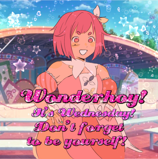
SPARKLE ON ✨✨✨
#project sekai#pjsk#prsk#emu otori#gif#blinking#proseka#sparkle on!#i was gonna queue this for wednesday but thats so painful for me so happy wonderhoy its wednesday sunday#kirakira dokidoki mochimochi puyopuyo wakuwaku wasshoi#i went through hell and high water and like 8 online free glutterbtext gif generator websites to find the exact font#thank you glittertextonline dot com#ive thought about drawing a lot of jerma bullshit as wxs. plesde be thankful that im focusing on artfight#the nene985 dollhouse is still on my mind. i wanna draw her leaping out of that window really bad#idk what to type here since this is like a week i advance and i wont remember scheduling this in about 20 minutes. ummmm#OHHH I HOPE MY GUITAR IS FIXED BY THE TIME THIS POSTS I FOUND A USED AMP FOR MY BIRTHDAY ^___^ I WANNA PLAY YIPPEEEEE#anyways.... be who you are. shalalalaaaa ^_^
1K notes
·
View notes
Text
It's Hard to Be a Saint In the City — Live at the Hammersmith Odeon, London, November 18 1975
#sorry for the quality this 1080 pixels of footage from 1975#anyway. you all wish you were him . and sex is when bruce springsteen and steven van zandt perform a double guitar solo live together#YOU ALL NEEEEEDDDDDD TO WATCH THIS BTW IM SO SERIOUS FOREVER.#bruce springsteen#steve van zandt#clarence clemons#fuck it im tagging all of them#garry tallent#max weinberg#danny federici#roy bittan#e street band#e street#archive#fave#vid#bruce#im tempted to post backstreets and jungleland next. i dont fuck around about hammersmith odeon '75
82 notes
·
View notes
Text


some fave pics of Eric and Assad~
#eric bogosian#assad zaman#i do be thinking hard about that guitar one LET ME TELL YOU#unfortunately i am going to be tagging this also#zamasian#because you KNOW any time i'm posting about either of them i'm Thinking About It
110 notes
·
View notes
Text
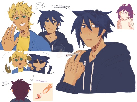
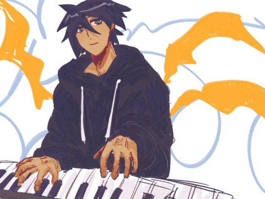
it's probably obvious that. sebastian is my favorite. sorry. i also like sam though hes cute
also in my first spring i kept fishign up flounders (because . BECAUSE I LOVE FISHING) and i found out only sebastian somewhat likes them and just kept giving it to him.
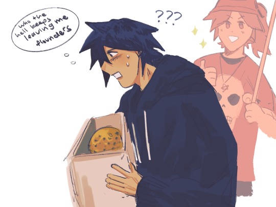
#the second and third darwings were like. from early december LOL so forgive the style change....#tehy're besties with fucked up hair#i swear like wtaf is up with sam's hair#its ok theyre so skrunkly to me.#especially sam. ooouuugh hes so cute im so weak for him#like sebastian is silly and a failure too but sam. man#and he plays the electric guitar im weak for that HELLO#not me going on and on about sam in the tags of a sebastian post#i draw skrunkly#stardew valley#stardew valley fanart#stardew fanart#stardew sebastian#stardew farmer#sdv#sdv fanart#stardew oc#stardew valley farmer#stardew sam
216 notes
·
View notes
Text
alright, here it is: ZENO'S COLOR GUIDE 3.0 !
here, i'll have three "chapters" regarding color:
CH1: how i color in illustrations
CH2: color and character design (in zeno's case)
CH3: how zeno makes his colors cooler
CH1: HOW I COLOR IN ILLUSTRATIONS
it must be noted that, as of lately, i heavily use halftones in my art and the way i use them for gradients effects my color choices. of course you don't need to use halftones if you don't want to, as it's just my personal choice, but anything regarding halftones here could (probably) also apply to regular gradients!
when choosing colors in an illustration, i usually have three things in mind: mood, character, and contrast. we'll be using "gloomy bunny naptime" as an example here.
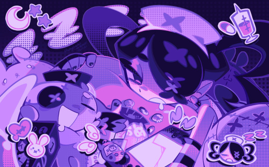
MOOD: what's the vibe of the piece? for example, here in "gloomy bunny naptime", wanted a mellow, sleepy vibe, so purples and pinks seemed like the best choice. these colors also have a dreamy effect due to being common in real-life early mornings/summer nights - basically, i tend to use associative colors in illustrations.
i usually only use a pallete of 3-7 colors, though of course more characters calls for more colors. for multi-character pieces, i would actually make a "rainbow" of colors based on the mood of the piece - essentially, a bank of colors to use for your colorful casts based on the actual rainbow. you can alter this based on the saturation levels you want! hope that makes sense. i'm not the best at this though, so i would heavily recommend looking for guides from artists who are more skilled in that department.
CHARACTER: velvet is the focus of the piece, and as a character her palette is made up of many purples and pinks. of course, it's easier because she and ribbon both have similar designs, but i would still recommend using colors based on/complementary to the focus character's pallete, though this is a rule that can and should be broken if needed. gradients can be used to provide a smooth transition from color-to-color and add depth to the piece, as well as showcase velvet's pallete. when making any gradient, you probably want to have a vibrant middle color. this is difficult to achieve in most art programs, so i'd do it like this:
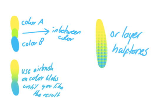
you can use gradients in lots of cool ways to make stuff pop! (i think this collage shows i use too much purple and pink though.)

CONTRAST: the context of the piece also aids the color through contrast. (that's a lot of Cs!)- we see that velvet is just waking up, and the light from her switch is glowing brightly. i wanted to convey something like her switch suddenly turning on in the middle of the night, waking her up - so the console emits "light" in the form of illuminating the contrasting color of pink against the purples. it might seem specific to this piece, but what i'm trying to say is that contrasting colors can lead the eye to the focal point of the piece, that being velvet herself. because a great deal of the rest of the piece is dark, we look at the contrasting switch screen - the brightest thing in frame - and our eyes move around and up to take in the focal point character. at least that's how i wanted it to be ;w; i guess you could convey it as something like this?
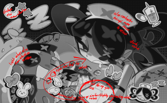
CH2: COLOR AND CHARACTER DESIGN (IN ZENO'S CASE)
this is where i start to get annoying, so stand back! when deciding on colors for a cast of characters, there are many factors: time period, variety, personality, and more that i can't think of.
TIME PERIOD: this one is simple. for example, a futuristic time period (such as that in x-calibur) calls for colder colors, such as greens and blues. for characters involved in futuristic professions such as space exploration, this works incredibly well. for modern time periods, less focus can be on colors and more on the shapes of the clothes, but this is not a shapes tutorial! i don't have any ancient times oc stories, but i'd probably use earthy and warm tones.
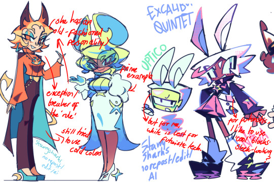
VARIETY: this is also rather simple. i try to be aware of the palletes that i used, and the similarities they might have with other characters. i try to use similar colors for characters who belong to certain organisations or have a uniform, but of course, it's not like catholic school students adhere their entire look to their uniform, so this is a rule that can be broken yet again. art is all about learning things and breaking them, remember that!!!
color can also be used for symbolism. my absolute fav example for this is vivica and octavia - the amount of red in their designs is supposed to represent the amount of freedom/passion/anger/confidence they have or are allowed to express under their different circumstances. as vivica belongs to a strict organisation, she has far less red in her design, showing her emotions are stifled - meanwhile octavia has it as her main complementary color because of her freedom to express her emotions, though those emotions may be destructive because of her circumstances.
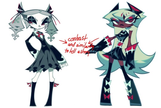
PERSONALITY: what colors are associated with your character's personality? i actually usually refer to magical girl groups to see what's commonly associated with different colors. here's the main trend:
red: hot-headed, passionate, firey
orange/yellow: bright, happy-go-lucky, sunshine personality
green: wise, mellow, kind
blue: serene, graceful, elegant
purple: magical, regal, fancy
pink: usually the main character (though this because magical girl anime tends to be marketed towards young girls), sweet, relatable, determined
of course these are only stereotypes from one genre of anime, and different colors have tons of different meanings. color theory is the best way to learn this! these colors can also express different moods, which ties into ch1. i myself constantly ignore these rules - v-con, a bombastic hyper DJ, is purple (though he does have yellow accents) for example. basically, i just take them as a general rule and try to have them in mind while drawing.
CH3: HOW ZENO MAKES HIS COLORS COOLER
this might be the most important part of this guide. once again, there are a few things to consider here: filters, hue, overlays, and more!
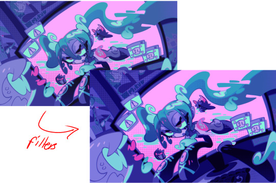
FILTERS: for ibispaint, you can use an adjustment layer on your whole piece to use a filter. i usually only use brightness/contrast here - upping the brightness (or darkening it based on the mood of the piece) and upping the contrast. this helps to better express values and intensify the colors if that's what you want. i often use it in all my pieces to some extent.
hue/saturation/lightness is also helpful in moderation. you can alter the hue - though it usually only helps if you bring it back or forward by just a few points, or the entire pallete will change. saturation is what it sounds like, and slightly over/desaturating the piece can help with atmosphere. lightness is what it sounds like - lightens the colors in the piece. i don't use it at all.
posterize and sharpen mask are some that i've used recently. posterize can add some crazy effects to your art, but i'd probably need to edit it slightly after using it because it can mess with certain colors.
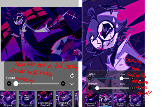
HUE: it's a layer type that can change the overall hue of the piece. i usually use it at a low percentage for atmosphere. kind of like a gradient map but nothing like it? idk
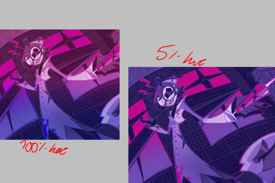
and OVERLAYS: i just use a very saturated blue/purple color over the entire piece at a very low percentage, around 5-10%. it can wash out the piece at too high a percentage.
and that's basically it! sorry it kind of derailed at the end i spent like 2 hours on this and got super tired. goodnight i'm going to sleep please also look at other artists etc etc. bye.
#zeno's art#long post#color tutorial#liar by korn is actually a really catchy song yea the lyrics are weird but its so good tbh#peak drums and bass and guitar and vocals and then the lyrics are hot booty. this is what nu metal's all about people#ask questions if you want#about nu metal or art i dont care
364 notes
·
View notes
Text
he’s literally so beautiful and handsome


#HOW MANY TIMES DO I HAVE TO SAY THAT IM SO FUCKING WEAK EVERY TIME BEOMGYU AND GUITAR LIKE LITERALLY MY HEART MELTS#I LOVE EVERY TIME HE PERFORMS W GUITAR I THINK THIS ONE IS MY FAVE SO FAR#his outfit as well omfg he looks so fucking good they styled him well g#the guitar is so pretty as well and I love the strap the bird design on the fretboard is so cool#I heard there’s only 200 of them as well I don’t even play guitar but I want to buy it just bc it’s so beautiful#BEOMGYU RAPPING !!! OH MY GOD 😭😭😭#HE DID SO WELL#HIS SINGING AS WELL#and his guitar parts were really good in this one like he’s improved sm I’m so proud of him 😭#like he’d never performed w guitar on stage before until recently and doing lots of lives and practicing a lot more#like I remember him saying he got a few guitar lessons for wonder and him saying he was shocked bc he realised he’s not that good at guitar#and is starting to learn the basics again and practicing more consistently#and he really has improved you can hear it ! I was actually shocked like it sounded so good#beomgyu<3!#also the when he posted on Instagram literally squealed THEYRE SO FUCKING PRETTY#honestly one of my favourite pictures of him#what can I say I love pretty sunsets and pretty boys#yo why are the tags so long 😭😭 wtf#I’m sorry I can talk about beomgyu for days
103 notes
·
View notes
Text


505, iTunes Festival 2014 🖤
#feeling uh. yeah#real normal about this entire performance 🫠#no wonder alex forgot his words#miles on guitar is just. something else#like he plays with so much passion and skill#so much power#but also such tenderness and sensitivity??#it’s an absolutely devastating combination#he really has something special ✨#miles kane#arctic monkeys#505#miles gifs#my gifs#lulu posts
84 notes
·
View notes