#this post format makes them bigger and it ruins the quality a bit
Explore tagged Tumblr posts
Photo
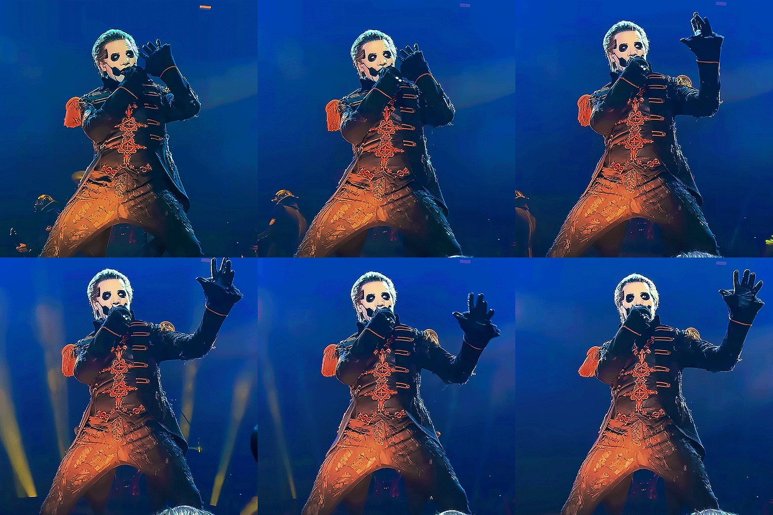


It's the words that were never spoken that echoes through the times. It's the smell of the burning temples swept away by rhymes (x)
#the band ghost#ghost band#ghost bc#papa emeritus iv#copia#papa iv#papa 4#popia#kaisarion#my gifs#i'm still so excited about the new EP!!#but anyway#have these gifs i made yesterday#they're super vibrant#cause i like color#heheheh#i'm def not comfortable with posting square gifs this way though#this post format makes them bigger and it ruins the quality a bit#so i'm a lil insecure about it#but i figured i'd try something new#also the coloring is so inconsistent#*cries*#hoping tumblr won't ruin everything and make them small again#🥲#sorry for rambling
1K notes
·
View notes
Text
folklermore spn finale: the last great american dynasty
Okay so this post took forever to write for a couple reasons.
First of all, this one is special in that it has two readings for my grief.
The first one is terrible and heartbreaking and honestly I don’t want to spend a lot of time on it. I see Andrew Dabb as THE great villain of Supernatural, and he truly had a marvelous time ruining everything. The sarcastic nature of the song goes in to speak to the fact that I feel legitimately crazy for how much I blame him. It’s sad and heartbreaking. I think about it sometimes when i hear this song and instantly force myself to stop thinking about it and go back to the other view.
So the other view is more what you might expect with the vibe of the song... but it is SO HARD for me to put into words, I found. So I’m sorry if this is messy and disjointed and all over the place.
I spoke in cardigan’s post about how I’m not the fan the show wanted and there’s a large part of the narrative in the folkermore-spn-finale feelings for me that expresses not being the fan the narrative wanted or needed.... Most of the time this is brought up in this, it’s angry, or sad, or whatever... but this time... this time it celebrates it.
I had a marvelous time ruining everything.
Putting this under a cut because it’s very long. I didn’t mean for this to get this long rip.
I let myself sink into the feelings of wonder and awe I felt when I first fell in love with the show and then let myself find the conclusion that IF I did in fact “ruin everything” (aka the show) by not being the fan the show needed me to be to enjoy it, at least I had a good fucking time!
From that first bit where Taylor sings that Rebekah’s salt box house took her mind of St. Louis.... Supernatural took my mind off my life too. I remember when I first watched the show, I was 20 and I’d just failed out of school (the first time). I was lying to my mother and her husband (who I lived with) about going to school. I rode the city bus at the time because I didn’t have my license yet. I’d leave the house and say I was going to the bus stop down the street. Instead, I hid in the woods that separated my neighborhood from my grandfather’s back yard. I worked at his house “after school” every day from 4-6, taking care of his house, doing light cleaning and cooking, helping him adjust to being a double amputee so it worked out nice. Every night I pre-loaded 5 hours of episodes on my computer so I didn’t need the internet and every day I would sit in the cold on a log and put my computer on a slightly bigger log and curl up in my warm coat for a day of Supernatural before heading inside to Pappou’s house at 4. Sometimes, I just waited until the afternoon when I knew my mom would be gone and I could go home where it was warm and I had wifi. Sometimes though I got wrapped up and I just stayed there.. all day.
Supernatural is, what I would consider, one of the last great american TV shows. Like... It’s right there with Grey’s Anatomy as the last TV shows that have an actual following where people watch it and it’s a thing that haven’t been corrupted by the streaming world. Television is so important to me, it’s my favorite medium of storytelling and it’s been lost. Streaming destroyed it. People say we’re living in a “golden age” because there’s “so much good TV” but there’s NOT! What we have is high production quality on a lot of mini-series and long-format movies that have been randomly split up into “episodes” but don’t make sense if you space them out in any way. The episodic serial format of television has been LOST and that’s heartbreaking...
But to me... this song... it’s about The Last Great American TV Show, The Last Great American Fandom, The Last Great American Dynasty over my life, my fandom, my relationship with tv, and my world view.
The line “How did a middle class divorcee do it?” also just... First of all there’s something so distinctly American about it... We all know Supernatural is itself a sort of lover letter to Americana... it’s the aesthetic of Nowhere USA which is part of what makes it so effective and heartbreaking. The line in the song is about how Rebekah was just... boring, average, a little sad. Someone unremarkable you feel a little pity for. That’s the Nowhere USA of the aesthetic of the show... THAT’S the heartbeat of “Americana.” It’s boring, average, unremarkable, a little sad, you kinda pity it, it shouldn’t be that deep, but it is. It’s when the unremarkable accomplishes the remarkable. And that’s the whole myth they fed us as kids, isn’t it? I could never explain the beauty of this line inside or outside the context of Supernatural to someone who isn’t US American so I’ll just stop trying... but it’s just kljasfkd
Anyway, the point I’m trying to make here is that first stanza in the first verse... When I fell in love with Supernatural, I was boring unremarkable, a little sad... and the show was a wealth of possibilities... but also I was at a point where I was getting over the main fandom I’d had for the past year and a half (Buffy) and I had just fallen in love with Sherlock and I had nothing but time. I wasn’t bogged down with the anxiety of school, I got to devote my whole life and existence to this show. I was also a wealth of possibilities, and as we know the show was also boring, average, unremarkable, and a little sad. Both me and the show were Bill and both me and the show were Rebekah.
So when the wedding between me and the show was charming, if a little gauche it made sense cause there’s only so far new money goes. For me, this represents 2012-Mishapocalpyse: The Golden Age... Look... It’s no secret 2012 was my favorite year of all time... Tumblr was small and fun and hadn’t been corrupted by wanting or trying to be “cool” or “edgy” or “interesting.” I chose the mishapocalypse for the end of this era to me because that was the last time I felt like I could come on tumblr and really just LET GO into insanity. Almost instantly people were shit talking it as if it was not the single most fun 24 hours this website had ever had. In 2013, we saw the rise of YFIP and people trying so hard to “””prove””” they were “”””cool”””” unlike ~those~ tumblr people!!! It was pathetic. But in 2012, we just... had fun. And it was charming, if a little out there. But there really is only so far that the youthful innocence of an online community that’s new goes.
But I picked out a home on tumblr. And our parties were tasteful if a little loud. Tumblr in 2012/2013 was..... Fun. From mapcrunch to the mishapocalpyse. Some would argue about taste, but I’d say... “if a little loud.” I really just can’t separate the fun I had on tumblr back then from spn and I can’t separate spn from the fun I had back then.
But then of course, we all need to settle down some times because the fun doesn’t last forever. In this line, I hear myself in both Bill and Rebekah and I hear the show in both Bill and Rebekah. Both of our hearts gave out and the other way to blame.
So then the chorus... “who knows if she never showed up what could have been?” I CHANGED because of the show, I don’t know who the hell I’d BE without it! And likewise, I don’t think *I* personally changed the actual show, but the show WAS changed by each one of us. The show itself is folklore, changed and shaped in each retelling. There’s a creative freedom to the chorus that lives in that love.
So then there’s the second verse. After the rose colored glasses came off, Rebekah gave up on the Rhode Island set forever and I gave up on the greater spn fandom forever. I dropped the hellers and joined the tight knit Dean stans. This verse is about living in spite. It’s that wild American rebellion mixed with a little bit of sensual romanticism. In season 9, it was us against the world. And the reality is we were angrier than this verse gives and less free and fun... but looking back, it felt like A Time. I don’t know how to put it into words really but it was like... We found ways (and continue to find ways) to celebrate Dean when we weren’t supposed to. Fuck everyone else Dean is perfect.
And then in the second verse, we celebrate that rebellion. The change from “the maddest woman” to “the most shameless woman” in the chorus is so important here... In the first chorus, Rebekah and I were mad and crazy and wild. In the second chorus, we had no shame. We lived IN SPITE of the state of the world around us and fucked anyone who had anything to say about it.
In the first chorus, “who knows if she never showed up what could have been” paired with “maddest” has this creative potential. Like who knows who I would have been without spn and who knows what the show would have been without us, the fandom. And in the second chorus, that line changes to this destructive force. Like the show and I were both shameless to just exist, you know? because we would have been better without each other... but even as it acknowledges that, it’s still... sweet.
So then we have the time I left the fandom. Here we only hear bits and pieces of Rebekah’s life and Rebekah’s time in Holiday House. She was only seen “on occasion.” And on occasion, you could find me reblogging some Dean stan posts, getting into spats with Sam stans, posting about how the writers suck, calling out a heller. But 7 years is a long time and my fandom sat quietly in the history of my blog... And then it was picked up by me.
Rebekah, in the song, refers to my past. My previous relationship with the show. Taylor’s part refers to my current relationship with the show.
Who knows if I never showed up what could have been? If I never came back, what would my life look like? It would have been healthier, I’m sure. But then again - I needed this. And if the show hadn’t came back who would I be?
But there goes the loudest non-woman this fandom has ever seen. I will scream from the ROOFTOPS! and what I want to scream is EVERYTHING from the past but with my full grown adult context. I know now more than I knew then that I had a MARVELOUS TIME ~ruining everything~!!! And I get to CELEBRATE THAT! I get to let go and have fun. I get to sit and think of Nov 5 and how that night, I relived those parties that were tasteful if a little loud. And then every day since I relived flying in the Bitch Pack friends from the city. I get to CELBRATE!
I may not have been the fan the show wanted. I may have fucked shit up. I may have lived in spite of this show even when I lived because of it. But damn I had a marvelous FUCKING TIME Ruining. Everything. Everything this show built it wanted me to see and love and appreciate with these toxic fucking relationships and the destruction of Dean Winchester can KISS MY ASS cause I had a MARVELOUS time fucking that shit up. Everything this show wanted from me that I refused to give it. Every SPEC of growth and learning and fun and enjoyment I have had from this show.... was toxic. It ruined it. Because it was not the growth and learning and fun and enjoyment the show WANTED ME TO HAVE. But damn did I have fun.
The show and I are the last great American dynasty full of rebellion and spite and damn is it fun.
#tlgad#taylor analysis#putting this in that tag because i mean#folklermore spn finale#personal#i SPENT FOREVER on this#god i'm so glad i got this out#but i don't know if it will make sense to anyone but me#tlgad spn finale
3 notes
·
View notes
Text
June 10th-June 16th, 2020 Reader Favorites Archive
The archive for the Reader Favorites chat that occurred from June 10th, 2020 to June 16th, 2020. The chat focused on the following question:
How does poor web design affect if and/or how you read a particular webcomic?
carcarchu
it's a huge factor. if a comic is amazing in every way but the website or app makes it difficult for me to read i'm simply NOT going to read it. there are a lot of great series that i've put on the back burner just because the website is so annoying to navigate
Eightfish (Puppeteer)
i've honestly never run into a website so bad it stopped me from reading a comic i was interested in
carcarchu
FYI the worst comic app i've ever experienced is Aqua Kiss which I downloaded to read a single series. it's the most barebones app imaginable with no search bar. if you want to read something you actually have to manually load each calendar week to find it and some stuff are buried dozens of pages back. and to make matters worse it doesn't have a "history" or "bookmarks" feature either
Deo101 [Millennium]
The worst things with sites that I see often are 1: huge headers, and 2: laggy sites (not really site design, but its adjacent I think) Another is if the pages are too big on the screen, so you can't, for instance, see some panels all at once. Those kinds of things can really ruin a reading experience for me
carcarchu
One example of a website that is hostile to the reading experience is ZMYK which for some reason hosts vertical scroll comics but cuts them up into little pieces as if they were comic format so you can't actually scroll through the entire chapter as it was intended to
That kind of thing grinds my gears so much how can something you have to pay for be that incredibly bad
Deo101 [Millennium]
I've also seen some sites that have graphic design issues, where elements are illegible due to their color, and some have very busy and distracting backgrounds. Those kinds of things won't necessarily ruin it, but they're distracting
Eightfish (Puppeteer)
forward comic's website was doing this weird thing where the further I read the longer pages took to load. Near the end it seemed they were taking 10 full seconds. Still read the whole thing though. Reading manga on shady sites with terrible internet connection as a kid has desensitized me
Oh one comic I was interested in but didn't read because of the site: I was kidnapped by lesbian pirates from outer space. It doesn't have a website. To read it you have to pirate (hehe) copies of the archive.
It's a pretty sad story- the author was young and tricked into giving up the rights to her series
She ended up taking the site down to prevent the company from getting any more money off of it
https://rosalarian.tumblr.com/post/65353128180/its-with-extreme-sadness-that-i-announce-that-my
Here's her post about it
I think it can be a good warning message to us
Cronaj (Whispers of the Past)
For me, the biggest thing that deters me from reading a comic is if the website isn't well optimized for mobile (as someone who reads a lot on the go). This includes the images loading bigger than the page, or navigation being hidden on mobile, or glitchy scrolling, or any number of ungodly things. Also, too many ads. That'll turn me away in a heartbeat.
Deo101 [Millennium]
Yeah ads are definitely a huge turnoff for me too
Eightfish (Puppeteer)
FYI the worst comic app i've ever experienced is Aqua Kiss which I downloaded to read a single series. it's the most barebones app imaginable with no search bar. if you want to read something you actually have to manually load each calendar week to find it and some stuff are buried dozens of pages back. and to make matters worse it doesn't have a "history" or "bookmarks" feature either
@carcarchu okay i just digested this comment and wtf
no search bar is laughably bad omg
how did you even find out about it
Deo101 [Millennium]
Yeah that's ridiculous hahahaha
carcarchu
it's a shame because there are genuinely good comics on there you can't read anywhere else?? and i found it because an artist i adore did a series for it but it got AXED after only 2 chapters and after that was pretty much scrubbed from the internet. i think it's a shame because it really had so much potential and it ended before the story was really able to start
it's a screenshot from the app. you can see that it is categorized reverse chronologically by week
the point of aqua kiss is to emulate monthly/weekly style manga magazines but in app form. however i think the execution of this idea was horrendous
SteffieMusings
Oh no! It must make reading there so challenging. As for me, if the navigation is so hard to understand/pages don't load properly when you click a link or when the website's colours hurt my eyes so much I can't stay there for too long.
Shizamura 🌟 O Sarilho
Honestly nowadays most of the CMS's out there share the same basic functionality and adaptability, so it's getting harder to screw up on that. Most sites are OK, if only a bit laggy. If the site takes less than 2 seconds to load and it's not so crowded that I have to look for the comic, I'm generally good.
Erin Ptah (BICP | Leif & Thorn)
How much bad/inaccessible web design I'll tolerate is directly proportional to how much I care about the comic.
I've dropped a couple series in the middle of the archive just because they changed the site design to screw up the tracking of bookmarking sites, so I would've had to figure out an alternate way to keep track of it, and it didn't seem worth the effort
mariah (rainy day dreams)
Oh yeah, I've totally had that happen too where I was deep into an archive, had taken a reading break for a month or two, and came back to find the urls had been updated and my spot was lost it isn't so bad if a comic also has an archive page, but ive stopped reading a few stories that it would have been too hard to track down where I was.
DaeofthePast
I haven’t had to experience weird websites in a while, but I do sometimes go to an unknown website to read the comic/manga I’m looking for. Mostly what I’ve had trouble with is unnumbered chapters, of that it’s unclear where/how to start reading in general.(edited)
Like, I get to the page for that specific comic and then there’s no easy “start reading here” button anywhere
And when I do find the chapters list, I don’t know which end of the list is the beginning bc it’s unnumbered
chalcara [Nyx+Nyssa]
Is a "First page" button enough or are you looking for a "new readers start here" button? (<- is redisigning her page)
DaeofthePast
Is there a difference? :0
chalcara [Nyx+Nyssa]
hm, sometimes yes.
Some old running comics have different jump-on points (schlock mercenary for example).
DaeofthePast
Ooh I see
Well when I first go on the site, I just want to start reading so idk
snuffysam (Super Galaxy Knights)
So, I always try to read every comic that's featured in the book club all the way through. Like even if I don't particularly like the opening, or if the comic is thousands of pages long, or I don't have time to meaningfully discuss the comic, I do try to at least give the comic a fair shake by reading through the entire archive. There have been four exceptions. One was because of content (it was a gag a day comic, and the content was SO horrible for SO long that I just couldn't stand it anymore. real "punching down" type of humor). Another was because the comic was literally deleted before I could get to it. The remaining two were because the site design/organization were so awful that the comics were unreadable. One of the two comics had a custom built, hand-coded site (I assume), and it just... didn't work properly. Like the "previous" button seemingly took you to a random page, the "next" button and the "latest" button led to the same place, etc. I'm not sure the creator ever bothered to test the site. The other one used some pre-built stuff, so it was ok... but you had to scroll to the top of the page to go to the next page. Not only that, but the author was posting all their comics to the same archive - which means one page would be the comic that was actually meant to be read for the book club and the next few pages were a completely different comic entirely. And this wasn't a gag-a-day either - it was a story based comic, so the three action minimum to get to the next page made things absolute hell to keep track of.(edited)
DaeofthePast
Wow
chalcara [Nyx+Nyssa]
Uff, yeah, that sounds horrible.
Nyx+Nyssa's page is currently a barebone mess, but I made at least sure the navigation works. :/
DaeofthePast
Having the comic be deleted while you’re reading it sounds like such a weird experience lmao
snuffysam (Super Galaxy Knights)
i mean, it wasn't thanos snap style lol
DaeofthePast
Was the website gone too or?
snuffysam (Super Galaxy Knights)
it was in between days
nah the website was still there, it's just that the author had decided to reboot their comic and forgot that they had submitted it to the book club
DaeofthePast
Oh okay I imagined Thanos snap style
keii’ii (Heart of Keol)
Not really a design but a site thing: I can't do comics without an archive of some sort. On platforms like Tapas or WT, the episode list serves that purpose perfectly fine. I personally need to be able to see how many pages there are, and I need a way to go to specific pages easily. It might sound like a small complaint, but it's a big thing for me! There have been comics that piqued my interest, but once I saw that there was no archive of any form, I left forever. Sure, I might be missing out, but there are also lots of good comics out there that have accessible archives. My life isn't long enough to read them all, so I'm letting myself be very picky.
copperine
I can manage a very basic site just fine. But if a site is hard to navigate, or just makes reading the page/getting to the next page difficult - I'd be likely to give up eventually. Doesn't matter about the quality of the comic, but if it's a chore to just read it, it's going to put me off after a while
snuffysam (Super Galaxy Knights)
I will note - if you want me to actually discuss your comic in the book club, please do have an archive link, and probably a cast page too. Like the lack of one doesn't stop me from reading entirely, but I can't discuss anything without being able to look back at specific moments. (and one of those archives that just has dates doesn't count - lemme know what the chapter is!)
copperine
For example - when I read webcomics on dA, I was absolutely fine with either the author having a dedicated folder with the pages in order. Another option was to link next and prev pages in the description. But if I had to go find each next page, I just wouldn't.
DaeofthePast
By an archive do you mean kinda like a chapters list?
snuffysam (Super Galaxy Knights)
A list of all the pages, ideally
That also list the chapters somehow
copperine
Short version: if I feel like I'm spending half as much time navigating the site as I am actually reading, it's gonna get old real quick
DaeofthePast
And same copperine. As long as it’s organized well, I will probably read it
snuffysam (Super Galaxy Knights)
Like maybe you click on a chapter link to get to a list of the pages, or maybe it's just a list of the pages with the chapter names as headers
some sort of organization
keii’ii (Heart of Keol)
Yeah! (I admit my own comic's archive page isn't the prettiest, but it's 100% functional.)
DaeofthePast
I only have a chapter list so far ^^; idk how to go about getting an archive
keii’ii (Heart of Keol)
Chapter list is totally fine if your chapters tend to be on the shorter side
chalcara [Nyx+Nyssa]
I like having chapter lists around, although coding them can be a handful Not sure if to go for an archive with thumbnails or just with page numbers though.
keii’ii (Heart of Keol)
It's also workable if you also have like... a dropdown menu for individual pages on the actual pages? So it only takes 2 clicks to go to a specific page (first click to go to the chapter, second click to go to the page)
snuffysam (Super Galaxy Knights)
OH yeah, there was also a dA comic in the book club once that didn't have any next/previous buttons. However, it was a short comic - the bare minimum for getting into the book club - so I still read it all the way through. But it was pretty annoying to do so. (it was also pretty obviously a fetish comic, but that's not really relevant to the discussion XD)
DaeofthePast
I want to post by scene so I’ll be dividing chapters like “chapter 3 part 1” to hopefully that will be better
copperine
I'll always take functional over pretty
DaeofthePast
Haha I’m not sure if I want to know the comic for that one
Also what is “punching down” humor?
snuffysam (Super Galaxy Knights)
Like, the author was a straight man, and nearly every joke was making fun of people who weren't those things.
Tuyetnhi (Only In Your Dreams!)
it's like making fun of people but
copperine
Yikes
Tuyetnhi (Only In Your Dreams!)
you're intentially trying to put them down
that's punching down in my imo rip
DaeofthePast
Oh
Tuyetnhi (Only In Your Dreams!)
yeah....
DaeofthePast
Well at least I know what to call it when I see it in the future ._.
snuffysam (Super Galaxy Knights)
Like, occasionally I see a shitty joke in a comic and I keep reading because maybe the author improved (we do sometimes get comics with archives that date back decades in here) But this comic was just so consistently awful for so long that I couldn't stand it
Tuyetnhi (Only In Your Dreams!)
oof that aint good
snuffysam (Super Galaxy Knights)
Though that's kinda off topic lol
DaeofthePast
Oh yeah
So bad site design...
snuffysam (Super Galaxy Knights)
Anyway, I don't really wanna post the examples of the comics I talked about in here cuz I don't wanna call anyone out
Actually, hold on, lemme check something
DaeofthePast
I feel I haven’t had too much experience with bad site designs, but I might have just forgotten(edited)
K
snuffysam (Super Galaxy Knights)
ok yeah
so, the comic where you had to scroll up to the top of each page to click to the next one, and the site was multiple comics alternating pages that made the story rough to follow
copperine
Oof yeah having to scroll up to click next won't stop me but it is a bother
DaeofthePast
I like having the next button both on top and the bottom, even if they update page by page(edited)
It just feels convinient
copperine
Yeah same
keii’ii (Heart of Keol)
Re: punching up/down, here's an overly simplistic set of examples: billionaires making fun of poor people is punching down. Poor people making fun of billionaires is punching up.
chalcara [Nyx+Nyssa]
's good webdesign pattern for everything with continous content - e.g. blogs, web-novels, webcomics.
Ideally you have one on top, between content and comments and under comments
snuffysam (Super Galaxy Knights)
the comic that alternated storylines & required scrolling back up to go to the next page was Antibunny: http://vinnied.comicgenesis.com/d/20061002.html if you see that page I linked and click next a few times, there's no obvious distinction between the main story and the spinoff story (no, like, header change between the two, and the art style looks similar), so you can see how it'd be confusing to follow and the scrolling is just icing on the cake (it used to be even worse) the only reason I feel comfortable sharing that is because the author uploaded the comics to new sites, and fixed all those issues in the process: http://antibunny.net/
DaeofthePast
Oh nice. So they realized the problem
copperine
Aren't they in this server? Or am I thinking of another one
snuffysam (Super Galaxy Knights)
Yeah, the author is in this server
copperine
I thought so
snuffysam (Super Galaxy Knights)
Hence why he realized, because we told him that there was a problem during the book club
copperine
I'm not gonna take anything said here as a comment on anyway btw
DaeofthePast
It’s cool that submitting their comic to the tea party resulted in some good feedback :3
copperine
You love to see it!
It always makes me happy when webcomic community stuff helps people out, that seems like the ideal outcome
DaeofthePast
Yess
Tuyetnhi (Only In Your Dreams!)
i agree on that yeee
DaeofthePast
It’s like having a friend point out a spelling mistake. Embarrassing but you can live with the knowledge that your work is now a little bit better(edited)
snuffysam (Super Galaxy Knights)
Yeah kinda off-topic, but I love it when the author of the comic for the book club joins the server. Like not only does it mean that the author could join in on others' discussions in the future (pay it forward 'n stuff), but... it's just really sad when I see a comic pop up in the book club and the author seemingly forgot they submitted it.
DaeofthePast
How long does it usually take to get to a comic? :0 that they would forget they submitted it?
copperine
I always hope I can help others out or support them, and I hope they feel the same
keii’ii (Heart of Keol)
The book club had a very very long wait list in the past. These days, not so long.
DaeofthePast
And I guess if you submit a comic with a website, the people here can be your beta testers
snuffysam (Super Galaxy Knights)
what's odd is that five months ago, the wait list was six months but now, the wait list is two months y'all need to submit/resubmit your comics
DaeofthePast
I tried going to submit mine yesterday and the site doesn’t let me v.v says you’re booked for July
snuffysam (Super Galaxy Knights)
oh yeah, so it is
DaeofthePast
Maybe later :3
snuffysam (Super Galaxy Knights)
i guess Rebel doesn't want the queue to get too long
copperine
I would submit mine but I'm only at 10 pages and I believe you need to have 20 to submit
DaeofthePast
Ooh they have a minimum?
Gotta count my pages now
keii’ii (Heart of Keol)
I mean it makes sense. Hard to discuss a comic that only has the cover for chapter 1
DaeofthePast
XD
Tru
keii’ii (Heart of Keol)
"Let us dissect this cover image for an entire week"
DaeofthePast
It would be a hilarious April fools challenge
copperine
Idk I think it was 20 minimum?
DaeofthePast
shrug
copperine
@snuffysam (Super Galaxy Knights) can you shed any light on this
keii’ii (Heart of Keol)
The sign up form is where you would normally find that information.
copperine
... very good point
keii’ii (Heart of Keol)
But the form is currently unavailable, and it's possible that Rebel might change the requirement when it becomes available again
copperine
Ah
Thank you for the heads up
keii’ii (Heart of Keol)
FYI, https://comicteaparty.com/ is where the form will be available eventually
Shizamura 🌟 O Sarilho
They accept resubmissions now?
FeatherNotes(Krispy)
I def like arrows on the top and bottom of pages for sites to be more of a thing, as well as clicking the image for the next page too! Honestly there hasn't been a make or break, mainly preferences, and the most complaints i have are with the mobile formatting. I think most comics have been pretty solid in functionality that i've read, and it's clear that having their own website is becoming mainstream enough for there to be help, tips, and tricks to making it work!
mariah (rainy day dreams)
I definitely prefer if I can just click on the comic image to go to the next page especially for mobile.
copperine
Agreed!
Idk about resubmissions tho
chalcara [Nyx+Nyssa]
... Wow. I absolutely HATE clickable images on mobile, because they usually mess with the pinch-zoom.
FeatherNotes(Krispy)
i've had sites that didnt have image click throughs and the arrow..... was like SO TINY XD
chalcara [Nyx+Nyssa]
Didn't think anyone would actually like it, so... huh.
FeatherNotes(Krispy)
i kept going back and forth
chalcara [Nyx+Nyssa]
yeah, navigation needs to be bigger on mobile for safe tapping.
mariah (rainy day dreams)
Oh, re:resubmissions, I'm pretty sure you can if it's been long enough? I think @snuffysam (Super Galaxy Knights) mentioned it recently as an option. But maybe a tangent for #general
boogeymadam
i dont mind the pinch zoom being a little more difficult from time to time cause usually the clickable image is worth it to me
mariah (rainy day dreams)
Same
boogeymadam
am also fond of sites that allow left/right arrows to let you move forward and back on desktop
mariah (rainy day dreams)
Mainly it's just for like Krispy said, reading on mobile and tiny next/previous buttons.
FeatherNotes(Krispy)
ye my dummy thicc fingers prefer the click through image for sure
ohh yes Boogey that too
boogeymadam
it took me hours of googling to find the very simple comicpress option to just turn that on on my site
copperine
Mmm I do like sites that allow pinch zoom though
keii’ii (Heart of Keol)
I also prefer clicking on the image to go to the next page
mariah (rainy day dreams)
My fingers small, but still dummy T-T
copperine
It makes it easier to get a better look at the page
FeatherNotes(Krispy)
iweudhweiu Mariah XD
copperine
Especially if it's got smaller font
chalcara [Nyx+Nyssa]
nyxandnyssa has a seperate navigation for mobile that's much bigger and skipping scene select to make tapping easier.
FeatherNotes(Krispy)
I've had the hover text def bum me out for some comics, where you click the image and it just displays the text, then you gotta click the tiny next bar def killed me there
copperine
I've never had issues with pinch zoom affecting clickable images but I can imagine it would be annoying
FeatherNotes(Krispy)
but! never breaks me out of a comic for me to stop reading-! i persevere in the face of adversity XD
boogeymadam
i've never encountered a site so bad i couldnt continue reading. maybe stuff where i'd stop reading until i was less frustrated but i'd come back later.
DaeofthePast
That’s something I’ll have to consider for my site then
mariah (rainy day dreams)
I feel like Smackjeeves had a really obnoxious auto pitch & zoom before they updated most recently. I like when I can turn it off on my phone. I'd rather do it myself most of the time and let my phone try to auto it X')
DaeofthePast
I usually read on desktop more often than on mobile so it’s good to hear from other’s experiences
copperine
Idk I've never used a custom site yet
boogeymadam
same dae, except on tapas and webtoons!(edited)
comics with their own website i'll boot up my computer for a single update of
DaeofthePast
Even on webtoons I read on desktop
boogeymadam
omg your power, webtoons feels so choppy on desktop to me
FeatherNotes(Krispy)
im definitely lucky that our site got a mobile friendly version i remember the 'ol pinchy zoomz was tiresome on our site for sure
DaeofthePast
I get headaches from reading on my phone unfortunately :/
Idk what the difference is between reading mobile and on a desktop but my brain doesn’t like it
Like, I can text fine???? But reading a comic for some reason is like “no”
So yeah, comics on desktop for me
FeatherNotes(Krispy)
ohh!! it could be the close proximity!
DaeofthePast
Ooh :0 maybe?
FeatherNotes(Krispy)
i know i get motion sickness depending on how close/ far i am from screens
DaeofthePast
Maybe it’s something like that... :O
boogeymadam
whatever the reason sorry you get headaches and motion sickness from comics :'0
DaeofthePast
Every once in a while I’ll try again to read on mobile I never learn
boogeymadam
the only reason i dont like mobile is sometimes comics text is a combination of too small there and the font is hard on my dyslexia
DaeofthePast
Rip
boogeymadam
so i see if zooming in on my computer helps
DaeofthePast
The lesson here is that it’s good to have both mobile and desktop options
boogeymadam
yep :'D
FeatherNotes(Krispy)
ohhh yea def agree. I know that feeling and i sometimes ... have a Time reading my own work XD (i admit it lol!!)
boogeymadam
sometimes my own comic is hard on my dyslexia for The Effect so i never have hard feelings with other comics
copperine
(brb)
FeatherNotes(Krispy)
ewiudhiwue the things we do AT WHAT COST XD
DaeofthePast
Asdfghjkl
Meanwhile I use the same font for everything
boogeymadam
wait im gonna generalize this more so it can be a party
DaeofthePast
Please post that on pillowfort so I can reblog it
boogeymadam
you can post it for yourself if you want dae!
i'm having a hard time logging on asdfgjh
DaeofthePast
Rip sure
copperine
Ah see I have both
Because hand lettering
It's great for feeling right for a comic but also eternally wondering if it's readable
DaeofthePast
Ooh yeah I guess that would count as both
What’s your comic btw :0
Wait, we’re supposed to be talking about website design right
keii’ii (Heart of Keol)
Yep! If it gets too off topic, you can always continue in another channel that's more fitting.
copperine
Ah sorry! Sure thing
sssfrs (JOE IS DEAD)
Mobile is too small for me
DaeofthePast
Yeah
FeatherNotes(Krispy)
(oHHMYYGOSH BOOGEY XD)
boogeymadam
mm archives were mentioned already, and how it can really turn readers away to simply not have one at all? my favorite archive is https://www.vaingloriouscomic.com/comic/archive 's but i've seen some where they attempted an all picture archive and it backfired by just being a page of all empty boxes. this didn't deter me from reading it and it got fixed pretty quick tho~ mine is one of these and its a very chonky slowmoving page cause i uploaded the first 90ish as fullsized pictures. nobody's ever complained so idk if it's ever deterred anyone from reading but i know i gotta fix it someday.(edited)
sssfrs (JOE IS DEAD)
I really dont mind any kind of web design in particular though tbh. I prefer desktop sites but it’s fine if the design isnt great
DaeofthePast
Have you guys ever gone to a comic website (for a single comic) and the colors used in the background were so bright that it felt like they were blinding you to the point it was hard to read the actual pages?
sssfrs (JOE IS DEAD)
My archive is down right now becayse it broke and I dont know how to fix it lol
FeatherNotes(Krispy)
i def want a fully view-able archive but we're gonna be hitting 800 pages and i dont know how well that will work XD
sssfrs (JOE IS DEAD)
But I have a navigation bar now
boogeymadam
u could have multiple pages of archive, krispy!
i'm starting a new page for chapter 2
sssfrs (JOE IS DEAD)
Or dropdown menus
boogeymadam
but its probably important to have a dropdown if u have more than 1 page, yeah
mariah (rainy day dreams)
I want to switch to picture archives, but I haven't found a good plug in/way to get my word press to do it :( if anyone has recommendations...
sssfrs (JOE IS DEAD)
I wish I knew how to make dropdown menus
FeatherNotes(Krispy)
i'll have to bring that up ! we dont do the tech work for our site ( thank gosh seriously) but i love archives that show full pages
sssfrs (JOE IS DEAD)
If I could make dropdown menus I would be unstoppable
copperine
I miss the drop-downs on SJ
boogeymadam
i feel like dropdowns are smth i pretty much only exclusively see on hiveworks comics
i wonder what their secret is,,,
sssfrs (JOE IS DEAD)
I’ve inspected the elements on so many hiveworks sites lol
I want to know
Tuyetnhi (Only In Your Dreams!)
they use word press I think
for their comic sites
just have to do some digging with the site html and csss
copperine
Right click and inspect maybe...
sssfrs (JOE IS DEAD)
Php stands for my Personal hell pit
FeatherNotes(Krispy)
if i could go undercover for yall i would XD
boogeymadam
also!! @mariah (rainy day dreams) i use elementor for mine
its not perfect and breaks like every time i update it but it works asdfg
chalcara [Nyx+Nyssa]
... I'm currently writing a sparkling fresh wp-plugin for my page (comic easel wasn't doing what I wanted), but I am also a software dev who enjoys coding.
sssfrs (JOE IS DEAD)
My template I use functions in mostly php and xml and its gibberish to me but functions so well I dont know how to improve it to have specific things I want
Tuyetnhi (Only In Your Dreams!)
my knowledge with site design is basic at best lmao
chalcara [Nyx+Nyssa]
wordpress is a bit special in that it does most things more complicated than strictly necessary.
Tuyetnhi (Only In Your Dreams!)
but I do like fiddling with stuff
^that too lmao
FeatherNotes(Krispy)
I know Shiza of osarilho is really good at web designing? she's made some beautiful work with her site!
boogeymadam
i want to ask shiza for more help but not before i have some money to pay her :')
she's helped me a lot already
sssfrs (JOE IS DEAD)
I can do html and css at the babiest level
mariah (rainy day dreams)
I'll check that out Boogey, thanks! Even if it does break X') And I guess I'll just make a note to start stashing money to hire shiza XD im definitely at the point where my site needs a general face lift, but I don't have the spoons for it.
boogeymadam
imo i've made some really pretty pges with it. it's a drag and drop that's excellent at galleries, but it doesn't like when you don't have even rows for some reason
the wordpress plugin, Elementor, i mean.
copperine
I've been wanting to try comicpress for ages
I just don't know where to start
mariah (rainy day dreams)
I'm gonna move over to #shop_talk for my response
copperine
I had someone who was gonna help me out but we lost contact so it's on the back burner
boogeymadam
OOPS yeah
copperine
But for websites in general I prefer to have one that feels very basic than one that feels too busy or crowded
I'm not a graphic designer at all lol
If I do try an independent site I'm planning to pay a coding friend to help me
DaeofthePast
yeah i have no idea what I'm doing when working on my site, it's kinda basic, but at least it looks nice
copperine
I just use a premade theme on my ComicFury site
It works and that's good enough for me so far
Oh I guess the other thing that would put me off reading a comic is if the site isn't formatted for mobile, and/or particularly if the site doesn't have adaptive formatting
Tuyetnhi (Only In Your Dreams!)
same, but editted it hard core so it looks like it's own thing lmao
copperine
I usually read on my phone because my computer is where I work so I like to get off it for hobbies
Tuyetnhi (Only In Your Dreams!)
but for me uh i guess mobile i try to read it either on tapas, webtoon or its own site
I find just clicking the page to the next one helps me a lot lol I don't do a lot of zooming
copperine
Mmm
copperine
It's personal preference a lot tbh!
sssfrs (JOE IS DEAD)
I like my comuter because its big
copperine
Valid
Mine is not
Shizamura 🌟 O Sarilho
did anyone talk about paying me please you don't have to do that
copperine
Idk but you can pay me
Idk what for but
I'll take money
mariah (rainy day dreams)
I absolutely would have to if you made my site awesome X') work is work, and you should be paid for it
Shizamura 🌟 O Sarilho
fair enough
Just send me a DM whenever you're up for that and lemme take a look at what you already have
sssfrs (JOE IS DEAD)
I would hire someone to do web design for me but I dont have the funds & I dont wnat to make someone do work for me for free
sierrabravo (Hans Vogel is Dead)
I've been meaning to set up my own website for a while now, since the collective i was originally hosting my webcomic with kinda fell apart, but it's so much work and i'm hella intimidated :'''D
copperine
@sierrabravo (Hans Vogel is Dead) there's been some related discussion in #shop_talk and I believe @boogeymadam might be able to advise (I'm sure others can too but I'm going off the convo from earlier)
Shizamura 🌟 O Sarilho
@sierrabravo (Hans Vogel is Dead) depending on how much it is I can help you out
RebelVampire
Admin Reminder Remember this channel is for experiences as a reader first and foremost, so #shop_talk and #general are better if you want to discuss your own stuff.
DaeofthePast
thank you for the reminder :3
RebelVampire
I would say poor web design is something I have a complicated relationship regarding webcomics. On the one hand, outside of a site being 100% completely broken, I'm willing to sit through a lot to read. So in terms of affecting whether I read a comic the first time or not, there isn't much to say there. But it does affect how engaged I am with the comic. Cause if I can't easily go back to re-read a page, easily find things like character names, have to deal with extreme lag cause the host is garbage, have to deal with eye bleeding color schemes, etc. you can bet your bottom dollar 1 time is all that comic is going to get in terms of reading it. I can only subject myself to so much, and if I don't feel like reading a comic again because of the site itself, I'm going to quickly forget it in favor of comics whose sites don't make me cry. I do give more leeway to sites created by creators in many respects. But professional bigtime hosts like Tapas or Webtoons literally have no excuse for some of their garbage design choices. And some of their design choices are super duper garbage.
DaeofthePast
that's true yeah, there's a big distinction of the quality expectations between sites by small creators and those of big companies like Webtoons
RebelVampire
At the same time, though, I know from first hand experience that poor design choices are literally influenced by user data for bigger companies. So for every decision I consider stupid- at the same time they probably did the AB tests that showed crappy design A had better results for their conversion rates than user friendly design B.
keii’ii (Heart of Keol)
Which boggles my mind
I wonder if there's some kinda causation-correlation thing going on that the A/B tests could not detect accurately
boogeymadam
Rebel mentioned sites that have eyebleedy color schemes and I'm in the same boat; will read the comic, just will be turning down the screen brightness a looot. Sites that have a huge space of extremely neon background that distracts from the comic make me reluctant to read on the site, and I'll look for a mirror before trying. That white background of the 2 big comic hosting sites can at least be affected and turned dark by nightmode when needed, while nightmode doesn't work on half the bright comic sites I've tried it on. u-u
#ctparchive#comics#webcomics#indie comics#comic chat#comic discussion#comic tea party#ctp#reader favorites
1 note
·
View note
Photo
BASIC GIF TUTORIAL (detailed)
In this tutorial, I’ll try to show you the basics of making a gif. Of course, there are many ways for that, but this is how I’ve been making them for a couple of months now, and it’s never failed.
I use Photoshop CS5 Portable (you can get it here)
for taking caps, I’m using PotPlayer (you can get it here)
Please, like / reblog if you find this useful
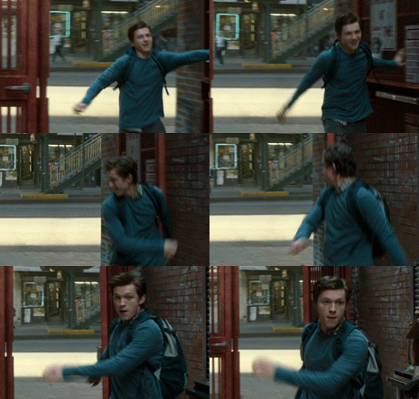
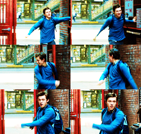
Videos
To make good quality gifs, you need videos with good quality. Best one for you would be 1080p, so always check if the video you want to gif is available in such quality:

I use this website to convert videos from YouTube. Select the formats to MP4 and highest quality:
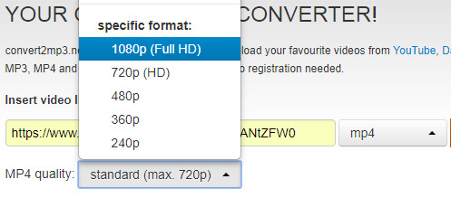
Then convert, and download.
You can use videos from YT or movies you have on your computer. The movies also should be in the best quality possible. For example, this is the movie I’m gonna use for this tutorial:

You can learn about torrents somewhere else, or contact me about that. I suggest visiting YT, though, they have good tutorials for torrenting movies.
PotPlayer
After you’ve installed PotPlayer, it’ll be for the best if you add it to your taskbar or wherever else you consider it easy to click and use.
1) Open the video
In this tutorial, I’ll be working with Spider-Man: Homecoming, so I open it in the program.

2) Settings
After pressing CTRL + G, this window should show up:
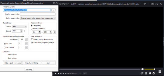
Make sure your settings look like that:
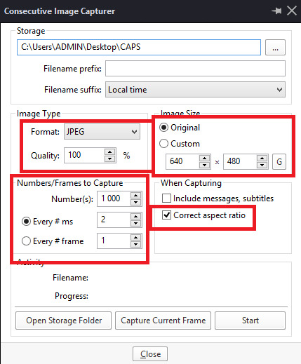
Storage is where your caps will be stored. It’ll be easier when you’ll create a folder on your desktop, and then set the storage setting to it:
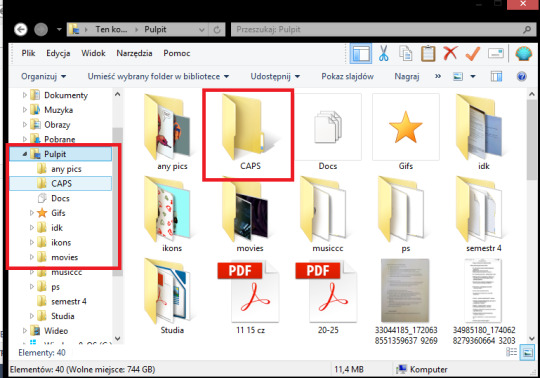

3) Taking caps (image capture)
Play the movie on the scene you want to gif, and pause it.

Now, click Start on the CIC window

and play the movie. Click Stop after taking the caps you need.

Your caps should be in the folder you chose in the storage setting
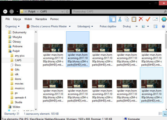
You can also have your movie playing and click start/stop whenever you want (if you know the movie/clip enough to know when to take caps).
Turn off PP after you’ve taken caps you need.
You can take as many caps as you want to, and then sort them into folders:
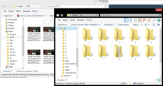
Photoshop: making frames into a gif
After you’ve installed it (search for tutorials how to properly install it, it takes unpacking and simple installing to do so; I’m more of a self-taught person and I can’t remember how I did it). Again, it’ll be easier for you to have PS in the task bar.

Open your PS,
then try to follow these steps:
[ window > animation - opens the animation window on the bottom ]

1) File > Scripts > Load multiple DICOM files > choose a file
You can give that command a keyboard shortcut.

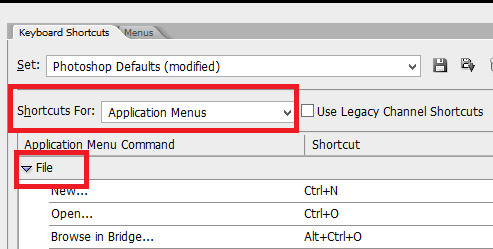
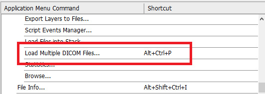
This window shows up:
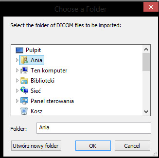
It’s important your folder with caps is on your desktop, so that the access to it is easier:
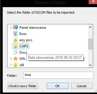
Click OK. The more caps you try to open at once, and the bigger they are (better quality), the longer it takes to open them. Don’t try to open more than 150 caps at once, it may work, but it’ll lag your PS and may even ruin a bit of your gif.
This is how it looks now:

As you can see, on my right I have specific tabs. I set them myself in the most comfortable for me way, but with time you should find your own way to set them to suit your liking. My tabs look like that:
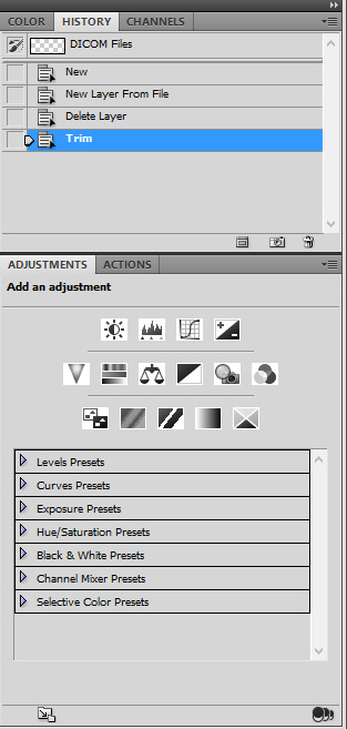
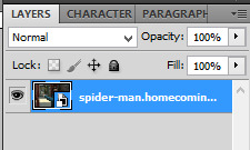
I only use history, actions, and adjustments. Of course, there’s also a tab with layers and paragraphs (text):
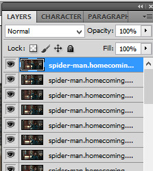
2) Convert to frame animation
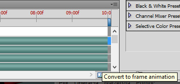

4) Make frames from layers
For that command, you can also set keyboard shortcuts.
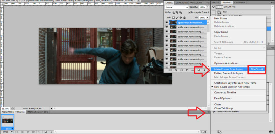
result:

5) Select all frames > set the time delay
(again, you can have a shortcut for this)
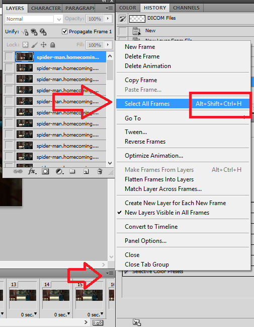

Make sure all the frames are selected, then:

For almost normal speed, choose 0,05. 0,04 can make your gif a bit too fast. The bigger the number (0,06 or 0,07), the slower the gif.

7) Convert to timeline
Make sure the frames are still selected.
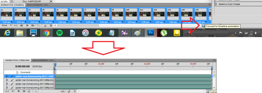
8) Select > similar layers
(again, you can set a shortcut for this)

9) Convert to smart object
Right click on one of the selected layers:

Choose convert to smart object. Result:

Photoshop: editing a gif
There comes the fun part. The most important thing is dimensions. Be sure to stick to tumblr width dimensions: 540px / 268-268px / 177-178-177px, depending on how many gifs per row. That way you’ll definitely get the best result when your gif is posted. Visual:

1) cutting/cropping
To crop your gif, use the crop tool.
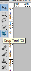
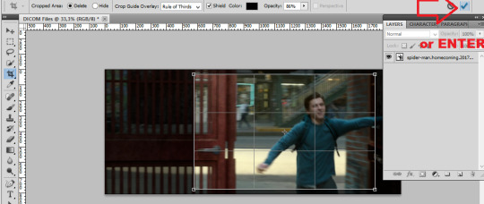
Now, it’s important your gif has the proper size. The bigger the dimansions, the bigger the gif’s size. The maximum size you can post is 3MB. Use this bar to set your crop tool:

5x2 (make sure it says ‘cm’, not ‘px’) is what I use for 540px gifs. For the 268 gifs I use 5x3, 9x5, 11x7 or any other sizing that I think looks good. We’re gonna use the 11x7 for a 268px gif.
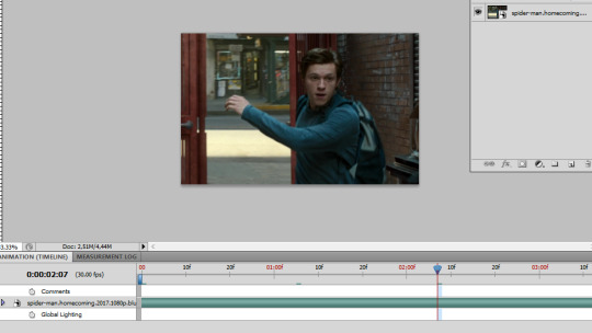
advice: to check if the gif looks good, click on different places in the animation bar:

2) size
image > size or Ctrl+Alt+I:

We’re making a 268px gif (width), but I’m gonna make it 230px so it won’t stretch in the post.

Ctrl + + will enlarge your view:

Make sure the thingy says “100%” so that you have the 100% accurate view of your gif.
3) sharpening
You can either experiment yourself or use actions. Search for actions that you like here, and download the action (make sure to like/reblog the post of the action maker)
Opening downloaded actions:
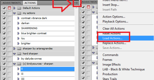
Choose the actions you want to load (it should be in the downloads folder).
Using/playing an action (make sure your gif is selected):

before:

after:

4) editing
This is the fun part when all you can do is to experiment. I’ll show you in parts what I do with that gif, but the fun part is when you try it, yeah?
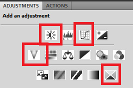
I use these adjustments: brightness, curves, vibrance, and selective color.

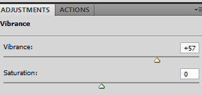
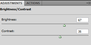
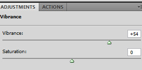
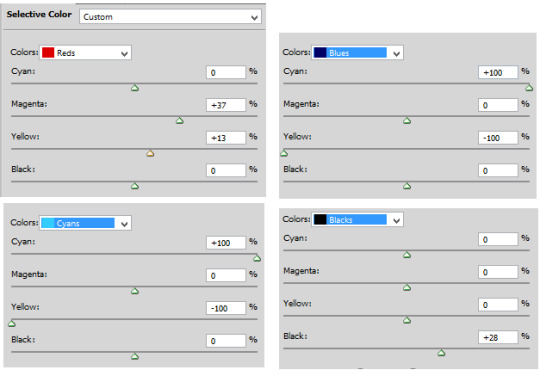
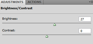
After all of these, the gif looks like that:

5) Saving


Make sure the looping option says “forever”:

you can play your gif to check if it looks like you wanted:
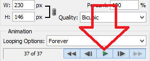
And save the gif:

(wherever you want, preferably on your desktop)
so, before editing:

after editing:

P.S. To cut your gif after making it, you can move that thingy:

wherever you want.

P.S. 2. Clean up the mess after making gifs. Delete the caps and clean up the trash folder.
That’s basically it. Advanced gif making takes using layers, brush tools, and the eraser tool, playing with colors, and a lot of other stuff.
As you can see, it takes time, patience, energy, and having the movies you want to gif. It’s fun, but it’s a lot of work.
Have fun!
#completesources#gif making#gif tutorial#my tutorial#gifs#yeahps#photoshop#itsphotoshop#iamlouistomlinson#go through it and think another time you try to repost a gif#it takes TIME.#sorry for typos#and grammar#it's MORNING.
842 notes
·
View notes
Text
File types (Pros and cons)
JPEG - Joint Photographic Experts Group
JPEG is a compression standard for digital images. It has been widely used by digital cameras and other image capture devices such as smartphones. It is also the most common standard for storing and distributing digital images online.
The Advantages of JPEG
1.High Resolution: One of the notable advantages of the JPEG standard is that it supports 24-bit colour with up to 16 million colorus.
2. Smaller File Size: JPEG has the advantage of compressing a digital image at a smaller file size which makes it more suitable for storage, online distribution, and online consumption.
3. Adjustable Compression: Another interesting feature of the JPEG standard is that users can adjust the degree of the compression of a particular digital image. More specifically, users can find the right balance or trade off between image quality and file size.
4.Compatibility. Most modern devices and software support JPEG images, making the format extremely compatible and practical.
The Disadvantages of JPEG
1. Lossy Compression: This standard works by dropping unneeded colour data as it compresses the digital image. Also, editing and resaving the image lead to quality degradation.
2. JPEG is 8-bit. The JPEG image format is limited to 8-bits, which puts a hard limitation of 16.8 million possible colours. This means that all those other colours that your camera is capable of recording are essentially discarded when the image is converted to JPEG format..
3. Limited recovery options. JPEG images contain far less data, which significantly limits their dynamic range and recovery potential. This means that if you manage to overexpose or underexpose an image, it will be very difficult, if not impossible, to recover that data.
4.Camera settings impact JPEG images. Since cameras fully process JPEG images, any camera setting that can damage the resulting image will be irreversible. For example, if you apply too much sharpening to your images, you will not be able to “unsharpen” them later.
Tiff - Tagged Image File Format
TIFF is a specific type of computer file format for storing raster graphic images and exchanging them between application programs. Examples of these programs include word processing, scanning, image manipulation or editors, optical character recognition, and desktop publishing applications.
The Advantages of TIFF
1. It can handle images and data within a single file, including header tags such as size, definition, image-data arrangement, applied image compression, thus making it flexible and adaptable.
2. Tiff format is flexible and adaptable. It can handle images and data within a single file, including header tags such as size, definition, image-data arrangement, applied image compression, thus making it flexible and adaptable.
3. It can store image data in a lossless format. Unlike the more common and standard JPEG standard, which is a lossy format, another advantage of TIFF is that it is useful for archiving image for further editing, transferring, and saving without losing image quality.
The Disadvantages of TIFF
1.TIFF is that it has a relatively large file size. Take note that this format is generally uncompressed. A single file can typically take up at least 100 megabytes of storage space.
2. Having a large image file size means that using the format would consume storage space quickly or it may be too large to be uploaded as an email attachment. When used as an online image for websites or web-based applications, it can take a long time to open or download, while also consuming more broadband data.
3. Unlike the PDF format, Tiff cannot directly store the textual contents of documents, thereby making it unsuitable for archiving searchable texts.
RAW - a.k.a “digital negative”
Raw is an image file that contains unprocessed or minimally processed data from a digital camera’s sensor. A RAW image needs to be post-processed in software before it is ready to be printed, shared or shown on a display device. RAW files typically consist of three main parts: the actual RAW data from the image sensor, a camera-processed full-size JPEG preview + thumbnail, and all relevant header and metadata information.
Advantages of RAW Format
1. Far more shades of colour. Compared to an 8-bit JPEG image that can only contain up to 16.8 million colours, a 12-bit RAW image can contain up to 68.7 billion colours. 14-bit RAW images increases RGB tonal values significantly to 16,384, which boosts the potential to 4.4 trillion colours and some high-end cameras are even capable of recording 16-bit RAW images.
2. Wider dynamic range and colour spectrum. A RAW image contains wider dynamic range and color spectrum compared to a JPEG image. For highlight and shadow recovery when an image or parts of an image are underexposed or overexposed, a RAW image provides far better recovery potential compared to JPEG.
3. Finer control and adjustment potential. When a RAW image is generated, all camera settings, including camera-specific and manufacturer-specific information (metadata) are added into the file, along with the RAW data from the image sensor. The metadata is then used for demosaicing and RAW conversion process, which is what converts an otherwise black and white RAW image to colour and applies particular gamma correction, white balance, brightness, contrast, and other adjustments. The RAW image itself remains unmodified or “non-destructive” – you can make changes to the image later in post-processing applications like Lightroom and Photoshop.
4. Can adjust colour space after image capture: Similar to white balance, colour space (such as sRGB or Adobe RGB) is not saved into RAW images either, which means that you can change it to any colour space later on.
5. RAW images are lossless: which means they do not suffer from image-compression artifacts.
6. Better sharpening potential: No image-sharpening is performed on RAW images, which means that you can use better and more complex sharpening algorithms for your photos.
7.Proof of ownership and authenticity: Unlike JPEG images that can be easily manipulated, RAW images can be used as evidence of your ownership and authenticity of the photograph.
Disadvantages of RAW format
1. Requires more storage:RAW images take up much more storage space than JPEG images.
2. Time needed to convert and edit photos.
3. RAW format compatibility: RAW files are not standardised across different manufacturers. For example, Nikon software cannot read Canon RAW files and vice-versa.
4.Longer backups: Due to larger file sizes of RAW images, the backup procedure takes much more time.
PNG - Portable Network Graphic
PNG files are commonly used to store web graphics, digital photographs, and images with transparent backgrounds.
Advantages of PNG
1. Lossless Compression: One primary advantage of PNG over JPEG is that it is a lossless compression. What this means is that digital images compressed under this standard retain their data, details, and quality regardless of repeated encoding and decoding.
2. Wide Colour Depth: The format is suitable for different types of digital images such as photographs and graphics. It supports palette-based images with palettes of 24-bit RGB or 32-bit RGBA colours, as well as grayscale images, and full-colour non-palette-based RGB/RGBA images.
3. Support for Transparency: Another key characteristic of the PNG format is that it supports compression of digital images with transparent areas. Take note that the JPEG standard renders these transparent areas as a solid white colour.
4. Ideal for Editing Images: Because this format is a lossless compression, it is ideal for storing digital images for editing. Unlike the JPEG standard, the PNG format retains image quality regardless of repeated encoding and decoding.
5. Sharp Edges and Solid Colours: Note that JPEG is not ideal for digital images with large solid colours and sharp edges between objects because it produces visual artifacts. This is not the case with PNG. Thus, this format is ideal for images containing texts, line arts, and graphics.
Disadvantages of PNG
1. Bigger File Size: A key drawback of PNG is that it compresses digital images at a larger file size. On the other hand, the JPEG standard can achieve a smaller file size than a PNG for a relatively similar image quality and resolution.
2. Not Ideal for Printing: Note that this format was designed solely for distributing digital images online. Hence, another disadvantage of PNG is that it is not ideal for professional-quality print graphics because it does not support non-RGB colour spaces such as CMYK.
PDF - Portable Document Format
PDF file format provides users with the ability to share content with users across a diverse array of operating systems and viewing platforms without having to worry about formatting and other presentation issues. We can convert almost all types of files in PDF format.
Advantages of PDF
1.Security: This file format is increasingly becoming popular among businessmen and other professionals in the corporate sector as it can be secured with a password. Thus, there are fewer chances of any confidential information getting leaked. Sometimes, there is sensitive and important data that needs to be kept secure from hackers and unauthorized personnel, and PDF files give you the option to do so.
2. Same Format: The format of a pdf never changes. No matter who you share the file with and on which device, the format remains the same. Also, there is no change to the components of the document and it doesn’t get distorted after being shared on several different platforms.
3. Multi-Dimensional: PDFs allow you to integrate different kinds of content i.e. images, videos, graphics, animations, 3D models, etc. without ruining the format of the document. In addition, you can make other things like presentations, reposts, and portfolios in this. This means that you won’t have to shift to different software for different tasks.
4. Compact: PDF file compress unlimited information into a file size that is easy to share or receive without compromising on the quality and taking less space.
Disadvantages of PDF
1. Difficult to Read: Files in PDF format can prove difficult to read on a computer screen. PDF files are laid out in standard A4 or A3 format pages, which is great for printing, but most computer screens fall somewhere between a 4:3 and 16:9 aspect ratio, which means you spend a lot of time scrolling through the pages when viewing them on the screen.
2. Difficult to Edit: A PDF file is essentially an uneditable image of the original document. This is great is terms of security, but PDF fails as a collaborative format. If your PDF file is native, it is possible to use software to extract the information into a usable form. However, if you have a scanned PDF document, there is no way to easily convert it back to an editable form.
0 notes
Text
Uncover the Mysteries of the Aegean with Cyclades Islands Cruise
How does the Aegean entice you? The magnificence of the mythical Cyclades Islands!
An archipelago that was inhabited even around 4,000 BC; Cyclades Islands are treasure troves for not just the history-buffs but also the adventure-spirited souls. With a total of around 220 islands forming this archipelago, most are uninhabited. The name itself can be traced to the geographical formation of these islands which circle the sacred Isle of Delos.
The best bit of sailing through the Cyclades is that it opens up a plethora of options for cruising tourists. You can be an adventure enthusiast or might be looking for a quality vacation with your family, or on the hunt for a private vacation with your partner; Cyclades Islands offers something for everyone.
While the cuisine is mostly Greek, the islands themselves evolved through an amalgamation of the former with Anatolian and other cultures. Prominently uninhibited beyond ancient times, you can opt for Cyclades Islands sailing charter to find your little cove away from the bustle of modern life.
A few large islands which are partially inhabited offer tourist attractions in plenty; serenity doused in history being its primary appeal.
Top 8 Isles of Cyclades Islands
Santorini
The most famous isle of this archipelago, your Cyclades Islands sailing cruise should include Santorini. A volcanic island, it also houses picturesque houses and churches, a volcanic black sand beach, and multiple viewpoints.
Mykonos
Known as a partying island, Mykonos records well over a million tourists every year. It also houses some of the best beaches in the whole of the Greek Isles.
Delos
A small uninhabited island, it is a destination you should not miss while on your Cyclades Islands sailing vacation. This island was considered sacred during the ancient times and is filled with beautiful ruins you can explore. It has some of the most prominent temples in Greece, the most famous being one dedicated to Apollo.
Paros & Antiparos
Paros is a famous island known for its marbles from ancient times. It also has a fishing village and a well-hidden mountain village, which you can also visit. Antiparos, a landmass just in front of Paros, is a quaint isle offering nothing but serene relaxation on its beaches.
Naxos
It is the biggest of the Cyclades Islands with a sizable population. The island is strewn with beautiful beaches, and while chartering sailboats in Cyclades Islands, you should also visit its central city Chora, mountain village Filoti, etc.
Syros
It is the most densely populated island in the Cyclades and also functions as its administrative center. The city is quite picturesque, much like most of Greece, and the view is mesmerizing from the cruise.
Milos
It is also a volcanic island primarily famous for its beautiful coastline. The cliffs hanging off this island are awe-striking, while numerous interesting shapes and rock formations dot the coastline too.
Andros
For hikers who want to stretch their legs a bit while on their voyage, Andros is the perfect island. Your yacht charter Cyclades Islands to this isle also offers a relaxation spot at the sunny beaches. It includes a shingled beach and quite a few sand beaches.
Cruising through the Aegeans: The Ancient Mysteries of Cyclades Islands
Opting for sailing rentals in Cyclades Islands and embarking through the Aegean Sea can be one of the most intriguing experiences in life. While the famous islands already offer innumerable archaeological wonders and historical memorabilia, you should also take time to explore the Greek cuisine.
While it can be quite challenging to visit all the islands in this archipelago, the picturesque settings can be quite beckoning. Its quaint little villages and towns have a cubistic appearance, making them one of the most beautiful sites in the whole of Greece.
Private Cruise Line Charters
Though many vessel options are available for Cyclades Island cruising charter, you must understand the difference among available options to choose the most suitable yacht.
Bareboat yacht
In the simplest of terms, bareboat refers to a package where you will just be provided with a yacht without any crew. Understandably, a vessel for the brave-hearted adventure lovers, this option requires proper navigational skills.
Skippered yacht
A captain accompanies the yacht in this option, though there are is no crew involved. Offering a private cruising experience, these yachts are good options for couples who do not want to be disturbed and prefer to keep a distance from too much company.
Crewed yacht
In this option, the yacht is provided with a full crew led by its captain. Any voyager who does not want to bear the responsibility of navigating should go for this option. Lack of responsibility opens up the option for more of leisure, maybe even a tan aboard the deck in the bright Greek sun.
Bareboat Charters for a Voyage across Cyclades Islands
Any seafarer looking for a vessel charter sans the worries of sailing through unknown sea routes is offered a sailboat. However, if you have a valid license, you can also go for the bareboat service as your Cyclades Islands sailing charter.
Bareboat Monohull Sailboats while Cruising through Cyclades Islands
These boats offer 1-5 cabins and can stretch between 30 and 50 feet in length. A convenient vessel with the ease of handling, monohull is an excellent option to sail through the islands, especially for someone not adept at seafaring.
Bareboat Catamarans for Voyages through Cyclades Islands
Bigger vessels often used for long-distance cruising, catamarans are quite comfortable too. These must be booked for a minimum of 5 days and offer a fair share of privacy as covered yachts.
Bareboat Motorboat Cruise while Sailing the Cyclades Islands
These are the fastest yachts, being the motorized option. However, as much as one would simply go for this option to enjoy the thrill of speeding, you need a valid license to book these yachts.
Crewed Sailboats to Cruise through the Cyclades Islands
A comfortable option for cruisers who do not want to bear the responsibility of navigation; these yachts are accompanied with a full crew. Important to note, this can feel a little crowded though it is the safest option, especially if you are not adept at navigation, or even a bit rusty.
Types of Motorboats for a Voyage through Cyclades Islands
Crewed motored vessels
These vessels are not just fast; a crew accompanying it ensures that you need not worry for anything, from cuisine to furnishings and luxury. With the charted course handled by experts, you can simply relax on the deck and enjoy the blue depths around.
Crewed catamarans
One of the finest of options, a crewed catamaran is an epitome of ultimate luxury. Sip on your wine or enjoy a tan while your crew takes on all responsibility of guiding you through, aboard your Cyclades Islands sailing charter.
Innumerable islands strewing the Cyclades make it an exciting place for every voyager. With a history in its abundance across the Greek Isles, a boat charter in the Cyclades Islands opens up the horizon for privacy, exploration, and adventure too.
SEND NOW YOUR ENQUIRY FOR YOUR NEXT CRUISE TO THE CYCLADES ISLANDS:
#ipt_fsqm_form_wrap_7 .ipt_fsqm_form_logo img, #ipt_fsqm_form_wrap_7 .ipt-eform-width-restrain, #ipt_fsqm_form_wrap_7 .ipt_fsqm_form_message_restore, #ipt_fsqm_form_wrap_7 .ipt_fsqm_form_message_success, #ipt_fsqm_form_wrap_7 .ipt_fsqm_form_message_error, #ipt_fsqm_form_wrap_7 .ipt_fsqm_form_message_process, #ipt_fsqm_form_wrap_7 .ipt_fsqm_form_validation_error, #ipt_fsqm_form_wrap_7 .eform-ui-estimator { max-width: 100%; min-width: 240px; } /**/
/**/
Javascript is disabled
Javascript is disabled on your browser. Please enable it in order to use this form.
.ipt_uif_ajax_loader, .ipt_uif_ajax_loader *, ipt_uif_ajax_loader *::before, ipt_uif_ajax_loader *::after { box-sizing: border-box; }
Loading

FIND YOUR BOAT Go ahead, it's quick and simple
FIND YOUR BOATGo ahead, it's quick and simple
Select your boat Type(s)*
Motor YachtSail YachtCatamaranGulet
Departure*
Click here ×
Lenght of charter*
Week-end7 Days14 Days21 Days28 DaysOther
Where*
Just type the place you dream
Budget
Help us to find the best solutions for you0 - 25002500 - 50005000 - 1000010.000 - 20.00020.000 - 50.00050.000 -100.000+ 100.000
Write your name here
Write your e-mail address here
Write here
Get a quote!
Your form has been submitted
Thank you for your request. Our team will answer to you within 24 hours. I you have an urgent request then you can also call us on +39-3343600997.
Server Side Error
We faced problems while connecting to the server or receiving data from the server. Please wait for a few seconds and try again.
If the problem persists, then check your internet connectivity. If all other sites open fine, then please contact the administrator of this website with the following information.
TextStatus: undefined HTTP Error: undefined
.ipt_uif_ajax_loader, .ipt_uif_ajax_loader *, ipt_uif_ajax_loader *::before, ipt_uif_ajax_loader *::after { box-sizing: border-box; }
Processing you request
Error
Some error has occured.
Uncover the Mysteries of the Aegean with Cyclades Islands Cruise
June 26, 2020
Ionian Islands Cruise: A Sun-Basked Voyage through History and Tranquillity
April 30, 2020
Exploring Sicily: Pamper Yourself with the Most Breath-Taking Cruise Ever
March 16, 2020
How much does it cost to rent a boat in Amalfi?
March 13, 2020
Share this Post
The post Uncover the Mysteries of the Aegean with Cyclades Islands Cruise appeared first on YBH.
from WordPress https://ift.tt/2YxSvWD via IFTTT
0 notes
Text
Part 2: Fall Tv Reviews
youtube
1080p LCD and Plasma TVs are the most recent innovation has readily available. Consider a 1080p TV if you're looking into brand-new tv's and you're questioning exactly what kind of innovation may be the finest option. 1080p TVs give <a href="https://youtube.com" rel="nofollow">best tv 2018 4k 65</a> image quality, the very best in HDTV requirement. 1080p is likewise the digital requirement for movies too. When you go to the motion picture theatre to see the most recent flick, you're actually viewing the motion picture on a 1080p digital motion picture projector.
If you further note the cons of the analog TV, then you can speak about the 4:3 image. It is great enough for kids programs however when it concerns watching Hollywood movies, it can be a dampener. LG <a href="https://www.youtube.com/watch?v=Z2ogoRiRu7c" >best tv 2018 ny times</a> will inform you that LG HDTVs have no issues in this area. Because many plasma LG TVs support widescreen format, you can see the complete effects of the movies on the LG TVs. It offers you the total home theater experience. You can learn more about all the specs of this experience from LG HD4k tv reviews.
<iframe width="560" height="315" src="https://www.youtube.com/embed/ofbDwz8O-mE" frameborder="0" allowfullscreen></iframe>
Examine out all the security features on each kids electrical scooter that you look at. Some of them will have various security functions along with 4K Reviews that you can look at. All this details jointly is going to assist you with making the choice of purchasing one of these popular gifts for teenagers.
The Flip oled 4K TVs is the very best selling small camera and for great reason. It takes the very best quality video in both routine light and low light scenarios. It has 2.0 inch non-glare LCD screen which is much appreciated when attempting to take video in bright sunshine.
Regardless, the odds are that if you have actually gotten this far in the post you remain in the majority that want the 3D home theater experience. Also, if you have actually gotten this far, you're probably saying "All right, all right, you have actually offered me. however do I actually have the money?" Read any 3D TV evaluation and it's difficult not to ignore the price of the next big thing in innovation. The 'next big thing in innovation' often are expensive however that does not suggest they're difficult to afford. So, yes, you have to purchase a brand-new TV. However exactly what if I told you that you could view Monsters and Aliens in 3D while in your underclothing? "I'm listening." you state. Which quickly you'll have the ability to play 3D computer game and view 3D pictures on your TV? "Done and done!" you shout, reaching for you credit card.
Now, I am certainly no expert, however with one of these tiny electronic cameras, you can do this so non-intrusively. This suggests that the minute is not ruined when Granny positions for the video camera. You can get the natural appearance you were intending for all along.
Your Flip Ultra HD Camera is a masterful little bit of work. Different HD video camcorders, whilst still little, are practically much bigger compared to this the Flip UltraHD, and you can't just slide one straight into your pocket or think about discreet film without being seen such as this one. Other flip camera reviews will inform you that there might be absolutely nothing wrong with their video camera's yet it still does not whip the Flip UltraHD - you can even go online and purchase one which is personalized for your specs and every one of your preferred colors. Will other electronic cameras enable you to do that? Do not think so.
0 notes