#this is a mid movie i will defend to my death its cute its fun it has TWO of the most beautiful love songs in the entire world
Explore tagged Tumblr posts
Text
god i really want to watch aaja nachle
#this is a mid movie i will defend to my death its cute its fun it has TWO of the most beautiful love songs in the entire world#even if one was wasted on a white guy and a relationship that didnt last the 16 hour flight from mumbai -> nyc#madhuri....................
5 notes
·
View notes
Text
Jack Frost Designs Review
Yes it’s finally his time. This is going to include his book designs including previous incarnations in said books. There are more movie concept designs than book so, let’s dig in shall we?
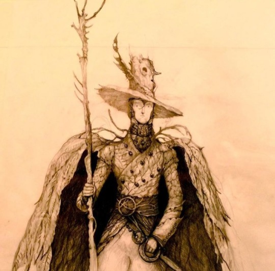
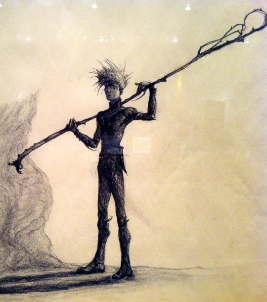
This was in fact the first ever Jack Joyce designed while he came up with The Guardians Of Childhood. He even comes with his own backstory! (Which was cut. Sorry Joyce posts walls of text so it’s a girthy read.)
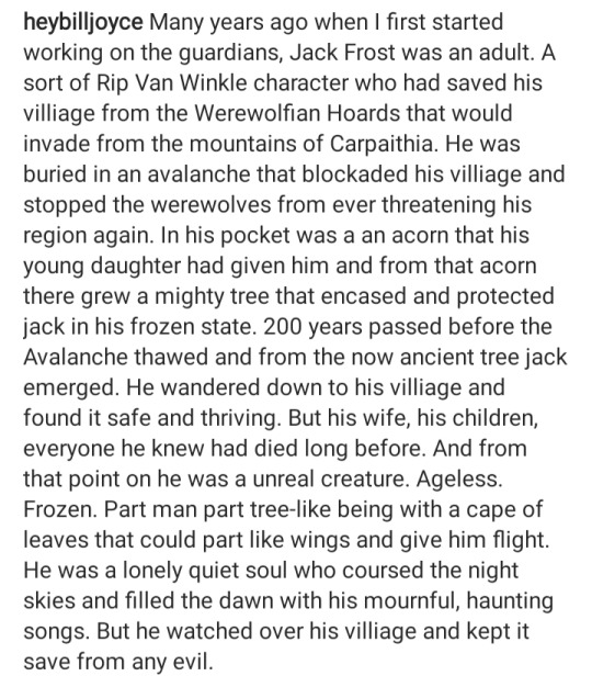
So instead of a young mischievous trickster, we got a much more depressing story of Jack. (Jack by default is sad obviously) but this one... It kind of hits differently and almost reminds me of the story he crafted for Pitch. A dad who tried to defend his family but through tragic events was ripped from them and changed completely. Design wise, he’s a lot more tree than snow. There doesn’t exist a colored version of this so we’ll never know if he sported winter and dull dead leaf colors rather than grassy greens.This Jack has a weird presence to him, I can’t put my finger on it. Rating: 6/10 He’s really neat! Just a little too Autumn feeling rather than a blend of both Autumn and Winter.
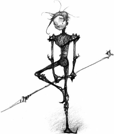
Nightlight feels like the baby evolution if Jack was a pokemon and that's what I’m gonna stick with. Below is a more recent version of him colored.
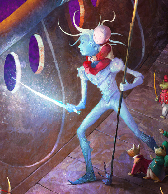
In all honesty that one is easier on the eyes proportion wise because sometimes Joyce has ‘interesting’ anatomy choices but we aint going into that today. It’s interesting how his hair somehow looks shorter and longer than Jack’s at the same time. Could be because the longer strands float seamlessly but star boy hair physics what can ya do. It’s a little hard to tell what is his skin and what is his armor, so that is a casuality in making a character only have one or two colors in their color scheme. I love other artist’s depictions of Nightlight but the canon one feels a little weak color wise. Rating: 5/10 Sorry, get some better LEDs and then come back.
Here we have a book Jack but I can’t entirely recall if this was used in the books or not. I digress. This design looks like him still wearing very Nightlight-esque armor/clothing and slowly growing into his new persona as Jack Frost. The intricacies are hard to make out but we’ll work with it. This one is very interesting to me because he very much looks like an older teen close to young adult. His hair looks very fluffy too. Not many complaints about this one but not much praise either.
Rating: 6/10 Not great but doesn’t stand out that much.

Remember when I said Joyce had ‘interesting’ anatomy decisions? Jack looks like he has half a head here and it bothers me GREATLY. This is the adult Jack design he went with. Supposedly he likes the opera and he sure looks it. This! Exists!! Kind of wish it didn’t. The outfit is nice but it just doesn’t fit Jack as a whole. This just screams to me that it’s someone else with a similar-ish hairstyle.
Rating: 3/10 Guess he’d be the...Phantom Of The Opera. (I’ll go home and so should he.)
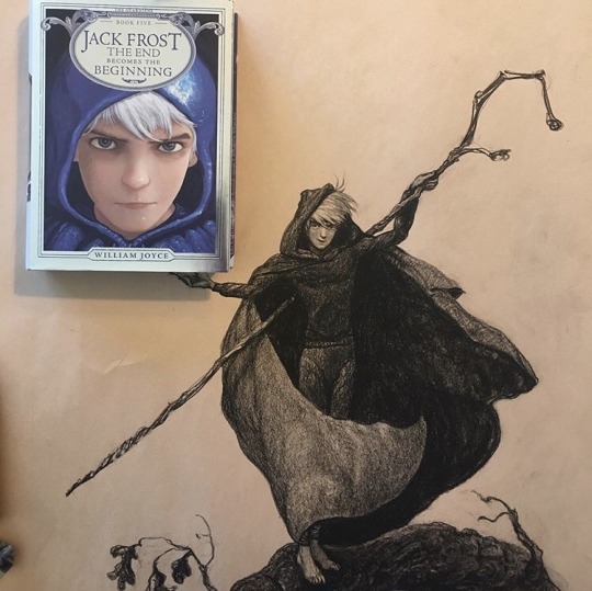
And finally the final Jack. This is the one that almost exactly resembles the Jack we got in the movies(Probably because it was made after the movie but w/e) but just add a cape on him. I can’t really tell if hes got a hoodie and a cape, or just a cloak+hood on top of a sweatshirt. It isn’t too important because my thoughts on this one are obvious. Rating: 10/10 Edna Mode would have a field day with you boy.
MOVIE DESIGN TIME
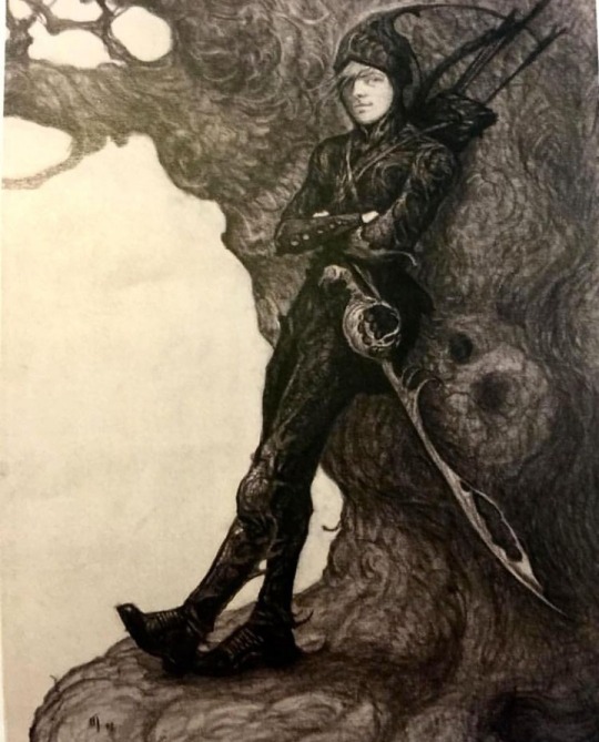
Joyce claims this is a design he drafted when Leonardo DiCaprio was considered to voice Jack and I can kind of see that with how his face is drawn here. This Jack looks a lot more like a warrior and less of that trickster look. I can’t say I’m a fan of the weird antenna his hood has but his sword is really cool looking.
Rating: 4/10 Nice bow and sword but it can’t save your fashion choices.
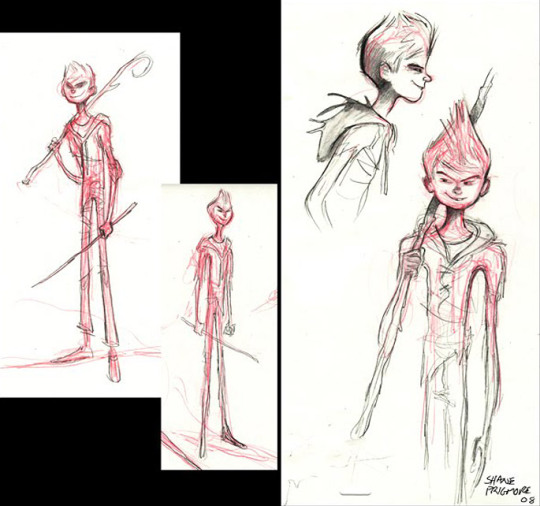
This looks like a lanky 11-13 year old who would put rocks or slugs in my shoes and relish in my disgust. He has the exact look of a snot nose kid and I’m unsure how to feel about it.
His various hairstyles drafted here sort of make him softer looking or just more of a snot nose, no in between. Maybe even an Anime Protagonist.
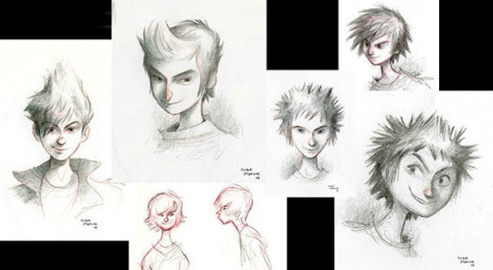
The top right one almost looks like Hiccup from How To Train Your Dragon if you squint. It’ll be a little hard to rate them all as one individual but why not.
Rating: 5/10 I don’t hate them but they aren’t my cup of tea.
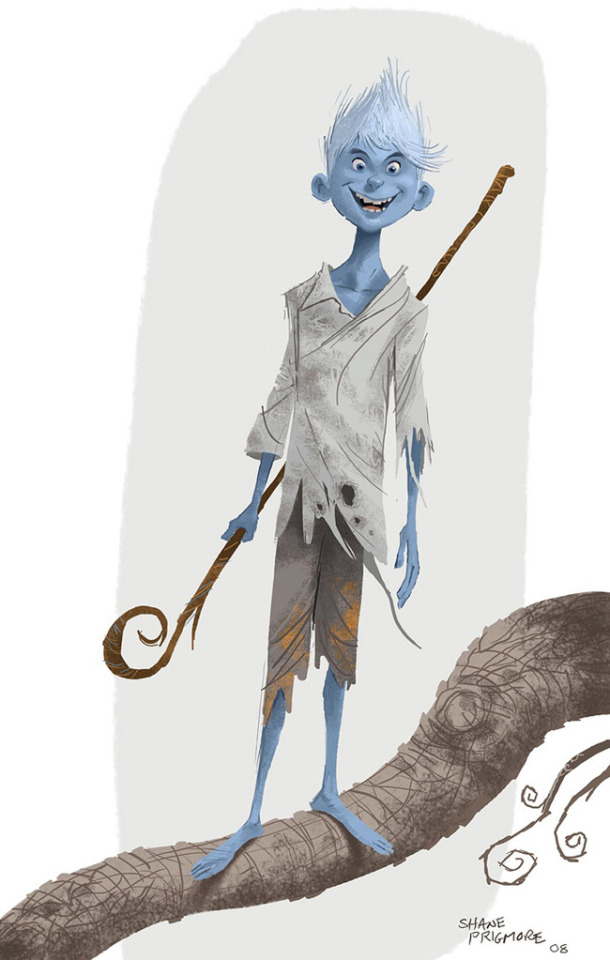
AH- IS THAT A FUCKIN GREMLIN?
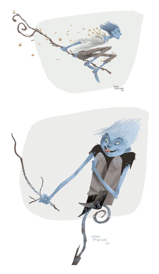
Oh wait no it isn’t he looks like a 10 year old. Whatever don’t feed him after midnight. The staff’s design of not being shaped like a G is an interesting tidbit but the whole design looks like he’s really young or like a troll etc. This Jack looks like he thinks girls have cooties uses outdated slang.
Rating: 4/10 This is me being generous.
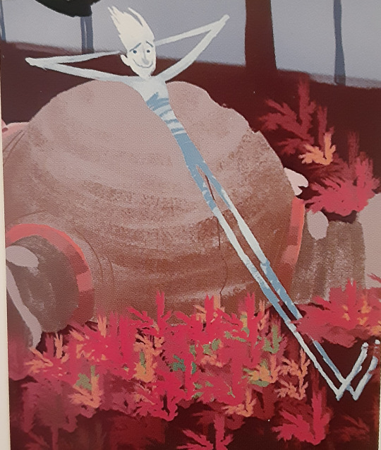
It honestly looks like he hiked his pants up all the way to his chest. A late teen with horrid fashion choices once again. Not many other thoughts here.
Rating: 2/10 Get a sweater on or something.

This is one is very interesting looking to me. His clothes looked a lot more leather based and very human-like. The tatters, tears and frays all make him look like he was a victim of an accident that never changed his clothes. It makes me wonder if this Jack had the same death as the final movie Jack or something else entirely. Either way, this one looks like hes a mid to late teen which really adds to my intrigue.
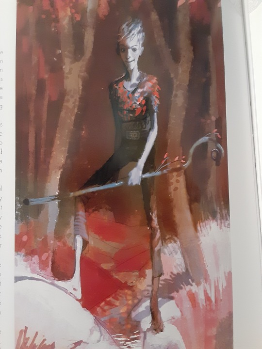
This was another image that greatly resembled the design so I included it here. It almost looks like his skin is blue here which is pretty neat to me at least. He’s also got leaf motifs here, which from the first Jack design Joyce made, we can see a pattern here.
Rating: 8 /10 I was originally weirded out by his head but now its not so bad.
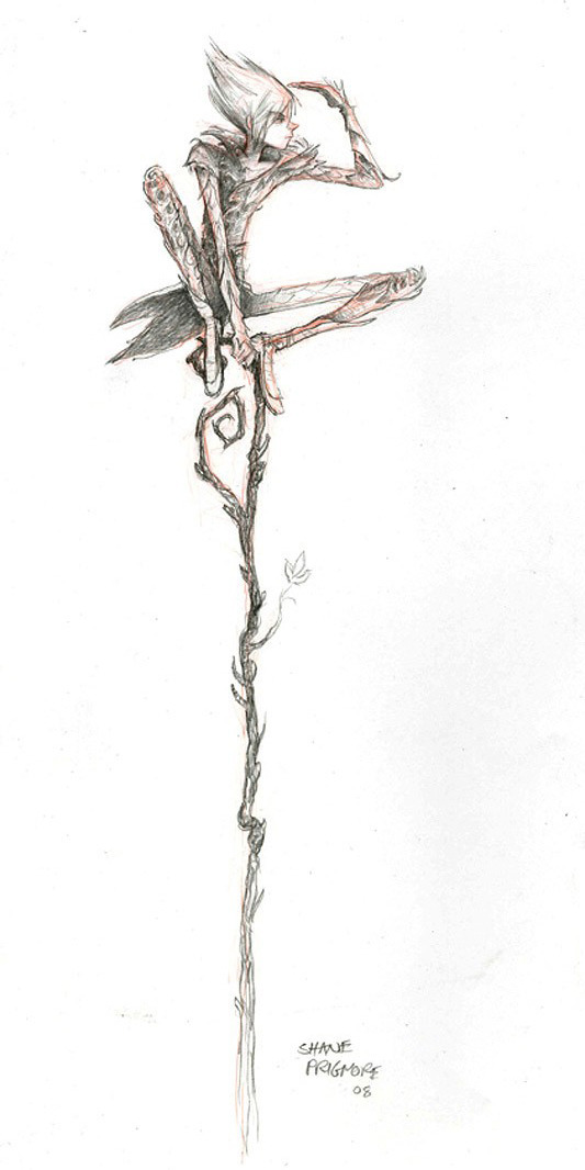
This Jack is definitely dressed more like a nature boy rather than him having human influenced fashion and it’s an appealing touch. The tiny leaf sprouting from his staff is also kind of cute since the designers seemed to want to put leafs somewhere on his designs. His hairstyle is also very cute but it reminds me of Sasuke Uchiha in a sense. (Not a setback for me at least)
Rating: 7/10 13 year old Jack is going thru a phase.
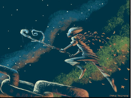
I thought this Jack didn’t show up again in story boards but I was wrong!
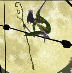
They look a little different from each other but just similar enough to pair together, so bare with me. The first one obviously has looser pants, slightly longer sleeves and got his leaf motif going. This second Jack is a VERY green. It gives the impression that this Jack made his clothes out of plants and natural materials. Again I’m not wholly sure if greens fit his color scheme but they sure went for it for a while. I can’t say I’m a fan of it because it heavily reminds me of Peter Pan.
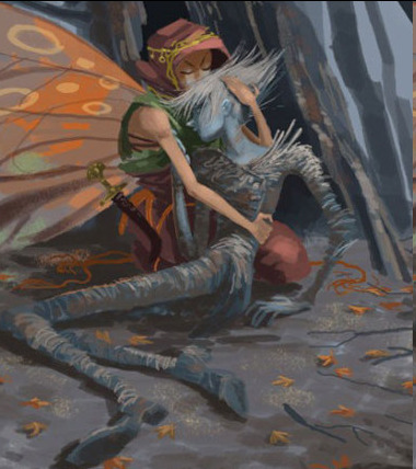
However a very similar looking Jack could be found in this storyboard. It doesn’t look as green as the other storyboards made it out to be and looks more like dead grass. Which is a pretty nice touch.
Rating: 5/10 I don’t hate it but it just doesn’t vibe yknow.
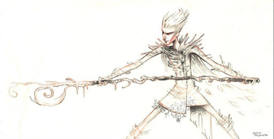
Speaking of a vibe...hoo this certainly has one. This Jack isn’t old but certainly doesn’t look very young, maybe in the 20-30 range, thats just me. He has facial features that remind me of Pitch but resembles the Jack Frost of Santa Clause 3
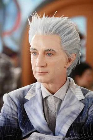
That being said, I wondered if him looking similar to Pitch was in the storyline of them being brothers.(Which was a scrapped thing, who knew.) He’s a bit more menacing in this design but certainly seems like he relishes in his work.
Rating: 4/10 I’d make it a lower score but I gotta give it props
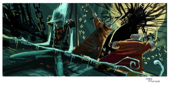
NOW THIS JACK IS KINDA INTERESTING. This one looks like he’s 16 and going through a grunge phase. He’s gonna play Nirvana loudly and not turn it down even if you tell him too. His staff itself has mini icicles hanging off of it and leafs look stuck to his shirt. Did you glue or staple those on Jack? His hair also looks much longer than his other designs and I kind of dig it( Shut up I’m bias.) I’m not wholly sure why else this design has stuck with me but it just has something about it that I just love. I wish there was a full body drawing of it.
(He also kinda has the same hair as the Jack Frost in Runescape but I wont go on about that hoo hoo)

Rating: 9/10 *Bad Boy by Cascada plays in the distance*
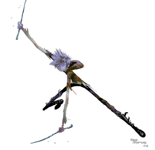
This one definitely feels like middleschooler trying to be in a band. His sticks just resemble drumsticks to me what can I say. I’m a big fan of his shoes and his color scheme screams a hibernating tree in winter. His hair also looks like it’s covered in frost rather than it being wholly white, which is very neat!! He looks like he wants to fight but has slight hesitance. Overall a very balanced Jack.
Rating: 8/10 He’s ready for band practice
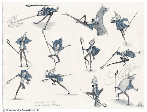
Not many thoughts here, I just found these tiny Jack designs cute. His hoodie being a jacket instead just adds to the charm of this one.

No talk to him he angy.
Rating: 6/10 fun sized boi
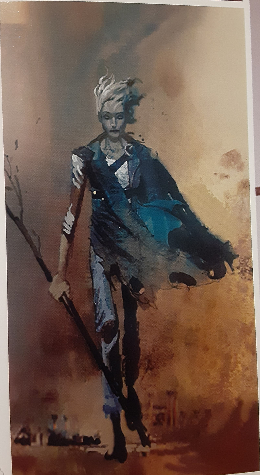
Now this Jack resembles the one earlier that dressed entirely in leather brown colors, however he clearly is different than that one. I’m gonna say it, he looks like a zombie or undead in this design and its pretty fucking gnarly. I don’t know whats going on with his hair but I’m gonna assume it’s just the wind making it look like that. He just has the vibe that he was once human but was turned into something else entirely. It isnt in uncanny territory but borders that. This version of Jack meeting Pitch and the others would have been *very* interesting. Rating: 7/10 Eat a twinkie Jack you’ll feel better.

The final design! I can’t complain much about this one. The way his staff subtly has a G shape and a hexagon(his signature shape) is a wonderful touch. Additionally, the way the frost is gathered mostly where his hand is such an intricate detail. His signature hoodie is iconic at this point so I can’t bad mouth that either.(I can’t anyway because there's no complaints from me here.) Although, I never understood the leather straps that his pants had or their functions. I couldn’t find any colonial outfits that resembled Jack’s pants so its a total mystery to me at least.
And I can’t go on about this design until I mention the snowflake pattern in his eyes
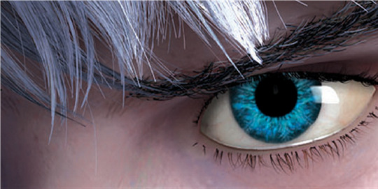
Pure beauty. It’s at a hue of blue that almost looks impossible to have, combined with the electric blue color of the snowflake in his eyes. The amount of detail in this movie amazes me to this day. Rating: One Great Blizzard <3/10
#rise of the guardians#guardians of childhood#jack frost#jack frost rotg#jack frost goc#jackson overland frost#nightlight#nightlight rotg#toothiana#tooth fairy rotg#e. aster bunnymund#nicholas st north#pitch black#pitch black rotg#concept art#artbook#art book#design review#my bullshit#stay tuned for Aster's review
646 notes
·
View notes