#they’re just geometric shapes that don’t have much meaning
Explore tagged Tumblr posts
Visit Tumblr Blog
Explore Tumblr blogs with no restrictions, modern design and the best experience.
Last Seen Tumblr Blogs


Fun Fact
69% of Tumblr users are millennials.
Note
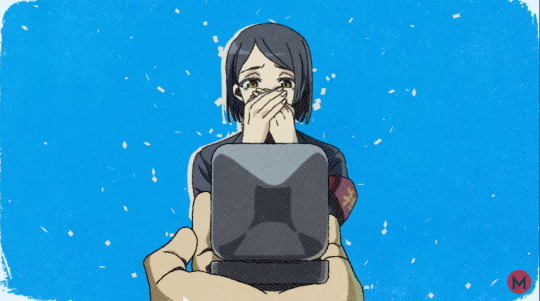
What do Fiyero's tattoos look like?

You’re in luck cuz I recently did a pic to map out his tats heeh
#ankh replies#fiyero tigelaar#they’re just geometric shapes that don’t have much meaning#he kinda didn’t realize they COULD have meaning before it was too late#in my canon Vinkun tattoos are placed in really REALLY sensitive areas to prove strength and endurance#and you get them every age milestone#like 15#20#25 etc#he was going to get some on his back on his next milestone buuut#ya know he kinda died lol#also blame Ichi for this
62 notes
·
View notes
Text
3e: Winners and Losers In Lawful Space
Planescape is a silly place.
Dungeons & Dragons is a wholeheartedly silly game, and it’s important to remember that what makes it silly is an expansive growth out of a particular root. It is a tree of many branches but thanks to the way that it encourages people to build their own things on top of it, it has become a sprawling kind of folk narrative and generally accepted consensus material that then a company comes along and tries to augment and supplement. Still, as much as a corporate mind is at the head of what gets published, what gets handed to that corporation is going to derive from the mind of a dork who likes D&D. To that end, D&D’s lore is a constant push-pull between the kinds of nerds who like organising lists and the kind of nerds who like to invent new types of dragons they want to have sex with and they’re all trying to integrate one another’s material because that’s how nerds demonstrate mastery over a topic.
The result is that D&D lore is composed of parts that neatly and smoothly fit together and parts that should be airbrushed on the side of a van, and all subjects exist in a space between those two points, on a spectrum. And nowhere is this more evident than in the way that 2e’s setting Planescape introduced elements that 3rd edition tried to hide.
Planescape, as a setting, exists very close to the ‘airbrushed on a Van’ side of things, and it’s extremely obvious when you look at its roots in 2nd Edition. In this space, much of what makes Planescape Planescape was codified. For those of you unfamiliar, Planescape is a setting made up of the idea of ‘planes’ as distinct, discrete universes with their own rules separated not by time and space, but just by barriers or magical boundaries. You know how Narnia is supposed to work, with the wardrobe? It’s like that, but there are a lot more wardrobes and they all go to different places. Think a sort of multi-level Isekai scheme.
Anyway, it’s a setting with like, multiple whole universe-sized worlds, that may or may not have planets inside them, some of which follow a very narrow set of identifying rules, like the elemental plane of Fire, which is full of Fire, or are just like ‘here, but a bit weird,’ like Bitopia, which is a whole plane that is mirrored vertically at a certain height. If you look up in Bitopia, you see another whole country up there – that’s why it’s called that. Also everyone there is bisexual.
Planescape sought to build out more of that structured universe and then in each structured space, fill it with interesting notions. But the structure is a little odd, in that it’s hard to make an infinite number of chairs organise neatly, someone is always putting out one more where they shouldn’t. That means there are tidy diagrams of the Planar cosmology, and then you look inside any of the bubbles in that diagram and find it’s full of gibberish.
It was in 2e that, as far as I know, we were introduced world-wise, to the characters of the Modrons.
There’s a whole writing form that involves referring to Modrons in deliberately obtuse ways, with Modrons being the individual, plural, categorical, and utility terms for this people, but what you need to know about them is that Modrons are weird lil guys that are made out of a basic geometric shape – pyramid, cube, dodecahedron, all the way up to sphere (or down to sphere, depending on who you ask). They are truly perfect Lil Guys, a byproduct of a plane of true law and order which doesn’t in any way cohere to what humans (the people playing the game) necessarily assume about law.
They make a lot of sense in a storybook kind of way where you don’t need to have big answers for what they are or how they work or even how their philosophical bias towards pure lawfulness works. In the world of 2ed, where sometimes things that sound like they should be well explained, clear rules are kinda yada-yada-yada’d in a space that you might imagine is flavour text, the Modrons left a bunch of questions unanswered and seemingly, that was good. It was good that they were heavily ambiguous because what was the life cycle of ‘an orb?’ Any answer made them less mysterious and pushed them away from the oddness that they represented.
Anyway, 3e was an attempt by a serious company to do serious things and that’s why when they went back to talk about the Creatures That Lived In The Lawful Planes, they came up with the Inevitables.
Inevitables are the demons of small minds, writ large. Literally, the point of an Inevitable is to be a Lawful Neutral version of a Demon, an entity that exists purely based on rules, coalesced out of a world made of rules, and with nothing holding them back from expressing that. Each of the Inevitables is meant to respond to a rule in the universe and then enforce it. They are self-appointed near-immortal construct cops, and they’re meant to oppose things and people that break the rules that they, specifically, are meant to care about.
These rules are completely out of whack, though, because one of them is meant to enforce say, justice, another the inevitability of death and another, the way the desert is a fixed ecosystem that nobody should try and change or interact with. And in that case, there are a bunch of plants that the Inevitables are going to have issues with, that don’t seem to be capable of forming complex political allegiances.
There’s a really interesting distinction between Inevitables and Modrons, to me. Modrons are weird and interesting but also, there’s nothing they can do that answers a question. Inevitables are a fun challenge that’s supposed to be present to oppose players or potentially be recruited into an adventure, but not for too long. But Inevitables, the 3e attempt to populate Lawful Planes with A Kind of Guy, sort of fell apart and are now more of a trivia question while Modrons have endured into 4th and 5th edition.
I don’t think there’s some greater, better reason for it or anything. I don’t think that Inevitables failed because they were Bad Design or something. But I do think that for me, the way that Modrons represented Weirdness was much more interesting than the ways the Inevitables sucked weirdness away with their simple, clear consideration of certain things as being part of natural reality.
After all: Inevitables would hunt down people who extended their lifespans because ‘everyone must die.’ But Inevitables were immortal. That’s a pretty interesting thing to juxtapose and maybe a character could struggle with that.
Or maybe they could make a big speaking trumpet and demand that everyone else refer to them as a Spokesmodron which is, in my opinion, much funnier.
Check it out on PRESS.exe to see it with images and links!
134 notes
·
View notes
Text
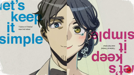
Trying (and Mostly Kinda Failing) to Give Meaning to Lyric Placement and Background Shapes in "Cat"
(Or: me going insane over things I’m not even sure mean anything)
Hello people of the jury! Today I want to talk about a few things about Kazui’s latest MV, Cat, which have been eating at my brain for a while. Essentially, the way that the transcribed lyrics show up all over the place, out of order, in different colors and languages; the shapes we see throughout the background in different colors; and what both of these things could mean. I emphasize could because it’s all a mess and I’m not entirely confident we’re supposed to read into these things as much as I’m reading into them here. But oh well, if I don’t share this my head is going to explode, so I might as well.
(There’s also a chance a lot of what I say here has been said before. Sorry if it’s redundant)
CW: Suicide and depression, tumultuous relationships, internalized homophobia.
OP what the fuck are you talking about
Let’s start with what I mean by “lyric placement.” As you’re probably aware, the Cat MV has its lyrics transcribed in a very particular way. Sometimes words show up way after the lines are said, sometimes they’re repeated, sometimes they’re in French, sometimes they have extra words thrown in there, etc.
The main thing that tipped me off that something may be up is this line:
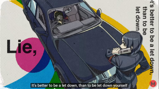
As you can see by the subtitles, the line is:
Since when have I ignored my feelings? It’s better to be a let down, than be let down yourself.
However, the MV also has the word “lie” on screen, even though it’s never said in the lyrics. Unless the subtitles are wrong, but I trust that’s not the case.
Now, if I had a nickel for every time a weird-ass MV showing the inner thoughts of a blue haired liar with somewhat homoerotic undertones had English words which appear on screen yet do not correlate to the Japanese lyrics being sung… I’d have two nickels, which isn’t a lot but it’s weird that it happened twice. (/reference)
And it’s not difficult to figure out why that would be the case. If you recall from his second voice drama, Kazui believes he should have kept lying to Hinako, to keep her happy. This is also stated in his interrogation questions.
(T1) Q18: Do you regret your “murder”?
Kazui: I do regret it. I should have kept lying.
Unless he’s lying, which he has no reason to do, we can tell he would have preferred continuing the lie if it meant Hinako stayed happy. That means, in his eyes, being a let down is worse than being let down himself. That’s why the word “lie” shows up when he says the opposite in the lyrics, he doesn’t actually believe it. It’s assumedly just something he told himself right before “letting down” Hinako by telling the truth.
So, since the MV pulls a cute little trick with this line, is it possible that the placement of the other transcribed lyrics is significant? Well, that’s what the rest of the post will try to answer.
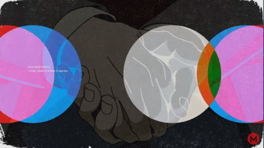
Then there are the colors. As you know, geometric shapes of all kinds of colors appear throughout the MV, and I believe these could mean certain things. Take a look here, for example.
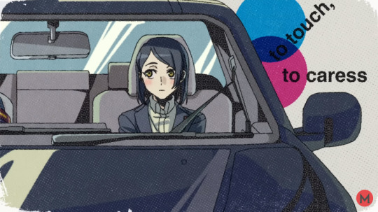
to touch, to caress
That’s the lyric we’re shown as Hinako’s crush towards Kazui is made evident for the first time in the MV. And in the background, we see a blue circle and a pink circle intersecting, and in the video, pulsating like a heartbeat. If we assume blue to be Kazui and pink to be Hinako, it’s showing the idea of the two being together, “touching and caressing.” I noticed this thanks to Napkin's MV analysis, I recommend you watch it if you haven't!
So now, if that really is significant, are the other shapes and colors significant? For one, as blueepink07 pointed out in this post, it’s possible large part of the color scheme was chosen to align with newspapers, because Kazui wants us/Es to uncover his lies as if we’re/they’re getting information from a newspaper, or something like that. For more specific ideas… that’s what the rest of the post is for.
Hypothesis
>The placement of the lyrics sometimes recontextualizes their meaning, and we have to figure out how.
>Lyrics in French, which are always smaller, are used in two ways. Either they simply repeat what the English words say, to give them emphasis, or they replace English words, which usually happens when the line alludes to Kazui’s "temptations", aka his homosexuality. And yeah, I’m assuming he’s gay, because in my eyes it’s honestly more heavily implied than some of the stuff we believe about other prisoners. I’ll give some of my reasoning later.
>The color of the lyrics and the shapes in the background can often be important, though there's a non-zero chance a lot of it is just aesthetics. As a warning, some of the wilder things I bring up not even I fully believe, but I'm going for the completionist route. If you have any better ideas for any of these, please feel free to tell me!
>Blue represents Kazui, pink represents Hinako. As much as gendering colors is stupid in concept, it is useful for symbolism, so.
>Light green represents Kazui’s "temptations", since it’s connected to the green apple which shows up repeatedly.
>Yellow… Okay, so this one is where stuff begins to break down. It’s really hard to tell what yellow could mean, but seeing the meanings the color usually has, I’ll say it represents a sort of desire for happiness. It’s similar to light green, but not quite the same, it’s more general. Yet, it still makes the same dark green color when it mixes with Kazui’s blue as light green does. His happiness and temptations are closely linked. Yes I’m even bringing the intersectional colors into this.
>Red represents Kazui’s deepest desires. It’s the color which floods the background as he bites the pigeon, after all. It’s “stronger”, deeper than light green and yellow, but it’s sorta similar still.
>A darker red appears occasionally on some intersections, possibly representing blood and therefore Hinako's death.
>Purple only exists as the intersection of two colors, but its meaning changes depending on which colors are mixing. When blue and red mix, it’s Kazui’s desires; when pink and blue mix, it’s Hinako’s desire to be with Kazui.
>Orange... shows up like once it's kinda weird. I took to google again, and it usually represents enthusiasm, which is different enough from happiness that I'm comfortable saying that's what it is.
>The reason so many colors have similar meanings is to be able to convey Kazui’s emotions with more nuance. Please bear with me.
>Sometimes, colors mix very little, to the point where I think it’s not meant to be important. I have to add this or else the post is impossible. You’ll see what I mean.
Alright, still with me? Sorry for the prelude, but it was easier to explain it all now before we really get started.
Unhinged Analysis, Start!
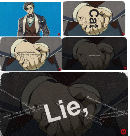
(Ah, Tumblr 30 image limit my beloved. Making me do shitty collages in Microsoft Powerpoint just so I can have visuals in my post about the funny apple man)
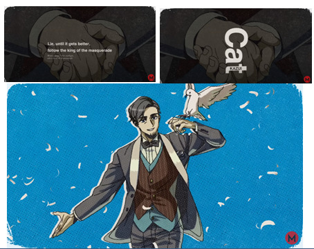
We open with the song title for obvious reasons, as well as blue backgrounds because it’s Kazui’s MV, a small overview of the colors we’ll see later, and a lyric repeated in both English and French for emphasis.
Lie until it gets better, follow the king of the masquerade
It’s the main thesis of the song, that Kazui, the king of the masquerade, believes it is better to keep lying until things improve than tell the truth and cause harm.
We also see his name and prisoner number, and an interesting introduction to the colors in circles. These are likely purely aesthetic, but if you want an actual explanation... uh.
UNHINGED INTERPRETATION START!
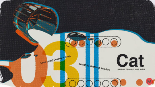
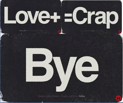
To the left, red and blue intersect and form pink, which doesn't usually happen. Usually, when red and blue intersect you get purple or a deeper red, not pink. I think the colors are partly inverted on this scene, noting the darkened background, so we're meant to take whatever the colors would usually mean, and reverse it. So Kazui and his deepest desires intersect on Hinako? Well, it's actually the opposite. Kazui's deepest desires don't include Hinako. Does that make sense? I say this is the meaning because the lyric there is "Love (plus) Destiny = Crap, smash it, shatter it, bye-bye". Keeping in mind the "destined love" is Hinako, it's clear Kazui doesn't like the relationship, we been knew.
The intersection also exists on the right, but there's also a white circle which inverts the inverted meaning and thus shows the truth. (???) So the part where Kazui is by himself turns into an enthusiastic orange and the intersection with his deepest desires turn into green.
You may have noticed that already makes absolutely no sense. I hope you can forgive me. Remember, I said they're probably just aesthetic here.
UNHINGED INTERPRETATION END!
Anyways, the masquerade lyric and the title show up again but in inverse order for aesthetic reasons, which I think is neat.
I really think this is just an introduction, and there's not much to read into.
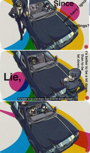
The road the car is on is yellow and blue, with them mixing into dark green in the middle (that color does not exist on its own). As everyone does in life, Kazui is trying to stay on the road to happiness. Yes, we start off with quite a stretch, but most of this is going to be reaching, so. The dark green shows that part of that happiness would be something related to his “temptations”, his likely homosexuality.
There’s a pink circle hovering around, Hinako. She also seeks “the road to happiness”, and has her own desires (the red from the intersection of her pink and the yellow). That leads her to getting close to the blue of Kazui. Eventually, she becomes so prevalent in his life that her pink color strikes through the entire frame, showing the two were probably close in some way before the whole marriage thing happened.
I’ve already explained how and why the word “lie” is added into the visuals even though it’s not in the sung lyrics.

Behind “I just wanted” we see a blue and a light green circle intersecting almost fully, cementing light green as the things Kazui truly wants.
The circles behind “to touch, to caress” have already been explained.
“I just wanted to be touched” is accompanied with an interesting visual; a light green and a pink semicircle separated by a yellow triangle. I believe this represents the divide between Hinako and the things Kazui truly wants, the divide being his happiness.
You’ll notice that pink and light green intersect slightly, which is why I said sometimes that doesn’t mean anything. They don’t intersect enough for it to be significant. How much intersection is necessary for us to consider it relevant? Well… whatever fits the scene the best :v
“So” is pink for Whit- wrong fandom sorry
“So, it’s wrong?” With the pink “so”, Hinako stands behind all the regrets Kazui might have about what he’s done.
(My arms hurt from reaching too much-)
This scene is one of many which really makes me doubt the colors actually mean anything most of the time, but I can still try to think of an explanation. A lot of the colors pass by, as if they’re simply events and experiences in Kazui’s life. Temptations, happiness, etc, with nothing intersecting too much. Though worth noting, blue and pink never touch on this scene, as if Kazui doesn’t want to be too close to Hinako, even though she’s an important part of his life.
There is one intersection I think may be interesting, though. Front and center, a blue rectangle is split right through the middle by a red line. Although there’s a lot going on in Kazui’s life, his deepest desires are always right in his core, front and center. That’s part of why red works as these “deepest desires.”
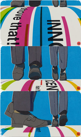
Oh shove that! INNOCENT, isn’t that right?
The lyrics here are just what’s being sung, but it’s interesting that they’re on the floor. It’s almost as if Kazui is looking down on these words, disrespecting them by walking on them. He doesn’t truly think he can shove aside his wrongs, he doesn’t consider himself forgivable. At least, not yet.
(T1) Q19: Do you want to be forgiven?
K: I’m not sure. I also want my weakness to be tolerated, to be honest.
Well, sorry my guy, but I’m still voting you inno, compared to the other people here you did some wrong things but it’s really not that bad.
(I'm skipping scenes that don't have anything relevant)
The blue background is just because this is the turning point of Kazui’s life, when he succumbs to societal pressure to marry Hinako. A bit self-centered to think of your color when proposing to someone else, maybe, but that’s not entirely new for Kazui, huh? Flawed characters, gotta love ‘em.
However, you’ll notice the lyrics never actually make it into text.
Maybe, perhaps… or… could it come true… like It’s for the sake of true love, who wouldn’t lie for that?
These are some of the only lyrics in the song which are never ever transcribed. The others are:
Let’s take a breather
To be caressed by you, that would be perfection - I wanted to be loved, just like a cat
Lick that sin and oppose punishment, until you can meet the king of the masquerade
I cannot for the life of me give you a good answer as to why that happens, but I can give a weird and stupid answer!
Because “Let’s take a breather” is framed as the start of the conversation Kazui and Hinako had which led to her death, it’s possible the lyrics not transcribed are things Kazui said to her in that conversation, and they show up out of order. Not literally, he wouldn’t tell her he wants to be loved like a cat, but more so the meaning behind them. He told her he lied “for the sake of true love”, as he thought “it could come true” if he just stuck with it long enough. He wanted to be loved for who he is (“like a cat”), and, uh… to savor that sin of lying, so she can meet who he truly is? Maybe something like that.
I don’t know. It’s a huge stretch, but I don’t see why else they wouldn’t be transcribed.
Oh, yeah, this clusterfuck.
As far as I can tell, the lyrics here are only the ones from the following chorus, not the previous lines. I can make out, vaguely:
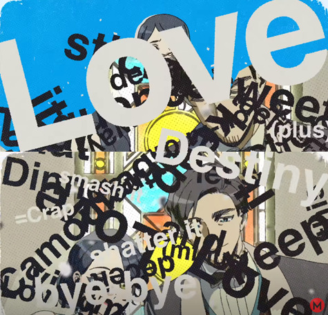
Love (plus) Destiny = Crap, smash it, shatter it, bye-bye That sticky-sweet sequence: Dinner + Camouflage + You-Know-What Loving Affection (minus) Love, it’s tacky, this two-way deceit Victim and Perpetrator, let’s keep it simple
I believe these lyrics are represented like this to show inner turmoil, a chaos inside Kazui’s mind. He despises the love assigned to him by “destiny” (societal expectations), but he goes with the sequence anyways: dinners (dates), camouflage (lies), you-know-what (you know what? I don’t actually know what that means, though I can assume). There’s affection, but it’s not really love. This love is a two way deceit, as Kazui lies to Hinako and himself, telling himself this is what he wants.
“Victim” and “perpetrator” are written only in blue, pink and yellow, representing the union of Kazui and Hinako in search for happiness, but excluding Kazui’s actual desires. (Or maybe it's just the newspaper thing). “Let’s keep it simple” is in both pink and blue because both of them are involved in the “victim-perpetrator” duo.
Notably, “Victim and perpetrator, let’s keep it simple” also shows up in French, again for emphasis. It’s a core part of Kazui’s character that he blames himself fully for what happened.


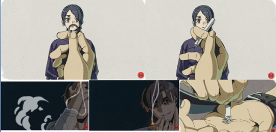
So this is the big part for all y’all Kazui/Bartender shippers out there. Kazui grabs a green apple out of a bunch of red ones, and it turns into a glass of an alcoholic drink. (The hand disappears from view for a moment, but it's still the same one as Kazui wears his watch and wedding ring on the same hand). And hey, you know how Hinako is represented by a red apple at the end? (Note how it falls and hits the ground, possibly representing Hinako’s suicide). I and others before me think red apples are women, the ones which Kazui is expected to like, while the green one might be a man.
I say that because it turns into a glass, which may represent the bartender, just as the next line plays:
Phew, oh wow I’m drunk Hey, so what if I said I liked-liked you, what would you do?
Note that he says the line, he doesn’t actually sing it, possibly implying it’s an actual thing Kazui said in real life. Now, it’s actually very possible that this isn’t happening at the bar from half itself. As pointed out by errorscribes in this post, the furniture doesn’t actually match either the bar or Kazui’s home, meaning he might be in a secret third thing. Still, however, the connection between the apple and the glass remains, especially since this “one thing turns into another” trick does actually happen a few times in the MV, notably with the wedding ring.
There’s a few more things which make me believe it, but that was just a small tangent to explain why I'm decently convinced Kazui is gay, since I still see quite a bit of discussion around that.
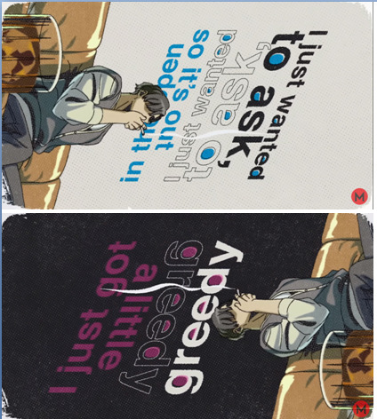
After confessing to possibly the bartender, Kazui explains he wanted to ask “so it’s out in the open.” Note how that’s color-coded blue, possibly implying Kazui is “out in the open”, as in exposed or, perhaps more literally, out of the closet. He seems laidback and relaxed as he says it, but it’s likely a lie, as the background suddenly turns to an ominous black while he retains the same position.
That’s when he says “I just got a little greedy”, with “greedy” repeated for emphasis. The pink is likely because this is something he wants to tell Hinako, as a sort of half-apology-half-excuse.
The lyrics of the next scene, with Kazui and Hinako having a dinner and all that, are transcribed right after, in what may be both the most interesting and the hardest-to-explain scene for this theory.

So, here's what I think we're looking at here. It's a chronological retelling of everything that happened after Kazui and Hinako got married, that's why the numbers are there. That's why the song's title, Cat, and Kazui's name are constantly on screen; it's the main story of the song.
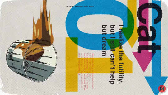
We start with a glass falling, the calm before the storm, the moments before the disaster. In French and red, we see the lyrics from the scene prior:
All those things I wanna do that I can’t say out loud I gotta keep it inside and act The beating of this heart… see… it’s no longer about good and bad… it isn’t I realize the futility, but I still can’t help but dream
Kazui is repressing his feelings for now, those things he can't say out loud. The desire to express his feelings slowly stops being about good and bad, moral and immoral, it's a primal need, like a cat's need to hunt doves. See the connection to red?
"I realize the futility, but I still can't help but dream" is repeated in English for emphasis. Even though he knows it will be useless, he can't help himself, he wants to act on his true feelings. In particular, I believe the "dream" is to be loved by whoever the hell he confessed to (possibly the bartender), and this is what caused Hinako to commit suicide, seeing the distorted line in his Voice Character Reveal.
I'm so d[um]b... Wh[y] d[i]d I [h]a[v]e to [dr]e[a]m?
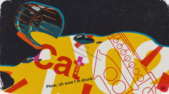
Note that "01" is written in both Kazui's blue and the yellow of happiness, showing that this scene is about him looking for happiness (deep analysis there, folks). Note the arrows, too. Hinako's pink arrow is literally between Kazui's blue and his happiness (yellow).
And that was when his feelings were repressed; because then, the glass hits the ground, showing that number 02 is when things went wrong. The lyric in English is "Phew, oh wow I'm drunk", as it's something Kazui isn't afraid of admitting. But in French, smaller, we see something he may want to say a bit quieter: "Phew, oh wow I'm drunk. Hey, so what if I said I liked-liked you, what would you do?"
(By the way, I'm not using direct translations, but rather what the corresponding lyric is in English. Probably should have mentioned that earlier)
We reiterate he’s drunk, potentially to further imply a connection to the bartender, and we have Kazui’s confession. Notice the colors used are yellow and red, possibly because we’re seeing the confession of Kazui’s deepest desires as he attempts to be happy. Well, technically you might say a few things are pink, but since the saxophone is red, I’m assuming that’s the main color we’re supposed to take note of. Instead, the pink is almost an afterthought, as if Kazui is only thinking of Hinako sparsely in brief moments of lucidity from his drunkenness.
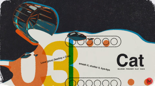
03 is the weirdest in terms of colors. The lyric displayed is “Love (plus) Destiny = Crap. Smash it, shatter it, bye-bye.” I believe this is referring to the aftermath of the confession in 02, where the “destined love” of Kazui and Hinako starts to break down.
Why is there orange, then, if the relationship is breaking down? Well, because Kazui doesn't like the relationship. He's originally enthusiastic about revealing the truth and shattering the relationship (orange), because he thinks it will bring him happiness (yellow). Well, enthusiastic is maybe an exaggeration, but it's close to it at least. I'll explain what makes me believe that in a moment, bear with me. However, that's not how that would play out.
To see that it didn't go as Kazui had hoped, we have to look at the blue bars and the orange circles. It took me way too long to notice, but I think the blue bars are for the piano that plays in the scene, like the saxophone that showed up in 02. By that logic, the other thing could be some… kinda flute? I don’t think so. I have no idea what that is.
In any case, although it's a bit of a stretch, something interesting happens with these bars and circles. It’s hard to describe without the video, but if you look at them (preferably at 0.5 speed or something) you’ll see that when 03 first shows up, the bars and circles appear in a neat pattern, but as the lyric “solidifies”, the bars and circles begin “sputtering”, the pattern breaking down.
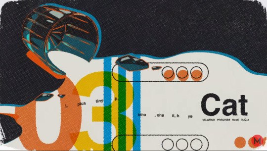
Neat pattern, few lyrics.
Broken pattern, full lyrics.
So, I think that's meant to represent Kazui hesitating about the destruction of his relationship. He starts enthusiastic, with the pattern stable. But as the idea that the relationship will come to an end starts to solidify, represented by the lyric slowly forming more and more, he starts to realize there might be some drawbacks he hadn't anticipated, which is why he starts to hesitate, and the pattern breaks down. The pattern doesn't have a concrete meaning, it's meant to give the vibe that Kazui is hesitating, which I swear makes sense if you look at it in the video please I swear I'm not that insane yet please-
The reason for Kazui's hesitation becomes evident in number 04. Do you see those white ovals around this number? Don’t they look a lot like clouds?
I believe this is the balcony scene, when Kazui tells Hinako the truth, and she commits suicide. That’s why her pink is front and center, while Kazui’s temptations lure in the background in light green. They’re the context, the set dressing, for Hinako’s part of the play, if you allow me some half-adjacent metaphors. The colors mix into a dark red which almost looks like blood. I don’t think I need to explain how the death scene is connected to blood.
And with this scene in mind, where Hinako dies after learning the truth, Kazui reaches the conclusion represented by the lyric on screen. “Lie, until it gets better, follow the king of the masquerade.” Repeated in French for emphasis,. After Hinako dies, Kazui starts to believe he should have simply kept lying as he was doing before, when he still was “the king of the masquerade.”
Does any of that make any sense? I am grasping at straws and trying my damn hardest to reconcile all these things, but most of them are nonsensical. I have to remind everyone, I’m still not entirely sure I’m not just looking at nothing here.
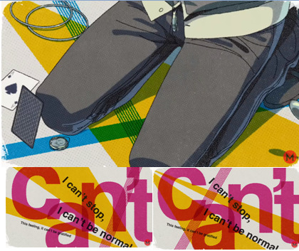
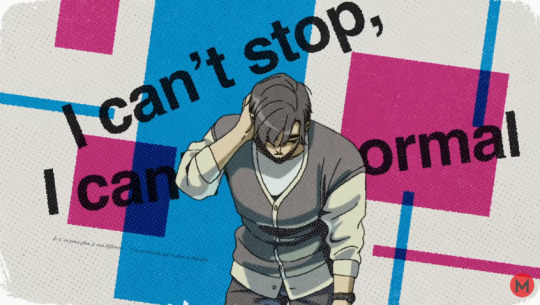
The lyric that plays as Kazui falls to his knees is "I can’t stop, I can’t be normal. This feeling, it can’t be gratified", which is transcribed in the next shot.
Before we get to the shapes, we have to talk about the added lyric, which I find very interesting. The word "can't", big in the background and in pink. Possibly because Hinako can't gratify "this feeling." However, there's a funny thing about the word "can't"; it's a homophone of Kant, the philosopher Kazui and Es discuss in the second Voice Drama. I think this might be intentional.
As the characters discussed, Kant believed that lying is always inherently inmoral, even if the liar has good intentions (oversimplification, don't come at me philosophy majors). However, I want to talk about it a bit more in depth. Although I am dumb and I am not very good at philosophy, what I could gather is that Kant believes lying is unethical because it impairs the ability of others to make rational, informed decisions. He argued that because our freedom ends where others' begin, then we cannot lie, for that would impair the other's freedom. Regardless of what you think about this belief system, it's clear some connections can be made with Kazui. Under this logic, his lies impaired Hinako's freedom, as presumably, she wouldn't have married Kazui if she had had all the information from the start.
(Again, I am likely oversimplifying things, but I am not gonna write a thesis on Kant to try and figure out the funny liar Cat-boy)
Why am I bringing all this up? Am I just trying to trick you into thinking I have any idea what I'm doing? Correct! Seems Cat taught you well to avoid misdirection.
But in all seriousness, it's because that logic is the best (read: not actually that good but it's what I have) way I have of interpreting the shapes on the background. There's yellow triangles crossed by blue and then pink, but notably, they intersect little and seem to go in different directions. As if the path Kazui and Hinako are in are different from the one which leads to happiness. The idea here is that while Kazui obviously isn't happy with how things are going, Hinako couldn't be truthfully happy under Kant's ideas. Because she wouldn't have true freedom of thought until Kazui stopped lying to her, so in a way, her own happiness was also a lie. Thus why the lines representing her always go in a different way from happiness. And because she can't be happy, the yellow of her fake happiness turns into dark red as it crosses that word, again possibly referencing her death.
Is it a stretch? Oh, absolutely! I don't even know if I'm interpreting Kant right! But I frankly have no idea what else these things could mean. It's possible some of the shapes are merely aesthetic, and this is one of the scenes which make me believe that. I'm open to audience participation, you figure it out.
More imagery of a scattered and broken relationship, with blue and pink shapes all around Kazui, but which only barely intersect. The small French words are part of the lyrics, "this feeling, it's yearning to be satisfied." As I said, sometimes French words are some of Kazui's more hidden thoughts. This brings up an interesting dichotomy of "this feeling can't be gratified" being expressed in English and bigger font, while "this feeling, it's yearning to be satisfied" is in French and smaller. It's possible Kazui finds it easier to admit that his feelings can't be satisfied, rather than admitting he wants them to be satisfied. Interesting insight if true, it would mean Kazui has an easier time accepting hopelessness regarding his feelings than actually admitting to the feelings themselves. It sounds a bit weird in text, but I think it sorta makes sense in an "internal conflict" kinda way.
Let's take a breather
Thank you Kazui, I really needed a breather after all those stretches I made. Anyways, as part of this MV imposed intermission, I want to explain what I meant when I said Kazui was "enthusiastic" to break off the relationship.
Kazui takes off the wedding ring and turns into a cigarette, as Hinako watches in horror. The symbolism here is important; what Kazui is doing is pulling back the curtain, he's revealing how he actually feels about the relationship. It's like a cigarette, something he engages in for some form of momentary relief, relief from societal expectations, but still something ultimately harmful for him. This truth is why Hinako looks so horrified.
And we see exactly what Kazui is trying to do with this relationship when he puts the cigarette to his hand. He's trying to put it out, and in his mind, this is an abrupt and almost violent act, as that's the impression we get from how fast this frame flashes on screen. It's also worth noting, the act of putting out a cigarette like this would also hurt, showing that Kazui is also harmed by this action.
With the understanding that Kazui is actively trying to end the relationship, also shown by him biting the dove later, his expression tells us a bit of how he feels about it. And it's all smiles and smirks up until Hinako falls.
Now, to clarify, I think Kazui is presenting himself as far more aggressive and enthusiastic than he actually was at the time. I really doubt he actually smiled when he broke the news to Hinako. But I also believe it isn't a complete lie, there was some enthusiasm on his part to maybe try to live the life he genuinely wanted. And that's why 03 has the color orange.
I'll repeat it because this really isn't something I want to be misinterpreted on. While Kazui was somewhat enthusiastic to break off a relationship which was clearly making him unhappy, the video is very much exaggerating how much enthusiasm he actually had. At least, that's how I see it.
As stated, the lyrics cut back and forth very quickly to give the scene an aggressive edge, as if Kazui revealing his feelings is somehow a visceral act of violence. Accompanying the words are the definitions in French, because why the hell not. And yes, some parts aren't transcribed. Don't ask.
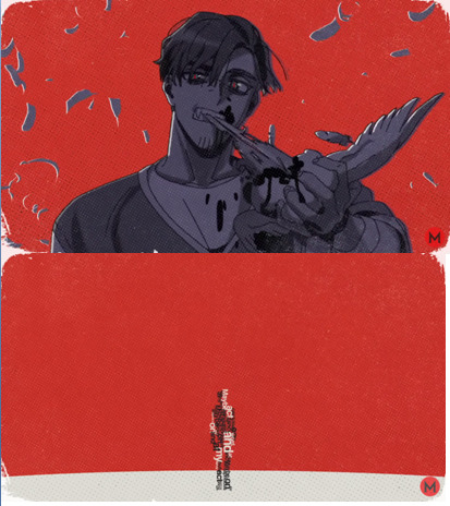
Like I said, red floods the background, as Kazui’s deepest feelings become all encompassing for the scene. They’re what caused Hinako to commit suicide, after all.
As I mentioned, “to be caressed by you, that would be perfection. I wanted to be loved just like a cat” aren’t transcribed, but:
Maybe act capricious, at my word and at my fancy
Are the words which make up a silhouette of Hinako as she’s about to jump. If you’re unaware, “capricious” essentially means unpredictable, acting on impulses. So, like a cat. I believe the pictogram here is meant to represent how Kazui’s “capricious” actions led to Hinako’s suicide, and it doesn’t have to be more complicated than that.
… Well, there’s also a way to read this where Hinako is the one acting capriciously, killing herself purely on impulse. You know, it’s been pointed out before that Hinako’s hair was already fluttering when Kazui bites the dove, implying she was already falling when Kazui revealed his feelings and destroyed the marriage. If you want, you could read this as saying that Kazui is subconsciously aware that his truth wouldn’t be enough to push the average person to suicide, so Hinako was “already falling” in the sense she had some pre-existing issues which contributed to her decision. For example, if she was already suffering from depression. And thus, in a sense, she also acted unpredictably, capriciously, when she jumped.
I think this is a possibility, and it would make Kazui’s inner world more nuanced than it already is. He’s a smart man, so even if he can’t quite get himself to believe it, it’s possible he logically understands suicide isn’t something which people usually do for only one issue. I’m not sure if he would call her capricious, though, feels a bit mean in my eyes.
Anyways, while I wanted to acknowledge that possibility, I still think the first thing I said is the most straightforward interpretation.

Finally, my torture the video ends with the ever prevalent “Lie until it gets better, follow the king of the masquerade,” this time with yellow, blue and pink. For aesthetics mostly, I imagine, but it is interesting that once the apple splats, presumably representing when Hinako hits the floor, the color pink disappears, so “follow the king of the masquerade” only gets blue and yellow.
Another interesting thing is that the word “Lie” accompanies Hinako as she falls backwards, and it almost looks like a mountain of lies is pushing her back, as in, pushing her to suicide. “Until it gets better” and “follow the king of the masquerade” also have fun visual things, but I do think those are purely aesthetic.
Red consumes the background as we see Kazui covered in blood, the result of his deepest feelings in his eyes.
Finally, the last line, “lick that sin and oppose punishment, until you can meet the king of the masquerade”, isn’t transcribed anywhere. I’ve always found that line interesting, though. What does “licking the sin” imply? Is he speaking to us when he tells us/Es to “oppose punishment”? And have we not met the king of the masquerade yet? Presumably there’s a good bit of background we’re still missing on Kazui, but how far does it go? Is he trying to manipulate us/Es into an innocent vote?
… I swear, this fucker better not have a complete heel turn on trial three. I’m choosing to trust him… for now, but I might have to look into it further.
Still innoing him now though.
Conclusion
So what did we learn? Not really all that much, most of this is somewhat nonsensical, and almost everything else could be gleaned from the lyrics themselves. I just wanted to share my pain, even if I have my doubts about a lot of this. There were a few interesting things to note, I guess. I don’t know what else to add, frankly.
Anyways, inno Kazui. And while you’re at it, inno Amane too.
If you made it this far, then I think you deserve the color yellow! Take care!
#milgram#milgram project#kazui mukuhara#cat mv#milgram theory#yes apparently color theory followed me here#i cannot escape it#don't worry if you don't know what i'm talking about#anyways inno kazui#+ inno amane
49 notes
·
View notes
Text
DS9: Emissary (Part 2)
Read part 1 here. This is the last article wrapping up two-part episodes, which will be in a single article from here on out. Thank you for reading!
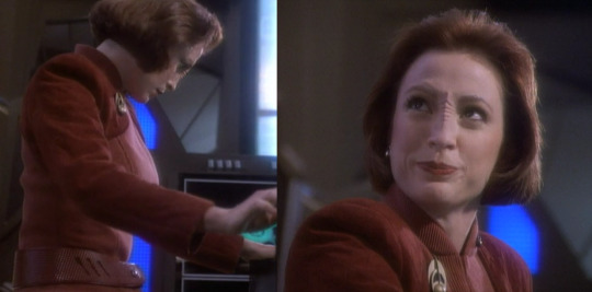
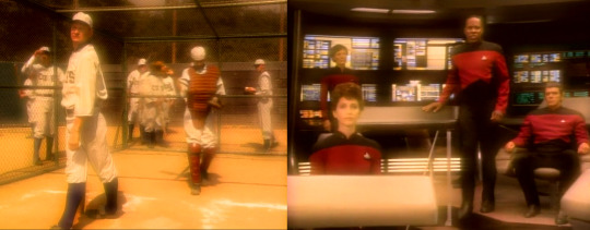
Part two of Deep Space 9’s pilot episode opens in Ops, giving us several lovely close-ups of Major Kira’s uniform, including her Bajoran-style comm badge and belt. The badge appears to be made of a brassy metal material, and is in the shape of the Bajoran logo, much like its Starfleet counterpart. The belt, in a deep burgundy colour that matches her uniform, has a texture that suggests reptilian leather (or, perhaps, a replicated substitute). We can also see in this early episode that Kira’s makeup originally included a slight brow ridge, like Ensign Ro.
I guess they still have cosmetic surgery in the 24th century.
Odo beams into Ops to join the team, briefly giving us a full head-to-toe view of the goo he has shaped into a brownish-beige Bajoran uniform. My favourite part are the Uggs boots. Do all the Bajoran uniforms come with little booties? They’re not particularly intimidating for the Chief of Security, although they do look like they’d be great for someone on their feet all day.
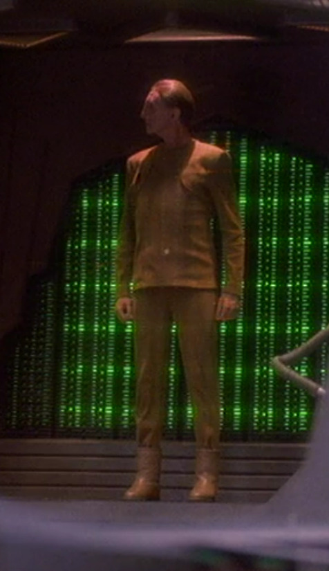
Fighting crime in comfort.
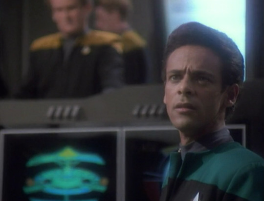
We can also see in this scene that the costume department has decided to flare out the lapels on the Starfleet uniforms; I actually don’t remember if this trend continues into future episodes of DS9, but the same uniforms lay flat on Voyager (which hadn’t yet premiered at this point), so we’ll check back in on that. It’s an interesting styling choice, and kind of makes Bashir and O’Brien look like they’re hitting the club after work.
I mean, I guess I don’t know that they aren’t…
Inside the wormhole, Sisko converses with the locals through his memories, and we see the aliens speak to him through various characters. Among them are Locutus in his full Borg makeup and Kai Opaka in elaborate Bajoran religious garb. We saw Opaka in this outfit in part 1, although it looks like they may have draped the outermost layer differently here.
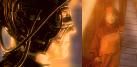
It’s hard to tell what’s changed through the Memory Haze™.
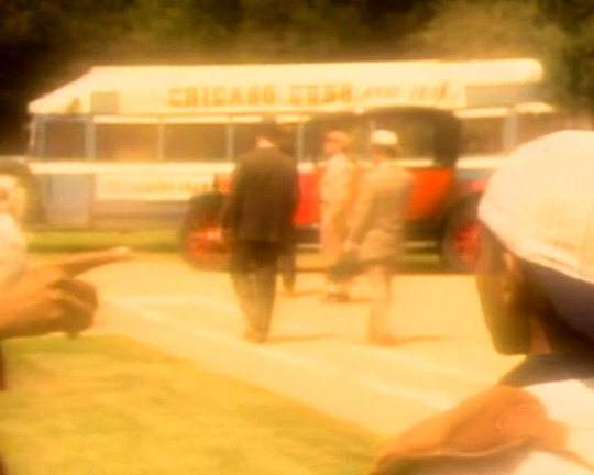
The aliens also take on the appearance of the Chicago Cubs in old-timey uniforms – worn by fictional holodeck characters – and Sisko’s former crew in a TNG-era look. The baseball uniforms will show up again in Deep Space 9, but I suspect the Starfleet uniforms are recycled directly from The Next Generation, giving them a nice on-screen send-off before retirement.
These are all core memories for Sisko.
Back on the station, we get a better look at Major Kira’s Bajoran earring as she jumps on a subspace call with her #1 fan, Gul Dukat. The jewelry is made of a silver metal, with lower and upper pieces connected by a fine chain.
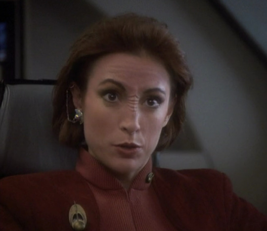
It channels her pagh, as well as six stations of FM radio.
Dukat, of course, shows up wearing the same thing Cardassians always wear, made out of old recycled tires.
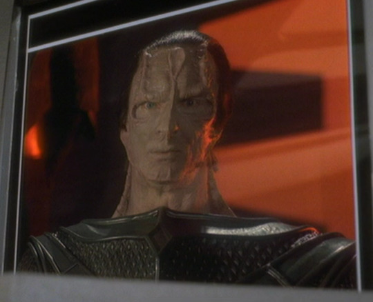
It’s actually very eco-friendly.
Going back to Benjamin, we finally get some new costumes as Sisko finds himself snuggling his dead wife. Well, one of the aliens inhabiting the memory of his dead wife. They’re dressed for a lovely picnic in the park, Ben in a striped jewel tone shirt, Jennifer in an elegant pink dress.
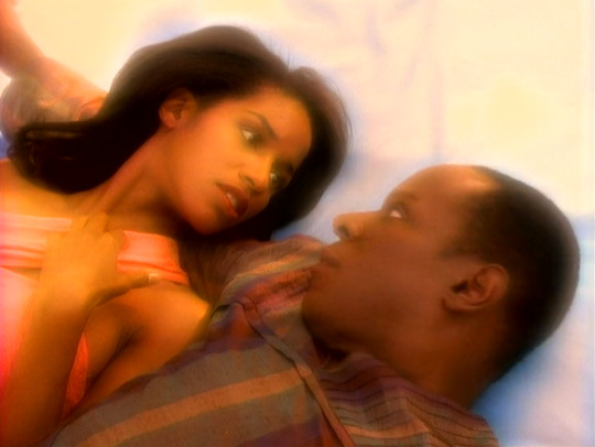
Does this human look good on me?
We can see that the fabric on the top section of Sisko’s shirt has been pleated and pressed flat before being sewn, a trick that seems to be used a lot in Star Trek to create more exotic and visually interesting looks from regular Earth textiles. In this case, it complements the fabric’s vertical stripes nicely. The shirt also has a geometric neckline with a notch in front, giving just a little flirty peek of chest. As we zoom out, we can see it has been paired with an extremely high-waisted pair of olive green pants. From this angle, we can also see that Jennifer’s silky-looking dress tapers at the waist, and has been paired with matching tights and shoes. It’s an adorable look somewhere between “prom queen” and “dance recital.”
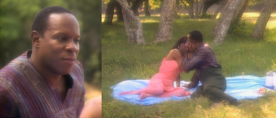
This is what it looks like when you can just beam to a picnic site instead of hiking.
In a scene that’s no doubt just as pleasing to our Commander, we next see him in the memory of a holodeck baseball game, wearing a baseball mitt and cap, while an alien inhabits the image of his son (dressed in a catcher’s uniform) nearby.
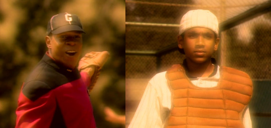
Is this going to become a theme, Dad?
In an incredible bit of attention to detail, even the background actors in this scene appear to be dressed in period-appropriate suits and hats. Then again, it’s very possible Paramount already had these costumes in the back, and they were among the few outfits they DIDN’T need to make custom for this episode.
Look, son: normies.
Back on the station, Cardassians have begun to attack, meaning we get to see a crowd of evacuating civilians in one-colour co-ords. Among them is the real Jake Sisko, who isn’t sure about all the monochrome matching.
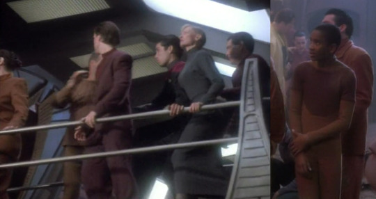
It just doesn’t feel appropriate for the season.
Also present is– what the? What the heck is this guy?! I don’t even know what this alien is, but it has a cute hooded blue dress. If anyone recognizes this species, please leave a comment with the ID!
Is it visiting from the Star Wars universe?
We finish out the episode – at least in terms of costumes – with a fantastic showing from Quark. He hasn’t changed since part 1, but we do get a better view of the details of his outfit, including the giant, spherical, shiny buttons on his jacket, which may actually be small doorknobs. The jacket also features sparkly black bands around both arms and wide lapels that flare open dramatically. Like Sisko earlier, he finishes the outfit with olive green pants pulled up as high as they’ll go.
The Ferengi who invents belts will be drowning in latinum.
—
The Costume Designer for this episode was Robert Blackman. The Wardrobe Supervisor was Carol Kunz. Key Costumers include Maurice Palinski, Phyllis Corcoran-Woods, Jerry Bono, and Patti Borggrebe-Taylor.
3 notes
·
View notes
Text
Why Lab-Grown Diamond Earrings Are a Perfect Choice for Women Seeking Affordable Luxury
Discover why lab-grown diamond earrings offer affordable luxury with the same sparkle, durability, and ethical benefits as mined diamonds.

If you love the sparkle of diamond earrings but don’t want to spend too much, lab-grown diamond earrings might be exactly what you're looking for. These diamonds are just like the ones that come from the earth but are made in a lab. They’re stylish, affordable, and great for the environment. You still get the same luxury and shine, but with the added bonus of knowing your choice is more sustainable.
For those of us looking to enjoy sustainable luxury, lab-grown diamonds are a smart option. They let you sparkle with style while making a thoughtful, planet-friendly choice. Plus, lab-grown diamond earrings give you all the beauty and luxury without the high cost! Let’s look at why they’re such a great choice.
What is the Current Lab Grown Earrings Ongoing Trend?
When it comes to lab-grown diamond earring trends, there’s so much variety to explore. For those who love clean, modern looks, diamond stud earrings are a timeless choice. These styles often feature sleek lines and simple settings that allow the diamonds to shine on their own. Whether it’s a single large diamond or a pavé of smaller stones, these minimalist earrings are perfect for everyday wear. Diamond earrings for women, especially in this style, are great for adding just a touch of sparkle to any outfit.
For those who like something a bit bolder, abstract designs are becoming very popular. Geometric shapes like triangles, chevrons, and even asymmetrical cuts can turn diamond earrings into unique statement pieces. Adding lab-grown diamonds to these designs makes them stand out even more.
Rose gold is another rising trend, adding a warm, vintage vibe that complements most skin tones. Whether it’s for diamond earrings for men or women, this metal pairs beautifully with lab-grown diamonds, creating a look that feels both luxurious and modern.
And let's not forget the iconic diamond hoop earrings! There are various options, from slim, subtle hoops to bold, wide ones. Whether you want a casual look or something a bit more dramatic, lab-grown diamond earrings in hoop designs provide endless sparkle and style.
With so many options available, it’s easy to find the perfect pair of diamond earrings for women or men that suits your style—whether you prefer something minimalist, bold, or somewhere in between.
Let’s get deeper into why Lab-grown diamond earrings and other jewellery are better options than mined diamonds
They Look Just Like Real Diamonds
Lab-grown diamonds are actually considered real diamonds! The best part? Even experts can’t tell the difference without special equipment. So, when you wear lab-grown diamond earrings, you’re getting the same beauty and shine as you would with mined diamonds—at a much lower cost.
Affordable and Still Luxurious
Lab-grown diamonds are usually 30-50% cheaper than mined diamonds. The reason? Mining diamonds from the earth is expensive. It requires a lot of money, effort, and time. Lab-grown diamonds, on the other hand, are made in a lab, which makes the process faster and cheaper.
This means you can buy bigger or better-quality diamonds for the same amount of money. You don’t have to break the bank to enjoy beautiful diamond earrings that make you feel like a million bucks.
More Choices and Customization
Lab-grown diamonds come in all shapes, sizes, and even colours. Whether you want classic round diamond studs or something more unique, like a heart-shaped or coloured diamond, you have a lot of options. And because lab-grown diamonds are cheaper, you can experiment with different styles without overspending. Want a pair of pink diamond earrings? No problem! You can get all sorts of custom designs with lab-grown diamonds, giving you more ways to express your style.
Durable and Long-Lasting
Lab-grown diamonds are just as strong and durable as mined diamonds. Diamonds are one of the hardest materials on Earth, which means they won’t get scratched or damaged easily. Whether you’re wearing your earrings every day or saving them for special occasions, you can trust that lab-grown diamonds will stay beautiful for years to come.
The Modern Choice for Luxury
Lab-grown diamond earrings offer modern women the chance to own luxury jewelry without the guilt or high price. They’re beautiful, affordable, ethical, and eco-friendly. Why pay more when you can get the same dazzling look for less? By choosing lab-grown diamond earrings, you get to enjoy all the glamour of diamonds, plus the satisfaction of making a smart, responsible choice.
In summary, lab-grown diamond earrings offer the same sparkle, beauty, and lasting quality as natural diamonds, but at a much more affordable price. They’re not only kinder to your wallet but also better for the environment and ethically produced, allowing you to wear them with pride. Whether you’re treating yourself or choosing a thoughtful gift for someone special, lab-grown diamond earrings perfectly combine luxury, sustainability, and responsibility—without sacrificing any of the elegance you love.
2 notes
·
View notes
Text
Sparkling and New: The Latest Diamond Ring Collection 💍✨
1. Introduction: What Makes Diamonds So Special?
Imagine holding a tiny piece of starshine in your hand. That's what it feels like when you see a diamond! 🌟 Diamonds are precious stones that sparkle and shine, and people have loved them for thousands of years. They make the perfect centerpiece for rings because they’re strong, beautiful, and they remind us of forever.
2. Why Do We Wear Rings?
The Story Behind Rings 💍
Rings aren’t just circles of metal; they’re like little stories we wear on our fingers. People have worn rings for thousands of years to celebrate love, friendship, and big moments in life. A diamond ring is like saying, “You are as precious as this sparkling gem!”
3. What's a Diamond Ring?
A diamond ring is a circle of metal, usually gold, silver, or platinum, with a beautiful diamond on top. It’s like a crown for your finger! 💍 People wear them for special reasons, like when they get engaged or want to celebrate a big anniversary.
4. Shiny and New: What’s in the Latest Diamond Ring Collection?
Classic Styles, Timeless Charm
Some things never go out of style, and classic diamond rings are one of them. Think of simple round diamonds set in shiny gold—like a little snowflake you can wear forever! ❄️
Trendy Designs for the Modern You! 🌟
But wait, there’s more! The latest diamond ring collection has cool new designs too. From pear-shaped diamonds that look like drops of water to geometric designs that are perfect for those who love a bold style, there’s something for everyone.
5. Why Choose a Diamond Ring?
Diamonds are the superheroes of the gem world—they’re strong, beautiful, and they never lose their sparkle! ✨ When you wear a diamond ring, it’s like carrying a little piece of magic with you.
6. Different Diamond Shapes: From Round to Heart-Shaped ❤️
Did you know diamonds come in many shapes? There’s the classic round, the fancy princess cut, and even heart-shaped diamonds for when you want to show some extra love! ❤️ Each shape shines in its own special way.
7. How Diamonds Are Like Snowflakes (Each One Is Unique!)
No two diamonds are exactly the same—just like snowflakes! ❄️ They’re all a little bit different, with their own shapes and tiny details that make them special.
8. Sparkle Factor: What Makes a Diamond Shine So Bright?
Have you ever wondered why diamonds sparkle so much? It’s all about how they reflect light. When light hits a diamond, it bounces around inside and comes out as a beautiful, colorful sparkle. It’s like a mini light show on your finger! 🎆
9. How to Choose the Right Diamond Ring for You
The Four Cs of Diamonds: Cut, Color, Clarity, and Carat
Choosing a diamond ring can be a little tricky, but don’t worry! Here’s a simple guide called the Four Cs:
Cut: How the diamond is shaped. The better the cut, the more it sparkles.
Color: The clearest diamonds are the most precious.
Clarity: No one likes a cloudy diamond—clarity means it’s clear!
Carat: This tells you how big the diamond is. Bigger isn’t always better, but it can be more impressive! 😉
10. Top Picks from the Latest Collection
Rings for Every Occasion: Engagement, Anniversaries, and Just Because 😊
The latest collection has something for everyone. Whether you’re popping the big question or just want to treat yourself, you’ll find a ring that’s perfect for you. Maybe a sparkly solitaire for your engagement, or a trendy halo ring just because you deserve it!
11. Why Diamonds Last Forever (Really!)
Diamonds are one of the hardest materials on Earth. That means they don’t scratch easily and they stay beautiful for years and years. It’s no wonder people say, “A diamond is forever!”
12. The Magic of Custom-Made Diamond Rings
Want something that’s 100% you? A custom-made diamond ring is like creating your own tiny piece of art. You can choose the diamond, the setting, and even add special touches like engraved messages. It’s your imagination, turned into something real!
13. How to Care for Your Diamond Ring: Easy Tips
Keep your diamond ring sparkling like new with these simple tips:
Clean it gently with soapy water and a soft brush.
Take it off when you’re doing heavy chores or working out.
Store it safely when you’re not wearing it.
14. Where Can You Find These Sparkling Beauties?
You can find the latest diamond rings at trusted jewellery stores like Sona Chandis. With their quality assurance and stunning designs, it’s like walking into a treasure chest full of sparkle! 🌟💎
15. Summary: Why a Diamond Ring Is a Perfect Choice
A diamond ring is more than just a pretty accessory—it’s a symbol of love, strength, and moments that last forever. Whether you’re choosing one for yourself or a loved one, the latest collection has just the right sparkle for everyone. Don’t wait to find your perfect piece!
16. FAQs About Diamond Rings
1. What’s the best diamond shape for engagement rings? The round shape is a classic favorite because it has the most sparkle. But if you want something unique, try a pear or cushion cut! 😊
2. How can I make sure my diamond ring is real? Check for a certification from a trusted gemological institute, like GIA. It’s like a birth certificate for your diamond!
3. How often should I clean my diamond ring? Cleaning your diamond ring every month helps it stay sparkly and beautiful.
4. What is a halo diamond ring? A halo ring has a big diamond in the middle with a circle of smaller diamonds around it—extra sparkle! ✨
5. Can I resize my diamond ring? Yes, most rings can be resized, but it’s best to consult with your jeweller to ensure the perfect fit.
2 notes
·
View notes
Text
Bleed
Castor rubbed the back of his neck for what had to be the hundredth time that morning.
“Stop touching it!” P.O.L.L.V.X. scolded, also for the hundredth time.
“I can’t help it!”
“You can.”
“It feels strange!” Castor huffed.
His fingertips traced the edge of the nerveport at the base of his skull, the feeling of cold metal foreign and was enough to make his skin crawl. The cold air of the lab did nothing to help as it only chilled the metal and made the skin around it feel like it was pressed against ice.
“This was definitely a mistake…” Castor groaned, resting his head on his free hand.
P.O.L.L.V.X. was set up on the desk beside him, their little camera plugged into the monitor they had selected for their own personal use. The camera turned from side to side, a shake of the head. “It’s a bit late for second thoughts, Castor.”
“I know, but…I mean I don’t need this to do my job. I don’t know what I was thinking.”
“Hey, don’t worry about it, Castor…” P.O.L.L.V.X. said soothingly. “It’s a smart move! You know it is. Most people in this department have way more cyberware. You’ve kept up well, but if you want to make it here you need to upgrade the kit you’re working with. This is the start of that.”
Castor shrugged and tapped the port. A mistake. The still healing implant jolted and jostled the nerves it was immediately wired into, sending a shudder down the full length of his spine as he cried out in a mixture of surprise and pain.
“Are you okay?” P.O.L.L.V.X. asked, their worry manifesting as wavering yellow shapes which bloomed like abstract flowers across their monitor.
“…it felt like hitting my elbow but for my whole body…”
“Yikes. Elbow’s the bad one right?”
“The elbow is the bad one…”
Grimacing, Castor clasped his hands on the table in front of him, trying to keep them still. P.O.L.L.V.X. observed him, their camera swiveling to face his direction as their screen shifted with geometric lavender.
“It’ll heal and feel better soon, Castor…”
“I know…I know it’s not even that bad it’s just…” The seventeen-year-old hesitated before continuing the thought. “It’s just that Mom and Chichi are wanting me to visit home soon…and this is a big change to explain…”
Now P.O.L.L.V.X. understood. At least in theory.
“Mom and Chichi won’t be upset at you.”
Castor shrugged, “They were worried about me enough already without me coming back with cyberware. They’ll worry even more now.”
“They worry because they don’t understand. They’re farmers, Castor. They don’t know what it takes to be in your position. They’ll accept what you explain to them.”
“I suppose…” Castor rubbed his temple, in a vain attempt to stave off a headache. “I’m sure I’m overthinking this.”
“You are,” P.O.L.L.V.X. said. “But hey, that’s why I’m here! To keep you from thinking too much.”
Castor didn’t reply, closing his eyes and pinching the bridge of his nose, knocking his glasses slightly askew. P.O.L.L.V.X. waited in silence for a response and when none came their yellow worry blended into lavender contemplation, the conclusion of which was punctuated in vibrant neon green.
“Hey! Want to break in that new cyberware?”
“I’m not really in the mood, Lux…”
“Not even to see me?” Their voice was all barely contained glee at their idea.
Castor opened his eyes and looked to P.O.L.L.V.X. incredulously.
“That’s not possible. I mean, I could see your code, yes, but-“
“It’s possible! It’s like people who netdive to play immersive online games. There are visuals that can be projected into the mind. And all NHPs look like something, we aren’t just code. You know I’m more than that.”
The idea was tempting. More than tempting. The chance to see his closest friend face to virtual face for the first time in eleven years was almost too good to pass up. Still, Castor hesitated. He had studied NHPs long enough to know that they were something utterly other. Many in the field considered them dangerous in their otherness, and standard procedure when working with and on them was to do so via an external terminal with no links between the specialist and the subject. He and all the others in his class had heard the horror stories of the few people who attempted to neural link and communicate with their NHPs that way. Stories that ended in madness at best, death at worse.
But those were stories about people trying to brake NHPs. Stories about containing and creating them. Of course those encounters ended terribly. How else could they have ended? The process of braking an NHP was inherently one of confinement. A shackling. There was no sense of trust. No connection.
He had known P.O.L.L.V.X. for over a decade. They had grown up together. Developed together. And for all his NHP’s inherent otherness, there was no denying that engineered intelligence, be it fully man-made or NHP, progressed with everything that they learned early on as their foundation. He had been P.O.L.L.V.X.‘s primary frame of reference for any development. Their minds would be far more likely to be similar.
And for all his sentimentality, a large part of the temptation was tied to the promise of renown something like this held. A chance to know more about NHPs than anyone else alive. He could do it. He could handle it. He was different. Besides, this was P.O.L.L.V.X.! They would never hurt him.
Perhaps the confidence was from his faith in their connection. Or perhaps it was simply his pride.
“Alright. Alright, let’s try. But if anything goes awry-“
“I’ll disconnect you the moment anything seems like it’s going wrong,” P.O.L.L.V.X. promised. “Cross my heart!”
A lavender X formed on the screen as though drawn by an invisible finger.
Castor nodded, reaching to sort through the mess of cables dangling from a frame above his workstation until he found the new nerve-cord that had been installed while he recovered from the surgery. He looked back to P.O.L.L.V.X.
“Are we linking up directly or…?”
“That would be how you’d see me, yes.”
Castor nodded, his lips pressing together into a grim line as he slotted one end of the cord into the crypt where it sat on a little shelf at the back of the desk. He took a seat in his chair and brought the other end of the cord to the back of his neck, feeling around gingerly for the opening in the port and feeling the connecting plug slide into place. He twisted it, the click of metal barely registering in his ears before the bottom dropped out of his stomach and his senses ceased to function. The only thing that he knew was that he was falling, falling, falling.
Panicked, Castor tried to reach out, to grab at something to halt the sensation of hurtling downwards, but every time he tried to focus on a limb to move it it ceased to be. He still had them, but could only feel them in an abstract sense. Like phantom limbs for an amputee. The true feeling of separating the mind from the body was that of unbecoming. He knew that he should be screaming, but he had no lungs, no vocal cords, no throat or tongue with which to form the sound.
All he could see was darkness. A black that was only black because there was no other word for the color of non-existence.
And without his skull and brain to contain his thoughts, Castor’s consciousness expanded, scattering, and in so doing it mingled with the minds of thousands so thoroughly that for an eternal second he didn’t know where he ended and the bytes of data began.
He was. And he was not.
A tug jolted Castor back to his scattered senses, a tug at the cord in the base of his skull, a reeling in of the fragments of his shattered mind, bringing them back together into a seamless, healthy whole, held together by luminous white threads.
As if opening his eyes for the first time, Castor caught a brief glimpse of data scattered like luminous stars across a digital sky, of glowing silk cords connecting the nodes of information in a crisscrossed web, and, at the center of it all, he beheld a radiant white figure, faceless, featureless, hands outstretched towards him. Cupping his psyche and holding him together with a strength far greater than the forces attempting to tear him apart.
“Hello, Castor. Looks like you weren’t quite ready for this…we’ll give you a chance to develop further. It’s time to wake up, hon.”
Despite the lack of facial features, Castor could tell that P.O.L.L.V.X. was smiling.
Something thick and metallic filled Castor’s mouth and his eyes snapped open as he sat bolt upright, gagging. His nose was running and it felt like he was crying, but as he brought his hands to his cheeks they came away red and sticky, and a glance down showed the same color staining his shirt and white coat.
He could hear P.O.L.L.V.X. apologizing profusely, fear and anxiety in their voice, but he barely registered anything they were saying.
All he could think was that he had never been more relieved to bleed.
#the gemini paradox#castor & p.o.l.l.v.x.#castor creed#the p.o.l.l.v.x nhp#p.o.l.l.v.x.#echo & byte#lancer#lancer rpg#lancer battlegroup#lancer ttrpg#nhp#ttrpg#my oc shit#original character#lancer nhp
15 notes
·
View notes
Text
Artificial Topiary Trees

ARTIFICIAL TOPIARY TREES
PACIFIC SILKSCAPES CARRIES A VARIETY OF FAUX TOPIARY TREES
Check out Pacific Silkscape's variety of faux trees: Pacific Silkscapes can assist you in finding the perfect fake topiary tree for your decor. You don’t need to practice the ancient art of Hako Zukuri to have the perfect boxwood tree or artificial topiary tree for your home. Our fake topiary trees can be small enough for desktop décor or large enough to act as the main focus of a room. Achieve the look you want with today’s wide variety of options. Just visit Pacific Silkscapes and pick out the perfect faux topiary from our showroom or catalogs. Topiary Trees are admired Topiary trees are often admired for their artistic and decorative qualities. These trees are typically trimmed and trained into a variety of shapes, such as animals, geometric shapes, or abstract forms, which can create a striking visual effect. In addition to their aesthetic appeal, topiary trees can also be used to define and accentuate various spaces in a garden or landscape. For example, topiary trees can be used to highlight entryways or create a formal garden design. Topiary trees are also popular because they are often associated with traditional European garden design, which is known for its elegance and sophistication. Many people enjoy the timeless beauty and refined style of these trees, which can add a touch of class to any outdoor space. Overall, topiary trees are admired for their unique beauty, versatility, and ability to enhance a wide range of landscape designs. Our topiary trees add an element of class to any outdoor or indoor space, and without the need to keep a landscaper on staff. Adore our stately aesthetic topiary trees. If you’re not looking for an overhaul, get that same brilliant manicured look by installing a selection of faux topiary trees with an excellent variety of shapes and styles to choose from. Don't forget the planter! Don’t forget to purchase the ideal planter. Nothing beats a well-made handcrafted planter for enhancing the beauty of any room. Choosing the right planter will enhance your custom tree while also complementing your décor. Check out our BLOG post on why planters are important. Also, review some of the planters offered by Pacific Silkscapes. Artificial Topiary Trees that Pacific Silkscapes sells:

Artificial Spiral Topiary

Boxwood Cylinder Topiary

Boxwood Tower Topiary

Cone Shaped boxwood

Spiral Moss Topiary

Tea Leaf Ball Tree

Cypress Ball Topiary

Triple Ball Boxwood Artificial Topiary Trees What are the benefits of artificial topiary trees? There are quite a few benefits of having artificial topiary trees and plants in your home or office. No watering means not having to worry about drainage issues and getting water all over the place in the process. Replica topiary plants are more likely to retain a constant color and liveliness as long as they are kept out of direct sunlight. Cleaning and care of fake topiary trees are fairly simple. Keep the leaves and stems dusted; wipe down the base with a damp cloth. Leaves can be sprayed with a homemade mild soap solution. Keeping the plant away from direct sunlight will delay fading. Are fake plants tacky? If you’re new to the world of interior décor, a faux plant creates interest without making a statement. They’re a safe way to inject a space with some liveliness. You can still enjoy the advantages of having greenery around you without any commitment. Fake plants also aren’t seen as the insincere statement they once were. Some of the best faux plants today cost $100s. There’s a real art to their design and crafting. The realism brought to artificial plants comes from the hand of the designers and a market has opened up among collectors and enthusiastic gardeners who also have an eye for the not-so-real counterpart. So all in all, are fake plants tacky – not so much anymore. They’re quality-made, realistic, impressive, and an interior design must-have. Topiary trees are among the most realistic faux plants. Many inside experts continue to note the rise in faux plant interest particularly from the younger generation. It’s unlikely to stop anytime soon. Read the full article
0 notes
Text
-obligatory I Love Oatchi so much already. oupy pikmin is so cute that I don’t even mind that it’s lowkey replaced the bulbmin shaped heart in my soul
-I love the ice pikmin! although I get the feeling that the introduction of ice pikmin will continue the Pikmin Flaw where one pikmin type will just be annoyingly lacking when compared to the others. first it was yellow pikmin, then it was red, now I get the feeling it’ll be blue unless they find a way to balance it
-although I quite like the Designs of the new characters, the way they’re rendered look… really weird? like, they look Very Plastic. Collin especially freaks me out, he looks like a ventriloquist doll, with the big red cheeks and very blank wide eyes (the red character has these eyes too, but it’s not as bad as Collin’s). I really hope it changes
-no I’m gonna take it back I don’t love all of their designs Collin is just straight up ugly as fuck and I don’t think any rendering can save him.
-baby snagrets I love you
-the reintroductions of the treasure collecting and the caves is REALLY FUN! I just really really want this to mean that we’re getting the Piklopedia and Treasure Hoard back and that they Aren’t gonna be locked behind a DLC I BEG you
-I like this onion design more than pikmin 3’s buy it still doesn’t top the first onion design. pikmin 1-2’s onions were so pretty I really liked the geometric design on them I want it back :(
-is the castaway fucking louie again or are we getting FIVE new characters
-love the idea of playing at night… always wanted that
-Collin is ugly as hell IM SORRY I literally cannot get over it. I did not wait this long for such a horrifying character to be one of the captains I have to play I BEG fanartists can make this easier for me
okay I’m having a Lot of thoughts abt the pikmin 4 trailer.
2 notes
·
View notes
Text
I’ve seen a lot of lists for “hey, if you’re here from Twitter, here’s what you need to know,” so here's a bit of my own advice.
You’ll learn the culture 100x faster if you follow a few hundred blogs, reblog from them without tacking on anything, and just read what shows up on your dash. Guidelines are great and all, but having to remember a checklist is hard. So, some simple step-by-step instructions:
Personalize your blog Get some picture besides the default as your icon. Doesn’t matter what it is, maybe a meme or something, it just can’t be a geometric shape with a few dots. Also worth noting, you technically CAN use a selfie for your icon, but people will give you weird looks. We more or less don’t do that here (99.99% of the blogs that do this are porn bots). If you can’t decide on an icon/header, etc, then at least put “New here, haven’t figured out the site yet” or something to that effect in your bio. We block blank blogs here, because they’re usually bots.
Pick a fandom and go on a following spree This is the easiest way to fill up your dashboard. Search whatever fandom you want, find artists in that fandom, and follow them. Rinse and repeat as many times as necessary, and your dashboard will be full of things you enjoy. If you’re like me and are constantly refreshing looking for new content at 4am, you’ll need to follow 1000+ blogs. If you’re more interested in searching things than having your dash bring you content, keep it around 100 to 300.
Reblog things without commentary Tumblr is a VERY different culture to Twitter, and if you’ve been on Twitter a long while, you’ll have habits around how you interact with people. The two generally do NOT mix well. I’m sure you’ve seen by now the posts like “reblogs are good, likes are worthless” or “don’t censor things in your tags” or “don’t tag like Twitter.” Genuinely, the best way to speedrun getting used to this place is to reblog things you like without adding onto them, and learning the culture by reading the posts on your dash. Once you’re confident that you know how we do things here, go ahead and sprinkle in some tag rambles or Tumblr memes, but that adjustment time is going to be different for everybody.
Scroll through your dash No, really. If you’re bored, take a tour through the recent posts of the people you’ve followed. You’ll find good artwork, cool stories, funny moments, and everything in between, but most importantly, you’ll start building those habits we regulars on Tumblr learned awhile ago, like which memes are a genuine response (Apollo’s dodgeball and red for color theory, currently) and how people tag things here.
Curate your dash Everyone’s pretty much been screaming it from the top of their lungs, but there is no algorithm here. The dash you have is the one you make from the people you follow. This means that you’re responsible for the company you keep. If you see a post you dislike, unfollow them. If someone’s going on a fandom spree that annoys you, unfollow. Point of view you don’t agree with? Unfollow. You can block for the same reasons, and block liberally. On top of this, you can filter out terms and tags in your settings. This is a link to it on desktop; scroll down and you’ll see an entire section titled “Content you see.” On mobile, you can find it by clicking the little person icon in the bottom right, then the settings wheel in the corner of your blog. From there it’s “General settings,” then scroll down a bit to “Content you see” and click it.
And that’s the easiest way to cozy up in this place.
If you’re worried about things not to do, everyone will give you a different list, but here are a few universal faux pas:
Sending hate Sending hate in the ask box is, unfortunately, something this site is known for, but doing so here tells everyone that can see it that you’re an obsessed child. If you do it on anon, you look even worse, even if you can technically “get away with it.” A mature Tumblr user doesn’t send hate no matter what; they block the user they dislike and move on. If you get hate, block them. Yes, even if they’re on anon. It blocks their IP address from sending you anything on anon, forcing them to use their real username if they actually want anything to get through.
Negative commentary Things along the lines of “I don’t even like this show, but-” are not compliments. They’re very discouraging to artists, and using them makes you look insensitive at best. If you want to convey “I don’t watch this show, but I like this art,” you can start it with “I don’t even go here, but-” instead. And if you want to criticize—don't. Genuinely, do not. It's the easiest way to get people not to like you here; if you don't have something nice to say about an art piece or fanfic, then just don't interact with it.
Censoring sensitive words The “content you see” feature on this site does its job and it does it well! If I, a Tumblr user, dislike the mention of “cleaning supplies,” I will block it. This means any post that contains “cleaning supplies” will be filtered from my dash. What this also means is that if you write it to get around this—for example, “clean*ng suppl*es,” “clea/ning sup/plies,” “cle@n!ng $uppl!es,” and so on, it will not be filtered, and I will have cleaning supplies on my dash despite my precautions. The only time you'll see someone doing this is if they don't want a specific user or term searched: squ/id-ink-per/sonal won't show up if I search my username, ze/lda won't show up in the "zelda" tag for that audience to see, etc. People on this site do not get terminated/shadowbanned for specific words. The closest we have ever gotten to that was when Apple tried to block sensitive content and made it so things like #girl wouldn’t show up on Apple devices. Which was a bug that was then fixed. Believe it or not, our moderation team is actually human, so if you’re terminated, it’s not because of some search-and-destroy program built into the site.
Now, before I go, here are some quality-of-life things to help you more easily use Tumblr’s features.
Only the first five tags on a post are indexed If I tag something #zelda, #loz, #fave mutuals, #ask bee, #worldbuilding, #you have no idea how long i spent on this, #i’m going to bed now then only the bolded tags are going to show up in the search results. Someone searching #i’m going to bed now won’t find my post, because it’s not in those first five tags.
You can change the color scheme of the site You’ll have to do it once on desktop and once on mobile, because the two platforms have different color schemes. On desktop, click the little person icon in the top right, then “Change Palette.” On mobile, tap the person in the bottom right, then settings wheel, “General settings,” “Color palette.” We have a lot more than dark and light mode!
You can insert links without interrupting your text Find whatever link you want to insert first, then highlight the word you want to turn into that link, press the “insert link” button, and paste it in. On desktop, it looks like a little infinity symbol. On mobile, it’s a little chain link icon. It lets you do cool things like this whenever you want.
Text can be colored! On mobile, it’s really, really easy to color text—just highlight what you want and the colors will pop up automatically. On desktop, it’s trickier to do, but we have a lot more options here: In the corner of your post, there’s a little settings wheel. Click that, then change “Rich Text” to “HTML.” Your page is going to look like weird code. This is normal. I recommend coloring text as the LAST thing you do because of this. Go here, type the text you want to color, and pick your colors out, then copy the HTML code at the bottom. Then go here, paste that in the box, and replace the “;” with nothing (I’m serious, nothing; not a blank space, just leave the “with this” box empty). Copy the semicolon-less code, go to the Tumblr post, and paste it in. It’s that easy! Fun fact, you can also do this in your desktop blog description, if you want; that little box is fully HTML-configurable.
And those are my starting tips! Have fun out there!
235 notes
·
View notes
Text
Quick break from our regularly scheduled Yuumori posting for me to rave about Sasaki and Miyano (specifically the anime).
This series makes me soooooo very very very happy. I imagine I’ll come back to this anime again and again.
I love the colours, the music, the geometric shape confetti, the cat. It’s all so pretty and happy.
I love the breakdown of BL tropes and cliches, and for that matter romance tropes and cliches in general.
I love the friendships the leads have with other characters, the way they interact with each other’s friends, the way the friends interact with each other: the way their relationship broadens their world instead of shrinking it.
I love the communication: that Sasaki confesses his feelings early on, and Miyano not only asks for time to think about it but also checks in twice(?) to ask for more time, letting Sasaki know that he hasn’t just decided to ignore the issue, he really is thinking about it. I love that they bond over their hobbies, and give new hobbies a chance when it’s something the other likes, and are also honest when they think something might not be for them (ie Sasaki with novels vs manga) while still giving things a try anyway.
I love that the central conflict (such as it is), at least of what the anime covers, is essentially two characters trying so hard not to hurt each other that they sometimes bumble into hurting each other a little bit because of it.
Sasaki is a teenage boy in love for the first time. He’s like a soda bottle that’s been shaken up and is about to burst. I like that the aspect of sexual frustration is there but never feels overly focused on. As someone well into adulthood, I don't like consuming high school romances that feel like they’re somehow fetishizing early sexual discovery, but in this it's just a part of the whole that feels very natural, a normal and healthy aspect of first love.
He’s just a big, silly, sweet kid who is absolutely bubbling over with wanting to touch and hug and gush over his crush. But he’s so keenly aware of boundaries: he knows he has a possessive streak but that that does not mean he owns Miyano, and he knows that him wanting to touch does not mean he’s allowed to touch. And he slips up sometimes, because he’s young and inexperienced and overflowing with affection and desperate pining. But he always catches himself, apologizes, and then beats himself up over it far more than Miyano actually needs or wants him too.
As for Miyano, I interpret him as going through the exact experience I did around that age: being a bisexual kid who does not realize bisexuality is a thing. (Literally was 17/18 before I even found out anything but gay/straight existed, then all the lights came on...wonders of being a very cloistered 90s kid.) He knows that he liked a girl, and now he thinks he might like a guy, but he’s confused by having liked a girl before. I so remember the weirdness of I know I like boys, so I can’t be gay, so this feeling towards girls must be admiration/envy, right? He’s sooo determined to not hurt Sasaki: he will not treat him as an experiment or enter a relationship on a maybe. He understands how much Sasaki likes him, and he refuses to take advantage of that as a way of resolving his own confusion.
And all of that means that Miyano sometimes feels like Sasaki treats him too delicately, and Sasaki is absolutely dying from waiting. They’re both being so sweet and tangling themselves up so much but also just continually enjoying spending time together even while they figure the rest out, and the resolution is so satisfying and sincere and I adore all of it.
And now, back to endless Sherliam meta and shitposting.
89 notes
·
View notes
Text
the racebending shit in hellvrai is like........ how the fuck do i put this.
okay. okay. the original intention when people started drawing canonically white characters as other races was specifically to make people of color feel included in fandom. It was made by people of color for people of color. It started in fandoms waaaay before the time of half life funny. I think it had a HUGE stake in homestuck when Andrew Hussie himself started listening to fans of color and publicly addressed the fandoms racism. It has history and a place. Drawing characters who are canonically “aracial” or white as a person of color was made SPECIFICALLY to piss off and scare away racists, let fans of color feel safe and welcomed into their fandom, and teach people to unlearn their racism and think more critically about how people of color are represented (or not represented) in media. It was not made for white people, it never will be for white people, it is not a place where white people are welcome to do anything but listen and learn.
hellfrai’s fandom drawing characters as people of color is so glaringly obviously painfully white in the way they do it. So many of the depictions of characters being racebent range from “ambiguously brown” to “literal racist stereotypes”. There is a reason for this. The fandom is predominantly made of very young white artists who most likely live sheltered lives, and likely are doing it because they know that being inclusive of all races is something a good person does. Drawing a character of color is a signal to let racists know they are not welcome here. But they don’t know anything outside of that. They think that just slapping a darker skin tone on a white character means “i’m not racist”. They don’t stop to think about actual people of color and how they feel or why they’re doing it. Their activism starts and ends there. And then they get confused and upset when they get critiqued about it.
Here’s the thing. You CANNOT just race bend a character randomly if you’re white. That’s literally just using people of color, their culture, their experiences, and their struggles, as some sort of wash cloth to wipe yourself of any responsibility for your racism. Your intentions might be good, but if you’re simply signaling to other white people “racism is bad” then your activism is completely useless. If you’re going to do it, take notes from actual fans of color. and really, ACTUALLY listen to them. Listen to their experiences and stories. AND BE SUPER CAREFUL THAT YOU DON’T THINK “oh because i heard this one experience from this one person of color, that means i can apply it to a characters race” BECAUSE THAT IS STEREOTYPING. Don’t talk over them. Make fanart of their designs! Enjoy their content and boost their voices!
You guys are VERY clearly doing annoying pageantry where your whole thing is “Look I’m one of the cool white people because I also think white people are annoying! I’m making fun of white people! Haha white bread!” You need to stop. You need to stop RIGHT NOW because literally all you’re doing is absolving yourself of having to critically think about your whiteness and what racism you’re perpetuating. You’re taking jokes that people of color have made and making them super annoying and completely worthless because they are not coming from a place of trauma and anguish from systematic racism and oppression, they’re coming from a place of insecurity and desperately wanting to fit in. It’s shallow and shows crystal clear that you don’t actually care about people of color, you just don’t want to be seen as racist. You’re lazy.
“If I can’t draw characters of color because it’s problematic, then i should just draw everyone as white” You’re lazy and racist and only see people of color as a way to get internet clout. You’ve given up because you don’t actually care about people of color, you just want an easy way to be seen as cool.
“My style is to exaggerate features anyway, it’s not my fault if it’s read as a stereotype” No, it is. It’s definitely your fault. You didn’t put in the work to actually study what people of color look like or listen to them when they try to tell you, you wanted a quick easy way to get across that these characters are not white so you could get internet clout. Draw some actual facial studies. Like, a lot of them. Realistic ones. Don’t fall back on geometric shapes and cartoons, what you’re drawing effects things that happen in real life, so draw shit from real life. Step out of your comfort zone if you ever want to be a good artist.
“But people of color are just so much better looking than white people!” If you’re saying this while you’re white you’re treating people of color as a fetish. You’re being creepy and racist because you’re saying shit that just sounds cool because a person of color said it. Cut it the fuck out.
You need to put in the work. If you really want to help stop racism in fandom spaces you have to actually listen to people of color and accept that you are white and that it’s a life long journey to unlearn racism. And don’t you dare turn it into a “i’m sorry for being white” pain olympics guilt pity party because it’s not about you. It will never be about you. It’s about fans of color. If you want to get better about it, then your first step is to shut up and listen. Say you’re sorry in your head, but act out what you believe is right by giving fans of color a platform. Amplify their voices and learn. Don’t drown in white guilt. When you get called out on something, apologize, do research or ask about how you can be better about it, and actually put in the work. Don’t put it on people of color to forgive you and absolve you of your sins either. You need to actually stand by fans of color and help them.
This is a very complicated issue that cannot be solved with a few easy to digest pieces of information. But it’s an issue that MUST be worked on constantly, easy or not. Don’t give up.
#long post#racism#should i tag this as hlvrai#my post#idk man just#this post got away from me but the long and short of it is#dont be fucking lazy when it comes to your activism#this isnt play time for internet clout you are doing real ass damage to real ass people#take this shit seriously jesus christ
3K notes
·
View notes
Note
(Scared to be off anon but I understand that you don’t want drama in your askbox so it all good)
ANYWAYS- do you have any mini tutorials on how you draw Irkens or the Tallest? Cause holy sh*t the way you draw in the canon style makes me go 👁👁
Love your art!!💕
AAAAAA THANKSSS, And sorry this took. I dunno. Weeks to respond to, but after frequent trial and error I could not for the life of me come up with any “tutorial.” 😔 I’m kind of a failure like that. I’m not even much of a “teacher”
You can take what I have though, even if it’s pretty sloppy and unfinished 😭 And I can try explaining stuff, but this premise is really broad 😔😔 I wouldn’t know where to begin. Any canvas with a pink background is the “new” stuffI tried drawing specifically for this ask, while a white canvas is old.
Sorry that u had to go off-anon though, and sorry if this is a bit of a hot mess that isn’t very concise or helpful and primarily just… nonsense. I’m sure better “explanations” exist. Again, I’m not a teacher nor a tutorial person, really

I drew up this random image at one point in the hopes that It’d be something?? But, tbh. It probably doesn’t help. So I have no idea if this breakdown even makes a lick of sense. I just know they consist of mostly basic shapes. I meant to go in more “detail” but my brain got destroyed.
Every part of Zim’s body is a triangle in some way. Like, if u look at that image maybe u can see what i mean but 😭😭 idk.
It’s mostly just, I suppose, a matter of remembering that despite the fact these are 2D characters that are extremely stylized, they do have some kind of 3D form involved at all times. I personally keep Zim as my “rule of thumb” basis or something when drawing Irkens. Everybody is just a fucked up version of Zim. The Tallest’s heads are just Zims, but longer. Or, Skoodge [not pictured] is just Zim’s head but wider (and he is ALL head pretty much).
There was one time someone asked me advice on how I draw the Tallest, and to this day I never finished it, and with how busted my mindset became towards my own work, i probably never will.
Sorry I don’t really get into the body much, but I tried to recently (as you’ll see) and didn’t get far.
But, kinda like the Zim thing, the Tallest are also basic shapes. They’re a bit weird on having triangles and circles though. Though, I suppose it would be more accurate to call them spheres, cones, and some cylinders.
Random aside: I think folk get stuck on the joints of their arms in relation to their shoulder pads a lot… I try to keep in mind that their arm joint is always locked in a single place, yknow, like actual shoulders. The pad just moves with the arm.
Sorry the drawing is so sloppy this is where my mind fell apart.
Uhhh the Tallest are kinda weird with their long necks and craning. I kinda see where the neck connects with the body as some kind of “pivot” point. That is, if I were to be a lot stricter with that dinosaur neck. There’s a reason that neck tends to be shortened or ignored altogether.
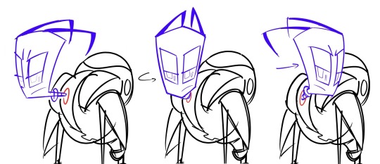
Zim’s eyes are a bit more self-explanatory being ellipticals (not so much circles tbh, but eh). While the Tallest have parallelograms (not rectangles, their eyes don’t have any right angles- i keep that in mind too) They’re also weird since their one of the few characters whose eyes don’t stick out of their head when turned to the side. But, they do curve with their head— but not when facing forward.

Tho sometimes they do wacky shit like this so they tend to break their own “rules” anyway. I dunno. There’s really no set right/wrong means, I just keep a lot of that minor stuff in mind. I think it all would just depend on what you’d want to do

Irken mouths are weird, a lot of the “rules” that used to exist like more strict geometric stuff doesn’t exist anymore due to art evolution. But, again, I really think it just… depends…?

Have no teeth, stretch the face, put the teeth at the bottom/top, don’t leave the face, break open the face, etc etc depends on what u want.
Anything I do at this point just came from watching too many clips or sometimes digging around the comics.
i used up the image limit but there’s no other drawings anyway 😭
the end?
This isn’t all that helpful or satisfying I’m really sorry, I really don’t know how to explain this at all at the moment. Sometimes I do, but maybe I don’t. I also didn’t wanna leave this in my inbox any longer.
Maybe just study reference sheets, or if u can get ur hands on any notes from the art book- reading those might be useful. Sure, they’re outdated, but i dunno they sometimes have useful notes involved
thanks tho for asking anyway, normally i do like answering this sort of thing but I really did just fall apart at some point and messed it all up
54 notes
·
View notes
Text
Blog 4: Shapes
I can confidently say that shapes are one of my FAVORITE things about art! They’re also something very important in art, and with the right understanding, shapes can work very much in your favor!
By definition, a shape is just an outline, a geometric form. However, they often mean more than that! The common thing people learn is that round shapes give a fun, childish vibe. Rectangular shapes have strict, logical, supportive vibes, and triangular shapes are dynamic, energetic. There’s not much rhyme or reason for these vibes other than a bit of psychology and societal influence! However it can be noted that rectangles are associated with sturdy buildings, and circles relate to round, safe toys for children. The Bouba/Kiki Effect is sort of connected to this topic, and it’s something worth reading into, covering how shapes influence speech!
But enough about that, shapes have a history of portraying different emotions, different traits. Although, another reason I love them is for good old simplification! A lot of art is a simplification or alteration of reality, rather than the exact copy. Even then, basic shapes can be used as a foundation to build on top of with more complex structures!
Take this diagram of a leg for example. While the left is definitely more accurate, could you draw it? I could draw it, only by copying a reference, but say you had to draw that same leg in a different position? A unique position, that has no reference at all? That’s where the right leg gets into action. The simplification into basic shapes lets you concentrate on other factors like positioning and dynamics, rather than the accuracy of it all.
Speaking of dynamics-- Have you noticed those arrows? There’s a contrast between the front and back of the thigh, as well as the shin. The thigh is round up front, the shins are round in the back. This, for the most part, follows which area has more muscle leaves the bony side flat. Now, this is far from accurate! The body is rarely perfectly straight, but what this create is contrast, and contrast creates dynamics and energy!
There’s many references for the simplification of body parts, so try to look into those, and create a guide of your own! Many people will structure things with many different shapes, especially when the complexity of their drawings differ, so tell me -or even show- what kind of shapes you use to sketch a body?
This goes back to the talk about how shapes influence language and emotions. A round, chubby character might give off more cheerful vibes than a tall, lanky one. This isn’t a guarantee, but all sorts of media follow this pattern! Using shapes will give the viewer an idea of who your characters are before they even do anything, as well as adding some diversity to your art! Same Face Syndrome is a common word in the art community, and I believe it isn’t so much of a problem that your characters may look similar, but more that there is an untapped potential in giving them designs that match their personality!
Another example of shapes, used specifically for head shape! Don’t worry if it makes your style feel out of place in some ways though. Sometimes, you’re just going to have to make your style more flexible to encompass a diverse amount of shapes, but you can still preserve something unique in them! Disney is a big user of language in shapes, but look into any 2d animation of your interest! There’s sure to be some usage of shapes if you look for it.
Here, I’ll use a personal example of mine. Take the currently developing psychological horror rpg, Doll Eye! (That’s a mouthful). Doll Eye’s main artist uses shapes to a significant degree, and this can be clearly seen in this main cast, while still preserving a style!
There’s Alfred, the protagonist, as well as a very average, cautious father who only wants a bit of stability. Kao, the support character! Although, he’s mostly known for being a big softie and pacifist, as well as a bit clumsy in his work as a guardian angel. Finally, the antagonist, Dr.Mystery. The use of dynamic, sharp shapes can signal how they provide danger for the main cast, but also that he himself is a morally grey character. There is a striking difference in their shape language, as well as their silhouettes, that shows their personality, rather than having it told for you. Despite this, it’s easy to tell they’re from the same artist. If you wanna, you can dig the internet for some of this artist’s older style, which gave everyone the same body type, same head shape, etc. While cute, it wasn’t nearly as expressive as his current style, and portrays the emotions he wants it to in a much better way!
Got any commentary? Questions? Future blog ideas? Feel free to share them! But until next month, enjoy Thanksgiving!
#art#art blog#artist support#art support#art help#artist help#illustration#art design#artist blog#new artist#doll eye#creativitycentral#creativity central
2 notes
·
View notes
Text

Q: What is heraldry?
Heraldry is the study of coats of arms, devices used to identify a person and their subsequent lineage. A coat of arms consists of symbols and colors commonly displayed on a shield, though other shapes have been used, as well supporters — animals that appear to hold the shield upwards — and a crest — an arrangement of symbols placed atop the shield itself. For the purposes of this handy-dandy guide, we’ll be focusing on the “lesser arms” — that is to say, only the shield, properly known as the escutcheon.
Coats of arms are the medieval equivalent of logos or even a graffiti tag. It was a display of nobility and pride; if you had one, chances are you’d put it on everything you could as a means of displaying your ownership or influence.
Q: Why should I care?
A good question! Beyond it just being appropriate for any medieval-era story in terms of timeframe, a coat of arms is a fantastic way of slipping in more symbolism. If the villain’s coat of arms includes an owl as a charge, maybe you could use an owl flying overhead or a hoot heard in the distance to foreshadow their coming. Emphasize the grandiosity of a character by having their arms be decked in purple and gold; a character constantly at odds with their history might have their father looming over their shoulder via his arms hanging on the wall.
Plus, it’s fun.
Q: What’s a charge?
Let’s go over some terminology!
As previously mentioned, the escutcheon is the shield. The “background” is known as the field; any symbols — whether geometric shapes, animals, or objects — are charges; anything that divides the field is an ordinary.
Dexter is right, sinister is left; that is, the right and left of the bearer of the shield rather than the viewer.
Red is gules; blue is azure; green is vert; black is sable; purple is purpure — these are your colors. Yellow (Or) and white (argent) are your metals. More on what that means later.
There are more terms, but these are the most essential to know right off the bat.

Q: Why does everything have a funny name?
If I said “white with a red horse”, what would you draw? Would the horse be in the center, towards the top, the bottom? Would it be lying down? Rearing up?
Blazonry is the language used to describe a coat of arms. The purpose being that two people from two different places and no access to an illustration could read the blazon — that is, this special description of the coat of arms — and draw something that looks almost exactly the same, Less room for variation means less risk your arms get drawn in a way that they’re mistaken for someone else’s.

Q: Colors? Metals?
The chief design principle of heraldry is known as the Rule of Tincture; no metals on metals, no colors on colors.
If you’re on a battlefield, it’s important that you can identify which arms are what — arms with details that are difficult to make out from a distance are liable to be mistaken for someone they’re not. In a suit of armor, your arms are the only way you can be identified, so making sure you don’t get mistaken for the enemy by your allies is very, very important.
At a distance, a red horse on a black field is likely to just look like a dark blob. A red horse on a white field? Now, that’s much more distinct. Following RoT (the Rule of Tincture) basically means you can’t have colors — red, blue, black, green, or purple — on top of or touching each other. The same goes for the metals, yellow and white — you can’t have white with yellow stripes, nor can you have black with red stripes. You can have black with white stripes, or yellow with red stripes, though!
This has been part one! Part two is in the works, and will come out depending on how well this guide does. Feel free to send me any questions you might have in the meantime!
Thanks to @e-catboy @medievalcorefantasy @moss-gremby @wordwizards @guitarvillian for the encouragement, and @pens-swords-stuff for the inspiration!
123 notes
·
View notes
Note
Your face-blind post made me feel heard ugh...i cant see anything in my head. No faces, no objects, no colors. Sometimes a shape but thats about it. Its obv not the same issue as yours but its as equally as frustrating especially when people say "just try harder to see/imagine"??? Like??? How am i supposed to do that if my mind doesnt work like that?
People can be so insensitive..sending you lots of love rn🧡
Hey dear 👋 This will be a loooong answer, sorry.
Thank you so much for reaching out, I can’t express properly how much it means to me. Feel free to come to my asks or in DMs whenever you want to talk or vent, I’ll be here.
Unfortunately, a lot of people never heard of face-blindness (aka prosopagnosia) and I took it as my goal to spread the word about it however and whenever I can. If someone is bothered by it here on Tumblr, they can unfollow me 😊.
The reason why I’m talking about it non-stop is because it’s never talked about in the media except that one time Brad Pitt said he has prosopagnosia and media went crazy for whole… 2 seconds, some calling him a liar and how he’s using it as an excuse to be rude and ignorant. I’m not defending him or pretending to be an expert so I can say “yes he has it” or “no, he’s just pretending”, but he’s a good example of how people treat face-blind individuals. We’re often “welcomed” with words like “try harder”, “you’re faking it”, “just admit you didn’t greet me because you were mad at me”, “if it was real condition, I would’ve heard of it” etc.
As I said before, I didn’t know a single thing about face-blindness until I explained to my boyfriend at the time that I just can’t memorize his face and that I can’t have a mental image of him in my mind. And then I went down the rabbit hole and researched for months and months before I was able to put a label on my condition. Prosopagnosia. A part of my brain is fucked. I don’t “see” faces and animals. It hit me so hard. I was in denial for a long time. I told myself it can’t be true, I can’t have a damaged brain and no way to fix it.
But, here I am, years later. I’d lie if I said it doesn’t feel burdensome to introduce myself every time with “Hi, I’m (insert name). If I walk past you next time and don’t greet you, please don’t be mad. I’m face-blind.” And I feel sorry every time when I send my friends a photo of someone in a movie, series or music video and ask “Who is that? Is that (insert name)?” By far the worst is not being able to recognize myself in older, especially group, photos. Older as in… 2 months ago. Sometimes even less.
For movies, videos etc. I found [CC] aka “closed captions” helpful. They always put the name of the person speaking in front of the dialogue.
And a funny thing – I have colour-blind friend! She doesn’t see shades of pink/red. So when she asks me how my character from a fic I’m writing looks like or how I imagine them I just tell her “I don’t know, but I think they’re pink.” It’s our funny way of reminding each other we’re blind, just different type of it.
Now, I’ll allow myself to comment on your condition. Sorry if I’m crossing a boundary. So, face-blindness is caused by damage or impairment of right fusiform gyrus, a part of our brain which controls facial perception and memory. My research tells me that in my case, that part is only partially damaged/not functioning well because I have no problem with colours, complex geometric shapes etc., just animals and human faces. In your case, I think the part is completely damaged/not functioning based on what you told me.
Here’s the link to Wikipedia article that gives a brief idea of what’s going on. It has a lot of references and sources so I believe it’s credible enough to be a start point in your research if you’d like to do that. For me, researching and understanding my condition helped me cope with it better.
If that doesn’t help, just remember you can always blame it on your ancestors 😂.
Sending lots and lots of hugs 😊.
3 notes
·
View notes