#they have like printed designs on them so they can't really be used for drawing
Explore tagged Tumblr posts
Note
Any chance I could buy a little mushroom plushie guy?
Probably! Depends on which version you want; I'm willing to make more plain mini mushroom guys, and I still have both the original mini mushroom prototypes*, but if you want an inky cap mushroom creature it'll probably be more expensive. I've been adding beads to the current one for about an hour and I'm still not done lol *I'll want to keep at least one because I have not yet typed up the assembly instructions, and I try to keep at least one prototype of every pattern until I have instructions saved
#ask away!#I want to share some more sewing patterns#it's on my list to do this weekend#so maybe I'll share the mini mushroom creatures pattern?#the big pattern will be harder to share#because most of my big patterns are drawn on larger than normal paper#that I got from an ex-neighbor whose husband collected stamps#and originally stored them in stamp albums and then moved them out of the albums into a different storage method#and they gave me the album pages#I have SO MANY pages#they have like printed designs on them so they can't really be used for drawing#but the paper is thicker than like printer paper#but still more flexible than cardstock#so it's great for pattern drafting#unfortunately it means I frequently make my giant patterns Just A Bit Too Big to trace onto printer paper
7 notes
·
View notes
Note
What inspired the outfits you have Bowser and Boo wear? ✨️✨️✨️ Because they both look incredible!
Ty for the great question! For (human) Bowser, My starting point was MonkeyKG's super crown bowser design:

here is a comparison of their design (left) and a more current one of mine (right) from the comic redraw I've been working on.
I was very inspired by their human bowser and used that as a jumping point for my own design. While they definitely went more traditional Japanese with the clothes, I went more minimal on clothing (I enjoy drawing shirtless men for sure and tight pants). My design is also more middle eastern, however the outfit itself is still fantasy. Tried to keep the color scheme red, black and green.
For boo it was a collaborative effort with my friends. We were on discord and I asked them to drop any photos they found for inspiration and we started to figure out what I liked from there and where I wanted to go with it.

I say these two drawings (right) were the most inspirational for my design (left).
I'm unsure of the artists (can't find a signature on these pieces), and this was way back in 2023 so I can't remember if my friends said these were game characters or not. Unsure. We were just look for pretty hair and clothes. I found the long white hair perfect for Boo, and the idea of printed black skin really appealing. From there i went more with a genie style since I thought the mischievousness of a genie fit LM king boo's personality. I wanted my design to stand out against others, and I noticed most people kept the western royalty design so I went in another direction. (No hate on other artists designs! I love a lot of them!)
A lot of people seemed to think king boo's black 'tattoo' skin was a shirt, so at this point I just consider it a top lol. I can see where they are coming from.
The glowing fingers were just an original Idea. I believe subconsciously I made his pants almost dbz style, because that is what I grew up with for influence.
For koopa bowser that was more simple: I desperately wanted to draw a more dinosaur style to bowser. It took a long time to get the design to a point I was happy with it. Trial and error more than anything.

70 notes
·
View notes
Text
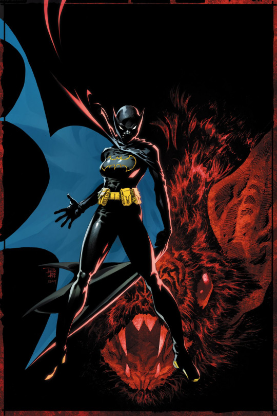
It's been A LONG TIME, but I feel I am so gonna have to catch up on my thoughts with Birds of Prey. So tonight I'm gonna do a three-parter.
Tonight, part 1 will cover #9-10. So let's start with my thoughts on the two issues.
Starting off, this issue means a bit to me three-fold as #1 it occurred during the character's anniversary month.
#2 Artist Jonathan Case once again draws the character (having gone to town with the character in Batgirls #14).
#3 said GORGEOUS AAPI variant cover by Phillip Tan and Elmer Santos. I remember seeing Tan's Cass at a C2E2 a few years ago and nabbing the print (for myself and a friend). He always drew a nice Cass, and I'm glad AT LAST he drew an official one.
As for the issue itself, it's a nice beginning piece to the new arc as the Birds are basically lost trying to find Babs, along with figuring out their new surroundings.
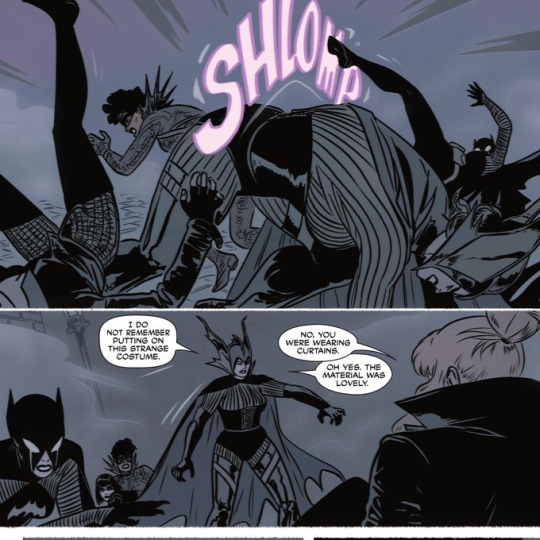
For the special costume given to Cass this issue. I saw an article via Screenrant going into detail on how edgy this suit gives off.
I agree it does, but also to a degree of how maybe she views herself internally. Though of all the unique designs, I'm quite curious on how the artists throughout this arc corresponded with writer Kelly Thompson on the unique looks to each Bird.
Regardless the "Victorian Era" Birds as I view this issue give a very Gothic style and lend to the twists and turns this issue has.
Which, leads into one of the major moments Cass gets in the issue.
The first is a move hyped on the covers during the first arc: Barda launching Cass via a fastball special.
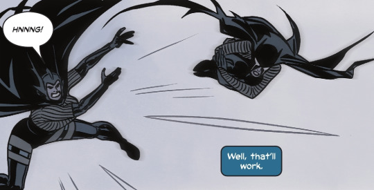
The moment had me squeeing as we get our first tag team move of the two and I hope there is MOAR from them besides the old classic (which you can't go wrong with).
The Birds rescue Babs, and for the briefest of moments everything "seems" right, but well Thompson remembers something OTHER writers kind of neglect with Cass.
In that, she can tell when someone is not truly themselves and is a walking lie detector.
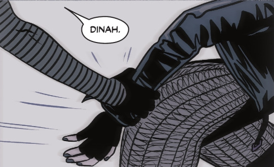

It's a brief, but if "you're in the know" of the character, yeah Cass would easily see via a few steps of body language and behavior that Babs wasn't really Babs.
It's a character quirk that a lot of writers usually overlook coughs some Batman writers coughs.
Again, Dinah trusts Cass 100% with her insight (as the series has already established) and attacks "Babs" and we get out fight in the issue: the Birds vs. this mangled Bat Babs creature.
This issue also feels like the closest meta Thompson has regarding the whole Babs as Batgirl in the issue too. If you take in the fact that her costume has a rather "classic" look to it. And well...
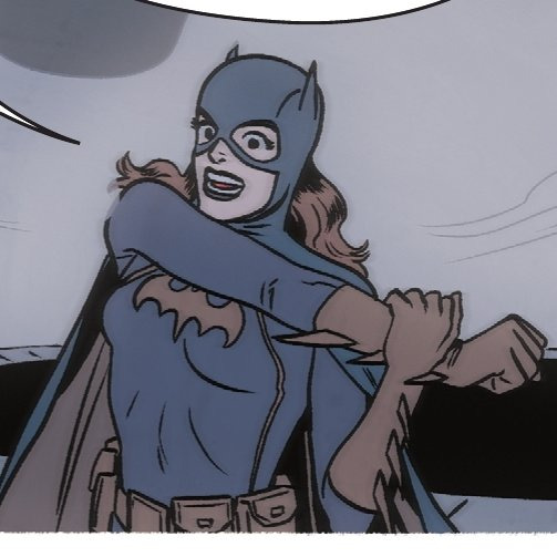
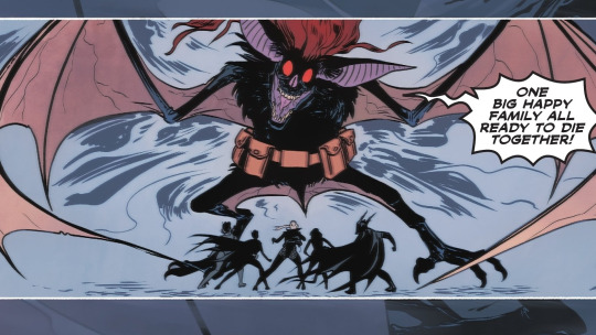
And that leads me to the only downer of the issue because like the Birds themselves, as the reader we are left clueless as they are as to whom or what is behind all of this.
However, for this "one and done" different look. I'll give it being something totally different and again this series trying something new (akin to what we've gotten in the first arc).
Case's art is still stunning, and though more minimalist (compared to his Batgirls issues) still packs a punch. The costumes and crazy demon she-bat Babs still pops in my head.
I just wish we got more information other than the teases for the issue, but this is an unfolding story and like the Birds I'm here for the ride.
Birds of Prey #10 continues this wacky out-of-this-world adventure this time with a 50s twist that has the same dark edge of the prior issue. So what about the Cass within? Well...
Again, another artist of Batgirls helps with the issue as we get Robbi Rodriguez (who's been drawing A LOT of Cass granting 2016 me a wish) and Gavin Guidry on art duties.
Their art compliments the setting within the issue with this 50s to 60s style with a dark undertone (like the prior issue).
So the issue begins with the newest suits we get a '66 version of Cass. The suit itself uses a bit of what we got with the '66 bat costumes but we get Cass bits to it. The bat symbol. The belt. Oh hey! A domino mask! How Black Bat of this suit!
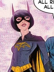
I do love the look, and for a "66' Batgirl" look for Cass checks all the boxes making it different from Babs' look.
Though I have to admit it's weird that Babs herself looks a lot more like her short-lived Sean Murphy bat ears look than something more to her '66.
We also get A LOT of exposition in the issue of what's going on, why someone is targeting Babs, and HOW this is happening.
And it works for me given well we need that info dump and this does feel like the part where we NEEDED this. Even if it does feel like a slight retread of Megaera from the first arc.
However, with one tiny bat twist…
The big fight for this issue is the Birds vs. a corrupted Barda. And oh dear me she is utterly terrifying. But like I said we get a twist, and it is SOOOOO Cass-characterization perfection.
Instead of a brutal fight between the two new friends we get Cass trying to reason to Barda, knowing the New God can beat this on her own.
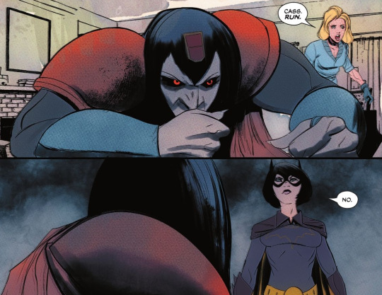
The moment between the two is just SOOO Cass. Akin to so many stuff with the character in the past. Thompson just GETS Cassandra Cain as a character.🥺
If there's any really nitpick of this issue I have is this issue felt so quick. Like we get so much info, Possessed-Barda, Cass does Cass thing, and that's it. I kind of wish we got more but I get we're sprinkling the Sin and Vixen stuff for later.
But man, Barda/Cass are just the anchor of this series period. Their friendship is something I always wanted and this series hasn't disappointed. I can't wait when Thompson repays this with Barda coming to Cass's aide or does this.
I KNOW THIS IS COMING.
I just wonder WHEN and if I'll have tissues for this moment when Barda unleashes hell or shows this compassion to free Cass from whatever bind.
But yeah Birds of Prey has been my favorite book of the early half of the month, with Tec always complimenting it for the back half.
62 notes
·
View notes
Text
My personal Analysis and Rating of Cassie Sandsmark's hero outfits
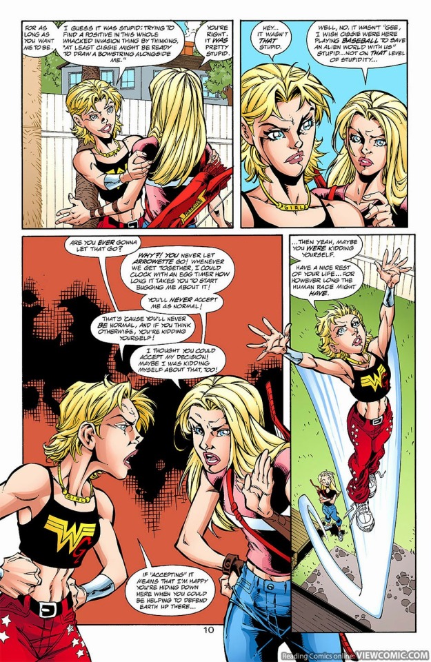
Cassandra Sandsmark's first "official" hero outfit first appears in Wonder Woman Volume 2 #111
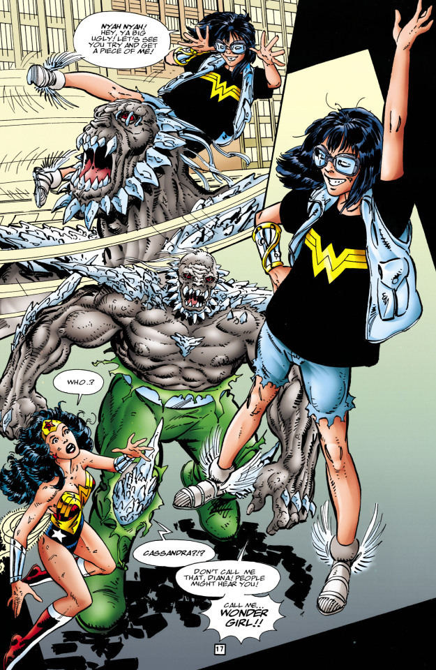
This look was created by someone called Anna Maria and it's just basically the shirt, shorts and vest Cassie was wearing when Diana is first in trouble and Cassie decides she's just going to go and help her as wonder girl. Along with what are just her regular clothes is some more practical choices such as goggles to protect her eyes she also wears them when skateboarding. The goggles also have another use which is to keep the wig she also wears in place. The wig actually is a call back to a wig Diana wore when someone else was being Wonder Woman. Cassie also wears the sandals of Hermes which grant her flight. The last piece to this makeshift ensemble Is the gauntlet of atlas which enhances her strength by ten and also helps to heal the wearer. I personally think this is on the way to a decent design for Cassie at the time. She has no powers at the time and while it isn't necessarily visually pleasing it works.
I would rate this just under her next choice of costume which first appears in Wonder Woman Volume 2 #113
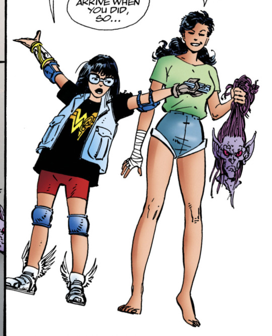
This outfit has all the same gear as the last one ( Hermes's sandals, Diana's old wig, Cassies goggles and the gauntlet of Atlas) However she also has some new gear such as some elbow pads and kneepads I think we can safely assume she also wears these when skateboarding. Next are the Grey gloves, In WW V2 113 she starts off with two grey gloves but one gets disintegrated / badly hurt along with her hand. Her hand is later healed by the gauntlet of Atlas (it's been a while so I'm not totally clear on the details). In later iterations of the same outfit she replaces the gloves In young justice they appear as blue while in the Wonder Woman comics they usually appear as red.
In The main part of her outfit We see a shirt much like the one in her other costume but this one has a gold or red G ( the color really changes from comic to comic in what could be a printing error) I personally prefer The red G as it looks almost drawn on. I think the G looking draw on signifies just how early Cassie is in the hero game because she most definitely made the shirt herself. Cassie also wears some red shorts but these are tighter to the body almost resembling some short leggings or biker shorts. I think the shorts being closer to the body is just so much smarter because they are just far less likely to rip or get caught on something. I do wish they were made of a more thick material like jeans though because it creates almost more of a barrier.
The last change in this particular outfit is her vest , This vest is less worn and ripped than the first one proving it's an entirely different vest all together. I wish the vest had more pockets so Cassie could carry more things with her even if she doesn't bring them into battle all the time. In the Wonder Woman comics I think she holds a music player in them but I think it would be so smart if she also held bandages or first aid of some sort in there as well.
Later on she replaces the vest with an almost leather looking jacket in which case I still hold firm on wishing for her to have more pockets. I think at the point she replaces her vest she also removes her elbow pads but I can't say for sure.
Overall I think this is the best design Cassie could have made at the time and really speaks to how tactful she was at the time. I firmly believe that the safety precautions were more for her mother's benefit than her own though I don't think that it was a conscious choice. From how much of her gear comes from skateboarding really speaks to how careful Helena Sandsmark is because I don't believe Cassie went out and chose to pick up gear to protect herself when skateboarding. The elbow pads and Kneepads are one thing but the goggles just scream overprotective.
Its totally possible that Cassie consciously chose to add things to her costume so she was less likely to get hurt but I personally think she was just in the habit of taking extra precautions to protect herself solely for her moms benefit. Helena was so so reluctant to have Cassie be wonder girl and be a hero maybe unconsciously Cassie thought this might make her mom feel better about her being a hero.
Next is from the Sins of Youth event, Particularly Young Justice sins of youth # 1
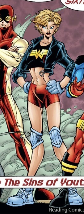
Now this isn't Necessarily a different Outfit but since she doesn't have the Wig or goggles I Chose to include it. I don't love this Design on older Cassie. I could handle the kind of scrappily put together look on Cassie when she was younger but when she's older she's completely outgrown the costume and at a certain point the same design becomes childish and lazy. Since she didn't choose this as an older version of herself I will let it slide though
This next one comes from Sins of youth: Wondergirls
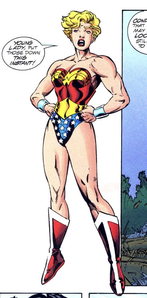
Now Cassie just switched outfits with Diana and I have to say, it's not that bad. While I wouldn't personally put an older Cassie in a complete replica of the Wonder Woman costume I love the idea of it being a main inspiration. Also I totally love a buff Cassie. If I was to redesign her and I couldn't change the main suit, or the boots I would totally give her earrings, a weapon of some sort, I would also elongate the cuff things and personally I would give her somewhat longer hair that was tied up in a ponytail or braid of some sort. If I was to totally redesign this hero suit though I would add some layers or at least some more muted colors.
Overall I don't actually hate this design and while it could definitely be better it could most definitely be worse.
The next hero suit is also from Sins of youth: Wondergirls
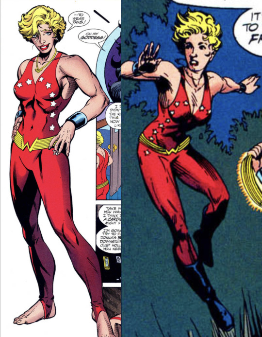
Now hear me out I actually adore the idea of Cassie in some sort of a body suit. I wouldn't necessarily put her in Donna's old suit as again it just screams lazy but I love the vibe I get from it. Now I don't know why but something about this suit just feels a bit off, I'm not at all sure what it is but something is most definitely missing. If I was to redo this I think ideally I would give her a weapon, do a deeper and darker red like a mix between wine red and the red in the current suit, like a deep scarlet or something. I would also lose the gold W belt because of its weird cut and replace it with more of a bronze or a rose gold belt, Actually replace the gold necklace with a bronze as well. As for the boots I don't know what to do with the boots because I hate the boots over pants look.
There is just something missing no matter what I try to think of to redesign it while still keeping the general outline of the suit and I just don't know what it is.
Overall I don't hate this suit it just needs minor tweaks as well as adding that thing that's just missing.
Next is a One-Issue hero outfit that Cassie helps her dream up in Wonder Woman Volume 2 #153
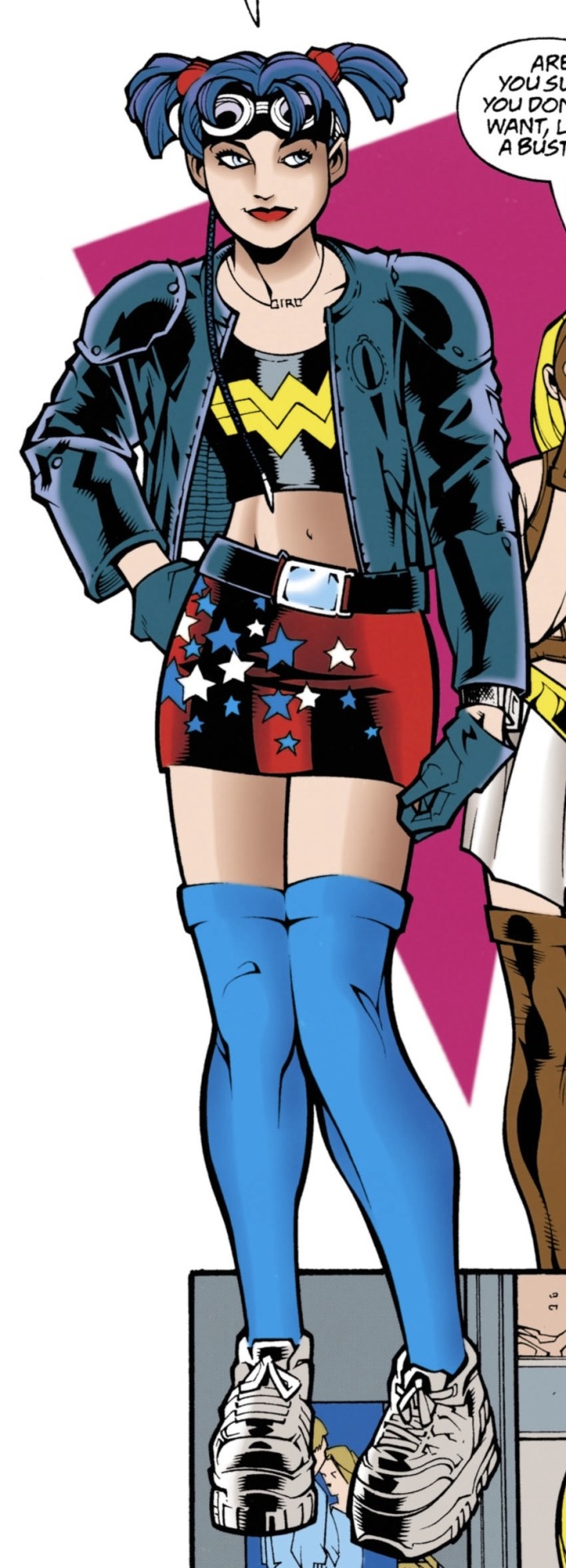
I think its important to clear up a misconception I've heard before, Im not sure where I first heard it but Its a misconception where Cassie says she hates wearing skirts. First of all No hate on anyone who said this I think it genuinely is just a misunderstanding, Cassie in this issue doesn't say she hates wearing skirts what she says is something about her mom would hate this outfit's miniskirt. Cassie has worn a skirt at least once before in cannon, Way before Teen Titans volume three. From my recollection it was in one of the Wonder Woman comics in a storyline where her mom follows a fake merlin somewhere because she's in love with Jason Blood and wants to exchange her soul for his or something. I think Cassie wore some tights or pants or something under the skirt but I'm not totally sure.
Now that I have cleared that up I hate certain aspects of this outfit and like others. Starting with the hair at this point in time I love the way she styled her hair with the ponytails and the goggles but I absolutely hate the color on her and the weird little Anakin Skywalker braid absolutely needs to go. Next the top half of the costume ( jacket, necklace and shirt). I think the shininess of the shirt is a bit odd but I love the black with the gold Wonder Woman symbol. A crucial part of at least Cassies starting designs is how at least one piece of it is Wonder Woman merch.
I think a lot of people forget that Cassie is a Wonder Woman fan who gets to meet her idol who she admires and later on becomes her pupil and sister. I think we as a fandom don't acknowledge that quite enough but I digress.
Back to the outfit, I love the jacket but I don't know how much I like it in a hero outfit. I love the armored shoulders but the cut of it looks like it's just about to fall off of her and I don't think at this point in time Cassie would prioritize fashion over function. I think if the sleeves gathered or suctioned in some way to her arm like maybe an elastic cuff it would be great.
As for the necklace I love it but I don't know how smart it would be for battle someone could grab on to it and if it didn't break it could end up choking or harming her in some way. As far as the gloves go I wish they were a similar cut to her previous gloves because again they just seem like they are about to fall off.
For the bottom half of the outfit I love how functional sneakers are except for the laces which could come untied easily, but I digress. I hate the unfunctionality of the skirt I adore the big chunky belt as well as the pattern and color of the skirt but I wish the skirt was shorts instead. It looks like a really tight skirt that would restrict movement and for a hero that fights with their body only I just hate it. I know that Cassie at this point mainly punches her way through problems but the ability and choice to be able to kick is always a good one. I don't hate the socks but I wish they were slightly shorter just as I wish that the skirt was shorts and the shorts were like literally half an inch to an inch longer.
Overall this outfit is great as an outfit but not as a hero costume as far as functionality goes but it really does have some strong starting ideas.
The next hero costume has two versions which I will talk about separately the first version of this costume first appears in Wonder Woman Volume 2 #153
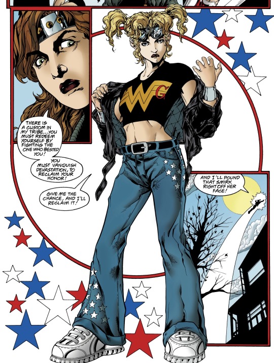
Now I love the hair and goggles but I do wish the hair was a bit more tied up instead of free but I have no other note on the hair as for the jacket I love the look of it and it adds so much to the outfit but again it looks like its about to fall off. I adore a cropped shirt moment for Cassie as it shows she's becoming more and more confident in her own abilities and really growing into her own, though I could be reading into it too much.
This is the first costume we see her cuff things being added to the equation instead of the cuff of atlas or just bare wrists. I really do think the cuff arm band things are such an important part of an amazon warriors design and it's really so important to me and a huge step forward in Cassie's hero identity and skills. I love, love, love her belt as well as her jeans with the little stars. The nondescriptness of the belt draws attention to the stars on her pants much more than it would if the belt were patterned instead though I do wish the pant were baggy and the proper length instead of being cuffed and too long. I think the pants being to long could be asking for trouble when fighting, if the pants become uncuffed then she could trip or get seriously injured by an enemy. I know Cassie usually flies and punches but it's just not smart to rely on that solely, a good design should work whether she is flying or not. Finally for the shoes I can't really tell if these shoes are laced ones or not but if they aren't then they could be velcro which I just like more as they are less of a tripping risk.
The next version of the design comes from Young justice but I forgot to write down which issue number
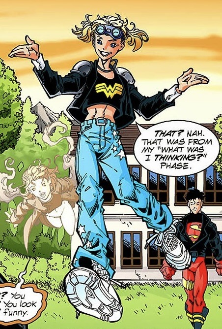
The main differences in this one are the belt and necklace. In the Young Justice version she wears the wondergirl necklace she wore in Wonder Woman V2 #153 and I think thats just a fun little tie in but I think as far as function goes I still have complaints with it. As far as to what I prefer in the version I definitely like the jacket a bit more but I do wish it stopped or cuffed right before what seems to be her amazon bracelet things. I adore how neat her hair looks because there's like no risk to it falling into her face with is very smart for usability. However I definitely prefer the colors in the Wonder Woman Design Overall I prefer the wonder woman version but its definitely not a bad design
This next outfit has two versions again but I'll try to keep it more brief The first design is from Young Justice #35
Hair: I wish it was tied up It seems like it would just blow in her face when she flies
Necklace: I don't know why its gold now and honestly I can't tell if I'm a fan of the change or not
Shirt: love the craftiness being brought back in with the gold W and red G, It seems like it accounts for a lot of movement too which I love for her. It again shows she's becoming more confident and I honesty think that's great. It also doesn't regress her design by making her look younger and I think that's honestly due to the cut of the shirt, if it was a t-shirt I think I would hate how casual it looks.
Arm band things: Always a win to have these out and ready to use in the design I especially love that they aren't at risk of being covered and are instead proudly displayed
Pants and belt: love how nondescript the belt is and I actually like the red for the pants it almost shouts back to donna's all red suit and I think that's just fun
shoes: the shoes are literally untied here like kill me now. girl please tie your shoes or a least tuck in the laces
Additional notes: I miss the goggles and while I like the overall design I think just doing small things could elevate it to the next level
The other version of the design: Wonder Woman V2 # 166
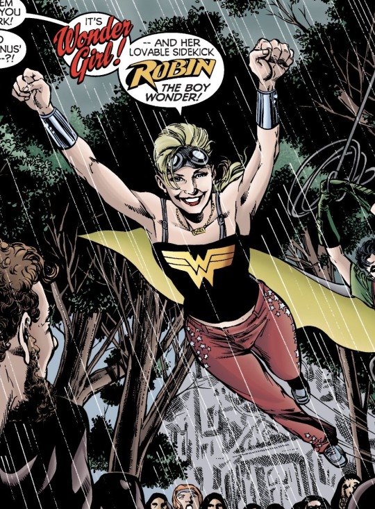
Hair: Its tied up! I love that. Also the goggles ugh it's just such a win. I couldn't design the hair better myself
Necklace: same notes as the other design except for this version I definitely prefer gold. I am still worried about the unnecessary harm the necklace could cause though
Shirt: I think I might like the plain gold W better than the W and G. I love the maneuverability she has and how the cut of the shirt actually reflects her age, It doesn't age her and it doesn't make her look childish either and that's honestly so refreshing.
Arm Bands: The arm bands are out, accessible and I'm loving it.
Pants: while I will mourn the loss of the belt it's probably smarter to lose it, if you've ever been sitting down and just felt the belt you were wearing start to dig into your stomach you know what I mean.
Shoes: I don't think she's losing the laces anytime soon but at least they're tied
additional notes: I prefer this design over the young justice design again and honestly I couldn't have designed her outfit better. Side note, In the dialogue where she and robin first show up robin remarks how he misses her "old black wig wearing quiet self" to which she replies "hey I gotta be me" and I really love them remarking on her growth in such a playful manner its honestly great.
This next design has two designs again and I'll once again keep it short. The first design is from Young Justice 49
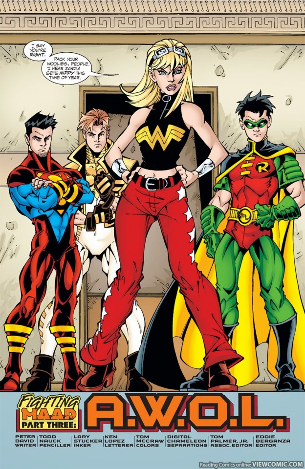
Hair: The goggles make a comeback and while I would normally complain that her hair isn't tied back the long bits are out of her face and I guess its okay ( a small part of me still complains and wants back the goggles with the ponytail but I guess its okay)
Arm Bands: Arm bands are out, accessible and shining. I couldn't ask for more as far as they're concerned
Shirt: I love the singular logo but the big zipper track and zipper loop are a bit odd, I don't really get why exactly they are there or at least why the big loop thing is there, I can live with the zipper track
Pants: I have no new notes on the pants
Shoes: Finally the shoes don't have laces! They don't seem to have to much of a heel either but if she wanted to be taller I kind of wish she wore some slight platforms or something instead
Additional notes: I know this is a well loved design and I actually have very little complaints.
Second version of design: Wonder Woman V2 186
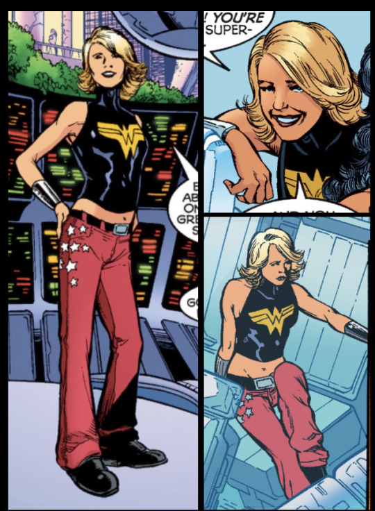
Hair: Get this girl a headband or give her goggles back or something, is styled lovely but it is all in her face
Shirt: I prefer this shirt over the other one, it still has the word zipper but this time its less obvious and that's honestly so much better
Cuffs and pants: no new notes
Shoes: I think these are boots also but they have less of a heel which I definitely enjoy better
Additional notes: This outfit is basically the same cut wise I mean the pants are lower but the shirt is at basically the same length just on a more realistic body type. I prefer the hair aspect of young justices version but outfit wise I'm all for this version. Overall it's really classy. it looks like an actual hero outfit while keeping Cassie's regular clothes/ merch apparel items aspect.
The next one is from Titans/ Young justice graduation
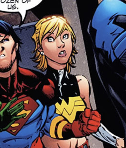
Now this one seems to be a combination of The young justice and Wonder woman outfit from last time but Cassies hair is kind of braided out of her face and she now has earrings, in my opinion this is the better design of the two previous versions
Next we venture into Teen Titans territory, this next design is from Teen Titans Volume 3 #2
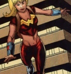
In my opinion this is just such a huge downgrade, It is worth mentioning that in the Wonder Woman version of this outfit the pants are red jeans and she has red star earrings in. Im just so not a fan of this design and honestly it's probably one of the worst designs for Cassie . I don't know how much more I could stress that this is such a downgrade and I hate it.
This is the first glimpse we see of evil older Cassie this next design comes to us via Teen titans Volume 3 #17
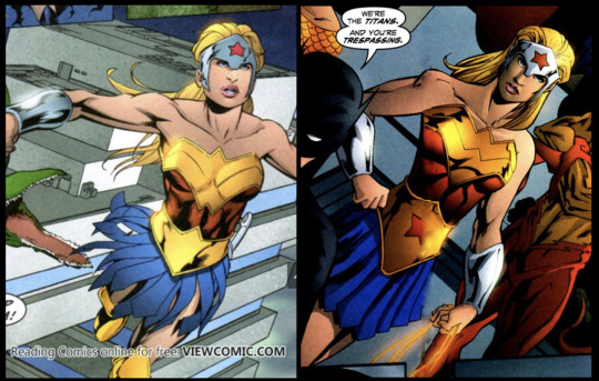
I hate this design this once again is basically bottom of the barrel. The gold boots, The huge belt and top gold breast piece, the weird tiara and that ugly blue skirt as far as future adult Cassie's go this is the worst.
The next design first appears in Teen Titans V3 #34
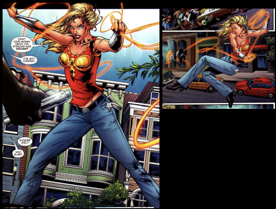
Now the gold breast plate thing is weird, especially in the areas it covers. but if it was just a bird the rest of this design wouldn't be that bad. the jewelery is nice as is the arm bands. I can't really think of anything else nice to say other than that I'm happy the jeans are back, I love that she has a weapon now. but design wise its still bad but its at least a step in the right direction.
Next is the final evil Cassie design ( Teen Titans Volume 3 #51)
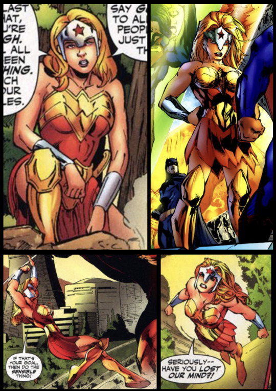
I actually love this version, its now occurring to me that the headpiece might be meant to allude to old greek helmets but its not very well executed so its hard to tell, I honestly think the blue was thrown me off in the last evil Cassie design. This isn't how I would design a future Cassie but it could be worse. Its still on the low scale for me but its not that bad
Next is Teen Titans Volume 3 #65
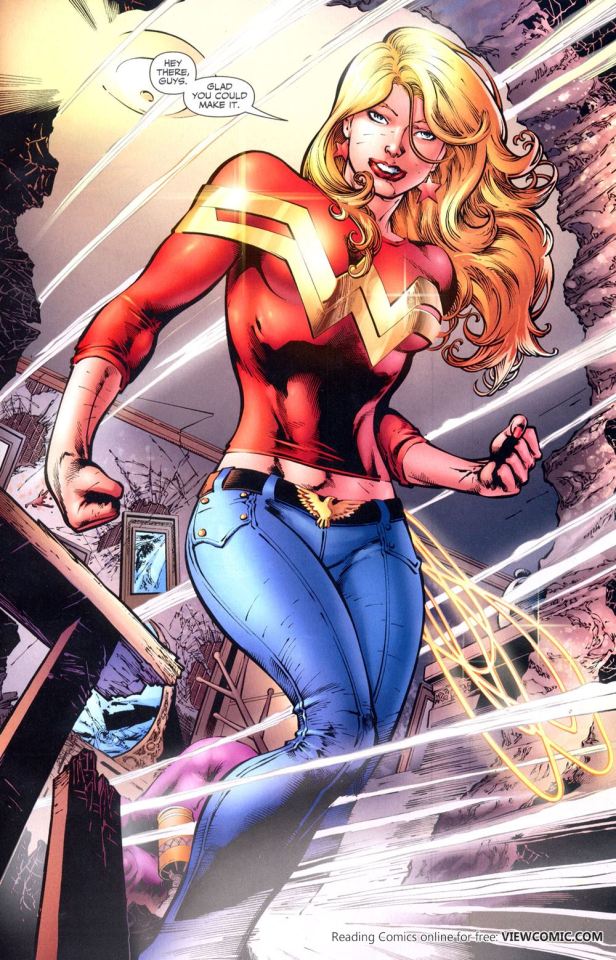
I wish her hair was pulled back but this is honestly one of the better designs of the teen titans vol 3 for Cassie, I love that she has her lasso I wish she had stars somewhere on her outfit but its alright I also really like the belt I think its a fun little thing. Personally something is missing from the shirt for me but I can move past it.
Her Final Teen Titans design first shows in Teen Titans Volume 3 #88
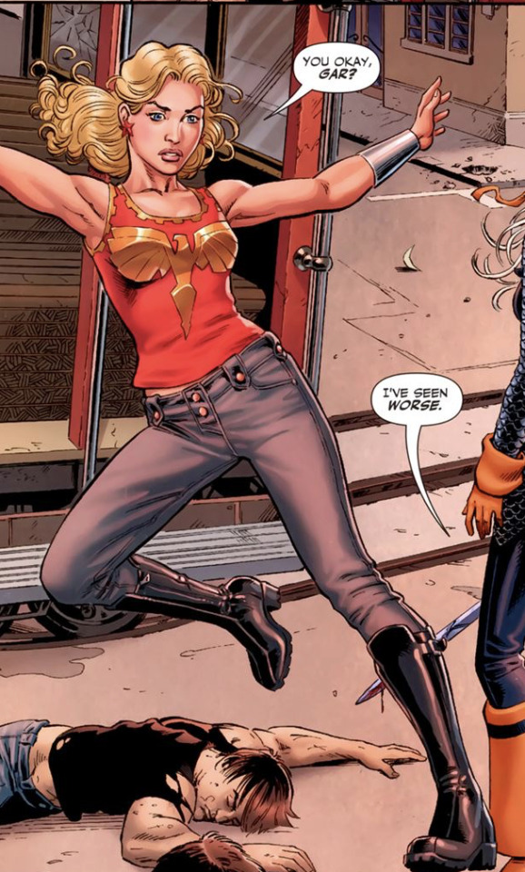
Now I hate the boots over pants moment that we're having again, I wish her pants were baggier and I desperately want more star details. It looks like her hair is in some sort of half up, half down style which keeps the hair out of her face mostly. I think the design could be worse but I'm still not wowed by it
Next comes honestly one of my favorite designs (Wonder Woman Volume 3 #28)
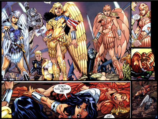
Now I would only change one thing about this and It is I would cover her midsection, like have her be fully covered the way Donna and Diana are . Now listen Cassie may be knocked unconscious for some of these but just look at the design. Her armor design is so different from everyone's but it also mirrors Diana's in a way that is simply breathtaking. I could rant on and on about this armor design but I would mostly just be repeating how much I love it.
Next is sadly the N52 version of things and while I personally wouldn't choose a lot of the decisions that were made some of the designs aren't that bad
Teen Titans Volume 4 #1
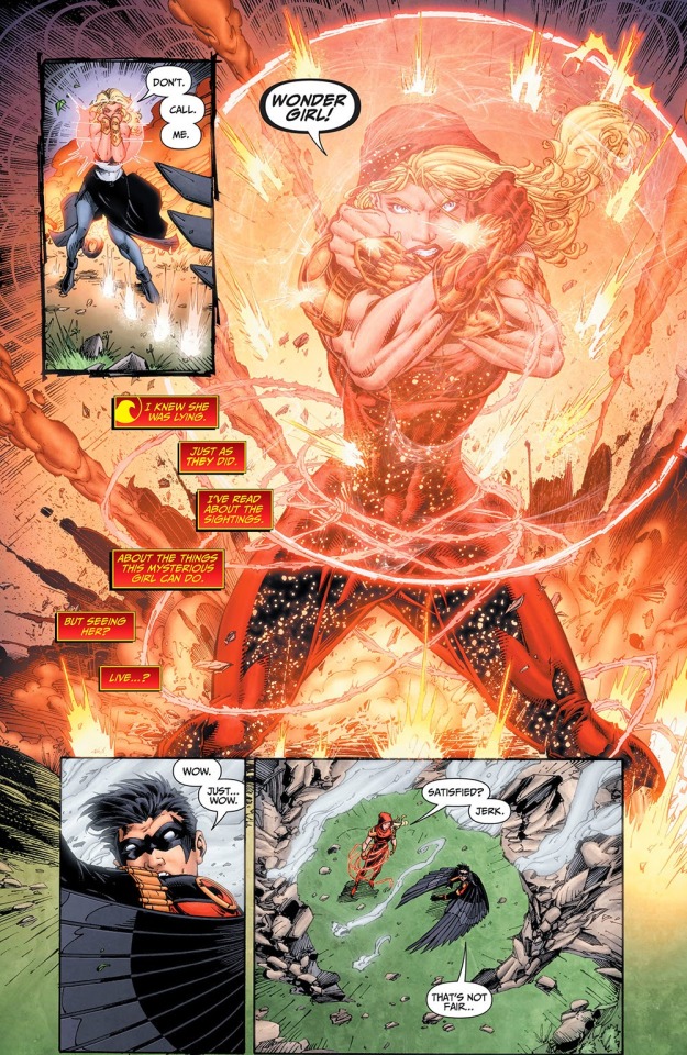
I love the hood and lasso in this costume as well as the little stars hidden in the fabric where the shadows fall. If this were for a different character I would honestly be all over it and as it stands it's honestly not that bad. I mean the hood is just gorgeous even though I'm not quite sure how the construction of it works, and I love the way the lasso drapes on her even though I'm not sure how she gets it off to use.
Next is the semi-armored version of the first N52 suit from TT V4 #5
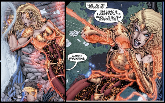
I love the armored look on Cassie she honestly suits armor so well and I kind of wish this was her permanent N52 look, or at least in Teen Titans V4
Next is something that was called like her armor within or something I wasn't really paying attention (TT v4 #8)
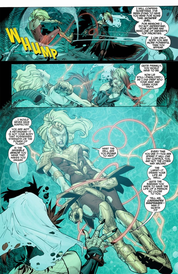
This armor is funky and oversized, even though her hair is tied up which I love it just doesn't look good. It has the potential to look good but it genuinely looks so bad.
Also from the same issue of teen titans comes this look:

This doesn't even look anything at all like her previous suits in any capacity and I think it's supposed to look cool because it's supposed to be all glowy or whatever. I think that the teen titan writers should have just stoped designing some of the characters at some point.
Teen Titans Volume 4 #12
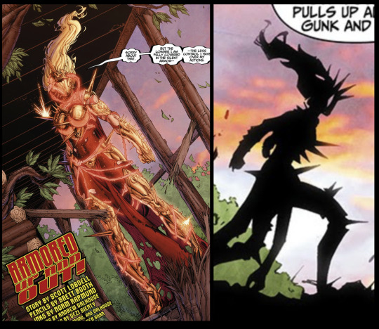
Again if this was any other character I would be all over this design because the silhouette and overall design of it is just gorgeous but for my girl Cassie Sandsmark I kind of hate it. It just seems really out of character despite how gorgeous the design is.
Next is her second main Teen Titans V4 design
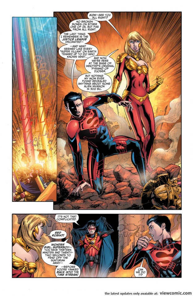
Something is just missing from this design and I think its that there's nothing interesting going on for the bottom half of the suit, The top is alright its not great and I'm still not a huge fan but it could definitely be worse.
Next is the dreaded Young Justice Volume 2 and onward design
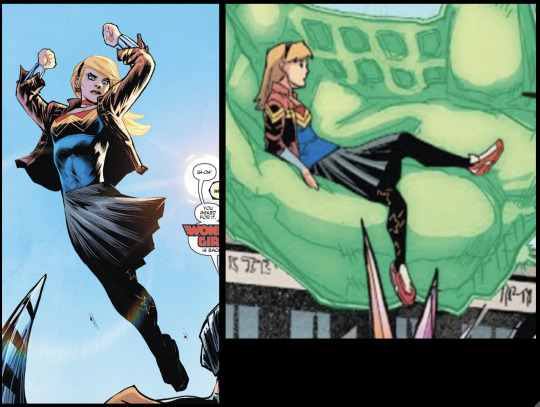
I hate basically everything about this design except for the hair which I honestly think could be better. The midi skirt over the leggings just makes her look so young and I hate the reintroduction of that blue into her design I really can't stand this design and every time I look at it I want to cry.
This next one isn't a hero suit but I think we all deserve a good thing after having to look at the YJ Vol 2 monstrosity
Trial of the Amazons: Wonder girl
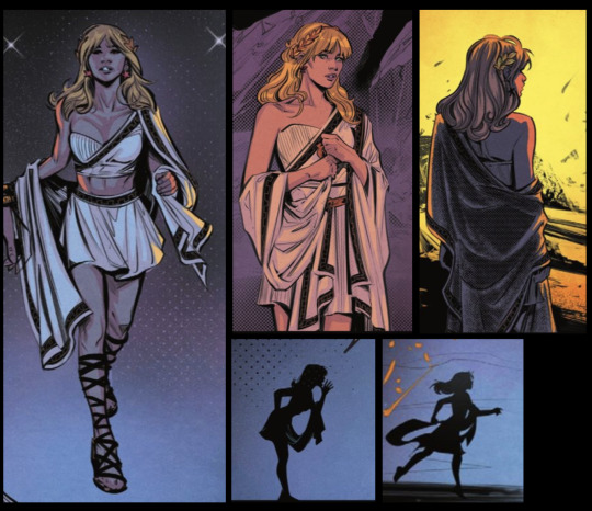
I just love this outfit on her I mean just look at the silhouette. I honestly think everyone should read trial of the amazons just to see Cassie get to play detective again it's honestly one of my favorite DC storylines in a while even though it gets a lot of hate.
#cassie sandsmark#teen titans 2003#yj98#young just us#tt03#wonder girl#young justice 2019#dc comics#cassandra sandsmark#Wonder Woman vol.2#Wonder Woman vol.3#help what do i tag this#I stayed up way too late doing this
34 notes
·
View notes
Text
HERMIT A DAY MAY - DAY 30
SmallishBeans x Mononoke
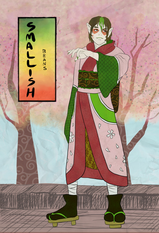
For Joel I chose the gorgeous anime mini series, Mononoke!
I chose this for Joel because Mononoke is the most beautiful anime I have ever seen. Others have come close, but Mononoke is number one for me. The bright colors, detail, and texture variation remind me a lot of Joel's base.
The show is animated with a paper texture and looks like a moving Edo era ukiyo-e woodblock print. Still images don't do the show justice, so please go watch it.
Do note, however, that the show is technically horror. The series is beautiful but very eerie and touches on dark topics. It also has a lot of surreal imagery that could be upsetting to some people, so discretion is advised.
To learn more about Mononoke and see my style references, go below the cut.
@hermitadaymay
(Gamers Outreach fundraiser)
Mononoke is the story of a nameless person known only as the Medicine Seller who wanders Edo era Japan. The enigmatic figure seeks out restless spirits called mononoke who bind themselves to negative emotion and haunt the living. The Medicine Seller finds ways to get close to the spirits and learns their purpose for lingering in the human world, then attempts to exorcise them. Every two to three episodes follows the story of an new exorcism.
The draw of the show, in addition to its beauty, comes from unravelling the mystery behind each mononoke, since the Medicine Seller can't perform an exorcism until he understands what happened to cause the spirit to become attached to a specific place or person.
The show feels almost like a detective story, but a really creepy one where you're not really sure what's going on half the time. Mononoke is unique, and definitely not everyone's cup of tea. However, even if the genre isn't your vibe, it's definitely worth watching at least some of it for the visuals alone.
Style references:
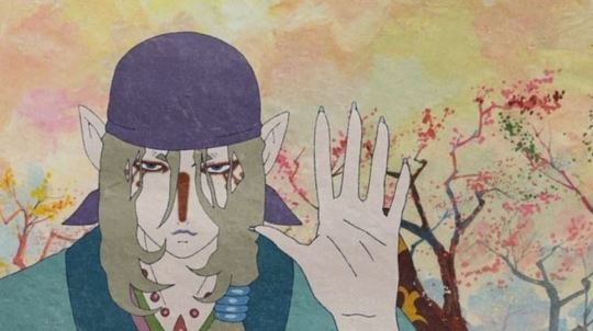
The show has a papery texture behind the animation, making even very simple shots look really detailed and beautiful.
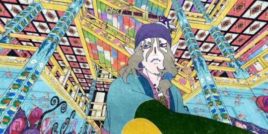
Some episodes reach hyperpop levels of colors and patterns, though still using paper-like texture throughout. The results are stunning - I remember pausing episodes on my very first viewing just to take in some beautiful scenes.
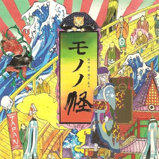
The title design in a piece of art for Mononoke.
#If you are an artist or just like beautiful animation#or are a fan of ukiyo-e woodblock prints specifically#definitely check this series out#it's only 12 episodes but its 12 of the most beautiful episodes you'll ever see#and you'll immediately understand why Joel's base makes me think of this show#hermitaday#hermitcraft#smallishbeans#joel smallishbeans
59 notes
·
View notes
Text
At long last, it is Post Stuff I Made Time again. The last time I had a book to show off was in May and that's just too long. Not a fic (this time. I have them, they're coming) but a journal:

I made this as a dnd journal for my husband, and it was originally supposed to be a Christmas present, then a birthday present (in March), and finally it has reached its true potential as a Labor Day Week present. But it's gorgeous, he loves it and I'm proud of it. The cover is Allure book cloth (the color's called skylight), with the strip at the bottom in chiyogami (from ChibiJay; I got it in one of their assorted strip packs), and the flower is gold foil htv. The campaign is pirate/high seas themed, and his character's background has a distinct Fantasy Japan element, so a lot of the design choices followed from that.
More photos under the cut!

Close up on the cover. I thought I had a close up of the flower icon but I must not have taken it. Love how close the color match is between the blue in the waves and the book cloth. The gold htv came out a bit less smooth than I'd have liked, but it has a kind of gold leaf look to it that we both ended up really liking.


He requested a Coptic bind so it would lay flat when opened, and I did Coptic end bands for stability and because they look cool, especially with the exposed link stitches. I find the link stitches also add a bit of stability when you've got fewer Coptic stitches. I special ordered the pink thread (again, his choice) from Hollander's, and it was expensive and totally not worth the hassle. The only way to get this color was pre-waxed and there is SO MUCH WAX on it, it's ludicrous. I scraped a lot of it off on a blade and it was still too waxy, like handling a candle. It's also very stiff and thicker than I'm used to, to the extent that it was hard to thread the needle with it. I've ordered their unwaxed thread before and would do it again, but this is the last time I buy the waxed stuff. Embroidery floss is cheaper, easier to work with, and comes in more colors.


Please ignore the blurriness in the second photo; I have never claimed to be a photographer and didn't notice it till now. This is the doublure on the inside of the front cover, and it's more chiyogami from Chibijay. The wave pattern wraps around from the front to finish up under this paste-down; I wanted to do the same in the back but didn't have enough of the wave print, so the back is plain.
I thought I'd taken a photo of the pages but I guess I didn't because I can't find it now. Being a journal there was no typeset for this. I actually bought a pre-cut and pre-folded unsewn book block from Hollander's for this. They come in a couple of colors and you can get them blank, with lines, or with graph print for drawing, and Husband chose the graph paper for ease of drawing and making charts.
As a rule I don't normally make journals; books only become interesting to me after there is something in them. So I just skipped the part of the "learning to make books" process where most people make a bunch of sketchbooks. This is actually the first one I've ever made. I'm pleased with how it turned out, and Husband loves it, but I can't see them becoming a regular part of my output unless it's requests like this. However, I've got six finished fic binds to post, so stay tuned for those.
#bookbinding#snek makes books#what else should i tag this#it's not a fanbinding it doesn't have a fandom#this isn't enough tags
47 notes
·
View notes
Text

for clarity Hakuji has his human eyes, blue iris and white sclera, normal lashes and no face tattoos but shares a mix of his demon and human form tats. Currently he goes by Akaza in this fic as an alias. Please enjoy ~

You've been hunting down this bag for months, a cute weekender duffle by a designer that had a bit of an agreement with certain stores. Bought in bulk and at a discount because it didn't meet the luxury brands normal standards however the flaws are so small most people didn't even notice them.
You were dying to have this bag.
Especially since you'd gotten a purse in all black by the same brand for a heavily discounted price, the only one in the store and it haunted you enough you woke up early to fetch it the next day.
But as you stand in the store you drove nearly an hour to be in, you frown. Not because of the size oh no it was perfect for a week stay, maybe longer if you used packing cubes, the design just as you wanted it where there were Js in hearts printed into the bag but the pattern didn't overly draw attention. The only problem was the bag was in a soft blush pink and not that dusty pink or black you've seen them use before.
You place it on your cart, debate if trying to find it in ‘licorice’ online is worth the hassle, wonder if you can find those black heart shades you've been wanting too.
“Whatcha got there princess?” The man's voice is smooth, cutting over the ambient music and chatter that you'd toned out. You hadn't noticed him approach, silent footsteps to near you and of course there wasn't a single reflective surface in sight.
But before you can scrunch up your pretty features an arm is presented to you, palm up. Body ghosting yours while he waits for you to take notice of his inky midnight bands on his forearm, three thick lines encircling thick muscle that flexes from his twitching midnight fingers.
“Akaza!” You purr and he adores the sound. Glad he's the one who can disarm you so quickly, “M not dressed to see you.”
Truly you weren't at least not for a…what should you call this? Not really fuck buddies as each meeting didn't always end in sex and there were too few dates between you to be dating. It was more like a situationalship if anything else. A situationalship you held with someone who you were pretty sure was muscle for a notorious mafia head, that his ranking was higher than just a goon. Much higher.
“Not dressed to see me?” There's a chuckle to his voice as he wraps his arm around your rib cage to pull you to him. His scent has a richness about it that always invades your senses. He smelled like fresh air, faint cigarette smoke and a cologne you can't quite pin point.
“Mmhmm I don't even have my lip on.” You pout hiding away your bare face when usually you'd see him with some strategically placed highlighter, mascara and at least lip gloss. Normally in a skirt or dress that hid away some frilly lingerie set in case he decided to unwrap you that night.
Now you weren't sure your plain bra and underwear even matched.
Akaza thought you looked cute in a form fitting black tee with monster girls on the front, paired with skinny jeans that hugged your ass and thighs nicely and black flip flops that made your white toe nail polish pop.
To him you looked sexy.
His fingers gently tilt your chin to look up at him and he's met with the cutest pout he's ever seen. True to your word your long fluttering lashes were bare, your top lip naked with not one single swipe of black lip stain while your bottom was your natural color either on its own or enhanced with gloss or a nude lipstick. Under the afternoon sun and fluorescent lights he can even make out your freckles.
“As beautiful as the day I first laid eyes on ya.” He leans in and kisses your lips, smiling as he does so his natural fangs can catch on your pout. His heart races when you giggle into the exchange.
“Flattery will get you nowhere Mr. Akaza.” You tease, looking into his icy blue eyes fighting off a sigh.
Flattery got him pretty far with you already.
“Hmm.” He hums, grabbing for the only thing in your cart, dark digits wrapping around the light pink handles but your clawed fingers pull it back into the cart. He lets go of the bag, puts the matching brown duffle in your cart too, you look up at him and replace the light creamy brown back onto the shelf. When you go to add the pink one back as well he puts it deeper into the cart and gives the handle a nudge so that you'll keep shopping. Reluctantly and with a sharp cutting glare, you start walking again and he follows.
“Shopping with your friends?” He looks around for a few of the guys he knows dates your girlfriends, doesn't see a single one. No lanky dark haired mop, no sunshine boy, and no scar face either.
“Hmm? No.” You wrap around to the next aisle, futally looking for that duffle in black, before you purse your lips in agitation, moving onto the next aisle that was now lined with hand bags and purses. Maybe a new one would take your mind off of the licorice duffle. It doesn't.
“By yourself then princess?” He watches you eye a mini tote, it's the same brand as the duffle and much larger tote on your pretty body now. You don't pick it up despite it being a dusty pink. Akaza reaches over you and nestles it into the cart, smiling down at you as he does.
“Yes. All by my lonesome.” You sigh dramatically before giggling, “Everyone is busy or out of town. I'll probably have dinner somewhere nice too.”
“By yourself?” He can't keep the growl out of his voice and you dangerously give him your back, looking at another bag.
“Most likely.” You leave it and when he tries to add it to the cart your flaring glower makes his lips pull up into a smirk.
“Lemme join ya for the day then, Princess.”
“No, ‘m fine.”
“I insist, don't like ya wandering around alone. Who knows who might find ya and try to bother you.” He teases, leaning in from behind to press a kiss to your throat, “I'll buy whatever ya want baby.”
“M a big girl. I can pay for my own things. Besides, how did you find me, Akaza?” You've gotta stop saying his name like that, he's gonna keep you forever if you don't. It doesn't help you turn to face him, stalking closer like a cat with easy prey. Until your chest is pressed to his and you're leaning up on tiptoes even in those platform flip flops to purr into his ear.
“So what's it on? Did you sew it into my purse? Is it underneath my car? Or did you download it onto my phone after you made sure to smear my pretty lipstick onto your sheets?”
You pull away before he can answer, innocent smile on your face as you blink up at him cutely, whine to your pretty voice, “But we'll be shopping all day, Kaza and I like to take my time!”
It takes him a moment to collect himself from the whiplash you give him. A smile slowly pulling up his lips as his tattooed fingers brush hair behind your ear.
“That's okay princess. I love taking my time with you, remember?” Letting his thumb come down to press gently on your throat before he lets go altogether, “But if you agree to me coming along just know that every outfit, every bag, every little thing ya look at a little too closely is gonna be in that cart and stay in that cart until we're ready to swipe my card.”
“Your card?” You curl your fingers through the loops of his black jeans, let your thumbs slide under his form fitting black wife beater that clings to his toned abdomen as you trace the hidden bands at his waist.
“My card princess. M not gonna argue about it.”
“Kay!” You lean up and kiss him between the thick twin bands on his throat, turning back and grabbing the cart to push along as you think of where that black bag could be. Maybe a sister store had it or maybe you should try online again.
Meanwhile Akaza smirks behind you as you allow him to be your scary guard dog, at least for the evening. And without a single effort to insist or remind him of your hyper independence he knows you have. He likes it, loves that you give into him even if it is just a little.
That you trust him to take care of you.
The afternoon moves along nicely. Akaza is always a man of his word, pulling out his card at the counter no matter how steep the price. He carries your bags to your car between each trip to every store while he holds your hand with his other until the final trip where he has you leaning against the drivers side door as the two of you agree on where to eat for dinner.
He leans down to kiss you, usually his parting is tender and yet intense leaving you giddy and dizzy until your next meeting but this time it is different. This time he cups your jaw and lets it move to your throat as his tongue slides into your mouth to lick the inside of your teeth, groaning as he does as if he's trying to taste all of you like it could be his last time. Starving that pretty head of yours of oxygen between his own searing kiss and the way he squeezes your throat before he finally lets go. Icy blue gaze boring into yours as he watches hearts form in your eyes before he presses his lips to your ear for a confession.
“I installed it on your phone.”
His mind flashes images of the exact moment his possession grew unstable, uncontrollable. Of you beneath him, fucked out and mewling his name, tenderly holding his hand while the other clawed his shoulders to shreds. Of you in his shower, giggling as you clung to him before he could fully step in, wetting his body with your suds before helping him wash. Of you lying next to him, giving such a cute smile before you reached out to caress his cheek with such a heavy sigh.
“Because the idea of any man seeing you the way I do makes me violent.”
42 notes
·
View notes
Note
Do you sell versions of your embroidery designs? I'm obsessed with your Solas patterns and would love to try them!
Hello!
So, short answer is yes, while the first digital mockups I made were designed just for my own reference and as color guides for transferring the designs painstakingly by hand, I ended up going back to them and turning them all into digital vectors. This means they can be printed onto transfer paper or directly onto stabilized fabric for stitching, which is MUCH easier than drawing by hand. Lots of people asked me if I could sell the designs so I figured this part out and was able to test it myself--the tower embroidery was an example of printing the vector directly onto the fabric and worked out great!
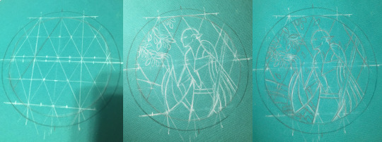
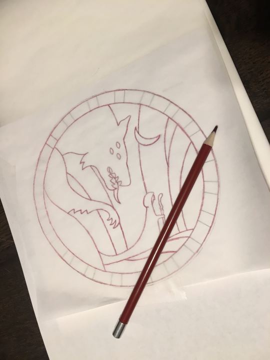
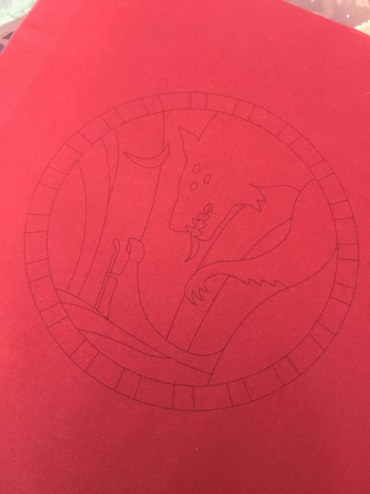
(above: tedious hand-drawing process for the Hierophant design, vs my failed attempt at transfer pencils that did not work at all for the Tower, vs printing directly onto fabric which did work in the end)
Long answer is after I did that, I uh, never figured out how or where to list them for sale online. Or what all to include with them--like what level of written instruction to include, should i also make notes on the thread colors I picked, should I include my colored-in-versions as color guides or just let everyone free-for-all it, in the case of the Tower embroidery i also hand-dyed a lot of grey thread that was crucial for it coming out how i wanted it to look--is it deceptive to sell a pattern when other people can't necessarily recreate it the same way because of that? Should I list in general the dye instructions if they wanna recreate it, or for people who want some of my extra thread or for people who don't have an inkjet printer so can't print the design onto the fabric themselves, should i think about selling full "embroidery kits" that include the printed pattern sized for a display hoop and the thread needed? etc etc etc
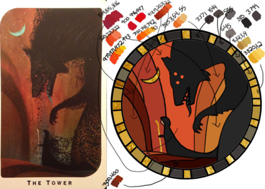
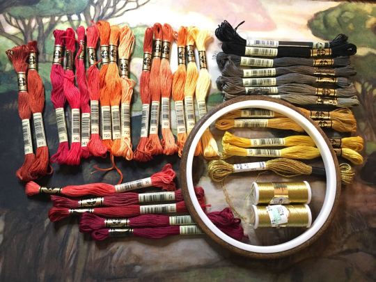
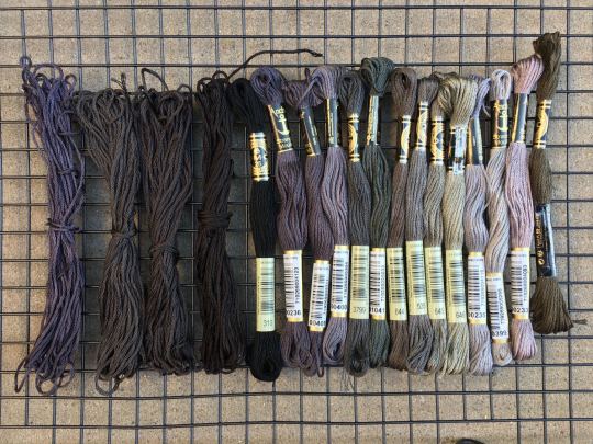
(above: photo of the color guide I made myself with tentative thread color selections (warning NOT the ones I actually ended up using), photo of my pile of threads I picked from, and photo of some of the threads I ended up dying myself to get closer to the design I wanted)
Anyway that was all a lot of thinking and work to do, so i put it off!!! and uh here we are 2 years later and I have still not posted them anywhere. I really gotta get around to all that still...
But in the meanwhile, if anyone reading would like a pattern, just let me know directly what you're looking for and I can save the versions of the files as needed for your plans and send them over. like for a digital only version (so no threads or me printing for you) i would probably make a zip file with a transparent png of the design (so you can put it in a word doc to print at whatever size you desire), as well as a pdf with a few copies of it already pre-sized for a display hoop for ease of printing or transfer, the colored-in version i used based on the tarot cards, photos of my finished versions, etc (note to self i must remember to include the design both normal for direct printing and horizontally flipped for anyone who plans to use transfer paper for it since those are mirrored...). Oh and a quick explanation of how i managed to get my fabric through a standard printer if you wanna try that.
But yeah i'm happy to work out something with kofi or paypal or venmo and sell the digital ones for like $20 each or something for now, if you don't mind not having written step-by-step instructions accompanying the patterns and example photos. Or if anyone has suggestions on where to host them for sale, for someone not interested in maintaining a dedicated storefront like etsy or storenvy long term. Maybe Gumroad? If i stuck to digital-only sales something like that might work. I'm open to input for sure. If you want something more than digital like a pre-printed fabric (since it's kind of weird to do yourself), I'm still open to trying, it just would be a little more $ to account for the fabric/stabilizer and cost of shipping, and probably take me a few more days to do.
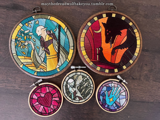
(above: example of finished DA themed embroideries)
But regardless, thank you for your interest at all!! I'm so glad people have enjoyed my embroidery series :) While I'd love to make lots of copies to sell to whoever wants one, I simply don't have the time, and they are SO labor intensive to make it really is like 80-90% of the cost is manhours. I spend anywhere from 5-15 hours making the patterns and vectors, but the stitching and rest of it itself is easily the bulk at 40-100 hours depending on complexity and number of threads used. So WAY more feasible to sell the patterns than make more to sell myself, and then anyone willing to put in the time can have one too :)
#ramblings#my stuff#my embroidery#dragon age embroidery#dragon age#replies#sparrowposting#dear tumblr PLEASE do not eat this one as i post it 🙏
26 notes
·
View notes
Text
Cutesie little things they do for you
Pairing: Poly!recoms x Recom!reader
Word count: 875
A/N: Just a little something something for @raving-raven-writing's birthday, so here's my (belated) birthday gift to you! I hope you have a lovely birthday next year and I can't wait for your next awesome writings!

🌍 Recom Miles Quaritch If your shoelaces are loose or undone, he’ll tie them for you. That’s it, that’s the headcanon.
No but seriously, imagine this man crouching down in front of you, putting your foot on his thigh and tying your shoelaces. Or even better, after a long day, he’ll take off your shoes and massage the painful spots 😫🤤
😈 Recom Lyle Wainfleet He hates it when you’re sad. So if he sees your sad face, he’ll do one of two things. 1: he’ll make the corniest, most horrible jokes to make you laugh. Or 2 (this is his standard go to when you’re crying): he’ll cup your face between his hands and starts kissing your face everywhere. Not a single spot goes unkissed. And he’ll continue kissing your face until you’re laughing, even if it takes all day.
🍬 Recom Z-dog Z-dog has asked you many times to design/draw tattoos for her. Even if you have the artskill of a 3 year old who’s been left alone with several markers and a giant white wall, she’ll get them tattooed. If you have several tattoos, she’ll design one for you too. If you don’t like tattoos because of the needles, she’ll still design one and print (?) them out as those temporary ones. It's her way to make sure that you carry a piece of her with you (and to claim you as hers, but she's not gonna tell you that).
🥽 Recom Walker I headcanon that human Walker was (and still is in her heart) a woman of color. She used to help her mama with braiding at her mama’s shop and knows how to do all kinds of braids. So when she’s bored, she tells you to sit in front of her and she’ll braid the most complicated things in your hair. She has special products to use and everything she might need. You’re her only victim (muse) because you’re the only one with long hair, since she can’t really do anything with Z-dogs short mohawk (she tried, Z-dog looked ridiculous and she made Walker swear to never tell anyone, but Walker has pictures to blackmail Z-dog when needed).
😎 Recom Mansk Mansk always has a spare pair of sunglasses with him. If he sees you squint in the sunlight (Idk if Na’vi eyes work the same as human eyes, but just pretend they do), he’ll magically appear behind you and puts his spare sunglasses on your nose. If they are too big for you, he’ll order and carry a pair of the exact same ones that he has in your size.
🧯 Recom Prager We all know that dying as a human and waking up as a Na’vi is difficult. The memories of your past life, the life that you can never return to, sometimes give you nightmares. When Prager sees that you’re having a nightmare, he’ll run his finger over the bridge of your nose, careful to not wake you up. It’s really soothing and often calms you down. When you’re awake the next day, he’ll be expecting a kiss as a thank you tho.
⚕️ Recom Ja Ja always carries snacks for you (for the others too, but only if they really need it). You can just reach into one of his pockets for a snack anytime you want. He carries all your favorites, if one of the other Recoms is close to fainting and they need something to eat, they get what they get. If they don’t like it, too bad.
🧢 Recom Brown He celebrates everything in your relationship. He celebrates the first time you two met, the first time you two talked, the first time you two kissed, the first time you two hugged, literally everything. He even knows how long you’ve been together to the second. And he has gifts for every celebration. Those gifts are like the little things.
Imagine that there is a mall/store(s) on Pandora (accessible for recoms/Na’vi as well). If he sees you look at something, he’ll secretly buy it for you as a gift for those celebrations. Also, he’s definitely the type to do those trends where the guy buys everything his s/o has in her online shopping cart/wish list.
📿 Recom Lopez I’m pretty sure that we all headcanon that Lopez carries extra medical supplies for Ja. So I think that he carries extra mags and whatever you might need when you’re on a mission. You forgot something? Don’t worry, he knows how you sometimes forget things. You have run out of something? Don’t worry, Lopez has some extra because he knows that you can’t live without it. Sometimes he’ll prank you with it too. Imagine you’re looking for something. You’ve looked in every single one of your pockets, both of your clothes and of your vest, your pack, literally everything. So now you’re just going through everyones stuff. Suddenly Lopez has the exact thing in his hands. He swears it was in your vest the whole time, but you’re 100% sure it wasn't.
⛓️ Recom Fike So we all know that I headcanon that Fike is an anxious boy. When he’s stressed or when you’re stressed (and the situation allows it) he’ll hold your pinkie with his own. It’s not a huge gesture or something sappy (except it totally is), just a reminder that he’s there and that you’re not alone.
#avatar recoms#recom miles quaritch#recom lyle wainfleet#recom zdog#recom mansk#recom ja#recom brown#recom fike#recom walker#recom prager#recom lopez#recom miles quaritch x reader#recom mansk x reader#recom prager x reader#recom lopez x reader#recom brown x reader#recom fike x reader#recom z dog x reader#recom walker x reader#recom ja x reader#recom lyle wainfleet x reader#poly recoms x reader#poly recoms#Avatar_Recom writing
78 notes
·
View notes
Text

did i ever talk about the a4 planner notebooks i designed and had made on here? 👀 (they all have blank covers which i decorate with stickers each month)
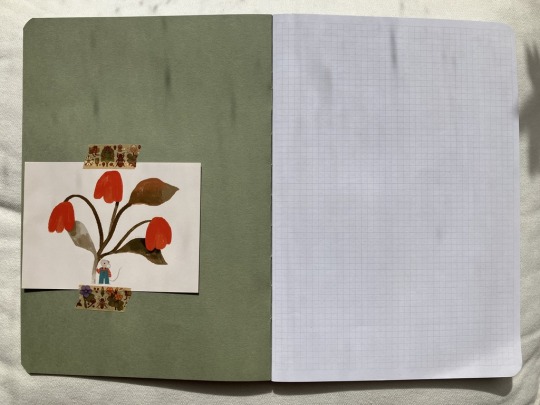

blank inside cover (this is my may/june planner which i started decorating yesterday, so there's a thank you note from my raahatillustration order in there), all the printed pages are printed on square paper! next page is a 2024 and 2025 calendar (minimum print quantity was 10 books, so i designed each book to cover 2 months and had 12 printed, for 2 years supply!), followed by a blank grid for future log of the 2 months that come after the ones in the current notebook).

page for trackers! i use the left hand page to write the things i'm tracking (sideways in the top box, so a column of boxes is assigned to each activity/task), then colour in the boxes corresponding to the date and each activity/thing each day. also doubles as a migraine log (colour in the box containing the date when i have a migraine), and the blank column is so i can colour in a mood tracker. the right hand page is for making a record of what i'm reading and watching (genre, start date, end date, title and author if applicable). lots of extra space for decorating or notes if i want to.

monthly page! (2 per book). the left is for a monthly overview that is heavily decorated/all the things i'm doing are written in (no completed version to show bc i have too much personal info in my completed ones to redact. sad bc they turn out very cute!!!). the space underneath that is where i stick in a copy of the playlist i'm listening to that month/any decorations i want to add. the boxes at the bottom have 31 spaces, so on the left of that i write down 4 physical therapy things i track to fill in each day. on the right hand page is where i write a little brief list of things that will be nice the following day, then the grids at the bottom are for me to shade in 'the degree to which i went outside', and a 'big picture' idea of the weather.
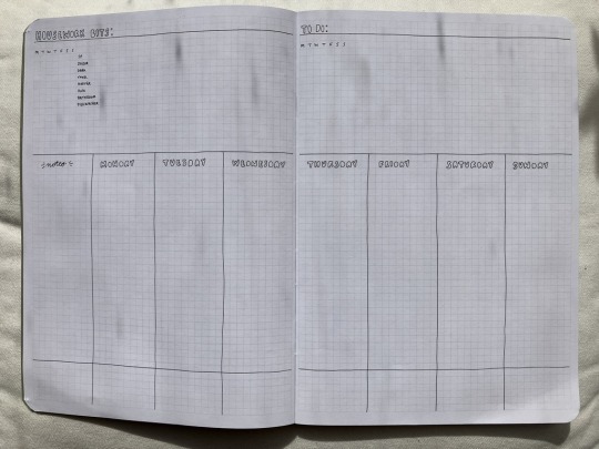
weekly spread! (10 per book). how i keep on top of the day! for vertical planning, with a running list-ish style chores log on the top left corner, and a blank setup on the top left corner of the right page for things i want to achieve across the week but that i can't assign to a specific day yet (or take place over multiple days). lots of room for me to stick in photos, a column for notes, and a gap at the base of the page for me to track other things. i colour code each month so it's easier for me to keep track of where i am in time, so a strip of washi tape goes along the bottom 3 rows of squares, and then above that i'm left with 3 more rows of squares - in the 'notes' column i pick 3 things to track, and then draw a line across the column for each day of the week when i do that activity/task in the corresponding row. for example:


weekly horizontal spread (10 per book). this is for my daily reflections, i write down things like my step count for keeping track of health stuff/energy expenditure, when i got up/any time i had to lay down, a bullet point summary of all the activities i did that day, times i made a decision that was, like, good for me, things like that!


blank squared pages (7 per book) and inside back cover for miscellaneous uses. i've used them for far for garden planning diagrams and collages, sticking in notes and ephemera, and collecting odds and ends of stationery. i usually stick an envelope that i've made inside the back cover so i can stuff a bunch of papers in there as i accumulate them (receipts, tags from clothes, order delivery notes, etc), for example:
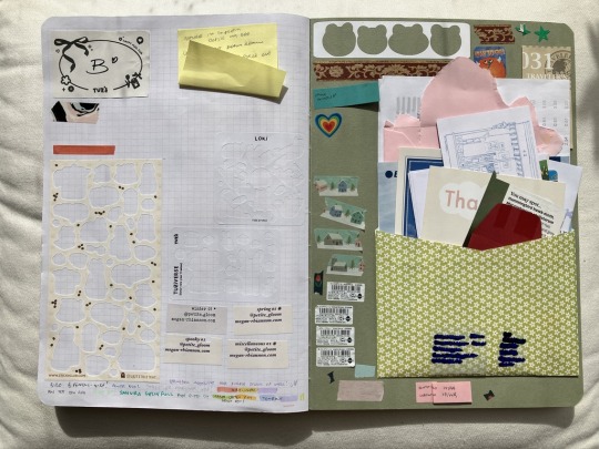
tada! really happy with how these turned out, very good investment of the money i would have put into buying a hobonichi each year for example, which is simply too small for my needs!
#how do i tag this :P#planner#planner notebook#journal#uhhhhh#scrapbook#stationery#<- will i be able to find it later to reference via any of those tags.... who knows........
33 notes
·
View notes
Text
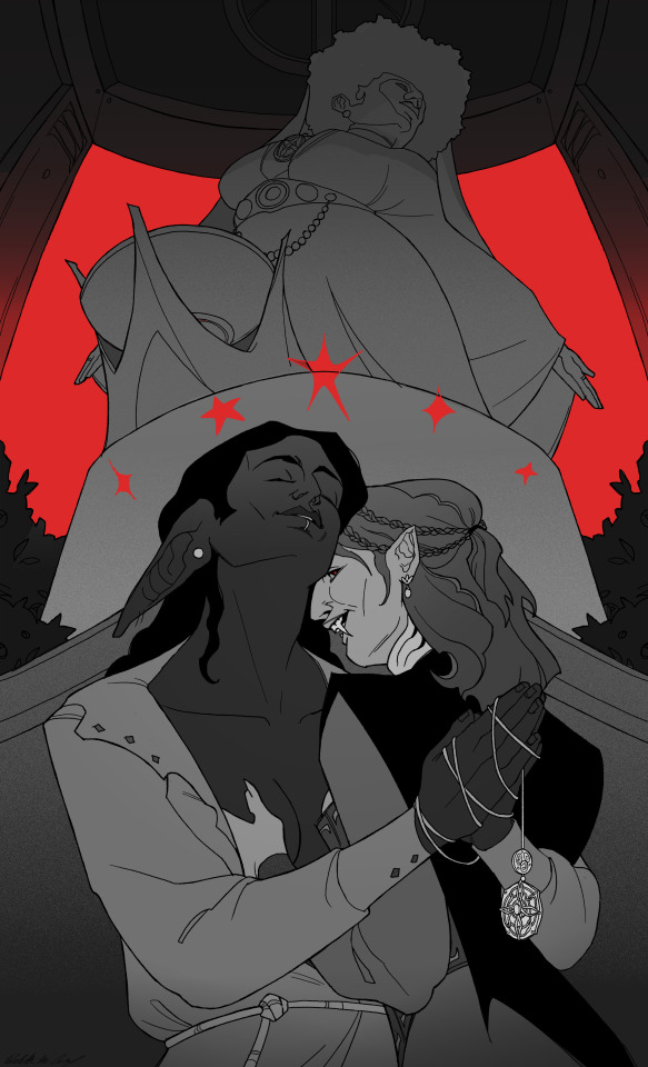
A Taste of Faith

[PRINT] - [COMMISSIONS]
Ok so the concept for this piece was : historical gay nuns, and 70s lesbian vampire movies meets tes (don't ask me why- I just had a vision at 3 am)
Because I think Serana should have been meaner<3 I love women's wrongs and when vampires do the suck <3
Btw of you want to see more gay Serana art, go check out @gay-of-waterdeep, their art is wonderful, and I can't say this was not a bit inspired by what they do :))
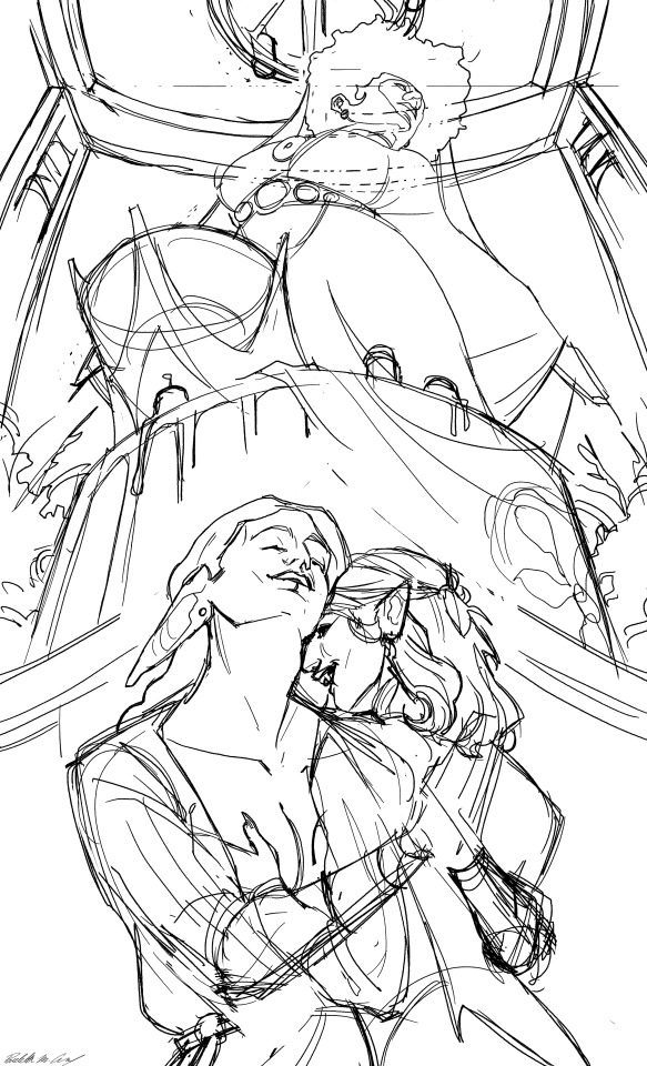
Process (and me rambling about some of my favorite 70s lesbian vampire movies (because I have a problem)) below vvv
Additional details about this drawing ! 1) I used the same Mara design than the one from my tarot deck :)) and 2) the other woman is one of the priestess in the temple in Riften lglggigkglgl her name is *check wiki* Dinya Balu

And now......... Some movies I enjoy because my house my rules, you came this far so why not hear about niche european movies :))))))
Disclaimer for a majority of the films in this genre : the male gaze is very fucking obvious in these movies... they were made by men for men, and the message is often "lesbianism is a dangerous temptation for women". It's a glairing flaw nearly all of them share and that sucks (and frankly it's a flaw Serana's writting kinda has in my opinion, minus the lesbianism part, but let's not dwell on that)- so if you can't get past it, it's completly understandable, be on your way and have a nice day <3

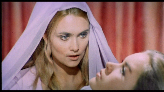
- Daughters of Darkness ! A toxic man is returning to london with his newly wed wife, but they get stuck in Belgium and are forced to stay in a luxurious hotel. Don't worry about the 10/10 smokeshow countess seducing his wife :). Completely unrelated, this movie has, in my opinion, the most beautiful lesbian kiss I've ever seen- but I might not be very objective because Delphine Seyrig is there lglglflflllglm The best one in the list ! So if you want to whatch one, whatch this one <3
- The blood spattered bride ! This is more of... an aquired taste let's say- but I really like it ! A quite effective horror movie, with goofy ass scenes (shoutout to the vampire lady buried in the sand naked with only a diving mask that is not the screenshot because tits), and emasculation being a recuring theme <3 (but if you want to watch it, please check the content warnings beforehand, it has a lot of very shocking and frontal scenes, and it's the 70s so it's not done very tactfully. Also pretty intense flashing lights)

- The vampire lovers ! Ok so this one is a lot less fun compared to the other two because it's made by the Hammer BUT... 1) Ingrid Pitt hello and 2) it's such a intriging thing to see a very christian/conservative studio make a film like that. I know a lot of people don't like the Hammer movies from the 70s, because the studio had a lot less money, and were making wild decisions. But I love them, because they tend to be much more fun bloody and sexy ! I'm a simple woman mjllkklhkhlhlho case in point with the vampire lovers (although if you want a fun vampire hammer movie from the 70s, Dracula ad 1972 is way better). And Peter Cushing is there (i love this man so much-) !
And now I shall resume my quest to find Vampire Lesbos by Jésus Franco and have a probably mid experience watching it xoxo
#haha I love drawing faces in an awkward angle haha (my life is suffering x2)#serana#serana volkihar#dinya balu#mara#aedra#lesbian#dunmer#vampire#lesbian vampires#the elder scrolls#skyrim#tes#tesblr#art#my art#digital art#illustration#fanart#skyrim fanart#artist on tumblr
284 notes
·
View notes
Note
Hiiii
Your work is soooo coolllllll!!!
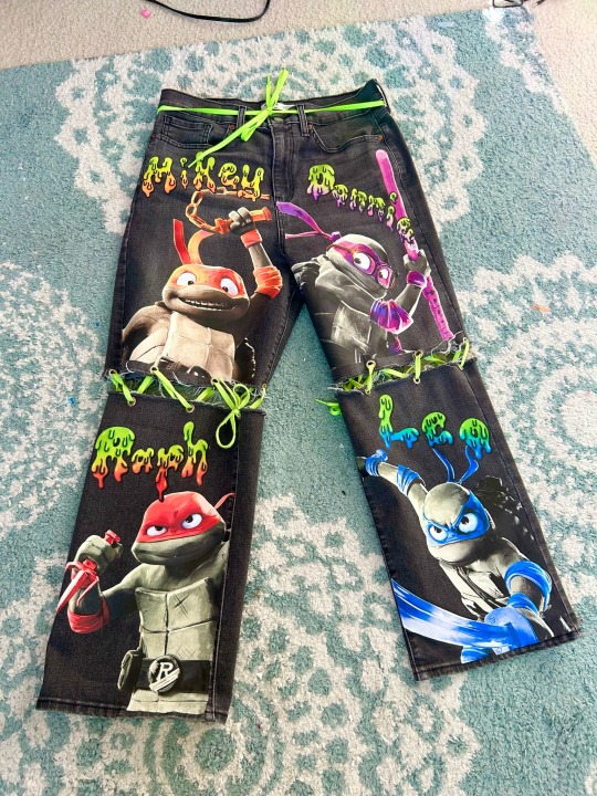
If I may ask, what was your process in making the MM pants?
-XO
Hiii! Thank you so much!! And Great Question! I didn't take too many pictures of every single part of the process so this is going to be mostly words if that's ok 😅
but here's
How I Made The Mutant Mayhem Pants
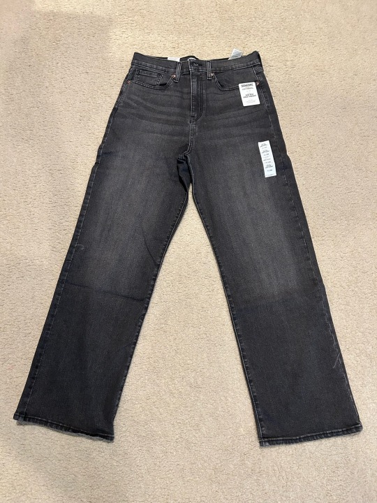
First We Need Our Materials:
An Idea or A Drawing Of Your Design
A nice pair of pants ( The wider the pants leg the more space for your design! So I personally prefer to not use skinny jeans but at the end of the day it's up to you! :D )
Eyelets
Heat Transfer Paper
Something Non permanent to mark your pants ( I used heat erasable fabric pens )
Scissors
Parchment Paper
Clothing Iron
Shoelaces ( or whatever you want to connect the pants like chains or ribbon or safety pins etc. )
Step 1: Design
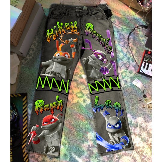
I use the app Procreate on my iPad to design all my projects! I just take a picture of the piece of clothing whether it's shoes or clothes and edit/draw my design on top of it until I'm happy with it! ( which usually takes a really long time 🤣 these took me 14+ hours to design )
Also here's a secret tip I used for this project: I put a denim overlay over the gray parts of the design before printing it so that when I printed it on the pants it blended in perfectly with the denim jeans! You can't even tell it was printed on, it looks like it was always there!!
Step 2: Cutting the Pants!
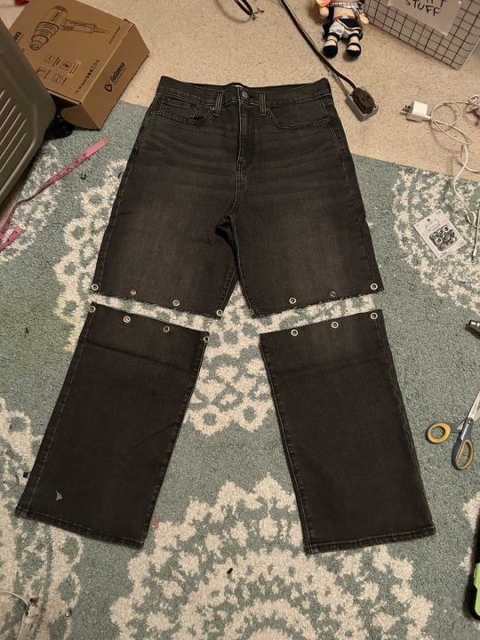
Use the Non-Permanent Pen where you want the opening of the pants to be. ( if you're making them for yourself then you can always double check by trying them on before cutting them just to make sure that they're being cut in the right place! ☝️🏽 )
Then once the markings are good, cut the pants!
Step 3: Eyelets!
Once I had the pants cut, I marked where I wanted the eyelets to go with my non permanent pen. Then I added them in one by one! If you've never worked with eyelets before it's not that hard. You can find a bunch of tutorials on Youtube! That's what I did lol! There's NO SHAME in being a beginner! :D ( Also beginner tip: practice putting the eyelets in the scrap pieces of pants that you just cut off )
Step 4: Printing and Cutting out the design
Get your heat transfer paper and print whatever your design is with a printer! If you have a big design like mine I had to use 2 pieces of heat transfer paper for each turtle!
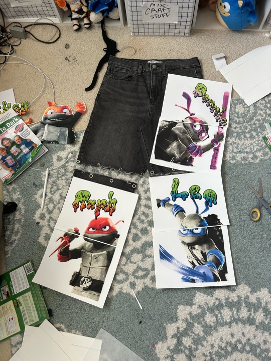
Then after I took this picture I cut them out! Then I sat them on the jeans again for a couple of minutes just to make sure that they were perfect and I didn't need to re-print them! ( also to make sure I liked the order they were in. I put my favorite 2 ninja turtles at the top so that if I wanted to remove the shoelaces and wear these pants as shorts I would only be left with my favorites...so sorry leo and raph 😅)
Step 5: Ironing Them On
Place the design where you want it, cover it with parchment paper, and then iron it on the highest setting with no steam! THE NO STEAM IS VERY IMPORTANT, PLZ DON'T FORGET TO DUMP THE WATER OUT OF THE IRON BEFOREHAND ☝️🏽
Step 6: Shoelaces
Put the Shoelaces ( or whatever you used to keep em together! :D ) inside the eyelets. Then I just tied them like I would tie a shoe but it doesn't really matter how you tie them as long as they're secure!
Step 7: Cry and Marvel at your astounding work
And there you have it!
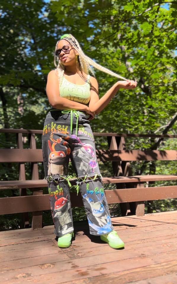
That how I made the Mutant Mayhem pants!!
Next time I do a project like these I'll take more pictures of every step, but until then I hope this was helpful!!
If ya ever make these or use this tutorial for anything plzzz tag me! I wanna see what ya make!! :DDD
And if there was any part of this tutorial you want me to elaborate on OR you know/found a better way to do some of the steps then please let me know!!! :D
#tutorial#crafts#handmade#tmnt mutant mayhem#mutant mayhem#teenage mutant ninja turtles#tmnt merch#art#custom#qna#fashion#tmnt#teenage mutant ninja turtles: mutant mayhem#bunnilime#my art
33 notes
·
View notes
Text
Replies
More replies! The first one is related to our reply from yesterday, and then a couple of other twst-related ones (about Trey, about Grim, etc).
Anonymous asked:
How about Sebek and the Tweel’s reaction to the accursed dakimakura? Speaking of which, have you ever thought of making one? If you could, who would it be of?
First of all, “accursed” sounds like the word Sebek would use to describe it. The accursed dakimakura would make him super uncomfortable… why would one own a pillow of that size, especially with some lecherous woman printed on it? (SO FUCKING RUDE, Idia’s waifu isn’t lecherous, she is actually pretty cute looking and pure!) Anyways, sometimes Sebek looks at it, then gets grumpy and looks away. He would be a bit jealous until Idia says something about the possibility of creating a daki of Malleus, and then Sebek’s head will stop computing. He is also someone who is the most likely to fall asleep hugging it… Idia doesn’t want Sebek to hug his waifu, especially after he disrespected her like that, but he looks like Sebek’s going to wake up and bite him if he tries to steal it from him.
The Tweels would like it and find it kind of funny, but in different ways. Jade would hint at Idia having interesting hobbies without outright saying it, but he would also treat the pillow like a lady. He would move it very carefully, maybe even apologise to it once. It amuses him to be such a gentleman to an object, it’s like he is trolling Idia for having a body pillow as a companion to sleep with. Idia doesn’t consider it “a companion”, but somehow still feels embarrassed about it…
One time Jade would find a picture of someone tying up a daki pillow shibari-style and “accidentally” send it to Idia. Just to see how he would react.
Now, Floyd. You know like some guys sometimes grab plushies and punch them in their plushy solar plexus? This is what Floyd does. He grabs this poor pillow and punches it for no reason other than it being soft and punchable. But then he would squeeze it and hug it tightly, cuddling with it and maybe even pushing his entire face against it. But then he would fold it in half and sit on top of it. But then he’ll nib on it gently. But then he’ll yeet it somewhere. But then he’ll caress its printed face and stare into her anime bug eyes for 30 minutes. And Idia can’t do anything about it, just wait until Floyd loses interest :( Idia’s poor girly…
Sorry, I got carried away lol But yeah, I have drawn pictures for dakis before! But all of those are private commissions, so I never posted any of them. I like drawing it though; it’s a lot of fun! Would you like to own a daki drawn by me?.. I don’t know why I haven’t thought about it all that much before.
The only one I actively thought about drawing is actually Edmund, the main boy from the Nebula College. I’ll definitely draw it one day. But if I had to pick someone from twst, then actually Lilia! He would be so cute on one side and so sultry on the other side lol
Anonymous asked:
Have you guys thought of human Grim design?
Not really, but I’m not opposed to the idea. I don’t draw Grim enough in general lol even though we like him.
I can’t quite imagine him as a human yet, but he’s probably still going to be short and gremlin-like… maybe it’s better for him to stay fluffy.
Anonymous asked:
Hiya. I'd like y'all's opinion on something.
So, I've had this headcannon for a while about a yan Trey. (or just a normal Trey, I guess)
Where basically he likes to brush someone else's teeth for them cause "they obviously can't do it properly themselves."
And I was looking through y'all's ship list and saw Trey/Idia and thought that fit really well.
And I just started imagining Trey brushing Idia's teeth for him, like gripping his face and just brushing away.
And I was wondering what y'all thought of that.
Yeah, Anon, this is pretty much regular Trey behaviour lol
Trey’s interest in Idia’s teeth is one of the reasons this ship could be so fun and hot, one of the drawings of them that I did was teeth-related… even though Trey isn’t brushing anything here, just touching and scaring the shit out of poor Idia… But still, I feel like drawing Trey brushing Idia’s teeth is somewhat inevitable. Hopefully. I really want to do it. Trey Clover isn’t alright.
We do have an ask about yandere!Trey hcs, and I didn’t have time to write anything for it yet, but whenever I think about it I think about pretty much what you described, so uhh it’s definitely going to be there…
Anonymous asked:
Me waiting on the whole school to have on big ol gang bang🧍
Stay tuned for Twisted Wonderland Book 8! 🥰
21 notes
·
View notes
Note
Hey, saw your reblog of the post about flyers being a good way to reach not-so-online folks. Do you have any examples to draw on for inspiration? I'm no graphic designer so appreciate some examples. No matter what I promise not to use Comic Sans or Arial. 😀
Ironically, Comic Sans and Arial are some of the best font choices because they're easier for people with dyslexia to read! They're also widely available on most machines, so if you're going to send an editable version to other folks to print on a home computer, they'll generally render correctly. (you can also export a PDF and force it to do the same if you don't want them to edit)
Some sample full page flyers.


This is a two up, where I printed on a single page and split the page in half for hanging

Conveniently, one of the things in the twoup is the same as the full page. We did a smaller, less detailed one for this as it was a mini-event, so we hang in a much more limited area where folks likely already knew a lot of details about the venue as they walked past it.
It's not obvious with these, but generally the smallest text on here is 14 point. These are all in Arial.
The initial header is at least 34 point and some are up to 50, if I had space. The subheading is generally in range of 20-30
Bigger is better! People are generally going to see these while walking so need a really big, clear headline to get attention. You still want to keep it overall large because often walkers are older folks who may not have their reading glasses with them. GO BIG.
Less is more for this type of flyer.
Event Title
date and location
Other info
That's it! That's the basics! Use declarative sentence. One clause per sentence. If you can present things in a list, even better!
If you're doing a BIG event that had sponsors and stuff, you'll want to use fancier posters with their logos and stuff in prime locations and then these little guys that are just "event, date, location" in outdoor locations with low traffic.
If printing at home, buy yourself a light colored pack of card stock in a bright color. I personally use a safety orange. If you're getting them copied somewhere, spring for the card stock. It'll withstand getting rained on a few times and if it's pinned to an indoor bulletin board, you can hang with a single pin without worrying about it curling.
If it's going to be a flyer for recurring event or just info about a local resource like where the food pantry is, put a small "hung on X/y/z" on the very bottom. Some places require a date on posters for hanging and they'll take them down after a certain point to make sure they're still current. If you date them, they may stay up longer, because they know when they were hung instead of going on vibes of "oh that's been here forever" and it was actually only two weeks.
QR codes are something some people like on posters, but I personally am old and suspicious about anything I can't see the destination URL on, so don't use them. If you do use them, look at the place generating them carefully. If you can't figure out how they make their money making free QR codes... you're the product. Be suspicious, don't sell out folks data via QR code data harvesting.
My top spots for hanging flyers:
Bulletin boards at grocery stores
Laundromats
Coffee shop
Library (you will probably have to take it to circulation for approval, so make sure its All Ages appropriate as there are free range children in that library)
trailhead or parking pulloff by a trail.
Transfer station/dump (you may need approval there as it's town property, but you will get ONLY town residents there. It's worth asking at the booth! Same rules as library.)
Good luck with the flyers!
10 notes
·
View notes
Note
2 for the artist asks! :>
2. 5 favourites of your own work?
ough this one is going to make me go digging so give me a second.

My dragon AU design for Hornet. I just love it so much that i'm probably going to re-use this eventually for an original project if it'll fit in it.
My married husband ocs, Trotter and Cygnus, lovin' on eachother. (Cygnus is a black hole and he's floating. Trotter has no concept of personal space)
I need to draw them more. Little Chip made them in highschool and was so valid.
This was for my hollow knight space AU I had with Paya. We had a FUCK TON of good ideas adapting the lore to a futuristic setting. I just didnt have enough energy to flesh them out in art.
But space Quirrel genuinely makes me happy every time I see him. It's just a very good design.
this one i made in a feverish state of hyperfixation in under 5 hours
i have no idea where my mind went, but when I came back this was on my screen

This one was just really fun to do and came out really well. The designs are satisfying, the posing is engaging and dynamic, and it encapsulates both universes equally.

my aroace girls :3c

This was originally gonna be posted like my usual comics (frame by frame) but the page composition turned out REALLY NICE and honestly makes me want to do comic pages more frequently
also im surpremely proud of Macaque's face and the bottle
look
the legs, the hesitant hand, macaque's ears over wukong's heart, the grass, the tree leaves shading, the grass, the colors-
im just really really really really happy with this one and might end up making it my first print (along with another piece im proud of but can't post yet)
There's 7 pictures here BUT THERE WERE SO MANY I PASSED BY
213 notes
·
View notes
Note
Hello!! How are you? I’m a writer and I’d like to incorporate someone with vitiligo into my story, however, I don't know much, which is kind of a problem seeing as I want to be sensitive to the community. Would you be so kind as to tell me some things you do/don't want to see in characters that have vitiligo? Thank you so much!
Hi! Im good thanks for asking, hope you're also doing well!
That's a wonderful question! Before I start I'm just gonna say these are my views on the subject so if anyone else with vitiligo wants to chime in please do so! I'm probably gonna miss a few things!
Let's start with the donts first, and I very much appreciate the fact that you also asked for dos!
I think one of the more a major issues I see around vitiligo have to do with the way in which it's designed. I've made a few posts about it in the past with more details, I think theyre tagged under "character design( tips)". So doing things like making repeated shape patterns like hearts or animal prints or like skulls or whatever is Not Great. This includes making humanized versions of animals. Like recently for the new Puss in Boots movie a lot of people were drawing Kitty Softpaws as a human with vitiligo, and that just...does not feel great lmao. I am aware that things like that don't come from malice but it feels like being compared to an animal in a way.
Another issue I've seen is when it comes to how the character developed vitiligo it happened due to some curse or magic or (demonic) possession something along those lines. This is also a very bad idea, seeing as it's basically demonizing the condition.
Vitiligo is also complicated when it comes to its genetic. There are working theories/plausible explanations for how it occurs but there are a lot of varying factors. However, it is NOT passed down genetically (to an extent) so having a child does NOT mean that you're character's child will also have the condition. It is also not something you get get at birth/in the womb.
Don't change the coloration of it! Vitiligo is DEFINED as a lack of pigmentation, not a change in it, so you can't have characters walking around with pink and patches. You could make an argument with yellow if its for legos I guess but unless you're drawing every white person lego as that neon yellow I'd avoid it still.
Don't only give it your characters of color!! Especially if you only have a few! I feel like this is something I see frequently unfortunately, but having a character with vitiligo or albinism or pibaldism or whatever doesnt make a character less or more of one race or another. I saw a post where someone said it's "curing POC" so....yeah big yikes. I know because it's not as visible on white people some people dont think they can have it, and it doesnt get used frequently in examples which doesnt really help so yeah.
Also try not to make them a villian especially if theyre the only character with vitiligo
As for the Dos:
I'd love to see a character embrace this aspect of themselves. I know a lot of people and for a very long time myself include feel a sense of shame about it. It took me years to get to a point where I feel comfortable let alone happy about having it.
I'd love to see another character comment on it with a compliment, and have the majority of other characters reacting positively and/or neutrally towards its.
However this is technically a disability and there are people out there that do make fun of people for having it so maybe lightly touching on that would also be a good idea. if you don't feel comfortable out-right writing a scene like that, mentioning things in passing like "oh yeah I got bullied for it when I was younger" or "I actually used to cover it up with clothes and makeup" are good ideas.
Having your character also be aware of things like the time and UV index and whether or not they have sunscreen on is also important. Vitiligo is essentially the lack of melanin, which means that there's no real natural defense against sun exposure at play so being sensitive/aware of these things is a good idea especially if they're fairly new to the condition.
Maybe there's another character that also has vitiligo present in at least some aspect. Whether its just some person that your character looks up to and doesn't know personally, but knowing that they have it makes them feel better about themselves. For me this was Michael Jackson!
This is technically kind of a dont but vitiligo spots are very different depending on the variation that a person has! Spots seem to have a relatively slow progression and, as I mentioned, depending on variation, might not progress at all past certain areas. So if the character has a more progressing variation like Universal or Segmental maybe another character can note that a patch or few have gotten larger since they've last saw them especially if its been awhile and not like last moth.
That's all I can really think of as of now, but I'll reblog this if I think of anything else to add!
166 notes
·
View notes