#they had a minimalist layout and i found it pleasing to look at :))
Explore tagged Tumblr posts
Visit Tumblr Blog
Explore Tumblr blogs with no restrictions, modern design and the best experience.
Last Seen Tumblr Blogs


Fun Fact
Tumblr has 411 employees.
Note
whats your inspiration in your account theme ? it's so pretty :0
my pfp!! hehe >ᴗ<
ive had this picture in my gallery since forever and finally found the opportunity to change my theme after a year and a half ^_^
#𖦹 talks#i have no other cool words to say 😢#literally just inspired by seeing this icon on pinterest#read veil kotteri now!!!!!!#but the layout of the theme overall was inspired from an account i came across back in 2022#they had a minimalist layout and i found it pleasing to look at :))#yeahh thats basically it
0 notes
Note
Drop the Wes Anderson thoughts
cracking my knuckles cause i finally have time to sit down and write this after tumblr obliterated it from existence last time. note this may be a ramble more than an essay bc i have a lot of thoughts. so the thing about wes is that i have such a complicated relationship with him specifically because of the way his gaze affects literally everything around him. like his vision is something that is so singular that as a young person it was so influential to the way i thought about and gathered information about the world simply because i loved the way he looked at it and i wanted to somehow acquire that way of looking. it’s interesting because more than wes is a filmmaker he’s more of a curator and he always has been, and what’s hilarious about that is that in the “esteemed” sense of the word “curation,” he’s really bad at it. like he curated this exhibit in vienna and it was just an absolute mess, like he was pulling items and pieces from their archives in a way that felt like he was pulling for a curio shop opening more than he was an actual exhibit that had a theme and a running narrative or common ground to cover (era, region, subject matter, all that jazz). he was putting displays three inches off the ground in vertical displays, which, speaking in exhibition terms is a horrible idea because it completely halts the flow of the guests by forcing them onto their hands and knees in order to view a piece while also presenting it in a way that offers the least advantageous look at said piece (angles are everything), idk i have a whole thing about this bc one of my bffs has worked in museums in various different countries their whole adult life and another one of my bffs has a degree in art history and i myself was three credits shy of an art history minor before i said fuck it i just wanna graduate, like all in all there’s just a whole reason exhibits tend to have the layouts they have and the pieces that have been chosen for display. so when it comes to that “esteemed” sense of curation in a professional sense, wes isn’t very good at it. but what wes has excelled in has always been curation in the medium of film in a way that film tends not to think about curation. his interest in the world is so carefully crafted and he’s found a way that is so specific and unique to his vision that he can present it to his audience in a way that is so specifically him. he has an interest in the object, the mundane, the beauty of a world where binoculars can be elevated to art, to a realm of the fantastic, where binoculars can be used to evoke a sense of nostalgia and sweetness, can be important to the point of dictating the way a narrative is told. given the medium of film, wes does beautiful beautiful things to the world around him, every object in a frame is carefully selected and curated to have purpose in creating a sense of the world that very much can exist, we just don’t have the means to make it exist (does that make sense?), he will show you beautiful compositions of the ordinary and make them extraordinary: a fur coat, a tracksuit, pink wallpaper, a kid’s painting, a fan, a cigarette, a radio, a pastry, a bike, a wingback chair, everything in a frame is meant to say “have you seen this? now can i show you how i see it?” and he doesn’t stop with the visual, his soundtracks are handcrafted mixtapes, love letters to the things he’s showing us, even his dialogue tends to be minimalistic displays of distinct word choices and compacted one liners delivered very often in a monotonous manner in order to punch through to the audience that the words are what matter the most.
with wes, every bit of his films is displayed with a sense of objectivity. it is curation in a way that is purely wes anderson, it’s an interior museum of putting things on display and saying this means something to me please see it, but asking the audience not to touch, not to engage, only to look and contemplate and give meaning. it’s the same kind of desperate plea i see in myself, of constantly trying to show people the things that have meaning to me in *my way* to show people things and have them internalize it the same way i have, to experience the world in the same way *i* experience it, but to also lend the meaning they find *back to me* (idk if i’m articulating this correctly). it’s basically like saying hi yes here is my favorite shirt, it is my shirt and i love it and i want you to see it and i will tell you all the stories about wearing this shirt that have brought me immense joy in this life, have you thought about everything i told you about this shirt? have you placed yourself in this shirt while i was telling you about it and did you imagine what it was like to be wearing this shirt while you imagined yourself being me? okay good good, now you know it is a very special shirt and i want it to be your favorite shirt too, but also please realize it is in fact *my* shirt and *my* experience of the shirt, it is mine and it makes me special and now it is yours by proxy but it is not *yours*. i think it’s a very human endeavor he’s showing us, that speaks to him and about him, no matter how removed and distanced a lot of his audiences may see his films as (“style over substance,” “aesthetics only”).
given all of that too, there’s the problem of wes anderson. he makes objects of everything on screen, and that means making objects of cultures and people and then not realizing how harmful his vision of these things tends to be. the way he presents specifically people of color as objects meant for beauty or exotic flair has always been hella weird and hella upsetting. i carried a lot of wes anderson movies with me as a teenager and continue to still hold a select few in my stable as films i find immense pleasure in, but i have not watched a new wes anderson film since grand budapest because i just can’t find it in me to see idk a movie that takes place in japan and has english speaking main characters while all the japanese characters speak japanese without any subtitles or translation, effectively turning them into foreign objects for contemplation rather than idk actual characters. it’s the whole problem with wes at the end of the day. he’s soooo white that his view of the world immediately gets tainted once you realize what you’re looking at. it’s a complicated relationship to have as i’ve held a lot of his films close to my heart and they really did shape how i looked at the world in some very formative years in my life but also looking back it’s like oh…cool that’s what i am to you…i’m not real, i’m not a person, i’m an object, i’m a display case, i’m the exotic accent piece, while a pair of binoculars is the centerpiece.
25 notes
·
View notes
Text
— hiraeth —
(n.) the feeling of being homesick for a home one is not able to return to; homesickness pertaining to a home that never was
Warnings: fluff, a bit of angst, tiny bit of miscommunication
Summary: The view of the sunset from your floor kept bringing Bucky back to you.
Pairing: Bucky Barnes x Female Reader
Word Count: 1.2k
A/N: Wrote this and edited it. Goodnight.
You never realised the way the sun settled itself in between the two buildings, lodged between them perfectly as if it was always supposed to be there. During sunset, it would slowly make its way down the buildings, reflecting in the windows to glare into your floor in the Tower. The warm hues of the sun poured into your room like honey at dawn. You tended to bask in the light for a few minutes before pulling your tired body out of bed and the comforts of your blankets.
You only noticed the coincident position of the sun when Bucky had pointed it out to you with an outstretched arm, metal finger glinting as he pointed and used it to outline the spherical shape of the sun. Perfect view he had said with a crooked grin, circling his finger once more before dropping it. You had shook your head and told him you never even noticed. He had shrugged and told you it was alright, that sometimes you just needed a new perspective. He had a way with little details, pointing out a crack in the tile that was shaped like a heart or a butterfly with a spot that seemed to form an outline of a star.
Your friendship grew and blossomed the more time you two spent together. He would end up in your apartment at dawn, sprawled on the couch you had gotten just because of his fascination of watching the sun set. His hand would always stretch out and a finger would trace out the sun. You found yourself sitting next to him the second time he ditched the movie playing in the living room to watch the sun set. Slowly it became a tradition for Bucky to come into your apartment floor and watch the sun set between the buildings.
It started off as a weekly occurrence. You had granted him full access to everything on your floor, apart from your art studio, and he was thankful for the permission. He was a bit reluctant to use your floor, but steadily started showing up as he pleased. Sometimes you would get back from a late night at the lab and find him staring at the sun kissing horizon or dozing off in your living room. It started becoming a daily occurrence and you were sure Bucky was spending more time in your apartment than his own.
You had seen his apartment; the plain walls, couch, and mattress making your heart ache for him. The emptiness of the floor made you want to cry for him, empathize, but he had merely walked into his closet and grabbed his sweater. He deliberately changed the subject when you had tried to bring the minimalist layout of the floor, sending you a quick smile that pained your heart even more; it was missing in his eyes.
You were dancing around an idea—an idea that was either genius or stupid, no bits in between—that you had yet to form into a sentence. The thought seemed like a good one when it first came to you, seeing Bucky walk into your apartment with an ease that made your insides warm. He had lounging gear on, sweatpants and a short-sleeved shirt, and was brushing his hair back with a quick sweep of his hands. He had glanced over at you in the kitchen nursing a mug of tea, grinning and letting out a good morning, doll.
It had been months since then and you still hadn’t found the courage to ask Bucky your burning question. You were going to ask. You were.
“Bucky?” You called out, turning your head to look at the blue-eyed man beside you. His eyes were trained on the sun, a low hum emitting from his throat as he adjusted his arm to be thrown behind you on the couch. You waited for his eyes to flicker to your face once before continuing.
“I was thinking,” you started, nervously wringing your hands together on your lap and looking at them, “you spend so much time here. In my apartment, on this floor, I mean. I was wondering, if it wasn’t too much to ask, I would like… I mean, it’s not like you have to, but I would like it if you just—”
“Shit, I’m so sorry, Y/N,” Bucky cut in hurriedly, eyes wide and frantically flicking around. “I didn’t realize—I’m so sorry.”
“Wh—what? Why?” You were beyond confused at his reaction.
“I shouldn’t’ve been coming around so often. Of course, you wanted your space—shit. I’m so, so sorry, doll. I knew you were too sweet to say anything—I just—it sorta just became a habit to come here, I guess. I can—I can stop comin’ over everyday. I know it might’ve bit much so—”
“Bucky,” you interrupted gently, placing a hand over his knee to grab his full attention. His nervous eyes met yours almost instantly, his guilt clear in them, and his cheeks tinged pink with colour.
“Doll, I’m—”
“Bucky,” you stressed, squeezing his knee to stop him from apologizing again, “that’s not what I was going to say.” Bucky’s eyes flooded with relief, eyebrows furrowing when he seemed to grasp the fact that he had no clue what you were going to say then.
“Oh,” was all he could get out, the pink tinge in his cheeks getting darker. “Then—then what were you sayin’?”
“I was saying that you could move in, here, with me?” You withdrew your hand from his knee, noticing that it was still on him. Unconsciously, you wrung your fingers together and started fiddling with them, licking your lips. His lack of response was making you rethink the whole ordeal. Perhaps you should have kept that thought locked away, hidden from the tip of your tongue. Maybe your floor didn’t mean as much as you thought it did to him.
“I mean, it's your choice. You just seem comfortable. At ease. I don't know. You don’t have to, but you seem to like it here more than anywhere else…” you trailed off, seeing his face break out into a grin.
“Doll, I would love to move in with you,” he said, dropping his arm from the couch and weaving his fingers through yours to force your hands apart. He let his thumb brush over your fingertips, grasping your hand tightly in his and finally interlocking your pinkies. “I was thinking something too.”
“Were you?” You murmured, slightly disoriented by the way his other hand creeped up your calf and landed on your knee. He hummed, nodding as he looked down at your intertwined pinkies. He slowly unlocked your pinkies and laced your fingers together, lifting your conjoined hands and twisting them so that he would place a sweet kiss on your knuckles.
“I was thinking, what if you become my home?” He let out a content sigh. His next words were carefully chosen, unhurriedly pouring out of him. “Wherever you are, home is. It’s not the apartment that brings me to ease, doll, it’s you.”
“Bucky.” You willed yourself not to cry.
“‘M serious, doll. Be my girl.” He kissed your knuckle again. “Be my home.”
#marvel#mcu#bucky barnes x reader#mcu x you#bucky barnes x y/n#marvel mcu#mcu x y/n#marvel cinematic universe#avenger x reader#mcu x reader#james bucky buchanan barnes#james bucky barnes#james barnes x female oc#bucky barnes x female reader#bucky barnes x f!reader#james barnes x y/n#james barnes x reader#james barnes#james buchanan barnes#james barnes x you
113 notes
·
View notes
Text
Web Portfolio Analysis
In doing this website, I have been able to uncover a new interest but I have found it difficult to implement everything that I wanted and saw from others' portfolios. As for LO1 I found looking into others portfolios not only helpful in creating my own but inspiring. It led me to not only view their web layouts but also their work in the UX realm, getting me more excited to push my work and webpage further. I was really excited to do this website. This is because it somewhat aligned itself with the type of work I want to pursue, but I realized the depth of working on a webpage and fell short of my expectations. However in saying this I still thoroughly enjoyed learning this and I know it's a skill I want to dive deep into. I just didn't have the knowledge necessary yet to create what I had in mind. I think this project has really pushed me further into the pipeline of my career. I know it'll be critical to understand the back end of webpages if I want to work on the front end in UI design.
When it comes to LO2, I found my research helpful in understanding how different portfolios can look. I came out of it with the conclusion that UX portfolios tend to be really clean and modern. I think this is because being involved in the tech world the designs reflect that modern minimalist look. Through my generation of ideas for web presence I exploredto a lot of different places. However, eventually, I landed on my final design as a middle ground between making my webpage functional yet pushing my small knowledge of HTML and CSS.
My final product ,LO3, I'm pleased with the overall aesthetic but I wish I could’ve gotten a bit dirtier with the code. The page itself represents me and the work I create well. As a result, I demonstrate my interest in motion graphics, as well as my simplistic style. I also think the site demonstrates my interest in the backend of things. I have a bit of custom code, however I believe this is a skill I’ll continue to push. I think the page demonstrates my growth as a design. This is becauseI continue to build this identity as a designer who's involved in many aspects of the web and app design world.
1 note
·
View note
Note
Evening to ya, Ghosti✌️😆
Sorry if the wording sounds silly, but I wanted to ask if you know any rituals I could do for the New Years. 🤣 Christmas hasn't been exactly an easy time for me for various reasons and I tend to get the holiday blues pretty bad, and for a long old while New Years has felt very similar. I'm doing my best to feel hopeful and to have some faith for the new year, but it's turning out to be trickier than I anticipated. So I wanted to ask for suggestions as to do anything that could help feeling more hopeful, I dunno. :3
Though feel free to ignore this if you don't have the energy for it. I hope you had delightful holiday however you celebrated!!! 😊💖💖💖💖
Hey anon! (it’s now afternoon here in the UK, and it was morning when I started this! I got a bit carried away). I don’t know that I’m necessarily the right person to ask about this, but here are some ideas of things I’ve found helpful/centring/calming anyway which you could draw from. Other folks, please feel free to chime in with your favourite ways to put the old year to bed and welcome in the new one!
(first of all, I’m sending you lots of virtual ghostli hugs to help drive away those holiday blues. That sucks, and I’m so sorry it’s been so tough for you.)
Here’s a rundown of what’s below, and I’ll put in a ‘keep reading’ so that it’s not an incredibly long post! Some of it is more on the ‘spiritutal’ side of things, and others are just mundane and practical things.
Congratulate yourself on making it through the clusterfuck that was 2020
Make some tea and meditate on what’s been and what you wish for
Go outside, be still, and breathe deeply
Let go of negative events and thoughts by writing them down, then safely burning the paper
Disconnect from social media for a few days (or however long you’re comfortable with)
Start a bullet journal
Write lists of goals for 2021 and then refine/distill them down to 3 manageable objectives
Commit 100% to 6 months of positive change
Pick three dates/months in the year when good things will happen, and make them happen (including growing veg/fruit)
Light a candle on the full moon or New Year
Ok, so, first of all, you’ve made it through this year!! That’s no small accomplishment, given the sheer volume of absolute shite that has been flung at us from all angles, no matter where in the world you live. Celebrate that. Seriously, I’m not being flippant. Take a moment of stillness wherever you are, be ‘present’, and just think about the fact that you’re here, right now, reading this post. Not everyone is here any more for one reason or another, but you did it. Congratulate yourself and celebrate that. Treat yourself to a slice of cake (or something you really enjoy) specifically to celebrate making it through 2020.


Make a cup of tea (try a new blend or recipe perhaps, or stick with your absolute favourite), or make a comforting drink of your choice. As you pour the water into the cup, breathe in the steam and enjoy the scent of it. Try and imbue all the positive things - memories, achievements, moments etc. - that you encountered this year into the tea/drink, and think about them growing in strength as the tea steeps, and envisage them continuing on to next year too. When you drink the tea, you take the positive thoughts into yourself and they become a part of you. You could try it in the morning with a caffeinated drink (if you enjoy those) and let it fuel you for the day, or you could try a herbal tea at night to let the good vibes steep overnight while you rest. Make it part of your daily routine; a private meditation.
Go outside and find a quiet spot somewhere and either stand or sit and just soak up the atmosphere. If there’s a tree nearby, think about the way its roots are planted in the earth, its trunk stands tall, and its branches reach towards the sky. Feel that space inside you. Breathe deeply in and out, visualising your lungs filling to the deepest parts, starting at the bottom. Count to four for each inhale, and six out (or whatever you’re comfortable with, so long as the exhale is longer than the inhale). This will help to still you and calm you.

If you have something fireproof (can just be a ceramic bowl), take a piece of paper and make a moment to write down all the negative things about this year, using a pen that you’re comfortable with. If you’re not one for words, draw pictures. You can make it really beautiful or just scribble it all down - it doesn’t matter. Get that shit out. Look at it for a while and read it through, mentally letting go of each thing as your eyes pass over it, then light one corner (carefully!!!) and let it burn somewhere with good ventilation (a cooker hood is good for that, but outside is better). Visualise all that negativity being swallowed by the universe and let it go. My favourite line from the Seamus Heaney translation of Beowulf comes at Beowulf’s funeral when a Geat woman is singing her grief at his passing to the sky, and there’s the simple sentence: “Heaven swallowed the smoke.” How beautiful is that? The sky swallowed up her grief as she poured it out to the universe. The negativity might take some time to vanish from your life (it’s not going to disappear at the same time as the paper, sadly!), but watching it go can be the first stage of letting things go. I did this last year, and I’m only just letting go of the last things on that list, but it was a start, and it made me feel more at peace.

Disconnect from social media. I know that with so much more happening online this year out of necessity, we’ve become even more dependant on our phones and computers, and it’s wonderful that we have this chance to connect with people when we can’t see them face to face, but social media can also act as a crucible for negative feelings. People usually post the best or the worst aspects of what’s going on for them or what they care about, so it leads to a skewed view of both the world and of what’s going on amongst our connections. It’s easy to start feeling insignificant next to someone else because of their achievements or their looks etc. and it’s also easy to start to get a bleak outlook when the news is full of terrible stories and people are reacting to it in a volatile and often knee-jerk way. Take some time off - uninstall the apps, or put the limiter setting on, or just step back - for a day, two days, a week, whatever you’re comfortable with. It doesn’t have to be forever. If you use those platforms to talk to people, tell them what you’re doing, and give them another way to reach you if they need. No need to isolate yourself completely!! Think about how you felt before you started it (write it down?) and do the same afterwards, and compare. If it didn’t work for you, then that’s fine too.

Start a bullet journal! Now is the perfect time to start bullet journaling. I first started this year when I felt like time was slipping through my fingers and my life was out of my control, and it’s really helped me to get a sense of order back. It’s not the magic cure-all for procrastinators and time wasters, trust me, but it can help to organise your mind as well as your day, and keep track of your habits etc. It can be literally whatever tool you need it to be. There’s a trend on social media - particularly Instagram and YouTube - that shows off these gorgeous journals that are basically works of art in themselves, and while it’s absolutely fine to aspire to that if you want to, the essential point of the bullet journal is to be a tool. You can buy print-outs from Etsy if you don’t fancy doing your own spreads. But don’t get completely hung up on pretty spreads and layouts because you won’t use it fully then. If you’ve got ‘new book fear’, like I did, make your own! I literally started my journaling by folding a few pieces of paper over, slapping a few stickers on them to cheer them up, and writing some lists. I didn’t buy a ‘proper’ journal until July 2020 when I’d got the hang of what I wanted out of the tool, and how to use it. I adapted one or two things, and I’ll be changing one or two things for next year, but it was a good way to start.
Here are two ‘minimalist’ journals and styles that I found helpful when setting mine up. They focus on usefulness and practicality, rather than overwhelming, artistic spreads and cutesy designs. I’m about to do a ‘plan with me 2021’ journal video for YouTube, so I’ll put that up when I’ve finished it, in case that’s helpful.
Elsa Rhae
Pick Up Limes

Write down the things you want to achieve for 2021. These can be more abstract concepts like ‘more organised’ ‘healthier’ ‘start a business’ etc. Then, when you’ve got as many things as you’d ideally love to achieve/accomplish/manifest (don’t hold back at that stage), take another piece of paper and choose a maximum of six from that first lot to focus on, and below that, choose just three absolutely essential things to focus on. Make those your things for 2021.
Now, this one is a personal one for me, so it may not be applicable at all to you/others, but I’ll share it anyway. For me, I need to make some significant lifestyle changes for my physical and mental health. So, I’ve decided to commit to 6 months of really hard work to bring about those changes. Time is going to pass anyway, from January to June. Six months will come and go anyway. Where will I be in six months’ time? I could be physically and mentally exactly where I am today. That thought is super depressing to me. Or, I could devote 200% focus, commitment, and energy, and bring about those changes, and be the ‘me’ I want to be in six months’ time.
It’s like the adage of ‘given a week to write a speech, it will take you a week, but given a day to write the same speech, it will take you a day’ - your brain will tell you it takes the amount of time that you have at hand to accomplish the task, and that’s simply how long it then takes. Use those three things from the 2021 list above, and commit to making those three things happen.
As an aside, tell someone (whose opinions you value) that you’re going to do this. By telling someone, you’re helping to cement the idea in reality, and you’ve got a support to turn to if it gets rocky, someone to cheer you on, and someone to celebrate with who knew what a struggle and commitment this was to you in the first place.
Pick three points in the year where good things will happen. Book yourself something nice, save up for something and have it delivered then, or tell yourself that you will have achieved [x] by May, or September, or December. For me, it’s a working draft of my novel, and certain health goals by October, but make it yours, and keep those points fixed in your mind. It will help 2021 not to be one amorphous mass of time, and will give it structure and form. You could also choose to grow something in a pot - lots of vegetables can be grown cheaply from seed in a pot on a windowsill, and you’ll have something tasty to eat at the end of it!!
Here’s a slightly gentler idea to finish with:
On New Year’s Eve take a moment to yourself, go outside if it’s not raining or too cold etc., light a candle, hold it (safely) in your hands, and be still. It doesn’t have to be exactly at midnight, but it will help your focus if it’s dark. Otherwise, go to a quiet part of the house and turn the lights down so that the candle flame is your focus. As before, think about what you’ve achieved this year, and be honest, not just negative! It’s very easy to say ‘oh I didn’t achieve anything, it all sucks, it was all awful’, when there will be tiny victories tucked away in there, I promise you, even if it was the toughest year of your life. Then think about where you are at the moment, mentally and physically. Acknowledge that state of being. Look at it with honest eyes. This moment is not for anyone else, so you don’t need to colour it one way or another. It’s for you. If you’re finding it hard not to be negative, be neutral. Let those thoughts come and go, and then turn your mind to the future. Mentally feed those negative thoughts into the flame in front of you, one at a time. Say it out loud if that helps, but do what makes you comfortable. Let the light from the flame fill your mind and your heart, and think about your intentions for the new year.
Tonight (30th Dec) is a full moon, so if that is significant for you, you may wish to do this tonight instead of tomorrow.
I hope that some of that gives you some inspiration, and I hope that people will chime in with their own new year’s rituals and habits. Be honest with yourself but not harsh, and be positive but not unrealistic. This year has been one hell of a ride, and we’re not done yet... Here in the UK, we’ve got the highest numbers of Covid that we’ve ever had, we’re in the harshest lock down (Tier 4) and can’t visit anyone, and we’re also going through Brexit (which is proving a nightmare for everyone, especially small businesses...).
Control the things you can control, and learn and employ systems to ride out the things that are beyond your influence. And take heart - you have a family of folks on here, all across the world!
44 notes
·
View notes
Note
Any editing tips, and how do your blog layout look so pretty? (love you writing btw.)
tysm anony!! 🤍🤍
editing tips? :o i’m like, an amateur i just do what feels right tho HAHA. okay but hmmm any tips i can think of... maybe standardise. i am someone who hates chaos in terms of colors, unless it works but i rarely see any that’s super pleasing to the eyes. i would make maybe a standard 3-5 color palette and then use it as the base for editing :) so eg your fonts and decorations etc will fall within the color combination!
if you wanna go one step further, have a theme. i’m talking about your mobile design btw, and your navigation (assuming you’re a writing blog or something). so theme in terms of banners etc. like i was gonna make this current one i have into a casino theme but ya girl got lazy :3 so i have my ‘eye in the sky’ basically meaning cameras ie navigation etc. or i had the idea to make it school based where navigation is bulletin board, masterlist is school clubs etc yknow?
and i tend to make my blog minimalist? like, i like structure in terms of design. as you can see i usually just make two-color palettes hehe. i used to experiment more for the banners but then now i feel less is more. (personal preference of course, i’ve seen a few blogs with such decorative banners and they’re so pretty but i am unskilled oops)
also, inspiration is everywhere. i found my previous grey-yellow color palette because i was in the cab and i passed by a building of a similar color HAHA. it was pleasing to the eyes so i used it. also tip: like a color? wanna know the hex code/rgb/hue saturation? i use this website. (lmao i sounded like an advertisement there) i use it to find colors in my photos :)
i’m not sure if these helped but hope they do!! <3
9 notes
·
View notes
Text
August 2020 Bullet Journal Spread - Practical and Colourful

Hello everyone!
I hope you are well!
Today, I have decided to share my bullet journal spread which I have been working on for the last week or so! The theme is ‘under the sea’ (as in ocean animals etc, not the film ‘the little mermaid🧜♀️’.
I have been bullet journalling since June this year, testing out which spreads I use most, and thus which spreads help me stay PRODUCTIVE and ORGANISED!
At its core, this post is a PRACTICAL set of spreads, and helps me keep track of my habits and my to-do-lists. If you want to remove all my doodle moments, it would make a great template for anyone who is after a MINIMALIST journal layout!
Now I’m NO PICCASSO, I just like to doodle! So yes this journal probably looks like it belongs to a kid, but I love it.
I hope you like the spreads and find them useful!
Calendar spread

I don’t think this spread needs much of an explanation... it is just your basic monthly calendar. I use this part of my journal, to keep track of key dates or events happening over the month.
Habit Tracker and Gratitudes Spread

Habit tracker:
I currently have 8 habits which I am trying to keep on top of . Three of them are educational and the others are to remind me to give my body the minimum self care it requires. That being a good sleep routine, exercise routine, and correct nutritional intake. Without these basic habits, you are neglecting you minimum needs, without this foundation, I personally cannot function to my full potential. So I like to keep on top of them, I give myself ‘a kick up the backside’ if I am neglecting one!
My sleep and mood tracker are there to obviously track my sleep but also to see whether my others habits affect my mood. I have found on days that I have completed more of my desired habits, the happier I have been. Although I desire to keep all my habits, it is not a big deal if I miss a day. I remind myself of this, so my habits stay healthy and not obsessive. Putting too much pressure on ourselves to meet our own perfectionism standards can be dangerous - so remember to give yourself a break, you are pretty awesome just the way you are!
Gratitudes:
During my exams, I was struggling to find/have excitement for a new day. So this gratitudes section helped me start my day on a positive note. Remembering what I already have, and what I have to be excited about - no matter how small. It personally puts my mind in a great place to start the day.
Monthly Reminders and Daily To-Do-Lists


Monthly Reminders:
This page is to list any tasks I need to make sure I do, or just something general I need to remember. The task is not grand enough to put in the calendar section, but it’s bigger than just appearing on a daily to do list. I refer to this list if I have a particularly free day, so I can ensure I stay productive.
To do lists:
I have daily to-do-list for a 1 week time period on 5 pages (the photo is clearer than my explanation 😂). Everyday I fill up the correct date with a list of things I would like to get done, and I cross them off as I do them! Easy peasey!
This method allows me to keep track of the things I need to do all on one A5 page per week. I don’t particularly like double spread weekly calendars, I find they waste of a lot of sheets, or I don’t have enough room in each box. I have lots of short things (short in word length) I need to do, which I like to write one under the other. Standard horizontal weekly calendars, are too wide and shallow, and thus better for tracking events. But for me this begs the question as to ‘why they have monthly calendar spreads?’because, they tend to only track events as well? Ultimately, this is why I like bullet journalling, so I can create my own logical spreads.
Please tell me this makes sense? And that other people find this too... haha!
Reflection

This page I enjoy using at the end of each month, as a conclusion. It enables me to reflect and enjoy the memories of the last month. Time flies past so quickly, so I like to take a moment to appreciate what I have. It doesn’t feel like 5 minutes since we had started lockdown in the UK, and now it is AUGUST?! Honestly how?
This spread is super important to remember; although we all have our fair share of trials and tribulations, there is always something good you will be able to find within your life . It might be small, and you may have to search for it, but significant it is.
Appreciate the small things, and you’ll see the difference it makes to your life - or don’t, up to you XD
And there you have it my monthly spread for August! I hope you can see that it is practical behind the doodles, and perhaps a method you could adopt for your organisation. Or even if it inspired you to doodle too, it doesn’t have to be good, as long as it brings you joy!😊
What is your bullet journal theme for August?
Speak soon,
Lucinda x
#new studyblr#newstudyblr#studyblr#bullet journal#under the sea#plan with me#august bullet journal#planner designs#organisation#study motivation#motivation#studyspo#productivity#summer2020#student#bioscience#microbiology#undergraduate#university student#diary#university
7 notes
·
View notes
Text
Erase the Shadow:20
Summary: Despite sharing dreams with Teris for as long as he can remember, Aizawa Shouta never believed in soulmates. That was until he met Teris in the real world on his first day at UA. Trouble is, Teris doesn’t know anything about their shared dreams. And the one time Shouta tried to tell her, he nearly lost her completely.
Five years after graduating from UA, Shouta still believes Teris is his soulmate. But things have only gotten worse. Teris moved to another town shortly after graduation. And now she’s dating his best friend Yamada Hizashi.
Please remember, this fic is rated explicit and has warnings of sex, violence, and other possible triggers.
If you prefer reading off AO3 here’s the link for that: https://archiveofourown.org/works/22027552/chapters/58217263
Sorry for the delay in this update. I recently started re-working and posting Lost Song, a fic that has beasts, spirits, and sprites with human forms. And focuses on a love triangle between Sphinx!Aizawa, Dragon!Kai, and Reader/OC. Anyway, I hope you all enjoyed this update and would LOVE to here from you if you did.
Also, if anyone is interested in what the layout of Hizashi, Shouta, and Teris' house looks like, let me know and I'll try drawing it up and posting it.
20.1
It had been hard enough leaving Shouta for three days when they had only been together for a little over two weeks. But the fact that they had just moved into their new home four days ago made it all the harder. The thought of Shouta alone in the big, beautiful place. Never mind the fact that Hizashi had put so much tech into it that both she and Shouta barely knew how to work the coffeemaker and lights. She just hoped the house wouldn’t revolt and kill Shouta while they were gone.
Stepping into the top floor hotel suite, Teris tried to focus on the time she would have with Hizashi, not the time she would be away from Shouta.
Near the elevator, Hizashi tipped the staff that had brought up their bags. A single small suit case for Teris and two large suit cases for Hizashi.
Teris and Shouta had made fun of Hizashi despite knowing one suit case was taken up mostly by the protective hermit shell case that held his directional speaker. In truth, Teris appreciated how careful Hizashi was with his hero persona. He knew that both the press and fans would hovering around like flies. And the case containing Present Mic’s directional speaker would be a dead give away to who he was.
The move of packing the case within a suit case had been done as much for himself as for her. Not being widely recognized without his trademark hairstyle and iconic speaker afforded Hizashi a much needed break from the celebrity hero that he was. But it also allowed Teris to enjoy being out with her boyfriend without too much worry that someone would snap a picture of them and turn her underground hero self into a household name.
Shouta had admonished Hizashi almost constantly in the days leading up to their departure, annoying his best friend to no end. Teris found it kind of sweet how concerned Shouta was about her hero persona staying out of the press; knowing as well as she that if it was discovered Shadow and Present Mic were dating her career as an underground hero would be over. But Hizashi had been right when he told Shouta that they had been dating for four years without any word of her or Shadow being linked in the press to Present Mic.
Though she hadn’t liked how snippy Hizashi had been when he said it. Teris had kept silent. It was difficult to know when or if she should step it. The dynamic of the three of them was still so new. And with Shouta and Hizashi being best friends, the last thing she wanted was to overstep or appear as if she were playing favorites.
Teris pulled out her phone, smiling at the thought of Shouta’s expression when Hizashi had handed him a step-by-step list of instructions on how to do the simplest things, from answering the door to turning on the tv. Well, simple if you didn’t live in a smart-home designed by Yamada Hizashi.
Hizashi came up behind her. He kissed her shoulder, smiling when she leaned back against him.
One eye on the screen of Teris’ phone, the other on her, Hizashi nuzzled her neck. “Whatcha doing, Baby?”
“Letting Shouta know we got here okay.” Teris mumbled, typing out a text.
Hizashi rolled his eyes, pushing down the angry swell of jealousy. Even when Shouta wasn’t here he still invaded. Hizashi reached around her and snatched the phone out of Teris’ hands.
“Hey!”
“You can message Shou when I’m doing that interview this afternoon.” He tossed the phone onto the sofa. “Right now,” he stepped backward, tugged her along, “why don’t we check out the bedroom. Yeah?”
20.2
Teris stood along the back wall of the hotel convention center with Nux, Hizashi's producer and friend. There was a long line of fans for Present Mic’s booth, were his signed autographs and took pictures. Hizashi had a full schedule. Yesterday had been his first interview, followed by a photo shoot. This morning he had been a guest on some show, followed by another interview. At least after this he would be done for the night. Though there was more scheduled for early tomorrow right before the award show.
Like watching Shouta work with his capture weapon, it always amazed to see Hizashi work a crowd. The man never tired and was never fazed. At least not in anyway that openly showed. As Present Mic, Hizashi was ever smiling and friendly to all. And had so many fans.
Teris shook her head, blinking in wonder at how Hizashi managed to engage with so many people when they were all calling and clamoring for him. Happy as she was for Hizashi, she felt bad for the other radio hosts who sat at their booths with nobody and nothing to do but sulk and watch the circus.
“Jealous?” Nux smirked when one fan, bent over asking Hizashi to sign her unofficial Present Mic booty shorts that had ‘YEAH!!!’ printed on the ass.
Teris turned to the man and arched an eyebrow. “Should I be?”
“No. But that wouldn’t stop most. I mean look at them. All those women, and men wanting a piece of him. Honestly, this is nothing. Pretty orderly and tame.”
“I’ve no doubt.”
“At least that one’s asking him to sign her shorts. There was one time a guy displayed full moon asking for an autograph.”
Gross. Still, Teris huffed in amusement. “Loud Blonde is an ass man.”
“Mic even entertained a few. Well, a bit more than a few.”
Teris rolled her eyes. She had no illusions about that. Hizashi was handsome, charismatic, liked to party, and loved sex.
“But that all stopped when he got with you.” Nux assured. “He’s crazy about you.”
“The feeling’s mutual.”
Nux took in her dopey smile, glad that appeared to be the case. In all the years he had known Hizashi, he had never seen the Hero so taken with someone. He never imagined a day when Present Mic wouldn’t accept an offer from a fan that met Hizashi's particular type. Nux looked at Teris. She was most definitely Present Mic’s type, but that didn’t explain what made her so different from the others that Hizashi took to bed and forgot about the next day.
Teris’ phone dinged. She pulled the device out of her pocket, smile growing at the text.
Shouta: Miss you.
She typed a quick reply.
Teris: Miss you more.
Shouta: Doubt it. What are you doing?
Teris: Watching Present Mic with his fans. He’s amazing.
Shouta: You’re amazing.
Teris: Flirt. What are you doing?
Shouta: Trying to figure out how to work the light switch in our bedroom.
Teris: Really?!?
Shouta: No.
Teris laughed at her phone. She could almost hear Shouta's dry response. See his deadpanned expression and the shine in his eyes that told of his humor.
Shouta: Looking forward to our three days alone.
Teris: Same. I miss you.
Shouta: You can be sure I won’t be ignoring you for fans.
Teris: Only cause you don’t have any. :P
Shouta: Don’t need or want any. So long as I have you...
Teris: Quit being so sweet! You’re making me miss you more.
Shouta: Fine. How about this. I can’t wait to break in our bed when you get back.
Teris��� eyebrows furrowed. How much more did a bed need to be broken in? She blushed thinking about all the ways Shouta and Hizashi had had her. They had done it in their bedroom, bathroom, living room, kitchen… It was as if the two men had agreed that they needed to fuck her in every room of the house. And before she and Hizashi had left, they nearly had.
Teris: ??? Didn’t we do that already?
Shouta: Not the shared bed. Our bed.
Her faced heated all the more. The fact that Shouta called his private bedroom theirs. That he had put in comforts that she knew he normally wouldn’t have simply because he saw the space as theirs and knew she wasn’t as minimalist as he.
Shouta: Are you blushing?
Teris: No.
Shouta: Don’t lie to me. I’ll tie you down and make you pay.
Teris: You’ll probably do that anyway.
Shouta: No probably about it Kitten.
She looked from the screen, eyes nervously darting about, as if someone could discover what was being typed by just looking at her.
Teris: And how do you plan on making me pay for being a naughty Kitty Cat?
“Whose that? Your other boyfriend?” Nux teased.
Teris dropped her phone. “What!”
“I--”
Nux had been about to say he was joking but before he could Teris cut him off. Her face blanched of color, a mixture of anger, fear and mortification in her eyes. “He told you!”
“He… Wait? What?”
20.3
Shouta woke up still holding his phone. He checked the device. Teris still hadn’t responded to his last text, but it finally showed as read. He wondered if his reply had been too detailed, but shook off the worry. Teris’ question and calling herself a naughty Kitty Cat had been a clear sign she’d been hoping he’d reply the way he had. He wasn’t like Hizashi trying to push and persuade her into things.
But then why hadn’t she responded?
He told himself that it was to be expected. She was out of town with Hizashi. Any number of things could've happened that stopped her from replying. But he felt a twinge just the same. None of this would've happened if Hizashi hadn’t taken her away.
Enough. Shouta scolded himself. It’s done. By late tomorrow night she’ll be back.
Shouta sat up, rubbing the sleep out of his eyes. He liked the new house. He especially liked that he shared it with Teris. Their room was even better than the larger shared bedroom that she, he, and Hizashi would be using most nights. Both rooms beds were comfortable. Not too hard or too soft. Though the bed in their room would be even better once it was broken in by a night spent with Teris in it.
One more night, Shouta told himself. One more night and Teris would come back to him. He looked forward to the time that he took his three days and two nights alone with her. But that would likely have to wait until summer break after training camp with his new class.
A bell rang throughout the house.
Shouta got out of bed and made his way to the small screen beside the light switch, forgetting he could use his phone to make sure who it was and buzz them in.
He knew Hizashi was something of a techie when it came to audio and visual but his friend had gone all out in decking out the place with security. Their living space was on the second level and basically looked like a big box within the massive warehouse. There was roof and window access for when Shouta was going out or returning from patrols. The main point of entry through a gate in an alley.
Once through the gate there was a door to enter the warehouse, to the right were a set of stairs that lead to the house proper. The gate and two doors locked automatically and opened for its inhabitants either through key, code, or RFID. Visitors rang at the gate, and small screens with intercoms in every room of the house allowed residents to see and speak with callers. Though the same could be done with a synced phone. From there the visitor could be buzzed through either one or all of the barriers with a simple push of one, two, or three on the screens key pad.
Complexly simple is what Hizashi had called it when Shouta had complained about the fuss. Shouta agreed with the complex part. He still couldn’t see the simple. What was wrong with a basic lock and a key, or ignoring unexpected visitors until they went away?
Activating the screen, Shouta saw Nemuri and tapped two, letting her through the gate and door into the warehouse. “Come through. Enter the door to your right.”
He made his way to the front door of the house and opened it.
Nemuri waved at Shouta from the bottom of the stairs. “This place is huge!”
Shouta grunted in agreement. But he like the home gym and training ground the space provided. Not to mention he and Teris were walking distance to UA and both their patrol routes.
Once inside the house proper, Nemuri gawked all the more. “I gotta say I was a bit surprised Zashi agreed to live here. The place looks even rougher than the neighborhood it’s in. But this...” She looked about. “This is so Hizashi.”
Shouta nodded. Even though Hizashi did listen and hadn’t gone overboard with color and character, the place still read Yamada Hizashi. Shouta didn’t care. So long as he got to be with Teris, had a comfortable bed and sofa, and Teris was happy, Hizashi could deck the place out however he pleased.
“He even had a small recording studio built.” Shouta remarked, eyes glancing to what was effectively Hizashi's side of the house.
“Does that mean he plans on doing his show from here?”
“I… don’t think so.” Shouta hadn’t considered that. He hoped not.
Though he had said that they would revisit their agreed upon evenings alone with Teris at the start of the school year, Shouta still hoped to have Friday nights alone with her. Having Hizashi doing his show from home would be weird. Would Hizashi come out of the sound booth during breaks?
“I think plans on using it for his music.” Shouta said, hoping that was the case.
“Well he does make good music. Care to give me a tour?”
“Not really.”
“Oh, come on, Shou! You know I’m the reason your here.”
Shouta frowned. “How so?”
“Well, I’m the one who put the idea in Hizashi's head that he should open things up a bit and share Teris with you.”
“Why?”
Nemuri plopped down on the couch. “Cause I’m a good friend! It was clear that you and Teris still had it bad for each other. Hizashi came to me worried that--” She smiled and shook her head. “Sorry. That’s not for me to say. Anyway, it was my idea. All three of you are my friends. Teris my closest girlfriend. Despite everything going on, I want you all to be happy.”
Her smile tightened thinking about the latest visit from the Void. She didn’t know what the Void wanted with Teris. Or why he had wanted her and Shouta kept apart all those years ago only to flip and decide he wanted them together now. But she had done what she could to set Hizashi and Teris up on the Void’s order. And she would've hated herself if she hadn’t tried to help Hizashi when he’d been so afraid to lose her. So desperate to keep her. It wasn’t as if Teris didn’t love Hizashi. She just happen to love Shouta a little bit more.
Based on evidence alone, it was easy to say Teris’ greater care for Shouta was purely because the two had almost gotten together in UA. That along with the whole what might've been, there was also the you always want what you can’t have aspect to it. But Nemuri knew better.
No doubt Hizashi thought that once things settled and the newness of Shouta and Teris being together wore off, her love would become more equal. Again. Nemuri knew better.
Nemuri couldn’t put a finger exactly on it. But she was certain it had to do with the reason why the Void hadn’t wanted Shouta and Teris together in the first place. There was just something between Shouta and Teris. Something she wasn’t sure Teris or Shouta even realized. It was something that would never settle enough to make things equal between Shouta and Hizashi in Teris’ heart.
Nemuri had no doubt that Teris loved Hizashi. That if Shouta wasn’t around, or had never existed, Hizashi would be Teris’ greatest love. But Shouta was around. He did exist. And he reigned supreme in Teris’ heart.
Shouta didn’t know what to say about Nemuri's involvement. A part of him was… grateful? If Hizashi hadn’t come up with the idea he might've lost his best friend. But being with Teris just a couple weeks, Shouta was even more sure that she would have left Hizashi to be with him. It would've been hard. Teris would have felt guilty. He would’ve felt guilty. But he wouldn’t have had to share her.
“So, since you’re not gonna show me around the place. What can I do you for?”
Down to business. Shouta could do that. Still Nemuri was his friend. Not wanting any hurt feelings he said. “Yamada’s planning some housewarming party. He’d be upset if I showed you around. He’d be able to do a better job anyway. I still struggling with working the coffee maker.”
“Zashi always wanted a smart house with a killer sound system.”
“Thankfully the place doesn’t have a remote.” Shouta huffed wondering which one of them would’ve been the first to lose it if it did. He sat down in a chair beside the sofa.
He had been wanting to talk to Nemuri ever since Delphin had told him the Void had someone working for him with a somnambulist type quirk. But now, seated with her, Shouta once again worried for his friend's safety. He questioned his carefully thought out quires, wondering if they were worded carefully enough that Nemuri wouldn’t wonder at them and put herself in danger seeking answers he wouldn’t give.
You need answers yourself, Shouta silently told. You’ve gotten next to nowhere checking the quirk registry. The Void seems to be growing stronger. He’s not just in your shared dreams anymore. Villains are starting to act in his name. And on top of that, it seems as if your shared dreams with Teris have stopped completely.
Shouta's heart clenched at that. It hurt losing his best and oldest friend. Yet at the same time he had finally won her in real life. Why didn’t she remember? Why were they no longer sharing dreams? What if Teris still went to what had been their dreamscape every new moon and the Void visited? It was bad enough that he couldn’t properly protect her since they couldn’t touch in their dreams; but at least she hadn’t been alone.
Steeling his nerve, Shouta took a breath. “I was wondering if we could talk about somnambulist type quirks and how they worked.”
20.4
“You sure you’re alright, Babe?”
Teris stepped off the elevator and into their hotel suite. It had been a long day. She certainly hadn’t expected to get caught up in the action when some guy, hit by a quirk, had mistaken her as his ex-girlfriend and thought Nux was hitting on her. Poor Nux. From his reaction right before the guy had grabbed her thinking her his ex, Nux had no clue what she had been talking about. Her misunderstanding had ended up telling him what she had angerly assumed Hizashi had when Nux jokingly asked about her other boyfriend.
She turned to Hizashi, grimacing. Would he be angry that Nux knew? She hadn’t meant to tell him, but that didn’t change the fact that Nux now knew she was with two people. Would Hizashi be okay with his friend knowing? Would he be embarrassed? Was Nux the kind of person to judge or make fun of Hizashi for it?
“Zashi… I wanted to talk to you about Nux.”
Hizashi frowned. “What about him? It’s you I’m worried about. That guy who grabbed you--”
Teris shook her head. “That guy was confused. Thought I was his ex who he missed and wanted to get back with. Honestly, Zashi. You didn’t even have to step in.”
Hizashi's frown deepened. “I was just taking care of you.”
“You called me merchandise.
Hizashi rubbed the back of his neck, grinning sheepishly. “I said you were merch that wasn’t for sale. Would you rather I have called you my girl?”
“With all those fans and media around? No. We’re lucky everyone seemed to think I was some helpless civilian that was saved by Present Mic.”
“I’ll always save you, Baby.”
Teris stepped to him, arms wrapping around his neck. “Yeah, well let’s hope no one goes looking for a name of the helpless damsel you protected today.”
“Speaking of saving things.” Hizashi reached in his back pocket and pulled out her phone.
“Where did you find it? I was--”
“Chatting with Shouta?”
Her eyes lifted from the phone and met his. “I was gonna say looking for it. But yeah. Before everything happened I--” Her eyes closed, remembering the message she had sent right before all that. What had Shouta replied? Whether adding heat, or turning it down she hoped he didn’t think she had ghosted him the rest of the day.
“Nux gave it to me. Said you dropped it right before that guy showed up tryin’ ta claim you.”
“He wasn’t trying to claim me, Zashi. He was trying to get back with his ex and the quirk he was hit with made him think I was her. We’re just lucky whatever it was wasn’t some substance that infected others.”
“Or you might be looking to get with your ex too.”
Teris eyebrows knitted together. “What’s with you?”
Hizashi turned off the switch on his headphones that produced a frequency that excited the molecules he sprayed in his hair and made it stand on end, giving him his trademark do without need of damaging products. He released a heavy puffing exhale as his soft locks fell down around his shoulders. “Sorry, Baby. Long day. While PR and everyone else might’ve enjoyed the show of me taking down a villain, I was just worried about you.”
“He was a victim not a villain.”
“He grabbed and pulled you around.” Touched you and said you were his. If no one was around, I would’ve made him hurt a thousand times worse. No one touches you and calls you theirs.
Teris smiled, arms once again looping around his neck. “My hero. Thank you for saving me from the real villains.”
Hizashi quirked an eyebrow.
“The media and their cameras.” Teris supplied.
“It’s the fans you gotta worry about, Babe. They’re ruthless.”
“Yeah?”
“Yeah.” He nodded.
“Well I saw the one that had you sign her ass. Though according to Nux, I should be grateful it was the back of her shorts and not her actual ass.”
Hizashi cleared his throat. Was she jealous? She never got jealous. Damn, he wanted her to be jealous. What was wrong with him?
“Don’t worry, Sunshine. I’m not jealous. I trust you.”
“It’s not just about trust.” Hizashi said, defending his own hidden jealousy. “I mean… I love you. So it’s about that too. Right?”
“Yeah. It is.” She leaned up to him. “I love you too, Zashi.”
His arms wrapped around hers. “Do you now?”
She nodded enjoying the kiss he gave.
It bothered her a bit that Hizashi had moved to help her with the guy. She was a pro hero just the same as him and had things well in had. But it was sweet how Hizashi had clearly been watching and paying attention to her while he worked. How else would he have noticed the problem if he hadn’t been? In the end, Hizashi's quirk incapacitated the poor victim quicker and easier than she would've been able to. Though Hizashi doing so had garnered a lot more attention than she would've.
She broke the kiss, pulling away.
Hizashi stepped after her.
Smiling, Teris placed a hand to his chest. “You wait out here, Sunshine. Get yourself a drink and make yourself comfortable. I got a surprise for you that I need to slip into.”
“Oh?” Hizashi grinned widely, arching an eyebrow.
She nodded, shyly biting her lower lip, and stepped backwards.
“You gonna put a show on for my, Baby?”
Teris blushed. “Maybe.”
“Can I record it?”
Her breath caught.
“Just for us.” Hizashi assured.
She reminded herself what this weekend was about. Remembered why she had accepted Hizashi's card when he had given it to her, telling her to not only get a new gown for the awards but a whole new wardrobe for the three day weekend. How his brilliant emerald eyes had sparkled when she hadn’t argued but accepted his generosity letting him ‘spoil’ her as he always tried and wanted.
This weekend was all about Hizashi. About showing him just how much she loved him. How grateful she was for him. How much she appreciated him and his understanding about her love for Shouta. She wasn’t exactly comfortable being videoed in such a way. But she trusted Hizashi when he said it was just for him. Stepping out comfort level and allowing him this was just another way to show her care and thanks for him. Besides, she had told herself she needed to be a better girlfriend to him and this was just another way of doing that. Right?
Too embarrassed to look him in the eye, Teris mumbled. “Sure. You can record it.”
20.5
It was late. Hizashi wake, having left Teris sleeping in bed. Hooking up his phone to his laptop he downloaded this evenings video file.
Teris had been beautiful. The lingerie perfect on her amazing body. Just a little bit innocent, with a hint of naughty. Though she had thought he would stop recording after her little show, he had gotten her to allow him to record the entire thing. Her going down on her knees. Swallowing his cock...
Hizashi skipped through the video, lowering the laptops volume, and pushing play.
“You like that, Baby? Sucking on my big, long cock?” Hizashi's voice sounded, though the image stayed focused on her lovely face and stretched, drooling lips.
She blinked watery eyes, and hummed around him.
Hizashi skipped forward some more. This time Teris was on her hands and knees, the image focused on his cock pumping in and out of her dripping pussy.
”Say it, Baby. Tell me and I’ll let you cum.”
His hand entered the frame slapping her ass hard with a satisfying crack, resulting in an equally satisfying cried moan from her.
“Zashi! Please! Fuck! I—I love it! I need it. Please. Please!”
“Say it all, Baby. Say it! Who do you belong to?”
“You! No one else but you and Shou—ta.”
Hizashi sighed, hitting pause, and sitting back. He frowned at the screen. He had told her to say she was his, but she had added to it saying she was his and Shouta's. He told himself that was why he was doing this. That doing so didn’t betray her trust and make his words a lie.
‘Just for us.’ Could easily be made to include Shouta. After all she had been the one first include him wanting and loving Shouta, and then saying she was the both of theirs when this was their time and Shouta wasn’t even here.
He opened a basic video editor and got to work. It wouldn’t be the big orgasmic end he had wanted; but it would have to do. At least Teris had been breathless enough that the cut wouldn’t be obvious. Shouta need never know she had included him and called herself both of theirs.
20.6
Shouta returned from patrol exhausted and in a mood. It didn’t help that he was coming home to an empty house. It was somewhat logical and startling how quickly he had become accustomed to living with Teris. Never mind how the place was rarely ever quiet with Hizashi there too.
He took off his googles and capture weapon, unclipping his utility belt. His phone dinged and he scowled, wondering who could be messaging him so late.
Taking out his phone he noticed it was a video from Hizashi.
Hizashi: Just a little something to help you through the rest of tonight and tomorrow. Don’t say I never do anything for you.
Shouta hit play.
I want to thank those who have left hearts. And give a VERY special thank you to those who have left comments or re-blogged. They REALLY mean a lot. Especially those of you who comment and/or reblog regularly. It might be weird to say that hearing from you brightens my day, but it does. I just really love interacting with you all. So THANKS!
As always, an extra special thank you to @inorganicone2230 for their encouragement and friendship. Also for them helping plot bunny this story out and encouraging me to give into my desire to start Lost Song before finishing Crossroads. This fic was my personal guilty pleasure, and without them never be getting posted.
#bnha#aizawa shouta#shouta aizawa#hizashi yamada#yamada hizashi#yandere hizashi#eraserhead#present mic#yandere#nemuri kayama#my hero academia#erase the shadow
10 notes
·
View notes
Text
Evaluation
The final major project. At the beginning of the project I wanted to create an editorial piece, something like a coffee table book, that would focus on three different mediums; fashion, product design and typography. This was inspired by architect and fashion designer, Virgil Abloh’s IKEA collaboration that I featured in my dissertation ‘The Unique Development of Virgil Abloh’s Brand Identity Through Contemporary Culture, Early Influences and Collaboration.’ However this idea never came to fruition as I didn’t really have a solid basis to go off of, plus I also wanted to show off more of an illustrative piece since that aspect of my identity has developed over the years at AUB and with this being my final project I felt like I should do something I was experienced with so that the design would be the best it can be.
Coming out of the first tutorial with a few ideas, I set out to research something that I could create some illustrative content for whilst still keeping with the editorial idea that I had prior. Since my illustration style is based around sarcasm and humour, I wanted to find a semi-serious topic that I could either mock or present in a new light.
My first instinct was to use something I like to call ‘honest truths.’ Honest truths are basically everyday criticisms that people want to ignore, for example; money want make you happy or time is the real currency, but I ended up hating the research I found for this and thought this topic is kind of boring to look at. This led me to researching into conspiracy theories because I personally find conspiracy theories fascinating to read no matter how stupid some of them may be, and who doesn’t love a good conspiracy theory. Some research that solidified my idea was the ‘Parcast Podcast’ hosted by Molly Brandenburg & Carter Roy, as they have two episodes on a lot of different conspiracy theories from Area 51 to Princess Diana’s death, with the two narrators stating fact from fiction and laying out each theory in its rawest form. Whilst listening to a few of these podcasts I drew up a few characters / designs that related to said podcast. Not really having anything to go off from there, I decided to do a bit more research into the subject matter.
I had an idea where I would make a series of short books explaining each theory and shows the fact from fiction in the theories. I went to Wikipedia to look at a list of potential theories I could select however this was too broad of an idea to complete in the time frame I had, so I was advised to pick one theory that I liked the most and focus on that one. This led to me choosing the flat Earth theory as the basis of my project.
The flat Earth theory, a theory that suggests that the Earth is a flat plane with ice walls surrounding the exterior. When researching into flat Earth, and why so many people believe in it, I thought that it was such an outrageous theory that an illustrated, editorial piece would suit the theory the best, being able to exaggerate my drawings in a sarcastic yet humours way. My initial idea for this project, including the flat Earth theory, was based off of this quote by Joseph Uscinski “If you can get people to ironically question systems like NASA... and the scientific process in general, you can... get them to question those things for real” meaning I wanted to create something that people would read then question said theory and maybe getting people to believe in such a questionable theory. However, my idea developed into more of a project about open-mindfulness and getting my target audience to be more accepting of other people ideas no matter how dumb it may seem. From there I started creating collages of different ‘scenes’ that would instigate and inspire further ideas. I used multiple different magazines to create these collages. This wasn’t as successful as I had hoped, but down the line in the project the pancake collage became an inspiration for an illustration. I did some more research into the theory, stumbling upon a “rap battle” between American rapper B.o.B and Astrophysicist Neil deGrasse Tyson, with B.o.B being for the flat Earth theory and Tyson being against the theory, proving B.o.B wrong. This inspired some small experimental pieces that developed into the future design that I finished on, a for and against type editorial piece.
This idea of a for and against type editorial piece was a strong enough idea for me to start creating layouts with different mediums. I started off with creating a Marianna Mooney inspired, typographic design which I thought was really effective yet lacked motivation and content, so it looked good but wasn’t exactly what I wanted. This is when I started questioning if I even wanted to do flat Earth theory as I felt like there wasn’t much to use that would fill an entire book. I also wasn’t referring back to my Learning Agreement that outlined what I was doing, which in hindsight was a bad thing to do. I was listening to the flat Earth ‘Parcast’ podcast and they kept referring back to this idea that NASA ‘lies’ about the research they do, which is one of the main reasonings that flat-Earthers use to defend their statements. This gave me an idea, that was way off topic, to create a for and against editorial design relating to the idea of NASA lying, this included flat Earth and the 1969 Moon Landings in which many people, to this day, believe was a hoax. I was advised in a tutorial, even though the experiment I created for this idea was well received, to stick with the flat Earth side.
To briefly summaries (otherwise this evaluation will go on for way too long), coming out of this tutorial I re-evaluated what I was doing, looked back at my edited learning agreement, and decided to challenge myself and continue with the flat Earth theory, to an eventual successful design that you see as the final piece. Obviously, I created a lot of experiments between the last tutorial and the final piece (evident in the process book), with one main struggle being that the editorial design was difficult to layout because the way I wanted people to read both books was that they are read at the same time, which meant I had to match up both sides. So, with this and the fact that the research I did didn’t exactly match it was a challenge to create. This was until I realised, I could do a ‘Z’ shaped book, which is what my final piece would look like if the Coronavirus wasn’t present. This is shown, however, in an example I created with the materials I had at hand.
If I had to describe the two different sides to the book I would say the scientific side or to use its proper title, ‘A Compendium to our Spherical Earth’, is an academic textbook inspired design with a minimalistic layout approach, presenting the reader with the facts about how the Earth is spherical and the history of this. On the other hand, the flat Earth side or ‘the truth’, is the complete opposite, it has a humorous approach mixed with repetition to represent the way flat-Earthers repeat their argument when others try to prove them wrong. The other aspect that ‘the truth’ side has is the lack of editorial rules which pays homage to flat-Earthers completely disregarding any scientific values and/or evidence. Another way you could summaries this project is the book gets the audience to think; ‘do I want to read the truth but it looks really long and boring to read, or do I read the dumb theory but it’s fun to read and more visually appealing’, relating back to that idea of being open-minded in a non-serious sense.
Overall, I am really pleased with my final outcome to the final major project, it’s just a shame that I may not get the chance to fully create this design due to the Coronavirus. If I were to ever revisit or do this project again I think I would experiment with an animation, even though I keep saying I never want to do an animation, looking back at previous ones I’ve created I actually really appreciate the time and effort put into them. I think I would also play around with the idea of conspiracy theories as a whole, for example creating an animation/editorial piece that would instruct someone on how to create their own conspiracy in a comedic way, obviously.
3 notes
·
View notes
Text
Cape Town Art Fair 2019 Questionnaire
Cape Town Art Fair 2019
1. Blank projects – The curation of the work was very similar to the exhibition in the gallery, it was very minimalistic. However, there was a wider range of variety of different mediums and much more colour.
Stevenson Gallery – They included a lot of paintings and it was curated very similarly to the show room in the gallery. There was lots of colour and included artists Penny Siopis and Zander Blom whose work is present in the show room.
Goodman Gallery – The curation of the work was completely different to that in the gallery. There were a lot more works and they were packed together which is a contrast to the usual curation of shows at the gallery.
2. Works I liked:
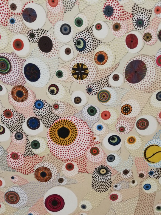
Asukra Nirasawa, Cell Division, 952 Cells, 2018
Mixed media on canvas, 150x200 cm
I really enjoy the use of colour, texture and shape in this work. I’m very interested in the subject matter and think the piece is executed really well.
Kim Wolhuter, First Drink
80 x 120 cm, edition 10
I love the emotion this work triggers as it is such a special and vital moment at the start of life. The photograph includes a lot of detail. The use of light and shadow creates a very emotive contrast which I really enjoy.
Stacey Gillian Abe, Seat of Honor #6, #7, #8, 2017
UV digital print on Art Board
Edition 3/5
50 x 50cm
The images are very atmospheric and very powerful. I love the sense of movement within each image and the narrative that continues throughout the series.

Works I disliked:
Chris Soal, The search for meaningfulness in the search for meaning, 2018
Concrete, and birch wood toothpicks held with polyurethane adhesive on ribstop fabric. 130 x 70 x 7cm
The texture of this piece makes me feel very uncomfortable. I am intrigued by the shape and materials, and want to get close but when I do my heart races and I felt extremely unnerved.
Armand Bous, Les Fre Sang (Les Inseparable), 2017
124cm x 90cm
Acrylic and collage on card
I am not excited about this piece and don't enjoy the use of colour.
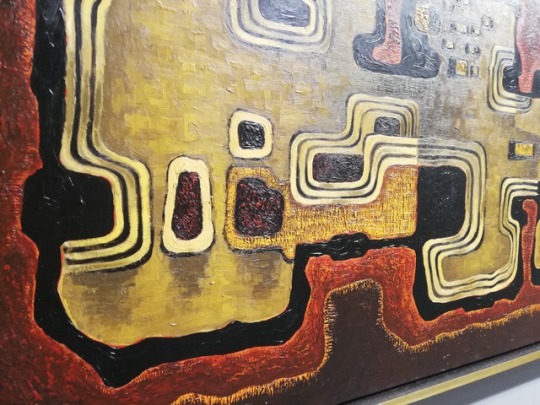
Kenneth Bakker, Abstract, 1960
68x 129 cm
Oil on board
This piece does not intrigue or inspire me. I could walk past this with out noticing it, nothing grabs my attention. It reminds me of an art work that could be found in a waiting room or hotel reception.
3. I found that painting and photography were predominant mediums present.
4. Most booths had white walls however, a few decided to have colourful walls. Another difference which was present between the booths was the inclusion of furniture, only a couple of booths had small plants whereas most booths had table and chairs.
5. Labels have been written in a variety of ways. There was a selection of; hand written labels on the wall, written labels on the floor and labels written on to masking tape. However, most labels are neatly typed out on to paper and placed on the wall directly next to or underneath the art work. I found the signs for each booth were often too small or located in a place which sometimes made it unclear to which booth I was currently in.
6. The layout of the booths was very simple and linear, making it easy for viewers and employees to move around.
7. The lighting in the convention centre was very bright and natural light. Some works had lights directly above them or pointing on to them which often added to the work. these lights were extremely bright and often much cooler than the other lights used.
8. I noticed that people working at the fair, especially in the booths wore very simple outfits. Most people were wearing black, white or a neutral coloured clothing. They didn’t wear patterned clothing, and nothing blended in with the artworks or distracted from them.
9. Products that were being sold at the fair included, books, tote bags, t-shirts, as well as books, posters and other merchandise of the artist’s and their works. I think the Art Fair is largely aimed people who are interested in art, such as students, lectures’/teachers, practising artists and other people working in the art industry. In addition to this, I feel that the art fair also attracts tourists, who travel from different places in the world to experience and discover the art and artists in Case Town.
10. Athi -Patra Ruga The Ever Promised Erection I, 2019
High-density foam, artificial flowers and jewels
I feel the overall aesthetic and the materials used for this piece really exemplify the spectacle of wealth. Furthermore the style of sculpture exemplifies wealth and power.
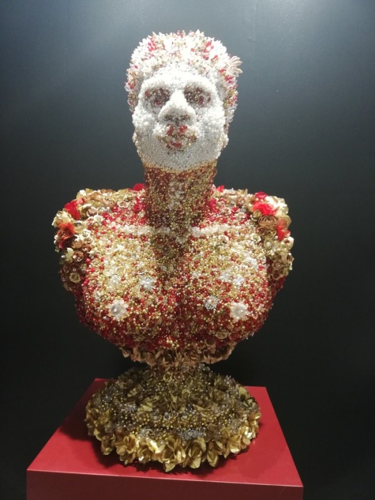
11. John Newdigate (In collaboration with Ian Garrett), Flying Ants In Summer Rain, 2018
Hand painted and Glazed Porcelain.
83cm x 52cm
I feel this piece didn’t fit in with the work as the functionality of the pieces is very different from the rest of the work present.
12. It was easy to speak to some staff about the work, in some booths I was approached by members of staff and was asked if I needed help with anything or wanted any information. Other booths were hesitant about sharing prices whereas others had price lists available.
13.The main sponsor of the art fair is Investec.
Investec focus on specialist banking, assest management and wealth and investment divisions. I think the possible clientele of this sponsor are people involved in the art industry such as gallery owners, curators, collectors and people who interested in investment and banking opportunities. I think they chose the art fair as a place to push their product as a place to attract a large audience and to show their interest into an industry that has the ability to create and include a lot of wealth.
14. I think the Cape Town International Convention Centre is a great place for the art fair due to it’s location and accessability. Other commercial events that take place here include; Cape Town International Jazz Festival, FanCon Cape Town Comic Con and Cape Town Homemakers Expo.
15. The oldest work I could find at the fair was Albert Newall’s Untiled. This was a watercolour and ink painting on paper which was made in 1952.
16. The youngest artist at the fair was Talia Ramikillawn who is 23 and recently graduated from Michaelis. Her work was exhibited at Smith.
17.The furniture and painting of the walls of the solo booths relate and compliment the artist work much more than that in the other booths. In a lot of the solo booths the artist’s work was much more spaced out whereas in some of the other booths the work could be quite cramped.
18. Georgina Gratix – Her work has become extremely sought after. Her style of oil painting and using bright colours is intriguing and aesthetically very pleasing.
Igshaan Adams - His use of material and the style of his work holds so much emotion.
19. The trends in subject matter this year included identity and art in the digital age. I believe art in the digital age was a trend and an important subject as the world is constantly looking towards the digital and how we relate to the digital age is constantly changing as technology becomes more advance. Identity is a popular subject matter as many people go through time in their life where they question their identity and it can often be constantly changing. I believe identity is something we are always questioning and discovering.
Materials that were on trend this year included thread, string, beads and pins. I believe this is because many artists were pushing the limit of a canvas and how they can move beyond that.
20. I would love to be represented by Smith as they seem to take a lot of young artist and support them and push them as they grow as artists.
21. I would love to work for Stephenson as I love the wide range of artist they work with and the work that is produced. The subject matter they work with is extremely important and I would love to work with these artists to exhibit their work in the most powerful and meaningful way.
22. How do galleries chose which artists they would like to show at the fair? How many international buyers are usually at the fair? How many people does it take to set up and take down the fair?
23. I would love to show my gallery or institute at the fair, as I think it would be a great way for artist to be seen and a wonderful way to create connections with other galleries. I would like my stall to be quite open to give the viewer a lot of space to walk around and see each art work clearly. I would possibly paint certain walls to relate to the work being shown. I would like to include works that can be hung from the walls as well as sculptures that could be placed on the floor.
2 notes
·
View notes
Text
Project 2
Project 2 was a typography assignment, which I struggled with even though the prompt was not to me supposed to be challenging. For me, I like my art to be minimalistic, clean, and easy to read. So this being an abstract prompt really challenged me. After looking at the examples posted and during the lecture, I found that I would have a challenging time with the composition of this piece.

For my first artboard, I used the letters Q, R, and S. This board, even though it was my first, was my hardest. I had a tough time composing it and making it look visually pleasing. I ended up redoing this one with this specific letter combination 4 times, with different typefaces and whether each letter was capitalized or not. I ended up making a formation with the Q and the R by using parallel lines and positioning and then tucked the curve of the S into the curve of the R. I am big on repetition of certain aspects to work on the balance of the composition, which is why in smaller letters kept the position of the R and S and included it in the Q. I then played around with working the negative space into effect by adding into the corners and other emptier spaces to fill the page.

For the second art board, I really focused on depth and perception. For me, this is my favorite artboard. It matches the abstract aspects to the best of my abilities. I also think the actual layout of each letter and the overall aesthetic of it is eye catching. The letters for this one was M, N, and O. I knew this one would look good because of the similarity in composition of the letters M and N. I began by choosing a typeface that had the M and N look very similar and make the O more of a squared edged letter as opposed to a rounded shape. I began connecting the M and N and forming a longer, more narrow type effect and then playing around with where the O should fit into. I then repeated what I did with the first artboard and replaced the insides of the letters with the same exact layout as the larger scale, just minimized and placed inside the letters. I then took the letter N and mirrored it to fill in the space and create rhythm throughout the piece.

For the third artboard, I knew I wanted to work from the bottom up. I wanted to utilize new aspects of the canvas than the other 2, and work in an off centered and balanced piece. I used the letters C, D, and E. I used a capital C and E but then used a lowercase d for the elongated look of the stem of the letter, which was cohesive with the E. I felt that the curve of the uppercase D and the C were too similar and found it hard to overlap/ form them. I started by morphing the parallel lines altogether such as the d and the e along with aligning the straight lines of the top and the bottom of the C. I also placed that C in the corner to drift the viewer's eye across the page. Iaslo really focused on asymmetry within this piece, as seen with the repetition of the d but in different places. This one was more simplistic, but to me that’s what I am the most comfortable with and felt the most confident with.
Overall, I feel that this project was helpful in getting me outside of my comfort zone in the aspect that I always did minimalistic art and this required abstract lettering and positioning.
0 notes
Text
Overall experience
I really enjoyed this BLAD!! My time management was so much better I think compared to my last assignment this year, I allowed myself time to explore different colours. This is actually a huge shift in design for me as I am usually a minimalist. I enjoyed playing with colours and up-skilling on photoshop by using halftone effects. I have found strength in managing my time better and regardless of personal life things, I still handed in on time. My ability to adapt to different design systems and be a better group member improved by ensuring that I always did my homework on time, communicated with my team and had an open mind when working with other designers regardless if I did or did not like their design. This was a goal I set from my last studio class in Semester 1, was to be a more productive team member and communicate better, this reflects in our G3 studios chat in Microsoft teams and in person as well.
I bought thicker paper to try and experiment with colour and images and wanted to see the result. Because I worked with halftone imagery, I think the grainy / thick paper complimented it sooo well. I would like to keep exploring this textures and overall experiences for a reader (Touch, smell, sound) etc. This is what I am researching in design research at the moment too, which is how can the 5 sensors impact influence design.
Going forward, I want to learn how to be more vocal in a group because I still want to be happy with the outcome as a group instead of just trying to please the whole group (to an extent) as I want to be respectful. I think that I could ensure that I am with people who are also open minded and possibly at the same design skill level (I'm not sure, I know that wrong to say I just don’t know how to word that correctly) I see value in all stages of design regardless of how good or unexperienced a person is. I just want to be able to work with people who appreciate your expertise and don’t self-allocate themselves to jobs without the whole group agreeing because I ended changing the whole thing, and this could have been prevented if we all communicated better and didn’t stick to ourselves and had a “I don't need your help” attitude. I made sure that was not my mindset going into group assignments as I understand how unhelpful that is for everyone. I think this would have saved us all time. I know that as a designer you have to be willing to work with other people which is what I hope members in my group really reflect on.
In terms of myself, I am going to make sure I keep working on my people skills as well as having more courage to give alternatives and contribute for the best outcome. My booklet could have used better layout / grid systems so I am going to ensure I look into that more and experiment with that. I am going to be consistent with my work ethic and be more accepting of my work as my aesthetic changes.
0 notes
Text
Week 1 - Brochure/ Pamphlet Research SDL
This week for SDL (self directed learning) we had to do some brochure/ pamphlet research and find some cool and interesting examples of existing folded brochures online that we could use for inspiration. And these are the some of the brochures that I like I found.
Some inspiration brochures/ pamphlet:

This a 8 folded brochure and I find this folded brochure very interesting and unique.

This folded brochure uses limited colour palette of red and black and the brochure design is very minimalistic and pretty boring to look a. But maybe the designer uses a minimalistic technique to make the brochure look minimal as much as possible.

I like this folded brochure because the layout is simple but not overwhelming, colour is very minimal, mainly using green titles and black lettering and images and its quite aesthetically pleasing.

Here is a landscape folded brochure but the poster on the back is horizontal. I think the colour red and blue works well because it gives it a retro effect to the work but at the same time it gives it a modern look.

This yellow brochure I don’t like it so much because I think the way the designer laid out their text and images is quite overwhelming and complicated, and along with the bright yellow colour it makes very busy to look at. The overall design is very blocking which makes it look worse.

This folded brochure is quite minimalistic but its aesthetically pleasing to look at, and it consistently uses the colour black for the text and image.

I like how this folded brochure uses big and bold font for the title of the brochure so it pops out. I like the colour choice the designer used because the colour is not too bright but it’s neutral colour and something that I could consider in my folded brochure in this project using neutral colour.
0 notes
Text
Design 101 - Assignment 1 | Visualizations
Poster 1
Selected Haiku -
Even in the crowd
In every nook and corner
I still feel your ghost
By R.C. Man-on
Brainstorming + concepts
Three key words / themes from the haiku : Loss, Distraction, Focus
Initial sketches / ideas

Poster title: Br(oken)icks

The process of coming to my final design followed a very linear path, I began with creating simple ideas from the words I identified as prominent themes in the Haiku, I later adjusted these themes into the ones written above. Once I came up with key themes, I began sketching geometric shapes that embodied said themes. Eventually these evolved into a few bigger concepts, until I decided upon the idea of a brick wall, and thus my final concept was chosen.
The title of this poster is a representation of the poster itself, and how one broken brick in a wall can cause the whole structure to fall down. Relating to the haiku, the broken brick represents the protagonist's feeling, as despite being in a crowd (the other bricks), his loss has him broken, and thus has brought his whole structure down.
Techniques : My poster uses very basic techniques, like that of contrast, to display its theme and message. It uses geometric shapes in order to fit into the criteria by combining rectangles to resemble a brick wall. The use of black and white furthers the obvious contrast presented by the poster, while also meeting the criteria of the brief given.
The statement of intent of this poster is simple, to display the message I portrayed from my poster in a style that fits the criteria given. If I were to do this poster again I would better illustrate the broken brick, or have a crack that runs along the whole poster.
-----------------------------------------------------------------------------------------------------------
Poster 2
Theme : Movie Poster (Haiku is theme / inspiration)
Haiku -
Even in the crowd
In every nook and corner
I still feel your ghost
- R.C. Man-on
Message from Haiku - Heartbreak, sadness, haunted.
Initial Sketches (layout and conceptual ideas + title options)
These sketches show 9 different layouts for a movie title, some following design concepts like the rule of thirds etc. Each layout, although similar, offers a different design approach to my poster, and each gives off a different vibe in terms of the mood of the poster and the piece as a whole.

This page shows both my conceptual titles for my movie, as well as sketches for what the movie

Poster could look like in respect to my 3 favorite titles. These ideas were then expanded on when I chose “Scopaesthesia” as my title. I chose Scopaesthesia as my title as it is the word for the feeling of someone watching you, and the fact that the haiku is about constantly feeling the presence of someone, I felt that they fitted quite well together.
First Poster idea / expanded ideas

Following on from the title selection, I came up with the idea to create an image that represents the mention of a crowd in the Haiku, so I took a photo of a full lecture theatre to represent the crowd, but blurred everyone's face to ensure that it follows the same key theme of focus that the first poster does. Blurring people's faces ensures that the person viewing the poster is focused on the key part of the poster, which in this case is the title and eyes on the screen, with a ghostly/demonic figure in the corner of the room. This poster however didn’t possess the quality I wanted, so I decided to scrap the photo idea and create an original poster with drawings and silhouettes instead.

This led to me taking a much more basic but aesthetically pleasing approach to my poster. I drew out some silhouettes of pictures on photoshop to create a very straightforward poster design. However, this second design I felt lacked an attention catching presence, so I added some colour and a slightly tweaked design, focusing on the protagonist and the representation of a “ghost” behind him.
Final Poster

This led to my final design, which after some detail tweaks to the silhouettes and the addition of colour, I think offers both a simple display as well as an attention catching image. The title “Scopaesthesia” stays the same, as the woman behind the male silhouette represents the ghostly presence that's referenced in the Haiku, which in turn is commonly associated with scopaesthesia. The use of contrasting colours (black and white) offers an obvious difference between the male and female silhouette, while the colour of red is commonly associated with passion and love, but can also represent blood and pain, which fits well once again with the message I picked up from the Haiku. Making the female silhouette larger and overshadowing the male silhouette was done to represent the haunted mood that the Haiku gives. If I were to do this again, I would try to develop the idea I had for my photographed poster a bit more, as I think if executed correctly it would look awesome.
-----------------------------------------------------------------------------------------------------------
Poster 3
Task : Create a storyboard in 9-12 panels that displays the message of your Haiku
Storyboard Planning
Scene (Column 1) - Idea 1. A man walking down a busy street through a crowd, sad. Busy scene, buildings, contrast.
Idea 2. A man running through crowds, through shops, terrified of something following him. Fear, panic.
Idea 3. Jungle, walking away from a temple with an artifact of some sort. Mystery, suspense
Plot Development (Column 2) - Idea 1. A flashback of driving, car crash, rainy, flatline.
Idea 2. A haunted house.
Idea 3. A flashback of ancient times in the jungle temple and the sealing of a spirit into the artifact.
Conclusion (Column 3) - Idea 1. Followed by a ghost, who eventually accepts fate and flies to heaven.
Idea 2. Discovers a secret, defeats the ghost that has been haunting the protagonist.
Idea 3. Haunted by an ancient spirit that is always watching, the protagonist is finally taken by the spirit.

Sketch of my chosen storyboard

The sketch shows how I want to lay out my final storyboard, with the first column setting the initial scene, a busy street and a sad protagonist looking to escape it all. The second column focuses on a flashback that explains and develops the storyboards plot, while the third column concludes the story as well as incorporates more aspects of the Haiku.
I then developed this layout and concept on photoshop, initially going for a more detailed approach to each box, however I found this aesthetic to be almost boring, so instead changed to an easier on the eye drawing type that also allowed me to display my story and message while also displaying minimalist techniques, much like how a Haiku is a very minimalist poem.

This resulted in my final storyboard. I used much of the same ideas as my initial sketch and my planning, however changed the final scene to adopt a more uniform ending, as well as adding colour and greater detail to specific parts. I feel that my storyboard displays my Haiku well, however my lack of artistic ability both digitally and physically means that it doesn’t please the eye as much as I would like, and is left pretty bland in an animation sense. If I were to do this project again, I would spend more time on the animations, and refine my artistic ability to improve the aesthetic of the storyboard as a whole.

By Harry Bushell
References:
A. T., & Reading, S. F. (2010, January 28). Color Theory for Designers, Part 1: The Meaning of Color. Retrieved from https://www.smashingmagazine.com/2010/01/color-theory-for-designers-part-1-the-meaning-of-color/#:~:text=But here's a quick reference,: New Beginnings, Abundance, Nature
What Is Typography, And Why Is It Important? A Beginner's Guide. (n.d.). Retrieved from https://careerfoundry.com/en/blog/ui-design/beginners-guide-to-typography/
Wikipedia contributors. (2020, May 23). Psychic staring effect. Wikipedia. https://en.wikipedia.org/wiki/Psychic_staring_effect
Chapman, C. (2018, December 13). The Principles of Design and Their Importance. Toptal Design Blog. https://www.toptal.com/designers/ui/principles-of-design#:%7E:text=The%20elements%2C%20or%20principles%2C%20of,and%20optimizes%20the%20user%20experience.
0 notes
Text
Grids and Compositions

I have harped on about this a few blogs ago, about grades and composition. I become more disciplined in learning how to balance an image and poster. Structure is important but I suppose it's even more important for a brand is the and remains consistent throughout all its marketing material and promotions. Great article for that here:
https://99designs.ie/blog/tips/design-composition-and-layout/
I took the plunge and made a poster for work a small flyer for the customer in Adobe InDesign. The spacing and around the logo was very important as well as the font families. We use Gil Sans as the body of the text, and we use Avenir font family as the headings. I thought that would be all to get right- allowing the image I'm told to breathe is a lot more important than squashing everything in and trying to get all these visual elements from the branding guidelines to fit on one page. Previously there was a modular grade but it decided to just use column grades and align everything that way gave me more room. Scale has to be considered.
The blue border on the edge of the document I've had to get rid of in the end. although the colours are in keeping with the brand, they don't allow the image to breathe it's not consistent with the message that we were trying to convey for the brand. clean minimalist and premium. Try to fit the customer logos colour scheme which contrasted heavily with the brands blue and white coloures. I've decided to just get rid of the border this level is for a more structured it balanced presentation. I've also had to pare back the logo so the text was readable. Read more about balance in composition here: https://visme.co/blog/layout-design/
I spaced out everything with columns make sure everything alliance so there is a clear structure and flow to how you read it. One thing I will not overlook again is adding this space are accounting for the margin around the image. for print this is often overlooked so we cannot forget about the space at the edge and the cut marks.
I watched a video which instructed me to have a preflight check before sending to print checking the colour is in CMYK (for print), check the size is correct for the desired printing space (for magazine or A4 etc.).
One thing also the links documents in an indesign file they may look pixelated this is to reduce processing speed or power needed to look at the image in the programme. after an hour playing with the programme I found this out, what a revelation!
Please be kind, repost and follow! Until the next wave of inspiration hits me, talk soon!
-AC
0 notes
Text
Web-app development / login page
Juan suggested that I could create this web-app on a website called ‘webflow’. I thought that I’d give it a go so that I could see if I liked using this rather than Brackets which I have used before. This website allows you to visually code your website by adding features to the screen such as text boxes or buttons and it adds the html tags for you. Although I thought that this would be easier than coding the web-app from scratch myself, I actually think I found it more difficult because I was restricted to what I could add as its just the options that they offer on their website. Alongside this, you can only add two pages for free and then you have to pay for a plan and seen as I want to try to create a functioning web-app, I would need more than two pages.
This is what I created in Webflow to see if I liked the software.

I think I have decided to use Brackets to code this web-app properly. I have experience using Brackets from 2nd year so I think I can get the hang of it much quicker and I feel like this allows me to add all the features that I want to rather than being limited.
I have started to code the log in page, this is just a rough layout, coding the page to be functional and then I will design it accordingly to how I want.


I like the use of the colour blue as through research I found that blue was found to be a calming colour, which I think is quite fitting for a web-app that is intended to be used by prisoners as the rest of their experience in prison is unlikely to be calming.
Colour theory for designers
https://www.smashingmagazine.com/2010/01/color-theory-for-designers-part-1-the-meaning-of-color/
Blue is often associated with sadness in the English language. Blue is also used extensively to represent calmness and responsibility. Light blues can be refreshing and friendly. Dark blues are more strong and reliable. Blue is also associated with peace and has spiritual and religious connotations in many cultures and traditions (for example, the Virgin Mary is generally depicted wearing blue robes).
The meaning of blue is widely affected depending on the exact shade and hue. In design, the exact shade of blue you select will have a huge impact on how your designs are perceived. Light blues are often relaxed and calming. Bright blues can be energizing and refreshing. Dark blues, like navy, are excellent for corporate sites or designs where strength and reliability are important.


Alongside using the colour blue I will use neutral colours like grey, black and white. Neutral colors often serve as the backdrop in design. They’re commonly combined with brighter accent colors. But they can also be used on their own in designs, and can create very sophisticated layouts. The meanings and impressions of neutral colors are much more affected by the colors that surround them than are warm and cool colors.
My design

I decided to add an animation in the background of the login page as it was looking quite bare, the animation is minimalist but I think it is effective in making the interface more aesthetically pleasing and I think it can also give it a calming tone.


I haven’t been happy with any of the designs I had done for the login page so I have tried a new design. I like this design, it uses the blue colour that I have been using throughout the rest of the design for the web-app, its simple yet effective and it has an animation in the background which makes the web-app more interactive and interesting to look at to hold the users attention as otherwise this is a boring educational web-app so I need to include features that can prevent this perception.

I have changed the background to white as this will fit in with the design for the rest of the web-app better.

0 notes