#they contrast and are still cohesive with the overall composition or design
Explore tagged Tumblr posts
Note
waahhh I'm obsessed with your artstyle!!! May I ask, what is your design process? You're so good at designing compositions!
thank you!! As for my design process, I don't usually follow any sort of strict guidelines, but I have noticed recently that a lot of my art lines up with the golden ratio style of composition. Like an unsettling amount. It's scaring me how many line up honestly

Something I've also noticed about the rule of thirds and the golden ratio is that their focal points are in fairly similar places. I think as an overall suggestion, putting the focal point into those general areas in a piece is a good place to start. Also, the background doesn't always have to line up with the composition, but it is a good idea to have something to frame the character near the corners of the piece, typically in the foreground. If the character is dead center, then the background can play a bigger role in the composition by adding either asymmetry or symmetry, or a mix of both. You can also lean the character's face into a focal point, while still keeping them generally in the middle. I tend to do this using perspective like in my most recent Maka art. Whenever I add two characters, I try to make a noticeable size difference between the two to add interest, also typically achieved by perspective. In more process-y terms, I first make a really rough layout sketch, and then a more detailed one overtop. I usually draw the character first (starting with the head), and then build the background up from there unless I have a really clear vision of what I want the full piece to look like. I also tend to lay out my colors in this stage, too, so I have a clearer idea of how the piece will look and to make sure I have a good color palette. Sometimes I even just straight up use this base for the actual colors but just tidy them up a bit, like I did for my most recent OMORI artwork. I think I also tend to use very saturated colors because my laptop isn't exactly the best at making them look accurate. I do this because I've been inspired by another artist who tries to make every process of their art look the best it can, so if I'm not entirely confident with how it looks at the sketch, there's a good chance I may not like it at the end. This happens a lot when I do line art and then color afterwards, I always seem to lose my ability to actually make them cohesive lol. If this does happen, I suggest using an absurd amount of blending modes. gradient maps, and maybe color balance to try and get it to work. For the color side of compositions, I use a lot of dramatic lighting to my advantage in order to make the focal point stand out from the background, or to just use heavy value differences in general. Adding a highlight at the very edges of things also helps the character and their pose stand out more. I also like to add contrast using cool and warm toned/complimentary colors. Fun fact! The typical complimentary colors are kind of fake because they don't include magenta or cyan. I like this color wheel as an example.

I hope this needlessly long composition study helped!
17 notes
·
View notes
Text

Process gif for the fishspine reef piece.
This one was a challenge. Not only did it take me over 30 hours, I struggled a lot with both the undertide design and the overall color palette of the piece not being cohesive. The first image in the gif is a sketch that I randomly started while I had nothing to do at work back in october 2023, which is way more dull and was originally going to feature my dragon Ells. Rest of my comments on the gif under the cut
Right off the bat I immediately commit to a purple and green color palette, which I then just as quickly break with the yellow plants and brown kelp. Adding these colors came from my reference photos but compositionally was a mistake. The entire image uses cool colors so these warm colors draw your eye too much. (will come back to this later).
The next thing you'll notice for a while is me trying out different undertide designs and placements. The first one covered up too much of the skeleton, the second one was too big and made the skeleton feel small and I didn't like the flying fish inspired fins. The 3rd sketch really didn't go anywhere and finally the 4th sketch helped me figure out the composition I wanted.
I had the composition but was still struggling with the color palette, because the grey-brown-green undertide I had chosen to draw for this piece melted into the grey-green background and pulled significantly less focus than the bright white bones. So I switched out dragons, instead picking a primarily purple undertide of mine so that the purple and green would contrast and help the silhouette not get lost in the background.
Now that I know where the undertide is I go ahead and add a bunch of coral details. I choose to continue the seaweed from the right side under the undertides head in hopes that it would push the green/purple contrast I needed to make sure her head doesn't get lost (I also increased the size of her head because it was too small).
After adding the coral to the left side of the image you'll notice a massive color shift happen. This is where I fix the issue I brought up right at the start where the browns and yellows were distracting. I turned the kelp green, toned down the saturation on the plants and upped the saturation on the blue band of coral between the green and purple areas of the composition. This move really solidified the color palette of the image, something that hadn't been very cohesive before.
Then most of what is left is finishing adding details (fish, octopus, more coral, always more coral) and continuing to push areas of contrast. Instead of having the oversaturated purple glow from below I increased the darkness of the stone above so relatively speaking you still get the effect. I added a shadow under the undertide as well as darkened the background over there so that she would pop just a bit more.
And that's the end! for now. I honestly might go and continue adding more fish and little details so I can then print it out for myself.
24 notes
·
View notes
Text
Midterm

In approaching my project, I began by considering a cohesive theme that could unite all four pieces while still allowing them to stand individually. I chose to use squares, triangles, circles, and other shapes as my primary elements, exploring various formations and compositions. For the colors, I opted for pink, purple, blue, and yellow to evoke a sense of vibrancy and harmony within the series. Before diving into the final pieces, I conducted preliminary sketches and experimentation to refine my ideas and ensure a successful execution although I did change some of my ideas to fit better at the end. Throughout the process, my understanding of the Principles of Art, such as balance, contrast, and unity, played a crucial role in guiding my decisions and refining the overall design. I'm pleased with the outcome of my design as each piece feels cohesive yet distinct, showcasing a balance between repetition and innovation.
0 notes
Text
Mastering the Art of Professional Flyer Design: Tips and Tricks
In the digital age, where information is disseminated at lightning speed, the significance of traditional marketing tools like flyers might seem diminished. However, when crafted with finesse, a well-designed flyer can still be a powerful tool for promoting events, businesses, or services. Professional flyer design requires a blend of creativity, strategic thinking, and attention to detail. In this guide, we'll delve into the intricacies of creating compelling flyers that captivate your audience and drive results.
Understanding Your Audience
Before diving into the design process, it's crucial to understand your target audience. Who are they? What are their interests, preferences, and pain points? Tailoring your flyer design to resonate with your audience ensures that your message is received loud and clear. For instance, if you're promoting a fitness event targeting millennials, incorporating vibrant colors and dynamic imagery might be more effective than a minimalist approach.
Clarity and Simplicity
The cardinal rule of professional flyer design is clarity. Your message should be conveyed succinctly and effortlessly. Avoid cluttering the flyer with excessive text or visuals that distract from the main message. Stick to a clean layout with ample white space to allow elements to breathe. Use concise headlines, bullet points, and compelling imagery to convey your message effectively. Remember, less is often more when it comes to flyer design.
Compelling Visuals
Visuals play a pivotal role in capturing attention and conveying the essence of your message. Invest in high-quality images and graphics that align with your brand and resonate with your audience. Whether it's striking photography, eye-catching illustrations, or sleek typography, every visual element should serve a purpose and enhance the overall aesthetic appeal of the flyer. Experiment with different layouts and compositions to find the perfect balance between visual appeal and functionality.
Consistent Branding
Consistency is key to building brand recognition and credibility. Ensure that your flyer design aligns with your brand's visual identity, including colors, fonts, and imagery. Consistent branding across all marketing materials fosters trust and familiarity among your audience. Incorporate your logo prominently and maintain a cohesive design language that reflects your brand's personality and values.
Compelling Copywriting
While visuals are essential, the power of words should not be underestimated. Craft compelling copy that resonates with your audience and compels them to take action. Use persuasive language, compelling headlines, and clear calls-to-action to guide the reader's attention and prompt them to engage with your flyer. Keep your messaging concise, focused, and benefit-driven, highlighting the value proposition of your offer.
Typography
The choice of typography can significantly impact the readability and visual appeal of your flyer. Select fonts that are legible and align with your brand's tone and personality. Experiment with different font pairings to create contrast and hierarchy within your design. Use typography creatively to emphasize key points, guide the reader's eye, and create visual interest. Strike a balance between aesthetics and readability, ensuring that your text is easily digestible at a glance.
Printing and Paper Quality
The quality of printing and paper can make or break the impact of your flyer. Opt for professional printing services that offer high-quality printing techniques and a variety of paper options. Consider factors such as paper weight, finish, and texture to enhance the tactile experience and perceived value of your flyer. Matte or glossy finishes, embossing, or die-cutting can add a touch of sophistication and make your flyer stand out from the crowd.
Testing and Iteration
Effective flyer design is an iterative process. Test different design elements, messaging strategies, and layouts to gauge their effectiveness. Solicit feedback from colleagues, friends, or target audience members to identify areas for improvement. Analyze metrics such as engagement rates, conversion rates, and feedback to refine your flyer design and optimize its impact over time.
Conclusion
Professional flyer design requires a meticulous blend of creativity, strategy, and attention to detail. By understanding your audience, crafting compelling visuals, maintaining consistent branding, and refining your messaging, you can create flyers that resonate with your audience and drive meaningful results. Remember to prioritize clarity, simplicity, and quality at every stage of the design process, and don't hesitate to iterate and refine your approach based on feedback and data. With these tips and tricks in hand, you'll be well-equipped to master the art of professional flyer design and elevate your marketing efforts to new heights.
Visit: https://futureitcare.com/flyer-design/
0 notes
Text
Digipack: Physical Media - Cassette and vinyl
With Vice primarily targeting young punks, the creation and selling of physical media would be imperative. This is not only due to the growing popularity of physical media, specifically cassette and vinyl, but also as it aids the band from relying solely on streaming platforms such as Apple Music and Spotify, which does not service the anti-establishment punk mentality. As such, the selling of physical media will serves as a stream of revenue for the band, and I wanted the designs to look as appealing as possible.
To maintain cohesion through my digipack, I re used the artworks made for the CD, however reworked them to suit the different formats and technicalities of cassette and vinyl.
Cassette
Inspirations
I again looked towards the digipack of Beabadoobee's 'Beatopia' for inspiration. Here, I wanted to understand how a square image was formatted to fit onto the rectangular cassette, as well as how information was laid out on the cassette itself, and ways it can correspond to the theme and overall feel of the product.
★ Beatopia


The designers for Beatopia opted to the crop the image to fit the margins of the cassette, a stylistic choice I wasn't particularly fond of, and thus needed to plan around as my original artworks were also created with the traditional square CD format. The font choice and graphic symbol of the butterfly were also maintained for the cassette, enabling cohesion throughout the Beatopia digipack, which is a sentiment I wanted to follow. I took note of the bold colour choices for the cassettes, specifically the use of colours that weren't majorly implemented in the album art such as olive and neon green, in addition to being fond of the far left indentation of detail.
Final

Following my analysis of the Beatopia cassette, my main takeaway was that I did not want my cassette artwork to be cropped. However, as I created my artworks with the square CD format in mind, I needed to either create new artwork entirely, or figure out a solution to make my illustrations fit on the cassette. I found a solution in combining the artwork from both the front and back covers, which did require the aid of photoshop. Despite this, as I used the same paper and the same drawing materials, the two illustrations blended together seamlessly, and only required minor compositional adjustments. This way, I avoided cropping and could have the illustrations suspended in white space, a look I find sleeker and more visually appealing.
For the cassette itself, I followed Beatopia's design philosophy of concentrating detail to one side, utilising my CD design for the cassette. However, I diverged from Beatopia by adding the songs that the side contained, to maintain balance throughout the piece. This also served a utilitarian purpose, enabling the consumer to know which songs are being listened to. Though I was fond of the bright colours the Beatopia cassettes offered, the juxtaposition between the comparatively muted colours of Beatopia and the boldness of the cassettes enabled a contrast that if replicated in my digipack, my already bright colours with a bright cassette would appear garish. As such, I took the opposite approach and made my cassette colours more pastel and muted, which perfectly balanced the product's aesthetics.
Vinyl
Inspirations
★ ...Baby One More Time


Though not a punk album, one of punk's core axioms is self expression and non-conformity. By not conforming to the traditional 'punk' design trends, and instead looking towards an album stemming from a highly oppositional genre, pop (or specifically bubblegum pop) my work still remains deeply rooted in the punk mentality. As such, I looked towards Britney Spears' ...Baby One More Time as inspiration for my record. I was fond of the pastel colours as well as the array of alternative vinyl designs, including but not limited to transparent records. The information layout of the central disc was also highly utilitarian, featuring the side, track list, copyright, and album and artist name. As such, I wanted to implement a similar layout on my final record.
Final

Again, I utilised a free .psd to create my record. I decided to keep the record cover the exact same as the CD cover, and thus it was eaisly included without change. I wanted to challenge myself to create a transparent vinyl mockup, which I achieved through lowering the opacity and using layer modes to adjust colours to create a pastel green. I followed the exact text and information layout on the ...Baby One More Time vinyl as I thought it was a highly efficient layout as well as being aesthetically pleasing, and thus come to a close on my physical digipack products.
Overall, I feel my physical media products are all highly successful in both aesthetics and displaying appropriate information. They, together, present as a cohesive pack and service presenting Vice as a modern punk band.
0 notes
Text
Poster type analysis

Poster 1:
The typography in this poster cleverly intertwines with the illustrations, as the text "The secrets" playfully hides behind the blinds. This artistic choice cleverly integrates the message with the visual elements, adding depth to the design.

Poster 2:
The text in this piece is ingeniously contoured around the image, mirroring the shape of the body itself. This creative approach not only captures attention but also reinforces the message about body modification discussed in the subtext below. Furthermore, the harmonious interplay of colors, particularly the contrasting orange against black and the subtle similarities on the arms, adds depth and cohesion to the overall composition.

Poster 3:
The type in this poster is so creative since it really plays with concept and illustration. The type itself is beautifully laid out with Japanese(?) characters placed largely on the page surrounding the subtype. The type has been played with due to the concept of there being multiple pages being blown up by the wind. This concept has been implied due to the meaning of the poster “In movement Film Festival” therefore the creator has decided to give the still poster movement in a very clever way.
0 notes
Text
24MJ_Music Theory
Thiss my blog for assignment, by Oleksandr Sodol, for Phil Dobie
Explain a range of harmonic and melodic theory concepts as typically used in popular music.
Several harmonic and melodic theory concepts contribute to its musical structure and appeal.
Harmonic Concepts:
Chord Progressions:
The song employs a common chord progression found in many pop songs, often revolving around a sequence of chords that create a harmonic foundation. This progression typically involves chords from the key of the song and can feature variations in inversions or extensions.
Modal Interchange or Borrowed Chords:
Popular music frequently utilizes borrowed chords from parallel scales or modes, adding color and variety to the harmonic palette. This technique could introduce unexpected chords that create tension and interest.
Melodic Concepts:
Melodic Phrasing and Rhythm:
Melodies in popular music often emphasize catchy and repetitive phrases or motifs that stick in the listener's mind. These melodies may incorporate rhythmic syncopation or unexpected pauses to create a memorable hook.
Use of Pentatonic Scales:
Pentatonic scales, with their five-note structure, are prevalent in popular music melodies due to their simplicity and versatility. They create melodic lines that are easily memorable and accessible to a wide audience.
Modal Inflections in Melodies:
Some melodies might employ modal inflections, incorporating notes from different modes or scales to introduce a unique flavor or mood to the song. This could involve using notes outside the typical major or minor scales.
Melodic Repetition and Variation:
Repetition and variation of melodic motifs are common techniques used to create a cohesive yet evolving melody throughout the song. These variations maintain interest while still connecting the different sections of the song.
Structural Concepts:
Verse-Chorus Structure:
Many popular songs, use a traditional verse-chorus structure. Verses typically feature storytelling or narrative elements, while the chorus contains the main hook or central theme of the song.
Bridge or Middle Eight:
Some songs incorporate a bridge, often in the middle of the track, providing a contrast to the verse-chorus pattern and leading back to the final chorus or outro.
Production Elements:
Instrumentation and Sound Design: The choice of instruments and sound design, including synthesizers, drum patterns, and effects, contributes to the overall atmosphere and character of the song.
Arrangement and Dynamics: Dynamic changes in the arrangement, such as build-ups, drops, or changes in instrumentation, add excitement and interest, enhancing the song's impact.
Understanding these harmonic, melodic, and structural concepts can provide insights into the compositional and production elements that contribute to the appeal and success of a popular music track.
Basic Musical Principles in Music Theory:
Music theory encompasses several basic principles that form the foundation of understanding how music works:
Pitch:
Notes and Scales:
Notes represent specific pitches in music. Scales organize these pitches in ascending or descending order, forming the basis for melodies and harmonies.
Common scales include the major scale, minor scale, pentatonic scale, etc.
Intervals:
Intervals measure the distance between two pitches. They define the relationships between notes, such as the interval of a perfect fifth or a major third.
Rhythm:
Beat and Meter:
Beat is the basic unit of time in music, while meter organizes beats into patterns, like 4/4 time signature indicating four beats per measure.
Rhythmic patterns, syncopation, and accents create rhythmic interest within a piece.
Note Duration:
Notes and rests indicate the duration of sound and silence in music. They vary in length, from whole notes to sixteenth notes, dictating how long a sound is held or how long a pause lasts.
Harmony:
Chords:
Chords are made up of multiple notes played simultaneously. They form the harmonic backbone of music and create the tonal foundation of a piece.
Common chords include major chords, minor chords, dominant chords, etc.
Chord Progressions:
Progressions are sequences of chords that form the harmonic structure of a piece. They create tension and resolution, guiding the listener through the music.
Form and Structure:
Musical Forms:
Structures like verse-chorus, AABA, or sonata form organize the arrangement of musical ideas within a composition.
These forms help shape how sections of music relate to each other.
Cadences:
Cadences mark the end of musical phrases or sections, providing a sense of closure or pause in the music. Common cadences include the authentic, plagal, and deceptive cadences.
Dynamics and Expression:
Dynamic Markings:
Indications like pianissimo (very soft), forte (loud), crescendo (gradually louder), or diminuendo (gradually softer) convey the volume and intensity of the music.
Articulation and Expression Markings:
Markings like staccato, legato, or accents denote how notes should be played, influencing the overall character and expression of the music.
Understanding these fundamental principles in music theory helps musicians, composers, and enthusiasts analyze, create, and appreciate music more comprehensively.
Explain a range of rhythm and meter theory concept as typically used in popular music.
In popular music, rhythm and meter play crucial roles in shaping the feel, groove, and overall impact of a song. Here are various rhythm and meter theory concepts commonly found in popular music:
Rhythmic Elements:
Backbeat:
Emphasizing the second and fourth beats in a 4/4 measure, creating a strong rhythmic accent. It's prominent in rock, pop, and many other genres.
Syncopation:
Off-beat or unexpected accents that fall between the main beats, creating a sense of rhythmic tension and interest. It's often used in funk, jazz, and hip-hop.
Groove and Feel:
Refers to the rhythmic "feel" or "pocket" created by the interplay of instruments, such as drum patterns, bass lines, and accents. It influences the overall vibe of the music.
Meter and Time Signatures:
4/4 Time Signature:
The most common time signature in popular music, featuring four beats per measure with a strong emphasis on the first beat. It provides a straightforward and danceable feel.
6/8 Time Signature:
Divided into two groups of three eighth notes per beat, giving a compound feel. Often used in ballads, folk music, and certain rock songs.
Rhythmic Patterns:
Shuffle Rhythm:
A triplet-based rhythm where the middle note of each triplet is skipped, creating a swinging feel. It's prevalent in blues, rock, and some jazz styles.
Offbeat Rhythm:
Placing rhythmic accents on the offbeats (e.g., the "and" in between beats) to create a lively and danceable groove. Common in reggae, ska, and some Latin music.
Percussion and Drum Patterns:
Drum Fills:
Brief rhythmic patterns played by drummers between sections or phrases, adding excitement and leading into a new part of the song.
Rhythmic Breaks:
Moments where instruments drop out momentarily, creating pauses or breaks in the rhythm. They add tension and anticipation before a new section.
Electronic Rhythms:
Programming and Sequencing:
Utilizing drum machines, samplers, and sequencers to create electronic rhythms with precise and repetitive patterns, popular in electronic dance music (EDM), techno, and hip-hop.
Looping:
Repeating short sections or loops of rhythms, often digitally manipulated, to create hypnotic and continuous patterns.
Melodic Rhythms and Hooks:
Vocal Rhythms and Phrasing:
The rhythmic patterns and phrasing of vocal melodies contribute significantly to the overall rhythmic feel of a song.
Catchy Rhythmic Hooks:
Memorable and repetitive melodic patterns that have a rhythmic quality, often serving as the main hook of a song.
These rhythm and meter theory concepts form the rhythmic backbone of popular music, contributing to its energy, danceability, and overall appeal. They vary across genres and styles, defining the unique character of each musical piece.
Create a lead sheet for an original, or existing well known piece that will demonstrate application of concepts explored in Task 1.
Title: Flashing Lights
Artist: Kanye West
Key: B minor
Explanation:
Chords: Represented above the lyrics, indicating when to change chords in the song.
Lyrics: Displayed with the chords, marking where each syllable aligns with the chord changes.
Key: Indicates the song's key signature (B minor in this case).
Structure: Divided into verses, choruses, a bridge, and an outro, following the arrangement of the song.
This lead sheet serves as a reference for musicians to play or interpret "Flashing Lights" by Kanye West, outlining the song's melody, chords, and structure.
0 notes
Text
next day reblog! as promised, here's a step-by-step progress breakdown for page 4 (since it's the one i had the most wips saved of)
step 0: thumbnails

i always start by making super rough thumbs in my sketchbook to figure out the basic page and panel structure! i don't have the script finalised at this point but i know the basic beats i want the dialogue to hit, and that's what i used to build the panels around. after a bit of experimenting i decided 6 pages was a good length - not too cramped, but also not too long overall. (you can see an early sketch of Vanishing Act's design at the bottom! i should post more art of him at some point...)
step 1: roughs

with the panel structure finalised, i move to the computer and rough out the whole comic in photoshop. i forget the exact dimensions/DPI i used but it ends up at 1987x3056 pixels for the canvas size. still keeping things super loose here - the main thing i'm focusing on is finalising the layout and panel structure, because it's easier to fix that now than it is at a later stage.
step 2: pencils

once i've settled on a layout, i go in and do the neat sketches for each page! this is also the part where i add in the panel gutters and finalise the script/dialogue bubbles - again, making sure the flow works overall, and also saving myself from working on anything in the next step that'll be covered over in the final page. i like to use layer groups for this; all the "art" (sketch, lineart, colours) go in one group, and the elements on top (gutters, text and bubbles, sfx and anything else) go in a second group, so i can easily turn them on and off and keep my layers... at least somewhat organised.
step 3: lineart and flats


went through the whole comic and did the lines and flat colours. not a ton to say here, this is by far my least favourite part of the whole thing - i'm not good at lineart, and the fill tool makes flatting a bit easier but it's still really tedious. optional step 3.5: get burnt out from working on this thing non-stop for like a week and a half and it's not even halfway done and oh, god, what was i thinking, i'm never going to get it done in time for my new job starting
step 4: background roughs

from this point on, i'm working on each page individually, finishing it before moving on to the next. while the characters were flatted and then shaded separately to keep them cohesive, the backgrounds were all painted from scratch, usually in one or two layers each (different panels/panel groups are on different layers to keep things neat). at this stage i'm just putting in really rough sketches of the background - making sure there's a nice flow and composition (bright colours and contrast draw the eye, and i wanted the comic overall to get darker as they go into the whirlpool and then brighter again towards the end) and giving me something to work with when putting in the lighting in the next step.
step 5: character lighting
this was done with a bunch of layers clipped over the flats! i started out with a multiply layer filled with my shadow colour, which i then added a mask to to paint in the shadow shapes. working like this allows me to later go back and tint the shadow layer to give some panels an extra 'glow'. for the later panels, i added a blue soft light layer at around 50% opacity to bring the overall palettes a little closer to the backgrounds (you'll notice above that raz looks very yellow against the blue background without this adjustment, haha). then i airbrush on some extra soft shadows and tints, and finally paint in the highlights and any other effects! here's a breakdown feat. raz bonking his head on the floor

a big thing that i had to re-learn when i was lighting this was that, in a comic, most of the individual panels are gonna be viewed at a pretty small size. sometimes i'd get too in the weeds with working in fine details that, when i zoomed out, got totally lost or otherwise confused the 'read' of the panels. i ended up focusing on big shadow volumes and a lot of edge highlights to help the characters pop out against the backgrounds!
step 6: background rendering and final tweaks
at this point, all that was left to do was to polish the background and then add any final adjustments to the page! a couple of panels have extra effects (like the glowing water in page 6), so this is where i add those in. i don't have any wips for this stage, but here's the final page for comparison!


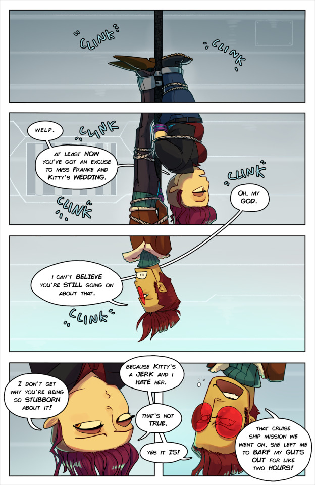
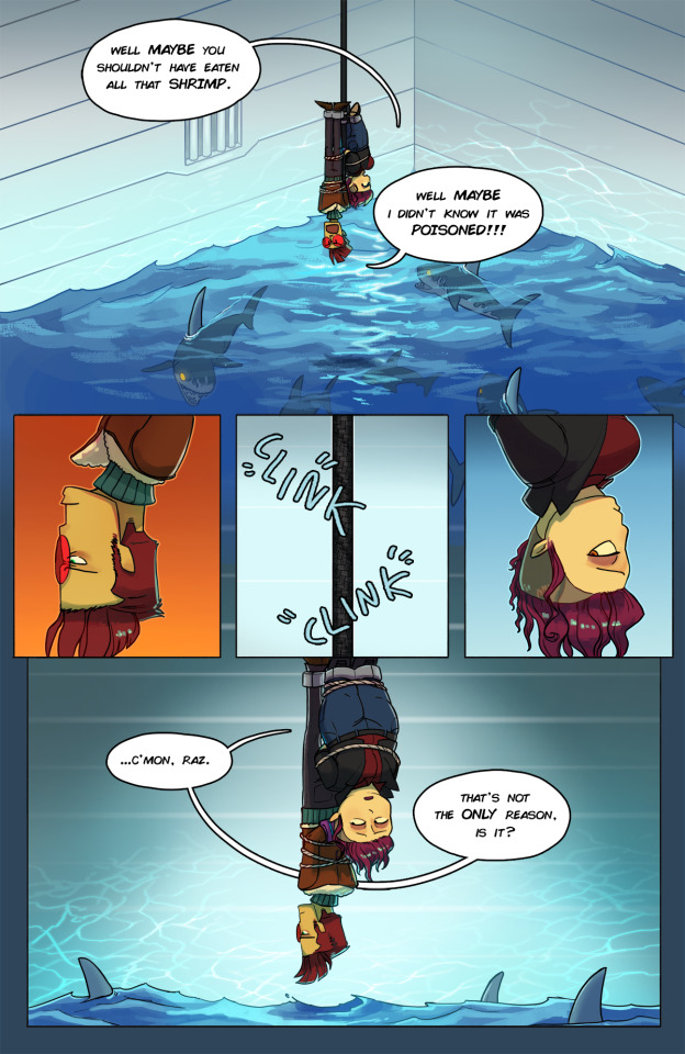


new comic is done!! this one was a DOOZY and i changed my workflow like six times, but in the end i think it came together really nice! it's, uh, probably the last longer one i'm gonna do for a while, though :P
i'll probably add a little step-by-step in a reblog tomorrow. for now, catch the transcript under the cut!
Vanishing Act, over the intercom: So sorry I can't stay and watch you be devoured by pyro-sharks, but I've got my curtain call to make... and the audience are simply dying to see me. Ciao, agents! Or should I say... CHOW! AHAHAHAHAHA!
(Caught in one of Vanishing Act's villainous death traps, agents Zanotto and Aquato find themselves hanging by a thread in... "LOVE BITES!")
(sfx: Clink, clink)
Lili: Welp. At least now you've got an excuse to miss Franke and Kitty's wedding.
Raz: Oh, my GOD. I can't believe you're still going on about that.
Lili: I don't get why you're being so stubborn about it!
Raz: Because Kitty's a jerk and I hate her.
Lili: That's not true.
Raz: Yes it is! That cruise ship mission we went on, she left me to barf my guts out for like two hours!
Lili: Well maybe you shouldn't have eaten all that shrimp!
Raz: Well MAYBE I didn't know it was POISONED!
(sfx: clink, clink)
Lili: ...c'mon, Raz. That's not the only reason, is it?
Raz: I guess I just... I feel weird about it, y'know? It makes me think about us.
Lili: Wow. Way to make things all about you.
Raz: Oh, c'mon, you know that's not what I meant.
Lili: Well what do you mean?
Raz: It just... sometimes, I...
Raz: Relationships are - complicated, right? I'm happy for them, but it makes me think about our own relationship. And how there are... milestones, and - and certain expectations, and... and marriage is... well, it's...
(He sighs)
Raz: Ow.
(sfx: BONK)
Raz: There's give on my right wrist.
Lili: Can you pass it under?
Raz: One second...
Lili: Alright. Just gotta get my legs free...
Lili: Hey. D'you... want to get married?
Raz: ...no. No, and I feel - terrible about it.
Raz: Because I - because we don't have a traditional relationship. And I don't want to have that with you. I like how we are now. But then I see other people our age getting married, and it makes me worry that... that I'm letting you down, or not doing enough as your boyfriend, and that - that maybe you deserve someone who...
Lili: Raz?
Raz: Yeah?
Lili: I love you.
Raz: I love you too.
Lili: You're being stupid.
Raz: I know.
(sfx: paf)
Lili: ...listen. We should talk about this. But, uh, maybe not in the pyro shark death trap.
Raz: ...huh. Y'know, these are great whites. You can't keep them in a tank. They need the space of open water.
Raz: Which means I'll bet anything that this... leads to the ocean.
Lili: Then let's get a move on. We've got a party to crash.
#i had to write this entire goddamn thing out twice because the first time tumblr ate it#so i hope people appreciate this behind-the-scenes glimpse#i've definitely been bitten by the comic bug and i really want to do more at some point#but... probably shorter ones for now :P#(for context i was working on the roughs on the 19th of march)#(this took a LONG time including like a 2-week burnout break lol)#comics are so time consuming. everyone go tip your local webcomic artist like $20 bucks
844 notes
·
View notes
Text
Week 7: Project #4 - Remaking Language Black and White & Color Spreads


During Week 7 of the course, students continued working on their spreads for the remaking language project, building on the work they did in Week 6. I decided to start from scratch and reassess my approach to incorporating the imagined 27th letter of the alphabet into a print space. This involved going back to the drawing board with my concepts and exploring new possibilities.
During week 6, I received feedback on my work, which made me realize that the artistic direction I had taken wasn't what I had intended. My ideas were being interpreted in a way that I didn't like, and my spreads lacked cohesiveness and consistency. Upon researching the typefaces I had used, I discovered that they were created much more recently than I had thought, which meant that I was trying to force my letter forms into categories that didn't fit their historical context. To get back on track, I took inspiration from the De Stiji and modernism movements of the 20th century and looked to two specific pieces of art for guidance: Matisse's "Jazz" series and Mondrian's "Composition II in Red, Blue, and Yellow." I was drawn to the color schemes and layouts of these works and used them to create multiple spread designs. By utilizing elements from both artists' collections, I was able to create spreads that were more balanced and symmetrical while still maintaining a sense of interest and appeal.
In Tuesday's class, the professor asked students to print their black-and-white spreads on 11x17 paper and offered individualized feedback. While reviewing my spreads, the professor liked the layout of the word alphabet in spreads #1 and #2. She appreciated the use of a small-sized alphabet surrounded by negative space. However, spread #3 was confusing and difficult to read due to the large title and body size, which crowded the corners of the spread. After considering the feedback, I focused on modifying the design elements of spread #3. During Thursday's class, when reviewing my colored spreads, I made more intentional design choices that balanced the various elements and improved the spread's overall clarity.
After considering several color palettes, I initially chose red, blue, white, and black for my project. The idea was to use these colors consistently across all the spreads. However, I received feedback from my peers that the colors did not provide enough contrast between the letterforms, so I decided to try a different approach. To break up the spreads and make the differences between the letterforms more noticeable, I decided to explore complementary colors for my second letterform. I referred back to the basic principles of color theory and eventually settled on incorporating the complementary colors of red and blue while keeping white and black consistent throughout each spread. Although I may experiment further with the colors, I believe this new approach is more successful than the previous one.
During Thursday's critique, I was reminded of the importance of hierarchy within design elements. This concept is discussed in the readings for this week in "Thinking with Type," where the author explains that hierarchy expresses the organization of content and emphasizes some elements while subordinating others. It is a structural rather than a stylistic way of organizing content. While style is an essential factor in design, the principles of design are crucial for making a design successful, clear, and organized. Hierarchy is a vital principle in delivering information effectively and distinguishing important details from background information.
During the critique, my professor suggested that I should pay more attention to hierarchy, especially on spread #3, which contains a lot of information related to the separate histories of the typefaces. The challenge was to present this information in a clear, organized, and distinguishable way. To make hierarchy more visible, my professor recommended adjusting the font size of the middle sections of the paragraphs to make them smaller. This approach would emphasize the first and last sections of information as the most important or key facts while providing background knowledge or small details in the middle sections.
Although I am still learning the various typography terminology, the introduction to the concept of hierarchy was quite helpful and has aided me in the layout of my spreads.
Lupton, Ellen. Thinking with Type: A Critical Guide for Designers, Writers, Editors, & Students, Princeton Architectural Press, New York, 2010, pp. 132–145.
NSW, the Art Gallery of. “Matisse’s Jazz.” Matisse’s Jazz | Art Gallery of NSW, 2021, www.artgallery.nsw.gov.au/artsets/sqoweh.
0 notes
Text
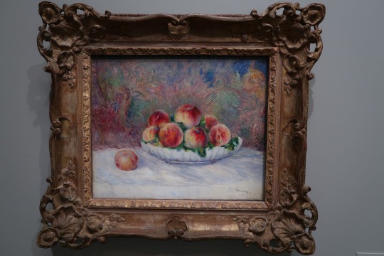
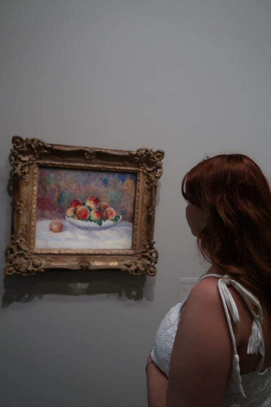
Pêches (#1)
I am an art major, but shockingly, I never have really enjoyed art museums. Before this past school year I had never actually taken an art class in my life, but I have always enjoyed creating art on my own. My experience of art museums was always the same. I would go, stare at a couple paintings or sculptures, think “Oh wow. This is so cool”, and then leave in ideally under an hour. My problem was that I did not know what I was looking at, and because I had almost no background knowledge, I just felt overwhelmed and confused.
In this class we have been talking about visual analysis and I also watched a few extra videos on my own to try to understand more. Throughout this trip we have visited a number of different museums and I tried to keep a mental list in my head of everything I had learned and apply it to the pieces we looked at to see what all I could get out of the experience that I had been unable to before. I was actually pretty amazed at how much more I appreciated my time in the museums. I know it makes sense, but I just had always tagged myself as someone who simply will not ever feel connected to those spaces. I felt like I could actually start appreciating paintings that were not mirrors of reality, which I had always felt the most impressed by. Now I am able to understand some of the choices that were made and why.
I really enjoyed all of the museums because there was not only amazing art, but also the buildings themselves were so beautiful (or more so just interesting in the case of the Pompidu), but my favorite was definitely L’Orangerie. The museum felt more approachable because it was not so grand and so much less crowded than the Louvre or D’Orsay. Looking at the collection there, I realized in typical American fashion that I really love impressionism. The use of color and movement is just stunning.
I wanted to look more specifically at Pêches by Pierre-Auguste Renoir, which is an oil painting on canvas. I found myself being very drawn to this painting. I had heard of the name Renoir before, but I did not know any of his work. I think of all the artists I saw in L’Orangerie, Renoir was my favorite, and I particularly liked this piece. It is just a bowl of peaches on a table covered in white cloth and what looks to be some sort of tapestry behind it. It is a pretty simple composition, but there is just something so compelling about the manner in which it has been painted, that it actually adds to how interesting it is because the composition really should be anything but interesting. Looking at how he has used the principles of design and elements of art, I wanted to talk about repetition, contrast, harmony, and color. The repetition is interesting to me because there was more and more repetition the longer I looked. The peaches themselves are repeated since it is a bowl of peaches and the bowl is also round, but the more I looked at the tapestry behind the bowl, the more I could see the shape of the peaches being repeated in there as well. There are two areas to the right and left of the bowl that particularly stands out on the tapestry that almost perfectly forms the shape of the peaches. The painting uses contrast as well which contributes largely to its visual interest. One is the juxtaposition of vibrant colors in the peaches against the more muted tones of the background which helps create a focal point in the painting despite how much texture and energy the background adds. The painting creates harmony through in a few ways. One aspect is the cohesive color palette. Renoir harmonizes warm shades of orange, pink, and red within the peaches, creating a unified and visually pleasing effect. The subtle variations in these colors add depth and dimension, further enhancing the overall harmony. The background has more gray mixed in, but it still uses variations of a lot of the same colors that appear both in the peaches and in the shadows of the cloth which ties all of the colors together. Additionally, he also uses a very stylized brush pattern which is seen consistently throughout the painting, despite there being a number of different textures present, which allows the viewer to enter into this altered reality and have each element fit into the world. Overall I think it is just a stunning painting and I am looking forward to learning more. (786 words)
0 notes
Text
RESEARCH METHODS////////////QWWK 12////////////VISUAL RESEARCH METHODS II
Time and dimension: Order
Movement creates a sense of action in the visual arts. It can be created by repeating visual elements (motifs): lines, shapes, colours. When depicting a person, movement is achieved by changing the person's balance point and posture, as seen in the illustrations of contemporary New Zealand artist and film animator Erica Russell.
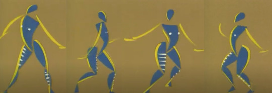
Feet of Song by Erica Russell

Feet of Song by Erica Russell
Another very interesting way to create movement is by using illusion.The beginning is connected with the appearance of the Op-art movement in the middle of the last century. It uses the human brain's ability to perceive complex patterns built through repetition and contrast. In this way, an illusion of movement is created in the still image.
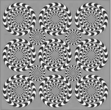
Spinning Illusion, Source : Pinterest
We consider this approach extremely suitable for illustrating Alice's adventures,In relation to the whole context. Therefore it will be used frequently in the layout of the spreads.

Visual attributes: Movement / on illustrations of my 'Alice' project
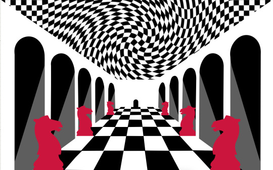
Visual attributes: Movement / on illustrations of my 'Alice' project
Time and dimension: Sequence
Sequence is the relationship between elements that determines their order in the composition. It is closely related to hierarchy as both follow the principle of "orderliness".(The sequence follows The English reading comprehension : left-right/up-down.)
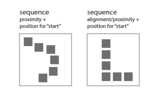
Sequence = Alignment/Proximity+Position for 'start'
We will visually demonstrate the principle of consistency in the cover of our product.
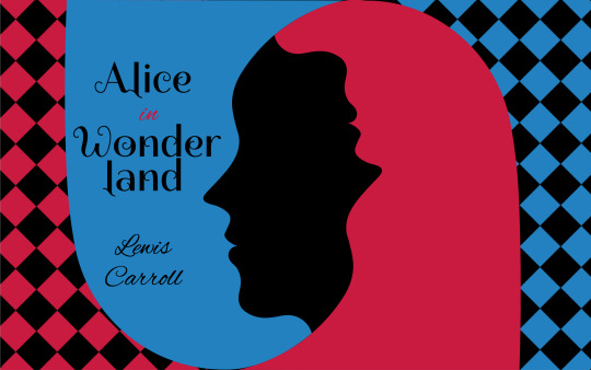
Use of Аlignment - it serves both to give a tidy appearance to the cover and to help convey information.
Typography - I chose to use two fonts in the cover layout: Spirax and Alex Brush. This contrast in fonts serves to emphasize the hierarchy: Spirax has a dominant role, bringing to the fore two words: "Alice" and "Wonderland". Alex Brush imitates handwriting. It has a supporting role and is used for the preposition "in" and for the author's name. Although completely different, the two fonts do not seek opposition. They are consistent within the overall layout. It can be said that they are grouped consecutively into two groups, with the title above the author's name, aiming to focus attention on it.
There is also Colour contrast within the title. It is achieved as a sum of the two colors: black and red. Contrast is used sparingly. The only word in red is the preposition "in", which aims to draw attention to the connection of the two words "Alice" and "Wonderland" in a single group.
Light and colour: hue saturation
Light and colour: Tone saturation
Light and colour: Transparency
Light and colour: Opacity
Factors of visual grammar: mass, unity, fragmentation, regularity, irregularity, activity, passivity, space, order, randomness, continuity, interruption.
Visual grammar According to Gestalt, "the whole is greater than the sum of its parts," but let's look at them anyway.
Mass By common definition in art and design, mass is the amount of matter (visual weight) in any one object in a scene. It is closely related to balance, i.e. to the positioning of the various objects. Their visual weight should be balanced around a central point so that the composition feels complete.
Unity Unity in design is cohesion between its various elements using powerful factors such as color, proximity, font, alignment, contrast. The goal is a maximally satisfying aesthetic perception for the user. -Choosing the right colours and their consistency within the design reinforces the connection between individual pages (if it's a web design) or individual elements (if it's a logo or print design). -Proximity helps to understand which elements within the design are related and how they are related. -Font is also a unifying factor, both in web design and in logo or print design. The combination of different, skillfully chosen and complementary fonts can build consistency across individual pages, as well as build hierarchy when needed. -Alignment unifies and enhances the user experience by arranging all elements on a single axis so that they appear connected. -It is important to note that unity does not always mean equality. Depending on the context, some design concepts focus on contrast in color scheme or fonts to distinguish separate groups of elements or simply to create a different mood. Adherence to Unity ensures a correct understanding of the message even by those users who do not have professional design knowledge.
Exploiting the cultural contexts surrounding 'Alice in Wonderland' and critically examining its use as a sign, symbol, icon and metaphor.
INDEX - We designate the smile of the Cheshire Cat in this image as an index because it is a consequence of the cat itself, which is no longer there, but was once there, and has disappeared, leaving its smile behind.
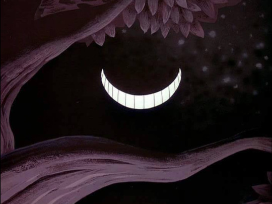
INDEX / Smile of Cheshire cat, Source : DeviantArt
SYMBOL - An issue by Tim Walker is a fashion collection for Vogue Italia, which rather emphasizes the presentation of clothes, but due to the specific scenography and mise-en-scene, it gives the impression of being close to Lewis Carroll's books. Symbols could be found in the references that the decor creates.
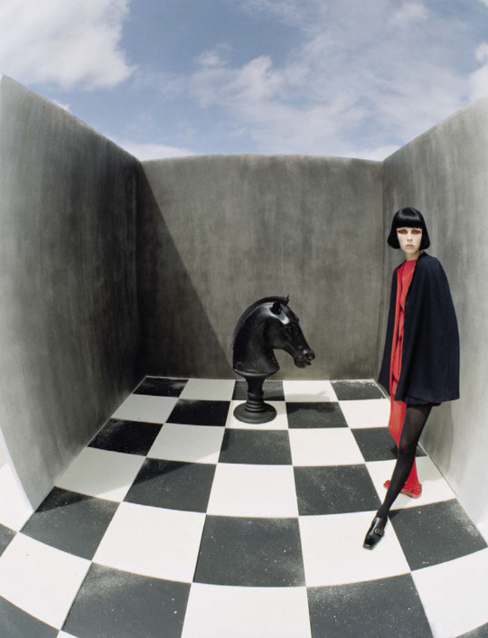
SYMBOL / An issue by Tim Walker for Vogue Italia, December 2015; Model : Edie Campbell, Styled by Jacob K. Hair by Shon. Make-up by Miranda Joyce
METAPHOR -
METAPHOR :
“The time has come,' the Walrus said,
To talk of many things:
Of shoes — and ships — and sealing-wax —
Of cabbages — and kings —
And why the sea is boiling hot —
And whether pigs have wings.’
L.Carroll
“When pigs fly" is not just a common saying or a funny phrase. Usually behind it lies the idea that the probability of something happening is very small or almost non-existent. This is probably the message that Roger Waters wants to convey at his legendary "The Wall" live concerts, because the allusion to Carroll's text is obvious.
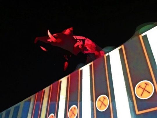
METAPHOR / Roger Waters concert "The Wall" in 2013, Sofia, Bulgaria, Photo : personal archive
ICON - This is my idea for Alice, which is the result of many years of personal interest and professional research.
My idea is that she should be presented in a minimalist style, and the play between positive and negative space should emphasize the illusory world of wonders in which it has fallen. Although not very realistic, we define this image as an icon because it bears a physical resemblance to the object it signifies.

ICON / Alice, herself, on my 'Alice' project
Questions about "Alice in Wonderland" in a range of contexts, meanings and values of the shape.
1/ What is the significance of Alice's fluctuations in size and shape in Alice's Adventures in Wonderland?
2/ How does Alice reach new knowledge about the interrelationships between shape, colour, smell, taste, content?
3/ What is the meaning of form in the world of the imaginary real?
4/ How does Alice challenge the physical laws of space, time and distance?
5/ What are form and content as philosophical categories in Alice?
1 note
·
View note
Text
PAMPHLET — V1 TEST PRINT + ANNOTATIONS

SELF CRIT
'www.typografika24.com' — could reduce size (from 22pt) 'www.typografika24.com' + 'The Annual Conference on Type and Typography' — could swap so that title/heading of event poster is in the reading hot spot (top left corner)
'24' — will viewer understand what this is referring too? Might look to change it to 2024 instead. Also, keep as black? Or experiment with other colours '24' + 'Typografika' — increase gap size in-between type (to 10mm to keep measurements consistent)
'The Annual Conference on Type and Typography' — I like the size, however, play around with the arrangement of the sentence
'25 Jan—20 Feb 2024' — could reduce pt size (from 40pt) to add contrast and differentiation from main heading/title. Could also look into experimenting with another colour other than black
'Four weeks of events including designer...' — experiment with colour and possibly reduce size (it isn't an ultra important element compared to other, so reducing its size wouldn't hurt)
'Carol Twombly, Jessica Hische...' — reduce pt size too
'AUT City Campus Auckland' — reduce pt size (from 22pt), but match it to the size of 'www.typografika24.com'
OVERALL — change from 4x4 modular grid, to 3x4 as 'Typografika' is right in the centre of the grid. Also just explore and experiment with the composition of all elements. I have the design style and all content there ready, it just needs to be explored more to uncover new possibilities

SELF CRIT
Intro — 8pt seems to look the ideal size for the body copy. Experiment with typeface variations (Helvetica Neue Bold for important parts of body copy, and Area SemiBold for normal copy). Also begin to explore possibilities for the layout of these panels. Much further design is required
Timetables — design of the tables is down pact, just need to work on rearranging these elements so that the body copy can be increased from 6pt to 8pt, and all elements will fit into two panels. At the moment, especially on panel 3, there is not enough room to have the body copy displayed any larger than 6pt. I also think the layout could look more visually appealing. Additionally, work on the structure of the tables, i.e some of the gaps between columns are too far separated and others are squashed etc
Designer profile titles + body copy — I like the pt size (28, 12pt) of the designer headings (name) and sub-headings (type designer etc), and the size of the body copy (8pt). It is consistent throughout the pamphlet and works well within the small space of each panel. Could experiment more with the use of Helvetica Neue Bold and Area SemiBold and colour for contrast of body copy (i.e more important text in a bolder font)
Designer profile imagery — solid images that are visually cohesive and work well together, but scaling needs to be fine-tuned so that they look completely and exactly compatible. Also a bit of further editing may be needed for some particular images (i.e Carol Twombly) as this is a slightly darker grayscale than others
Designer profile layouts — I still have a lot further to go in terms of the way these panels are composed. I have all the content, now I just need to find a way to achieve a visually interesting but clear way displaying and arranging elements and information. At the moment these panels are very all over the place and confusing to look at — my eye doesn't quite know where to look when each panel is so contrasted to the next. The information doesn't flow easily and would definitely cause a lack of readability and clarity for the viewer. I could look into ways to overcome this by moving designer headings and sub-headings in a more uniform and consistent way, also displaying imagery the same way. Some sort of system needs to be established.
Panels 12-16 — more experimentation and designing needs to be done
0 notes
Note
easy! your artist trademark is your swirly color block shading style and the colors that you use!! your art is always so nice to look at and I think how you shade is so interesting!!! :)))!!
!!! ahhh!! thank you so much <3333 I'm so glad you like my shading and colours! and that it's good enough for it to be my trademark!<33 >w< Also, liking my colours means so much coming from you <33 !!!! You're definitely one of my inspirations for working on getting better with colours since I always love yours so much <333 :D
#thanks for the ask!!#ask game#<3#lol what if I use the tags to just talk about how awesome your art is while I have you here XD#cause I don't think I say it enough#everything you draw has so much energy and passion in it#it's so expressive!! and beautiful!!!#your colour choices are always stunning#they contrast and are still cohesive with the overall composition or design#the variety!! the hue!! the saturation!!! I'm in love!!#as I was looking through some of your art to find your artist trademark I realized how much your variety in line weight really adds#Everyone who isn't disco reading the tags#GO LOOK AT THEIR ART#its mandatory#because it's wonderful#hehe hey disco bet you thought this would just be an ask about what my artist trademark is#but it was a trap!! so I could compliment your art even more!!!#ahahahahah!!!!#in all seriousness#thank you so much <333#and the same goes to you <3333 your art is SO nice to look at
1 note
·
View note
Video
youtube
This week on Great Albums, we look at a surprisingly experimental album from a band who got royally screwed by their record label: Propaganda, with their arguable only LP, A Secret Wish. Oh, and did I mention that that record label was none other than Zang Tuum Tumb, run by none other than Trevor Horn? Find out the whole story in the video, or in the transcript below the break.
Welcome to Passionate Reply, and welcome to Great Albums! In this installment, I’ll be looking at a relative sleeper of its era, with a unique sound that’s set it apart and won it a contingent of cult followers over the years: A Secret Wish, the first, and only, studio album from the classic lineup of Propaganda, first released in 1985.
First formed in Duesseldorf, West Germany by Ralf Doerper of Die Krupps, Propaganda soon relocated to Great Britain in the hopes of finding a wider audience for their music. Their lucky break came in the form of being signed to the record label Zang Tumb Tuum, headed by then-rising star, Trevor Horn. Fresh off his first major success as a producer, ABC’s The Lexicon of Love, Horn then lent his famous production chops to Propaganda’s first single, “Dr. Mabuse.”
Music: “Dr. Mabuse”
The first time I heard “Dr. Mabuse,” I wasn’t familiar with the titular character, and that might be true for you, too, if you’re from the Anglosphere like me. Dr. Mabuse was a literary villain invented by Norbert Jacques, and later made much more famous in a film adaptation of his tale directed by Fritz Lang, the mastermind behind Metropolis. A manipulative criminal kingpin, Mabuse wields strange powers like psychic possession and astral projection, which, despite their seemingly occult origins, often exploit modern technologies, like cinema screens that can hypnotize people. While he may sound like the perfect subject for a chilling, brooding synth-pop anthem, I can’t help but wonder if the character’s relative lack of recognition in the English-speaking world may have hampered this single’s success. While its ominous, gothic energy sets it apart from much of Horn’s other work, it still has some of his characteristic bombast behind its sinister hook, and has an evident “hit single” feel. Still, it performed significantly better in Continental Europe than elsewhere.
Much like ABC’s famous hit, “The Look of Love,” was expanded into a four-part suite that included an instrumental reprise on its LP, this version of “Dr. Mabuse” is listed on the album with the subtitle “First Life,” and assorted variants of it were available in different formats. It also received an arguable reprise with the album’s final track, titled “Strength to Dream / The Last Word.” The title is a bit more opaque than that of “The Look of Love (Part Four),” which made the relationship more obvious, but the synth sequences do bear a rather strong resemblance.
Music: “Strength to Dream / The Last Word”
Unfortunately for Propaganda, Trevor Horn quickly became a little too successful for his own good. Labelmates Frankie Goes to Hollywood achieved unprecedented success with Welcome to the Pleasuredome, and their famous singles “Relax” and “Two Tribes,” which led Zang Tumb Tuum to throw almost all of their promotional support behind their newfound golden child. The release of A Secret Wish was postponed, and Horn was no longer able to produce the rest of the album, besides “Dr. Mabuse.” But despite the fact that Horn isn’t actually here, there’s still a noticeable attempt to finish the album in an aesthetically similar, “in-the-style-of” fashion, and the end result is an LP that's surprisingly quite sonically cohesive!
Music: “Jewel”
With its abrasive textures, aggressive energy, and heavy emphasis on percussion, “Jewel” feels more like a track from the Art of Noise than it does Horn’s triumphant pop productions like “Relax.” “Jewel” also has an alter ego on the same album, and serves as a sort of evil doppelgaenger for the similarly-titled track, “Duel.” The two tracks feature the same lyrics, but vastly different treatments and moods.
Music: “Duel”
I like to think “Jewel” displays how a tumultuous relationship looks from outside, painful and unpredictable, whereas “Duel” is a bit like experiencing it yourself, and being so enraptured by the blissful pain that you don’t realize how frightening the lyrics actually are. Besides the much softer instrumentals, the lead vocal performance by Claudia Bruecken is also markedly different, and I think the contrast between the two is a testament to her vocal chops. Throughout the album, Bruecken’s voice is rich and full of character, setting her apart as one of the more distinctive vocalists in 80s synth-pop.
Overall, “Duel” is perhaps the most accessible and easy to like track on A Secret Wish, and it accordingly became the album’s biggest hit. But unlike most obvious singles, it arrives at the tail end of the album’s first side, after a slew of much more experimental tracks. Not only does “Jewel” arrive before “Duel” does, but the album’s opening track, “Dream Within a Dream,” is an eight-minute psychedelic opus based around a text by Edgar Allen Poe! “Duel” feels a bit like a break for refreshments after listening to the earlier parts of the album. It really is a surprisingly experimental work given its relative commercial success, reaching #16 on the UK albums chart. Still, despite that success, *A Secret Wish* doesn’t seem too strongly remembered today, which is something I’d certainly like to see change. Counterbalanced between pop and the avant-garde, this album sounds like a cross between the Eurythmics and Einstuerzende Neubauten--something I say with as much affection as possible!
At first glance, the cover of A Secret Wish almost appears abstract, an inky web of squiggles. But upon closer inspection, one can see that the object depicted on the cover is actually a dress form, a wireframe in the shape of a human torso, which might be used to display clothing in a retail setting, or in the design of clothing.
While this emblem may not sound particularly sinister, I’m tempted to compare it to Harry Harlow’s famous experiments on rhesus monkeys. Harlow took orphaned baby monkeys and offered them a “cloth mother” and a “wire mother.” Artificial effigies of monkey mothers dispensed food for the test subjects--one with a soft and cuddly body of cloth, and one with a cold and barren armature of wire. When distressed, Harlow’s monkeys sought shelter and comfort from the cloth mothers, regardless of which mother had dispensed food to them, suggesting that the comfort of their soft touch had a value of its own to the monkeys. The results of this research have often been used to suggest the importance of physical contact between children and their caregivers. Propaganda’s use of the cold, bare, female-coded wire frame, enshrined, alone, in the center of a drab-coloured composition, centers the idea of the inhospitable and the unloving. Perhaps it is a symbol of the inhumanity and alienation of modern life?
As I hinted at earlier, A Secret Wish ended up being the only album this version of Propaganda managed to put together, despite the tremendous promise that it shows. Feeling flagrantly under-compensated per the terms of their contract with Zang Tumb Tuum, the members of the band went to court, and eventually jumped ship to Virgin Records instead. That is, except for Claudia Bruecken, who decided to stick with Zang Tumb Tuum for several more years. Later in the 80s, she would team up with Thomas Leer to form the synth-pop duo Act, whose lone LP, Laughter, Tears, & Rage, is a worthwhile listen that I would consider the ideal follow-up to A Secret Wish--though it’s markedly less experimental and percussion-driven, sounding more like late 80s, post-Pet Shop Boys, baroque synth-pop.
Music: “Absolutely Immune”
My personal favourite track on A Secret Wish is the album’s final single, “p:Machinery.” With pounding percussion and buzzing synths, not to mention some dramatic and dystopian lyrics, this is definitely the track on the album that reminds me of Ralf Doerper’s industrial music roots! Apparently, parts of this track’s melody were composed by none other than Japan’s David Sylvian, who receives a minor thank-you in its liner notes. While I don’t think the finished track sounds terribly similar to anything of Sylvian’s, I can’t say I don’t find that pretty interesting. That’s everything for today--thanks for listening!
Music: “p:Machinery”
#music#album review#album reviews#great albums#propaganda#trevor horn#ztt records#claudia brucken#claudia bruecken#synth pop#synthpop#synth-pop
10 notes
·
View notes
Note
Have you noticed the latest edition of Charlie Bowater can only draw one (1) face? She did The Princess Will Save You and Cast In Firelight both YA Fantasy set to be released this year. And they are how you say... the same fucking cover
Ah yes so you saw the same tweet I did
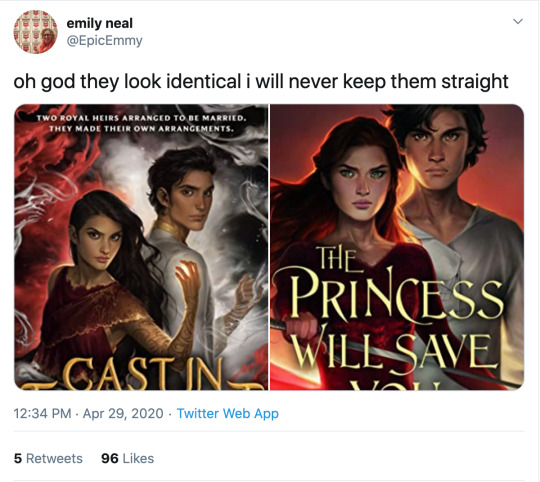
I know I literally just posted that we cannot outlaw book covers from looking like each other, but ! Oof!
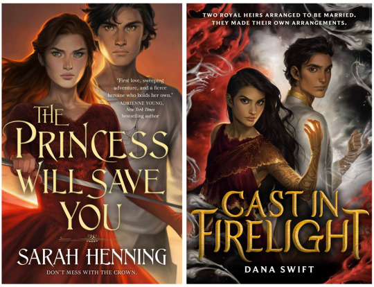
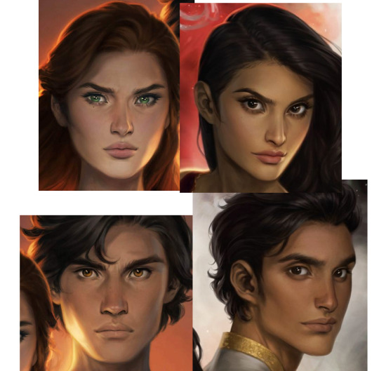
The only thing that softens the blow here is that Charlie has improved at representing nonwhite features such that characters look like POC rather than tan white people, although,, that bar was low. Anybody remember the ACOTAR coloring book.
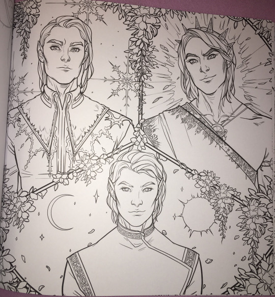
(Would you have guessed that 2/3 of these people are nonwhite? Or even that they’re supposed to be three different men? I guess all the men in Prythian have the same haircut?)
But that minor victory is mostly lost in the quagmires of the fact that Charlie’s style is to give everyone instagram face:
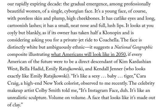
I wouldn’t even call this “Sameface” necessarily: that implies limitation, that an artist is only capable of drawing a single facial structure competently. Bowater is incredibly technically talented, she just chooses to give everyone catlike fae eyes and the cheekbones of a starving nymph. (My previous post on this here.)
But I don’t really blame her for that, or for these hilariously identical, nearly devoid of personality covers. Artists are allowed to do whatever they want. Artists who make art for covers are being art directed by designers and marketing teams who bear responsibility for how the finished pieces turn out.
No, this is our fault, as a community and an industry and..... society, kind of, for valuing character portraits that are “pretty” (“pretty” being an extremely loaded, culturally subjective concept) over art that actually Says Something About The Story. Bowater’s style happens to dovetail perfectly with what we currently collectively find pretty, and so we’ve put her art on a pedestal at the cost of everything else art can or should do for our stories.
And this is understandable: in contemporary western culture, pretty is a value unto itself. Seeing our characters portrayed as pretty denotes them as special, as smart, as powerful. It’s almost impossible to de-program ourselves from that reaction. There are approximately five kajillion studies on how beautiful people are at personal and professional advantages; how they’re perceived to be happier, healthier, more successful, and how those perceptions can translate into realities. (Nevermind how thinness and whiteness enter that equation, see above note about “pretty”.) I would love to see more “average” or weird- looking characters abound (and be accurately visually represented) in the YA/ Genre lit sphere, but for now... everyone is pretty.
Which sometimes means everyone is pretty boring.
But that’s just the specific, "What’s the deal with Bowater’s success in book circles and her style and all the sameiness” part of this equation. What if we backed up and asked: why character art at all? Beyond a question of “pretty”-ness (and general obvious Artistic Quality), why do we gravitate towards it, what's the purpose of it, how does it fall flat in a general sense, and how can it be utilized more effectively?
This is something I think about all the time. I follow writers on social media (because..... I am a writer on social media, regrettably), and we have an enormous collective boner for character art. “Getting fanart [of the characters]” is one of the achievement pinnacles constantly cited when people get or want to get published. Commissioning character art is something we reward ourselves with, or save up for (WHICH IS GOOD AND CORRECT. FREE ART IS GREAT BUT DO NOT SOLICIT IT. PAY YOUR ARTISTS). And like???? Same????? We love our stories because we’re invested in our characters. Most humans, even prose writers, are visual creatures to some extent, and no matter how happy we are with our text-based art, it’s exciting to see our creations exist in that form. So we turn that art into promo material and we advocate for it on our covers-- because it’s so meaningful to us! It goes with the story perfectly!! Look at my dumb beautiful children!!!!!
But on an emotional level, it’s hard to grasp that it only means something to us. Particularly when you take into account the aforementioned vast landscape of beautiful visual blandness of many characters (in the YA/ genre lit sphere, that’s pretty much all I’m ever talking about), character art can be like baby photos. If you know the baby, if that baby is your new niece or your friend’s kid, if you’ve held them and their parent texts you updates when they do cute shit, you’re probably excited to see that baby photo. But unless it’s exceptionally cute, a random stranger’s baby photo isn’t likely to invoke an emotional reaction other than “this is why I don’t get on facebook.”
Seeing art of characters they don’t know might intrigue a reader, but especially if the characters or art are unremarkable-looking, it’s doing a hell of a lot more for the people who already have an emotional attachment to that character than anybody else. And that’s fine. Art for a small, invested audience is incredibly rewarding. But like the parent who cannot see why you don’t think their baby is THE MOST BEAUTIFUL BABY IN THE WORLD???? I think we have trouble divesting our emotional reaction to character art from its actual marketing value, which.... is often pretty minimal. This is my hill to die on #143:
Character portraits, even beautiful ones, are meaningless as a marketing tool without additional context or imagery.
I love character art! I’m not saying it should not exist or that it’s worthless! Even art that appeals to only the one single person who made it has value and the right to exist. And part of this conversation is how important for POC to see themselves on covers, whether illustrations or stock imagery, particularly in YA/kidlit. I’m not saying character portrait covers are “bad”.
I am saying that I have seen dozens and dozens of sets of character art for characters who look interchangeable, and it has never driven me to preorder a book. (Also one character portrait for a high-profile 2019 debut that was clearly just a painting of Amanda Seyfriend. You know the one. There’s nothing wrong with faceclaims but lmfao, girl,,,,)
I’m sure that’s not true for everyone! I am incredibly picky about art. It’s my job. There’s nothing wrong with your card deck of cell-shaded boys of ambiguous age and ethnicity who all have the same button nose and smirk if it Sparks Joy for you.
But if your goal is not only to delight yourself, but to sell books, it’s in your best interest to remember that art, like writing, is a form of communication. The publishing industry runs on pitches: querys, blurbs, proposals, self-promo tweets. What if we applied that logic to our visuals? How can we utilize our character design and art to communicate as much about our stories as possible, in the most enticing way?
Social media has already driven the embrace of this concept in a very general sense. Authors are now supposed to have ~ aesthetics. “Picspams” or graphics, modular collages that function as mini moodboards, are commonplace. But the labor intensity and relative scarcity of character art visible in bookish circles, even on covers, means that application of marketing sensibility to it is less intuitive than throwing together a pinterest board.
Since we were talking about it earlier, WICKED SAINTS, as a case study of a recent “successful” fantasy YA debut, arguably owed a lot of its early social media momentum to fanart.
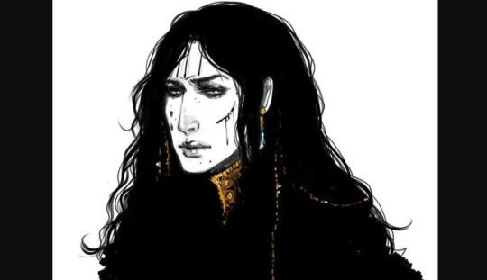
(Early fanart by @warickaart)
The most frequently drawn character, Malachiasz, has long hair, claws, and distinctive face tattoos. WS has a strong aesthetic in general, but those features clearly marked his fanart as him in a way even someone unfamiliar with the book could clearly track across different styles. Different interpretations of his tattoos from different artists even became a point of interest.
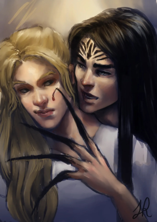
(Art by Jaria Rambaran, also super early days of WS Being A Thing)
Aside from distinctiveness, it's a clear visual representation of his history as a cult member, his monstrous powers, and the story’s dark, medieval tone. The above image is also a great example of character interaction, something missing from straightforward portraits, that communicates a dynamic. Character dynamics draw people into stories: enemies-to-lovers, friends-to-lovers, childhood rivals, platonic life partners, love triangles, devoted siblings, exes who still carry the flame-- there’s a reason we codify these into tropes, and integrate that language and shared knowledge into our marketing. For another example in that vein, I really love this art by @MabyMin, commissioned by Gina Chen:
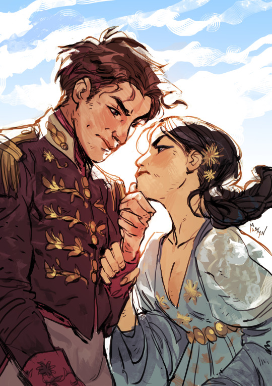
The wrist grip! The fancy outfits! These are two nobles who hate each other and want to bone and I am sold.
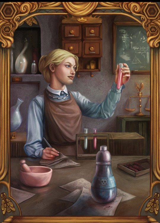
In terms of true portraits, the best recent example I can think of is the set @NicoleDeal did for Roshani Chokshi’s GILDED WOLVES (I believe as a preorder incentive of some kind?):
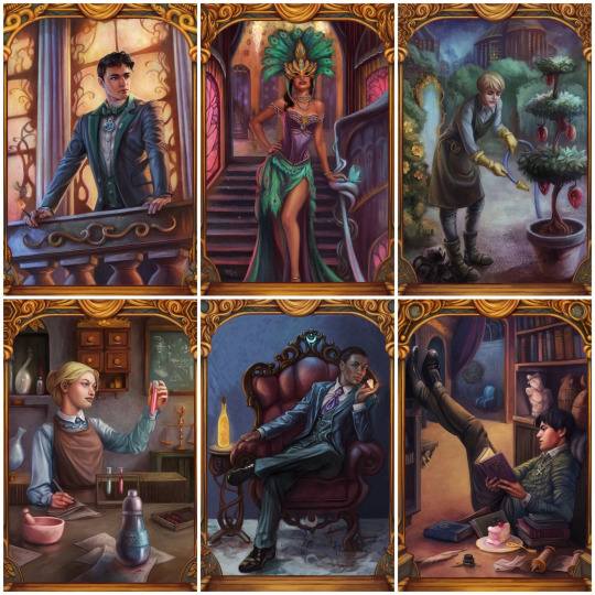
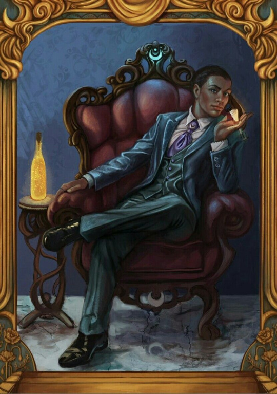
They showcase settings, props, and poses that all communicate the characters’ interests, skills, and personality, as well as the glamorous, elaborate aesthetic of the overall story. Even elements in the gold borders change, alluding to other plot points and symbology.
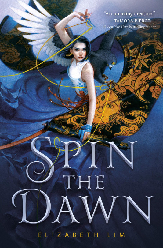
For painterly accuracy in character portraits on covers, I love SPIN THE DAWN. The heroine looks like a beautiful badass, yes, but the thoughtful, detailed rendering of every element, soft textures, and dynamic, fluid composition form a really cohesive, stunning illustration that presents an intriguing collection of story elements.
The devil isn’t always in the details, though: stark, moody, highly stylized or graphic art with an emphasis on textural contrast and bold color and shape rather than representational accuracy can communicate a lot (emotionally and tonally) while pretty much foregoing realism.
The new Lunar Chronicles covers are actually the best examples I found of this (Trying to stay within the realm of existing bookish art rather than branch into All Art Of Human Figures Forever):
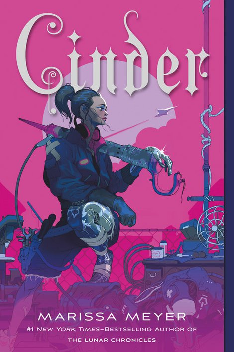
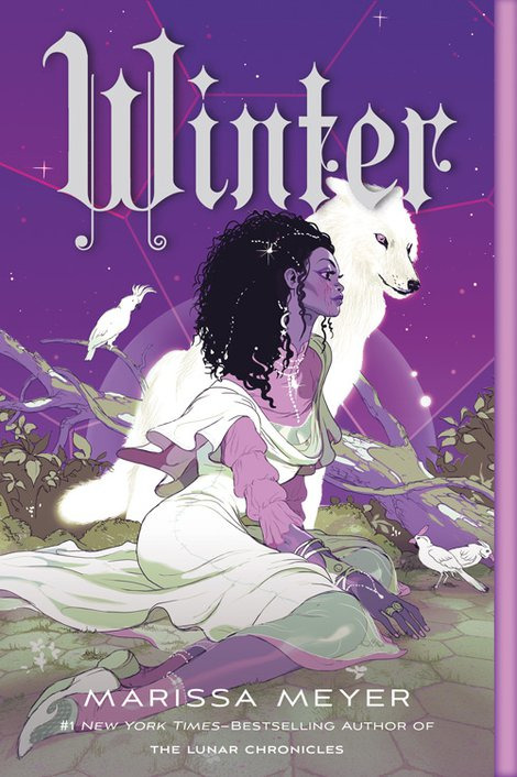
Taking cues from styles more typical of the comics and video game industries. (Games and comics, as visual mediums, are sources of incredible character art and I highly recommend following artists in those industries if you want to See More Cool Art On Your Timeline.)
TL;DR: Character art and design, as a marketing tool (even an incidental one) should be as unique to your story and your characters as possible, and tell us about the story in ways that make us want to read it. I tried to give examples because there are so many ways to do this, and so many different kinds of art, and I could give many more! But I’m bored now. So to circle all the way back:

These are not just bad because they look like each other, although that is embarrassing and illuminating. These are bad covers (although,,,,, PRINCESS is the far worse offender, at least FIRELIGHT suggests a thoughtful cultural analogue) because a desire for Pretty Character Art overrode the basic cover function to tell us about the story. We get no sense of who these people are, what their relationships are, what these books are about beyond the most general genre, or why we might care. The expressions are vague, the characters generic-looking, the compositions uninteresting and the colors failing to be indicative of anything in particular.
They’re somebody else’s baby pictures.
(And yes, that’s the CRUEL PRINCE font on PRINCESS. I better not have to do a roundup post but it’s on thin fucking ice.)
330 notes
·
View notes
Text
Ransom note style collaging
Today I created some compositions in a ransom note style by cutting up articles and writing, changing the order of the words and what they mean, before developing onto these with different medias for a mixed media outcome. The inspirations for this task are “Tomato” (a design collective including John Warwicker and Karl Hyde), Linda Zacks, Meg Hitchcock and Steve Mccaffery. Another source of inspiration for how to start these compositions was David Bowie’s “cut up technique” which he used to write songs.
By using words in this way within our art the messages we are trying to communicate can be in plain sight without people realising.
“Tomato” John Warwicker and Karl Hyde
Tomato is a design collective made to “support individuals on their exploratory journey”. The particular pieces I am focusing on today are from John Warwicker’s collaboration with Underworld, where he visually responded to the content of the music to produce album covers and artwork which portrays the themes and sounds of the music in a visual format.
To achieve this he replicated some of the techniques used in the music into his art, such as layering many elements, which can also be heard in the album. Another important part of the music to tie into the art was to make the art almost indecipherable, as Karl Hyde’s music is also indecipherable in ways from the sounds used being enigmatic to his “stream of consciousness vocal poetry” which he pairs with it.

The art is all monochrome and typographic. This works really well when paired with Underworld’s music as they have a very electronic industrial sound which has so many elements but overall a cohesive sound, so by using black and white throughout but then having many elements within, it visually shares the messages of the album.
The black shapes on the front cover of the album remind me of the “threshold” technique I have used previously in photoshop and therefore it is something I could possibly implement in my photoshop lessons. I really like how distorted and mysterious most of the imagery is in this and how you can’t really tell what they are of and they appear more as misshapen objects. I could use this in the future in my own work to display glitches and hacking.

I also really like the way all of the type is duplicated and overlapped in this part of the cover and I was heavily influenced by this in one of the pieces I created. My favourite element of this is where the text “30 feet above” gets cut up and squashed with lines as it reminds me almost of an elevator as you see yourself go past all the lines which are different levels. The use of different fonts is also something I am heavily inspired by as it adds lots of intrigue and could represent all the different sounds and stories that Karl Hyde is trying to communicate in this album.
Linda Zacks
Linda Zacks is a contemporary artist who’s visual storytelling uses many different mediums to create compelling, vibrant mixed media outcomes. She describes her work as “part paint, part poetry” and sends her messages on a usually large scale, making installations in cities or working on very large canvases to maximise the mediums and details she can add.
I really like the use of colour within her work especially where she sticks to one colour and uses many different tones of it to create her composition, and I used this in my own work in areas to try and replicate some of the use of colours I saw here.

Zacks’ work contains many layers and textures which I really enjoy as there is always more to notice in her work. It appears that she starts with a base layer of colour before adding type and illustration on top of it which is something I tried to do in my work. Her work makes me wish I had stencils as her use of them works in a way I really enjoy as it contrasts something uniform against the scratchy hand written words in what is presumably oil pastel.
I also like how the words in this piece are all black and white on their colourful backdrop, as that could be to emphasise the message of the piece. The piece to me seems as though it is highlighting the control that places and the government have on how we live our lives, telling us “no” we can’t do things. The colourful background is counteracting the serious words and voices we have to put up with on a daily basis.

As said previously, I really like how this piece only contains one many colour and uses many tones of it. I really like how colourful the silhouette is and how the type within it can share the message of the piece. The bright red which is paired with the pink could be to share the violence in the city and how living in a city can aggressively affect your life and perception of the world. The text “boxed in” can be seen which could be Zacks’ way of communicating her feeling towards cities to her audience.
In my own work I tried to create some mixed media outcomes similar to Zacks and I tried to make my words appear as different textures to communicate something within my message.
Meg Hitchcock
Meg Hitchcock is a text based artist who works with sacred texts as part of her lifelong interest in religion, literature and psychology. In her work she takes texts and cuts them up letter by letter to rearrange them into a pattern and abstract shape. She mainly uses curved, flowing lines and creates her work in such a way that the trail of letters is one continuous line. The messages in her work could be perceived as religious due to the words being that of actual religious passages, but could also be perceived as very anti religion, as you aren’t typically meant to “destroy” religious passages like this. She spends hours cutting and sticking to produce “visual matras of devotion”.
Personally, I see her art as a respectful visual presentation of these passage which still tells the audience the original message, just in a different form.

I really like the way she cuts up the letters to create new compositions with them, and I attempted to use this in my own work but it didn’t work very well or as I intended. The scale in which she works sometimes is extremely large and the intricacy that she achieves is phenomenal. I think the way she makes these letters swirl and curve is extremely captivating to look at and follow. I also like how she manages to create smooth curves with small rectangles and straight lines.
The way her shapes chosen are influenced by the passages she uses are very interesting to me, as the piece above contains many words about direction and guidance, so her choice to make them centre of the composition a spiral may be so that the piece has a direction.

The piece above is a small extract from a composition which contains so many curves and is very large. By the way that the words are arranged it looks as though the words are almost crushing eachother, like the words on top are weighing down on the words below. this could be Hitchcock’s way of send the message that the passage chosen for this piece is very heavy and not a joyous read.
Steve McCaffery
Steve McCaffery is a poet who uses typography to create abstract typewriter art that captures the concept of the poem in an abstract way. He sticks to a black and red colour scheme with a white background throughout all his pieces, and he uses many different scales of type and repeating letters. A common occurrence in his pieces are circles or semi circles of type of a single word, highlighting the importance of this word in the overall message of the typographic compositions.

The pieces contain the poem along with additional letters overlapping and producing new shapes and additional elements to the page which help to push forward the message McCaffery is communicating. I like how he uses this artistic format to emphasise and display pats of the poem in a way which isn’t just reading it from left to right. An example of what i mean is above where text says “coral reefs and later a land bridge” it is in a wave shape, not a straight line, to visually represent the coral reefs and bridges mentioned.
I was very inspired by the repetitive use of “O” within this piece and it reminded me of binary code so I used that within one of my compositions about robots to send the message of technology and robotics.

I really like how he repeated words and shows them facing directions which aren’t the way words typically face. I also like how he joins the verses of his poetry together by overlapping them, as that way they keep their original message without being cut up but still create a new appearance and this creates some darker areas within the composition. Another thing I took inspiration from in this piece is how there is one area where all the ink and type is concentrated, and everything builds off of that until the edge of the page where there is little to no type. In my own work I tried to have areas where there was more type that then gradually built out to nothing, but it was not as effective.
David Bowie’s “cut up technique”
David Bowie utilised a technique when writing songs which is similar to this art as he would cut up words and phrases and put them back together to make some abstract lyrics unlike any others at the time. It was this technique which would bring him some of his most famous songs and deem him unforgettable in the future. He would take is weird and wonderful thoughts, write them down and put them back together like a puzzle to see what fits and sounds good and what doesn’t. The more bizarre the better, at times.
https://www.youtube.com/watch?v=m1InCrzGIPU
The technique was originally made popular by William S Burroughs, a French poet who would cut up and rearrange his text to create a new one. In my own work I cut up text in a similar way to this to create out of context pieces of text that I could then put into context with the art I chose to apply on top of it.
My ransom note collages
In my own ransom note style pieces I took inspiration from all areas of these 5 artist’s ways of working to create my own pieces relevant to my news articles.
To start with on this piece I decided I was going to use one colour along with black and white in a similar way to McCaffery, however I put the the black and green in the background and made the white the foreground. I really like the texture I created by using a dry brush to spread the ink as it is similar to some of the textures seen in Zacks’ work. I didn’t want the background to be entirely black and green so I left some of the white of the paper, but in hindsight that wasn’t the best idea as you cant see some of the type I added as it is white on white. I chose the colour green as green and black is a colour scheme commonly associated with spies in the media (for example, it is used heavily throughout “The Matrix”), and therefore the message of spies is instantly recognisable as I chose to focus this first piece around my article about the CIA creating robot fly spies.
Before I added type I added some cut up extracts of the article I was representing to add to the image, in a similar way to Meg Hitchcock. I created the shape of eyes with these people so that they would stand out and send the message that the fly is watching you. I don’t particularly like how this turned out as I don’t think the representation of eyes is very understandable, I wish it were more obvious what it is.

I also don’t like the elements I added after this. I tried to make the fly out of binary but it isn’t very obvious what it is due to the lack of detail added. I also added some type in a binary font but the white in the background makes it unreadable.
If I was to do this again I would make sure that the background was slightly more saturated with colour and I would make the fly the only focus so I could add more detail to it. I would also make this on a larger scale for the same reason.
For this piece I was heavily influenced by John Warwicker’s work on the album cover for Underworld and the way David Bowie would use the cut up technique. I cut up my article into fragments which made little sense without context and arranged them in a way which I thought would represent a corrupt file, as the article I worked with for this piece was also a technology based one, this time themed around robots displaying human emotions. To create the look of corruption I staggered the lines of writing and also left extremely large gaps between parts of it to make it look out of the ordinary.

When adding the type on top of my article cut outs, I decided to pick out words and phrases from the composition that were already there and enlarge them and duplicate them. I also added some black areas on the page and wrote on them with a white pen. which I think worked really well to add some deepness to areas of the composition which I felt were unbalanced. I also really like the area where I created a mirror image of the type of “artificial faces” as I feel it could send the message of how these robots are mirroring our facial expressions but are not real, just a reflection of how they have been produced.
I am much more happy with this piece than I was the previous one as I think it works well as a representation for the article and it highlights the important phases to communicate the message. I also am really glad I chose to leave white space and I didn’t add any colour as the lack of colour and harsh contrast between black and white acts as a communication of the difference between human-like robots and real humans.

For my 3rd piece I made the subject of my composition the article about mammoths being resurrected by scientists. I started by applying colour to the background and brown in the rough shape of a mammoth. I tried to keep my brush dry so that some of the texture could be seen, in a similar way to Linda Zacks’ work. I chose the blue as the background as mammoths were alive in a cold climate and blue is usually associated with freezing temperature.
To represent the scientific element of this story and also to show that the mammoth could be living, I collaged a simplified anatomical heart and I used the news article to create a skeleton for the mammoth. The idea to use the words for the ribs was inspired by how Meg Hitchcock and Steve McCaffery create shapes with their words to illustrate the meaning behind them.
I was inspired by Zacks’ style again when adding words as I tried to use different medias to create words in different textures. The dark blue words have a more calm feel to them since they are written in ink and therefore aren’t scratchy, whereas the words in blue and white are scratchy due to them being done in acrylic paint very quickly. I wanted to have this effect to communicate the time period that mammoths are from as they could represent cavemen’s inscriptions onto walls and other writing forms from a long time ago.
Overall I am extremely happy with how this piece turned out and I think the mixed media approach I took to it worked very successfully to emphasise all the elements I wanted and included many textures within.
2 notes
·
View notes