Text
curated portfolio


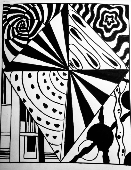
I have selected these pieces for my final curated portfolio because they exemplify my strongest work from this semester. While I acknowledge that each could have been refined further with additional time and effort, they still stand out compared to my other projects. Throughout the semester the process of making these pieces became significantly easier. This experience has shown me that I am capable of much more, and I am determined to push myself to achieve even higher standards moving forward. My goal is to build on this foundation and continuously improve my skills and performance as well as to learn a few more styles of art.
0 notes
Text
Final assignment


For this project, I selected "Killer Instinct" by Jennifer Lynn Barnes and "A Different Kind of Human" by Aurora. "Killer Instinct" intrigued me with its suspenseful narrative and psychological exploration of crime, offering rich material for artistic interpretation, while Aurora's album inspired me with its ethereal music and themes of humanity and nature. Immersing myself in both works, I created a cover for "Killer Instinct" that reflected its tension and mystery, using dark colors, caution tape, a chalk outline, and a spotlight effect to symbolize crime scenes and investigation. For "A Different Kind of Human," I depicted a uterus intertwined with nature, symbolizing life and the environment, with vibrant red and green hues to emphasize humanity's connection to nature. The final outcomes for both covers successfully convey their respective themes: the "Killer Instinct" cover evokes the eerie atmosphere of the crime and mystery genre, while the album cover captures the introspective and mystical essence of Aurora's music. This project allowed me to explore diverse artistic techniques and concepts, resulting in unique and representative art pieces.
0 notes
Text
final assignment book and album
for my book I chose to do killer instinct by Jennifer Lynn Barnes and for my album I chose a different kind of human by Aurora
1 note
·
View note
Text
museum visit


After visiting the New York virtual museum I found three amazing protists by Catherine opie and I wanted to make something like that but with my spin on it. These paintings to me represent the three significant phases of life: childhood, adulthood, and old age. The first painting captures childhood wonder with a young girl wearing a crown, her expression embodying innocence and imagination. The light blue background symbolizes clarity and boundless possibilities, mirroring a child's unbounded curiosity. The second painting portrays a young woman in graduation attire, symbolizing the journey of growth in adulthood. The vibrant yellow background represents energy and optimism, marking the dawn of a new chapter filled with opportunities and challenges. The third painting depicts an older woman reading a book, reflecting the tranquility and introspection of old age. The green background signifies growth, renewal, and peace, capturing the reflective nature of this phase. Together, these paintings tell a cohesive story of life's stages.
1 note
·
View note
Text
Midterm

In approaching my project, I began by considering a cohesive theme that could unite all four pieces while still allowing them to stand individually. I chose to use squares, triangles, circles, and other shapes as my primary elements, exploring various formations and compositions. For the colors, I opted for pink, purple, blue, and yellow to evoke a sense of vibrancy and harmony within the series. Before diving into the final pieces, I conducted preliminary sketches and experimentation to refine my ideas and ensure a successful execution although I did change some of my ideas to fit better at the end. Throughout the process, my understanding of the Principles of Art, such as balance, contrast, and unity, played a crucial role in guiding my decisions and refining the overall design. I'm pleased with the outcome of my design as each piece feels cohesive yet distinct, showcasing a balance between repetition and innovation.
0 notes
Text
principles of art

Repetition 1

Variety 2

Rhythm 3

Balance 4

Emphasis 5

Compositional 6

Scale and proportions 7
0 notes
Text
Black shapes on white background
White shapes on black background


0 notes
Text
Franz Kline paintings


In my series inspired by Franz Kline, I delved into the interplay of form and line. In the first piece, I began by coating the canvas in a deep black, then applied bold strokes and shapes in white, exploring a range of line orientations—vertical, horizontal, diagonal—and varying thicknesses.
In contrast, the second artwork reversed the technique: a white background served as the canvas's base, onto which I layered dynamic black lines. Here, I embraced more fluid, curvilinear forms and intensified the composition with additional lines, aiming to imbue the piece with a sense of richness and depth.
Throughout both works, I employed a mix of assertive and delicate brushstrokes, strategically applied to evoke dimension and diversity, ultimately enhancing the visual impact of the paintings.
0 notes


