#desugn
Explore tagged Tumblr posts
Text


WHAT DO YOU THINK ABOUT THIS DESIGN?
2 notes
·
View notes
Text
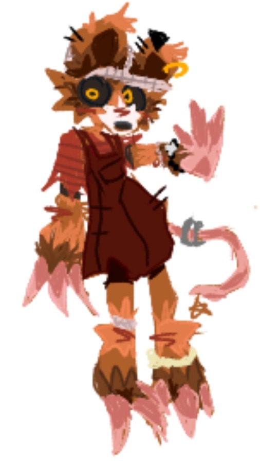
Anyway I claim this scrawny twink (/affectionate) to be my ratsona now
#yeah sorry for using this artstyke#its just very convenient for trying to set up a simple design#fursona#ratsona#my art#- i suppose#you can still see some similiar details to my green goblin#?#desugn#like the earrings#or the brojanica#which reminds me FUCK i forgot the violet earring#sjdjdmc#toki drawz
5 notes
·
View notes
Text
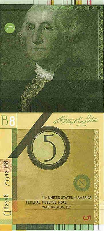
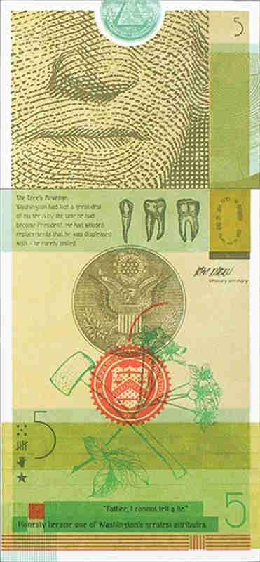
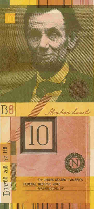
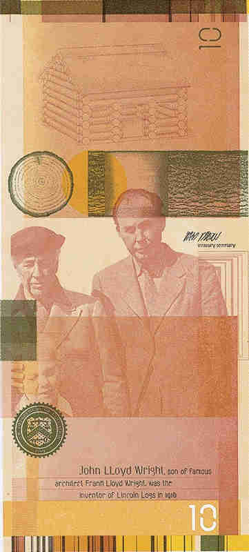

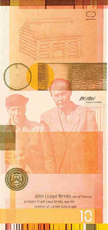
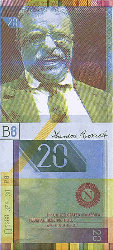

Another design of US dollars.
#dollars#desugn#projekty#wzory#banknote#banknot#fantasy#fancy#fantazyjny#not circulated#nieobiegowy#note#usa#united states
0 notes
Text
RESEARCH METHODS////////////QWWK 12////////////VISUAL RESEARCH METHODS II
Time and dimension: Order
Movement creates a sense of action in the visual arts. It can be created by repeating visual elements (motifs): lines, shapes, colours. When depicting a person, movement is achieved by changing the person's balance point and posture, as seen in the illustrations of contemporary New Zealand artist and film animator Erica Russell.
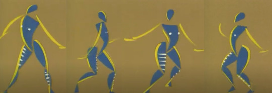
Feet of Song by Erica Russell

Feet of Song by Erica Russell
Another very interesting way to create movement is by using illusion.The beginning is connected with the appearance of the Op-art movement in the middle of the last century. It uses the human brain's ability to perceive complex patterns built through repetition and contrast. In this way, an illusion of movement is created in the still image.
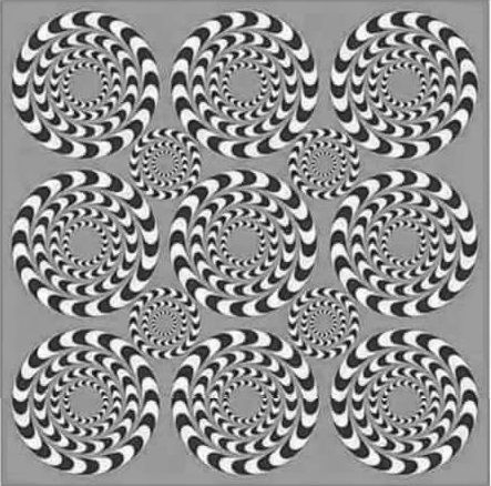
Spinning Illusion, Source : Pinterest
We consider this approach extremely suitable for illustrating Alice's adventures,In relation to the whole context. Therefore it will be used frequently in the layout of the spreads.

Visual attributes: Movement / on illustrations of my 'Alice' project
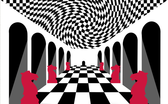
Visual attributes: Movement / on illustrations of my 'Alice' project
Time and dimension: Sequence
Sequence is the relationship between elements that determines their order in the composition. It is closely related to hierarchy as both follow the principle of "orderliness".(The sequence follows The English reading comprehension : left-right/up-down.)
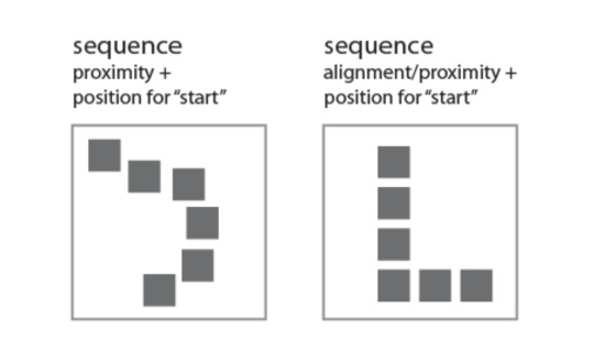
Sequence = Alignment/Proximity+Position for 'start'
We will visually demonstrate the principle of consistency in the cover of our product.
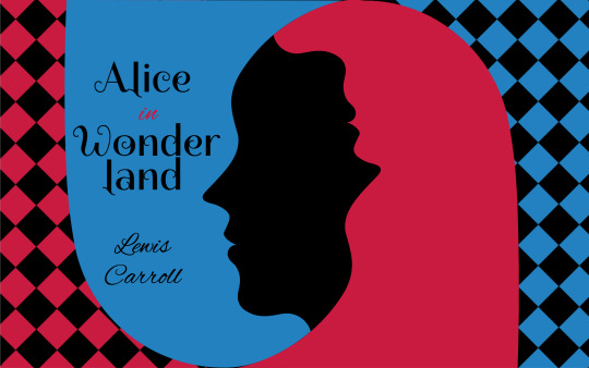
Use of Аlignment - it serves both to give a tidy appearance to the cover and to help convey information.
Typography - I chose to use two fonts in the cover layout: Spirax and Alex Brush. This contrast in fonts serves to emphasize the hierarchy: Spirax has a dominant role, bringing to the fore two words: "Alice" and "Wonderland". Alex Brush imitates handwriting. It has a supporting role and is used for the preposition "in" and for the author's name. Although completely different, the two fonts do not seek opposition. They are consistent within the overall layout. It can be said that they are grouped consecutively into two groups, with the title above the author's name, aiming to focus attention on it.
There is also Colour contrast within the title. It is achieved as a sum of the two colors: black and red. Contrast is used sparingly. The only word in red is the preposition "in", which aims to draw attention to the connection of the two words "Alice" and "Wonderland" in a single group.
Light and colour: hue saturation
Light and colour: Tone saturation
Light and colour: Transparency
Light and colour: Opacity
Factors of visual grammar: mass, unity, fragmentation, regularity, irregularity, activity, passivity, space, order, randomness, continuity, interruption.
Visual grammar According to Gestalt, "the whole is greater than the sum of its parts," but let's look at them anyway.
Mass By common definition in art and design, mass is the amount of matter (visual weight) in any one object in a scene. It is closely related to balance, i.e. to the positioning of the various objects. Their visual weight should be balanced around a central point so that the composition feels complete.
Unity Unity in design is cohesion between its various elements using powerful factors such as color, proximity, font, alignment, contrast. The goal is a maximally satisfying aesthetic perception for the user. -Choosing the right colours and their consistency within the design reinforces the connection between individual pages (if it's a web design) or individual elements (if it's a logo or print design). -Proximity helps to understand which elements within the design are related and how they are related. -Font is also a unifying factor, both in web design and in logo or print design. The combination of different, skillfully chosen and complementary fonts can build consistency across individual pages, as well as build hierarchy when needed. -Alignment unifies and enhances the user experience by arranging all elements on a single axis so that they appear connected. -It is important to note that unity does not always mean equality. Depending on the context, some design concepts focus on contrast in color scheme or fonts to distinguish separate groups of elements or simply to create a different mood. Adherence to Unity ensures a correct understanding of the message even by those users who do not have professional design knowledge.
Exploiting the cultural contexts surrounding 'Alice in Wonderland' and critically examining its use as a sign, symbol, icon and metaphor.
INDEX - We designate the smile of the Cheshire Cat in this image as an index because it is a consequence of the cat itself, which is no longer there, but was once there, and has disappeared, leaving its smile behind.
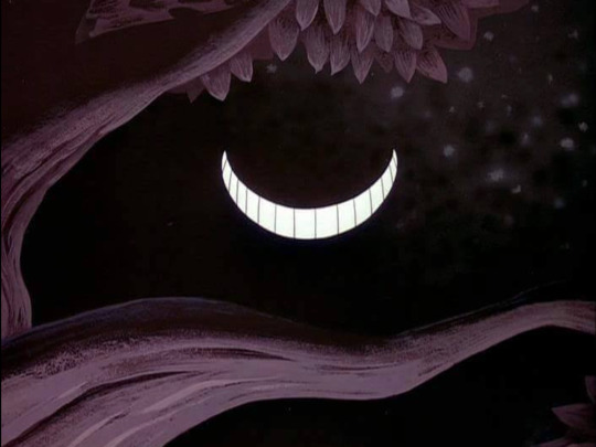
INDEX / Smile of Cheshire cat, Source : DeviantArt
SYMBOL - An issue by Tim Walker is a fashion collection for Vogue Italia, which rather emphasizes the presentation of clothes, but due to the specific scenography and mise-en-scene, it gives the impression of being close to Lewis Carroll's books. Symbols could be found in the references that the decor creates.
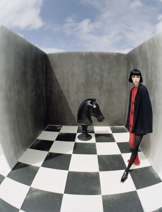
SYMBOL / An issue by Tim Walker for Vogue Italia, December 2015; Model : Edie Campbell, Styled by Jacob K. Hair by Shon. Make-up by Miranda Joyce
METAPHOR -
METAPHOR :
“The time has come,' the Walrus said,
To talk of many things:
Of shoes — and ships — and sealing-wax —
Of cabbages — and kings —
And why the sea is boiling hot —
And whether pigs have wings.’
L.Carroll
“When pigs fly" is not just a common saying or a funny phrase. Usually behind it lies the idea that the probability of something happening is very small or almost non-existent. This is probably the message that Roger Waters wants to convey at his legendary "The Wall" live concerts, because the allusion to Carroll's text is obvious.
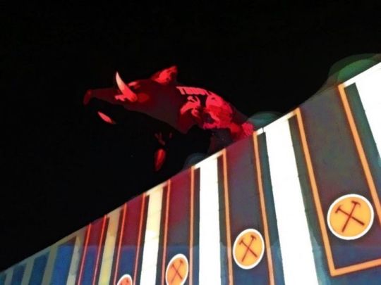
METAPHOR / Roger Waters concert "The Wall" in 2013, Sofia, Bulgaria, Photo : personal archive
ICON - This is my idea for Alice, which is the result of many years of personal interest and professional research.
My idea is that she should be presented in a minimalist style, and the play between positive and negative space should emphasize the illusory world of wonders in which it has fallen. Although not very realistic, we define this image as an icon because it bears a physical resemblance to the object it signifies.

ICON / Alice, herself, on my 'Alice' project
Questions about "Alice in Wonderland" in a range of contexts, meanings and values of the shape.
1/ What is the significance of Alice's fluctuations in size and shape in Alice's Adventures in Wonderland?
2/ How does Alice reach new knowledge about the interrelationships between shape, colour, smell, taste, content?
3/ What is the meaning of form in the world of the imaginary real?
4/ How does Alice challenge the physical laws of space, time and distance?
5/ What are form and content as philosophical categories in Alice?
1 note
·
View note
Text

GLEAM O’DAWN: A Novel by Arthur Goodrich (New York: Appleton, [1908]) Illustrated by D.C. Hutchison. Cover design by Decorative Designers.
source
#beautiful books#book blog#books books books#book cover#books#vintage books#illustrated book#book design#arthur goodrich#decorative desugners#d.c. hutchison#americana
16 notes
·
View notes
Text

#niche character desugn thing that's not done very often but which i love with all my heart#top left is a character from the interpretation of shadows by nyoomian and it's getting a webcomic soon!#resi.txt
27 notes
·
View notes
Text

https://www.pinterest.com.
19 notes
·
View notes
Text


Nursey; odd beast in custody of a field hospital. It heals the wounded by simply being in close proximity. Not muzzled & coned for risk to people; it is friendly, just prone to chewing its own legs.
#creature design#monster design#character desugn#illustration#my art#very unserious chibi type design forgive me
6 notes
·
View notes
Text

made myself one of those should be divorced parents kids
3 notes
·
View notes
Text

Work for 2023 10th Taiwan Biennial of Indigenous Poster Design [Great Love : The Beauty in the Indigenous] awarded "shortlisted"
山海的大愛:原容之美-第十屆台灣原住民海報雙年展徵件 參賽作品 榮獲"入選"
0 notes
Text
My sibling sent me a link to Welcome Home while i was watching jaiden's qsmp vod AND OHMYGOD I HAVE NEVER FALLEN IN LOVE WITH ART SO QUICKLY
THE ART IS SO BEAUTIFUL THE COLORS THE LINEWORK EJEI I AM IN LOVE SJJWIWJWAJEIDJOSSOAJ
#I AM SO IN LOVE WITH JULIE ALEEADY SHE JUST SO PRETTY EOSBWIDJSJSJSISBEJIEWOWI I LOVE ART SO MUCH SKEJWOWIWO#AND STARLET HOLY HELELWJWO.#THE CHARACTER DESUGNS ARE SO GOOD THEY ARE SO PRETTY TJSJWOWKWOWWK
0 notes
Text

omg.......the where wolf

hai kinda late but happy halloween rb this with a pic of ur fo and i'll slap a silly halloween hat on them bc i feel like it<3
(pr*shippers NOT welcome)

88 notes
·
View notes
Note
Jedi I have been thinking about it for weeks now but YOUR DESUGN FOR FUGO. OH MY GOD THE 2 TONE SHIRT IS DRIVING ME CRAZY ITS SO COOL LIKE A COMBINATION OF THE ANIME AND THE MANGA IM GOING TO GO INSANE ARRGHGHDKSNSKSJSISJ‼️‼️‼️‼️💥💥💥💥
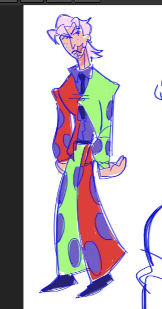
IM SUPER HAPPY WIGH HIS DESIGN TOO!! I REALLY COULNDT PICK EITHER ONE SO I COMBINED THEM!!!!!! RAAAHHHHHH
#jjba#jei poopy art#jei poopy asks#jjba fanart#jojos bizarre adventure#jojos bizzare adventure fanart#fugo pannacotta#pannacotta fugo#jjba fugo#golden wind#art#my art#doodle
83 notes
·
View notes
Text
OOC post (again)
Er!
Uhm! I'll probably work on this after my exams, sence I have exams this week!
I might list off the things I might do w this blog if u guys r interested
List below cut
+ give glisten a desugn
+ redo the intro post
+ make tags to find my posts easyer
-eg : it's, answering asks, m! Anons
+ more
#dandys world#glisten#glisten dandys world#dandys world askblog#glisten <3#eepyposting#not an ask#gaybo#glistening#ooc
9 notes
·
View notes
Note
As a sock collector, the socks addiction has brand me over to your blog seeing as Pomni has been seen talking about socks and having cool socks.
i hope that you know that i alos post things other than pomnis socks and that most of the time uou cannot even see her silly socks .. bit jsut for you im.going to make canon ghat in rvery single art i post, even if you cannot dee her feet, she has the sillest socks on with the most silliest desugns just for you to habr funwith that .. look forward to.more sock comtent
38 notes
·
View notes
Text


Rock type Miku. To be honest this one was hard to do. I have mixed feelings about her cause her desugn looks more like ice type than rock type. Maybe I'm just getting tired of Project Voltages fanarts but I'll try to not give up
My cara / My insta / My Ko-fi
#my art#fanart#artists on tumblr#art#illustration#myart#vocaloid#hatsune miku#project voltage#pokemon#digital art#digital arwork#digital illustration
7 notes
·
View notes