#these were originally going to be separate images but the different in height made proportioning the canvases weird
Text

More fraggle art these two have been my favourites ever since I was a kid.
#unlabelled drawing tag#fraggle rock#mokey fraggle#wembley fraggle#idk what these poses are i kind of made them up as i went on#these were originally going to be separate images but the different in height made proportioning the canvases weird#so they're kind of just existing next to each other i guess#also i remembered to add a shadow to the flowers this time#ik it's not something the dsi does in its photo editor but i just like how it looks#id in alt text
99 notes
·
View notes
Video
youtube
tree Explains Things 01: SnapMotion
In this tutorial I talk about using SnapMotion to create caps from video clips for the purpose of making gifs. (I recommend viewing this on YouTube for better quality and a larger video size.)
Please note that I'm not affiliated with SnapMotion or its creator in any way and there's nothing in it for me if you choose to purchase SnapMotion for yourself. Obviously, I recommend it, but do investigate your options, as there may be something out there that's better suited to you.
(This transcript is approximately 60% accurate to the tutorial and 40% me condensing my waffle into more sensible narration.)
--
SnapMotion is a Mac OS X program available to buy at the App Store. (As far as I'm aware, there are no releases for any other operating system.) It's fairly inexpensive: AUD $7.99 when I bought it two years ago. (In the video I said $12, from memory, but then I looked up the receipt email to confirm and found myself $4.01 wrong.) Considering that I've made thousands and thousands of caps in the couple of years I've been using it, I've definitely gotten my money's worth.
SnapMotion has two modes: what I call photo mode and then batch mode. Photo mode is good for one or two caps, but to extract caps in bulk you'll be using batch mode. (Something I forgot to mention in the video is that dragging your file to the SnapMotion icon will open it in photo mode by default. In order to access batch mode, you have to open the program and select it.)
Selecting Show Batch Mode takes you to the batch mode work space. Here you can drag and drop your clip or click the plus sign to add it. Once you've loaded a clip, select it in order to access the Add Batch Tasks menu.
One of the things that I particularly like about this program is that all the information you need about the file is clearly set out. In particular, it shows you how many frames per second you're working with. This is important because the fps rate determines how many frames you want to extract from a clip.
--
Why? Because math.
All the sources I've worked with have an fps rate of either 24 or 60. That number tells you how many individual images are contained in one second of video. Obviously, there's a considerable difference between 24 and 60, and that affects how many frames you choose to extract.
I've found I get the best results by extracting every other frame from 24 fps sources and every fifth frame from 60 fps sources. So:
24 fps = 2 (or 1/2 ← why does Tumblr do that?? I hate that!)
60 fps = 5 (or 1/5)
(That gives you roughly 12 caps per second for both sources. I say 'roughly' because, as you can see on my screen, the fps rate is rounded to the nearest whole number. 24 fps is actually 23.7 fps, so that missing .03 can have a cumulative effect.)
I find this is the best compromise between having smooth, natural looking motion in your gifs and keeping your file size within Tumblr's constraints. (I'll talk more about that in the next tutorial.)
--
Tools
The green bar is obviously your clip timeline. The cursor defaults to being in the centre for some reason. You have start and end caps (or whatever you call them) that define the start and end points of your extraction. The left and right arrow|bar buttons move your cursor to the start or end cap respectively, and between them is the play button. To the left are the transformation options. I've never used them, so I don't know what they do. (If you decide to experiment, please report back about your results!) To the right of that is the volume icon, which allows you to hear sound from your clip during playback. I don't find it useful, so I don't bother. The tortoise icon allows you to adjust the speed of your playback (left is slower, right is faster in case that’s not obvious). The arrowheads on the far right move your playback cursor to the start and end caps respectively.
Add Batch Tasks
This is where you specify the parameters for the batch.
Mode: there are four options. I primarily use Every X Frames. As this is a 24 fps source, I want to extract every 2 frames, so I use the value 2. When I type my value in and then press tab, the bottom of the panel shows the number of frames that will be generated from my selection. If I process this selection, SnapMotion will create twenty-five images. But because I moved the start and end caps earlier, and I actually want to extract frames from the whole clip, I need to adjust them. When I tab through my X value again, I see an updated number of generated frames.
I always include the Starting and Ending frames because I trim my clips to the exact frames I want (unless I'm being lazy).
Max size: This refers to the width of the image in pixels. (Technically, it refers to the maximum size of the largest dimension, but since video sources are universally landscape oriented, for our purposes this number will always refer to the width.) The default setting is 4,000 pixels and since the source clip is 1920 pixels wide my caps are going to remain 1920 pixels wide. However, if you know what width you want your eventual gif to be and you don't want to go through the extra step of resizing it in Photoshop, you can use this setting to do that for you. For example, if you want your gif to be 540 pixels wide you would enter 540 in this field. When you process this batch, SnapMotion will resize each frame it extracts to a width of 540 pixels with a proportional height. (Yeah, I said width at first and then I had trouble getting out the word height. Talking is hard!)
I don't use this feature simply because sometimes I change my mind, and I would have to rerun the batch if I did. (This isn't a big deal for a single shot like this, but if you're working with a whole scene that contains hundreds of frames, it's a hassle.) I also reuse caps sometimes. As you probably know, if you follow my Longmire gifs, sometimes I do a full scene using small gifs and then I go back and do large versions of some of the Vic shots. (Because I love her so.) And sometimes I make other graphics. In those situations, I want the image at its original size, so that I can resize or crop it the way I want.
Format: I prefer PNG.
Override: this tells the program what to do when a file with the same name already exists in the destination folder. The options are Replace existing files or Use alternative name. They're probably fairly self-explanatory (but just in case, I included a note).
Errors: I don't think I've ever had an error in this program. You can choose to generate a log file with each batch, but I kept getting logs that said "no errors" every time I ran one and it was annoying having to constantly delete them, so I switched to No error handling.
Headline/Credit: I believe this is like watermarking your images. If you want to watermark your gifs (I honestly don't see the point but some people do it), I think it'd be a lot easier to do it in Photoshop (or whatever program you use for image editing).
Export: this is where you specify the destination for your extracted image files. Click Choose to open the menu from here. Alternatively, when you're ready to process a batch, click the red button (aka the "Do the Thing" button according to me when I recorded this), and if there is no destination already specified, it will prompt you for a location.
Once you've clicked the Do the Thing button (yeah, I'm just leaning into it now), SnapMotion will display Task Added. If you look at the top of the window, you'll see a progress bar showing the percentage of completion as it processes.
When the images are fully exported, you'll see All Tasks Done and also an alert if you've selected that in your preferences (which I haven't gotten to yet but it's coming up). If you go to the destination folder, you'll find all the images that have been extracted. That's it!
--
I want to address the syntax for how files are named because I found the options very confusing to begin with. The default syntax made no sense to me and it took me a while to configure something that did. File names are defined in the program preferences, so go to the SnapMotion menu, select Preferences, then select the Batch tab.
Number of concurrent snaps: how many frames should be extracted at the same time. This has an impact on your RAM usage and also impacts how long it takes a batch to run.
Alert users with: this is where you choose whether or not you want a notification outside the program. It's useful if you're running a larger batch in the background and therefore don't see the All Tasks Done message.
Output name format: these are the elements I use:
<movie_name> = the title of your clip file
hyphen
<time_seconds> = the actual second position of the frame within the clip; for example, a frame that was extracted at 14s would be numbered beginning with 14. This parameter converts durations of 1 minute+ into seconds, e.g. 60, 61, etc.
<frame _index> = the running number of the frames extracted in the batch, beginning at 1. The position of this number depends on the total number of frames you're extracting. From 1 to 99 frames, the number will be 01; from 100 to 999 frames, the number will be 001. I've never extracted more than 1,000 frames, but I assume in that situation you'd begin with 0001.
If I were extracting 40 frames from my clip beginning at 14s, then the numerical portion of my file names would start at 1401. If I were extracting 120 frames, then the numerical portion of my file names would start at 14001.
<image_extension> = the file format you've specified
So, my file names are constructed like this:
<movie_name>-<time_seconds><frame _index>.<image_extension>
And the files from the batch I've just run look like this if you separate the elements:
1x05_2206 - 0 01 . png
In this batch, the seconds run from 0 to 3 and there are 34 frames in total. The first number column represents <time_seconds>, while columns two and three combined represent <frame_index>. You can see that the numbers in columns two and three are sequential from 1-34, whereas the numbers in column one aren't. That's because I've extracted multiple frames per second. Caps 1-7 were extracted from the first second of the clip, caps 8-18 from the second, caps 19-31 from the third, and caps 32-34 from the fraction of the fourth second.
This naming system is what works for me, but you should experiment with the options so that you can construct file names that work best for you.
--
The last couple of things:
You can import multiple clips either individually or at the same time.
You can delete a clip by selecting it and clicking the minus button.
--
And that's SnapMotion!
If anything is unclear or I've omitted something that you wanted to know about, please let me know. Thanks for watching and listening (and reading). Next up, I’ll be explaining the process of importing your caps into Photoshop and creating your gif file.
2 notes
·
View notes
Note
Hey, may I ask how you make your icons (which are really cute btw)? I would love to give it a try myself but I dont really know where to start vor what size they woud need to be. Do you use a specific program? Thank you in advance ❤
Hi again my love!!! ❤
First of all, thankyou so much!! That’s so kind of you to say and I’m honoured that you’d come tome for advice!!! I’m going to put this under a read more because it might getvery long, I hope that’s okay! Also want to say I am by no means an expert - myicon making stems from a lot of trial and error, hahah!
There’s soooo manydifferent ways to make icons! I have seen and read a thousand tutorials, butthe first thing I have to say is it’s got to be what you’re comfortable with.Whatever works best for you is the best way!
When I first started to make icons, I used paint.net, which is free todownload and such a good program! I still haveit because you can download free ‘plugins’ (like added extra features)that people make and they’re so handy!!!! I used to make coloured backgrounds using the gradient feature, and zoom in very closely and use the rubber tool toerase the background of the characters/people I wanted for the icon, whichworks great if you have a lot of time and patience!
Now however, I use photoshop CS5, which I got from here (no idea if the link stillworks but I hope it does!!!) which I find a lot easier now that I know how touse it! For sizing, as long as the canvas is a perfect square you’re generallygood - I usually go for 150px x 150px, but I know a lot of people use 100px x100px or 200px x 200px!
Here are some tutorials that you might find useful to start you off in explaining how to use PS if you’re not familiar with it!! (x) (x)
Once you’ve got that down, usually you want to cut the people/charactersout from the background. There are soooo many ways to do this but I prefer touse the pen tool to draw around them and then erase the background, a tutorialfor that that I like is this one!
For background, I make my own gradients. Generally, you want to pick acolour you like and then find the lighter version of it, so to do that I pick acolour (for example this is a good list of different colours I referto) and then I use the hex code of that specificcolour to find the lighter version of it - so when you click on it, or searchfor it, it gives you the lighter and darker codes for the colours, which youcan put into Photoshop and then use to make gradients! alternatively you cansearch on places like itsphotoshop and find them,which is coincidentally where I get my textures from that I sometimes put onthe background of icons.
The textures are downloaded, and then once you’ve got them, uploaded into PS and usually set to soft light or overlay (I prefer soft light, but it depends on the colours you’re using I think!) in the drop-down menu on the right side of PS, where there’s different tabs (this one is found directly underneath layers!). It looks like this and put it above my colours to get cool effects in the background :-)

For the shapes part, I actually only learnt this really recently (although I’m going to do a demo of how I did my latest icon further down) and this is the method I used to get the shape!!!! Although I didn’t apply it to the icon in the same way that they did, I found an easier way for me!! Haha.
Something a lot of people also do is change the colours of people’s clothes! This is a great tutorial for that and one that I’ve used for my edits, although still learning with icons!
Okay so I think the easiest way to try and tell you how I make icons is just to show you! So, first things first, you’ve got to get your cap - it’s nice if it’s good quality, but it’s not the end of the world if it’s not!
I decided to use this one from the ITV hub, haha:
Once you’ve got that, I usually crop it so there’s not as much of the background, but that’s just personal preference. Then, with my pen tool, I go around it and outline the bits of them I want for the icon! (I’ve circled the pen tool on the left just for clarity!)

You’ll also notice the boys look a bit brighter and more defined in the above screenshot - I’ve added a PSD to them, which I’ve made myself. I have an ‘emmerdale psd’ that works quite well forall the characters so I use that as a base and adjust it depending on thescene! But there’s plenty of places to download PSDs too!
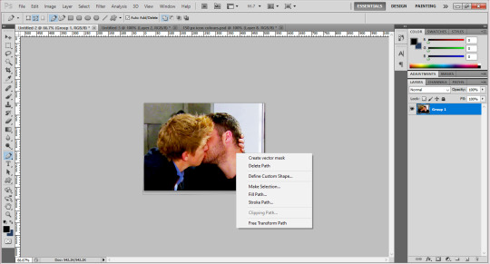
Once I’ve got the outline, I join up the dots to the first dot to make a solid line around the boys. Then, right click on the picture and choose ‘make selection’.

Then you get a pop up box saying if you’d like a little blurring around them - sometimes I do 1px, sometimes I have none, like in this case, depends on the quality of the photo (and sometimes how well you’ve cut out their hair hahah). Once you’re happy, click okay and you’ll get the solid line around them flashing now.

I’m not sure how to do this on a mac, so really sorry if you have one, but you’ve got to invert this line to select the background instead of them, by pressing Ctrl, shift and i at the same time. Once you’ve done that, you can then click the delete button and the background will disappear! Yay! You should get something that looks like this:

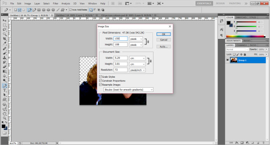
After this, you want to go to the menu at the top that says image and click image size, which will present you with a text box like this:

Change the pixel dimensions’ width and height to whatever your icon size is, so in this case 150px - don’t worry if the height isn’t equal to the width, it’s better that the icon is the full width if its not a person’s full body, as you don’t want the picture to take up the full height of the icon anyways! Like this:
And voila! They are to size. Now, since I’ve made icons before, I have backgrounds already made, so I would drag them onto them. I suggest you make the backgrounds in a separate window and save them for later use (using the gradients for example), meaning you can drag new people onto the backgrounds which will save you time! Once you’ve done that, you’ll get something like this:

Now, you could just leave it there! If you were to do that (I save them with multiple colours for variety!) You might want to go to filter > sharpen > smart sharpen and play around with it until they look more defined, but not overly so!
(Also please don’t judge me - it’s good practice to name your layers informational names but as you can see mine are pretty all over the place, oops.)
For the shape part of the icon, please refer to the link I added above to add a custom shape to your gallery. Once you’ve done that, this is how I added it to my icons!
For now, zoom into your icon and place the shape above the icon and use ctrl and t to make it the size you want, making sure to hold down shift when you’re dragging the sides so it’s in proportion. Once you’re happy with this, press enter to confirm it (its usually best to leave a few pixels between the shape and the edge for the ‘transparent effect’.)
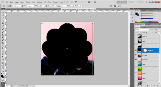
Then, drag the layer down in the bar on the right so it’s underneath whatever colours you want to use for your icon. In this case, I’ve just done a few as an example:
You can see the sort of outline of the shape on them, as well as the background colour. Now, you want to move the boys into the position you want them for the icon, and use something called a ‘clipping mask’.
Right click on the layers at the side and choose ‘create clipping mask’ - the background will then fill into the shape and so will the people once you click it. At this stage, you probably want to use the little eye symbol on each layer to make it visible or invisible, so you can see if this is working or not!
As you can see, there’s a blank bit at the bottom of the icon since I cropped the boys’ bodies there. Luckily as they’re wearing dark colours, I can just paint over this on their layer to fill it in, but you could also resize the original image down to 150px and use a clipping mask on it too! (You can also merge the layers to make sure they’re one layer, by right clicking and using ‘merge down’ which isn’t available in the above screenshot but usually would be!)
Then zoom out, and you should have something that looks like this! (I’ve gone back to the file I made the actual icons on for this screenshot.) Make sure you save the image as .png, not .jpg! Files saved as .jpg can’t read transparency and the edges around the icon will show up as black or white, rather than transparent!

I hope this has been helpful, and that it makes sense, and gives you a good idea of what to do?? If you have anymore questions don’t hesitate to ask❤❤❤
21 notes
·
View notes
Photo


WALKING SIMULATOR
WEEK 2
My second asset was a fox statue. I enjoyed making the previous model in Maya, but I really want to improve my skills in Zbrush, that is why I decided that my next model would be the fox statue. The screenshots at the top show the general process of the model in Zbrush.
First of all, I had to get familiar with the object. Fox statues are commonly found in Japan next to shrines, so it was really easy to find references. When researching, I found out that they do not look exactly like a real fox. That gave me a bit of freedom with the design since the model did not need to look exactly a super realistic fox.
Also, when we established the aesthetics of walking simulator, we agreed on making semi-realistic assets. Consequently, I was allowed to not spend time on small details, as they did not have to look realistic.
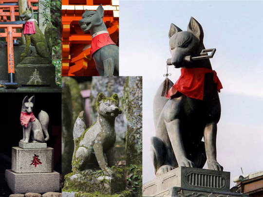
Once I got solid references, I started modelling. As you can see in the first image, I started modelling the head, followed by the body, legs and tail. I sculpted all of them in different meshes and in low poly. I started trying different proportions; as you can see in the references, they can have different body, tail and ear size. When I got a good shape, I combined the meshes and I used dynamesh, and I started now to work in a higher resolution mesh.
I used the basic brushes, Standard, Claybuildup and Move. Even if I knew I was going to add an object in the mouth, I sculpted the statue with the mouth closed. Therefore, that is why you can find a screenshot where the mouth has been masked. I decided to mask the bottom part of the mouth, I separated it from the mesh, rotated, and placed it the right way. Then, dynamesh again and finishing touches. When I finished, I used the brushes TrimAdaptive and TrimDynamic to polish the edges and get a closer look to statue’s features.
When the model was ready, I duplicated and I made use of Decimation master to keep the original characteristics with less polygons. Now, the model was ready to be imported to Maya, where I would add the plinth under the statue. But before that, I used Dynamesh and Zremesher to get a low poly model and I did the UV unwrapping in Zbrush. I knew I would not get the same result as making it manually in Maya, but I wanted to save as much time as possible and I wanted to see how it would look in UE4, not before giving a quick texturing in substance.

I found out that I did something wrong in Zbrush. When making the eyeballs, I just added two spheres and use Dynamesh, that resulted in holes in the mesh when I exported it. After every significant change of the model, I saved the file (resulting in 10 different files) so it was easy to come back to the right moment. I went back to the moment of making the eyes, but this time with Draw Polyframe selected to see the polygons. As you can see, it was clear that something was wrong. I deleted the spheres and I change the eyes look. Also, I exaggerated a bit more the part of the eyebrows and cheekbones. The comparison images are: 1.Before placing the eyeballs 2. After placing them 3. After I fixed it.
The model now looked fine in UE4, so it was time to finish the asset by making the plinth and the tool of its mouth in Maya. I assigned different materials, having a total of 3 materials when including the fox.
This is how the model and UVs looked at the beginning:


Then, I took the model to Substance Painter. Here, I first bake the mesh map, including the high poly version of the statue, and I add a simple texturing to the objects. Also, I typed the Japanese kanji in a different layer, playing with height and roughness to make it look like a stone engraving.


Even if I did not make the retopology, it looked fine to me, because since it was a statue, it did not need to look perfect. After making every object, I would try it first in Unreal to make sure that I would send the file ready to be placed in the prototype. The screenshot below is how it looked, and it was ready to be uploaded for the project.

After I sent it, I was told that the model was still to high poly. In addition, the day after, Darius had it exported into the project and for some reason, the texturing was not working properly. I did not know why that would happen because it worked just fine for me when I tried it in unreal. Anyway, I decided to make things right, so I did a proper retopology of the fox in Maya.
By then, I was working in another asset (a shed) where I encountered some problems with the textures. I will explain this later, but the fact is that I learn that I was not doing the UVs in a right way. So I did not make only the fox’s retopology, but also I change the UVs of whole model.
Here bellow you can find the difference between the polyframe of the model with Zremesher in Zbrush and the model after making the retopology in Maya. The last images show how I changed the UVs of the plinth, which was looking better and allowed me to get better textures results; and then, the last rendering. They were finished at the beginning of the third week and they looked much better than the first results I got the week before.


0 notes
Text
Agate Pass Cabin, Olympic Peninsula
Agate Pass Cabin, Washington Real Estate, American Property, Seattle Architecture Images, Architect
Agate Pass Cabin on Olympic Peninsula
Nov 23, 2020
Agate Pass Cabin
Design: Olson Kundig
Location: Olympic Peninsula, Washington, USA
Agate Pass Cabin is the home of Alan Maskin, principal and owner of Olson Kundig, this project reflects Maskin’s longstanding interest in the various uses of history. The project includes an 1,100-square-foot renovation and building addition to the original 1930s cabin, interior design and landscape design, as well as an art and custom furniture collection. Maskin’s design intervention delineates the house’s two different eras: the 1930s and today.
Originally, the one-story cabin had low ceiling heights and an attic. The interior walls and ceilings were clad with wide planks of Douglas fir, which would have been plentiful in the area 100 years ago. For Maskin, this was one of the best qualities of the original house – throughout construction, he had a “what comes down must go up” policy for the original wood panels.
Each panel taken down for an alteration was repurposed in the new additions, becoming cabinets, new ceilings and storage areas. Throughout the design, Maskin worked to make the different construction periods legible. Modern additions are demarcated with different wood types from the original planks, making it clear to see what was “then” and what is “now.”
Even though the house needed a large amount of work, for Maskin it was a dream project. He removed the low ceiling in the living room and turned the former attic space into a cathedral ceiling 17 feet tall at the gable. New foundations were added where none existed previously, and seismic upgrades were made. Maskin essentially added a second story to the house – a new stairway with orange plexiglass risers leads to a large bedroom. Here, floor-to-ceiling glass windows give expansive views of the water and Agate Pass. A small second floor terrace was added atop the original screened-in porch, which Maskin converted to a dining room and office. These rooms have views of two gardens that Maskin designed, including one with hardy plants inspired by visits to tropical areas.
Maskin also designed most of the built-in furniture and cabinets. There are several custom-designed pieces, all made of glulam plywood as the main material, including a daybed in the living room, an armoire, and a bed with built-in storage underneath.
Agate Pass Cabin features works by Scott Fife, Sutton/Beres/Culler, Leiv Fagereng, Karen Rudd, Rebecca (Raven) Lucan, Chris Crites, David Eisenhour, Mary Larson and Klara Glosova amongst others.
Agate Pass Cabin on Olympic Peninsula, Washington State – Building Information
Architects: Olson Kundig
Completed: 2014
Project Size: 1,100 SF
Project Team, Architecture: Alan Maskin, Design Principal and Interior Design; John Kennedy and Hill Pierce, Project Architects
Project Team, Landscape Design: Alan Maskin, Hardscapes; Duane West and Brian McLaughlin, Plants
Key Consultants:
General Contractor: Krekow Jennings, General Contractor; Nic Rossouw, Giraf Design, Structural Engineer; Niteo, Lighting Design
Quotes:
“My work life and love life were separated by Elliott Bay and a three-hour commute. I was looking for a small, extremely inexpensive fixer-upper. In my dreams, I wanted it to be a small cabin with a view of the water – hopefully with some character – and located somewhere in the middle of my two primary destinations. I heard there was a house that might go up for sale, so I went to see it. It was a 1930s beach cabin in pretty rough shape, but it was nicely proportioned and had stained wood interiors. When I climbed onto the roof, I realized there would be a nice view of Agate Passage if I built a second-floor addition. I hired a residential building inspector to check it out and make sure that buying such a rundown house wasn’t insane. While he was underneath looking at the foundations of the house, I noticed twelve bald eagles flying directly over the house. Let’s just say that after that, the inspector’s report didn’t seem as necessary!” – Alan Maskin, Design Principal
“I started sketching ideas immediately after buying the house. Shortly afterwards, I became an owner at Olson Kundig and that required my focus for a while. Finally, in 2008, I decided I was tired of sleeping on a mattress in an unheated attic and I asked John Kennedy, a friend and former colleague from work, to help with the drawings and detailing. We had worked well together designing a museum a few years earlier and it was an opportunity to collaborate again. It took about six months to get the building permit and seven months to build.” – Alan Maskin, Design Principal
“This cabin serves as the ideal antidote to my daily life, where I am constantly working on intense projects, going to meetings, and traveling. Out here there are no streetlights, very little noise. It’s monastic in a way that I really love.” – Alan Maskin, Design Principal
Photography: Kevin Scott
Agate Pass Cabin, Olympic Peninsula images / information received 231120
Location: Seattle, Washington, USA
Seattle Architecture
New Washington Architecture
Seattle Architecture News
New Seattle Houses
photo : Benjamin Benschneider
West Mercer Residence, Mercer Island
Design: Sundberg Kennedy Ly-Au Young Architects (SKL Architects)
photograph : Tim Bies
Mercer Island Residence
Built for a busy family, this residence nestles into its hillside location along the shores of Lake Washington.
COR Cellars Winery Complex in Washington
Design: goCstudio Architects
photo : Kevin Scott Photography
COR Cellars Winery Complex in Lyle
400 Fairview Building, Seattle
Design: SkB Architects with Kendall/Heaton Associates
photo : Magda Biernat
400 Fairview Building in Seattle
Washington Fruit and Produce Co. Headquarters in Yakima
Design: Graham Baba Architects
photograph : Kevin Scott
Washington Fruit and Produce Co. Headquarters Building
Charles Smith Wines Jet City, 1136 S Albro Pl, Seattle, WA
Design: Olson Kundig, Architects
photo : Kevin Scott and Nic Lehoux
Charles Smith Wines Jet City Seattle Building
Website : Seattle, Washington
American Architecture
American Architects
American Architecture Designs
American Buildings
Comments / photos for the Agate Pass Cabin, Olympic Peninsula page welcome
Website: Olympic Peninsula
The post Agate Pass Cabin, Olympic Peninsula appeared first on e-architect.
0 notes
Text
What is Luxury Furniture?
Halfway between the original design and superior quality, luxury furniture is not only comfortable but also especially beautiful to look at. It gives a sense of spaciousness as well as the appearance of a luxurious lifestyle.
They combine high end furniture materials with creative styles that make them simply unique. Whether it's a bed base, a leather sofa, a solid wood dining table, or a sideboard, every piece of furniture can be a piece of luxury.
If you’re looking for valuable furniture for your home, Modern Resale is the perfect partner to work with. With their exclusive selection, you will find everything that fits your luxury furniture needs.
What is luxury furniture?
What we call luxury is always relative and highly subjective. In the past, running water, heating, and frequent consumption of meat dishes were a privilege. Today, this is taken for granted by many people. In the same way, having muscle and low fat content was a sign of hard work and low social status. Now, a slim and trained body is intimately linked to the image of self-made success. It’s all a matter of perception.
Still, luxury is not determined arbitrarily. It’s by nature rare and not essential to survival. Luxury goods are those that can be possessed mainly by wealthy and powerful individuals. This has made them valuable. It also implies that the value of luxury furniture is not really proportional to the purchase price. Anything that justifies its cost not by any particular utility but only by its beauty and rarity is thus considered luxury.
In addition to the luxury villa, the expensive car or the private swimming pool, there are also other items that are worth a fair price. Occasionally indulging in one of these luxury items can give you a real sense of satisfaction, whether these are beds, chairs or tables. Design is about creating an object in its most beautiful and noble form. That is why design furniture and accessories clearly fall into this category.

The extraordinary beauty of design pieces goes far beyond their practical usefulness. In addition to being functional and comfortable, you also want the furniture in question to have unique aesthetics. This is precisely what Modern Resale offers with their luxury furniture.
The marriage of luxury and design
The home and its design has long been treated quite casually, but in 2020 it became a new playground for luxury brands as a result of people being home more.
Design has become strategic for this luxury market. The added value of products and image management are now really making a difference. All the cards are currently being distributed in a sector that is only waiting to be transformed:
Position statements
Alliances with high-end furniture or textile publishers
New strategies
Everything is now being played out in the field of real estate. Hotels and condominiums are becoming the new showcases of luxury. Big, luxurious brands all have hotels in their name in Europe, as well as in the Middle East and Asia. Among them are:
Missoni
Ferragamo
Moschino
Bulgari
Versace
Armani
The time is ripe for alliances. For these brands, it’s merely a matter of exchanging know-how with partners. They’re often from different fields of business, but share common values. Armani is engaged to Roca for bathrooms, Molteni & C Dada for kitchens, and Rubelli for textiles. As for Hermès, it has chosen one of the Italian pillars B & B Italia for the manufacture of its furniture. The brand has created a joint venture with Dedar for textiles. Little by little, the contours of the map of a new "luxe-design" business are taking shape. French or Italian furniture are particularly appreciated.
The contemporary movement
When it comes to furniture, the current movement does not characterize a specific design. It's instead a temporal reference. In this case, it’s a style that dates from the beginning of the industrial era. This goes from the end of the Second World War to the present day. In other words, it refers to our time.
It can be recognized by the use of:
Molded plywood
Plastic
Bright steel
The decorations are designed with a desire for clean design without too many decorative motifs. The color mainly used is white. Most of the existing pieces are considered current, and some of them have also become real icons. The design of modern furniture is characterized by the following points:
The use of natural materials
Unique and original shapes to break the industry's patterns
Surfaces made with warm colors and textures
A priority of comfort and ergonomics
A design with clear and pure lines
In other words, the current movement in luxury furniture embraces all the decorations that are produced and sold today. It follows the trends and fashions of the moment.
Enhance your home with luxury furniture
Luxury furniture obviously comes at a certain price. As you may know, it's often not very affordable--although Modern Resale helps by providing quality luxury furniture at a cheaper price. The interior and outdoor models are exclusive and not accessible to everyone. Do you want to embellish your home with a touch of luxury? Here are the main things you need to pay attention to when shopping for this type of furniture:
The layout
As far as the layout of your home is concerned, the most important thing is to keep it simple. One of the main codes of the contemporary luxury living room is the airy aspect it gives off.
You shouldn't pile up furniture and decorative objects at the risk of overloading the room. If you do overload the room, then your luxury furniture won't be able to stand out properly any more.

It can also be a good idea to determine living spaces in your home, especially if you have enough space. For example, a library or a television corner could create a cozy spot. This can be done with the help of decorative objects such as carpets, which will also bring a warm touch to your room furniture.
The colors
To keep it clean and trendy, don't add more than three colors to your room. Additionally, you have to play with the shades to keep some warmth. However, make sure that you don't overdo it so as to avoid overwhelming the room.
When it comes to choosing the right color, white is obviously a timeless color. It will enlarge your room, illuminate it, and allow your furniture to stand out. You can also choose more fun and trendy colors such as duck blue combined with mustard yellow. Of course, you will have to balance these tones.
If you have trouble with colors that are too bright but you want to bring a pop touch to your room, you can choose to apply them only on a part of the wall. This works very well, especially if you want to make a particular piece of furniture or element stand out.
The lights
One of the main characteristics of the contemporary house is its high level of brightness.
When designing your room, it’s best to choose large bay windows. However, if you just want to redecorate the room and don't want to do any major work, you can also bring some trendy lights.
We especially like the big industrial style bulbs which are very modern and which also bring a lot of light. The small lamps--placed on the floor--will bring a very warm spirit in addition to the big chandeliers.
How to decorate a contemporary home?
When it comes to decorative objects, the first thing to talk about is rugs. Rugs are timeless and classic, and will bring an essential touch of elegance to your dining or living room furniture. As specified before, rugs will also separate the different living spaces. They bring warmth and structure to your home.
We especially like the cocooning carpets, which give a cozy nest look to your room. But if you’re a very modern type of person, you should go for cowhide rugs on a waxed concrete floor, or fabric rugs in a light accent. Gray rugs work well in that case, but you can customize them any way that you want. This solution is particularly suited to a parquet floor in oak, for example.
We avoid trinkets of all kinds. That’s because they’re not of high quality. They will clutter up your room and at the same time spoil the beautiful materials that you have placed in it. A contemporary living room should be both airy and comfortable. So don't hesitate to go for stools. They give your home a very warm look and make your guests feel comfortable in them.

Also think about the cushions. Their color should match your chairs or sofas. And of course do not forget to select some quality works of art to customize your interior. These are the height of luxury. They will bring a lot of cachet and singularity to your room furniture.
Luxurious styling tips for your living room furniture
With the following tips from our outdoor and interior design experts, you will quickly succeed in creating a luxurious home with a stunning effect!
Think about high quality materials! Cashmere, silk, velvet, lambskin or wool should be used specifically. This creates a classy look. You should avoid buying synthetic fibers. They are not suitable for this style of furnishing.
The attention to detail! Find luxury decorations that will make your furniture eye-catching. Make sure that zippers and zip fasteners are well integrated into the decorative cushions. Keep the design simple enough.
As luxury furniture is expensive, it’s worth investing in high quality accessories. Fur blankets, velvety cushions or crystal glasses and brass candleholders are all great choices. These allow the room furniture to immediately appear elegant and luxurious. More importantly, this can be achieved without having to invest a large amount of money.
Less is more! Small rooms in particular quickly become overcrowded. Too much furniture and accessories give a chaotic look to your home. Instead, you should rely on beautiful individual rooms. Create a luxurious home atmosphere to please both the residents and the guests.
Let your wall do the talking! Yes, high-quality wallpapers also show luxury in a home. They embellish the room furniture individually and make it visually more interesting.
Looking for tables or desks? Chairs or stools? Beds and custom sets of rugs? You can purchase your favorite brands and pieces of designer furniture in the Modern Resale online store right now.
source https://www.modernresale.com/blogs/news-feed/what-is-luxury-furniture
0 notes
Text
to my Exalted Secret Santa
Three options under the cut:
Ledaal Manus, Twilight Caste Solar Spymaster
Cathak Argon, “The Forge of Melted Chains”, Slayer Caste Infernal Prince
Black Wings to Blot the Sky, Day Caste Abyssal Renegade
1) Ledaal Manus, Twilight Caste Solar Spymaster
Manus is a beautiful, feminine, very privileged young Dynast-turned mastermind of the clock city of Towersong. He acts as social prep/cleaner and advisor to his small Circle, and specializes in seeing everything and making people underestimate him so he can work freely.
He is extremely pretty in a soft, gentle way. He dresses in a sort of semi-Victorian style he’s borrowed from Thorns, brocade vests and slim trousers and so on. He still likes the very high collars and wide sleeves common in Realm fashion, though. He is slim and around average height. His skin is very pale (though should still be recognizably Realm in ethnicity, which for our Creation is closest to Chinese). His right eye is icy pale blue, and his left is a darker, warmer blue (having had it replaced after the original was cut out by a Lunar). His hair used to be white graded to blue at the bottom, kept in a four-foot braid down his back, but recently Ligier chopped it off in an ill-advised duel. Now it falls just below his jaw, short at the back and longer in the front, pure white, and he keeps it pinned back, sometimes with the longer front “french braided” along his scalp. (Drawing either is totally fine.) He wears small oval spectacles and especially loves wearing purple. He has a strong aversion towards displaying skin, so covers up to his neck, down to his wrists, but if it is relevant, he has a brand around one bicep- a chain with a crown linking it like a lock.
He idolizes his Air Aspect father, and often wears a piece of pale blue clothing as if it were his token. Though he has a lot more jewellery, he almost always wears a simple gold circlet on his brow, a brass gear ring nailed through his finger, and a silver pin (on his cravat or coat) of an upright-pointing clock hand, a human hand before it, an eye on the palm- a gift from his Zenith queen when she appointed him her Hand.
He is brilliant and cunning and a dedicated problem-solver, which are put to the test in his role as right hand to one of the queens of the city. (He is always up to his neck in paperwork and responsibilities and happy about it. A consummate bureaucrat, he is Bureaucracy Supernal.) He fights using the sword he pulled from a tree (fulfilling local prophecy at the time), the long and delicate moonsilver-and-starmetal daiklave Silver Riddle. Having recovered his long shorn braid from Ligier, Silver Riddle now wears it like a tassel. He also occasionally uses one of a matched set of artifact assassin blades, the Sun-and-Wind Talons. Manus’ has the image of an orichalcum sun laid over a blue jade sky, but he usually keeps it hidden under his sleeve. In combat he fights with Solar Melee and the counter attack-focused evocations of Silver Riddle, and for sneaky purposes has a little training in two separate Martial Arts styles concerning assassination.
He is a Solar Circle sorcerer, initiated in all three times via scrying into the depths of the giant clock he lives on. He has three signature spells: a clock version of Corrupted Words (which flares his eyes with a subtle emerald flash), Lost Hour’s Offering (in which he uses weird clock magic to remove memories, taking the form of him ringing an ornate hand-bell), and The Titan’s Held Breath (in which he steps between the spaces between Autochthon’s laboured breaths and can run through a strange green-hued clock dimension until he either passes out from nausea or he chooses to allow time to function again).
His anima banner is gold in the center and fluxes to reds and purples towards the edges. The image is a hand presented like the Vitruvian Man, fingers extended and closed simultaneously. An eye opens wide in the palm. Lines of proportion encircle the fingers and their joints and extend out into the rest of the world to display the symmetry of Creation.
Reference:
Normal clothes 1 2 3
His stupid yachting costume
“Savage warrior of Karn” clothes
= = =
2) Cathak Argon, “The Forge of Melted Chains”, Slayer Caste Infernal Prince
Argon’s backstory is Extremely Second Edition and will be under construction until whatever year Infernals are released. However, here is what is not confidential:
Argon was raised in House Cathak alongside his twin sister Araka, raised to believe that obedience to his superiors was right and good, and that it felt right and good, and that his superiors deserved his unquestioning loyalty and admiration. His sister learned alongside him, but all she took away was that the strong get what they want. She exalted as a Fire Aspect, and the two attended the House of Bells together, Argon praying to exalt every step of the way. Araka’s carelessness with her power and her personal abuse of his loyalty to her were key to convincing Argon that his superiors did not, in fact, deserve his loyalty. A metody, one of the acid Malfean elementals, took advantage of his onset of doubt to offer him the demons’ bargain. He exalted as a Slayer, and fled the Isle. Araka, always pressing their relationship beyond that of brother and sister, refused to accept his fate, and wastes countless resources pursuing him wherever she finds a trace of his passing.
Argon is not particularly tall, with a slim build, but is muscled like a lightweight boxer. His skin tone was originally the same as Araka’s, a natural sallow skin native to the Isle, both with brown hair, but as her exaltation brought out ruddy auburn tones in her skin and hair, Argon’s turned his more yellow, mimicking the virulent acid of his co-adjutor. His hair is pulled in a ponytail, and it writhes with uncomfortably living force; distinctly more disturbing than the way an Air Aspect’s hair might blow in unseen breezes, Argon’s seems more to twitch and curl like some strange animal. His eyes are a brilliant acid yellow, and he smells of brimstone. In all ways, he is meant to mimic a Dragon-Blood of Malfean element, with the same sort of elemental “Tells” aspected towards the demonic.
He wears essentially a House of Bells training outfit slightly pimped up to look more majestic. Grey soft clothes underneath, maroon and red tabard over top, with a bright yellow band to signify his loyalties. He bears a yellow jade short spear partially encased in basalt, the Standard of the Beggar-King. From just below the head he has flown a long pennant, bearing only a field of solid black laced with brilliant green pavement cracks. He wears a tainted iron hearthstone amulet after conquering a brutally physically punishing manse in Malfeas itself, and has set a Gem of Infernal Regeneration into it. As a result the scars he bears from his time in the House of Bells and later in Malfeas have filled with basalt; the most noticeable ones are across his nose and cheeks and one deep one in one shoulder, though several smaller ones splash across his arms and torso.
Argon tries to be patient, noble, stern and proud, and emulate the virtues of the Prince as taught in his childhood. He has come to regard the Isle as corrupt, but still believes that a good, benevolent leader exists, in the form of his patron, the Brass Dancer Malfeas, whom he knows almost nothing about and only caught a glimpse of, dancing, for a few minutes once. He believes that he is destined to be the treasured, benevolent leader of some nation, and that he just hasn’t found it yet. His surety that people want to follow strong, loving leaders is somewhat undermined by his powers, which lace him with radioactive essence and punish the slightest misstep on the part of his devoted followers. He is trying his best to believe that he hasn’t signed on to the wrong team, and steadily and stubbornly turns his eyes from any proof that he might not be the worthy leader he believes he is.
He has By Rage Recast (3rd Edition willing), so whenever he goes iconic he transforms into a gargoyle-like beast (an Argoyle), with talons on his hands and feet, a thick tail, bright yellow armored scaling, sometimes black horns, if you liked Gargoyles the feel of it is ripped right out of that. His caste mark is a searing green X as if cut by a blade, and his anima banner is a broken crown with a cracked emerald in its brow.
Reference:
1 2 3
= = =
3) Black Wings to Blot the Sky, Day Caste Abyssal Renegade
Wings was raised as a princess in one of the tiny nations of the Hundred Kingdoms. It was expected that she would be married to broker some allegience, and was made into a creature of beauty and desire, with pure white hair nearly to her knees, unblemished rosy skin, and tattooed with a pattern of white lilies down her body. She would rather have died, and she did.
The princess would have been laid to rest in a state ceremony unlike any her tiny nation had ever seen, had anyone been able to find her body. But as soon as the touch of death came upon her, she rose a different creature. Shearing their hair off, they bound their chest with a strip of cloth ripped from their closet of sumptuous gowns. Clinging to shadows, they left their realm, following the call of something deep and terrible.
Wings is small of build but raring to go. Their hair is still pure white at the sides, cropped short, but they’ve grown the rest into a wild mohawk and dyed it bright red. Their skin is an ashen grey, and they still bind with a strip of no-longer-white cloth that was once a very nice dress. They have been training in martial ways since they left home, and they wear a pair of soft, baggy pants and a red sash around their waist. They have the old style pointed deathknight ears, pierced with several silver rings, and their bottom lip has a thick silver ring as well. Their eyes are crimson, and their cheeks are tattooed with a crest of black points to denote their royalty. The lily tattoo is still in evidence, but they’ve been tattooed many more times since, marred with black bands like shackles and barbed wire from their brief time at the Walker’s side.
During that time, they dressed considerably more princely, with fine, high-necked black tunics and scarves, ornate silver armor set with jet and garnets. They left that all behind in a mirror of their exaltation, when they realized how awful the Walker really was, though they kept the oversized soulsteel smashfists he gave them. Wings has no intention of returning those, and is kind of fiercely enjoying the idea of the fight they’ll give the Walker if he tries to retrieve them. They still tend to throw on scarves sometimes, looping them over their shoulders like dark wings, and they have a weakness for garnets.
They’re a little hotblooded these days, trying to play it cool and not attract too much attention, but unable to stop themself from interfering when their temper gets the best of them. They tend to swear a lot of very earnest and compelling oaths, which they have to grudgingly follow through on in the sober light of day.
Their anima starts as a halo of ominous darkness like a storm in the evening, and culminates in a rushing cloud of bats, their detail reduced to nothing but rapid beating wings, white teeth, and shrieking horror.
I don’t have a design for the smashfists but i’d love to see them on either renegade wanderer Wings or loyal new servant Wings with their full deathknight regalia. They’re originally from a concept where all deathknights can turn into bats so like, forgive furry Wings in the references
Reference:
1 2
10 notes
·
View notes
Photo

Touch, look, interaction, sensibility, senses, proxemics, distance ... how could all of these be perceived ? What is the focal point of looking at them? Where could these occasions lead us to? How could we generalize them? Or should we? And if we should then why ?

The starting point is the exploration of boundaries starting from Bangkok, where the most common event with most blurred personal boundaries happens to be Songkran - Thai new year. While looking at a certain event or occasion there is always a main point and idea that it carries but what is most interesting about events is what hides behind the idea, what happens behind “closed doors”, what is the darkside, secret, mystery, that nobody speaks, writes or thinks about, or does but society gets to ignore it. This is a perfect occasion in exploring first key points mentioned above, as Songkran apart from fun and religious beliefs does have its dark side - Sexual harassment, about which many statistics, research and studies have been made where majority of visitors despite their gender identity, sexual orientation, go through harassment

One of the topics of study is an event that is not directly embedded inside Songkran, but has originated from it - Pain To Power #donttellmehowtodress - a demonstration leaded by Thai model Cindy Bishop, the point of event was to tell government to stop telling woman not to dress attractively during the event but to tell violent people to stop being violent.


My own research about violence starts from psychological exploration of an individual and the crowd. What is the vulnerability of the crowd? What makes individual (part of crowd) vulnerable? Does the psychology/actions of individual changed under the effect of the crowd?

This is where it gets impossible to have one sharp and clear answer on each of these questions, but if we survey famous scholar psychologists they do have an answer, like Momboisse and Berlonghis research about types of crowds where they name four different types: Casual, Conventional, Expressive and Aggressive, from which we can conclude that Songkran falls under Expressive and Aggressive types as first expresses one or more emotions based on religious beliefs, political rally and so on, while the second is where crowd turns into aggressive mobs and becomes violent.

Meanwhile Le Bon and Charles Robert Darwin focus on individual or plural psychology and criminology reasons, where Le Bon identifies three stages of the crowd: Submergence, Contagion, Suggestion, depending on which we could say that Songkran falls under Submergence and Contagion as these two explore how the individuals in the crowd lose their sense of individual self and personal responsibility, as well as individuals in the crowd tend to unquestioningly follow the predominant ideas and emotions of the crowd. As for second study of Charles Robert Darwin - anthropological criminology explains how crowd behaviors is heavily influenced by the loss of responsibility of individual and impression of universality of behavior.

What actually drives the individual to violence as being part of the crowd? Could it be culture? Lack of interpersonal distance? Nudity? After comprehensive study made based on important sources it could be said that generally culture is based on seeing woman or any person having what is considered female behavior more weak as through past centuries women were seen only at home, not being able to have work or to be independent individuals.

Lack of interpersonal distance is based on study of proxemics where there are several stages of distances which are not respected though public events.

As for nudity depending on study it is considered that people exposing more skin are seen more vulnerable rather than ones that are more covered.

If we explore all these studies and examples mentioned in this text closer we will understand that nudity and culture could be one of the influences of interactions but eventually almost everything is based on many individuals gathering and tightening up in one space where the physical distance defines their positive or negative behaviors. Therefore the path of investigation leads us to one generalized word representing discussion mentioned above - Intimacy.
As intimacy contains proxemics, view of culture, desire or rejection of nudity, ignorance or lack of individuality in the crowd or separately individual behavior itself.


After arriving to the main focus of research interviews and experiments were conducted based on the main topic-intimacy. Where discovery was made that for each person intimacy and whole interpretation of it is very different, based on interview for some it is positive, for some negative, for some its alive organism, others material or mental, for almost all the respondents color of intimacy is very dark regardless of if seen positive or negative, it is outstanding color, noticeable, in this way we could conclude that intimacy plays very important role in human beings everyday life physically and mentally as well.
So could we see intimacy as love? Violence? Freedom? Proxemics? Individual? Personal? Public? All or none? And what tools do we need to explore intimacy deeper? Could intimacy be objectified? Could it be transformed into skin and bones? Space? Could we let people have artificial and different experience of intimacy based on their own desires? And finally could intimacy lead to creation of something brand new?

This is a sum up diagram of the projects so far collecting all research. After which I started thinking how to answer all those questions based on intimacy today. I have arrived to the scholars exploring standards of a human being to understand how could this be interpreted today and if this interpretation would serve for creation of something new based on todays world.

VITRUVIAN MAN 1940 Leonardo da Vinci
“The proportions of the human body according to Vitruvius” “For the human body is so designed by nature that the face, from the chin to the top of the forehead and the lowest roots of the hair, is a tenth part of the whole height; the open hand from the wrist to the tip of the middle finger is just the same; the head from the chin to the crown is an eighth, and with the neck and shoulder from the top of the breast to the lowest roots of the hair is a sixth; from the middle of the breast to the summit of the crown is a fourth. If we take the height of the face itself, the distance from the bottom of the chin to the under side of the nostrils is one third of it; the nose from the under side of the nostrils to a line between the eyebrows is the same; from there to the lowest roots of the hair is also a third, comprising the forehead. The length of the foot is one sixth of the height of the body; of the forearm, one fourth; and the breadth of the breast is also one fourth. The other members, too, have their own symmetrical proportions, and it was by employing them that the famous painters and sculptors of antiquity attained to great and endless renown. Similarly, in the members of a temple there ought to be the greatest harmony in the symmetrical relations of the different parts to the general magnitude of the whole. Then again, in the human body the central point is naturally the navel. For if a man be placed flat on his back, with his hands and feet extended, and a pair of compasses centred at his navel, the fingers and toes of his two hands and feet will touch the circumference of a circle described therefrom.”
MODULOR 1943 Le Corbusier
Le Corbusier developed the Modulor in the long tradition of Vitruvius, Leonardo da Vinci’s Vitruvian Man, the work of Leon Battista Alberti, and other attempts to discover mathematical proportions in the human body and then to use that knowledge to improve both the appearance and function of architecture. The system is based on human measurements, the double unit, the Fibonacci numbers, and the golden ratio. Le Corbus- ier described it as a “range of harmonious measurements to suit the human scale, universally applicable to architecture and to mechanical things”.
Vitruvian + Modulor
With the Modulor, Le Corbusier sought to introduce a scale of visual measures that would unite two virtually incompatible systems: the Anglo Sax- on foot and inch and the French metric system. Whilst he was intrigued by ancient civilisations who used measuring systems linked to the human body: elbow (cubit), finger (digit), thumb (inch) etc., he was troubled by the metre as a measure that was a forty-millionth part of the meridian of the earth
Nowadays/Proxemics/2020
Nowadays we are not only speaking about a man separately or the architectural space in correspondance with human body but also envirnment aound the man that does not concern only architecture but is a conceptual, intangible environment based on psychology and confortability.
Finally we arrive to the man of today which is the mic of Vitruvian man, modulor in contemporary world, defining the proxemics of a man of today.
Now to start exploring the design process itself I have created a narrative image representing the qualities and aims of the project itself. Each image has an author and is chosen carefully. The exploration starts from the crowd continues with density - group - space - talking architecture - proxemics and continues with translating into the new space. Where in the middle we have some important examples like performance of Marina Abramovic and Ulai where they have stood in the narrow entrance of exhibit space nude - whats interesting here is the behaviors of the people - how they felt uncomfortable but firstly starting passing though them very slowly but suddenly one couple passed fast and rest of the crowd started mimicking their behavior and curculation because faster and faster though them.
Or in example of the book Learning from Las Vegas, how sometimes architecture speaks for itself and becomes very clear to people.
Also the project by Rebecca Horn, who dedicated whole carrier exploring the limits of human body, where in one of her projects created a transparent box full of metal tubes and stood in it to indicate that is exactly the limit of her own body.
Another important example is work by Bruce Nauman - Green Corridor, where he had created very narrow corridor exactly 50cm as proxemic intimate space, where people were passing though and felt extremely uncomfortable due to the size and color as well.
Or Walter De Maria, Mile Long Chalk Drawing - we see Walter himself lying on floor and his feet touches line from chock and distance of lines is double of hight of him. Two lines are 1 mile long. So there is a comparison between measure of body and measure of geography, scale of individual and scale of earth thats why also its considered as land art.
And many other examples of same type.
As you can see while explaining on the right side there is timeline kind of grouping all these images into a cluster. Like proxemic, people/space, freedom clautripoobia, inside/outside, threshold and how all of it could result into social behavior.

The design invades the spatial typology of Bangkok that represents continuity in terms of crowd that is not shaped in any way. It becomes a way of designing behavior of the people, it is what space defines rather than what is a definition of the space.
Summing up the research based on human proxemics influencing different social behavior has led to a shape mimicking the proxemic rules.
Here we see the representation of the size of proxemics, followed by combination with new human standard, with shape of movement respecting the rules, then transformation of these measure into three platforms and framing them - in this way we have three immobile spaces - intimate, personal and social. In the final result it is the combination of all three into one mobile space varying from intimate to public, providing threshold for people placed in dense spaces.
First site choice is open space - Khaosan road - one of the most crowded streets in Bangkok during the day as well as during the night. The street where all the rules of interpersonal distance are absolutely disrespected.
The design is influencing social behaviors, giving shape to a crowd, exploring different ways of reactions and choices, spotting sequence of moving bodies in reference to proxemic rules provided by mobile spaces.
We see how the space, notion of the crowd becomes an experience. There might be a desire to be part of the crowd cited by this space or there might be not.
The second choice of site was to challenge the design to adjust to more enclosed space where people are not given too much freedom avoiding the “black box” passage. The space varies from intimate space which is on three sides - centre, right and left and personal distance in the middle. The size, span of time and movement is organized in a way that the whole space ends up narrow disrespecting the interpersonal distance at all times in order to influence and study human behaviors responding to this specific space.
It is not a conventional space, there is no specific aim of being in it, no specific desire of accomplishing something, it is up to people to decide weather it is connecting something of separating. What space does is brings people with no aim together in a neutral space experiencing the social distances. It is the idea of human body passing the threshold, human body reacting negatively or positively or even indifferently to threshold.
So in both cases we see the circulation of the crowd depending on how the layout of threshold would be in that specific timing the crowd automatically shapes itself according to it, not only being part of threshold but also after passing it people would tend to maintain the behavior at least for some seconds.

Here is represented the space containing the black box - the black box is most important element having measure of intimate space which is immobile, and the outer spaces move in and out of the black box making different variations of proxemic. The span of the space passing though each proxemic phase happens in 4 minutes and 30 seconds, spanning from one to another for one minute and half. Where here we see span from public - social - personal and intimate.
As well as the same happened in enclosed space in Silom road, but instead of C shaped elements are vertical slabs that stop on sides on intimate space, giving less freedom in terms of open space.
Elements are composed from lightweight scaffolding framed into a eco virgin plastic.
So if people always have possibility in choice weather to experience dense and claustrophobic environment or pass though free spatial arrangements that lasts for some minutes.

Spacial behavior predicts social behavior, they are directly connected. If in other cases for example domestic architecture is being built depending on human needs and after deep exploration of human behaviors, this case is organized other way around, first we build limits and then explore human social behaviors according to them.
The exploration is how do people use the space in reference to the limits and very importantly - in reference to one another.
It is known for example by the narrative references of Bruce Nauman that the narrow space resulted into extreme uncomfortability in human beings - this space being the same measure as in my own project, also important aspect of contagion of the behavior in case fo Marian Abramovic and Ulai. For example how in the narrow space we see only one person but depending on the culture of contagion we can assume that despite of uncomfortably people do tend to mimic each other, so even if the space is uncomfortable it could be contagious, as well as comfortable which is more easier to be contagious which we see in upper example of the public space how people tend to grow and grow in density. So generally the usage of the space can span from individual to collective and that 100% depends on the limits that space provides + the behavior that people choose.
So basically the strategy of occupying the space is completely free, even though it provides limits it does promote the form of liberation - the question is how? Firstly people represented in the image do not have a gender, social status, religion due to diversity of the crowd that appears to be in spaces like khaosan road or Silom, they are just - people - free people.
so More free people are, better we can realize their social behaviors, the deign of the space does impose the rules - which are proxemic rules, building up the limits which does shape the crowd, puts the people into specific point, specific position, condition, make them experience specific emotions, but in the end the deign is not violent, it doesn’t force people to end up in an open or enclosed space, there is always another choice of avoidance - this is what interesting about the space, all the possible variations of reactions, as Socrates said: “sometimes you put walls up not to keep people out, but to see who cares enough to break them down.” - so the design does impose the the limits in face of walls but it is 100% up to people how to react to it. The threshold in the end could result into overcrowded occupation shaping the crowd while being in threshold or after passing it or being completely empty shaping absolutely nothing - and the most important point is that each scenario would be a success, because both responses are the specific reaction to the space that predicts the space itself between one person to another by a free choice. So today architecture is nothing else but the creation of proxemic limits chosen to be experienced or not.
0 notes
Photo


The Finalised Collaboration Piece Installed
Credits:
Sculpture: Rebecca Webb
Alcohol Inks/Film: Jordan Witt and Sam Whitton
Film Editing: Rebecca Webb
Inspiration
This piece aimed to bring awareness to one of the many Issue’s corals face - Oil Spills. The film footage captures the process of Alcoholic Ink painting, to portray the nature of oil contaminating marine environments. The sculpture on the other hand, representing the diminishing coral reefs as a result of human activities such as Oil Spills. Presenting the two together we aimed to portray the harmful relationship oil has on coral reefs.
Why are Oil Spills harmful to corals?
Chronic Oil Pollution leads to lack of colonisation in reef-building corals, decreased viability in colonies, damage to the corals reproductive system, lower life expectancy in coral larvae and abnormal behaviour responses to both planulae (coral larvae) and corals. Exposure to chronic low levels of common marine engine oils and fuels has been seen to cause corals to eject the algae, zooxanthellae that they need in order to photosynthesise resulting in the bleaching and death of corals.
AIMS
The relationship between the sculpture and projection
Considering the work of Daphne Wright and Marielle Neudecker, where both present two works within a space that cause a direct relationship between the two; both influencing and enhancing each other's meaning. The action of presenting the two works together creates a meaning that would not be present without the two co-existing within the same space. For example, Daphne Wright presenting her Primate and Stallion piece together and the influence of opposing methods of presentation on the work, and Marielle Neudecker’s films presented alongside her sculptures/tanks.
We decided to project the Oil inspired film over the coral sculpture. This way the coral would be covered and immersed within the ‘oil’. Originally, I had concerns with the proportions of the work, as I knew projectors produce very large images in comparison to the scale of the sculpture. I was afraid that although they could be considered separate works, due to the difference in scale this could create a separation between the two - deeming them unable to fit and work together. There were also concerns that by projecting film onto the sculpture, all the detail of the sculpture would be lost, therefore turning the sculpture into a 2D image - which defeats the object of sculpture. I was advised before by multiple opinions that I was attempting to fuse too many practices/works into one thing, therefore over complicating the work, and losing the work within the chaos.
However, I feel many interesting things happened when introducing the projection to the sculpture.
Aims and Reflection
Scale - The shear enormous, towering and overpowering scale of the projection in relation to the tiny sculpture, demonstrated a sense of power; something that loomed over us all, it felt intimidating but also left you in awe as it towered over not only the sculpture, but yourself. This caused me to feel swamped by the film. This induced dominance over the sculpture, and made the corals feel outnumbered and diminished, successfully portraying the idea of coral loss in relation to oil pollution.
Light and Shadow - The image as previously described swarmed and took control over the coral, claiming the sculpture in its own image. The sculpture became part of the film. Although the sculpture was not lost as the differentiating patterns enabled the viewers to clearly see the sculpture occasionally uninfluenced by the patterns created by the film, enabling you to both appreciate the sculpture itself uninfluenced, and as a work on its own.
Some of the more illuminating colours of the film truly made the coral glow fluorescent. Which i felt linked in to the behaviour of corals when stressed due to over heating (which can be caused by oil too through 80% of oil being burned as industrial fuel, releasing over 36 million metric tons of CO2 into the earths atmosphere, which results in global warming, which is the primary cause of coral bleaching). The corals begin to fluoresce as they produce what you could refer to as sunscreen, similarly to how this sculpture fluoresces.
There is also a shadow produced by the sculpture on the screen that is used for the projection. Initially I thought that this would be a technical issue and I would want to erase it through using a short throw projector behind the sculpture so that the sculpture does not get in the way of the projection. However, due to the practicality of installing within the room, it was easier to use a long throw projector, as a short throw projector would not reach the height of the projection screen. However, once set up, we felt that the shadow reveals the presence of the loss of a life. The oil that has consumed the coral, has now left behind a dead coral; The sculpture of the coral stands for the alive and bleaching coral and the shadow reveals the fate of the coral, that is going to be ‘erased’ by the oil. The oil is responsible for the coral's death, therefore is shadowed within it.
Therefore, the nature of the film projecting onto the sculpture appears to induce a life cycle onto the coral, as you see the coral alive, attempting to protect itself and indulged in oil, but also appearing blank, white and dead with its empty silhouette.
Installing - After previous installation work and considering how my work sits in an environment, I wanted to ensure the work was presented at the right height for both the projection and a level of viewing. Previously people had to crouch to properly see the sculpture but this time I ensured to get myself a tall plinth so that the work was just below shoulder height so that you could see the detail of the work from the sides and the top. Also, the projection screen was quite high up which meant in order to have the projection hit the sculpture it had to be positioned at the level of the projection screen. I also placed the plinth a little distanced from the screen so that people could walk round the installation and see the sculpture from all angles, preventing the work turning into 2D. From this positioning, you could see on one side the oil coated coral and the other side bleached, representing the cause and effect relationship of oil on corals.
Although a downside of having a long throw projector meant that if you walk too close to the sculpture you will become in the way of the projection, causing viewers to create shadows on the screen. However, I was not bothered by this as I saw this as a way of instilling a direct connection with people and the issues of corals, as humans are now placed into the frame of the artwork, making people consider their relationship within the work. Oil spills are a man made problem as well as global warming from carbon dioxide building up in the atmosphere; it could be necessary to portray this direct relationship in the work. People may look at the work and as humans are erased from the work initially, people see oil as the enemy. This means people may not see themselves responsible for the ‘enemy’ within the work. Therefore, having people incorporated into the work could be a very interesting attribution to the work and a quality I feel I want to work on incorporating within my future practice.
In reflection, both me and Jordan feel as though we would like to develop the work by incorporating shadow, text, sound into the installations, I feel like the inclusion of sound particularly will build up a multi-sensory experience making the work feel more ‘real’ as though the viewer is actually part of the environment the art is making. This is the best kind of publicity for raising awareness for corals as the artwork will be establishing an opportunity to generate real relationships between those unexposed to corals in day to day life. Vague, abstract text can also be good for providing a point for reflection - giving the work more impact. Keeping the words vague will allow people to interpret the work as they please while further influencing the understanding of the work (without telling people what the work means).
0 notes
Text
Milestone 2A - Week 9
During the tutorial consultation I received some helpful feedback about my new concept and techniques to enhance the visual style of the 2D elements in UE4.
Feedback from tutor for new concept
Have structure be main focus (angle shelves down more – to a V – too much ground surface shown compared to structure/not weighted correctly
Using advanced material techniques in UE4 (height/roughness/SSS maps) to achieve a more realistic ice look (refer to VFX tutorial on BB)
Using post pro volume to disable auto exposure/use for colour correction
Exponential fog start point wasn’t working due to volumetric lighting being enabled
Really extend planes/structure to increase parallax effect and add more depth to scene
Add spot lights to create highlights
Add other structures in the distance to increase parallax effect
Digital painting - Iceberg
Now I had a more clear and strong concept I started to digitally paint the elements. Using a hand painted style meant more time, however it also allowed for more creative freedom over the style and placement of my environment. This meant I didn’t have to waste time trying to find the perfect image that would fit the space.
I first focused on the front icebergs as these require the most time and detail due to the close proximity to the camera. This is still a relatively rough drawing as I plan to add more detail later if time allows.

vimeo
Advanced materials
After watching the advanced materials tutorial on Blackboard I was inspired to try the techniques on my drawings.
I decided to proceed to this stage in UE4 with just the foreground iceberg as I was keen to see how effective this would be and if there were any changes I would have to make to my drawing approach/pipeline.
I first experimented with making some quick maps in PS. I found it wasn’t difficult to create the height and roughness maps just by desaturating and adjusting levels as most of this information was already conveyed through the shading of the ice in the original drawing. The SSS is something that still needs some work though. I need to do a bit more research on how to create an effective SSS map as I found it difficult with this particular subject and was hard to adjust in PS. For the other elements I will better separate the information into layers to allow for more control. This is why I chose to explore this technique at an early stage so I can continue my digital drawings while keeping certain maps in mind.

Even with these basic maps I began to see a noticeable difference in UE4. The iceberg now had more depth and glossiness. I could also see the SSS working in some spots where more light was passing through creating a brighter blue colour. With further adjustments and refinement in the coming weeks I will hopefully create an even more believable material.

Digital painting - Drawing/fixing ice shelves
I re drew the ice shelves to better fit the style and perspective. I started with a rough drawing to ensure the proportions and perspective were correct in UE4. Once I found a size and style that fit I went back into PS and added more detail. I duplicated it and made some visual changes for the left ice shelf to better create more visual variety, better depicting real life.

Digital painting - Ice shoreline and distance mountain scape
These were done relatively quickly as they are further away from the camera and will be shrouded with fog (particularly the background mountains). Therefore I didn’t include a lot of detail at the moment. After I add the VFX and see how it is all looking together I might come back and add some more detail.


Time spent
Tutorial consultation - 1hr
Digital painting iceberg - 2hrs
Advanced materials - 4hrs
Digital painting/adjusting ice shelves (including creating and adjusting maps) - 3hrs
Digital painting shoreline/mountains (including creating and adjusting maps) - 2hrs
Revised weekly objectives
At the moment I am on track with my weekly objectives. However adjusting the advanced materials settings have been added to be completed over the break. I have also added an extra week to experiment more with water effects in UE4 just in case I am not able to achieve it and have to go back to painting it in PS.
Mid sem break - Finalise advanced materials - Model structure - add to UE4 scene
Week 10 - Lighting and VFX in UE4 (fog/snow)
Week 11 - Water in UE4 or PS
Week 12 - Final edits - camera animation - composite in AE
Week 13 - Further development
0 notes
Text
The Body Shop: What went wrong? – BBC News
Media captionBalmy days: The Body Shop story
“A confused shop with a mish-mash of products with no emphasis on the fact that this is supposed to be a shop specialising in cruelty-free, fair trade toiletries and make-up,” is Suzy Bourke’s damning verdict on The Body Shop.
The 42-year-old stage manager used to be a regular shopper at the High Street chain, but now she tends to go to Boots instead.
And she’s not alone. According to a report in the Financial Times, its owner, cosmetics giant L’Oreal, plans to offload the High Street chain due to its slowing sales.
The Body Shop, founded by Dame Anita Roddick in 1976, was a pioneer using natural ingredients for its beauty products when it started out. It initially thrived, expanding rapidly, and by the 1980s was one of the most well-known brands on the High Street.
I remember the chain fondly from my youth, when it seemed to be an exciting shop full of affordable, fun and exciting products. Coloured animal soaps, banana shampoo, white musk perfume and strawberry shower gel were the height of 1980s beauty chic as far as I was concerned.
But by the early 2000s, rivals had caught up, with firms such as Boots, for example, developing similar natural beauty ranges. New challengers such as Lush also emerged, encroaching on The Body Shop’s market share.
Image copyright Jean Bourke
Image caption “You never see a Body Shop busy anymore, they always used to be packed,” says Suzy Bourke
The chain is still a sizeable High Street presence with more than 3,000 stores in 66 countries and employs 22,000 people, according to its website.
The Body Shop’s most recent results – for the first nine months of last year – show like-for-like sales, which strip out the impact of new store openings, rose 0.5%. But total sales were 600m euros (512m), down 4% on the same period last year, which L’Oreal blamed on market slowdowns in Hong Kong and Saudi Arabia.
The sales were a tiny proportion of L’Oreal’s overall 19bn euros of sales for the same period.
And arguably the chain – which L’Oreal bought for 652m ($1.14bn) in 2006 – remains a lower-end and insignificant part of its huge portfolio of brands, which include skincare specialists Kiehl’s, Lancome and Garnier, as well as fashion brands Ralph Lauren and Giorgio Armani.
Veteran retail analyst Richard Hyman says he wouldn’t be surprised if, a decade on, it has now decided to offload the firm, arguing it overpaid for the chain and has failed to add any value to it.
“Frankly it’s a bit of mystery them buying it in the first place.
“What they bought is a retailer and what they’re good at is brands,” he says.
Image copyright Gareth Cattermole/Getty Images
Image caption The Body Shop’s use of natural ingredients made it a pioneer when it started out in 1976
He thinks The Body Shop’s struggles are down to the same issues facing the retail sector as a whole:
competition from an ever-increasing number of shops all muscling in on the same territory, from supermarkets to fashion chains
the seemingly unstoppable popularity of online shopping
the high cost of running a large number of shops
“Retailing in shops is becoming an increasingly challenging business. You’ve got to have a very compelling retail proposition as opposed to a brand or product proposition.
“Everyone that shops in The Body Shop spends most of their personal care budget somewhere else. They’re constantly chasing their tail, having to work hard to attract people into a store,” he says.
When the 2006 deal was struck, founder Dame Anita – who died just a year later – was forced to reject claims that The Body Shop, known for its ethically sourced goods, was joining with “the enemy”.
There were concerns that some of the ingredients L’Oreal then used in its products had been tested on animals, while The Body Shop was publicly opposed to animal testing.
The Body Shop’s ethical foundations
Image copyright PA
Dame Anita Roddick, who founded the firm in 1976 at the age of 34, said her original motivation for the firm was simply to make a living for herself and her two daughters while her husband was away travelling.
But as someone who had travelled widely, she set out to do things differently, relying on natural ingredients and her customers’ interest in the environment.
“Why waste a container when you can refill it? And why buy more of something than you can use? We behaved as she [my mother] did in the Second World War, we reused everything, we refilled everything and we recycled all we could.
“The foundation of The Body Shop’s environmental activism was born out of ideas like these,” she wrote.
The French firm insisted the brand would complement its existing offering, giving it increased presence in the “masstige” sector – mass market combined with prestige.
But Charlotte Pearce, an analyst at consultancy GlobalData Retail, believes the firm has “slightly lost its way” under L’Oreal’s ownership.
“While The Body Shop’s heritage is strong, it needs to work on its brand perception. It’s not known as a brand which is innovative and new, and it’s failed to keep up with market trends – contour sticks, kits and palettes were a strong trend in 2016, and these are nowhere to be seen in The Body Shop’s range,” she says.
Image copyright Gareth Cattermole/Getty Images
Image caption Analysts say The Body Shop has lost its cache as a fashionable brand
These days the firm is not seen as “a trendy brand”, but mostly as a shop for gifting and low-value items, such as its body butters and body lotions, she says.
“With premium retailers such as Jo Malone and Liz Earle offering in-store treatments, there is more that The Body Shop could be doing to raise its profile and improve the customer experience,” she adds.
Nonetheless if the firm is put up for sale, Prof John Colley from Warwick Business School, believes there will still be plenty of interest from private equity funds.
He expects the firm to be sold with its current separate management team, whom he says are likely to have their own ideas for how to improve it.
“When a major corporate has decided it doesn’t want a business, it will sell it, probably, whatever the price.
“They [L’Oreal] are trying to get rid of it because it’s underperforming. But anyone bidding will see a clear turnaround. Independent ownership would probably serve the firm well. A refreshed image would almost certainly work,” he says.
Mr Hyman, too, believes a new owner could improve The Body Shop, particularly by selling the chain’s products outside its own shops. But he says trying to offload the large store estate with long committed leases will be a hindrance to any buyer.
“That’s not to say it isn’t a business with potential, but it could perform much more strongly,” he says.
Related Topics
Retailing
Read more: http://bbc.in/2k7nstr
from The Body Shop: What went wrong? – BBC News
0 notes
Last Seen Blogs

imagine-those-dorks
Our Multi-fandom blog!
transbian-mailbomber
Insert title here

techprotectionbagworld-blog
Tech Protection Bag

animike122-blog
Whozitinthewhatwhere?

genderfluid-fujoshi
Genderfluid fujoshi