#these photos aren’t colour edited
Explore tagged Tumblr posts
Text


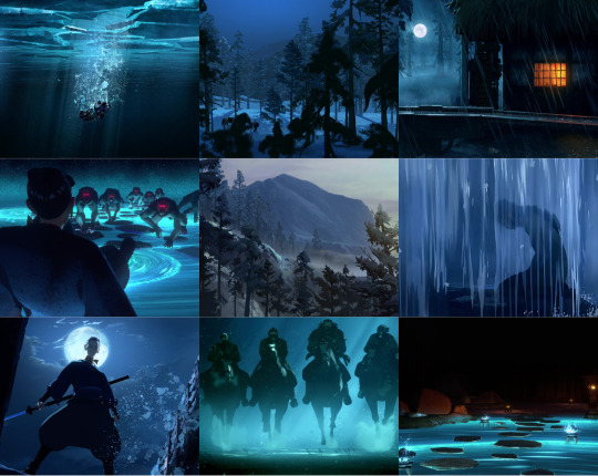
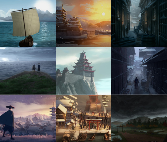
#this fucking show#y’all#I cannot#it’s so beautiful#these photos aren’t colour edited#this is just the colours of the show#aaaaaah#blue eye samurai#mizu
169 notes
·
View notes
Text
I’m at work right now, but I feel like doing gifs/portraits of tavs tonight once I get home… if anyone wants to allow me to borrow their tav/oc to make some gifs and portraits, send me a dm and/or ask into my inbox!! <3
I’ll need all the info for their mods and all the customization stuff so I can apply it into my game. Also an idea of what kind of scene/theme you would like + colour palette (since some may want it different from what I usually do)
If you play on console and maybe are missing out on mods (but have an idea of what your modded tav would look like), I’m happy to do so as well ! 😊
EDIT: forgot to add, the photos will be 4K and I can email the original PNG files to you as well for higher quality downloading. The gifs quality aren’t guaranteed to be suuuper amazing because it honestly depends on the length/colour complexity of the gif, but I can also export a higher quality (over 10mb) gif and send it by email if you wish.
ANOTHER EDIT: A lot of people are concerned about if there are a limited number of slots. I have no limit as of right now and will be taking every request that is sent to me until I impose a limit (which I probably won’t). If I receive a lot, it will just be first come, first serve and MAY take like 2-3 days MAX. I pretty much do nothing with my life except play games, sleep and go to work lol.
Thought i'd do a template to make it easier if you aren't sure what I need to know:
Picture of your tav/oc
DETAILS
Name: Race: Head: Body type: Skintone: Scar: Skin details: Eyes: Body art: Piercings: Makeup: Eyes- Lips- Hairstyle: Haircolour:
CLOTHING LIST
head: neck: body: hands: shoes:
MOD LIST
(links to your mods)
THEME
(what kind of scene/theme did you have in mind?)
COLOUR PALETTE
(a general colour palette, e.g. cool tones, focus on blue hues, dark and gloomy or warm tones, focusing on orange/yellow tones, bright and cozy)
#༊*·˚ random thoughts#bg3#idk if this is something people would want#BUT I’m going to be doing a bunch of stuff for my Tav tonight and feel like doing some other tavs as well :)
63 notes
·
View notes
Photo
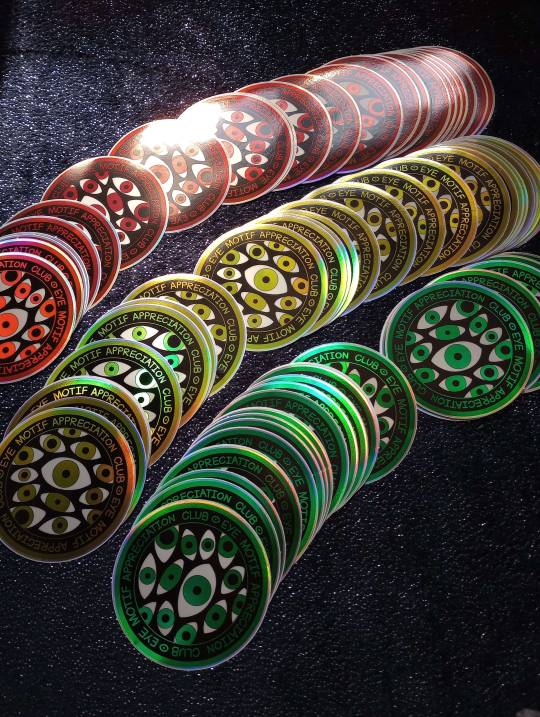
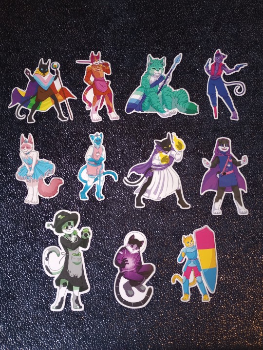

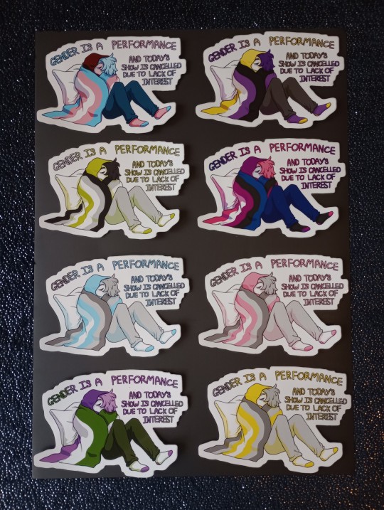

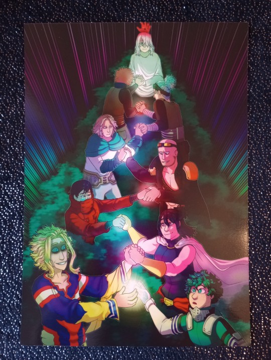

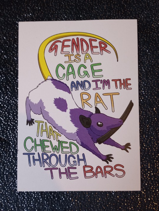
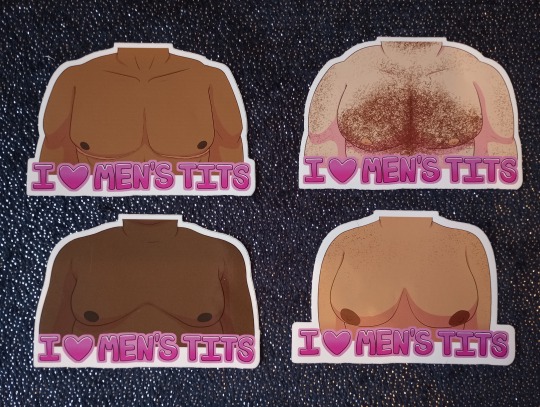
[image description: promotional photos of various prints and stickers. in order there is:
An assortment of holographic stickers with eyes that sa “eye motif appreciantion club”
A set of fantasy cat stickers with the colour palette of pride flags
skeleton stickers with a flag (one nonbinary one trans) with the text “the difference between sex and gender is that i didnt have gender with your mother”
various stickers of a person wrapped in a pride flag blanket with the words “gender is a performance and todays show is cancelled due to lack of interest”.
3 stickers of different cat people with flames in the background and various firestarting devices titled “catboy arson, catgirl arson, and nyanbinary arson”
an a5 print of various all for one holders from my hero academia, all holding hands as if passing a torch.
3 a6 prints of mha characters, specifically, uraraka, iida, and tsuyu
an a6 print of a rat with the caption “gender is a cage and i’m the rat that chewed through the bars”
4 different stickers titled “i [heart] mens tits”, each with their own body type
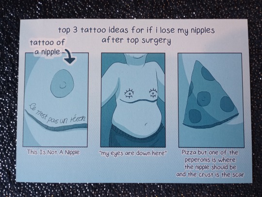
an a6 print titled “top 3 tattoo ideas for if i lose my nipples after top surgery” end id]
Finally opened my etsy account!! it’s here!!
Would greatly appreciate if people took the time to check it out, as it would mean a lot!
also unfortunatly i’m currently only able to ship inside the uk, as I’m trying to get used to selling before i’m able to ship overseas. I dont know how tarrifs and customs work and trying to check made me want to cry. EDIT: shipping internationally now so can send wherever royal mail will take it to!
If you’re looking at any of these but aren’t in the uk, i still have a redbubble!! here that is
lastly if anyone here is near Birmingham next sunday (21st may, 2023), I’m going to be at a queer pop up market at The Flapper, and I’ll have all of this there!
155 notes
·
View notes
Text
Day 791
When Animal Crossing New Leaf released, one of the best features they implemented was the ability to take pictures in the game and then (relatively) easily port them to a computer so they could be posted on the Internet, along with the player’s ability to visit the towns of other players.
Not because as a game mechanic it made this game suddenly the best thing on earth (though the ability to visit other towns was great), but because it was free advertising for the game.
Animal Crossing New Leaf did not need to advertise itself very hard because there was a community of dedicated players who loved to take pictures and then share them on the Internet. Rightly so, because it was a lot of fun to do and then you got to show people all these amazing things other people made or designed.
Something that I’ve been thinking about lately as I’ve been playing Infinity Nikki.
However, I don’t think the advertisement is towards gaining new players, but rather towards the already existing ones. See, as I’ve mentioned in the past, Infinity Nikki is a free to play game, but it’s a game, which means it has a gacha (lottery) system for its cosmetics, that’s how it earns money. It’s a system that is standard in free to play games, and one that I have negative feelings on because while I am not necessarily affected by this system, there are people who are predisposed to spending too much money on that system.
But I’ve also mentioned that Infinity Nikki’s actual gameplay is so robust, that you can play through that game, enjoy the game, and not spend a dime. If you are into the dress up portion the clothes that are part of the game are very pretty and not substandard at all, and if you do want the very shiny pretty clothing, the game gives enough rewards that you can reasonably earn a good number of those clothes. So, if you’re not a person who suffers from the fear of missing out, you can very much enjoy this game.
So what does this have to do about photographs and advertising?
In Infinity Nikki, you can take pictures in the game. The camera feature in the game is incredibly well done. Camera mode offers a wide range of poses, lighting, filters and adjustments while picture taking. Best of all, the game automatically dumps a copy of that picture into a folder in your files for easy access. So you could… you know… upload it to the Internet?
Not only that, but the outfits won from the gacha system are more often than not, better for picture taking than they are for running around in. I’m not sure what it is, but I find that full gowns aren’t as satisfying to jump around in the game, but they are beautiful to take pictures of. In fact the limited edition clothing from the gacha seems to be purposely designed with picture taking in mind.
For example, I had recently won the full outfit of Daughter of the Lake. I had originally meant to stop once I got the veil as that was the item that fascinated me the most. However, my luck… as it were, caused me to win the veil last, after winning all the other pieces in that outfit. So I had the whole outfit, which, if you wear it and then put Nikki in water (like she is a colour changing Barbie doll), scales will appear on her skin.
In gameplay, you will not be able to see this while moving her around. It also takes a second or two, like a real colour changing Barbie doll, for the scales to appear. So it’s a feature not practical in gameplay, but for picture taking… where there are a lot of beautiful places with shallow waters… It makes for an excellent photo opportunity. Photos that other players can then see, both in game and on the Internet.
And when you see those photos, it’s gorgeous, who wouldn’t want an outfit that kind of makes their character a mermaid? So you want that outfit and you may try for that outfit, and because the gacha system guarantees a 4 or 5 star level item after a certain number of pulls, you may find yourself only an item or two short. So you might want to spend a bit of money to finish off that item if the stuff you got for free isn’t enough.
Now do I think the developers are being malicious by having the camera feature? No, the camera feature was clearly built with a lot of love, but it is good to keep in mind that if you see a picture of Infinity Nikki in one of those really nice dresses, that it’s probably meant for photos, not necessarily play.

5 notes
·
View notes
Text
Red, White & Royal Blue: comprehensive watchnotes + review
i want to start by saying we need more queer rep across all genres, especially romcoms because they're lighthearted and fun and depict (queer) relationships in a positive way and the world (especially america) is in dire need of that right now.
as someone who hasn't read the book, i've been enjoying the general hype for this movie. i'd love to know how much the movie differs from the book but for now i'm just going to judge the movie based on its own merits.
in this post i will share my thoughts for key moments (edit: actually it's a bit of a play-by-play and gets a little long, sorry!) as the narrative unfolds and progresses, and then end by highlighting the main hits and misses of the production.
runtime: 1 hr 58 mins
amazon prime content rating: mature 13+ (australia) [link]
plot score out of 6: ⭐⭐⭐⭐⭐
production score out of 6: ⭐⭐⭐⭐
overall score out of 6: ⭐⭐⭐⭐⭐
is it worth watching? yes. is it worth rewatching? yes.
note: please read all the way through my watchnotes; my opinion changes as the movie progresses. these are first-impressions so i'm at the whim of the narrative as it plays out and my closing thoughts differ from my opening thoughts.
youtube
here we go! screencaps + thoughts below the cut..
we start with a reporter voiceover; it's a nice easy way to set the scene and introduce us to each character, i really like this simple but effective storytelling technique.
full disclosure: i didn't love the scene in the car; it's the first time we hear alex speak and see him up close and it reads as a little too camp for the vibe that's been set so far.
i'm surprised the lighting/filters/editing is so muted; i expected more vibrance and richness of colour to the royal setting, it all feels a bit flat.
the line greeting is a fun little scene: we get a decent intro into alex's personality and learn that he and henry aren't strangers but don't like each other - a classic trope, a fun take on enemies to lovers.
we get a peek into henry's character too: his viewpoint on royal weddings being ostentatious - soon to be echoed by alex - reflects very real concerns in present-day uk, the wasteful and luxurious lifestyles of royals while their people struggle to put food on the table.

the cake scene could've been more fun but it seems to kick off a more upbeat narrative; bad reputation is the perfect song choice and the overlay of newspaper headlines and social media snapshots in the intro credits relates well to the modern era; i'm curious whether social media posts were a significant plot-driver in the book.

president uma therman?! with a southern accent?! what a treat.
zahra and alex's dynamic is fun; shahi is perfect in this role.
as alex is sent back to the uk we're now moving away from the almost stuffy introduction scenes with more lively characters and better pacing.
the frenemies setup between alex and henry is great: we start off with them being at odds and will likely see them slowly but surely get to know and like each other (probably with a few bumps along the way). it's like watching a fanfic come to life bc these tropes and characterisations are the bread and butter of fic (and honestly media with hetero pairings don't know how to use them properly). i'm excited to watch their dynamic shift and their relationship grow.
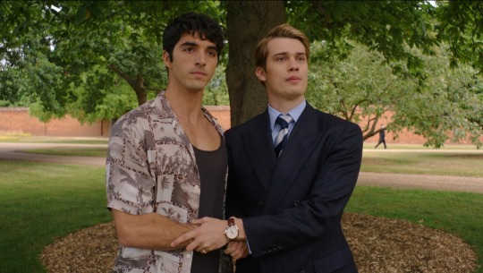
the photo op handshake scene, the push-pull of it all, henry calling alex 'sweetheart' in jest: the snark between them is so much fun. and this kind of faux affectionate namecalling is actually quite common in hetero romcoms and i enjoy seeing moments like these bridge the gap between hetero and queer pairings; i think if people paid more attention to the common ground of characterisation and character development we would see less worry about showcasing queer relationships, or at least see less plots that focus too much on being queer instead of focusing more on fun plot.
the underhanded swipes and passive aggressive smiles during the interview should've been more fun than they were; i enjoyed the scene but i'm having trouble attuning to the score music - it sounds like it should be backing a fast-paced kitchen scene, it just doesn't match the vibe of what the story and the actors are trying to do and it feels like stock music (which is what you get in made-for-tv and hallmark movies, bland and interchangeable, without identity).
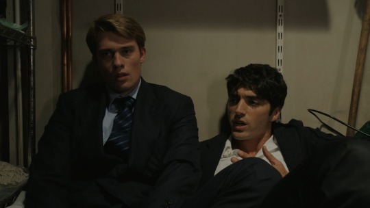
the children's hospital scene starts out kinda cute then jumps into a minor tense situation quite suddenly without much breathing room; they're shoved into a closet (ha) and proceed to have a heart2heart and clear the air; alex brings a little levity to the moment with his pouting, henry's eloquence is a bit stilted in the dialogue but it's helping to highlight the difference in their education/upbringing; the vulnerability they both exhibit with each other for the first time signifies a turning point in their relationship from squabbling to allies perhaps.
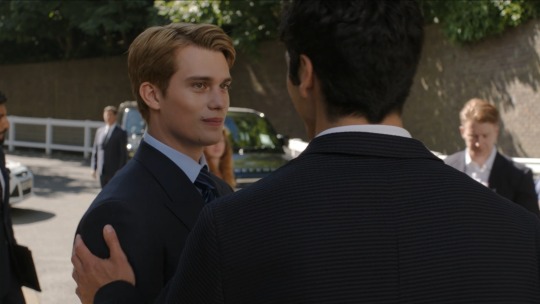
their parting scene (for now) hints at what's to come: a NYE party in the usa. henry gets a little flustered as he shakes alex's hand (the second show of possible attraction after the closet scene; i know nothing of their sexuality at this stage but i'm going to guess henry knows he's gay) - it's a little hard to see, and feels letdown by lack of a closeup shot (the cinematography in this movie isn't great; we should be getting lots of close-ups to get a better sense of their mindsets and to capture the emotional nuances between them; some movies do well without close-ups but this one definitely needs more of them).
we're 20mins in and I'm going to make a guess based on pacing so far: we'll see them hookup soon, then move from friends to love, or friends with benefits to love. personally i prefer stretching out the will-they-won't-they a bit, but this is a movie and a romcom not a 100k fic or a several seasons-long tv show. i'm excited to see their dynamic shift and their relationship develop no matter which route they take, and i'm pleased with the plot so far; i can see so many of these scenes on the pages of a book and being excited to see them brought to life on the big screen, i just hope fans of the book aren't disappointed by the movie. i'm looking forward to delving into their backstories a little more.
miguel is definitely flirting with alex and even hints they have a history which makes alex a little nervous; when it comes to sexuality this makes me think alex has at least experimented with guys even if he hasn't accepted that he's queer - but i don't know what his deal is yet and i appreciate the narrative leaving things open for now bc too many movies and tv shows hit their audience over the head with the (specific) queerness of their characters and reveal it too soon so there's no room to wonder or anticipate.
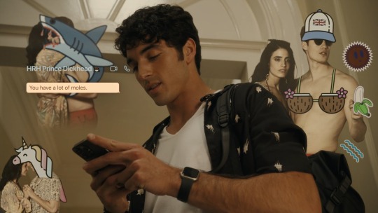
it's montage time: the use of a text-chain is relevant and fun (graphics) as we follow their correspondence inc. commentary on each others lives as viewed by the public. their (flirty) banter is so cute. i'm not a fan of them voicing their texts as it's mixed with voiceovers and feels a bit busy, but it is engaging; the scene melds are a little confusing at first but i appreciate the visual storytelling meant to bridge the distance between them by putting them in the same room - it's clever and feels fresh in an otherwise stale directional effort, and it means we get more scenes of our boys together despite physically being worlds apart.
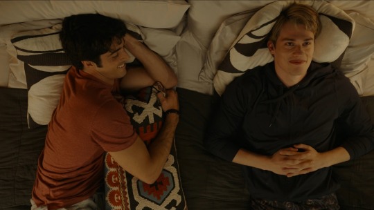
it's partytime: no matter what side characters surround them, alex and henry steal every scene, as they should since we haven't established any side pairing or even friendship yet (this could be good or bad depending on how the plot progresses, but i prefer the focus to be on our boys so no complaints here). get low being the song of alex's childhood is hilarious especially as henry points out the explicit lyrics; the visual slow-mo of the crowd getting low leaving henry and alex to stare at each other is a great direction and editing choice! it's little moments like these peppered throughout a good romcom that make it memorable and worthwhile because it's not just going through the motions it's inviting you to enjoy every scene, and i'm so happy to see that in a mlm love story.
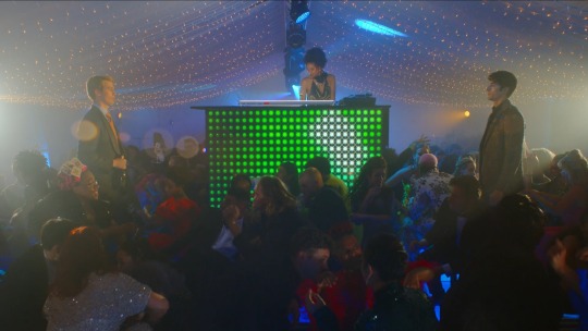
here comes the first kiss: i wasn't expecting it in this moment, i thought henry was going to storm off but this works too - unfortunately both covered angles of the kiss are obscured and once again i'm grabbing a megaphone to yell 'we need a closeup!' at the director. it's pretty disappointing to not get a better view and see their facial journeys but at least i know we'll be getting many more kisses - which is maybe why this one wasn't given Thee Big Kiss screen moment, i just hope the camera catches the next ones better.
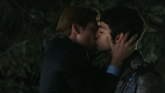

30mins in and we're over with act 1: their dynamic has shifted.
with henry giving alex radio silence after their impromptu kiss at nye, alex confides in his friend nora - it's the first time we've seen them together in a conversation since the limo at the start and the first time we see them actually talk at length and get a sense of their dynamic and nora's personality; i like her, i want to see more of her and more of their friendship. i'd like to see more from the various supporting characters and i trust the plot can do that without taking focus off our boys, the question is: will it?
we also get more explicit talk, specifically reference to the dom/sub undertones of their kiss, and nora saying alex wants henry to 'dick him down' - outstanding; the same level of sexual chatter is seen often with hetero pairings but with queer pairings you seem to get either g-rated fluff or x-rated drama (that usually ends with them dying or breaking up). i wasn't expecting this kind of language and i'm so pleasantly surprised that they went there.
we get more info on alex's sexuality: he's cool with being 'low-level into guys' but is confounded by his apparent attraction to henry, and when nora enquires about how many male partners he's had the scene is conveniently interrupted - classic - but we get our answer: he's been with 2 guys including miguel. alex knows he's queer but is still hesitant about being with more guys and specifically what to do about henry.
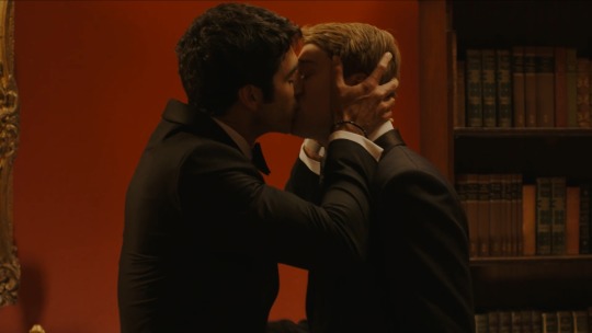

things start happening: another kiss at a fancy party, another member of their inner circle finding out, sexual banter, their first time together (bj) - a cut-scene, as is appropriate and expected. alex tells henry he's bisexual - it seems like this is the first time he's saying it out loud, perhaps even settling on the term in the moment, and while it might be nice to get a little more insight i'm glad they don't dwell on it - so many queer love stories fixate on the label thing and provide you with a sort of queer identity origin story, and while that's fine for a coming-of-age flik or something with less plot or more angst it's simply not necessary for every queer love story; every flavour of queer rep is yummy but it's a good thing to see media moving away from characters having to explain themselves instead of just being.
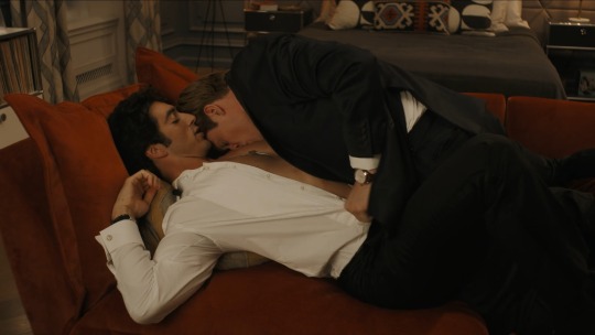
henry reciprocates by saying he's gay. it's nicely done, poignant but not stealing focus from the various other plot pieces at play; it's rare to see a coming out that doesn't get heavy so kudos to the writers and the boys here.
we get another insight into their private lives: alex wears the key to his austin home around his neck - texas ie. the state up for grabs in the president's reelection, which may recieve help from alex's proposal (this has been a recurring mention and i look forward to seeing what unfolds); henry has never owned a key which is so telling of a controlled life where he doesn't really own anything.
the bittersweet note of henry regrettably marking their dalliance as 'casual'; you can see they both want more but alex was not expecting nora's words of the closeted prince to thwart this thing between them; they both agree to friends with benefits but ofc they're falling for each other. the little addition of henry nervously fiddling with his ring is a nice character detail.

i like that whenever they make plans to see each other again the plot doesn't dither with B-plots - i don't think we've had a single scene where one or both of them weren't present and they've always been centre-stage. plans for another date are followed immediately by that date: the scene switches between a fast-paced polo match and a rendezvous in an equipment shed. we're getting as many stolen moments - sexy or sweet - as the runtime can fit and again that's so remeniscent of fanfic.
paris: 'prince henry belongs to britain. henry fox has to belong to himself or else he'll vanish' this tugs at my heartstrings and the light angst of it paired with denying alex the chance to comfort him in semi-public is the kind of understated writing that makes an angsty emotional impact without being loud about it.
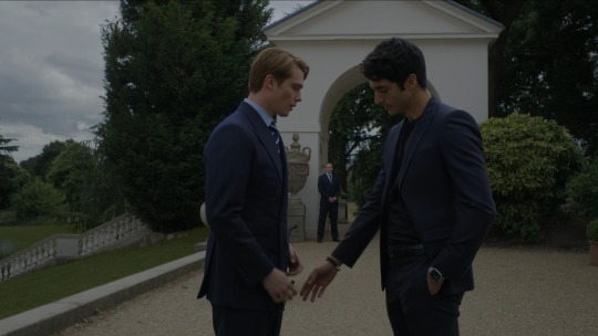
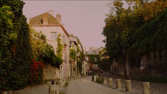
there hasn't been many good cinematography shots but the europe settings are giving the directors (or b-roll archives?) something pretty to insert with parisian cafes and palace gardens.

henry @ alex: don't fall in love with me, we can't be together but we can have fun. also henry @ alex: 'we should make love tonight, here in paris'. the discussion of who will be doing what is handled with nuance instead of stuffed dialogue; you can do it either way depending on the story but they found the best way to touch on the topic without overdoing it. learning alex has never fully been with a guy is another moment of vulnerability and it should be said they both play these moments well, but even in intimate moments like this we see them being themselves in some measure of levity, reminding each other that they were friends first and remain friends still, that they can be themselves, that there's care and familiarity between them, they're safe. the direction improves during this sequence with close-ups of bare skin - but that intimacy is undercut by switching to mid-shots; the softness of the scene is handled well enough but the lingering mid-shots would be better as short close-ups.
one visual reminds me of that Kill Your Darlings sex scene:
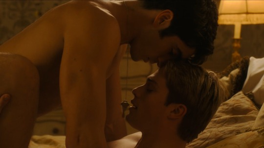

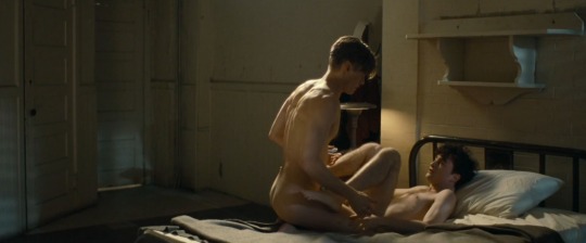
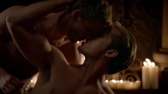
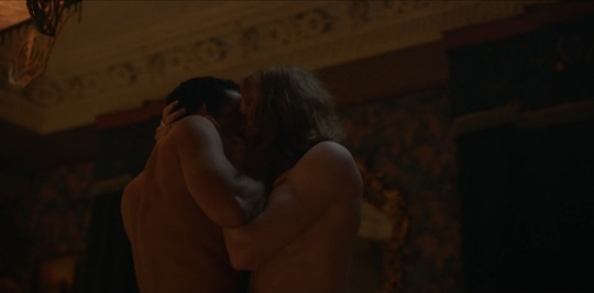
the sex scene is oddly slow, like the boys are moving in slow-motion, and the movements are a little awkward - an easy fix for this would've been to reduce the lighting in the room; it's very bright so we lose those intimate shadows and the mystery that goes with them.
the golden lit opulence is something that's been done before with gay sex scenes, notably Interview With The Vampire (2022) and True Blood. below you can see the similarities in composition and setting, and how rwrb could've used more shadow and less light for contrast to help heighten the intimacy (they could've still kept it bright if they took inspiration from the Cruel Intentions sex scene):
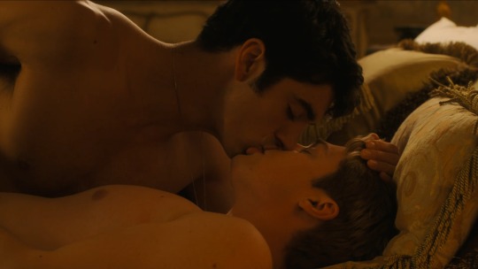



as they lay together in the afterglow the wide camera angle catches two condom wrappers on the floor by the bed - a small but mighty detail in both depicting safe sex and stating in no uncertain terms that these two guys had penetrative intercourse.

it's inferred that henry doesn't want to be a royal, doesn't want to live in the spotlight. on the flipside alex loves the opportunity to help people and to be a role model for people like him to look up to.
unfortunately there's a lot of dead air in their d+m pillowtalk scene and it's not the first time this has happened; it comes down to 1 of 4 things: direction, editing, music, acting. the boys play the scene well but their emotion and vulnerability is lost in the wide angle shots - moments like this highlight how poor the direction is, but even bad direction can be helped along by editing and music, but in this scene (and many more) that's simply not what happened; the easiest post-production fix would be to add a musical score to drown out the too-long silence that just reads as awkward; adding some rainsounds and distant thunder would've also worked. but even without a soundtrack this scene could've been improved during filming: it's begging for close-ups and better contrast lighting (everything is still too bright, it looks overly lit like a soundstage not a hotel room).
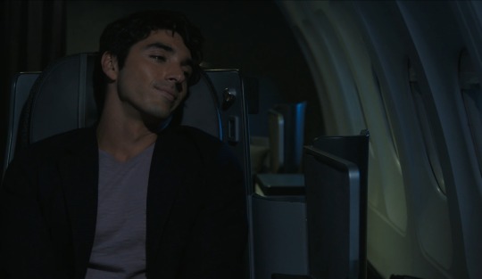
we end on a hopeful but very dark scene of alex flying home: shots like this need color or light; if i saw this scene out of context i wouldn't guess it was from a happy moment in a romcom (alex's black-gray wardrobe also does nothing to highlight the hope and love he's feeling).
we're just about at the 1hr mark: i want to take a moment to highlight some important plot points about the boys' separate storylines which i'm loving not just for the depth it adds to their characters but for the important subject matter in the present-day: alex's family history, background and ethnicity and what it means both to him and to his country, as well as his passion for wanting to be more involved in politics in order to help people is uplifting. we haven't seen henry's passion explained just yet but the childrens hospital visits and condemning exorbitant royal spending show that he has a heart, conscience and sense.
we're finally getting some politico plot: president uma, the sneaky flirty journalist miguel, alex's plan to help turn texan voters - yes this is a romcom but i've been hoping they would delve into political matters on both sides of the pond and now here we are; it doesn't come out of nowhere, these narrative threads have been woven in from the start, but it's taken an hour for us to get a dedicted scene (the partial scenes with miguel were overshadowed by his flirting and imho skeevy vibes so i'm glad we're getting other characters in on this plotline).
rather than draw out the drama of mother vs son the plot chooses to skip over the filler and go right to a resolution via mom believing in her son; alex is off to texas to implement his campaign strategy. adventures surely await.
1hr mark: we're halfway done and onto act 2 (3? we're in a new act).
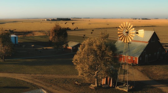
points for the cinematography: the landscape shots are striking and gorgeous and they ground the visuals in a way that the fake snow (nye party), greenscreen DC skyline (white house balcony), and greenscreen paris skyline (through a hotel window) simply didn't. real locations, even pretty b-roll, have been lacking. the campaign office feels real not staged - it may seem like a small thing but it's actually crucial to aid believability, which is also helped along by a backing score and voiceovers from the boys reading their emails to each other (it's almost too busy but they forgo the graphic overlays so it works).
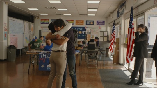
montage time: campaign office and real locations backed by a somewhat rousing musical score and email voiceovers - which seem to overlap towards the end but something is off with the sound layers because one is almost too soft to hear while the other one stays loud. we get a bunch more locations and scenes outside with real sky and sunshine which helps the believability; all the scenes in the white house feel fake so real locations are a win at every turn.
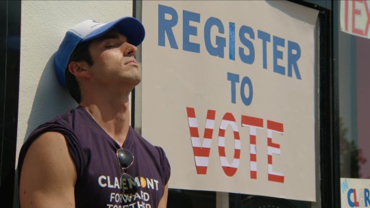
i don't like miguel. his first interaction with alex was kinda fun and intriguing but the more scenes he's in the more i wish screentime was being made for other characters; i don't know if it's the character or the actor or both but i'm just not digging his vibe. if he turns out to be a dbag then it works, but if the plot intends to turn him into a friend i hope his vibe is tweaked moving forward.
alex storms off and henry is suddenly there - the movie has so many shots that linger too long and feature dead air, but it also has a lot of these scenes that aren't given room to breathe; alex should've run into henry in an outer room instead of a prince walking into a crowded bar and claiming 'skullduggery' - it's poor planning and poor direction, but if it was like this in the book it definitely should've been altered slightly for believability, even if only to move them away from the main entrance and many prying eyes. alex basically whisper-shouts that he needs to get henry in his room 'right now' and whether it's sexually loaded or meant to conceal him it fails to be covert on both accounts.
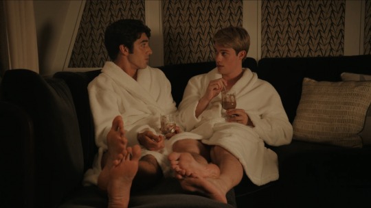
another cut-off sex scene and more post-coital chatting; alex asks henry a bunch of personal things and we learn henry isn't allowed to vote - which relates to alex's campaigning and the fact he (somehow) got 1million voters to register (in an undetermined timeframe). their not-so-casual affair has reached the point of more people finding out: miguel obviously suspects, and now zahra finds herself in the know. we get a butt! and a frantic search by zahra for the 'rando girl';��fun subtext when she finds henry in the closet. there's mention of a percy and i have no idea who that is, and henry confesses he told his sister about them which gets an 'aww' from alex - which is at odds with the whole 'just casual' thing they agreed on earlier; ofc they're both developing feelings but to say them out loud (like in the emails as well) undercuts that nice little angsty moment of when the whole lust-not-love agreement was made after their first time together; did it play out this way in the book? bc right now their relationship reads like a secret romance instead of a secret fling which is fine but it contradicts what they said; pick a relationship and stick with it instead of saying one thing and doing the opposite.

oof, okay: while i love zahra's stresshead freakout i take issue with comments about who tops and bottoms - it's fine to discuss between the boys and anyone else who knows the specifics (maybe nora?) but to have a character with no proof state that she knows (by belittling alex, mind you) is not cool, not cool zahra. alex is quick to say he won't stop seeing henry and again it's playing like a romance not a fling - the least they could do here is focus on henry's reaction but we're not given the chance as the camera follows zahra as she leaves. kudos for zahra giving us 'little lord fuckleroy' and her witty rant but the scene misses several opportunities for close-ups once again.
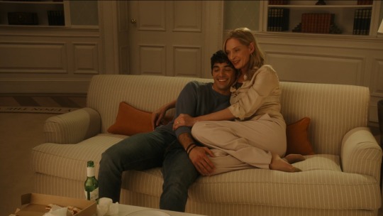
the next scene takes place in the oval office: it feels like a scene or two are missing; alex comes out to his mom and ellen (literally just realised her name was ellen thanks to the subtitles; i thought the ellen on the posters in texas were for her representative since there were no visuals of her. she's not the only supporting character whose name i don't know) supporting alex. the couch cuddle is an awkward angle and looks more like a cougar cradling her boytoy but points for the president mentioning various queer identities as well as specific safe gay sex practice - has this ever been done? this feels groundbreaking.
it's getaway time: alex's dad, nora, henry, and henry's friend (who we met at nye and whose name i can't rememeber) make up the group. the roadtrip visuals are sad - the wideshot of the desert is drab and looks like greenscreen, there's no sunshine and no fun roadtrip vibes, then we get a road-level driving view of a dusty road with no car in sight (stock footage?) - it's mismatched especially with the greenery surrounding the modern minimalist house they arrive at. alex's email voiceovers are starting to annoy me: his tone is that of a highschool drama student or disney channel energy - it sounds fake. oh, percy is henry's friend from nye.
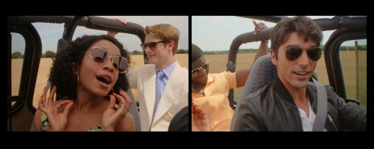
this is the first i'm hearing of ellen having published a book: fiction or non-fiction? autobiography? this is relevent since henry voiced wanting to be a writer so they may find some common ground when they get to know each other.
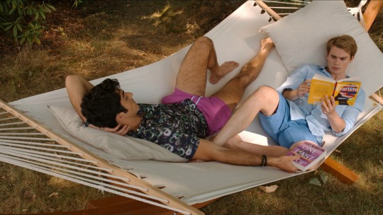
another montage: their first day inc. henry showing off his ball skills to alex's dad and them all playing volleyball - it's a pity the weather is drab because sunshine would help lift these scenes particularly bc the production crews haven't bothered adding any filters. we were robbed of alex talking henry through the family photos on display as he leans down to look and the scene cuts away - i wish we were give more of these moments. the club pop isn't what i would've chosen for the montage sequence; there's a difference between eclectic and giving a movie its own musical identity - rwrb doesn't have one, it's a bit of a mess. it is nice to see the boys sharing a hammock in their shorts with hairy legs on display - body hair is not common in young queer media.
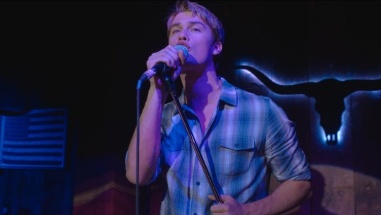
the bar sequence has a few odd moments: their entrance vibes make them all look like vamps on the prowl and henry is the new baby vamp; alex's comment about henry being excited for karaoke has no reference point in the narrative so far - all we know is he named his dog after david bowie and now he proceeds to sing queen - and he can sing! and does alex catch a faux kiss from henry on stage? the audio fade as alex gets all mooney-eyed could do with more switches to henry, maybe with their eyes locking - there's just so many scenes that beg for better direction and editing. we get a bit of decent set dressing, blocking, lighting and symbolism - like the shot of henry singing onstage between an american flag and bull skull in blue [re:gay] lighting with shirt to match; bisexual lighting could also be argued with the pink-purple hue or it could be ascribed to love.

i like alex and his father's dynamic, i wish we'd seen more of them together before now. 'patron saint of gender-neutral bathrooms in austin' is another win for positive queer rep especially in america's political climate right now. i'm confused over his father's advice relating to his own relationship: alex hasn't told him about henry or his bisexuality yet(?) so the purpose of 'your mom and i were a stupid idea too' is unclear.


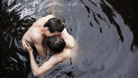
the shots of the wooden platform on the lake: reminds me of the queer coming of age movie jongens. i wonder if it's a nod:
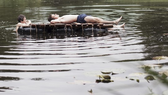

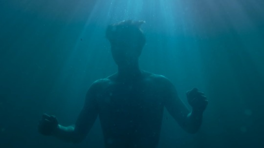
the shot of henry escaping alex's love confession and finding solace in the lakewater is another rare, well done cinematography moment.
alex truly is smitten and it's adorable. henry is more reserved in his affections. we've seen a lot of alex's life and family and heard about his backstory and ambitions, meanwhile henry's side is all but unexplored: 'i can take you around to all the places i grew up and you can get to understand my life a little more' - two points here: 1) i think we've seen enough of alex's life and journey; i hope the narrative shifts to the uk for a bit so we can see henry's side of things but i get the feeling we're going to be focused on alex's journey and i'm worried bc atm the narrative feels unbalanced. 2) it's painfully clear that alex sees them as a couple and i think that's about to blow up in his face bc henry isn't ready for that (as he already stated).
henry cuts alex's love confession short and we finally get a moving backing score (even though it was a little late in the scene). i do love how the story has progressed: henry instigated things at nye, then told alex not to fall in love with him, and now alex is in love with henry and thinking henry loves him too. the next few scene progressions are odd bc we get henry sad alone in bed wallowing presumably about not being able to have a public relationship, then he's sneaking off with his bags in the night - alex's shirtless state suggests they were together one last time but that feels a little underhanded for alex's sake.
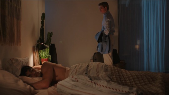
we're about 2/3 of the way through at 117mins: alex's personal story had a nice arc to it and now with the boys' separation we move onto henry's personal arc which will likely carry us through to the end of the movie or at least keep focus for a decent while.
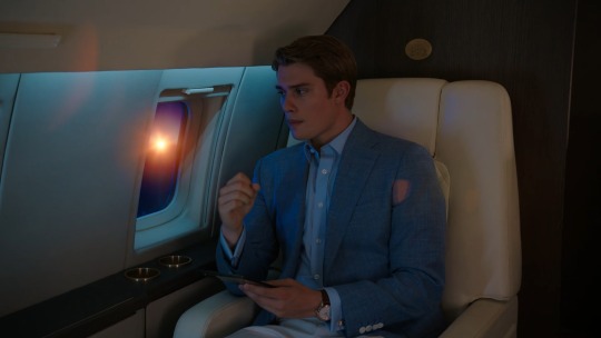
we follow henry on the plane and to his home: he's trying to swallow down his pain and move on but still obviously pining for alex. i'm keen to see his side of things and his relationship with his family and royal duties. the soft bittersweet alt-folk lovesong playing in the background is a good choice for mood and lyrics and the plane is better lit than the earlier shot of alex - we even get a pretty sunset through the window; the two scenes stand in opposite: alex was in love but in the dark, and here henry is bathed in the light of riches and a setting sun and is miserable - if that was intentional then kudos bc i love visual meta, but it doesn't immediately read that way and alex's scene still deserves more lighting and colour.
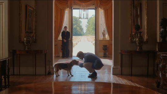
more real locations and natural light: english gardens and sunshine as henry strolls and confides in his sister. alex is fun, but he's a very different vibe to henry and i prefer henry's emotional expression more. i'm glad we're finally getting henry's side, starting with not wanting to break alex's heart, not wanting the king to find out, and resenting the presence of royalty and doubting their need in the 21st century - again relating well to the times, and bringing things back to how alex has inspired him: henry doesn't believe the work royals do has meaningful impact on peoples' lives, whereas alex is out there making a real difference.
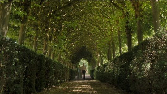
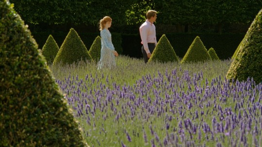
the bittersweet lovesong from before resumes over footage of henry playing the piano: missed opportunity to have henry's playing set the melancholy tone over the montage of royal meetings and tea while reading an online article about alex's bright future in politics.
we see nora comforting alex but not percy comforting henry despite mention of him; we didn't even get anything from percy during the getaway and i'm annoyed bc he's almost a non-character, a wasted supporting role.
alex flies to henry: instead of being a grand romantic gesture it's undercut by angst which is a nice change of mood - the storm outside and a rain-drenched alex are perfect.
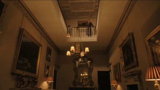
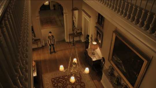

the palace setting is opulent and looks real even if it isn't, so well done on the location scouts or set designers. the lighting is also really good here. the angsty emotional confrontation is well-scripted but again we lose so much visual impact as the camera just loiters on alex in a mid-shot instead of giving us close-ups of his face and switching over to henry's reception and back to alex. 'my life is the crown and yours is politics and i will not trade one prison for another' - this sounds like a book quote, i love it; we learn that not only does he not want to be a royal but he doesn't want to be with alex bc of the spotlight that he lives in. henry tells alex he doesn't know the real him - fitting for a narrative that has heavily favoured alex's story up til now, the audience doesn't really know henry either; we've seen glimpses but nothing substantial. this scene is a confession, confrontation, venting, resigned acceptance, and fight for love - once again a segment lifted right out of fanfic; it's a little cringey but it's heartfelt, delivered well, and for once the setting feels real - the colors are rich, the lighting contrast is spot-on, and there's a gentle hopeful musical score in the background. this is the sort of love confession scene usually reserved for near the end of movies but we have over 30mins left - i hope they fill that time with alex in henry's world.
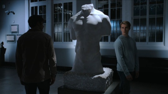
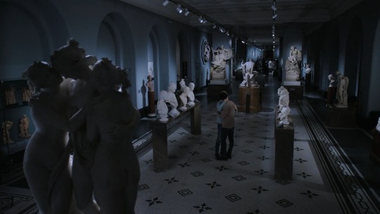
sometimes a closeted prince sneaks off to a museum in the dead of night to take in all the naked male statues - am i the only one seeing this and trying not to laugh? it's supposed to be sombre and beautiful but they put two queer characters circling naked male statues and i can only take so much! also: does henry just have a key to the museum? they slowdance to a modern version of can't help falling in love with you - it should be melancholy and romantic but again the lighting fails the narrative, it's too well lit and lacks contrast. henry asks for patience and makes a promise to be brave - this feels like a goodbye (for now).
on the tarmac there's a trading of personal affects: we don't know what henry's ring means (maybe we'll learn?) but it's basically a promise ring in this moment and we've seen it be something of a comfort to his nerves, and we know alex's key is his home - which is where the heart is.
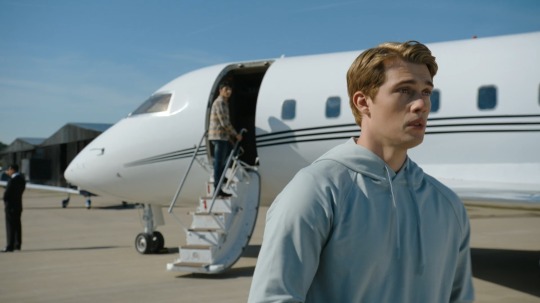
1hr 30mins: we're onto the final act.
the fade to black after the boys part ways is a very odd choice considering it doesn't happen at any other point in the movie; fades are usually reserved for final scenes so it's a weird fit as we have almost 30mins left.
henry wakes to a scandal: their emails have been hacked and shared with the media, photos of their museum haunt have leaked too but are not shown. who is to blame? a montage of news segments referencing their relationship inc. an interview with miguel which insinuates his involvement - confirming suspicions of him being a dbag.
alex's press conference becomes voiceover to henry facing the music while a gentle piano music track plays - scenes like this out of context could fool viewers into thinking the production quality is better than it is. his speech is overlain with unseen moments of their romance and ends on a hopeful note despite the interspersed scenes of henry looking miserable; this is noteworthy bc while alex is allowed to speak his truth at a press conference henry is shown with people at a table speaking for him and his brother berating him, he has no chance to speak for himself, no freedom.
zahra is supportive but still a comically semi-dramatic stresshead; she's a gem that we haven't seen enough of - and is apparently in a sexual relationship with henry's not-butler; she helps put alex in contact with henry calling them 'lovesick homosexuals' (affectionate). at last we get henry playing the piano and it seems to match the score recently played, but i have a new theory of why his music wasn't used as the backing track: bc not doing so plays into his story of living a controlled life not being allowed any expression of self beit in word or song. alex calls henry 'baby' for the first time on the phone and i wish we'd gotten it sooner.
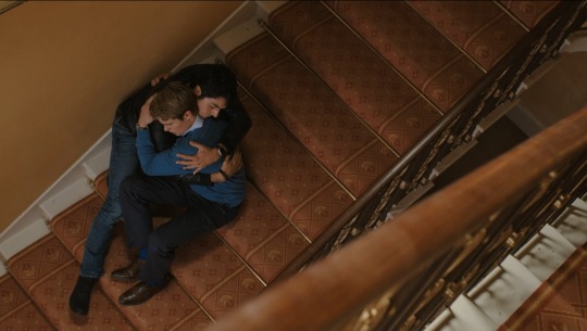
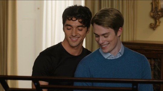
alex flies to henry to comfort him, support him: the stairwell hug is a little awkward but sweet and one of few good direction choices. henry plays piano for alex, expressing himself freely in his own home - they even play a few notes together of my country tis of thee, expressing their love freely.
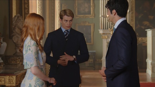
king stephen fry as i live and breathe! they cast an iconic, out and proud gay man to play the king and he plays the role so well. in fact this entire scene is so well done not just in how the plot plays out but in the direction: the room is opulent and real and suits wide-shots but we also get close-ups, and switches between the various characters in ways we haven't seen for the majority of the movie; perhaps such a turnaround is a visual choice: to see people individually and up close as henry is freed - but it's a flimsy excuse for the otherwise poor direction we've been subject to.
henry watches as alex fiddles nervously with henry's ring he now wears; it's a reminder of their shared promise and how close they are to being together no matter what happens.
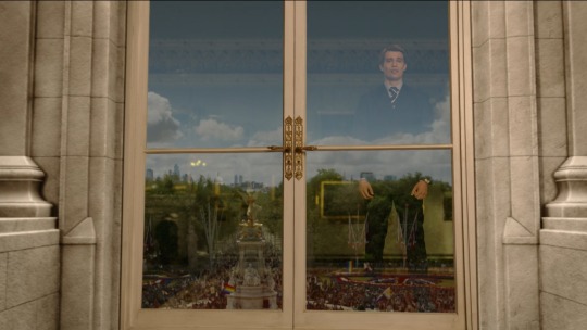
crowds gather in the streets: queer identities have gained a lot of ground on equality in the past few decades but they still experience backlash and hate both in the uk and america. to see thousands of people turn out in support of their queer prince, rainbow flags flying, as the king himself tries to bumble through the indefensible claim that only traditional values will be welcome by the people.. what a sight to behold. 'starting today the world will know me for who i am, not who you want me to be'.
back to usa: texas is the turning state that ends up winning ellen reelection. in her victory speech she talks of representing everyone from 'auto workers to transgender students', another win for queer rep. the entire election sequence is directed well and edited well - with inserts of news footage and ellen's voiceover with nothing getting muddied; production is stepping up their game for the home stretch.
alex and henry visit alex's austin home using the key henry now wears; the camera shot of the street is striking and more proof that the crew can give us decent visuals when they try. 'we won' is the shared sentiment as they enter the house - tbh i'm not clear on why: do they plan to live there? is it a matter of sharing more of alex's roots, or the simple symbolism of home is where the heart is? the key ties it together but the meaning is lost, it feels like an odd place to end. the shooting star above the house is cliche but perhaps it has a simple meaning too: wishes do come true.
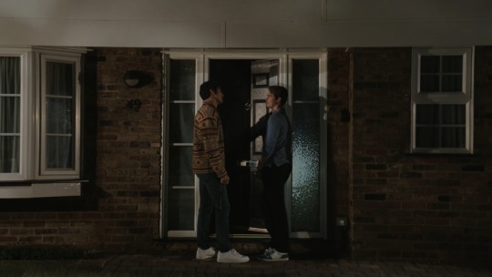
the end!
that's it for my watchnotes. below i'm going to talk a bit about plot and production highlights and drawbacks.
the trailer: i didn't watch the trailer before i watched the movie and i think doing so would've heightnened my expectations. it's really well made, sets the mood for a heartfelt romcom, and the song choice of lil nas x is perfect and the whole thing feels like a high quality fanvid - which honestly is what i want in queer trailers because it means the focus and tone is where we want it. but it does spoil a few key moments that i wish were omitted, so i'm glad they weren't ruined for me.
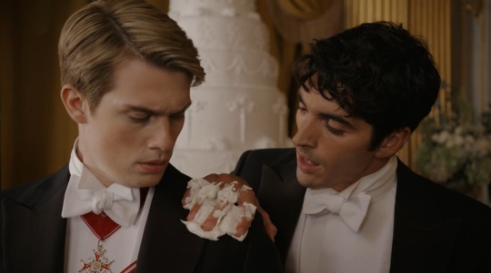
overall plot impressions: i've mentioned a few times that rwrb plays like a fanfic and i stand by that. i think most viewers will see the plot progression and know it's a book adaptation - it has a flow and a busyness that almost doesn't work but they handled the pacing really well. i enjoyed the story! the romance and cute humour balanced well and all the plot points were resolved. i particularly liked that the book didn't make alex a bitter politico baby but instead excited to use his platform to help people - and we see that wish reflected in henry's bitterness and misery over his royal standing bc he also wants to help people. their characterisations and relationship was engaging enough to want to know what happens next, and production failings aside, taking a step back from my messy scene-by scene commentary i think it's a story worth watching. it's not perfect (again, production issues) but it's worthwhile.

things i would change: i mention in my watchnotes that i like the focus being on the boys and not giving us filler scenes with other characters, but as the story progresses it feels like it's missing the inclusion of other characters to help round out the narrative; scenes like talking with friends and family - and not just about their relationship or sexuality but about their lives - i want to see more of the side characters bc they have potential for supportive and tangential plot and could've enriched the story a little more.
we get barely a taste of other interpersonal relationships with alex helping with the presidential campaign, but next to nothing on henry's side; i was expecting a conversation with someone about the royals' role in modern society instead of just venting to his sister - it feels like a missed opportunity. i also would've liked to see more of henry's life. i'm glad the narrative shifted to give us his side towards the end but i would've liked to see more of his journey.
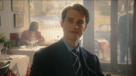
there's so many elements of henry's story we could've known more about: the hospital visit was so sweet and he usually goes without cameras so it's a personal investment - might he be interested in doing more nonprofit work? we know he can sing, play piano, loves Byron, and wants to be a writer - he's a creative boy, explore that! and what about his relationship with his mother, and when his father was alive? the plot could've switched between the boys during their correspondance showing henry's royal duties and mindset and given more insight into his character instead of focusing solely on alex. alex's story is nicely fleshed out but henry remains something of a mystery and it leaves the story feeling lopsided - time may be the issue so again, perhaps a mini series would've been better, but if it was a choice to keep henry's side unexplored compared to alex's i get it but i wanted more of him.

i mentioned my confusion over alex's key and henry's ring. i would've liked them to be touched on a little more: is henry's ring of royal lineage significance or from his father? I think his brother was wearing the same one on his finger. on that note, i would've liked to learn more about henry's father: he was an actor, so why not tell us something about his films, have henry or alex rewatching one of his films together over the phone or at least show us a family photo.
for a minute i wished we'd gotten more international relations but that doesn't really suit for adolescent princes; if it was a king and a president or heir prince and president/senator it would've called for that. the political stuff we got was a nice enough amount and I'm glad it was part of the plot.

more overlay graphics and social media inserts would've been fun - relatable for the modern era. i'm guessing they weren't prevalent in the book otherwise we might have gotten more, or it could've been a budget thing. they weren't necessary for the plot but the styling reminded you this movie is a romcom.
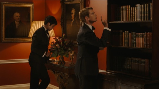
the main characters: alex and henry are likeable in their respective senses, but it's interesting to note that while alex occupies the majority of screentime and plot, henry [nicholas] is the one who steals every scene; he's mysterious [re:reserved] and vulnerable leaving the viewer wanting to know more about him. alex is fun and charming and vibrant and he brings henry to life, while henry shines in the more tender intimate moments. the development of their relationship works for pacing and there's enough time spent together that the viewer can witness them falling in love.
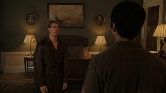
from a technical standpoint: the movie is lacking. my main issue is with the direction: the lack of close-up shots makes it seem like they didn't have the equipment - but this is fucking amazon! they can afford it! so either they didn't want to spend the money on a queer romcom - which is insane considering the times we live in and how queer rep in media is gaining traction and speed - or the director was so unskilled that they didn't think to utilise close-ups. sadly, the direction is lazy and uninspired for much of the movie with far too many mid-shots when the scenes call for close-ups; it also needs more switching between characters to capture reactions rather than just focus on one person while they monolgue (this could also be a script issue).
note: when i was skimming through a second time for screencaps i didn't have any issue with the direction; from faraway or if you're not really paying attention the direction and soundtrack are fine. it's when you're hanging on every scene that you feel letdown by the repeated missteps.
the script was a little clunky. there's a lot of monolgues - fine for a book but they come off a little cliche on-screen and often feel like a stage production. but these instances were made worse by the poor direction and editing teams. however the boys' banter and conversations are always good.
the overlay of graphics, the scene meldings where they're in the same room, and inset scene segments, are all visually appealing - but aren't consistent throughout the movie. i was expecting more social media and correspondance visuals but they get replaced by voiceovers and montages which don't have as much impact (although the execution of this style is done well).
the lighting needs work: most of the night scenes feel overlit and fake, lacking shadows for intimacy and just feel all around uncaring and drab. i swear some scenes look like they didn't see the editing room - lots of dead air, which can also be attributed to a directing issue ie. not getting enough shots. high budget romcoms are brighter and have more contrast, use better lighting and filters - and sometimes are too bright and feel too fake - but the overlighting and lack of richness in rwrb leaves it feeling drab; the plot and characters are begging for more colour, more contrast! giving the story what it needs wouldn't have adversely altered the vibe, it would have elevated it to what it deserved to be.
there was a problem with the soundtrack: the score was messy when present, but absent more than present. sometimes the score was too fast or too slow and had no discernible vibe - honestly it sounds like stock music, and while i do understand that romcoms don't need a signature sound they do deserve their musical needs met. there was a lack of musical score in many scenes which resulted in dead air between dialogue; it feels like the music track is missing, and without that atmospheric element the characters are left hanging and the vibe is awkward and unfinished. and the chosen licensed songs are fine on their own but when you cobble them together you get a lack of cohesion, no unified vibe or atmospheres that compliment one another, it feels mismatched rather than eclectic.
when these seemingly small issues pile up and are recurring it affects the quality of the movie and can lower the overall reception; people can tell that it wasn't given the care or money it deserved and then they start to ask why - and you better hope you have a good answer.
the runtime is considerably long: 2hrs is long for a romcom. it makes sense given that it's a streamer debut and not in theatres, and they make good use of the time in progressing the plot and letting love bloom, but while the focus on the boys and their relationship is what audiences are tuning in for there could've been more room for the supporting characters. you don't need side characters to make a good romcom but when the production quality is lacking like it is for rwrb side characters can help add dimension and believability - it's the actors that make up for the failings of production.
i think they could've done a 3-part mini series instead: flesh out their personal arcs more - especially henry - and give the side characters more screentime - nora, percy, henry's sister, zahra, the not-butler, alex's parents; the plot calls for more of them but they're not given the chance which results in the boys feeling somewhat isolated no matter how supportive their family and friends are.
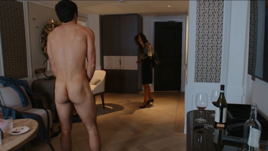
content rating: american content ratings are strange because it skips from pg-13 to 17yo with a guardian? but here in australia rwrb is rated m13+ on the amazon prime app. teens and young adults are the target audience and going by the language used and lack of nudity it makes sense it wasn't given a more mature rating because the content doesn't call for it. basically there's nothing to be censored - which is good in a way, bc it proves you can depict a queer romance with sex without it coming off like a porno. hopefully rwrb will motivate more queer productions and invite audiences to read the book and to seek out more queer fiction.
as for the actors: it's nice to see some fresh faces - i didn't recognise anyone except uma and fry. the diverse casting is also a win with most of the side characters being poc, and a biracial poc in the queer main pairing is a double win.
alex aka. taylor, is the charmer, the enigmatic one of the pair and real easy on the eyes. at times it felt like he was falling back on his good looks, and other times his line delivery was almost farcical and reads as over the top or awkward - but this is something that should've been mitigated by better directing, better editing; it takes a village, as they say. but taylor also gives more than he gets from everyone around him - with the exceptions of henry and nora - which is a shame. i can't help but think taylor would've been better suited to a brighter more energetic vibe for rwrb - the production around him falls flat including most of the side characters (with a few exceptions) who did nothing to brighten the atmosphere let alone elevate it to a standard that shows how much love and care should've gone into creating rwrb.
henry aka. nicholas, may play the more reserved character but he doesn't shy away from taking us on an emotional journey. he has greater emotional range and knows how to use his face and body to convey those emotions whether they be small and private or an outburst of passion. imho nicholas was the shining star of this movie despite getting less screentime; he brought his a-game to almost every scene and i'm sad this was a romcom not a dramedy or drama bc from what he shows us he would do wonders in genres with more angst.

other characters: hilson was great - we didn't get anywhere near enough of her and her friendship with alex; i would've loved to see her own character fleshed out a little if rwrb were a mini series, and i was actually hoping for a friendship or fling/romance between her and henry's sister. shahi's character was a well-placed addition and she tried so hard to nail the comedic timing and tone despite letdowns from the director - and again, we didn't get enough of her. uma was perfect casting in a power postion but she was a little stiff in the motherly role, namely the physical aspects - maybe she's like that in the book but for on-screen it was a little awkward. as for the other side characters we barely saw - percy, shauun, alex's bodyguard and henry's redheaded sister whose roles were so minimal i don't even remember their name - they all held potential for relationships with our boys and their own storylines and are another vote in favor of rwrb being better suited to a mini series.
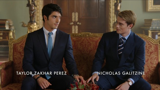
overall closing thoughts: this one is a winner. is it a masterpiece? no. the biggest letdown is the production quality, but the story and leading men perservere well enough and deliver a decent, fun queer romcom. it plays out like a book in the sense that the narrative is layered and the plot is full, which makes it different to the average romcom which barely has plot let alone good plot. rwrb might not seem like groundbreaking content but a feature-length queer-focused romcom is, even in 2023 - you'd think we'd have more by now but maybe this is the start, maybe rwrb will prove to producers and streamers that the viewership is here and hungry for more. i know there are always issues with adapting books for the screen but with so many quality queer books out there we might be in for an era of queer reads making it onto the big screen and i for one am here for that, across all genres.

#rwrb#red white and royal blue#spoilers#watchnotes#review#queer characters#queer cinema#lgbtqia#mlm#gay characters#bisexual male characters#queer reads#long post
14 notes
·
View notes
Text
Some extra thoughts...
I have some random extra details I would like to talk about that aren’t worth a blog post each, so here are some fun little details that I have been thinking about!
INT vs EXT
An interesting aspect of the script and the location was the contrast between the vast beautiful expanse of the outdoors and the cramped closeness of the caravan. One of the main reasons for suggesting to Katie that we set the film on a group holiday was because of this ‘trapped together’ sense that is created when you are away with your friends, and I really want to lean into this. There should be a distinct contrast between this feeling of freedom and openness and this crushing close proximity. This also comes into play with the confrontation scene being set in the woods.
The best way to describe this in terms of scenes is that as the night grows slightly darker in tone, and then after the assault happens, we move from exterior to interior locations, trapping Phoebe. We then move to the forest for the confrontation scene. This resembles Phoebe’s attempt to escape back to the freedom from before, however she cannot do this until she has faced Harry and let her hurt be known to him. She then has to face Sara inside the caravan once more before she can reach the true freedom of the loch, where we return to wider shots and vast spaces.
Shifting from Memory to Reality
Something I want to explore in Saint Catherines is how to effectively shift quite drastically in tone, whilst keeping a consistent style. I see the film in two halves, pre-assault and post-assault. Pre-assault, the film should have a memory-like feel to it, specifically Scene 2 and 3. There should be an almost dream-like quality to the free-flowing nature of these scenes. They should not be linear, and should just be montages of individual moments, in the same wat one remembers fond holiday memories. The colours should be warmer and more saturated, and the sounds should follow the edit in their free-flowing nature and fast paced fullness.
The shift in tone should he felt at first between Scene 3 and 4, but only slightly, and should be felt strongly between 4 and 5. Scene 4 is when the film follows a more linear pattern again, and lighting should return to a less saturated ‘normal’, and the sound should level out and calm down, focusing more on specifics. Scene 5 will complete the tonal shift by being just one shot of an isolated Phoebe, surrounded by silence and darkness. This move over these few scenes from fast paced energy and fun to a single quiet shot should hopefully communicate to the audience where the film is going from this point on.
To keep a consistent style, I plan on ensuring that the film still has a naturalistic feel to it, primarily through having every shot handheld. Through the cinematography remaining consistent, it allows for a drastic shift in tone without losing the primary style of the film.
Also, the help me visualise this idea of memory, I looked through my own photos of fun times with my friends to create a sort of 'vibes folder'. It was more of just a fun way to wast time but oh well!


360-Degree Set
I was listening to an interview with Mia McKenna Bruce talking about her experiences filming How to Have Sex (our fave inspiration film) and she mentioned a concept I hadn’t really heard of before: a 360-degree set. She explained that a lot of the rooms and spaces the girls were in were fully dressed sets, with props and things to interact with hidden in cupboards and placed all over the set. This meant during takes, the actors could interact with any part of the room that felt natural. There was mascara wands in the drawers, empty noodle pots in the sink. I loved this idea, and thought it would be great to try and incorporate into Saint Catherines to aid the actors with their performances. Lucky for us, the caravan we are filming in is already full of stuff for us to use, it is a natural 360-degree set!

( the 360-degree set in use)
3 notes
·
View notes
Note
hii!! I have a question. the theme on your profile is so cool, do you possibly have a tut on how to do a similar thing like that? because mine only appears on my computer but i can see it clearly on others profiles on my phone
hii anonymous!! I’m really glad you like the theme of my profile. I’m not 100% how to give a tutorial but I’ll try my best ‼️
I designed my profile on my phone so I hope this helps.
The Entire Rundown of Creating a Tumblr Profile— With Screenshots
Part One. Editing Appearance
Find two photos you choose to make your header and your profile picture I try to colour match mine as much as possible, you’ll see they have a pink tint to them.
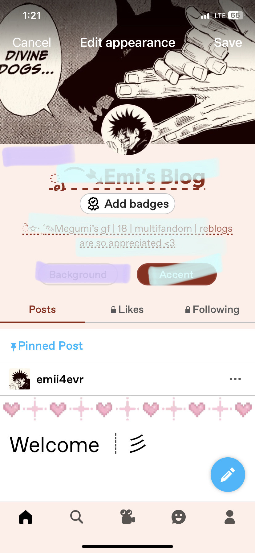
You’ll go to your profile and pick the little paint palette which’ll bring you to editing it. On the second photo I colour coded it (just incase) purple is what changes the background and your accent colour changes your bio and blog’s colour.


┊┊❁ཻུ۪۪♡ ͎. 。˚ °
Part two. Ask Page
The you can go to settings and find your ask page title (I can only see it on my computer as well but it’s there on your phone I promise, it was really confusing for me as well because I could see it on other peoples blogs just not my own. If you look at the very first picture you can see it’s not there)
Make sure you have everything allowed minus allow others to blaze or show top post because they aren’t associated with your ask page


┊┊❁ཻུ۪۪♡ ͎. 。˚ °
Part three. Inbox
Your inbox is in settings as well, which is where you’ll see your asks or you can see them from your notifications. Have fun designing a profile you’ll love!!

I hope I answered your question right and if I did but you’re still having troubles or want ideas feel free to DM me (this goes out for everyone), I’d love to help you out since I wish someone could have helped me when I first made my blog❣️
BYE BYE
#tumblr tips#send me asks#asks open#anon ask#tips#designing a tumblr page ^_^#I’ll go back to posting fanfiction now i’m sorry#sincerely one of your favourite megumi stans :3
2 notes
·
View notes
Photo
updated links:
@notjustabooksims cc archive: here
jumper (compressed package): here
More information and previews ▼
Hello everyone! So yeah – another piece of CC. Have I lost my ability to type stories and take pictures? Maybe. A bit. Or maybe I’m just on a bit of a CC roll and I can’t stop making new items. This time, I bring you a cozy jumper, named for cardamom. It puts me in mind of spicy chai and autumn and I hope you’ll enjoy it. Let’s have a look at it. 🙂
About the Jumper
New mesh by yours truly!
For young adult/adult females.
Custom CAS/Launcher thumbnail.
Shows up as a top under everyday and career.
Disabled for random.
Fully recolourable with three channels: the blouse itself, the sleeves, and the cuffs.
Comes with three presets, as pictured: one textured green, one striped plain-textured, and a textured dark brown.
8,900 polys = VERY HIGH. Recommended for photos, not gameplay.
Has morph states.
Presets

Channels

Known Issues

It has some shadows in CAS, but these aren’t visible in game.
It may clip with certain bottoms, as pictured. (Lol, these trousers clip with everything).
There is some wonky bone assignment under one arm. I just couldn’t find a way to fix it, but since it’s fairly small and easy to edit out as well as only present in rather extreme cases, I left it. (Remember, this IS only intended for photo-taking, not gameplay!)
The top looks better in the textured variety (1st and 3rd preset) or with patterns and in darker colours rather than light. Plain versions… they’re just not the best for this one. The chunky knit is how it was intended, really. 🙂
(Not really an “issue” as such, but I regret adding darts at the boobs. It’s a jumper, not a fitted top wtf is wrong with me?! Maybe some day I’ll make a better jumper, but I think this can still have some use).
Credits
Software: Blender, GIMP, TSR Workshop, Milkshape, PhotoScape, Affinity Photo, Affinity Designer.
Chunky knit texture: Tiling Textures
Ribbing knit texture: Tiling Textures


Download | Cardamom Jumper
Yay! So, this one isn’t perfect - far from it - but I still think it’s a cute, cozy jumper. It features a boat neck and a chunky knit texture that I think is super cute. :)
You can download it at ma bloggy blog.
973 notes
·
View notes
Text
I miss some of my favourite songs. I miss what they used to mean. I miss when we’d listen to them. They were romantic. They were sexy. They made me melt and I still remember the way you’d smile whenever I put them on queue.
Purple and yellow. Fuck you. Fuck that playlist. Fuck all of New York, and us cuddled up on a summer night listening our soundtrack.
“You’re the love of my life.” Then why aren’t you here?
I miss your friends. I miss your yard. I miss the crochet pieces you made for me that frayed over time. I miss our room where you’d help me with my photo shoots. I miss Andy giggling while watching me fumble with my gear, and you taking the extra time to make sure the pleats on the curtains were perfectly spaced, or making sure props were placed exactly as you sketched it. I miss the way you accidentally called Andy “our” roommate at that coffee shop around your corner, and how we couldn’t stop blushing. I missed the way I’d suggest a colour to use and you’d just give your staple disapproving giggle. “I don’t…I don’t like it” with a sheepish smile that implied an “I know what’s best”, because you did.
I still look over my shoulder when I edit photos, or try on new outfits, or crochet a new project. Just to imagine what you’d say or think.
I miss you. I miss you so much. I miss your smell. I miss your name. I miss your laugh. I try to imitate your laugh when I’m with people now, as if you were laughing alongside me. Jesus Christ you helped me pick out my name. You’re there wherever I go. You were the first person who saw me as a woman and loved every bit of me.
Fuck you. Fuck you. I miss you and I love you so much and I hope you’re healing and I hope you’re eating well and I hope you’re sleeping okay and I hope that the meds are still working and not losing efficacy as you worried they might and I hope the flare ups are manageable and I hope your doctors stopped gaslighting you and I hope your new roommate has settled in okay and is safe from their parents and fuck maybe I hope you kissed Anna again for sweet lesbian giggles that you probably need these days even though I also hope you’d run back to me.
I was waiting for the perfect ending, that ending where we lived together with our friends. Where Andy was our roommate.
I’m scared that maybe our ending already happened. I’m scared you’re gone. I’m scared you’re just another person in my past.
After all this time, I’m still smitten Birdie.
0 notes
Note
I do like simple suits as well, maybe a pop of dark colour generally. But not at the MET. This one time of the year, I'd really love to see some insane creations in men's fashion as well.
But yeah I do agree on the rest. And I have no idea how much time is given to the designers, like when is the theme revealed. But I just often get the impression they're not even trying. And I often get the vibe that most men are kind scared to do something flashy and scandalous because that would reflect bad on them? But the met to me always felt like a glorified dress up party, so you could wear whatever you wanted and I still wouldn't think that oh so Hugh Jackman is gay because he wore that to the met ya know?
Yeah that’s totally valid. I just think most of the time when I see what is considered creative in men’s fashion I have trouble appreciating it as art rather than kind of assessing how much it would irk me if my boyfriend wore that outfit. It’s like the girl version of the male gaze for me idk 😂 but I do get that considering these men are the invitees and not just the plus ones that they should be making more of an effort to stay on theme considering how women get roasted for not trying.
I feel like sometimes with designers, especially the commercial ones, there’s an element of them wanting to advertise themselves and that becomes more important than staying on theme. Like Jennie Kim, she was just a walking Alaia advert, her dress was literally just what was on the runway at fashion week. And same with the guests, especially those who aren’t “A list”. They’re concerned with avoiding the worst dressed lists etc.. I think the ones who really go all out are the designer/celebrity combinations that appreciate fashion as art form, and they’re normally the celebrities who reflect that in general. Like Zendaya has always been really into fashion and her styling has always reflected that. Same with Gwendolyn Christie.
I low-key wish they would do away with themes for the gala and just have a regular black tie dinner because the outfits have been disappointing since like 2017. Then they could a special edition photo book to coincide with the exhibition and include guests of the gala but choose their outfits for them and work with designers who understand the theme and curate outfits. It seems pointless to just keep demanding people stick to a theme when they’re clearly more interested in self promotion.
And I think the thing with men ties into that. The men invited, or at least the ones I often see on the carpet, are very often relevant or up and coming stars, eg. Josh from Challengers (forget his last name), or Jonathan Bailey. They’re just making names for themselves, they can’t really afford to be introduced to a new audience wearing a something that looks like it was thrifted from Louis XIV when they have to appeal to an often female audience. And that’s not to say anyone would genuinely be questioning their sexuality, I think most of us are more evolved than that, but you don’t get a second chance to make a first impression on your audience or even the people you meet at the gala networking. I think they probably feel the need to project as much of an “Everyman” vibe as possible. Which I do get.
As I said, I think the theme idea is nice but it’s not inspiring the outfits in the way it once was.
1 note
·
View note
Text
Tech News Roundup: OnePlus AI, Pixel 8a Leaks, and Goodbye Google Podcasts
It's been a busy week for tech news - while some news days might seem slower than others, there's always a tasty tidbit of information lurking just around the corner. With that in mind, we're recapping some of the biggest updates and announcements from the tech landscape this week - everything from smartphones, software, and more. In case you missed them, here are some notable updates this past week. OnePlus Unveils its own AI Editing Software OnePlus recently announced that it was moving forward with its plans to integrate generative AI software into its smartphones, and as such recently announced its new "AI Eraser" feature. Simply put, it's OnePlus' own take on features like Google's very own Magic Eraser, which lets users remove unwanted visual elements from the background of their photos. According to OnePlus, the AI Eraser feature will begin to arrive for OnePlus devices globally starting from April. Several phones including the OnePlus 12, OnePlus 12R, OnePlus 11 and OnePlus Open will be compatible with the feature, while handsets for users in Europe will begin to receive these features later in Q2 2024. Google Bids Farewell to its Podcasts App In a move that has once again revived talks of the dreaded "Google Graveyard," the Google Podcasts App has finally been shut down. It should be noted that this has been a long time coming, with Google announcing several months back that the small user base was a key point of consideration in shutting down the podcasts app. Part of the announcement reads: "Looking forward to 2024, we’ll be increasing our investment in the podcast experience on YouTube Music... as part of this process, we’ll be discontinuing Google Podcasts. As part of this process, we’ll be helping Google Podcasts users move over to Podcasts in YouTube Music." The Pixel 8a Gets Leaked... Again Google can't seem to get things right when it comes to leaks. Time and time again, its various Pixel phones have appeared on the internet way before the intended launch date, and the same goes for the Pixel 8a. Most recently, the phone appeared in a Google Fi ad, at least according to a user which managed to save the image and share it online. The ad shows the Pixel 8a in two different colours, including a blue variant and what appears to be a white model. Upon closer inspection, it's clear that the phones in the ad aren't the Pixel 8, due to the lack of a microphone between the camera lenses, as well as the flatter camera bar. Mobvoi Updates Several TicWatch Models In a recent announcement, smart wearable brand Mobvoi stated that it will provide a new software update for several of its smartwatches, which include the TicWatch E3, TicWatch Pro 3 GPS and TicWatch Pro 3 Ultra GPS. The updates come with version numbers RMRB.240228.002 and RMKB.240228.004, so TicWatch owners might want to keep an eye on their devices for the new update. In addition to the latest security patches, the updates also come with an option to pick a desired shortcut for the secondary function key (which somehow disappeared in a previous update), as well as a fix for problems with Bluetooth calling functionality. The Star Wars KOTOR Remake is Still Alive A few years back, it was announced that a remake of the highly-popular Star Wars: Knights of the Old Republic RPG was in development, with developer Aspyr set to handle production on the game. Eventually, the task was handed over to Saber Interactive, although not much has been heard about the game's status in recent years. With that being said, Saber Interactive CEO Matthew Karch finally revealed that the KOTOR remake is still under production over at Saber Interactive, following the latter's split from Embracer Group. Karch states: "It's clear and it's obivous that we're working on this... It's been in the press numerous times. What I will say is that the game is alive and well, and we're dedicated to making sure we exceed consumer expectations." Read the full article
0 notes
Text
Piracy update! I made sleeves and labels for my DVDs, so now they can look super cool and pretty while living on my shelf.


I made different covers for all of them, with pictures of some of my favourite moments from the episodes that are inside. I'm super proud of how they turned out. The blending especially on the fronts of the first and second cover went really well I think, also some of these pics are Aaron's official bts photos and they so good. The mermaid picture was honestly a bit of a dick about blending, but it's The Mermaid Moment, I couldn't make a cover for this episode and not have The Mermaid Moment on it. Several other things were a given as well. The Ed on the third cover is my favourite pic of him, look how happy and at peace he looks. Also gotta have cursed suit Stede (kudos to @sherlockig for both of those, they are some of the few pics where I'm sure who uploaded and edited them, and they're the best).
I splurged on glossy photo paper for printing these out, and that was a great decision, the quality is so much better than anticipated. Looks super professional, really dark black, deep colours, super shiny. I'm so happy with them.

Here's a look at the spines. All of my piracy projects sitting next to each other on the shelf where they belong! Next to the one official fave show physical media I was able to buy lol. (Good Omens S2 DVD project post here.)


If you do something, may as well go all out: Disc labels!
Designing them was a blast. I reused the design with the ship I did for the on-screen menus, put the episode titles, and then added little Stedes and Eds. (Like with all the designs, I followed the rule that the pics on anything have to be from the episodes that are inside.) Look at the first case, they're looking at each other! In the second case they are not looking at each other, because this is the sad part where they aren't together. Little Ed is drinking. :( But in the third case they are together again! On disc five they are a united front against the drama lesbians, and yeah, I knew what my disc six pic of them was gonna be the moment I saw it first. They may have cut it from the show, but it'll be on my disc forever.
Printing the labels was a fucking nightmare. I had a few pages of premade disc labels (sticker paper with perforated circles of the right sizes, so no cutting, yay). Already printing the sleeves took a good amount of test prints and template tweaking; I don’t know why printing exactly to scale is still so difficult in 2024. I think Crowley was involved in designing printers. The things are definitely haunted. Printing a rectangle to scale? Difficult, but okay. Printing two circles to scale, in the exact correct position? Oh god I cursed so much. But look at them, aren’t they beautiful? Definitely worth all the sweat and tears.
It's home cinema manufacturing time! 🏴☠️ Gonna put my pirate show on my shelf! (I'm doing an Arts and Crafts Project and I'm making it everyone's problem.)
After seeing how much they cost, I abandoned the idea of getting a Blu-ray writer for now. For the time being, good old DVDs is what it's going to be! My TV is old and not very big, so DVD resolution is gonna be fine.
It's been ages since I last burned a DVD. For the full experience, I'm gonna create nice menus and pretty sleeves for the boxes. Graphic design is my passion! Um.
Well. First needed to find a program to do stuff with. I'm a Linux guy, so I'm using Devede. (Which is free, btw. In case someone else wants to do a low cost spot of putting pirate show on the shelf.)
DVDs fit a maximum of 120 minutes of video. So, four episodes, I thought. But after a quick attempt, the program refused to do more than three (maybe because of the menu also taking up space, and four episodes cutting pretty close to the 120 min mark?). Anyway, three episodes per disc it is. It's a pretty nice runtime for watching the entire disc, IMO. An hour and a half, and then you can return to reality to realise you should probably eat something, or go to bed because it's midnight.
OFMD with its current two seasons has a total of eighteen episodes, which is divisible by three. You get the following setup:
Disc 1: Pilot, A Damned Man, The Gentleman Pirate - That's pretty good, Stede's introduction to piracy all on one disc!
Disc 2: Discomfort in a Married State, The Best Revenge is Dressing Well, The Art of Fuckery - All bangers. Great to watch together, our boys meet and shenanigans happen!
Disc 3: This is Happening, We Gull Way Back, Act of Grace - Many romantic moments, lots of great scenes, shit hits the fan at the end there. Alright!
Disc 4: Wherever you go, there you are, Impossible Birds, Red Flags - ... Pain and angst! What have I done!?! The disc of horrors. Gotta make sure to have tissues at hand when I watch this. But hey, it also has messy bun Ed! Small mercies.
Disc 5: The Innkeeper, Fun and Games, The Curse of the Seafaring Life. - Another disc with all winners. I love all these episodes so much! (You can watch this disc to recover from the trauma of the previous one!) But seriously, this one slaps.
Disc 6: Calypso's Birthday, Man on Fire, Mermen - Great combination again. Season finale! Love and excitement!
... Honestly, except for the psychological damage of putting all the most painful episodes together, this is coming out pretty cool. Says a lot about how good the show is. I actually really love all the episodes (yes even the painful angsty episodes of massive depression). Thinking about this little project really reminded me how much I love this entire show.
So, we got a tracklist, now menus, then we can burn this stuff!
I did the menu backgrounds in GIMP. Realised I have a big folder full of screenshots I took myself, screenshots someone else took and posted on Tumblr, official promo pics for the show, and I have no idea anymore where most of them are from, because I named the files according to what's on them. Which is useful for when you want to find pics (Need a picture of cursed suit Stede? I have files named that, easy peasy!), but not so great if you wanted to give credit to whoever took a given pic you used. (It's probably @sherlockig or @ofmd-ann or @blakbonnet. Please feel credited, your beautiful screens and gifs brighten my day, and some of them are now probably part of my DVD menus. Shrunk down and cropped, but, yeah.)
I originally wanted to structure my menus as having the title of an episode, then some pics from it, then the next episode, then pics from that, and so forth, but I couldn't convince the program to give me the necessary padding between the menu items, so I ended up just putting the episode images below the menu. Still like it.
Anyway, DVD menus can also play sound! Behold a crappy video of my beautiful creation (provided entirely for sound):
It plays Gnossienne N°5!
More crappy pics of my other disc menus:
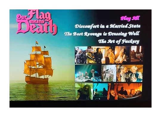
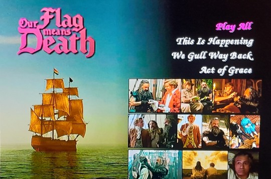
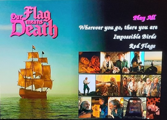
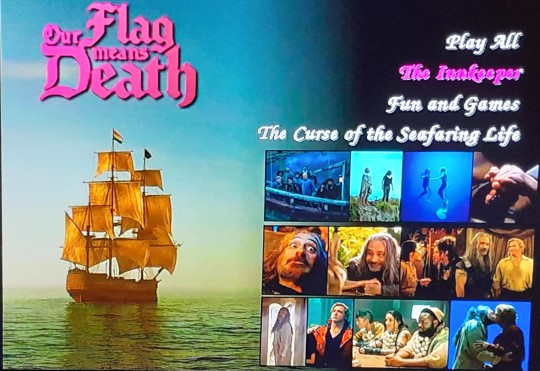
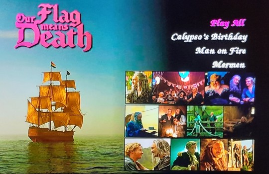
Gonna make them some nice sleeves next. Some day. Gotta make sure they all work properly first. So. I'll be on my sofa, watching my DVDs. With menus!
295 notes
·
View notes
Text
These new porn blogs they just don’t get it like babes what the fuck COME ON stop posting pictures (uncredited by the way) of CHILDREN (18,19,20yo). There are hairy daddies RIPE for the picking.
Things we need less of:
Abs. Get rid of it. We’re doing dad bods (ACTUAL dad bods) now, catch on or delete yourself.
Men who won the genetic lottery and do fuck all but get so much unnecessary attention.
Broccoli haired boys
Conventionally attractive men just existing.
Tiktoks of guys smouldering at the camera or squeezing fruit - I am going to vomit, pick up a trade for fuck sake.
Size queens and photoshopped dicks. I am going to go feral if I see one more of you cunts edit a picture to enlarge the penis of a man WHOM WE ALL KNOW has a tiny dick. Leave his dicklet alone.
AI photos. self explanatory. I’m single but even my life isn’t so pathetic that I need to use AI to generate an image of a photogenic man.
Things we need more of
Real men, average, not fit, not hung, not conventionally attractive, TRANS MEN. Fuck off with your “it’s just a preference I want masc for m” throw yourself face first into setting concrete.
Varying degrees of hairy men, including patchy beards
Men of colour - not in fetish or dedicated blogs. If you still in this day post pictures (that aren’t yours) of WHITE jocks, you are too old to be using this website.
COLOUR photos. You are not hoscos. Stop the greyscale, unless the original photo is like that.
Sourcing. Put the name of the photographer and subject(s) in the CAPTION (not just the tags). Some of us use the tumblr feature called filters. It lets us avoid seeing posts of things we don’t want to see. Contrary to minority belief, this includes the men you think are attractive. And if you happen to find a tumblr man, reblog his picture. Don’t save it :) don’t fucking save it and post it without tagging him.
You need to physically recoil, and gag, when you see the instafit, twitter gay, tumblr gay hot, “no fats no asians no whatever tf else they say” men. Let them know that toxicity is not gonna fly. Starve them of their OF income.
And! One last thing. If you, a grown ass man, think shirtless tiktok teens (the broccoli hair boys) are hot, and you think posting pictures of them is totes harmless and uwu fine, PLEASE, give us your full name, date of birth, and full address, and why not a selfie while you’re at it. I super duper pinky promise we won’t report you to the authorities.
TLDR: Just put a little more effort into your wank bank and be a better person allllllllllll round.
1 note
·
View note
Text
3D development using Digital Editing
- I decided to try and edit some of the images I took of the sculpture I made as I found certain areas of them quite interesting. The images themselves aren’t the best but the details with the emergency blanket and the reflections were really fun to manipulate digitally. Even though the images didn’t end up looking the way that I had hoped the ones against the plain white background did as it created some shadows that made the images look atmospheric.
- When editing the images, I decided to increase the saturation as using colour is one thing I constantly aim to do. Along with increasing the saturation I also played around with the colour hues and the opacity of the images as I found that the emergency blanket just made the photos look too dense.


0 notes
Text
This is the wristband Phil showed on stream!
Edit: Just found out these aren’t for sale anymore but the people who made them are working on a second version!

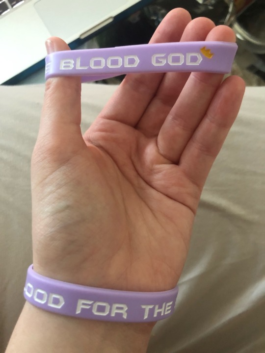
[Image ID:
2 photos of a pair of identical silicone wristbands being worn by Mod Luna on their hand. The wristbands are lavender coloured for cancer awareness and say “BLOOD FOR THE BLOOD GOD” on the outside with a little golden crown. Not visible here is the fact that the inside reads “#TechnoSupport”.
End ID]
#ph1lza#philza#mcyt#image id#no id in alt text#tw cancer#cancer mention#i can personally vouch that these are really nice i bought a pair ages ago and I’ve worn them almost daily since#mod luna
1K notes
·
View notes
Text
III ║ Dapple Grey

Jack Daniels x f!reader
{ << Part 2: Buckskin | Series Masterlist | Main Masterlist | Part 4: Strawberry Roan >> }
Rating: M (will be E in future chapters)
Summary: Tinder is a dangerous game. So is Never Have I Ever.
Warnings: Flirting, yearning, insecurities, sexual tension, gratuitous descriptions of the male body, sexual innuendoes, language, mention of food, drinking, drinking games, mention of breakup, no use of Y/N
Word count: 6.5k
Notes: I had a little bit of a meltdown writing this part. Thank you @mandoblowmybackout and @prolix-yuy for talking me out of it ❤️ I had the busiest week so I didn't have as much time as I usually do for edits, so this chapter's a bit of an… experiment 🙈 Thank you for everyone who's been so kind to me and this series - I hope you enjoy this part! 🦄

Dapple grey: A grey or white horse with spots or areas of a darker colour.

Day 2
‘Stop looking at me.’
‘I’m not.’
You turn the camera around to show Jack the photo you just took and deadpan, ‘I have literal proof of you looking straight at me.’
The two of you are sitting underneath the shade of a tree, a simple lunch laid out in the middle on a picnic blanket. The horse’s saddles and packs are resting against the trunk behind you while they graze nearby.
In front of you, several yards away, the grassy plain drops off into a deep valley. And beyond - a sight to behold. If the bentonite hills had been sculpted by a higher being, they must have run an inadvertent finger through the clay while it was on the spinning wheel, creating dramatic curves that cut into the soft rock. The hills are painted from left to right for miles and miles in white, red and green stripes, candy cane colours faded under the sun.
Jack gives you a scowl as he rolls up his tortilla wrap, but there’s no real annoyance behind it. He grumbles, ‘It’s hard not to. You’re pointing the camera at me.’
‘Well, you gave me full control of today’s photography, so you have to do what I say.’
He flings an accusatory finger at you. ‘Only because you promised to help us with our marketing.’
You press a dramatic hand to your chest. ‘What exactly are you insinuating, cowboy?’
‘You’re obviously taking pictures for the Tinder thing instead, which, by the way, I am not convinced about,’ replies and takes a bite of his wrap.
‘Not convinced - ha! Says the guy who drives two hours to a bar and doesn’t even know if he’ll get laid,’ you retort. ‘And don’t you worry, cowboy, these pictures will definitely work for both the ranch and Tinder.’
His frowns. ‘What do you mean for the ranch?’
‘I mean for the website and social media. Honestly, I’m surprised there aren’t any pictures of you on there already. You guys would get so much business you’ll have to turn people away.’
He cocks an eyebrow, arrogance seeping into his smile. ‘Oh, and why is that?’
You roll your eyes at his fishing for a compliment. ‘You know why, cowboy.’
‘Enlighten me, darlin’,’ he insists with a wink. ‘I want to hear it from the horse’s mouth.’
You put the cap back on the lens and reprimand, ‘What did I say about your ego last night?’
You avoid his gaze as you unwittingly steer the conversation into dangerous waters. You probably shouldn’t be bringing up anything from the night before - at all. There’s no alcohol to blame in the bright light of day though. Somehow, just being around this cowboy is enough to cloud your better judgement and make you say reckless things.
When you finally peer at him out of the corner of your eye, he casts you no more than an amused glance. Polishing off his lunch and dusting his hands, he looks away to watch the horses.
The morning hours before passed with no mention of what transpired by firelight. All the tension that has built up between you two in the dark burned off with the daybreak mist, and you’re feeling a lot lighter after your little bedtime distraction. And in the absence of any suggestive ogling or innuendoes from the cowboy, you conclude that you must have gotten away with it. All you are is a bit saddle sore, but nothing too serious, and you ride on with little difficulty.
An easy camaraderie has set in between you and Jack after surviving your first night together in the mountains. The banter packs a bit more punch now that you are no longer complete strangers, and you spend the morning trading horsey stories.
Jack learned to ride on his uncle’s farm. His first pony belonged to his older cousin who lost interest in the sport, so he spent years riding Sparkles, resplendent in matching pink bridle and saddle, until he outgrew her. He worked in and around the equestrian circuit until Champ offered him the job ten years ago, after meeting at a rodeo.
The conversation petered out when the lush green landscape gave way to drier sand, and suddenly, towering ahead, were the famous soaring red earth formations that you’ve been travelling the last two days for. Jutting out of the ground and chiselled by centuries of wind and rain, the echoing clops of the horses’ hooves bounced off the crimson stone as you rode under arches and past columns, dwarfed by the natural architecture.
After spending the better part of an hour exploring the red earth valley, you were taking a quick water break in the shade, when an idea struck you.
‘Do you think I’d get a discount for my next trip if I helped you guys with your online marketing?’
Jack chuckled. ‘Already thinking about coming back, huh? I mean I’ve always been told that I’m charming, but a turnaround this quick-’
You leaned out of your saddle to give him a small slap on the shoulder for his cheek. ‘Don’t let it get to your head, cowboy. I’m doing it for selfish reasons - a project like this would be a great addition to my portfolio.’
‘What exactly do you do for a living?’ he asked.
Capping your water bottle, you fastened it to its holder. ‘Branding and marketing. I work at an agency now, but someday I want to start my own business, so I always take on projects on the side when I have time.’
‘And you didn’t even bring your own equipment?’ he teased.
You pouted. ‘C’mon, let me borrow yours. I won’t drop it, I promise.’
With a dramatic sigh, Jack relented, ‘You know I can’t say no to you, darlin’.’
Now, hours later, he clearly wishes that he did. Jumping onto his feet, he leans down and unceremoniously plucks the camera from your hands, prompting an indignant cry.
‘That’s it,’ he grunts. ‘I’m laying down the law. No more pictures of me today.’
You shrug, not bothering to look up as he walks away towards the saddlebags. ‘Joke’s on you, cowboy! I got more than enough for your Tinder profile and the ranch.’
At the unexpected click of the shutter, your head snaps up to see Jack grinning at you from behind the camera a couple of feet away. ‘What do you think you’re doing?’
‘Taking photos for your profile,’ he replies triumphantly.
You pull your hat down low over your face and grumble, ‘Stop it! I’m covered in sweat and dirt.’
He scoffs. ‘So am I! Didn’t stop you though, did it?’
Ugh. Does this insufferable man not understand that sweat and dirt only adds to his appeal?
You grouse, ‘And how are you going to be able to help with my profile? You’ve never even heard of the app.’
Jack crouches down to pack the camera securely in a saddlebag, peering at you over his shoulder. ‘I’m a man. Surely my opinion would count for something.’
Oh, he doesn’t need to tell you that. He’s all man. One whose very tight jeans are practically straining against his pert backside while he rearranges the packing on one knee.
Standing up, Jack whistles at the horses grazing nearby. He turns to you and says, ‘Come on, darlin’, no more clownin’ around on my watch. We got some ground to cover to get to our camp for tonight.’
You groan half-jokingly, climbing to your feet and grumble, ‘Yes, sir.’
You notice the way he stiffens. There’s a twitch in his neck as if he’s holding himself back from turning towards you, and his jaw shifts like he’s grinding his teeth. When you walk up behind him, he clears his throat deliberately and busies himself with the tack as the horses trot lazily back towards you.
Interesting.
You reach out to rub Scotch on the nose when he approaches, giving him half of the apple you saved for him from lunch. You keep an eye on Jack, your mind whirring, as you saddle up for the afternoon.

Turns out the cowboy wasn’t joking. It’s a seriously hard ride, with long stretches of cantering over flat ground. It’s as exhilarating as it is hard on your body - your calves and thighs are burning, your shoulders ache, and you start to actually worry if you’ll be able to carry on tomorrow. If you even survive this afternoon, that is.
You’re on what feels like the hundredth backbreaking canter streak of the day. Jack and Whiskey a safe four horse-lengths ahead, Bourbon following behind you and Scotch. The sun is veiled by clouds, but the heat is no less forgiving. You’re sweat-soaked to the bone, hair sticking to your forehead and the back of your neck. You’ve never been so desperate for a shower and a cold drink.
You see Jack stand up in his stirrups and turn around in his saddle to check on you. You must look like hell, because he takes mercy on you and holds up a hand to signal the end of the lope. When Scotch slows down to a walk next to Whiskey, he asks, barely winded, ‘You ok, darlin’?’
Panting for air, you reach desperately for your water. ‘Are you trying to kill me, cowboy? You remember what I said about the gym last night, right?’
He chuckles, taking a drink of water himself. ‘I’m sorry, I know I’m pushing you, but there’s somethin’ I want to show you before we lose the light.’
You swipe at a bead of sweat running down the side of your cheek with your clothed shoulder, too tired to sit up straight in the saddle anymore. You point a threatening finger at him. ‘It better be worth it, or I swear I’ll have your head.’
Jack gives you an encouraging pat on the back. ‘I promise it will be. Come on, darlin’, I know you can do it.’
Despite your exhaustion, some baser instinct in you can’t help but preen at his words. Damn your need for approval and praise from the lips of a handsome man.
It’s another hour or so on the road when you discern a drop in temperature, the sun starting its descent for the day, though the sky remains bright. Jack slows you down to an easy trot, craning his neck, as if searching for something. Distracted by an itch on your ankle, deep inside your boots, you don’t notice Whiskey coming to an abrupt halt in front of you.
‘Whoa, sorry,’ you apologise, gathering up the reins last-second to stop Scotch from running straight into the chestnut’s rump. ‘I wasn’t paying atten- ’
You trail off when you look up, hands frozen awkwardly in mid-air as all your motor functions grind to a stop.
You’re not sure how or where it came from - an enormous field of wildflowers in bloom stretches before you, as far as the eye can see.
‘Did I deliver on that promise, darlin’?’
Air rushes into your lungs when Jack’s words register, and only then do you realise you’ve been holding your breath. Robbed of your faculties, you answer with a mute nod.
Jack smiles broadly at your speechlessness. ‘Come on. Let’s take a closer look.’
Scotch follows when Jack nudges Whiskey down the small slope. The meadow parts like softly lapping waves around the horses’ knees, a riot of colour and scent. If it was earlier in the afternoon, you’re sure there would be a muted buzz of honey bees hard at work. It’s mostly still at this hour, other than the whistle of grass and leaves brushing the horses’ legs as you make your way deeper into the field.
Your eyes dart about, barely focusing long enough to recognise what’s in front of you - bluebells, woodland sage, verbena, daisies, foxglove - and far more that you can’t name off the top of your head. The sweet nectar is overwhelming, and when a breeze stirs, it washes over you like a gentle mist from a perfume bottle.
Slowly regaining your senses, a familiar sound catches your ear. Glancing to your left, Jack has his camera aimed at you as the horses walk slowly.
You grin, not caring that you’re a mess. Your knees brush when the horses drift into each other’s course. ‘Thanks for bringing me here, Jack.’
‘My pleasure,’ he tips his hat at you. ‘So - there’s a camp around three quarters of an hour’s ride away, but we can stay here tonight if you want to.’
Your chest swells excitedly at the prospect, but you demur, ‘Will it be too much hassle? We don’t have anything here.’
With a wave of his hand, Jack dismisses your doubts. ‘It’s just the two of us, it can be easily done. There’s a stream a short distance that way, which is all we need. I’ll take care of everything else.’
A grin breaks across your face. ‘If you’re sure it’s not too much trouble - I’d love to camp here tonight. Thank you.’
Jack nods. ‘Of course. Anythin’ for you, darlin’.’
You don't want to contemplate how you’ll ever go back to an existence where you don’t have cowboys with gorgeous brown eyes telling you things like that. And you suppose you don't have to - at least for a few more days.
‘Can I help with anything?’ you offer.
He shakes his head adamantly, one hand outstretched as if to physically stop you. ‘Absolutely not. Stay here with Scotch and Pinto, take a breather, stretch your legs - I’ll get everything ready.’
When Jack and Whiskey return half an hour later, having loaded up on water and firewood, he finds both horses untacked and brushed down. A smile tugs at his lips - of course you wouldn’t listen to him. The tack and saddlebags are neatly laid out, the cooking supplies already unpacked in preparation for dinner.
Scotch and Pinto are lying down, hooves tucked tidily under themselves, snacking on grass and half-dozing. You’re sitting cross-legged next to the palomino, braiding daisies into his white mane. You look up when you hear Jack approach.
‘I moved us further down so we don’t set fire to the field,’ you joke, pointing at the slightly barer patch of land.
‘Well done, darlin’,’ he replies and dismounts, giving Whiskey a big pat before quickly unsaddling him. Tipping his face to the sky, he remarks, ‘I think we’ll have quite a sunset tonight.’
Despite it only being the second day of the trip, you and Jack seem to have settled into a comfortable rhythm. He sets up the fire while you shower, and then you feed the horses - dry feed with apple and carrot bits for tonight - while Jack nips off for his.
He doesn’t protest when you help with dinner - corn chowder and jacket potatoes are on the menu this evening. While Jack preps the vegetables for the soup, you oil, season and wrap the potatoes in foil, planting them directly into the fire for a slow roasting.
At the first sign of the sky turning colours, you set up your phone on timelapse, propping it against your water bottle behind the two of you, with the horses and the campfire in-shot as the sun starts to sink. You don’t have to worry about battery life as the solar chargers are fully charged from abundant sunshine these couple of days, and there will be electricity at the Halfway House when you get there tomorrow.
At some point, both of you stop what you’re doing to watch the sunset. The sky is stained blood orange, the colour dripping from the horizon to stretch across the field of wildflowers until it is awash in red. A flock of birds cut across the cloudless horizon in a homeward formation, their caws echoing in the valley.
The digital click of the shutter pulls you out of your thoughts.
‘Jack,’ you berate him half-heartedly.
‘Come here, darlin’,’ he shuffles closer and turns the camera around so the front is pointed at you both. You can see your reflection in the lens - and he presses the shutter-release.

The chowder is delicious, as has been everything Jack has made so far on the trip. But after dinner, when the plates have been washed and the sleeping bags rolled out, belly full but slumber not yet come knocking, and Jack asks if you want a nightcap with a twinkle in his eyes - you decide that’s your favourite time of the day.
He puts a kettle on the fire, and pulls a tin of cocoa from a saddlebag. ‘You want a hot chocolate? We can make it Irish.’
You chuckle. ‘Sounds good, cowboy.’
Steaming mugs in hand, Jack carefully makes his way to your sleeping bag, the fire tracing his silhouette in bright orange. You take one, legs crossed and elbows on your knees, thanking him before taking a ginger taste.
A violent cough racks your frame, the potency taking you by surprise. ‘Jesus Christ - is this three-quarters whiskey?’
Jack cracks a roguish grin in your direction. ‘Maybe. But I bet you can take it, darlin’.’
Holy fuck.
Heat creeps up the back of your neck and spreads over the planes of your cheeks, and you duck behind your drink. Under the cover of night, in that gravelly Southern drawl, his words wield an unholy power.
Not ready to spar yet, you take a steadying inhale and a long sip, the alcohol burning on its way down. You grab the camera that’s been lying closeby all evening and say, ‘Let’s go over the photos I took today. I might even let you choose which ones to use for your profile.’
He snorts in jest, but shifts closer so that he can see the screen. ‘Sure, I believe you, darlin’.’
For such a good-looking man, Jack doesn’t seem to have a vain bone in his body. He is complimentary of your photography, stopping you when you want to zoom past the reel of your scenic shots. Instead, he takes the time to politely appreciate the composition, framing and lighting. But whenever one of him shows up, it’s he who wants to fast forward, uncomfortable with the attention of seeing himself on film.
When your drinks run low, Jack gets up to get more cocoa and hot water. You two are in the middle of an argument about the merits of (or according to him, the lack thereof) candid shots, after he vetoes one that you propose for Tinder.
‘Why that one?’ he disputes, collecting your mug. ‘I’m not even looking at the camera!’
‘That’s the whole point!’ you rebut. ‘It’s natural and in the moment. It’s a great photo of you!’
You ignore him as he grumbles while he mixes the cocoa. You click all the way through the reel, reaching the last photo of the day - the selfie of the two of you at sunset. Glancing up to make sure Jack is still occupied, you steal a moment to really study at the shot.
It’s a flattering take, the lighting and angle kind on you. You admire the way Jack’s eyes crinkle warmly at the corners, one side of his moustache tilted up with his smile, tidy teeth peeking out from behind that wicked mouth.
This damn cowboy.
Accidentally, your finger brushes a button on the dial, taking you to the top of the SD card. What comes on screen first appears innocuous enough - but when your gaze focuses, you freeze and your jaw drops.
Jack’s just poured a tall measure of whiskey into each mug when he notices you’ve fallen completely motionless, camera still in your hands. With a frown, he leans over to see why.
‘Jesus Christ!’ he swears loudly, leaping forward to snatch it away from you, nearly knocking over both drinks in the process. He just about tosses the machine away as if it burns him. ‘Shit, fuck, shit. Fuck!’
You haven’t heard him cuss much yet on the trip, and you’re not sure if that’s what triggers it, but suddenly you’re laughing so hard that your chest heaves and your lungs ache. Tears sting the corners of your eyes as you gasp for breath, what you saw on the screen seared into your memory.
It’s a photo Jack took of himself in what you assume is a bathroom mirror, his left hand holding the camera. Something about him is different, maybe his hair is a bit shorter, more slicked back. A flannel shirt hangs unbuttoned on his firm body, just like yesterday when he was undressing at the lake. It’s innocent enough up to this point.
Lower still, his belt with the now familiar flask buckle dangles undone, jeans shoved carelessly just past his pelvis. His large hand - which you’re now used to seeing deftly grasping the reins or resting on his thigh as he rides next to you - is wrapped around the base of what appears to be a very generously sized, very hard cock.
You just wish you’d been granted a few more seconds to peruse before Jack ripped the camera from you.
Finally, you wheeze, ‘Who takes nude pics on a DSLR?’
Jack runs a palm over his face and sighs. ‘You saw the state of my phone, the camera doesn’t work. The pictures were for my ex, she lived two states away and we didn’t see each other much. I thought I deleted them ages ago.’
You make grabby hands at the fresh hot chocolates, which he passes to you. You squeak, ‘I’m not drunk enough for this.’
Even in the dark, you can see the tips of his ears turning beet red, and you don't think you're imagining the insecurity in his tone as he mutters, ‘Sorry, that was embarrassin’.’
‘Why are you sorry? I didn’t see anything you should apologise for,’ you reply truthfully, swirling your drink, the hot steam warming your nose as you take a sip.
Jack peers at you with a bemused frown. ‘No?’
His gaze follows as you lick an errant drop of chocolate from the corner of your mouth. You add slyly, ‘I don’t see anything to be embarrassed about, either.’
‘Is that so?’ He hums thoughtfully, a self-assuredness squaring his broad shoulders as he leans towards you. ‘Does that mean you liked what you saw then, darlin’?’
It’s a loaded question. You give him a lopsided smile, and with more bravado than you feel, you quip, ‘I don’t know - I’ll have to take a closer look, cowboy.’
He holds your challenging stare when he knocks back a mouthful of his drink, and smacking his lips, he grins, ‘All you have to do is ask.’
Batting your eyelashes ironically, you half-joke, ‘Do I have to say please, too?’
Jack breathes out hard through his nostrils, a strangled laugh caught in his chest. He chides, ‘Behave, darlin’.’
And with two little words, he turns the tables on you and shoves you up a metaphorical wall. The shudder that ripples through your body at being told to behave by this cowboy doesn’t escape his keen observation, and his lips quirk in a cocksure manner.
Jack opens his mouth as if he’s about to say something, but he’s interrupted by a quick succession of pings from your phone, which has been silent since the start of the trip. The sound is alien in the quiet of the mountains.
Your brow wrinkles in confusion. ‘Uh - what’s happening?’
It might be wishful thinking on your part, but disappointment seems to flash across Jack’s features as you change the subject.
‘There’s a weather station nearby. Sometimes we get the splash off,’ he explains.
You give him an enquiring look. ‘You know what I’m going to do now?’
Jack sighs in resignation. ‘I won’t be able to get away with this Tinder business, will I?’
‘Don’t be so glum about it, cowboy, it’s fun,’ you wink. ‘First things first - do you have a Facebook account?’
Lying on your stomach, your pillow tucked under your chest and your socked feet up in the air behind you, you look like you’re settling in for the long haul. Jack rearranges himself accordingly, rolling up his sleeping bag and reclines into it like it was a beanbag. With a deep drag of his drink, he takes stock of the situation.
First, Champ tries to set him up with you.
And now, you’re trying to set him up with an online dating account.
If questioned a few moments ago, he would still have thought that he was the cause of your little show last night. Right now - he’s not so sure anymore.
He’d been on the cusp of sleep when he heard you - a whimper that would’ve passed him by if the fire had cackled, or if a breeze had rustled the leaves in the trees. But in that window of perfect silence, he heard you. It paralysed him, sending blood rushing everywhere but his head, and he was up for hours, until his erection was eventually forced to dissipate from literal exhaustion.
Today has been something of a struggle, but he has bouts of sleeplessness every now and then, and even when it gets really fucking bad - he copes. He knows for a fact that you haven’t noticed. Hell, even his own team can’t pick up on it unless it’s been three nights and he literally trips over his feet walking on the fourth morning.
On the upside, at least the fatigue has forced him to keep his head on whatever task is at hand, sparing no room for thoughts about what he heard in the dark. But when you said ‘yes, sir’ earlier with such casual nonchalance, and the way you so boldly met him blow for blow just now - it took him all he’s got to fucking physically hold it together.
He’s not sure how it’s gone from that to you setting him up on Tinder, and by extension, with other women - in so fervent a manner.
Has he been reading you wrong this whole time? He’s barely taken a break from flirting with you, and he knows he’s not imagining your reactions to him when he pushes you a bit harder - just so he can see your eyes widen and hear your breath hitch - for him.
Watching you type on your phone with gusto, shooting questions at him - what’s your email address? How old are you? Do you want to link your Tinder account to your Facebook? - he wonders if he's lost his touch without realising it.
It’s been a couple of years since he broke up with his ex-girlfriend. She was sweet but his heart wasn’t in it, and the long-distance didn’t help. It’s been the odd one night stand here and there since, and while he’s not one to brag, his record is pretty damn near perfect.
Not that there’s much competition in this neck of the woods - well, Tequila puts up a good fight if they’re on a night out together. But right now, he’s the only man for miles and miles, and somehow, he’s still losing.
So he tops up his mug (it’s mostly just whiskey now), and he drinks until you reach out and poke him on the knee, grinning from ear to ear. Jack bites the inside of his cheek and wishes you wouldn’t smile at him like that. Not when he can’t figure you out.
You wear the fireside glow so well, like you’ve always spent your days in the saddle, traversing the Wyoming hinterland, and ending your nights at the warmth of a campfire.
Like you belong here.
‘What do you think?’ you prompt him, tipping the screen towards him.
He takes your phone and studies it. It’s a photo of him that you took this morning, with his age and job listed on top of it in the bottom left corner. He shrugs. ‘I don’t know, you tell me. I have nothing to compare this to.’
Undaunted by his uninspired response, you swipe through enthusiastically, showing him the other uploads. ‘Look, I took some pictures from your Facebook page too. Trust me, you’ll be knee deep in pussy before you know it, cowboy.’
He chokes on his drink, which draws a chortle from you. He shakes his head, but he’s smiling. ‘Are you always so crass, darlin’?’
You salute him with your almost empty mug. ‘Only when nefarious cowboys spike my hot chocolate with way too much whiskey.’
He huffs a laugh. ‘One more or should we call it a night?’
‘We can’t go to bed yet, setting up your account is only step one. I still have to show you how to swipe right,’ you protest, but the screen abruptly goes blank when you tap on it. ‘Shit, the connection’s gone!’
‘Praise the Lord,’ Jack proclaims, turning his palms heavenward in relief. His knees creak when he gets up to add more wood to the fire. ‘What do you want to do now, then?’
You put your phone away reluctantly. ‘I don’t know. What do you usually do with guests?’
‘Depends,’ he grunts when he sits down, close to you. ‘If the Kingsman were here, we’d play poker and darts.’
‘I got to say I’m glad they’re not here, then,’ you say with a wrinkle of your nose. It’s getting colder, so you sit up and drape the cosy blanket across your shoulders. When the idea comes to mind, you almost leap up from your seat in excitement. ‘Oh I know! How about a game of never have I ever?’
Jack scoffs. ‘Are you fourteen?’
‘It’s a classic. Please? It’ll be fun,’ you needle, waving the now half-empty bottle at him. ‘We still have to finish this off.’
He pins you with a stern look. ‘We’ll get wasted.’
You shrug with a cheeky grin. ‘So? I’m on holiday, and we’re halfway there already.’
‘Just don’t blame me for your inevitable hangover tomorrow, darlin’,’ he replies in capitulation.
‘I’ll give you a get out of jail card,’ you assure him. Rubbing your hands together, you jump right into it. ‘Ok, I’ll start - never have I ever had a dog.’
Jack drinks, repositioning his long limbs so that he’s sat with one leg outstretched, and the other bent at the knee. He asks, ‘You’re not a dog person?’
‘I love dogs, just never had the space in the city,’ you answer. ‘I’m the designated dog sitter for all of my friends and neighbours though.’
Setting the bottle down between you, Jack continues, ‘Never have I ever had a cat.’
You drink and muse, ‘I miss having a cat - haven’t had one since I was a kid. Maybe I’ll look into adoption when I get home.’
Travel comes up next. You drink at his never have I ever been to Asia (you went backpacking all over for two months after graduation), and he drinks at your never have I ever been to Europe (he travelled to Greece for the Olympics when he worked as a groom for a short stint).
You trade several more benign questions until, with an impish grin and a rush of alcohol-induced adrenaline, you tilt your head to one side and change the direction of the game. ‘Never have I ever - sent nudes.’
‘That’s not fair!’ complains Jack as you giggle, thrusting the bottle towards him.
‘I’m the guest, I don’t have to play fair,’ you retort.
‘Two can play this game,’ he shoots back, narrowing his eyes playfully. ‘Never have I ever used Tinder.’
‘Well played, cowboy,’ you smirk, grabbing the whiskey from him and taking a sip. After a moment’s consideration, you divulge, ‘Never have I ever had a one night stand.’
His eyebrows reach for his hairline, his voice deep as he comments, ‘So you’re one of them good girls, huh?’
Teeth catching your bottom lip, your answer echoes so clearly between your ears that for a moment, you thought you’d said the words out loud.
I can be. For you.
‘Always been a relationship kinda girl,’ you admit, somewhat belatedly, as he takes a sip.
He smiles, then with a wriggle of his eyebrows, he fires his next shot. ‘Never have I ever - fancied a cowboy.’
Your mouth hangs open in bewilderment, your heart threatening to hammer its way out of the confines of the ribcage. Is he drunk?
Well, you both are.
He’s watching you, his posture loose and relaxed. There’s no deviousness in his gaze, not even the playful kind. If anything, he appears - genuinely curious?
You suppose you could lie, but… you don’t want to. Keeping your eyes on him, you pluck the whiskey from his grasp. You add high-handedly, ‘Just so you know, I’ve met a lot of cowboys before you. So many, you wouldn’t believe.’
A lazy smirk curls his lips as he watches you take a swig. ‘Sure, darlin’ - what with all the ranches you’ve been to.’
Dangling the bottle in front of his face in a challenge, you retaliate. ‘Never have I ever fancied a guest.’
Instead of reaching out with his fingers, Jack drags himself across the sleeping bag so he’s practically hovering over you to grab the whiskey. Echoing your words, he says, ‘Just so you know, I’ve met a lot of guests before you.’
You watch his Adam’s apple bob when he swallows. He’s so close you’re tempted to count the whiskers on his neatly trimmed beard.
‘It’s your turn, darlin’,’ rasps Jack, but you’re immobilsed by the brush of his calloused fingers against the tips of yours, planted on the sleeping bag.
You stammer, coming up blank. ‘Um - uh - never have I ever - ever -’
Jack gives you a crooked grin. ‘Need some help?’
Throat dry, you can only nod.
He leans in, his exhale hitting the shell of your ear, and he delivers the coup de grace. ‘Never have I ever touched myself thinking of said cowboy.’
Your eyes widen and you stop breathing. Oh fuck. He heard you. He knows.
Turns out you weren’t quiet enough after all.
And yet - you can’t bring yourself to be ashamed, not when he’s staring you with something that looks a lot like reverence.
You realise you haven’t addressed the gauntlet he’s thrown down at your feet. Bringing the whiskey to your lips, you confess with a wet gulp of whiskey, the liquid sloshing hollowly in the almost empty bottle when you place it down next to you.
The tension thrums between the two of you like some quantum disturbance, one that’s been building and ebbing for the last forty-eight hours. The air grows thick, his eyes dropping to your mouth the same time his rough palm moves to cover the back of your hand, startling you. Misjudging his proximity, your nose knocks into his cheek when you turn your head, and a quiet gasp slips past your lips when you feel his hot breath brush the hollow of your neck -
So caught up in the moment, it takes you three long seconds to realise that the two of you have suddenly broken apart, and three more for your head to grasp why.
The ringtone blaring from your phone is deafening in the tension-laden silence. Across the bright screen, your ex’s name flashes clearly.
Motherfucking cockblocking asshole.
Before you can unstick your tongue from the roof of your mouth to protest - or ask him to please stay - Jack has gotten onto his feet with a rueful smile and a shake of his head. Scooping up his sleeping bag and tucking it under one strong arm, he reaches for a bottle of water that he filled up earlier and places it next to your pillow, knowing that you’ll need it in the morning.
Even in the shadows, you can discern his eyes sliding over your face. His whispered words barely reach you as he turns on his heels. ‘Good night, darlin’.’
You let the call ring out.

It’s still dark when you feel a hand grip your shoulder, pulling you out of a shallow slumber.
‘Jack?’ you croak, rubbing your eyes that are sticky with sleep. ‘Is something wrong?’
He shakes his head with a reassuring smile that you can barely see in the din. ‘No, I just wanted to show you somethin’. Put on your shoes and bring your blanket, darlin’, it’s cold.’
Even wrapped up in fleece, you huddle into yourself as you follow him. He leads you past the dying fire and snoozing horses, a thermos in one hand, the other tucked into the pocket of a battered thick denim jacket.
You stumble when your feet catch on knots in the grass, and Jack reaches out to steady you, his reflexes fast even in this ungodly hour.
When your sight slowly adjusts to the darkness, you see that you’re approaching what you presume is Jack’s sleeping bag on the ground. He nudges you gently towards it with a quiet, ‘Make yourself comfortable, darlin’.’
You do, hugging your knees to your chest, your icy fingertips trying to find warmth under the blanket. Jack settles down next to you, and noticing your shiver, he wraps his extra quilt around your shoulders.
‘Tea?’
‘Yes please.’
The thermos warms your hands as you hold it, hot steam hitting your face as you drink carefully so you don’t burn your tongue. You’re too groggy (and more than a bit hungover) to try to figure out what is going on, and Jack doesn’t enlighten you, happy to sit in the silence as you pass him the bottle. The tea burns a comforting trail down to your stomach, warming you from the inside.
You don’t have to wait long for what comes next.
It starts with the faintest of glows. The ghost of your breath misting in front of your face. The distant, backlit profile of the Bighorn. The outline of bush and flora, then the textures fill in as the light swells. And without warning, the dawn breaks, colour spilling across the field of wildflowers, like a light has been switched on.
A light fog hangs in the air, gently refracting the morning rays into an iridescent sheen. In every direction, the ground is carpeted by a sea of summer blooms. It looks like a page ripped straight out of a book that starts with the age-old refrain of once upon a time.
You turn to Jack. He’s watching you closely with a smile, hair sleep-mussed, the sunrise casting him in rose gold.
It might have been you. It might have been him. It might not matter in the grand scheme of things.
The next thing you know, your shoulders bump and your lips meet. A sigh catches in your throat when he takes your lower lip between his, dragging slowly and sweetly, the wet friction and the tickle of his moustache on your Cupid’s bow chasing a shiver down your spine.
When he pulls back, he traces the tip of his nose across your cheek before tucking it behind your ear, his arm closing in around your waist.
‘Happy birthday, darlin’.’

More notes: They're going to get to the Halfway House next chapter. Just FYI 👀 I've really made you guys wait for the smut for this one, I swear I didn't plan it this way, but here we are. In the meantime, I'm going to try not to psyche myself out because I haven't written any smut since Consent ended. But I'll worry about that later, for now, thank you for reading and for the wonderful feedback so far - comments and reblogs are so appreciated as always!
Horsey notes (optional reading): This part is a bit thin on horses so this is quite random. Horses love treats - carrots, apples and polo mints will all be devoured. Make sure the treats aren't cut too small to encourage horses to chew before they swallow. Carrots can be broken into 2 or 3 pieces, and should be fed horizontally instead of vertically, to encourage chewing. Apples can be quartered or halved. When feeding, stretch out your hand flat, don't curl up your fingers or you can accidentally get bitten!
#jack daniels x you#jack daniels fanfic#jack daniels x reader#jack whiskey daniels#jack daniels#jack daniels x f!reader#jack daniels x fem!reader#jack daniels au#kingsman golden circle#kingsman fanfiction
787 notes
·
View notes