#the whole screenshot uploaded but im too lazy to change it
Explore tagged Tumblr posts
Text
late to bistro huddy party ive liked it for a while but didnt know a somewhat fanbase existed on tumblr here is women likers

#the whole screenshot uploaded but im too lazy to change it#bistro huddy#jett talks (me)#jett art (me)#nicole bistro huddy#bridgette bistro huddy#poppy bistro huddy
212 notes
·
View notes
Text
cristalcarrington’s icon tutorial!
a little treat for day 28 of my filmuary challenge!

i’ve honestly lost count of which one this is, but welcome to another icon tutorial! here i’m going to breaking down my icon creation process step by step. i currently am a mac user and all my previous tutorials have been windows orientated (which unfortunately were all lost in the great url loss of 2017). my process hasn’t changed much since then, but i have picked up quite a few new go-to tricks and i’ll be sharing these tips in this post!
anyway! here’s what you’ll need-
photoshop (i currently use photoshop cc so be aware that options and tools may not translate onto other programs/versions of ps) and yes, i do pay for my photoshop but if you’re in need of a decent, safe download i might be able to point you in the right direction so hmu
patience (believe me some of these icons have taken me a painfully long time to create) just don’t feel discouraged if things don’t work out perfectly right away!
a creative mind. please be aware that this tutorial is only for educational purposes. under no circumstance directly replicate my icons! the one involved in this tutorial is clearly fair game, but please try to take creative liberty with your work. what i’ve found a lot of fun is incorporating bits and pieces of what other people do into my own work.
further resources
if you need more reference/help, here’s an icon psd for you to have a look around while reading the tutorial or instead of the tutorial. again, please do not re-upload or redistribute.
please consider reblogging this if you’ve found it useful. or checking out my resources!
starting off
so today, i’m going to tackle a screencap for my ongoing filmuary challenge!
i tend to get my screencaps from google, so for this i literally just googled “mirror mirror screencaps” and selected a image from google images. when i’m not feeling lazy, i tend to go through the whole movie (great screencaps can be found at screencapped or kissthemgoodbye)
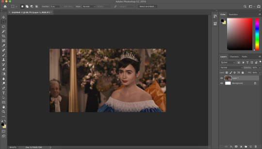
my first move is to open the screencap in the photoshop on it’s default canvas. the one i’ve chosen is normally the sort of screencap i’d go for-- one that has a central focus on the character and allows me to get a solid outline.
i tend to avoid screencaps that cut off the top of the characters head. i also tend to gravitate towards scenes that look easy to colour; if you choose overly saturated screencaps or screencaps that are too dark/light, then you will find it difficult to colour while conscious of the screencap quality.
base colouring
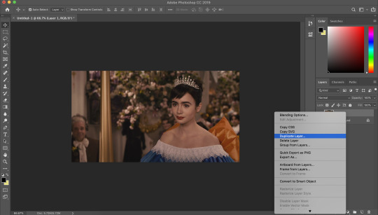
i then duplicate the screencap.
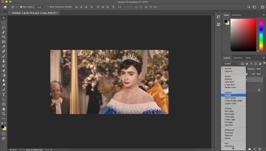
and then i set that duplicated layer to screen.
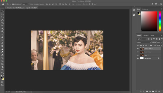
i like to make my icons super bright so i repeat this. it will vary depending on how dark the scene is. i prefer to do this to the screencaps as i find that it preserves the quality of the cap.
alternatively, you can use a psd-- my favourite as mentioned in previous tutorial is @blairsfelicity‘s icon psd which you can find in her tutorial here. my new method is just a whole lot lazier and i’ve been really enjoying the way my icons have turned out.
outlines
now here comes the menial part-- time for the outline.
remember to add a layer (unless you want to break your own heart by doing it directly onto the cap and being forced to start over (which i would NOT recommend by the way, crying over a screencap is as demoralising as it sounds)).
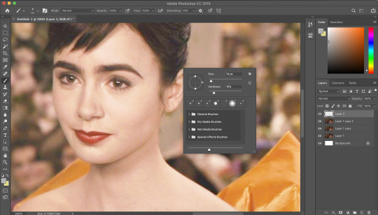
i vary between using the pen tool and a brush/eraser for my backgrounds. i like to shake it up depending on what i feel like doing or what the screencap would best fit. it also completely depends on whether i’m feeling particularly lazy or not-- if i have time to burn, i’ll use a brush. if i’m in a rush, i’ll use the polygonal lasso tool and refine my selection area with masks.
in this tutorial (due to my boredom of doing things over and over, this beautiful filmuary) i’m opting for the brush method. but if you want me to talk through polygonal lasso process which is a lot quicker and really streamlines the process-- then feel free to drop me a message and i’ll be happy to make another talk through.
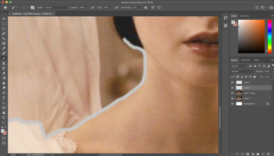
i like to use a brush for my erasing, on 30-50% hardness. i like to use a diffused/low hardness so my icon doesn’t look too sharp and the background and model seem to go with each other more. i’ll go for a small brush size when it comes to detailing (for example, when it comes to profiles, hair etc).
once i’ve outlined the model, i select the area around her with the magic wand tool and fill in the selected area with either a brush or a fill layer. then i merge the outline layer with the new colour layer.
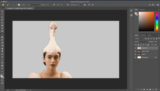
(these two examples are from another icon process bc im dumb and forgot to take screenshots)
there will be a full little line around the model once you’ve merged the layers. i just tend to fill it in manually with a brush.
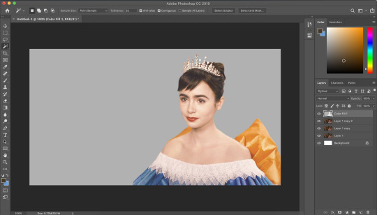
now here comes the fun part-- the colouring.
make those colours pop!
as you can see, the screencap has a lot of colours, but we need to make them pop. i take one of the colours, make a new layer and just paint until it’s vibrant and bold. once you’re happy with your colour selection, set the layer to soft light and adjust accordingly.
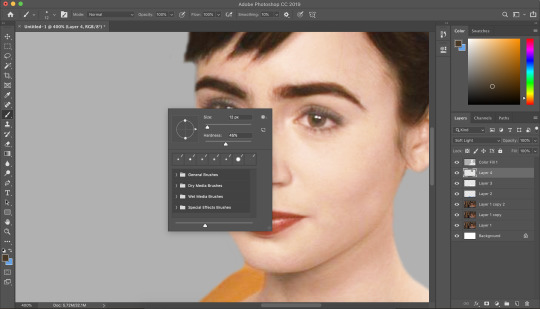
i tend to go for softer brushes when it comes to facial features. the lips, to make them a darker colour, i opt to set the layer style to multiply instead of soft light, and paint over the lip shape with a light pink/red.
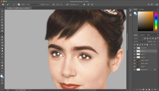
i always like to highlight the eyes to aid contrast in the screencap. i also like to fill all eyebrows in with a black (set on soft light) as well as the lashline, just to add further dimension and contrast to the model.
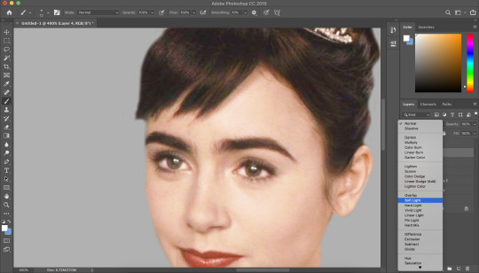
prepping the icon
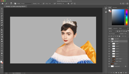
this is what my screencap looks like with the colouring complete. as you can see, each colour is on a separate layer. this is so i can adjust/duplicate each colour accordingly. once i’m happy, i place everything into a group together.
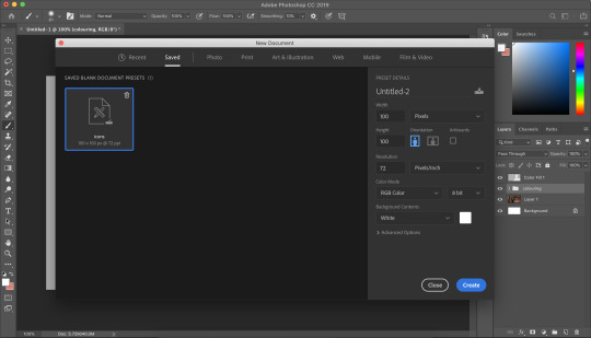
i make all of my icons on a 100x100px canvas.
i like to edit the screencaps on their original canvas as it helps with the quality of the screencap as well as allowing me to outline accurately.
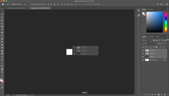
i just drag the files from one tab into another.
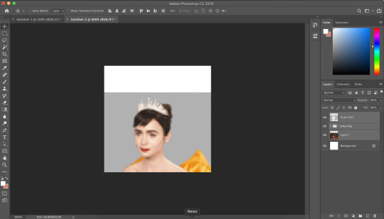
and then you can size it appropriately.
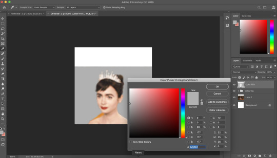
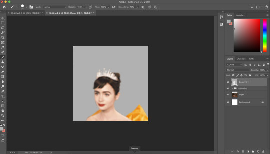
my next step is to select the same colour as the background and to paint over the white strip at the top of the icon. i do this directly onto my outline and then merge the two together. you now have the foundations of your icon to build onto!
final touches in the colouring department
there is honestly no direction that i could give you when it comes to these final colouring steps.
i like my icons to be very bright, so i target the contrast with levels and brightness/contrast layers. I like to also turn up the vibrancy to make the colours pop even more.
my preference is for the skin to be very neutral, so i try to combat the saturation of the skin with colour balance and selective colour layers (as well as another step i will explain later in the tutorial)
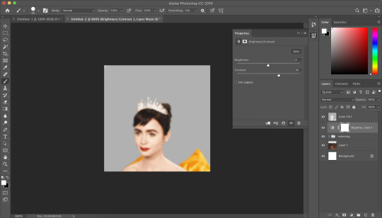
as you can see above, i place the final colouring all underneath the background layer as this makes it easier for me to place textures later on.
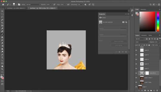
if you have problems with the model’s skin appearing too saturated, i’d recommend taking a solid fill layer of a black/white/grey and setting it to colour. place that layer just above the screencap and adjust it so it combats any saturation you might be experiencing.
textures and finishing touches!
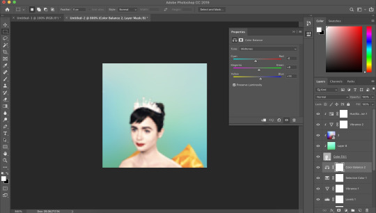
clipping masks are honestly a god send for me. you can find them by right-clicking on the layers and selecting clipping masks. as you can see above, i use clipping masks to place a green texture on top of the icon’s background. i then layer above that by using further clipping masks, adding other textures and even layers to adjust the colouring of the background.
my favourite place to find textures are livejournal and deviantart-- soaked on livejournal is my go-to at the moment and i really enjoy evey-v’s icon textures. i also have my own resouces/textures that you can find here!
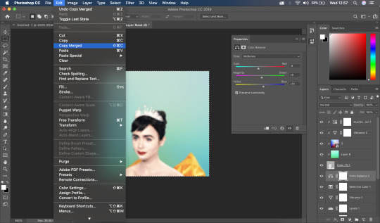

once i’m happy with how the icon looks, i copy all of the layers together and paste them under the background.
this is a super lazy way of sharpening the icon-- an alternative method is explained really well by @jennifergarner (aka the god of icons) on her icon faq page. i have used this in the past but after filmuary i’ve found a few little tricks.
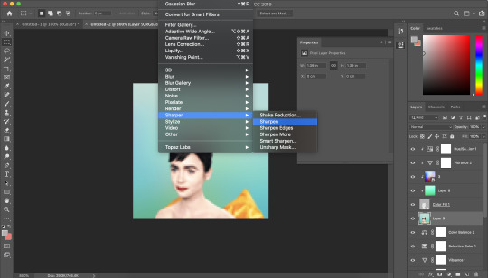
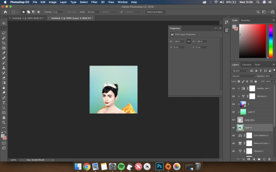
i then just sharpen the icon and adjust the opacity of the sharpened layer depending on my preferences.
and then there we go---

my chosen export settings are just to go for PNG every time. this helps preserve the quality of the icon and help it look super clean and tidy for whoever wants to use it.
and with that, that’s a wrap up of my tutorial.
for other tips and tricks, here are some of my asks that i’ve responded to;
do you have any tips for cutting short/curly/messy hair?
hey, would you mind sharing a psd icon?
what are some of your favorite icons textures?
can you break down how to use different types of textures?
67 notes
·
View notes
Text
New Post has been published on Otaku Dome | The Latest News In Anime, Manga, Gaming, Tech, and Geek Culture
New Post has been published on https://otakudome.com/reviews/nba-2k22-review/
NBA 2K22 Review
2K Sports is back with it’s NBA titles in the latest offering of NBA 2K22. Built with current generation consoles in mind the newest entry promises an expanded online community, every NBA team’s respective public address announcer, and so much more for both core console versions of the game. NBA 2K22 also includes exclusive features for the Playstation 5 and Xbox Series X & S.
NBA 2K22 is a 2021 basketball simulation game it is developed by Visual Concepts and published by 2K Games. It is currently available on PC and current as well as last gen consoles.
Editor’s Note: A Playstation review copy of NBA 2K22 was provided by 2K Games in support of this review. Minor spoilers for the game’s story mode may be present within this review.
Hit the court on next-gen with NBA 2K22.
I’m sure I’ve mentioned this several times prior on the site, but I’m no sports fans not even a little. However, I always have a bit of a weird appreciation for the video games. I’m not sure if that’s simply due to the fact that it’s a virtual simulation of something I otherwise wouldn’t care much for. Or if it’s a delusional attempt at using the video games to feign any sort of real interest at all into sports. Whichever the case may be I do often find some joy playing the NBA 2K titles outside of any others as there’s some genuine effort seen throughout almost every entry. And although lately the title has suffered from very similar issues plaguing sports games I do sense way more passion with these 2K games than any other AAA sports sim.
Rise top the top of the NBA in the MyCareer mode.
THE GOOD: I’m just going to do a brief summary of NBA 2K22’s story mode MyCareer as there isn’t really a whole lot to go over and this should be a gameplay focused review. In MyCareer you play as a young basketball project working his way up the NCAA circuit before getting drafted into the NBA. There are ways to increase your appeal as a draft pick by doing practices and such before the big games. Eventually if you follow through with the optional though probably necessary tasks you’ll get top priority as a draft pick and also gain bonuses for your created character.
Continuing with MyCareer players can earn attribute points to continue to improve their player character’s abilities on the court. At the start of the mode you can choose your own play style in the vein of being a better guard or shot. You can also focus on a centered build or power forward or small forward build. Naturally, each build has a set of strengths and weaknesses that will be felt as you play. In addition to your attributes players also have to keep the actual body build of their player in mind as they also have their own strengths and weaknesses. For example, some body builds have far more or far less attribute stats open to them out of gate. And if you’re not careful it could really make or break your playthrough early.
The new shot meter returns with some small updates. Timing is everything, if you press square too early or too late you’ve basically given the ball to the other team for an easy score. Fatigue also plays a heavy role into gameplay. It gets to a point where you have to reserve stamina and choose when to run or dribble. etc. There’s a major learning curve with the I’d recommend practicing HARD before you play any major modes as it can be rather jarring otherwise.
The game gets a whole lot realer in NBA 2K22.
With the core gameplay out of the way I wanted to talk about the multitude of modes available. And when I say there’s a lot of modes I’m not joking. Seriously, there’s modes available on all versions of the game, modes & features exclusive to the current gen version of the game, modes exclusive to the last gen version of the game as well as features. If you’re playing both on PS4/PS5 or Xbox One/Series X/S there’s a lot to sit through and experience. It can be really overwhelming for newcomers or passerby players like myself. Two modes in particular that are exclusive in a way on last and current gen are The City& Neighborhood modes.
Both modes have been revamped on PS5 & Xbox Series X/S. Not sure why the need to split the modes between versions was necessary. Maybe the features they implemented for The City couldn’t run correctly last gen? Whatever the case, each mode offers a unique experience to the player depending on which console they’re playing on. In Neighborhood you tour a huge cruise ship and there’s a ton of activities that can be done on it. You can also port and explore areas off ship which is a really neat touch. The City almost acts like an RPG of sorts as you explore the titular mode on and off the court with quests and NPCs to interact with. There’s also a new go kart mechanic to make getting around easier which felt like a random but cool addition. It should be noted that Neighborhood will evolve and change locations every season making exploration a huge selling point for the mode.
Run your own team with MyNBA.
THE BAD: I mentioned the learning curve earlier and trust me when I tell you it’s huge. If you don’t play these games regularly or have been out of the hoop (I’m sorry) then you’re gonna be in for a rough time. And there’s a ton of modes and mechanics to wrestle with so you’ll probably spend more time playing around with the mechanics than actually getting into the game a good bit. Also something I mentioned earlier about NBA 2K22 suffering from issues of AAA sports titled? Yeah this game is pretty heavy on the microtransactions and it unfortunately can often kill the fun and immersion of it all. That packed on to the already overwhelming learning curve can admittedly be a bit of a turn off.
Take your skills to the streets with the City & Neighborhood modes.
OVERALL THOUGHTS: No game is perfect, and with the last several years that statement has never been truer with sports games. Bur, even with it’s issues I do think that there’s a very good game in NBA 2K22. If it could step a bit further back from the unfortunate norm of sports games with fewer microtransactions I think the franchise absolutely has a shot a getting back to it’s glory days. As it stands however, NBA 2K22 is 100% several steps in the right direction and very few back.
0 notes