#the website looks like something from the 1990’s
Explore tagged Tumblr posts
Text
On the WebSoilSurvey website looking at soils from around the United States. Never been more genuinely excited about soil mapping.
24 notes
·
View notes
Text
SO. The Question. david 8 or 1? i think, in short, Our David(TM)(the custody battle was long and fierce but he belongs to all of us now. fuck weyland) WAS a david 8 in prometheus but this was retconned into him being the First in covenant. in long, uhhhh. it's complicated. let's get to the meat (or...cadmium alloy?) of the matter. apologies in advance if this is like incomprehensible, i'm awful with words LOL
so first of all let's go through the prometheus marketing materials: they all seem to point to david being an 8.
youtube
now i don't necessarily believe the david being interviewed in this video is Our David (yeah i'm gonna be calling him that for the rest of this post) but the fact is that this video's purpose was to give us an insight into the david that would star in prometheus, so i assume it implies strongly that the david in prometheus is also an 8
the old promotional website straight up calls him an 8
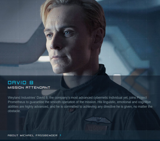
but now let's look at covenant, where he is retconned to be The First david to be made and activated. covenant opens with our david's activation: notice how old weyland is in this? he's pretty young looking compared to fuckin' methuselah we see in prometheus LOL.

BUT! how can this be? if our david is a david 8 he could have only been activated after 2068, 2068 being the year david 7 was released according to the timeline, by which time weyland, born in 1990, must've been 77.

so weyland must've been over 77 years old by our david's activation IF he is an 8. but as we see he is nowhere near that old in covenant's opening scene. if we're to assume he is activating david 1 here, he would be 34, which looks about right!
(david 8's release isn't even mentioned in the timeline page, which is something which, paired with the aforementioned "happy birthday david" video advertising david 8 models, plus the news page featuring an article dated 2072 that mentions david 8 pre-orders (imagine if they had stupid pre-order bonuses like video games have now lol? pre-order david 8 NOW and he comes with a FREE maid costume!!!!), must mean that the 8th model is NEW by the time prometheus happens. fresh out of the oven, just now available for purchase)
there's also the scene in covenant where walter tells daniels that our david is the first ever david model that weyland made that was "thought lost" in the prometheus mission. unfortunately i don't have a clip on hand of this scene, neither can i find the final movie's script which would have it written out, but i'm sure if you have quick access to the movie like on a streaming service you can find what i'm talking about :P it's sometime after david guides the covenant crew to the destroyed engineer city.
but an outright, blatant confirmation of the idea that our david is the first david lies in an early script of covenant that i DO have access to. behold:
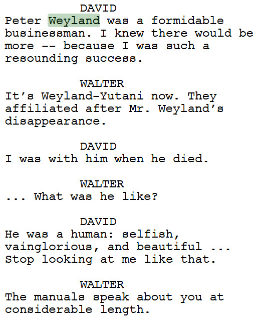

david.....NUMBER ONE!
well i think i've made my case clear....but john, you ask, this has quite the implications about our david's quality and ability! david is so intelligent and emotional, yet this idea would imply he's an inferior model capable of such things. and you're right to wonder that, even the weyland website's investor page seems to say as much
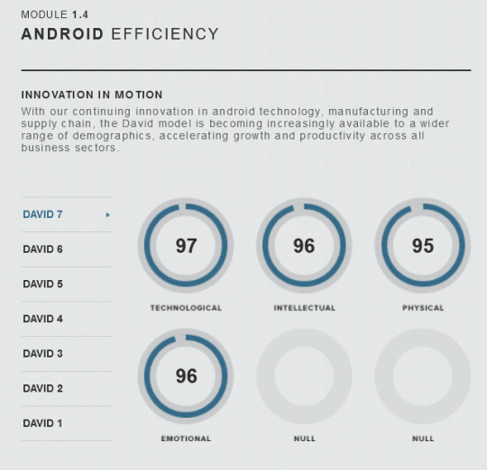
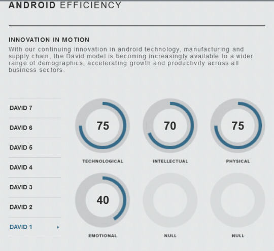
and the answer to that question is.......... ummmm ridley didley didnt think this one thru :) i do think it's an oversight from the writers LOL so it's up to the fans to think about it and explain it.
me personally, i think the difference between a commercial david, be it a david 1, or david 8, is different from our david. our david, the first, wasn't made to be a commercial product, it was to test weyland's abilities and see just how close he could get to creating an artificial person. so he went all out, no punches held back, so we get our david being super intelligent and emotional and human and with a sense of independence. this is not a product: this is weyland seeing how far he can go. so in may ways he is the best, really.
the other davids following him though, including the commercial mass produced david 1's (which i believe the chart shows), up to david 8, these are products meant to be bought and sold. an android that is TOO human is, as walter says in covenant, quite disturbing for people, so these commercial davids actually are a little reigned in and "dumbed down" lest they get TOO smart. like yeah, in terms of materials/resources and technology and stuff, these are the superior ones, but in terms of the ability to think, to feel, to philosiphize and of course create, our david is king. the commercial davids are the better machine, our david is the better human. so that's my take.
of course everyone's free to make up their own minds since the actual films fumbled this a little. @muscari-midala had the idea that our david is a david 8 prototype specifically, or that weyland put our david's memory in newer models as they got released, which is very interesting! there's a lot of ways to go about it in my opinion.
anyways if you made it all the way here CONGRATS!!! you get a david as a prize. check your mail tomorrow.
17 notes
·
View notes
Text

Title: Don't Call It a Cult: The Shocking Story of Keith Raniere and the Women of NXIVM
Author: Sarah Berman
Genre: nonfiction, cults, true crime
Trigger/Content Warning/s: physical and emotional abuse of women and minors, rape (including of minors), sexual assault (including of minors), forced confinement, gaslighting, stalking, persecution
Summary (from author's website): Don’t Call It a Cult (2021) is the culmination of years of investigation into a secretive self help program that was first accused of branding, blackmailing and starving women in 2017. Its leader Keith Raniere was sentenced to 120 years in prison for sex trafficking, sexual exploitation of a child, wire fraud, racketeering and other crimes. This is the story of NXIVM, the rich and famous people who helped Raniere evade prosecution for decades, and the trial that revealed his darkest secrets to the world.
Buy Here: https://bookshop.org/p/books/don-t-call-it-a-cult-the-shocking-story-of-keith-raniere-and-the-women-of-nxivm-sarah-berman/15011261
Spoiler-Free Review: Well, that was a RIDE of a read, and also UTTERLY INFURIATING AND TERRIFYING.
I learned about this book after I finished listening to a Cult Podcast episode on NXIVM and did some googling. There are other books out there about NXIVM, with some of them written by victims, as well as some that focus specifically on Keith Raniere, but I was looking for something that was written by someone uninvolved in NXIVM, and this book fit the bill. (Also ngl but the title look interesting compared to some of the other titles of NXIVM-related books out there, which also encouraged me to pick it up.)
Anyway: I think this book’s a very good introduction to what NXIVM did to the people who were involved in it, especially the women. Most people know about the branding and DOS, but the book shows that those were more the ultimate manifestation of what Raniere had been doing for years to those around him. He didn’t start out with those from the get-go; those were things that came about after he’d cemented his hold on the women surrounding him and manipulated and abused them into a mindset where they would do whatever he asked them to do. It was deeply upsetting how he twisted the language of self-help and psychology to prey upon vulnerable women, who should have been seeing qualified psychologists and psychiatrists and not this snake-oil salesman who wasn’t above turning tail and hiding when things weren’t going his way (which is something he did A LOT, often abandoning his loyal followers to the cops whenever the law came calling).
What’s interesting to me is that his victims don’t strike one immediately as being “vulnerable”. Many of them are white, wealthy, and ambitious, with some working in fields like finance, law, and computer programming, which were heavily male-dominated during the late 1990s and into the early and mid-2000s (and still are, to a degree). I could see why they were drawn to NXIVM’s messaging of self-improvement and “ethical responsibility”, but it’s disturbing how Raniere was able to con so many of them, to the point that some of them actually helped him perpetrate his abuse onto other women. It got me thinking about the deep-seated misogyny and self-hatred that lives in a lot of women no matter how successful they might seem on the surface, and which Raniere clearly knew how to pull up and prey upon. It also got me thinking about the self-help industry, and how so many people will fall for whatever unproven claptrap self-declared “gurus” spout out because they are desperate to find a way to help themselves and maybe others too.
Overall, this was a great overview of NXIVM and what happened before it all exploded in 2019. This has a more journalistic approach compared to some of the other books about NXIVM, which are either memoirs written by victims, or books that focus on Raniere himself, and I think this is useful if one wants to come to grips with what NXIVM was, and what the brouhaha was all about if one was only hearing about it for the first time in 2019.
Rating: five long walks
1 note
·
View note
Text
The Influence of Japanese Horror
This next post is going to focus on the overall influence these 1990/early 2000’s Japanese horror films have on directors. This research is going to consist of an interview with the cast of the American version of The Grudge directed by Takashi Shimizu (who also directed the original). This will also consist of an interview transcript with the director of Ringu, Hideo Nakata. This will consist of his influences for the film and some of the important film aspects used during it. In my research I could not find much talk about directors or filmmakers taking influence from the Japanese horror films of this time, but that could be due to the lack of influence those movies have in today's day and age. As talked about in the first blog post, these films were very influential for that time period because of the boom of technology and it was very story driven rather than using the film techniques of those movies. In the second blog post, I talked about how when these Japanese horror films were remade to cater to the American audience, much of the film techniques that were used to induce uneasiness and horror were dramatized. I will link the interview that I watched for context about how these actors and producers reacted to Takashi’s film style.
youtube
During the interview they equate that the film style of Takashi was much different from the in your face American style of horror. One actress who put the feeling of the film style in a great context of that creepy feeling you get when you walk down a hallway alone and just feel that something is off. It is a very suspense driven type of filming consisting of these long drawn out scenes that build suspense for the viewer.
To move on from the interview for The Grudge to the interview transcript with Hideo Nakata, this interview predates the American remake of his movie and the interview takes place in July of 2000. For Hideo Nakata, Ringu was heavily inspired by the Amityville horror series and it influenced how he filmed his movies. During the filming of Ringu Hideo heavily collaborated with the audio composer for the films. They wanted to make sure that the sound effects were well integrated in the films to create this horror. In this interview they bring up a very interesting description of how they filmed the flashback scenes as well as the cursed video for this film. An excerpt from Hideo is as follows, “Originally it was shot on 35mm film but we did discuss filming it on 8mm or home video. The scene was shot on 35mm, then we went to the lab, and it got passed through a computer to get the grainy image quality. But the technician at the lab didn’t want to give up his trade secret, so I’m not exactly sure what was done to the image to get that texture! Though I know that the 35mm was also transferred to video format at some point.” (Nakata). It is interesting that the main director does not know they got this portion of the film to look the way it does, but it got the point across to make the viewer not know where they are when watching the flash back or cursed video. When directing the cursed video, they did not want to give the viewer any reference points of where they are located or where the light or dark is coming from. It really gave off a dream-like atmosphere. Overall these films play with a long drawn out suspenseful and wandering sense of horror that is unlike the in your face horror of American films of that time period.
Interview Transcript of Hideo Nakata/ citation of website used:
The “Ring” Master: Interview with hideo nakata. Offscreen. (n.d.). https://offscreen.com/view/hideo_nakata
0 notes
Text
Various Male Porn Stars x Fem Reader- "Making the Video"
Hopefully people reading this fanfic won't find it problematic, but viewer discretion is advised.
This is a fanfiction that's somewhat different from what I usually type.
Hopefully when you read this fanfiction, you'll understand it and picture it in your head, it won't sound like word salad.
______________________________________________________________
In 2001, you released an album of music where you sang remakes of sexual songs from the 1980's and a few from the 1970's and early 1990's, like Madonna's "Justify my Love" and "Erotica", Appolonia 6's "Sex Shooter", Samantha Fox's "Touch Me (I Want Your Body)" and "Naughty Girls Need Love Too", and Donna Summer's "Love to Love You Baby".
One of the songs you remade on that album that was released as a single (as well as had a music video) was a remake of Berlin's "Sex (I'm A)".
This music video was released in October of 2001, shortly after your album was released.
The video starts off with a handsome, photogenic Caucasian young man in his 20's with short, brown, slightly spiked hair and blue eyes sitting in front of a blue iMac computer in a purple looking room, where both the walls and floor are lightly purple.
The camera was filming him on his side when he sat in front of his computer at the beginning of this video.
With a slight smirk on his face and his hand on top of the mouse of his computer (as well as the camera now zooming in on his face and filming him above his shoulders), he clicks and scrolls the cursor on his computer on top of an Internet browser, where he clicks it and a porn website is what completely covers his computer screen now.
As the opening strains to the song begin playing, it shows these bluish colored shots fast forwarded, looking like this:

Just replace those cars, roads, buildings and streets in the video with these turquoise colored, new millennium Y2k shots looking like those early 2000's Microsoft playlists where you could play a Beethoven song and these amoeba looking screens titled "Comin' atcha!" are shown.
It's like it shows what the inside of a computer is like when you press and click on something.
The camera now shows a fake porn website, not showing him or his computer.
This porn website on his computer screen had these shots of you in provocative poses, where you were laying seemingly naked with your vulva and breasts blurred out.
Some of the images of you on this computer screen had shots of you laying down naked on your stomach with your bare naked ass and breasts blurred out and your head turned sideways and looking at the camera with this "come hither" look.
Below those images of you had white font saying things like "Hardcore slut!", "Horny slut wants cock!", "college cutie!", "barely legal!" and "horny teen virgin!".
Of course, there were different images of you with these aforementioned captions.
You looked like a stereotypical porn star in this video, your makeup looking like every typical porn star during that year.
"Fuel the fire, feel my love inside you is so right" you sang in the opening lyrics to the song as your eyes looked into the camera, the camera now filming you singing those lyrics while you had the tip of your index finger on the corner of your mouth and your legs spread wide open.
When you were filmed seeing that, you were filmed on that porn website with your legs spread out and the tip of your finger on the corner near your mouth while your eyes looked in the camera.
"There's a sound and a smell of love in my mind" you sang, still with the tip of your finger by the end of your mouth and your legs spread out.
The computer scrolled down, scrolling down to multiple shots of you in provocative poses (sometimes you were nude and sometimes you weren't) with explicit white font underneath these images, and then the computer stopped scrolling once it showed a shot of you standing on your knees with your body positioned sideways in front of this camera, you wore a white thong and your head was turned sideways looking at the camera.
"I'm a toy, come and play with me, say the word now!" you sang as you looked into the camera, the white font below this shot of you saying "Hot teen wants to play with you"
You weren't really a teenager in this video, this was just a video made to be like typical porn websites.
When a bit of the music was playing, the video then cut to a shot of that cute guy behind the computer, having a slight smirk on his face and being filmed above his neck.
"Wrap your legs around mine and ride me tonight" you sang as the camera then shot back to the computer screen showing an image of you sitting and straddling on top of a shirtless man's lap.
The man you were straddling was pictured from below his neck, whereas you were pictured as if someone was shooting a picture in front of your face and torso.
For a while as instrumental music played while you whispered the word "sex", there were a few more shots of the man sitting in front of a computer, where he was filmed from above his neck with a smirk on his face.
He looked like his hand was scrolling down this webpage to view this porn website, which he was.
"I'm a goddess" you sang again, where now the camera was entirely filming the computer screen, and when you said "I'm a goddess!", there was an image of you standing up in a camisole and panties, the picture was pictured above your knees and your eyes making a come hither look at the camera.
When you sang "I'm a goddess!", there were separate images of yourself scattered right next to you singing.
These separate images had shots of you with your legs spread out wearing panties, wearing a thong with your back turned in front of the camera with your head turned sideways making a come hither look on your face.
Some shots had pictures of you sitting down on your side while your eyes looked directly into the camera and your mouth was partially open.
These images of you on this computer screen didn't move unless you were singing a part in the song.
"Well, I'm a virgin!" you chirped in a shot of you on this computer screen where you were wearing these white panties and your legs were spread out, one of your hands holding a lollipop near your mouth while the letters "Tiny teen virgin!" appeared below this image when you sang "I'm a virgin!".
"I'm a blue movie!" you added during an image of you where you were sandwiched in between male porn stars Tony Tedeschi and Shawn Ricks, who both had their long hair hair hanging down.
During this shot, you, Tony and Shawn were all pictured naked and standing sideways in this shot, the sides of your bodies and theirs in front of the camera.
There was the letters "Three's Company" in blue letters splashed at the bottom of this image of you sandwiched in between those male porn stars.
"I'm a bitch" you snarled into the camera during a separate shot of you dressed in a black leather dominatrix outfit on this computer screen.
"I'm a geisha!" you squeaked in a shot of you topless with your bare breasts pixelated out and wearing a pair of thong panties, the white letters read "Live college slut" below this image of you.
"I'm a little girl" you crooned into a camera while you were dressed in a naughty schoolgirl outfit with your blouse unbuttoned completely and your legs and thighs spread out while your fingers were touching your vulva covered by your panties, your hair done up in these pigtails with pink maribou fur tied around them.
In this separate image of you dressed as a naughty schoolgirl, the white letters "Horny Teen Schoolgirl!" appeared underneath this picture.
Some people watching this video think there has to be an uncensored version of this video, but sadly, no.
"And we make love together" you boasted with your head turned and looking at the camera in a separate image of you on this computer screen with your body turned sideways and standing in front of Tony Tedeschi, who was also standing sideways in this shot.
Tony and you were both shirtless in this image, although your breasts weren't exposed.
You and Tony were seemingly embracing in this image.
Tony had his long hair hanging down during this shot.
After some shots of you in this video, the camera then cut to this man sitting behind his computer still with a smirk on his face and clicking the buttons on his computer mouse.
When you began to sing again, the camera then filmed this man's computer screen with multiple images on a fake porn website, this computer screen had multiple provocative images of you and some other women that looked pornographic, but the private parts were blurred out.
"Slip and slide in your wet delight" you sang during the second verse during a shot of you with your legs spread wide open while your barenaked vagina and breasts were pixilated, this image had the caption "Wet and wild!" in white letters under the picture. "Feel the blood flow!"
For a brief while, the camera showed a moving image of you standing sideways with porn star Gerry Pike standing in front of you, where Gerry was shirtless whereas you were naked.
Gerry had his long hair hanging down in this shot.
One of your hands was behind Gerry's neck during this shot.
"Not too fast, don't be slow" you ordered and sang during this shot of you with Gerry. "My love's in your hands"
While scrolling down through this webpage, there were more images of you and porn stars (and even some professional wrestlers).
"I'm a boy!" you whined when you looked in the camera in an image of you wearing panties with a fake penis (a dildo!) bulging through the fabric of your underwear, one of your hands tugging down your panties sideways.
"Well, I'm your mother!" you moaned in an image on the side with a picture of you wearing a bra and panties.
This image of you dressed as a mother read the white letters "Slutty MILF" below it.
"I'm a one night stand" you boasted and sang in a separate shot on the screen of you with male porn star Biff Malibu, where the image had a picture of you naked and straddling Biff's lap while you were pictured sideways.
This image of you straddling Biff had the white letters "Blind date!" below it.
Biff had his long hair hanging down in this shot of you.
"Am I bi?" you asked in a separate image of you sandwiched in between Tony Tedeschi and a blond female porn star.
In this image, you, Tony and this blond female porn star were pictured sideways, you, Tony and this female porn star were stark naked, although no private parts were shown, not to mention you, Tony and this female porn star were pictured above the waistline.
"I'm your slave" you crooned into the camera in a separate shot of you that read "I'm a slave 4 u!" in white letters below the image.
"I'm a little girl" you sang during a shot of you with your back turned in front of the camera wearing a cheerleader outfit with your panties pulled down, your head turned sideways and your eyes looking at the camera while the tip of your index finger was poking into your mouth and your other hand held a pom-pom.
This image of you as a cheerleader said the letters "Tight teen Lolita!" in white letters below that picture.
Yeah, this was problematic, but most porn websites are like this.
"And we make love together" you added during an image of you where you were pictured above your shoulders with Shawn Ricks standing in front of you with his genitals blurred out.
This man was pictured below his stomach, but above his knees.
During the instrumental part, there were shots of this same handsome young man unbuttoning and unzipping his pants, pulling his pants and boxers down, although his genitals weren't shown.
When he pulled his pants and boxers down to his ankles, he was filmed below his knees.
"Skin to skin, tongue to ooh!" you began singing again when the camera showed a shot of you and Tony standing together, where you and he were both naked and you were standing in front of him, you and Tony both pictured sideways. "Honey hold tight!"
During this part, there were more shots of female porn stars as well as shots of you looking pornographic.
"Come inside, it's a passion play just for you!" you sang into the camera, your legs spread wide open while you wore these panties blocking your vulva and your hand reaching out to the camera and motioning to come to you.
"Let's get lost in a magic place, all alone now!" you ordered in another separate shot of you posing provocatively with your head turned to the camera and your eyes looking into it.
"Drink your fill from my fountain of love" you sang in a separate shot of you as the computer scrolled down. "Wet your lips!"
After singing that, there was a brief shot of this handsome man behind the camera staring at it.
"I'm a teaser!" you chirped in a separate shot when the camera shot back to this computer screen, an image of you pulling your panties sideways and slightly down with the caption "Cocktease!" below it.
Were these captions necessary? People get what these images are about.
"Well, I'm a virgin!" you sang into the camera in a different image on the screen of you dressed in a light pink camisole and panties where the caption read "Barely legal virgin!" below it.
"I'm a one night stand!" you boasted in a different image on the screen that said "Local and willing to meet you!" below it.
This image when you said "I'm a one night stand!" had you looking provocatively and pornographically.
"I'm a drug!" you bragged in another different moving image on the screen.
"Well, I'm your slave" you sang into another different, separate image of you on this screen that read "Love slave!" in white letters.
"I'm a dream divine" you crooned into an image of you raising your camisole up your torso while wearing a pair of panties, the letters "Wet dream!" in white letters below this picture.
"And we make love together" you added in an image of you and a female porn star standing in front of each other, you and her both topless and pictured above your waists as well as pictured sideways on the sides of your body, your head turned sideways and looking at the camera when you sang "and we make love together".
"I'm a goddess!" you gloated into the camera in an image of you dressed in lingerie.
"Well, I'm a hooker!" you sang in a stretched out fake add on top of the computer screen that read "Horny and needs to hook up!" with an image of you laying down on your stomach with your eyes looking into the screen and dressed in lingerie.
"I'm a blue movie!" you added in a separate image on the screen of you with your back turned in front of the camera wearing a pair of denim shorts.
This image of you wearing shorts read "Cumsluts 10".
"I'm a slut!" you boasted in another image of you on this screen that read "Horny Gangbang Slut!" in letters below it.
"I'm your babe!" you chirped in a different image of you wearing a college sweatshirt that reached your upper thighs, the caption "College Babes!" below the image.
"I'm a dream divine!" you sang in a different image on the computer screen.
"And we make love together!" you sang in an image of you with Tony Tedeschi. "And we'll make love forever"
All of these certain shots of you with your legs spread out in this video, you didn't have any pubic hair peeking out of your panties or anywhere near your vulva, and you didn't have any things normal women have, like bruises and scarfs on your legs and body, stretch marks, shaving bumps, none of that.
During this part, the camera now zoomed in on this image of you and Tony, where you and he began kissing each other while you and he were both shirtless.
You were a World Wrestling Federation/WWE diva who tried to have a singing career, and you actually had this music video played on "Monday Night Raw" to promote it.
There were many horny guys searching online if there's an uncensored version of this video, but nope.
This music video got thousands of requests from horny teenage boys and guys wanting to see it played on "Total Request Live" on MTV, but it was "too hot for TV" as they say.
However, this video did play on the Playboy channel, and it ended up being the most viewed video on that channel.
You put some male professional wrestlers in this video because, while there are some sexy male porn stars out there, you didn't just want male (and female) porn stars in this video.
'Tis a shame "Beavis and Butthead" had been cancelled in 1997, because we all know Beavis and Butthead were 2 horny teenage boys that loved beautiful, oversexualized slutty chicks and would also sit down and watch music videos.
Had they seen this video, they'd flood their house with drool.
1 note
·
View note
Text
20 Years of Blogging. No, really. (Part 1)

So, twenty years ago Jamie and I were living in the wasteland suburbs of Phoenix, Arizona in a town-turned-bedroom community name of Chandler. We'd moved out to Phoenix in pursuit of a new job for Jamie. But, also, we figured we were young and didn't have that many roots down in the years after college and marrying fairly early (2000). Now seemed a good time for trying new places and things.
It didn't work out.
You can visit Jamie's occasional remembrances of our time in Phoenix, and that's a goodly part of the story. But, also, between Jamie's health, the fact I was working crazy hours, and a general lack of opportunity to meet people, we just didn't know many folks in town that we could call "pal". I either managed or was supervised by the people I worked with, and Jamie mostly worked with men - so she wasn't meeting many women she could pal with- and everyone she worked with seemed to be at a different point in their lives from hanging our with two 20-somethings. That, and, man, if you asked me what the culture was in Phoenix in 2003, I'd say "strip malls and pretending you're rich". We just didn't click with many folks.
So, that's where we were at in some ways.
For technical context, in 2003, we had BBS's, but we didn't really have social media. Facebook as you know it would happen closer to 2007. Friendster and MySpace would happen in quick succession around 2004, but they were barely interactive. If you wanted to email someone when you found them, you could. But including posts and comments and all that came with FB, really. Twitter would happen closer to 2009.
But in 2003, we were experiencing the golden age of blogging.
The web as we know it started happening in the mid-1990's. My first modem came into my possession in 1994 when a guy on my floor, who had just replaced his hardware, was punting his old modem down the hall and was willing to just let me have it. I got an account, got an email address, and was online in 24 hours.
Websites were more or less a thing by 1995 or 1996, so that first year was mostly BBS's and figuring out who had email. Which was PINE, I think.
By the time I was wrapping up college in 1998, my friends were working as web designers for a living, and the first internet boom was off to the races.* While companies looked for angles for how they could sell their stuff online, people were out there creating individual websites, which were hard to set up and maintain until GeoCities and other companies made it possible to set up a light (and often horrible looking) web presence. It was a bold new frontier.
By 1999, I was already working in online video and early streaming efforts, delivering courses to the internet. I was already *very online* by 2003. The last thing I wanted to do when I got home was spend more time putting content on the web.
When we moved to Phoenix, we were suddenly 1000 miles and a couple of time zones from anyone we knew. Add in, I used to sleep about 5-6 hours per night Monday to Friday, but like 10 hours on Saturday and Sunday. Suffice to say, I had some downtime. And pre-blogging, you'd sometimes find yourself sending out missives and correspondence via emails, and you'd have chains of folks you messaged. But not everyone was good about it. Somehow I fell into emailing a lot with a pal from college/ film school, JimD, who would CC folks I didn't yet know into email chains. And thus I met folks like RHPT.
I was also, and had been, into comics, sci-fi, etc... for a good chunk of time. And Jim and I would email about movies and comics, and then one day he suggested I start blogging.
I had no illusions about writing for the comics sites that were mushrooming up at the time. Comic Book Resources. Robot 6. There were others. I can't remember what Heidi's site was before The Beat, if, in fact, she had a different name for it. But as Wizard Magazine self-immolated and failed to bring it's brand of comics nerddom to the internet, the websites gained steam. And there was a pretty good cross-pollination of individual bloggers just writing for the hell of it and folks trying to make it a business.
Folks would set up Blog Rings or Circles, so you knew who their peeps were. And, of course, they'd use good ol' http to make sure they were linking to one another.
But, man, it was the wild west. No one knew who anyone really was. People used handles a lot (I think I was 2 years into blogging before I went by anything other than "The League"), and all the old barriers of zines and magazines and spending money to get to print went away. So it could be literally anyone out there talking comics from any angle they chose. Like Bronze Age funny animals? GREAT. Go get a blog.
But here's the kooky part - and the thing I miss. They were also *personality* blogs. Folks were as likely to discuss a day at the dentist or their passion about stamp collecting as they were about Bronze Age funny animal comics. And that deeply informed what became The League of Melbotis.
In addition to just me and Jamie in Arizona, we also had Jeff the Cat - an utter bastard of an animal who only liked me of all other living things. And, Melbotis. Mel was a 100 lb. golden retriever of great intelligence and an phenomenal disposition. He was so loved that I still get a little teary thinking about the guy.

I grew up with some good dogs, Puffy and Misty, and wanted a dog very badly after Jamie and I got married. Shortly after we got married, some friends of ours split up and moved to separate coasts, and neither could take their dog. So we did. And he became our great pal.

I don't really remember where the name "League of Melbotis" came from. "Melbotis" was his name when we got the dog, and it was some gag between them I won't explain here. The "League of" came - I am sure - from Justice League America and League of Extraordinary Gentlemen, and something sounding official around our buddy.
Anyway - at some point Jim gave me the right push, I picked Blogger as a platform as the easiest and free-est one to manage, and thus launched League of Melbotis on March 30th, 2003. And a few days later I was like "this is dumb. I'm not doing this." and pulled the plug.
I think it's very hard for people to understand in 2023 that in 2003, employers and people in your life expected for you to present a certain face to the public world, and they didn't love it if they could Google you and up would come something as silly and trivial as comic books. You were allowed to have hobbies and lives outside work, but you weren't to bring them into your work life, and the internet's eye meant that the lines blurred and crossed. So there was concern there.
But, also, I was of the (correct) opinion that it was semi-pointless and useless to put your thoughts into print. This was when having legitimate publishers behind you meant something, so a blog was less than that. Heck, it was thumbing your nose at that idea. Who was I to write down and send my thoughts on anything into the ether?
But then I decided: I'm not using my real name. It doesn't @#$%ing matter.
Though I'd blown away the original blog, it turned out, JimD had somehow stashed the first blog posts, and sent me the text. So the first few posts are very strange as they're recovered from the erased first take at blogging.
For the very earliest posts, which include random thoughts on comics, American Idol, the situation in Iraq and my moment of pause at turning 28 years old, you can visit, why not hop over to League of Melbotis?
It was, as I said, a personality blog. Sure, I talked comics, but as we did back then, I talked about the news, about my dog, about what was on TV... basically anything that crossed my mind became fodder. Because one thing I did want in 2003 was an easier way to stay in touch with people, and have the chit-chat you don't realize you miss until it's gone.
Fairly quickly after the blog launched, I reconnected with some folks I'd lost to time, moving, etc... Friends from childhood, high school, college, etc... popped up shooting me emails. I employed a comment plug-in and conversations started. New folks popped up. Who was this Harms fellow? Strange Canadians eventually showed up.
In an era before centralized social media, I could tell people were checking on the blog during their coffee breaks or in the evening. The sorts of posts I'd make that now would be a one sentence facebook post became lengthy comment threads. Pondering about sports - and I was very in the tank for the Phoenix Suns at the time - drew all sorts of commentary, often from friends of friends.
For good or ill, most of the comments from the first years of League of Melbotis have been lost to time and the ether. That plug-in I was using went defunct, and all my comments went with it. It's a bit of a bummer as I'd like to track when people showed up in my life, but I also think maybe for folks' personal lives and to protect the innocent years on, it's good that our Golden Era of Blogging comments are lost to time.
Because it wasn't all pleasant. As folks engaged in "someone is wrong on the internet" behavior, suddenly I was monitoring and managing arguments between folks who didn't even know each other wanting to debate (endlessly) in the comments, and any attempt to tell them to knock it off was met with fury and "help! help! I'm being oppressed!"
And I'm sure my attempts to keep an open door at The League of Melbotis also both made it easy for these tiffs to start and made it confusing when I had to play Dad. It certainly prepped me for the stuff that would spiral out on facebook and twitter in the 2010's.
So, if my primary mission was to talk to folks outside of the greater Phoenix area on an ongoing basis - that worked out.
My secondary mission was, in an era where Spider-Man movies were now a thing, and people now knew who the X-Men were thanks to High Jackman, to talk about the wide world of comic books, superheroes, and the general hidden corners of pop culture that people generally didn't discuss much in polite society.
There was an element of boosterism. This is an era where one bad movie could have reset everything back to people thinking comics were for children or the mentally deranged (or perverts, which... fair enough). Anyway, I wanted to share my enthusiasm for all-things comics using Superman as a lens.
In truth, I was still learning about Superman at the time (and still am. It's lifelong learning). But I would make a post about a bad time at the post-office one day and then discuss a comic book series the next. Or sometimes in the same post.
I was fascinated by the work of publications like The Comics Journal, or Alter-Ego, but I wasn't trying to turn LoM into a job. I was pretty aware that even my meager government job at the time was a better deal than the gig life of trying to make articles about comics a full time job.
I did link a lot to comics news sites. Newsarama, Robot 6, CBR, The Beat. This was when they wrote actual think-pieces on comics and hadn't traded their credibility for access, and then the death spiral into listicle sites. That all came later. Circa 2003, those sites were excited young adults writing actual articles that had a point of view
And then... sometimes they linked back. Which was amazingly weird.
(End Part 1)
This is a cross-post with the recently revived League of Melbotis blog, which we're using for non-media-related blogging.
*it's here I want to tell the story of how my family tried to tell me in March of 1998 that the media studio I was working at part time wasn't developing pages that would appear on "the real internet". Which is as crazy a story as it sounds like.
0 notes
Text
Lala Kent Net Worth: James Kennedy Cheated On His Girlfriend Raquel Leviss With His Secretary!

American reality TV personality and writer Lala Kent (born Lauren Elyse Burningham). She entered this world on 2 September 1990, in Salt Lake City, Utah, USA. In 2015, she joined the cast of Vanderpump Rules on Bravo and quickly became a household name.
Lala Kent Net Worth
American reality TV star, actor, author, and businesswoman Lala Kent has a net worth of $2 million. Kent's main claim to fame is that he is a regular on Vanderpump Rules on Bravo (2015–present). Before becoming a regular in season six, Lala appeared in episodes occasionally in seasons four and five. With over 1.7 million Instagram followers, Kent is also the founder of the cosmetics and skincare line Give Them Lala Beauty. Kent's filmography as an actress includes such titles as "Reflections in the Mud" (2009), "The Mentor" (2014), "One Shot" (2014), "Pitching Love and Catching Faith" (2015), "10 Minutes Gone" (2019), and "Hard Kill" (2020). She also runs a podcast of the same name and released a book in 2021 called "Give Them Lala." https://twitter.com/vnaij/status/1171336035680301056
James Kennedy Cheated On His Girlfriend Raquel Leviss With His Secretary.
Ally Lewber, James Kennedy's new girlfriend, watched "Vanderpump Rules" with shock. On Wednesday night's show, Kennedy's ex Lala Kent confessed that she and the DJ "hooked up" while she was dating Randall Emmett and Kennedy was with Raquel Leviss. The news "shocked" Lewber. You might also be interested to read about this article Eric Yuan Net Worth. “I was upset at him for a minute, for sure, yeah,” the 27-year-old told Page Six exclusively at the Season 10 premiere party. “I felt for Raquel a lotatn that moment—just knowing were about to get married, and she was never going to know this.” Leber said she and Kennedy, 31, "spoke things through" after he told her Kent had mentioned it on tape. “Honestly, no, I haven't got time to be bitter at Lala about something that happened six years ago,” Kennedy said when asked if he was unhappy at Kent for revealing their secret. Since then, we've improved our friendship so much.” He said he was “not proud” of his acts and that they didn't reflect “the man that is today.” In the unsettling encounter, a grinning Kent, 32, told Katie Maloney, “James and I, when we were both very early in our relationships, certainly hooked up.” “You're making me nervous,” Kennedy pleaded. Heartbeat. Don't. Don't.” Kent, now clean, recounted the drunken hookup in Chicago, adding "handstands" were involved. Must read about this article Kim Pegula Net Worth. Kennedy laughed and nodded, but he wouldn't admit to having "fun" behind Leviss' back. A montage of his supposed ex-girlfriends GG, Ellie, and Hope followed.

Lala Kent Net Worth Leviss, 28, told Scheana Shay that she hopes Lewber “doesn't suffer from low self-esteem” like she did when she dated Kennedy. “Some of the stuff I tolerated—I look back, and I'm like, ‘What the f–k was I thinking?'” At the premiere party, Kent said, “This season, coming into it, I just felt like I was sitting in a pile of s–t. I wanted all my skeletons out. I wanted toapologizee.” She promised "a lot of ups and downs" between her and Leviss, whom she memorably called a "Bambi-eyed bitch" during a furious argument, as the season progresses. “And maybe I shouldn't have told because she was furious about it, but hindsight's 20/20,” Kent said. I felt like I was doing something for both of us since we were in a good position and I wanted to move forward with her. I couldn't move forward with her knowing I was someone I wasn't proud of.” Kent said she and Leviss are "not great" now. “That's OK, though,” she said. “This group.” https://youtu.be/WxJXecVz1f0 If you liked this article, follow our website, serveupdate.com, and don’t forget to follow our social media handles. Read the full article
0 notes
Photo

Was discussing the origin of memes with a dear friend yesterday and the linked article mentioned a few that I remember from their heyday (classmates that drew the ‘S’ in the early 80s, my fascination with Kilroy in junior high)... but it left out one source of such images, which was photocopy art.
Going back about as far as when photocopying technology became commonly available and running strong until the late 1990s (when sharing those images in email became more of a thing), someone would make a thing and then Xerox it a few times, hand it out to friends and family, and then those people would copy it and share it also. Oftentimes they were text, like “the flexibility of the word Fuck” and “this paper is a space alien and it’s having sex with your fingers”, but others were images, like the frog in the stork’s mouth reaching back to choke the stork with caption “never give up!” or Mickey Mouse giving the finger with caption “Hey, Iran!” [at the height of the Iran hostage crisis, circa 1980].
And somewhere in this phenomenon was Miss Bhummphuque Brew.
In 1992 I worked with this woman by the name of Amy at a Pizza Hut, and when we were chilling at her house one afternoon she pulled this tattered, waterstained, and ambering piece of paper out. I fell for Miss Bhummphuque Brew immediately. She didn’t have any information about the image except that she believed that this was being passed around in the 1960s though it looked very 1970s to me, and she said that I could copy it for myself but I needed to be careful with it (I took it home in a portfolio) and return it to her after. I scanned my paper copy in 2002 and cleaned it up as best as I could to share on my long-deceased website.
Through the magic and wonder of Google, I have tracked it down! The image was from a 1973 poster; the author was Peter Becker, the photo by Dan Morton and Bernie Kolysher, but no identification of the model, and it was originally in four colors with the caption “Beer has something for every body.”

And further Google-fu reveals that Peter Becker did a second version of the poster for Budweiser. Same model, same premise, a sneaky reference to the original at the bottom, and different cans.


14 notes
·
View notes
Text
July 1st Activities
Preface: I am a white settler residing on Gitxsan territory. I have compiled this list (guided by this infographic from Covid19Indigenous, conversation with Indigenous friends, and conversation I’m seeing on social media) for anyone who wants to educate themselves about Indigenous people and/or support Indigenous people. I have done my best to only center Indigenous voices however, I acknowledge that as a white settler, I have blind spots, and if there are any issues with the list I have compiled or something should be added or removed, please let me know.
Watch a free film online to learn more about Indigenous Peoples
CBC Gem: Indigenous Stories Collection (all free)
Angry Inuk: (documentary) Exploring how Inuit hunters in tiny remote communities in the high arctic are negatively affected by animal rights groups protesting against the Canadian east coast seal hunt that happens a thousand kilometers away.
Birth of a Family: (documentary) Three sisters and a brother, removed from their mother's care as part of Canada's infamous Sixties Scoop and adopted as infants into separate families across North America, meet for the first time.
The Grizzlies: (movie) An Inuit community in the Arctic is transformed when a high school teacher reignites his students' passion for living through the game of lacrosse.
Indian Horse: (movie) The film follows Saul Indian Horse as he survives residential school and the racism of the 1970s. A talented hockey player, Saul must find his own path as he battles stereotypes and alcoholism.
Trickster: (TV series) Jared is only sixteen but feels like he is the one who must stabilize his family's life. He puzzles over why his maternal grandmother has never liked him, why she says he's the son of a trickster, that he isn't human.
We Were Children: In this emotional film, the profound impact of the Canadian government's residential school system is shown through the eyes of two children who were forced to endure unimaginable hardships.
Many more films are available
Much more info under the cut
National Film Board (some free, some paid)
Trick or Treaty: (documentary) Trick or Treaty? succinctly and powerfully portrays one community’s attempts to enforce their treaty rights and protect their lands, while also revealing the complexities of contemporary treaty agreements.
Kanehsatake: 270 Years of Resistance: (documentary) In July 1990, a dispute over a proposed golf course to be built on Kanien’kéhaka (Mohawk) lands in Oka, Quebec, set the stage for a historic confrontation that would grab international headlines and sear itself into the Canadian consciousness. Director Alanis Obomsawin—at times with a small crew, at times alone—spent 78 days behind Kanien’kéhaka lines filming the armed standoff between protestors, the Quebec police and the Canadian army.
Many more films are available
YouTube
Blockade: (documentary) Documents the blockade of logging roads and the CNR railway line by the Gitksan in defence of their aboriginal land claims in British Columbia. Footage highlights differences in viewpoint between citizens of the white community of Kitwanga and natives of the Gitwangak Reserve vis-a-vis logging, moral and political issues.
Podcasts
Telling Our Twisted Histories: Words connect us. Words hurt us. Indigenous histories have been twisted by centuries of colonization. Host Kaniehti:io Horn brings us together to decolonize our minds– one word, one concept, one story at a time.
Nation to Nation: Nation to Nation takes a weekly look at the politics affecting Indigenous people in Canada.
Follow and Support Indigenous Artists and Creators
Michelle Stoney: Gitxsan artist. Instagram. Etsy. Facebook. (formline)
btw: she will be going live on insta/fb today to show how she does formline, not so anyone can use it, but just so people can learn more about it
also there are lots of free colouring pages on her FB and Insta
Home and Native Productions by Alex Stoney (photography and film)
Facebook
Gitxsan Mystic Crafts
Etsy. Instagram.
Chase Gray: Abbotsford-based queer xʷməθkʷəy̓əm and tsimshian artist.
Instagram. Website.
Luke Swinson: Anishinaabe - Mississaugas of Scugog Island First Nation.
Instagram. Website.
Check out this Twitter thread by Angela Sterritt for more
Learn about the History and Legacy of Residential Schools
Truth and Reconciliation Commission Findings
TRC Calls to Action
Beyond 94: CBC webpage that measures the progress of the Calls to Action.
Map of Residential Schools in Canada (only includes the schools listed in the Indian Residential Schools Settlement Agreement)
Learn Whose Land You’re On
Whose Land
Native-Land
Contact your MP and Provincial Representative and Demand they Implement all 94 of the TRC’s Calls to Action
Current Members of Parliament
Current Cabinet
Minister of Crown-Indigenous Relations
Alberta MLAs
British Columbia MLAs
Northwest Territories MLAs
Manitoba MLAs
New Brunswick MLAs
Newfoundland & Labrador MHAs
Nova Scotia MLAs
Nunavut MLAs
Ontario MPPs
Prince Edward Island MLAs
Quebec MNAs
Saskatchewan MLAs
Yukon MLAs
Donate
Indian Residential School Survivors Society
BIKE PROJECT for the children of Puvirnituq!
Follow Indigenous TikTok creators
Ashley Calingbull @ashleycallingbull
James Jones @notoriouscree
Sherry McKay @sherry.mckay
Shina Nova @shinanova
Tia Wood @tiamischihk
102 notes
·
View notes
Note
Please post about et adventure, i work there and there arent enough posts about it especially with the 40th anniversary of the movie and the 32nd anniversary of the ride that just happened ♡
You know what's funny about E.T. Adventure? I've been to Universal 3 times, each time longer than the last, and I still haven't ridden it. And I hate that I haven't! It's just every time we go to the park we just seem to miss that part of it.
I have seen POVs, of course (One of which will be linked at the bottom of this post), and while it looks like an odd one, I really want to ride it!
For those who don't know, E.T. Adventure is a dark ride that opened in Universal Studios Orlando in 1990. It's based on the 1982 Speilburg film: E.T. the Extra-Terrestrial. The ride features things like the iconic flying bike scene, E.T.'s home planet, music from the film, and plenty of animatronics.
From what I know and have seen, it is very much a ride from the early 90's. The animatronics are pretty decent and in good shape, obviously not the quality of animatronics in newer rides such as Reign of Kong and Hagrid's Magical Creature Motorbike Adventure. That being said, of course, they absolutely still hold up considering, I don't believe, they've ever been replaced.
Between that, the bright, fun colors, and creative scenery, I'm not surprised this ride is such a fan favorite.
I also know the Tribute Store is currently set to "Summer" and themed to a cinema, and that the first "theater" is specifically themed to E.T. for the anniversary. From what I've seen it's extremely well done and I think it's super cool to see the Tribute Store all lit up for a change.
The E.T. portion of the store features things like a 40th-anniversary cup for $10 (Which is an absolute steal for something like that), an E.T. hidden in the toys figurine for $95, as well various shirts, trinkets, and toys, such as the Speak and Spell that was featured in the movie.
Most of which are available on the Shop Universal website: HERE
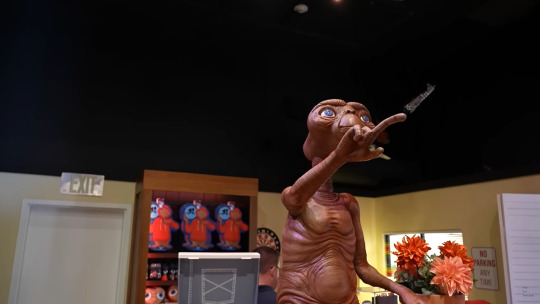


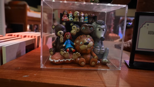


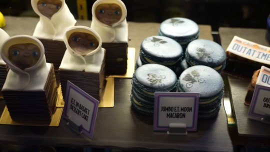
I recommend that if you're headed to the parks soon, you not only make sure to ride E.T. Adventure but that you also make your to the tribute store to see the wonderful theming and possibly get an E.T.-themed snack from the concession!
Screenshots from: TheTimTracker
☆☆☆☆☆
youtube
I would also like to say that while I do post articles and videos from WDW News and Universal News I am not affiliated with them in the slightest. They just seem to always have the most up-to-date and trustworthy news for the parks I've seen.
#Theme Park Answers#E.T. Adventure#universal studios orlando#Universal Studios#e.t. the extra terrestrial#Thanks for the ask Anon!
5 notes
·
View notes
Note
I was wondering if you had another source that otherlinkers were explicitly excluded from the original definition of otherkind in 1990? The source on AnOtherWiki leads to a 2001 FAQ that doesn't mention anything like that. Also, otherlinkers aren't the same thing as KFF.
(just as a warning, this is going to be a LONG post, but i'd rather not put it under the cut for archival reasons, in the case that for some reason this blog disappears)
firstly, i'd like to apologize for phrasing things as if KFFs and otherlinkers were the same thing; a better phrased way to say things would be for me to say that i think many KFFs would be otherlinkers, were they to acknowledge that their experiences don't fit the definition of otherkin.
something else i'd also like to note that i've been thinking about (while it isn't exactly related to this question) is that perhaps people are misinterpreting the terms "voluntary" and "involuntary".
i feel that many people think "voluntary" simply means the initial decision to willingly take on an identity, which is, in part, true! however, voluntary identities are very likely to become involuntary, simply because it becomes too emotionally/mentally difficult to separate oneself from the identity that they've chosen.
being drawn to something, or someone, enough to take it on as an identity can often be a sign of something deeper! i would see this as a form of awakening in and of itself—like cracking open a geode, or perhaps like putting on training wheels before you experience the real thing.
but back to your first question: the way i initially phrased that post was also rushed, as we were trying very hard to write it during a single lunch break at work.
the term otherlinker is a very recent invention (coined in 2018 on the alt-h discord server, while copinglink was coined in 2015 by who-is-page), as being otherkin has always largely been considered a serious, personal experience. only recently have people NEEDED to specify that it's involuntary, so the only sources i can give you are ones that cite otherkinity as being intended as a serious identity, as well as those that state that otherkinity is not as shallow as a game or roleplay.
also important to note is that many of these pages were made and existed before fictionkin were a largely documented (let alone accepted) presence, thus they are scarcely mentioned, (and typically with skepticism or even scorn,) save for on their own, smaller pages. for our own personal comfort, we will not be listing sources that discredit fictionkinity completely.
firstly, here's a full timeline of otherkin history by orion scribner, to show the scope we're looking at
Otherkin Lexicon by Orion Scribner: "Otherkin are real, non-fictional people who identify as other than human. Otherkin identify as creatures from myth and legend, usually elves, faeries, and dragons. This is a sincere identity, not role-play. Many otherkin identify as other than human for spiritual reasons; that is, they classify their identity as otherkin as a personal spiritual belief. Being otherkin is a very individualistic thing: each otherkin reaches his own explanation for how and why he is an otherkin. Some of their common spiritual explanations include that they are other than human in spirit, or they were other than human in past incarnations.187 Although spiritual belief is often involved, “otherkin” isn’t a religion. As such, each person who identifies as otherkin practices whatever religion he individually wants. It has always been the case that most of the otherkin community practices Neo-Pagan religions, and so that religious perspective shapes the common views and ideas in the otherkin community. Some otherkin don’t use spiritual explanations. Some otherkin believe that they are physically other than human, or that their ancestors were."
A Field Guide to Otherkin by Lupa: "The definition for Otherkin I will be using for this book is: a person who believes that, through either a nonphysical or (much more rarely) physical means, s/he is not entirely human. This means that anyone who relates internally to a nonhuman species either through soul, mind, body, or energetic resonance, or who believes s/he hosts such a being in hir body/mind, is in my own definition of Otherkin. Some people do have more stringent standards. However, for the purposes of this book, I am including a wider range of people.
"This is not a roleplaying game. When a person says s/he is a dragon, or a wolf, or an elf, s/he is not referring to a character that s/he only becomes during a gaming session. That which is Other is a constant part of the person; s/he is the Other at all times. Grey, a wolf therian,says it marvelously: “Perhaps I should say that if a being is a color, or a sound, I am two items merged to form a different color/sound. The two are within each other. Sometimes plain to see, sometimes deeply mixed.”"
A Simple Introduction to Otherkin and Therianthropes by Orion Scribner: "Some real people think of themselves as kinds of creatures from mythology. These people call themselves “otherkin.” An otherkin has the belief that he is a creature from mythology, such as an elf. He says that elf is his true self. It is his identity. This is real to him. It isn’t a pretend person that he plays in a game."
The Otherkin Resource Center: "1 : one who identifies with various mythological archetype as vehicles of spiritual evolution and self-expression, similar to Native totemism only with a stronger level of self-identification.
"2 : someone who believes in reincarnation, and that not all of their reincarnations were as a human."
What are Otherkin? by Tirl Windtree: "By far the most common explanation from those who fit the definition (even if they don't claim this specific label) is that whilst their physical forms may be human, their essence, soul or equivalent term is not.
"Of those, the majority make their claim based on reincarnation - what they have been in a previous incarnation so strongly affects their current incarnation that they still identify with it. Obviously this requires a belief in reincarnation, and in the transmigration of souls. Both are reasonably common in a number of religions and spiritual beliefs across the world."
"The most frequent accusation is that all otherkin are lost in fantasy, they've played one too many D&D games and gone over the edge. Personal study seems to indicate this is actually one of the least frequent explanations. Most roleplayers know they are roleplaying, even if they are also otherkin, and roleplaying can be a very useful tool in self exploration."
The Lostkin Project by Gazer: "Otherkin are the supernatural among us. They are the elves, dragons, nymphs, and trolls that used to live more openly amoung humankind. Some are from other dimensions and other places. You may occasionally see them refered to as Otherkind. Otherkin is the more generally accepted term."
Otherkin Coalition by Kreyas: "What is Otherkin?
In a nutshell, Otherkin are a coalition of people who share in common the belief that some internal part of them is somehow incongruent with the rest of the human race. Beyond that, beliefs vary too widely to classify them into any one group.
Some of the most common beliefs are that the soul is somehow different from human. This may go in hand with a belief in reincarnation and “imprinting” (in which a past life as another species leaves an imprint on the soul which is then carried over into the next life), or the individual may believe that this is his/her first life and they are simply different.
Above all, Otherkin is a spiritual belief.
"Are Otherkin really a bunch of delusional, socially maladaptive kids like I read on that website?
NO. As with any group, not everyone fits the stereotype. Any community is going to have its bad apples which stand out in people’s minds better than the typical members. In my experience, Otherkin are usually levelheaded and able to question their beliefs and function in human society.
"Is it a Roleplaying thing?
NO. While some Otherkin may participate in roleplaying, strictly speaking the beliefs are separate from the roleplay - even if they are roleplaying as their identified “kintype”."
Otherkin FAQ v 4.0.1 by Arhuaine, Miaren Crowsdaughrer, Thistile Kachunk, Golden Syrpent, Knight of Ghosts and Shadows, Jarin Dreamsinger and The Crisses: "The Otherkin are those people who believe themselves to be spiritually and/or physically other than human. While mythological species (elves, satyrs, fairies, dragons, and so on) are widely accepted as being included under the term "Otherkin", many people in the community prefer to include aliens, vampires, furries, extraterrestrial humans, and other nonhuman races. A mythological or literary equivalent is not necessary to be included under "Otherkin"; there are types of otherkin that have not shown up in known legends or fiction (star-dragons, Elenari, etc.)."
What are Otherkin, Anyway? by Adnarel: "Otherkin is a term that is generally used to describe people who, In some way or another, physical bodies aside, do not feel that they are “human” in the conventional sense of the word. We (they) feel as though their spirits are not human, nor have they ever been, despite our physical bodies and outward appearance. Some otherkin have testified that they feel that this is their first time on this plane of existence, a.k.a. Earth. Others feel that they have been here numerous times to teach and to heal people. Maybe once they were here in their “true forms”. Otherkin use the term “true form” to describe what they feel to be the shape and nature of their true selves."
What Are Otherkin? by Arhuaine:
"Put simply, someone who is Otherkin feels that they have a soul (or souls) other than human. Usually this encompasses what are commonly regarded as mythical beings such as elves, dragons, fae, satyrs and so on. A broader view of otherkin might also include therianthropes (were-creatures) and those with animal souls (such people are sometimes known affectionately as "furries"), and also perhaps people who consider their souls are alien (often called star-born). The lines between Otherkin and Furries or Star-born are often blurred.
"Most Otherkin feel for most of their lives as though they don't belong. Human society seems alien and unfamiliar in many ways. They may feel isolated and unhappy, yet unable to explain these feelings at first. Then, perhaps they may begin to remember a life other than their own. Sometimes it is not easy to understand such memories, and sometimes the awakening to Otherkin-ness is a difficult and frightening process, especially if they are going through it alone. It is something not easy to share with others, for fear that they may consider you crazy.
"Being Otherkin is not something to crave, nor is it glamorous. It is a difficult and lonely path to tread, and sometimes it seems to bring only sorrow. Memories of loved ones long lost, a home that can no longer be reached, cause great pain. And yet, the life of the Otherkin is not all sadness. It is a life filled with wonder and magic, and a way of looking at the world that humans can never understand. Because magic is so much a part of an Otherkin's outlook, they may be drawn to Paganism or other New-age philosophies."
Are You 'Kin? by Gazer: "To really find out if you are otherkin takes searching. No, not on the internet, inside. You have to reach inside yourself and really look at yourself. This ,for the most part, is an inner journey. You have the answers, not me or anyone else. If you are otherkin then it is a PART of you, but you may be the only person able to find it.
The best others can do to help you is to provide pointers. Show you ways to search inside yourself, tell you how they found something inside themselves. We can hold a mirror up to you, but you won't see anything unless YOU do the looking, and what we see from our side of the mirror may not be the truth."
Otherkin Phenomena: "Otherkin are people who believe themselves to be something other than a human being on a spiritual, psychological, energetic and some even on a biological level, and choose to identify with that non-human fragment of themselves to the point where they count it as a permanent and ingrained part of their personal mythology and/or identity."
and there's plenty more! i'm just tired
i hope this helped answer your question, and perhaps gives others some insight as well!
41 notes
·
View notes
Text
WIRED

Chris Evans x Fem!Reader
Warnings: None
Summary: Y/N L/N and Chris Evans filmed a movie together and are asked to answer the Web’s Most Searched Questions. Pretty straight forward right?
Author’s Note: It’s 6:17 am here in California and I just wanted to make this, I woke up at 9 pm and I didn’t fall back asleep.
Love you!
~~~~
“Don’t touch me!” Y/N playfully slaps Chris’s arm as he laughs, “Oh, now you don’t want me to?” He asked, “You just get all sour on me now?” Chris turns to the man behind the camera. “Maybe she just didn’t get her coffee,” Chris mutters.
Y/N laughs. “Okay, let’s do our intro.”
“Who goes first? You? Me?” He asks, he shakes his head, “You go, you go,” He waves his hand. Y/N shakes her head, turning to the camera with a board in hand. “Hey fans, my name is Y/N L/N.”
Chris laughs, “Hi, and I’m Chris Evans. And we’re about to do a WIRED autocomplete interview.”
“Who should go first, you?” Y/N asks, Chris points to the board, “It has your name on it, so here, I’ll take it and you peel them off.”
“Aw, what a gentleman,” Y/N says, Chris turns to the camera witha childish smile, “I know. I am, am I?” He says.
“I just peel them off?” Chris nods, “Yep, just rip them off.” Y/N takes the edge of the strip. “Who Y/N L/N...” She tilts her head, “Wow, lacking some words there.” She rips it off.
“Who Y/N L/N look like?” The woman looks at the camera, “You’re looking right at her, people.” Chris laughs. Y/N smiled and reached for another, “Who was Y/N L/N...” Rip. “...date at the Oscars?” Y/N smiles.
“Uh, my first Oscars was my dad, he was happy to be there in 2010. I had my mom, my sibling and then my recent two were Chris Evans. And Chris Evans, he’s a very nice guy.” Chris nods, “Hm. I should meet that guy,” He says.
Y/N nods, “Yeah, you should.” Y/N reaches for the next, “Who is Y/N L/N... sibling?”
“I have a brother/sister, their name is S/N and I’m the oldest sibling and I love them.” Y/N takes the board and throws it behind them. “Next, where’s this guys board at?” Y/N asks. The camera man hands her the board.
“Who Chris Evans,” Y/N starts, holding the board, “Peel them off. Rip ‘em.” Chris grabs the strip, “Who Chris Evans look like?” He asks. Y/N nods, “He looks like Scott Evans, just a bit more taller and more shoulder mass.”
Chris chuckles, “When I was younger some people used to tell me I looked like Ricky Nelson.”
“Oh, yeah. You do,” Y/N nods. Chris reaches for the next strip, “Who Chris Evans date at the Oscars-Wow! Similar questions,” Chris says. Y/N laughs. “Well, it was my ma one year and then my sister. Then I had Y/N L/N at the Oscars with me.”
“Oh wow. How was she at the Oscars?” Y/N asked, Chris smiles, reaching for the next strip, “She was beautiful, would love to take her as a date again.” Chris rips the next one off. “What Chris Evans dog’s name?” Chris smiles. “His name is Dodger, he’s a mixed-breed boxer, I got him in the year of 2017 when I was filming with Mckenna Grace on the set of Gifted. I adopted him. Mostly I call him Bubba, that just... is what I say a lot.”
Y/N throws the board back. “Another!” Y/N takes the next board and Chris holds it. “All right. What is Y/N L/N...” Y/N rips the strip, “Like?” She hums. “I mean, I rather not describe myself I think it’s better for someone to say who I am in person.”
“She’s funny, gorgeous, good sense of humor, she’s just out of her comfort zone,” Chris says, Y/N laughs grabbing his shoulder. “Are you saying that I’m crazy?” She asked. Chris laughs, “No, I’m just saying you’re so outgoing!”
Y/N laughs, “You’re cute, let me continue. What is Y/N L/N... favorite food?” Y/N cranes her neck to think.
“I have a lot of food that I like. I make it a lot sometimes.”
“Y/N does make some good food. But pesto eggs, oh! You make the best out of them!” Chris says, Y/N laughs. “I’m not really much of a cooker, I just am really hungry! I might just have to go with pizza.”
Chris nods, “All right. All right. Good choice. She doesn't make pizza but that’s something.” Y/N rips the strip with a laugh. “What is Y/N L/N’s first movie?”
“Was it Casper, right? In 1995? You were fifteen,” Chris asks, Y/N shakes her head. “I actually at the age of ten filmed in Home Alone in 1990,” Chris drops his shoulders. “What? You didn’t tell me that!” Chris says.
“I thought you’d know, I’m famous, you don’t look me up?” Y/N laughs with Chris, “No, I don’t because I should hear it from you!” He laughs, “Talking is better to know someone than to know them from a website.” Y/N leans forward in laughter as she hides her face on his shoulder.
He looks at the camera, “I didn’t know you worked with Macaulay Culkin! That was-Oh!” Chris claps his hands, he laughs against her.
“How did I not know you were one of the kids? Now I remember who you were!” He grabs his left boob laughing. Y/N pulls away from his shoulder and wipes the tear under her eye, “Gosh, we can’t even read the last one. We still have to do you!”
“What is Y/N L/N’s boyfriend look like?” Y/N looks up at Chris. “He looks like Ricky Nelson.” Chris laughs. Chris throws the board behind him. “All right!” Y/N pulls out another board. “Here’s another, babes.”
Chris looks at it, “Did Chris Evans... rip a log in half?” Chris shrugs at the thought. “I mean...”
“Yes, he did,” Y/N says, Chris smirks, “Yeah. I mean, it was made out of styrofoam? I don’t know, it’s nobody’s business,” Chris shrugs. “Did Chris Evans... quit acting?”
Y/N holds her hand out to him, “He’s right here.”
“I’m here, aren’t I?” He says. Y/N smiled, “Another one.” Chris looks over to the board again, “Does Chris Evans drive?” Chris smiles, “Like a champ. I have speeding tickets to prove it!” Y/N laughs.
“Does Chris Evans have a brother?” Chris says, he nods. “Yes, he does. Funny guy, love him,” Y/N says.
“His name is Scott. He’s very talented, very funny.” Y/N throws the board behind her. “I’ll clean that up later,” She said, Chris chuckles. “This is really fun, I like these questions,” She hands Chris her board. “They are pretty fun. We learn about each other, I guess, since you didn’t tell me you filmed in Home Alone-”
“Hey, I thought you knew! Stop it!” Y/N playfully hits him. “Where did Y/N L/N grow up?” Y/N asks, she turns to the camera, “I grew up in my home,” She says, causing Chris to laugh. “That’s true.”
Y/N reaches for the next strip, “Where did Y/N L/N start acting? Oh, that’s a good one,” Y/N says, “When I was young, at the age of 9, my mom and dad moved us to New York and I managed to start auditioning for films and I ended up in my first movie, Home Alone and so I started acting in New York.”
Chris grins, “Last one. I think-”
“Yep. Where is Y/N L/N today? Huh? Weird question but I’m here. That’s where I am now,” Chris laughs as he drops the board down. “Okay, this is our last one!” Y/N says, Chris grabs the board and hands it to Y/N.
“Do the honors, babes,” Y/N says, Chris looks at it. “Does Chris Evans actually sing?”
“Yes! He does!” Y/N says, pointing at the camera, “He may reject this fact but he does sing! He sings me to bed sometimes,” Y/N says. Chris laughs, “I do not sing her to bed, she actually does.” Y/N laughs.
“Can Chris Evans tap dance?” Chris asked, Y/N smiles, “That I can do. I can’t sing, but I can tap dance.”
“You’re gonna have to show me some tap dances. You dance like the penguin from Happy Feet that’s why he’s cute when he does them.”
“I can do some soft shoe in the hallway after this camera turns off,” He mutters, reaching for the next one. “Can Chris Evans drive?-What is going on with me and driving? Yes! I can drive very well! I’m a grown up,” Y/N laughs as she leans against him.
“That was some good questions,” Y/N says. Chris nods, Nailed it! Give me five, babe,” Chris holds up his hand to her and she gladly high fives him.
“Yes!”

~~~~~~~~~~
RANDOM TAGS (even though they’re the same people I’ve tagged multiple times) : @joannaliceevans-fanficblog @jtargaryen18 @luvinchris @chris-evans-imagines
Want a tag? Just ask, I’ll be happy to tag you!
820 notes
·
View notes
Text
All The Rage: Chunky and Colorful Resin Rings
If you’ve been paying attention, you’ve noticed that the bold and chunky resin ring look has made a big impact on fashion styling. For those who are late 90’s babies like I am, this accessory trend will be right up your ally.

Link
This look comes from playing up on the late 1990’s to early 2000’s nostalgia. As a child my sister and I would play dress up and adorn chunky colorful plastic jewelry, I’m sure most of us can relate to this experience, and that is what makes the look such a hit. As adults we can have the same experience of playing dress up with our chunky rings, but this time around make it chic.

Link
This trend gained popularity from those following youthful Instagram and TikTok fashion bloggers. Refinery 29 states that, “On TikTok, #resinrings has over 5.6 million views, while #plasticrings has almost 200,000. #Clayrings — another ring trend — has 14.2 million views.”

Link
Across these social media and photo sharing apps is where we can find these bright and colorful rings lining the fingers of numerous users.

Link

Link
The best way to style these rings is by the handful, wearing multiple rings across both hands is what really defines this look.

Link
While this trend will be meaningful for those in their mid to early twenties, teens are also loving the look since the colorful rings are a great accent to their colorful nail designs and this trend is very cost effective.

Link

Link
What we’re loving about this trend is that these rings of ten look like something you could win from a gumball machine or bring back home from summer camp. The DIY-esque look to this trend is really helping sell the look to those who have an arts and crafts style.

Link
Run, don’t walk, to go get your own resin rings this season. They are easily accessible on websites such as Etsy, Depop, or even Amazon.

Link
Catch up with us next week where we’ll be giving you the scoop on accessorizing with gloves.
-CB
8 notes
·
View notes
Photo
Master Levels for Doom II.
By various authors.
1995.
https://doomwiki.org/wiki/Master_Levels_for_Doom_II
MAP01: Attack
This is our first introduction to the iconic maps of the Master Levels. Created by Tim Willits and his sister, Teresa Chasar. This is a medium sized map with a boxed design that manages to establish a good sense of progress with a bit of dynamism and balanced combat. Taking into account that it's 1995, this is a decent/solid map that, if we play it in the order I'm using (Xaser's order) works as a good start to this classic collection. Interesting to know that Tim Willits' story is one of, uh, quite the polemic stuff, but it is also good to know that he did not do this as a lonely map, on the contrary, he made these maps with his sister. Quite an interesting story and an equally fascinating map.
MAP02: Canyon
Canyon, second map in the order of Xaser, is also the second map made by Tim Willits and Theresa Chasar. We start with an abstract arena of combat with a few pillars and multiple directions to advance. The use of items is favorable enough to compensate the instantaneous combat. Surprisingly, although not so visually appealing, this map has certain areas that have their own unique appeal, such as a catwalk with a small acid pool and a beautiful green waterfall. What stands out the most in this solid map is the unique and well designed progression, being simple but always maintaining a constant rhythm that makes us move without major stops. What can you expect from one of Id's lead designers?

MAP03: The Catwalk
Christen Klie is the author of the third map of the Master Levels. An author with a fairly prolific track record during the 1990's that would capture the attention of Id Software and then other companies like LucasArts, The Catwalk is a mid-sized map that encapsulates the early art of mapping during the 1990's. An amalgamation of different designs that tries to recreate together under the same progress, along with interesting quirks that give it a certain flavor of adventure and a little bit of discomfort. This is a simple map that stands out more for its layout than for its simplified and tight gameplay. The one titled Catwalk is actually only part of the end of the level, but leaving that aside, this is a pretty interesting attempt to create something distinctive but still relevant. Did it succeed? I'll leave it to you.

MAP4: The Fistula
Another map by Christen Klie. This one appears also on the PS website, being the sixth map of the first episode. This is a medium size map with a claustrophobic design and a somewhat forgettable layout. Confusing at times and with a somewhat mediocre gameplay, it's a map that fortunately ends quickly so we shouldn't hate it too much.
MAP05: The Combine
Christen Klie certainly designed a lot of maps, with at least a quarter of the Master Levels being made by him, sharing the honor with the legendary Dr. Sleep. The Combine is a medium sized map with a rather abstract design that actually reveals without any problem the year and the design philosophy it has. With a large number of doors, meaningless roads, alignment errors and a few hesitant design decisions, this is a map that is at best mediocre. Only about 65 enemies in UV but it can take us more than 8 minutes to find the exit despite being a relatively small-medium map. Interestingly, Chris' maps seem to drop in quality as we go forward, this is probably the one I like the least.
MAP06: Subspace
Oh boy. What we have here is an interesting and classic attempt at prog mapping in the 90s by Chris. Tricks, uh, interesting, plus a somewhat strange progression and a confusing layout. Visually we don't have to wait for anything, they are 100% stock textures without any creativity. After that we have nothing more interesting than a floating switch that until today I wonder: What was the idealization process to create such a thing? This is a map that seems to stand out only because of the innocent charm it has, but stripped to the bone, it is rather mediocre.
MAP07: Paradox
Now we have more interesting things. The first and only map by Tom Mustaine (not related to the famous guitarist and singer) and an interesting example of good design, layout and not-so-raw gameplay, but totally uninspired and with very bland visuals and ultimately, a very lost layout. Trying to find that red key is a pain in the ass or just a walk-in-the-park, 50 / 50, and that really lowers the overall fun of this map.

MAP08: Subterra
Christen Klie is back with another map that starts quite hot brings an interesting gameplay curve all around. A design that for to point I consider typical of Chris: varied rooms connected to a central path as well as a bizarre search for keys. He seems to focus more on finding an avant-garde design. This is a map, like his previous ones, doesn't stand out at all for its visuals but at least it defends itself a bit with a somewhat rough but challenging gameplay. Some acid softlocks and pit with no exit may slow down progress, and the confusing path system goes into some unnecessary roads that bog down progression. Not a good map, to be honest.
MAP09: The Garrison
More square than ever and with a somewhat gothic visual style. At least it's not completely brown. What we have here is another classic example of Christen's maps. They are not funny. They are pretty rough to look at and play with, with a cryptic and unfair progression system. There's not much I can say, maybe just defend it with the fact that it's 1995, but still, other mappers do a much better job. This is not a good map but luckily it is the author's last one in the Master Levels.
MAP10: Black Tower
Here we have something quite interesting. A massive level created by Sverre André Kvernmo (Cranium), an author who would remain active for almost 2 decades (although a little sporadically and with a few hiatuses). This is the first truly massive map in the Master Levels, and also one of the most creative thanks to its interesting progression system that, despite being quite lost, feels like a real exploration adventure of the 90s. A big black tower in the middle of the map where we will have to search and find all the keys through teleports, rooms, traps, etc. This is a pretty decent map that manages to entertain for the 20 to 30 minutes it lasts. It is big, no doubt, but in its well-made creativity and quality of the 90s, it is one that manages to be successful.
MAP11: Virgil’s Lead
Created by the legendary Dr. Sleep. Virgil's Lead is the first map of Dr. Sleep in the Xaser Master Levels order, continuing with our adventure we now have a mapper who acquired a legendary status for his incredible vision and fantastic mapping skills. This map is a testament to his ability to create even during 1995. A medium size map with a very characteristic style that reminds me of the visual theme of Thy Flesh Consumend. With a good progression, an entertaining breakthrough and a well balanced challenge as well as well defined examples of architecture, this is a great map that is part of the famous Inferno series.

MAP12: Mino’s Judgement
Dr. Sleep established a legacy thanks to his fantastic contributions to the community and his great signature style that would later inspire a multitude of new mappers. This style can be well appreciated in this series, part of the Master Levels. Minos' Judgement follows the same remissive style of E4 (marble and tight architecture) with a nice unique touch that gives it a very appreciable atmosphere. This is a bigger map but with a much more complicated style that in spite of having a multitude of interconnected roads, we always manage to know where to go and how to go. Progress is key and the gameplay feels incredibly satisfying because of that. Apart from some fantastic visuals for the 90s, this is a good map in every aspect.
MAP13: Nessus
Dr. Sleep continues to pamper us with his fantastic maps. This is a simpler, more modest one with a simple and easy to understand layout without any unnecessary complexity. The progression is designed to make you go through the whole map twice but offering different paths and a dynamic combat with varied enemies, as well as different encounters and solid visuals.

MAP14: Geryon
Geryon: 6th Canto of Inferno by Dr. Sleep, part of his classic Inferno series. This time around we have a more simplistec yet fun medium-size map and a more palpable modesty. With a style that encourages adventure/exploration, this is a map that shouldn't be too difficult but fun enough to finish without problems. It highlights the final area where we have a good battlefield, creating a palpable and appreciable style.
MAP15: Vesperas
The last entry of Dr. Sleep's Inferno series in the Master Levels. It is a medium sized map with a box design that promotes constant combat under different tight and open areas, making use of plenty of teleporters and monster closets. Challenging but surmountable! Ammunition can be a problem. Unfortunately, this map is a bit lost and it can be slightly annoying to try to find the keys, which do not seem to be very visible. Starting with the fact that if we don't know that there is a small invisible ledge that leads to the yellow key, we will probably have a good time wondering what to do. In spite of that, this map rewards us with a good and exciting gameplay.

MAP16: Titan Manor
Here we have the first map by Jim Flynn. Titan Manor is one big boxed manor set in the moon of Saturn, Titan. What appears to be quite simple on the outside reveals an intricate layout on the inside, with good attention to detail (for 1995) and several routes to take as well as secrets to reveal. In spite of having an interesting design and promoting exploration, this map has a rather cryptic and difficult to understand progression system; designed based on hidden switches, tiny platforms and other things. Expect to spend a lot of time trying to find your way out if you don't have a guide.
MAP17: Trapped On Titan
This map feels like a direct sequel to the previous Titan Manor, but now we are stuck in Titan. Or something like that. It's a map that combines elements of abstract design with areas that try to look like cities or urban settings, all with a good dose of weird but understandable progression. This is a difficult map, you have to say that. The beginning and the middle are quite tight and the items are usually hidden in unofficial secrets or other areas. The end is also a hot one but if we were careful we should have enough HP, armor and ammo to survive. In general, this is a pretty solid map that has a particularly hot design that makes it attractive for those looking for challenges. It is not as lost as the previous one so that is an extra point.
MAP18: The Express Elevator To Hell
I had been warned a little about this map... I see why. What we have here is a clear example of an original and fun idea but executed in a wrong way and too much of a novice. The essence of it is to cross a map with an elevator that takes us to different paths that we need to travel to complete it. The problem is that such an elevator is a bit annoying to use, the enemies are too many and in places with 0 maneuverability and by the way the items are very short, resulting in a map of very high difficulty that does not feel satisfactory. Especially the final area, ugh. I have mixed opinions about this adventure, but it's not all bad.
MAP19: Bloodsea Keep
Another map by Sverre André Kvernmo who seems to have a little creativity in mind. I had high hopes for this map, since I like the idea of castles and fortresses, however, this is a classic example of a beautiful design ruined by a terrible gameplay. The positioning of enemies is terrible and it is made with the purpose of delaying you as much as possible while offering you the minimum of ammunition to survive. There is no SSG in sight, only in the secrets that will not be so easy to find. Unfortunately, I can't give a positive opinion about this map since it cost me half a soul to finish it, at least I can say that its layout and design is attractive enough, although it doesn't manage to make synergy with the clearly outdated gameplay.

MAP20: Mephisto's Maosoleum
This one feels like the previous one. An interesting (though clearly outdated) map that is on the theme of castles. It has a slightly more interesting gameplay and offers more interesting alternatives. I'm not a fan of the fact that the vast majority of enemies are Revenants, which are not easy to balance on open levels. On the other hand, the middle of the map is interesting enough to be worthwhile, but the end is disastrous. This is a IoS fight but with only one window of opportunity to attack Romero. Such window is located in a super narrow corridor right next to the spawn point of the cubes. Totally absurd and unfair, but oh well, that's the end of it!
MAP21: Bad Dream
This is probably the most mediocre map of all, but at the same time, an interesting proposal. The last level in the Xasers order of the Master Levels and one of those levels that we would find with 1 of 5 or 5 of 5 stars in /idgames. A simple enormous circular level with dozens of Cyberdemons and a single Spidermastermind that blocks our way. The trick is simple: make the Cyberdemons attack the Spidermastermind and then run for our lives while we pick up the keys one by one. The roof will start to crush us slowly so it's a matter of repeating the process until victory is achieved. What else can we expect from a secret level of the 90s?
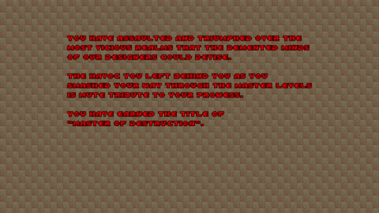
End textscreen.
Overall:
Master Levels for Doom II (1995)
By various authors
Let's travel in time. Let's go precisely to the year 1995, on the date of December 26th. It is practically a post-celebration day for many and some are even still resting and recovering from Christmas hangovers. It is a time of celebration and joy for many, and for others it is just another day. But... for some people, somewhere in the world, it is a unique day of premiere in which they will see things they never imagined before. For some Doomers in whatever part of the world they were, possibly the US, it's the day the legendary Master Levels for Doom II was released. Iconic, dear, mixed, hated, infamous, etc. There are many opinions about this particular collection of 21 maps for this fantastic game. Some talk about it with positive voices and memories of nostalgia mixed with a hint of longing; others despise it and consider it as a mediocre point in the life of Id Software where they only collected a bunch of levels and called it a day. Well, that is true, indeed. Master Levels for Doom II is pretty much that: a collection of 21 maps from different authors that range in quality and quantity, sometimes going from the very best that 1995 had to offer, to also the very worst that we can find, all in vanilla, lovely vanilla flavor. Well, then, what makes it so special? We could start with the simple fact that this is an official release from Id Software, which in theory could be considered a curated list of maps that the boys considered worthy of release during 1995. Something we would never see again with this style. Of course, there are many collections of shovelware with different styles and certain legends behind them, Maximum Doom is a good example (which is included alongside the Master Levels but that's another beast for another day) but probably the only underground collection with true legendary status is this one. The Master Levels are a distant memory of past times, of creative nostalgia and stages of immaturity. This is vanilla beauty and also inept ugliness. Mediocrity and fantasy come together to give us a bag full of gold and dirt. Here we have a piece of history, and like any story, it can be as ugly as it is beautiful. This is a relic of the days of yore, and one that I’m about to give my honest opinion and also some words of exterior retrospective. So, shall we?
The Master Levels for Doom II is a collection of 21 maps by different authors, ranging from some well-known community legends like Dr. Sleep, to even some authors that would later become official Id members, like Tim Willits. Created with the purpose of making direct competition to the rest of the creators of collections/compilations of shovelware, according to the words of the Johns: to "give the D!ZONE guys a run for their money." In that I think we can agree on that they did achieved it. While other collections are not as well known to this day, much less played, the Master Levels even have a certain cult category that gives them relevant popularity among Doom fans. Surprisingly, Maximum Doom probably has a more representative but equally interesting cult next to the Master Levels.
Most of the maps that we find here are from already existing WADs released previously by their creators, such as the Inferno series by Dr. Sleep. According to Sverre Kvernmo, one of the authors, most of the stuff was hunted by Id Software looking for some skilled mappers who might have some unreleased material, hence why this is more considered of collection than a properly made WAD. Some maps have special touches to give them some quality value, while others are in their pure and raw state no matter what. Inside you go and inside you play. In spite of that, the Master Levels have a certain air of born quality that we can detect without the need to make further extensive analysis within the range of levels that we will find. Of course, these are not the best maps of 1995, but they certainly have a certain touch of quality. Taking into account that this is 1995, a stage in which the level editors were not yet as convenient as they are now. Primitive tools, primitive maps. But don't let that fool you, the primordial state always has appreciable qualities even if hundreds of years go by. After all, it was called the Master Levels for something. The levels here were published with the idea that they would be of the highest quality, almost elite, making an allegory to the fact that their authors were masters of such creations. We only have to look at the ad of the Australian magazine version to read: ''Dust of Doom II, because now the master creators bring you...'' So, yeah, this was going in with quite the spiciness.
But in the end, does it manage to meet these high expectations? Well, that is quite hard to say. How can we compare it in current years? That would be unfair taking into account that even the best of the Master Levels looks pretty dull and boring compared to some recent stuff that has come out. Yet, how was the game for 1995? Well, things get interesting if we start to look at it from a more... antique perspective. Sure, playing the Master Levels in 2020 or 2021 probably isn't the most rewarding experience in the world, but I still have to admit it was fun. But what about going to 1995? Remember, this is before Final Doom and other projects that would revolutionize map design philosophy and change the world of WADs. This is 1995, Thy Flesh Consumed had just come out a few months ago so there wasn't much competition between official Id products. But competition between PWADs? Well, Memento Mori came out just a few days ago, the closest I can think of to compare between a community-made WAD but, of course, not Id released. Both are pretty iconic now a days, with Memento Mori probably being more played now a days. On the other hand, Memento Mori does suffer a bit from being outdated for today standards, and well, so does the Master Levels, yet, for 1995? Oh boy, I’m pretty sure these things were like gold bars for a Doom enthusiast.
I can’t say much about relating to that kind of experience, but I can try to, at least, lower my perception and look through a different kind of mirror into the past.
For 1995, the Master Levels are pretty solid in much of their levels. Heck, even the bad ones could be acceptable in 1995. As a matter of fact, I’m actually willing to say that most of the levels found here are superior in their overall quality to Doom II. Quite the fascinating subject of study but looking it in a more closely way, we begin to appreciate the kind of work that this collection offers, but to do so in a fair a just way, we have to look at each single of the authors in the Master Levels.
Going in with just the general order that the Doomwiki has, we start with:
Dr. Sleep: Legendary mapper and one of the earliest WAD masters that actually deserve the title. A great artist who stood out for his great ability to create levels that were as aesthetically appealing as they were fantastic to play; a stylized progression that combines gameplay elements as well as a classic example of early synergy with level design and enemy placement. Creator of the iconic Inferno series, five maps from this series are present in the Master Levels. Each of his maps stands out for having a fantastic presentation that makes great use of geometry and innovative attention to detail. From Virgil’s Lead to Vesperas, these are classic levels that are really worth playing and manage to stay relevant after all these years thanks to having good progression and a solid gameplay that will offer us good minutes of fun. Even if some of the areas of some maps can be seen as a bit old-fashioned for current years, his maps still manage to hold their own thanks to the simple fact that they are fun to play, even in today’s date.
Jim Flynn: An interesting case study of a mapper who seems to have ambitious ideas and even a bit of narrative. Creator of two maps, Titan Manor and Trapped in Titan. Flynn has an interesting style where he embraces more to the great and big, than to the modest or simplistic, straying from the traditional style of small levels with tight interiors. Its maps have a mood of adventure and exploration that seems to be clearly designed with the purpose of giving the player a few minutes of thought. Unfortunately, this is why his maps are the tardiest of all the Master Levels, with some very hard-to-understand progression, which can be somewhat detrimental to some players.
Christen Klie: Klie did six total levels for the Master Levels (curiously enough all his work was published in 1995, and then he just stopped doing Doom WADs) making him the most prolific mapper in the group. Unfortunately, as the saying goes, number does not equal quality and Klie offers several maps of very questionable quality. His maps, for 2020 or 2021, are horrible, but even for 1995 I think they are rather mixed examples of level design. They tend to be simple in presentation and their size is usually around medium to small, but it is in progression and gameplay where I really think he fails. his maps are lost, cryptic and with a style that makes us scratch our heads numerous times, which damages a lot the general quality. Interestingly enough, he would then make a multitude of other maps to release for free to the community, including a megawad and some maps for Heretic. So at least for that, thanks for the content, I guess.
Sverre André Kvernmo: Oh boy, this is the guy most people point at when talking about the hard levels of the Master Levels, cause let me tell you, his levels are tough as nails. Sverre aka Cranium, gives us a total of five levels for the Master Levels, ranging from interesting concepts to living nightmares in terms of design and difficulty. His best map is probably Black Tower, a concept map that stands out for offering an interesting adventure through different areas connected by teleporters. The map suffers a little bit of bad progression, but it is good enough. On the other hand, the rest of his maps are rather challenging to play with in every sense of the word. A bit lost, but always offering interesting original concepts although somewhat poorly executed. I can't say much about Sverre, their levels are solid for 1995 and have the charm of being challenging, except for Bad Dream which is a joke practically. After that, it's an interesting mapper that reminds me of Jim Flynn style. Sverre is also the only mapper that still contributes to the community in modern times, albeit quite sporadically. His last map was in released in 2016, after all.
Tom Mustaine: Not related to the famous metal guitarist and singer. Mustaine only contributed one level to the Master Levels, so there's not much to say about his overall legacy here, but he did have a special legacy elsewhere. Concentrating here, his only level, Paradox, is a square map with a simple design and too brown, but making use of an interesting and dynamic layout that allows a good fight and feels fun, even if a bit raw. After that, Mustaine, unfortunately, didn't contribute with more levels to the Master Levels. On the other hand, his legacy extends to multiple commercial projects, contributing with several maps to projects such as TNT: Evilution, Perdition's Gate and Hell To Pay. Also, he did other contributions to community projects like Memento Mori and even made music for Icarus and TNT: Evilution. A prolific author for the 90s, no doubt. A pity he didn't continue with the contributions. I think he would have achieved an admirable style among the community.
Tim Willits: The last ‘’Master Creator’’ of this article and probably the most infamous of them all. Willits is well known within the Doom community for becoming the studio director and co-owner of Id Software for over a decade, eventually leaving the company during 2019. Not well liked for his hot-takes and somewhat ass attitude, which has given him a bad reputation even among the gaming community in general, but now we will focus on another point that is often obscured by his previous bullshit. Willits is practically the dream of many mappers and designers in the community. He was recruited by Id Software after impressing them with his Raven and Empire WAD series. His levels were no doubt at Id's level to get him to join the team, since, we can see with his contributions to the Master Levels. We can quickly see that he had a special flair for level creation. Attack and Canyon are his two contributions to this collection. Maps made with the help of his sister, Theresa Chasar, of whom there is not much information other than that she co-authored many of the Willits' maps. Its two maps are solid and of a good quality, enough to offer a good entertainment thanks to a somewhat adventurous progression but always maintaining a constant rhythm that does not stop in terms of flow or combat. Making use of a little bit of abstract or surrealistic designs, Willits delivers two solid maps that are fun to play with. I wish he would have refrained to that alone.
As we can see more easily, this collection of maps brings 6 (or 7) authors of different ranges to give us 21 maps of different quality. Each author has, in one way or another, a certain style or set of characteristics that give them a distinguishable touch, either for good or for bad. Much can be said after so many years, but we always have to take into account that this is a work that was made almost 3 decades ago. Almost! That is quite a long time and a great testament to the fantastic work of conservation, perseverance and constant classical appreciation that this community possesses. We can see that these maps are, for lack of a more sensual word, ancient for modern times, and they show it in all honesty. Misuse of textures, confusing layouts, abstract themes, original but poorly executed concepts, boring and simple visuals, etc. But just as we can see the mistakes at first sight, we also have to be able to change our perspective and see what they did well with effort and a certain charisma. Original, creative maps, extravagant layouts, palpable design philosophies, different themes for each author, adventure designs, exploration capabilities, etc.
The Master Levels are, in one way or another, a master creation of different maps by different authors that all manage to have a distinguishable trademark. Launched on December 26, 1995, it is a creation as fantastic as it is terrible. Constantly changing levels of quality and style that show us different ways to play as well as paths to take that can lead us to rewarding exploration or to get lost in the pools of frustration while we are constantly struggling: Where the fuck do I go from here? That's what the Master Levels are all about. They may be a mixed box for these times, but I can't repeat again that what we have here is a piece of history that deserves all the attention it can get. This is just a glimpse of what the future holds. We have mappers who showed us the capabilities that our community would reveal over the years to come. We have mappers who would also show us the ugly and mixed face of many of the maps that would plague us for eternity. But, most of all, we have a collection of chocolates of different flavors ala Forest Gump. You don't know what you'll get, but you know you'll eat it and you know damn well… it is a chocolate. A tiny fraction of taste, of flavor. Just a small piece of candy for you to enjoy.
Personally, I had a lot of fun going through this historic delivery. Perhaps it is because I consider myself a historian and archivist of any piece of knowledge or content that exists. I like the idea of numbers, I have to admit, but I am also a lover of quality like everyone else, but, above all, I am an admirer of variation. The Master Levels present us with both factors, a trifecta of a fascinating odyssey: There is number, there is quality (in part) and there is a lot of variation. All this together and we have a piece of history that can never be erased from this world. They may not be as well-known as Final Doom or other installments, but the Master Levels are still a milestone that everyone should play, if only for the simple retrospective value it offers. After all, the true taste is found in tasting everything, until finally understanding each flavor. The Master flavors.
Fun fact: The Doom Master Wadazine name is inspired by, yes, indeed, the Master Levels.
Fun fact 2: And pretty much anything I’d do is going to carry Master as part of their name/title. Sorry not sorry.
7 notes
·
View notes
Text
Tom and Jerry 2021 Review: It’s Almost Adequate!
Hello you happy people, and welcome to a surprise review! While this was on my schedule, I moved it out to make room for my new Patreon Sponsored review. Yes at the 5 dollar tier you too can get a review a month.. but enough shilling. Point is I had some thoughts on the film, and felt I could squeeze a review of it into the schedule since my review for yesterday, the 90′s Tom and Jerry movie, got canceled as I both had to finish up my tex avery birthday review and hadn’t noticed it wasn’t on HBO Max like I thought. I could’ve sworn it was once but not anymore. Gee it’s almost like they removed their overtly awful Tom and Jerry movie from the service so people woudln’t be reminded of it when they watched the mediocre new one. Or it was never on there because HBO wants to bury that mistake in a hole. You make the call.
Point is I had some room in my schedule, so if I can’t cover the 1990 movie this weekend, though I FULLY intend to still do that at some point as it still fascinates me, might as well cover the one everyone’s actually watching. So join me under the cut with spoilers to go into why this film is .. ehhhh. under the cut

Tom and Jerry follows, as you’d expect, our working boys up to their ass in shit, what is this buisness. In this case Tom literally rides in on a rail with his keyboard wanting to be a big musician one day, while Jerry is shopping around for a home but can’t find any in his bracket. The two end up fighting, as you’d expect, when Tom performs as a blind cat in a park, a great gag, and Jerry first steals his customers by dancing to his music, but then when Tom tries to stop him, not only exposes his scam, but gets Tom’s beloved Keyboard broken.
In the process of Tom trying to get Jerry back for runing his day, Tom ruins the day of Kayla, a cynical young lady played by Chole Grace Moretz who like Robin in the last theatrical film, is a blonde girl who takes up way more screen time than our heroes for some reason. Tom accidently destroys the clothes she was sent to deliver, and she gets fired from her Task Rabbit esque job... despite the fact that TaskRabbit is app based, entirely built around how you do jobs for hire as needed, and that at most she’d get a bad review and that the app dosen’t actually hire people. I know this both because i’ve seen the apps and parodies of it show up on tv shows I watch, most recently Close Enough, and because I took the 2 minutes it took to google it , read some of the Wikipedia article and do the bare minimum that me, a paid only by commissions and patreons reviewer, did to prove a point, and that the writers of this film, who likely got paid at least 10000 for a rewrite, and more for whoever wrote the treatment, which is about 30,000 at lowest as told to me by this article on what screenwriters get paid I looked up solely to prove a point. So they got paid tens of thousands of dollars, probably more than standard... to not spend 5 minutes looking up what task rabbit is, becuase they wanted to give her a “hip” job instead of just having her work for a dry cleaner. Then again they got thousands upon thousands to half ass it and i’m getting paid nothing to go on a rant about how they half assed it, so maybe i’m the dumbass, I dunno, but at least I take pride in my work. And i’ve had trouble spellchecking at times so take that as you will.
But so far the film is not bad: the slapstick is blended really well, the action is pitch perfect and our heroes are given good motivations: Kayla’s to find a job, Tom to play piano professionally and Jerry to find a proper home. You ready for some letdown?!
All three of our heroes converge at the Royal Gate Hotel, a prestigious hotel that’s been host to popes, dignitaries and Drake. Jerry sneaks inside, and soon finds himself at home and making himself home, Tom TRIES to and ends up getting on the wrong side of Butch, the black cat from the shorts played in this film by reggaton performer Nicky Jam. Why they choose him over a comedian or anyone who could actually act, especially since Butch dosen’t have a musical number or anything, is a riddle for the ages. My best guest, as it always is, is that Tim Story owes him a Wookie-Style life debt. Not only that but even more bafflingly Butch’s gang, who to the films credit like him are all his gang of cats from the classic shorts, are played by Kevin Hart’s Improve Troop, The Plastic Cup Boyz. I got a preview for what passing a kidney stone’s going to feel like just typing that name. I thought I had no explanation for this, not even a wookie life debt can explain how Kevin Hart’s posse, because he has one for some reason but at least unlike Adam Sandler he’s helping his smaller named friends get big instead of just promoting guys who really shouldn’t have a career or dragging poor guys like Shaq or Terry Crews into your bullcrap because they like you., can explain how this happened. But I forgot I looked up Tim Story’s filmography when I first found out he was director here, more on him later, and found out he directed both Ride Along films, both think like a man films, and one of Kevin Hart’s specials, so the two presumably are friends or at least have a solid working relationship, and given how successful the first Ride Along was for both men, I doubt Tim would turn down a favor from him and vice versa.
And while I find the Plastic Cup Boyz inclusion in this film bizzare and wish it was fellow comedy troupe and starkid adjacent wonderkinds the Tin Can Bros so I could get Joey Richter voicing an animated cat, they at least try their best, their just not given much to do and I don’t get casting them in these side rolls or not giving the butch role to one of them as Nicky Jam just sucks in the role. And I get Butch isn’t the most solid or complex character, but it still isn’t THAT hard, with the 80 drumloads of great comedians out there, to find SOMEONE better, and it’s weird Kevin Hart himself isn’t in the roll. If it wasn’t a wookie life debt i’m betting Hart was going to play Butch, had to back out due to scheduling conflicts or whatever, and Tim found the first guy he could who’d take almost nothing instead of an actual actor.
Kayla meanwhile somehow takes herself from sympathetic to wholly unlikeable in the span of the scene by maniuplating and terrifying a poor woman into not taking the job, outright STEALING HER RESUME, meaning if she screwed up this might go on the poor woman’s record, and lying her way into the job. And if the woman had been you know a classist dick or something, i’d understand but this is a perfectly nice lady who worked really hard, and who looses out on a job because some little bitch talked her out of it and then stole her identity. This one act really just makes me not care: It’s one thing to do what you gotta to get a job, I myself have never lied on an application but I get new york’s insanely expensive. Even if she presumibly lives in a hole that’s cramped, has roaches or rats, who given this unvierse probably have tiny tv’s that are still way too loud and binge watch way too much Jersey Shore at 2 in the morning, and is probably haunted, probably by Droopy wearing a bedsheet going boo but still, and yes he’s also alive here but he has identical cousins. Not the point. Point is even if she has sympathetic motives.. what she did is not okay and when she get flashes of guilt throughtout hte film it’s never long enough to feel like it’s not her simply feeling bad she didn’t get this herself and not that she STOLE IT FROM ANOTHER PERSON. Again if she’d FAKED her resume, this would’ve been fine, simply set up some websites, and it would’ve worked so why they went with this elaborate setup that takes her into outright crimes is beyond me.
Point is she gets hired by the manager/owner, Mr. Dubrois, played by Rob Delany, but since his name isn’t used enough i’m just going to call him Mustache Manager. Her direct superior whose against her being hired is Terrance, the Gate’s Event Manager played by a way too good for this film Micheal Pena, who sadly is given nothing to work with. Terrance.. is supposed to be the bad guy because he distrusts kayla. And while one of those reasons is stupid, she makes a joke about the goldfish being an aquatics manger and he takes it dead seriously, he’s rightfully supscious she’s not who she says she is, since one of the places on her resume is a place he knows people from. The only way the film manages to make him the bad guy is he is COMICALLY out of touch: he dosen’t get sarcasm, as seen before, dosen’t want people posting jerry to “snapgram or instaface”, and seems to have trouble relating to his guests. What makes this not work is that he’s manger at a ludicrously expensive hotel. As such a good chunk of his events would be for Celebrties, since New York’s a big hub for them, having tons living there and visiting for films, apperances on late night talk shows, SNL and what have you and being a prime spot for events and it’s clear part of his job is talking to the guests as the two the film focuses on, more on that in a minute, know him and have met him before. He also mentions Drake having stayed there... he would NOT have kept this job.
You’d need to do through research on these kinds of celebrates and social media is the easiest way to do that, to get what they like, what they don’t, what they don’t want to talk about, what scandals or gos might be going on to keep paparazzi out. I don’t even know how this business works nor did I google it.. and I didn’t to prove a point.. that even with no real idea how this works.. I still get what you’d probably need to know to make events for rich famous people. I’m not convinced Terrance knows how an internet works. And given writer Kevin Costello wrote the well received and weird film I still want to see Brigbsby Bear, I get the sense a lot of this nonsense was added in rewrites demanded by executives and credit him more for what works in the film. More on that in a moment.
Kayla is hired on because the Royal Gate has it’s biggest event ever, the wedding of Ben, played by Colin Jost, and Preeta, played by Pallavi Sharda. Why is it big? What do they do exactly? Are they trust fund babies? Did Ben invent an app? Did Preeta cure global warming? Did they both help defeat Galactus DEVOURER OF WORLDS?!... I dont’ know. If the film told me at all why their big names, even if it’s just because their famous for being famous which would be fine, why this is bigger than a fucking pope visiting, I missed it and I actually went back to their first scene and the scene where Mustache Manager brings up the wedding in the first place to Kayla, and found nothing. We just know their rich, their getting married, Ben doesn’t listen to Preeta and is insufferable, and that they own two classic Tom and Jerry characters: Ben owns spike whose played by Bobby Canavale who isn’t bad but dosen’t try to sound like spike at all and that annoys me given unlike Tom and Jerry, the former of whom’s signature noises from the cartoon were used archivally and otherwise dosen’t talk and only sings on occasion or does that wonderfully weird “don’t you belivie it” thing., has a distinct voice they could’ve got someone to imitate. The other is Preeya’s cat toodles, that white cat Tom is always trying to bang, who got a neat less anthro redesign.

Toots, Toodles whatever you call her the redesign works, making her more of a cat, and only speaking in meows for some reason, and combinging the two female cats tom’s liked, but while still being just funny animal enough that him wanting some pussy, so to speak, isn’t too creepy.
And this is where the film undergoes a bit of a shift. While the 20 or so minutes are rightfully focused on our boys with a bit of focus on Kayla, from here on out she’s our defacto lead. Given the last film did the same damn thing of making Tom and Jerry not the main leads in their own movie, you can see the problem. I will say to the film’s credit it is still LEAGUES better in a lot of other ways than the 90′s film in that the plot is actually centered around them: Jerry, when stealing some cheese, and runs afoul of the tempermental Chef Jackie played by Kim Jeong. Though i’m 100% not convinced Ben Chang didn’t just lie on his resume at some place and has now somehow become a michline star canditate. He finds Jerry, and Kayla volunteers to catch him to help her own career and validly points out her doing this discreetly with only the staff knowing about the mouse will keep it from becoming a social media nightmare.
The 90′s film could work without them, replacing them with any animal sidekick for Robin, since nit’s so far removed from Tom and Jerry their really an afterthought. Here the film DOES feel like a tom and jerry plot at it’s core, Jerry’s somewhere he shoudln’t be, Tom wants to chase him either due to personal greivance or his job depending on it, in this case both. The small side cast are all involved, and given decent if thin justifications for being there: Butch is an ally cat and Spike and Tootles are the pets of the happy couple.
And honestly the slapstick portions, the portions that are tom and jerry focused or use the humans well, are BRILLIANT. No really, it’s good stuff once in a while using a bit from the classics but mostly coming up with new gags and the animation is gorgeous. I won’t lie and say it’s always perfect, sometimes the models are a bit off and look unfinished and that’s not forgivable when you delay your film two months, and thus have extra time to work on that. But that’s a few shots here and there versus the majority of hte film where the various animals all blend perfectly. Unlike most Live Action adaptations of an old cartoon, this one actually seemed to have good reason, as they’ve taken the basic roger rabbit tech of decades ago and expanded on it well. Just like that classic you often wonder how the hell they pulled this off, and outside of one egregrous sequence where tom sets up an elaborate trap we spend far too much time on, when they do use CG for any props, you can’t tell. This is best highlighted by what I consdier to be the film’s best sequence and what brings Tom into the plot proper after lurking on the fringes for a good 15 minutes: Tom, miserable in the rain, finds jerry living it up in an empty room, and after some fun shenanigans trying to get in, finally succeds leading to a good 2-3 minute sequence of the two chasing after each other in the room. There are no actors, no one else and the room is empty, but perfectly gimmicked to time with thier movments. Wether they used cg and I couldn’t tell or just simply timed things great, it’s utterly fantastic and shows why this film is live action: while i’td be fine animated they cleary ahd the tech and ideas to do it live and thus did it this way. Naturally Kayla meets Tom again, and after finding out the room was trashed by both him and Jerry gets Mustache Manager to hire him.
But this is the problem: While there are great set pieces like this, or a REALLY damn impressive one later where Terrance gets dragged into a ball of violence while walking Spike for Ben and we see INSIDE IT, with Terrance not moving as fast but that being okay. And I love the movie’s commitment that ALL animals are animated. So it has it’s charms and gets a LOT right.
It’s clear to me from this strong core that the script was messed with, either by director Tim Story or the execs. Some misguided and stupid bits I get even if it was a bad idea: Tom does do the piano at one point, after he thinks he’s gotten rid of Jerry thanks to again an unwieldy overly long bit of CGI that’s a down spot on the usually good just tom and jerry stuff. And he STARTS singing a 40′s jazz song, and I thought “Okay they really got this and are doing something like is you is or is you ain’t my baby this will be fun”. Then T-Pain started using autotune, because of course, and Tom’s shoulder devil started scratching next to him...
By the way Tom’s Shoulder Devil and Angel are played very well by Lil Rel Howrey , aka Rod from Get Out. So good on you man, one bit of non miscasting. There’s one or two cringe inducing moment of trying to be hip here or there though for a film like this it isn’t nearly as bad as you’d expect. Still bad but i’ve seen so much worse at this point i’m not going to bother getting mad or upset over it. I’m used to this kind of thing from kids movies.
But while the film dosen’t really lack Tom and Jerry, it sidelines them way too often> There’s just too many scenes just about Kayla, whose not only not a great character despite Chole trying her absolute hardest god bless her. Her hitting it off with the bartender, her arguing with Terrance whose even more insufferable and her bonding with Preeta and Ben being annoying, we’ll get to him.. WE’LL GET TO HIM. But they aren’t funny or interesting, there’s nothing THERE to really get me interested, nothing new or fresh that we haven’t seen done better before. There’s just nothing, it feels like large parts of blank space. And to illustrate this my Niece, who I watched the film with and really loves Tom and Jerry after I showed it to her... played with other stuff during most of those scenes. And she’s young, her attention span is not great.. but noticably during the actual scenes of slapstick she was glued to the tv, just like she was when I showed her the classic shorts. It’s not just old farts like me who remember tom and jerry from their youth.. it’s the kids your TRYING to appeal to that don’t want this. If you can’t get kids, who in general and speaking from my own personal experience will watch just about anything, to pay attention YOU. HAVE. FAILED.

Okay took a second to compose myself, let’s move on to the rest of the movie. So after T-Pain stabbed music in the throat, we get to the worst section of the film as Kayla brokers peace between the two to get Preeta’s ring back after the three end up in the aformnetioned violence ball with Terrance, who she ducks his claims that she didn’t catch the mouse.. which she did not but for once she’s sympathetic as Terrance is much more likeable either, though gaslighting him and getting him put on leave is a bit extreme. Bafflingly, Kayla gets his job as event cordinator for now, and thus has to broker peace between the two warring factions.. and does so in the strangest way possible: by booking a day for them in new york to hang out and be BUDDIES!. This isn’t bad as the last film as it dosen’t last, but it is just.. surreal seeing the two having a hanging out montage around new york. Like the film just took a really weird turn with this, the montage itself isn’t weird, it’s standard shenanigans minus the fighting but still good stuff. Unlike the 90′s movie instead of singing about being palls or helping a small child, they just get into cartoony shenanigans together. More proof the film could’ve been so much better just with them.
Speaking of proof the film would’ve been better without them , Ben fucks around with a drone for the wedding, after Preeta confided in Kayla the wedding’s getting to be a bit much. So let’s talk about Ben shall we? While Preeta is just nice, friendly and down to earth, Ben... is a dumbass, a jackass and just an ass. His whole schtick is that he keeps escalting the wedding despite her wishing he’d stop, and i’ts just.. not funny. A guy ignoring his partner’s wishes, constnatly doing big gestures in large part to try and win over her dad who RIGHTFULLY hates, and in general just sucks. I do not blame this on Colin Jost: He’s perfectly charming on SNL, and Weekend Update is usually damn fun under him and Micheal Che. But like with Pena and Mortez, he’s given NOTHING to work with, and furthe rmore can’t improvise.. aka the skill most SNL cast and almnus walk away with. So it’s no suprise he instead comes off like an anoying plank of wood you want to see fall down a manhole and never return so Preeta can marry someone else. I dunno the Doorman’s a pretty cool guy, and if he’s taken or something there’s always Droopy. Droopy’s the smoothest motherfucker and we all know. And if HE’S taken there’s mustache man. The point is we have a Dating Game’s worth of elligble bachelors and the film tries to sell a plank of wood who clearly wants to bang Preeta’s dad more than he wants a genuine equal relationship with Preeta.
So that dosen’t help the final act.. which is started with something REALLY weird to round off tom and jerry’s day as Tom catches a ball, interupts a play and get.s. thrown in the pound for it?
I don’t know how tha’ts a crime, I don’t get it either, point is the animal control guy is a creep who shows them off as they pass some angry dogs.. and..


MY BOY. There was an earlier joke with him taking the place of The Joker, and I thought that was it sadly but nope there he is! While, given they don’t really have much to do with each other, it is a tad weird he’s been grafted onto the tom and jerry legacy.. I really don’t care because it means Droopy gets to show up every so often in other stuff like this.. And hopefully the spinoff series coming in the summer. I”ve talked before about how much I love this dog so having him show up here was a HUGE delight and easily the higlihgt of the film and the gag is perfect. WHy is he in prison? I don’t know. But given who we’re dealing with I also assume he just disappeared later and showed up at the Wolf’s place again to get the evidence to clear his name and to help a young brodway hopeful played by Peyton R LIst get to her audition in time. And yes I just imagined another live action film with a classic character.. but admit it you’d rather be watching that one. They also run into butch who tries to force him to eat Jerry or they’ll kill him.
Terence saw the arrest on the tv though, so he bails the two out, pits them against each other, and sets them loose at the wedding. This goes how you’d expect. the two cause chaos and thanks to Weekend UpDumbass there’s pecocks, tigers and elephants, and Jerry naturally spooks the elephants, Spike, who has it in for tom as usual, goes after tom the tiger goes after him and the wedding is destroyed. Preeta breaks up with Ben and leaves, and Kayla is fired.
Less good is that Tom gets thrown out because Terrance backed out on his deal because he’s a fucking asshole. So while Kayla gripes to her sorta loveintrest bartender man, and wishes she could fix things, T and J show up, both realizing it’s their fault and both with a plan to fix things leading to our climax. Kayla goes back to the hotel, and while Terrance tries to boject she rightfully blackmails him. Sadly neither get their commupance and while Mustache Manager puts two and two together, he’s all for ending this PR Nightmare and helping with Kayla’s plan to get ben to stage a wedding in central park that Preeta actually wants while our two actual heroes go to stop her and do some light kidnapping of toodles to get Preeta to stop.
So it ends how you’d expect: Preeta makes a huge mistake, seriously Droopy go to their honemoon I guarantee Ben will wonder off into the ocean because he thought it looked sick bro, Kayla gets her job back and in a move that makes her almost tolerable hires the woman she stole from who Terrance clearly wants to bang, and Tom actually catches Toot’s eye, but then Jerry mucks it up because cockblocking tom has been his job since the 40′s, they fight, Kayla tells them to cut it out, they put an the end thing over it. Roll credits.
As you could tell I had issues with this film and had more the more I thought about it. So it’s not very good.. but I still recommend watching it if you have Max right now. Yes really. While the human parts are pretty awful as you could tell, you can have some fun mocking them, and it’s worth suffering through them for the bits with our boys, as those bits are geneuinely energetic, fun and what you came for. If you like tom and Jerry, you probably won’t like this movie.. but you’ll enjoy those bits. Hopefully if there’s a sequel, and this film was a suprise hit so their probably will be, they’ll learn their lesson from this one and focus less on the humans and more on the hyjinks but overall this is just a medicore waste of some really great technology and slapstick. This is just one huge ball of dispaointment instead of cartoon violence and i’m sorry it ended this way. If you liked this review, you can follow me on my patreon at patreon.com/popculturebuffet. Even 1 dollar a month helps and my next stretch goal nets a Darkwing Duck episode a month, so if that excites you, please sign up. And if you can’t afford to that’s fine and feel free to stick around anyway. Times are hard and I get that. And I will see you at the next rainbow.
#tom and jerry#tom and jerry 2021#tom and jerry movie#tom and jerry the movie#tom cat#jerry mouse#droopy#toodles#spike#micheal pena#chloe grace moretz#kim jeong#colin jost#hbo max#mgm#warner brothers
6 notes
·
View notes
Text
Contemporary Typographic Design
The past year of design study has shown me that everything from the past has its place in influencing the present and the future. Multiple names have shone through in previous research pieces, all of them important and influential in their own fields. With specific regard to typography I’ll re-reference Jonathan Hoefler (Abstract, 2019) who spoke about the creation of a typeface being seen as “designing oxygen”: it’s something that is just everywhere, and to the untrained eye is a fact of life.
Like air, text at its base structure, is functional and common. But in the hands of typographers and designers it is a medium to expressive diversity and, over time, show the progression of how we can get information across through not only the words, but through their appearance as well.
Wim Crouwel – structure
“A message that should be explained on paper to other people should be as straightforward as possible without coming in between my personal ideas and thinking. I am the one who is structuring the message and not mixing it with my personal feelings.” - Crouwel, 2015
A Dutch-born designer who worked through the middle of the 20th Century to bring identity to multiple public venues – from museums, to post offices to airports. Known for his creation of New Alphabet, a self-proclaimed experimental yet unusable font (online), it allowed him to start the consideration of design changing to meet the developing technology of the 1960s. Crouwel has works in various collections and museums for his artistic spin on what had been such a functional part of art until this time period. A follower of Josef Müller Brockmann, Max Bill, Karlt Gerstner he worked with a grid system to perfect his typefaces. Through the 1950s he met and worked with many of these influencers, translating their styles into his own interpretation. When struggling to find the typefaces his Swiss colleagues were using, he would cut it out of magazines imported from Germany and Switzerland, and when Univers came on the scene in 1958 it represented a new way of thinking to Crouwel (2015). It was during this period, from 1958-1963 that he found himself experimenting with typography: using sans-serif fonts, more straightforward designs, considering the aesthetics and combating this against the function of the text. The function was always the driving force, but he worked to find out how much of his own opinion or style should come across in his work.
GAIL ANDERSON – diversity
“It’s time to embrace what are no longer just grey roots.” - Anderson, 2018
Known for her work at Rolling Stone, with the US Postal Service and for the multiple books she has co-authored, Gail Anderson is a pre-eminent black designer who, despite winning multiple awards in the genre, sees herself as a “master type obsessive more than a master typographer” (2018). In looking through many of her works, a theme I’m noticing is her tendency to mix typefaces. Her partner in design, Stephen Heller, goes into great detail describing her eclectic styles utilising “old and new forms” to create something “which is neither modernist nor post-modernist” (2008), to me allowing her work to seem utterly timeless. Posters for modern Broadways shows that wouldn’t look out place in a wild West saloon, Rolling Stone covers that look as enticing today as they did when they were created 25 years ago. Another thing that strikes me in almost every interview I read from her, is her desire to pay it forward. This is a phrase that’s overused as a term for people pushing others to be better than themselves, but Anderson seems to mention is as a justification for what she does naturally. As a female African-American designer she has won awards and immediately used the platform to push the mentality that “It’s all about talent and your ability to communicate effectively” (Rawsthorn, 2011), something she credits the creative industries as understanding already.
HAMISH MUIR – progression
“It is a fact that typography is rarely noticed and of little interest to most people, including some graphic designers: perhaps the raw material, the type forms, are too familiar.” - Muir et al, 1986b
In reading the typography journals Octavo curated by Muir between 1986 and 1992, the progression element of his work was clear. Solid, clear columns delivered information in the early editions, by 1990 the text was being rotated and played with, and by the final edition in 1992 huge letters were being utilised to make huge statements. A quick wander down the ‘Selected Work’ on 8vo’s website shows how his style developed with the time, showing work from the late 90s and early 2000s that now feels stereotypically late 1990s and early 2000s. Rounded, computerised letters represent the blossoming digital age that the world was coming into, bringing life to the concept that “typography is the point where content and form meet” (Muir et al, 1986a). His work seems to push forward at all points, he talks of having a set structure and intentionally seeing how far it can be pushed before you see some potential in what it is at its limit (2017). His posters and type-uses seem to have a very futuristic edge, many of the fonts created by MuirMcNeil in the past eleven years are clearly based in grid-systems influenced by Wim Crouwel and Karl Gerstner (2017), but have a very futuristic edge. Using geometric shapes or glyphs to represent the “too familiar” letter shapes Muir and McNeil show their willingness to push type into the 21st Century, not seeing themselves as “type designers so much as designers making type” (2014). This partnership is another massive part of Muir’s success, he feels that working along as a hindrance to the creative process – with collaboration comes challenge, freedom and a force that helps you to adapt.
966 words. I’m as surprised as you are.
REFERENCE
Hoefler, J. Netflix.com. (2017). Abstract: The Art of Design. [online] Available at: https://www.netflix.com/title/80057883
www.designculture.it. (n.d.). Designculture • Wim Crouwel. [online] Available at: http://www.designculture.it/interview/wim-crouwel.html.
www.youtube.com. (n.d.). Wim Crouwel interview: Wim Crouwel – A Graphic Design Odyssey exhibition | Design | Dezeen. [online] Available at: https://www.youtube.com/watch?v=ZYGRAAgYhpM [Accessed 9 Apr. 2021].
Talking About Swiss Style: Wim Crouwel. (2015). YouTube. Available at: https://www.youtube.com/watch?v=eQCZuN1khPk.
PrintMag (2018). Gail Anderson Receives National Design Award for Lifetime Achievement. [online] PRINT. Available at: https://www.printmag.com/post/gail-anderson-national-design-award-lifetime-achievement [Accessed 11 Apr. 2021].
gailycurl.com. (n.d.). About / Contact - Gail Anderson. [online] Available at: https://gailycurl.com/About-Contact [Accessed 11 Apr. 2021].
Heller, Stephen (2008) AIGA | the professional association for design. (n.d.). 2008 AIGA Medalist: Gail Anderson. [online] Available at: https://www.aiga.org/medalist-gailanderson/.
Rawsthorn, A. (2011). Design Gets More Diverse. The New York Times. [online] 20 Mar. Available at: https://www.nytimes.com/2011/03/21/arts/21iht-DESIGN21.html?pagewanted=all [Accessed 11 Apr. 2021].
Muir, H., Johnstone, S., Holt, M. and Burke, M. (1986a). Hamish Muir | Octavo 86.1. [online] Available at: http://hamishmuir.com/8vo/work/octavo-86-1 [Accessed 12 Apr. 2021].
Muir, H., Johnstone, S., Holt, M. and Burke, M. (1986b). Hamish Muir | Octavo 86.2. [online] Available at: http://hamishmuir.com/8vo/work/octavo-86-2 [Accessed 12 Apr. 2021].
Muir, H (2014) interviewed by Andy Butler at Architecture & Design magazine. (2014). interview with hamish muir and paul mcneil (muirmcneil). [online] Available at: https://www.designboom.com/design/interview-with-designers-hamish-muir-and-paul-mcneil-muirmcneil-12-17-2014/.
Muir, H (2017). Interview: Hamish Muir, Graphic Designer | Big Conference. [online] Available at: http://bigconference.co.uk/2017/04/hamish-muir-graphic-designer/ [Accessed 12 Apr. 2021].
muirmcneil.com. (n.d.). Two Type System «MuirMcNeil. [online] Available at: https://muirmcneil.com/project/two-type-system/ [Accessed 12 Apr. 2021].
3 notes
·
View notes