#the two versions are cmyk vs rgb
Explore tagged Tumblr posts
Text


Entanglement
en·tan·gle·ment /inˈtaNGɡəlm(ə)nt,enˈtanɡəlm(ə)nt/ noun noun: entanglement
the action or fact of entangling or being entangled. "Threads of time are entangled for the Warden."
a complicated or compromising relationship or situation. "I can never be relieved of my entanglement of you, Renegade."
in science: quantum entanglement
a bizarre, counterintuitive phenomenon that explains how two subatomic particles can be intimately linked to each other even if separated by billions of light-years of space.
#ocs#scifi#the warden#the renegade#ward#rene#tried something new irt My Art#the two versions are cmyk vs rgb
9 notes
·
View notes
Note
Stupidest of stupid questions: So humans are trichromatic, right? We basically have RGB eyes. How inefficient would it be to have CMYK eyes? Is it even possible?
You could absolutely do CMY eyes, but the K (being black) is a little more difficult because black isn't a wavelength of light so much as the absence of light. I suppose you could call the K your rods, which are best used in low light and convey things like "shadows" and "movement" particularly effectively. As a human, the most sensitive part of your retina, the part you're using when you directly look at things, is called the fovea. It is PACKED with cones, which are good for color and also tight spatial resolution; rods are found outside along the periphery of both the retinal and visual field. So we're just going to set the K aside now and think about those cones.
Honestly, tetrachromat eyes are technically pretty easy to achieve: all you need is four versions of cone-rhodopsin genes getting translated into different kinds of cone-rhodopsin cells in your retina. Old World primates evolved our trichromat eyes from dichromat mammalian ancestors exactly this way: with a gene duplication in one core cone-rhodopsin gene that allowed one of the copies to accumulate mutations until a sufficiently divergent copy fixed in the population.
So to have CMY eyes, you'd need three cone-rhodopsins with different wavelength sensitivities: one that is most sensitive to cerulean, one most sensitive to maroon, and one most sensitive to yellow. You might or might not have better color resolution than a regular old RGB human, though: color resolution is partly a function of the sensory information hitting your retinas, but it's also partly a function of how much brain space you dedicate to processing that information.
I mentioned my blind cat Arthur the other day--here's a photo:
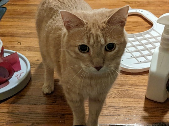
Arthur is what we call cortically blind. As a kitten, he had an intact pupillary reflex and could probably see light vs dark, but he also had severe nystagmus, so his pupils jittered uncontrollably all the time and he probably didn't get a whole lot of useful visual input. Without the visual experience of seeing things and learning how to organize and process visual information, his brain as he developed went "you know what? fuck this" and stopped dedicating any processing power to whatever visual input he was getting.
Basically, he lost visual acuity because the information he was able to pipe to his brain was fragmented and poor-quality enough that his brain stopped bothering to process it. If I pulled his current eyeballs out and magically hooked up new totally functional ones, he wouldn't be able to do anything with them: his brain has given up sorting out the information.
So the question of whether theoretical CMY humans could distinguish colors better than RGB humans is driven by two things: one, whether having two highly-overlapping cones helps you distinguish between slightly variant light types better than very different cones, and two, whether we're extending the total visual range by moving the cones at the external ends of the range (B and R) farther apart. Overlapping but unique sensory information can be really helpful for localizing and distinguishing similar-but-not-identical inputs--that's one of the reasons owls are good at localizing quiet noises, actually, their ears are wildly asymmetrical and they can computer where a noise is made based on how loudly it can be heard with each ear, especially if the owl is on the move as it listens. Like the Doppler effect, but faster with a lot more processing power on it.
I have no idea which would be more effective, but it's a fun thing to think about!
62 notes
·
View notes
Text
I've got a small pile of unanswered asks, sorry for the wait! got myself busy again with other projects, like a christmas themed kids book I need to get done by thanksgiving.
I've been noticing that when my uncle has the books printed, they come out very dark and muddy, which is not great! I tried to research rgb to cmyk conversion and ran into all sorts of different advice on which profiles to use, found that most of the instructions rely on very specific art software, only to ultimately learn that many places used for printing art will just apply their own cmyk profile anyways. which can actually make the colors worse if you already converted the file yourself.
and furthermore, the problem is extra bad with these books because my uncle has been going through Amazon and they use a variety of third party printers! based on the results with the books, I'd say they're cutting costs with low quality cheap printers >:/ which means there's nothing I can actually do on my end to ensure that the illustrations accurately print with the colors I'm using.
However. I don't give up so easy. I've seen artists make all sorts of color choices just so the end results looks a specific way under specific circumstances. Like using negative colors so the image only looks "normal" when it's been inverted. or using blue and red so the image looks different based on whether it's under a red lens or a blue lens. making color illusions like that blue/black vs white/gold dress or the illusion of grey strawberries looking red when they're surrounded by cyan. I did a final project in college on the topic of color illusion, making my own example paintings.
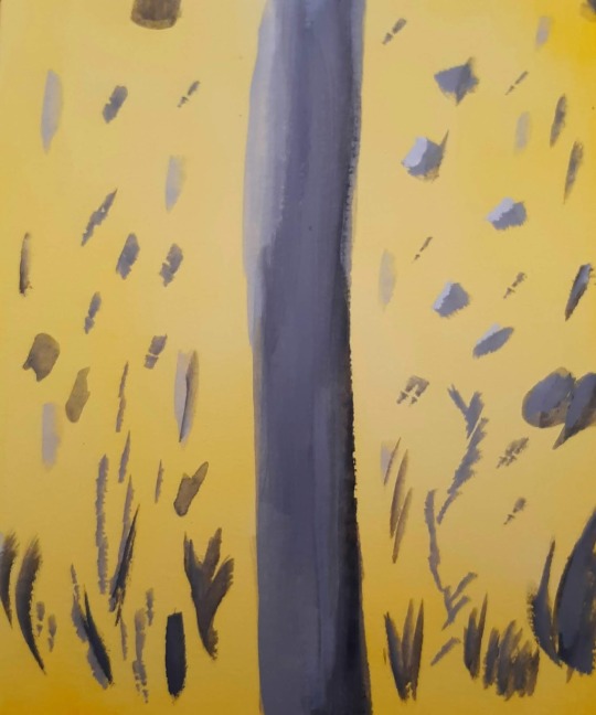
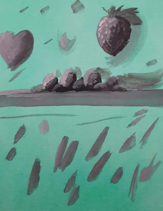
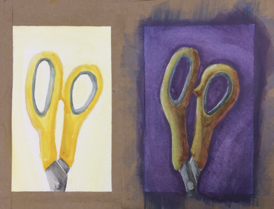
(image description: three photos of small paintings. the first two images are solid yellow and green respectively, with neutral grey abstract shapes painted over them. because of the solid color backgrounds, however, the neutral greys appear to be slightly tinged with the compliment color of their backgrounds; blue tinged on the yellow and pink tinged on the green. the third painting shows a side by side comparison of the same pair of yellow scissor handles. on one side, they are painted bright yellow on a plain white background. on the other side, a dark purple background and more dramatic lighting still give it the appearance of being yellow scissors, but in actuality the handles are painted in shades of green and orange, blended together in some places and darkened or lightened with other colors. they simply look more yellow because of the purple background and the warm shading. end description.)
So I know a thing or two about color strategy. and I am not losing a war against low quality cheap printers, not today. I spent a while looking for cmyk color charts and palettes, testing images through an online cmyk converter, and I have finally achieved my goal. the final test will come when the book is done and sent to print. essentially, I just ran a cmyk color chart through a converter to see how it might look after being printed, then set the original and the converted version next to each other on my file. I can now use the brighter original colors but base the colors I pick on how they'll look in the printed result rather than how they look on my screen. this means the version on my screen is far more pastel than I would normally go for! but the test results so far prove the method, and I think this book will print just fine.

(image description: screenshot of the rgb and cmyk versions of the same painting, which look very small and compressed because they're thumbnail images. the rgb version looks very light and uses a lot of pastel colors and soft shading, while the cmyk version looks much darker and has more distinct shading. it depicts a family out caroling around Christmas, standing at the porch of another family who look very happy to hear the song. end description.)
by golly I am not going to let Amazon keep turning my hard work into muddied disasters. I get paid for these illustrations and I'll make them look good in print by any means available to me.
here's the colors btw if anyone else needs to use this trick:
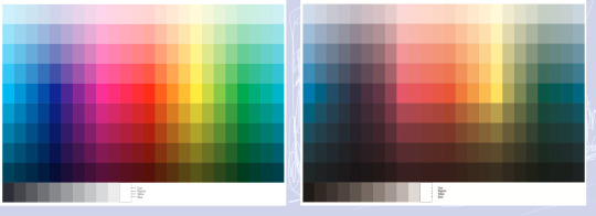
(image description: two color charts. one is very bright and rainbow, the other is much lower contrast and dark. the colors that are the most affected are the blues and greens, while the reds and yellows are somewhat more intact. the greys have also become more brown in the second version. end description.)
just figure out what the end result needs to look like and pick the brighter color accordingly. should make the low quality print jobs look at least passingly decent! sometimes you really have to plan ahead to make things look the way you want.
27 notes
·
View notes
Text
I made an interesting observation with the chromatic aberration effect for art programs
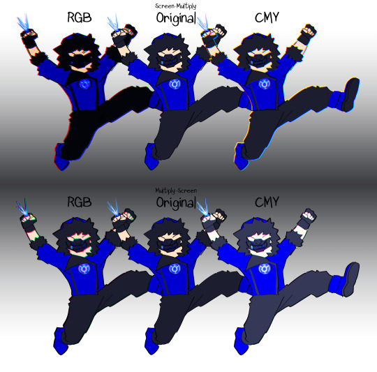
What does this mean? Well, let me explain!
Most chromatic aberration tutorials will show you how to separate color channels to make a cool effect. You duplicate the layers and clip a color layer over them, each with a layer mode, and then you're good to go! What they didn't tell you that if you do it, well, not wrong but weirdly, the subject will either turn darker or lighter.
Hey, what does "Screen-Multiply" and "Multiply-Screen" mean?
That's what the first and second layer modes are. Yeah, I know, it's confusing, so here's a look on what it is:


Basically, there are two methods to do a chromatic aberration:
A single color Screen layer clipped on top of a duplicate of the subject as a Multiply layer; or
A single color Multiply layer clipped on top of a duplicate of the subject as a Screen layer, which in this case requires a completely black version of the subject under all of it for the Screen layers to brighten.
What's up with the RGB and CMY labels?
That's the fun part that I found out. So, instead of just using Red, Green, and Blue as the clipping layers, like shown above, I also tried it with Cyan, Magenta, and Yellow. Y'know, RGB vs CMYK? Commonly used for printing with inks? It's fun because I realized which group of colors with which type of layer modes has the best accuracy with the original subject.
That Screen-Multiply with Cyan, Magenta, and Yellow clipping layers and Multiply-Screen with Red, Blue, and Green clipping layers have the best color accuracy.
Why is this important? Well, I think some people, me included, wanted their subjects to only have chromatic aberration and not the backgrounds too. Too many tutorials and CLIP STUDIO PAINT AutoActions show the whole image having the effect, but not a lot show how to do it on only one part of the image. Plus, having the whole image gain that effect may result in borders showing up unless cropped. On a white background, Screen-Multiply CMY works best, while Multiply-Screen RGB needs to have a black background or even just the silhouette of the subject under all of it. Meanwhile, doing it any other way might result in different colors from the original, unless you want it to actually look brighter or darker.
Well, I hope this helps a lot of you out there. If you guys manage to get to read this at all.
#newquestion#my art#original character#art tutorial#art reference#chromatic aberration#yeah i turned one of my characters into a blue lantern but she's a test subject okay? okay#artists on tumblr
6 notes
·
View notes
Text
Week 2: Printing Technologies & Media
Photoshop
Now - version 24
Started - black and white
Mike McQuade - collage/digital collage
Massimo Morandi - Rotonda del Festical 2015, printed in 2 colours. Green first than blue.
Offset printing CMYK in order
Vasilis Marmatakis 2017 - removing instead of adding.
RBG vs CMYK
Mainly for print design
RGB is for screen
CMYK is for print
3 colour process - yellow, red then blue taken in 3 photos.
Printing process - 1 cyan, 2 magenta, 3 yellow, 4 black
Suzanne Dean - created book cover. Used RGB to create CMYK.
Image made to change to CMYK when printing.
Some filters don't work on CMYK/RGB.
Colour & consistency
Podpunkt - limited colour palette -> more presentable, it's not too into our face. Its got simple line drawings -> milky blue, pink, accent of purple/violet. It's simple.
Nya Upplagan - strict grid, limited colour palette (different but similar), colours more settled.

CMYK
RGB is impossible to print, so CMYK mode helps to show what it would look like in RGB.
All work must be proofed.
Double check by printing, go back and adjust. Never trust your eyes as it differs in lighting such as screen and ambient.
cmd + Y - Preview of CMYK
Colour correcting!
Adjustment layer to go back and edit. Think about how we can present an image.
Contrast - the difference between light and dark pixels.
Levels - is a histogram, how much colour is available. Left is black, and the more you move to the centre the image becomes darker. White on the left, moving to the centre increases more white in the image.
Curves - valuation is smoother, histogram is reversed.
Opacity - pressing the number changes the opacity. 5 = 50%
Free hand - add -> shift, subtract -> alt, multiple -> shift & alt.
Polygonal - shift -> angle of the line.
Magnetic - caps lock -> changes the curser. [ -> increase in width, ] -> decrease in width.
Smart object - it allows you to do whatever on photoshop.
Object selection - select object -> select & mask -> view
Magic wand - increase tolerance for more tone. Contiguous -> selects entire colour, deselect -> only in certain yellow.
when using elliptical marquee tool -> alt + drag = starts from the centre.
cmd + spc = select & drag to zoom in and out
shift + cmd + I = invert selection
cmd + dlt = deletes the selected area
Unsplash for free images
creativepro.com for photoshop cheatsheets
SAVE BOTH PS FILE AND FLATTENED IMAGE!
A2 Tasks
In class, I was able to experiment with selection tools such as object selection, magic wand and lasso tool. I am used to using magic wand and magnetic lasso tool so it was useful to learn how to use other tools available as well. I also learnt more about the magnetic lasso tool, and how the curser changes into a circle when the capslock is on.


The selection and lasso tool were helpful when I was trying to remove the background from the speakers image.
Brochure Examples
I have researched some brochure examples, which help me understand what other creative options I can explore. I have looked through Pinterest for brochure design, typography layouts, and different ways to fold a brochure.
Below are some examples I want to focus on because I like the use of space in the three examples, the pop of colour in the images and the highlighting of the critical messages on the brochure.


Starting Point
The two images below are of several examples I have sketched, exploring different ways to display speakers and designers in my brochure. As mentioned on my blog, I wanted to include a pop of colour with a black and white photo and highlight the important part of the brochure.


The two sketches show how and where wanted to place the speakers on my brochure. However, it was challenging to do so because I felt the placement layout was restricted and needed to be more open.


Designer's images
I wanted to focus mainly on cropping images of the designers by removing the background and keeping the colours black and white to create a contrast with a pop of colour.


I have experimented with different shapes and layers and filtered with red, black and white images to visualise what could work and include on my brochure.


0 notes
Text
Colouring rainbow gifs
The lovely @buckiecap and @djarsdin requested a tutorial of some gifs from this TFATWS rainbow set.
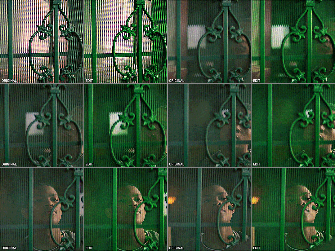


My colouring process is kinda chaotic and it always depends on the gif itself. These three gifs will highlight the similarities and differences in how I colour my rainbow gifs.
You’ll need some understanding of basic gif making and adjustments. I use Photoshop 2021 but I imagine these processes will still work in other versions.
Some basic tips:
When doing rainbow sets, once I've got my base gif ready, I always make a hue/saturation layer on saturation +100 so I can see what colours I'm working with. I just keep it hidden so i can check how my colours are doing throughout the editing process.
Also something to stick at the back of your mind: you want your final gif to be as “monochromatic” as possible - make sure your final palette will be only black + shades of whatever colour you're targeting. This is not only to make the gif as colour-focussed as possible, but it also helps with saving your gif under 10mb. That saturation +100 layer I always keep hidden at the bottom of my gif so I can keep an eye on what colours are present.
It’s also helpful to understand how RGB and CMYK colours work and what to add/subtract when you want to bring out a certain colour. A good example of this is with Colour Balance:
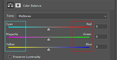
You’ll notice the colours on the left are Cyan, Magenta and Yellow (CMYK), while the other side is Red, Green and Blue (RBG). So if you want more cyan in your image, you’d push the bar towards cyan, but then you’re compromising the reds. In Selective Colour adjustments, the panel is reversed.
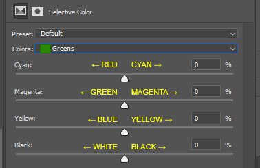
This knowledge is absolutely necessary when you’re doing any adjustment, so keep this in the back of your mind as I work through the tutorial.
Green gif - Eli's door
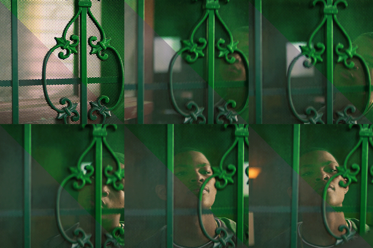
So I start with my hue/saturation on saturation +100 to check what I’m working with here. This gif of Isaiah's grandson opening the door has green, yellow and red as the dominant colours, and I can see a bit of cyan on the right. I’ll keep that hue/saturation layer hidden as a reference.
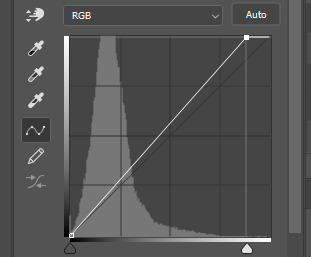
Normally when I make gifs I start with a curve or levels layer to get any unwanted hues or create a more visible scene. But in this gif, I'm pretty happy with the colours, so I'm just using a simple curves adjustment, because I want to have whatever is behind the door as the ‘background’ and the door frame is the ‘foreground’, so only a slight adjustment is needed here.
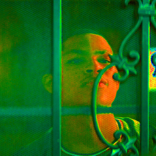
Since the colours are already prominent, I'm going to make the green more visible and vibrant. I do this by using selective colour in the green colour to make the green stand out. When thinking of CMYK adjustments, you might think that Magenta -100 would work, as that normally pushes the greens, but I find that this makes things grainy and patchy looking, as you can see here:
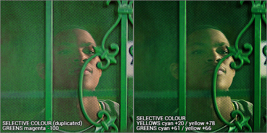
Instead, I’m enhancing cyans and yellows, and only pushing the magenta back just a little bit towards green. I’m not sure why green specifically does this, but it’s useful to know this when you’re colouring.
With the yellows, I want to push those more as well, since the amount of yellow usually influences the green-ness of the gif.. I'm also going to max yellow too since that will also make the green pop, but I also have to be careful not to distort the skin colour too much. I also want to balance the skin tone with a little redness so he doesn’t look like he has jaundice (skin tone will be explored later in the gif process)
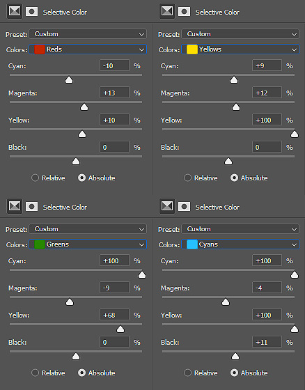
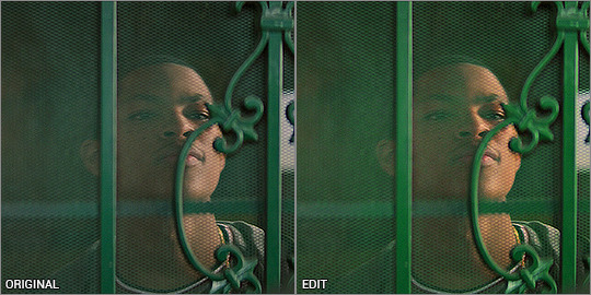
I've added another selective colour layer on top of that, only adjusting the greens just to make it pop a little more. Don’t be afraid to use more than one selective layer, this can really bring out vibrant colours if you use it right.
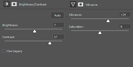
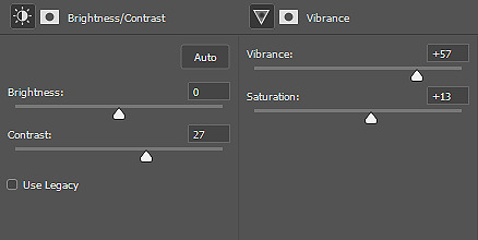
Just to get some more depth, I add a colour balance layer, again just subtly pushing the cyan and yellow up and not playing with the green too much. Then my usual last layers are with a vibrance and brightness/contrast - I’m usually quite generous with contrast so I can bring out the different shades and it makes things a little more vibrant too.
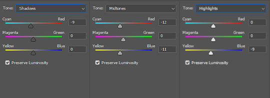
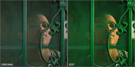
This next step is really important when colouring people with dark skin - you want to lower the redness from their skin so they don't look unnaturally orange, as you can see here:
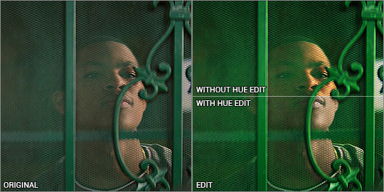
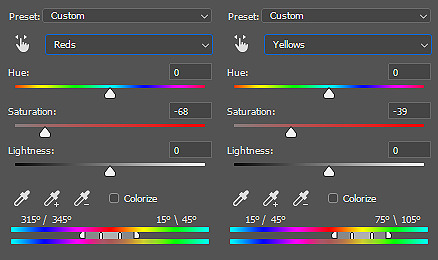
There is a fantastic tutorial here about colouring dark skin tones and avoiding the orange-washed look, and I recommend all gif makers to take note! It's difficult especially when doing rainbow gifs, and it takes some practice. I do this with a hue/saturation layer, and specifically targeting red and yellow and reducing saturation. I might need to play with selective colour or colour balance to get it right. Luckily Eli doesn’t move around too much, so I can use a mask to adjust only his face.
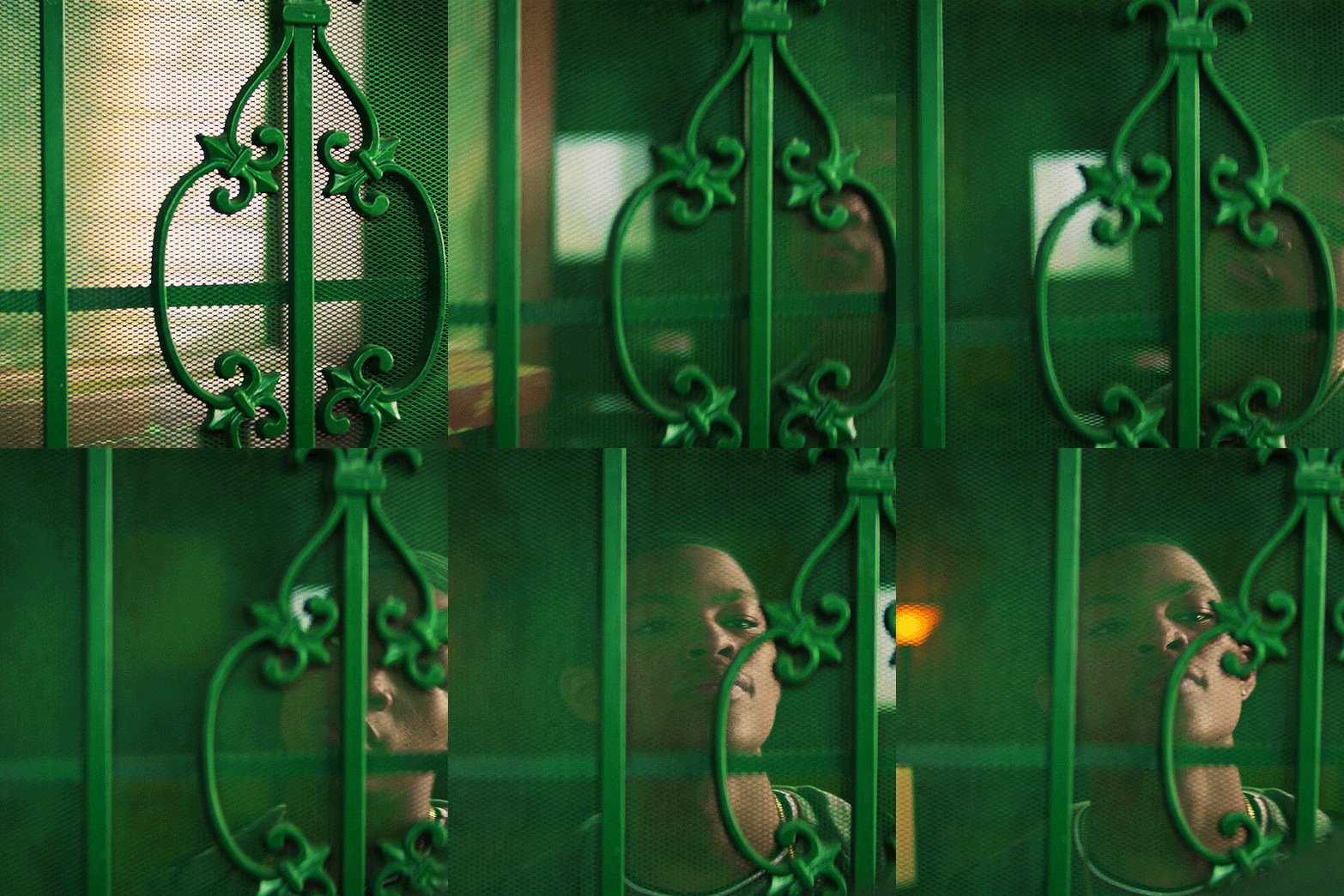
And that’s the end product! now just ignore me as I re-upload the green gif in my set so you don’t see such a horrible jaudiced skin tone sldkfjsldkf
Yellow gif - Karli vs Sam
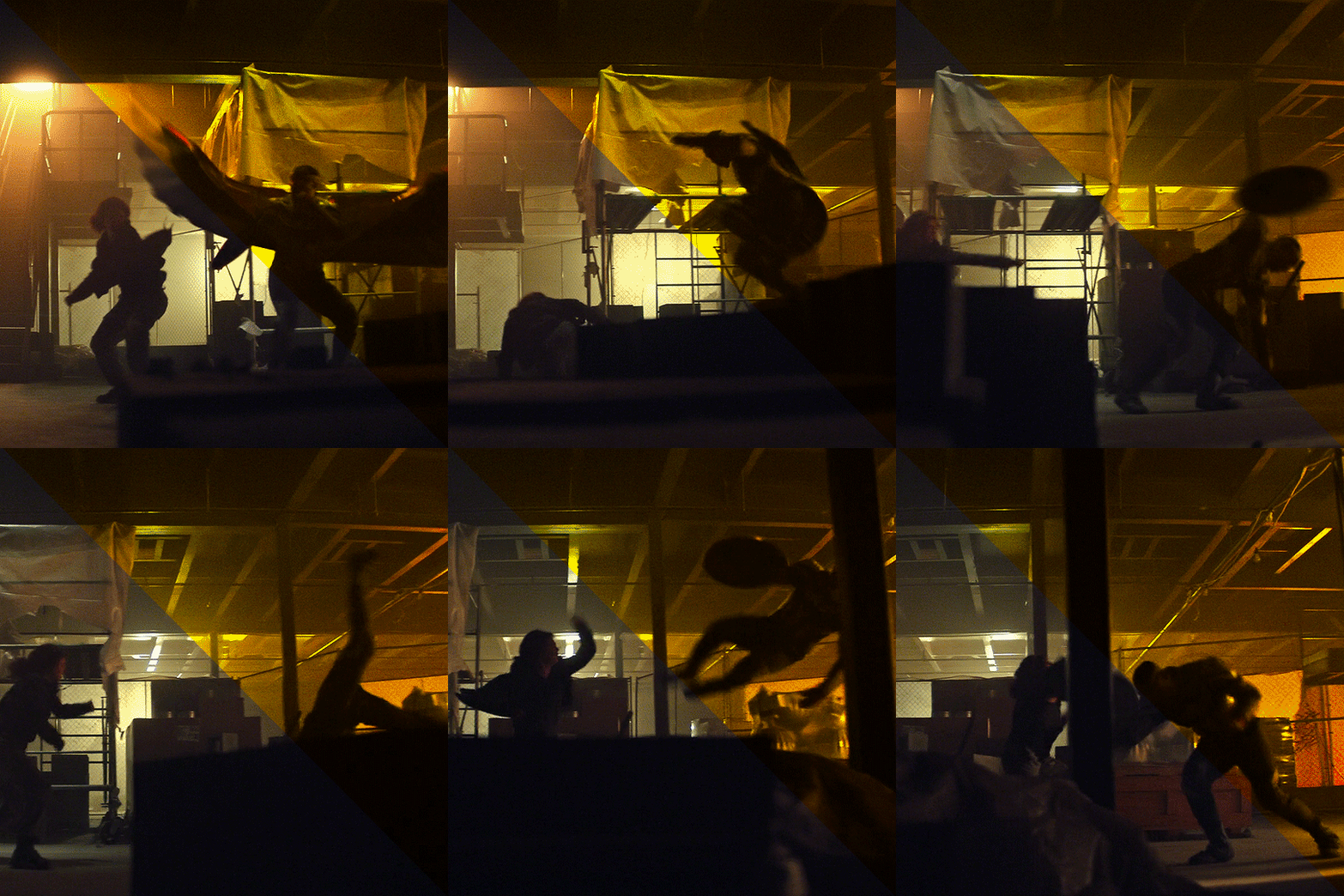
I'm gonna be completely honest here - this gif was very tricky to do. I actually have about three different versions of it. At first I thought "this is the yellow gif so I'm only going to have yellow tones", and did selective colour to get rid of any traces of green AND red, because I didn't want any orange at all. It ended up looking quite dull:
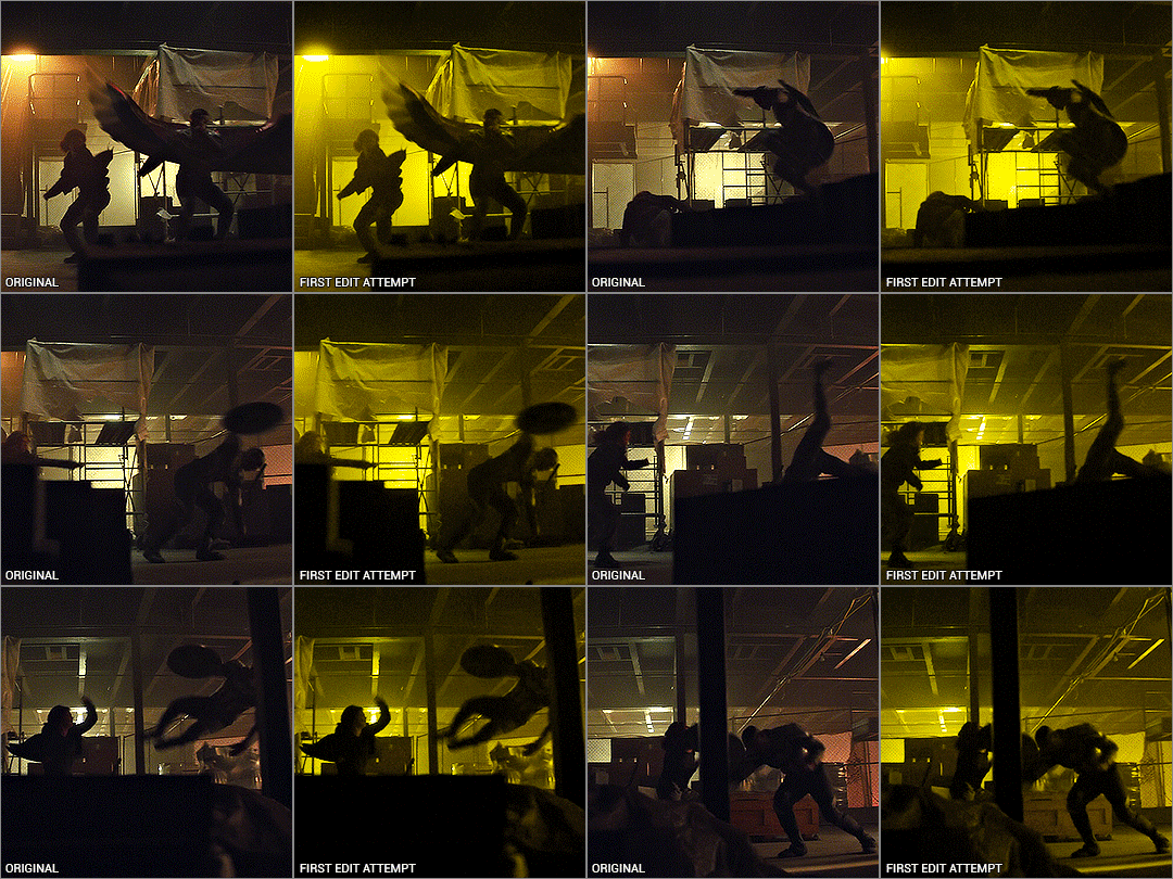
I mean.. yeah it’s yellow........... but it’s kinda boring. So I deleted all adjustments and watched the raw gif, and noted the orange light contrasting with the pale light. The raw gif itself already had some beautiful lighting - why get rid of it? It depends on what you want, but I like my rainbow gifs to have a different colour there to contrast with the main colour.
Starting off with a hue/saturation layer with saturation 100+, I can see there are clearly yellows and reds and a bit of green on the ceiling.
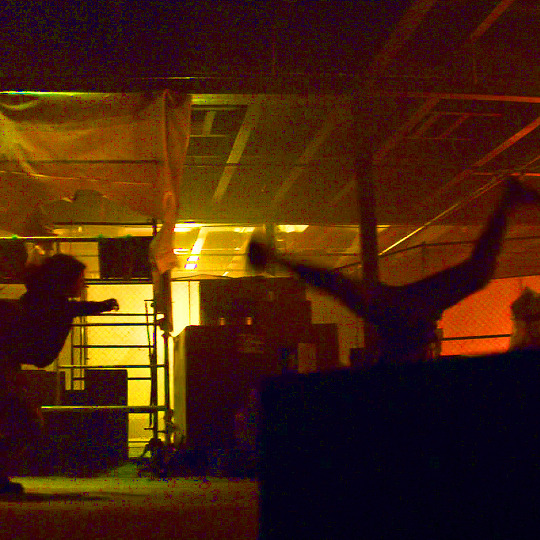
I thought the contrast of the orange and pale lighting was too good to mess up so I started with that. My first layers are vibrance and brightness/contrast to exaggerate the silhouettes and bring out the colours that are already there.
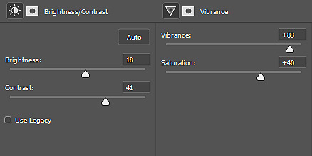
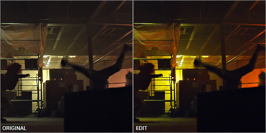
I added a channel mixer layer to narrow down the colours. I wanted to fill the white bits with yellow, and with channel mixer I’m able to manipulate colours into something else while still looking natural and blended. I won’t be doing too much colour manipulating here so the settings are very minimal. I don’t know how to explain it but it just takes a little fiddling to figure out what works for your gif. You’ll notice the white reflections on the ceiling are now a solid yellow colour:
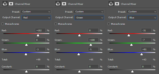
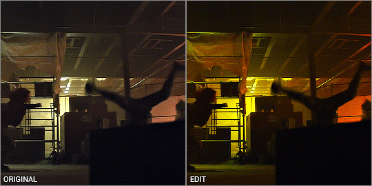
Next is a colour balance layer. I'm basically trying to bring out the yellow out. This is really just trial and error. I added a bit of magenta to bring the depth of the orange colours in the darker shades:
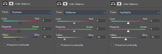
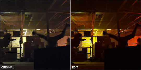
Now for selective colour. I'm often adjusting all of these while hiding/showing the hue/saturation layer I have kept at the bottom. This time, I’m aiming to subtract the reds and bring it down to a warm orange, and I do that by bringing it towards cyan/away from red, and away from magenta/towards green.
Then I max out the yellows so it becomes the most dominant colour. I've also manipulated the green to make sure it is excluded from the gif - again, checking with the hue/saturation layer at the bottom, while keeping my eye on the ceiling and other places where I’ve noticed green lurking about. I don’t want any unwanted shades ending up in the final colour table.
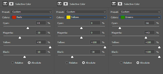
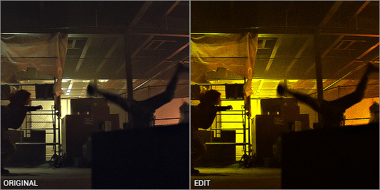
Finally, I finish with yet another vibrance and brightness/contrast layer, just because I like things bright and vibrant!
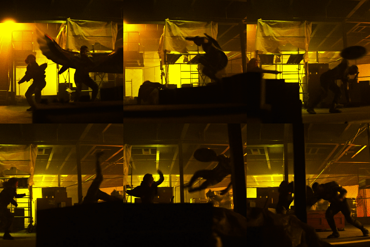
And there it is! The orange is still there and adds a contrast, but you can tell that the main colour is the yellow. This gif seems very straightforward but I assure you, it took me quite a while to get this one right. This gif was a joy to work on because Sam was so very extra in this fight sequence lolll
Pink gif - suspicious mechanical grenade? idk
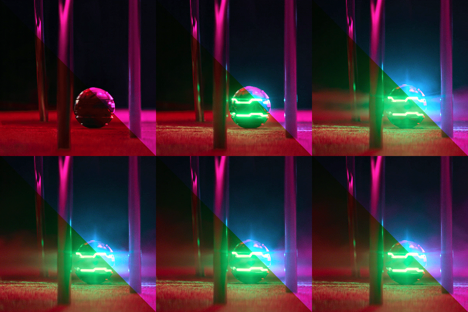
While this gif may look simple, it actually took a couple of tries before I got the colouring right. You'll notice when the ball activates, there is a bright green light that highlights the gas released and it reflects on the chair legs and carpet.
At first I tried this with the above mentioned selective colour method - which I thought turned out okay but it didn't sit with me right. Notice the reflection of the blue light on the carpet - it definitely isn't blue and more like a green-orangey kinda colour, and it doesn't look natural at all.

So I re-started from the beginning and had a look at what I’m working with, starting with hue/saturation at saturation +100. I can see that the original gif has red and green as the dominant colours, with yellow bits blending the two on the carpet. That’s what I was having issues with the selective colour - so I’ll be doing it differently.
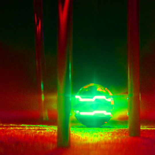
Enter: channel mixer. I’m gonna be honest............. I have ZERO idea how the channel mixer really works! It’s all a matter of trial and error, but I’ll try and explain my process step by step.
I normally start in the blue channel (again - no idea why, it just works for me). I start with the reds, and I know if I go over 0, it will push the reds towards cyan, which will get it more purple-y:
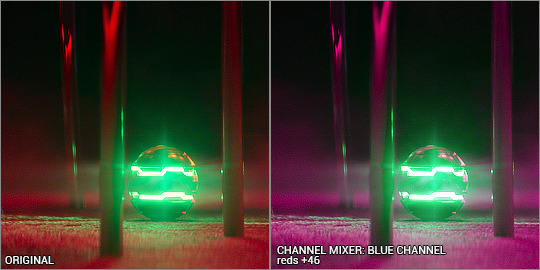
Ooooh looking good!!! then I want to push the greens towards magenta, so that needs to go over 0 as well:
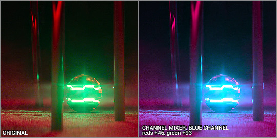
Woohoo! It’s already starting to look good. The green light and the way it blends into the red/pinks have all been completely changed into the cyan hues, so there’s a perfect reflection you can see on the carpet! Yay! I had a fiddle with the green and red channels but nothing too drastic. Here are the settings:
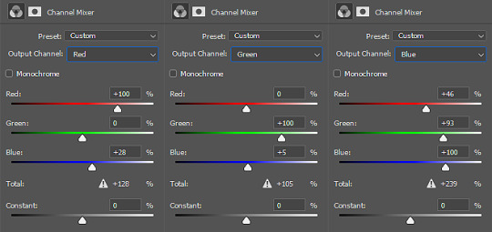
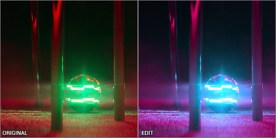
Even with just the single adjustment, I was already pretty happy with it and only did a few touch ups: I added a selective colour layer to bring out a more pinky-purpley colour, then a levels layer to brighten things up. It might seem very backwards to add a brightening tool at the end, but I didn’t want to mess up the original colour shades because I liked having the dark shadows lit up by the ball’s light.
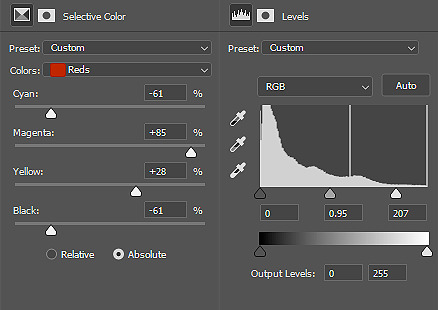
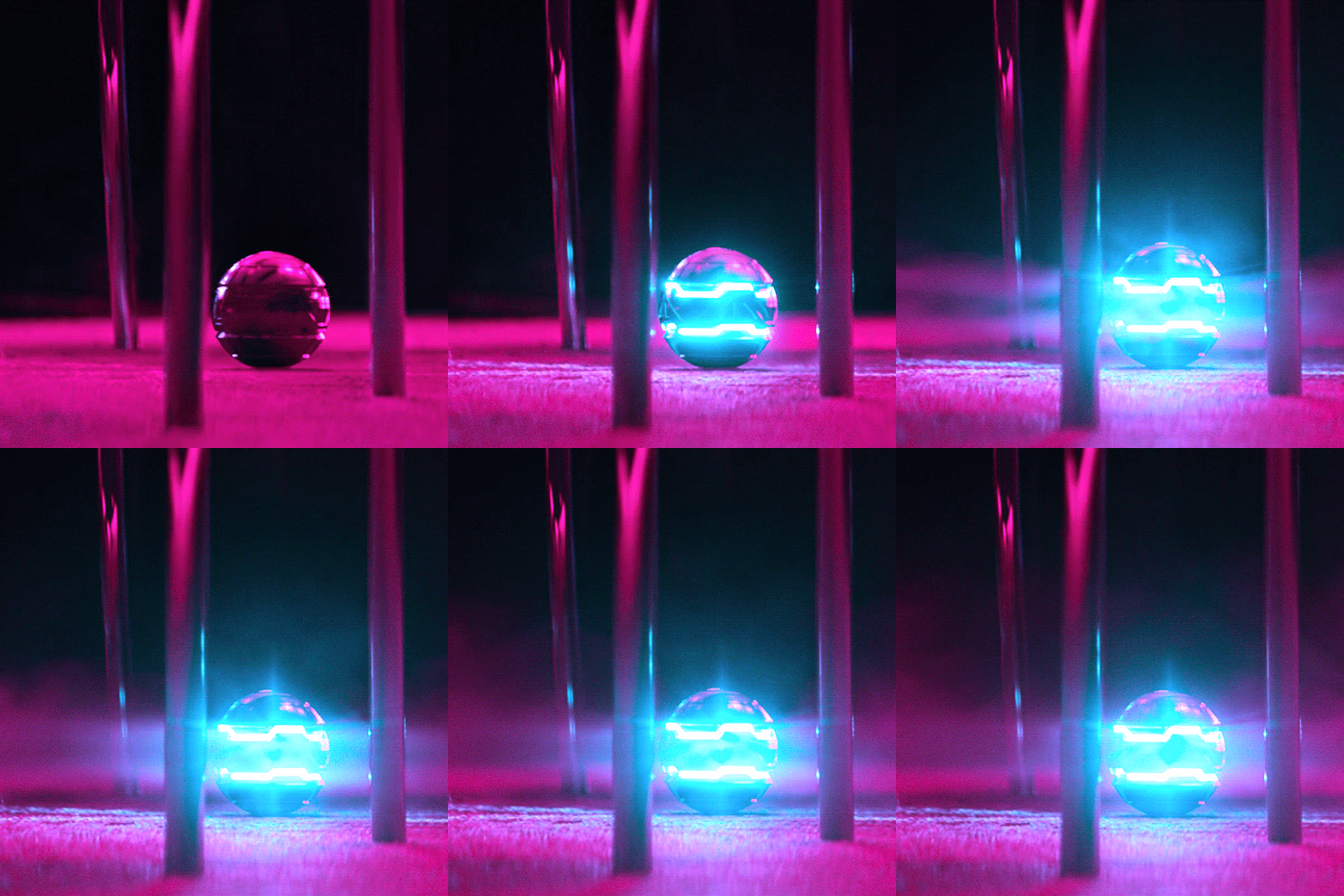
And that’s it! Only three adjustment layers, but it took some time to play with the different adjustments and what worked best. Channel mixer can be really intimidating but it works like a charm when you manage to figure it out.
the end!
Finally I have to give credit to some amazing content creators and their brilliant colouring tutorials that have made such a huge impact in the way I edit. Some brilliant guides include:
this colouring tutorial by @favreaus
this colouring tutorial by @inejz-ghafa
this colouring tutorial by @meliorn
I hope this tutorial has been helpful! I’ve tried to explain myself as best I can, but let me know if you’d like any clarification or have any questions. I’m still learning how to do things, and honestly most times it’s just randomly clicking things until something works out!
#gif tutorial#coloring tutorial#rainbow gif tutorial#gif editing#completeresources#dailyresources#chaoticresources#allresources#photoshop tutorial#fyeahps#dailypsd#**mytutorial
266 notes
·
View notes
Text
Homestuck concept - Crayon box Fetch Modus
Hey~ How are you doing y’all? So I was recently reading The Doll in the Garden by Katreal, and I just love the crayon metaphor used in it.
And I come out with a cool concept: a Crayon box Fetch Modus, who would be in theory a collaboration with Crayola.
Disclaimer: I don’t have any knowledge in data structure and programming, so the whole technical aspect is mainly speculative and represent how I interpret it according to the few things I do know.

I created the cards on Photoshop. Do not use without my permission. If you want to add it in a story for example, please do credit me and do not remove the watermarks!!
The concept is the following: For each object catchalogued, the card will use an eyedropper and get the hex code from the predominant color of said object (if several colors are predominant, the system will favor one that isn’t present in the sylladex yet), and store it (temporary) in its data. That’s when one object is stored. When two or more objects are catchalogued, the next action from the system depends on several factors:

When you flip turn-ways the card, this is what you can see. You can choose between a RGB (red green blue) based hex code system, or a CMYK (cyan, magenta, yellow, key/black) one. When the user switch to the other, the whole sylladex remain the same, but something do change on the back of the catchalogued cards. When an object is catchalogued, when you flip the card, you can see the stored hex code along with RBG or CMYK details data.

For example, let’s imagine that the Fetch Modus caught the color red #b80f15, its RGB would be 72.16%, 5.88% and 8.24%. Flip it to CMYK, it would be 0%, 92%, 89%, 28%. The point of all of it? To be able to use this color on the computer! Besides being a nice way to store your items, it allows you reproduce the color of your favorite items. What about that brown green leave on the ground, or that peculiar shade of wood at the store? Boom, instantaneous hex code! Your objects are almost crayons themselves :D Though note that the vanilla version of the Fetch Modus display only the predominant color, you’ll need an extension patch in order to pick up more than one shade. (boo hoo, marketing and capitalism >:/ ) Additionally, if the color happens to correspond to one of the official hue that the brand Crayola propose, it will be displayed next to the color. Like this: Red (Crayola) *ka-ching~* Auto-sort, while put as ‘true’, sort the objects in a rainbow fashion, like an actual crayon box. While put as ‘false’, the objects are simply left in the catchalogue card you put them. It’s a “I’ll find what I’m looking for according to the rainbow” vs “I’ll find what I’m looking for cause I know where I put it” logic. It adapts to the user mind set, whether they are the kind to perfectly respect the colors order or do not mind putting back a color where they fit to. It’s realistic that way. If this system’s too plain or unfitting to the user, they can program it to their liking. Like allowing only analogue colors, or complementary colors to be catchalogued. Which turn to be a more professional and art oriented system than a regular crayon box Fetch Modus.

Example with Blue Sapphire (in the middle), and its analogue colors.
Default number of cards in the sylladex is 8-10. More can be added. Picture screenshoot here: https://fr.spycolor.com/126180#
Detect collisions, while put as ‘true’, prevent the deck to catchalogue similar colors (ones which have a close hex code). While put as ‘false’, the system is less severe and allow a larger range of hues. Want a deck full of purple and blue objects? No problem! Just untick detect collisions.
When untick, the system offers the user to switch two objects (one already in the sylladex, the other in the user’s hand) if the sylladex where to be full. In that case if the box is ticked, you can switch the objects only of if the hues are quite similar. Unticked, the fetch modus doesn’t care. That’s it for the crayon box Fetch Modus! Hope you liked the idea :)
#Homestuck Universe#homestuck concept#fetch modus#crayon box#crayola®#hexcode#RBGandCMYK#fitting for both kids and adults#pictures made on photoshop#wow this is more developed than I envisioned it to be :o#did my best to separate it into small paragraphs#god I hope it's readable#urgh numbers#it took me so long to maaaaaaake~
2 notes
·
View notes
Text
Vector vs Raster - What Is The Basic Difference and Which One Choose for Your Artwork
If you are a photographer or designer, you probably know what you are dealing with. For the others who are just starting, it can be a little bit overwhelming – raster, vector, bitmap, pixel. I’m expecting that everybody knows .jpeg, .jpg, but what about .svg? What is the difference between .png and .jpeg? Well, if don’t know about .jpeg, probably you have never downloaded a wallpaper then but do not worry, everyone has to start somewhere, someday!
What is actually the difference between vector and raster?
Which formats are used for each of them?
For which projects I should use vector or raster?
For a digital artist, it is very important to understand the difference between vector and pixel art. Each of them has special software and needs, each of them is used for different purpose. Also, every single file format is giving you different options. Today we will look at the basics of these to get a better understanding.
Raster (bitmap, pixel)
Raster images are often called bitmaps. They consist of millions of tiny little squares which we call pixels. Pixel stands for “picture element”. It’s the smallest physical element of a digital display device. It’s pretty easy to recognize it by yourself. Try to open any photo you have and zoom in. Closer you look, more blurry the image becomes and in the end you will be able to see the little pixels. Bitmaps are created with pixel-based programs, captured with a camera or scanner. Usually, almost every drawing/painting app is raster oriented. Creating such artwork is pretty similar to traditional painting or drawing. You have many brushes to choose from, you can blend colors easily to soften the transition, you can apply many filters, gradients, undefined lines and shapes, and complex composition.
Raster format is resolution specific – that means that the photo you just took is displayed in one specific resolution. If you will try to resize the picture, bigger without changing the number of pixels, it will get blurry and not nice to look at anymore. Scaling down its not such a big problem, but the smaller version could be less crisp or softer than the original. There is a possibility to change the number of pixels but the pixels will be added randomly, rarely producing a good outcome.
We have two main names using raster images. PPI and DPI. They are both describing the resolution or clarity of an image, but they are not the same thing.
PPI (pixel per inch) means how many pixels will fit into one inch. A 72 PPI image will have 72 pixels per inch. PPI describes the number of pixels for the digital screen. PPI can be modified with photo/painting editing software.
DPI (dots per inch) means how many dots per inch my printer will print on the paper. Printers are not printing little squares. So how do they do it with raster images? They reproduce the image by spitting out tiny dots consisting of a mix of colors – Cyan, Magenta, Yellow, and Key (black) per the pixel of your image. DPI is set by the printer itself and cannot be manipulated.
That’s why we as digital artists can work with two different color schemes CMYK and RGB. Today we are not going so deep into this, so just put it simply – CMYK is for printing method, RGB is for electronic displays – monitors, phones, tablets etc.
Almost all the pictures you will find on the websites are raster images (even though they could be vector images before). Photographs and pictures in books or magazines are usually also pixel images, but these images are saved with very high resolution what is making them very big files in the end.
Formats of raster images
.jpg, .jpeg, .gif, .png, .tiff or .tif, .psd (Photoshop)
Popular programs used with raster images
Adobe Photoshop, Procreate, Affinity Designer (pixel persona), AutoDesk, Corel and many others
In which hobbies or jobs I can use pixel graphic
Photography, digital painting
Vector
Total opposite from pixel images, vector images are created with a mathematical formula that’s defining lines, curves and primitive shapes like polygons, circles, and rectangles known as paths. Vector graphics have to be created in software that is designed to create lines includes node position, locations, lengths, and curves. Because vector graphics are composed of geometrical primitives, it is very best to use it for more structured images like logos, line art, illustrations with flat, uniform colors, letterheads, and fonts.
Vector images are more flexible and versatile. You can scale them down, up easily and perfectly. They have also no resolution restriction and therefore they are not depended on the output device. And because vector images don’t have to handle millions of tiny pixels, these files are usually smaller than their raster sibling. You can easily recognize vector by looking at the edges, doesn’t matter how much you scale, they will always stay crystal clear and smooth.
One of the biggest disadvantages is the compatibility. They are often saved as native files from the programs they have been created in. Like Adobe Illustrator and their native .ai file. If I will use Affinity Designer to open .ai file, good, I will succeed. But if I will save a file with Affinity, I will not be able to open it with Illustrator. Another disadvantage is the limitation of effects. Vector will be never as a natural painting. It is just not possible. The best to print vector is PDF or EPS, which are producing the sharpest result.
THEREFORE MANY ARTISTS ARE COMBINING THESE TWO TOGETHER AS WELL.
Formats of vector images
.ai, .ait, .art, .svg, .pdf, .eps and many more
Popular programs used with vector vector graphics
Adobe Illustrator, Affinity Designer, Corel Draw, Sketch, Inkscape etc.,
In which hobbies or jobs I can use pixel graphic
Graphic designer, illustrator, printing publications design and others
Conclusion vector vs raster
It all depends on your project. Vectors are best for logos and illustrations. Raster images are classic for digital photography and are very often used for all graphic once they have been published digitally. If you want to repaint Mona Lisa on your iPad, you will not use vector unless you would like to look it as Picasso style Mona Lisa.
Raster images should be used if you require high lever detail (photos) and you don’t care much about by enlarging the image by a great amount. On the other hand vector you will use on images what requires tiny details and might be resized in the future.
1 note
·
View note
Text
CMYK VS RGB
Color performs an essential role in normal life. It can have an effect on your temper, your impact of a logo, and even have an effect on your buying picks. Getting the color proper for your designs is crucial if you want to deliver the right message. But as a fashion designer, you need to also realize which shade device to apply if you want your layout to appearance as meant. Knowing which shade device to apply will be a lot simpler while you know how your design might be used. There are most important color structures inside the virtual and print design industries: the RGB color gadget and the CMYK shade gadget. In this article, we’ll provide an explanation for the distinction between the two and display you ways you can without problems switch between them in Photoshop, Illustrator, and InDesign. What is RGB? RGB stands for Red, Green, and Blue. It’s used solely within the virtual layout enterprise because it represents the equal colorings utilized in pc screens, TV monitors, as well as mobile tool monitors. It’s an additive shade machine because of this that the number one shades are introduced collectively in numerous combos to provide a much wider spectrum of colours. These shades are produced by way of mixing mild itself by superimposing the purple, inexperienced, and blue light beam. Without any depth, each of those colorings may be perceived as black, while complete intensity will make them appear white. It’s also worth mentioning that specific intensities of every shade will produce the hue of a selected coloration. The ensuing color will also seem more or less saturated relying at the difference between the most and the least in depth coloration. When ought to you operate the RGB color device? As a widespread rule of thumb, the RGB color system ought to be used only in digital designs, most normally when designing for the net. This includes designing web sites and imagery and pix to be used on websites and social media.
If you need to use the ones designs in print, you’ll should convert it to the CMYK shade system. What is CMYK? CMYK stands for Cyan, Magenta, Yellow, and Key (Black). Black, in this example, is known as key due to the fact it is used within the key plate that’s accountable for including the contrast and the detail for the final photograph. The CMYK color machine is maximum normally known as the four-coloration method because it uses 4 exceptional shades to produce specific shades. The black colour right here is used due to the fact the opposite 3 colours combined can’t produce a totally saturated black.
Related: Animation peripheral product customization
Unlike the RGB coloration machine, CMYK is a subtractive shade version because the printed ink reduces the mild that could normally be reflected. The inks used subtract the brightness from a white heritage from the ones four colorings.
The CMYK colorations are combined all through the printing technique that may now and again motive minor inconsistencies. For that reason, you ought to constantly observe the printed evidence of a given venture before going through with the whole print run. Read more about
0 notes
Text
Adobe Capture One

Adobe Color Capture One
Adobe Vs Capture One
Adobe Vs Capture One
Capture one is better, as imaging software, for Fuji GFX and provides better results after editing for the Fuji XT2. Capture one pro efficiently processes RAW images captured through Fuji XT3 digital camera and cameras that use the Fujifilm x-trans sensor, than Adobe Lightroom does. Some Fuji cameras supported by Capture One include: Fujifilm X-T2.
Design is all around us and inspiration can be found everywhere in the world from nature to cityscapes. Transform digital images of physical objects that inspire your imagination directly on your desktop. Turn the coarse texture of tree bark or sweeping wisps of grass to the symmetry of a brick face or patterns of metal work into captivating digital assets. Designers can trigger the in-app Adobe Capture extension from the Libraries panel in Photoshop (desktop version only) to create patterns, vector shapes, color themes, and gradients extracted from images. The ability to capture workflows is no longer limited to the mobile experience. Designers can use the Capture desktop extension to access powerful mobile workflows via the desktop to avoid distractions and save time when creating a variety of digital assets.
Adobe Color Capture One
Capture One + Adobe Bridge (1/1) neilcolton: Hello All-Full disclosure, I'm quite new to the DAM digital workflow, but I'm generally sold on Peter's approach After years of shooting film, I'm finally getting my arms around Peter's way for digital shooters. The more I learn about the digital world of images, the more sense Peter's method makes.
Capture One Pro lets you edit files from all major camera brands. Or save with a Capture One version that's just for Fujifilm, Sony or Nikon cameras. Plus, get solutions for business and multi-user teams. Products & Plans. Scroll to explore. DK-2000 Frederiksberg.
Adblock plus for edge. Capture in action. Use your mobile device as a vector converter to turn photos into color themes, patterns, type, materials, brushes, and shapes. Then bring those assets into your favorite desktop and mobile apps — including Adobe Photoshop, Illustrator, Dimension, XD, and Photoshop Sketch — to use in all your creative projects. Last Published: October 19, 2020 Adobe Capture gives you the power to create production-ready color themes, patterns, vector-based shapes, 3D materials, type, and custom brushes—all from a single photo.
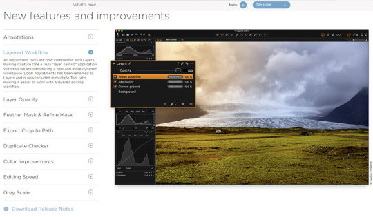
Adobe Capture Color Themes Module.
Use your existing Library creative elements to create unique digital assets that can be imported into your Creative Cloud desktop applications via Creative Cloud Libraries. Adobe Capture allows you to use photographs and transform the physical world around you into creative library assets and elements that can be incorporated into your creative design work. Simply open an image or project file, edit, and add to your Library, which can be accessed directly on your desktop and in mobile apps. With the Adobe Capture in-app extension, you’ll find a new level of ease when it comes to creating and editing creative assets. Batch process multiple assets at once, or quickly extract multiple assets from a single image, and streamline your workflow by reducing steps and saving time on task.
Adobe Capture Shapes Module.
With Adobe Capture, you can create and vectorize shapes on the fly without scanning or using live trace. Vectorize directly in Photoshop within the extension panel and avoid a long manual process using the pen tool. Use the slider to select the level of detail and invert the image to vectorize it. You can modify and apply smoothing to reduce path points. To turn the vectorized images into actionable assets, just add them to your Creative Cloud Libraries and bring in the vector shapes as layers in Photoshop.
You can also do vectorize images while you’re on the move, thanks to the new Photoshop for iPad. Adobe Capture lets you use these assets for masks and adjustments in your .PSDs whether you’re at your desktop or on the road. To use your shape, drag the element from the Library panel and place it onto your Photoshop project. From Photoshop, you can use the shape in Illustrator, Indesign, XD, Premiere Pro, Animate, and After Effects. This workflow is powered by the new Cloud PSD file format (PSDC – the “C” is for cloud), which allows you to move .PSD files seamlessly between your desktop and the cloud. The new PSDC file format for Photoshop with iPad will also autosave changes and allow you to store files in your CC Libraries or other cloud storage.

Using Capture to create color swatches and gradients
You can easily create color palettes using Adobe Capture. Open an existing image or project file to start creating your new color theme with harmony rules. Edit swatches by changing the color levels, selecting a color harmony, and moving the color drops in the original image. Save swatches in a variety of color spaces including LAB, CMYK, HSB, and RGB formats to your CC Libraries. Add swatches directly to Adobe Color to create Pantone color themes for your real world creative output projects.
Adobe Capture allows you to create custom gradients using images and photographs from your Creative Cloud Library. Switch to gradient capture mode to view and edit gradients with Capture’s organic creative process, replacing the tedious and time consuming non-creative method of gradient production. You have full control to add or remove stops (drops) to create gradients from two to fifteen unique color swatches within the Capture panel.
BitPay and Coinbase are major points of entry known to every crypto enthusiast in the world. Even though BitPay is only a bitcoin payment processor while Coinbase is primarily a crypto exchange, the two of them have been making a lot of changes and constantly adding new features to cater to the needs of the evergrowing number of customers. Select to Send on Coinbase (off-chain) or Send on the blockchain and follow the remaining prompts. Note: All sends to crypto addresses are irreversible. Coinbase mobile app. Tap at the bottom. Tap Send; Tap your selected asset and enter the amount of crypto you'd like to send. You can toggle between the fiat value or crypto amount you’d like. Users can also buy crypto from Coinbase or Wyre directly in the BitPay app. If you prefer to buy cryptocurrency through an exchange, the process in most cases will be: Create an account on the exchange. Register a payment method. Buy cryptocurrency. Send the funds to your BitPay Wallet. Learn more about purchasing cryptocurrency. Bitcoin wallet vs coinbase. James from BitPay here. Right now Coinbase accounts aren't suitable for paying BitPay invoices. We go into the details for that here. You will need to send some of your spending bitcoin to one of the bitcoin wallets which are compatible with the Bitcoin Payment Protocol. Learn more about getting a. After Coinbase approves your account, you can link your BitPay app to your Coinbase account. This allows you to buy and sell bitcoin from Coinbase with your BitPay app directly. Below is the process for connecting your Coinbase account to the BitPay app: Step 1: Open the BitPay app. Step 2: Click the gear icon near the bottom right corner of.
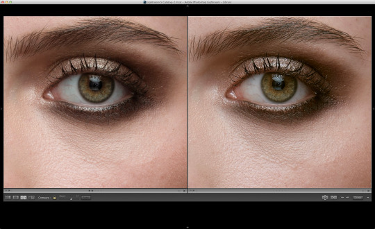
Adobe Capture Gradient Module.
Adobe Vs Capture One
Create patterns
From your collected images you can create seamless tiling patterns within the Capture panel in Photoshop, something that wasn’t previously possible without spending a lot of time and effort compositing images. Creating patterns in Capture is as simple as opening an existing image in the pattern module. Bartender for wedding near me. Any image can be used to create kaleidoscopic patterns. Change the reference shape to create different repeating vector patterns that you can save to your library and use in your design work.
Adobe Capture Patterns Module.
Adobe Vs Capture One
The Adobe Capture extension panel tool set allows you to find inspiration and create creative elements on the fly from your Library images. Seamlessly sync your files and elements across platforms with the expanded Creative Cloud integration to manage your files and bring new creativity to your projects with Photoshop.

0 notes
Text
Poster Printing: How To Print A Poster Flawlessly
Ever thought about poster printing? Let’s dive into the subject.
Posters are great choice to market your goods and service.
They are cheap to get printed and easy to distribute.
Poster can be used to target areas your regular customers frequent as well as more general high traffic areas.
A good poster is more than just marketing, however, and figuring out the ins and outs of poster printing can be challenging. You need to consider resolution, paper type, and much more. Where to get started? Here are some tips and tricks for custom poster printing to help you figure out how to print a poster.
The 40/40/20 Rule
Before you start printing posters, you should easing it with the 40/40/20 rule. What is this rule? 40 percent of the poster’s success depends on your distribution, 40 percent is based on your offer, and 20 percent deepens one everything else.
You need to have an attention-getting headline and a design that really pops to viewers. Show off your offer and back it up by telling people the benefits. Make sure you make your call to action obvious so potential customers know what they should do next.
What Do You Need to Think About With Poster Printing?
Most Posters are Borderless
It’s important to know that posters have no borders. No matter what you’re using your poster form, whether it’s for a sign at a business or as poster of artwork at an art show, they should be borderless. Giclee prints usually have a border added and that’s the key difference. Because posters are borderless, they will be full bleed prints.
You should account for a certain amount of loss of the image, since some of it will be trimmed away. If you order a 20 x 30 poster without a border, the image will be printed with a slight increase in size.
Most poster printing services, allow for size to vary 1/4 to 1/8 of an inch. The cutters most poster printers use are not incredibly precise machines, so they need a bit of room in case the cut is off by a bit. Design your posters with this in mind.
Resolutions for Printing Posters
Most posters are printed at a slightly lower resolution. Posters can be printed in very high resolution for very sharp images, but posters do not require the same resolution as other prints.
Posters are typically very large and aren’t going to looked at very closely. Pixelated or soft-focused images are fine. The best resolution for printing a poster is not very high and you should only worry about making sure it clearly communicates your message.
Sizes for Printing Posters
How large can you print an image and still keep it clear? Trying to print an image larger than it should be will result in a pixelated, unusable mess. The first thing you need to determine if an image is suitable for large poster printing is to determine its actual dimensions. You can do this through programs like Adobe Photoshop or the properties menu of the image file.
Then you need to multiply the height and width. This will tell you the size in megapixels. Divide this by 300 to get the number of pixels per inch (ppi), the measurement used for high-quality printing. The more dots/pixels per inch, the higher the resolution and the higher quality the production.
Some printers refer to pixels per inch as dots per inch (dpi). The terms are interchangeable. Try to keep this number at 300. The larger the megapixel count, the larger the image can be printed.
If you’re designing your poster in Adobe Photoshop, you can change the dpi before you start by going to File > New and entering 300 in the Resolution box. This will help you avoid problems further down the line. Poster print files are very big, so don’t be shocked by the file size. It will probably take them a long time to attach to emails or to load on slower computers.
It’s important to remember that bigger is better for posters. Large posters get attention. You want to make sure both pedestrians and drivers can see the important elements of your poster.
It’s likely that they won’t spend longer than a moment to see what your poster is about, so make sure it grabs their attention. Large posters also make your product or service look larger than life. It’s well worth the extra cost to get larger posters printed. Look at the available poster size dimensions at various printers to see what your options are.
Normal poster size includes A2 (594mm x 420mm), A3 (420mm x 297mm) and A4 (297mm x 210mm). Good options for the weight of your poster paper include 170gsm (grams per square meter; a measure of how heavy the paper stock is) Silk or Gloss Art FSC or 150 grams per square meter.
Paper Stock for Posters
Paying for good premium poster paper stocks is a good idea. They’re thicker and more durable, generally less prone to tearing. They are also often coated with matter or glossy sheens, and because of this look better and stay cleaner for longer.
Altogether, this means they’ll hang for longer, allowing potential customers to see your ads longer, meaning there is a more likely conversion rate.
Some good premium poster paper stocks include 100 lb. gloss text or cover, thick 16-point gloss cover, and eco-friendly 13-point 100 percent recycled matte cover. Investing in good poster paper stocks will pay you back. You’ll find that having longer lasting posters makes a difference in how well your poster campaign performs.
Finishing
You probably do not need to have your posters sprayed with a protective coating. Posters are made to be much more rugged than giclee prints. It also cures faster. Posters much more resistant to scratching. If you’re looking to get artwork printed, this is the one benefit posters have over giclee prints. They’re just plain physically tougher.
If you still want to coat your posters, do some experimenting. Local art stores might have laquer based sprays, if you’re trying to print posters at home. If you’re going the professional printer route, talk to the pros to see what they recommend.
If you want to sign your posters, you likely won’t need any special pens, though you will defiantly want a Sharpie or other marker to make your signature clear.
CMYK or RGB?
Try to keep your poster designs in CMYK instead of RGB, since that is what most printing shops work with. It’s fairly easy to switch from RGB to CMYK in Adobe Photoshop. Just to Image > Mode > CMYK color. This will give you a more accurate version of how your printed poster design will look.
If you’ve converted the poster image from RGB to CMYK, greens and blues in particular may look lifeless and dull. If you’re using Adobe Photoshop, use the Gamut tool to show which colors will have trouble converting to CMYK. Go to File > View > Gamut warning to use it. Change the colors bit by bit to make them work better with CMYK colors.
RGB has a more colors available than CMYK. It’s important to remember, though, that all the computer generated colors you use in your design will have to be printed on real paper with real world inks.
The ones that can’t be replicated will be replaced ‘out of the gamut’ and printed onto paper with the closest available inks. It’s important to remember this limitation before you send your completed poster design file to the printers and format it accordingly.
Supplying Your Files
Supply print files to your printers in PDF format with a print resolution of 300 dpi or tiff with no compression with a print resolution of 300 dpi. You can also send very high resolution JPEGs. Always check all your image settings are correct before you send the final design to your printer.
Make sure you keep backups and make sure one copy of the finalized poster printing file is on hand at all times. Printers can and will lose their clients’ poster printing files.
If you file is not already a vector, convert it into one. Printers prefer vector files because they make it much easier to print correctly and crisply. They are also smaller files. Adobe Illustrator is a good program to design vector poster designs in.
Litho Printing vs. Digital Printing
Litho printing is used to produce a wide number of mass print items, including books, newspapers, and— of course— posters. Litho prints are made using a set of plates that press the image to paper. Digital printing uses a printer much like you use at home or work, though they can be much larger.
Creating the plates can cost a bit and is not as quick as digital poster printing. It will cost a lot more up front. It is the smart choice for a large print run, however, and also offers a better quality of printing. You can also get larger posters printed using this method. Larger litho prints generally cost more.
Digital printing is much cheaper and faster, as it is done on either inkjet or laser printers. It’s a good idea for smaller print runs, typically no more than one or two.
The quality will not be as good, but that may not be a major concern for very simple poster designs. Most of the time, you’ll have to stick to smaller posters than you do with litho printing, since the size of the print run is limited by the size of the printer.
Smart Distribution
Poster printing is relatively cheap, but you still need to use your resources widely. Feel free to blanket an area with your posters. If someone walking their dog in the area sees your poster several times along his or her route, that’s great! Just don’t waste your posters.
Put them up in the places where your potential customers spend time, like hot spots and high traffic areas. Scatter a few posters off the beaten path, as well. Even posters in these areas can reach a number of people. Posters in restroom stalls, for example, can reach a lot of people every day.
Think of how you see official posters distributed on college campuses and you have a good idea of how you should distribute your own posters for maximum effectiveness.
What Not Do with Poster Design
Using Image Resize to Enlarge Images
Photo editing software, including Adobe Photoshop, allow you to easily resize your images. This is a great tool for making images smaller, but you should never use it to make an image bigger. The resolution will remain the same. The resulting image will be heavily pixelated.
Text, if there is any, will probably be unreadable. This is a terrible way to adjust your image to something bigger and looks very unprofessional. People will automatically be turned off by your poster design.
There are software programs that are designed to allow you to enlarge photos and other images. There is an open source app called SmillaEnlarger that available for free that works very well.
There are a lot of users that are very happy with this program and it is worth trying out if you’re trying to enlarge photos for your poster design. It doesn’t cost anything to try out and may just be the answer you’ve been looking for.
Infringe Copyright
Do everything you can to use original or stock photos. Using copyrighted images can cause legal issues. If you get caught, the best scenario is that your posters will be pulled. You may end up having to deal with a lawsuit. It’s unethical, as well, and you may find customers recognize the image you’ve stolen, which could turn them off from your product or service.
If you decide to use stock images, make sure you get them legally. Many stock image websites have rules about the use of their images and how credit should be given. Follow them to avoid issues. If you do have original art or photography, give credit to those who made them if it’s a part of your contract with the artist. Never steal art no matter how well it would fit with your poster.
What to Do With Poster Design
Scanning to Enlarge
If you have a flatbed scanner available, it can be a great way to enlarge an image. This is one of the best choices to enlarge old photos or low resolution digital images. Make sure you adjust the setting before you begin to scan at 600 dpi.
Make sure you save the image as a low compression TIFF files instead of JPG. Congratulations, you now have a higher resolution image to enlarge for your poster printing!
For digital images you’re scanning to enlarge, print it out at the highest resolution and largest size it still looks good in. Make sure you use good quality paper. After you’ve done this, scan it using the settings detailed above.
Keep Photos Large
If you’re taking photos for your own poster design, make sure they are large. You can adjust this in your camera’s settings very easily. A lot of photographers keep images small to save space on their memory card, but avoid this adjustment for images you plan to use for poster printing.
Memory cards are cheap, so if you’re still concerned about losing space when taking photos for your poster, keep extra memory cards on hand. Get as many megapixels as you can in your photos. This will result in better resolutions for your photos at bigger sizes.
Enlarge an Image With a Professional Service
If you don’t have the equipment or time to resize an image on your own, go to the pros. It is the lazy way to enlarge images, but it’s convenient, practical, and quick. It’s a very useful way to resize images in a format larger than your home printer can handle.
Your local Costco, Walgreens, or FedEx Office can all do this resizing for you, but there are also a number of online services available like Snapfish and Shutterfly. Make sure you give them the highest quality images available to get the best results.
Use Spellcheck
Check and recheck your spelling of any and all text on your poster. Use your word processor’s spellcheck during every stage of the poster design and then recheck that. Good spelling is very important for posters, since they are often the only way you can reach potential customers about your product, service, or event.
If you misspellings and grammar are bad enough, people will get confused and end up uncertain about what you’re advertising. Smaller mistakes appear unprofessional and cause people to doubt that your organization knows what you are doing.
It’s a good idea to have a friend check over your spelling on your final design before you send it off to a printer. Always keep backups of older versions so you can correct any issues in the spelling, grammar, or even gaps in important information. Remember, your poster design is about communicating with others. They should understand what you’re trying to say.
Have a Good Relationship with Your Printer
Your printer is going to be the one ultimately responsible for the quality of your posters. Make sure you keep an open, polite, and professional line of communication with your printer. This way, any issues that arise can be caught and resolved early on. You’ll know about issues with the colors or any problems with equipment that might cause delays.
Even when the pressure is on and you start to get frustrated, remain professional. It doesn’t matter if you communicate by phone, text, or email, you should always maintain good communication with your printer.
A key part of this is to make sure you choose a good printer. Look at reviews and see how their operation works. Some printers are more suited to certain kinds of jobs than others. Professional, experienced printers will keep you informed about the poster printing project as it goes along.
How Do You Print Posters at Home?
Choosing to print a poster at home is a good decision only in certain circumstances. If you are creating a poster for a very small run, like for a small black party or a lost cat, it’s a viable solution. You can also print poster-sized photos from home for home décor.
Printing posters at home is fast and easy to fix if there are any mistakes. It isn’t something you can do if you want very large posters, however, and the cost of printer ink means that complex and colorful posters are not cost effective when printed from home.
If you want to design a poster to be printed at home, you can use any graphic design program and most word processing ones as well. There are also a number of free websites that can help you design posters you can print at home. They provide instructions, tools, and occasionally assets to help you design a poster.
Posters printed from home will have the paper quality you print them on, so load your printer with whatever kind of paper you want to use for them. You can find poster quality paper in a number of sizes at many home office stores or order it online. Make sure you ink type will show up on the paper correctly.
Your poster size will be limited by your printer. If you want a very large poster, even for a small run, go to a professional. You can get larger poster designs printed out in small runs at places like Kinko’s or office stores. These posters will not be as expensive or as high quality as they will if they come from professional printers, but they will look very nice for smaller poster printing runs.
Ending thoughts on poster printing
Poster printing is a much more complex process than it seems like. Make sure you check that everything is ready for printing once the time comes.
Talk to your printer (or look online, if you’re printing from home) to make sure you have everything ready for the best poster print run possible.
If you liked this article about poster printing, you should check out these as well:
Typography posters: Tips, Best Practices, And 108 Examples
Adidas Ads in Print Magazines and The Company’s Marketing Strategy
Packaging Design: Tips, Ideas, and Inspiration
Concert posters: Design, Ideas, and Inspiration
Posters on Wikipedia
The post Poster Printing: How To Print A Poster Flawlessly appeared first on Design your way.
from Web Development & Designing http://www.designyourway.net/blog/graphic-design/poster-printing/
0 notes
Text
Adobe RGB vs sRGB Profiles
The Adobe RGB (1998) colour space is an RGB (RED, GREEN BLUE) colour space developed by Adobe Systems, Inc. in 1998. It was designed to encompass most of the colours achievable on CMYK colour printers, but by using RGB primary colours on a device such as a computer display.
sRGB is the standard RGB colour space created cooperatively by HP and Microsoft in 1996 for use on monitors, printers and the Internet, and subsequently standardised by the IEC as IEC 61966-2-1:1999. It is often used as the "default" colour space for images that do not contain any colour space information, especially if the images are stored as 8-bit integers.
To better understand which one to use, you must first understand the difference between the two. AdobeRGB, by all accounts, is better, as it represents a wider range of colours. How much better? They say that AdobeRGB is able to represent about 35% more colour ranges than sRGB is able to. But does that make it the best for photography? Not exactly, as the world works with sRGB far more than it does with AdobeRGB.
How to Accurately Convert Your Photos from AdobeRGB to sRGB
Adobe Lightroom
If you use a tandem of Lightroom and Photoshop, Adobe makes this conversion process painless for you. My workflow and many others consist of loading images into Lightroom, making basic corrections, then importing the image directly into Photoshop. Upon importing to Photoshop, you can have your images converted for the web with just a few simple setting adjustments. Simply go to Edit>>Preferences>>External Editing and adjust your colour space to sRGB when being imported into Photoshop. This technique is the most preferred, as it'll automatically convert all images you export to Photoshop to sRGB, without any colour loss in the web format. This will also allow you to keep both an AdobeRGB copy of the image for print, and an sRGB version to use for the web and everything else.
Adobe Photoshop
If you work without Lightroom and still want the benefits of AdobeRGB colour space, you can also convert your images for the web in Photoshop. Simply navigate through your menus to Edit>>Convert To Profile and change your destination space to sRGB after editing your image. To ensure that you do this every time, I recommend you incorporate it an action used for saving your images. Remember, failure to convert your images prior to saving them for the web will result in dull and unflattering colour tones.
Conclusion
All of this is very confusing and leaves you feeling overwhelmed, you can switch your camera to sRGB colour space. It'll still allow you to photograph and print beautiful images. However, if you're shooting specifically for print, AdobeRGB offers more range and versatility in the images taken. It all really comes down to personal preference, AdobeRGB does offer more colours, but at the cost of complicating things for a subtle difference in your photos. However, if you're a perfectionist, like me, the extra steps taken to shoot in AdobeRGB may be worth the headache to achieve nicer prints, and get the best of both worlds.
References - Fstoppers and Wikipedia
#adobe#photohop#ICC#icc#colour profile#colour profiles#ICC colour profile#icc colour profile#icc colour profiles#photoshop colour profile#adobe colour profile#printing#print#prints#color#colour#RGB#rgb#sRGB#Adobe#Adobe RGb#Adobe RGB 1998#Printing
0 notes