#the shooting diptych
Explore tagged Tumblr posts
Text
The shooting diptych
Part of the red string of fate series
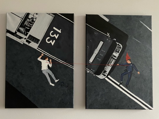
#it’s finished and I love how it’s turned out#the shooting scene#the shooting diptych#red string of fate series#the red string of fate#911 abc#911 on abc#911 art#911 fanart#painted by me#kym paints things#my art#buddie#evan 'buck' buckley#eddie diaz
608 notes
·
View notes
Text
“Shattered”
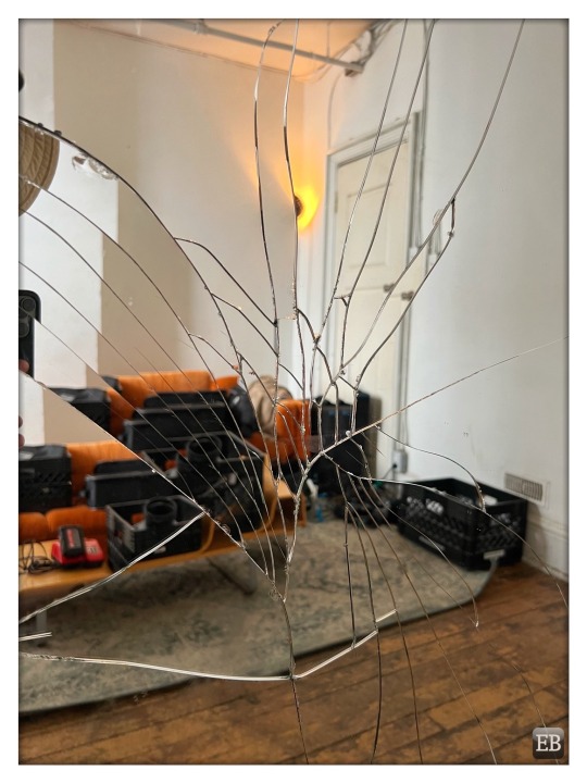
View On WordPress
#bad luck#broken#broken mirror#cracked#cracks#Diptych Studios#mirror#orange#photo shoot#setlife#seven years bad luck#shattered
4 notes
·
View notes
Text
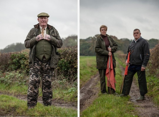
Beaters & Pickers, Pheasant Shoot, Surrey, UK. Images ©Jason Florio
Portraits of Beaters and Pickers at a Surrey pheasant shoot, Surrey UK. Pickers often work in tandem with gun dogs or retrieving dogs to aid in the efficient recovery of shot game. They may direct or assist the dogs in locating and retrieving birds, enhancing the overall efficiency of the process. Beaters aim to create a controlled movement of game birds, ensuring they fly in a predictable…
View On WordPress
0 notes
Text
the fact the konica autorex is one of only two cameras to do full & half frame. and the other one is a fucking hassleblad......kills myself
i'm kinda like a guy who just wants to buy a specific camera but not have it shipped from japan
#talkin to myself#it's such a neat option i really want a half frame but the ability to also shoot full is like WOW what a thought!#i was always leaning towards getting more of a point & shoot just something pocketable#but then i came across the konica............#anyways i gave up on the idea of an instant camera because i would rather just go straight film#i love shooting film. i love my film camera!#but it is like.... old. and the lens options are so expensive#i am thinking of just doing a kodak ektar h35 because it is such a cheap cute little camera#and it is half frame!! which is what i really was looking for#the idea of doing diptychs and having double the amount of exposures per roll is so dope#anyways long rambling post to say a lot of nothing sajhk
5 notes
·
View notes
Note
No way! Another person who has spent way too much time on apex! Who's your main? I'm guessing BH but I don't want to assume. How did you feel about the BH/Fuse engagement? Do you have any heirlooms? Sorry, not very many people play apex on here.
Also, do you have any apex art? If not that's totally cool but I would love to see it!
you have activated my trap card!! many drawings ahead
my main is indeed bloodhound. i also whip out fuse, mirage, and to a lesser degree octane, but mostly i'm a one trick bloodhound. they were what got me into the game in the first place back in season 7 when i heard their 'i'm afraid of heights :(' voicelines (a cool hunter nonbinary character voiced by none other than allegra clark? sign me tf up), and even though i am Very Bad At Shooting and don't actually like battle royale-type games apex stayed my brainrot for over two years. the brainrot is definitely over now and these days i play it as a social thing, but that's how i acquired 2k+ hours lmao
also they released a magpiehound recolor called 'frosthaven' that i gleefully snatched up and have been wearing it ever since (ft the magpie holospray and the magpie mural on their latest map. i think they are catering to me specifically)
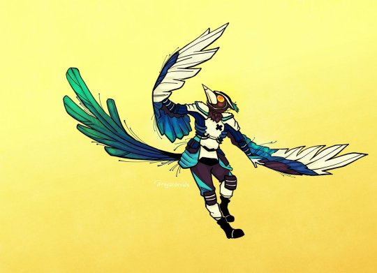
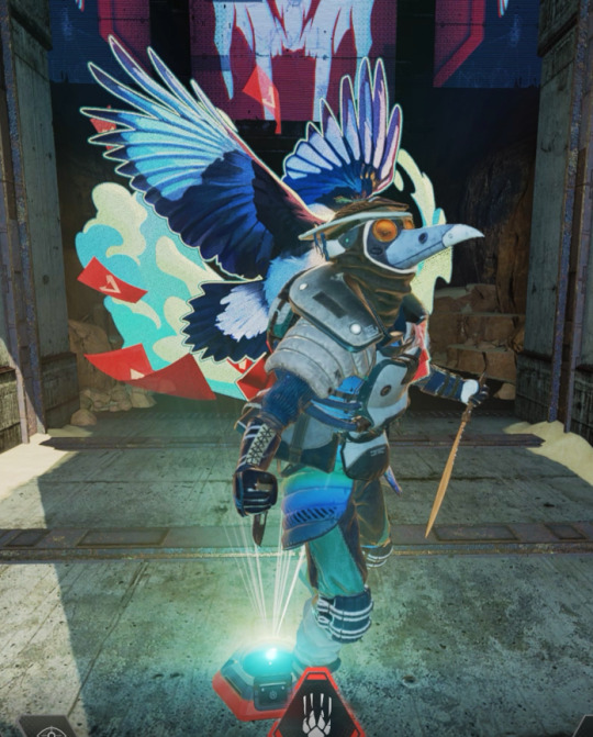
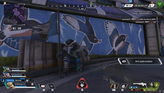
i am. truly Not Good. i am here just to clown and gossip and make poor life choices. my impulse control is too non existent for someone whose best skill is shooting a perfect outline around the enemy and not a bullet within
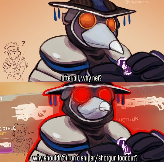
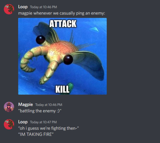
i had SO MUCH bloodhound art over on twitter good god. out of the following two drawings, the first one was bought out by allegra to sell as signed prints, and the second one was reposted onto apex's IG account, and in general this was the one time i genuinely had a blast on twitter interacting with all the devs and vas before everything went downhill both in respawn and on twitter lol. also i have to say, s10 and the whole White Raven thing fed me so. so so. SO well. the existential angst was incredible.
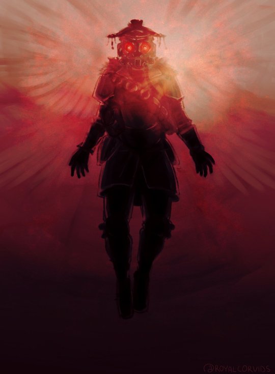
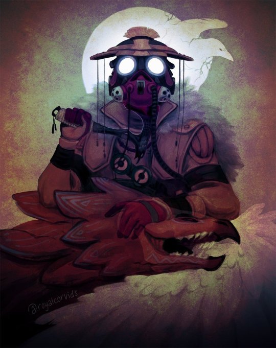
i participated in a couple of zines/projects as well! i have many thoughts about their canonical(!) respawn system and the resulting unimportance of death. adds to the existentialism and to bloodhound's religious themes
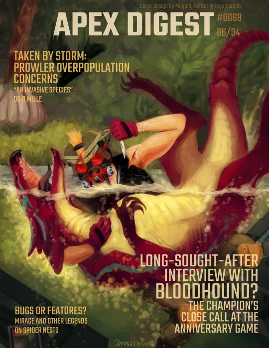
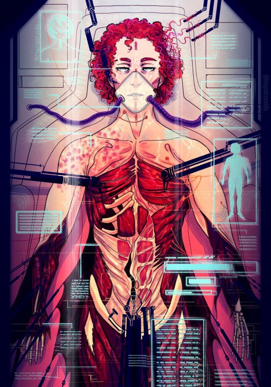
overall it was a very, very prolific period for me, and there are many pieces i'm still very happy with to this day
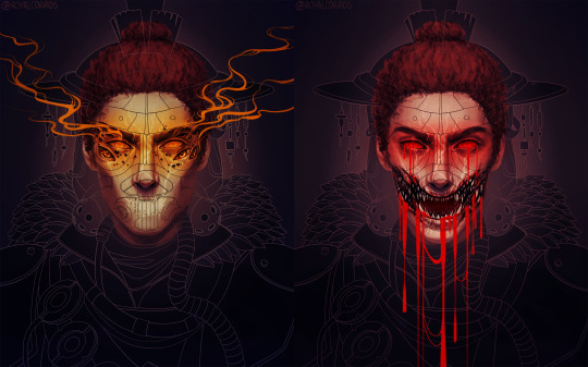
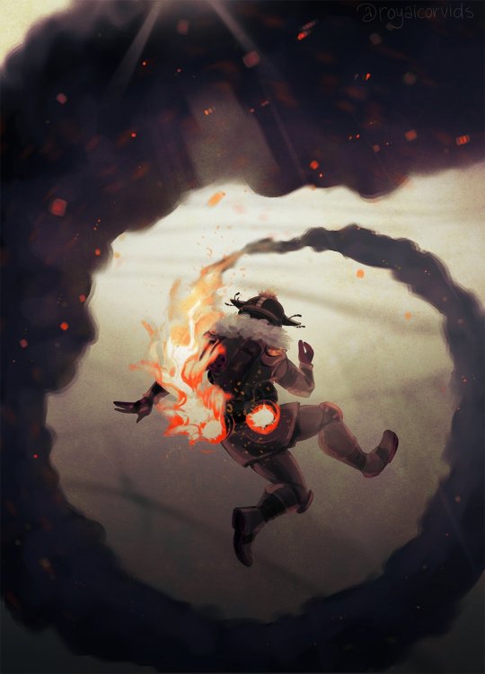
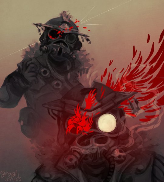
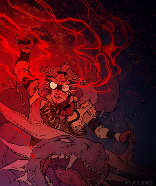
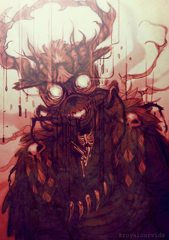
(^ the second to last one is a reference to the fusehound confession scene, and the last one is related to one of my fics, wooden bones (forest deity!bh au))
shipping!!! miragehound was my initial and most prominent ship, and i will never forgive respawn for not expanding on their backstory (their mothers worked together COME ON. they might have met as children! COME ON!!!!! i have a whole series exactly about the What Could Have Been)
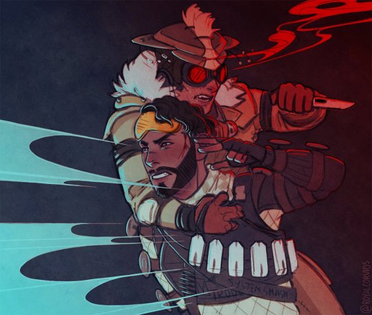
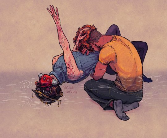
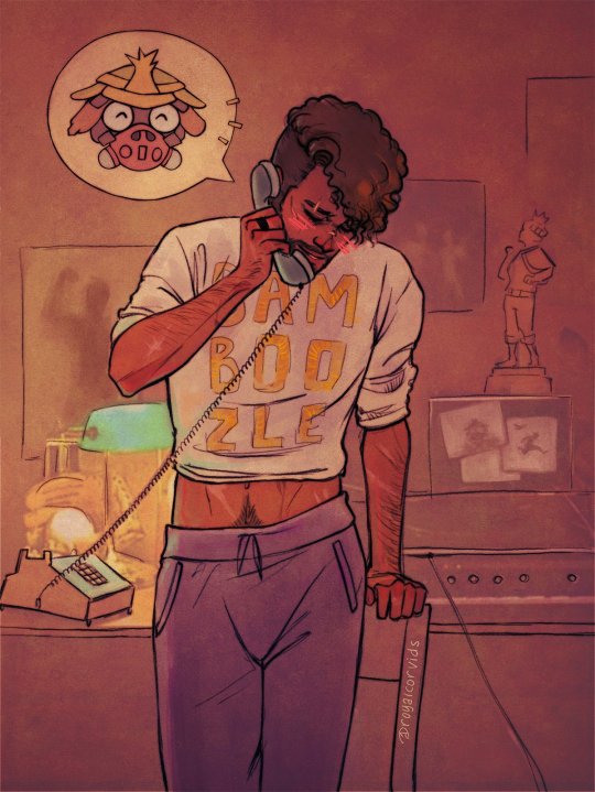
their backstory with boone also fascinated me for a very long time, and my friends and i spent many a yap session dissing the dude until we stopped and thought, hey, what if he really was Just Some Guy who made mistakes, what if he wasn't evil, and that's what pulled me right back into the brainrot when i was already starting to slowly recover from it. boone now has a very elaborate backstory and lore and i hope to god respawn never puts him in the games the way we did because a) they don't GET him and b) i don't trust the fandom with him lmao. i'm super down to blabber about him though just say the word. he's everything to me, my big, sad, hairy man
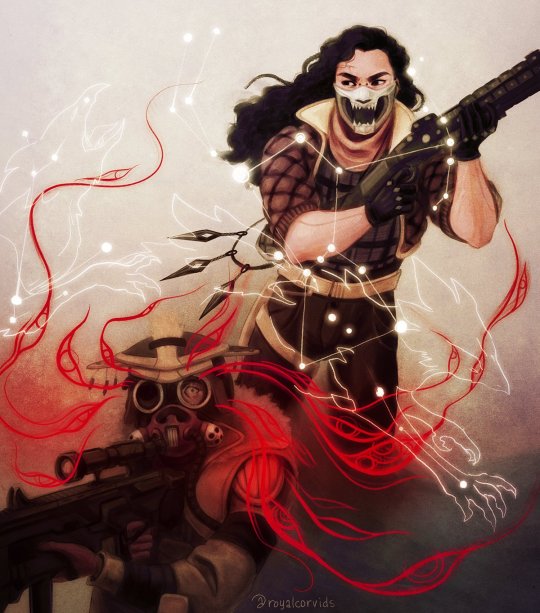
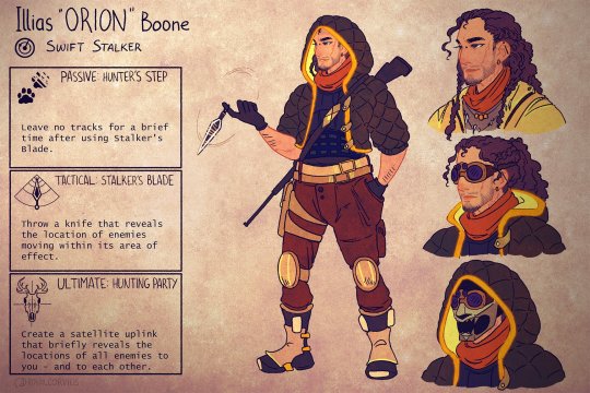
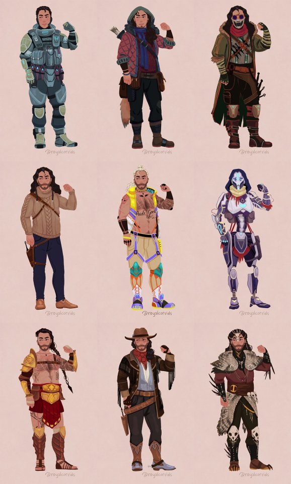
we also invented in-game stuff for him. he had abilities and skins etc etc (the top row of skins is his titan pilot backstory + talos era + 'default' in-game skin)
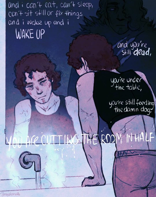
this diptych still lives rent-free in my head, i think i really won with this one
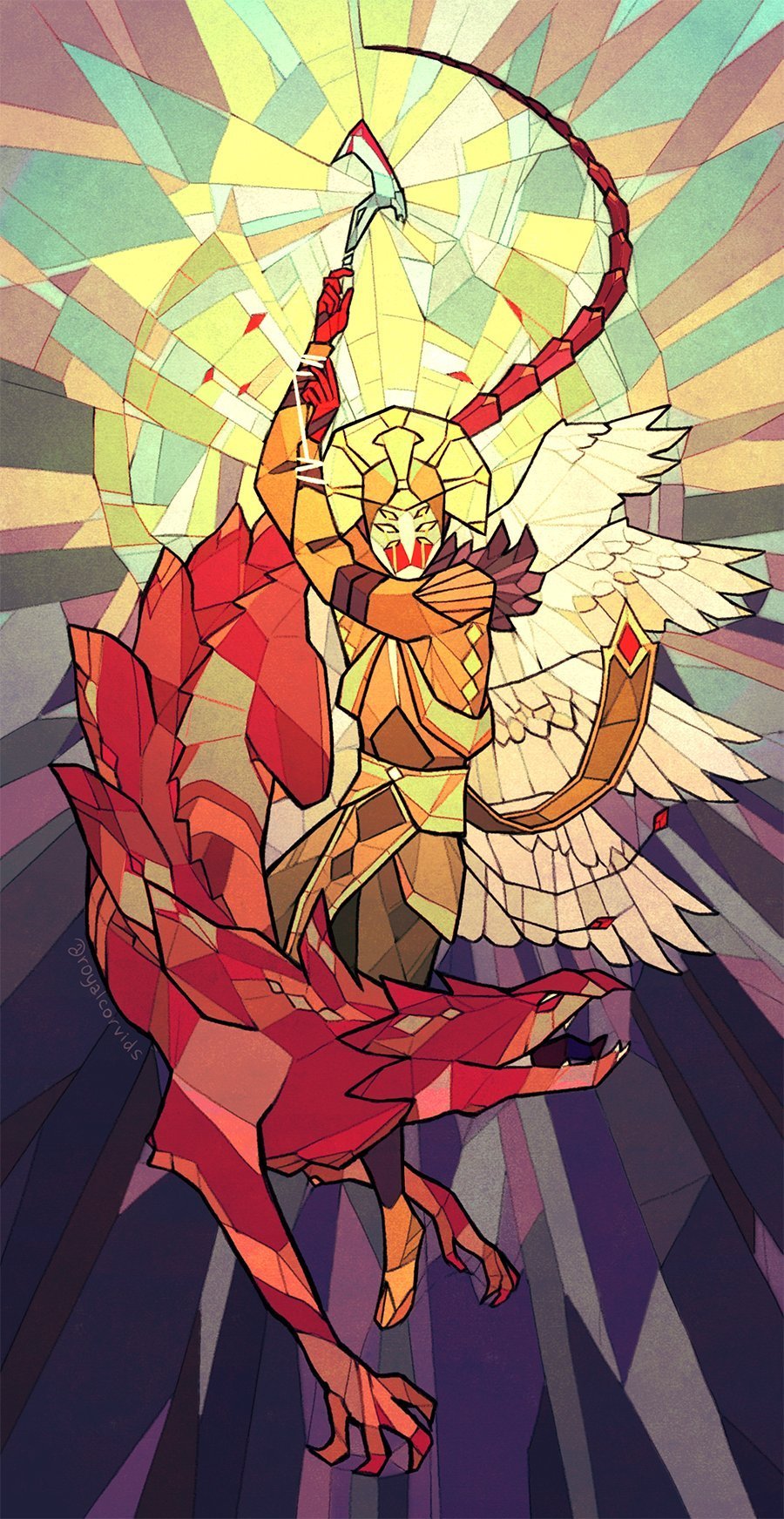
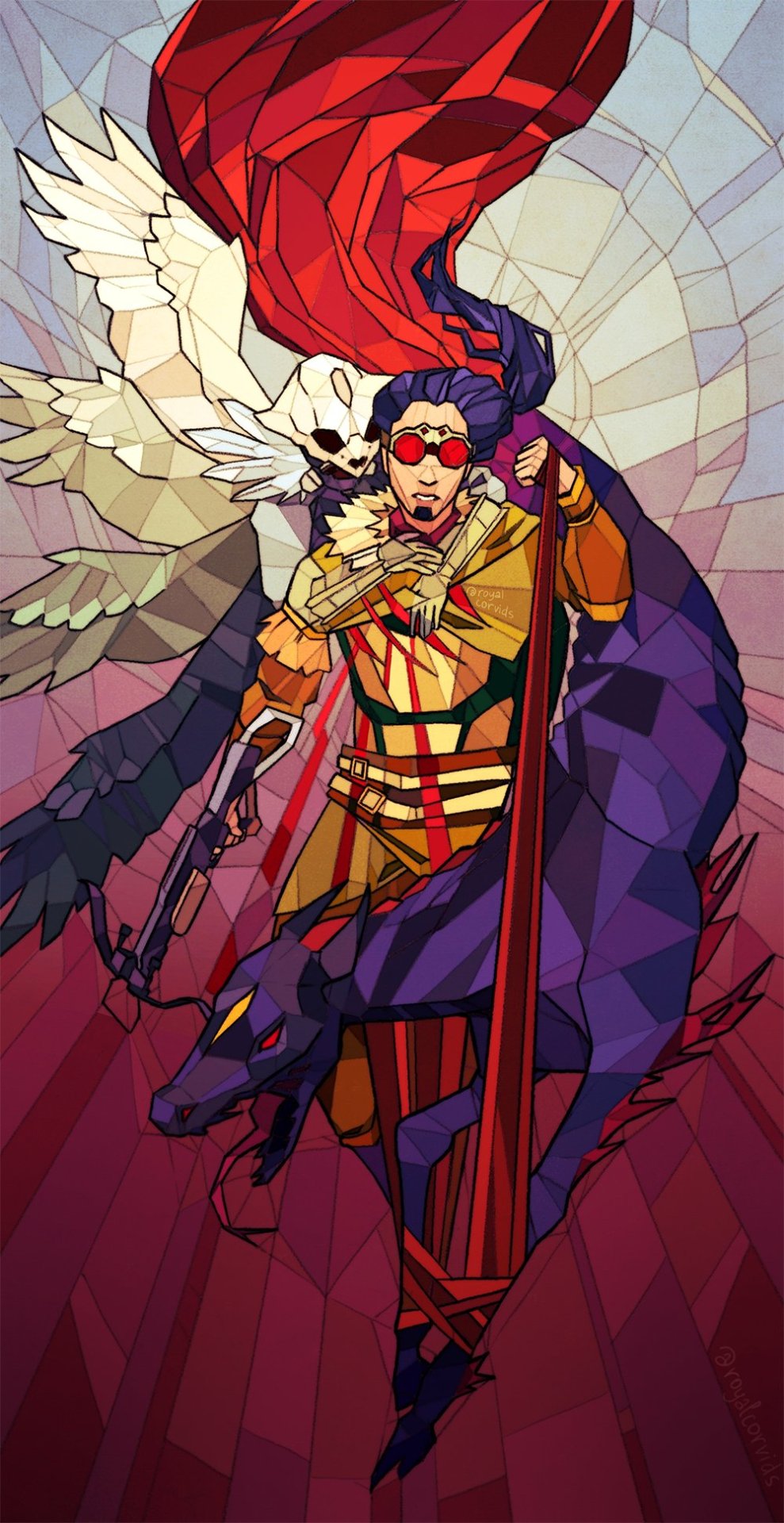
where miragehound and boonehound flourished, mirageboonehound wasn't far behind! i wrote how it came to be and all. also Рorn. so much Рorn. seriously.
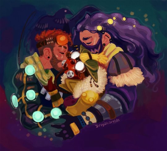
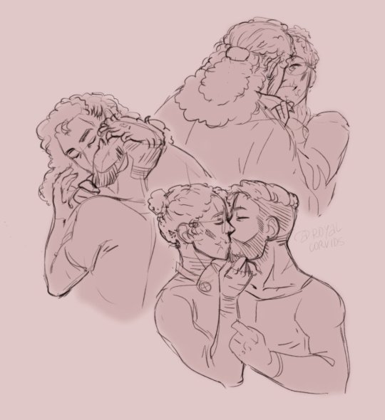
also this was the first time i redrew the twelfth night as my otp. the second one was mouthwashing
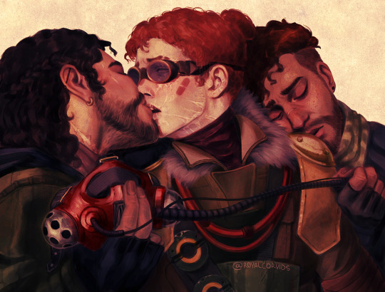
fusehound was an absolute delight to watch blossom, especially since we know it wasn't planned and just Kind Of Happened. i felt that lmao. characters be like that. i'm a bit sadge they shelved the whole talos plotline in favor of romance but at this point i gave up on expecting good lore from apex, especially after they fired herr frozenfroh. i didn't draw fusehound nearly as much, BUT i do have one fic that was basically a dream i had lol
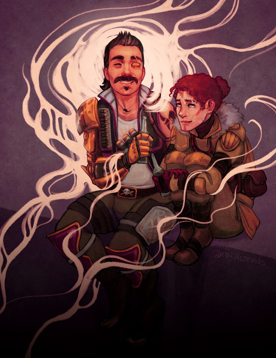
honorable mention goes to revhound!! this is the ship that went really hard with artists and writers. deeply painful, deeply compelling, absolutely incredible. mindblowing angst and just as mindblowing рorn, together or separately. best shit. the one ship i didn't write for because compared to the fandom's behemoths i never felt like i'd be able to contribute anything meaningful lol, i just got to sit back and enjoy
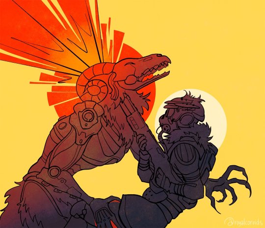
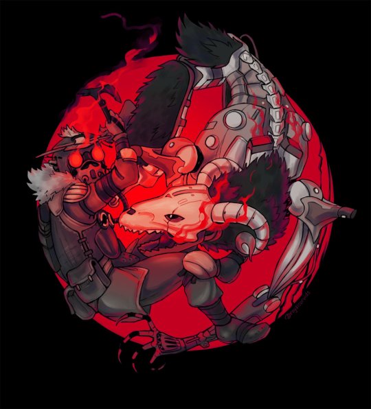
bonus: as one of my friends eloquently put it, bh and their bhitches :)
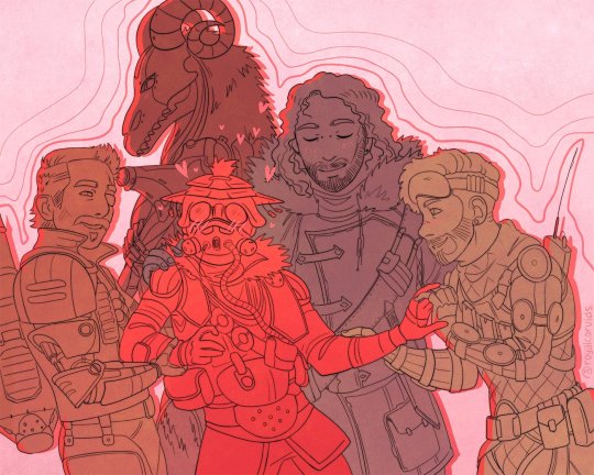
i was going to put in more pictures but hit the 30 images limit!!! my twitter is now abandoned but if you scroll down just a little you can see all the stuff that didn't make it into this post.
apex and bloodhound also REALLY, REALLY got me writing. i came into the fandom already relatively warmed up after a 170k fire emblem fic, but i ended up writing 200k+ for miragehound, mirageboonehound, and fusehound combined. i was unstoppable. it was insane. i've linked some already but you can peep them all here. bloodhound's pov was especially fun to write for, purple prose my beloved
also you asked me about heirlooms! i'm a lucky motherfucker who managed to get one set of shards from the 500th box and another from just the random 0.4% chance. so i have bloodhound's and fuse's as they are my most played characters :)
52 notes
·
View notes
Text
The Marilyn Portfolio, Untitled Bella Goth, and Professor Venomous' Self Portrait
youtube
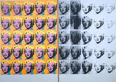
Marilyn Diptych, Andy Warhol, 1962
After Marilyn Monroe's unfortunate death in 1962, Andy Warhol released the Marilyn Diptych. The base portrait is a cropped, zoomed in reference pulled from a promotional shoot Marilyn posed in for her starring role in the movie Niagara. This portrait was screen-printed 50 times in color to black and white with varying degrees of quality/deterioration. Warhol's intention was to marry commercial art and celebrity culture with the kind of worship and devotional imagery found in churches and Christian art.
The Marilyn Diptych takes part of its inspiration from classic triptychs: multi-panel works depicting religious scenes and figures. Where classic triptychs were made to endorse and deepen someone's faith in God, the Marilyn Diptych was commentary on celebrity worship and how celebrities could and were placed on pedestals similarly to religious figures. The portrait repetition mirrored how often Marilyn was typecast as a "dumb blond" in movie roles. Because of how heightened celebrities are, they are the subject of intense public scrutiny. Their personal lives are as much spectacle and centers of intrigue as the fictitious characters they portray.
Her public image was the blonde bombshell and sex symbol; a fantasy that men lusted after and women both envied and admired. When Marilyn was outed as a scandalous subject because of her past pin-up work or the dicey nature of her movie roles, it only strengthened her image and reputation. Though, the fact her past was placed under such scrutiny and everything about her was subject to similar microscope slide treatment shows how much more Marilyn was seen as a character instead of an actual person. Marilyn wanted her celebrity image to exist as a separate, distinct entity from her personal life. Warhol's various Marilyn works are described as a tribute to Marilyn's desire for just this. Works like Marilyn Diptych are part of the library of iconic imagery that draws attention to Marilyn, but the hope is to redirect and keep focus towards Marilyn the immortalized image instead of the person behind the image.

Marilyn Monroe portfolio, Andy Warhol, 1967
The Marilyn Monroe portfolio series is a popular set of images to pull inspiration from for other derivative art and even art assets in games or shows. The intent behind the Diptych is similar to the inspiration for the Marilyn Monroe portfolio series. Though, the biggest difference is that the portfolio works center more on channeling commercial art and playing with varying color theory. Each of the works can stand separately as an individual piece because of how the dramatically different color schemes can change the mood or theming of the portrait. These weren't made as a deliberate, cohesive whole like the Diptych. That said, the varied, careful, and deliberate approach to color theory sets the portfolio as a striking but convenient set to reference or recreate.
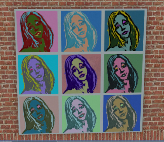
In The Sims 2, the in-game Bella Goth pop art piece Untitled draws inspiration from the Marilyn portfolio series. Not only is the in-game art named after one of the Marilyn portraits, Untitled features a magazine posed and smiling series of Bella Goth in 9 different color variations.
Bella Goth has become an unofficial mascot for the Sims series ever since The Sims 2. In the original Sims, Bella, her husband Mortimer, and their daughter Cassandra were inspired by the classic kooky, creepy, and lovable Addams family. They share the Addams' love for Gothic and the macabre; they dress in darker colors and live in a Victorian flavored mansion next to a prominent graveyard. Most people are also familiar with Gomez and Morticia as a pair of hopeless romantics. Gomez peppers Morticia with shameless flirts and kisses. One of the iconic scenes in the 90's theatrical movies features a series of champagne corks popping off as Gomez dips and deeply kisses his wife. To an extent, Mortimer and Bella are supposed to recapture or echo Gomez and Morticia. Player success in recreating this are varied because of the finicky mood and intensive needs micromanaging Sims requires. If players can kick off successful romantic interactions between Sims, one of the kiss options is 'Passionate,' which features a tender embrace and dramatic music swell. This isn't directly related to Mortimer and Bella, but it isn't a stretch that these two might perform these interactions autonomously on a community lot.

After the Sims, Mortimer and Bella's relationship becomes muddied. Where Mortimer and Bella could be seen as a do-not-separate unit before, Bella easily overshadows Mortimer or the other Goths as a notable figure in her own right. In the PSP spin-off for Sims 2, Bella confides in the player that she only married her husband for the money and was in the process of running away from him period. In the mainline Sims 2 for PC, Bella has mysteriously disappeared. In-game bread crumbs point towards alien abduction, potential meddling from Bella's freshly-introduced sister-in-law that has convenient family ties with aliens, and Bella's prominent feature in the art for the paranormal-flavored and Area 51-inspired neighborhood Strangetown.
Game devs wrote an official Q and A with the Bella in Strangetown on the unfortunately-retired Sims 2 site. This Q and A was dropping further breadcrumbs about nefarious actors trying to use her as a means to get to Mortimer's neon green life-extending potion. There's no direct confirmation as to the why behind Bella's abduction, let alone concrete details on what happened after. Everything is a series of vague hints; pieces that the player strings together for their own personal soap opera. Overall, Bella's disappearance is something that has fascinated and enraptured players for years. There's still people writing stories, speculating, and drumming up theories about her 20 years later!

In game, Bella is portrayed as a beloved and highly charismatic socialite. She's a local celebrity. Artists are so enchanted by her that she has several pieces of in-universe art and sculpture modeled after and made in tribute to her specifically. Placing Bella as the subject for an art piece inspired by Warhol's Marilyn Monroe portraits is a stroke of genius. Bella is an iconic, larger-than-life figure among her in-universe admirers and Sims enthusiasts alike. The mystery around her catapulted her from fun pre-made character to such an established character in Sims canon that players expect some news about her or some hint at her presence in every existing Sims game, past and upcoming. She's beautiful, she's tragic, and she's such a mystery. Because of how few details players have to work with or piece together, Bella captures the imagination and plays with the theater of the mind. Regardless of how effective Simmers may consider Bella's story, it's become a front-and-center example for the storytelling potential a Sims game can have.
Marilyn is described as the postergirl for Hollywood glamour and part of celebrity culture. She has a very iconic look: heavy lidded eyes, sculpted bob, and red lips. Bella is considered fashionable and glamorous. While there has been some variation in her hair color, she's best known for her classic red dress. No matter how Bella's design or fashion is changed to try and keep pace with changing trends, the red dress is a staple. Red is Bella's trademark. In a fitting way, Bella is the immortal icon of the Sims world. She may have an official playable Sim in Sims 4, but her presence as a figure in Sims 2 will always eclipse or influence every following iteration of her in some way, shape, form, or respect.
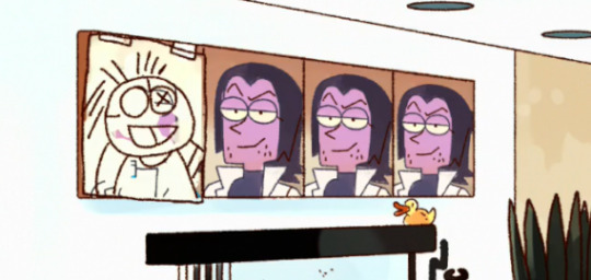

(I included Boxman's set of Darrell portraits here as a potential nod to the triptych inspiration behind the original Diptych.)
There's also a Marilyn Diptych inspired portrait of Professor Venomous in the cartoon O.K. K.O. This portrait is prominently featured on his wall whether its at his house or in his personal office at Boxmore. Lord Boxman has a repurposed version of Michaelangelo's famous Creation of Adam mural placing himself in the role of God and his robot kids as the 'Adam' or otherwise reaching out towards him. This repurposed art is a cheeky nod towards Boxman expressing sentiments like 'I am your god!' to his first robot Mr. Logic and how much emphasis he places on the power trip he holds as the Boxbots' dad. Given the context of the original Marilyn portfolio, the Professor's variant might be part of his attempt to reconstruct himself and his self-image. The Marilyn portraits depict a very specific version of her; a very careful and highly curated image.
As soon as viewers learn about his alter-ego Shadowy Figure, the Professor tries to present the split as a Dr. Jeckyll and Mr. Hyde situation. Professor Venomous is his smooth-talking, level-headed, and reasonable public image. He has moments of being obnoxious or showing some irritation, but he usually tries to school his expressions. There's some level of restraint and control. Shadowy Figure is openly cruel and sadistic. He's the culmination of the more impulsive and desperate things Venomous wants to do: In his previous role as Laserblast, he was publicly reamed for suggesting inventions like a ray that permanently debilitates super powers, shrinks someone to subatomic level, or other obvious harm. He's openly evil as the Professor, but still feels some need to protect his image and reputation. He's still a very private and guarded person. At the very least, the increased secrecy as Shadowy Figure is an extra layer to make it harder to trace anything Venomous-related back to Laserblast and reveal his big secret.


Narrative ties aside, the Professor's portrait is also an interesting parallel to some of the art direction choices around him. Marilyn Monroe was considered a sex symbol. As Laserblast, he was called 'the hot hero' in a newspaper headline for his obituary. Otherwise, the Professor was given an elevator eyes treatment from Lord Boxman. That scene can be argued as a POV camera that's similarly applied to Boxman from Venomous' perspective and again applied in a ship-bait scene between Enid and Red Action. There's also the how-did-this-slip-past-censors scene where the Professor is leaning back in his office chair, legs spread, and slight drool dripping from his mouth. That scene has the same energy as a sex appeal fan service camera in most anime. The camera is full-on ogling Venomous here. This move was as deliberate as Studio Bones turning a Reigen Arataka undress and shower scene into something more dramatic and theatrical than the mundane, candid shot it is in the manga it was adapted from. At least Reigen's scene has a layer of irony to it; it's a Poe's Law situation where viewers aren't 100% sure if the fan service approach is a joke or earnest.
It's not an appropriate one-to-one comparison to Marilyn's sex symbol status, but it's interesting to look at both the cartoon's portrayal of Professor Venomous as well as fan reception. He's part of the ever-growing library of Tumblr sexymen and given draco in leather pants treatment. In a roundabout way, the Professor's pop art portrait is a reflection of the complicated commentary around Marilyn and what dialogue the portfolio and other works have drummed up about her image and celebrity culture in general. Characters like the Professor can drum up interesting conversations about how 'sexy' villains are portrayed, how that might impact the way people interact with the story/media they are from, and what it says about the play between someone's looks vs their actions. In the Professor's case, his looks arguably help drum up more sympathy than he might get otherwise. The bigger part of his particular story is about reputation and public image than physical appearance, though. Even when he has a come-to-Jesus moment with his ex, he has a moment of L'oreal model pout, but that doesn't stop Carol from attacking him or demanding answers.

In a nutshell, it's interesting to pick out a Marilyn-inspired self-portrait as part of the Professor's decor. Looking at the history or commentary around Warhol's Marilyn portraits, there's strong emphasis on her identity as a cultural icon vs who she was in private. The commentary centers on her lack of privacy; she's not allowed to have a separate life outside of being a celebrity. Profesor Venomous' portrait borrows this commentary and applies it to his ongoing struggle with identity. He managed to escape a role that didn't fit his values or personal self-image, but he still felt forced to create and maintain a new identity. There was always some tug of war between his private self and how he wanted to portray his public image. The other example pulled from Sims 2 highlights the difference between Bella Goth as a grand mystery vs the mundane Sim she is when she's actually playable.
Regardless of what someone thinks of the original Warhol Marilyn works, there can be some nugget of intriguing character writing or other commentary when a character is deliberately centered in their own Marilyn-esque portfolio.
#marilyn monroe#marilyn monroe diptych#marilyn monroe andy warhol#sims 2 bella goth#sims 2 bella goth pop art#ok ko let's be heroes#ok ko professor venomous#ok ko meta#art analysis#art discussion#ok ko#i'm not 100% sure how to tag this lol#character essay#character analysis#professor venomous#Youtube
21 notes
·
View notes
Text
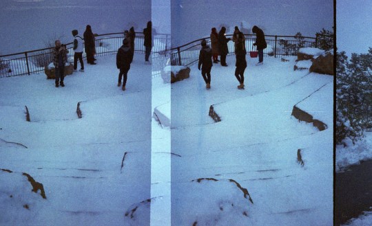
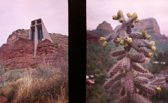
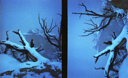
If you shoot color film you know just how expensive shooting film has gotten. Being a budget minded person I decided to jump on the half-frame camera bandwagon and honestly despite some mild setbacks I am hooked. These images of the Grand Canyon and Sedona were shot on a Canon Demi camera. Despite the low-fi look, scratched film and soft images I credit this camera with getting me really into half-frame. What I love most is the diptychs you unexpectedly get, big plus for getting up to 72 frames a roll!
#analog#filmisnotdead#film photography#35mm film#35mm color film#35mm color photography#grand canyon#sedona#half frame#fuji superia 200#canon#canon demi#landscape#nature photography#original photography on tumblr#original photographers#photography
13 notes
·
View notes
Text
Spider-Man: Comics Recommendations (The Sixties)
MASTERPOST
So I just finished reading The Amazing Spider-Man comics from the Sixties (aside from about 20-30 issues in the Ditko era). Want to know what's worth a read? Probably everything, in a way, but here are my recommendations in chronological order under the cut, and if you can't be bothered, here's a quick summary:
ASM #1, Ann #6, ASM #39-40, ASM #47, #50-52, #53-61, SSM #2, Ann #4, ASM #67, #68-70, #75, #78-79.
(In bold: what I particularly loved.)
Issue #1. It's a classic. Amazing Fantasy #15 isn't so interesting. It features a few different stories so it's already a meaty part. Please be aware that this era is very verbose and the art is... what it is. Read a few issues from that era here and there, maybe read issues 31-33 ("If This Be My Destiny...!") but you quickly get the idea.

2. Annual 1: Dozens of cameos, Doc Ock uses Bluetooth, plot twists, it feels like a greatest hits issue.

3. The Green Goblin diptych: Issues #39-40 AND/OR Spectacular Spider-Man #2 (which partly retells it, and adds to it). For the first, it's the start of Romita Sr. taking over Ditko as the main artist (although he tries to keep the same visual style for his first few issues). The Green Goblin discovers Spider-Man's identity and reveals his own... and in SSM#2, this is retold with better art, as well as more story.


The difference in style is striking and SSM2 is definitely one of my favorites. If you hesitate, pick SSM2.
Maybe you can read issue #42 to see Mary Jane's iconic and long-awaited first appearance, but the issue itself isn't that good.
4. Issue 47: Kraven shoots lasers with his titties, and Peter and Harry become roommates. Enough said. If you enjoyed it, you can read the next two issues as well since they continue the storyline, but they're less fun.
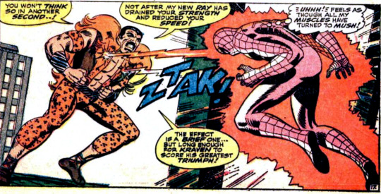
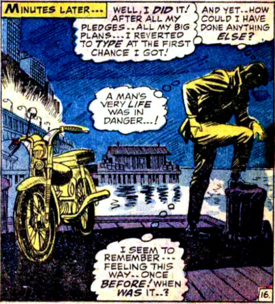
5. Spider-Man No More (Issues 50 to 52): Another iconic storyline. The mob plot would be a bore if not for a specific character, but Peter has had enough of being Spider-Man and the art is gorgeous. #52 in particular is great. The original comics have different coloring from the scanned, cleaner version, just FYI.
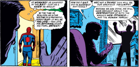
6. Annual 4: Spidey and the Human Torch team-up against two mysterious villains... The two heroes often pair-up, and I really enjoyed this one so here you go! Plus, you get to see Peter and Harry's apartment in details in a double-spread, as well as the cast in the iconic coffee shop.
7. What a Tangled Web We Weave (Issues 53 to 61): So here's an extract from my read-through:
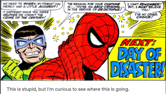
In this batch, we have Dr. Octopus drinking tea with Aunt May, and Spidey getting amnesiac, which influences his hero life and his soap opera daily life.
I was very invested in the storyline, so that's why I'm recommending all of it. If you're a soap fan, read it! And you can add Marvel Super-Heroes 14 as a treat. It's a weird issue, but imo it's a worthwhile read.
8. Issue 67: By this point, the stories are pretty much consistently entertaining, but this issue has a very nice fight with Mysterio. It's a visual treat. Maybe read the previous one if you want context.
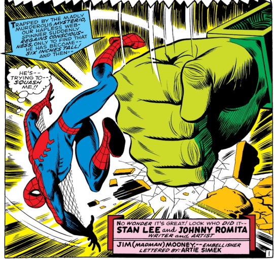
9. The Clay Tablet Arc but specifically #68-70 & 75. Peter gets involved in politics, Civil Rights are discussed, Jameson gets his due, Harry gets a moustache inspired by Fu-Manchu. However, the villains aren't compelling and the mystery of the tablet only gets interesting as it is resolved, hence why you can skip a bunch of issues. Ideally, you'd read everything, but hey, I'm only putting the best out there.

10. The Night of the Prowler (Issues #78-79): One of the more interesting characters introduced this decade! Aside from that, the balance of soap and action is perfect. The art is awesome too. #80 is also fun.

gosh he's so pretty
#spider-man#peter parker#comics#recommendation#guide#green goblin#the amazing spider-man#Stan lee#steve ditko#john romita sr#The Prowler
4 notes
·
View notes
Text
Movie Review | Miami Vice: Calderone's Return (Glaser & Colla, 1985)
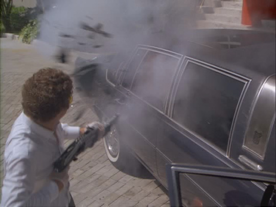
This series has been defined in part by its maddening roster of guest stars, with the likes of Bruce Willis, Pam Grier and Dennis Farina in memorable turns, to name a few. I'm into the second season now*, but I wanted to come back to this one, as one guest star in particular has lingered in my memory: Jim Zubiena, who plays the assassin hired by Calderone to a number of his enemies, including Crockett. Zubiena, a professional shooter initially hired to teach Don Johnson and Philip Michael Thomas proper weapons handling**, was pushed into the role by Michael Mann, and his non-actor background plays a big part in his effectiveness in the role. Those other guest stars bring to their roles their presence, bringing their personalities and star qualities to the material. One of the reasons Willis is so memorable in his episode is that his formidable charisma is applied to a character so unheroic. (A weapons dealer who sells to terrorists and beats his wife. Just a bad guy in all respects.)
Zubiena does not have the same star qualities, so instead he brings a certain absence, of charisma, of distinguishing features, leaving only an eerie blankness. No humanity, all killer instinct and craft, a pure instrument of death. His appearance, curly hair, shooting glasses and a slight smile, causes any facial features to recede into the nondescript. His lack of allegiances, having worked every side of every conflict, give him a sense of total amorality. Even his weapons handling (the deployment of the Mozambique drill, heretofore unseen on television, and holding guns overhand to control the recoil) is simultaneously unusual and practical, operating on a hidden logic not spelled out to the audience, like the imminence of death in an Italian horror movie. Even when he's not on screen, he haunts the proceedings, a spectral presence with an unsettling void at his centre.
Unlike Brother's Keeper, this aired in two parts, with an interesting diptych structure, both halves being punctuated by off-kilter, unceromonious violence and ending with songs featuring soaring vocals (Russ Ballard's "Voices" in the first part, Tina Turner's "What's Love Got to Do With It?" in the second). There is plenty to enjoy in both, but as Zubiena only appears in the first, and the second depends on a relationship between Tubbs and Calderone's daughter that can't be fully fleshed out in the runtime, I can't help but prefer the earlier half.
*I've found the series almost uniformly excellent, with only two subpar episodes so far. "Made for Each Other", which makes the mistake of foregrounding the comic relief characters of Switek and Zito and as such plays with little tension, although it does provide the scene where Noogie's stripper girlfriend grabs him by the ears and shouts in his face "I wanna see Mickey Mouse!" And "Nobody Lives Forever", in which Crockett (re)learns the age old lesson of putting one's bros before their hoes, and which has the misfortune of coming after "The Home Invaders", which features more unpredictable and sadistic villains (and shows Castillo crack a case in real time), and before "Evan", which explores Crockett's vulnerability much more interestingly and tackling the subject of homophobia with unexpected sensitivity.
**Apparently Johnson took to it better than Thomas, and this was a motivation behind the latter's weapons of choice. You can hear Zubiena talk about the experience here.
2 notes
·
View notes
Text
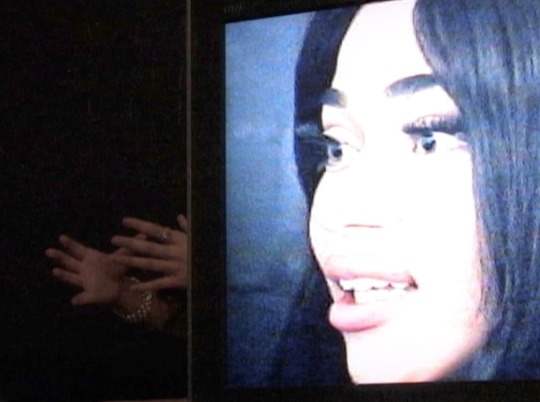
for this campaign i’m creating a project that juxtaposes b-roll from the shoot against a series of interviews with our models. these short ads/films will be formulated as a diptych, using prevalent excerpts from interviews and behind-the-scenes. (there will be a long unedited cut of the interviews as well, which will be displayed at a gallery)
one screen will play footage capturing the call and response between me and the models: they answer my questions that one may ask a friend or a stranger. the other screen will be footage of them owning the stage and posing for another camera.
we witness someone blossom on camera through the use of words, and we witness them bloom through the use of movement. [swimming vs. bathing]
the idea is to form a new relationship between their two forms of action. with the interview shown next to, and playing over the b roll, one is forced to give a voice and apply an understanding of their own humanity/empathy to the models, that contradicts the initial desire to understand them through the lense of deaf sex appeal or the veil of glamour. (hence the phrase “anti-porno”)
the depth of the character we see on screen suddenly deepens by leagues, as a one degree of interpretation now stretches to become multidimensional.
because this is advertising, and we’re selling sex no matter how we cut it, we wanted to add a more human aspect to the brand by turning our models from an object into the ~subject~.
-Me, and the Books of War team
1 note
·
View note
Text
Artist Research (Week 10)


Images source: https://www.carylineboreham.com/public-works
A particular style that I like of Caryline Boreham’s work is her diptych’s. Each picture is able to stand by itself, depicting a different aspect of the same scene. When stood next to each other, they create the same effect that a panorama has due the continuous horizon line in both images. However, they have been edited in a way that creates the idea of them being two separate photos. Both images are the same size, but one image frame is positioned slightly higher than the other. There’s almost an uneasy feeling about this slight skew, despite the horizon line being straight. In one image we see a little more of the sky, and in the other more foreground is seen.
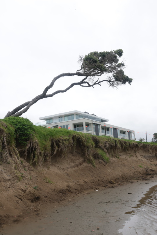
The uneasiness that comes with the slight skew isn’t something I’d like to include in my work, but I like the idea of setting up a panorama in this way. Taking multiple photos while panning from the same point is an immersive way to explore a scene. The viewer is taken to the place where the photographer is standing and can see a wider viewpoint than that taken with one image. This is something I would like to apply to a particular reshoot of the banks of Ōrewa Beach where the erosion of the land is occurring. I took one image in week 8 (below) of an area that received serious damage from the storms in 2023. The focus in the image is the tree that has grown at a peculiar angle due to the strong onshore winds. However, the damage to the banks and the landscape has only been touched on in the lower half of the frame. By using the method of panning that is displayed in Boreham’s work, I would be able to capture more of the detail in the surroundings of the tree, while continuing the use of this composition. I plan to explore this in my shoot next week.
0 notes
Text
(born in 1995 Bulgaria, Lives and works in Plovdiv)
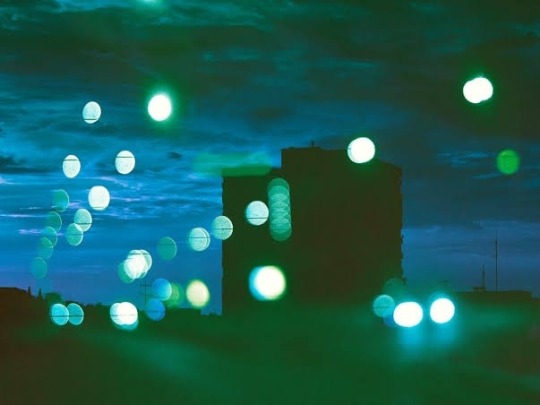
Guided by intuition, Mia Novakova creates photography that is as unusual as it is beautiful - taking inspiration from the every day life. Often the images are combined and rearranged. "Through blur, texture, intense colour and lighting I try to put together an experience that encapsulates emotions such as nostalgia, longing, anger and desire. Most of my recent work focuses heavily on diptychs through which I illustrate movement, transition and polarity."
Interview: Cinematic photographer Mia Novakova
Mia’s beautiful multiple exposures transport us to a familiar - yet equally unfamiliar - reality. Naturally, we were intrigued by her inspirations and processes. We speak to Mia to find out more about the photographer behind @coughh_syrup.
MN: I'm drawn to the quietness, solitude and lights. During the night, the city looks different. Even the dullest places can appear mysterious and exciting. I feel like the night allows me to be more honest and true to myself, which - in return - inspires me to create and to express those feelings.
MN: I'm drawn to the quietness, solitude and lights. During the night, the city looks different. Even the dullest places can appear mysterious and exciting. I feel like the night allows me to be more honest and true to myself, which - in return - inspires me to create and to express those feelings.
MPB: Do you generally have an idea in mind, or are you more reactive?
MN: When I shoot, I rarely plan anything. I'm mostly guided by intuition. I spend a lot of time editing my work, combining multiple photos, and putting little pieces together to create the image that I see in my head. Almost like a painting. Sometimes, I instantly recognise which photos would look good together, but there are times when I prefer to experiment. I listen to some music for inspiration and follow my intuition until I end up with something unexpected.
MPB: If landscape or nature photography is as close to a literal interpretation of the world, how would you describe your work?
MN: I don't think there's such a thing as a literal interpretation. By default, an interpretation is subjective. In that sense, I don't really see a fundamental difference between shooting nature or landscapes and my own subjects.
For me, there isn't really a difference between one person shooting something realistically, and another who does it in a surreal or dreamy way. The difference is in the experiences that the images evoke, rather than a style or technique used to create the image. I've had surreal feelings when looking at work that has been shot realistically - and vice versa.
MPB: Is there a certain way you want people to interpret your work?
MN: To me, it doesn't really matter what the evoked emotion is, as long as there is one. Everyone perceives things differently, and I think that's the great thing about art. Occasionally, I try to influence the interpretation of the image with, for example, the help of a certain colour. Most of my work is introspective, in one way or another. I often project my own thoughts and fears into it, but I still try to leave some room for different interpretations.
MPB: You feel quite strongly about snobbery in photography - specifically when it comes to equipment. Could you talk us through what made this an issue for you?
MN: The photography community has tons of gatekeepers, to the point it's often toxic. Especially for people who are just starting out. It demotivated me when I was starting out, I began doubting if photography was actually for me. I thought that if my work was to be considered ‘legit’, I had to follow certain rules and have really good gear. And even then I'd still be an ‘amateur’ in the eyes of a lot of people. All of this made me quite distant, and it's one of the reasons why I still don't like calling myself a photographer. Some people are so wrapped up in camera wars, they don’t realise how silly it is.
I've always tried to understand where that gatekeeping attitude comes from. I guess before the mass adoption of photography, those people considered themselves special and self-important. They thought they had mastered that craft. Post-processing is often mocked and frowned upon as if it's ‘cheating’. I think that’s ridiculous. Not every artist wants to document reality. Some want to create and show their own version of our world.
This is just a means to an end, the tools we use to create our images. The important thing is the passion and creativity that we bring to our work.
MPB: Most people are consuming photography via a digital device - do you feel this is destructive to the medium or is it a positive thing?
MN: I recently graduated from university. For my final year project, I decided to make a photo book. I spent a lot of time designing the layout and text, figuring out where to place every photo, so that it all came together to tell a story. It was the first time I saw my work in this light. I had complete control over the way it was presented. After spending months working on my photo book, it felt strange looking at Instagram through the tiny screen of my phone. I felt detached from Instagram and stopped posting for a while.
I’ve noticed the way I've been consuming photography had been overwhelming and distracting me. It hadn't been inspiring me. The constant scrolling through streams of images had led to a kind of image overload. I started to be more mindful of the way I consume art in general, looking at more photo books and going to exhibitions.
Of course, there are positive aspects to digital platforms like Instagram. They connect people, giving opportunities to artists because their work is more accessible to the public. If it wasn’t for Instagram, we wouldn't be speaking right now.
MPB: Do you encounter any hidden problems with having a big online following?
MN: It still feels surreal, having so many people follow me and want to see my work. Although I'm incredibly grateful for it, I don't let the numbers get to my head. I take breaks from social media. And I try not to post just for the sake of posting. Sometimes, I refrain from sharing certain photos because they’re either vastly different from most of my work online, or they are too intimate. For example, I have lots of black-and-white images that I’ve never shared with anybody. I think it’s liberating to make artwork and not show it to the world.
MPB: Your work is very cinematic - with light playing an important role. Have you ever had leanings towards cinematography?
MN: I definitely have leanings towards cinematography and I'm eager to learn more about it. I'm incredibly inspired by the work of Robby Müller. It cuts through time. His use of colour and light is incredible. It has influenced me a lot.
MPB: Is there anything you’d like to try?
MN: Might sound cliché, but I'd love to shoot on Super 8 film. I'm a fan of its gritty and grainy feel. I really want to try it. I'd also like to start working on another book.


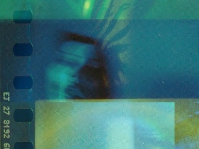
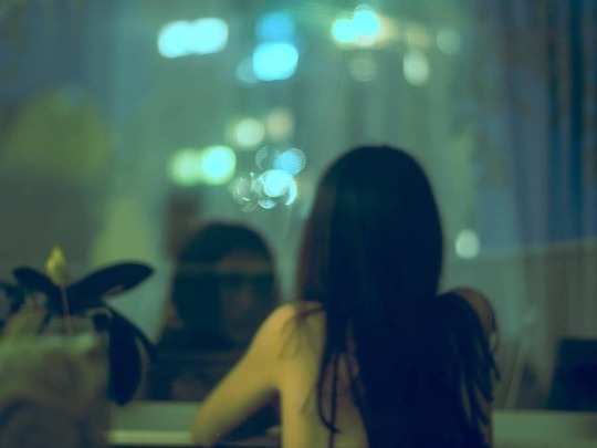
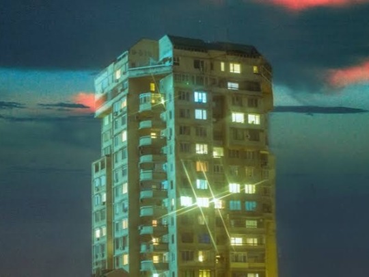
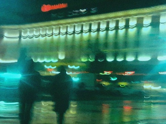
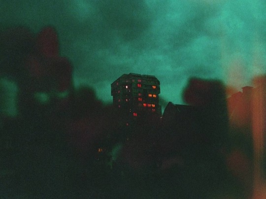
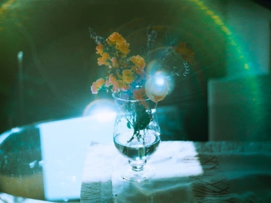
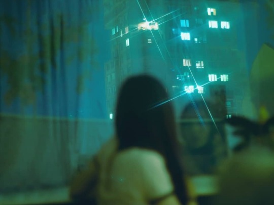
Mia Novakova
3K notes
·
View notes
Text
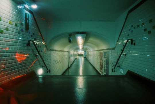
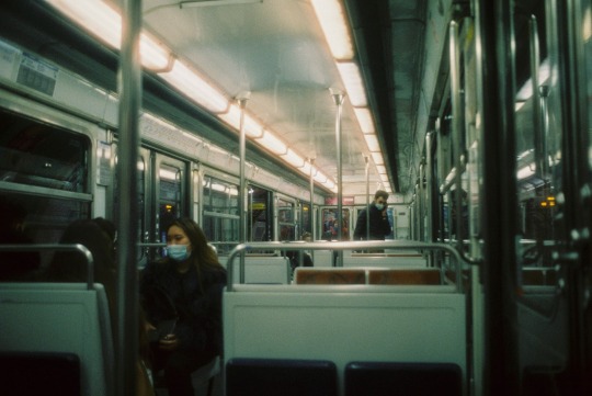
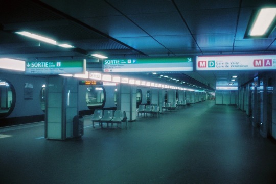
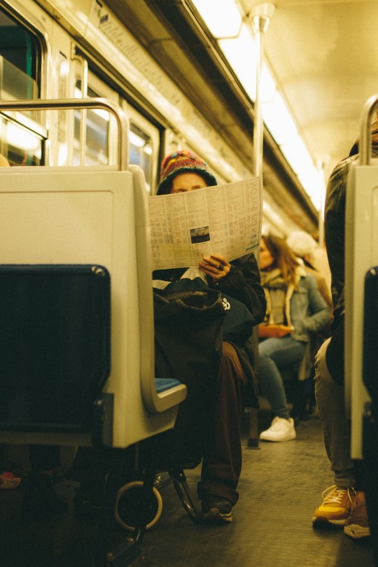
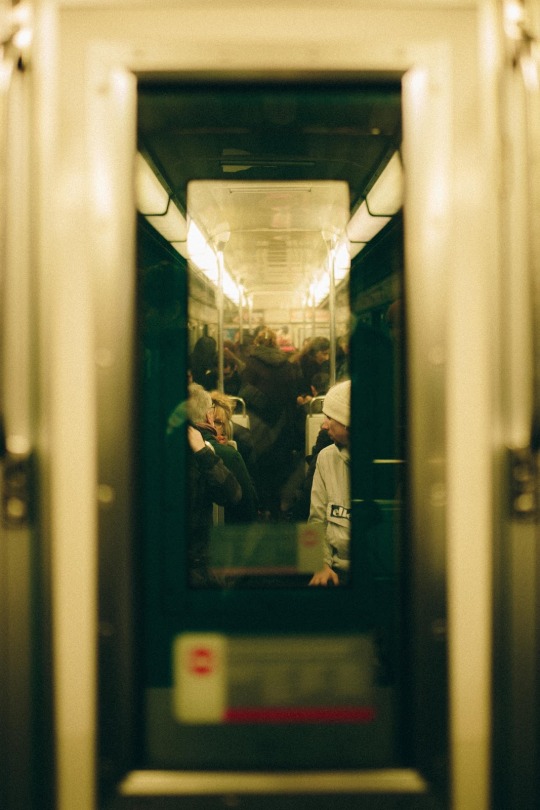
Tanguy Delavet
"Im a Paris based photographer and videomaker. Centred around expressions, shapes, colours, light, and imperfection, my work focuses on capturing the energy and identity of the people and the places I encounter. I am in constant pursuit of a feeling, of a mood... of small clues to help me communicate what it was like to be in that moment and enable the viewer to feel present while looking at the images. My previous collaborations with various brands and magazines include: Jacquemus, Calmann Levy, Foudre Magazine, Bad to the bones, Nike, Élite Paris, Leica, Wagram, Silent Model."
= From the contact area on his website
Tanguy Delavet Contact. (n.d.). Retrieved 08 23, 2024, from https://www.tanguydlvt.fr/contact
Curfew - Ouch, it's 10 p.m., to have to go home quickly, we're going to be checked.
Choice - Take time to discuss about everything, nothing or picking up a call ?
Quarantime - It offers us the luxury of taking our time, silently, in a place in perfect opposition to this principle.
This diptych was produced in 2019, far from the virus, where humans could guess their feelings, their boredom, anger, joy, concentration.
Researching another photographer I found Tanguy Delavet well known for shooting popular brands. I personally like his Sous-terre collection which is all about 'below the life' looking deeper and observing empty and silent places and how it shows emotion with people in the shots and how an empty image can also evoke an emotion. I like the tonal range and the saturation of his photographs which I definitely think I should integrate into my photographs moving forward.
0 notes
Text
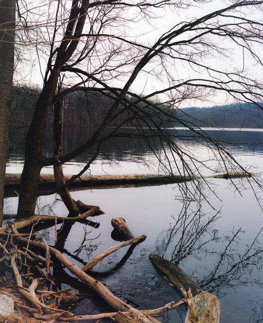
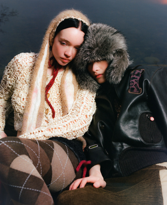
Diptych of one of my favorite shoots of the year.
Credits:
PHOTOGRAPHER Michelle Corvino (Mico) @m.corvino STYLIST Natasha Bock (Tashie) @tashiejane MUA Shiori Sato @shiorisatomua
CREATIVE DIRECTION: Natasha Bock + Michelle Corvino
LOCATION SCOUT: @maxsobieski
PRODUCTION DIALECTIVE @dialective.xyz Zhexuan Katherine Hu @kath.hu Grace Gordon @a.grace.g Helen Sotropa @helensotropa
STYLIST ASSISTANT: Odera Nkem-Mmekam @do.u.dare.me
TALENT Lauren Shivers @renshiv Eden Abebe @eden.abebe Juju (Julian Trompeter) @jujumerk Mindy Chen @mindyyymiao
0 notes
Text
04/11/24 - 3D Design - FINAL CURATED PORTFOLIO
1. Video notes and sketched ideas for symmetrical and asymmetrical composition:
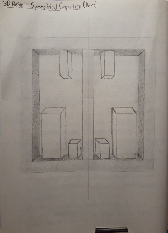
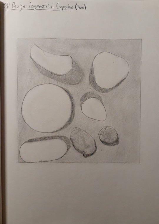
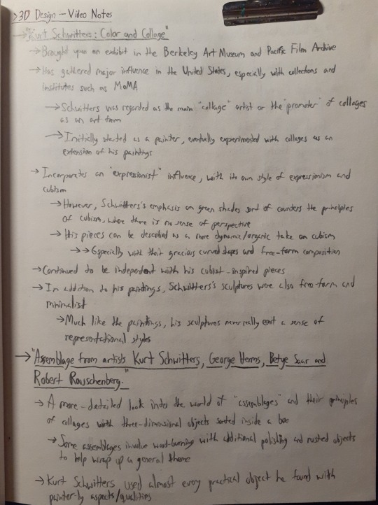
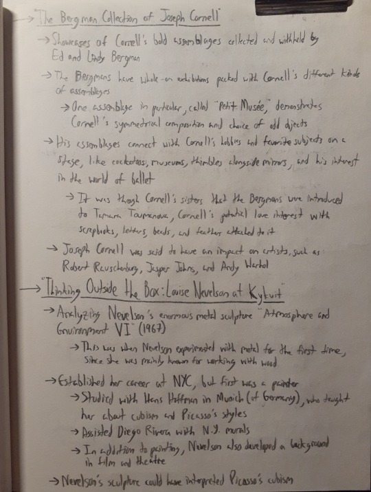
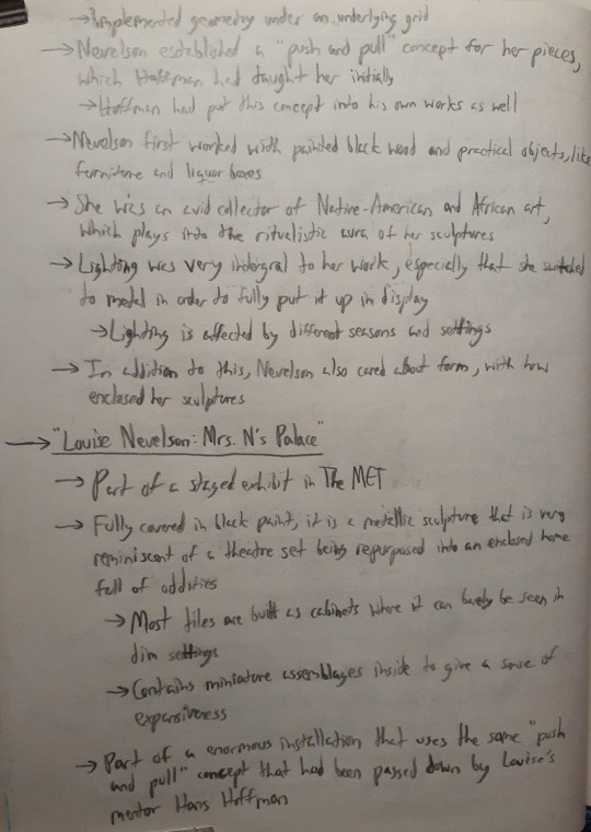
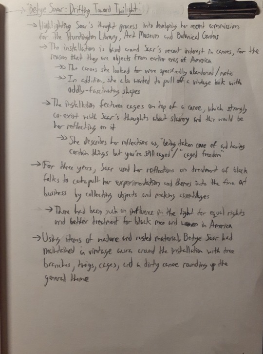
2. Process photos for the assemblages:
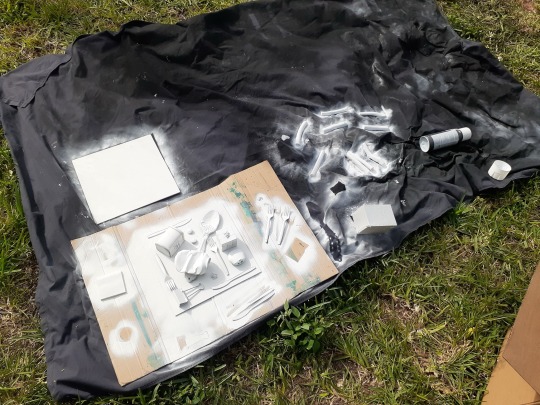
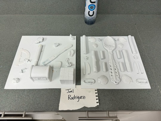
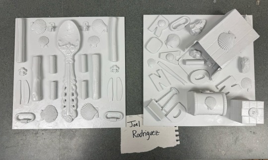
3. Side-by-side symmetrical and asymmetrical assemblages: “Home” & “Random Nature”:
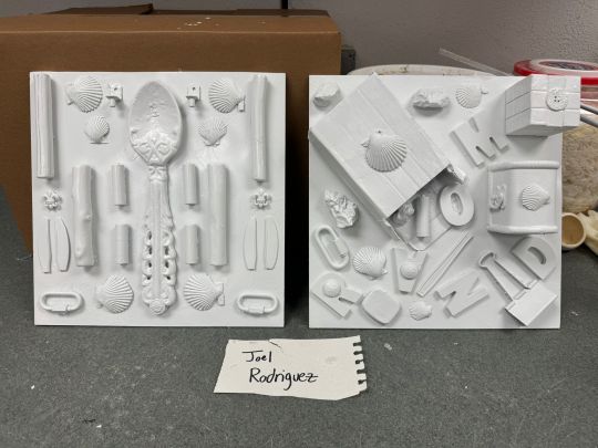
For this diptych, I was tasked to explore different ideas with symmetrical and asymmetrical composition. Both pieces were made over the span of two weeks from last Tuesday up to today.
I wanted to take a more spacious approach with my symmetrical piece on the left. The piece is called “Home” and contains assortments of plastic cutlery (from knives to spoons), sea shells, wooden branches, buttons, batteries, and items of nature and office environments. I’ve assembled these items to portray a feeling of being inside your home, where there is always just a mixture of items for working, decoration, and collecting. I’ve made the giant rustic spoon be the main hook of the piece because it symbolizes how antique models of silverware (mostly wooden) would be used to decorate the kitchen. The other hook would be the branches and sea shells, because it reminds you of the child-like feeling of playing outside in the backyard and beach. The chain-links and batteries symbolize your environment slowly turning into an office space in terms of professionalism.
As for the piece on the right, “Random Nature” is all about embracing sudden changes in settings for the items being used. Every single item here comes from a different background and as seen here, they all clash together in different spots. This piece represents the idea of randomness and truly embraces it by simply scattering all of the items around and leaving only little negative space in the composition. In addition, it does this by bringing over a select few of the same items used in “Home” but also inserting new objects found in backyards and other grassy areas. From the box being knocked over implying that there were items being left over inside it to the letters hidden in the piece spelling “Random” fittingly enough, “Random Nature” develops a sense of having scattered ideas while also allowing space to formulate between them.
4. Process photos for soap structure:
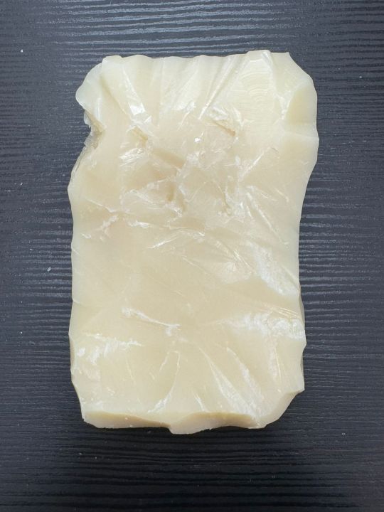
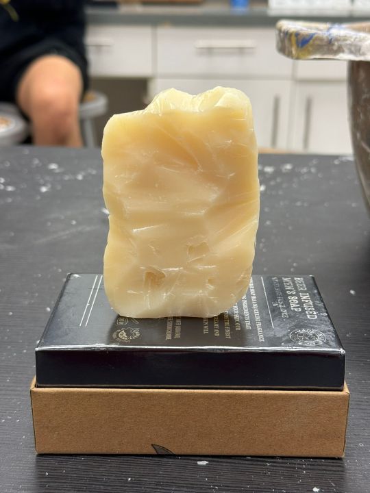
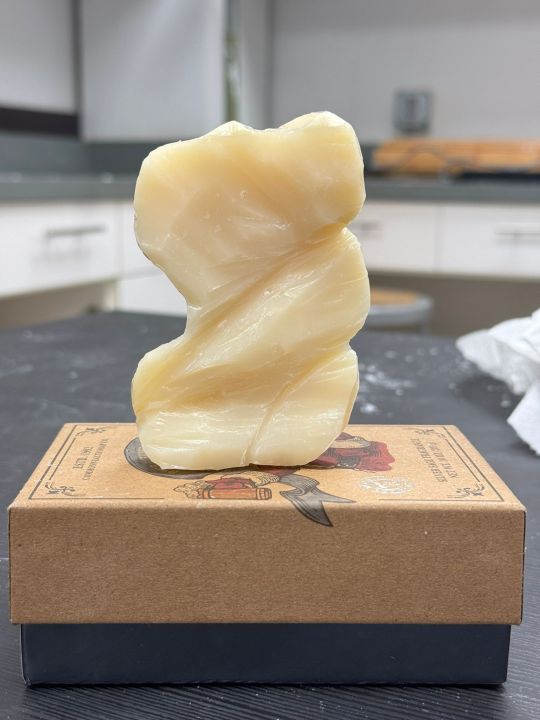
5. Photo shoot of soap sculpture: "Daze":
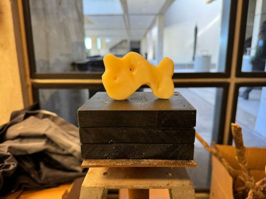
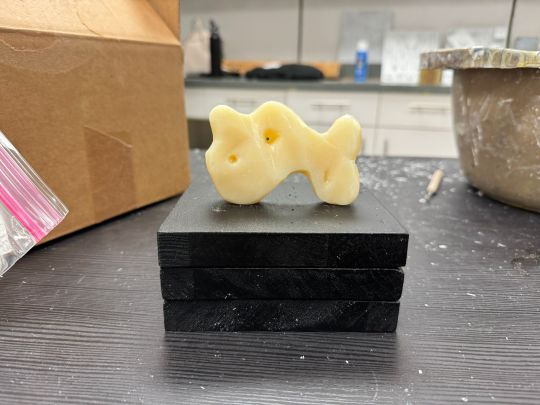
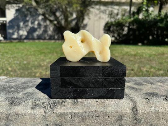
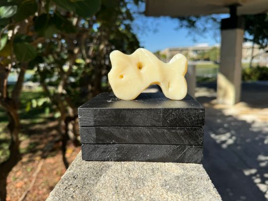
For the last two weeks, I was tasked with turning a beige bar of scented soap into an abstract sculpture. The piece was designed to have three openings that surround the soap through different wedges and inclines. The tool used to carve the soap was a smooth carving knife and the black wooden base serving as a platform is comprised of three wooden blocks glued and pasted on top of each other and spray-painted with matte black.
The process of carving the soap was starting with removing the sharp edges of the rectangular soap and curving them more prevalently, with a large lump on the right side in addition to more jagged curves on the left side. With disjointed lumps on the top of the front side and the bottom of the back side, the piece is carved smooth with the exception of a few rough surfaces in order to describe the feelings of smoothness and roughness countering each other. With the three openings placed around the piece, they are not placed in the same spot through both sides. Instead, they are carved in different places to imply that the inside of the soap is an indirect labyrinth of passages instead of just raw oils.
6. Process photos of ephemeral art:
(Missing)
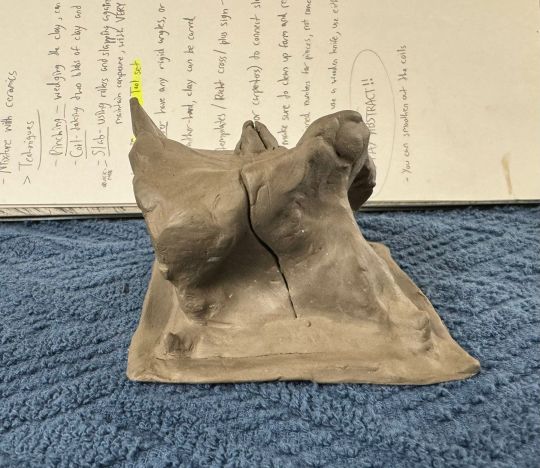
This will be replaced with my notes for techniques with sculpting clay that I’ve took in class:
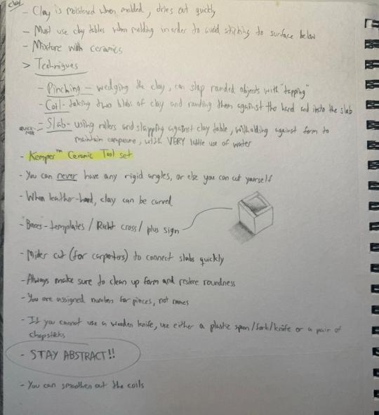
7. Photo shoot of ephemeral Art: "Sail":
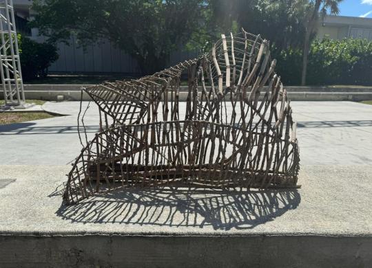
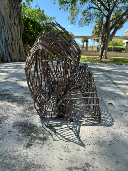
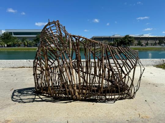
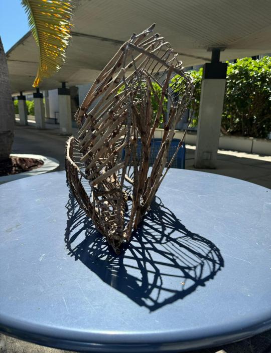
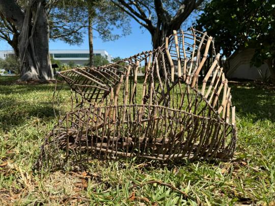
For the ephemeral wood structure, over the course of a few weeks, we were tasked with creating abstract works that "last for a short while." As the term "ephemeral" would suggest, our sculptures suggest that the piece is slowly disappearing as time goes on, whether that would be through the rough angles or the connected branches that somewhat overlap each other almost like the structure is rounded. The pieces were all assembled with sticks gathered around the grassy areas near our studio and hot glue. For my piece, I wanted to look for different ways to make the piece cross itself out by overlapping itself in different directions. I have struggled a bit with not making my piece seem triangular from any viewpoint because whilst constructing the base, I was trying to make the individual sticks connect to each other on different ends and accidentally formed objective sections from those ends of the piece, which I have rearranged in order to make the piece more abstract (and seem less "grounded"). It was quite fun coming up with different ways to make the piece more angled and stretched out in order to make the piece imply that it is slowly stretching itself out so that it could be close to becoming more transparent (which almost fits the purpose of making something that is ephemeral).
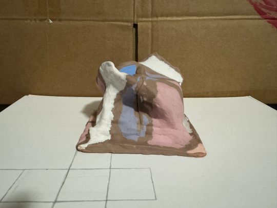
8. Ceramic sculpture - photos of process:
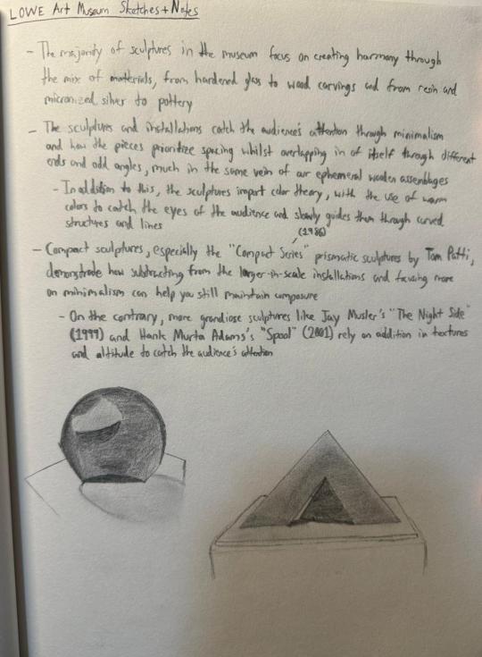
9. Museum sketches and studies:
10. A few pages from my sketchbook throughout the semester:
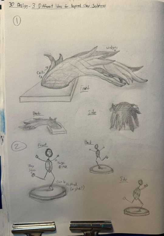
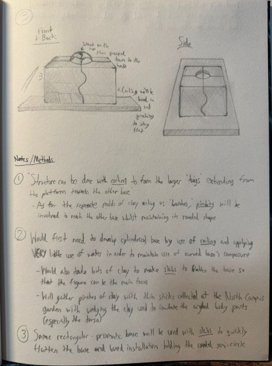
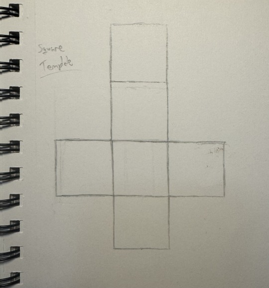
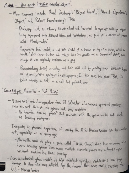
Final Artist's Statement:
Throughout the semester, I've experimented with different techniques in developing my three-dimensional assemblages and sculptures in addition to working with different processes in constructing them. For example, I have used the "additive" process, which is a process in which you carefully add different spots of composition whilst paying attention to spacing and how it affects the harmony of the piece. In addition to the additive process, I have also used the "subtractive" process which involves minimalizing the composure of the piece whilst being mindful of negative space. Moreover, the "constructive" and "critical thinking" processes include coming up with relative significance for the use of invisible composition and harmony to create eye-catching pieces. My favorite process would have to be the constructive process because it would help me control just how much realism I can put into a piece's meaning whilst arranging the pieces around so that it would be more leaning towards an abstract meaning. I would personally recommend this course because it enables you to be creative with making three-dimensional sculptures and installations with different techniques whilst also giving you the tools to experiment with said techniques!
Missing:
- 6. Process photos of Ephemeral art:
The reason why I haven’t taken any photos of my ephemeral art “Sail” was because I forgot to take photos of my progress throughout the weeks I was working on them. This will be substituted with my notes for techniques with using clay.
0 notes
Text
3D Art
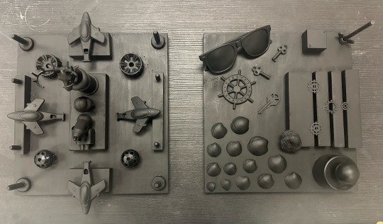
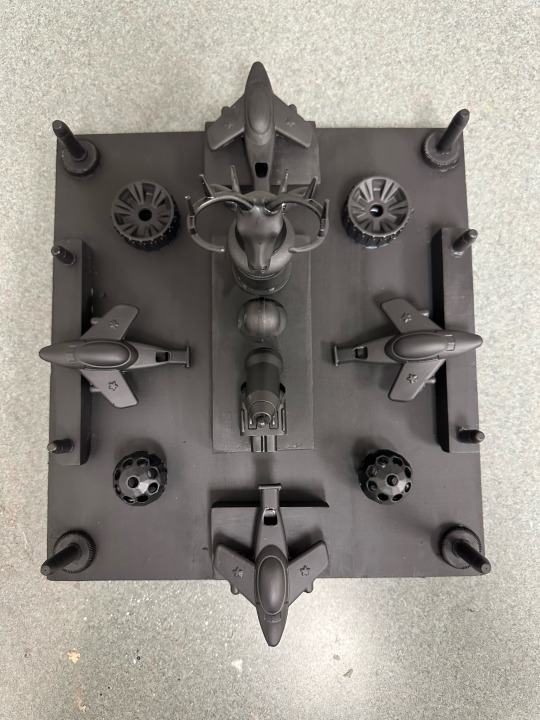
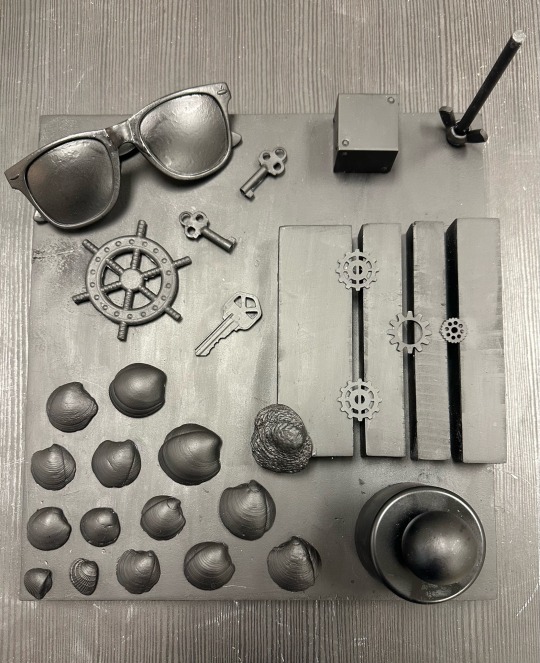
The Symmetrical and Asymmetrical Assemblage Diptych assignment, inspired by Betye Saar was an amazing opportunity to explore working with different materials and techniques I had not used before. I initially began collecting whatever objects I could find in my house such as scraps of wood, bottle caps, perfume caps, collected seashells, toy airplanes, toy balls and wheels, bullets, keys, and even sunglasses. Eventually, once I had enough items, the combination of multiple ones helped create some type of story or theme. Things such as the planes, deer head cap and bullets emulate what many American men enjoy, hunting, shooting, and the ability to travel. More relaxed figures like the seashells, glasses, keys, and boat steering wheel represented the beach or the ocean. In my pieces it is very apparent which is the symmetrical one vs which is the asymmetrical one. For the symmetrical assemblage, I tried using objects that were evenly shaped that I had at least one or two of or multiples in even numbers as well as alighting my objects evenly. For the asymmetrical one, I used objects that were more uneven and abstract like the seashells and pieces that I had in odd numbers. The main reason as to why I used black spray paint for both of my pieces is because It looked more clean and sleek as well as the fact that even though they’re supposed to be opposites in terms of symmetry, they are both meant to cohesively work together and tell their own stories. I believe that my assignments were completed successfully because I followed the instructions but found a way to have fun with it. Creating these two pieces was very enjoyable because I got to experience using materials I hadn’t experimented with before. Spray paint, although more difficult to use than I thought it would be, was so fun! The process of placing, rearranging, and hot gluing the items onto the base was very enjoyable because it was a new way to articulate ideas while narrating a story or message. Overall it was a good experience that taught me many new things as an artist.
Symmetrical and Asymmetrical:
0 notes