#the png segment
Explore tagged Tumblr posts
Text
Since I didn't have the video planned at all and had to think of how it would go across the span of a few hours, it was originally going to cut to a few Gmod segments before going to the one in real life. Here's the three segments that I filmed connected to each other
youtube
#The real life segment was also going to be different originally#It would've been me walking around my kitchen with a png of Mephiles standing on the table lmao#Gmod Stuff#Youtube
5 notes
·
View notes
Text
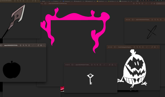
Yea yea >_> I Get it I got lazy. But GUESS WHAT FOR ONLY 0.00 (and some brainless minutes) you CAN USE OUR REALLY SMATHERING AMAZING (ok some of them are my shitty attempts @duskfallcrewart and some are @earthnicity if something is 100% clean, and not janky it's earthnicity)
The LISC file is to give you a clue that we don't own the hazbin properties.
Please note there is a FAN ART that we were inspired by to make the Angel dust segmentation parts.
Also please note a ton of these were used to make @the-hazbeens graphics, so please don't copy the 1-1 style that @duskfallcrewart (Me, i'm the idiot) spent all week dying of covid (LOL XD ....like ... LOL.) and DYING OF THEIR QPP's affection (whilst setting off their mental health sadly XD) .....
Anyways yea, do your own thing, re-edit, remix just make sure you credit Capsekai OR our personal blogs for credit.
DOWNLOAD HERE
IF YOU REALLY ENJOY THESE CONSIDER spamming Earthnicity with donations!
Also the Fan art i can't find FULL CREDIT FOR but it seems to be a twitter artist - We picked it up from Alpha coders but a more regulated credit is found on Zerochan here:

And yes I included my extreemeeeely shitty blurred version. Sorry we're late to the punch on this, PLEASE DO GIVE this a reblog, and do not credit as your own.
LEAST of which if you re-use or remix just please let us know :)
#capsekai#art#graphic design#caps#screen caps#my screengrabs#my screenshots#plural system#movie screengrabs#screencaps#png segment#hazbinhotel#alastor hazbin#hazbin hotel fandom#hazbin alastor#hazbin hotel#rp resources#rp related#free rp resources#rp icons#rp psd#rp template#rp theme#icons with psd#coloring psd#psd coloring#character psd#psds#carrd template#psd download
3 notes
·
View notes
Text
hello so am making it official -- all the art on the highres segment of my website is in the public domain now. released, set free, forever.


the illustrations are available to download in their original sizes, generally square aspect ratio, both as .tif and .png, 300-350 dpi
u can use them both privately and commercially, in whichever extent, wholesale or transformed, credit not required
there are currently 33 pieces from last couple years, but whenever i make larger illustrations i feel would fit the general historical fantasy thing u can bet i'll be adding them in there. anyway here's the link for good measure --
https://kriskukko.com/highres.html
and have a great day everyone <3
#also happy birthday to me am about to go have my coffee and some lemon ice cream#public domain#historical fantasy#free art
596 notes
·
View notes
Text

There is Something Seriously Wrong with this Logo..... Chapter Two
So. Lots of you have seen this post by my dear partner ( @lailau7904 ) in which the Williams F1 design team get absolutely torn to bits. In the case you haven't read it yet I highly recommend you do because a) it's really fucking funny and b) it makes what I'm about to tell you even funnier. Though you don't have to, this post touches on entirely different things still regarding this one goddamn logo.
The original post starts like this:

Innocent enough, we made an assumption in good faith that the logo displayed on the Wikipedia page would be the same one as the official version used by Williams. Buckle the fuck up because I'm about to tell you why that was the worst mistake we could have made.
Please. Please I beg of you keep reading this took YEARS off our lifespans. Like the original post was fun and all but it was merely the top of the iceberg. If this were an hbomberguy video this would be the part where he reveals that the background was a greenscreen the whole time. More below the cut!!! :333
The Truth
Already after only a few hours after hitting "post" on the dissection, people started pointing out to us that we'd missed an absolutely crucial detail on the Wikimedia page we got the logo from, pay careful attention:

See THIS?

Yeah this means that that image is not, and never was, the official logo of Williams. All along it had been the work of a Wikipedia user by the name of Juanchocarbonero. Here you can even see the (admittedly painful) history of the file as provided by Wikimedia, this image was uploaded all the way back in 2016, it even underwent an update when the team changed their colour scheme to a lighter blue without getting fucking fixed.

But to me the absolutely most painful part about this page is the "File Usage" section. Which gives you a quick preview of just how deep the goddamn disease that is this piece of graphic design sin really spreads.

And just to clarify: the official version of the logo used by Williams on merch etc is perfectly fine. It's a nice piece of graphic design. I still quite like it. But the story doesn't end there. Not even close.
Consequences
When you look up "williams logo" on Google the image provided by Wikimedia the very first result that pops up, if you're looking for a high-quality .png of this logo that, logically, is what you'll end up using. And I mean, why wouldn't you? What reason do you have not to use it? As long as you don't look to close (oops) it's a perfectly fine, high-definition, clean and transparent image of the logo! No shit people are going to use it!
But this raises a question: Why IS it the most widespread version of the logo? That's fucking weird isn't it? Surely if the actual logo used on ex.: the official Williams F1 website (which, again, is perfectly fucking fine) was available they would've just used that, right?
Now. Small problem. If you want you can go ahead and open whatever search engine you use, if you do that I'm gonna need you to type in "Williams logo" into the search bar, and just try finding a picture that is
of the actual official logo (you can tell the bootleg from the real thing by checking if the middle segment of the W has spiky ends or flat ones. We're looking for flat ones here)
high quality (no pixels or blurring visible to the naked eye)
a transparent png (none of that chequered background bullshit)
NOT a logo with any words (such as: Williams or Racing) visible in it. those don't count.
If you didn't feel like doing any of that, I'll just tell you the answer: you fucking can't. Nothing like that EXISTS. The closest I could get are these two, both of which are mid to ass quality, so they don't count either.


No sensible individual is going to scroll google search results for 5 minutes straight just so they can use a 200x200 image, especially when they think a perfect alternative is right there.
I even found several recoloured versions of the diseased logo, including one as a sticker on Redbubble! Fuck me that's a horrible sight!


The Search
Because I wrote the previous paragrahps after we'd figured out exactly what had happened, you might be under the impression that by this point in trying to answer the question "Why the fuck is that image on Wikipedia instead of, idk, the real fucking thing?" we'd at least established the existence of said "real Williams F1 logo". You'd be wrong, because for somewhere around 24 hours after we'd made the initial, horrifying discovery of just how fucked the Wikipedia version is, we genuinely could not tell if that was the official logo or not.
The ones displayed on their website weren't at all downloadable or even copyable, a non-ass quality of the damn thing just didn't seem to exist anywhere, so we didn't dare draw any conclusions. And we were still foolishly operating on the assumption that Wikipedia wouldn't just lie to us. (this is why your teachers hate it when you use it a source btw. like this is the ONE time it's actually been reasonable)
So, in the hopes of finding the offical Williams Racing logo, the non-scuffed one because clearly it exists, somewhere, we consulted an expert on Intellectual Property: my mother!
What this "consultation" actually roughly looked like was: we went on a walk and I started rambling about the Situation from Last Night before she cut me off and pulled up the website of the World Intellectual Property Organisation, aka the place they store all the Copyright information of like, everything.
BEHOLD:

(pictured; THE ACTUAL FUCKING LOGO I CANNOT BELIEVE IT'S EXISTED THIS WHOLE TIME)
Link to the actual real official legal document because goddamn this rabbithole just kept getting deeper so I like, have that now.
For refence, here is the official copyrighted version and the Wikimedia file overlayed on top of each other. As you can tell, it's disgusting. It's a poor, eyeballed imitation at best.

The copyrighted logo is horrifically low quality because, guess what, that image also isn't downloadable or copyable from the page. I really really cannot blame Juanchocarbonero for uploading his own version to Wikimedia because there legitimately does not exist a version of this logo that is freely available to the public. Like that goddamn abomiation is all we have. It's the effort that counts I guess.
My mother suggested that a possible reason for this could be avoiding the production of knockoff merch, or at least making it recognisable in case it is sold. Think about it, when your logo Doesn't Exist online, no one can use it without a license! It's kind of genius! I'm also about 99% sure they didn't orchestrate it so, it was good luck I guess?
interlude: How the FUCK does Copyright even work
I did immediately think to myself "we should REALLY fix the wikipedia version, like, stat" because I cannot in good conscience have this information available to me and not do anything with it, for the good of the people. However, this poses an issue: was the logo really not scuffed on purpose? Could it be that that version uploaded to Wikipedia isn't a 1:1 of the official logo because of copyrighting issues? To find out I had to look deeper, by comparing the official, website-available logos of various other F1 teams I came to conclusion that: [........................]
Yeah so I wrote that paragraph before actually checking for refences, but even after probably an hour of trying very hard to make sense of the copyright documents and copyright law in general we could not make sense of any of it. According to my mother (again, the closest we have to an expert, like she actually works with copyright in the context of companies but she's not specifically an IP expert. just to clarify) it's actually a lot worse for Wikipedia to have a falsified version of the Williams logo, than it would be to use the copyrighted version. This is because they're spreading misinformation by pretending that's the actual logo. And yet.

According to the Copyright Tag (the one on the top) in the Licensing section of the Wikimedia page for the thing pretending to be the Williams F1 logo, it's fine to use it because just a bunch of shapes. The thing is however, that it says that for pretty much every F1 team's logo, most of which are sourced straight from the official website. So this doesn't really mean anything tbh. According to our local expert (still my mother) it's fucking confusing. So I've decided to leave that at that.
update October 20th: as far as the Wikimedia pages on copyrighting tell me, uploading the official logo could, potentially, get me into serious legal trouble with Williams because of copyright laws. Which is still confusing because as said, every other team's logo is sitting uncontested on their respective Wikipedia pages. So basically we still don't know.
Okay. Backtrack. We forgot to ask something very important:
HOW?
HOW does one fuck up a perfectly fine logo THAT BAD.
WHY does one make their own scuffed tracejob and HOW does it end up like THAT. Clearly something must have gone horrifically wrong for it to end up like that.
I have a theory as to what might have happened:
It was either drawn or painted by hand, for a physical paintjob it's actually sort of impressively precise, but still objectively fucked. For a while I outright refused to believe that it could have been done in a digital program with the types of mistakes that were made, but you'll see this theory (partially) disproven later on so I retract it for now.
Operating on the assumption that it wasn't done digitally, a likely theory could be one involving a picture of scan of the paintjob. If the picture was taken at an angle or the logo itself was on a curved surface that COULD potentially explain the weird sort of slide everything has to it.
From then the picture might have been inserted into a digital art program, and the area of the logo might have been automatically selected using the magic wand tool, which could explain the weird growth at the top and that odd rounded off corner.
We also drew the conclusion that the file itself had been "tampered with" (aka cropped manually) by a human, because no computer would generate a resolution of 3356x2543 (you can that this is the original resolution on the Wikimedia page)
WAIT HOLD ON IS THAT IT?
The question of how the Fuck this guy managed to mess up the logo, and even more specifically why some edges were fine and some weren't (ant colony looking thing on the top left) bothered us so much that I at one point started just looking up "WIlliams logo" with the results filtered down to pre-2017 in an attempt to find when exactly the messed up logo was created. As if that would be any help.
Now what I definitely didn't expect to find was THIS

ENHANCE

Yes, you're seeing it right, THAT is the original 'Williams logo with the fucked up arm angles and lenghts'. Which PROVES that, contrary to our previous belief, Juancocarbonero was NOT the origin of the mistakes. Instead it was [checks notes] a DeviantArt user by the name of Nerdkid56?
The original DeviantArt post, which as of 9:47pm CET on the 13th of October 2024 I am about 90% sure is the actual first appearanace of the scuffed logo, is from May of 2015, which lines up well with the original upload date of the fucked up logo onto Wikipedia (November 2016). At the time that DeviantArt post was almost the only source for the logo.
And in the case you needed any convincing that those two logos are the same, here they are overlayed. You may notice that it's one shape (excluding the rounded corner which isn't visible at this resolution.)

This discovery is essential to understanding why the current scuffed version is the way it is. You might remember our confusion about the way some edges are fine while some are attempting to leave the image, the whole thing is a weird Frankensteinian amalgamation of vectors and magic wand mistakes. With this knowledge we can now assume that the mistakes happened in 2 layers:
Nerdkid56: likely just eyeballed the proportions. I'd guess he drew one arm before the other and flipped it around without really checking the angles. Also didn't give a shit about whether the arms lined up with the base or not. Legitimately bad design made in a digital program.
Juancocarbonero: why he used the scuffed W logo instead of the normal ones that were also perfectly accessible by 1 goddamn Google search is a mistery. HOW he even got access to it is another question I do not think we'll have answers to. And I've already explained some of the things we think may be responsible for the uneveness and bumps. Point is he fucked it up even more.
My theory for why Juanchocarbonero used the scuffed version instead of any other available picture goes like this: it was the only png he could find. Practically every other search result for "Williams Logo" that predates 2017 is a jpeg or absolute ass quality (sometimes both for good measure) so, despite it's flaws, Nedkid56's trace of it could have been the best option available at the time (the quality is actually very very good since it's a vector image, and I guess our friend Juanchocarbonero doesn't have an eye for design considering he didn't notice uhm, everything that is wrong with that model.)
Conclusion
The only way to right these wrongs is to go back, to the very beggining of this saga. Wikipedia. Williams I'm so sorry for what you've had to endure. I know what I have to do now. When I eventually make a proper vector image of the official logo and upload it to Wikimedia it'll all be over. And I WILL do it (but not rn this has already robbed me of like 3 whole days of my life. soon)
All of this is, admittedly inconsequental, but also absolutely fucking hilarious. Like imagine. you. one single guy, you make ONE mistake in a silly little "tracing this logo" project because you couldn't be arsed to check the angles of a silly little W. And some other guy, who you likely don't even know, over a whole ass year later, takes your flawed piece of design, makes it even worse somehow and uploads it to a site from which your little tiny innocent mistake becomes the most widespread version of a logo used by an actual real company worth over 700 Million US Dollars. HOW. HOW DID THAT HAPPEN. WHY HAS NO ONE FIXED THIS??? IT'S BEEN 9 YEARS
Just to give you a final look on just how widespread this plague is, here are some examples of media the fucked up version of the logo is featured in:
this Mr V's Garage video (the original reason we started this conversation in the first place)
the thumbnails of these two videos by Tommo, this one by FP1Will, and this one by RicksF1Addiction
such an amount of random places. likely fanmerch and fanart, and like, pretty much any place someone wanted to use the logo. it's everywhere. if you've ever had the Williams logo displayed in anything you've made I can guarantee you 99.9% chance you used the fucked version


and late thank you to everyone ( @bumblewyn @mid-nighttiger @vro0m @lemonsgovroom @mikraas @leclerced fucking hell I kept needing to add people to this list because compiling all of this took absurdly long) who pointed out our misconception in the reblogs of the original post and contributed to us actually looking into this further. and sorry to everyone for accidentally spreading misinformation lmao (it's too funny not to have been worth it tho) (ALSO it's not really our fault is it)
and to keep the tradition of ending on a live discord reaction:

#please please consider reblogging this if you read through considering the original post (as funny as it was) was just spreading misinfo#williams slander themselves enough already they don't need us to do that#f1#formula 1#williams#williams racing#williams f1#james vowles#williams formula 1#f1 analysis#technical#lai core#nebrain#neb50#neb100#neb200
270 notes
·
View notes
Text
So. I just tuned into another wayneradiotv stream. First one in a while. Once again it’s fucking insane
It’s a charity stream event for Palestine, cool! Baaulp is playing Root Beer Tapper. There’s twitch predictions for how far he’ll get, which is basically just gambling but instead of money it’s funne haha points you can use to get emotes with. Cool! I get a lot of points, someone gifts me a tier 1 sub, everything is fine!
Baaulp is confused about the betting. Doesn’t know what the fuck anybody is betting ON. Starts getting angry because it’s “ruining the vibe” and we’re turning his root beer tapper gameplay into a “whole thing”. Somebody tries to read donations and Baaulp fucking loses his shit. Entire chat, rtvs team, and even Baaulp himself falls silent. He’s in the zone. For 30 minutes plus the stream is nothing but Baaulp’s blank stare and the sounds of root beer tapper. Wayne puts up a text box on screen that reads “do not disturb Baaulp”. Predictions are still running in the background but with titles like “don’t tell Baaulp” and “I’m sorry Baaulp”. The next segment is supposed to begin and Baaulp doesn’t say anything, just continues to play Root Beer Tapper. He cannot be shaken. His webcam and gameplay is slowly dragged off screen with a cane png, the Root Beer Tapper music and sound effects growing quieter as it is. Baaulp never says a word. Break starts and everything is silent again
Unironically pretty normal rtvs stream considering they made the fucking live action spamton stream and hlvrai
#The stream is still running so please go and donate btw they have a bunch of links for different stuff to donate to all Palestine related#It’s great go donate if you can#rtvs#wayneradiotv#baaulp#palestine#free palestine#free gaza#from the river to the sea#palestine genocide#gaza genocide#gaza#palestinian genocide
157 notes
·
View notes
Note
Another Grandfest announcement- https://youtu.be/2pZVLgb5aTg?si=xh4ER0DKz-DhK6oA
On one hand, I'm happy because it's similar to the really cool idea you thought of, but on the other, I'm annoyed at how a fan slapped this edit together in a day while Nintendo used PNGs.
HOW THE HELL DID A FAN IN LESS THAN 24 HOURS MAKE A SIMPLE EDIT WITH MP4 FILES AND IT'S SOMEHOW BETTER THAN THE EFFORTS DONE BY A BILLION DOLLAR COMPANY THAT HAS MADE A GAME WITH OVER 11 MILLION COPIES SOLD!!!!!!!??????


It's not even that bad and it's a trillion times better THAN THIS FUCKING BULLSHIT!!!

This was supposed to be THE BIG MOMENT! All 3 Idol groups coming together properly in the game! Not in some online magazine, no, this was IT! THE MOMENT WE'VE BEEN WAITING FOR! AND THEY GAVE US LITERAL PNGS WITH NO TRANSITIONS! NO ANIMATIONS!!!!! NOTHINGGGGG!!!!!! IT'S ON THE SAME LEVEL AS A POWERPOINT PRESENTATION!!!
"Oh but it would have been a waste of resources to make animations for a limited time event!"
THEY ALREADY HAVE ANIMATION FILES FROM OVER 8 YEARS AGO IN SPLATOON 3 AND IT WORKS FINE ON THESE NEW MODELS!!! They could have easily recycled those animation files from the Inkopolis News segments for the Squid Sisters and Off the Hook, so that argument is null and void.


And guess what other limited time event has animations?
SPLATFESTS!!!!! We don't even know for sure if we're gonna be able to replay those performances, all we got is a leak that suggests we MAY be able to revisit the Grand Festival but nothing about the performances themselves.
Also literally every other online shooter has animations and other limited time things that never come back. Nintendo literally put in barely any effort or time into this announcement that's supposed to be a big fucking deal.
I HATE calling things lazy in game development because that argument itself is lazy and it shows a lack of empathy towards some of the hardest working people ever... But... This is just lazy.
This is just... This is wrong man...

My live reaction.

#splatoon#splatoon 3#ask blog#ask me stuff#ask me anything#rant post#ramblings#callie cuttlefish#callie splatoon#marie cuttlefish#marie splatoon#rambles#pearl houzuki#pearl splatoon#splatoon marina#pearl and marina#marina ida#frye onaga#frye splatoon#shiver hohojiro#shiver splatoon#big man#squid sisters#off the hook#deep cut#nintendo
40 notes
·
View notes
Text

every problem and nitpick i have with the jartoon video:
the gknd art in the thumbnail is uncredited fanart
sector v is referred to as "sector five" throughout the video, despite the i.n.t.e.r.v.i.e.w.s. clip shown where "sector v" is said. sector w is properly referred to by letter in that segment but sector v isn't
instead of an official png of numbuh 3, they use another piece of uncredited fanart
"grandma stuffums" grandma stuffum
"sector three" is said in the l.i.z.z.i.e. segment
"nigel has been bafflingly decommissioned" is incorrect usage of "decommissioned" and implies his memories have already been wiped. the word is used correctly in the f.u.g.i.t.i.v.e. segment later in the video, but not here
mushi is misspelled 'mushy'
numbuh 206 is referred to by "he" and then "her" before the video's reveal that 86 actually caught 362
362 was not the supreme leader of the knd during f.u.g.i.t.i.v.e.. it was her first appearance and the episode ended with 86 giving her to 274 because he was the leader.
"the kids next door galactic" improper grammar, the gknd is never referred to like this
the gknd art at the end is fanart. they do show the tweet from the cn account where credit is given but it would've been significantly less misleading to show a picture from the stop the g:knd animatic or any other concept art. gknd as a spin-off is not even touched upon in the video aside from addressing the fanart tweet. this channel has several shameless clickbait thumbnails, this is no exception. at least it's not wildly inappropriate like the others are
what do a few of these episodes have to do with knd's overarching story at all? there's other little arcs missing but not even covering the splinter cell stuff? how do you skip over the 274 tnd reveal? not enough research was done at all (which seems like a common trend with these)
the recommission module is referred to as a reinstating device then "recommission" is said a sentence or two later. inconsistency
sentences that don't have to be long/structured a bit weird
#knd#codename kids next door#kids next door#transmission.txt#i hate the beginning recounting the archive backstory and not revealing it was one's essay until later like the ep did#regardless of the show implying it's real or parts of it are or whatever#several ppl in the comments were like HUH? WHAT?#this is a way more personal gripe so i'm not adding it to the list
26 notes
·
View notes
Text
Kyman YouTuber x Twitch streamer au where they are both popular creators on their both respective platforms yet literally both them and their fans hate each other with a extreme burning passion
Cartman was already like canonically a YouTuber(the cartmanbrah thing) but I do think he'd fit better as a twitch streamer, anyways he would definitely be like a ishowspeed type of streamer, where he's so controversial it leads to infamy to actual fame, for every hater he has, he has 3 more fans that find him incredibly hilarious. He'd definitely be aware of his notoriety and try profitting off of it, although he'd probably slow down over time because he doesn't want any of the sponsors to drop him LMAO.
Now over to Kyle, I think he'd have like the total opposite of Cartmans career, where Cartman blew up incredibly fast because of his persona, Kyle would have started earlier and overtime rose to popularity,at first he'd definitely be one of those "hidden gems" type of youtubers, where he has a small but dedicated fanbase that enjoy the variety of his content. I think he'd have like many types of videos(video essays and raising awareness for other important topics) at first, his videos are quite awkward and janky but overtime you can see him improve him as his mic quality gets better and his videos get more detailed, he'd be known for a few very popular call-out videos he made for other creators, his fans would love him because of of his sincerity and how he isn't afraid to call out other people on their bs, and whereas Cartman is loud and brash, Kyle is very polite and civil(even in his call-out videos) and he very rarely gets mad or rages out loud in his videos(well until cartman shows up in his videos LMAO)
I think they'd both blow up at the same time and get extreme amounts of attention, Cartman because of his streaming and his very horrid remarks and Kyle because of a very well-researched 3 HOURS long video essay where the topic/title is basically "How content creators breed toxicity in their community and others" with a HUGE png of cartman slapped onto the thumbnail. (Most of the segments are basically about Cartman with passing mentions of other creators) Anyways his fans would notice a big difference in his behavior in this new video because of how frustrated he is LMAO and how much he uses subjective language, "HES A RUDE, MANIPULATIVE SOCIOPATHIC ANTISEMITIC ASSHOLE WHO HAS NO REGARD FOR ANYONE ELSE AND HIS FANS AND SHOULD BE BANNED FROM THE PLATFORM" he'd def gain new fans from this but I think cartmans fans would find the video and start clowning/spam the comment section and Kyles new and old fans would defend him and now both of their fambases are basically waging war on each other
(Also even before the essay or when they both gained fame, Cartman would tweet about how much Kyles videos/channel suck ON HIS MAIN ACCOUNT like "Wow Kyle looks extra bitchy in this video, Is he on his period?/ Kyle uses so much of his jew brain in this video yet his conclusion here is much so dumb like multiverses are____"
Anyways Cartman would sooo definitely tease the shit of Kyle after that video, he'd be like "Kahl, obviously, I'm your reason for fame you shouldn't treat me so- AW SHIT, KIYAL THAT FUCKINH HURTS" and Kyle "Your fatass deserves it"
Also they would narrowly avoid being cancelled because of their behavior towards each other, Cartman for his (implied) antisemitism calling Kyle a jew many times as an insult and Kyle for his (very direct) fatphobia towards Cartman lmao fortunately when anyone tries to cancel the two of them, both of their fanbases put aside their differences and defend them from everything.
Just wait until the yaoi fangirls(us) find them and kickstart a new saga LMAOO
#despite being so different i like to think they'd gain fans for the same trait#their sincerity and honesty AAA i love when kyman are more similar than they think#kyman#sp kyman#south park kyman#south park#kymannies please interact#kyle broflovski#eric cartman#kyman fanfiction
29 notes
·
View notes
Text
Towing An Abandoned Car Fundraiser
Hi!
Long story short, there’s been a car in our driveway that’s been abandoned for about five years now. We transferred the title to someone, but they moved hundreds of miles away without it, so we need to tow it to their family’s place instead since that’s closer. It’ll be about $200-$400.
I’m chronically ill and can’t work, and can only really do art as a way to make any cash.
I was going to have a better, flashier commissions post, but I’ll just give the price breakdown here. Any little bit helps, so thanks in advanced!
PRICES
$5 - 800x800
$12.5 - 1200x1200
$17.5 - 2000x2000
$30 - 3500x3500
ADDONS
$0 - basic painting, minimal complexity, no painting past terminator, one body
$10 - extra attention to detail, painting past terminator, plus unshaded png
$0/$5/$10 - extra per celestial body, depends on level of complexity, limit depending on canvas size
$0-$15 - rings, dependent on orbital plane and no. of segments
$0/$5/$10 - cloud layer, dependent on complexity
$15 - flat fee for addition of a landscape
$2 - convert to mission patch
$0-$15 - background, dependent on complexity (black > starfield > sf + galaxy > sf + galaxy + nebula/accurate stars)
$5 - commercial rights
TERMS
I will take 15% of the full order up front, and will immediately put that towards a donation fund of my choosing. The rest will be taken after I finish your piece. Proof of donation will be sent privately, or posted publicly depending on your preference. It will be added to a donation counter, either way.
I cannot rush pieces. I am chronically ill, and cannot make promises on when I will be done, but I try to work as quickly as my body and mind allow.
A minimum of an hour and a half will be spent on pieces smaller than 1200x1200, with the attention to detail option.
If wanting a piece larger than 3500x3500, please DM me and we can discuss details.
I can be reached here or on discord, just at “tolbachik” without the quotes.
EXAMPLES
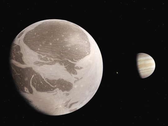
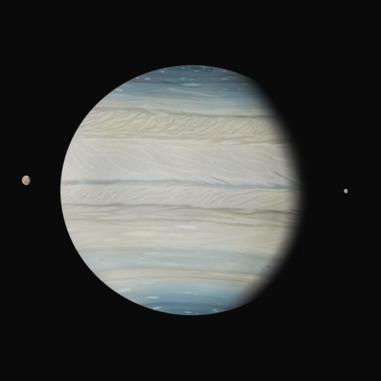
27 notes
·
View notes
Text

@dash-n-step ok . youve given me an excuse to infodump about the forbidden megamind lore
to start off, the Doom Syndicate . originally they were going to be in the main film , but they didnt have enough runtime to develop each one's plotline so they scrapped all but Tighten . the members that appear in anything other than concept art include:
Destruction Worker: just a big guy with a traffic cone on his head and demolition tools for hands
Hot Flash: an old lady who can fly and ostensibly wields fire, though in the game i played, she just summoned goons
The Conductor: supposed to be the leader i think? never played his game and i have no idea of his deal
Judge Sludge: a court judge made of slime . thats it
Psycho Delic: my personal fave . a skin tight purple dude dressed like a pimp who runs a sewer disco . can turn into a cloud of toxic gas (he's voiced by King Andrias from Amphibia and Dr Facilier from Princess and the Frog!)
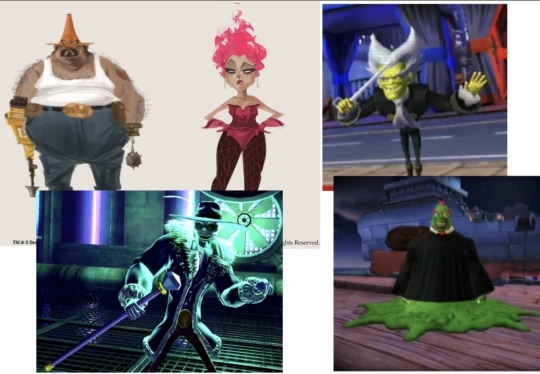
they serve as the main antagonists of three spinoff games. two are plot-identical i think, but are played very different due to platform limits, and one is a sequel.
starting with the home console games bc idk that much about them: the first is Megamind: Ultimate Showdown. a serviceable title, the Doom Syndicate blows up a building and kidnaps Hal out of prison, infusing him with metroman AND megamind dna, turning him into the super-strong super-smart Blue Tighten (his costume is the same, his skin is just blue now).
its worth noting that , after his defeat, hal has no memory of his time as Blue Tighten , and he seems more concerned than upset at his loss. this is important because of the next entry: Megamind: Mega Team Unite . the dumbest title ive ever heard. in this one, metro man and tighten are playable characters, as are each of the villains as you defeat them. because of the prior game, hal being a hero makes some amount of sense because of his unwilling role as the head of the Syndicate .
ok . now i get to talk about the weird fucked up ds game i love so much.
the title of this game befuddles me. the cartridge and box call it Megamind: The Blue Defender. The title screen, on the other hand, calls it Megamind: Bad. Blue. Brilliant.
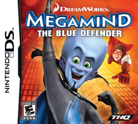
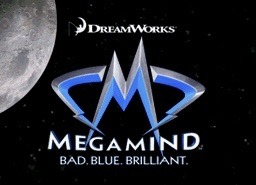
so thats off to a great start , but it gets better and worse from here. the plot is identical to Ultimate Showdown but the gameplay lacks robot segments because its the ds.
megamind has a set of voice lines that have a random chance to play every time he takes a variety of actions, unfortunately including jumping. this set is very small and he is fully able to say the exact same line back to back . hooray!
one of the game's collectibles is pngs of the film . except one of them is a png of megamind doing finger guns, only found in a trailer . i have no idea why its there.
the credits of the game are astonishingly short, and it only credits four voice actors: those playing Megamind, Tighten, roxanne(?), and Metro Man. this is a problem for a few reasons. first, it fails to credit the misc actors for the goons, the main villains, and minion(may have swapped minion and roxanne) . secondly, and much funnier, it credits metro man, who has zero lines in this game. hooray!
anyway . this game sucks and you should play it . there isnt a 100% reward but the musics a jam and sometimes megamind just gives you a bloodcurdling scream when he falls or gets hit. ok bye
38 notes
·
View notes
Text
Did a drawing of the Bloodmoon Bros-
I imagine in the ‘mindscape’ they appear separately and have more moon-like hats as opposed to the double-sided Jester hat like I normally draw their main body with. They each get their own side of the hat, because ✨sharing is caring✨
(WARNING FOR BLOOD SPLATTER IN THE BG - NOT SUPER GRAPHIC BUT STILL NOTEWORTHY!)
Hope ya enjoy!
Gonna pray that the transparent png works I’ve never posted anything transparent on here before-
.
.
.


Davis-VA Bloodmoon is on the Left, EC-VA Bloodmoon is on the Right.
Hope ya enjoy the lads, I had a lot of fun drawing these two (especially their hands- drawing the segmented fingers at different angles was difficult but oddly very fun for some reason).
I wish I could make stickers to sell, this would probably work well as one 🤔 future project perhaps.
I have a bunch of Sams!Eclipse doodles I did on paper recently, very tempted to post those in the future but we shall see.
Have an awesome day!
Likes and Reblogs are appreciated, but PLEASE DO NOT REPOST MY WORK!
#myart#my art#fnaf security breach#fnaf sb#bloodmoon sams#sams bloodmoon#fnaf bloodmoon#finished art#fnaf#fnaf fanart#dca fanart#tsams fanart#fanart#I doubt the pair are ever coming back but I miss them ever so#I’m still so behind on SAMS lore bros#I started watching the lore vids again but I’m still like maybe a month and a half behind#paaaiiinnnnnn#the sun and moon show#tsams bloodmoon#tsams
65 notes
·
View notes
Text
I doubt anyone here cares about my videogame opinions, but we finished Life is Strange and it was honestly such a let down.
Both endings sucked. Maybe it’s because I didn’t care for Max/Chloe as a ship, but saccing the town seemed like a complete nonsense ending, and extremely of character for both of them. That last shot where they were smiling and pawing at each other as they drove through piles of rubble and presumably dead people. Well that certainly was something.
Even the save the town ending felt unsatisfying. I literally started laughing when they were playing the montage of cutesy Max/Chloe photos going up in flames. And it just felt like nothing we did mattered. Which I guess was the point of the story, but then they shouldn’t have made such a song and dance over your 🦋choices having consequences🦋
I get that there were budget issues, but like.. Fallout NV’s endings was a bunch of pngs with text. Couldn’t we have had something like that to show what’d become of all the side characters? And maybe have it reflect the choices you made throughout the game?
I dunno. I feel I’d have an entirely different takeaway of the game if I bought into the main ship they were pushing, but I just didn’t at all. And Warren only seemed appealing by comparison, so it’s not like I’m sitting here mad over that.
I have so much more to say but I’m gonna shut up now. We’re playing Detroit Become Human next, and I am unironically excited for Connor and ironically excited for everything else. Don’t let me down David Cage
OH YEA ALSO THE STEALTH SEGMENT WAS SHOCKINGLY BAD AND FRANK CAN STILL KICK ROCKS
#life is strange#video garmes#one positive note:#I kinda like how David madsen wasn’t like ‘oh he was the honest goods all along’#he was still a paranoid control freak who JUST SO happened to be right about one of his many suspicions
10 notes
·
View notes
Text
NB Masterpost:
Something I’m very passionate about/A hefty OC carried AU.
‼️NOT MY ART, THIS AU IS DRAWN BY MY ARTIST. WE POST IT HERE, IVE BEEN GIVEN PERMISSION‼️
Cashapp:
My YouTube:
My Artists Tumblr:
My Artists YouTube:
Little things: Theories: Edits:
————————————————————
Cover Art:
Transparent text PNG:
Lore:
Chandler/synopsis of NB:
Swannie AU:
Fanart?:
Two silly gingers hanging out:
A giant woman and the silly ginger:
Chandler fanart💕
Chandler confesses!:
Art and or mini comics:
Chandler and Odis antics:
First impressions:
Silly comp promo:
Chandlers lair games segment:
Chandler makes a friend!:
Chanleo<333
Ref sheets:
Chandler & Bishop
Comics:
Kraang Infection comic:
Protective Leo:
Chandlers first kidnapping:
Chandler made it to the comp!:
Mama Chandler to the rescue!:
One leg at a time.:
DO NOT REPOST OR USE WITHOUT PERMISSION
⚠️If you use our comic pages in your art (such as voiceovers, edits, etc) please credit me as their author and attach a link to this blog.⚠️
#rise of the tmnt#rottmnt#rise of the teenage mutant ninja turtles#tmnt#tmnt 2018#tmnt fandom#tmnt au#rottmnt oc#rottmnt original character#rise movie
9 notes
·
View notes
Text
Comic Box 1997 End of Evangelion Issue - Archive Scan

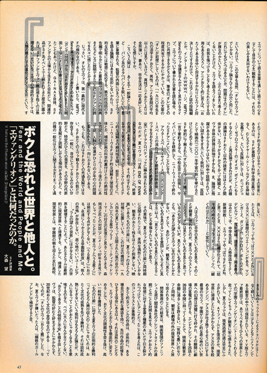
Comic Box was a magazine in Japan launched in, from what I can gather, 1982. It was a bit of an ‘alt” magazine - it has an imprint, Comic Box Jr, which focused on doujinshi for example - and would cover anything anime-adjacent, including western films. The October 1997 release of the magazine was dedicated to the release of the End of Evangelion film, and to answering the question “what was the phenomenon called Evangelion?”. Towards that end it features fan submissions, art, comics, essays, all talking about what Eva meant to them. Some are serious, some are fully comedic, way way more than I expected are erotic, and overall it is a time capsule of how the anime community was thinking about Evangelion when EoE came out. The magazine dissolved in 1998 from what I can tell, so this was one of its last releases - you can still see its absolutely vintage website here! Complete with dashing chibi cat gif.
I discovered this magazine through japanese anime/manga archivist-in-residence ehoba on twitter, who provided photos and rough summaries of some of the pages. They are just camera photos of an open magazine though, not scans, and not at all complete. I hunted around for a while to find a scanned version, messaged ehoba and a few others, posted on forums like Evageeks, and drew total blanks. I couldn’t find any listings of it online, so I set the quest aside...until I was placing another order for some artbooks for import and decide to check Yahoo Auctions Japan and lo and behold, there is was! It arrived this week.
So that image above is not one pulled from the internet - I have scanned the entire Evangelion segment of Comic Box - October 1997 issue. I am a neophyte scanner & image editor, these aren’t gonna be amazing or anything, but while I hope to make a more polished version I wanted to share the drafts now. I really aspire to translate it, but of course I don’t speak Japanese, so I am going to see how far working with some people I know and brute-forcing with AI would go. If you are interested or know someone who would be, definitely reach out! 100% would crowdsource this. If someone already scanned and translated this, also let me know, I would groan heavily and curse my google skills but i’d rather it be available and know, and not waste time.
Below will be some reduced-down PNG’s of the magazine to fit Tumblr image limits with Ehoba’s notes and a few of my own attached to them. A link to the full images as a singular PDF is on the Internet Archive [Here]


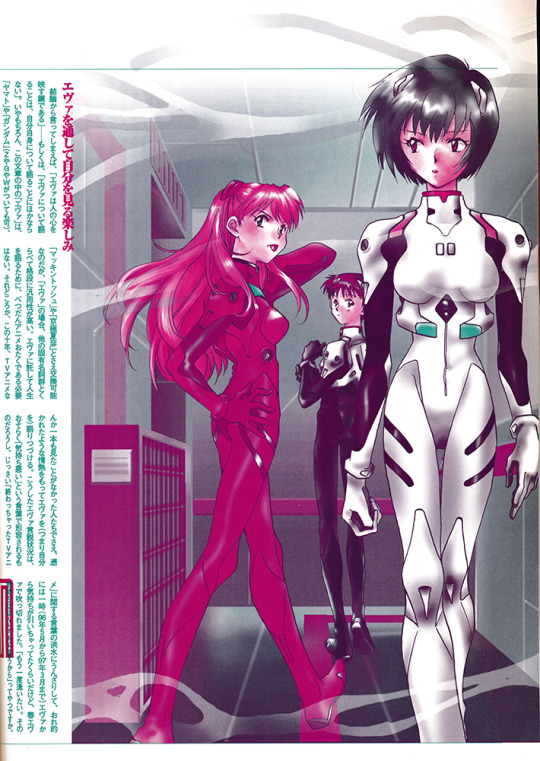
A reflection of a very known thing in this magazine is that, from my perspective, End of Evangelion is definitely Asuka’s moment to shine, but it didn’t matter because the 90′s Eva fandom *loved* Rei. She was the most popular by far, and I think dethroned Sailor Mercury on the ‘best girl’ polls in magazines of the era. Nowadays if you poll audiences - as the NHK did recently - Asuka is the most popular girl, but it was a different, proto-moe-boom time.
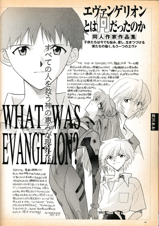


"Evangelion was fake. A fake made by one director, or by the staff. However, it was a very real fake. God, it was so good."

Watermelon Kaji absolute goat here; so cool indeed
How much Asuka is suffering in all these images vs god-salvation Rei is, again, saying alot about the waifu wars.

"I don't think episode 25 and 26 were professional work. I understand that the ADR script and previews with layout sheets are supposed to be avant-garde, but something is wrong with it." "TV show is not an individual's job, so I wanted them to deal with the schedule limitation."
90% sure this Asuka ‘escaped’ and I saw it on the internet in the early 2000′s - maybe the author published it elsewhere in a doujin, I assume a lot of this art would have been repurposed for other mediums.
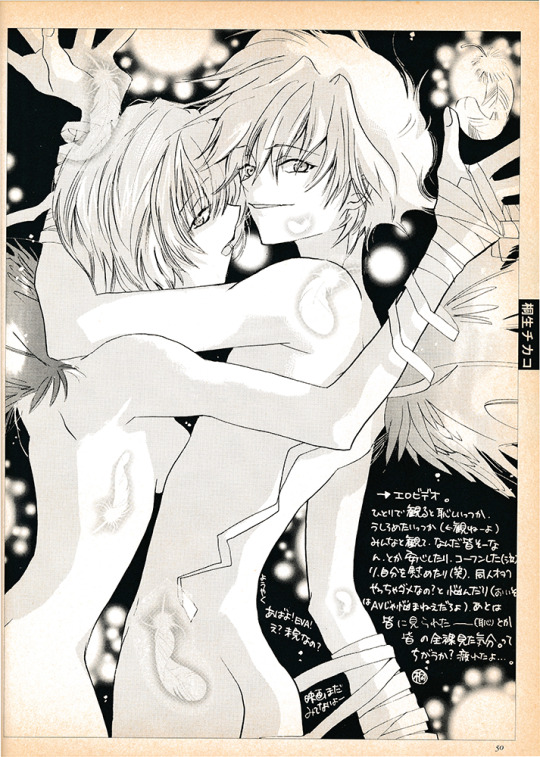
Honestly the art is incredible for this magazine sometimes, the splash pages they have are filled with Evangelion’s anime-spiritual energy.

"Unit 02 has a mouth, which means it can give a blow job." "The biggest surprise is Rei in cowgirl position. The official content does that, so hentai authors have nothing to do."
(Gainax putting hard-working hentai doujin authors out of a job, what assholes!)

"My heated up feeling toward Evangelion was quick-freezed by episode 25 and 26. EoE defrosted it, but now I feel distant from Evangelion."
How much Episode 25-26 come up here is great evidence for how divisive they were - End of Eva is absolutely seen as commentary on, and opposition to, the TV ending. I think in the west the initial reception of the original ending is overall more positive? Certainly nowadays, would be curious how it is seen in Japan today.

OCR’ing this image will literally murder me, pls I can’t
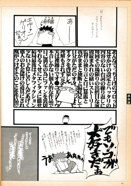
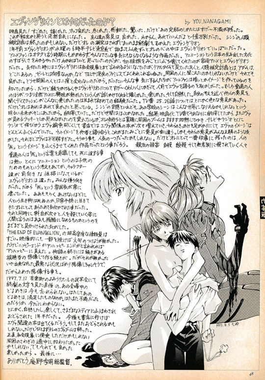
"Bullshit plot, surficial information, shallow dialogues, inconsistent direction, story with tons of plot holes, the director's masturbation, the otaku's useless attempt to enlighten other otaku..." "BUT I LOVE IT."
10/10 take

"'Sincerity' of someone I don't like just confirms that I still don't like them. Anno apparently thought that honest depiction of himself can be depiction of otaku, but that's not wrong. Anno is exceptionally creepy."

God-tier Anno portrait here. I love how many of this art showcases “settings” from End of Eva and which ones hit the audience - re-using the movie theatre seats for Shinji, that is really cool!


Evangelion - Slayers edition! The artist names are in the black box panel on the page lining, I absolutely hope to track down a few of them and see what kind of works they made.


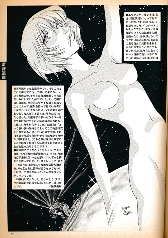
"I think each material of Evangelion was nothing new. In the early half, however, I was moved by their techniques of arranging and remixing those materials." "Creators' strong desire for expression supported this story, but I'm not sure."
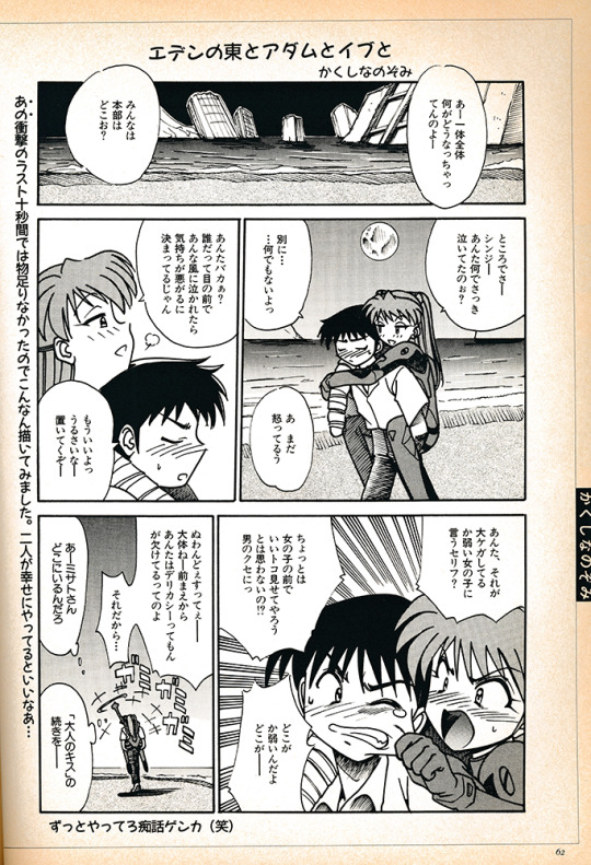
"Adam and Eve in the Eden East" "I hope they will live happily after the ending."
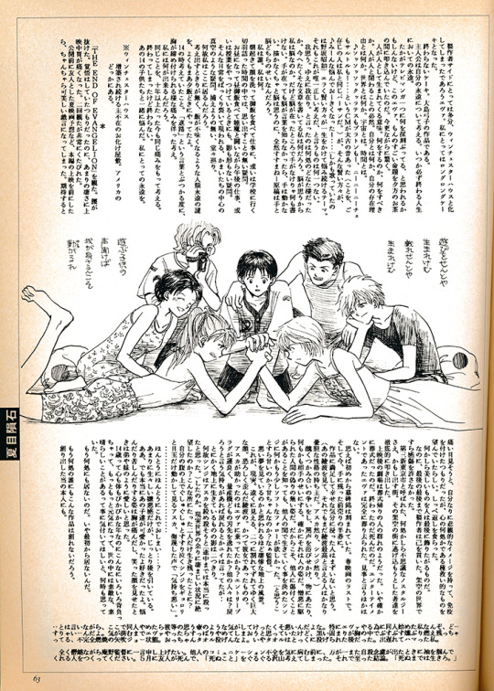
"The theater was like a funeral after the screening. No, I should say it was a literal funeral. Evangelion ended, it died. In terms of entertainment, Evangelion was completely and brilliantly killed."
Kaworu’s insta-inclusion into the ranks of the kid cast is always amusing to me; he is in one episode of the show after all, barely in Eva! But he is all over the art immediately. The power of design - and also being one of the first gay characters on television (as opposed to OVA’s) in Japan.

Hopefully if I can make progress on translation I can have actual thoughts to add to the scan, certainly I will post results if I get them.
I value, way too deeply to be honest, the preservation of the other side of the ‘media mix’ - how people responded to the media in question and what it meant to them. It is way more likely to be lost than the media itself or documents from the production side. May this contribution to preserving a bit of that experience be of value to those out there who would be interested in the history of Evangelion, and anime more generally.
If you think you know anyone or your followers overall would be interested in translation help, I would appreciate the broadcasting!
105 notes
·
View notes
Note
Hi! I love your reimagining of LO! I just have a random technical question about canvas size for long scroll comics. Would you recommend following the WT sizes (maxing at 800px width) for posting to tumblr? Or maybe something else entirely? Hope it's not a dumb question
Not a dumb question at all!
So the one thing I will recommend is to always draw big, export small. So whatever format you're using, whether it's Clip Studio or Photoshop, work in bigger canvas sizes with high resolutions, even if they're higher than what WT allows, because you can always resize the JPG/PNG exports for smaller sizes, but you can't make a small root file bigger for other things without losing quality.
I use the same standard size for pretty much all of my webtoon projects, with a fixed width of 2400 pixels at 350 dpi. The height doesn't matter so much as Webtoons will crop your episodes for you (or in my case on Tumblr, I just cut out the segments from my pages with the marquee tool and transfer them over into Tumblr, I try to make these segments as small as I can while minding the image limit so that Tumblr doesn't compress them to shit). Sometimes I have pages that are 20000px high, other times I have pages that are as high as 35000px, it just depends on how the sketches turn out, especially if I'm doing a set of panels that need to be interconnected.
When I finally export my pages, I usually size them down a touch so that Tumblr doesn't slap me for image sizing restrictions, I do the same thing with Time Gate on WT because they have a 20MB limit. So for Time Gate I export it to 800px width, but for Tumblr I go a little higher around 1600px. But I keep all the root files at their original sizes, this is so that if I want to post my art anywhere that doesn't have such strict image constraints, I can. It also means I can get decent quality images for print.
So really the only thing I keep consistent is the 2400px width because it's easily divisible by 800 if I need to post to WT, makes my brain happy LOL And I just sorta stuck with it for Rekindled because it works. And I always, ALWAYS keep those root files at their original sizes!
Hope that helps!!
#lore rekindled#lore rekindled ama#webcomic advice#webtoon advice#ama#ask me anything#anon ama#anon ask me anything
36 notes
·
View notes
Text

Here's some art for the upcoming Chapter 7 in the style of a 90's anime screencap!! I'd say this is for an important segment but I already posted it sajdjhsdhajhdhdakd
I had my friend @that-peach-anon help me with coloring and shading Vanny/Gregory
Here's the pngs of YN and Vanny/Gregory by themselves plus the sketches they came from
Edit: Un-90’s filter of the full pic above


#art#my art#digital art#sketches#the howling pirate king#thpk#werewolf pirate captain yn#yn#security breach vanny#vanny the dread#gregory fnaf#fanfiction#fanfic#my fanfiction#my fanfic#a03 fanfic#a03 writer#sundrop x y/n#sundrop x reader#moondrop x y/n#moondrop x reader#the daycare attendant x yn#the daycare attendant x reader#the daycare fandom#fnaf#fnaf security breach#five nights at freddy’s security breach#five nights at freddy's
38 notes
·
View notes