#the pixel one is his overworld sprite and the other is his in battle sprite
Explore tagged Tumblr posts
Text
since mole interest is up, I'd like to introduce you to my favorite mole from earthbound


thank you
#mole interest#god look at his cheeky grin#the pixel one is his overworld sprite and the other is his in battle sprite
10 notes
·
View notes
Text
pretty muuch everyone in the cast has some minor inconsistencies between their artbook cover artwork, ingame art work, and sprites. (this is INCREDIBLY nitpicky i do not care thaat much.. but still. wanna point it out. also i am DEFINITELY missing things i am not going too in depth here i am soo eepy)
some small examples:
sunny:

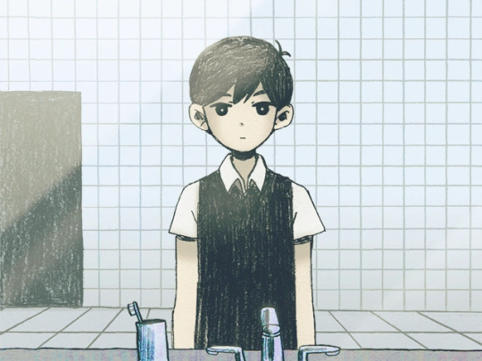
in sunny's official artwork, and all of his in game artwork, his vest is completely black, the only time this isnt consistent is in his actual pixel sprite

--
Omori:
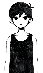

he has a preeetty simple design? so his never gets too inconsistent. but at times his sock length are changed.
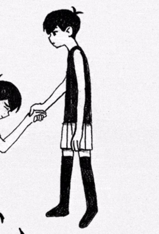
(socks higher up)
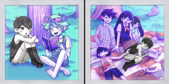
(socks lower than the knees)
--
Kel:
Obviously, DW!Kels shirt changes constantly between artworks. cant even be annoyed at this one that shirt looks like agony to draw, altho his sprite loses the more pastel coloration.. altho i think this is just kind of a consistent thing with the dw sprites, so i wont point it out much with them.
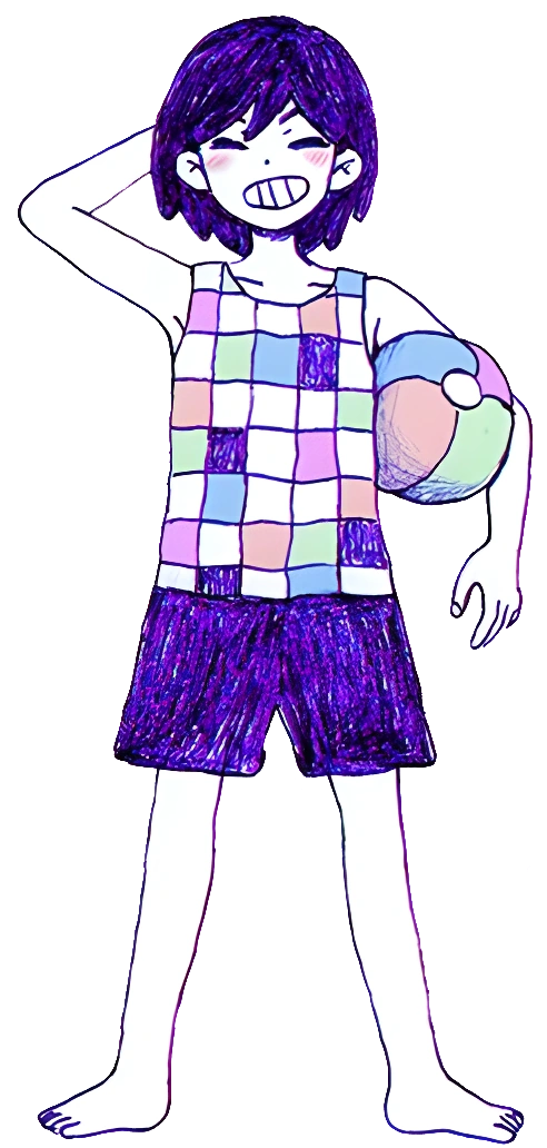
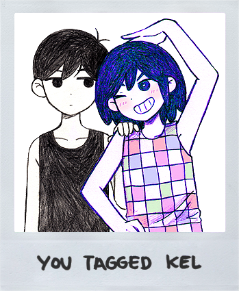

RW Kel doesnt have.. anything suuuper noticeable ?as far as i can tell. but his sprite and actual artwork definitely have.. inconsistencies (skin tone, along with the stripe on his pants)


--
Aubrey:
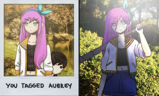
DW Aubrey doesnt have anything suuper inconsistent i believe? so i wont bring her up. and we have already talked about RW Aubrey. her outfit is. WILLDLY inconsistent between artworks, even in the game itself. (im NOT getting into other official artworks here but . her shoes too i believe tend to not stick too one design)

--
Hero:
for DW Hero, just inconsistencies with the stripe thickness, the collar part of his pajamas, and.. whatever the part near the hands are called being either solid white, solid blue, or striped
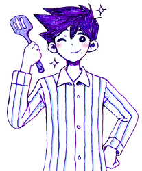
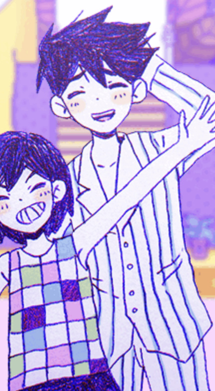
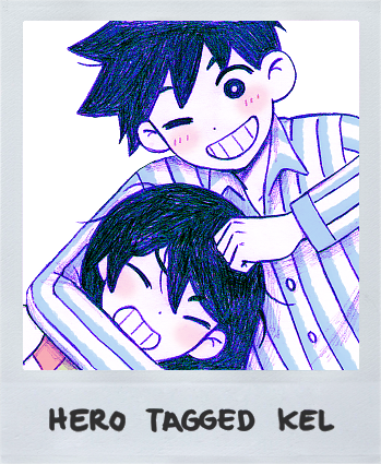
for RW Hero.. oh boy. His shirt collar

Official artwork (and tag photos) it looks like this ^
in his talk sprite, its still a vneck but with a white stripe

when he saves you from drowning, it looks like this
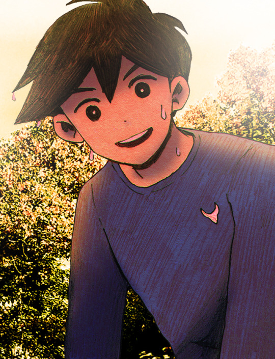
even his pixel sprites have inconsistencies between eachother

(normal)

(hospital)
good fucking lord man .!!!
--
Mari:

not too much with her actually!! main thing is. inconsistencies with her having shoes or not. (if u want a bit in non-in game comparisons, some official art has her dw self wearing socks when in game i dont think shes ever shown wearing them?)
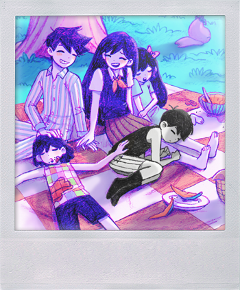
--
Basil:
and to end it all off, lets move onto Basil. !!!

(going to point this out first, in a LOT of both RW in DW Basil's actual artwork, he has 2 little tufts of hair at the top of his head, but in both his talk sprites and overworld sprites, its missing)
for DW Basil there is.. 2 things i think?
1: the flower crown. it varies.. a LOT between artwork. kind of obvious.
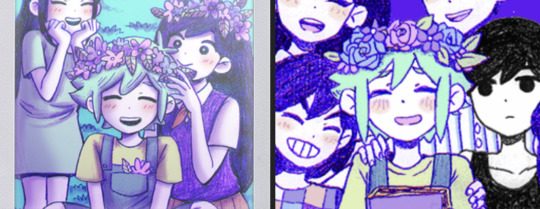
aaand. 2. his shirt . in most artwork ^ like shown above, it has a rounded tshirt neck. but in one specific artwork, it shows it being a collared shirt with a button

for RW Basil.. i dont think theres much?
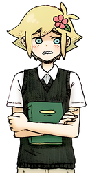

kiiind of the same issue as sunny? tho less obvious ig. his shirt is shown as dark green in the official artwork, but as a muuch lighter green in the sprite.
also in his battle sprite, he loses that... little part between the vest and the collar of his shirt? idk what to call it.
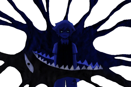
i beliiieeeve thats.. it for them all? i think i am missing things apologies .but i dont feel like looking thru the wiki anymore . and i have no space left for imgs pretty much
#sorry for weird format for some images. it was because image limit#omori#<- I GET TO MAINTAG IT THIS TOOK FOREVER TO WRITE OUT#aubrey.txt#omori spoilers
222 notes
·
View notes
Text
Chapter 6- Part 2


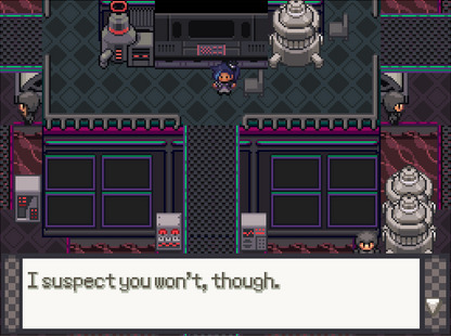
…I mean, they’re not wrong…


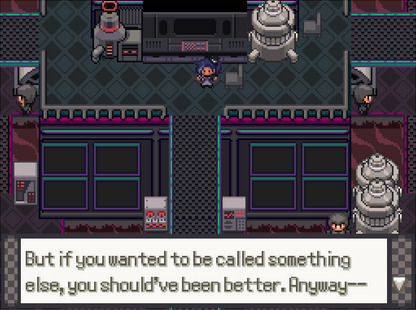
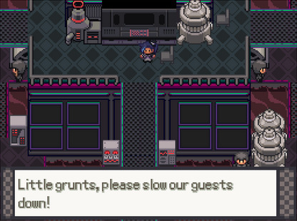

Wait, how much are these guys getting paid? How much can they even be paid, they’re borderline terrorists. Do they have insurance? Do they even have dental!?

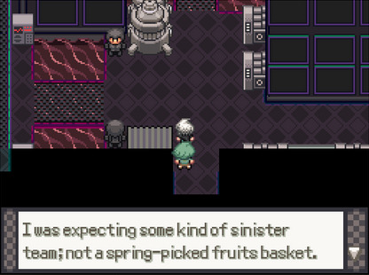
…Did Fern just call Ace fruity?

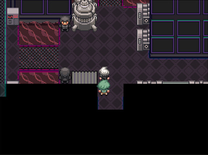
Now that is something I can get behind, especially now that we’re in control again. Let’s go left over here and challenge our first Grunts in the whole game!!
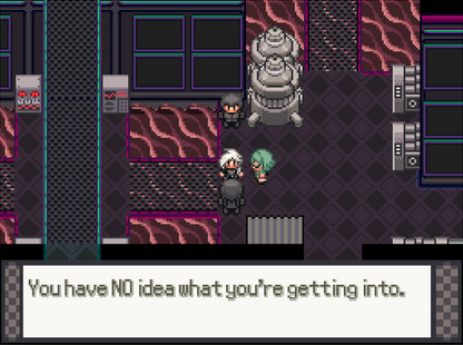
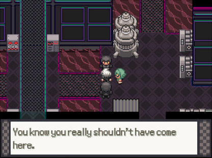
And you guys shouldn’t have blown up a train and train station, but here we are!


Ooooh, this battle music…so grim, so intense…it’s clearly a remix of some kind, but I can’t identify it right off the bat.
But uh…huh. They aren’t wearing armor, it really is just some kinda hood-and-jumpsuit situation. Okay, fine, but like- c’mon, you can’t blame me for thinking it was armor, look at those overworld sprites! You can’t tell me it doesn’t look at least sorta like a helmet and armor, especially from the front!
Interpreting pixel art aside- there was some kinda…tooltip? Flavor text? I didn’t get a chance to screenshot it, but it said something like “Machines whir in the background” and…given the background right now, yeah dude they sure are. But what did that mean? Was it just some flavor text because we’re all battling in a factory, or did that actually mean something…?
Well, onto the actual battle here…given there’s a Grass-type on the field in addition to the Rock-type, Summer might be best to send out here. As for Fern, he’s having his Budew use Natural Gift, aaaaand…

WHOA! Super effective on Bounsweet! What Berry was Budew holding, that was sick!
Also! By now, the BGM’s gotten to a point where I finally recognize what song this is remixing: none other than the Legendary Beasts’ battle theme! And while I would normally hesitate to use a Legendary Pokémon theme for something like battling local team Grunts, given these guys have literally killed people and were planning to blow up an entire Gym…yeah, the intensity of this theme is very fitting, and so good to listen to, oh I love it so much-
Anyways, Bounsweet’s practically down for the count by now, we can handle that, so let’s instead focus our attention on having Summer deal with the Roggenrola.
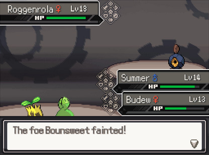
And sure enough, on this next turn, Budew is able to finish off Bounsweet with its own Mega Drain! This is good, because it gives Summer even more room to boost himself with Growth.
With the combined Mega Drains of Summer and Budew, they suck the soul out of that Roggenrola and win Xera and Fern the battle!


Hey, don’t tell them they’re the ones who don’t know what they’re doing, you two are the ones that lost the battle!
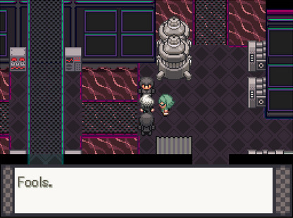

I dunno, they seem pretty playful to me, being a circus magician and all-
Previous
Next
2 notes
·
View notes
Text
Avatar: The Last Airbender DS Game Review
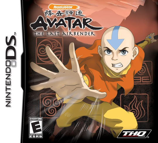
no one asked for this but i don’t ever see anyone talk about the atla videogames, which is a true tragedy, and i know that this may be because the video games aren’t technically canon, but i think they’re still worth talking about!
i finished this game in about three days, and i’m going to be talking about its gameplay, graphics, and story, all in that order.
spoilers below, as i’ll be talking about the entire game in depth.
Gameplay:
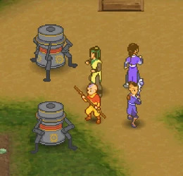
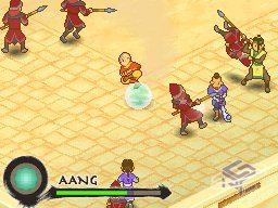
the bulk of the gameplay consists of controlling your party of four, which consists of aang, sokka, katara, and haru. you can swap between any member of your party at any time using the touchscreen. you can run around with the d-pad, and you can also walk by holding down the b button. but onto the combat- each member has a specific set of attacks they can use, with two kinds of attacks and defenses, primaries and specials, with attacks assigned to the y and x buttons, and defenses assigned to the b and a buttons respectively. the game is jrpg-esque, in the sense that it has (somewhat) random encounters and a multi-person party, each with strengths and weaknesses. the random encounters aren’t fully random, as the enemies (which range from animals to machines) can be easily spotted and avoided in the overworld, but they do chase the party down. there is no in-game option to run from any random encounter, as you have to purchase smoke balls to run away from a fight. each random encounter will either drop a healing item or an unspecified amount of gold, which can be used in shops.
the game works in “chapters”, similar to the actual show’s structure, which has episodes, each of which start you and your party in/near a village, according to whatever setting the plot deems necessary. in each village, there is a variety of shops, which include an herbalist, medicine man, and fruit seller. the herbalist will mix together any random herbs you find (for a fee) in the overworld, creating single use status-buffing items that have varying effects based on the kinds of herbs used. the medicine man (unsure if that’s what he’s actually called) will sell incense and smoke bombs, with the latter used to control the rest of the party, with different kinds of incense used to dictate their behavior in battle. for example, defense incense will make the rest of your party use more defensive moves, rather than offensive. the fruit seller sells various healing items, which range between single and party-healing. as the game progresses, these items grow more and more costly, requiring increasing amounts of gold. there are also hidden item boxes, though these are found in both the villages and world itself. items can be held in a sizeable inventory, but items must manually be moved up into a six-slot hotbar for use during combat.
though the bulk of the gameplay is exploration and fighting, there are also some smaller parts within the game that switch it up a bit. there are minigames, such as four nations force, which can be found in villages and is a pai-sho-esque game with similar tiles, as well as opportunities to train certain members of the party, namely haru (at least in my experience). there is a segment in which you can control momo, and have him solve a puzzle to open a door, and in that same segment, there is a mission where you have to utilize the b-button to silently walk past guards. there are a few of fetch-quests, though they aren’t too difficult, and drive the plot forward.
the gameplay isn’t anything groundbreaking or spectacular, but it serves its purpose well, and can make for some really fun strategy-driven moments where you have to constantly swap between characters to see if there’s advantages to using one over the other, and rationing out health items carefully to see if they’ll last you before a boss fight. there’s definitely a lot of combat, and, while the game doesn’t force you to, there is the inherent expectation of level-grinding, which can make certain segments of the game a whole lot easier, especially with unlocked specials and higher power. there is also the fact that, should you lose a random encounter fight with no smoke bombs, you are basically stuck in the fight until you win or quit, which are the only two options. furthermore, should you quit, you’ll be sent back to your last save, and you must manually save, as is standard for most games of this era, as it only prompts you to save at the very conclusion of a chapter. there is a bit of mercy, however- should your entire party die and you continue, your party’s health will be restored to at least a third, and all items used in the previous battle will return in your inventory, ready to be used again.
Graphics:
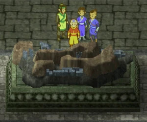
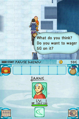
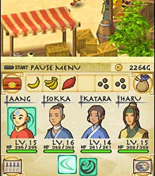
as is expected with ds games of this era, the characters are rendered in charming little pixel sprites, which each sprite being beautifully animated and full of personality. in cutscenes, each character emotes with their own set of sprites, and their mouths are animated when they talk. sometimes, their sprites are used for comedic effect- there are rarely moments where characters are just standing and spewing dialogue. there are also pixel-rendered portraits of each character in the party on the touchscreen, allowing you to see their health, moves, and level.
what’s interesting about this game, however, is that, while the characters are 2d sprites, their surroundings are 3d, and you can change the viewpoint of the camera at any time in the overworld with the l and r bumpers, allowing you to really see the entirety of the map. this makes exploring all the more interesting, as you can spin the camera around to see hidden loot boxes or other items you may have missed. in villages, there is a lot of new personality and depth given to each setting, especially familiar sights from the show such as omashu and the northern air temple. the aesthetic of the overall show is kept intact well, as even the npcs in new towns all appear to fit by design, and there is a sense of visual cohesion that makes it feel true to its roots. there are little nods to canon beyond just the main characters, such as one of the healing items in the game being a custard tart, and town designs expanding on already established settings.
each segment of the game carries with it a unique feel, making each chapter easily distinguishable from the last. the game has so much charm, with its bright visual styles and faithfulness to its canon inspiration, and each setting is unique and fun to explore. the only thing that may bog it down in terms of both gameplay and graphics is that a majority of the surrounding buildings in villages and cities can’t be entered nor explored- they’re just props. this gives a slightly empty vibe to the environment when you notice that the background props are just props. it would be much more fun to explore the given environment if there was more to do, rather than just the same three to five things. furthermore, while the camera function is very useful, it can also be really confusing in terms of navigation. there’s a map and a compass, sure, but sometimes you’ll be stuck spinning the camera until you’re absolutely sure you’re headed in the right direction. the map, at least, does give you an indicator on where you’re supposed to go next to advance the plot, and there is a similar kind on the compass as well, which helps immensely.
Story:
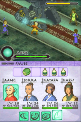
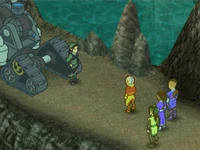
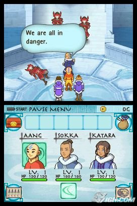
unlike other games (namely burning earth and into the inferno), this game’s plot is mostly standalone, and doesn’t follow the canon timeline very closely. there is less “a game about playing through the show’s events”, and more of “a game that uses canon elements to create a story of its own”. the story, which doesn’t fully fit within the bounds of canon, is still an interesting story to present nonetheless.
spoilers for the entire story begin here!
the story opens with aang, katara, and sokka in the north pole, where master pakku has been mysteriously replaced with a character named master wei, who tells the gaang that one of their waterbenders, named hiryu, has vanished. upon further investigation, a waterskin and a weird piece of metal is discovered where the waterbender was seen last- however, these investigations are quickly halted by the arrival of zuko and the fire nation, who kidnap katara as bait for aang. sokka and aang track her down to a fire nation prison, where they have to dress up as fire nation soldiers in order to sneak in and get info on her whereabouts in order to save her. while saving katara, they also discover another prisoner named lian, who is presumably being forced to work for the fire nation. after a brief battle with the warden, they find that lian has escaped on her own, and left a note behind, pointing them in the direction of an earth kingdom village.
after katara has been saved and the gaang follows the note, they find the village being terrorized by mysterious machines with the ability to bend/use singular elements, though they are being fended off by two earthbenders. upon further investigation, the earthbenders turn out to be tyro and haru, who were saving villages when this one was attacked by machines. after defeating the machines, the gaang learns from tyro that another bender has been kidnapped- an earthbender named yuan, who was one of haru’s closest friends. because of this, tyro encourages haru to join the gaang’s quest to find out where the machines are coming from, and points them towards the forest for clues, as a wise spirit resides there. the party then encounters a bear-like creature, which attacks them, though upon defeat, reveals itself to be the forest spirit, who gives them very cryptic answers when asked about the origins of the machines, saying something related to the heart of the earth kingdom.
somehow, this prompts the gaang (now joined by haru) to go to omashu, as it’s in the heart of the earth kingdom. aang decides to ask his friend king bumi to help them figure out where they need to go to find the origins of the machines, and the king, while happy to see his friends again, is forbidden from helping the group discover secrets, due to his royal counsul, who refuses to let them go to where they need to go. nevertheless, bumi directs them towards the earth kingdom royal library, where a scroll is found showing a series of bending techniques, as well as some kind of map. upon bringing their findings to king bumi, he points them in the direction of four paws island- an unmarked island off the coast of the earth kingdom. however, as the gaang prepares to leave, the fire nation attacks once more, forcing them to find an alternate route out of the city, where they are challenged by the royal counsul, who is revealed to be conspiring with someone relating to the machines. haru, enraged by the counsul’s traitorous actions, takes him on one on one, and, upon defeat, allows the gaang to escape to four paws island.
now on four paws island, the party finds more mysteries than they bargained for, as there are more machines terrorizing the people of four paws, as well as more benders going missing. unsure where to start, they begin to search the island for a statue they recognized from the royal library, soon discovering a hidden passageway underneath it that leads them to a model of the island itself, which holds a mysterious blue rock. the rock, covered in old writing, is then brought to the elder of the village, who reveals that it holds the entire history of four paws, and also serves as a key to a secret passageway. the passageway, which is discovered in the side of a cliff west of the village, is revealed to be a sprawling, underground lair, crawling with machines. at the end of it, a large machine sits in wait as a familiar face operates on it. the person reveals themselves to be lian, who has been building the machines in hopes of restoring peace to the world. the machines, she hopes, will wipe out and replace benders, thus evening the playing field, as the very existence of benders creates divide between people and nations. she worked with the fire nation solely to gain resources for her machines, as well as the omashu royal counsul, and she tries to persuade aang to join her, stating that he will never be ready to fight ozai. aang refuses, along with the rest of the gaang, and, in a fit of rage, she states that she will cut off his connection to the avatar state and unleashes her prototype bending machine on them, which uses three of the four elements to attack. upon defeat of the machine, the gaang rushes to catch lian before she can escape again.
the group now lands at an earth kingdom village that borders the air temples, and aang decides to take appa head off on his own towards the northern air temple, knowing that lian will most likely head there and destroy the avatar statues, mistakenly believing that this action will sever his ties to the spirit world. the story then alternates between aang at the air temple, and katara, sokka, and haru back at the village. while aang fights off machines and tries to protect the air temple from destruction, the rest of the group fights off machines in the forest, where the people from the village were trying to rebuild. after defeating the machines, however, a mysterious large machine appears, and katara, sokka, and haru are taken. when aang arrives back at the village after successfully protecting the temple, he is attacked by a drill-like machine, and has to destroy it on his own. upon defeating the machine, he discovers a large hole/tunnel in the ground, and decides to follow it, hoping it’ll lead him to his friends.
the tunnel leads aang to another village, where a large temple resides in the northwest that villagers refuse to enter, due to benders mysteriously disappearing around there. aang, after battling his way through the surrounding forest, enters the temple and discovers his friends imprisoned there by lian, and he is forced to save each of them separately. sokka is found trapped in a strung up cage, and he discovers a tool left behind by lian, which he uses to open locked doors within the temple. katara is inexplicably found on the other side of a large lava pit, and aang must fly across it to save her. haru is found in a metal prison below the temple, and, after being feed by sokka, tells the rest of the gaang where lian is headed. now fully reunited, the group heads towards the heart of the temple, which is blocked by a series of large rocks that haru makes quick work of, and they prepare to stop lian.
before stopping lian, however, the group discovers zuko, who lays injured on a bridge. aang, who runs to help him, asks if he needs help and assumes he was captured by lian as well, but zuko refuses to accept his help, instead berating the fire nation for trusting lian and her nefarious machines. the gaang reassures zuko that they will do something about the machines, but are forced to leave him behind, unable to do anything to save him at the time, despite aang’s protests. the group then falls for a trap, which unleashes an even stronger version of the prototype bending machine from before, which now has the ability to freeze water, and is forced to destroy it before they can continue. after the ensuing battle, aang, sokka, katara, and haru finally prepare to confront lian for the final time.
lian, standing in front of a powerful machine with the ability to use all four of the elements, is found alongside two other benders- hiryu and yuan, who are revealed to be working with and for lian, teaching her machines their bending techniques, as they support and believe in their cause, rather than held against their will, as originally believed. this upsets haru, who tries to convince yuan to join their group, to no avail. lian repeats her speech on division between the four nations and elements, stating that she would rather have thinkers in charge of the world, rather than magicians. she gives the group one more chance to join her side, lest they be eliminated by her ‘avatar’ machine, stating that benders such as yuan that side with her cause will be spared, and that benders such as zuko who refuse will suffer the consequences. aang, who firmly believes that zuko didn’t make the wrong choice, states that being the avatar is something that can’t be replaced by machines, and he and the rest of the party ultimately challenge and prepare to destroy her ‘avatar’ machine.
midway through the fight, however, a fireball is shot at aang, which none of the group sees except for katara, and she throws herself in front of it, taking the hit for aang. while the rest of the group rushes to her aid, lian mocks the group for being weak, showing that this is proof that her machine is stronger than all benders. enraged, aang enters the avatar state, facing the machine alone and destroying it quickly, soon passing out from exhausion once the fight ends. unlike in other iterations of this same game, lian survives and is helped by hiryu and yuan, who realize the consequences of their mistakes and elect to help lian and improve themselves. escaping as sokka and haru care for aang and katara.
aang eventually reawakens in katara’s arms, and sokka gets angry with katara putting her life on the line for aang, but katara says that she had to do something, as aang is important to not only the world, but her as well. aang learns that this message is applicable to his role as the avatar, realizing that he has a responsibility to help when no one else can, and he must accept his role in the world. soon, the group escapes the fortress over to appa and momo, and begin heading back to haru’s village, bringing him home before starting back off on aang’s quest to learn all four elements. zuko is also revealed to have escaped the fortress, and is upset that he missed his opportunity to capture the avatar.
spoilers for the entire story end here!
the story is extremely simple, yet chaming and full of twists. it’s definitely not something one would expect from atla’s usual fare, especially considering the technology and themes, but it still fits pretty well. lian is an interesting and dynamic villain, and her motivations are presented in a believable manner, and she makes for a pretty sizeable threat over the course of the story. the dialogue and cutscenes are generally entertaining, and the story is fun to watch unravel. the only things i personally took issue with were the pacing and some character inconsistencies. there’s a segment in omashu that’s a bunch of fetch quests that lead up to a joke, and, while the joke is pretty funny, bogs the pacing down a lot. there’s also no sidequests whatsoever (barring the singular one in the north), and there is no way to go back to a previous chapter, so you have to accomplish every single thing you want to accomplish before moving forward. the story is extremely linear, which works well, but i found myself wanting more, especially in the character department. surprisingly, haru works extremely well as a member of the gaang, and i found his interactions with them to be entertaining and fun to watch. it’s cool to have an atla piece of media that not only remembers him, but makes him an actual character. however, there’s not much for character on character interactions, even with all the cutscenes. i wanted to see more of this new gaang being friends, since it presented an entirely different dynamic from the show. there’s also the issue of some interactions feeling pretty flat, such as haru being imprisoned again and having no reaction to it, or sokka not being given much depth outside of being the butt of many jokes (outside of the one scene with the kid and the boomerang), but these are minor gripes in the face of the characters and story it presented. overall, i think the only big thing i have to complain about is the ending, which was changed from the original ending, where lian ambiguously dies and haru and yuan reconcile. it feels like a last ditch attempt to redeem lian and yuan, which i understand to some extend, but it feels extremely out of place and put in at the last moment. this also downplays haru and yuan, which is sad considering that yuan getting captured is what leads haru to join the adventure in the first place.
In Summary:
7.5/10. it’s a fun game with some difficulty spikes and a genuinely enjoyable story. i know that most tv show videogames don’t have a great reputation, so i think this was pretty good compared to what i’ve played before. the main things that keep it from being a 10/10 for me was the realization that the game wanted me to grind, lack of extra content that would’ve heightened the experience, some story and character snags, and rather repetitive boss fights. i took off an entire .5 for the fight with the spirit bear, which was a really infuriating experience (that was largely my own fault as i walked in unprepared), but other than that, i would genuinely recommend this game to anyone who wants a fun time with well-made spinoff videogame.
#this got way longer than i intended#long post#sorry guys i just had to recap this game in detail#no one else would#also for anyone wondering the characters i used the most were aang and haru#i liked all of aang's specials and well#we all know that i love haru so#now! onto burning earth!#hope you guys enjoyed this lengthy review#atla#avatar the last airbender#atla ds game#avatar the last airbender ds game#atla game#atla videogame#aang#atla aang#aang atla#katara#atla katara#katara atla#sokka#sokka atla#atla sokka#haru#atla haru#haru atla#lian#atla lian#lian atla
12 notes
·
View notes
Photo
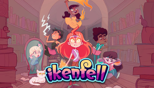
Blaster Caster - An Ikenfell Review
Genre: Adventure Subgenre: Tactics RPG Developer: Happy Ray Games Publisher: Humble Games Platform(s): PC, Switch, Xbox; Reviewed on Xbox Series X Release Date: October 8th, 2020
Ikenfell immediately caught my eye in a marketing email from Humble. The art style looked charming, and it stayed on my radar for a while until I gave it a try on a whim from Game Pass, needing something to sink my teeth into on Xbox. I was a little wary at first, as tactics games can sometimes be difficult to get into (I’m looking at you, Fire Emblem), but the art style and whispers of praise I kept hearing drew me in. Does it hold up, though? Let’s dig in!
Story
The story of Ikenfell follows Maritte, an “ordinary” (non-magical) girl who travels to the titular school of magic to find her missing sister, Safina. After suddenly gaining magical powers of her own, Maritte soon realizes that something that happened at the school is causing the world to destabilize and magic itself to distort in strange and unusual ways. Best of all, Safina seems to be right smack dab in the middle of everything.
Along the way, Maritte will meet a number of students of Ikenfell, friends and rivals alike of Safina, with whom she will partner in order to get to the bottom of the strange happenings at the school. One of the best things about the game is its diverse cast of characters, seemingly all of whom are queer to some extent. It felt really nice to have some representation that didn’t try to make a huge deal out of the characters’ identities. That being said, I found it somewhat difficult to keep up with characters’ genders, pronouns, and sexualities, since it’s rarely mentioned by the game. One idea that could alleviate this is if the game could remind you of the characters’ pronouns on their status pages. Additionally, while some characters, such as Maritte, Gilda, and Pertisia, felt fully realized and fleshed-out, the other half of the party seemed to languish in stagnation. While Rook and Petronella had a bit of development regarding their relationships to Safina, Ima had basically no backstory and felt forgotten.
The game has plenty of side characters as well that help to flesh out the cast, particularly the bumbling dandy Ibn Oxley and his surly protector Bax. These two were pretty adorable in their relationship, and I’m always a fan of the incompetent braggart archetype, however I feel like they didn’t do much except constantly get in the way throughout the entire story, and I felt like I was always cleaning up after them. The headmistress, Baudovinia Aeldra, has a very touching, and surprisingly dark, backstory, and she becomes something of a tragic antagonist throughout the course of the story.
Perhaps the thing that impressed me the most was the game’s scope of worldbuilding. In one chapter, you ascend a tower as the game drip feeds you bits of its mythology, and I was really into it. Additionally, I like that there are small hints about the world at large outside of the play area, which made me feel like the school was only one part of a larger world, even if it was effectively the center.
The story itself is fairly basic and somewhat on the short side. There were plenty of touching moments throughout, but I couldn’t help but feel like I was just chasing Safina’s coattails the whole time, as she’s all that anyone can talk about. What’s worse, outside of flashbacks, Safina doesn’t actually do anything the entire game, which was a disappointment. I was looking forward to having a sororal bonding moment that didn’t really come until the epilogue, and even that was a bit lackluster.
Gameplay
At its core, Ikenfell is an RPG. The battles take place on a 12x3 grid, and on each character’s turn, they can move and cast a spell from their repertoire. As opposed to other games that have MP or a fixed number of spells, Ikenfell’s spells are thankfully unlimited. Instead, some spells have a cooldown time, though this is rarely an issue, as most spells with cooldowns are powerful spells anyway. Additionally, each spell has its own effective range, so proper positioning is constantly important. Most spells can be categorized as one of the following:
Single-target damage dealing
Area-of-effect damage dealing
Ally buffing
Enemy debuffing
Placing a trap
Other, or some combination of the above
Despite this, most spells feel different from a combination of their ranges and other unique properties. For example, while Pertisia’s Retaliation spell hits multiple targets for damage, it has the unique range of hitting all allies that are orthogonal to her or her allies, incentivising close-quarters play. This pairs well with Gilda’s Teleportation ability, which lets her teleport to the other side of the battle grid and immediately take a second turn. In all honesty, I found the combination of Gilda and Perty so powerful that I spent most of the game using only those two and Maritte, who becomes so physically powerful by the end of the game that she’s a must-have. Unfortunately, I never found much use for Rook and Ima, as their spells never really stood out much to me, aside from being the only characters able to set traps. Traps become useless pretty quickly, since most enemies can fly or teleport to their destination square, meaning unless they land right on a trap, it’ll more likely hinder your own movement. Nel at least had unique abilities in being the only character able to cast healing spells, but the spells are so difficult to actually perform, and they’re so miserably weak otherwise that it doesn’t feel useful to include them, which is really sad considering their backstory!
Enemies also get the same mechanics as the player, which usually meshes well, however it seems like most enemies get way more turns than the player, especially certain enemies that can use actions that immediately give them an extra turn. It pretty much requires you to use Gilda to provide speed buffs and debuffs just to feel competitive. This is felt particularly strongly during boss battles when bosses can summon minions and then immediately take another turn. It can get overwhelming quickly, especially if one character gets knocked out. Fortunately, if you’re leveled up enough and you stay on top of healing and taking out minions, you should be fine in any battle, though this does put the player in an odd dichotomy where you either stay on top of everything for the entire battle, but you make one mistake and you basically lose outright.
The other mechanic to battles is the timing mechanics. Every spell has a specific timing for pressing the A button in order to deal max damage or buff. You also use the same timed button press to defend against enemy attacks, which gives the battles a slight Paper Mario feel. Unfortunately, I found that timing was often inconsistent. Some spells have helpful visual indicators for letting the player know when to hit A, but many are best used slightly before or slightly after the visual trigger, making it frustrating when you whiff a spell or take major damage despite looking like you were right on time. The game has some accessibility options that can bypass this, by making your attacks auto-hit or skipping battles altogether, but this feels more like cheats than balance, so I didn’t use them.
As far as the overworld goes, you travel between areas to reach various story objectives, giving strong Mother series vibes from your party following along behind you. The game allows you to save your progress by petting cats around the school, which is automatically an A+ from me. The cats also refill your HP, so you don’t have to worry too much about healing outside of battle.
I really enjoyed the equipment system in the game as well. Aside from weapons, each other item can be worn by any character, and usually offer both benefits and drawbacks, so it’s up to you to decide which stats you want to optimize on each character. Though it wasn’t a really tough decision, as there are only 5 stats (HP, Attack, Defense, Speed, Movement), and most equipment only modifies the middle three. I ended up speccing Maritte into Attack, Perty into Defense, and Gilda into Speed, since those seemed to match their play styles and base stats.
There isn’t much in the way of side content in the game, the main sidequest being collecting hidden gems throughout the world. These gems can be exchanged for special accessories that give unique effects. Unfortunately, these accessories don’t provide any stat bonuses, so I didn’t find any of them as useful as just buffing stats. Lastly, the game has a few optional bosses to defeat, which basically require you to hit the, admittedly low, level cap of 30. These bosses were interesting, but at that point I was getting sick of boss battles.
Presentation
Ikenfell is a gorgeous game. There’s plenty of great pixel art throughout, particularly in the environment. The character sprites are very expressive, both in battle and on the overworld. I wasn’t a huge fan of some of the portraits (Perty particularly has some oddly lumpy cheeks), but for the most part they’re perfectly fine.
The music in the game is wonderful, and is largely done by electronic musical group Aivi & Surasshu. Most of the background tracks were a wonderful blend of chiptunes and melancholy instrumental which is definitely my thing. Unfortunately I wasn’t all that fond of the vocals on some tracks, but that’s likely just a personal preference thing. My partner loved them, so your mileage may vary.
Conclusion
JK Rowling wishes she could tell a magic school story this good. At the end of the game, I loved the characters and felt good knowing that I had accomplished everything the game had to offer. I loved just exploring, seeing the different locations, petting cats, and listening to the music. Definitely give this game a try if you love RPGs, queer representation, good stories or music, and DEFINITELY if you have Game Pass.
Score: 8 / 10
9 notes
·
View notes
Text
Octopath Traveler: Review

Let me start by saying that, historically, I’m not a huge fan of turn-based RPGs. Ironic, given that my favorite game series of all time is Pokemon, but I consistently find most JRPGs to be a bit slow-paced and convoluted for my liking. Octopath Traveler, for the most part, managed to subvert my expectations and kept my attention for much longer than I expected going in.
Octopath Traveler is not terribly unique in its gameplay or story, but instead carves a niche in an otherwise crowded genre with stunning visuals, solid fundamentals, and a character-driven gimmick. The game begins with the player choosing one of the eight possible character options (ranging from a staunch, by-the-book knight to a “dancer,” a medieval-fantasy representation of a stripper). Each of these characters has a few tidbits of backstory to entice the player, but not much beyond that. I chose Ophilia, a cleric and the adopted daughter of this universe’s archbishop, for no reason other than she seemed fairly nice and I knew I would want a healer on my team.
The games largest problem became clear fairly immediately: the pace of Octopath’s cutscenes is glacial, and there are a lot of cutscenes. I immediately checked the settings menu for a quick fix, but the most you can do is speed up text speed slightly. Normally this would get the job done, but 50-70% of every cutscene is comprised of movement, not even actual dialogue. Between every line of speech spoken by a given character, their adorable little sprite twitches slightly to add emphasis to their next phrase. I was able to burn through the text itself, but the little interruptions added up and I spent a substantial portion of my playthrough watching nothing happen.
And it was a long playthrough. The average playtime for this game, completing the main story for each of the eight characters, rounds out to 60 hours, a hefty chunk for any player with a busy schedule. It took me several months of on-and-off play to finish the game, though I’m sure that a hardcore player could skip through a lot of the cutscenes and finish in under 50 hours. That said, I can’t really recommend skipping the cutscenes. As slow as they are, this game lives and dies by its cast of characters, most of whom I grew to love by the end of my playthrough. Each of the eight potential members of my team felt fleshed-out and I genuinely cared about the outcomes of their stories enough to see them through (though some were a bit more tedious/strained than others).
Unfortunately, the characters also contribute to one of the game’s other most frustrating features (or lack of features): there are dreadfully few interactions between the various figures that the story follows. Each one of them has five distinct missions, complete with their own little story arcs and supporting characters. The player completes each of these missions with a team of four, three of whom are merely background actors in the primary character’s adventure. Most of the time this isn’t terribly disorienting and can even be fun; the game offers little snippets of dialogue between characters showing how their personalities clash or compliment each other and I was able to fill in the gaps with how they might interact outside of combat. Other times, however, Olberic might engage in a heated one-on-one battle with his greatest rival...only for the actual battle to take place between Olberic’s rival and four magically-enhanced strangers.
I found myself ravenous for the rare moments of interaction between characters since so much of the adventure took place in various little vacuums. Every one of Therion’s snide remarks felt like a breath of fresh air in the absence of story arc crossover. Given, there is a bit of story overlap in the postgame, but if I have to wait that long to see the characters actually come together, is the game doing what it was marketed to do? Hard to say.
As for the rest of the game, it was highly enjoyable. The combat system’s use of weaknesses and shields is unique and complex and kept me on my toes, even against weaker enemies. I really enjoyed customizing my team, and once I unlocked multiclassing it felt like I was playing a whole new RPG. The visuals are stunning, using fabulous pixel art and some blurring to give the sense that the player is looking down into an adorable little world, explored by little pixel people. I did find myself wishing for more high-resolution art of the playable characters; you only ever see them in their tiny overworld sprites, while most bosses get fully-rendered combat sprites.
The actual content of each character’s stories varied wildly, from lighthearted and mischievous to surprisingly dark and harrowing. Without spoiling too much, I found that the game’s attempts to tackle more serious subject matter felt odd given the otherwise lighthearted fantasy veneer, such that each gruesome death felt out of place alongside Tressa’s friendly bouts with local pirates. To be fair, I didn’t find anything about the game’s commentary or story to be genuinely offensive save for some light queerbaiting (if you’ve played the game you know what I’m talking about).
Overall, Octopath Traveler was a solid, classic game. It plays well and I was genuinely invested in it, if not a bit excited to be done once I finally reached the ending. I can’t reasonably endorse purchasing it at the full retail price of $60, but if you can get this game on sale like I did, it’s well worth the investment. If you lean into the fun and the characters, it feels more like a choose-your-own-adventure than the hardcore JRPG it sometimes tries to be, and I think it’s for the better.
TL;DR: Solid game, lovely characters, very long, surprisingly dark, visually stunning. Buy it? Only if it’s on sale.
15 notes
·
View notes
Text
Undertale Height Calculations
So I just did some math with @argentdandelion and discovered that the ratios between the battle and overworld sprites are ridiculously inconsistent. How inconsistent?
Well, I used the Bedroom Door hypothesis @undertale-science which compares Papyrus to his bedroom door and assumes that the latter is the same size as a standard bedroom door in our world.
Using the median calculation, which assumes one but not two pixels of height on the door to account for a door frame and space between the door, frame, and floor, I calculated Papyrus to be 6 feet, six inches in height. (for reference, the other two calculations; one with zero and the other with two pixels of clearance, put him at 6′4″ and 6′8″ respectively)
If we assume that Papyrus’ height stays consistent between his battle and overworld sprites (not necessarily the case as his battle sprites are leaning somewhat, but his b:o[battle to overworld] ratio is 2.5 while Sans’ is 2.45, and the Papyrus:Sans ratio is 1.45 in the overworld and 1.46 in battle, which is close enough to suggest that it does not affect the calculations overly much and that the brothers were probably made using eachother as height references) then he will remain 6′6″ in the battle sprite and we can use him to measure other people.
AsgoreB is 160 pixels tall, and AsgoreO is 61, which puts his ratio at 2.62, which is close enough to the brothers’ ~2.5 that I was impressed and considered the theory of consistent ratios and comparable sprites likely. ~0.1 could easily be chalked down to stylistic stuff and the inaccuracy of pixels as a medium. Asgore, with horns, would be 9′5″-9′11″
High off of this success, I turned to Toriel. And this is where we started to have problems. ToriB is 101 and ToriO is 52, which gives her a 1.94 ratio. That’s... not even close to what we’re hoping for. Upon entering battle, this Tori would shrink from a formidable 8 feet an half an inch to a mere 6′3″! Two friggen feet!
Hoping this was an outlier I brought in Muffet next. MuffetB: 107, MuffetO: 35. With a ratio of 3.12 my hopes were dashed. Unlike Toriel, this Muffet would grow from 5′5″ to 6′7.5″.
Recalculating the latter results to exclude horns (7′9 & 5′8) and pigtails (5′1″ & 6′4.5″) didn’t help. Neither did the fact that the disparities mean that a height chart would have to be re-ordered, Tori towering above Papyrus initially but being able to tuck her head under his chin during battle and not even reaching Muffet’s height.
The theory is disproven, so I’m not going to calculate everyone else
Conclusions:
Battlesprites and overworld sprites are inconsistent
if you want consistent heights or a height chart you’ve gotta choose whether you’re going by the overworld sprites or the battle ones.
You can’t determine the size you should make your battle sprites by comparing a custom overworld sprite to the other characters, and vice versa. Just make it up.
Similarly, if you only have a battle sprite you can’t determine how tall they are in feet, especially since all the height comparisons to the real world I’ve seen involve either Frisk or an overworld object.
How tall is Tori really? We just don’t know. She is a shapeshifter.
Considering how the player (and Frisk) is likely to feel about the characters in question at the time, there might be an essay in how psychological factors might effect the perceived size of an enemy combatant, and whether that might make sense of the discrepancies. (Tori, who has mothered you, is tiny. Muffet, a spider monster who just got you tied up in webs in a dark room, is huge)
#undertale#undertale analysis#muffet#toriel#height#videogame analysis#height chart#height charts#math#undertale height#text#my stuff
14 notes
·
View notes
Text
2019 Mega Drive Explorations [1]
It takes me a long time to do some things and I’ve finally gathered up a bunch of Sega Mega Drive / Genesis titles that I’ve been meaning to play, hopefully through their entirety, or replay and take as many screenshots as I can. These aren’t going to look like most other screenshots you’ll see online, though; I’ve been using an NTSC filter because I believe it’s the visual format in which these games look best. So, let’s take a stroll through the material so far.
Super Hydlide (1989)
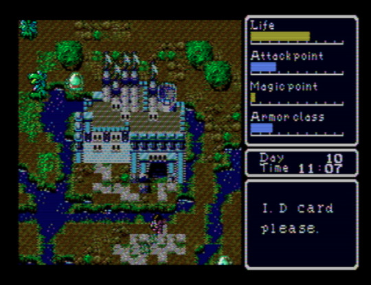
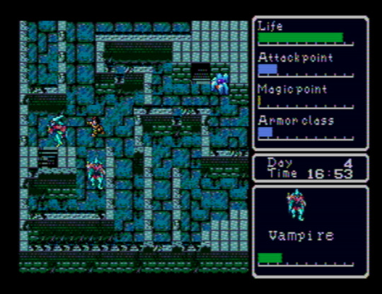
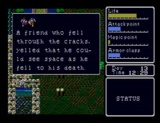
This is one of the best “old style” action-RPGs I’ve played. I’ve gone in with barely any prior knowledge, and I think that’s how to best experience it. Spoiling yourself on the extent and workings of its mechanical systems would, I think, turn it into nothing more than leveling up and finding the next place to go. The range of overworld which you’re initially able to explore is fairly restricted, and, as the action-RPG designation suggests, there are no randomized battles. Because of details like your need of food and sleep, or the encumbrance limit, though, it’s a deep relief to return to a town after some exploration in a way that reminds one why this trope of wilderness vs. domesticity caught on. You might just find yourself exhaling when your enter an inn. In another game, your character’s attack would likely be assigned a hitbox straight ahead of the sprite, but Super Hydlide locally assigns it to your right arm/hand, and it’s a welcome quirk in a game with super basic combat. There is no in-game map (or, if there is, I haven’t found it yet), and so -- as with Simon’s Quest -- I’ve been drawing my own on a sheet of gridded paper.
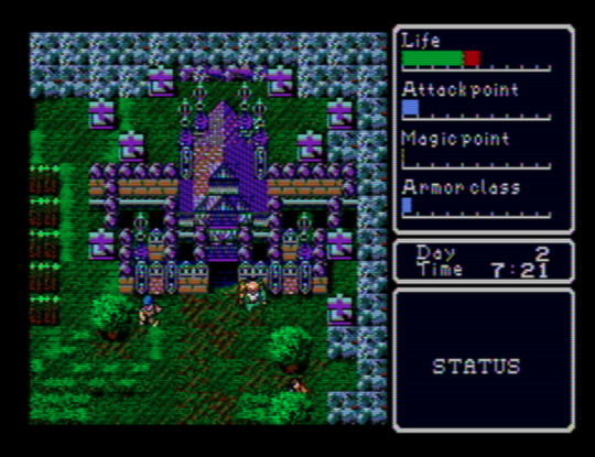
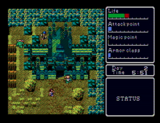
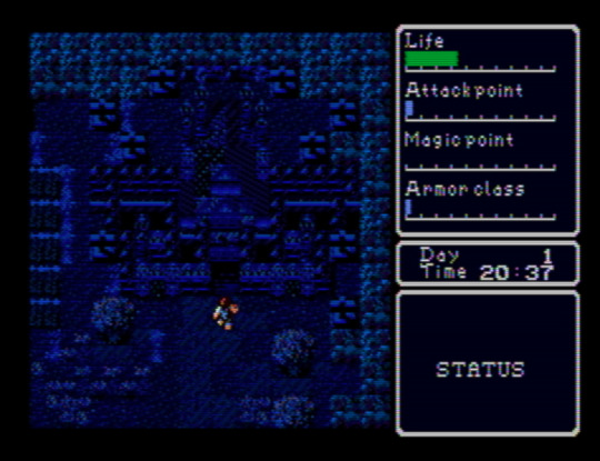
Above: the same screen at different times of day.
I hope that this blog’s emphases and its audience make the claim that I think Super Hydlide looks amazing at least appreciable. Everything has just enough detail to render the object, being, or space as categorically legible while retaining ambiguities, and there’s a variety where you might not expect it, like the grass around the building above, that gives each screen a kind of visual grain that an ornate and time-worn carpet might have. Complementing this is a soundtrack that seems unaware of the console’s audio capabilities in a way that another contemporary Mega Drive release, like Sword of Vermilion, certainly was not. That’s fine, though; the sound’s smallness, with those lite approximations of exclamatory synth brasses and the percussion’s dusty, dinky punches, enhances the cute visual aesthetics: people, monsters, and buildings you could hold in a pair of cupped hands. Especially remarkable is the overworld theme, “Chaos Separator” -- almost three minutes long, a duration that was basically unheard of at the time.
Atomic Runner Chelnov (1992)
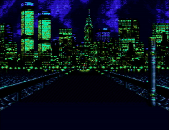
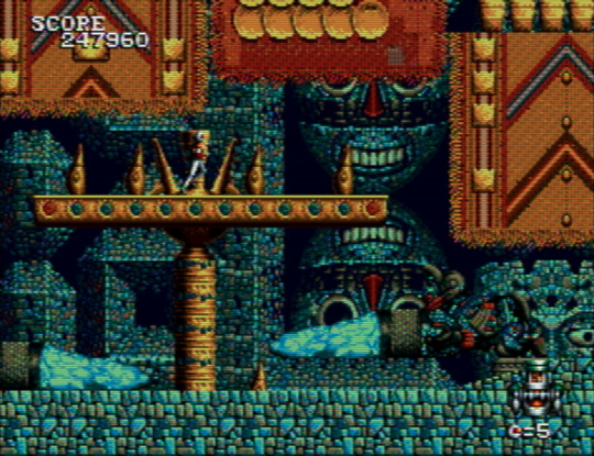
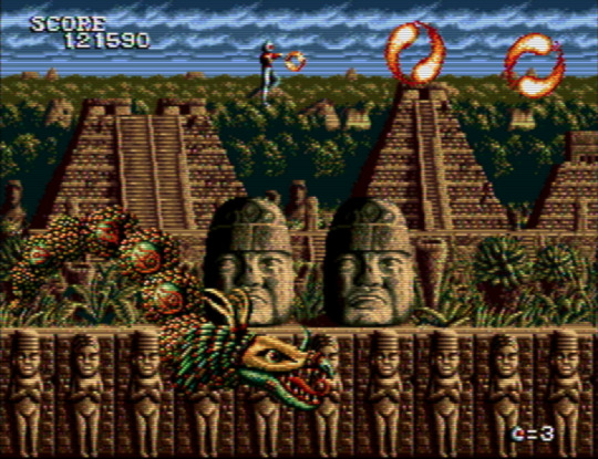
Chelnov has me torn between wanting to share either as many screenshots of it as I can or as little. It’s so stunning to behold that exposing anyone who hasn’t played it to its sights seems like a disservice. It’s in extreme contrast to the game’s original arcade version, too, which may as well be a different game. Every stage is a stream of layered ornaments, and continuing to play to see more of this is motivation alone. At first I thought the graphic theme was one of a general “exoticism”, with ziggurats settled above lava giving way to stepped Mayan pyramids, but then the penultimate stage threw architecture designed by Antoni Gaudí my way, making me wonder if the theme is more broadly “eclectic” -- choosing certain settings and motifs for their dazzling power alone. This is one of those run ‘n’ gunners where your character will keep running unless you stop them -- but you soon have to start running again anyway, since the screen keeps moving right and only stops for bosses. It took me playing through half of the game to figure out how to turn around. Please, if you want to give Chelnov a look: consult a controls FAQ.
El Viento (1991)
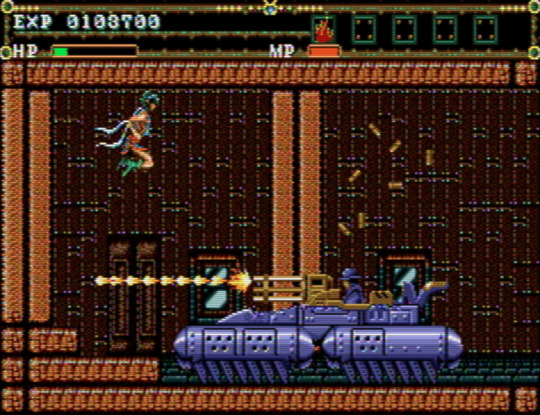
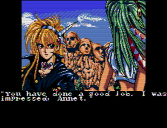
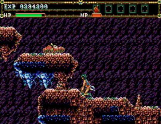
If you’re looking for level design that’s a mixture of the mundane and the out-of-control, El Viento might be for you. One moment you’re walking through an open sewer channel, exploding the occasional fish; the next, you’re navigating a bundle of platforms that feel way too closely packed together for your character’s sprite size as you attempt to outrun a never-ending flood of rats that move at speeds never before recorded. One moment you’re going through an apartment’s door into an empty interior; the next, a tank bursts through the opposite wall and just starts hammering you with missiles and bullets, giving you only five feet of space to work with. It’s the second in a trilogy of games, which includes Earnest Evans, a game perhaps most notable for all of its footage making it appear that the players are incompetent on purpose, but which in fact plays more or less the same no matter how good you are. Grave sacrifices were made so that the titular character could be a composite sprite. El Viento’s level design hews closely to Earnest Evans’, with the important difference that its protagonist, Annet Myer, is controllable.
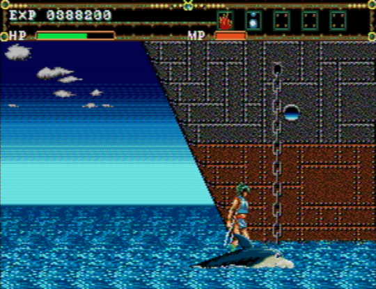
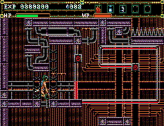
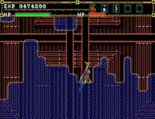
Even with its problems, El Viento is charming. It’s nice to play a videogame with a female protagonist who’s not creeped on by the artist(s) (perhaps we can, in part, thank technical limitations for this). The palettes and style of pixel art bear an uncanny resemblance to Master of Darkness, released for the Game Gear and Master System, and give each stage a distinct, almost dirty granularity. For me, El Viento gets especially interesting around the fourth stage, a ship’s engine room (or... factory?) that’s preceded by a short segment that has you crossing water on top of a cartoon-eyed dolphin. The level design transitions to looking like a network from Metroid Fusion -- a knotty maze with small destructible points that cause chain reactions, oddly small platforms, moments where you’re not sure what’s interactive and what’s not, and low ceilings underlined by spike-beds that necessitate you make use of a crouch-dash mechanic that feels like it shouldn’t work the way it does. It’s a hardly perfect yet precious occurrence of extinct, or endangered, level design, and the developers apparently had a confidence in letting it, as it were, speak for itself, because there’s not a single enemy to defeat throughout.
Jewel Master (1991)
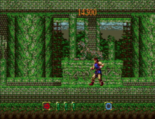
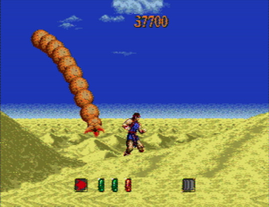
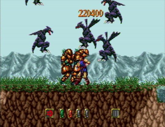
Wanting to hear Motoaki Takenouchi’s incredible score, one of the Mega Drive’s best, in its intended context was almost totally my incentive to play Jewel Master. It’s a fine, somewhat haphazardly designed action game; not bad, not memorable, but for the music. You acquire different rings, some optional, as you go from stage to stage, and can assign them to a total of four active slots on an equipment menu. Different combinations will lead to different effects -- or you might want to leave a ring on one hand on its own. It’s a neat idea in the abstract. In practice, you’ll often be better off sticking to one set-up per stage until a boss demands a switch. The level design is pretty uninspired, and it increasingly makes artificial attempts at challenging the player by burying you under swarms of suddenly-appearing monsters. When this happens, you just have to hope that you can make it out alive. There’s not a whole lot to look at, either: the stages’ environmental peculiarities and palettes are minimal to an extreme, although I do love that the protagonist’s sprite seems to take a cue from Rastan’s by only moving his legs when he walks.
Gynoug (1991)
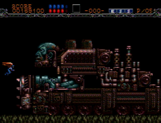
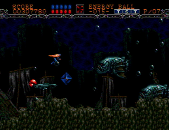
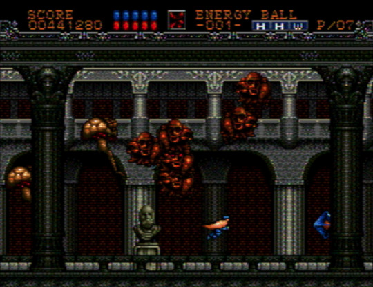
My experience with, and interest in, shumps, is next to nonexistent, so I don’t have a ton to say about Gynoug. Why’d I bother? Well, because of the weird and grotesque enemy and boss sprites, which combine the mechanical, exoskeletal, and visceral. The first miniboss is like a floating snapping turtle... except without legs, and a head that’s a toothed skull. Later, in stage two, you’re confronted by the bow and head of a ship that reveals itself to be the hat atop a colossal, wrinkled face. Maybe it was expecting too much to hope that the settings would match the bestiary’s inventiveness, but only stage three and four wowed me. If it’s not a game I’m going to be returning to any time soon, it was worth going through once.
That’s all for now. Other titles I’ve been exploring and will write about at some point include Alisia Dragoon, Cadash, Chakan: The Forever Man, Elemental Master, Light Crusader, Mazin Saga: Mutant Fighter, Mystic Defender, Shining Force 2, Splatterhouse 2 and 3, Two Crude Dudes, and Ys III.
14 notes
·
View notes
Text
Research Pixel Animations.
Super Mario 3:

As this game I’m attempting to start has a pixel aesthetic, references to SNES or any other titles with an older style are a place to take inspiration from. The key frames are an essential thing to copy, movement or normal person functions can be taken in from it.
There was a limit within the coding from that era, meaning reserving certain aspects was a logical move.
This is helpful for my current project, as any reasonable shortcut is going to contribute to more work in other areas being done at less cost.
This sheet is refereeing to a Mario title, a four-frame animation that shows a straightforward angel, walking. It’s a quick and effective method, swaying the entire body for full-motion in a brief time span to result in heavy movement. It’s limited in detail.

Sonic Mania:
Sonic Mania’s a game attempting to obtain original graphics with gameplay in a modern setting without changing too much.
Sonic as a character is prominent in detail within this setting, meaning working out how running or other movement functions is more challenging, as making limbs pass one direction has the whole body move appropriately, with all detail changing to pursue it.
As the Sonic franchise is known for speed, getting a fast animation result can work within favour for the game designer, skipping some frames to signify a blurish movement from fastness. Less work.
Artist Tyson Hesse was brought into this project to spearhead the art side. Artistic decisions came from the project.

Wario Land 4:
Opposing the other art, this is a step-by-step idle animation that has appropriate detail for the pixel count. The details for every moment show Wario’s personality clearly, having him demonstrate muscles, marking his braggish personality out to the player.
It displays the cartoonish feeling the Nintendo titles are known for, having Wario pull dumbbells from a nonexistent space, following cartoons in logic. The game has a
Despite being 2D, his character is viewable from every side. Dynamic views of Wario give the approximate dimensions he is. It helps a player remember the character design more, with the viewable angle.

Sunset Riders:
This is an older title that opens with a 2D drawing style introducing the characters because the art-style tries to come across as realistic in a sense It’s aged badly. It’s better to take this art as an example for aged graphics. But if the plan is to necessitate a nostalgic feeling, the graphics can be acceptable in a newer project.
In this picture the windows are blacked out, this saves time to make a detailed interior for a house while adding a ghostly atheistic, making things more tense.
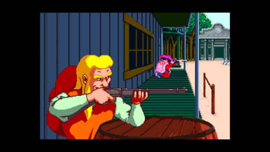
Despite the western setting, their outfits aren’t dusty or patchy, the clothes being bright colours took an outlandish character design rather than the typical cowboy outfit.
Taking into account the standout outfits, they seem like a good idea to replicate in a general idea. It’ll help with character design.
Pokemon, DS Or Prior Generations:
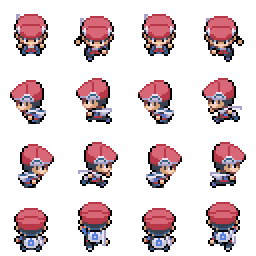
As it’s a top down view on a character there’s more room to see how different parts move, but the problem is it’s only at this specific angle, an angle I don’t plan on using within my project. On this specific model there’s a scarf, this is helpful in seeing how detached clothing moves.

Within a battle screen the characters have a proportionate body, hinting that the overworld sprite is a limitation in technology, or thy’re cutting corners. The screen is bare with not that much detail in the surrounding areas. This is probably since every character has a full sprite, so putting in a nice looking background is wasting time spent on coding.
The Legend Of Zelda:

Zelda has the best full angle movement compared to the other games looked at. The player can see Link’s entire figure when moving, showing his full ensemble. It doesn’t do much different except versatility, which can help when making a full world that has life, a Mario title seems one-sided with the flat side angle.
Kirby (Game Not Known):

With Kirby’s large move pool, there are lots of attacks that persist the 2D animation.
His colour is mainly pink, probably because at a earlier time when Kirby was made there wasn’t many colour options for a character with the GBC (gameboy colour) system. It most likely stuck, so there wasn’t a need to change him anymore. The reasons for his smaller size might have a similar GBC origin, but there was less to animate from a small figure as well. Plus, it’s a style choice.
Mega Man:

In this Mega Man sprite sheet there’s various different colours signifying damage or power ups.
The creator made sure to have Mega Man blink, which doesn’t seem like much, but if forgotten the character can look like a doll or dead. It gives Mega Man more life.
Mega Man has many different small facial animations, such as jumping with the surprised look, or being tired and almost falling asleep as a idle animation.
Earthbound:
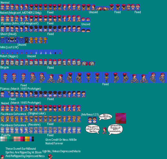
This Ness sprite sheet has the character on a bike, which shows the extra work needed to fill in the new movement. Also with the pyjamas clothing, that adds an extra clothing option even for a short time, having the artist make exactly the same movements in a new uniform. There’s a blank version of Ness, no cloths, this probably made alternative uniforms easy to wear, being quicker than editing the clothed version as it’s more editing with removing a hat or backpack.
At the ending there’s a new form, it’s nonhuman, meaning more effort is put into Ness.
Applying Use In This Project:
There were some things not thought about, such as the personification of idle animations (Wario Land 4). This can now be taken into account for my project, giving more life to sprites.
I want my project to gleam information from this, where the inspiration is obvious to a point, making this post worth more than just research purposes.
0 notes
Text
MOkay, so I just finished Shuuichi Saihara’s battling sprite for the DanganronpaxPokemon video game I’m still working on.
Here’s what it looks like:

And here’s him with a Rowlet because why not:

And here’s him in action!


He looks amazing! I’ll have to create overworld sprites for him, but honestly, I think that sprite is a reaaaaalllly good size for the game itself. I based his sprite off of Red’s battle sprite in Pokemon Heartgold and Soulsilver. I’ll have to pick gen 4 sprites (and maaaaybe gen 5) to use as a base for the other characters. Gen 4 sprites are a little bigger than gen 3, and I think the same trend occurs in gen 5 vs gen 4 sprites. Haha, it’s a hassle, but one that is well worth it.
I actually took a new approach to designing a sprite more complex than Pokemon overworld sprites. I isolated then designed each piece of the sprite separately, like the hat then the face, arms, legs, etc, etc. And as I completed each segment’s design, I gradually pieced everything together and obtained this final result! I’m really proud of him! I figured that this method might help me try to focus on details on a smaller and slower pace so I won’t become overwhelmed by the sheer complexity of it all.
The one thing I’m not totally in love with this sprite is his hair near the ear that sticks out. It just...looks a little off, but I’m not sure how to fix. I followed the reference sprite’s hair to the exact size, but I’m thinking the oddity may be caused by my choice in color scheme. Shuuichi has rather pale skin, so the color palette of his skin was white, light grey, etc. I had to get some more flesh-inspired colors, but it’ll have to do.
I gave him three Pokemon: Dusknoir, Eevee, and Umbreon...then destroyed them all with my level 100 Aerodactyl, mwahahaha
Oh, but it does feel good to get back into pixel art.
Materials Used:
MS Paint
Reference Sprite of Red from Spriters-resource
Reference pictures of Shuuichi Saihara
RPG Maker XP (for testing)
#Shuuichi Saihara#Pokemon#Danganronpa#nDRv3#New Danganronpa v3#PokemonxDanganronpa#pixel art#gaming#video games#fanart#all-things-fanart#my gallery#art#crossover
61 notes
·
View notes
Text
Cross Stitch Papyrus and Sans!
Look at these two beautiful monsters…That I finished back in September.
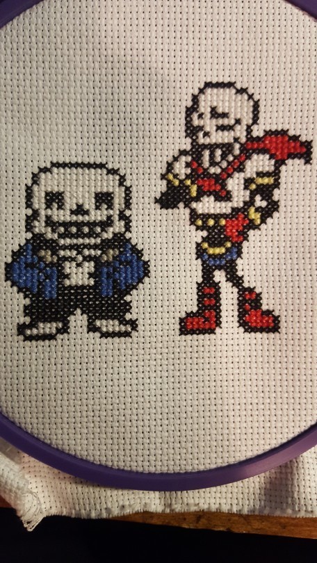

Well, here they are now, and I absolutely adore them! There were a few little issues along the way, but I still absolutely love it.
Below, I’ll show you the steps I went through! (and the mishaps I experienced…)

Here’s the pattern I created and used, based off of both of their overworld sprites. (The file is called oops because I accidentally deleted the paint.net file and had to recreate it from a pic I’d taken.)

Decided to start out with Sans - his outline came along really quickly!

Look at that grin! ^_^ He isn’t empty-headed anymore, there’s white filling it halfway - even if you can’t really see it.

This is what the backside looks like, when I’m trying to keep it as neat as possible. The white is a little clearer here than it is in the last picture.

I really hope I picked the right colors for him…
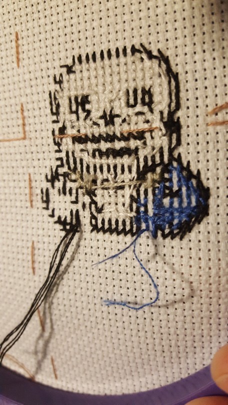
Random fact - I absolutely love in-progress pics, for my stuff and for others. It’s so incredible to see the steps as the creations are formed and beauty (or even mediocrity) emerges.

…something is wrong
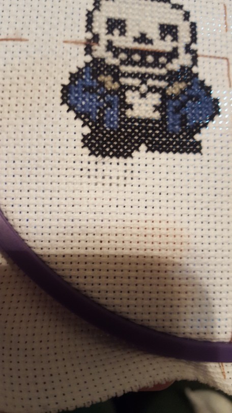
I had to go back and rip out his foot… I messed it up… Luckily, I realized it before I finished off the current thread. I had to go back diagonal stitch by diagonal stitch, pulling it out from the front and then behind by tugging at it with the needle. I hope that’s the biggest problem I have to rip up! I hate losing progress - that’s also the reason this is only being shown now in December rather than September, my internet and tumblr were being little butts and discarded my post without even saving it.

Whew, he’s landed squarely on his feet! And this time, there’s no extra row. Sans is all done!!!!!!!!!!
Time for THE GREAT PAPYRUS!!!

That’s… mildly unsettling. You can see his giant teeth, and gaps in his skull where his eyes will be.

This is your friendly reminder that Papyrus the skeleton has eyebrows.

And a magnificent cape.

And incredible battle body! No, I’m not just referring to his outfit. *audible wink*

Can I just reaffirm how much I absolutely adore these two and wish we could be friends? My adoration for them is as bright as the red of Pap’s cape.

Pap’s outline is done! ….aaaaaand I realize I screwed up. I started his head one pixel higher than I should have, leaving him floating a square off the (invisible) ground that Sans is staring on. So, I had to add an extra layer of pixels to his legs… which amounted to four in total, but it still meant I had to rip up his boot. :/ What is it with me messing up their feet?

Look how nicely he appears now!!!

Side by side comparison with my first project! Trying to psyche myself up to finish Pap… I have so much trouble finishing things, it’s absolutely terrible. :/

BOOM
LOOK AT THEM
LOOK AT THESE TWO BEAUTIES.
Papyrus, his cape flapping in the wind. Sans, his face in a grin as he shrugs to a joke he’s made.
AHHHHH

Now to wash them, to purge them of any impurities!

Don’t worry - skeletons don’t need to breathe! I used a small amount Wool-ite with just plain water and gently scrubbed at the fabric and even more carefully at the threads.

Time for their relaxing dry-off experience…

Ironed out and ready to go! …and also apparently my feet, in those comfy aloe socks you can pick up at Christmas time.

I’m prepared to frame them, now. There’s a frame, 4x6, and a piece of chipboard I’d cut to just that size.

You can see how I folded the fabric over the board, threading it so that the sides pulled together. I kind of cut it close heightwise on accident… whoops! That made it a little more awkward.

…so, this frame is one where you slide the glass over the picture, and it slips into place. Sans and Papyrus were a biiiiiit (okay, a lotta bit) to thick for this to work. Back to Walmart for a new frame!

Boom.

Here they are, 3 months later, and still absolutely beautiful.
So! Thank you for staying around to see all these progress pictures and listen to all of my rambling! I hope this was at least somewhat interesting, and I’ll work on posting my third project - that I also finished a bit ago - and my last completed project to date. I kind of got stuck on the fourth one despite how small it was, had to completely redesign the fifth one after I spent hours creating the pattern. So, I’ve been put off cross-stitching for a while, but I hope to start up again! …I better, if I want the fourth and fifth pieces to be done by Christmas - one’s a present for my dad, and the other for my mom. : )
#undertale#sans#papyrus#cross stitch#my cross stitch#my crafts#my stuff#i love them#my beautiful babies
17 notes
·
View notes
Text
Indy Review – Tears of a Dragon
As I recently stated in my review of Silent Hill 2 (here) I value honesty when it comes to game reviews. It is an integral part of this blog. So, to begin with, I’m going to be open and upfront with this review; Tears of a Dragon (available on Steam) is made and released by a long-term friend of mine. However, that is not going to change or affect this review, as I will still be honest about the game. I just wanted to make you all aware of this fact beforehand.
With that out of the way, Tears of a Dragon is a top-down 2D RPG made using the RPG Maker engine. Whilst that might put a lot of people off straight away, I’ve previously written a post about RPG Maker and how it can make great games (here). The game engine can create some truly epic games if it is put in the right hands. It can also make truly awful games as well. Tears of a Dragon, however, doesn’t fit into either of these extremes. So, let’s take a look, shall we?
Storyline
For those of you who have been reading 16-Bit Dad for a while now, you probably know that the quality of a story is very important to me. A poor storyline can completely break a game in my eyes. So, when I started up Tears of a Dragon and played the first few minutes, I was rather torn. You see, the opening caught my attention with the idea of a “Dark Passenger” and the main character referring to the plot as “my story”. It echoed Final Fantasy X’s use of the phrase.
However, after a few minutes of gameplay, I found my interest levels falling. Part of this was the fact that the areas of the game were based upon real-life locations that I had grown up in or around. That did break the immersion initially. Then things started to turn around. As I continued through the game and was taken back in time to a point where the lead character worked as a mercenary, things started to get interesting again.
The reason I focus on that is because it helps to show my opinion of Tears of a Dragon’s storyline very well. The game’s plot has ups and downs throughout. There are parts that seem really good and very interesting, but interspersed between them are low points that feel like they drag a bit. In short, whilst Tears of a Dragon may not have an award-winning storyline, it definitely isn’t a low-quality one.
The plot is enjoyable, especially considering it was put together by a single person as their first game. This is especially true as the game features multiple endings, which is a feat of achievement for many development teams, let alone a single developer working on his own. Just don’t go into the game expecting something along the lines of Final Fantasy or Silent Hill. You will be interested and entertained, though… And that is, in the end, the most important thing a story can do.
Gameplay
Considering that it was built in RPG Maker, Tears of a Dragon’s gameplay makes use of the standard J-RPG format of town and dungeon exploration with random battles that appear as you move around. Battles are menu driven and utilise a turn-based system that you would expect to see in classic J-RPGs like the aforementioned Final Fantasy or Suikoden. Each character in your team gets access to a variety of special skills and attacks as well, and there are 10 playable characters that you can have in the said party.
It is worth saying, though, that the battles are challenging to say the least. The enemies deal a relatively high proportion of damage, dwindling your health down rather quickly. On the other hand, to begin with, you’ll find that your attacks miss rather often… Oh, and they also seem to not do a lot of damage compared to the amount of health that the enemies have. For me, this is actually a plus, as I dislike games that feel like a walk in the park. Difficulty and challenge make progress in a game all the more satisfying. However, it won’t be for everyone. If you want a game that you can breeze through without any real thought to a battle, then Tears of a Dragon probably isn’t the game for you. However, if you like to be kept on your toes, then you’ll find the battles very enjoyable, once you’ve started to unlock extra attacks and skills.
The only real negative that I have about the gameplay is that it doesn’t add anything particularly new to the J-RPG formula. However, that can be attributed to the fact that it is the solo developer’s very first published game and was made with an engine that is designed for traditional RPG gameplay. This also doesn’t take away from the enjoyment of the game either, especially if you are a fan of old-school J-RPGs.
Graphics
Being that Tears of a Dragon was built in RPG Maker, it makes use of sprite-based characters and objects on top of a tileset world, similar to the 8- and 16-bit (and some 32-bit) era games. As you can probably tell from the name of this blog, I’m a big fan of the 16-bit style graphics. However, despite using this style of graphics for the game, RPG Maker itself is actually 32-bit, meaning that the characters, objects and tiles within Tears of a Dragon don’t have the pixelated look of classic SNES and Megadrive games.
Instead, the sprites and tiles used to create the characters and game world are smooth around the edges, feeling rather polished. This is a very big plus for me, as it captures the nostalgia of the 16-bit era but with a more modern twist.
In battle, Tears of a Dragon makes use of background imagery related to the current area you are in, which keeps a sense of immersion during the switch between overworld and battle scene gameplay. However, the battle graphics for enemies often feel disproportionately large compared to the player characters. This results in two different reactions at the same time;
A sense that the enemy is stronger than you, suiting the challenge of the battle, reminiscent of early J-RPGs like the NES Final Fantasy games.
A slightly confused sense of scale in the battle scenes.
This isn’t a major issue, though. The enemy graphics, even though they are static, look different and unique with a rather original art style that I haven’t seen in other indy RPG Maker games.
In fact, the only downside to the graphics is probably the mapping of each area, which can sometimes feel a bit empty. Yet, once again, I think it is important to remember that the game was developed by a single person who hasn’t made a full game before Tears of a Dragon. There was no long-term experienced level designer involved in the creation of the game, and the developer has added numerous improvements and patches to the game since release. Therefore, I feel that the game is rather good in terms of graphics. Again, it may not be award-winning, but it is still enjoyable and the graphics don’t really detract from that enjoyment.
And That’s All Folks
Tears of a Dragon is a game that is actually really hard to review, and not just because the developer is a close friend of mine. Overall, the game has some really high points and the odd low point as well, meaning that giving a final score that justifies both of these is difficult. But, for a first-time developer releasing a game they made entirely by themselves, Tears of a Dragon is impressive. Also, considering the fact that it is just £3.99 on Steam (here), you can’t really go wrong with just giving it a try, can you?
As stated earlier, Tears of a Dragon isn’t a Game of the Year candidate, but it is a fun and enjoyable game in the end. Have you played it? Would you be interested in playing it? Let me know in the comments below!
from More Design Curation https://www.16bitdad.com/indy-review-tears-of-a-dragon/?utm_source=rss&utm_medium=rss&utm_campaign=indy-review-tears-of-a-dragon source https://smartstartblogging.tumblr.com/post/173559259690
0 notes