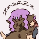
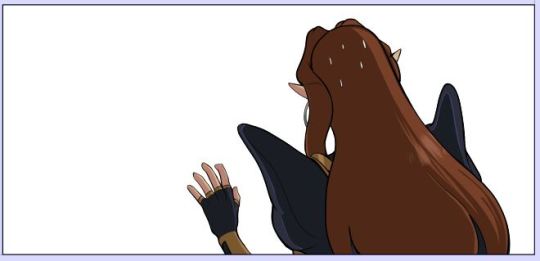
#the perspective and background are wonky and lazy
Explore tagged Tumblr posts
Visit Tumblr Blog
Explore Tumblr blogs with no restrictions, modern design and the best experience.
Last Seen Tumblr Blogs


Fun Fact
The KCSC sent more than 20K requests to delete posts related to prostitution and porn to Tumblr from January to June 2017.
Text
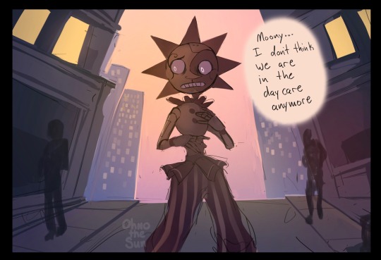
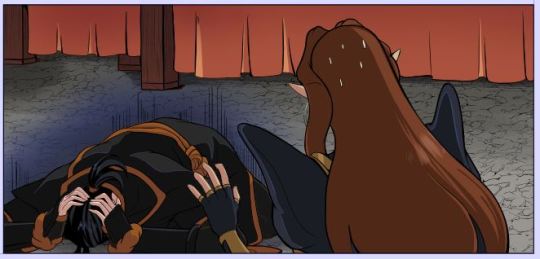
Wonder where he is
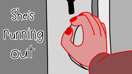
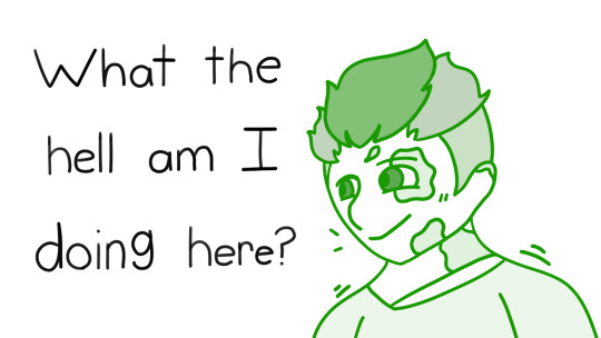
#sundrop#fnaf daycare attendant#moondrop#fnaf sun#my art#fnaf moon#old art I found in the drafts#the perspective and background are wonky and lazy#ough life has been so busy recently#literally no time for art I have so many projects i need to finish
1K notes
·
View notes
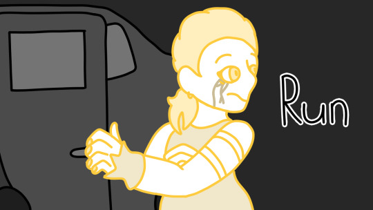
Text
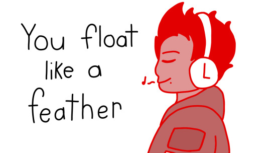
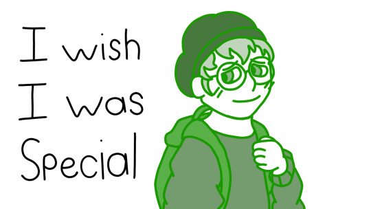
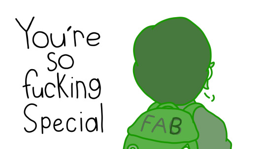
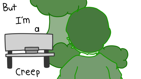
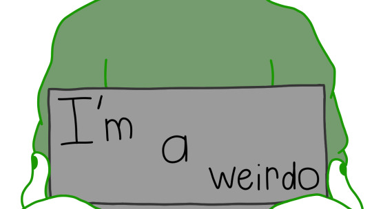
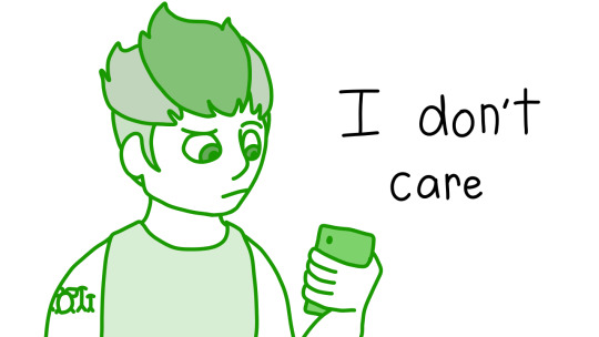
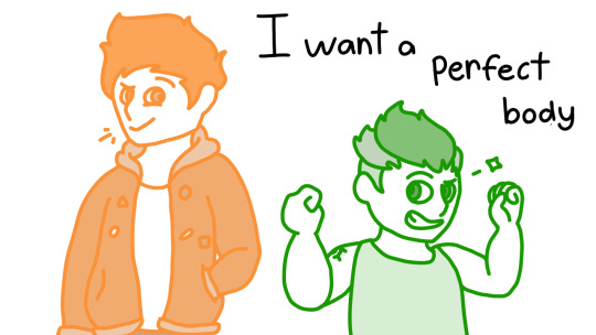
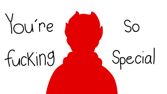
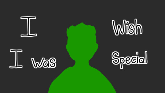
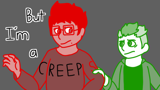
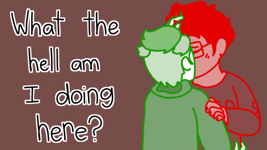
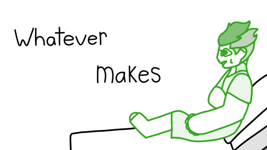
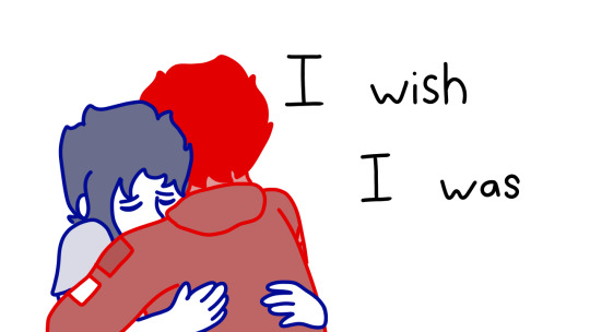
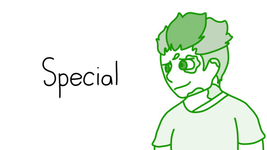
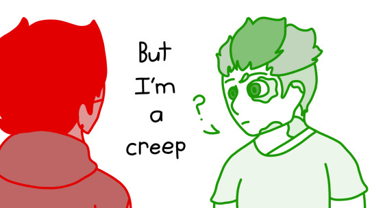
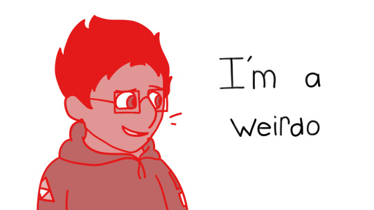
Creep | Expensive Headphones Full Comic + commentary
Just click on the panels if you don’t wanna see all the commentary.
This was actually the first time I did a perspective like this. I found a reference for hoodies and used a back-facing one similar to the panel
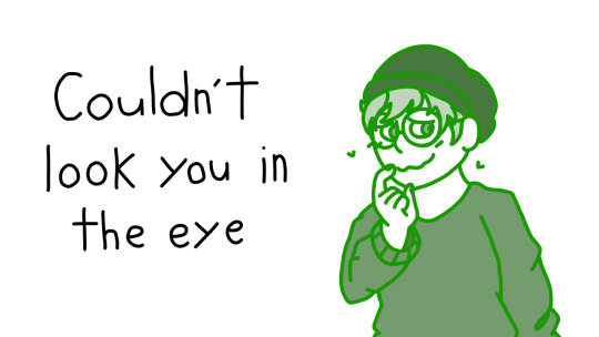
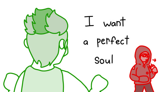
First time I’ve done this pose. I got the reference from here. Also look at that crushing man!
I honestly don’t know where I was going with the angel wings. Like- I thought I was gonna add more visuals like that but I kinda..didn’t?
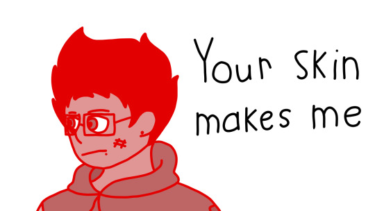
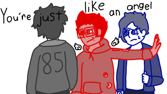
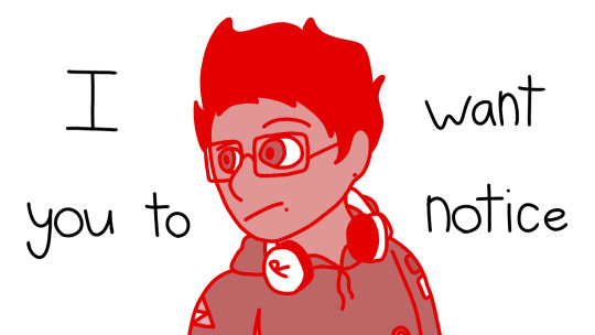
Kinda don’t like this bc it looks wonky. But yeah, point is, bullies succ
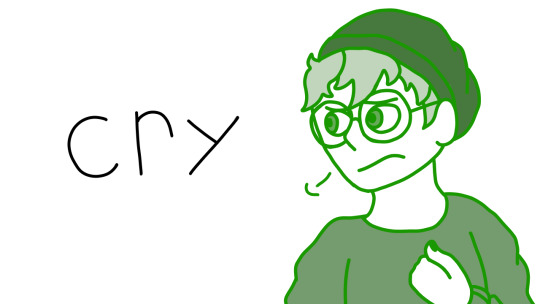
I have a thing where like- my side profiles are inconsistent to my normal style?? Idk, its fuckin stupid sometimes but im working on it.
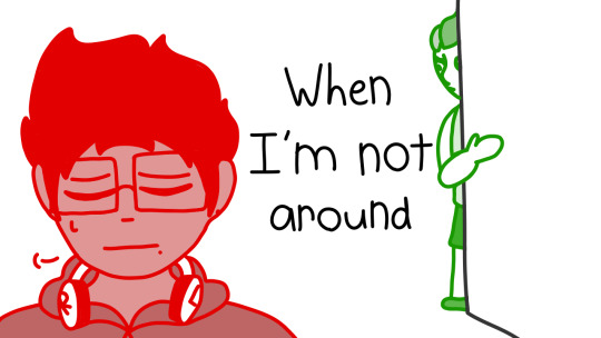
Also I kept forgetting Michael’s headphones hA-
This one was kind of a pain in the ass tbh. Bc I didn’t copy and past anything like I should’ve. And also because I had an inefficient way of using the bucket tool so i had to fill in all the edges
This wasn’t an original idea but I can’t find the original post. All I know is that it’s somewhere on Tumblr
ASHLEEEY! SQUIP MOOOOM!
Sorry, I love her lmao. My friend Evan created this specific design for Rich’s mom/Squip and I kinda took it as gospel because it just Makes sense
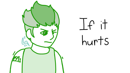
ft. me remembering that Rich has tattoos
(btw! the undercut and the natural hair are slightly different colors. fun trivia for ya)
Lmao I hated the hand in the last frame so I just kinda..cut it out..
Also I had drawn the spark thing as green for some reason. The reason it’s a slightly different blue than Ashley is bc i was too lazy to go back over it so i just changed the hue
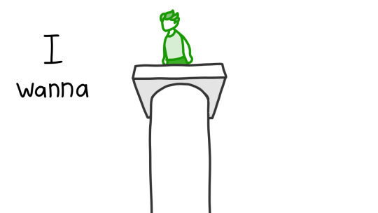
I know this looks like ass but I never really draw with perspective like this
Like, the podium looks good
But RIch? Eh...
(Btw, i used a thing call 3D viewer on my laptop to figure out the podium)
I would just like to note that there’s a little scene transition between this panel and the next one.
I just
Didn’t realize how it would look together
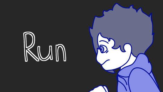
ft. me remembering Michael’s headphones
Funky silhouettes
Funky backgrounds
This looked way worse than I originally had planned
But hey, look at that hand! The expressions are garbage but that hand!
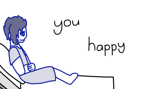
ft. my art cooperating with me for once (minus Michael’s hand smh)
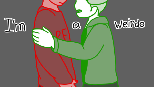
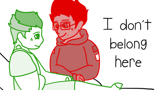
Btw, this whole scene is after Michael’s breakdown, which is why he’s trying to get out in the last panel
In this panel, Rich is pretty much just trying to persuade Michael
now kith
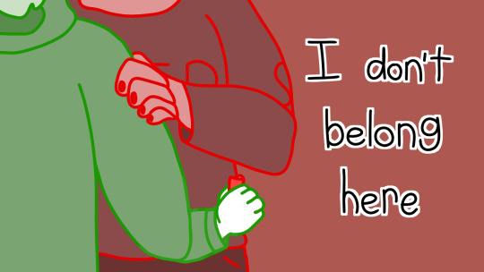
the arm sucks but yeah thats a lighter
also i probably mentioned this in the part i posted it in but
i highkey kinda hc that they hooked up in this time frame
and thats how Rich stole Michael’s lighter
but im not fucking drawing that so
just know ig
ew inconsistent side perspectives
ew inconsistent door
ft. hickeys ( ͡° ͜ʖ ͡°)
The most detailed panel of the entire comic
CINNABUN
CINNABUN
CINNAB-
yo look at that
a side perspective thats not ASS
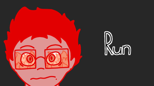
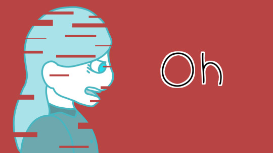
fun fact
Jeremy and Michael’s hair are both messed up for the same reason ( ͡° ͜ʖ ͡°)
Except in Jeremy’s situation it wasnt exactly consensual but..go off ig..
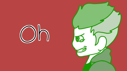
lowkey dont like this but yk
it works
back at it again with the bad side views
btw i almost forgot his burns!
or well
i did forget and then went back to edit them in
the
bisexual epiphany
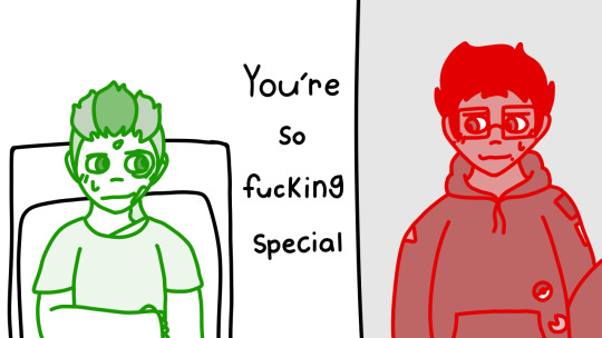
ft. Michael overhearing and getting flustered bc Halloween
Alright that’s all the boyfs content yall are getting, sorry /lh, g
Oh but this was a first too! For hugs n shit. Here’s the reference I used
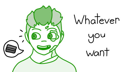
ft. me getting better with expressions!!
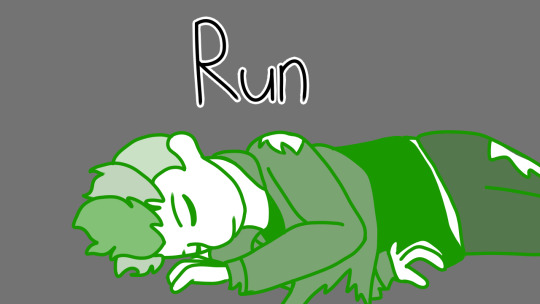
this little scene is honestly just, Michael cracking a joke or some kinda comment and Rich being all :)) about it
happy bois
starting to catch a little bit of feels
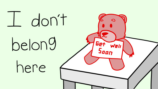
and the get well soon bear :))
But there you have it! There’s my comic
I’m really happy that I was able to finish it! Especially considering I started it in August, I think
Normally I lose motivation for that kinda shit but nope! Not this time! :))
Also I just think we need to overthrow the Boyfs supremacy so
I’m trying to do that with Expensive Headphones content
But yeah! Thanks to everyone who enjoys this comic! You all make my day!
#bmc#expensive headphones#creep comic#creep#radiohead#michael mell#rich goranski#rich x michael#michael x rich#jeremy heere#jake dillinger#brooke lohst#jenna rolan#christine canigula#cinnabun#christine x jenna#jenna x christine#platonic boyf riends#platonic richjake
30 notes
·
View notes
Text
Lines.

✎desc; how I would rate haikyuu character's drawing.
✎team[s]; fukurodani, inarizaki
✎genre; crack
✎language[s]; english
✎chef note; okay, first off, I'm not a professional drawer but I can still rate drawings. This idea just came to me like a minute ago and I had to do it now, so enjoy :)
fukurodani.
Bokuto
Aight, I see that we started off greatly.
In all honesty, he have no idea how to draw,
And of course his drawing would look,,,, quite terrible i'm so sorry bokuto lovers
He's that kid in art class where's when the teacher already told them what to draw,
Bokuto sat there on his chair, staring at the canvas
Like, what is he suppose to do? Draw?
Well, yeah technically but what???
I can totally see him frustratingly erase the sketch if it can be called as a sketch
And then proceed to try to copy other people's work
Keyword; try
It's bad but at least he had an effort to finish it
4/10, there I said it
Akaashi
His drawings are not that professional but it's pretty
Have you ever seen a drawing that you wanted to stare at it for hours until you're satisfied?
That what's his drawing are like
Not typically an art kid so he's fine when student's from his art class asked him to draw for them
And is feeling pretty neutral with his talent (he actually won't call it a talent but more like a hobby or sum)
And just say 'thanks' if peoples compliments his drawing
Let say his drawing is, a good 8/10
A decent drawer in conclusion :)
Konoha
Not a bad drawer but he rather keep it basic
Konoha's prolly too lazy to draw something over the top so he's just gonna draw flower or something ksndnzkj
Sometimes sleep during art class and had to ask what they had to draw
Proceeds to decently draws a scenery
He's totally not the creative kid so whenever the teach tell them to draw something, he'll always go with basket of fruits, like,
Man, I appreciated the drawing but at least put some effort on thinking what to draw
The art teacher also kept telling him that he have raw talent and should enhance the skill more,
But that never happened, no
"Sorry ma'am, I'll just stick to volleyball, thank you,"
One part of the art room has a section of konoha's basket of fruits drawings but in different mediums
Rating is 7/10
Washio
IS actually an art kid and you cannot convince me otherwise
Has a small sketchbook with him and he'll always doodle when he's bored or in a middle of a lecture (while taking notes of course)
His main skill in drawing tho is painting
The colors blends in so well with one another and he's good at picking color palettes
Also, he doesn't really get that annoyed if some kids from his class ask him to teach them how to draw
Or even look through his sketchbook
He'll just nod and hand it to them without a second thought
Ajsjdhsijsi Washio get so blushy when someone compliments his drawing,,,,
I’ll give a 10/10 :), congrats
Sarukui
The best that he can do is doodles of owls and other shits but other than that, he cannot do
But the doodles are kinda cute doe ngl
He’ll have his moment where he’s in class and have no idea what to do, and just doodles a bunch of stuff
Once he draw his whole teammate including his coach and himself, he thought to himself,
“Huh, this looks good,”
And then take a picture of it for memories (cause he might throw the book he’s doodling in away)
Speaking of that, he doesn’t have an official book for drawing and just draws in his english or math’s textbook or sum
His juniors eyes are blessed when they got his textbook
Sarukui just vibes in during art class, draws and that’s pretty much it
The drawings,,,,,eh,,,, not that good, he only specialize in doodling as I said
so in conclusion,
drawing? 2/10
doodling? I’ll give a solid 5/10, good job
Komi
I’m gonna say this and I’m prolly gonna say it again
He hates art class
Like, even with him trying his best to draw, it’ll always gonna look strange than what he planned
mf cannot draw a straight line in art class
This dood can draw a nice straight line in any other class whether it’s for a graph or others,
And then proceed to shakily draw a straight line during art session
Totally not an art kid and will never be one
His drawings,,,,
I’m so sorry but it looks so bad
It’ll prolly look a lot better if he put more effort, but it’ll still look bad no matter what
Komi hates art class and can’t draw even a decent doodle so unfortunately, I’ll have to rate it 0/10, sorry :(
Anahori
His drawings are eh
It’s not good but also not bad?
Sometimes you’ll just stare at his drawing for a good minute and be like, what did he just draw just now?
What I’m saying is that his drawing’s are unexplainable
Maybe if you stare at it a little bit longer then it’ll make sense and you can see the beauty in it
But honestly I can’t really see anything, not in a bad way, but like, literally nothing
You’ll be staring at his canvas as the mario kart rainbow road music started playing inside your head
But Anahori is always proud of his drawings no manner what
So, I’ll rate confusion/10
Onaga
Just like Komi, he sorta hates art class too
But lemme tell ya, his sketches are GODLY, like, have you seen those pinterest hand sketches?
That’s what his sketch would look like
It’s so yummy to look at what
But he sucks at lineart so JAHGSDSHD
Onaga cannot properly hold the black pen and do the lineart, it’ll always turn wonky and he had to throw it away
Like, if he spend even hours tryna outline it all, and then erase it
It’ll look so trash
And he’ll just stare at it for a couple of minutes before crumpling the paper
He’ll also suck at coloring
Mans cannot understand how the color blend in together
And I think I’ll rate,,,,,6/10 just cause he suck at coloring and lineart lmao don’t worry i suck at coloring too
Kaori
Another decent drawer and her drawings are almost the same as Akaashi’s
But instead of it looking pretty, it looks cute
I have a headcanon that Kaori have a journal and does journaling so that’s prolly the reason why her drawings are cute af
But honestly, her drawings sometimes depends on her mood,
If she’s mad or frustrated, her drawing would look kinda rough and not that cute anymore
If she’s feeling happy tho, It’ll look so nice and cuddly does that even make any sense
Isn’t necessarily an art kid but would love to try be one
And she totally have drawing sessions with Washio aaaaaa,
Just imagine both of them sketching in the same sketchbook while talking about the volleyball club or anything else
She’s getting an 9/10 just cause her sketchs looks clean <33
Yukie
She doesn’t draw at all
Like, you’ll never see her drawing at any kind of time so you have no idea what it looks like
Yukie would still attend art class,
But never draws
She said that she’s pretty lazy to draw it and said to draw it at her home later
But no one even saw that drawing after that
Yukie doesn’t show her drawings nor EVEN draw for once
So I technically can’t rate :/
inarizaki.
Ginjima
LISTEN
The only reason why I started with Gin is because he have some amazing drawing skills
He admit that he’s not an art kid but draws godly as if he had been thought since he was a kid,
Well, actually yes
I think Ginjima actually wanted to be a drawer when he was still a little kid way before he started his 3rd year of middle school
So he practiced a few and became a nice drawer since then,
But he kinda quit being a drawer and decided to go with volleyball
And guess what?
His drawing talent is still there
He totally specialize in pencil drawing cause that’s the first thing he started learning
The lines are smooth and the shading are so yummy what is wrong with me
The Miya twins and Suna are so sh00ked when he saw his drawing during art class
ngl he’s pretty smug about it too but doesn’t brag about it
I’ll give this boy 12/10, mwuaah
Suna
I hate this man for this sole reason
Suna is too LAZY to draw so he doesn’t give any effort in his drawing
I can guarantee myself that I’ll get an eye strain when I saw his drawing
And...
*wipes away tears*
He draws too many dick
–2/10
Don’t come for my head Suna lovers
Atsumu
OMFG
OKAY, OKAY, I KNOW THAT ATSUMU MIGHT PUT ON SOME EFFORT IN HIS DRAWINGS,
BUT WHY IS IT STILL SO BAD?????
He’ll prolly think his drawing would look good but no, it’s not
No matter on what perspective you look his drawings at, It’ll still look bad
AND HE DOESN’T EVEN NOTICE IT
Osamu laughs a lot at his drawing and they started fighting for that only reason smh
Atsumu, I appreciate your effort so SO much,
But please, just stick to volleyball
–10+/10
I put a plus there because of his effort and because of pity
Osamu
He draws in ms paint, with a mouse
But he can draw some foods tho
But all of it looks wonky af
1/10
Akagi
A pretty decent drawer
Akagi always draw happy and cute drawings so you’ll also get happy when you saw his drawings
Puts on a big smile when people compliments his drawing and shyly scratches the back of his neck
“Nah, this just look normal!”
But he draws oddly thick lines sometimes
Sometimes it looks good in some drawing
And sometimes it looks, bizzare in others...
But I think his drawing would look nice <3
Overall, I’ll give a,,, 7.5/10, keep up the good work
Oomimi
He’s from class 7 AND I really think that he’ll be good at drawing
Well, he can draw a few things but he struggles drawing other things he never accustomed to
But!
Oomimi is that kid who’s good at drawing scenery
He knows basic color palettes and which is cold and hot colors
So the scenery drawing would always look good
He get a lot of compliments for the drawing (50% of it from Akagi)
I think he doesn’t have that many time to relax and draw freely but when he does have it, it’ll just be small and simple doodles
um, let’s go with 8/10 <3
Aran
I truly believe that Aran can draw peoples face but in a pretty decent amount
He’s also good with anatomy teach me your ways king
But as much as he’s good at that, he kinda sucks at drawing any kind of background drawings
Mans can’t draw a scenery I’m telling you
As if the background doesn’t even exist in his mind lolol I’m sorry Aran lovers, I didn’t mean that in a bad way
Mainly uses copic markers to color and color pencils to shade
The first time he use the copic marker, he got really frustrated that the marker stain the other pages lmao
And he never uses digital drawing applications or softwares
Aran just doesn’t
I think I’ll rate him, 8.5/10
Kita
Okay, I know that Kita’s a top student and never fails in anything
But he’s not typically a good drawer that much
His drawing still got good marks but when you look at it, it just looks normal
I just know that the Kita lovers gonna get me after this
It’s not that bad and not that good, just a nice balance in between
I personally think Kita’s not that godly in drawing but rather a neutral drawer
He draw what he can and does shading and coloring when it’s needed
The colors are all basic colors, no pastel, no neon
And the shadings are pretty basic
Just a normal drawer here
Ya’ll gonna fight me for this but I’ll give Kita’s point,
7/10
#haikyuu#haikyuu headcanons#haikyuu crack#inarizaki#fukurodani#bokuto#akaashi#konoha#washio#sarukui#komi#anahori#onaga#yukie#kaori#ginjima#suna#atsumu#osamu#akagi#oomimi#aran#kita
27 notes
·
View notes
Text
Processing a panel
As I’m in no way a professional comic artist, I still want to share some of my process in drawing a panel. Maybe in the future I’ll change my way of working but for now it works for me.
So whenever I finished designing the page layout, I’ll usually sketch the most crappiest storyboard you’ll ever see and place the speechbubbles. Getting the speechbubbles in right place is important as they take a lot of space. So it’s not about getting the details right but moreso the right idea, setting and character traits for the dialogue.
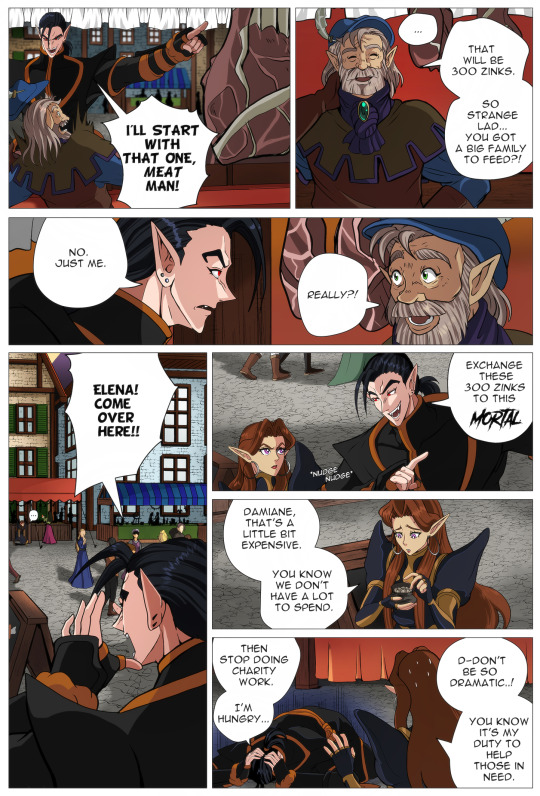
My first storyboard, contained a dissapointed Damiane and Elena having some attitude towards Damiane.
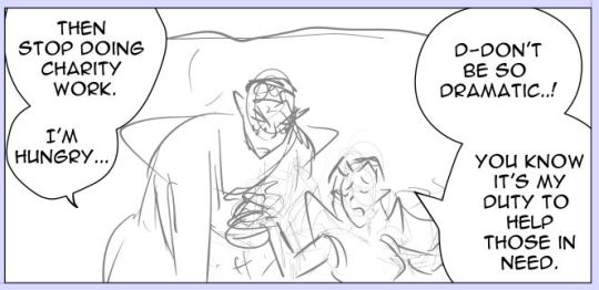
At first it was fitting with the dialogue because the original dialogue contained:
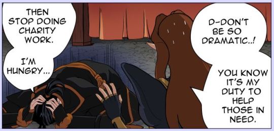
Damiane: Then stop doing charity work.
Elena: Can’t do. That’s basically the purpose of my existence.
The reason why I changed the dialogue and also the composition/storyboard of the panel was because of their dynamic in the previous pages. The story I wrote before starting this comic is the guideline but within the process of the pages, I’m willing to change the dialogue into something else because I think it fits more natural within the panel or character.
So I changed it into this:
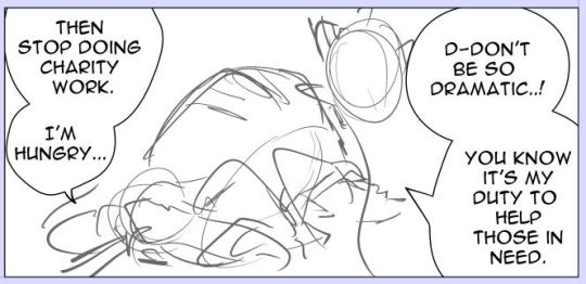
The main reason I changed this panel is because I wanted them to be nicer to each other, while still having a bit of the original dialogue.
I’ve also changed the composition because a composition where two characters are standing next to each other is less interesting than a composition with a different angle.
Something to keep in mind is that after a few pages it’s becoming a bit boring if the characters are constantly having the same pose. So that’s also one of the reasons why I’ve changed their poses.
Last but not least: when making these changes, I always check if the panel still fits with the panel that comes before and the panel that comes afterwards.
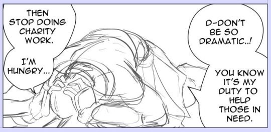
So when the set up is right I’ll focus on the anatomy. I’m going to be honest with you. I think I’ve used 10+ layers to get it in this condition. Each time I just redraw the pose with better adjustments. I usually check references such as Pinterest and the Morpho anatomy books to get the anatomy right. I know a lot of Webcomic artists use 3d-models that come with Clip Studio Paint and sometimes they’re great! But I always have the feeling the anatomy gets either stiff or just wonky when they are traced directly.
Clean up sketch. This is the process I always do when going towards the final lineart. I usually do this step in 3 or 4 times and when the most important details are right, I’ll start lining it.
I also drew Elena quickly. As her pose is less difficult, I started later with her. But since she’s at the foreground. She needed to be done before Damiane. And yes I draw the characters always seperate from eachother.
So this is why Elena needed to be finished first. She’ll cover Damiane mostly and I didn’t want to erase his pose because she’s infront of him.
Because I could see how Elena was infront of Damiane, I could also resize him so that it fitted the composition better.
And I was also lazy with his foot because I knew Elena was going to cover that part of his body.
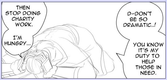
Fully colored. Also when colored drawing can change. So sometimes I need to adjust the final lineart. Which sucks. Especially when it comes to their faces. But this one came out alright. :P No face.
So now you have the two characters together. Last thing I’m going to add is the background. If the background is complexer, I’ll start with the background first and then add the characters. Sometimes I want to move the characters a bit (yay for drawing them seperately) and when I haven’t draw the background first. Well I get an ugly blank space I need to correct.
Since I knew the background was easy, I just drew it later. I always make a grid for the background to get the perspective right.
And done. In the end, I’ll just let it rest. Sometimes I’ll go back and edit minor details like the sizes of their eyes, color or background details. I’ve also completely removed panels and redrew them with a different angle (sigh). Really editors stuff.
Fully page:
Thank you for reading :-D!!
3 notes
·
View notes
Text

FOUR MONTH ART IMPROVEMENT RATE COMPARISON - Jan 2023
art block: 2/19 (from 2/19)
personal: 19/19
study/figure drawing sessions: 12/129 days(from 32/105)
Same goals as yearly - negative. only finished art goal completed
Finish DAB Lesson 7 - NO -_- I KNOW I can do this. It's just so boring and I don't want to spend an hour drawing a wonky car when I can instead do nothing
1+ finished piece per month with 2pt+ perspective plotted background (screenshot study counts as a background, in which case it doesn’t need to be finished-finished and the finished piece will be a separate requirement) …yes and no? Quantity-wise I did six plotted-out 2pt perspective pieces but they were mostly in October. Didn't do any in September or December
one screenshot study per month - can focus on any area (perspective, expressions, colours, composition, etc.) - I totally forgot about this
In January, I want to be more confident/accurate quickly drawing hands and have more mileage drawing backgrounds. - well, I do actually feel more confident in these! Success!
Studies done: repeated attempts at getting more than three drawings into DAB Lesson 7, some hand and hair studies from other artists, some everyday objects and concept art stuff in perspective
Had a lot of physical/mental stress during this period but managed to at least keep afloat. Trying to be more thoughtful with what I draw by setting goals for it (storytelling, improving on stuff I messed up last time, etc.) - don't always remember to do this but it has helped. Tried to focus on making stuff suitable for commission examples w/ good composition but I got bored of that really quickly. Overall I'm quite pleased that I'm trying to put more thought into most areas of art - just wish I'd managed to do those grindy studies that I keep putting off
IMPROVEMENT METRICS
Anatomy/gesture: there wasn't that much improvement in this time period last year so I'll say about the same xD kinda coasted on the progress I made in the last period
Backgrounds/perspective: Improving at drawing more complex stuff in perspective thanks to DAB. Better than last year YAY
Composition/storytelling: Starting to think about how to add elements to tell a better story and doing better at thumbnailing. Better than last year YAY
Colours/values: identified a problem where I tend to go way too dark overall. working on fixing this but usually end up needing to adjust with levels at the end. starting to experiment with deliberately lowering contrast in non-important areas. colour-wise trying to use more saturation and think about an overall palette. results about same as last year, thought process much more deliberate
Lighting/rendering: got really into leaving my sketch lines visible purely out of laziness when painting. I think this is a bad habit because it decreases the amount of work I have to do to define things. still don't understand light sources. worse than last year but I don't care because it really isn't my priority
PLAN OF ACTION FOR NEXT FOUR MONTHS:
Same goals as yearly
Finish DAB Lesson 7
1 finished piece with 2pt+ perspective plotted background (or two sketched screenshot studies with same)
one screenshot study per month - can focus on any area (perspective, expressions, colours, composition, etc.)
In May, I will have even more mileage drawing hands interacting with things and have experimented with different ways of ideating on composition thumbnails
1 note
·
View note
Photo
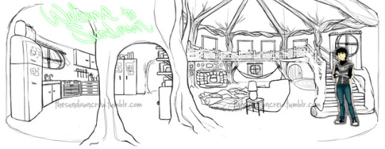
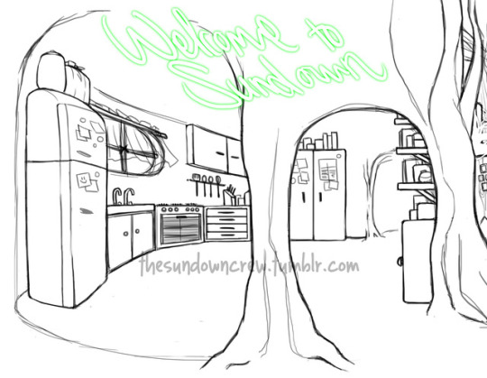
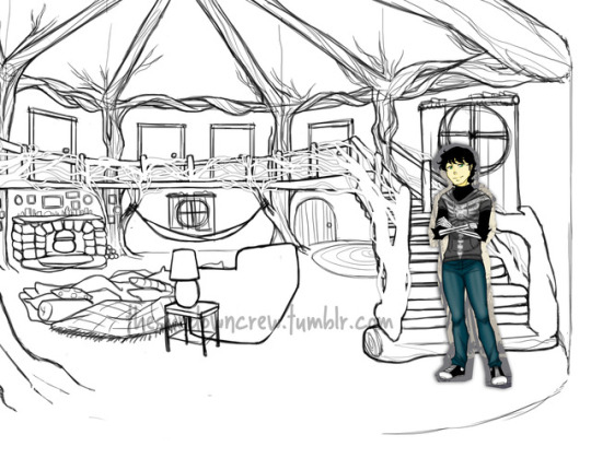
I think this took me about 6 to 7 hours straight, from the initial sketch to final product. I’m VERY pleased with how it came out because it’s close to how I pictured Sammy’s home to look like! Perspective may be a bit wonky though.
From the left, we have the kitchen, mainly known as Nightshade’s territory. She knows the room inside and out. There’s the fridge, sink, stove and a couple of cupboards stocked with groceries as well as witchy ingredients. There are two archways leading to the kitchen. The second one (in the background) will have a door to the bathroom.
The living room has the fireplace, decorated with a seasonal altar and surrounded by picture frames. Next to it is Samhain’s famous hammock, and by the hammock is the front door. In the center of the room is the infamous snuggle pile where pillows, quilts and bedsheets are tossed as a makeshift nest. The couch is a three seater.
The stairs lead you to the second floor where the study, guest room and second bathroom are. The railings are pure timber, twisted round the other smaller pieces of wood to make a sturdy fence.
#;my art#home headcanon#;no place like home#;headcanon (Samhain)#;headcanon (Nightshade)#;headcanon (Axel)
20 notes
·
View notes
Text
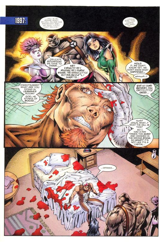
Essay time: A Rant About Comic Backgrounds- Part IV
The Final part on web comics and backgrounds. So let’s wrap this up with some Rob Liefeld classics and a few final words. This was a joy to write.
Where we last left off we were looking at background absence and genre. SO let’s pick up where we left off.
When Backgrounds go wrong
But of course. Where would this essay be without an example of a comic with atrocious backgrounds.
And where would anything about comics and bad art be without Rob Liefeld.
Now, choosing an early Rob Liefeld original comic was a tough decision. It’s a stellar example of backgrounds not only being not really considered, but, being genuinely confusing. But, to pull apart the background and see why it doesn’t tick, you have to ignore a lot of other problems in these 3 pages. (Wouldn’t advise stopping and reading the pages either).
That said, let’s ignore the 8 unexplained costume changes of the main character (Do you or do you not have a neckline, man!?), women with only legs and broken spines, awkward dialogue, poor panel layout, and too many missing thumbs and broken hands.
Let’s focus on the backgrounds.
Alright... Buckle up.
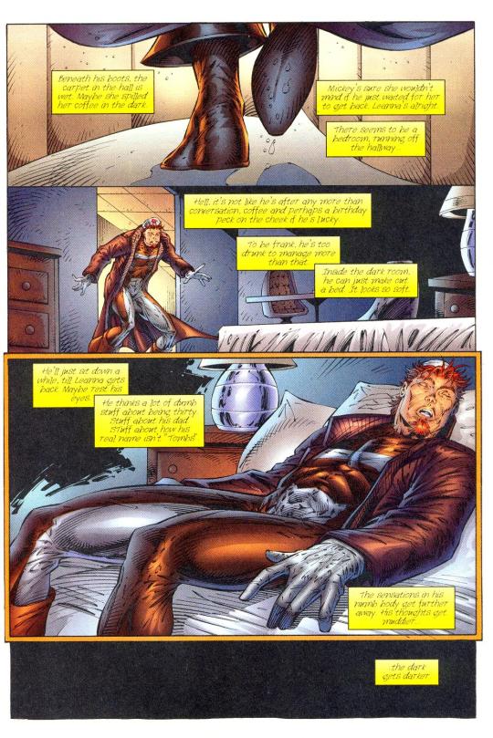
Judgment day - Rob Liefeld & Alan Moore Floating objects and warping objects When researching comics for this essay, this was the first comic I’ve read where I’ve had to reread pages to understand what’s going on. And the first where I turned the page and burst out laughing at the visuals. So let’s break down why this is confusing, but, only background wise. This essay rant is long enough...
In the first panel it’s apparently a hallway, the lines are wonky and warped, this might’ve been an attempt to show how drunk the main was, but it doesn’t look like a corridor. The end of the corridor is too short, and is blocked by the feet, it’s also weirdly thin for a corridor, and that’s not to mention that the “coffee stains” are clear. WHich comes off as lazy, if it’s supposed to be a mystery liquid there were other ways to hide what it really was than to show it as neither what it was or what the character thought it was. It isn’t clear, it’s not obvious what’s going on. On top of the first panel not making sense the next two backgrounds don’t make physical sense, where the floor would be changes 4 times, and the perspective doesn’t work. Mistakes in comics happen. That’s fine. But not when the layout of an image is strange enough to totally pull the audience out of the story. It is fun to stare out and point out mistakes. From there the page changes from panel 2 to 3, slightly, but the change in bed type and twisting of the bedside table is distracting. The main problem with this page is the lack of care of backgrounds and it’s effect on the story, in this case it’s distracting and not easy to read.
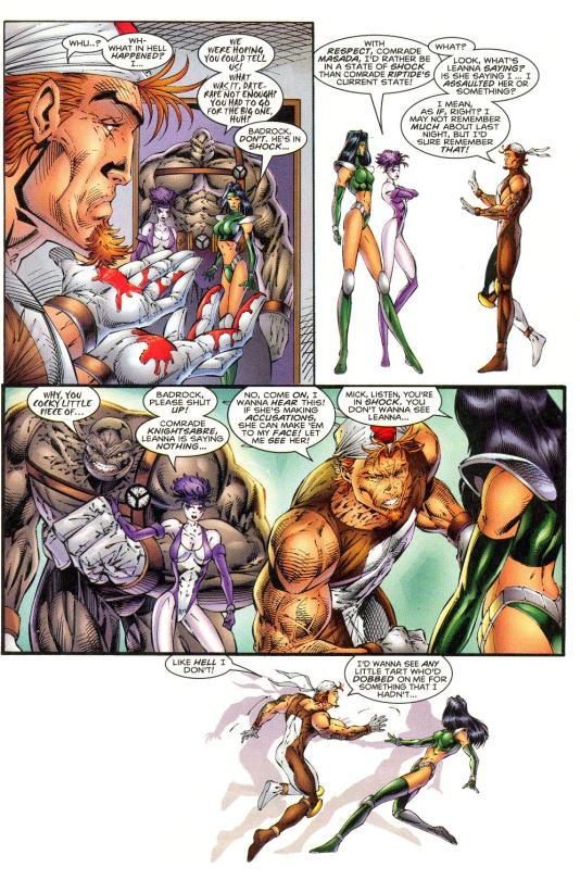
Judgment day - Rob Liefeld & Alan Moore Changing interriors and strange background choices Although the backgrounds really fall apart with the second page. Besides the first background being an odd choice to start with. They wanted to show the team as impressive, which is kind of strange considering that the character doesn’t see them that way, nor are they saying anything that makes them seem impressive. The character is disorientated and shocked at the people in the room, and the character’s aren’t really saying anything heroic, it doesn’t entirely make sense for the background to try and position them as impressive there. But, heroic introductions to the main cast isn’t the weirdest thing to happen in comics. But, it’s still strange when it doesn’t match how the characters are actually introduced story wise. The next panel doesn’t do much, it doesn’t add to the character’s confusion, it doesn’t contrast the first. It doesn’t do anything. A little strange for such a large panel, but it isn’t confusing at least. The biggest problem in this page would be the third panel, though. This page happens straight after the first example, and the entire set up of the bedroom has completely changed. The room is now covered in blood, the bed’s a different shape, the table and chairs are gone, the bedside table and lamp are gone, and there’s now a book table in the far corner. It’s supposed to be a reveal of the actual state of the room. But the sense of place is absent, there’s no continuity, there is no reason to believe this is the same room (besides maybe the carpet?). Did he get moved to a different building when he was asleep? was that a flash back? Why is it a different room? It’s confusing, at least I was heavily confused. The audience doesn’t know why the superhero team is impressive, they don’t know what the character generally thinks of them, and they can’t tell where the character is. The backgrounds here aren’t just not being used in interesting ways, they’re ultimately confusing. Which is bizarre from a print comic.
Judgment day - Rob Liefeld & Alan Moore Blank backgrounds without purpose But distracting and confusing setting design aside, there’s also the weird use of negative space. In the two blank panels in this page the character is supposed to be confused and angry. He’s being accused of a crime he didn’t commit. But the use of negative space is... bizarre. It doesn’t really contrast with the other blank backgrounds, the only thing supporting that is the border-less edges, and narrative wise. In the first instance the character is calmly trying to explain his innocence. the background is probably trying to show he’s shocked, but with the angle used it doesn’t make sense, he’s just speaking with two calmly talking people side on. He’s backing away but again, he’s not in enough fear for the panel to show his emotional state, and with him spacing out it doesn’t match his calm yet confused dialogue. Even narrative wise the sense of place is... strange, he was sitting on a bed and now he’s backing away, why is he backing away? Why did he get up? especially if he’s in shock. Why are the people standing right in front of him standing in the door frame, and why are they standing right in front of him again? it’s just hard to read, what’s happening, why is the character doing things, where is he in that room and why does he keep teleporting, why is everyone teleporting, why is the background blank? It’s not entirely clear. The next instance of a white panel isn’t much better, the character is running( I think) at the other character (not sure what he’s trying to do there, maybe he’s floating... trying to hit the woman maybe???). The panel is white except for the shadow on the backdrop which is an odd choice. Besides the shadow it doesn’t make sense timing wise or focus wise. The action isn’t clear enough to be the focus; the dialogue isn’t ground breaking enough to be either; the character is disorientated maybe, but the dialogue, angle, warping of the scene, and pose does not support that; and it’s strange to just have a big empty panel to end on a note that’s supposed to be frantic or angry. It doesn’t really make sense. The backgrounds in Rob Liefeld and Alan Moore’s “Judgment day” doesn’t make sense. The backgrounds don’t have a use, and in many case are used in ways that contradict or just muddy what’s happening in the scene. Not to mention that a lot of the background assets are warped or don’t make physical sense. Which is really distracting. But, the poor use of backgrounds (and visuals in general) makes reading the comic extremely confusing. I still don’t understand what’s supposed to be happening in those pages...
The End
In the end, comic backgrounds are a tool. People aren’t required to use them, and there’s no one way to use them. This essay isn’t about what comic writers are expected to do, or a standard that needs to be obtained. Webcomics are written by people, for people. And there reasons for being written are as diverse as their backgrounds. It’s not even an issue if people write comics for the hell of it and don’t want to put a lot of effort into it. This way too long rant isn’t about that. It’s about backgrounds and how they’ve been used to create beautiful pages, settings with character, tones and emotions, comedy, focus, powerful scenes, and simple conversations. There’s a lot of webcomics that haven’t utilized the wide landscape of information they can bring to a comic. There are already a handful stunning comic panels out there.
And it would be great to see more.
Ariel Magic - Walking North A beautiful panel.
This rant was supposed to be 3 paragraphs. No-one will read the entire thing, no-one will even really click on it. But, this was so much fun to write, even if it took a few months. And on the off chance that someone did read this entire thing. Oh wow, welcome to the end of scrolling, hopefully it was a bit of a kick to read hahaha.
0 notes