#the little square box w arrows at the bottom of a post
Explore tagged Tumblr posts
Visit Tumblr Blog
Explore Tumblr blogs with no restrictions, modern design and the best experience.
Last Seen Tumblr Blogs


Fun Fact
In Q3 of 2020, 31% of US users access the Tumblr app daily.
Text
facebook and reposting
I know nobody’s here for long spiels, but this might be a bit lengthy... I’d much rather fill my dash with replies to you guys about stuff that has actual substance, or just post art in general, but this needs to be said.
Please don’t message me to ask if you can re-post/re-upload/re-distribute my work. I have an instagram, twitter AND tumblr where I distribute my work. That’s where I’d like to keep it.
I appreciate the respect you’re giving by asking, but it gets exhausting to keep saying ‘thank you, BUT’...it says clearly on my description page to Not Repost Anywhere. It does not say ‘Please only repost with permission’ it just says Don’t Do It. If you send me IM’s about re-uploading my work on instagram/FB/twitter/wattpad etc, I will ignore it. My silence isn’t an unspoken ‘do whatever you want’, it is a blatant ‘no’. OTL
In terms of Facebook - I respect and admire the effort put in by those who run translation fanpages - but I will also have to automatically decline all of your requests. Not because I don’t want my work to be accessible to those who don’t speak English, but because I’ve had multiple facebook accounts re-upload my work without my consent and with barely any credit/proper captioning of the work. And whenever I’ve tried to fix the issue, I’ve either been blocked, or had the re-posters try and lecture me about how I’m asking for the impossible.
Artists don’t ask for much. We do this for free and because we enjoy sharing our love for a series with the world in the best way we know how - by drawing out our feelings and ideas. It’s honestly a bonus and privilege to be able to earn money from my fanwork/fanmerch, and I greatly appreciate every gesture of patronage.
Artists shouldn’t have to ‘suck it up’ or be ‘aware that this comes with the territory’. Some artists, especially those who share work on Pixiv, face very real VERY serious legal repercussions if their fanwork is tracked back to them from sites that they did not consent to it being uploaded to. It doesn’t take much to paste a Pixiv artists description into google translate to see if they have said ‘Do Not Repost’ in their native tongue.
Please respect artists. Please look at our descriptions, read our FAQs and consider ‘why am I re-posting in the first place? Do I have explicit permission? Did I check if they allow this? why not just support and spread my appreciation for their work by reblogging their art post, or telling friends about their blog/twitter/pixiv?’
Artists are not machines made of endless amounts of money, time, or energy. We’re human beings that thrive on feedback, communication, and mutual respect. I wouldn’t have gotten to where I am now if not for the wonderful, kind people who supported and encouraged me on my art accounts. To those who support artists by re-blogging our work and/or keyboard smash their thoughts at us, I love you dearly. To those who support artists by purchasing our prints/keychains/charms/standees/zines? You guys are phenomenal, we couldn’t do half of what we do without you.
To the re-posters however? And to those who try to lecture artists about the Ways Of the Internet and how Reposting is Inevitable? The solution starts with YOU, not us. Mutual respect and honest communication, please utilise it.
#reposting#last time i had a bunch of people asking me about the difference between#reblogging and resposting#to which i say again#the little square box w arrows at the bottom of a post#that brings up a new window and u can add tags?#thats called reblogging#reposting is u saving the images#and then uploading them yourself#one involves a whole lot more effort than the other#HachiYabbers
906 notes
·
View notes
Text
"palette” gif tutorial
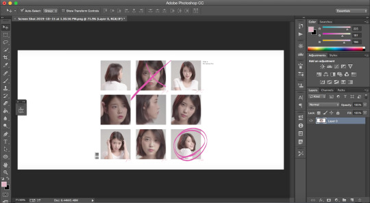
hi everyone!!! so i’ve gotten countless requests to make a tutorial for my lara jean gifset, more specifically this gif:
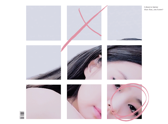
so today i’ll be showing you how i make this gif right here:
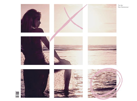
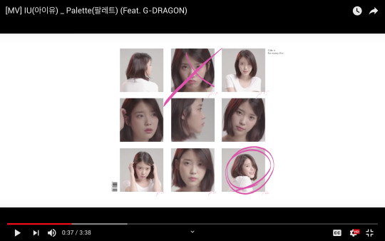
as mentioned in the original post, this whole gifset was inspired by one of my favorite mvs of all time: palette (hence the creative name lmao). i essentially used screenshots of the mv to make my own similar template to work off!
disclaimer: i suck at explaining things, so you’re all gonna have to bear with me and my 100000 screenshots and poor attempts at explaining wtf i’m doing. hopefully you can manage to understand what i’m on about!!
if you’ve never made a gif, check out this detailed tutorial i made some time ago:
how to make gifs + color gifs (this tutorial includes links to download ps)
tutorial under the cut (i’m sorry for how long this is rip)
first, screenshot the mv. (timestamp 0:38)
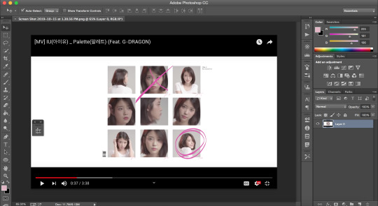
here is my screenshot:
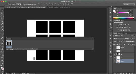
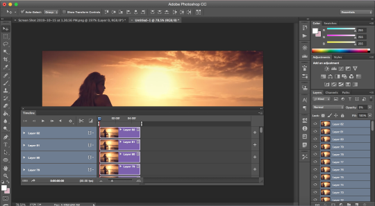
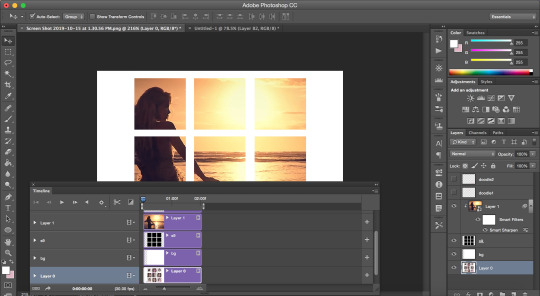
now, we’re gonna open ps and go to file > open to open the screenshot on there. this is my screen rn:
notice how my timeline is there (little box on the right side of the screenshot). we’re going to need the timeline for the gif later. if u don’t see the timeline, go to window > timeline and it should show up!!
time to crop the screenshot. using the crop tool, (left sidebar, 5th icon from the top) remove the black parts of the image (top and bottom) until all you’re left w is the white area. final product:
now it’s time to change the size of the canvas we’re working it so it can be the dimensions we want it to be! go to image > canvas size
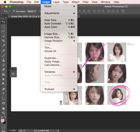
a window like this should pop up:
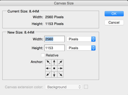
we want our gif to b 540px by 400px, so just fill that out and press ok:
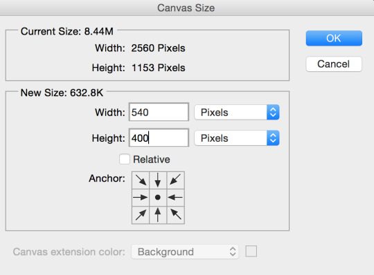
this is what your screen should look like after (aka super zoomed in):

we’re gonna fix that rn!!! making sure the layer (right sidebar) is selected (you can tell it’s selected when it’s in blue), press command + t, which will leave you with this:
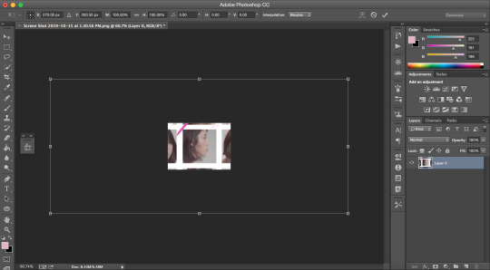
okay, so i’ve covered this before in my previous basic gif making tutorial and not much has changed since then aka i’m still shit at attempting to explain wtf i’m doing. BUT basically this part involves using the top bar (pictured below) and changing the % of the W and the H to make the image the amount of zoomed in i want it to b (if that makes sense)

again, i usually just play around w the %s, depending on how zoomed in i want my image or gif to be, its dimensions, etc. the higher the %, the more zoomed in it is. basically, putting in 50% would make it way more zoomed in than 20% and so on. for this, i’ve tried out several % and decided to use 39%, but of course you can pick the % you prefer. so write in your chosen % in these two boxes in the top bar like this:
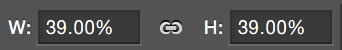
click the checkmark at the right of the top box and voilà! this is what you should have rn:
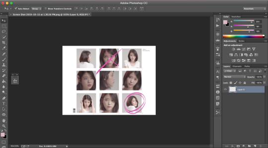
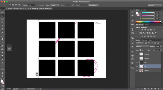
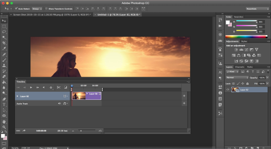
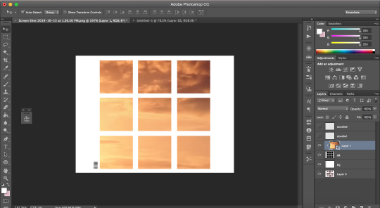
see how all the 9 squares fit perfectly inside? wow, powerful. anyway, let’s keep going djfhdkfd. now we’re going to make our own squares aka the squares in which the gif is going to be. start by creating a new layer (at the bottom of the right sidebar, the second to last icon before the trash icon). give it a name so it’s easier to keep track of: i picked s1, since this is going to be the layer where the first square is going to be (and so on). also make sure the new layer is above your image like this:
time to actually make the first square!! select the rectangular marquee tool (left sidebar, 2nd icon from the top) and select one of the squares in the image (113px by 113px) like this:

select the paint bucket tool (left sidebar, under the eraser tool) and make sure the color is set to black (#000000) before you click on the square you just selected. very important: don’t forget to have the s1 layer selected (should be in blue) when you do this or else it will fuck up.
this is what your screen should look like after:
as you can see, we have one square done, but there are 8 more left. right click on your s1 layer in the right sidebar and click on duplicate layer. name that layer s2. making sure the s2 layer is selected, drag it to the place of the second square:
keep doing the same thing until all the squares are covered with black ones like this:
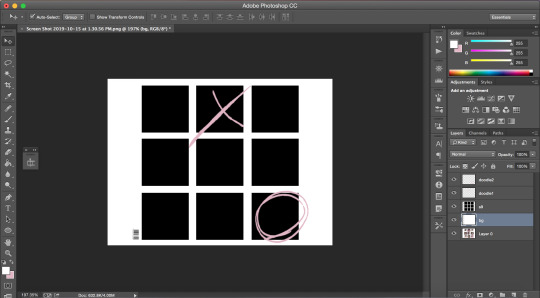
now i’m going to hide the black square layers by clicking on the little eye icon (left of layer) for each of them bc i want to include the little dark pink doodles on my gif as well, but you don’t have to, so if you don’t wanna include it in your gif, you can skip over this part!!
there are technically 3 ways you could do that (well maybe more lol but these 3 are the ones who came to mind:
method #1: use the brush tool to draw your own doodle (or trace over the existing one with a new brush)
method #2: use the magic wand tool to select the doodle and use the brush tool over your selection
or method #3: look up doodles on google and drag them onto your image
i don’t have an ounce of patience rn, so i will b using method #2. select the magic wand tool (left sidebar, 4th icon) and make sure you select the first doodle the best you can. don’t forget to make sure your screenshot (image with the doodle on it) is selected while you select the doodle or it won’t select anything!!! like this:
create a new layer (bottom of the right sidebar, the second to last icon before the trash icon) and again, make sure it’s above all the other layers. with your new layer selected (in blue), select the paint bucket tool (left sidebar, under the eraser tool) and pick a color (i used #e1b5c4). click on your selected doodle. this is what you should have:
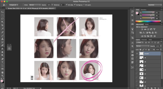
repeat for the other doodle with another layer.
final product:
it looks a bit Rough, but hopefully you get the idea?
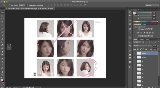
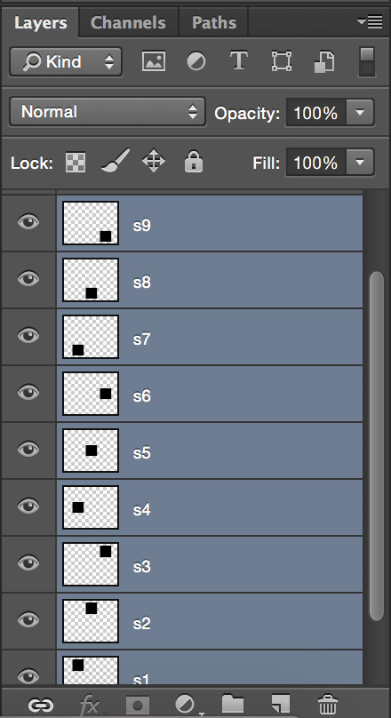
now we’re going to merge all the little squares into one layer of little squares. if you have doodles, remove the eye icon (left of layers) for both of them to hide them and make sure all of your eyes are there for the square layers. select the s1 layer and then the other layers up to s9 while keeping one finger on the shift button until all the square layers are selected (in blue) like this:
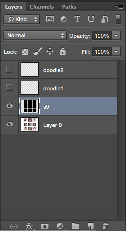
right click on the s1 layer > merge layers. all you should be left with is:
now that this is done, we need to fix the background.
create a new layer that you will drag above the screenshot (layer 0) but under the s9 layer. i named mine bg (background). i want to keep the barcode in the original screenshot, so i won’t select that part. using the rectangular marquee tool (left sidebar, 2nd icon from the top) and with the bg layer selected, draw a square at the right of the bar code so you have this:
with the paint bucket tool (left sidebar, under the eraser tool) and the color set to white (#ffffff), click on the selection.
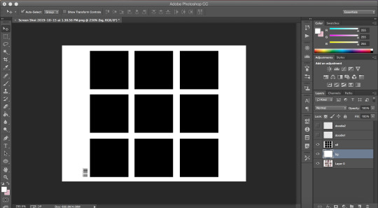
and that’s your template!!!
with doodles:
now onto making sure the gif is going to actually move properly.
click on the little arrows at the right side of the timeline to expand it until you have this:
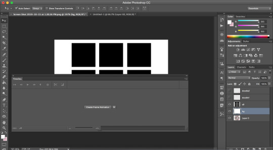
and then click on create frame animation. your screen should look like this:
notice how it says once at the bottom of the timeline? make sure to change that to forever, or it will not play:
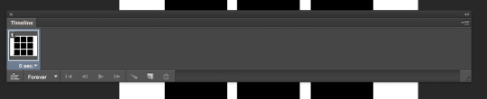
click on the convert to video timeline icon (the one on the left of the forever). this is what you should be left with:
now, time to make the gif that is going to go there*
*if you have no idea how to make gif and are lost af, i suggest you check out my previous tutorial where i explained this part with more screenshots and more specifically bc i will be more vague here regarding this
also i’ve said this again and again, but remember to ALWAYS USE 720P OR 1080P FOOTAGE WHENEVER POSSIBLE FOR YOUR GIFS or else they will be grainy and extremely unpleasant to work with.
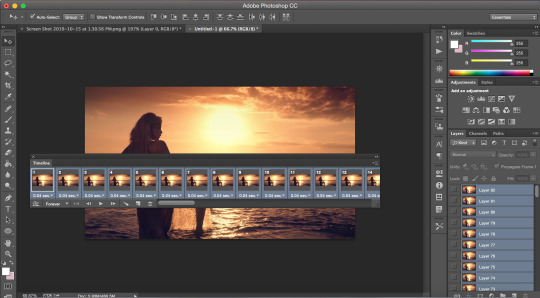
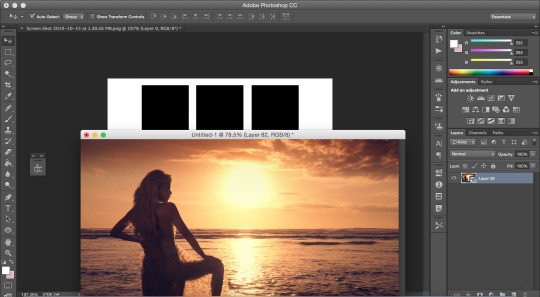
i’ll be using a video from youtube for this. i suggest converto as a converter, it works really well and allows you to download youtube videos in 720p and 1080p!! once you have your footage ready, go to file > import > video frames to layers. use the markers to select the part you wish to gif, and, once you’re happy with your selection, click ok.
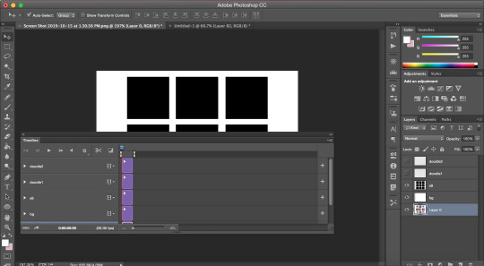
to select all the frames, click on the icon on the right of the timeline (4 lines with an arrow) and click on select all frames. then, go to select > all layers in the top bar. everything should be selected (in blue) like this:
now, fixing the speed of the gif.
super helpful post explaining gif speed right here
i’ll personally be using 0.06 here.
click on one of the frames in the timeline > other. write in the speed you chose and then press ok. go to convert to video timeline icon (the one on the left of the forever).
you should have something like this:
go to filter > convert for smart filters:
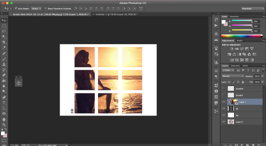
the time has come to drag your gif to the canvas:
make sure the gif is above the s9 layer (layer with the black squares) like this:
to make our gif fit inside the squares, we’re going to make sure the gif layer is selected. then, press the option (alt) button and click between the gif layer and the s9 layer to create a clipping mask (like this). this is what it does:
this is where i usually play around trying to find a size for my gif that looks nice. press command + t and, like we did earlier, find a % you’re happy with. i’m going to go with 20%. after moving my gif around and making it less zoomed in, it now looks like this:
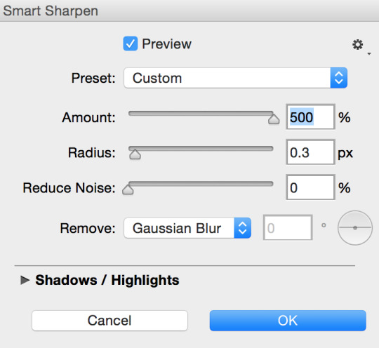
this is usually where i would sharpen my gif, so, with your gif layer still selected, go to filter > sharpen > smart sharpen, and then ok.
these are my settings:
we have to fix the length of the gif, since there’s a lovely limit on this amazing site. i suggest you pick something to gif with not much movement, or you’ll have to make it even shorter. there’s no magic formula, just try not to make it too long, especially since the gif is large in size, so the smaller the better in this situation. this is what i have:
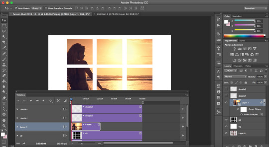
notice how the layers in the timeline are all of different lengths, so make sure you make them all the same like this:
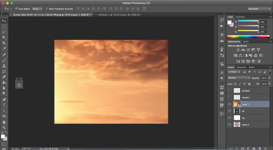
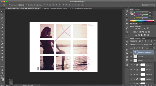
once you have a psd ready, go to file > open and when it loads, drag it onto the canvas, above the gif. i added one of my psd on mine.
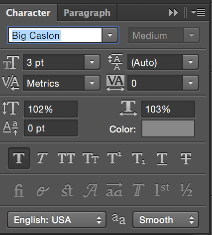
for the text on the top right, i can’t remember the exact font i used, so i picked another font different from the original.
these are my settings:
what it looks like with the psd + doodles + text:
and we are DONE!!! all that’s left is to save our gif!! go to file > save for web
these are my settings:
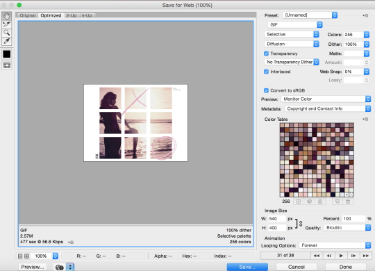
SUPER SUPER IMPORTANT: make sure your gif is set to forever in the looping options at the bottom right of the window or else your gif will absolutely not play properly!!
also, CHECK YOUR GIF SIZE (bottom left). with this website changing its gif limit every 2 seconds, better safe than sorry!!
here’s the final product:
thanks for sticking around and reading all of this!!! i hope it was somewhat helpful even though i suck at explaining how i do stuff! :)
#stupid tumblr crashed so i had to start over but here it is finally!!! sorry for how long it took!!#gif tutorial
48 notes
·
View notes
Text
so you want to make an amv?
Hello, everyone! As some of you may know, I make amvs or little video edits for BH6 from time to time. While video edits aren’t necessarily the most popular form of creating for this movie (or upcoming show…who knows??), there are still some people out there who might be interested in making videos. This tutorial is mainly for @princess-kidatheart17 but if anyone else is interested in this post, I hope it helped!
The following tutorial are just the basics to Movie Studio Platinum (a form of Sony Vegas).

So, you get the program loaded and ready and this is what it looks like. Again, MSP is pretty much the same thing is Sony Vegas or Vegas Pro. Most of the features are the same (although I have learned that my program cannot do photoshop styled masking…but that’s not a basic thing to learn lol).
First things first, you have to get a video (or sound) file onto the timeline. In order to that, the first thing you have to do is go up to the top, click Project and then click Open…

Once you click that, you should get a video folder of something like this:

All you have to do is click on one of the video clips and then press Open

And now you have the clip of your choice on a timeline! Now you can officially start editing your video! Now, splitting clips is a pretty simple task. See that little bar at the end of the movie? Move your mouse over to that and click it. You can drag it anywhere you want on the clip.

As you can see, the bar is now about halfway onto the full movie. If you have that bar just where you want it, all you have to do now is press the letter S on your keyboard and the clip will split!

Now the movie is split in two!
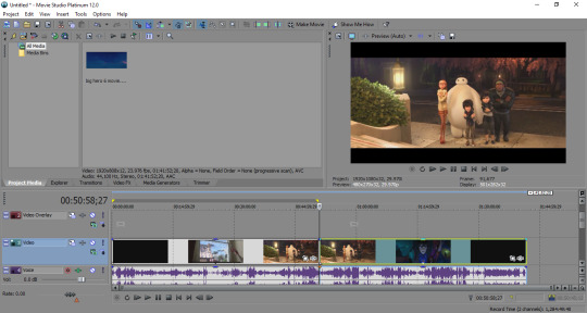
Clearly, if you’re editing a video no matter the size, you’re not going to want the full thing on screen. So, to get rid of a clip, all you have to do is click on it (the clip will turn from gray to blue and be bordered with yellow) and press the delete button on your keyboard.

Just like that, it’s gone!

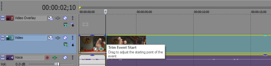
Now, as you can tell, I’ve trimmed the remaining file a little more. Another way to do that is by putting your mouse over the beginning or end of a clip. As the box says, just drag and adjust to where you want the end of the clip to be.

You have your clip just the way you want it. Great! If this clip happens to be in the middle of the timeline, no worries! Just click on the file and drag it to the beginning of the timeline

Aaaaand now it’s where it needs to be!
Effects/FX

Alright, now let’s get into the more fun parts. I think adding effects to the clips are my favorite parts and you can pretty much add them in at any time during the editing process, but I’m going to start with the effects here. I tend to make the mistake of adding effects after I have every clip trimmed and split which isn’t always a bad thing, but if the same effect is noticeably different, that can be a problem.
The fun part is trying to figure out what effect(s) you want to use and it’s totally up to your own preference. Don’t be afraid to look around and mess with some different effects (if you don’t like it, just press Ctrl+Z to undo it).

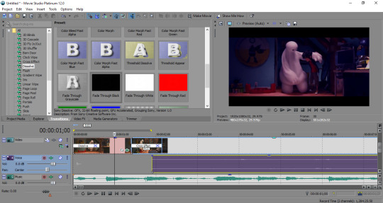
I personally like to use Color Curves. For most of my edits, I specifically use Cool Colors. Again, whatever effect(s) you want to use is completely up to you. Once you find the effect of your liking, click down on it and drag it onto the video file.

Something like this should pop up. It won’t look the same for every effect, but most effects have ways to adjust them. This is what it looks like when you choose a color curve effect.
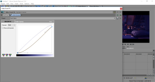
Because the effect wasn’t to my liking, I adjusted the bottom of the red curve. There’s little gray lines with tiny boxes at the end of them. All I did was click on that box and dragged the line down to edge of the square.

The effect is officially to my personal liking!

…but wait, I’m not done! I’ve decided that I want to add another effect! No problem! Like I said before, you can add more than one effect to a clip. Sometimes I like to mess around with Brightness and Contrast. Personally, I go for the Darker effect.
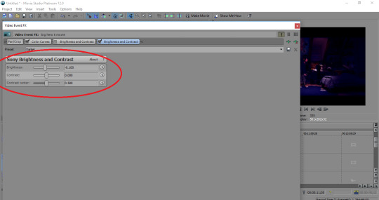
Again, another box will pop up where you can adjust the settings. As I can see on screen, the effect is just a bit too dark for me, so I’ll mess around with the settings.

It may not look like I’ve done much, but every little adjustment matters. The effect looks much more pleasing!

And now I have it the way I like it!
Transitions

In my opinion, transitions are just a little bit more tricky to manage. You have to pick which ones you like and sometimes, you have to trim them up. They might be going too slow, or you may trim them to the point where the clips transition so quickly, you don’t even notice you added a transition at all. But once you get the transition where you want it and the flow of it to the next clip looks pleasing, it’s all good!
What’s cool is that there is more than one way to make a transition. I’m going to show you the first way right now which is pretty simple. First, you’re going to need to drag that little bar to a point on the clip where you want to split it.
Now before I add the transition, I want to get rid of part of the clip that I have clicked on. Click the beginning of that clip and drag it until your satisfied with what you’ve gotten rid of.

This is what it should look like while your trimming the clip. Your mouse will look like a double-ended arrow whenever you trim clips like this.

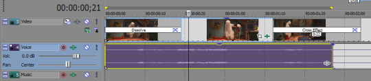
Once you get the clip to the part where you like it, drag it back over so it’s touching the other clip. As you can see at the top, there is a blue triangle on the end of the first clip and beginning of the second. When those are connected, that means the clip will just go into the next which is what you want. Sometimes, I edit a clip that doesn’t touch another on purpose because it makes sense with the beat of a song. If you want those blue triangles to touch, make sure they are touching or else you’ll have a split second where the video is pitch black (and unfortunately, that is VERY noticeable).

Even with the triangle gone with this added transition, it’s important to have them touch nonetheless. The way I made this happen was taking the beginning of the second clip and dragging in onto the first. It creates what you see in the picture above and shows the duration. Make sure you watch back the transition to see if you like it. If it’s going by too fast or slow for your liking, adjust it until you get results that you like.
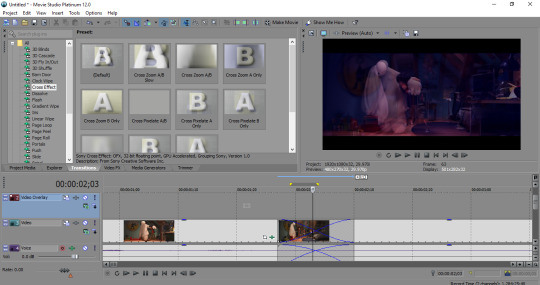
With this transition, it looks like this about midway. I actually like how that looks, but it may not be the transition you want. Gladly, there are many transitions you can choose from and you can experiment with those as well to see what you want to use. As simple as it may be, I use the Default Cross Effect transition ALL THE TIME.

As you can see, the transition I made before is gone. In order to put a transition in, click the one you want, drag it, and put your mouse between the two clips (the split). When you get it between the clips, a little white and black static looking box will show up. When you see that, drop the transition in there.

Like the effects, a box will pop up like this. Honestly, I just close these pop-ups when it comes to transitions. If you want to mess around with the settings, feel free to do so. But I just close out of this.

Now the timeline is showing the transition! Whenever you drop in a transition from the transition folder, the default duration is always 1.00
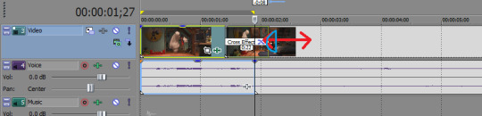
Now, I personally didn’t have a problem with how the transition turned out at 1.00, but in the event that you want to trim down a transition, All you have to do is move your mouse over to the end of the transition. Another double-ended arrow will show up, but it will also have an arch on the side (I did my best to draw it, my apologies it doesn’t look great!). Once you have it where you want it, watch over the transition and see how it looks.

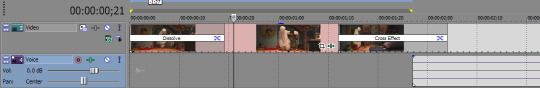
This is how the video looks mid-transition. Again, you can use any transition you want. You just have to see if you like how it flows to the next clip.

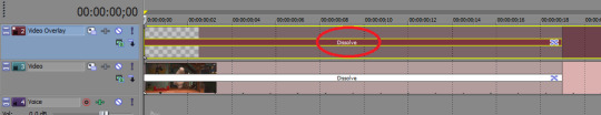
Another transition I love to use is Dissolve. I think it’s best used at the very beginning or end of a video. In my opinion, having a video fade in from a black screen is the most natural, so what I’m going to do is choose Fade Through Black and drag it to the beginning of the first clip.
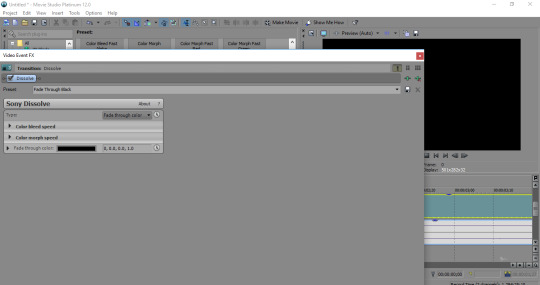
…again, a pop-up will happen. CLOSING THAT UP (ofc if you want to mess with it, do so!)

As the video begins the play, the first clip slowing begins to fade in. I like how it’s fading in, but not where in the clip. Sooo I’m gonna adjust it a bit!
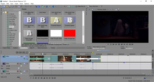
I have clicked the end of the transition, dragged it slightly to the left and now I like where the transition is! The bar shows what’s currently on screen and the little line on the clip shows where the transition ends!
Sound
If you’ve noticed, the movie has both video and audio. But unless you want the audio to stay while music is playing, there’s a simple way to get rid of it. Click on the clip where you want to remove the audio file and press the letting U on your keyboard. Now the video and audio are un-grouped. All you have to do now is click the audio and press delete.
TADA! The audio from that clip is gone!
Now, whatever type of edit you’re making (amv, crack edit with funny audio, etc). You’re gonna want to get your audio file in. You can do this anytime during the editing process. It actually tends to be one of the first things I do, but I wanted to show the basics on effects/transitions first. Remember at the beginning how you imported the video file in the timeline? You have to do that with your audio as well.

You have to go back here, find your music folder (or w/e folder has the audio you’re looking for), click the file of your choosing and then click Open
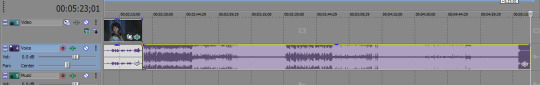
The audio of your choosing will automatically go on the first timeline section for audio. Luckily, it will place itself at the end of the audio file you already have on that timeline. The problem is you don’t want the audio on the same timeline as the movie’s audio. Simple to fix though! Just click the file and drag it to the timeline below.

Yay! Now it’s on it’s own separate section! All you have to do now is drag it so it’s under the other files.

With the audio at the beginning of the timeline, feel free to trim it up if you feel that’s needed. You’ll get that double-ended arrow again. As you can see, audio files show when sound starts up and how it moves. The very beginning of the song I’ve chosen doesn’t start up right away, so I’ll trim it.
Make sure you play the edit from the beginning to see if you like how everything is flowing together. (Oddly enough this is just a tutorial, and I’m satisfied with how it all is).
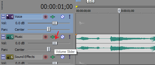
If the sound happens to be too loud or too quiet, you can always change the volume by adjustng the volume slider on the side of the timeline. Make sure you adjust the one on top ONLY though. The bottom one will move where you hear the audio from (aka, if you move it to the left, you’ll only hear the audio in your left ear and to the right in your right ear). Keep that bottom slider where it is!
Text
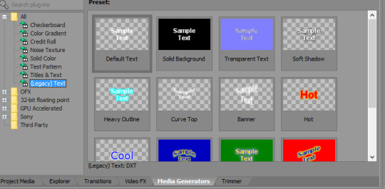
I like using text! While it’s not something you do for every edit, it’s still nice to know. Every once in awhile, I’ll mess with Titles & Text, but I usually just use (Legacy) Text on edits. I mainly use text to add song lyrics or sometimes quotes from the movie. And when I decide to use text, I tend to pick Soft Shadow because it has a nice, simple shadow behind the letters.
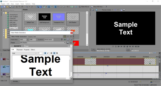
To get text on it’s own timeline, just click and drag the text of your choosing on the timeline above the video. When you import a video, the video automatically puts itself on the third timeline. You have two other timelines above it and those can be used for text!
As always, you get a pop-up box, but this one is VERY IMPORTANT. Use that box and get the words Sample Text out of there!

You can change the font and size of the text which is great! For this edit, I randomly chose the song Demons by Imagine Dragons, so I typed the first line of the song out to the font & size of my liking.

If you look closely, there are four tabs you can click through when editing your text. I went from Edit to Placement to see if the text was in a good spot. For me, this looks great, but if you wanna move it around, click on the text that I circled and mess around a bit!

Now I’m at Properties. This tab allows you to change the color of the text or the background of the video. The first section is Text Color, so if you want to change the color, change it to the color you want! Of course, I’d suggest adjusting the color so it’s visible, not too bright, and it doesn’t blend in too much with the video behind it.

Aaaaand you can trim text too! For song lyrics, it’s best to trim the text to where the last word is spoken. Same goes for quotes that characters are saying.
And you can add transitions to text too! Text don’t have to necessarily transition at the same time as video transitions, but it’s nice to have things fade in at the same time. So, if there is text in the beginning of your video, try to have it fade in at the same time the video does. Remember; go to the transition of your choosing and drag it at the beginning of the text clip. Adjust/trim to where you want it to go.

Adding text lyrics can be a bit strenuous, but it’s worth it once you get it to look the way you want. Video transitions are important because they should have a nice, fluid flow to the next clip and text should be treated the same. If you add another text clip next the first one, it should have a transition too (I think the first example I used for transitions works pretty well for text!) And that’s how it should look like mid-transition.
Something Extra

You see these little black bars? If they don’t bother you, that’s great! But sometimes, I don’t want them to be there in my edits. I didn’t think there was a way to get rid of them for YEARS, but a long time ago, I found a tutorial that showed me how to get rid of them and I’m so glad there’s a way! Luckily, I don’t think this will be a problem with the show, but if anyone wants to make a movie edit, feel free to read this part.

Right beside the timeline, there’s this little box I have circled. Click on that!

This will open up. Now you see that little blue circle on the top-left edge of this rectangle? You’re going to want to click the edge of that (actually, you can choose any edge of the rectangle, but I just use the top-left one). Drag the edge outwards and watch the video clip on the screen until it fills up the entire screen.
look at that

IT’S ALL FILLED IN NOW (this makes me so much happier than it should)
Rendering
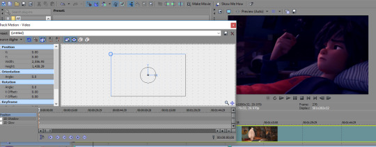
So, you’ve edited everything to the way you like it and your video is done now? Great! Let’s make sure of something real quick before you decide to render it.
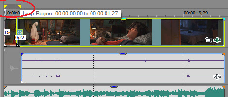
See those little yellow triangles I have circled. Yeah so if I were to render this video right now and leave those triangles where they are, everything everything between them would only end up getting rendered. THAT’S NOT GOOD. Click on the second triangle (the one at the 00:00:01:27 mark) and drag it to the end of your video!
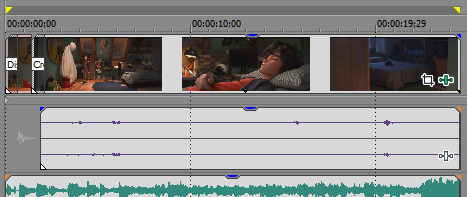
There! Now your entire video will be properly rendered!

To begin your rendering process, go to Project and click Render As…
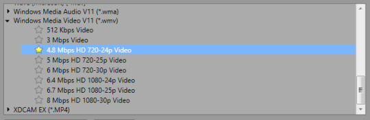
You’ll get a lot of different types of files to save it under as. You don’t want to make the mistake of rendering it as an audio file. When I make a video, I want to make sure the whole thing can end up on Tumblr. So, I use a Windows Media Video (or .wmv) file which manages to keep the finished product at a low enough number for me to upload the whole thing on here. You can choose anything within the WMV area to render it with, but the one I have highlighted is the one I use.

don’t forget to name your file as well!

Last, but not least, press that Render button! All you have to do now is wait for the rendering to complete and watch your video as a final product! Upload it to Tumblr, YouTube, etc and you’re done!
And those are just the basics to know when editing a video in a Sony Vegas program! I might end up doing another one of these someday, but just in case, here are some links to some more tutorials that I have found to be very helpful!
How to make audio echo: https://www.youtube.com/watch?v=7264MXk_BeY How to use your green screen: https://www.youtube.com/watch?v=HKk7tJV934s&t=203s (i found the beginning to be most useful to learn how to edit out a green screen so I can overlay a clip on top of another) Phone audio effect: https://www.youtube.com/watch?v=JixZ-IbueEs
Anyway, I hope my basic tutorial was good! I’m sorry it was so long, but those are just some basics to know if you’re interested in making videos! Hope this was helpful! :D
#i really hope this was helpful#video editing#movie studio platinum#sony vegas#vegas pro#tutorial#video editing tutorial#long post#big hero 6??#bh6??
2K notes
·
View notes
Text
Post Processing your Raw Doujinshi Scans
This guide is meant to follow my first guide on scanning doujinshi without destroying them in the process. You can find it here. In this section, I’ll show you how I take my images from photographs and turn them into professional-looking digital scans.
So I Took a Lot of Pictures - Now What?
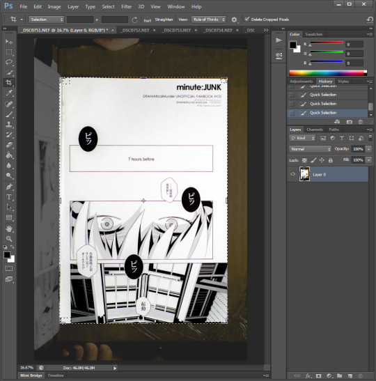
Sadly, after all the hard work you put in to get amazing pictures of your glorious doujinshi… you’re still not done yet - but the more effort you put into the first part, the less you’ll have to expend here. Pull the photos you took off of your digital camera and put them in a new working directory with the name of your project on your computer. From here, this guide uses Photoshop CS6, but you can find most of the same actions in GIMP.
If you shot in RAW:
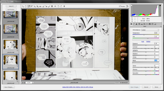
This can make your life a little easier if your lighting setup was a little less than ideal, but it’s still not a cure-all. The biggest advantage to this is that you can set the correct white balance for your scans all at once instead of page by page (although, if the doujin is mostly black-and-white it isn’t such a big deal). Select all of the RAW image files in your project and drag them into photoshop.
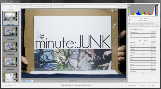
(Look how amazing they are. So highlights. Very contrast. Much wow.)
Click the ‘Select All’ button because we want the next changes we make to apply to every picture at once.
White balance
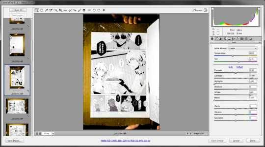
Press ‘I’ or click the white balance tool button, then click an area that’s supposed to be pure white. This is correcting for the color temperature of your lighting, so make sure where you select isn’t actually intended to be a beige or off-white color or it will affect how the other colors are rendered. You can always include a little sheet of white printer paper in your shot to white balance off of if there isn’t any on your doujin covers.
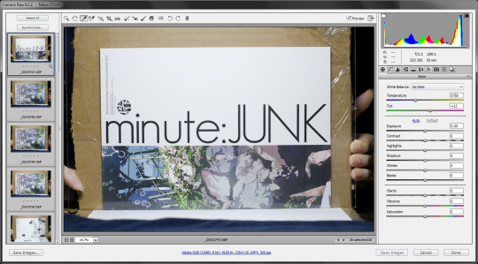
Next, select just the inside black-and-white pages (you’ll come back and fix up the fancier cover pages afterwards).
This is where the best features of shooting in RAW come in. First, since we shot all of our pages towards the light side, take the Blacks slider and drag it down (make them darker) until what should be ‘pure black’ on your page looks good. It might be as far as this example page used (-100), or it might not - yours might not need as extreme of an adjustment.
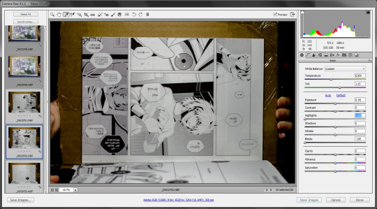
Once you’ve got the blacks as black as they should be, you’ll probably notice that the bright areas are too bright. Grab the Highlights slider and drag it down to return some detail to the lighter regions.
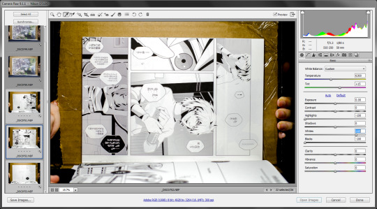
We don’t want the whitest regions to be less than pure white however, so next, adjust the Whites slider up until they look right.
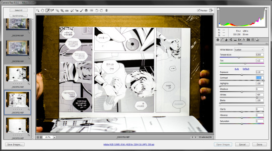
This scan didn’t need Shadows adjustment, so I skipped it and bumped the contrast instead.
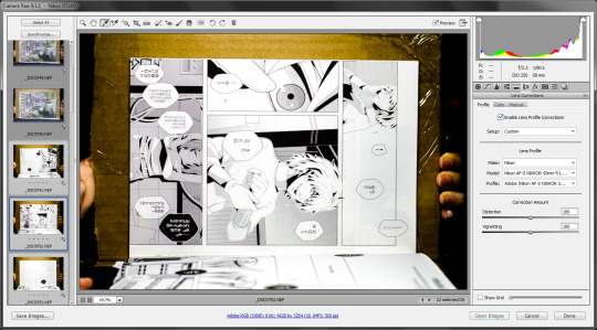
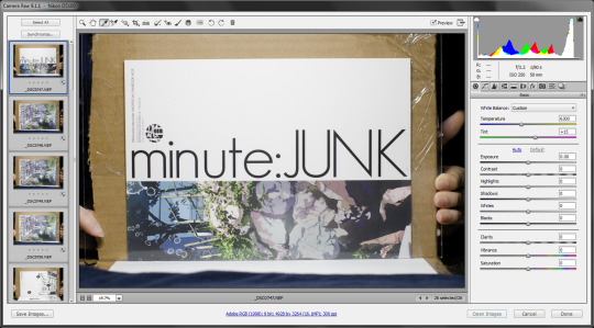
If you were to try and crop the pages here, you might notice that the edges don’t seem to be totally straight - they follow a very slight fisheye effect due to the lens distortion from the camera. Select All pages again, then flip to the Lens Corrections tab and check the ‘Enable Lens Profile Corrections’ checkbox.
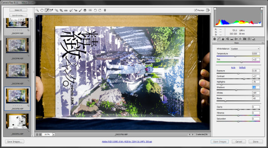
Now select only your cover pages and repeat the same steps as above. You can also play with the vibrance and saturation sliders to adjust the intensity of the colors.
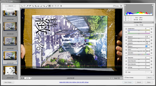
If you happen to get an edge reflection or some other kind of local effect you’d like to get rid of, you can use the Graduated Filter tool to apply most of the same effects you just used to a specific zone of the image instead. In this case, I had a bit of reflection on the lower edge of the cover page, so I used a Graduated Filter effect with darkened shadows to mute it.
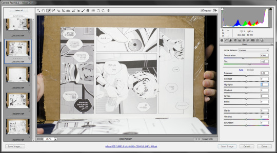
Before we finish, let’s take advantage of the RAW import dialog to rotate our pages with hotkeys. Start at the first page and press ‘L’ or ‘R’ depending on which way it’s oriented (if you hit the wrong one just press it again twice to rotate it to the correct orientation). Then, hit the down arrow to get the next picture, rinse, and repeat. L, down, R, down, L, down, R, down…
Once they’re all rotated correctly, hit ‘Select All’ one more time and then ‘Open Image’ to open all the shots in Photoshop.
Photoshop time
If you didn’t shoot in RAW, you’ll still be doing all the same steps here as if you would otherwise - you just might be need to be a bit more picky and intensive while doing so since the controls aren’t quite as fine.
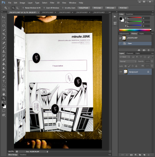
Oh no, your camera setup wasn’t completely square and perfect. That’s what the Lens Correction tool is for! Even if you checked the box in the RAW import process, you’ll still want to use this tool (in the Filter menu) to straighten and adjust your pictures.
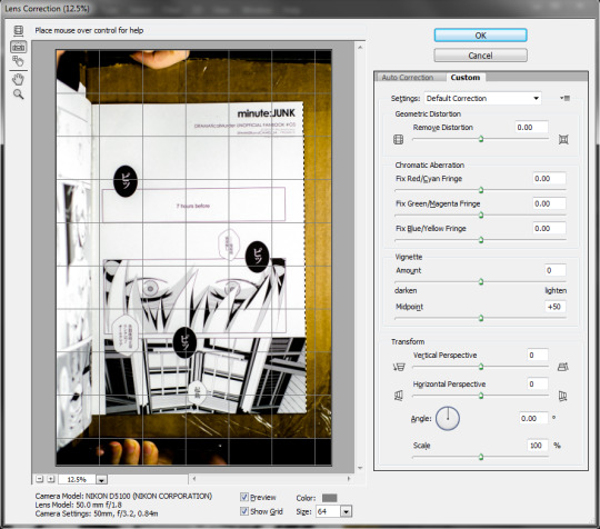
The default tool should be the ‘straighten’ tool which will micro-rotate your picture according to lines you draw that are supposed to be true vertical or horizontal. For instance, in the picture above, I selected the right edge of the book which wasn’t perfectly vertical.
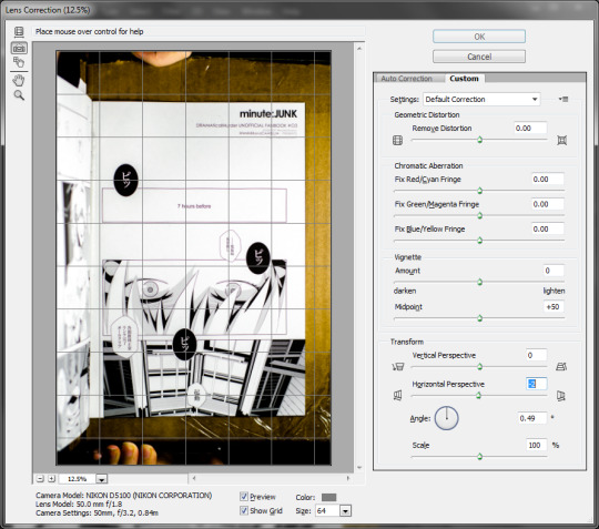
Next, once the rotation is corrected for, it’s easier to see how the top and bottom edges were slightly trapezoidal (due to camera positioning optics). Drag the Horizontal Perspective slider left or right to correct the perspective until they’re as parallel as you can get to the guideline grid.
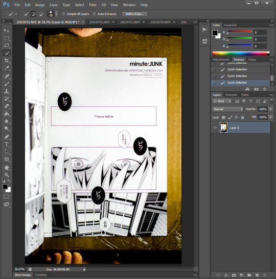
Now that the page is nice and square (it’s probably still not perfect, but that’s alright), it’s time to crop it down to just the page. You can manually use the crop tool on every page yourself, but I’ve found a fast and easier way to do it is by using the Quick Selection tool (W) to select the four corners of the page and then hit the Crop tool hotkey (C) to snap the crop region to the selection extents. At this point, you can either micro-adjust the crop borders here, or just hit accept and then zoom in to each side one by one to pull the borders in so none of the background remains.
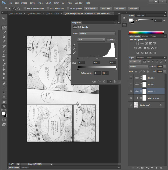
Your page might look nice and black-and-white already, but let’s make sure it stays that way by quickly adding a Black & White adjustment layer.

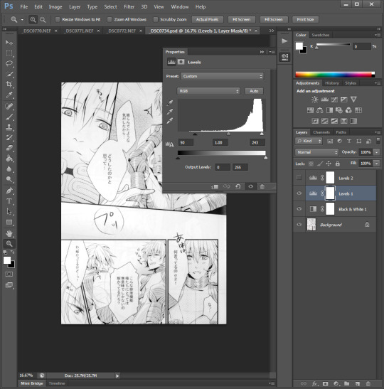
Next, add a Levels adjustment layer. The graph represents an intensity histogram of the pixels in the image, and since this shot came out so nicely in the RAW import process there’s not much more we need to do to it - just drag in the black and white sliders a tiny bit.
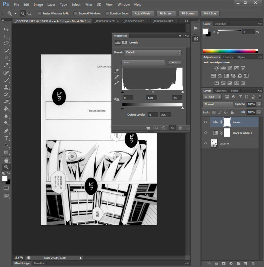

If you didn’t have as much luck in the import step, or if you can’t shoot in RAW, your graph might look a bit more like this - showing that your peak whites aren’t fully white, and your blacks are a bit lighter than black. Drag the sliders in to match the horizontal extents of the histogram.
As good as your page might be looking already, there’s probably some lighting asymmetry or other artifacts that are starting to show up as you refine your image. In our case, the top of our image didn’t get quite as much light from our lamp as the bottom did, so it’s just a smidge darker.
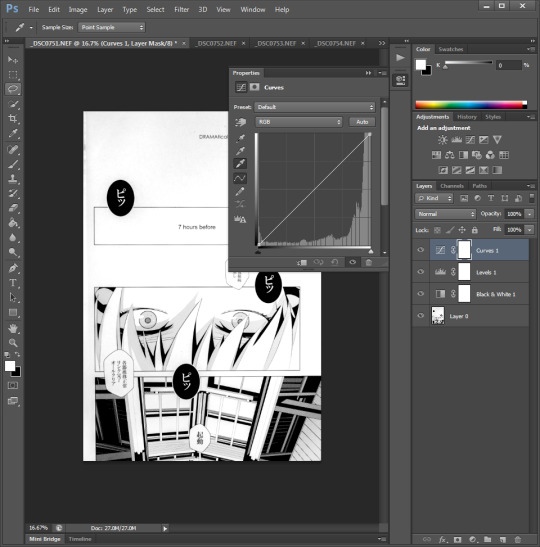
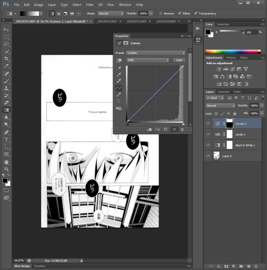
Add a Curves adjustment layer and click the white eyedropper tool on it to sample a point that should be pure white.

Unfortunately, when we did this it started to bleach out the faint shadow on the character’s face in the mid-lower panel. Fortunately, each of these adjustment layers comes with a mask we can tweak to customize what parts of the image they affect. If we use the gradient tool to make a vertical on (white)/off (black) transition, then the top gray gets lightened while the lower gray stays as it is.
Do a final check around the edges of your scan. Sometimes if you didn’t crop enough there can be some light imperfections in the edges. You can usually correct them by zooming in and either using the crop tool or the paintbrush to make them perfect.
Once you’re satisfied with how your post-processing turned out, be sure to save a native photoshop file keeping all layers so you can go back and adjust if you need to (such as, if you figure out a better adjustment formula). If you’re planning to continue on and make a full scanlation of your doujin, you’ll use them in the final step of erasing the original text and adding in our own. If not - they’re ready to post or email to a translator.
Now... go forth and scan!
6 notes
·
View notes
Text
New to Krita Quick Tips
AKA things I wish I would have read/figured out when I first started using it months ago! Krita is a free and open source art program of wonders. Downloadable for Windows, Linux and recently Mac! They have a Tumblr
Stablizer
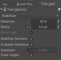
Krita has one and it’s built in! It’s BUILT IN. Pretty sure some other programs still make you get an extention. There are several options in the dropdown in case you don’t want it (default) or want smoothing instead. I have not played with smoothing but the stabilizer is a godsend. My personal main line preferences above, you may have to turn it off for small details or remove the delay. It will not make your lineart pefect but if your hand is just a bit shaky it can help you redraw that same line a few less times before it feels right.
References
Settings->Dockers->Reference Images and Check that box!

It shows up with my color selector dockers. The little dropdown with a house is where you will browse for your images. Default for me is the home/pictures location. Double click the image you want to use as a reference. You will have to double click each one but you can grab them all from different folders if you like!

Once you have the images you get this view. The dropdown with file names is how you switch between images. The little icon next to it lets you zoom in. The arrows and you can flip through them in order. What you can’t see is that it actually gives you a color dropper when mousing over the image at well! I’ve only gotten it to work with flat images.
Fill in Flats
Fill in flat colors easily?

Grow selection by x in order to get past the edges of your lineart. Also useful for other fill options.
Tiling and New View

I know it’s blury I wanted to keep image sizes small. So lumping these two together, how to title without doing it manually and how to get a new view of the same image.
Tiling: Make sure in Settings->Config->General->Window you have Multiple Documents Mode set to Subwindows. Go to Window->Tile and you’re done. It will use the currently selected window as the main window, all windows currently open show up when in the Window menu and the checkmark is the one currently selected for easy shifting. Newly opened windows will not shift tiling.
New View: This I got from a post I can’t seem to find but it’s somewhere in Krita’s Tumblr as they answered a question about it. Window->New View->File Name. Anything done in one view shows up in the other, so you can work on details but see if they look right over all. The two images to the right are two views of the same one image.
Patterns

Take a normal image and hit W
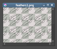
W just gives you the view in which you can better manipulate the pattern. Something to note is that it doesn’t work so well with transforming things. I generally create the pieces for the pattern and make the appropriate copies. Hit W and roughly move them around or transform them how you think the pattern will work, they will probably get cut off this way. Un W yourself. Use either the origonals or new copies and rotate how I I had roughly laid them out (making sure they are all 100% visible in the canvas space). Hit W again and move them into place. There may be a better way but I haven’t found it yet.
You can add these to your patterns either by saving them as png and importing them or through the quick add. Just click the little pattern square next to your gradient and the first tab will let you import. The second tab is quick add. Make sure you are Un W for both.
These are the main things I would have liked to know when I started out. Below the cut will be some random other things.
Palette
Setting->Dockers->Palette

I, for one, just like having one if I want to quick pick colors. The little icon in the bottom left lets you select different palettes like websafe, pixel art, photoshop, or make your own and save it.
Canvas Tweeks
Settings->Config->Display
If you saw in the above pictures my area around my canvas is a light purple color. This is a preference to the default that I can’t remember anymore. This is found under Canvas Border color. My squares are also slightly off color which might be harder to see. They are a slight green and red color instead of grey and white. These fall under Transparency Checkerboard Pattern and help a bit when coloring/hurt my eyes less. Green: #babdb6 Red: #e0d9d9
Brushes
This is my last little personal “tweak” off the top of my head. The brushes Krita comes with are actually exceptionally useful. All my lineart is done with the preloaded inking pens. (And flat colors with the fill brushes)

Ink brush makes wide lines that look a bit like painting. I favor this one the most.Ink circle looks a bit pixely but is a nice style for simple things or sketch-like images. Ink Gpen looks like my inking would if it were on paper, good for more controlled lines.
*Plug time*On top of the defaults I also use brushes from David Revoy, specifically the brush kit v8. These are a bit hard to show. 1f draw brush is what I use for most of my basic sketches. It’s like a really soft pencil. 1e rigger is what I use if I’m going to give a sketch a cleaner style. It’s like the sharp tip of a pencil. A lot of other brushes are good for shading. Many have low opacity so you’ll need some kind of color layor under them, even just white. The blenders are excellent. As are the stamps.
Also make sure to check out his site as it has other Krita tips, tricks and updates!*End Plug Time*
That’s it, those are my super beginner tips from a fellow super beginner. Hope they help! (Yes some of these things are in the Krita highlights but I missed them so others might too) Also remember the community of Krita is awesome!
#krita#quick tips#artists on tumblr#art problems#what do i tag this as#it's not really a tutorial or anything
43 notes
·
View notes
Text
TIC UNIT FOR SALE | 246 1/2 Park View Street | $549,000
1923 Detached Spanish-Style Bungalow | Private Yard
246NParkViewrear.com
This 1923 detached bungalow abounds with original details and is surrounded by an abundance of private patios and paths. The living room is bright and airy with a period built-in bookcase, charming kitchen with vintage cabinetry, an antique stove and light pouring in from the large dual paned windows encased in original trim. Through the laundry room, which comes with stacking W/D, is an exit to the rear deck/patio. This boxy 728 square foot home comes with two bedrooms and an updated bath with period five-panel doors and delicate glass knob hardware. This unit comes with 250’+ square foot additional structure which could be used for storage or converted to office space. Spacious grounds, mature trees and patio space with parking for two off street in the driveway. Intimate 3-unit HOA with low monthly HODs which feels like a single family residence.
Located in the Historic Filipinotown neighborhood, adjacent to Echo Park. With lots of up and coming eateries, bars and cafes – including Doubting Thomas a block away (cafe, restaurant and bakery), Gigi’s Cuban bakery and restaurant, Jonathan Gold approved Porridge and Puffs, Tactile Coffee, The Clark Bread Company, Vaka Burger, Genever, and more.
TIC sale with financing available – with as little as 15% down thru Sterling Bank, Henry Jeanes, [email protected].
(function ( $ ) { "use strict"; $(function () { var masterslider_d017 = new MasterSlider(); // slider controls masterslider_d017.control('arrows' ,{ autohide:false, overVideo:true }); masterslider_d017.control('bullets' ,{ autohide:false, overVideo:true, dir:'h', align:'bottom' , margin:10 }); masterslider_d017.control('thumblist' ,{ autohide:false, overVideo:true, dir:'h', speed:17, inset:false, arrows:false, hover:false, customClass:'', align:'bottom',type:'thumbs', margin:5, width:120, height:120, space:5, fillMode:'fill' }); // slider setup masterslider_d017.setup("MS5b8da7484d017", { width : 615, height : 500, minHeight : 0, space : 0, start : 1, grabCursor : true, swipe : true, mouse : true, layout : "boxed", wheel : false, autoplay : false, instantStartLayers:false, loop : true, shuffle : false, preload : 0, heightLimit : true, autoHeight : false, smoothHeight : true, endPause : false, overPause : true, fillMode : "fill", centerControls : true, startOnAppear : false, layersMode : "center", hideLayers : false, fullscreenMargin: 0, speed : 20, dir : "h", parallaxMode : 'swipe', view : "basic" }); window.masterslider_instances = window.masterslider_instances || []; window.masterslider_instances.push( masterslider_d017 ); }); })(jQuery);
Details
246 1/2 N Park View Street, Historic Filipinotown
2 BED/ 1 BATH
SQUARE FEET: 728 SQ/FT
LIST PRICE: $549,000
For more information, contact Listing Agent:
Liz McDonald, Broker TRG Realty Company, Inc. The Rental Girl Sales 323-313-5780 Cell [email protected] BRE #: 01449897
MORE FROM THE RENTAL GIRL ON TIC OWNERSHIP:
Read more about TIC ownership HERE
View all our current TIC offerings HERE
View The Rental Girl’s current properties for sale HERE
Visit Andy Sirkin’s website for more research on TIC sales HERE (Andy is the TIC attorney who pioneered TIC sales in the early 80’s in San Fran. His website has a wealth of info on TIC ownership).
Interesting in purchasing a TIC? Contact an experienced TIC Realtor®
Elizabeth McDonald, Broker & TIC Specialist [email protected] TRG Realty Company, Inc. The Rental Girl 323-313-5780 / Cell BRE Lic #: 01449897
ABOUT THE RENTAL GIRL & HOW WE GOT INVOLVED WITH TIC:
The Rental Girl (therentalgirl.com) is a full service Real Estate brokerage specializing in residential leasing and sales. We have been serving renters and landlords since 2004. We work with thousands of Los Angeles renters each year, and many of these renters are qualified to buy, but can’t afford or find a home in a neighborhood they want to live. In 2016, a client of ours introduced us to TIC ownership and we saw immediately how many renters and entry level buyers in LA could benefit from a TIC market here. We met with Sterling Bank, who was working actively to pioneer a TIC market in LA, and other San Francisco vendors. And so began our research on TICs. Since then, we have helped bring many TIC units to the market, and we have many new TIC communities coming soon. With every new TIC building that hits the market, more renters, landlords and realtors are discovering TIC sales and the TIC movement is growing rapidly. We love to share our accumulated knowledge, and support our real estate colleagues, landlords and renters and the TIC community.
The post TIC UNIT FOR SALE | 246 1/2 Park View Street | $549,000 appeared first on The Rental Girl Blog.
from theokbrowne digest http://rentinginla.com/tic-unit-sale-246-1-2-park-view-street-549000/
0 notes