#the gradient effect i have in the middle i did using the color dodge tool.
Explore tagged Tumblr posts
Text
a small clip of a fire.
#drawing fire is addicting#i have a sketchbook full of fire#and with good reason (reason is that i love fire)#made with krita#the gradient effect i have in the middle i did using the color dodge tool.#2d animation
2 notes
·
View notes
Photo

Hey! So a lovely anon asked me how to make Halloween icons. I’m gonna show you 3 possible ways of doing so, keep reading...
First thing you are gonna need is your picture & remove the background, I’ll be using this .png pictures of Evan Rachel Wood by southsidepngs on DeviantArt.
ICON 1
After removing your background, move your png to the canvas you’ll be working on, mine is 100x100px then get the texture you’ll use for you background, I used one from this pack by @cristalcarrington.
I applied a reverted B&W gradient map to turn it into this:


Then merge the layers, drag it to your canvas and set it to soft light and lower the opacity to whatever you see fit.


Drag your picture to the canvas and resize it, I applied a light texture set to soft light with the opacity set to 68%

To achieve the effect given by texture on “Layer 3″ you can use a gradient and set it to soft light as well and adjust the opacity to what you like.
Apply your psd, I used “Psd173″ by soundsofineedyou on DeviantArt.
I moved my psd below the light texture and this is my result:

I also added some sharpen to my png.
ICON 2
Create your background once again, drag your picture, apply your coloring, you should have something like this on your layers:

and your canvas like this

now add whatever you like to it, I added the Witch hat below, I googled “witch hat”

I removed the background & then added a gradient map to change the color of it, you can do so by clicking this icon

at the bottom of your layers box, then select gradient map

choose one of your preference

(You can download gradients here.)
then click ok and put your cursor in the middle of your gradient map and your hat while holding “Alt” then click and your layers should now look like this:

You can use this technique to change the color of anything you want, like we did with the texture on the ICON 1 part.
Now drag it on top of my picture, adjust it (by using CTRL+T or Command+T) as much as I could and I got this result:

P.D: if some of the hair or whatever comes out of the hat, just erase it with the eraser tool.
You can also add cat whiskers, I got mine from this pack by @wildfireresources

You could add angel wings, I used this one here , drag it under my picture and resize it using CTRL+T or Command+T

Or demon wings:

You can also add a texture for dramatic effect:

I used this texture

set to screen. I don’t remember where I got this texture from so I can’t share the full version. ( If you are the maker of this texture, please let me know so I can credit you.)
Or you could use some fire, I used this stock set to screen:


Just play around! don’t be afraid to experiment.
ICON 3
For this one we are gonna do a bit more of editing, we gonna make Evan look as creepy as we can, duplicate your picture and let’s get to work...
P.D: I recommend you to change the name of the layers to whatever you are working on for example, I’ll name the next one “eyes” cuz’ we’ll be working that area.
1) First we gonna go with the eyes, zoom into your picture and select the dodge tool

make your brush small

and pass it through the part you want to “light up”
before

after

continue until you are pleased with the results, then with the burn tool you are gonna go over whatever you want to make darker. I wanna make her eye makeup a bit heavier so I’m gonna cover that. Remember to duplicate your layer again in case you wanna go back and remove it, this is how my layers look so far:

After using the burn tool:

2) I’m also gonna pass the burn tool through her eyebrows

3) I want her lipstick to be darker, what you gonna do is create a new layer by clicking this icon at the bottom of your layers panel and rename it

with a dark color and a small brush, paint over her lips

change the blending mode to multiply & adjust your opacity to whatever you prefer


4) Create another layer and name it “cheekbones” with a brush we are gonna paint over the part of her body we want to exaggerate.
With the eyedropper tool, we are gonna take a color sample of the area we are going to paint

Set your layer to multiply, lower the opacity

I’ll do the same to hew jawline


5) I wanted more contrast so I applied a B&W gradient map set to color burn with a 15% opacity

6) If you want to make her skin more dull, add a vibrance layer

select your layer mask

and with a black brush paint the parts you want to exclude from the vibrance layer

I painted over her eyes, hair, clothes & lips.
before

After

6) If you want some veins you can google it, this is the one i found

I made them red by using a gradient map (like we already showed on ICON 2)
created a layer mask by clicking this icon

while I had the layer selected

then with a black brush, remove the parts you don’t want to show, I also reduced the opacity to 47%

7) flatten your image, drag it to your canvas, resize & sharpen

+ This is how I sharpen my icons: Duplicate your layer> Filter>Filter Gallery> artistic> Paint daubs

My settings

Lower opacity to 70%
8) For final touch I applied a lighting png set to screen, I used this one

The end result:

Well that’s all folks, hope it helps (and that you understand, lol pardon my english), have fun experimenting!
Go get your resources & tutorials for #Halloween🕸🎃
121 notes
·
View notes
Text
Mobile Editing for Beginners!
I was out for a run last night through the park next to my apartment, and I had to stop because the light was just TOO GORGEOUS. Golden hour should be illegal here. Honestly I’m not sure I’m capable of getting anything else done when there are photos that could be taken!
Anyway, since I was running, I only had my phone on me, so that’s what I used to grab a few quick shots. It seemed a little counter-productive to move them to my computer for editing, since they’d have to come back to my phone to share on Instagram anyway, so I decided to edit on my phone when I got home.
Hello, Snapseed! I’ve been hearing good things about this app, but I haven’t had a reason to use it ‘til now! I thought I’d share a guide/review of the app and quick overview of how I edit my landscape photos.
Disclaimer: I’m an android user. The interface should be very similar for iphones, but if you find any differences, let me know and I’ll update this!
When you launch the app, you’ll get a screen that looks like this. When you tap it, it’ll take you to your gallery to pick a photo for editing.

Once you’ve picked an image, you’ll see three options at the bottom of your screen: Looks, Tools, and Export. Looks are like Instagram filters, the Tools menu contains all of the individual options for editing, and Export is how you save your results. We’re going to focus on Tools for now.
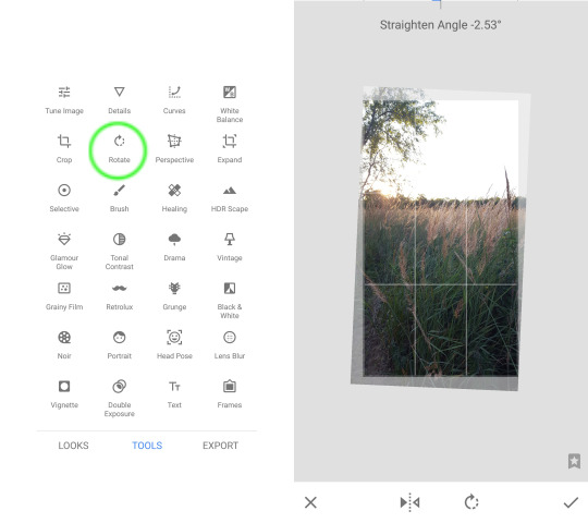
My first step is always to adjust the angle. I know I don’t want to share it with a crooked horizon, so I fix it right away so that all of the later steps look closer to what I actually want to share.
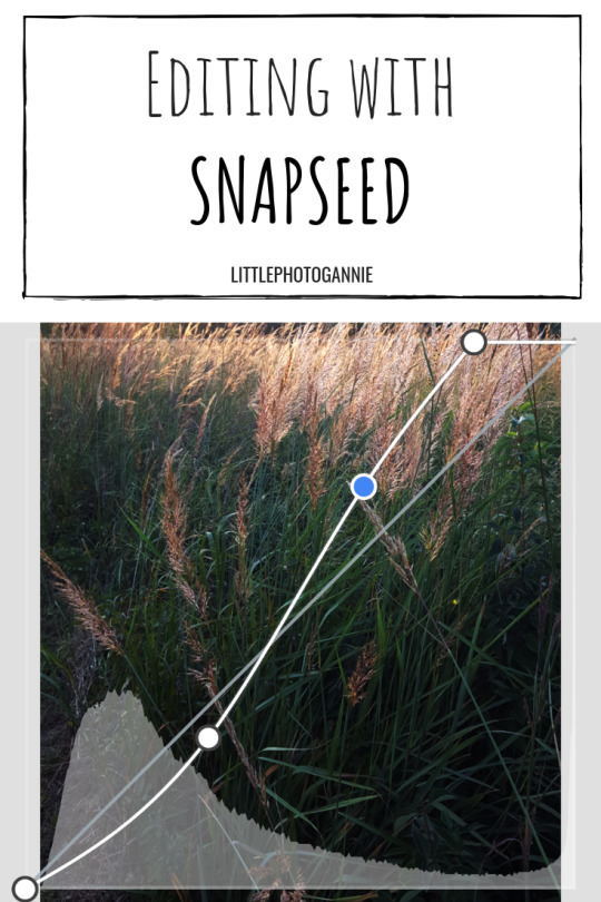
Next, I adjusted curves (this link has a pretty good overview of editing with curves in general). When you open this setting, you’ll see a diagonal line across the image (the curve) and the histogram across the bottom. I think histograms probably deserve a post of their own, but the quick version is this: Divide the chart into thirds. The left section shows your shadows, the middle section is for midtones, and the right is for highlights. I like to think of it as peaks showing the most dominant tones and valleys showing the least dominant tones. What you want is for the peak to be somewhat balanced over the midtones and spilling into shadows/highlights. My image was underexposed, so the histogram is skewed to the left (more intense shadows).
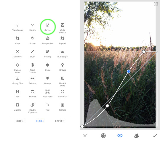
You can add handles to the curve by tapping it, and drag up or down to edit the shape. This “S” shape is pretty common; it brightens highlights and darkens shadows, which really makes images pop. I’d suggest playing with the options to find what works for your style! If you need to get rid of a handle, you can tap and drag it off the bottom of the chart. If you move the top-right or bottom-left handles, you can adjust the “pure tones” in the image. Basically, sliding the top-right handle toward the center makes more pixels pure white, and sliding the bottom-left handle toward the center makes more pixels pure black. There’s no reason you have to adjust all these things every time you edit an image, but the option is there if you want it.
I bumped up the highlights, dropped the shadows, and added a little more white because I wanted to really show the light coming through the tops of the grass.
Next, I went for the white balance. There are two main tools here: temperature and tint. Photography rules say you want your whites to be white (such as clouds, someone’s teeth, maybe a blank wall, etc.), and white balance (aptly named) is how you can get there. Adjusting the temperature slider will make your images “warm” (more yellow/orange) or “cool” (more blue). I usually make my photos a little warmer than the “correct” value, but it’s all personal preference.
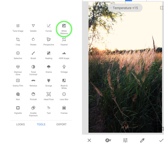
If you have to make any dramatic adjustments to the temperature, you may end up with a different color tint. That’s where the tone menu comes in. You can use the slider to add more pink or green to even out the image.
I decided to try out the Details next (top row of the tools menu, second from the left). I’ve seen basically the same feature under different names in different programs. Increasing detail (structure) acts like a Sharpen feature; decreasing detail acts like Soft Focus. Here’s how it looked (the center image is from the last step of my white balance edits, so no detail change is applied):
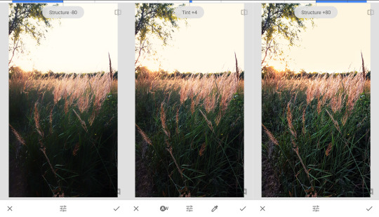
I liked a little bit of the softer look here, so I set it to -20.
The other important menu here is Tune Image. We accomplished pretty much all of the changes you could make here by using other tools, but if you’re more comfortable with this interface, use it! Brightness, contrast, ambience (add light to entire image), highlights, and shadows can be covered by the Curves edit. I use Curves because there’s more of a gradient in how the effect is applied (remember the “S”?); with Shadows/Highlights, it’s all or nothing. Warmth is covered by the White Balance menu, which, again, gives you more options to control the result. I did nudge the saturation up just a tiny bit for some more punch to the orange tones in the tops of the grass.
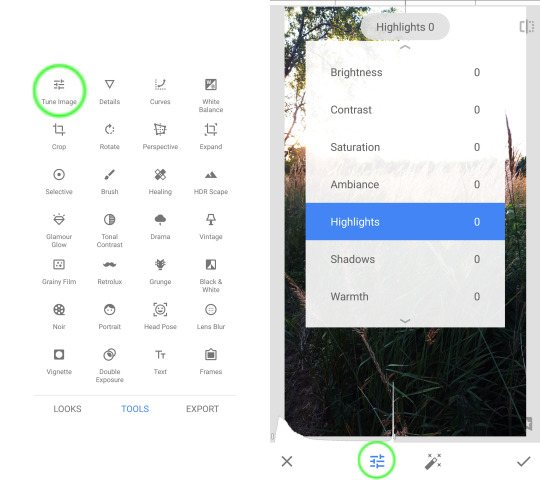
We’re almost done! If you want to go back and change any of the edits you’ve made, tap on the image options icon in your top toolbar (it looks to me like sheets of paper and an arrow) and then select “View Edits.”
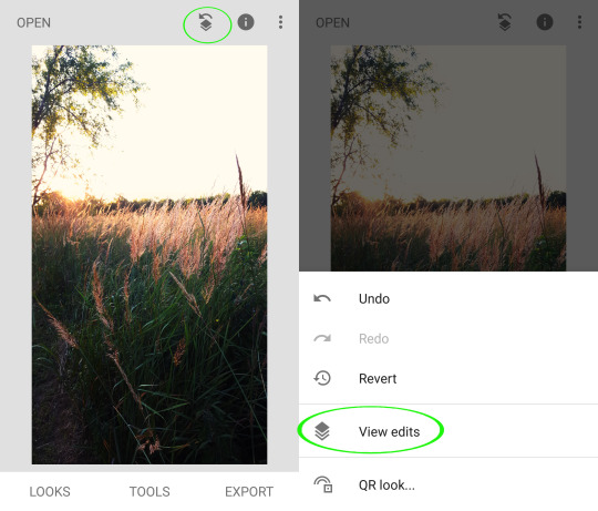
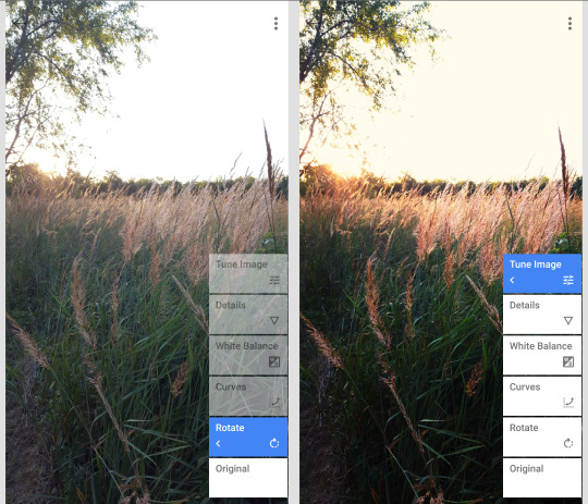
Here you can see all of the changes you’ve made to your image, and you can adjust them if you’d like! You can also go through it step by step to see the change between each edit.
And we’re done with this photo! I decided to save my changes as a preset. To do that, go to the “Look” menu, scroll all the way to the right, and tap the plus icon. Here’s how it looked applied to another photo I took that night:

If you want to try out the filter (Look) I made, you can find the QR code here. (You can add it to your image using the button right under View Edits)
All in all, I’m pretty impressed with this app! I like that it has plenty of options for different editing styles with traditional tools like curves and white balance but also more modern additions that probably look more familiar to instagrammers and the like.
Would anyone be interested in a Part 2 of this tutorial? Maybe a portrait-centric version? There’s so much more to this app than what we’ve talked about here! Masked editing, dodge & burn, black and white photos....
As always, if you’ve learned something from this (or any other post!) and you want to share, tag @littlephotogannie or use #littlephotogannie on Instagram! I love a good before and after from post-processing. Happy editing!
#editing#mobile photography#phone photography#photo editing#snapseed#mobile editing#how to#photography for beginners#tips
7 notes
·
View notes
Text
Task 2
Introduction
In task 2, I am asked to begin prototyping my user interfaces and post any idea generations or concepts I create. pre production is essential as I can better visualise what I want to create and draft it and then fully implement it into unreal engine. This is especially important for the industry as when you have other people working on the same project, The pre production is how you can share the vision and general idea of what you’re trying to create.
I’ll also take into consideration human factors during this process.
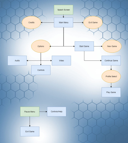
Here’s a simple flowchart detailing the way the menu system will direct the player into the game. It begins with a splash screen during the loading process. This gives the player a visual queue that the game is starting up. Then the main menu is opened with the following options:
Start Game > Takes the player to additional options
Options > Lets the player change game options
Exit Game > Exits the game application
Credits > Plays Credits for the game
If the player selects ‘Start Game’ they are then asked to either choose between starting a new play through or continuing from a previous save. Upon selecting start game the main menu will unload, the level will load and the player character will spawn.
Whilst playing the game the player character can pause and find an additional window detailing the player controls. The game can also be exited from this menu. I’m planning on having the player controls in the pause menu as it can be accessed at any time. Fighting games in particular like Mortal Kombat are notorious for having long combos that you have to remember and navigating the menu to find them is annoying. I want to avoid that in my game and have the pause menu be direct access to the control list.
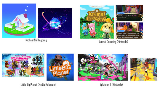
Whilst looking into some potential colour themes for my game I came across an artist and game dev called Michael Shillingburg who has a really unique and colourful style that I love. His great visuals would be perfect for a game aimed towards children and so I’ll definitely be looking at his work for inspiration when developing visuals for my project.
I also found an interesting detailing the differences between photo-realistic and stylised game worlds. I’ve decided to go towards a minimalist stylised approach and this needs to be seen in my menu/hud too.
‘The significant difference between realism and stylized is that with realism you are restricted to making things look ‘real’ while enhancing their visual language. With stylized you are free to play with the shapes and colors, exaggerate or remove details to enhance the look and feel in any direction. Doing so with realism would break the illusion of reality as it wouldn’t be viewed as what we perceive to be as ‘realistic’, it would not belong in our world.’ (Aava, 2017)
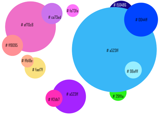
I created a colour pallete in photoshop by using the eyedrop tool and taking colours that I liked from art in my moodboard. There are a lot of colours however this is spread across the game environment, particle effects and UI/UX so not all of these colours will be seen all at once. Instead they’re spread across different environments to not overwhelm the player.
Game Title


Here’s my concept title graphic for my project. I also created an animated GIF to visualise how I’d have the title animate in game. A good use of this animation would be during a splash screen/loading screen. The pulsing animation gives the player visual feedback that the game has not frozen and it’s just taking a moment to load the next area. I chose the name BabyBot as most games popular with younger audiences have short names because they’re easier to search for online like ‘Fortnite’ or ‘Splatoon!’. The alliteration also makes the name easier to remember.
To create this graphic I simply typed up the title ‘Baby Bot’ changed the leading of the font to reduce the space between the words then I went into the effect and gave it a thicker stroke. I chose pink and blue as they’re both colours that are common on my colour palette.I like how the gradient creates purple in the middle too.

I then used the timeline tool to create 5 frames of the stroke reducing and enlarging. This gives it the movement.

I’ll use what I learnt in the future when creating animated features of my menu system. As I concept more of the projects assets I’ll also stick to a general aesthetic so it all blends together well.
My main inspiration for the title was LittleBigPlanet and it’s similar use of bold colourful fonts. I chose the name Baby Bot as it’s short, uses alliteration and refers to the robot characters which use baby like proportions which are common in cute characters. (Large Head, short limbs)
HUD Draft
I’ve created a draft for my HUD for my project.
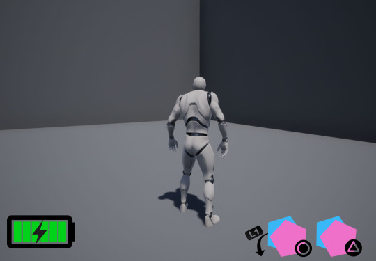
I’ve drafted a health bar and ability interface so far.

Here is a gif showing my concept for the ability interface. The player character will have four abilities that they’re able to activate with circle or triangle. They can hold L1 to activate the alternative ones. The symbol representing each ability will move forward to make it clear to the player what button activates what ability.
When the abilities are on cooldown the symbol will become transparent and then pop back into full opacity when it’s ready to be used again.
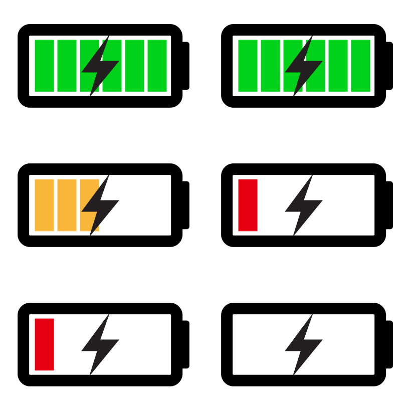
Here’s a gif showcasing my idea for the players health bar. As it’s a robot I thought it’d be fun displaying the health as a battery. As the player loses health it decreases and changes from green to orange to flashing red. This uses colours to represent the players health without relying on numbers. I have chosen this because younger demographics such as children will be able to see at a glance the characters health without having to stop and read text or percentages.
Splash Screen
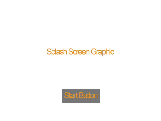
Here is my wireframe. I took inspiration from games in my moodboard such as animal crossing. The splash screen in animal crossing is the game title with a simple (press start) button underneath. I will follow a similar format for my splashscreen.
I then went into photoshop and created my finished concept from my wireframe.
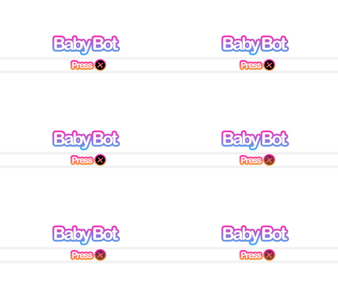
Here’s the splash screen which will prompt the player to press X to continue. I might add additional information like a company name or a project build. The reason why I changed ‘Press Start’ to ‘Press X’ is because I’m building this project with the playstation controller in mind and children will have an easier time finding the X button rather than the start button.
Main Menu
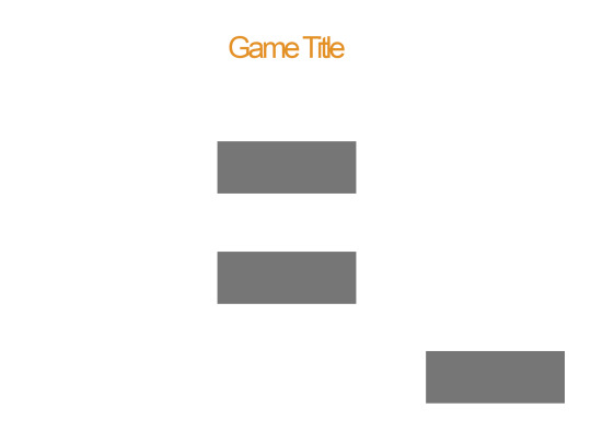
I’ve drafted up my main menu with another wireframe. I plan to have three buttons which I planned before in my flowchart. Start, Exit and Credits. After creating my wireframe I then went into photoshop and used the 1920x1080 resolution as that’s what’s most common at the moment with monitors. I tried to keep withing the blue guidelines provided by Photoshop.
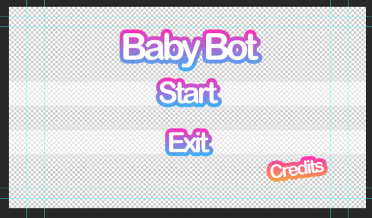
It’s a transparent background so it will showcase the game environment behind it. I’ve chosen a transparent background to give this menu a clear difference from the splash screen.
Here’s a GIF showing how the player will scroll through the options.

I like showing the exact button itself as it leaves no room for confusion on what the player needs to press. I’ll add a sound such as a click whenever the player scrolls through different options to give an additional indicator that they’ve moved their selection. When adding sounds to a game however it’s important to think about how often the player is going to be hearing that and if it’s going to annoy them. That’s why you don’t want anything set too loud or shrill.
Credits Screen
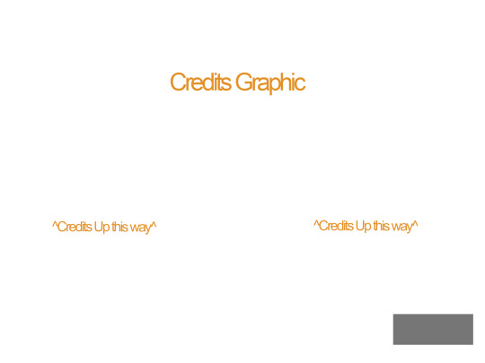
Here’s a draft for the credits screen. I kept to the same structure in my wire frame except that I moved the title slightly lower and larger so it overlays over the moving credits. I did this because the slow pulsing animation on the title is pleasing to look at.

Pause Menu
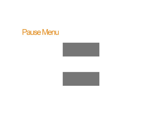
Here’s the pause menu when the player presses ESC or Option/Start. It has a transparent background and two large buttons. When creating my concept in photoshop however I put a slight angle on pause to make it appear more playful.
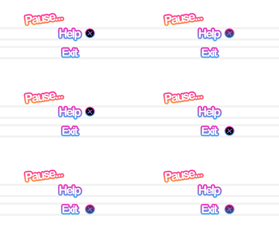
The widget will come to the viewport and blur the gameplay behind it. This is so the character can still see what’s happening onscreen even when the game is paused. They’re also able to open up the help menu which will display the character controls.
Controls Menu
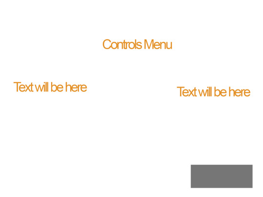
When the player selects help the player is taken to this menu. When creating the wire frame I went back and looked at the credits menu and kept to the same format. This is to simply keep the menu system to a similar structure as I don’t want every page being wildly different. Games in the industry usually have a set style and stick to it throughout which I what I’m aiming to do.
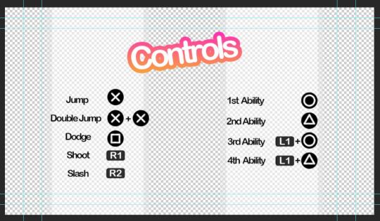
Here’s the controls menu to remind the player how to use their abilities. I added the transparent white walls so the black text stands out more. The rest of the screen will show the game environment behind it. The title “Controls” is also animated as you can see from this GIF.

In-Game Dialogue
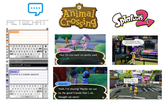
Here’s a moodboard of some ways of displaying text which I think will work well with the style I’m going for. I like the vaporwave aesthetic which often appropriates styles from 1990s-2000s. I’ll keep these three in mind when designing my dialogue display.
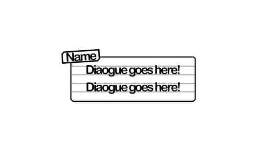
Here’s my draft dialogue box that’s heavily inspired from pictochat but I made the name box larger and off centre similar to animal crossing. I’ll also have different colours for the different character so it’s clear who’s speaking. I’m tempted to have the white background on the box slightly transparent so it doesn’t obstruct the players view of the game.
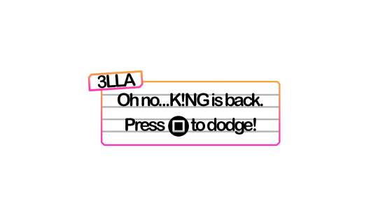
Here’s a draft dialogue box for sidekick character ‘3LLA’ (pronounced Ella) as she warns the player of the antagonist’s return and reminds them how to dodge attacks/dangers areas.
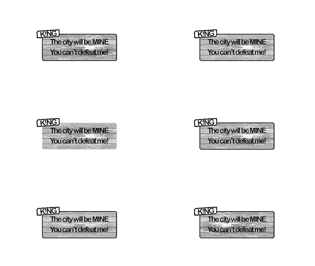
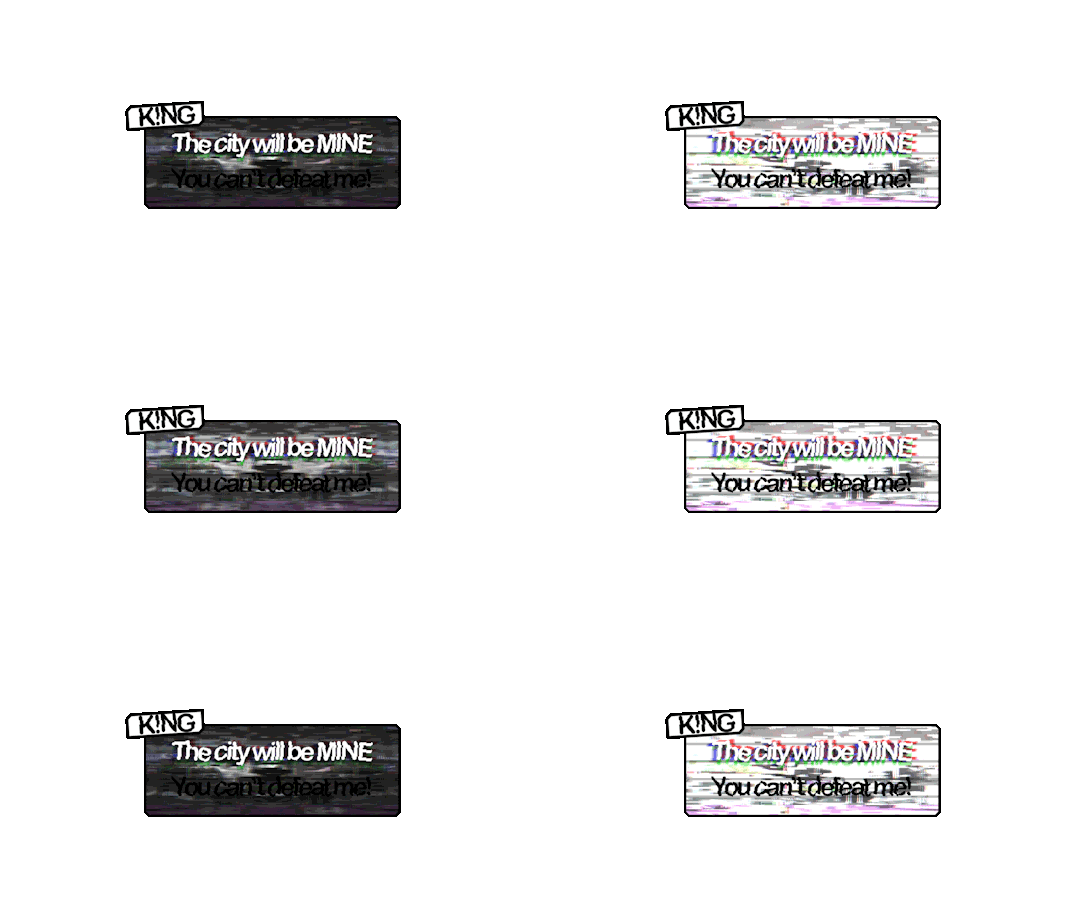
Here’s a draft one for K!NG who’s a malfunction buggy robot who acts as the main antagonist. I wasn’t too happy with this as I felt it was a little bland. I decided to go back and use filters such as offset and wave to mess up the text. I also made duplicates and switched off parts of the RGBs to get the shadows behind the first line. I like how the white text stands out against the background. I’ll use this method to create the distorted glitch affect for K!NG’s dialogue.
I’ll be having recorded voice lines playing alongside so I’m not too concerned with it being hard to read as it’s kind of the point with K!NG. None of his dialogue is informative to the player anyway rather it’s just ramblings of a mad robot.
Evaluation of Task 2
I enjoy pre production as it helps me organise my thoughts and ideas on the current task. It allows me time to look at games in the industry and select what I like and don’t like. I looked at games suited towards the same demographic and what I found was bright colours and simple layouts were favoured over more complex menu systems such as something you’d see in a game such as Fallout or Skyrim.
My biggest inspirations were LittleBigPlanet, Hello Kitty Roller Rescue and Splatoon. Animal crossing was also great when coming up for ideas for my in game dialogue.
Feedback I received from peers was that my idea generation was clear but to think more clearly on interactive elements I could add to my menu. I agree that an interactive element would make my menu system much more interesting. Interaction is also great for keeping the attention of younger audience which my game is aimed towards. In task 3, I’ll build my scene which will act as the backdrop for the menu and see what appropriate interactions I could add. I’m thinking of creating an urban scene to set the scene of the game from the get go. Appropriate interactive elements would be flickering lights or birds sitting on buildings which can be clicked on.
References
Aava, K. (2017). Realistic vs. Stylized: Technique Overview. [online] 80.lv. Available at: https://80.lv/articles/realistic-vs-stylized-technique-overview/ [Accessed 5 Oct. 2018].
0 notes