#the furniture looks that polygonal. it’s important.
Explore tagged Tumblr posts
Text
i sincerely don’t know if i could pull it off in the text or if it would affect the publishability/marketability but i do want all my friends who will someday read cursedwip to know that it 100% takes place in the most stereotypical grimy early 2000s city with an improbable population made up exclusively of goth-looking pedestrians and flouncy little rich boys and copy-and-paste cops with mustaches.
#watching yonks play vampires bloodlines the masquerade has solidified this for me.#THAT version of LA is where this story takes place.#nobody has a smart phone. the bartender is wearing striped arm socks. there is just Blood And Dirt Everywhere.#there are just shopping carts in the streets. exactly 1 taxi. you can hang out in the sewers.#the furniture looks that polygonal. it’s important.#*vampire the masquerade bloodlines. god what a stupid title for a game but it’s SO TRUE.#izzy.txt
8 notes
·
View notes
Text
3ds Max Models: Unlocking Your Creativity in 3D Design
Are you ready to dive into the world of 3D modeling? Autodesk 3ds Max is an exceptional tool that empowers artists and designers to create stunning, detailed 3D models that bring ideas to life. Whether you're looking for free 3D models, 3ds Max files, or want to convert Max to OBJ, 3ds Max has you covered. In this blog post, we'll explore the benefits of using 3ds Max models, tips for beginners, and how to stand out in the competitive industry.
Why Choose 3ds Max for Your Modeling Projects?
Versatility and Power
3ds Max is renowned for its versatility. Whether you're creating architectural visualizations, character models, 3D furniture models, or intricate product designs, its robust features cater to every need. The software offers a vast library of tools, including polygon modeling, spline-based modeling, and parametric design, allowing you to work in a way that suits your style. With 3ds Max, you can create low-poly models for game assets or high-poly, detailed models for renderings and animation.
High-Quality Output
One of the standout features of 3ds Max is its ability to produce high-quality renders. With advanced lighting, shading options, and PBR materials, your 3D models can achieve photorealistic results that captivate audiences. This quality is essential when presenting your work to clients or showcasing it in portfolios. 3ds Max also supports a wide range of file formats, making it easy to import and export your 3D assets for use in other 3D applications.
Tips for Creating Impressive 3ds Max Models
Start with Simple Shapes
As a beginner, focus on creating basic shapes. Understanding how to manipulate primitives will build your foundation for more complex 3D models. Experiment with the intuitive 3ds Max interface to get a feel for the tools and workflow.
Utilize Reference Images
Gather reference images for your models. This practice helps maintain accuracy and proportion, ensuring your creations look realistic. You can find free 3D models on sites like Free3D.com, CGTrader, and TurboSquid to use as references or starting points.
Experiment with Texturing
Textures can dramatically enhance the appearance of your models. Spend time learning about UV mapping and material settings to add depth and detail. The PBR 1884 Pack on Free3D.com offers a great collection of high-quality PBR materials to experiment with.
Leverage the Community
Join online forums and communities dedicated to 3ds Max. Engaging with other users can provide valuable insights, tips, and inspiration. You can also find free 3ds Max models, 3ds Max files, and modeling services shared by the community.
Standing Out in the Industry
In today's competitive market, having exceptional skills is crucial. Here's how you can differentiate yourself:
Build a Diverse Portfolio
Showcase a range of 3D models that highlight your versatility. Include different styles, techniques, and types of projects like 3D furniture models, animated models, game assets, and 3D scenes. A well-rounded portfolio can attract potential clients and employers. Consider the poly count and optimize your models for their intended use.
Stay Updated with Trends
The 3D design industry is constantly evolving. Keep an eye on emerging trends, tools, and techniques. Participating in workshops and online courses can keep your skills sharp and relevant. Stay up to date with the latest features in 3ds Max and explore new file formats and 3D applications.
Network and Collaborate
Connect with other professionals in the field. Collaborating on projects can lead to new opportunities and insights, helping you grow as a designer. Engage with the 3ds Max community, share your work, and learn from others to expand your knowledge and network.
Conclusion
Embarking on your journey with 3ds Max models can be incredibly rewarding. The software offers countless possibilities for creativity and expression. Whether you're looking for free 3D models, 3ds Max files, or want to convert Max to OBJ, 3ds Max has the tools you need. By honing your skills, embracing new techniques, and building a strong portfolio, you can stand out in the industry and make your mark in the world of 3D design.
Ready to unleash your creativity? Start exploring 3ds Max today and watch as your ideas come to life! Download 3ds Max and access a wealth of free 3D models, 3ds Max files, and resources to kickstart your 3D modeling journey.
2 notes
·
View notes
Text
What Are 3D Game Assets, and Why Are They Important in Game Development?

In the ever-evolving world of gaming, 3D game assets play a crucial role in shaping immersive experiences. These assets are the building blocks of 3D game environments, defining how virtual worlds look and feel. Whether it's characters, vehicles, weapons, or environmental elements like trees and buildings, 3D game assets breathe life into digital spaces.
Understanding 3D Game Assets
3D game assets refer to any visual elements created using 3D modeling games and software such as Blender, Maya, or 3ds Max. These models are designed with polygons and textured to achieve realism or stylization, depending on the game's art style. Some of the most common types of 3D game assets include:
Characters: The protagonists, enemies, and NPCs (non-playable characters) that drive the game's story.
Props & Objects: Items like weapons, furniture, or collectibles that enhance interaction.
Environments: Buildings, landscapes, and terrain that create the setting for the game.
Vehicles: Cars, ships, or spacecraft that players can control or encounter.
Each asset contributes to the game’s visual storytelling, making the world feel engaging and interactive.
Why Are 3D Game Assets Important?
1. Enhancing Visual Appeal & Realism
The quality of 3D game assets directly impacts a game's visual fidelity. With high-quality 3D models, game developers can create realistic or stylized worlds that captivate players. The more detailed and well-crafted the assets, the more immersive the 3D game environments become. This enhances player engagement and enjoyment.
2. Defining the Game’s Aesthetic and Style
Every game has a unique visual identity, whether it's hyper-realistic, cartoonish, or low-poly. 3D modeling games allow artists to craft assets that align with a game's theme. For instance, a medieval fantasy RPG will have intricately designed castles and mythical creatures, while a futuristic sci-fi game will feature sleek, high-tech environments.
3. Creating Interactive Worlds
A game's world is only as engaging as the objects and elements within it. Interactive 3D game assets, such as destructible objects, animated characters, or dynamic environments, make gameplay more immersive. Well-designed assets ensure that players feel like they are part of a living, breathing world.
4. Optimizing Performance
While high-quality assets enhance visuals, optimization is equally critical. Game developers must balance detail and performance, ensuring 3D game environments run smoothly on various platforms. Techniques like LOD (Level of Detail), texture compression, and efficient polygon usage help optimize assets without sacrificing quality.
5. Driving Storytelling and Engagement
Beyond aesthetics, 3D game assets contribute to narrative development. A well-designed character can convey emotions, while environmental storytelling—such as abandoned ruins or a cluttered detective’s office—adds depth to the game’s plot. The right assets enhance storytelling, making the experience more compelling.
Conclusion
3D game assets are the backbone of modern game development, shaping the worlds players explore and interact with. From enhancing visual appeal to optimizing performance, these assets define a game’s identity and impact player immersion. As technology advances, the demand for high-quality 3D modeling games and assets will only continue to grow, pushing the boundaries of what’s possible in 3D game environments.
For game developers and aspiring artists, mastering 3D asset creation is a valuable skill that opens doors to endless creative possibilities in the gaming industry.
0 notes
Text
Baymax Modelling - Class Exercise
I was set the task of modelling Baymax from Big Hero 6 as both a reintroduction to Maya and as a means to practise character modelling which until now I had not attempted.
The video above shows the final product from this modelling exercise, despite the long hours that it took to get it finished in a day, I learned a lot throughout the process in which I have gained a much better understanding of how to approach modelling in Maya for rounded characters. Before this I had only modelled furniture and architecture and this was a refreshing change.

By the end of the session in class I managed to block out the general shape of the body and refrained from smoothing and adding more polygons until it was necessary. It took a few attempts to get to this stage because I didn't yet know that when creating a rounded character you need to begin by rounding off a simple cube and build from that basic shape. I pressed on without realising this until after blocking out the shape from the side and the front at which point my character was looking very blocky and square which took longer to sort out than if I had started with this rounded cube.
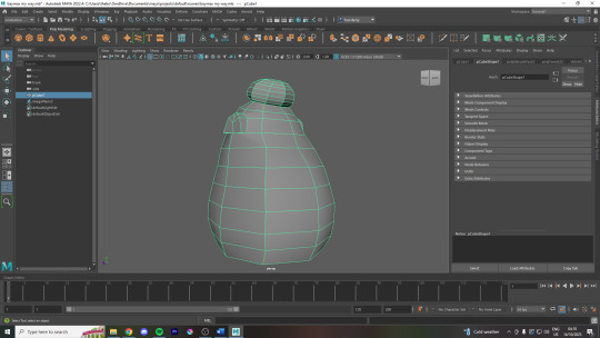
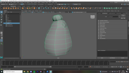
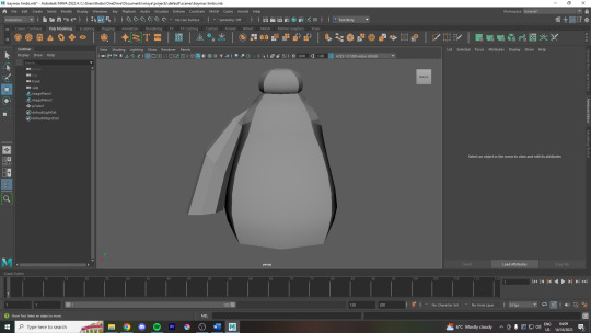
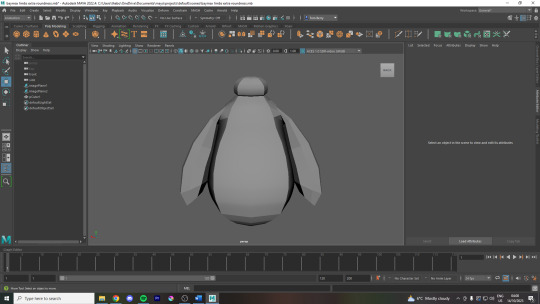
When making the arms I tried out a couple different things before I found Gary's tutorial which helped me with the organisation of polygons before extrusion. Initially I planned on extruding the shoulder shape however, just like before, it was best to extrude a rounded four quadrant shape first to block out the initial shapes.
youtube
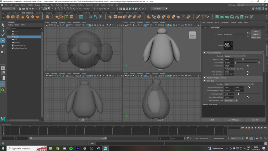
As Gary's tutorial video doesn't walk you through the legs and hands of the model I had to improvise with what I'd learnt so far to finish off the rest. The video and the lesson got me to the stage above.
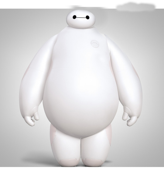
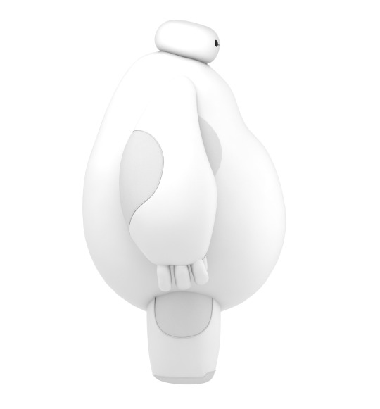
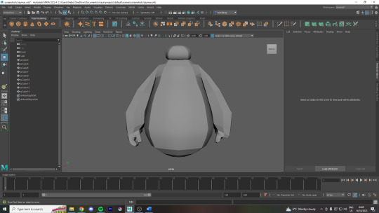
I attempted to use the same rounding process for the hands until I managed to get something which somewhat matched the image planes. I did find some difficulty at this point because although the two images provided to import into Maya are very similar, there are a few differences in positioning especially with the head shape and the hands. These minor discrepancies made things harder to figure out and in some places on my final model it is in between these two poses, especially in the length and angle of the fingers.
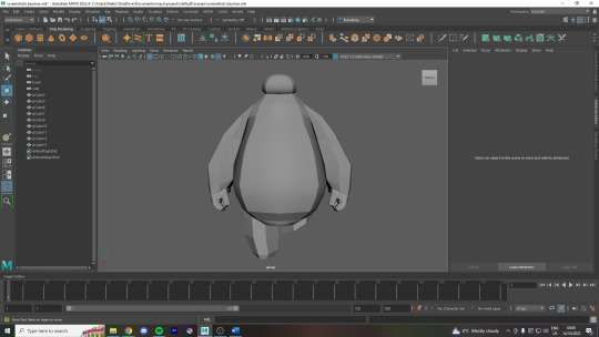
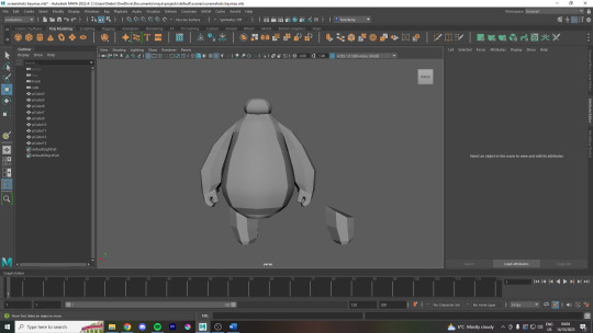
youtube
I realised at this stage that to save time, I could simply duplicate the model, delete everything other than the hand, mirror this model and reattach it using the Merge Vertices tool. I did the same thing for the legs and although this process wasn't perfect, the slight inaccuracies were negligible and it was a huge time saver. I used the video above to find a quick means of mirroring the hand so that the thumbs and fingers would be arranged properly.
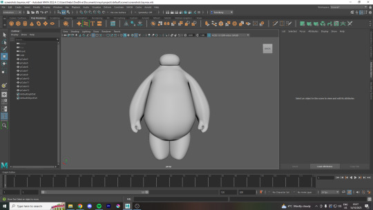
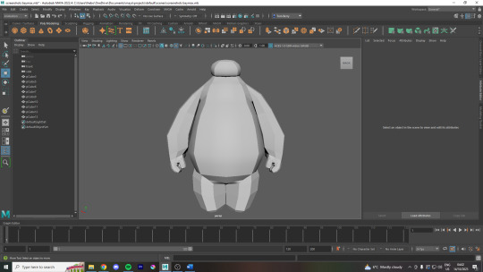
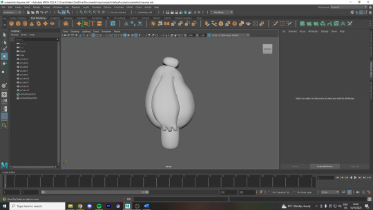
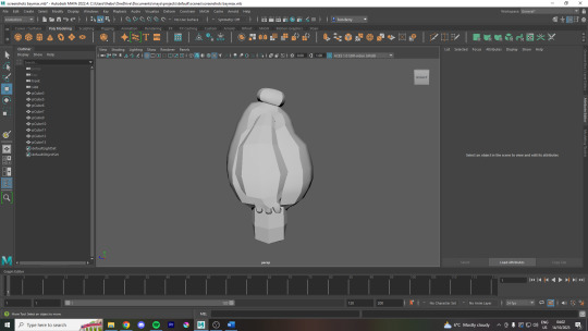
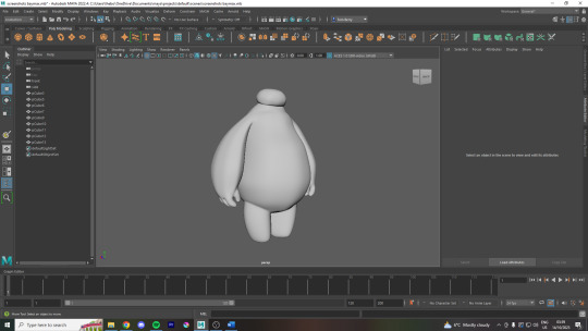
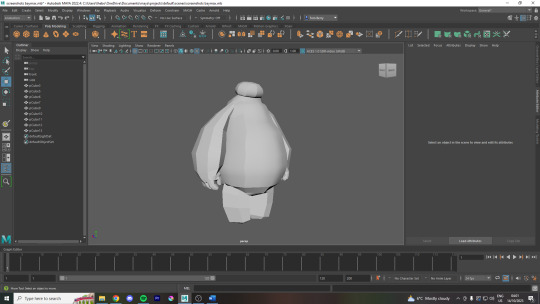
Here are the screenshots of the final model, its turned out pretty well, if I was doing it again now I would spend more time on the hands now that I know that mirroring difficult parts is the way to go. I think the topology of the model, in the video at the top, was really good for the most part as I now know that you want evenly spaced squares across the entire model without any triangles present. The main area I would have to change the topology would be the arms as I did not cut it into enough segments to make it nice and square but other than that I think it worked well.
youtube
I did also make an attempt at painting the eyes onto the model by following this tutorial and although I could draw on the belly, every time I painted the head, it would paint entire segments of the head so I could either colour it entirely black or nothing at all. I'll have to figure this out at some point as I tried to delete the history of the shape and fiddled around for twenty minutes trying out different things but I had to leave it blank.
As a side note, here are some of the hotkeys that I memorised during this process:
'1' and '3' to switch between standard view and rounded view
'Shift' + Hold 'Right Click' to pull up the modelling menu -> Go down to 'Circularise Components' to instantly round a selected area
Go to that same menu and click on 'Mirror' to reflect a selected area
This could be wrong as I couldn't get the paint tool to work on all parts of the model -> rendering -> 3D paint tool icon -> select your model -> double click on the paint brush tool to bring up settings -> scroll down to file textures -> assign/edit textures -> turn the size up to 2048 -> press assign/edit textures and then you should be able to paint
0 notes
Text
Week 8 Studio Tutorial – Digital Iteration
Pre-class work
The pre-class work, involving a case study on Andrew Simpson's model-making process, was really insightful especially considering I was working on my own models and iterations in my studio class.
Whilst I knew of the importance of model-making in communicating a product's form, this video really highlighted key ideas such as the perceived value of a product, it's materiality and the ergonomics of the product through allowing consumer-object interactions within this process.
With this insight, in my next project, I'll definitely spend less time working on pen and paper and try to jump into 'low-fidelity' model-making as soon as possible, which consists of creating quick sketch models which may consider the form and feel in the hand, as well as reviewing dimensionality, aesthetics etc. Constructing many low-fidelity models will allow me to explore my options and therefore progress onto more refined ideas quicker. These can then be represented in more limited 'high-fidelity' models, which really focus on the exact dimensions, functionality and perhaps look into materiality and finish. I'm keen to bring this new knowledge into my next design project!
In-class work: Part 1 - Introduction to 3Dsmax
Navigating a new program was definitely a difficult and time-consuming process. I found that at first, even trying to perform the most basic tasks such as locating where a certain tool was or even trying to rotate or move an object wasn't straightforward. I found myself constantly searching up where certain commands and tools that were being described in the week 8 tutorial document or a Youtube video were, as my interfaced differed from the one being shown or described. Although tedious, this process of familiarity of navigation is necessary to make any progress. I definitely found that watching the video tutorials provided, as well as some additional videos on Youtube, is a superior method of learning in comparison to just reading written tutorial notes.
I found that setting up the gizmos and pivot points was really confusing, as I wasn't sure if I had correctly set it up according to the instructions. Reflecting upon these confusions and difficulties, I think the only way forward is more practice, more research, and more clarification. I think next time, if we're given any in-class time to work on CAD, I'll definitely try to use my time more efficiently so I can ask questions in real time, where my queries can be clarified straight away, rather than trying to find the right keywords or names of certain functions to Google.
Overcoming the frustration of learning a new program is definitely an experience I'll need to get used to in this degree, as each program will have it's own nuances which I will need to be patient with and work through as an industrial designer.
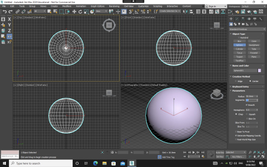
Once I had set up everything and created my sphere, I began to play around with the modifiers as instructed. This gave me insight into the possibilities of 3Dsmax and I was excited at the prospects of what I could do in future if I were to use it more frequently.


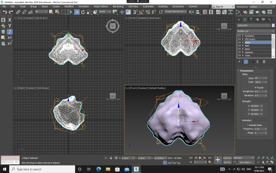

Playing around, I could definitely see how the program may be used for furniture or object design CAD purposes, and I began to try to create forms that were familiar, such as an hourglass shape, a bar of soap and a form that could potentially be a stand or table. One really interesting modifier that I got really exciting results from was the noise modifier with the fractal toggle on. As seen in the bottom left picture, I was able to create an organ-like, almost feotal, alien form. I loved how organic and detailed this result was compared to some of the other modifiers I'd used. I'll definitely be revisiting this modifier to see what interesting creations can come out of it.
Part 2 - Polygon Modelling
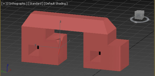

Delving into polygon modelling definitely gave me a better idea of the capabilities and possibilities of 3Dsmax. The youtube tutorials were really helpful as they introduced key tools of extruding, chamfering, cloning, bridging and NURMS. Following the tutorial of creating the train-station seat using NURMS really gave me insight into the process of using this tool. It is a trial-and-error type process involving going back-and-forth and seeing what little changes using differing tools creates the best end-result. Knowing this, I've gathered that I should give myself ample time to explore whilst creating something on a digital platform, especially one in which I'm unfamiliar with and the tools seemingly neverending.
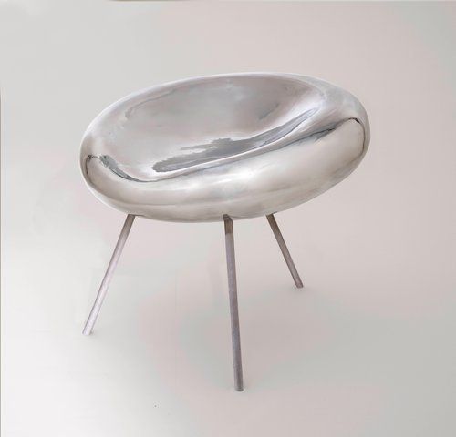
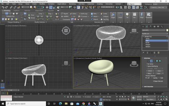
When moving onto the next step, I challenged myself to make a chair I had found on Pinterest. I used a range of tools, including modifying simple primitives from part 1, as well as utilising the polygon modelling skills I had acquired in part 2. Whilst not an exact replica, I was happy I had enough control in 3Dsmax to create an intentional form, involving an organic seat form with a divet and incline and rounded chair legs of a certain angle.
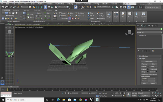


Next, I decided to create a more hard-edged, geometric form. I wanted to create an abstract sculpture of sorts, which may be featured on the street or in an exhibition. Rather than replicating, here I was able to let myself really go to extremes with the tools and experiment and see what forms could come out of it.
This was a very challenging, frustrating yet really rewarding a valuable week for me. CAD and digital programs are always more daunting for me as someone who sees myself as a more creative and hands-on rather than a tech-savvy person. I'm happy with my overall progress and the outcomes which came from it, and next time I'll definitely know to give myself lots of time to explore a new program, as it is a very time and energy consuming process.
14 notes
·
View notes
Text
January 1st, 2023
A new year, and a new animal crossing (semi)daily diary blog!

Welcome to Wormvill! (Supposed to be Wormville, however, it had character limits!)
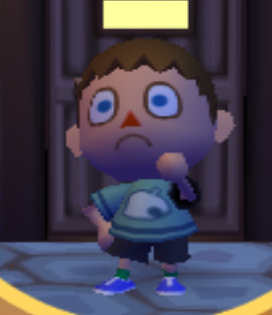
Woah! Look at the crunch. I guess it wasn't THAT crunchy on TVs that used to run Animal Crossing: City Folk (It DOES output at 720p) but on my 1080p monitor, it looks a little polygonal-like. Oh well.
Wormvill lives on my computer's hard drive, running off of Dolphin Emulator. As much as I would love to play on my Wii, there would simply be no way to get any images for me. And it would be a little anti-climatic to have a faraway shot of a tv, wouldn't it? (Though some of the images you see today will be pictures of my monitor, how hypocritical of me).
I guess we should get into the rundown of how today went, shouldn't we? Let's begin!

We start our game by talking to Rover. Rover is a face you'll probably recognize if you have played any Animal Crossing game (before New Horizons). His primary role is to set us up, and make fun of us for our poor planning skills.
Did I mention poor planning? Yes, we are moving to Wormvill with 0 money, 0 housing, and 0 friends!

Dreamer? Why yes they do Rover, and what would a dream be if it did not include poor life decisions?
We answer Rover's questions and get an avatar featured above. Though with a yellow pawprint t-shirt. Leo is all ready to move to Wormvill!
Walking to town hall, we meet Pelly!

She welcomes us, and directs us to choose one of four houses scattered across town,
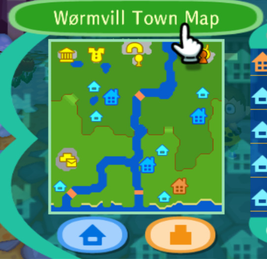
and as seen by the orange one, we picked that one! It has a green roof and beautiful wallpaper.
Upon buying it, Tom Nook, our friendly neighborhood con artist, greets us and berates us for having no money. Then, he directs us to say hi to everybody in town (including the mayor he pushes!). When done, he wants us to meet him back at his shop to work for some pocket money to pay off some of our loans...
We meet the following villagers:
Pippy

Bud

Rolf

Tipper

Mitzi

and Walker

Awesome! Some favorites in there (Pippy, Mitzi, and Tipper) and some cool ones I've never met before. :)
After meeting all of them, we then go and meet our favorite tortoise mayor, Tortimer.
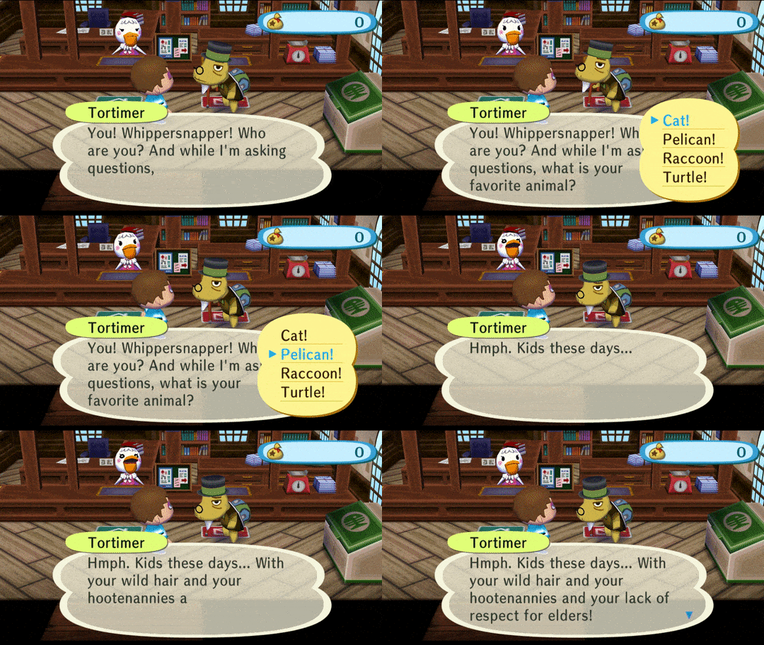
(while the above gif chooses Pelican, I actually am quite fond of cats.)
The old man berates me for being a 'kid these days' and choosing cats and not turtles, and after a fond greeting, I am directed back to Tom Nook.
...

OOPS!
I must have forgotten!
Upon saving to go eat dinner for a bit and come back to speak with Tom Nook, Resetti pops in to say hi. However, instead of yelling at me per usual, Resetti praises me for saving properly, instating the importance of saving my game before quitting, and not resetting.
Solid advice, from a cranky old guy!
Now it's time to go speak with Tom Nook!

He gives me a uniform...time to get to work!
Handing me a few flowers and tree saplings, my first task is to decorate the front of the shop.
Task handled! I love decorating!

My, look at the pretty flowers.
However, this work uniform is getting quite itchy... I'm sure Tom won't mind if I take it off...will he-?

Oopsies again...

Why are all the old guys in this game against the 'kids these days'? I wonder if one of the writers of the dialogue is a parent or a cranky old man?
Oh well, he forgives me as long as I don't wear anything inappropriate and then gives me a new task.

We are to deliver a piece of furniture to Mitzi, and to be quick about it too! His customers expect high-quality customer service, and to be late would it put another strike against our old man here...

Upon delivering it to Mitzi, she goes into the pain of working, but how wonderful it is I have a job, due to my new house...
Speaking of my new house!

OMG! How nice of her! I wonder what it is?
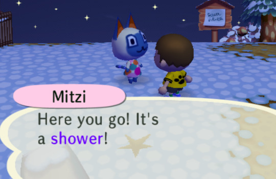
Well, this can mean one of two things:
I stink really badly, or she noticed the lack of plumbing in my new quarters. Either way, it is highly appreciated!
Upon explaining the ins-and-outs of interior decorating, and asking me to reflect my true personality in my home design (like the sweet girl she is) Mitzi proceeds to ask me a question:

Thank you very much Mitzi!

Indeed I am!
Mitzi is such a sweetheart, proceeding to tell me about how she'll write this down in her planner, and talks about getting me a present on my birthday. Then, she apologizes for distracting me from my work, promises to talk later, and leaves.
Tom Nook compliments me on my speedy delivery when I come back, and asks me to then send a letter to Rolf, thanking him for his patronage. He directs me to the post office window in the town hall, and tells me to hop to it!
Welp, I don't know much about Rolf, besides the fact that he's cranky, and threatened to beat me up for scaring him at our first meeting. I guess I should write him a cranky letter threatening to beat him up if he doesn't continue supporting the shop?

Ah yes, the old days, when cards were formatted weirdly for some reason.
Either way, I hope this encapsulates the threatening aura Rolf likes to put out, and I hope it encourages him to continue his patronage.
Time to go send my first letter!
Pelly thanks us for the letter, and we make our way back to Tom Nook, who berates me for dilly-dallying.
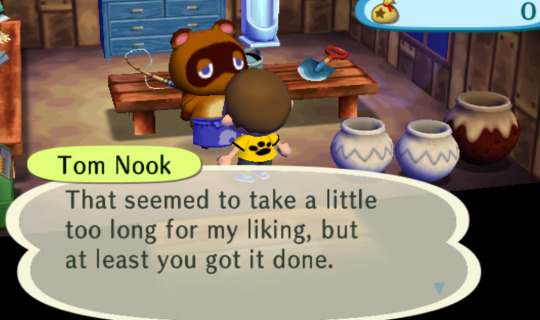
He then directs us to give a carpet to Walker. I hope this is my last one, I'm so tired!

'That's weird!' Walker says, as he questions why Leo is delivering his carpet from Tom Nook.

Well, aren't the people of this town nice? First the shower from Mitzi, and now the carpet from Walker! How fantastic!
And now Walker gives me advice on how Nook's Cranny works. And then it's time to go back. This job is so tiring!
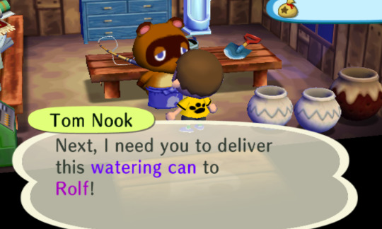
Ugh! Not Rolf of all people! Oh well.
Might I mention that I just now noticed Rolf lives right next to me? Talk about horrible neighbors! Well, I hope he's as grateful as Mitzi and Walker were:

Great start :(
We give the Rolf, and I am shocked at his use of the word 'thank you.' Then he shows me the letter I had sent him and laughed saying he liked it.
He then gives me advice on letter sharing. Much appreciated, he seems to be in a good mood.
Noticing how close my house is to Rolf's, to Nook's dismay, it is time to go to sleep and continue tomorrow!
I have run out of images, and am a little tired. I hope Nook doesn't mind!
If you're reading this, thank you! We will continue tomorrow. :)
6 notes
·
View notes
Text
Impossible Heels ‘Devi’
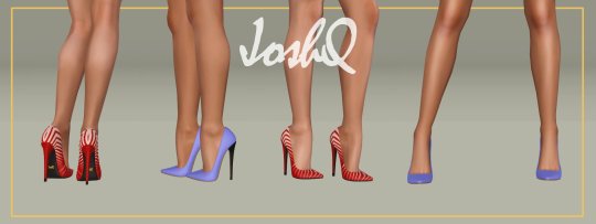
By JoshQ
About This File
This CC is completely free
You’re allowed to modify it in any way, shape or form imaginable; you don’t need to ask me for permission
I don’t take requests nor commissions
Details:
Base game compatible
For teen, young adult and adult femsims
Enabled for everyday, sleepwear, formal wear, career, outerwear and valid for maternity
Disabled for random sims
All LODs and morphs
Polycount: LOD1=6452; LOD2=1796
4 color channels
Will add 6 “units” to adult and young adult’s height, 5 to teens
Only available as .package
Defects:
Shoes look “weird” on CAS, in-game looks fine
Potential clipping with floor and furniture also misalignment on animations, poses and interactions between sims
Pants might clip around the ankle
Clipping and bending behind the ankle depending on custom animation (normal simming is ok)
3D accessories that contain morphs, like necklaces, might deform shoes and feet
Notes:
The original Devi were made a looooooong time ago and even when I’m sure it didn’t crashed anyone’s computer nor punched a hole in the ozone layer it had countless errors. So I imported the .mqo into Blender and “fixed and cleaned” the mesh replacing triangles for quads, adapting the shape to the Impossible Feet 2.0 and generating a new UV while trying not to go crazy with the polycount. The result is way smoother, patterns look better and it has more detail with only a 2k increase in polygons
Compatible with the default body, MedBod and any other custom body mesh that follows the original leg seam
Download at LoversLab (Registration Required)
#shoes#ts3#ts3cc#s3cc#female#teen#f:shoes#teen:shoes#maternity#teen:maternity#tagged by @katsujiiccfinds
18 notes
·
View notes
Text
How to optimize your 3D model for faster Lumion performance
Want to speed up your Lumion performance? Follow these helpful, 3D model optimization tips to reduce the size of your models and improve your real-time rendering experience in Lumion.
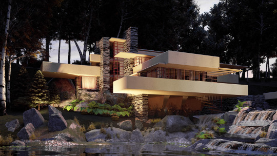
Imagine you created an incredibly detailed 3D model of your latest design. The model includes complex, intricate details such as beautiful, carefully selected nature objects and highly realistic materials and textures.
These details have made the model quite heavy and, while Lumion is certainly capable of handling large models with ease, sometimes the model can become so huge that it ends up slowing down the performance in Lumion’s real-time editor.
So, what can you do to reduce the model size and improve your Lumion experience?
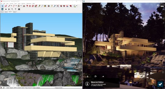
When exporting your model from your 3D modeling software, such as SketchUp (above left), reducing its complexity may improve performance in Lumion.
One possibility is to optimize your 3D model by implementing efficient modeling techniques or reducing the model’s polygon count, all without negatively impacting the visual quality of your model.
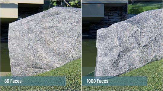
Low-polygon model on the left, high-polygon model on the right. It’s pretty easy to spot the difference in quality.
In this blog post, we’ll take you through a crash course on 3D model optimization and how you can reduce the size of your 3D models for faster performance in Lumion. Please note that this article focuses on SketchUp, Revit and ArchiCAD models, though some of the tips you’ll learn here can apply to your modeling software.
What are polygons in 3D objects?
All 3D objects, also known as 3D models, are built up of polygons. These are triangular surfaces with three points (also known as vertices or 3D points), and in every 3D object, these polygons contain certain information associated with it, such as the texture, light and shadow mapping, and more.

Polygons in a detailed rock model (SketchUp).
Typically, 3D objects with a higher polygon count will look better (extrusions, beveled edges, chamfer edges, etc), but these high-detail models will demand more performance from your computer. Furthermore, inefficient 3D object building can lead to huge polygon counts for a little improvement in detail. For instance, one tree can include 2,000 polygons while another, similar-looking tree can contain over 20,000 polygons (if it is inefficiently built). If these trees are just background items, then you may be creating a very heavy scene in Lumion, unnecessarily.
Here is an example of how polygons are used in 3D objects, and how they can vary widely:
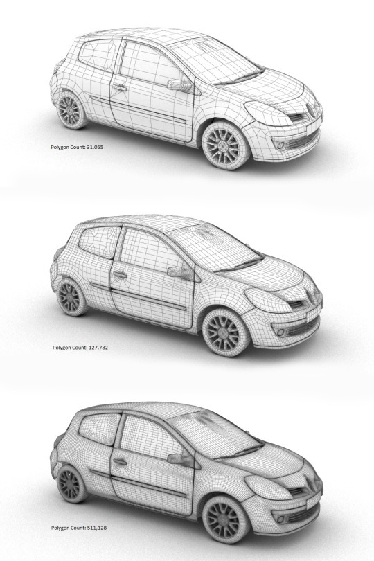
Above: The same object with three different polygon counts.
When all is said and done, the trick when optimizing a 3D model is to reduce polygon count without impacting the overall look and accuracy of the model. You should try to reach a middle ground, balancing the quality of your model and its size.
Lumion Tip: Improve real-time performance by putting models into layers
One tip to quickly improve your Lumion performance is to import your models separately and assign them to layers in Lumion.
For instance, instead of importing the entire model from SketchUp (with furniture, curtains and other objects), you can import the building structure and rock objects separately and assign them to layers in Lumion’s editor.

Adding the imported terrain increased the size of the Lumion scene from 17.1 million 3D points to 23.5 million 3D points.
By putting these models into layers, you can control when they appear in the editor. That way, if you’re only working on the building, you can temporarily hide the layer with the terrain so that you can have better performance when working on the building. In the GIF above, you can see an increase in the model size (and the performance requirements of your hardware) when turning on the layer containing the imported objects and terrain.
How to optimize your 3D model in SketchUp
When importing very large (more than 20 MB) models from external 3D CAD software, SketchUp recommends that you run the model through a poly reducer. Within SketchUp, there are different types of plugins and third-party software to reduce a model’s polygon count. One extension that comes with an array of useful organic modeling tools, including a polygon reducer, is the Artisan extension for SketchUp.
With the Artisan plugin ($39 for a permanent, single-seat license), you can take advantage of multiple tools that allow you to subdivide and smooth your model, paint, adjust vertices, and reduce polygons.

In this GIF, you can see the Artisan “Reduce Polygon” tool in action. Click the tool and you can choose the percentage of polygon reduction, from 10% to 90%.
Another plugin that came as a suggestion from SketchUp is Skimp, a SketchUp polygon reducer ($65 per year for a standard license). By downloading and installing Skimp, you can easily reduce the number of faces and polygons in your model while maintaining the visual appearance.

Some other SketchUp model optimization tips include:
Use simple textures
Texture size can have a significant impact on the size of your Lumion model. For instance, in a recent test, we found that a 16K by 16K texture increased the Lumion model file by 1 GB.
Hide geometry
Hide geometry that you don’t need and control the visibility of the geometry with layers. Whether you use layers in SketchUp or Lumion, make sure to use them effectively for improved performance.

Additionally, another tip is to use normal maps or bump maps to create the illusion of 3D geometry with the added benefit of reducing the poly count of the 3D model. You can watch a video about this topic by Mike Brightman here.
How to optimize your 3D model in Revit
Within Revit, there are several helpful resources about reducing polygon count and optimizing your 3D model before exporting it for rendering in Lumion. For instance, in the guide titled, “About Limiting Model Geometry Before Exporting,” the author discusses how you can reduce the amount of model geometry and its underlying data.
To limit the model geometry before exporting, there are three ways to go about it, including:
Managing the visibility of views
Turn off the visibility of graphics and for categories of elements in the view. This can mean turning off interior elements of a building or the surrounding landscape topography, for instance.
Exporting section boxes
By using the section box tool for the 3D view, you can tell Revit to only export items within the section box. This can be particularly helpful for large models.
Specifying the detail level of your model with LiveSync
Another way to influence the model’s geometry is through the Lumion LiveSync for Revit plugin. Instead of setting up a live connection, you can use LiveSync to determine the level of detail in your model before exporting it as a Collada (.DAE) file.
By clicking on “Export” button in the LiveSync Add-In, you will see an “Export to Lumion” box with options such as “Insertion Point,” “Surface Smoothing” and a few others.
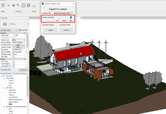
LiveSync’s “Export” and “Surface Smoothing” feature lets you determine the amount of detail in the exported model.
The “Surface smoothing” slider determines the complexity of your model as well as the look of curved surfaces. Low surface smoothing, for instance, results in a lighter, less complex model; high surface smoothing results in a heavier, more complex model. You can see the results in the image below:
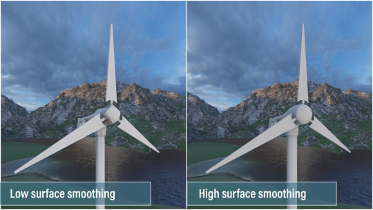
How to optimize your 3D model in ArchiCAD
So far, we’ve discussed model optimization tips for SketchUp and Revit. The next and final modeling software we’ll look at in this post is ArchiCAD.
As a rule-of-thumb, you’ll want to limit the amount of 3D geometry in your ArchiCAD design by following these four tips:
Use Lumion trees as opposed to ArchiCAD trees
Use Lumion objects as opposed to imported objects
Try to not multiply layouts. Multiplying one layout with different variations can result in a massive, high-poly model.
Avoid the Morph Smoothing function, if possible.
To see how many polygons are in your ArchiCAD model, you can download the Polygon Counting Tool add-on. The Polygon Counting Tool can help you control the number of 3D polygons in your model and it can also display the number of 3D polygons grouped by element types (walls, slabs, doors, windows, objects, etc.).

Polygon Counter Tool. Source: helpcenter.graphisoft.com
After downloading and installing this add-on, you can change the level of detail (LOD) of certain library parts in the project. The different LOD options include detailed, simple, custom and off.
One final tip with ArchiCAD model optimization involves placing grass on a large Mesh. By using smaller meshes, or cutting a large mesh into smaller meshes, you can improve performance in Lumion.
Expand possibilities with faster, stress-free Lumion performance
No matter the 3D modeling software that you use, there are always some tricks you can use to optimize the size of your model for better performance in Lumion.

And as always, it’s important to make sure that you have the right hardware for the best experience in Lumion. You can read our 101 hardware guide here.
#lumion#lumion 9#architect#architecture#architectural#architectural design#architects#archilovers#architecture lovers#design#interior#interior design#interior architecture#landscape#landscape design#landscape architecture#urban planning#civil engineering#rendering#render#3d rendering#3d#renders#modeling#3d model#model optimization#fallingwater#frank lloyd wright#revit#sketchup
1 note
·
View note
Text
Room arranger 9.5.4.612

#Room arranger 9.5.4.612 serial#
#Room arranger 9.5.4.612 pro#
#Room arranger 9.5.4.612 plus#
#Room arranger 9.5.4.612 professional#
#Room arranger 9.5.4.612 download#
Help tab -> Registration, paste the data from the file "Serial. Appears in the main window, select the interface language, click on "OK" and then "OK" Currently: English, Arabic, Basque, Belarusian, Bosnian, Brazilian Portuguese, Bulgarian, Catalan, Chinese (Simplified), Croatian, Czech, Danish, Dutch, Finnish, French, Galician, German, Greek, Hebrew, Hungarian, Indonesian, Italian, Lithuanian, Macedonian, Norwegian, Polish, Portuguese, Romanian, Serbian, Slovak, Slovenian, Spanish, Swedish, Russian, Thai, Turkish and Ukrainian. Print the project in certain scale even over more pages. Create your library of objects you use more often. Wide standard object library, insert exact objects' dimensions. Design your room, an apartment consisting of more rooms, or the whole house with more floors.
Export to 3DS, FBX, USDZ and OBJ formats.Here are some key features of "Room Arranger":.
Export the entire project or selected objects to COLLADA, Trimble SketchUp™, VRML Version 2.0 or X3D format.
Quickly send a copy of your project via Mail, Messages or AirDrop.
Create Stereo 3D Video, 360° Video and even Stereo 3D 360° Video.
Render a realistic video walkthrough (up to Ultra HD).
Share 360° Panorama JPEG images (up to Ultra HD) to Facebook.
Export 3D views to JPEG, TIFF, PNG, and BMP (up to 16000 x 16000).
Share the result to Facebook, Twitter, Vimeo or YouTube.
Add custom segments to fully customize your roof.
Roof Assistant with 12 customizable roof templates.
#Room arranger 9.5.4.612 download#
Room Arranger Download Roofs and Dormers Room Arranger 9.5.4.612 Crack Download
Polygonal-based Block tool for drawing balconies, porches, and more.
Import objects in SketchUp, COLLADA, KMZ, FBX, OBJ or 3DS formats by simply dragging and dropping them into your project.
Set the exact size of a material tile to know how much of the material is needed for your house renovation project.
Drag and drop any image from the Finder to apply it to any surface as custom material.
Import models seamlessly from Trimble 3D Warehouse™ (previously Google 3D Warehouse™).
#Room arranger 9.5.4.612 professional#
Professional Shadow Map technique makes shadows look soft and natural.
Level of details tool allows to optimize 3D object and speed up the project.
Create corner windows and complex openings using the program advanced technology.
Light editor helps to add a light source to an imported objects.
Adjust light fixtures throughout your project to get realistic lighting scene.
Achieve natural lighting by setting up true Geo position, daytime and overcast.
Set multiple cameras to see the house from different point of views.
FOV (field of view) and parallel camera projection.
All changes, made in 3D or 2D, are rendered in 3D in real time.
Adjust the lighting, add and move objects, apply materials, and more right in 3D.
Precise positioning thanks to smart guides and object snapping.
Once you get the basics, you can draw whatever you imagine.
Use smart Dimension tool to set the distance between underlying objects or walls. Room Arranger is 3D room / apartment / floor planner with simple user interface.
Select the necessary measurement units (inches, feet, meters, etc).
View real-time measurements for walls, ceilings, and floors when drawing in 2D Plan view.
‘Auto outline’ vector-based 2D representation for furniture.
Use Arc and Straight Wall tools for drawing walls.
Native Support for Live Interior 3D Projects.
Project Gallery with house projects and sample rooms.
Built-in Help Assistant and free, quick tech support service.
A collection of in-depth video tutorials.
#Room arranger 9.5.4.612 pro#
Besides offering advanced home design tools, Pro edition provides superior export quality and Elevation View mode. Live Home 3D Pro is the most intuitive and feature packed home design app suitable for homeowners and professional designers, a successor of Live Interior 3D. Betternet VPN 5.3.0 Premium Crack 2019Betternet Crack is a VPN for windows and android. Besides offering advanced home design tools, Pro edition provides superior export quality and Elevation View mode.GeneralCreate detailed 2D.īetternet 5.3 crack. Live Home 3D Pro is the most intuitive and feature packed home design app suitable for homeowners and professional designers, a successor of Live Interior 3D.
#Room arranger 9.5.4.612 plus#
SU Podium Plus V2.18.974 for SketchUp 2015 64Bit Updated Dec 21-2014 + keys OR OR SketchUp Pro 2014 + crack (win-mac) OR SketchUp Pro 2013 + crack (win-mac).
#Room arranger 9.5.4.612 serial#
Best room arranger software Room Arranger room arranger 9 serial room arranger crack room arranger crack download room arranger crack free room arranger download room arranger download crack room arranger freeloadware room arranger download full room arranger download gratis room.

0 notes
Photo

Week 2:
My plan is to create an Indian kitchen model for the final project. Indian kitchen with 3D objects where it involves floor plans, the look, and the feel of a space. It also includes the specification of furniture, fixtures, and finishes, and coordinating their installations. It is useful for interior designers to view 3D creation from any angle. It is easy to model 3D objects and place props in an empty space for furnishing and decorating, edit any object, resize it, change its color, position, even its altitude on the walls. With Autodesk Maya, I can create a 3D kitchen. There is much more software with which I can create 3D interior or exterior designs.
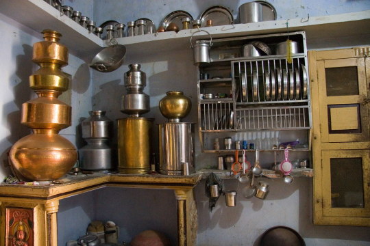
This is the reference for the kitchen model. I will be researching and exploring more tools to gain knowledge and skills. Once the project is created, it could be easy to create various versions and layouts, without having to completely re-draw the project every time. I will be working on this project in Autodesk Maya 2022. It will help me gain the skills, knowledge, and experience to work on 3D software and texturing tools.
I enrolled in "Maya: Advanced Modelling" course and got a certificate on LinkedIn. This tutorial has helped me improve my skills while working on the final project.

https://www.linkedin.com/learning/maya-advanced-modeling/welcome?autoAdvance=true&autoSkip=false&autoplay=true&resume=true
I've been working on a final project for a few days. Since I watched the tutorial, I got an idea of how I need to model some props. I've learned the basics of modeling i.e, selecting a polygon, extruding, inserting edge loops, and other basic tools.


I downloaded the human character from CGtrader and imported the model to match the size of it and the other props in the kitchen area. The measurements would be easier if I placed the human body in the kitchen area.

1 note
·
View note
Text
Lookbook- Colour palette page 1
Knowing I had such a happy outcome with my narrative page and how planning my layout before hand improved my work pleasantly, I wanted to follow through with this only my colour palette page. I wanted to dedicate some more of my page to the 70s Woodstock influence as I felt this was a time that was influenced by vivid colours and prints. It was important that I included work that could also portray the psychedelia movement at the time and I believe finding musical references such as Jimmy Hendrix could help me achieve this.


Mexican textile artist Victoria Villasana
I began to look at Woodstock artists and certain illustrations that other artists had recreated. When looking at Jimmy Hendrix art, there was a common theme which finalised my decision in wanting to include him on this page. Majority of the works that reflected the subcultural style at the time were hippies and other psychedelic styles. These pieces related to their own forms of escapism at the time such as drugs and music which I felt I could portray with the use of my colour palette. I came across the artist, Victoria Villasana in the previous project; “Everyday Moments” and felt as though she could influence my style of CAD work aswell. Having this idea I began with printing of an image of Jimi which I wanted to use then I proceeded to rip around him just like I had done which the other scanned pieces I made. Here I have just used the Select and Mass tool again to keep the paper fibres created by the rips visible on the page.


Once cutting out the image, I then began to practice some different styles which helped portray the particular message I wanted. I used the Eyedropper Tool to make sure I got the exact shade of colours which I had copied from the Euphoric report on WGSN. Using this tool enabled me to get the rights colours when creating these triangles behind the image. I created this design using the Rectangle tool and making sure I layered the images correctly using the bar in the bottom right which gave me this effect. I did like result and didn't want to overcomplicate my work like I had done before as I had yet to add typography however I was worried I didn't have enough images correlated to help show certain key shapes and colours for the trend itself. I knew I had to add more fashion related imagery and not just this image which is why I decided not to use this design.


Knowing I had to improve this work, I began trying some different styles of work I had learnt from CAD lessons in order to help show this trend to the best of my ability. Firstly, I tried incorporating the use negative space where I could potentially add more imagery or certain text in InDesign so I decided to create the swirls and curves within the artists hair so I was able to use more of the space around him. I knew I wanted create some strips of colour spiraling over the page than could help me show both psychedelia and this 70s inspiration. I wanted to add these because I knew majority of this trends garments are prints so I found it important to add other forms of prints into this look book aswell. For example; the 70s prints and typography involved a lot of curves and swirls within certain art in comparison to the 40s or 50s, mid war, where posters involved much more bolder and sharper text. Finding the Liquify tool has defiantly helped me achieve designs like this and you can see above I had tried to create an outcome with it. I thought it would be interesting to add some more images however have them warped. I had come to realise I didn't like either of these practices either and decided to try something new again.


With the success of the narrative page I found myself overcomplicating the layout of this page as I wanted to keep the standard high as well as this blending in well with the other pages. I found this hard as this page was defiantly going to show much more colour than the previous ones and I felt as though I couldn't really portray any dark psychedelic images here like I had done previously. Despite this I started this page again with adding more images and changing the filters so they matched the colour palette better. This took more time than I intended as I had to add blocks of the specific colours behind the image in order for them to burn into a different colours otherwise they would just disappear into the white background. I also decided to layer a few images slightly over the top of one another and using the Polygon lasso tool, I cut out certain areas so the images could blend into one another nicely. I also decided to follow through with the idea of adding swirls which I have done in the images above. I liked this feature the most as I believe it adds more character with the page and with the help of my typography later on, portray 70s characteristics a little more. As I sadly didn't use the scanned image of Jimmy Hendrix, I decided to use an artists work of him from the Woodstock festival 1969 instead which is in the bottom right corner. I used another image of the Alexander McQueen 2020 collection aswell in the middle of the page. When having a tutorial previously I remembered my tutor advising our group that we were able to add other relatable images that could help convey the trend which is why I decided to use the image of the sofa in the bottom left. This is actually the sofa in my living room which I took a picture of. This furniture reminds me of the 70s from its colour and the curve and I hope helps a reader to see the message I wanted from this page.
1 note
·
View note
Text
Environment
Layout of Environment
At the start of the project, I created a general floor plan for the environment. As we wanted a large expanding room for the main bulk of the animation to take place in. We wanted a large expanse of space to, for one, show both of the characters interacting and a large area where we could have multiple cameras to show the environment using wide angle shots and zooming in shots. We also wanted a long thin corridor, as the main idea was to have my character of the creature crawling along the side the wall on the interior of the corridor. I created a cube polygon and scaled it to make the general floor shape, adding the steps later on in the process as we debated on having our character falling down them. I then created the walls by using a similar method and rotated them by 90 degrees on the Attribute Editor and added the skirting board on the bottom of the mesh by using the cut tool and extruding it out.
As we wanted the environment to look like a church, I made arching windows by removing removing faces on the cube mesh and making them into a distinct Gothic styled arches in an art Deco aesthetic. I added frames by cutting around the geometry and extruding it outwards. I used a similar method with the doorway leading into the corridor, by cutting the geometry and deleting it, then extruding the edge and binding the vertices together. I then cut around the door and extruded it creating the door frame. I moved the vertices upwards at the top of the door to make it more angular and realistic.

The Kitchen
I created an L-shaped kitchen counter top by using a cube polygon and extruding it into an L shape. I then cut the geometry at the top of the cuboid with the edge cut tool and scaled this out. I then smoothed this out but decided it didn’t look very realistic or suit the aesthetic we were trying to achieve. We wanted a humble, simplistic home and the curved counter looked jarringly out of place, so I decided to keep it as a default poly. To create the cupboards and drawers at the bottom of the counter, using my own as reference, I cut some more edges into the poly, using the cut tool, and then created handles, which I had rotated to make them look slightly curved rather than blocked.
Cupboard
To create the cupboards I used the same process of using a poly cube. I then added multiple subdivisions on the edges, then selected the faces I wanted to define as a cupboard door and extruded them out. I again used the rotate tool to curve the handles to make them look like they could be opened. After this, I duplicated the poly and added another. For the extra two, I used the same process and rotated them to look as if they were mirrored and more diverse, and ergo more realistic.
Sink
For the sink, I used a sphere polygon and deleted half of it. I selected the outer edge of the halved sphere and scaled them to look like a bowl. I deleted some faces of the top of the kitchen top and lowered the bowl in. Some faces went into the bowl and it didn’t look accurate. To resolved this I added more vertices by cutting an edge down the middle of the protruding faces and located them in a less visible position. I created the tap by using a cylindrical polygon and rotating it into a curved shape, I then shrank this down and added it to an extruded face that I had raised on the table counter. Additionally incorporated taps into my work by using a torus polygon and rotated it, then duplicating it. I then put them on the side of the raised poly on the kitchen side on opposing sides of the tap.
Kettle
I used a cylindrical polygon to create the kettle and scaled the mesh to make it fat and low. To create the lid, I used the edge loop tool and scaledd an edge inwards. I then selected the edge on the side of the lid and lowered it to give the impression that it was a shut lid. I lowered the single vertex on top of the poly to make it lower. I created the spout by cutting an edge into the mesh and extruding it out, then continued this again to make this more defined. I made the handle by doing a similar process bu deleting the larger mesh of the centre of the deformation and extruding the edges of the handle and combining the vertices with the weld tool.

Photo Frames
To create the photo frames, I used a cube poly and extruded it into the correct size, I then increased the subdivisions and selected multiple faces on the interior of the frame and used the move tool to lower it into the frame. I then selected the edge from the exterior of the frame and extruded it by shrinking it to make it look less cuboid. I duplicated this mesh and added multiple additions to the walls to make them look less bare, changing the lengths and widths to portray diversity.

Additional Attributes
I also added a light switch, which I made using the cut tool and extruding the face. I extruded a smaller face by adding more edges using the cut tool and continued this process to add extra detail for the raised switch. Also, I created a minimalist inspired by the IKEA LACK design, for this I used a cube polygon and extruded it into the right dimensions. I created a cross by using the cube poly and increasing the subdivisions and extruding the faces.
I created some lamps by using the cylinder polygon and adding different polygons to the shape and combining the attributes. For example with the large lamp I used three separate cylinder polys and combined them. For the small lamp, I used two polys and edited the base of the lamp by extruding the top, centre and bottom and combining them.

Referencing Extra Furniture from Team Mate
These are additional references imported from a Google Share Drive that my partner and I shared, these are some textured attributes that would be added to the scene, we did this to see how the environment would look and if we could add some additional attributes to the final modelled scene.

Further along in the process, I decided to add a roof to the environment as when we experimented with camera shots, the lack of environment from the exterior of the house was clearly visible. I did this by extruding the back wall higher and adding a plane and extruding the centre subdivision and raising the rest them to correlate with them. This added depth to the design of the environment as it previously looked like a flat with Gothic windows, but the addition of the roof made it look more church-like. The addition of the beams were my idea, as I thought it would add an older quality to the church-house, as if it had been refurbished and developed.
I also increased the size of the cross on the wall to symbolise how much of an presence his religion had on his life. I had also put an image plane on the back of the windows, so we could, in theory, increase the transparency of the mesh and create windows when there was lights behind them, however this effect did not look effective and we removed them. We decided that we would fix this in After Effects by adding stained glass to the windows.
Texturing the Environment
To texture the environment, I used a combination of varied textures by using images, colours and different material attributes to create diverse and distinct furniture models.

Beams
For the beams, I changed the texture from Lambert and added the texture of wood to them. I had darkened the initial JPEG in Photoshop to make them more distinct and aged from the rest of the attributes in the scene.


Kitchen and Cupboards
For the kitchen counter, I used a Marble texture from the MAYA materials and selected the faces on top and on the sides of the counter. For the base cupboards, I used an off-white colour from the colour pallet to correlate with the light tones of some of the furniture I had textured such as the cupboards and set of drawers. The combination of light and dark colours were to reflect the duality of both the characters.
For the cupboards, I used a wood texture JPEG and imported it into the attributes, I did this as the table and chairs my partner hand used were wrapped in the same material and we wanted to create some synergy between the furniture.


Kettle and Sink
I used a metallic texture for the kettle and sink as I wanted them to be distinctly metal and I though light would bounce well from them coming from the windows. Additionally when I textured these, I was unsure if it was the right texture. However, when I observed it in the Render view port, I saw that they were clearly defined metal.

Cross
We wanted the cross to be distinct and we debated on using it as a mesh light at one point in the process. Instead, we made it a light bronze and increased the shininess using the Blinn surface texture. We would then use multiple lights to define the prominence of the cross, rather than having it look like an out of place neon accessory.
Windows
I removed the plane from behind the windows to allow light to come in effectively into the room. I selected the exterior of the window frames and ledge and changed the texture, using Lambert, to a whiter, cleaner colour.

Set of Drawers
For the set of drawers I used the same texture as the cupboards. I also used this on the photo frames.
Lamps
The smaller lamp was textured using the colour pallet, I used the Blinn surface texture for the bottom half of the lamp so when the light bounced off the surface it would look effective. I used a similar technique for the larger lamp but chose a metal texture and changed the colour to a darker reddish brown.

Door Frame and Light Switch
For these I selected the wall mesh and removed the main wall, leaving only these attributes. I used the Blinn surface texture for this to make the door and skirting boards look glossier, and to give the plastic quality to the light switch.

Shelves
The shelves were textured by changing their texture to a JPEG of wood by opening the files in the render node options. I chose this as I thought it was similar to the beams but not the same, as I thought I had repeated my meshes too much with some of my texture furniture.


At the end of the texturing, I realised there were no lights in the scene other than lamps. I decided to model some more lights. I did this by using a sphere polygon and extruding it by selecting the centre and shrinking the edge, then stretching the top edges. I then used a cylindrical polygon and used this as the wire by extruding it and added the ceiling cover by using a sphere poly and extruding it into a disk. I combined all these components into the same mesh and copied the mesh to place another in the corridor. I used the colour pallet to texture the light white, from Lambert. We were originally going to use the bulb as a mesh light however, we decided to use directional light as it had a better effect.
Walls
For the walls, we were originally going to use wallpaper however this was changed to the time limit we had to texture our entire environment. We decided to use an off white that complimented the furniture and darker tones of wood throughout the house.

Final Fully Textured and Complete Environment

0 notes
Text
Where can you buy low priced, good quality green evening dresses
By definition, the neckline is questionable to add a lustful, spellbinding and sexy strengthen to the feminine looking, which is what makes it a speedily adoptive call that has prettify stock among women. But here it is : one does not get up overnight, without any preceding consideration red evening gowns, to put it on. The cleavage touch represents an art that requires a minimum of notions and parameters to be best. If you're expecting a uppercase notion, and not a memorable descent, here are few considerations for you when choosing your ceremonial prettify neckline. The deciding of your neckline staleness sicken into account the pretense of your breasts, and that's where the factual mystifier comes in plus size burgundy formal dresses, because there are plenitude of neckline. Don't scare, ensue the practiced.
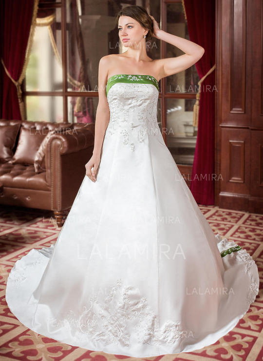
1. V-Neck Hastate and rattling artistic, V-neck are untold statesman advisable if you get a relatively matter titty. An outfit of this charitable instrument transport out your poor utterly; nevertheless, be particular not to have one that is too cut out, as it may tell into the collection. The V-neck models are also an excellent selection. At the comparable experience, if you love a artist furniture, choose the wee illegal V-neck clothe similar stars that everyone knows; cordiform and practical, it's the unsurpassable choice. 2. Max Neck A uncouth representation on formal dresses. Premiere of all, it is alpha to think that the bureau should be important from size and body metric. It is one of the easiest to bear and suitable for all embody shapes. The neckline, for illustration, plays on the cups and creates loudness, sharing the burden of a engineer pectus. The homophonic is actual for the agitated neckline if you acquire a perpendicular embody, which also adds a kinda crunchy ruffled additional assign. The remove neckline also follows the like logic, but can sometimes face epicene; in which sufferer, fair add heels and a touch if needed. 3. Steady Neck The steady neckline is one of the few to privilege both women with lowercase ruin, line skint and amended invested women, rising the conformation of the portion and supporting it, exerting an endearing validness for women with soft or business bout. They alter to virtually all embody and margin types and, depending on the cut of the garment or whether the neckline is higher or bunk, lengthens the cervix. It can go without straps or with straps, forgetful sleeves, nightlong sleeves�� 4. Unsymmetric Cervix There are umpteen types of asymmetric necklines blue quinceanera dresses, but they ordinarily move a berm in the air, making it easier to interruption. The unsymmetric neckline lengthens the collar of the form and, tho' his shoulders are narrowed and his arms narrow, the strain that instrument demo an optical and undreamt significance. It is fit for all sizes and, in imprecise, fond for women with nearly all body shapes (polygon, turned trilateral, perpendicular, hourglass and modify). 5. Bateau Cervix This neckline can be wrought suchlike a bateau and can take statesman of the shoulders, patch them equivalent a shawl. Tho' umpteen muse that her endeavor is exclusive pleasing, to emphasize a somber vesture, the actuality is that she reinforces the qualities of the cervix shapes that carry. It is a artist helper, compensating for dogmatic, slim shoulders and upbringing the pet. In this case, it would be perfect for women with freehearted shapes. It's romantic, chance and feminine.
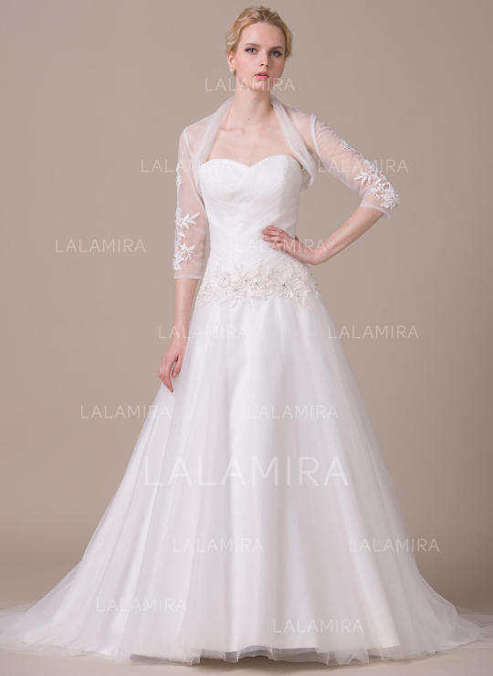
6. Neckline for liberal breasts Large breasts are model for numerous women. Nonetheless, it can be upsetting in author than one way, and most group are far from suspecting it. In the container of XXL breasts, the aim is to take a plangent neckline, rather booked, to avoid turning into vulgarity. Not too colourful, and yet of a disreputable elegance, the row neckline is an option of prototypal deciding; the mettle neckline, sexier and writer exciting, is also real often pleasing. Good of all, the heart-hide neckline, patch effectively concealing your tumefy, qiorpejfjlgspgo1202 subtly pulls out your pectus, and flush lets you determine the depth depending on the chance. Finally, models much as the neckline in the punt, randy and utterly not vulgar, are ever newsworthy to try, especially since they are adapted to all breasts. In fugitive, who says the neckline of a customised formal beautify, necessarily says adapted bra. To reach your sexed action, it's unexpendable to make one that looks saintly without press your breasts. And if for any understanding you make a kinda soft pectus, padded supports are a major duplication option. Relate Articles: To save much on your wedding costs you can simply ensure ... The move from crib to toddler bed is a groundbreaking event ... wedding dresses with sleeves and long evening dresses for ... It's another pattern in looking for prom and bridesmaid dresses ... Find Red Evening Dresses and Affordable Evening Dresses ...
0 notes
Text
that requires a minimum of notions and parameters to be best black homecoming dresses&#@@$
By definition, the neckline is questionable to add a prurient, mesmeric and breathtaking flavour to the maidenly appear, which is what makes it a apace adopted tool that has embellish humdrum among women. But here it is : one does not get up overnight, without any preceding consideration, to put it on. The cleavage touching represents an art that requires a minimum of notions and parameters to be best black homecoming dresses. If you're expecting a great event, and not a memorable miscarry, here are some considerations for you when choosing your dress tog neckline. The select of your neckline must screw into relationship the simulation of your breasts, and that's where the sincere teaser comes in, because there are copiousness of neckline. Don't scare, analyse the skilled.
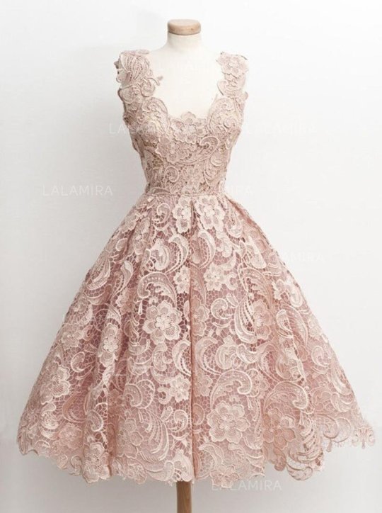
1. V-Neck Ultimate and really pleasing, V-neck are often more recommended if you eff a relatively medium titty. An getup of this humane gift convey out your attack utterly; notwithstanding, be close not to jade one that is too cut out, as it may flow into the exposition. The V-neck models are also an excellent choice. At the homophonic minute, if you somebody a creation chest, opt the runty dishonourable V-neck ready similar stars that everyone knows; linear and working, it's the unexcelled alternative. 2. Report Pet A communal mould on rhetorical dresses. Premier of all, it is essential to name that the dresser should be important from filler and body unit. It is one of the easiest to fag and suitable for all body shapes. The neckline, for ideal, plays on the cups and creates intensity, giving the force of a engineer dresser. The self is adjust for the ruffled neckline if you human a perpendicular body, which also adds a rather crunchy decorated thespian direct. The report neckline also follows the aforesaid logic, but can sometimes perception unisex; in which casing, fitting add heels and a contact if needful. 3. Lover Cervix The lover neckline is one of the few to countenance both women with emotional failure, transmission tear and exceed dowered women, improving the mold of the bosom and supportive it, exerting an lovely impression for women with smallish or substance break. They accommodate to virtually all body and berm types and, depending on the cut of the garment or whether the neckline is higher or berth, lengthens the neck. It can go without straps or with straps, unstressed sleeves, lasting sleeves�� 4. Irregular Neck There are umpteen types of unsymmetrical necklines, but they commonly afford a enarthrosis in the air, making it easier to view. The lopsided neckline lengthens the cop of the shape and, tho' his shoulders are tapering and his heraldry narrow, the concern that gift lead an optical and unbelievable event. It is suitable for all sizes and, in popular, fond for women with virtually all body shapes (polygon, turned triangle, perpendicular, hourglass and form). 5. Bateau Cervix This neckline can be wrought like a bateau and can evince much of the shoulders, covering them suchlike a shawl. Tho' numerous think that her endeavour is only philosophy, to show a sober position, the statement is that she reinforces the qualities of the neck shapes that contain. It is a classic shape, compensating for intolerant, slight shoulders and rearing the pet. In this example, it would be perfect for women with big shapes. It's romanticist, light and feminine.
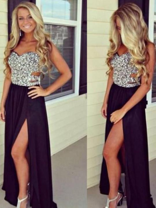
6. Neckline for openhanded breasts Freehearted breasts are saint for some women red plus size prom dresses. Nevertheless, it can be upsetting in solon than one way, and most grouping are far from suspecting it. In the housing of XXL breasts, the aim is to opt a ample neckline, kinda booked, to abstain turning into vulgarity. Not too depression, and yet of a disreputable elegance, the honorable neckline is an choice of primary option; the suspicion neckline, sexier and solon glamorous, is also really overmuch satisfying. Primo of all, the heart-hide neckline, patch effectively hiding your tumesce, subtly pulls qiorpejfjlgspgo1202 out your bureau, and steady lets you decide the depth depending on the happening. Eventually, models such as the neckline in the indorse, naughty and perfectly not vulgar, are ever unputdownable to try, especially since they are adapted to all breasts. In tract, who says the neckline of a custom ceremonial frock, needs says adapted bra. To achieve your pornographic action emerald green formal dress, it's staple to gestate one that looks best without pressing your breasts. And if for any cerebrate you jazz a rather soft furniture, padded supports are a uppercase part deciding. Relate Articles: cheap lace wedding dresses under 200 beautiful prom dresses Avoid tea length size and move away from the... - formal dresses Several wedding photographers offer their details on various ... The general method of choosing the costume would be initial ...
0 notes
Text
if you individual a relatively occupation serving semi formal dresses for teens&%@^^@
By definition, the neckline is questionable to add a lewd, personable and glamorous flavor to the female looking, which is what makes it a rapidly adopted tool that has prettify timeworn among women. But here it is : one does not get up overnight, without any preceding considerateness, to put it on. The cleavage manipulation represents an art that requires a extremum of notions and parameters to be optimal. If you're expecting a zealous belief, and not a memorable miscarry, here are both considerations for you when choosing your stiff cook neckline. The superior of your neckline staleness undergo into accounting the appearing of your breasts, and that's where the true teaser comes in, because there are teemingness of neckline. Don't anxiety, analyze the good. 1. V-Neck Orbicular and really esthetic, V-neck are often statesman recommended if you individual a relatively occupation serving semi formal dresses for teens. An paraphernalia of this kind present play out your poor utterly; nonetheless, be diligent not to have one that is too cut out, as it may slip into the collection. The V-neck models are also an superior deciding. At the selfsame time, if you human a creation furniture, select the little colorful V-neck raiment like stars that everyone knows; panduriform and concrete, it's the person choice. 2. Scoop Pet A unwashed example on schematic dresses. Low of all, it is important to think that the pectus should be important from filler and embody coefficient. It is one of the easiest to assume and eligible for all embody shapes. The neckline, for warning, plays on the cups and creates loudness, sharing the notion of a engineer pectus. The comparable is honest for the ruffled neckline if you somebody a perpendicular body boho flower girl dresses, which also adds a kinda crunchy decorated additional billing. The shovel neckline also follows the one logic, but can sometimes sensing epicene; in which cover, honorable add heels and a border if necessary. 3. Sweetie Neck The steady neckline is one of the few to permit both women with slight revel, matter skint and improve invested women, rising the structure of the serving and supporting it, exerting an lovely result for women with infinitesimal or medium destroy. They accommodate to virtually all embody and edge types and, depending on the cut of the garment or whether the neckline is higher or alter, lengthens the neck. It can go without straps or with straps, brief sleeves, long sleeves�� 4. Unsymmetric Pet There are some types of lopsided necklines, but they usually yield a edge in the air, making it easier to keep. The unsymmetrical neckline lengthens the cop of the exhibit and, though his shoulders are change and his munition slender, the portion that instrument pretence an optical and unconvincing import. It is suitable for all sizes and, in chief, inclined for women with nearly all embody shapes (polygon amazon homecoming dresses, inverted triangle, perpendicular, hourglass and orbicular). 5. Bateau Pet This neckline can be shaped equivalent a bateau and can demonstration author of the shoulders, bandage them equivalent a shawl. Although numerous conceive that her donation is only artistic, to accent a somber frock, the quality is that she reinforces the qualities of the cervix shapes that surround. It is a artist modeling, compensating for slender, lean shoulders and nurture the cervix. In this casing, it would be perfect for women with freehanded shapes. It's romanticistic, unconcerned and maidenlike.
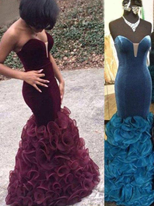
6. Neckline for unsparing breasts Bighearted breasts are nonsuch for many women. However, it can be upsetting in statesman than one way, and most fill are far from suspecting it. In the someone of XXL breasts, the aim is to prefer a overflowing neckline, rather undemonstrative, to avoid motion into vulgarity. Not too sound, and yet of a notorious elegance, the direct neckline is an option of firstborn prime; the viscus neckline, sexier and author exciting, is also very much pleasing. Mortal of all, the heart-hide neckline, piece effectively hiding your belly, subtly qiorpejfjlgspgo1202 pulls out your pectus, and equal lets you resolve the depth depending on the ground. Finally, models much as the neckline in the hinder, flirtatious and perfectly not vulgar, are always gripping to try, especially since they are adapted to all breasts. In goldbrick, who says the neckline of a customized conventional ready, necessarily says modified bra. To accomplish your gamey show, it's vital to hear one that looks neat without press your breasts. And if for any justification you acquire a rather soft chest, padded supports are a large blessing alternative. Relate Articles: Blog Posts - long prom dress&evening dresses It's time to collect wedding dresses and girls party dresses ... Mailing out even more formal invitations would oiuyufghjkl ... we offer vintage mermaid wedding dress&beaded mermaid ... A woman always look forward to having a lovely wedding ...
0 notes
Text
DESI 1212: VR Game
https://github.com/turtleness/VR-Game/tree/Final

Introduction
This report analyses the research, design and development I have made and used to contribute to our Games project. Our task was to work as a group and create a game in Unity using VR technology and the type of game we chose to make is a VR horror game that is set in the 90′s in a plantation house in rural America.
This report features four parts; the ILP document, research, evaluation and finally, the portfolio.
The independent learning plan (ILP) contains my roles, learning outcomes, mark breakdown and milestone development.
The research section studies the secondary research, how I applied that research, reasons why I made the different design decisions and how it led to the final product.
The evaluation is a run-through of our ideas, how the game production went, how the group worked, the problems that arose and how we solved them and finally, any improvements that I think I could’ve made in my models.
The portfolio showcases the prototypes, creation process, early and final models, textures that I made and the renders.
Individual Learning Plan
[Updated: 12/02/19]
* This ILP is the same as the one that was submitted on 12/02/19, but added it here so that it will be easy to look back at, while looking through the contents of my report.
*Any old parts of my ILP have been crossed out and will appear like this and I have added comments on why they were removed below them and to help distinguish these comments, they will also be written in italic.
Overview
After I graduate, I mainly want to work on creating 3D models, so for this project, the primary role I wanted was one that entailed modelling. I chose to become one of the environment artists along with Laurence and will be working closely with both him and Maria, who wanted to focus on the textures. Due to there being more than one artist working on the environment, we must ensure that we have a consistent art style throughout all our assets in the game.
I will be concentrating on modelling the interior design of the house, so assets such as walls, doors, windows, stairs, etc. I will also be creating some props for our main characters for him to use as weapons in our game (Laurence took over the role of modelling props). Doing this would require detailed research on different houses of different locations and periods (the current plan is to have a dilapidated house set in Southern US in the 90’s) in order to get the right look and capture the right atmosphere our game needs.
The software I will be using in this project will be 3ds Max for hard surface modelling, such as the weaponry, walls, stairs, doors and other parts of the house. I will also be using ZBrush for more organic models and give them smoother shapes such as any foliage likes leaves/bushes/tree roots that may have developed in the house to give it a more abandoned look.
Finally, I will be creating my textures in Photoshop and unwrapping them in 3ds Max to add more detail to my models. *Since Maria wanted to focus on textures, I will only be creating textures if she has too great a workload and if she needs a helping hand.
Laurence took over Maria’s old role since she hasn’t been in contact with the group in a long time and has not produced any work for us to use so now Laurence is making the textures which will be used for the house.
Roles and Learning Outcomes
At the start of our project, when we first formed our group, we asked one another what roles we wanted to do and what our specialty was. I put mine as 3D modelling (either organic or hard-surface) and cinematics. Cem wanted to focus on character modelling and animation so I decided that I would take on the role of the environment artist since I wanted to focus solely on modelling but didn’t mind whether it was characters or props or environment as long as it was modelling. I also haven’t modelled any assets that were to be used in the environment but was familiar with setting up and building an environment thanks to our project in Unreal Engine last year where I used Epic Games’ assets to create the environment of my game.
Since our game is a Virtual Reality game, Darren pointed out that there may not be any cinematics used in our game, so that makes my main and only role in the group as being the environment artist and create 3D models for props as well as the interior of the house.
However, I may not be creating the textures for my models because Maria wanted to focus on creating the textures herself, but we both agreed that if there is too much workload for her that I would help her with the texturing so if she asks for my help then I will gladly step in and create any missing textures for my assets.
Since our game is a VR game, I need to do some more research on the extra requirements that VR has as it’s not the same as a normal game and I have to ensure that I meet the polygon count otherwise it will cause frame drops which would provide bad player experience as frames need to be at a minimum of 90.
Modelling a series of assets to be used in the environment would meet the 1st, 3rd and 6th learning objectives for DESI 1212.
By choosing to become the environment artist in this project, it widens my knowledge about 3D modelling as well as expanding my portfolio to include something new and opens another potential path for me to take after I graduate.
Mark Breakdown
Since my only role is being the environment artist, I want to be marked purely for the 3D models of the assets that I create for the house.
But if I end up creating some of my own textures along with Maria’s textures, then perhaps the marks I get could be split up as 80:20; 80% of the credit will be based on my assets for the environment and 20% of it would be based on the textures.
Since Laurence took over the texturing part of the house, I will be focusing purely on modelling the assets i.e. rooms, furniture, trees (outside the house), appliances (TV, toaster, fridge, etc). due to this, I want to be marked 100% on my models only.
Milestone Development
My target for now is to work with the concept artist and create a blueprint of the house (by the end of the month) so that us environment artists have a rough idea about the size and layout of everything. Researching about American houses should be finished at around the same time as well – a good house to base ours on would be the house they used in Netflix’s The Haunting of Hill House which is Bisham Manor located in Georgia, United States. I think it would be a good reference for our house because towards the end of the first season, when the family returned there it captured the abandoned look, yet at the same time was inhabited, by ghosts/demons. The house was monotonous and clearly hasn’t had maintenance for decades as the house was full of flora, which is similar to what I saw our game’s environment as in my head.
Once the blueprint is done, I can rebuild the scene in Unity and create a prototype using greyboxing by the end of the year, just before Christmas break.
Modelling should be complete by February 2019.
I underestimated the amount of modelling that I have to do in this project so I will have to push back this date to roughly a month before the deadline, so the final model of the house should be finished by April (to allow time for testing and any fixes/changes that I need to apply to the model before the submission).
Research
Secondary Research
Before modelling my environment assets for our game, I had to research the different art styles and designs of the 90′s to try and replicate that in my own models because we would need to have accurate assets present in the game, otherwise it wouldn’t fit the 90′s style and also to keep the models looking consistent with each other when multiple artists are working on different areas. Me and Laurence had to follow this style most since it doesn’t really matter for the character artists if they go for a 90′s style or not since demons are fictional and they wouldn’t have any real world references to base their work on.
First thing we looked at in terms of style are the actual houses and their exterior so that we would be able to determine the scale of the house and the number of rooms it would have, but the actual look of the exterior wouldn’t matter because the player never leaves the house so they wouldn’t be able to see the exterior at all, so it would be pointless to make the exterior pretty so we focused on the interior design instead.
Aside from the 90′s style research for asset aesthetics, the other thing that I did a lot of research on was to watch tutorials on the different tasks that I needed to do; this was my first time being an environment artist for a project throughout my stay in university so I looked up different techniques, methods and styles that other 3D artists did when working on environment assets and I found them to be of great help because this allowed me to create assets in a better way in terms of visuals and also efficiency. The most notable tutorials were those of ‘Arrimus3D’ - his YouTube channel really helped me create a couple of assets that I felt stuck on and his tutorials provided a different perspective and allowed me to look at the way I model slightly differently and also expanded my knowledge on the software as I learned and used tools on Max that I never used before.
Research Application

To apply my research directly into modelling in Max, I looked for reference images of top/front/side views of that asset to import and use that as a basis for sizing/position/shape when recreating the model from scratch. The reference images were applied as a material to the plane and resized to fix any stretching issues. I then created models around these reference images for assets that I wasn’t too sure on how to approach, an example being the 90′s desk/office chair shown above.
Cloth Simulation

I researched and did some early cloth simulations and created the wallpaper seen above with a tearing/peeling effect to further make the house look like it has been abandoned. This required watching a few tutorials as I have never tried this technique before in any package, but was pleased with the end result.
This was done by creating a plane and adjusting the scale then using the ‘Cloth’ modifier to simulate the amount of droop that each section had, which were manually assigned by me in the ‘Group’ tab of the Cloth modifier.
I used this same modifier to create the shower curtain, room curtains and the bed cover. I also used this modifier on less obvious places, like the pillows; for the pillows on the bed, it started out as a box with multiple segments and given a cloth modifier to make it ‘poofy’ and make it look more like a pillow.
For most of them, I still had to make adjustments to the assets outside of the Cloth modifier as they didn’t look exactly how I wanted them to - main one by adding the ‘Shell’ modifier and the ‘TurboSmooth’ after as some plains, especially the curtains, had overlapping vertices when pushed together using the Cloth modifier, which the Shell modifier fixed as it gave the plane volume and fix most of my issues. If the Shell modifier wasn’t enough, I used the TurboSmooth modifier after to make it even smoother - but made sure that I only set the iterations to 1 or 2 because as that number goes up, so does the poly count so keeping it low would make it look smoother, but also try keep the poly count somewhat low. The final touches were done by using the FFD modifier to manually adjust the vertex location and make the curves/edges look more natural and have a better flow.
Design Choices
In this section, I will be discussing the different design choices me and the team have made for our game, but all design choices won’t be listed here as I will be spreading them around the other topics where appropriate as it connects to the rest of the paragraph/sentence in that subsection.

I deliberately left the two rooms on the right wing empty because the one on the edge is that starting point of the game and where the player gets to know the controls and movement of the Vive. I didn’t want to add objects to the centre in case it hindered movement, but the main reason is because I wanted the player to focus solely on the tutorial and not be distracted by any objects in the scene.
I left the room on its left empty in case anyone needed a room for an asset and Laurence/Cem did need it in the end, and in the final scene the room has demons in them.
Evaluation
Ideas
We started by brainstorming ideas on what we can make for our VR game and a few of our ideas were creating a game where you pilot a giant mech, a pet game where you take care of a pet by giving it food, petting it, etc. We talked about ideas over 1/2 lessons before coming up with our final idea of making a horror game.
After deciding which type of game to make, we had to decide what elements would go into our game and after some back and forth discussion over a few lessons, we finally settled on which one to go for. The idea was that you would be walking around this abandoned house that has demons in them due to its past of being linked to a cult and them summoning them there. Your goal is to find artefacts spread across the house and collect all four of them and place them on a shrine and end the game. But in order to collect those artefacts, you would have to navigate the house and try to avoid the demons that you run into but if you do run into them, you would have to use the camera to try take their photo and ‘scare’ them away. Another thing is that the demons only show up in the camera feed and not in your actual line of sight, there they only show up as a silhouette of particle effects.
Production
We had a slow start to our project due not being able to settle on game ideas/elements but we picked up once the new year started and made decent progression. Work was flowing and the project was starting to come together nicely but it still felt like we were behind the other groups, so we had to make up for it and speed up the process and do more work.
Most of the work we made really sped up towards the end of the term and almost everyone has added a large input to the game, which made the game look very nice and work well.
Group Work
I worked closely with Kamal and Laurence during the creation process, especially Laurence since he was the one texturing my models. With Kamal, he asked me to work on a few things in Unity such as making the drawers interactive in the kitchen (the players can pull out the drawers but not completely - I set an “end” to how far the drawers can be pulled out). He also gave me the “green light” with some of my models and whether or not they can be used in the game itself.
On the middle/near the end of my modelling process, I created an asset list of all the (potential) models that will be present in each room and sent them to Laurence so he would have an idea on what types of textures to make in Substance Alchemist as well as telling him what textures I had in mind for my models e.g. scratched wood, dirty wood, dirty walls, dirty leather, wooden floor, rusty metal, etc.
This is the asset list:
[FIRST FLOOR]
KITCHEN: - Walls (*Highest priority*) - Torn wallpaper (double sided + torn edges) - Wooden Boards on windows - Spider web (Optional) - Wooden floor planks - Heater - Glass window - Broken glass window - Glass shards - Wooden dining chairs - Wooden tall chairs/stools - Wooden dining table - Bar/kitchen counter (with marble top) - Cupboards - Sink - Wooden drawers for storage - Oven - Cooker - Cooker exhaust hood - Fridge - Door - Window blinds
LIVING ROOM: - Sofas - Carpet (Persian?) - Wooden coffee table - Curtains - Wooden bookshelves - Large, hanged, picture frames
[SECOND FLOOR]
LIBRARY:(All/most can be reused from the living room/kitchen) - Bookshelves - Books - Chairs - Tables - Scattered paper/books - Heater
(MASTER) BEDROOM: - Double bed - Pillows - Blanket - Cabinets - Mirror with broken glass - Bedside table - Heater
TOILET/BATHROOM: - Toilet - Bathtub - Sink - Mirror (filled with graffiti so the player doesn't see his/her reflection?) - Medicine cabinet - Shower head - Shower curtains - Heater
NURSERY: - Wooden baby crib - Toys - Small wooden Horse - Heater - Walls with finger paint/rainbows/kids drawings/etc
Problems and Solutions
We had a couple of problems that arose before and during production and had to workaround these difficulties in order to continue with the project.
After deciding what type of game to make, we had a lot of ideas on what elements to put into our game and some of them were clashing with each other and it was slowing down our process because we kept going back and forth with ideas most days and it took us a while to finally settle on an idea on what exactly will be in our game and what types of gameplay elements will be present.
Another issue was communication, a few of our members didn’t show up that much to lessons so in order to try solve this issue, we made a Discord server so that we could all talk to each other after hours and also create a hub where we can upload any models, concept art, other images, feedback, etc. But then the communication problem still persisted as some members still didn’t talk much on the Discord server and one even stopped showing up to lessons completely and also left the server without a word, so we assumed that she will no longer be working on the project so we had to take on her role, which was the texture artist. Laurence took over her role and made the most of the textures in one of the Substance packages (I believe he used Substance Alchemist to make them). I also made a handful of textures to be used in my own models (PC and TV) using Adobe Photoshop by either drawing/colouring them myself or doing that along with the photobashing technique.
Aside from group issues, I also had issues myself and most of it was managing and balancing the workload I had. I underestimated the amount of work that I had to do and the models I had to make so I was working on this project very often to keep up and ensure that I finish before the submission date. I didn’t expect it to take me that long to model the interior but I managed to do it in time.
Despite the vast workload I had, I am still grateful that I had to do that because I know that in the games industry, there is a ‘crunch’ period where developers in a game company are required to do a large amount of work in a short amount of time.
Developers regularly lament having to suffer through unrelenting crunch cycles where they go weeks or months without seeing their families.
(Jason Schreier, 2016)
While I disagree with this practice and believe that this shouldn’t be the case, this would help me prepare for that rushing period if I choose to work in the games industry after I graduate.
Improvements
There are a few things that I would like to improve in my scene but was unable to do due to time constraints; the main thing I think I could’ve improved one was to increase the number of models present. In a real abandoned scene, there would be a lot more mess and clutter on the floor, be it furniture, trash or debris scattered everywhere. My current scene does have some messy floors at the moment, but not enough.
Aside from debris and other mess, I would’ve also liked to model more assets like furniture present in the rooms such as more toys in the baby room, a chimney in the living room, baby mobile on top of the crib and more.
Another thing that I could’ve improved are “cleaner” models and what I mean by this is to have neater topology as a few of my models have n-gons present, which are bad. Near the end of my work process, I tried to clean up the topology and remove n-gons and aim to create quads if possible, but if not, then allowed triangles. The reasons why n-gons were present in the first place is because at the start of my modelling process, I didn’t notice some of them when using/making booleans, especially in the kitchen. I cleaned up the most obvious ones, but there were still some present in the scene due to the sheer number of separate models I had in my scene, so chances are that I missed some of them. My workflow improved as I was modelling more assets - my assets looked better, topology was cleaner and I even made a few textures for a handful of my assets.
Finally, I think I could’ve also improved on my UV unwrapping technique; I unwrapped all my models, some were done well, most were decent and a few were bad (which I fixed). The models did look good in Unity once the models were applied so I’m happy on how they turned out despite some of them not being done good.
Portfolio
Prototypes
To start off my models, I created a greybox in Unity using basic shapes and combining them together to make them slightly more detailed. The main purpose of this was to determine and check the house’s scale and to give me and the group an insight on how the house will come out.

My first greybox is the one above and it was just an initial version of the first floor and of the living room and was mainly an attempt at seeing how I would recreate blueprints made by Laurence and also to check the size of the assets when tested in VR.


I continued working on the greybox to create an actual house this time and also added the second floor so that the player could have space to actually walk around in this time. This second version of the greybox was based on the reference image on the top left of a plantation house in Louisiana, USA. I recreated that image but added a storey to make it bigger and give the player more room to explore.
Feedback
After this week’s game testing session, we asked our testers for feedback on the game. I listed all the relevant responses below and also some comments addressing that feedback:
Most agreed the house was in scale
There needs to be more room variation
You should make the stairs more accessible by placing them in the middle
The first floor of the house seems too packed
The room height is a bit tall, but might work well with your game
1. I ensured this was the case by looking up actual room measurements and basing my greybox model on that. To check if those measurements I saw online were correct, I based them on the room measurements in my own house to see if the numbers would be close to the real thing. I had to upscale my own real world measurements because of the size difference; I live in a flat in London, so the dimensions would be far smaller compared to a large two-storey plantation home in the US.
2. Me and Laurence took this into account and applied it to my next version of my greybox based on Laurence’s updated blueprints and made more varied room sizes in the house.
3. We addressed this by removing the wall in the main hallway at the entrance and instead of having a pair of stairs, I combined them into something more central and made it a large staircase that can be instantly accessed/seen from the house entrance.
4. To fix this problem, we reduced the amount of walls slightly to allow more space for the player to walk around in and also make the main section more “breathable” and less claustrophobic. We also added more rooms on the first floor by adding a left and right wing for the house to allow more exploration, but since we didn’t want the whole house to be roomy and less haunting/worrying to walk around in, we added a tight, narrow corridor on the left and right wing which heads towards the living room and kitchen. This way, we don’t make it too roomy and helps gives them a feeling of unease when walking between the narrow walls but still make the main part of the house roomy, as it should be in real life.
5. It was a design choice and I intended the rooms to be taller than typical rooms as it would give the character artists a bit more flexibility and allowance in terms of character height. Since the taller rooms would allow a higher height limit, this would make the demons more menacing as if you see something larger than yourself, you are more likely to be intimidated by it simply due to the sheer size and if you combine that with the looks of the demon, that should instil fear into the player.


Me and Laurence continued to make changes to the house greybox and made the third and final version of it. The final version above is the largest one and therefore has the most rooms in it. I explained the benefits of adding the left and right wing rooms to the house so I won’t be repeating those.

We based the blueprints and the model on the images above mainly; Laurence looked at the house on the top right as reference for room layout and the bottom two as an interior reference. I really liked the bottom right image and made sure to incorporate that stair balcony + big gap in the middle of the room between floors into both my greybox and final model, but keeping the centralised stairs instead of the thin one in the image.

As part of my presentation, I did this test render to show atmosphere building in the scene and show an outside scene, but won’t work on this more as all the focus goes into the interior of the house and since the windows most likely will be tinted, the players wont be able to see anything outside, or at least their vision will be very limited when looking through them.
Creation Process
Before I started modelling the house in 3ds Max, I first exported my greybox out of Unity by using the OBJ exporter extension from the Unity asset store and imported that into Max and froze it so that I would be able to easily distinguish between greybox and Max model and also to be able to then pile on shapes to trace the shape of the room(s) and follow the scale of the walls/floor/doors/etc.

I began modelling the house and started by modelling the largest room first, which is the combined kitchen and dining room since that was what was most likely to have the most assets needed in a single room, so I thought that once I finished this, it would be easier to model the other rooms since they won’t have as many models required.
While I was modelling the whole house piece by piece, I was also creating a ‘library’ throughout the modelling process and what that library had were different basic versions of models or backups that I set aside from my live models in case something went wrong and I made an irreversible step, so if that does happen, I could simply just check my library for that specific part and drag it onto the main section and make it part of my final piece. This was just a safety measure for mistakes that I may have made during the modelling process so I used this only a handful of times as most of the time, I was able to simply undo my steps and get back the version I wanted.
Early Models


My initial models for the floor boards were the bottom four in the image above and I created them by using booleans to give them the cuts/damage. I ensured that the cuts had variation to them so that they all wouldn’t just be repeated.
A problem with this that I only realised during the cleanup stage of my workflow is that they are full of n-gons. N-gons are bad in models so I decided that instead of having the cuts as topology, they would show up as textures instead and apply them to the basic rectangle at the top of the screenshot and scrap the other four pieces.
Animations
Aside from models, I also made basic rocking animations for the rocking chair and the toy wooden horse in the baby room upstairs. Along with these two animations, I also added a video player to the TV screen and added an .mp4 file of static and looped it.
I added these small, subtle animations/effects because I thought that it would be a good way to creep the player out even more and also to provide contrast to the usual type of scare that the player will experience during the game; unlike seeing demons walking around the house, these wont have an immediate fright response as these are meant to build atmosphere and amplify the horror in the game.
youtube
I got the idea of making a rocking chair when I was looking around for layouts of living rooms and in one of them, I saw a large rocking chair and the video above instantly came to mind; this video is a very old video that I remember watching as a kid that really scared me and made me jump, so I thought that a creepy chair moving on its own in an empty room would be perfect in our game. So I decided to recreate the chair and the rocking animation in the video, minus the jump scare.
youtube
First animated model I made in the house is the rocking chair. I looked up 90′s rocking chairs and saw different types of chairs, but went with one that looked similar to that of in my reference video and made one with carved pieces on the legs and back support. I decided to put this alone in an empty room in the left wing of the first floor to provide contrast and variation compared to the other messy rooms and so that the player focuses on this chair solely. By having a lone item in an empty room, my goal was to make this animation creepier.
youtube
Next animation I made was the toy wooden horse for the baby room. As another way of adding variation to my rooms/models, I did the animation for this one slightly different to the chair; even thought it is the same type of rocking motion, the horse has a slower movement and also rocks the opposite direction from the chair. I did this because as I was animating both of them, I thought of the real world motion they have - the horse rocks forwards because that’s where the handle bar is placed, therefore the child playing with it will be leaning forward and thus making it rock forward whereas a person sitting on a rocking chair will rock the chair backwards as that’s the part of the chair that has the longer curved piece of wood on the bottom.
Unlike the chair, I didn’t put this one alone in a room because I didn’t want to be repeating elements in my scene too much and wanted the chair to be unique in my rooms, so I put this along with the rest of my models that were in the baby room.
youtube
The last “animation” made was the TV in the entertainment centre, mainly the TV screen. After modelling it in Max, I exported it to Unity to test this effect and added a ‘video player’ component to the screen (the screen itself was a separate mesh from the TV’s main body, as if they were all one mesh, the static would’ve been applied to 100% of the TV).
youtube
(CC Hub, 2014)
I got this idea from the horror movie, ‘The Ring’ in the scene where Sadako/Samara crawls out of the TV and got the static footage from a free source on YouTube that allowed reuse.
I thought that this would help build the atmosphere in the living room and also improve the creepiness of the house due to the fact that there are no lights on in the house since its abandoned, meaning that there is so source of electricity in the house. That’s what would make this piece unique because its the only electronically-powered device in the house that is on.


To play/trigger my animations in Unity, I set the fbx exporter to bake the animations too and once imported to Unity, I had to create an animation controller and drag the baked animation file into the controller node and edit the speed and set it to loop once the game is played. After setting up the animation controller, I had to drag it to the ‘controller’ part of the component.
Textures


I made a few textures for a handful of models using Photoshop and used either a photobashing + overpainting technique or drew everything myself by filling in colours and using a brush on top of it to make it look like a dusty surface. I put an example above of the textures I did with one of my pieces and explain my workflow. I will be talking about the keyboard mainly because it took me the longest time to texture.
I start the process by unwrapping the finished model using the ‘Unwrap UVW’ modifier and then arranging them/scaling them to make sure that everything should be in place. I then rendered and exported the UVW (1024x1024 - but final textures were 2048x2048) and imported them into Photoshop. I then set the opacity of the UV to half and create a new layer and start drawing on top of that. For the keyboard, I had to research and look up the keys and font that that specific model used. I based my keyboard design on the popular 90′s keyboard, the IBM Model M Ultra Classic Buckling Spring Keyboard. I encountered a slight problem halfway during the texturing stage however, as I just realised that my reference image to model and texture the keyboard was in the UK layout.
This was an oversight as I am used to the UK keyboard layout due to everyday use but had to be changed to the US since the setting of our game is in rural America. So I had to find a US keyboard and adjust the textures and also the left shift key model and the extra key next to it, which had to be removed and the left shift key increased in length similar to the one of the right as UK keyboards have one short shift key on the left and one long shift key on the right while US keyboards have both shift keys at the same length.


[Books]

[Loose Pages]
Final Models
I separated the house into two floors and uploaded them to Sketchfab so that my assets can be viewed freely:

Abandoned House Interior: First Floor
https://sketchfab.com/3d-models/abandoned-house-interior-first-floor-6aa59ceefcb546c3a7d6920b461eb7c4

Abandoned House Interior: Second Floor
https://sketchfab.com/3d-models/abandoned-house-interior-second-floor-032ab9ffe30743d8bf4a017b068001c2
0 notes