Don't wanna be here? Send us removal request.
Text
Week 10 - Completing the loop
This unit has been really insightful and rewarding for me and I think it's given me some really useful tools, tips and processes I can apply in future projects!
Looking back on the learning outcomes, I can definitely say that I've learned plenty about design communication, from hand-drawing engineering drawings to creating tangible models to digitally iterating these!
I definitely found that the hand drawings and engineering standards weren't my favourite as they were really technical and a little dry, as not much creativity was involved. However, it was definitely really useful to have gone through the process and understand the intention behind engineering drawings which you could otherwise just generate in CAD softwares.
The perspective drawings from week 4 was definitely one of the more challenging tasks for me personally, as with more complex drawings, the number of construction lines made it really difficult to decipher. I think when I have time, I'd like to revisit parts 2 and 3 of the task in particular, as I found them to be quite confusing at the time of completing them.
The digital aspects of this unit were also the more difficult tasks for me, as I haven't had much experience in any type of digital software when it comes to design. Interestingly enough, although these tasks were difficult and time-consuming, they also turned out to be the tasks I enjoyed most. First, with the photoshop rendering, I found myself getting really sucked into the process of slowly adding shadow and light, and found that having a final outcome I liked felt really rewarding. Secondly, with 3Dsmax, I found myself getting really frustrated with the first steps of getting used to the interface and all the tools, however, was really pleased and surprised with myself when I was able to develop some things I was pretty proud of. In future, I know to dedicate more time to learning digital softwares, because although I'm always sceptical at first, this unit has shown me I really warm up to them and enjoy playing around with designs digitally.
Creating foam models and sketching freehand came pretty naturally to me as I've had more experience with these methods.
A key insight I've gained are the sheer amount of tools and skills both digitally and applicable by hand that can be explored in this degree. This unit has opened my eyes to the world of T-squares and set-squares in creating accurate drawings, the use of tracing paper for sketch iterations, 3D scanning, the possibilities and scope of digital softwares and so much more.
I've learnt that I should be more conscious of my time and time management and keep up with the weekly work, or at least try to catch up as soon as possible after a busy period of assignments. Although extremely valuable upon reflection, better time management would've definitely elevated my learning experience.
I enjoyed this unit a lot more than I anticipated, and will enjoy looking back at my blog as well as others' blogs to see the progress and the skills we've gained along the way!
11 notes
·
View notes
Text
Week 9 Studio Tutorial – Preparing a 3d scan for printing
Part 1: Obtaining a 3D scan from the MCIC
This class was really useful in opening my eyes to the amazing world of 3D scanning. With our studio class work coinciding with the work we were doing in this class, the practicality and applications of these technologies were amplified.
I was amazed at how well my blue foam model for my perfume bottle translated as a scan and will definitely be returning to this technique for projects dealing with similar-sized objects.


Part 2: Using rhino to quadify the model

Rob's tutorial introducing us to the Quad Remesh tool in Rhino was really useful in translating a 3D scan into something which could be inserted into a program and altered using CAD. These steps will be something I know I'll use in the future when it comes to 3D scanning any model.
Part 3: Import into 3ds Max and correct orientation

Again, I found that a video tutorial was extremely helpful in helping me correctly orientate my model in 3Dsmax. Rob's step-by-step tutorial gave me a lot of clarity that may not have been if I was simply reading a written set of instructions. I know in future, if video tutorials are not provided, to conduct my own research on Youtube or on websites such as Autodesk in order to seek clarity.
Part 4: Modifications to enhance original model
Luckily, my scan came out quite well as I had really worked to refine my foam model to a smooth finish. Therefore, there weren't too many noticeable dents but I did play around with some of the tools such as the relax tools just to experiment and gain experience in refining.
Part 5: Design Iterations
This part was really exciting as I was able to play around with my own design and utilise the tools I had been using on simple spheres and boxes on an object I was familiar with and that was close to my heart. I really had fun playing around with design iterations and see how this could be a step in my design process in future projects!


Here is an example of a subtle iteration: on the left is the original bottle and on the right I changed the form slightly using taper, bending and melting tools stacked on top of one another. This method opened my eyes to a great way of creating slight readjustments to an already existing model design.


These were some more subtle iterations where the predominant modifier used was the squeeze tool. This created more petite and taller looking designs. I can see how these iterations could be used in presenting different moods and feelings to a client, as these create a more feminine, yet tall and proud effect.


These were slightly more radical, experimental changes which were more to test how much I could do using 3Dsmax rather than to show slight changes in my bottle design. Using the bend tool as my main tool, I was able to change the form of the bottle to more of a triangular prism than a rectangular prism. Having separate scans for my bottle and lid also meant I could play around with the scale of the lid in comparison to the bottle.
I really enjoyed this process and can realistically see it becoming a regular part of my design process where suitable!
Part 6: Uploading to Cura


The orientation of my model was yet again an issue when preparing my Cura file, however, the ability to rotate your model on the plate was a really helpful tool. I found the rotation to be really frustrating and laggy, however, fixed this problem by turning off the snap rotation, which allowed me to make incremental changes to the rotation so that it sat well in the printer.
Again, I found this week really rewarding, as I could see how comfortable I had gotten with some of the digital programs compared to when I first encountered them. As mentioned throughout my blogs, I know I'll be utilsiing some of these techniques in future projects for sure! In terms of what to improve on, I think time management and starting things earlier would definitely minimise the frustration of tackling unfamiliar digital softwares.
2 notes
·
View notes
Text
Week 8 Studio Tutorial – Digital Iteration
Pre-class work
The pre-class work, involving a case study on Andrew Simpson's model-making process, was really insightful especially considering I was working on my own models and iterations in my studio class.
Whilst I knew of the importance of model-making in communicating a product's form, this video really highlighted key ideas such as the perceived value of a product, it's materiality and the ergonomics of the product through allowing consumer-object interactions within this process.
With this insight, in my next project, I'll definitely spend less time working on pen and paper and try to jump into 'low-fidelity' model-making as soon as possible, which consists of creating quick sketch models which may consider the form and feel in the hand, as well as reviewing dimensionality, aesthetics etc. Constructing many low-fidelity models will allow me to explore my options and therefore progress onto more refined ideas quicker. These can then be represented in more limited 'high-fidelity' models, which really focus on the exact dimensions, functionality and perhaps look into materiality and finish. I'm keen to bring this new knowledge into my next design project!
In-class work: Part 1 - Introduction to 3Dsmax
Navigating a new program was definitely a difficult and time-consuming process. I found that at first, even trying to perform the most basic tasks such as locating where a certain tool was or even trying to rotate or move an object wasn't straightforward. I found myself constantly searching up where certain commands and tools that were being described in the week 8 tutorial document or a Youtube video were, as my interfaced differed from the one being shown or described. Although tedious, this process of familiarity of navigation is necessary to make any progress. I definitely found that watching the video tutorials provided, as well as some additional videos on Youtube, is a superior method of learning in comparison to just reading written tutorial notes.
I found that setting up the gizmos and pivot points was really confusing, as I wasn't sure if I had correctly set it up according to the instructions. Reflecting upon these confusions and difficulties, I think the only way forward is more practice, more research, and more clarification. I think next time, if we're given any in-class time to work on CAD, I'll definitely try to use my time more efficiently so I can ask questions in real time, where my queries can be clarified straight away, rather than trying to find the right keywords or names of certain functions to Google.
Overcoming the frustration of learning a new program is definitely an experience I'll need to get used to in this degree, as each program will have it's own nuances which I will need to be patient with and work through as an industrial designer.
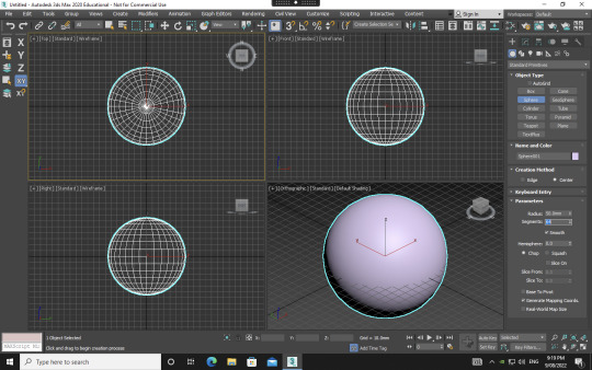
Once I had set up everything and created my sphere, I began to play around with the modifiers as instructed. This gave me insight into the possibilities of 3Dsmax and I was excited at the prospects of what I could do in future if I were to use it more frequently.


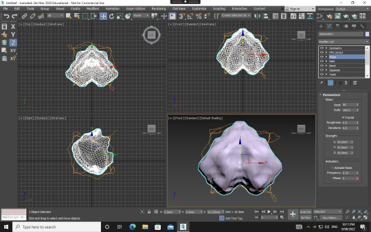

Playing around, I could definitely see how the program may be used for furniture or object design CAD purposes, and I began to try to create forms that were familiar, such as an hourglass shape, a bar of soap and a form that could potentially be a stand or table. One really interesting modifier that I got really exciting results from was the noise modifier with the fractal toggle on. As seen in the bottom left picture, I was able to create an organ-like, almost feotal, alien form. I loved how organic and detailed this result was compared to some of the other modifiers I'd used. I'll definitely be revisiting this modifier to see what interesting creations can come out of it.
Part 2 - Polygon Modelling
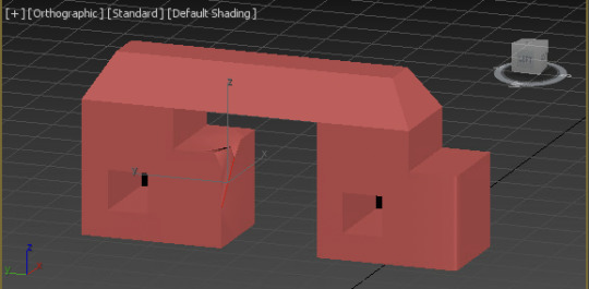

Delving into polygon modelling definitely gave me a better idea of the capabilities and possibilities of 3Dsmax. The youtube tutorials were really helpful as they introduced key tools of extruding, chamfering, cloning, bridging and NURMS. Following the tutorial of creating the train-station seat using NURMS really gave me insight into the process of using this tool. It is a trial-and-error type process involving going back-and-forth and seeing what little changes using differing tools creates the best end-result. Knowing this, I've gathered that I should give myself ample time to explore whilst creating something on a digital platform, especially one in which I'm unfamiliar with and the tools seemingly neverending.
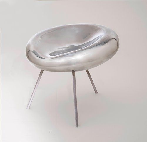
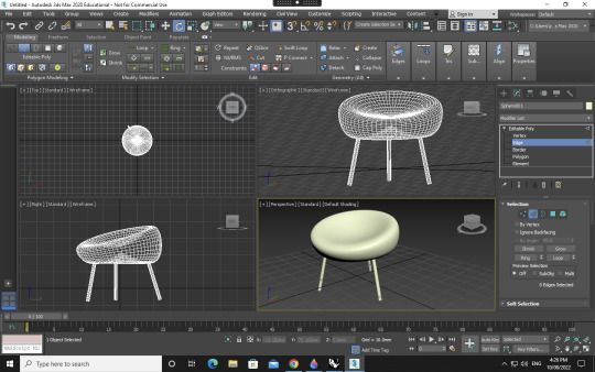
When moving onto the next step, I challenged myself to make a chair I had found on Pinterest. I used a range of tools, including modifying simple primitives from part 1, as well as utilising the polygon modelling skills I had acquired in part 2. Whilst not an exact replica, I was happy I had enough control in 3Dsmax to create an intentional form, involving an organic seat form with a divet and incline and rounded chair legs of a certain angle.
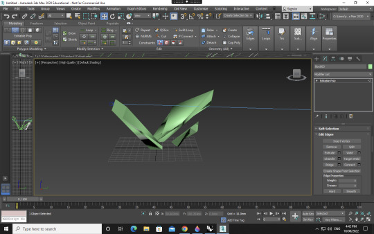


Next, I decided to create a more hard-edged, geometric form. I wanted to create an abstract sculpture of sorts, which may be featured on the street or in an exhibition. Rather than replicating, here I was able to let myself really go to extremes with the tools and experiment and see what forms could come out of it.
This was a very challenging, frustrating yet really rewarding a valuable week for me. CAD and digital programs are always more daunting for me as someone who sees myself as a more creative and hands-on rather than a tech-savvy person. I'm happy with my overall progress and the outcomes which came from it, and next time I'll definitely know to give myself lots of time to explore a new program, as it is a very time and energy consuming process.
14 notes
·
View notes
Text
Week 7 Studio Tutorial – Physical Model Making (foam)
Part 1 and 2: Constructing profile templates and cutting foam blanks
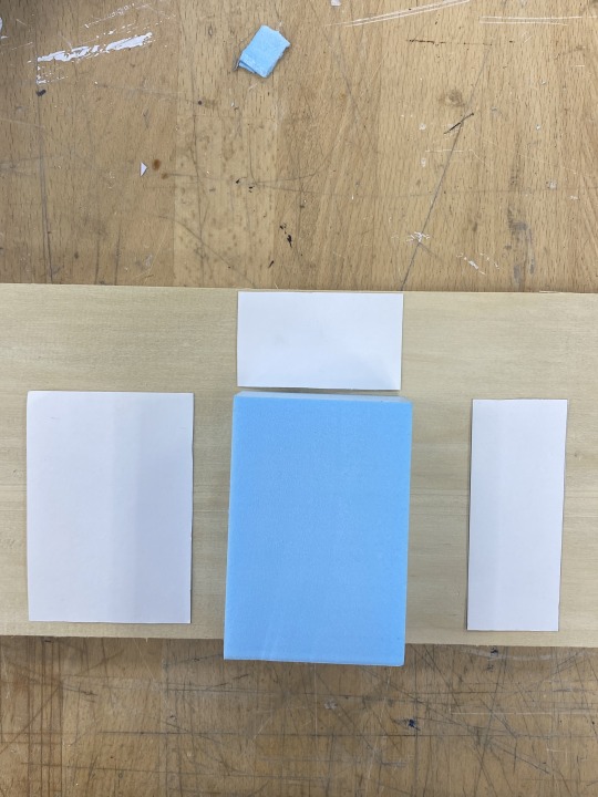

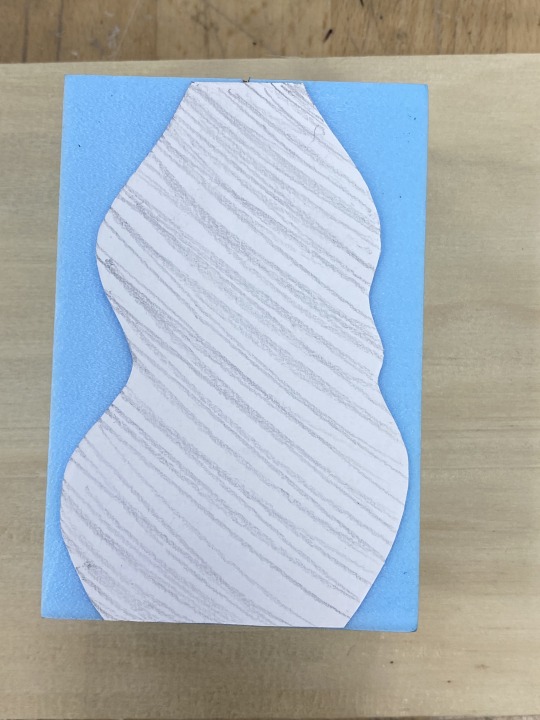
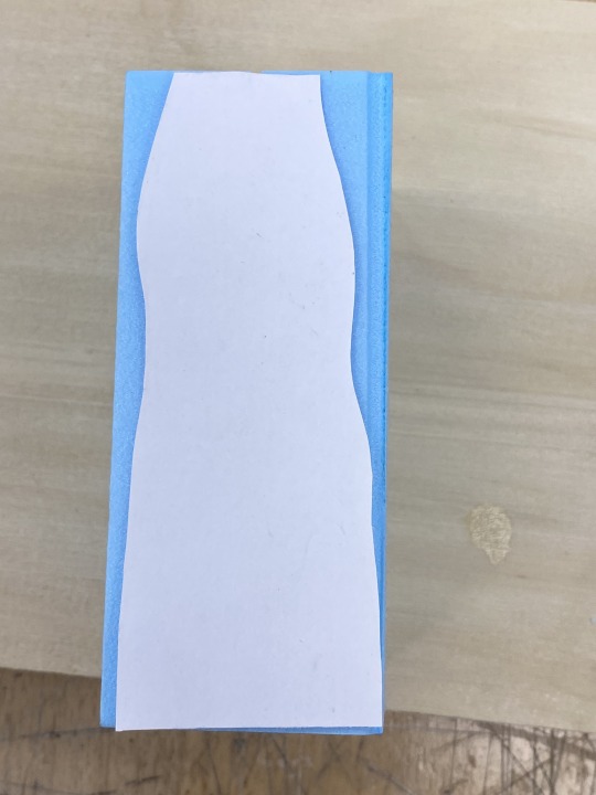
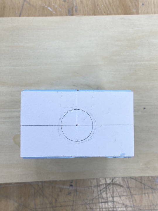
Before this task, I had been creating 3D blue foam forms freehand without any templates. At first glance, I thought that the method of using templates was time-consuming and potentially somewhat pointless. However, after giving it a go, I found that it allowed me to get to the general form I was after much quicker and without the extra thought and confusion of translating a 2D sketch to 3D model that I sometimes found with going straight into a block of foam without planning.
Part 3 and 4: Roughing-in an extruded front view and refining the bottle form
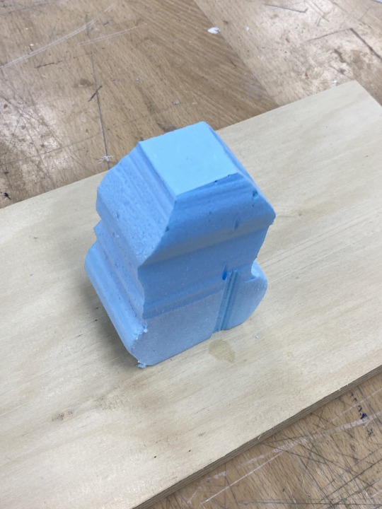
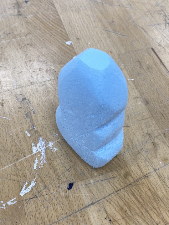
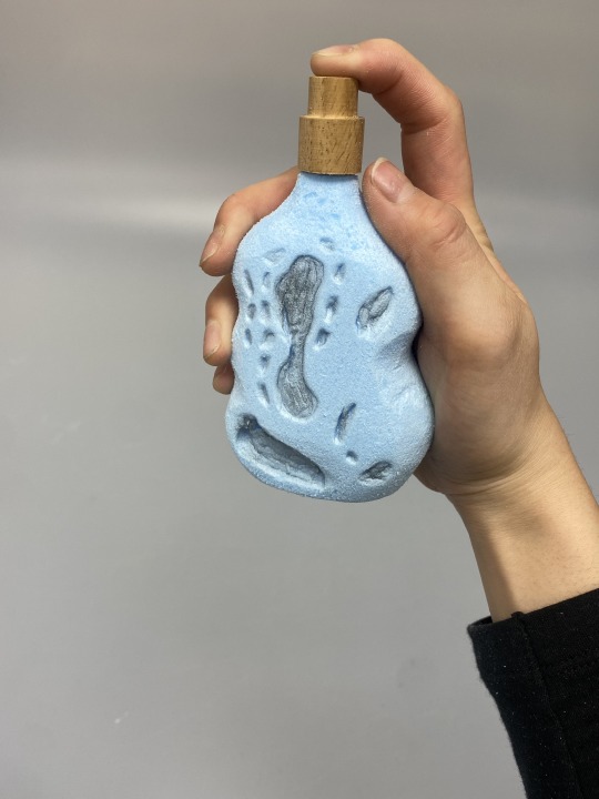
Whilst getting to the general form was quicker and more effective, this method provided less opportunity for improvisation and the happy mistakes that happen sometimes without a template. Therefore, I think it's a method I'll employ when trying to make rough prototypes from 2D thumbnail sketches to 3D form to get an idea of how they'd feel in the hand, or, a method for a final, very, accurate model. However, I think freehand forming with blue foam is something I'll go back to because of the looseness and opportunity for creating new forms through a different, tangible process of experimentation that may lead to new ideas and designs. I think that a combination of both methods can lead to the most successful final outcomes, as going back and forth between processes of sketching and model-making provides variety and therefore, opportunity for more innovative designs.
Other prototypes
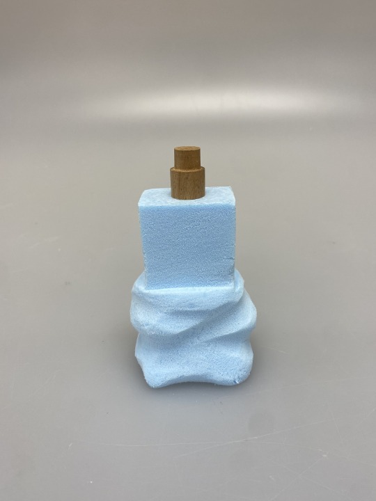

These were some forms I created freehand. With the first model, I think that forming it freehand allowed for the interesting variety and asymmetry and flow of the bottom half, which, if I had used templates, might be more regular and prism-like. However, I think that a simple template with two different sized rectangles for the top and bottom half may have been helpful to create a more balanced ratio.
With the second model, I definitely think using a template would've saved me some brain power, since it is a rather controlled yet organic form, which was a bit of a process to get to without a template.
Overall, I think that this lesson was helpful in introducing me to a method of modelling I hadn't come across or thought of previously. It's definitely something I'll go to when I think it'll be helpful and more efficient. Rather than following the process step by step, I think I might use templates simply to create general forms, ratios etc. rather than creating really accurate or complex templates, so that I have some room for creative improvisation through sculpting.
If I were to redo the exercise, I would ideally create templates for multiple models to really test out if it'd be a helpful method for me rather than being skeptical. This could lead to developing my own process of model-making with blue foam.
5 notes
·
View notes
Text
Week 6 - Continuation from Week 5
Part 3 - Digital Rendering
I found myself really enjoying this week's task, which surprised me, since I haven't delved much into digital drawing techniques and don't have much Photoshop experience at all. I found it a really therapeutic process, and I was definitely able to familiarise myself with some of the tools that were used in the tutorials which will be really helpful for future projects.
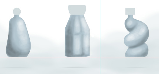
I decided to go with a colour palette and style which communicated the essence of my emotion for Studio rather than sticking to the tutorial steps exactly. I really enjoyed the process of playing around with light, shadow and blurring. The carving process was also really enjoyable and rewarding, seeing shapes and form come to life from a 2D rectangle.
Process pictures:


Final product:

I'm pretty happy with the final product for my first time trying to render on photoshop. I think I definitely need to get to know where light and shadow hits an object from different perspectives, as there were times where I felt stuck as to where to place more tones and where to place highlights.
I like the bottle on the right side the most, since I was able to envision how the lights would hit the curvature of the form. I struggled more with the first two, especially the one in the middle, going back and forth between highlight and shadow.
Overall, this was probably my favourite exercise so far and I'm keen to learn more about drawing digitally and rendering.
14 notes
·
View notes
Text
Week 5 - Sketching
The in-class activities were a good refresher to get back into freehand sketching after the first 4 weeks of very technical drawing. I enjoyed the ellipses exercise and the tips that were given to use your whole arm in a looser movement.


Tutorial Exercises - Part 1
I liked this exercise as it combined two of our units, allowing us to learn and explore the content for both simultaneously.


I found that the technique of outlining the boxes with a thicker pen and then tracing over the top was a much more clean, efficient way of creating accurate thumbnail sketches than say, rubbing out all the pencil lines around the final object.
I explored themes associated with nature as my perfume emotion is serene, and for me, this evokes very organic shapes and influences from the earth.
I purchased two grey copic markers and played around with those for the first time which I found really rewarding and exciting. I'll be sure to use copic markers a lot more in my sketches in future. I combined this with lead pencil to try to create tone and shade.
I found this exercise pretty enjoyable, since it allowed me to express my creativity and explore a little bit with new mediums, which differed from previous weeks.

Part 2
Again, I found the technique of creating an underlay a really clever and clean way of reproducing the same dimensions.


Again, I used a combination of copics and pencils to create some more depth and perspective, communicating the form and shadows of the bottle a little more.
Overall, I enjoyed this week's tasks, which felt more interpretative and allowed for more creative freedom.
15 notes
·
View notes
Text
Week 4 Studio Tutorial - Perspective Drawing
This tutorial exercise was definitely the most challenging and time-consuming of all the exercises thus far, however, because of this, it was also a great learning experience.
Part 1
For the first activity, we had to construct a 2-point perspective view of the chamfered box we had constructed and brought to class.

My first attempt failed as I hadn't taken into account the need for the Station Point (SP) and Picture Plane (PP) to be close enough to each other so that the left and right vanishing points could be established on the page I had. I had set my centre of vision (CV) too close to the centre and my horizon line (HL) and PP too far from one another.
In my next attempt, I moved the CV more toward the right and moved the HL and PP closer together, which worked out.
Projecting the lines from the left and right vanishing points to construct the box was quite confusing and overwhelming when attempting it for the first time, however, this became less of a struggle by the time I had done it a couple more times in the following exercises.


The final product definitely could've utilised better spacial organisation. The construction lines don't come through on the scan, making it look even more bare and poorly spaced. However, I was happy with the outcome of the chamfered box itself, which resulted in a similar perspective to the image in the tutorial task.

Part 2
I definitely felt more comfortable completing the first step, and revising constructing a box in 2 point perspective. However, the rest of the exercise took quite a bit of energy to figure out.
I found that the sheer number of projection lines made it confusing to decipher which lines were integral to actually constructing the extended sides and faces. It was quite time-consuming and at times confusing, however, I'm pretty happy with the final outcome.


Part 3
Constructing the cube felt pretty comfortable for me at this point which I was happy about seeing as how foreign it felt doing it for the first time in class. I found that this task was generally pretty straightforward by following the tutorial in the reading. However, I didn't quite understand how to identify the major and minor arcs on the top face, as there were no opposite vanishing points from the top face.


Overall, I found that this week was very informative and definitely challenged me as well as taught me a lot more about technical drawings.
12 notes
·
View notes
Text
Week 3 Studio Exercise - Section and Auxiliary Views
I found this lesson was definitely a step-up in terms of difficulty and challenging the way I envisioned the forms and dimensions of an object. It tied together everything we had been learning for the past 3 weeks quite well, including section and auxiliary views, orthographic projection, and continuing to apply AS1100 drawing standards.

Again, I found the initial rough sketch to be very useful. Especially in this week's exercise, where the front, section and top views weren't all apparent from first glance, the draft was very effective in helping me to grasp how the form would look from each angle.
Next time, I definitely need to also take into account the layout of the page in my rough sketch, or even do multiple rough sketches to really plan out my page before starting my final drawing.

Projecting a partial auxiliary view of the tapered surface was difficult for me to wrap my head around at first, however, with help from tutors and peers, I understood what was to be represented on the page. I hope that these unfamiliar skills become somewhat second-nature to me by the end of the term.

My final drawing definitely didn't turn out as well as it could've. Using 1:1 scale automatically is definitely something I need to reconsider next time (I would use 1:2 if I were to redo the exercise). There was not enough space on the page for me to create a neat and pleasing layout using this scale. Further, the lack of space and planning resulted in me diverging from drawing standards and putting my title block in the top left corner instead of the bottom. I think I can also improve on the neatness of my handwriting, and again, the line weights aren't as dramatically different and effective in emphasising the views themselves as I would like.
I think my biggest take-away from this week's exercise is to spend longer planning, including thinking about scale, positioning, line weights etc. in order to generate a considered, well-balanced drawing.
22 notes
·
View notes
Text
Week 2 Studio Exercise - Orthogonal Projection & AS1100 Standards
This week's exercise introduced us to AS1100 drafting standards and methods of orthogonal projection. This was done by bringing in an object to create a third-angle orthogonal drawing. I chose a hand cream which proved to be quite a simple object with minimal details to draw and project. However, the curved nature of the shape made it difficult to create a very accurate representation, as that would require measuring the width at multiple intervals.


Constructing the 5-sided box was an interesting and helpful exercise. It allowed me to continue practicing hand-drafting skills using a T-square and ensuring measurements were accurate. The end-product also allowed me to understand third-angle projection better via a more tangible learning style rather than trying to visualise it in my head. However, I think it may have been more effective if I had a more complex or confusing form to draw.

I found that generating a rough sketch of my orthographic views was very helpful in giving me a starting point and providing a reference, which I continually looked to when I was drawing up my accurate orthogonal drawing. This is something I think I will make a habit of starting with for every exercise in the next few weeks, as it helps to double-check measurements, positioning, labelling etc.


The lesson was definitely effective in introducing me to the applications of the theory we went through in the lecture. It was good to be able to apply dimensioning, line weight, border and title block standards, however, I still found myself unsure if what I was doing was correct.
If I were to redo the exercise, I would definitely have chosen an object with more a little bit more complexity and perhaps consisting of geometric and straight edges rather than more organic curves to really allow for accuracy. I feel like it would have been more interesting to have multiple parts to project. I think I would use a bigger difference in line weights next time, as the thinner pen seems to look quite similar to the thicker pen once scanned through.
13 notes
·
View notes
Text
About me
Hi, I'm Tina!
A little bit late to the self-introduction post but I'm really enjoying this class so far and I'm keen to see my sketching and model-making skills develop over the term. I love anything that allows me to express my creativity and am excited for term 2 of industrial design!
1 note
·
View note
Text
Week 1 Studio Tutorial - Drawing Instrument Exercises
Part 1
I found this exercise to be really helpful in introducing me to using T-squares and set tools as jigs to create accurate shapes and drawings. Especially reflecting on past instances where I attempted to create perpendicular or parallel lines, the convenience and practicality of the T-square became apparent. I found that doing the exercise in class was unfamiliar and slightly confusing for me at first, however, by the end of the lesson I was more comfortable, and after redoing the exercises at home, I was more efficient and familiar already. I found that translation from pencil to 0.5mm pen was quite tricky, especially with figure 2. The use of pen with the compass was definitely a bit of a challenge, which is reflected in the final result of my figure 2 drawing. Determining the distance of the compass with a thicker line weight as well as the positioning of the pen within the compass proved to be difficult. Overall, I found that this was a great introductory exercise which I found very useful.


Part 2 - Tesselating Pattern
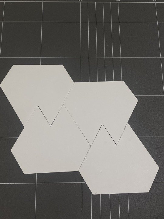
I found this exercise to be interesting, and it allowed me to continue to become more familiar with the T-square and set squares. I found myself drawing the shapes in a way that I found easiest with the tools, which involved using the same lines and angles to create multiple shapes. This probably defeated the purpose of exploring how they tesselated, however, it helped me develop my drawing skills with the tools.
The shapes didn't tesselate perfectly, which I'm not sure was a result of inaccuracy of drawing or inaccuracy of cutting using an exacto knife, or a mixture of both.


11 notes
·
View notes