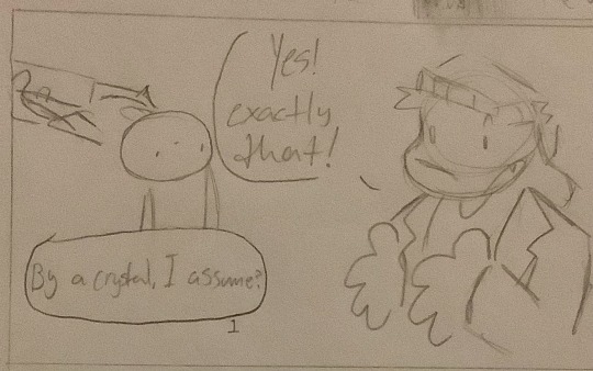
#the first pic is a wip of a traditional comic I wanted to try out
Explore tagged Tumblr posts
Visit Tumblr Blog
Explore Tumblr blogs with no restrictions, modern design and the best experience.
Last Seen Tumblr Blogs


Fun Fact
Post activity is at the highest at 4:00 pm EDT; notes peak at 10:00 pm EDT.
Text
I have news!
I made 3 new aus!
But dw I didn’t forget abt the book thingy au
Tw: bright colors for the last one, and lots of reading
1st au (going from most recent)
So the magic rabbit au. Max is a magician that’s in need of a assistance and Sam is a dog man in need of a job, what perfect match! Sam always wanted to be a magician, but he was horrible at it, but Max never gave up on him. Max never gotten too attached to anyone, but Sam was something different, but of course because I’m writing it Max believes that this shouldn’t be allowed, so they just go on with their acts. Since Max has a bad reputation with other magicians, they get into some “freelance trouble” like being tied up on a spinning wheel and letting little kids throw axes at them /hj. Max does rethinks his feelings, but I’m not sure if he ever confesses to him since I came up with this yesterday, but he does go over Sam’s house so much they practically live together, so yeah.
2nd au
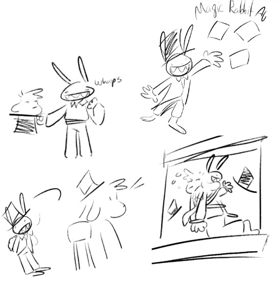
In The love doctor au, Max has every type trauma you can imagine (main character moment). He’s a sad, unemployed, lifeless soul. While watching tv one day, he comes across an ad about a nonprofit organization that helps cure people called ‘The love doctors’. He finally decides to go there after been told to go there by his therapist several times and was partnered with Sam. Sam worked day and night to help him. At first, Max was hesitant and uncooperative, but the more they go one the more he realizes that he likes Sam. Once he got cured, he got too attached and decided to cheat his way into staying with Sam more. In the end Sam finds out about the crush and Sam and Max now live together. Max taking care of the house, and Sam helping out patients. Every now and then, Max finds hisself sad at home, but Sam can easily cure him.
3rd (and final)
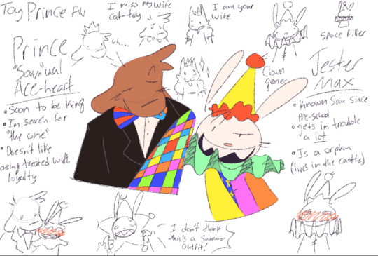
I wanted to redraw this since it was made a whole month ago so here’s the original
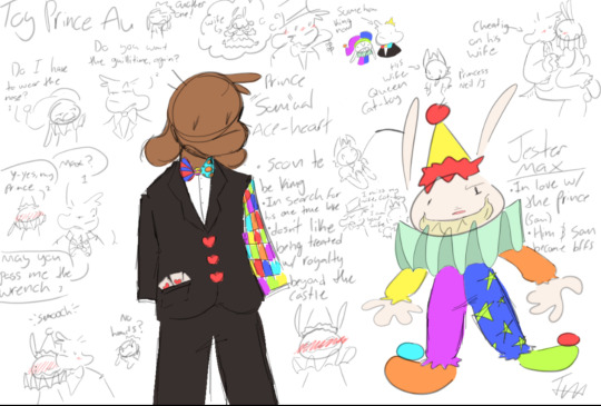
In the toy prince au they live in a society where they’re different regions that belong to certain kings and queens (and they’re all toys). Sam is the prince of “The Aces” (one of a few colonized lands) but soon has to make his choice on who will be his spouse. And because this is Sam we’re talking, he’s looking forward to marrying someone. Max is an orphan picked off the streets when he was little, and was chosen to be the royal jester. Ever since then Sam and Max has been best friends, but Max’s friendship for Sam has grown stronger over time. A bit too strong. Once the day comes for Sam to choose his wife, his mother breaks the news that he’ll be marrying princess ‘Queen Cat-toy’ (yes that’s her name) for treaty purposes with one of the regions. This marriage makes Max jealous because he’s Max, and because he’s afraid Sam won’t hang around him anymore. And that’s when he discovers his feeling for him, but he tries to reject them because “forbidden love” stuff. A few weeks later, Sam’s birthday comes around and he and Max barely talk anymore because Cat-toy needs attention and she keeps dragging Sam everywhere with her. Sam becomes sick of her but he can’t divorce her because she’s crazy and tries to threaten him by planning out a huge war. Because of this Sam realizes that he misses Max, in a way he feels like he shouldn’t. In the middle of the huge birthday party, he sneaks to go take a break from life itself, and Max follows. Max finally decides to speak his feelings and Sam and him decides they’ll be in a royal affair. Princess Queen Cat-toy soon finds out that about this affair and is trying to catch him in the act to get guillotined (I forgot to mention, Max gets sentenced to the guillotine several times because he and Sam like to go out on adventures around the village, and usually Max is the one to get in trouble even if it was Sam’s idea to go in the first place).
Fun fact: this one was inspired and made the same day as The Amazing Digital Circus
#sam and max#sam and max fanart#artoftheday#freelance police#snm#sam and max freelance police#freelance husbands#sam and max au#the first pic is a wip of a traditional comic I wanted to try out#it’s also apart of the story#in summary. the first one’s just Sam and Max but ✨magical✨. the second one’s just extremely gay#Oof I pressed the comma#I don’t feel like retyping that#and the third one is just them in loyalty#I need to get to writing#idk what else to tag
10 notes
·
View notes
Note
Hi! You're one of my favorite artists ever, and I would love to do some studies of your art! What are some of your favorite pieces that you've done, and how do you pick your colors? There's a lot more questions that I could ask, but figured you wouldn't appreciate an entire list of questions XD
Hello and thank you, I am honored! Feel free to send me all and any questions! I'll answer these two, starting by:
How do you pick your colors?
As I change art style with pretty much every illustration project of significance, this varies a lot. Here are, from most to least common, ways I pick my colors.
Eyeballing it. Unfortunately my most common... What I will do a lot digitally is lay down a color background, and flats of a few colors, then manually adjust each until they look good together by selecting by color and using adjustements. I then paint over it all.
Using a limited palette, eyeballed. Same as before, but this time I force myself to only use a few colors. It helps me, as constraints do.
Using a reference, eyeballed. This happens a lot when I mimick an art style. My medieval drawings for example, are often done by looking at images of actual medieval art to get an idea of what colors to use to look medieval.
Using an existing image, pipetted. Rarely, often as a challenge or if I'm super stuck, I'll just take a pic with colors I like and pipet from it. This website automates this if you want a good easy starting point!
These can be combined around. I'll post examples now, explaining how they use each.
This is a sketch for a drawing I ended up doing way different. This is the first method - I used a flat layer for the characteres and three colors for the sky to test out atmosphere. This is how I plan out most full paintings, just trying to nail down a mood I have in my head. I fiddle around until I like it or, like in this case, fully give up and iterate further. Here, the composition was to be redone too as I did not like the body language. I was going for "bright hot sunny day under a weather that feels wrong".
For this comic, I combined a very limited palette and a photo ref to pipet from. I was looking for the stark cold/warm contrast of a mid-season bright night by a fireside. I took a google image photo of a campfire at night that was already edited. The photo itself looks unnatural but conveyed what I wanted. It's still on the file itself! From it, I pipetted a few colors I found "summed up" the palette and did all with them.

While my own habits make me prefer painting as you would in traditional methods, with directly picking the right colors, I will often digitally alter with overlays and layer blending modes some colors and gradients, etc, to alter a drawing to fix it's color palette. The following is a quite egregious example, because I first drew the character in flats before putting him in a full scene. Here is a before/after summed up.

The shadow is a layer, the bright yellow light zones also, and the orange "transitions" of light zones on the skin a third. There's also an overlay over the full character to blend him in. I do this by...making a full flat color of a layer, fucking around until a blending mode does what I want, and adjusting hue/brightness/saturation and opacity until it looks good.
Another WIP where I was struggling with the overall palette. I was going for late 60s psychedelic. You can see in the top right the original color. I thought it looked too...new, so I added a yellow layer on top, and fiddled with it. Final choice was the following setting. I then put it with my sketch and color blockout in a folder and painted over it.
For this sort of adjustement, the "Color Balance" modifier in CSP, Photoshop, and others is also a godsend - but one I often use for fine tuning a finished piece.


This being said, there's some rough rules to coloring which are...born from studying color theory and doing studies. I am guilty of doing very little studies...so I'll just sum up the basics of the color theory rules I use.
For "default" shading, I use a color that is darker, more saturated and with a slight hue diff. This is my "don't shade with black".
Using a shadow that's cooler will make the light look warm.
Vice versa.
There's a bunch of stuff to remember in how colors relate to each other and pipetting images who's atmosphere you think is interesting really is the best way to learn... It's learning how to black-blue/gold-yellow dress in your own art for the lack of a better word...But the basics will be:

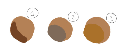
Don't trust numerical values, but look at your colors in context. A same hue, brightness, saturation can look so much different. This is how Rakkan's beard looks whiteish here despite being a light very grey brown.

All this but...colour is such a wide topic, I can't really say a lot but can also type for hours... if you have precise questions about a piece in particular I can explain :') I hope this wasn't too vague and was instructive!
Speaking of particular pieces, answering your question last under the cut:
What are some of your favorite pieces that you've done?
In no particular order, illustration only.
Including this in another poast bc staff's new post editor limits the amounts of pics I can put in response to asks. Insert colorful language here...
Frankly twas hard to pick I am rarely fond of what I draw
41 notes
·
View notes
Note
Hello! May I ask how you draw? I'm currently learning how to myself and would be highly interested into a step to step process by you! Like from sketch to the done thing (no color necessary)
Hello there!
I dunno how I feel about showing how I work/giving advice to someone who’s learning (and I say it as a pro artist who went through years of traditional art education) because when I do the illustrations you see here on my tumblr I BREAK THE RULES you’d learn though life drawing routine, and give in to bad habits, and my methods are rather unplanned and chaotic which makes it difficult to pinpoint significant stages. But I used my portable potato to take some photos during working on my last piece, so I’ll throw it here with a bit of an explanation of what’s going on.
Before I begin - and because you’re about to look at a mess of a WIP - I’d like to give you some general advice that generally makes life easier when you draw (again, things that I learned in traditional arts education - another artist might advise you the complete opposite, dunno!)
Work holistically. Forget them satisfying-to-look-at clips on instagram showing someone produce a hyperrealistic portrait starting from an eye, with each and every element emerging being finished before they proceed to another part. It takes a lot of talent, yes, but these are ppl redrawing a photo in a kind of a mechanical manner. Most artists don’t work this way. Especially if you’re working without a reference, or if you’re doing a life drawing - your process will be layering and changing and finding what works best to give an impression of what you’re drawing rather than reproduce the exact image, and your artwork is likely to look messy most of the time.That said: don’t start with the details. Don’t spend too much time on a particular part while neglecting others. Your goal is to keep the whole piece at the same level of ‘finished’ (even though it’s unfinished - do I make sense?) before you’re confident that everything is where it should be and proceed to the details. So sketch out the composition first. See how things fit, what’s the dynamics. You’ll save yourself from limbs sticking out from the frame, odd proportions etc etc.
Because it’s a game of relationships between different parts of the picture/scene. I ask you not to worry about finishing a single element before laying out the rest because you’ll find that said element will look different once the other part appears! For instance - you might think that the colour you picked for a character’s hair is already very dark. But once you’re done with the night sky background, you’ll find that it’s in fact too light, and doesn’t work well with the cold palette. You’ll have to revisit different parts of the image as you go to balance these relationships and make the picture work as a whole.
Give an impression of something being there without actually drawing it ‘properly’- because details are hard, mate. You’ll see that my lineart usually has hardly any, and my colouring is large unrefined stains, but the finished thing looks convincing. Like, fuck, I can never focus on how Crowley’s eyes are really shaped. So I just turn them into large glowing yellow ellipses crossed by a line, and heard no protests so far.
Don’t panic if you messed up (you probably didn’t anyway). It might turn out to be a completely unnoticeable mistake - because, remember, things work together to balance each other, so another finished off prominent element will probably drown that badly placed line that looked so visible and out of place a second ago.
It might not look good before it’s finished. I’m mostly immune to it after years of drawing, and my recent illustrations all follow a specific method (ykno, my sunset glow effects and all that) so I can kinda predict the next stage. But I do my linearts on a specially picked crap paper, I don’t bother erasing the smudged graphite, and it looks messy af until I make the background white in Photoshop. Conclusion: you might have a moment of doubt as you work through a piece, but try to break through it - I often suddenly start to like what I cursed a minute before! - and try to finish it even if it’s meant to be bad. This way, looking through your past pieces, you’ll see the progress. And trust me, I can’t even look at my art from literally three months ago. It’s normal.
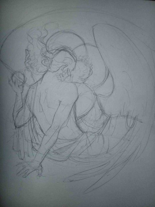
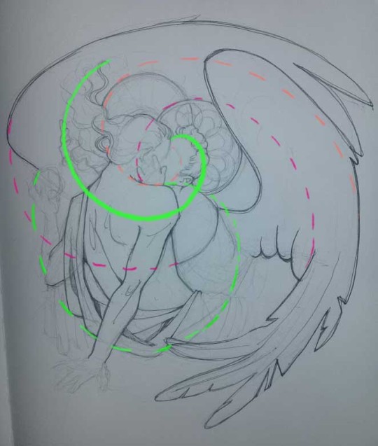
Now, pics! The sketches are paler in real life, but I increased the contrast a little so you can see something.
1. Laying out the composition!
I wanted to just show them kissing, but I got carried away due to some Art Nouveau inspiration. As you might have noticed, most of my illustrations are quite self-contained (ykno - they look like a sticker on a plain background). So I wanted a tight swirl bordered by Aziraphale’s wings creating a sort of rounded, yin-yang like bubble around them. Consequently I made the whole composition revolve around their heads.

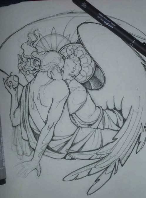
2. Adding more details to the sketch. It’s messy af. It will be messy until I’m done. It’s fine.
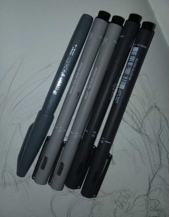
3. These are the fineliners I use for the linearts! They are made by Uni-ball and come in light and dark grey. I also sometimes use the guy on the left - ‘Touch’ sign pen by Pentel, when I want more brush-like, wider strokes. I work in grey because when I scan it and do my usual boring trick with sunlight highlights - which is an Overlay mode layer in Photoshop - the highlights ‘burn out’ the lines too and make them vanish a little, and the lighting effect gets more striking. I also like to use the light grey ones to make something look pencil-y without actually using pencil, because pencil fucking smudges.
4. It smudges! So because I am right handed, I start inking from the right hand side, no matter how tempted I am to do their faces first.
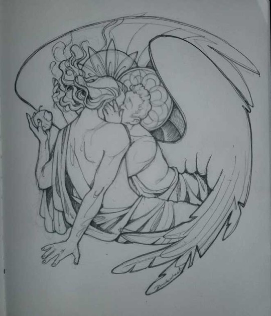
5. You can see the composition directions here. I made it intuitively, but ofc some ppl actually use grids etc to lay out their drawings.
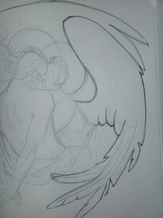
6. See how pale ans thin the lineart was at first? I kept adjusting it as new inked parts were appearing. It starts to look nice and consistent now!
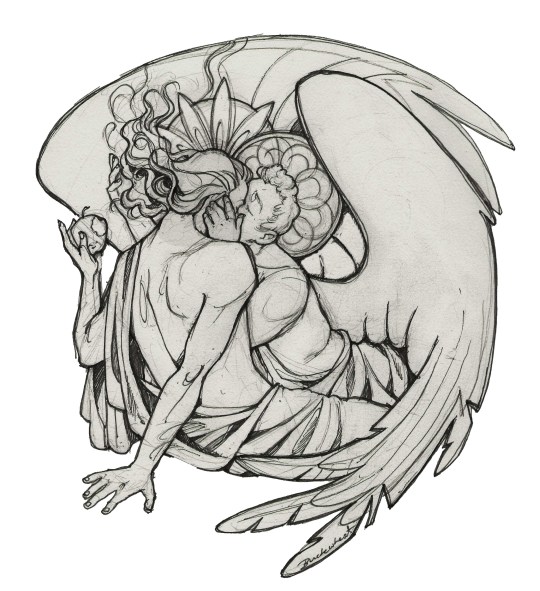
7. Finished lineart? There are some mistakes which I later corrected in PS. Notice that Aziraphale’s face has hardly any details on it - I tried to make the drawing suggest his expression rather than risk overdoing it.
8. Photoshop time!! You can totally do what I did here even if you don’t have a graphic tablet. I used Curves tool to enhance the lineart, then Quick Selection Tool to select the background around around my sticker-like piece and filled it white (on a new layer ofc). I keep this white layer on top of the layer order so it works as a mask as I colour. I decided I did not like the hatching shading underneath Aziraphale’s halo, so I erased it with a Stamp tool (because I wanna keep the textured grey fill my crap paper naturally gives me!). It’s done roughly but won’t be visible once the thing is coloured.
9. And the reason why I keep the grey shade instead of easily getting rid of it by using Curves/Levels is because when I set this layer to Multiply mode and colour underneath, it gives me this nice desaturated look like from an old cheap paper comic page. It works as a natural filter! But of course I can’t do bright colours this way, so all my glowing highlights happen ABOVE the lineart layer - on a separate layer in Overlay mode!
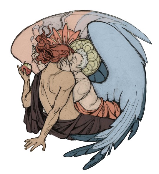
Finished thing here!
_____
Commission infoBuy Me a Coffee - help me with my transitioning expenses!Prints and stickers and things on my Redbubble!
#ask the buckwheat#long post#tutorial#drawing advice#drawing tutorial#good omens#ineffable husbands#good omens fanart#good omens art#my illustrations#doodles#toastedbuckwheat
1K notes
·
View notes