#the first one was . my first ii fanart i think. i drew what after finishing s1
Explore tagged Tumblr posts
Text
gaymers and such more


#ii knife#ii pickle#ii knickle#knickle#ii taco#ii microphone#ii mephone4#inanimate insanity#knickle.. gaymers#they game for days straight#GET OFF THE COUCH!!!!!!!!! TAKE A DAMN SHOWER!!!!!!!!!!!!!!!!#have been very iffy drswing lately#blurgh#the first one was . my first ii fanart i think. i drew what after finishing s1#gaymers .....#phonification#still getting the hang of drawing objects#artsy fartsy
103 notes
·
View notes
Text
BTTF Year-End Tag Game!
Thanks for the tag, @mjf-af! And thanks for loving one of my favorite fics this year, @daryfromthefuture! 🥰
This year:
How many times would you guess you watched the first back to the future movie? First film, only once or twice. After I finished basically studying it frame-for-frame for my triloogy rewrite, I took a bit of a break lol.
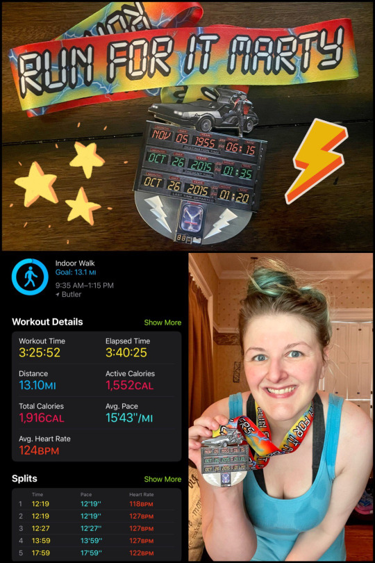
Did you get any sweet bttf merch? If so, what! I did! Lots! I got the complete 1989 BttF II Topps trading card collection, We Don't Need Roads: The Making of the Back to the Future Trilogy, Creating Back to hte Future: The Musical, Save the Clocktower tote, BttF Musical t-shirt, Pink Clint Eastwood hoodie, Enchantment Under the Sea Dance t-shirt, and a 10K medal from MedalChasers!
3. How many cans of Pepsi Free did you chug this year? None. Don't hurt me, but I'm a Diet Coke girl. I was heavily into Pespi in my youth, but I gave up pop for a few years, then one of my medications changed my tastebuds like whoa and I couldn't handle how sweet it was!
4. What was a favorite bttf fanfic you read this year? Don't do this to me! 😩 Tie between He Didn't Start the Fire by @daryfromthefuture, which really started all this 40s Doc phenomenon and was gifted to me in exchange for A Fracture in the Space-time Continuum. I also loved being a part of @professorsaber's r/ThePinheads: Guys, Marty McFLy really *is* a time traveller!!!
5. A favorite bttf fanart you saw this year? (please give us a link, not a screencap/repost!) My favorite this year was one that was a surprise made just for me, so it has no link, unfortunately. @daryfromthefuture drew this for my birthday way back in March of her Until I Get Home Marty and my Once Upon A Time in the West "Clint" about to be blown to bits by cake. Affectionately. :) I smile at it often and love it so much! 🥰

6. Did you create any bttf fanart or fanfic? If you did, what one(s) are you proudest of? Pfffft. Apparently, I added 22 (‽) fics to the BttF AO3 this year?? When the hell did I have time to do that?? Anyhoo, my favorite is a three-way tie and changes based on my mood: A Fracture in the Space-time Continuum (the most canon-flavored of the lot), Now I Am Become Death (my history-heavy Manhattan Project Doc fic), and Once Upon a Time in the East (#2) (because of all the personal leaps in my writing I took with this one).
7. How many times were you late for school this year? I don't attend school anymore, and being self-employed, I have the luxury of running a few minutes late (if it's more than 5 minutes, I count it as late late).
8. Did you watch any other movies/tv shows with BTTF actors in them? I watched MJF's documentary, Still. I watched about a million episodes of classic Spongebob, where Tom Wilson does a lot of voice acting. Watched Who Framed Roger Rabbit? once with Christopher Lloyd as the amazingly unsettling Judge Doom, Titanic with Billy Zane, and I think that's it. I didn't get a lot of screen time outside writing this year.
9. Was there a memorable moment you heard a Huey Lewis song this year? In September, "Hip to be a Square" came on in the grocery store, and I was reminded how much I loved that song as a kid. I'm gonna catch hands for this, but it's probably my favorite Huey Lewis song. :)
10. How many times did you fall down this year? I don't even know. Two of those falls involved my lower legs folding up underneath me as I slid down the stairs, though. The first time, I broke a toe, and the second time was down a set of brick stairs. My entire left leg was a bruise from knee to ankle. There is still some swelling in my knee a month later that makes it painful to kneel on that knee.
11. Did you get to see BTTF: The Musical? What was your experience like! I did I did I did I did I DID!! It was AMAZING! I was out the door and back home in 25 hours, and it was such a fun solo venture! I even got to meet @bri-to-the-future because we happened to be there the same day! I have detailed it extensively in this post!
12. How many times did your mom retell the story of how she and your father met? Uh, maybe once that I heard (I don't live with them anymore). It's a great story. I heard it a bunch growing up, though! My mom was a Good Student, and my dad was Just There Joking-type. They had Home Ec together. She was passing out tests for the teacher, and my dad handed the test back to my mom and said, "I don't want this." My mom just froze up because she didn't know what to do. XD
13. If you could describe your year in a BTTF quote, which one would it be? "You man enough to back them up with more than just a pie plate?" comes to mind because I'm a dreamer with ADHD. That means I spout off stuff all the time that I want to do (fics I want to write), but they're only going to get done through my actions. Starting stuff is hard for an ADHDer, even if it's something we REALLY want to do. I have to follow through or it won't happen. And I did a good deal of that this year and last year, and I'm big proud of that!
14.⚡️LIGHTNING ROUND⚡️ Did you get to: go on any trains, skate on a skateboard, ride a horse, drive a Delorean, run in the rain, go to a dance, hang up a clock, play the guitar, pull an all-nighter, read science fiction, or drive-thru Burger King this year?
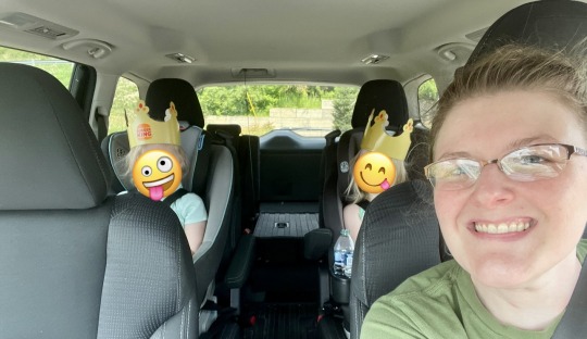
15. Your future is whatever you make it! So what are you going to make of this coming year? I said this last year, but this year I'm gonna stick to it: this coming year, I'm going to focus more on reading again. I've spent the last three years going so hard with my writing, terrified if I stopped I wouldn't start again for another eight years, but I'm also confident enough to say that I'll be writing here and there again and not lose it like I did before. I want to read more in 2024 because some of my own writing is feeling stale, like I'm reusing phrases, words, scenarios, etc., and I need some new stuff to inspire the evolution of my writing. I also want to start working on something original! I will absolutely still be around (I host June of Doom after all, and I have a McFly July streak to maintain)! So keep tagging me in these awesome games!
I'm tagging everyone who hasn't been tagged yet!!! :D
#back to the future#bttf#bttf year-end tag game#tag game#fanfic#fanfiction#bttf art#i love these!#thanks!!#see you guys in 2024!!
7 notes
·
View notes
Text
liner notes/unused joke summaries for kiss fics (part ii)
Despite what my general dislike of the shift key and my tendency to mock all that I love might imply, I actually overthink everything I write to a great extent. I make no claims to these explanations being in any way enjoyable, but if you wanted to know what I was thinking while writing KISS fic… now you do. Part one can be found here.
all of your b-films A passionately embittered Peter wants to complain about KISS limping along without him and Ace, while Ace just wants to celebrate their anniversary. No, not KISS’.
>>Arguably the bookend to times upon this star, although the events are set a year apart. The themes are similar-- feelings of having had everything and utterly blowing it, longing to return to the past. I was really nervous writing this since I haven’t ever done much with Peter and I didn’t want him to come off like a caricature. The title comes from the Elton John song “I’ve Seen That Movie, Too,” which has some of the most incredibly caustic lyrics of any of his and Taupin’s work and fit Peter’s anger, though it doesn’t fit his relationship with Ace at all. But a b-film itself is made on a cheap budget, something the studio shoves out for a quick buck without it being terribly polished, and without any big stars. So it’s the other side of the coin, really-- Gene and Paul, still pulling in a couple thousand people a show and managing fairly respectable tours as KISS (let it be said that in ’89, when “all of your b-films” is set, Paul really is wandering around doing a depressing solo club tour while Gene’s busy taking care of Shannon/enjoying being a first-time acknowledged father with Nick-- I’m not sure if Peter himself was actually touring then, though; he did a lot of sporadic stints), while Ace and Peter are playing dive bars and Ace is having to time his album release to coincide with KISS’ just to pull in publicity. The Blondie bit is a probably too-obvious parallel-- KISS (at least original flavor KISS) is long gone, but Ace is still taking care of Peter. As much as an alcoholic can, at least. I wanted to explore a bit of how much everyone in the original band misses each other, even though Peter’s spiteful about it. A lot of Ace and Peter’s relationship goes deliberately unstated here; I think what goes unsaid in a story is ten times as important as what’s said, but I hope how they feel about each other is still clear even without any confessional moments-- or any verbal acknowledgment that the cake was a wedding cake.
something blue Paul convinces his bandmates to do drag. Ace convinces Paul to give him a blowjob.
>>@collatxral_damage drew up some really lovely fanart of KISS’ birthday drag for Paul and the initial scenario, which was the primary inspiration. I started writing it during an unforeseen layover and pretty much plowed through finishing over a couple days. I enjoy genderfuckery with KISS (I’ve heard-- this is unsubstantiated-- that very early on, pre-Aucoin, they dressed in drag for their actual performances), albeit within certain parameters; I don’t think Ace would’ve ever gotten away with calling Paul a girl if they weren’t both in drag. There’s a lot of both blatant and subtle goading in this fic, like Paul deliberately sucking on Ace’s wedding ring finger (at this point he’d been married less than a year), and random amusing stuff like Ace making Paul be the one to barricade the doors for their liaison. I enjoyed the transgressive aspect and the hesitation on both sides; it’s not something I’ve gotten to play around with much with Ace. The something blue is, well, Ace’s panties, but it’s also a really obvious reference to the list of bridalwear requirements. I’d like to do more crossdressing fic where they’re exploring the kink more, but I’d need an idea for it first.
starfucker Paul decides that all he needs to seduce Gene is a bathrobe and some sexy poses. Apparently, he isn’t wrong.
>>Gene’s photo album is probably one of the most infamous pieces of kisstory, as it were. When I was in middle school, I remember listening to his NPR interview in the car with my parents (I sort of knew who he was from TV clips-- this was right after the Farewell tour) and being more than mildly horrified at this guy who talked so readily about all the sex he’d gotten, and was brazen enough to suggest his interviewer needed a good lay. It stuck with me. Anyway, I wanted to write something re: the album, and I also wanted to write Paul as the instigating party, for once. Paul always tried the hardest during photoshoots to be alluring and sexy, and most of the time, he succeeded, so it was fun to check out poses he actually did during the seventies as I wrote up his seduction of Gene. “Starfucker” is a Rolling Stones song, referencing groupies, but it’s also a bit of an in-joke within the fic itself-- Gene’s the starfucker, as in he’s fucking the Starchild. Or maybe, since they’re both rockstars, they’re both starfuckers... I think Paul wanted to get closer to Gene than he actually managed in this fic (asking him about ever wanting an honest relationship, then, when Gene tells him to go to a shrink for that, Paul just goes all sexy Starchild on Gene instead...), which is kind of a shame!
#kiss the band#kiss fanfiction#kiss slash#ace frehleyxpaulstanley#ace frehley x peter criss#gene simmons x paul stanley#paul stanley#ace frehley#gene simmons#peter criss#liner notes
25 notes
·
View notes
Text
Coloring in grey scale
So, hey, this is somewhat of a tutorial for those curious about some of my coloring and blending. I made this especially for anyone younger than me and is exploring digital art, but this is also for others who are curious about what I do. I love reading other artist’s comments and looking at their WIPs, so why not.
Another reminder: if you’re looking for my artwork, please follow @rainbow-illness and not this blog. All of my finished stuff goes there; usually, my works in progress (WIPs) or Angry Doodle Corner go here. Sometimes I use this blog to repost my art, but that is my official art blog, no this one. Not unless you like nonsensical posting and metal, then have at it. If you have any questions, don’t be afraid to hit me up, I love talking about art.
So I can’t always sit down and talk about my processes and how I go about doing them, but I was able to sit down and take some screencaps while I was working on my iPad Pro. Using the iPad is actually my first choice to draw on because of the convenience of carrying it around like a sketchbook, whereas my laptop isn’t always easy to carry around--it’s a big laptop. While I use my iPad, I also like to go back and correct things, recolor, re-proportion, or spend more time privately working on a drawing. I have my iPad with me, all the time, so I’m out in places usually like Starbucks doing this. I also struggle with pretty bad PTSD and agoraphobia, so having my iPad out with my headphones on gives me an excuse to put my mind elsewhere to calm down. My family just usually looks at me and goes “oh, she’s working on her art again”; I did this as a kid, too, only with sketchbooks.
I do not have a Cintiq either, though I would absolutely love one. This laptop is capable of using a stylus, but I think I need a better one to do it with. All I’m using is a cheap Wacom Bamboo tablet that I’ve had for five years, that’s it. Everything I’ve done on this blog has been on a small surface. So if you’re just dabbling into art, don’t beat yourself up for having the small stuff, I’ve worked with small stuff and still do. The only thing I have that’s not small is, well, the space and processor on my laptop are much faster than any other laptop I’ve owned, bought especially for graphic design classes and my artwork.
So, that being said lemme just forewarn some of you guys. My artwork is all done in two to three layers! Yes, you read that right! Why? When I was 16, I didn’t have a Wacom tablet to mess with, so I had to use a mouse and learned from there. When I turned 18, I got my first Wacom tablet while working my first official job and the family computer didn’t have a good processor. So when I got my first official laptop, it was basic and not made to run anything beyond the web browser and such, it could barely handle Photoshop. It did, however, run Paint Tool SAI with no issue (which is why I still prefer it over anything I use), it just couldn’t handle more than five layers. After losing my drawings constantly and not being able to do anything in the prized software I’ve been eyeing since my Sophmore year of high school, I found a workaround with it.
And that’s what I’m going to write about here. With that in mind, no, you do not have to limit your layers! I’ve taken traditional art classes so my first instinct is to literally paint over my stuff like I would on a canvas. If you don’t want to do that, you don’t have to! Yes, I am nuts.
That being said, let's do this.
If you haven’t taken traditional art classes, that’s cool! I’m going to be using some art terms you haven’t heard of, but you definitely will when you take your first ever drawing class. These terms are foreground, value, negative space, contour, and weighted line (I’ve seen it called line weight too). For the more experienced art students who are likely groaning over that stupid contour practice from that book “Drawing on the Right Side of the Brain”, I’m sorry, guys. Newbies, you are going to know this.
And you are going to hate it. While I still hate it and, yeah, my eyes are rolling into my skull right now just even talking about it, there are some useful practices in here that I... actually use. Who would have thought? At least we’re not talking about still lives.
Anyway, here’s what I’M going to say that some art teachers will not tell you but I want anyone to read this to know:
- Do not obsess over your drawing to look exactly like your reference. Just don’t. Forget this completely, worry about it later or don’t even worry about it at all. This is your style, your interpretation.
- Digital art is hard. Art is hard! Practice makes perfect and you learn over time just by studying (looking at) other pieces of art. It took me like well over 10 years to find my own little niche and I’m still playing around with coloring styles. I have a lot.
- If you’re just starting to draw with a tablet of any kind, play around with it. My first official program was a cheaper version of Paint Shop Pro and when I first got it when I was 14, I sat around and experimented on layers to see what it would look like. Explore!
- When you start drawing figures or faces, try not to think of it as, well, face or a figure. Reduce it to basic shapes, like squares, triangles, and circles.
Greyscale can establish light source, value, scale, and negative space.
I don’t always use greyscale for my art, but when I do, I appreciate it because it makes my life easier. For example, Alphonse Mucha’s pieces here from his “Slav Epic”.
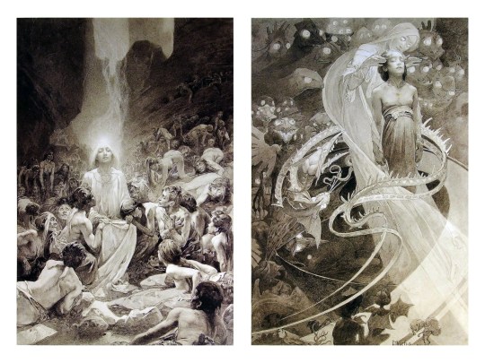
Chances are, you’ve seen Mucha’s art nouveau on prints, fanart, fabrics, and all of that. But Mucha did so much more and he is a huge influence on me for a reason. By the greyscale we see here, we can see foreground/subject with each illustration. Mucha is using value (that’s shadow) to emphasize this, in addition to negative space (background) to draw you in, just by using black and white. Notice how the other subjects don’t have such a powerful contrast and light source versus the other, especially the woman on the left. Mucha made his art pop by his understanding of contrast.
For this first part of this entry, I’m going to be using Papa Emeritus II from “Ghost”... who is a good example of how to draw faces, too. Huh. Regardless of what drawing program you’re using, keep your opacity low, at 50%.
Simplicity at its finest
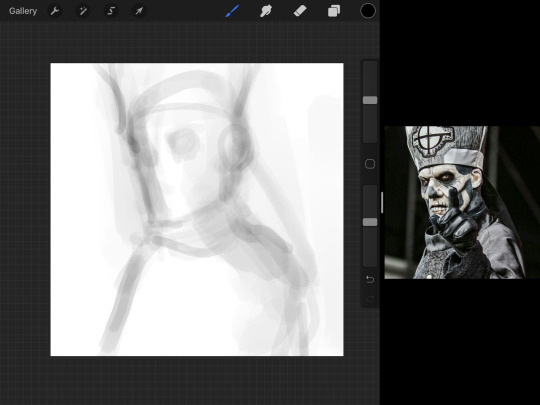
Instead of focusing a lot on Emeritus’ face, I’m going to focus on the negative space behind him. I’m using this to define his figure. This is a good picture because of the stark contrast, though, it’s a little tricky because it is really contrasted and you can’t see where the light source really is. But that is okay! I am going in and just using this negative space, the contour of his head and torso. Before I even think of a face, I want to softly go in and use black (or grey) to fill up that negative space. Keep it simple and work your way up.
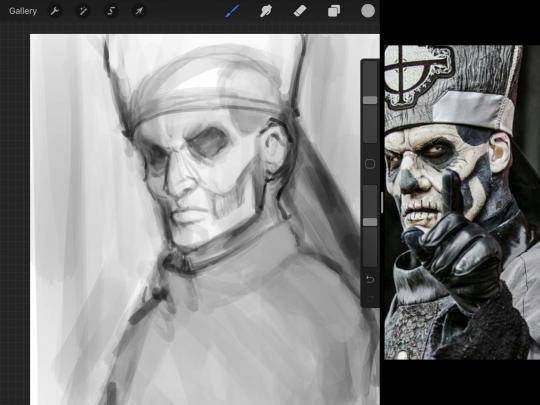
After I lightly fill in the negative space around him, I can start lightly going in and establish his face by blocks of shadow. And this is why Emeritus II is such a good example for this kind of work. I don’t usually start going in and drawing eyes, I rely on the shadows of the face to see where their eyes, ears, lips, and such lie.
Here’s another example (though, it’s old):
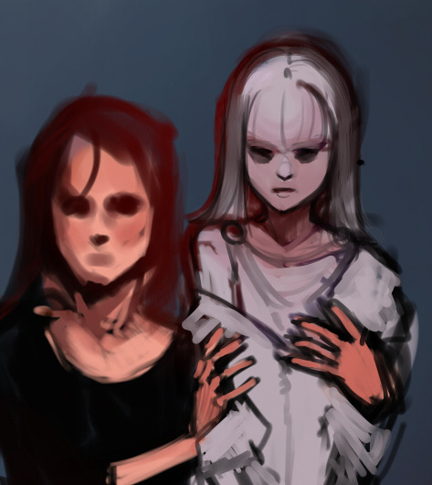
This is in my maroon style underpaint, which is what I post most of the time. For their faces, I just used basically eye sockets to start working on their faces, like Papa Emeritus II down below. Again, this dude is a great example.
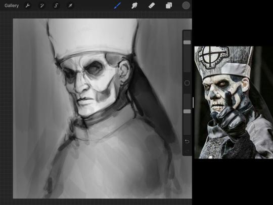
Here is where it may get a little funky. I created a new layer and set that layer to Multiply, still keeping that opacity low. Since I have no light source and I just want to create a really dramatic lighting, I made a vignette with a simple airbrush tool.
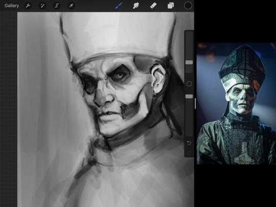
With that little vignette, you can create a new layer (unless you’re me, I just merge it down because of that constant fear of nonexistent software crashing) and I’m using the color pick tool to go back and forth to start using greys to really get into Emeritus’ face, especially his wrinkles. I’m painting over it constantly, switching back and forth between a paintbrush tool and color pick tool to blend. Again, keep your opacity low... unless you’re me and you’re feeling adventurous. You’ll also notice here that I have more than one photo reference. I use several for a lot of my art, so I encourage you to do the same. I had no idea what his jaw looked like, so I grabbed a second photo. Now that I have a better idea of where his hat ends on his forehead and how his nose looks, I start doing a weighted line.
Weighted line and Contour
Now is the dreaded talk. Of contour.

Welcome to Drawing I hell. This cursed image is from the book “How to Draw on the Right Side of the Brain” and if your teacher does not talk about this in your first drawing class, I am going to eat my hat... I have a hat lying around here somewhere. ANYWAY, the contour line exercise is basically you just using a neverending line for a drawing. I don’t know who drew this (and tbh, thanks a lot for every single boring assignment I’ve done in drawing classes), but this guy used contour lines for his drawing. I’m having war flashbacks over here, but I managed to find an art teacher’s page talking about different types of contour. My god, they are evolving.
Going back to our dear friend Papa Emeritus II, I used weighted line to start adding in little shadows to his face. Weighted line goes hand in hand with contour; it is a great technique to not only add details, but add little bits of shadows.

This is a simple example; the thicker line is adding to the shadow of the apple, giving it value!
Papa Emeritus II is such a good reference... I used him as inspiration for King Melwas here.
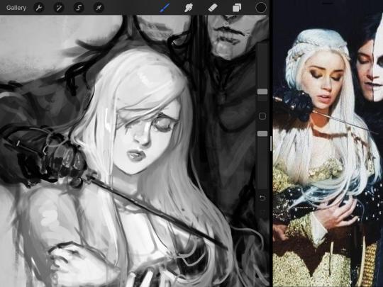
Gwenhwyfar is also a good example of weighted line. Gwen is essentially a very, very pale character. In contrast to Melwas, who is in darker clothing, Gwen is soft, she is the focal point in this drawing. For the little pieces of her hair, the corner of her lips, eyelashes, and her fingertips, I used a weighted line to establish these things, otherwise, Gwen is so pale, she’ll easily be washed out completely.
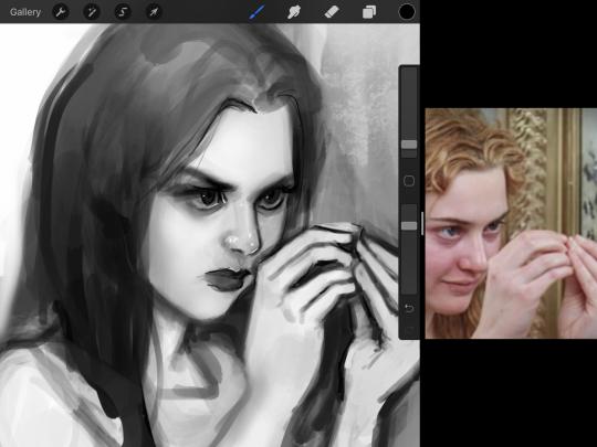
This drawing of Alice, which I’m still messing around with, is another example of how effective a weighted line can be with depth. The lines I added into her face, eyelashes, creases, hair, and fingers add those little details since everything I’ve done before like Papa Emeritus II was so soft with a low opacity on the brush settings.
Layer masks and curves
There are two ways you can color greyscale images.
You can do this by going into Layer > Adjustment Layer > Curves (this is how it looks like in Procreate).
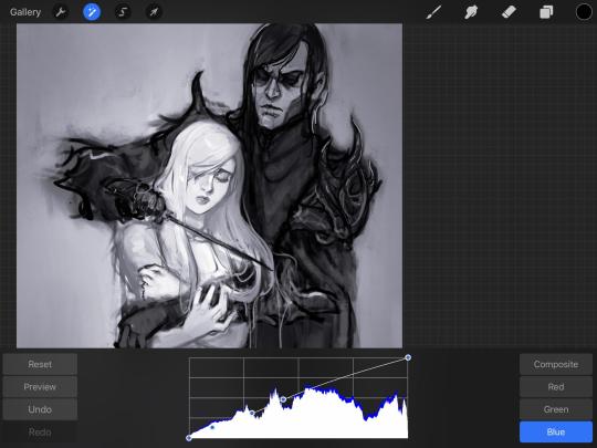
This gives you a neat ol’ base color! I am playing around in the blues, adding soft hues of blue in their figures and the white in this picture can either turn blue, cream, or even green. You don’t have to use Blue, you can use any of the other colors. For me, I’m always drawn to blues. Another cool thing to play around with is Color Balance, which is underneath the same function as Curves.
But if you don’t have any of these, you can add a new layer, and do Multiply.
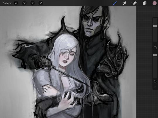
The only drawback to this, of course, is how destaturated (the lack of color) it looks. And yes, that’s an issue you will have and I did run into this while doing this. How I combat this is using additional layer masks. Believe it or not, Alice here was once at a grey scale, looking even more desaturated than Gwen.
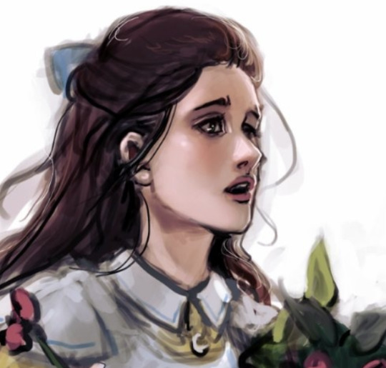
For Alice’s face, I went in and use:
- Soft Light because she needed more peach and roses in her skin. Omri’s original drawing gave her a light rose blush so I wanted to do the same.
- Overlay to mask out the black lines from the greyscale I had.
- Lighten which I used to make her lips pinker, her apron’s shadows lighter, and parts of her hair brown.
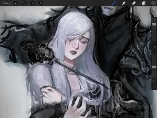
The same went for Gwen, who is, again, very pale. But while she’s supposed to be pale, I didn’t wash her out completely. To add more saturation, I used a combination of Soft Light over my Multiply layer and Overlay to start working at the highlights on her hair, nose, and shoulder.
This little walkthrough isn’t as visual as I like, but with limited software like Fire Alpaca, GIMP, or Paint Tool SAI that don’t have the abilities of Photoshop in terms of color correction and playing around with colors, I really encourage you, readers, to play around with these tools. Using the color picker back and forth, especially after using layer masks, gives you an ability to mix and blend colors. The reason why I work with greyscale or a maroon under paint is that you can create brilliant colors and make a new palette; the trick is to constantly mess around with them. I never go in and flat out color anything, with the exception of things like “angry doodle corner” which is basically what I call my lazy drawings, drawings where I’m just honestly goofing off with.
So in summation...! Or me trying to summarize this.
Experiment and explore with layer masks and adjustments. Whoever says that using these tools isn’t real art, they’re wrong. And please don’t ever be afraid of using references of any sort! Alphonse Mucha is saved ten times over on this computer.
#my art#tutorial#i think#an attempt was made#digital art#procreate#ipad drawing#ipad pro#Alice madness returns#alice liddell#american mcgee's alice#alice asylum
8 notes
·
View notes