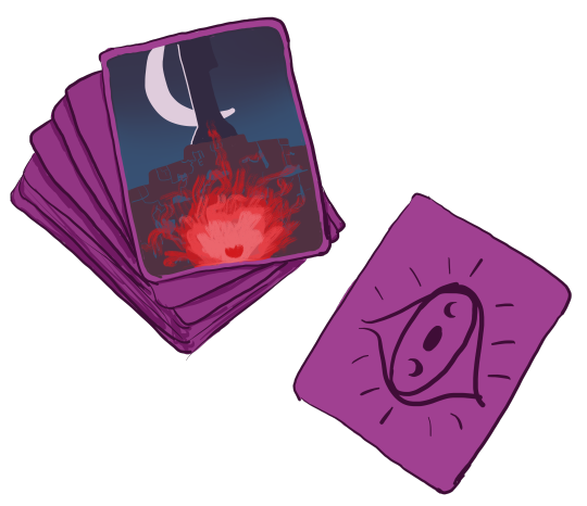
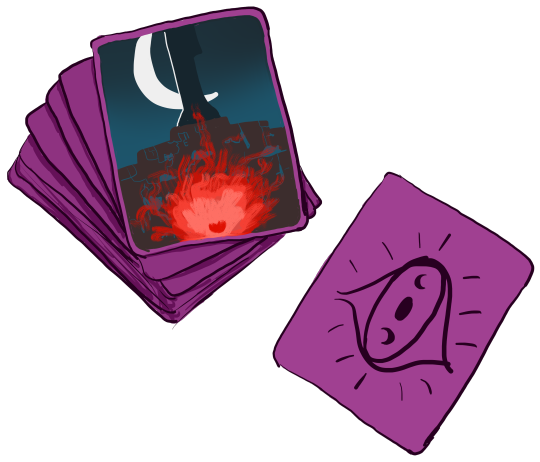
#the first is tinted purple the 2nd is as it was originally drawn
Explore tagged Tumblr posts
boyfeminism · 1 year ago
Text
Tumblr media Tumblr media
a deck of Malrique fortune cards--the Heart
upright: success, ambition, good fortune, changes
reversed: destruction, stagnation, failure, stubbornness
6 notes · View notes
flower-fantasy · 4 years ago
Text
Assignment 1
Thought Process
We were tasked with taking a photo of an object or scenery, then presenting a visual abstraction of it. We had to show 5 stages of abstraction, from Stage 0 (the original image) to Stage 5, where the object or scenery would be in its most stripped-down version, only consisting of the most essential features. 
When I first saw the assignment brief, the first thought that came to my mind was: “Choose an object that has just enough detail, not too many and not too few, otherwise it’ll be difficult to do the abstraction.” Sounds easy right? The question was: how many was “just enough”? I had a few objects in mind: the first one I thought of was actually my Herschel backpack (which I eventually chose as my subject) because of the different details it had that made it different from other backpacks, namely the 2 straps across the front of the backpack. Next, I thought of a two-fold wallet, as I felt that it would be interesting to abstract the wallet when it was half-open, showing the different compartments on the inside. The last object I thought of was my laptop, but I eventually chose my backpack because I felt like it would be the most interesting to abstract. 
When taking a photo of my backpack, I chose to angle the backpack towards the side, allowing for both the front and back of the backpack to be captured. I actually took a few different photos of my backpack, with some only capturing the front of the backpack, but eventually chose this photo as the strap on the back can be captured, along with the front straps and pocket. 
Tumblr media
From there, I used Adobe Illustrator to trace out the backpack in Stage 1, trying to capture as many details as possible. This was so that it would be easier for me to do abstraction in the next stage, where I would remove some of the unnecessary details and features. I actually used a few different layers: layer 1 was the original image, layer 2 was the basic outline of the backpack while layer 3 was the additional details, such as the stitching and texture of the strap. I separated the drawing into 2 layers so that it would be easier for me to move to the next step of abstraction, where I could just remove the layer with the additional details. 
Tumblr media Tumblr media
Actually, after Stage 1 I asked myself: what do I want for the final stage of abstraction? What details do I think are absolutely necessary such that they need to be present in the final stage? What distinguishes a (Herschel) backpack from other objects? This was to ensure that in the next few stages, I would not be removing any of these essential features. 
In Stage 2 I decided to remove most of the smaller details, which were drawn using 0.5 point strokes, as compared to the other lines that were drawn using 1.0 point strokes. 
For Stage 3, I mainly focused on removing the details on the front pocket, including the straps, as I felt that they were not necessary. I also simplified the strap at the back that was connected to the backpack strap. 
In stage 4, I wanted to make the object more abstract, but at the same time keeping the shape of the backpack. So, I used the ellipse and rectangle tool to create the outline of the front of the backpack. Apart from the straps in the front, I also chose to add the backpack straps on the back, which were not so prominent in the original photo. However, I chose to add them in this stage because I wanted to make the drawing resemble a backpack more. Other than that, I kept the front pocket, presenting a simplified version of my original backpack.
In stage 5, I faced a dilemma: I did not know which features to remove and which to keep, so I came up with a few different variations. First, I kept the straps and the line at the bottom to depict the base of the bag but removed the front pocket. For the next version, I removed the straps, leaving only the front pocket. The last version looked almost identical to the 2nd one, other than the fact that there was an additional line near the bottom to represent the base of the backpack.
Tumblr media
I then asked my friends and family which one resembled a backpack more and all of them chose the one with only the straps. My brother even said that the one without the straps resembled the Among Us character and told me “I think you’re playing Among Us too much it shows in your work” so I decided to scrap that version and use the one with the straps instead.
I think it was a good idea to leave the front straps in the final abstraction because it is a feature that I associate with Herschel backpacks as other backpacks usually do not have these straps. Therefore, I hope that when people look at the final abstraction, they will still be able to tell that it looks like a backpack.
Below is my submission for critique: 
Tumblr media
Lessons Learnt from Critique
Based on the feedback I got from the critique session in the tutorial, the main problem lies with the last 2 stages, as the bag looks weird. My tutor mentioned that the flap of the bag does not resemble the original photo, because of the weird shape. Initially, I used the ellipse tool to create that shape, before overlapping it with the rectangle that formed the body of the bag. However, after my tutor pointed that out, I realised that the shape does look weird, so I changed it to look more like the flap of an envelope, so that it will resemble the original bag more. Initially, I thought of making the shape look more like a hexagon, but realised that the lines were too sharp, so I smoothened out the lines to make it look like this: 
Tumblr media
My classmate also suggested that I add in colours such that the final stages will resemble the original image more, so I took her advice and coloured the last 2 stages of the abstraction. I used the eyedropper tool in Photoshop, and saved the colour of the bag to my library. 
Tumblr media
From there, I adjusted the tints of the purple so that some parts of the bag (eg. the straps) will be darker than the rest of the bag, like in the original image. I also added extra straps in Stage 4 (the short rectangular objects) because I realised in my original image, there are a total of 4 of these straps, so I wanted to reflect that more accurately in Stage 4. However, in Stage 5, I removed 2 of these straps, so that the abstraction between Stage 4 and 5 would be more obvious. My tutor suggested leaving the front pouch in the final stage, so I added that in as well. 
My classmate also suggested that I leave the backpack straps in Stage 5, because she associates those straps with backpacks. However, I wanted to reflect the front view of the backpack, where the straps are not visible, so I chose not to add that in in my final design. My tutor also suggested extending the front straps to overlap with the front pouch, but I realised that doing so would look weird, so I did not add that in as well. In the original image, there are 2 different straps (one extending from the top of the bag to right above the front pouch, while the other extends from the top of the pouch to the bottom). Since I wanted to make things as simple as possible, I chose to only leave in the first strap, making the pouch appear as just a simple rectangle. 
Overall Lessons
I thought this assignment was quite fun, because I got to try my hand at using Illustrator properly. Although I had played around with Illustrator before, I was quite lost on the various features and tools, so after attending tutorial I became more familiar with the tools, and managed to try using them in this assignment. I mainly relied on the pen tool, but found that it was quite flexible in the sense that I managed to complete most of my assignment using only that tool, so I learnt a lot. The in-built tools, namely the pen tool, ellipse and rectangle tool were all very useful in helping me to create neat lines and shapes for my sketches, allowing me to be able to present such detailed drawings for submission. 
The critique session was also especially useful, because it allowed me to see things from other people’s perspectives and further improve on my work. It is always useful to get feedback from others, because to us it might seem like our work is already good and cannot be improved further, but that is usually not the case. Therefore, we need a fresh pair of eyes to look at our work and point out areas for improvement. 
Additionally, I think that the process of writing this blog post helped me to articulate my thoughts better, as I have to explain why I chose to do things in a certain way.
0 notes