#the design and the functionality
Explore tagged Tumblr posts
Text

Hello, Cassidy
#art#fnaf#fnaf au#five nights at freddy's#cassidy chen#cassidy fnaf#golden freddy#the design and the functionality
84 notes
·
View notes
Text
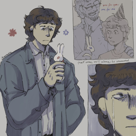
a gift that holds both good and bad memories based on this post (kinda, this artwork sorta goes under interpretation territory-) michael afton fanart for @k03rinz 's AU! it was really fun experimenting my art with this! love how fluffy michael's hair is tbh
#take this as a style experiment AND fanart bc damn i love this artist's artstyle so much something about it speaks to me#anyway go check their art and au out! super underrated artist omg!! :D#the design and the functionality#the design and the functionality fanart#michael afton#mike afton#william afton#fnaf#my art
398 notes
·
View notes
Text
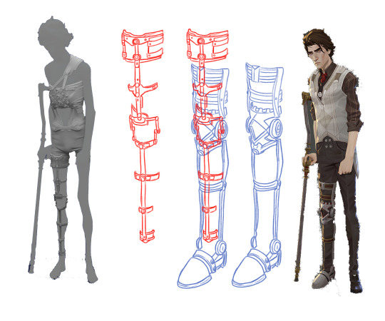
Was looking at refs and since Viktor has two different leg braces I was wondering, do we think he wears them simultaneously?? The refs don't perfectly line up perspective-wise so it's hard to tell but parts of the one he wears during the Hexcore scenes look like they could maybe line up with the brace that he wears over his clothes, but also some parts really don't and look like they'd be super uncomfy. Also HOW does he take these on and off. Experts weigh in
#viktor#arcane#ig my assumption would be that he wears both simultaneously cause in the scene where he injects the shimmer#it seems implied that he just threw off his clothes and kept experimenting#so one might assume he was already wearing the smaller one underneath#tho it is a funny image to think of him just being like 'one sec i gotta go all the way home and grab my other brace to do this'#he can take off the back brace too cause hes not wearing it in the scene where he's in the hospital bed and you can see his shoulder#where the strap would be#but that one seems to make even less sense functionality wise#everything looks like its screwed together#or screwed INTO him#but only the top bolts on his spine are i think#in the close ups of his back brace model it looks like theres cushioning underneath the parts of it that cover the rest of his spine#so he can take it off. but HOW#what parts of it unscrew/detatch to pull open and off#does it not do that at all and he just has to shimmy it off his shoulder and all the way down his legs to get it off like a romper#the shape language of the designs are cool but like. tell me how it wooorrkkksss#forgive me if im just dumb and dont know at all how braces work and theres a very simple practical explanation for all this#any king who wants to infodump about mobility aids at me....the floor is yours#something to be said i suppose about the fact that zaunites have crazy prosthetics with wild augmentations that work flawlessly#and piltover's like. idk heres some fucking uncomfortable ass metal. salo gets wheelchair in non ada compliant place#they havent ever needed to adapt to accommodate disabilities etc etc#or maybe artists were just like 'heres a design' and everybody clapped and didnt give it a second thought#and then they just turned off the visibility on the mesh when they didnt need it knowing thered not be a scene where its taken off#dont even wanna THINK about what that rig would look like#like 40 different controllers#soft body and rigid hard surfaces needing to move together....#a cold chill just shot up my spine#<- guy who is only an animator and doesnt know how to rig#forgive the magic wand tool with zero cleanup. i am lazy
5K notes
·
View notes
Text

part 4 of a lot funnier in my head than on paper
#before anyone asks its not a series the part 4 is a joke dont go looking#the solver granted me this mental image#definitely not at the right skill level to draw it correctly but i did good enough#nori forgetting her ipod in space and then needing n to launch her into orbit to get it back#yknow now that im actually stopping to think about it v would be the only one of the two in functioning order at this point#or they just waited for n to regen and then forced him to do this#we both know n is fully capable of punting nori into orbit#something something stupid mutt#my hatred for this is growing the more i look at it im gonna finish off the tags#art#murder drones#murder drones n#murder drones nori#murder drones uzi#murder drones flesha#i guess#or#murder drones cyn#serial designation n#one day ill be able to draw n in a way i like#noris text box is supposed to be a rose it did not come out looking like a rose#i dont know how to draw roses help
2K notes
·
View notes
Text
*peering down at my own genetic sequence* uh-huh uh-huh bold choice bold fucking choices my friend
#and i don't have veto power over any of this? that Cannot be correct information#there must surely exist an Appeal Process or#*me discovering how any of reality's systems function* this can not POSSIBLY be how this system functions#*scribbling furiously filling an entire college ruled notebook DOUBLE-SIDED with a list of design flaws to present to the court*
9K notes
·
View notes
Text


He's somekind of marketing wunderkind, Dipper!
(This isn't the first time Bill has met the baby Pines twins but like any distant relative, he wants to make sure they think he's the cool uncle)
#party billiam au#silly billy#silly straws#gravity falls#billford#bill cipher#mabel pines#dipper pines#it took awhile to make a functional straw design#totally worth it#my art
1K notes
·
View notes
Text

A protection that becomes more creepy
Azul in my heart. You can see the original art here and read the monster list here @lustlovehart
[Alt under the cut]


My first concept, since my style could not simulate the texture of slime in its purest state
It is quite thick so water can not enter or wet. Only small puddles where you can accumulate
It is a monster and that, magic, but I can imagine that it can only reach a height by the pressure, it can come out expelled sometimes
#When I read that I had some kind of armor so it did not expand everywhere#I imagine it’s some kind of spell that must carry with you to stay a little more solid#It would also be interesting that to have shape must have a skeleton. As any construction with cement. Found this and clean it#it lacks some parts but otherwise is a good structure#It’s fun to think that your vision distorts by the drastic change in size so you should wear lenses#I wonder what function their hearts will have if there is no blood for two of them#He would be perfect to experiment scientifically#I thought two hearts set in the head until you see the original art#it would be funny that you try to kill him in the chest but only become a little silly#twisted wonderland#twst#fanart#digitalart#drawing#monster boy#creature design#azul ashengrotto#twst azul#honneydraws ⊹⃬۫🍜̸᩠໋࣪꣹۫
1K notes
·
View notes
Text
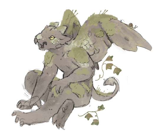
the grassy gnoll had me thinking about a mossy rock … mossy .. statue?
so here is a gargoyle i’ve doodled up. he’s my son
#art#ID in alt text#fantasy art#fantasy character design#umm not gonna tag this dnd because technically it isn’t but#i had the thought to maybe play this fellow and use the warforged race for the function#they’re an animated statue who doesn’t sleep or eat or anything#they were born yesterday so everyone needs to be nice to them
20K notes
·
View notes
Text

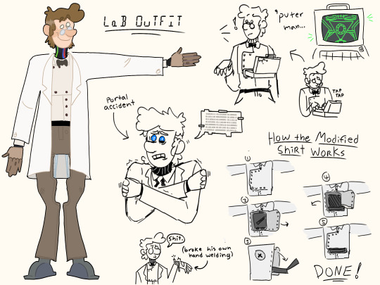
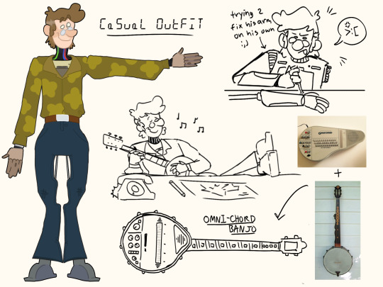
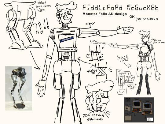
Monster Falls girlies how we feeling about this one.
Happy Fiddleford Friday Y'all
(Bonus art under cut)

And one for the fiddauthor peeps

#this took 12 HOURS#i think it turned out well#his pants were the hardest to design tbh bc of the way his mechanics work 😅😅#i used a lot of old tech for reference but couldnt fit all the cool bits i wanted in to o just ran with the laptop chest#i hope you guys can understand my explinations of how he functions with the doodles too 😅#this also might be for a personal au instead i havent decided yet#fiddleford mcgucket#fiddleford hadron mcgucket#gravity falls fiddleford#old man mcgucket#monster falls#monster falls au#gravity falls au#gravity falls#the book of bill#tbob#gravity falls fanart#gravity falls fandom#fiddleford friday#FIDDLEFORD FRIDAY!!!!#happy fiddleford friday#fan art#illustration#digital fanart#fiddauthor#ford pines#monster falls fiddleford#monster falls ford#art :p#Bill Synther Lives
2K notes
·
View notes
Text
If we talk about the aesthetics of technology in Lancer, we can divide each of the Big 4 along lines of form and function.
IPS-N: Pure Function
IPS-N cares only what a mech does. It doesn't need to look good or pretty doing it - it only needs to be able to do that thing well. It's notable that the Raleigh, arguably the most form-oriented of the IPS-N frames, is also considered to be the company's biggest commercial failure - they strayed from their core design principles and got punished for it.
Harrison Armory: Form Follows Function
Harrison Armory still leans pretty heavily towards the functionality side of things, but it isn't satisfied with doing a good job alone. Yes, the mechs have to perform well, but they also have to look good doing it. There's no practical application for the Sherman's sleeveless coat or the Tokugawa's dainty little tassels, but they don't hinder combat functionality and they make the mechs look dashing. In comparison to IPS-N's coarse, industrial, almost unfinished look, HA mechs look stern, austere and imposing. There's a smoothness to them that you just don't get on IPS-N frames.
SSC: Function Follows Form
SSC is where we start to plunge into aesthetics-forward mech design. The Death's Head isn't six-legged because it's a sniper - the Death's Head is a sniper because it's six-legged. SSC came up with a mech design and asked: "what would this do best?" A six-legged chassis provided a more stable firing platform for precision weaponry, so that was what it did. Shapes and appearances are invented, and then a use case is discovered for them.
HORUS: Pure Form
It might seem weird to classify HORUS as "pure form" when their mechs largely don't have a consistent visual identity outside of the examples in the book. However, if we look a little deeper at the definition of "form," the explanation becomes clear: in some ways, HORUS is in the business of making statements, not mechs.
For anyone who's actually played a HORUS mech in Lancer, you may have noticed how awkward they are to actually pilot. Their statlines are, on paper, often very poorly suited to the sort of work they have to do. The Gorgon is built to attract attention and draw fire but has no armor. The Manticore is meant to be a front-line fighter but is quite slow. The Minotaur is meant to be a tech platform but has a low sensor range. The Pegasus' one functional trait doesn't apply to any of the weapons in its equipment package!
This is because HORUS mechs are designed purely as a testament to a certain discipline of technology. I remember expressing irritation with a friend's NeoGeo-for-X-Box emulator once, that you couldn't reconfigure the controller mapping so that it was easier to play with the X-Box controller. He remarked that it was meant as a historical preservation tool that perfectly duplicated the functionality of the NeoGeo, and that the only reason you could even play games using it at all is because that was a function of NeoGeo arcade cabinets.
That's how HORUS mechs are - their usability as chassis is broadly a side-effect.
#ips-n#harrison armory#smith-shimano#ssc#horus#lancer#lancer rpg#lancerrpg#lancer-rpg#in golden flame#design aesthetics#form vs function
934 notes
·
View notes
Text

….michael
#art#sketch#fnaf#five nights at freddy's#michael afton#evan afton#cc afton#crying child#afton family#the design and the functionality#80s
1K notes
·
View notes
Text
OHHHH WOWWOW WOW I AM SPEECHLESS!!!! THIS IS SO GENUINELY COOL AND ABSOLUTELY NAILS HOW I IMAGINE MICHAEL FEELS ABT THIS MOMENT :’’’ Thank you sm North, this is literally amazing. I love how there are multiple ‘panels’ within the drawing that display different times, it’s a really neat aspect. Also you drew his hair and expression so nicely and got that spot on as well AHHH. I adore the colours and style used very much, it lends itself SO WELL to the piece as a whole. This in its entirety is just so so good. Thank youu:’)
I could actually go on about this for so long but I’m just going to have to stare at this for a bit after I post this to appreciate it fully frfr,, Again thank you so much for drawing fab art of my au, it’s so surreal??!
Everyone go check out @north-noire !! !

a gift that holds both good and bad memories based on this post (kinda, this artwork sorta goes under interpretation territory-) michael afton fanart for @k03rinz 's AU! it was really fun experimenting my art with this! love how fluffy michael's hair is tbh
#ahhhhhh#crying forever this is so meaningful to me :’’#tytytyty#amazing art amazing artist!!!#-#fnaf au#michael afton#william afton#porcelain rabbits#the design and the functionality#the design and the functionality fanart
398 notes
·
View notes
Text

Skeuomorphism is a design approach where contemporary items incorporate decorative elements from earlier versions, even when these features are no longer functionally necessary. Examples include tiny, non-functional handles on maple syrup bottles, decorative buckles on shoes, the floppy disk 'save' icon in software, and the shutter sound in digital cameras.
#skeuomorphism#design#aesthetics#functionality#maple syrup bottles#faux buckles#floppy disk icon#camera shutter sound
277 notes
·
View notes
Note

i drew ur micheal :3 also i noticed he has a backpack in a lot of panels... whats in it?
THIS IS SO CUTEEE!!
#ask reply#fanart#THIS ART IS super cute I love#TYSM FOR DRAWING THISS 💜💜#added to my pile of Michael fanart ..#ALSO Michael does have things in his bag#not just a design choice it’s a functional one too#I imagine Michael is the type to always be perpared#seeing things are after him on the daily#so he has a flashlight a lighter probably a melee weapon#he has a mask batteries sleep medicine bandages etc#plus his work journal where he keeps note of all the animatronics#so dude is just prepared#he’s so silly
506 notes
·
View notes
Text

weird little long quiet sketch. pretty bird <3
#blues art#i’m obsessed with this game and its artstyle rn#lightbluesleeper when there’s hatching at the function#oh and this character design of huge fluffy winged guy is actually my favourite thing ever#GOD this game makes me ill#10000 heart emojis#slay the princess#stp#the long quiet#stp fanart
513 notes
·
View notes