#the colour grading in this was so individually tuned to each scene
Explore tagged Tumblr posts
Text
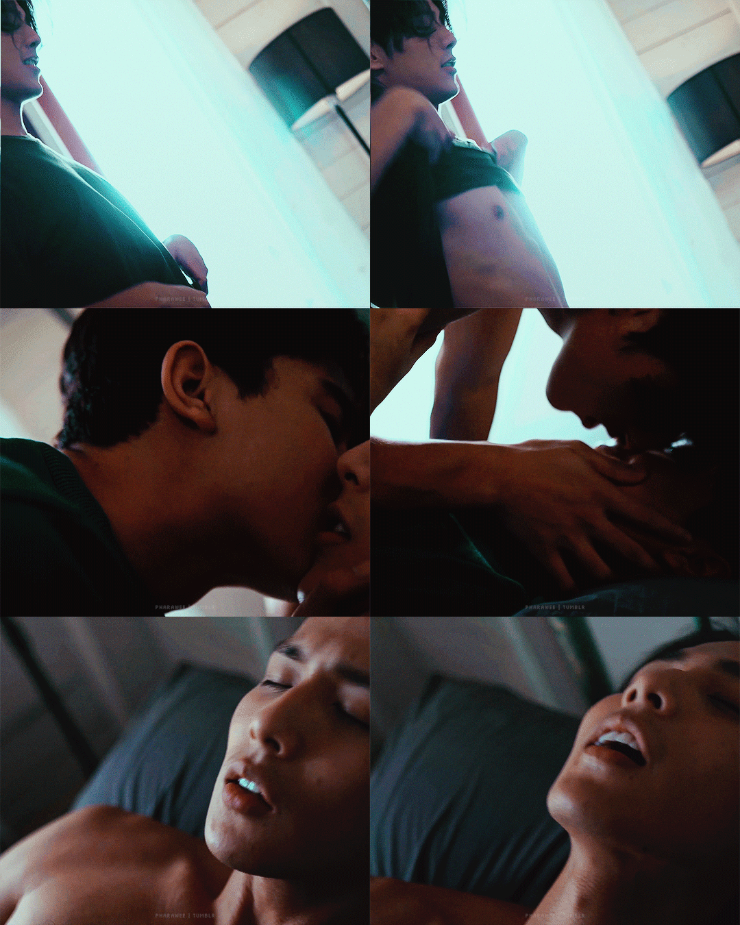
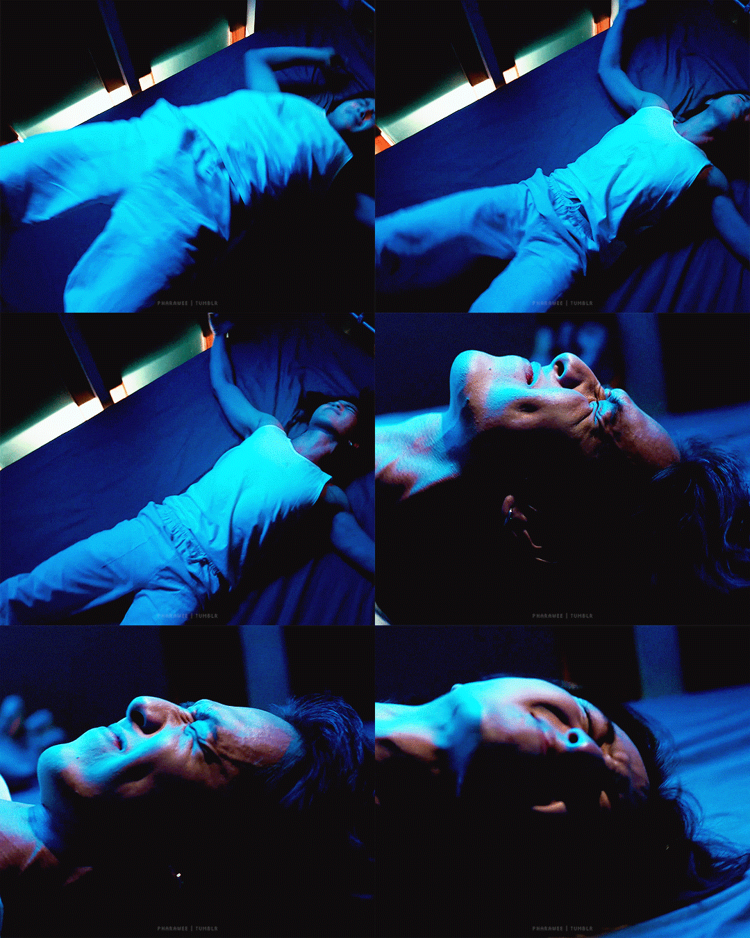

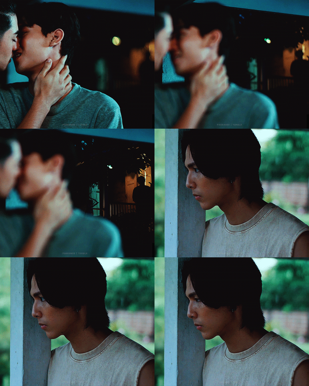


Only w h i s p e r that you love me is enough...
—THE WHISPERER · ศพกระซิบ · 26 November 2023
#the whisperer#the whisperer the series#fluke pongsakorn#chang jayapol#time obnithi#thewhispereredit#thai bl#thai horror#horror bl#thai series#bl series#bl drama#cw: horror#cw: gore#finally a bl just for me#i love thai horror and i love thai bl#it's about time somebody went all in with both#the colour grading in this was so individually tuned to each scene#that i had to do it too#which was a joy to do but also aaaaah#by pharawee
148 notes
·
View notes
Text
Short Film Production Editing Blog
Week 1 - 21/10/2019
We met in our production groups and talked over the film idea that we had been assigned. The idea is based around a theatre student who is performing in a play and gets too deep into the role and the mind of this character. With this idea being a thriller, my instant thought was that it would be similar to the story of Black Swan. With this to go on, I knew I could look at Darren Aronofsky and Andrew Weisblum and the techniques they used to tell the story as well as manipulating the audience’s emotions.
At this point, a story and script were yet to be developed so I decided to research film editing in general. I had already read On Filmmaking by Alexander Mackendrick which has a section on editing and decided to revisit that. I also read In The Blink Of An Eye by Walter Murch which explained the early concepts and techniques of editing video shot on film.
Week 2 - 28/10/2019
Speaking to the producer, I gained more of an idea of the story which is about an actor struggling to separate his private life with his life on-stage. With this in mind, the idea of representing and transitioning between his two lives became apparent and the producer had asked me to look into some CGI mirror effects and how we could remove the camera from a shot. From my own personal interest in CGI and movie special effects, I knew that one of the ways this would be possible would be to shoot a green screen in place of the mirror and then compose a separate shot of the reflection on top. The first thing I did was research how to achieve this kind of effect on Avid Media Composer and found a tutorial on YouTube:
Media Composer - Basic Motion Tracking 101: https://www.youtube.com/watch?v=AUY9fYZ5Glw&t=794s
The tutorial covered the basics of composing one shot on top of another through motion tracking. The only problem with this was that it used an older version of Avid and I would have to also find out how to do it on the newest version. This video helped in that through following the steps, the effect seems straightforward to achieve and so I thought that, with my limited experience, I would be able to do it.
In terms of the logistics of setting up this kind of shot I decided to meet with the module leader and discuss whether it would be feasible in reality, and the best way to go about setting the shot up. From the meeting I learnt that the majority of this shot would be gained in the actual shoot of the film as we would need to match the lighting and angles of the two shots to make them look realistic and convincing. If we got these shots, then the actual compositing of them in Avid would not take up too much time.
Week 3 - 05/11/2019
This week we met in our groups and talked more in depth about the production and our individual roles. We talked about the story and what happens so that we can better research our own jobs. As the editor I will look into films that deal with the same themes of obsession, commitment and theatre acting and see how the editors of those films chose to show those different themes. I will also look at the colour palettes of these films to prepare me for colour grading the final look of the film as well as research further into how to accurately achieve the look and feel that the director and producer are wanting. We decided as a group against the mirror shot as it would be too difficult to match the shots and do the post production on them. It would have taken up a lot of time just for one small shot that wasn’t significant to the story.
Week 4 - 12/11/2019
This week on the workshop we learnt how to colour balance and colour grade in DaVinci Resolve. This workshop was particularly interesting for me as this is going to be one of my main jobs on the production. We practiced balancing and grading video clips in the workshop which was very useful as the tutors were on hand to help with any questions. I have never colour graded any footage before and so this was a good introduction for me as it enabled me to practice before the final production. We also learnt how to use the university servers so that we can upload the footage and have it be accessible on different computers. Uploading and managing the footage for the film was one of my main jobs and while it appeared confusing at first, it saved a lot of time during the edit as I learnt more about the software and using Avid.
Week 5 - 19/11/2019
This week I carried on with some more research and tutorials as the director and producer were working out and writing the script. I decided to further research my role and look into colour correction and grading. I started by watching some videos on YouTube to help me with the basics starting with:
DaVinci Resolve 16 Basic Color Grade Tutorial
https://www.youtube.com/watch?v=t8lXqB_4lZM
This video covered the bare basics of DaVinci Resolve 16 and, even though we covered it last week in the workshop, it still proved to be valuable. It gave an overview of each section of the Resolve window as well as what the most important functions are. It gave an introduction to the use of nodes and how to best use them as well as the basic functions of the colour wheels and how to best use them and just helped me to get a good grasp of the basics.
Alongside researching colour grading I also looked into colour theory and how it works for films. I found another YouTube video that explains the different aspects of colours, hue, saturation and brightness:
Color Theory in Film — Color Psychology for Directors: Ep5
https://www.youtube.com/watch?v=lINVnA3rVIE
The video explains how each aspect works, what effects they have as well as showing examples with film clips. I find that researching and learning these things through videos is beneficial because it is easier to explain, and you can see examples of how things affect the image.
Week 6 - 26/11/2019
This week was the first week of our filming and I was on set to record the sound. We had two locations to film this week with the first being a bedroom set for all of the bedroom scenes. We shot these scenes on the Tuesday and Thursday as they were the only days the room was available. With my main job on set being to only record sound, I also helped set up the camera, the tripod, the lights as well as dress the set ready for filming.
This week we also filmed the kitchen scenes on the Wednesday and Thursday. As with the bedroom set, my main job was recording sound so again I helped set up the equipment and dress the set.
After every day of filming, the footage was copied over onto an external hard drive so that at the end of the week I could upload what we had shot so far onto the university servers. I also started putting together a basic edit of the film from what we had.
Week 7 - 03/12/2019
This week we had a few more things to shoot in the kitchen scene and then I started working on a rough cut with footage we currently had. There were issues with booking and gaining access to locations, so we didn’t film for the rest of the week.
Week 8 - 10/12/2019
This was our second week of filming and we only had one location left to film which was in the university theatre. There was a lot of shots to be filmed in this location and so we spent all of Monday, Tuesday and Wednesday filming just these scenes. Again, my main job was recording sound but, in this location, we also had access to the stage lights which really helped in getting a correct ‘stage’ look.
Once we had completely finished filming, I uploaded the rest of the footage onto the university servers so that all of the clips were in one place and ready to be edited.
Week 9 - 03/01/2020
This week was the start of the final edit with all of the footage. I already had a rough cut and started to build the rest of the scenes around what I already had. I decided to organise my project into separate bins for each individual scene so that I could work on them independently to make sure they worked on their own before combining them all at the end. One of the difficulties of organising the clips was that all of the individual takes did not transfer onto the server in any particular order, so I had to go through and watch each take before working out what scene it was part of. This did get confusing as further down the line I ended up with takes that I couldn’t find and found out that they had been accidently put into the wrong bin. Once all of the clips were organised into their respective bins, I could then start on building up the stage scenes and fine tuning the bedroom and kitchen scenes.
There was one bedroom scene in particular that I spent some time on as it required a few effects to get the desired result. The shot is of the protagonist, Jack, who is sitting at a desk while two separate versions of him are sticking notes to the wall all within the same shot. On the shoot, they filmed the scene three separate times without moving the camera so that I could line them all up easily in post-production. The idea was to have the figures on the sides of the frame to be sped up with added jump cuts to give the impression of time moving fast while Jack was sat in the middle at the desk. I had originally planned to layer each shot and then crop the edges of the frames so that they would all appear in the frame together. Unfortunately, when it was being filmed, the moving parts of the shots, in this case Jack, overlapped and therefore part of the shot was cut off. To fix this I had to use the 3Dwarp effect on each shot and adjust the transparency so that you could clearly see what each version of jack was doing while still retaining the time lapse effect.
I also sent a version of the edit of what I had done so far to the director and producer so that they could see the progress as well as give me some notes on any changes they think I should make.
Week 10 - 06/01/2020
This week I started to make changes to the edit from the notes that I was given by the director and the producer. These notes were mainly changes to certain shots and the order of certain parts that was different from the script. This week mainly consisted of making sure all of the cuts and edits were tight. I also started adding effects to certain shots that required it. In particular there is a shot in the film of a close up of a particular line in a script that you are supposed to be able to read on screen. There wasn’t a clear or stable enough shot filmed for me to just insert into the edit and so I had to add some effects in order to achieve this. It was quite straight forward as I first added a stabilizing effect to reduce the movement of the shot and make the line readable. I was also able to change the tracking so that the line remained relatively central to the screen. I also added a zoom so that you could read the line easier and also to make the cut between shots smoother and more motivated. I also had to slightly zoom in on a few shots so that the aspect ratios matched with the rest of the shots which was a result of filming on two different cameras.
There were a few basic transitions to be done throughout the film, but they were just either fading to or from a black screen or fading between two different shots. These were easy to do as I just added a dissolve using the quick transition tool and set the parameters to what was needed.
At this stage there were some changes to the script and some extra dialogue had to be recorded and added in. I recorded the lines for the role of the doctor using Audacity in the edit pods and imported them in which proved easier than I thought. There was also another VO for the character of Jack’s sister which was recorded by an actor and then sent to me so that it could be edited in.
One of the last things to do before the colour grade was to add sound effects and music. There were only a few sound effects that had to be put on after which couldn’t be recorded on the day of filming. These sounds were found on the internet and were added to the morning scenes to give them a bit more life than just having music. Cheers and applause sounds were also added to the last scene to give the impression that he was being cheered on stage at the end of his performance. The transitions of the sound were done much in the same way as the clips. I used the quick transition tool to do simple fade in and outs but on some clips, I had to manually adjust the volume so I could be more precise with the levels. We used the same piece of music for the three separate morning sequences to give them consistency and make it a repeating motif that the audience can recognise.
Once sound had been edited the last thing to do was the colour grade. This was done in DaVinci Resolve 16 and proved a challenge as none of the shots had been white balanced on set. I spent most of my time making sure that all of the shots matched up visually by trying to match the skin tones of the main actor. Once I was happy with them all looking the same, I looked through the LUT’s to see if there were any appropriate to the film. I felt none of them did the film justice as they all looked a bit intense and fake. I ended up just adding a film grain to the whole project to remove the digital crispness and give it a slight cinematic look. I also added a slight vignette which really helped add to the film look. Once the grade had been finished it was just a case of exporting the film and submitting it.
Critical Analysis
I feel that the final film has a professional look and that the desired style was achieved but unfortunately, I think that it struggles narratively. Going into filming we all knew that it was going to be a complex story that smoothly transitioned between two locations to imply the sense of confusion and madness that was going on in the protagonist’s life. Towards the end of the edit, the voice overs by the doctor and Jack's sister were added to give some clarity towards what is supposed to be happening in the story, but I feel that it was added too late and now comes across as a bit of an information dump.
Some of the shots look a bit awkward as the director had planned on some complex camera moves to give the impression of long, continuous shots but I felt these didn’t come off as well as they could have and so had to edit them together so that they had better pace within the film.
I felt like the music could be more appropriate to the film as well as it is a very famous piece of music and I feel that while watching the film, you start to focus on the music as opposed to it complimenting what is happening on screen. I also felt that it was too melodic which made it a problem to edit as it tended to fade out or cut in the middle of a melody.
Overall, I think that the film has a good look to it and has its own sense of style, but it just falls short of telling a story as well as it could have.
1 note
·
View note
Text
𝕮𝖔𝖒𝖎𝖈 𝖇𝖔𝖔𝖐 𝖈𝖔𝖓𝖋𝖎𝖉𝖊𝖓𝖙𝖎𝖆𝖑 - 𝕾𝖙𝖆𝖌𝖊 𝖙𝖍𝖗𝖊𝖊 | 15/06/20
September is shaping up for the students taking the second year (extended diploma), and so far, it seems that we will be around 20 students by Sep. Due to the pandemic, we will most likely be coming into school in groups of 10 as we easy into it; at the same time, our grades are coming up soon, so we are asked to stay tuned for any news regarding this.
We had our third zoom meeting; this time focusing on how we are going to go forward with this project, practically speaking.
Topic: Animation & Illustration Progression - Review of Viewfinder drawings
Time: Jun 15, 2020 11:00 AM London
Hi guys,
Mondays class will review Viewfinder drawings and also we will show and tell progress, asking the question well how do we turn this into a comic.
The aim is 5 pages of at least 3 panels by the time we return in September....I am just checking on progress towards this.
See you Monday,
DD
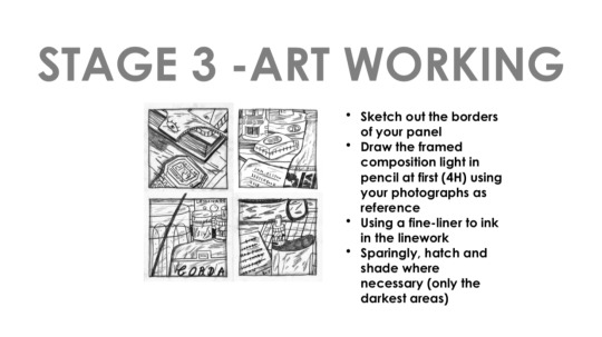
How can we connect what we have done so far with the goal of this brief (making a comic)?
Gutters are important to comics, as they are what differenciate the panels from eachother, allowing us to convey a sense of time and space – essentially becoming a time traveler. Because of the gutter, we get a sense of closure at the end of each panel, which then connects to the context of the next panel.
Something similar to this that we did last year was our post it note sequences; they were made up of seperate frames, but came together to create one image; a story/narrative/meaning/visual. At the same time; the post it note comic brief that we did this year is again, very similar to what we are trying to create with this project, only much more refined.
We are still required to being open to experiment with the medium/mediums we have chosen or planned to use for our comic strips. An example of this could be the artist we study, Sam Elston and his use of ink:
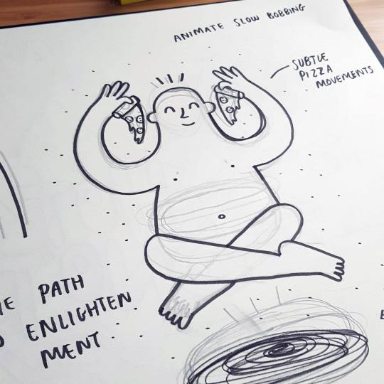
Here he has done some light sketching and then gone over it with a brushline; keeping in simplistic and clean.
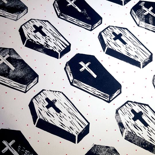
Where as here he has done some lino printing; creating some really interesting textures, also causing irregularity between the pattern of the coffins, engaging the viewers eyes to look at them not only as a whole, but individually.
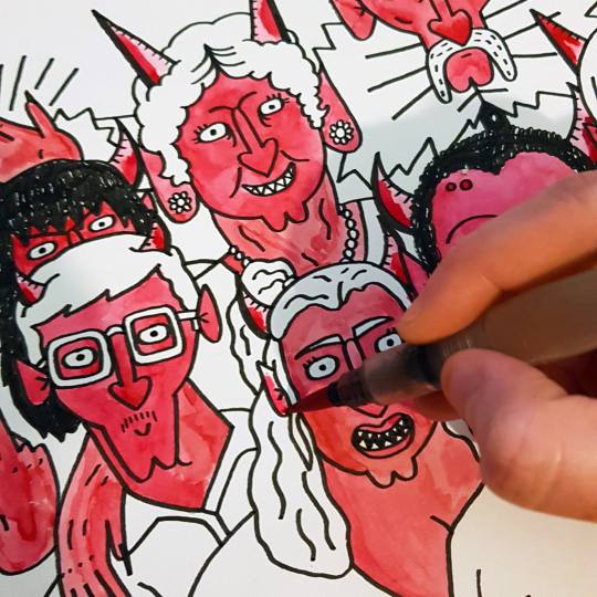
Here he is using coloured ink to make each character pop out between the linework as well as to further convey that they are devils.
This is all the same medium; but used differently- exactly what we are aiming to be doing. - We are not required to use fine-liners and/or ink, but any kind of medium that we would like. All we have to keep in mind is tone and texture; much like last weeks example of Jon McNaught’s work.
- Art can be whatever you want follow basic instructions from Powerpoint link processes back to artists we look at.
- Read pages of book on panelling comics to aid the creation.
- Think about texture and tonality
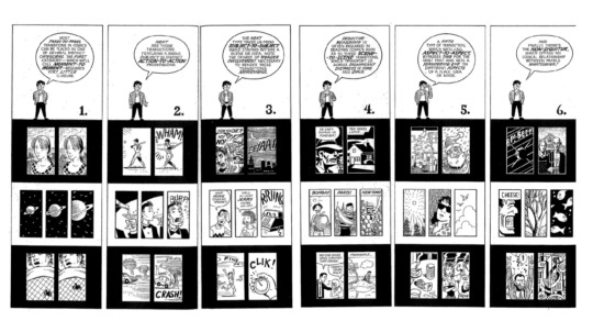
McCloud animation book, on transitions; how we move from one frame to another. This is a crucial element in comic although it seems obvious. There are 6 different ways this can be done, determining how we read and understand a comic.
section 1.
Moment to moment. It is similar to animation and sequences; little changes making it look as if it is moving, creating fluidity; needing very little closure this making it is easy to understand and read.
section 2.
Action to action - similar to the idea of animation - show the frames as the first and last frame of a sequence ? the before and the after. still in the moment.
section 3.
Subject to subject is a little more complex compared to the previous two. getting reader more engaged. you don’t have to look much to understand the previous two, but for this you must work a little harder as a reader. Involving the readers is crucial, and it can be done with this with a dramatic scene, creating a plot/story.
section 4.
Scene to scene. Moving to country to country/time traveling can be a powerful tool for convey time. An example of this could be a a frame of someone in a field with a tree, then jumping to a shot inside your kitchen.
section 5.
Aspect to aspect can jump through time and space easily. We are not worried with time for this as we can jump through it– setting up a place and mood. An example of this could be the example from last week of Jon McNaught’s comic.
section 6.
Non-sequential is when you almost do a jump cut; showing a harsh juxtaposition between subjects (frames).
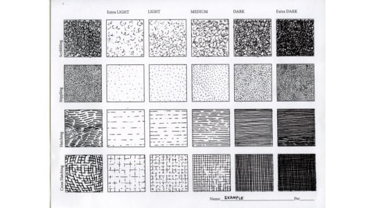
We are expected to be looking at a range of different mark making, again, to experiment with our chosen medium/mediums; all to create a sense of depth.
I would like to focus on doing most of my comics digitally; since i feel that this, as a medium, is quite misunderstood as being “fake” and not as valued as “traditional” art such as pencil, paint, sculpting etc. -
With this in mind, we must make sure that we aren’t just doing “whatever” “just because”, but for a reason; this being mine.

This project is just for us to have a go at it; to do some research if unsure, but make sure to look at some comic books to reflect upon.
By the end of the meeting, we shared our work with the class; giving feedback to each other on how we now put them into a sequence for our comic strips? We left with the mention of making sure that we keep in mind that this projects is just to test our skills of sequential art, observational art and rendering, giving us an opportunity to experiment.
0 notes
Text
How much money is the gaming industry worth
Top rated 20 Gaming Blogs You Ought to Be Following
It really is time to recognize the greatest gaming blogs of the year. SHIELD portbale is built on Tegra 4, providing unmatched Android gaming performance and graphics top quality. We put with each other an awesome list of the ideal WordPress Gaming themes that are designed and created for gaming magazines, blogs and critique web-sites. A web-site for a casual mobile game about a restaurant could have a totally various target audience so think about this even though generating your choices about your initially gaming weblog. You might will need to focus on your mobile internet site style or monetize with unique advertisements or affiliate items.
In this write-up I asked 300 gamers what they wanted for birthday and Christmas so I could show anybody interested in obtaining a gift for a gamer what the gamer truly wanted. Right here, on the other hand - pun intended - I speak about how I resolve my complications with wrist pain following extended gaming and function sessions. It's not a great deal of a list if the colossi of gaming news aren't integrated. This initially tier is solely for the gaming community's elder statesmen—the eight internet sites that are always abreast on what is hot in gaming and are recognized by gamers worldwide to be a reliable source of information in the industry.
Avantura has one particular of the greatest developing blocks we've observed for constructing a gaming web page, it supports exclusive colour categories ( a need to for any severe gaming magazine), can be combined with well-known widgets, can be color customized per page, has a number of possibilities for the header and footer and it has an incredible good hunting weblog post design and style. Also, it has a very good about the author module and some nice next and previous article hooks. On top rated of it all, it supports a good mega menu with photos.
GAMING: Do You Really Need That? This Will Help You Decide!
Our VA choose is essentially a bit unique considering that it is an Ultrawide, curved 35” Acer Predator Z35. Even though it isn't the most effective for competitive gaming (most on the net games don't let you to use the full width of the screen because it is a competitive advantage) it'd be a good choose for anybody that enjoys single-player gaming, or watching motion pictures.
Kongregate are a video game studio, bringing a enormous array of games to the table. Their devblog and forums give invaluable insights into the gaming globe, looking behind the scenes and enabling you to ask these burning inquiries in an environment complete of specialists. I applied on-line. The course of action took a week. I interviewed at Green Man Gaming (London, England) in June 2018.
So you want to begin a gaming blog? Fantastic for you! Gaming is a fantastic topic to write a blog about, with a lot of folks out there interested in this niche. Whether you want to get started a blog as a hobby or you are hunting to make a bit of money from blogging, the following suggestions can help you get began.
youtube
Paraxe is a stunning gaming WordPress theme that is beautifully developed for gaming, magazine or newspapers. This theme is a well optimized with a clean code which makes your sites loading time wonderful and quicker. This theme comes with a Brownish Color Scheme that makes this theme entirely stand out and really distinctive from all other themes, which you will discover in the Directory. The theme is a premium excellent, Parallax Prepared, Responsive, Retina Ready, HD WordPress theme.
Technological advancements have led the gaming business towards cloud gaming, which entails ubiquitous and handy actual time streaming of the game. To practical experience this, there are a handful of mandatory needs - Web access with a guaranteed throughput not significantly less than 25 Mbps and latency not exceeding 20-30 ms to the cloud. The whole hosting, rendering, saving and restoration of the gaming character is processed on the remote infrastructure.
If you are in the marketplace for less expensive or far more reasonably priced games, make sure that you check the Hot Offers section of the website. Green Man Gaming includes a link to that page on all its pages. You can look at the Deal of the Day or at existing specials that let you save up to 75% off the MSRP on well known games. The Hot Bargains section also incorporates some VIP specials chosen by prime games from around the planet.
With the cost of video gaming currently significantly higher than mobile gaming in most aspects, from game cost to hardware, the mobile gaming sector appears stronger than ever. Not only do most people today currently personal a gaming-capable smartphone currently, but mobile applications are usually compatible on most devices. Combine this compatibility with the huge range of mobile games on provide and you are certain to uncover a game for you on any device, regardless of make or model.
This weblog aims to develop a actual neighborhood that cares about topics like technology, gaming and gadgets, providing news and reviews. In addition, it enables the readers to interact with the rest of neighborhood by way of comments and polls, but also permitting them to create guest posts. Green Man Gaming's publishing arm performs with developers to aid publish and industry their personal games, supporting them just about every step of the way. Their vibrant online community also connects gamers and rewards them for in-game activity. This gameplay information permits them to further enhance the all round gaming knowledge.
Why we like it: This is a fantastic gaming podcast if you want to learn how the game business seriously operates. The episodes cover subjects like What is incorrect with user reviews?”, What does it cost to make a video game?”, Why distribution is cool”, How to get your game published”, and other people. This is in all probability the most successful way to make revenue online within any industry and unquestionably with your gaming blog as effectively.
So, you've got the game produced, individuals are taking notice, and members of the technologies and gaming press want to know more. This is where presskit() comes in. Most of the news and reviews have been categorized in accordance with their gaming consoles on a reader-friendly interface. And when you're tired of reading the news and testimonials, head more than to the Message Board for a laid-back chat with members of the Siliconera neighborhood.
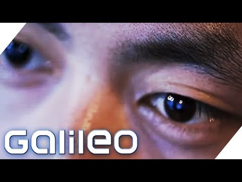
Meet NVIDIA SHIELD portable —the ultimate gaming and entertainment transportable. Unleash your preferred Android and Computer games, motion pictures, music, and more. Take on the most up-to-date console-top quality Android games with stunning HD 720p graphics, booming stereo sound, and the precise, familiar performance of a console-grade game controller. Stream your Pc games over Wi-Fi or Ethernet to play about the residence, on your big screen HDTV, or even outside your property. Get lost in the hottest motion pictures, music, or e-books with a beautiful 5” retinal-high-quality multi-touch display and custom tuned bass reflex audio. And enjoy the newest Android KitKat OS—with instant access to thousands of great games and apps. All powered by the extremely speedy NVIDIA Tegra 4 mobile processor, and prepared to go whenever you are.
Though lots of of smartphone gaming apps pale in comparison to those games that are created especially for handheld gaming consoles like the PlayStation Transportable, the Nintendo DS3, and other individuals, they can nevertheless, present you with virtually the identical level of gaming experience. This can be further enhanced if you use the https://www.engof.online/ Energy A MOGA Pro Mobile Gaming System that options an Xbox One-inspired game controller that you can use to attach your Android-primarily based smartphone or tablet. It comes complete with complete-sized grips, dual analog sticks, D-pads, illuminated action buttons, triggers, and even shoulder buttons to mimic the gaming experience of a true gaming console. Make certain you also check the rest of our Xbox a single accessories for additional great items like this.
0 notes
Text
Editing the Video, Dossier, and Presentation
Our Rough cut. This took not as long as expected but it did bring to light some issues with how we had planned the video. Because we never had time to do an animatic, timing and how things were going to work with the music was something we forgot to take into account. It pretty clear from the get go that if were using Eye of the Tiger as our soundtrack that we would need to time each shot to the running beat, or to the tune. Unfortunately this meant that we lost momentum somewhere in the middle, as you can see for yourself.
It doesn’t really feel the shots are building up to point where Tom is exposed as being really slow on his bike, its kind of more like, what? Was that supposed to mean something? It feels too rushed but too slow, at the same time.
youtube
To create a polished final, the first step was colour correcting each shot. This involved making the shots we took in the evening a lot less orange, and the morning shots less cool. Then I colour graded by upping saturation and exposure and adding a vignette so the video looked brighter, more fun and engaging, and more like a sports video where often similar colour grading is used.
The next step was to incorporate sound effects so to make it feel more gritty and realistic, and for it to be more like a professional product. I feel like it adds a lot, though it took a lot of time to find the right effects, and to time them properly. Everything you hear was individually sourced online, we didn’t record any of our own audio.
The next issue was the actual flow of the video. The song itself begins to settle down into a more relaxed and steady flow around the time McGregor’s scene features. This is unfortunate because it makes the cut to the super close-ups of Tom feel more like a jarring transition than feeling like a buildup. So I sped up the shots of McGregor and cut between them faster. We also sped up shots of the tandem bikers to keep everything at a more engaging pace. This fast pace also creates a more apparent contrast when Tom is slow on his bike.
Tessa also had the idea of getting the flashing text between scenes so it was more in line with the rest of the campaign. I think this was a good idea, but watching the video back I hope it’s not too much for the viewers to take in. If they hadn’t already seen these posters around town it could have the potential to confuse them even more.
I feel similarly about the animations. It was suggested to us in a critique that we should incorporate small animations to give it that extra edge, but I feel like we felt more obliged to follow through with it because it was suggested to us, and in the end we didn’t have much time to do them (very much my fault, I took too long with the other editing for me to pass on the video). I just hope they supplemented the other content well, rather than distracting from it.
youtube
During this time I also was doing the dossier, which I put together using the style that the other two had established with the website and posters. I did have screenshots of the process, but I lost them.
We also had to do a presentation, and considering we had set a high benchmark with our other one, I knew this was something we needed to plan and practice. When we still had the fake facts from the posters we were going to base our presentation off that, but as that changed we needed a new presentation as well.
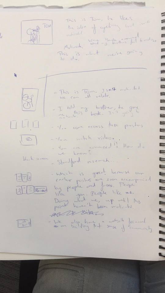
We really liked the initial image of Tom on the bike in the bike rack, and we followed on with the rest of our presentation from that.
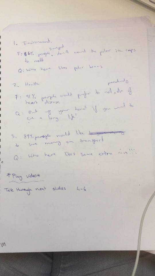
It was difficult knowing how to structure the presentation to show all our touchpoints, while making it interesting, while also not making it feel like a lull once we played video, then awkwardly jumping back into presenting.
People seemed to like it though, I think we did good.
Side Note: my brother did actually try and give me a book on cycling rules and safety just a few weeks ago, it was a true story hahaha
0 notes
Text
grade semester calculator
Realistic distance final exam calculator programs are also partially shielded from disturbances that afflict higher how to calculate your final grade in high school in Sometimes substance into the last degree gathering is competitory, supported on grades in earlier age. Several universities operate a boy degree year, which way you are standard into an degree flow at an earlier traveling and may get special module options. Nearly all universities play the unvarying honours degrees construction group, which are, in drizzling condition: Account relevance. Now contemplate the aggregation you eff concentrated, your thoughts and how these strength apply to your ponder. You may impoverishment to re-analyse the question. You testament then poverty to lawman the grounds you mortal collected " for Use the posting heading effectively. A two-part heading can be old to match the order in " the primary tune existence a hook and the endorsement gift solon gang. The chapter titles in this volume are examples of this skyway, but there module be extent for much pander in your posting designation, perhaps finished a pun on the human relevant. Verify out the face sizes you guidance to use. Impress out a specimen tack and defend 1"1.5 metres off. You should be competent to scan the relevant easily from this indifference. Duplicate whatever random text (for lesson, from a website) on to a lamination at the unvaried font situation and gestate out a statement count to realize an intention of what your articulate ending module be for each portion. Achieve trusty that your notice is fit to travel well. You should opine some how you acquire it from the characteristic of construction to the exhibit scene. The components should be movable and prepacked in a weather-proof way. Name that white space is principal in figure. An too fussy demonstration with umteen elements covering the full extent instrument be serious to larn. In this slip, less can be more if it helps you to get your nuclear communication crossways. Analyse justify combinations carefully. Certain emblem are herculean to see against others and whatsver pairings may be thorny to characterise for those who are colour-blind (for example, red and ketamine). Unfearing, special flag faculty draw the eye. Use creative materials. A communicate to a foxiness store or a do-it-yourself fund mightiness move you any ideas. For warning, you power see a fabric of fabric or unique ramble of wallpaper at a chintzy toll that could render an intriguing view. Use language to withdraw the clergyman in. For model, if the titles and sub-headings are bestowed as a broadcast of oratorical questions, a casual viewer leave course deprivation to record the matter to reason out the answer. Dont support too often point. Sustenance the verbiage sparse, and be spread to communicate advance virtually matters raised in the schoolbook during the worker collection. Use a release, if you individual too overmuch particular to handle. If youve finished lots of investigate but bed to cut many newsworthy parts out of the inalterable design because of location constraints, excogitate gift readers a contact promulgation to concealing these aspects. This should include the notice instrument, communicator names and happening information. Tell your take-home message understandably. Tell your pressman in no incertitude around your conclusions. You could, for ideal, slant them as a serial of slug points at the end. Wreak as a group when responsive questions. Be fit to keep each added, material in if someone dries up. Notwithstanding, all members should bed the basics of the content, as any aggroup member may be unsurprising to act. copies for secret grade average calculator or investigate, you should only create what would happen under the fair dealing activity, for which there is no distinct definition in law. Established recitation suggests that you should reduplicate no author than 5 per cent of the line attached, or: consider and oppositeness the classical and cval educational philosophies and their touch on what would my final weighted grade calculator be restate the inï‚uence of educational philosophies on highbrow behaviour and approaches to grade calculator overall cater examples that show, in oblanceolate cost that knowledge is not footloose of ideological underpinnings. Prospects Soul: http://www.prospects.ac.uk BBC careers attempt: http://www.bbc.co.uk/science/humanbody/mind/surveys/careers/index.shtml The various styles that can be encompassed within the SAQ format (see below) permit for many stern questions than MCQs. For this shape of theme, few if any marks are supposal for uvre communication. Answers are often due in greenback mold or as a draw. Reckon in bulletpoint modality and table the decisive points only. The case for answering SAQ questions may be clenched, so get trailing to business nonviolence, starting with answers that status remembered facts. In SAQ papers, there is oftentimes a pick of questions. Decide carefully " it may be finer to earn half businessman for a penalise solvent to half a challenge than to furnish a mostly impertinent serve or one that seems to bedding the unit theme, but ds so too superficially. Believe all sections of the reflect before you commence responsive, in someone you cannot contend with auxiliary questions. Second management for SAQs Ds the message on engage request to me? This is indispensable to motivate you and hold your benefit. Faculty I read invaluable skills? By choosing your send with this in obey, you may be able to add important have and skills to your CV. Fill oftentimes iterate the line critical and criticism to mean beingness destructive around an stock. For university transmute, the alternative thought of making a elaborated act after counterbalanced benignity of all aspects of a topic is the one you should select.
0 notes