hello name's gable is mine ref art blog. (they/them)Main blog:softypyro
Last active 4 hours ago
Don't wanna be here? Send us removal request.
Statistics
We looked inside some of the posts by justpickupthatpen and here's what we found interesting.
Average Info
Notes Per Post
55K
Likes Per Post
36K
Reblog Per Post
18K
Reply Per Post
38
Time Between Posts
10 hours
Number of Posts By Type
Text
11
Note
5
Photo
1
Last Seen Tumblr Blogs


Fun Fact
Tumblr is available in 18 languages.


Note
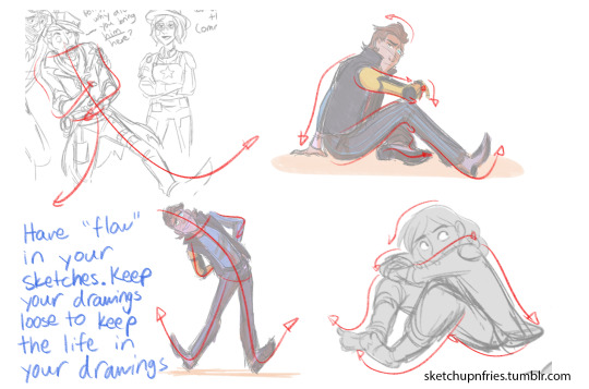
Hi there, I was wondering if you could give some tips on how to draw character body expressions because I can't seem to get it right, they always look like robots or unnatural abominations pretending to be humans. Also, your art is fantastic, on both of your blogs and I love it :)
Hi there! :D Ahh! Thank you so much! Usually when I go about approaching drawing a pose or expression, I start off with sketching in the gesture of the pose to make sure the pose or expression “flows” together. I try to make sure that the lines have a “rhythm” to them to help lead the eye around the pose, and give the pose life. In addition, keeping your drawings loose will also help to make the poses have more life, and maintain the energy of the pose. Here is a tutorial on how I tend to approach sketching :D I hope this helps!


6K notes
·
View notes
Text
youtube
How I Do Lineart | Tips For Improving Your Lines
2 notes
·
View notes
Note
Do you have anything good on line art in SAI? I've looked in the #inking tag and I can't quite make sense out of it.
There are some features intended to aid inking in SAI, but I personally don’t like them very much for a couple of reasons:the first being that I’m mainly a painter so inking isn’t something I do a great deal of (especially not with the vector layers!)the other being that I use lots of different mediums and programs - so things like stabilisers? They’re not very useful in the long run, being able to draw a neat line in sai with the stabilisers on doesn’t let me do the same in tvpaint, or on a light table!I personally keep it on 0 and don’t really recommend going above 3, purely because I think it’s better in the long run to teach yourself to draw smooth lines. If you find yourself relying on them, I’d suggest gradually reducing the amount SAI smoothens your lines!—REGARDLESS, the actual process of inking in SAI is the same as anywhere else.
If you’re finding the stuff in my inking tag a little confusing, then allow me to break down the basics those posts are talking about for you!First, there are two things you are aiming to give the illusion of in inking whilst only using two colours: Distance and light.Distance is the easiest to understand and show. Remember on the old windows computers how there was always a photo like this on there?

This is a great example of what we call ‘atmospheric perspective’, wherein the further away something gets from the viewer, the more particles in the atmosphere begin to filter the light and make things hazy.Or more simply, the contrast is reduced and the colour gets closer to the sky. So, when colouring, the further something gets away, the less contrast there should be and the more it should blend in with the atmosphere. Most often this is blue, but indoor it could be yellow, or in the evening it could be red.When inking, the way to show less contrast is to reduce the lineweight:

This is useful to remember for backgrounds obviously, but also if you’re foreshortening something, the closer something is the thicker you want to be making the lines. This post shows off this concept very well!How extremely you vary the lineweight is up to you, in this post I’m varying it a lot to make it easier to notice.—And the other thing is shading, which you’re probably most familiar with. As things get darker, the thickness of the line should increase. To show you what I mean, here’s the same sketch but inked to two different light sources:


Looking at these two pictures, even though there isn’t really any shading you should get a sense that the light is coming from different places, right?
If you look at western comics, DC in particular and especially the ones from the last couple decades, a lot of the shading is incorporated into the linework itself.
That’s what this post is about, and it’s basically just what happens when you increase the lineweight in the shadows so much that they become the shadows, and the lost edges discussed in the post are what happen when the lines in the light get so thin they disappear.
—
When you combine these two concepts, you get things like explained in this video, and this video!
As for producing clean lines themselves, you want to use as few lines as possible.
That’s what these exercises are for!
in particular, the one on the left here:

The exercise is to draw a curve (or well in this case circles) which meets three of the dots you have put down. The aim is to improve your line drawing aim, so that when you’re inking you can draw curves that follow your sketch with one line:

I hope that helps! Just keep in mind: use as few lines as possible, and vary lineweight according to the light and distance
5K notes
·
View notes

Text
TSUYO'S MOUTH SHAPE RULE
A personal character design technique for giving your characters more dynamic facial expressions

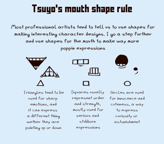

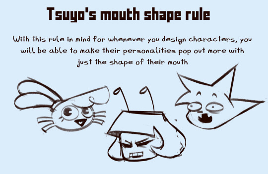
Reminder, this rule isn't meant to be used 100% of the times. This technique is just a rule, and as they say, rules are meant to be broken.
282 notes
·
View notes
Photo


HEY GUYS…. my TIPS AND TRICKS PACKET #2 is out on patreon for $5 patrons!!!! this time i’m just talking about what i’ve learned in regards to character design. Here’s a little preview, and thanks for donating!!!!
608 notes
·
View notes
Note
hai! ummmghh ur like . my main inspo for art rn and like . i rlly like ur sty;le . im wondering if its polite to ask how you draw..... or sum tips.,... im sry if this is rude i just rlly enjoy ur artstyle and ive been trying to mimic it for so long noew.......
Not rude at all!! I love art analysis! [and it’s an honour Ty!]
Everything case by case and I’m not good with step by step stuff but I can provide fundamentals!
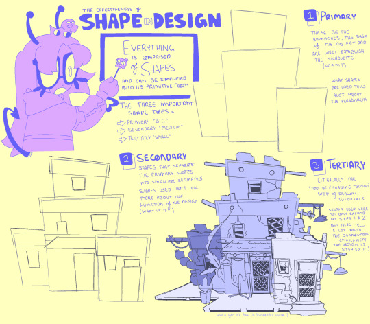

Understanding shape language to me one of the most important things to art and design yet is either overlooked, mis or under-studied in regards to why said design is successful by form.
character design AND building tutorial cuz multiple ppl asked for both
It’s not all of it but hopefully it’s enough >u<
I would have nerded out forever if I did
329 notes
·
View notes

Text


my lengthy talk about lineless art since someone asked!
disclaimer: I'm no pro and am self-taught but I hope this helps someone who is curious about this style and how I tackle it
306 notes
·
View notes
Text

Petal dragon 🌸🐉
All the plum and cherry blossom trees around me have been blooming for the past couple weeks and I was looking at a tree outside my apartment and I was like... what if that was a dragon lol
38 notes
·
View notes
Note
you are so awesome I love your art 😭💚
Oh thank you sm!!!! Here’s some sneak peaks of some other things I’m working on :b


415 notes
·
View notes
Note
Do you have any tips on anatomy or dynamic poses? I just really love your art and how fluid it is!
I'm bad at doing art tutorials but things that helped me specifically on that area are;
Prioritizing flow (and the line of action) over anatomically accurate shape; as absolute legend ciro put it really well on this thread made to respond to more or less the same question
Think animation smears, movement before mimesis of the realistic form. More stylized traces benefit heavily from this! But lets say you're also doing some mostly stactic action without a lot of "movement". In that scenario, ive found that thinking of the same principle (flow of the whole instead of the singular piece) can also help if you focus on the characters weight distribution and try to minimize the amount of straight angular lines in your art. Even on things like arms and backs, there's a slight curve instead of a ramrod straight line. It's the juxtaposition with a more loose corresponding line that makes it seem snappy, mid-movement, "bendy". Think about the figure as a whole and be conscious of how the outline loops around itself-which side is the snappier one and which is demonstrating the elasticity of the form. Im gonna take another pic from ciros twitter bc i went to look for the tutorial and found it (sorry king)
This is gonna look confusing at first but bear with me. Check out this image:
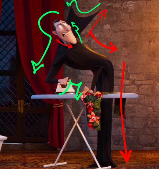
Looks like a fucking mess right. Now let's isolate the elements:
IN GREEN: here you have the bendier, more complex lines, the ones doing the loops and informing the shape.
IN RED: Directly In Contrast to the green lines, we have these TAUT ANGLES, not quite completely straight but just enough to give the impression of the figure being pulled every which way, like the meat of dracula boy is being tugged to one side and thus the other is gonna be a bit more modest, having less to work with. Specifically on his face, they even switch sides!
You can find even more contrast points inside that picture but I'm doing this on my phone so I'm only pointing out a few. (Like look at the shape of the hand sitting on the table, theres a complex curved top angle and a taut, lower arm-hand line.) This is definitely an animation-oriented principle instead of a Bellas Artes principle, so id reccomend paying attention to shapely animated things (mostly highly stylized ones, like cartoons not every style does this!) to get your eye trained on that. Try to break down pictures to see how that distribution is being made! Be conscious of the general idea when practicing your poses! There are exceptions to every rule and you shouldn't stress about doing this like math at every turn, but it really helps to 'loosen up' your drawings.
Also to add up on the "movement" thing i tend to sketch loosely and fast out of practice, and only polish it with subsequent re-sketches. Some artists get bogged down by this practice so its not like im reccomending it, but it works for me and i like lineart when its all about doing sweeping gestures and swirls and shit.
i’m gonna put some progress pictures under the cut!

I did this on my phone. there’s my dirty secret i don’t give a shit about how my sketches look.
lets like polish this thing with 15 layers now untill i get it where i want it (i do color blocking on this stage because i also love color distribution art is just about what you like doing tbf)
you’ll see that the Actual Lineart looks fairly different and i thought some movement was lost (A gamble that is always made when you’re trying to “solidify” or overpolish things, but you win some you lose some. I was able to find the mid stage of the jaderadia piece too so here it is
aaaand since i also have this saved here’s two pieces where one was more fateful to the sketch while the other was all just direct lineart bullshit


hopefully this helps
229 notes
·
View notes