#the benefits of minimal colour and significant shadow
Explore tagged Tumblr posts
Visit Tumblr Blog
Explore Tumblr blogs with no restrictions, modern design and the best experience.
Last Seen Tumblr Blogs


Fun Fact
Women make up for the other 50% of Tumblr’s audience.
Text


*Grips Keefe*
#so mad i had to save the hug one as a jpeg because the png was too big#the righteous gemstones#kelvin gemstone#keefe chambers#kelvin x keefe#fanart#study#trg#art tag#i've had that first one saved for AGES waiting to be painted#and i finally got to it and I was like#good enough lmao#the second one took like half the time#the benefits of minimal colour and significant shadow
67 notes
·
View notes
Text
9 Reasons Why Your Stairs Need Metal Balustrades
When one steps into a home, what are the details that catch the eye? The colour scheme, the furniture, the artwork on the walls? Undoubtedly, all of these play a part in shaping a home's aesthetic. Yet, there's another crucial component, often overlooked, that forms the backbone of your interior architecture: your stairway with balustrades Melbourne. Stairways aren't just functional elements to get you from one floor to another. Instead, they can be a statement feature, blending safety, utility, and style.
When it comes to architectural details in your home, you should never underestimate the importance of the elements that enclose your stairways. Among the myriad of choices, one option stands out for its perfect blend of style, durability, and functionality: metal barriers. They can transform a commonplace stairway into a sophisticated, elegant, and safe pathway. This article will delve into nine compelling reasons why your stairs need these metal barriers.
Read on to find out why you should have balustrades installed for your stairs.
Enhance the Visual Appeal
One of the top reasons to opt for metal barriers is their ability to elevate the aesthetic value of your home. With an array of design options, from simple straight lines to intricate patterns, these barriers can match any architectural style. Whether you desire a minimalist look or a grand artistic statement, these metal barriers can deliver.
Unmatched Durability
Metal barriers are synonymous with longevity. Thanks to their robust construction, these barriers stand up to wear and tear over time, promising an investment that pays off in the long run. While wooden barriers can warp or rot, and glass ones might chip or break, metal ones remain resistant to such deterioration.
Easy Maintenance
Another strong argument for choosing metal barriers is the convenience of maintenance. They are resistant to environmental factors and require minimal upkeep. A simple wipe-down with a damp cloth from time to time is generally sufficient to keep them looking pristine.
Safety Assurance
The primary role of any stairway enclosure is to ensure safety and metal barriers excel in this regard. Their sturdy construction prevents accidents and gives peace of mind, especially for families with children or elderly members.
Versatility
Metal barriers offer unparalleled versatility. They can be paired with wood, glass, or even stone steps, making them adaptable to any design scheme. Plus, their ability to be painted in any colour allows for perfect coordination with the surrounding decor.
Space Optimization
One of the significant benefits of using metal barriers is their space-saving quality. Unlike bulkier materials, metal barriers have a slender profile that doesn't encroach on valuable space, making them ideal for smaller homes or areas where space is at a premium.
Light Flow Maximization
Metal barriers also contribute to creating an airy, open atmosphere by allowing light to flow freely. In contrast to solid barriers, which can create shadows or block natural light, metal ones enable a bright, welcoming ambience that can make your space seem larger and more inviting.
Value Addition
Incorporating metal barriers can also add value to your property. By enhancing safety, requiring low maintenance, and contributing to the visual appeal, they are a feature that potential buyers will appreciate. The initial investment in installing these barriers can pay off handsomely if you ever decide to sell your home.
Environmentally Friendly
Lastly, metal barriers have a lesser environmental impact compared to some other materials. They are often made from recycled materials and can also be recycled at the end of their lifespan. Plus, their long-lasting nature means you are less likely to replace them, reducing waste.
The reasons to choose metal barriers for your stairways are abundant. From aesthetics and durability to safety and versatility, they offer an ideal solution that caters to a wide range of needs and preferences. By incorporating them into your home, you not only ensure a stylish and secure environment but also make a smart, long-term investment. Make the choice today and transform your staircase into a testament of elegance and practicality.
1 note
·
View note
Text
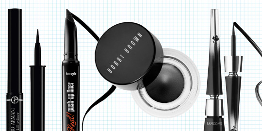
Makeup Products for Beginner
Whether you're new to makeup or have been experimenting with it for years, having a collection of beauty essentials that will help you to create a go-to everyday look is key. It's a lot easier to add fun or fashionable makeup products to your collection and incorporate them into your beauty looks once you've mastered the basics.

Makeup Essentials – Face:
1. Face Primer
While some people believe that face primer isn't necessary, I consider it to be an essential part of my makeup procedure.
Face primers have a variety of impacts on your face and makeup, but their main goal is to keep your skin smooth and your makeup appearing fresh all day. Whether you're searching for a product to regulate oil and/or acne, hydrate, smooth out uneven texture, colour correct, or anything else, there's a primer for you.

2. Foundation
Foundation is undoubtedly the most difficult component of your makeup regimen to master, because you must consider not only the level of coverage you like (sheer/natural, medium, or full), but also your skin type and undertones.
If you're new to foundation or aren't sure which type or shade is best for you, I recommend visiting your local Sephora, MAC, or department store and having a makeup artist assist you in selecting one that matches your skin tone and meets your coverage requirements. Requesting a sample is also a smart idea if you want to check how a formula feels on your skin before purchasing it.
Even if you prefer to buy foundation at a drugstore, I recommend that you get matched at a higher-end store first. This will help you figure out which colours to look for.

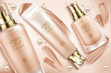
3. BB Cream
I prefer BB cream to traditional foundation because it gives a more natural appearance. If you're searching for a product with skincare advantages like moisturizing or priming, this is an excellent choice (some BB creams have primer built in).
Furthermore, if you are new to makeup, a good BB cream is a better place to start than foundation because it feels lighter on the skin, is difficult to overdo, and can be applied with your fingers.One significant disadvantage of BB creams is that they typically come in limited shade ranges and do not cater to darker skin tones.
4. Concealer
Concealer is a must-have if you have acne, dark circles, or any other type of discoloration.Concealers are available in full-coverage and sheerer-coverage formulations, and which one you should use depends on how much you want to conceal.
When selecting a concealer for acne and/or discoloration, choose a shade that is as close to your foundation/BB cream shade as possible for the most natural look.
Dark circles are a little trickier to conceal because there is so much variation in their shades and how they appear on different skin tones, but in general, a peach or pink-toned concealer will do the trick.

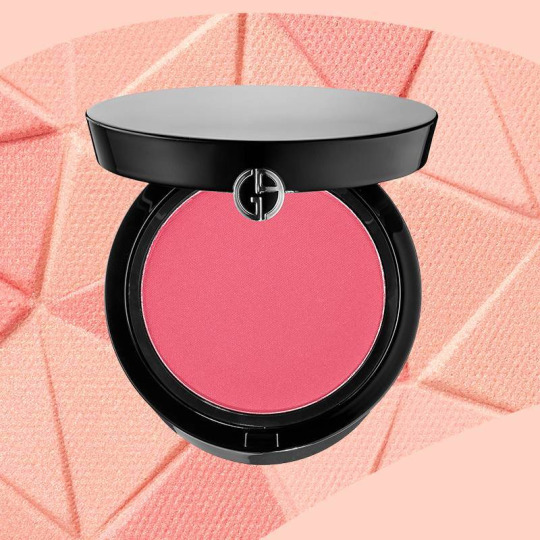
5. Blush
Applying blush can have a significant impact on your overall appearance, and I never leave it out of my makeup routine. Blush is especially important if you're wearing a foundation with more opaque coverage, which can leave your skin looking a little flat. Blush is available in powder, gel, and cream forms, with powder being the most popular. However, cream and gel blush have recently gained popularity.
When selecting a blush colour, choose one that will give you a natural flush. Regardless of your skintone, avoid going too bright or applying with too heavy a hand, as these can make you look clownish.
Pink and peach tones look best on fair-to-medium skin tones, while mauve, purple, and maroon tones look best on darker skin tones.
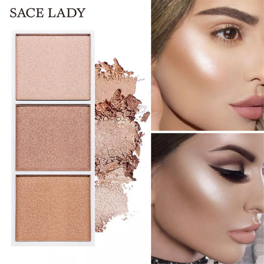
6. Highlighter
Highlighter, like many other beauty products, comes in a variety of forms, including powder, cream, liquid, stick, and powder/cream hybrid. Each of these forms has its own set of advantages, but for beginners, I recommend powder or stick because they are the easiest to work with.
My go-to highlighter application technique is to lightly dab it along the bridge of your nose, the tops of your cheekbones, your cupid's bow, and just below your brows. You can even use your highlighter as an eye shadow!
Finally, finding the right shade of highlighter, like finding the perfect shade of foundation, is dependent on your specific skin tone and undertones, so it's a good idea to test out different colours in person if possible.
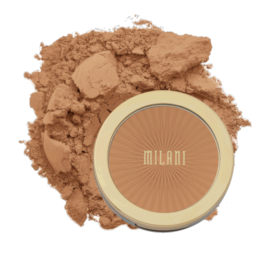
7. Bronzer
Using the right shade of bronzer is essential if you want to achieve a sun-kissed look. I suggest going no darker than one or two shades darker than your natural skin tone, and lightly dusting it all over the high points of your face for a healthy glow, or simply in the hollows of your cheeks (below where you'd put your blush) for a more chiseled look. In either case, use a light hand and blend thoroughly.
The choice between matte and shimmery depends on the rest of your look: If you're using all matte products on your face and want to add some radiance, try something with a bit of sparkle. However, if you're already wearing shimmery makeup, stick to a matte formula to avoid shine overload.
8. Setting Spray/Powder
Setting spray/powder, like face primer, works to keep your makeup in place all day.
There are various formulations available depending on the type of finish you want (matte, radiant, etc.) and what skin care benefits, if any, you want your setting spray/powder to have (e.g. moisturizing, oil-absorbing, etc.). But, if you want your makeup to last, don't skip this step.

Makeup Essentials – Eyes:
9. Eye Primer
My eye makeup would literally be virtually gone within two or three hours before I started using eye primer, so it's been a lifesaver for me.
Not only should a good eye primer keep your eye makeup from sliding off, fading, and creasing, but it should also have a formulation that keeps colours appearing true to how they should all day.Keep in mind that eye primers aren't just for oily skin–there are a variety of hydrating, color-correcting, and anti-aging formulations in the market.

10. Eyeshadow
Eye shadow is my favourite cosmetic product, along with highlighter, because it comes in so many various hues and finishes and can be used in so many different ways.Finding makeup colours and tones that match your eye colour is a terrific method to make your eyes stand out.
Always define your crease, regardless of the style you're striving for - from natural to smoky. By blending the shadow into the crease, you may create depth to your eyes and make them appear larger. The key is to use a soft fluffy brush to build up the eye shadow in a back-and-forth motion.

11. Eye Pencil
If I had to choose only one cosmetics product to wear before leaving the house, it would undoubtedly be eye pencil (or kohl). Because "eyes speak louder than words," I believe they should always be highlighted.
Always begin at the outside corner and work your way inwards while using an eye pencil. Always use tiny strokes and don't be afraid to press the pencil towards the waterline. You will not injure yourself while performing this task. Eye pencils are creamy and silky since they are made with the area in mind where they will be utilized.

12. Mascara
Mascara has a magical way of bringing your entire eye look together, and it comes in a variety of formulas to lengthen, thicken, and curl your lashes.
Most individuals can get away with black mascara, but if you have really light-colored lashes, you might want to try a brown mascara instead for a more natural effect.

13. Eyeliner
Eyeliner, like mascara, may offer that additional something to truly make your eyes pop.
While black eyeliner is frequently considered a must-have, if you have lighter skin, try brown or dark grey. Eyeliner may be applied in a variety of ways, but my preference is to draw a fine line at the lash line and wing it out just a little beyond my eye.If you want to make your eyelashes look thicker, line the waterline with eyeliner. Eye pencils and kohl products created exclusively for this delicate area are available.
If you're concerned of messing up with liquid eyeliner, I recommend lining your eyes first with a similar-colored eye shadow or pencil liner, then going over that line with the liquid liner.
Makeup Essentials – Lips:
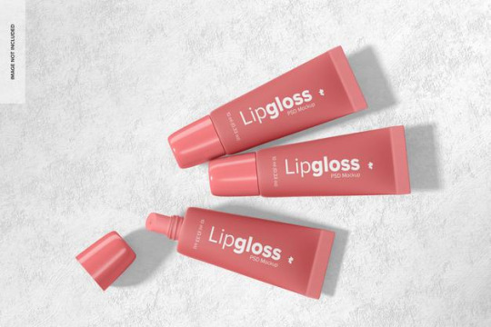
14. Lip Gloss
Lip gloss was popular in the early to mid-2000s, but has lately resurfaced, with trendy brands such as Anastasia Beverly Hills, Glossier, and Fenty Beauty all offering their own variations.
When you're in a hurry, don't have access to a mirror, or when the rest of your makeup is more dramatic and calls for a subtler lip, go for lip gloss.
15. Lipstick
You can't dispute that lipstick is having a significant moment right now: whether you prefer a liquid or bullet formula, a glossy, satin, or matte finish, or a glossy, satin, or matte finish, there's a lipstick out there to suit your preferences!
Beginners should start with a colour that is near to their natural lip colour, as this is the easiest to apply and remove.
Once you've mastered that, it's a good idea to invest in a basic red that works with everything and can be worn to class or on special occasions. For a softer look, try a glossy formula or a lip balm, or a matte formula for a more glamorous look.In addition, I recommend wearing a red lip with minimal makeup or none at all.

#makeup#bueaty#mua#fashion#makeupartist#cosmetics#bueatiful#eyelashes#eyeshadow#lipstik#looks#love#brushes
4 notes
·
View notes
Text
Some Must Have Characteristics To Look Out For Just Before Buying A Smart Tv

The use of televisions has developed through time with improved places getting introduced with the progress of engineering. Now, you are able to play games, live-stream by way of the world wide web, view informative teaser in the own flash and then see using decoders amongst the others using a single television. Using a television being able to accomplish all these duties, industry for Smart television includes sky-rocketed. Below are a few features to look out for in your purchase of some Smart television.
Screen Resolution
Resolution indicates the sharpness of this television photo, usually regarding horizontal lines of pixels. Television manufacturers are rapidly shifting from hd-tvs into ultra-hd places. These 4K designs possess four times the variety of pixels as existing HDTV screens. The most important benefit of all 4K TVs is that tiny objects on the monitor contain more depth, including sharper text. ONN tv is among the ideal television in history and you also are able to checkout onn tv review by means of online.
Ultrahd video appears excellent, which is becoming easier to get. Many streaming companies have started presenting 4K content, and ultra H D Blu-ray discs are getting to be more prevalent.
youtube
Complete high definition 1080p continues to be probably the most frequently encountered display resolution today, but 4K is increasingly becoming the norm, and it's a superior alternative if you want a Smart television which may last long without appearing obsolete.
HDR
This is a new characteristic of 4K Ultra HD sets and it stands for High Dynamic Range. It produces more colours, more contrast rates and increased stability.
The basic standard for high-dynamic variety articles is named HDR 10, as put forth by the UHD Alliance, an industry trade group. Be on the lookout to get"HDR10" or"extremely HD Premium" pinned on the set. You can find a significant number of new movies on the newest 4K bluray disk format, even with a growing amount of HDR displays accessible via streaming products and providers. Don't pick a set only because of its HDR support as the benchmark have not yet been settled. But in case you prefer the very best, buy an HDR set because format seems to be getting momentum. In the event that you voucher onn tv review, you'll know the greatness of this merchandise.

Refresh Rate
This describes how many times per minute a movie is refreshed on the screen. It's normally expressed in Hertz. The standard refresh rate is 60 times per second, or 60 Hz. In arenas together with fast moving items, a minimal refresh speed can create matters seem blurry.
Some fresh types are boasting High-Frame Rate support, which means that they have both a higher refresh rate speed and added aid for material with more than 60 Hz frame rates. It is highly advisable that you avoid terms such as"effective refresh speed," which means the actual frame rate is half the stated rate. Look for a television with a refresh rate of at least 120 Hz.

HDMI and Connections
Pay attention to the number of how HDMI inputs a smart TV collection has. The more the better. These interfaces can get used up quickly: Insert speakers, even a decoder along with also a console, and you've utilised three vents . In addition, make sure the group's ports support HDMI 2.0 to adapt future ultra-hd sources. Opt for a television with at least 4 HDMI vents out there.
Contrast Ratio
This describes the assortment of humidity ranges a pair may show. Better contrast ratios exhibit more subtle colours and hues, and thus better depth. However, how manufacturers quantify these kinds of ratios fluctuates broadly. Regardless, it is still best to watch for your self how a television displays shadow detail by having a movie with dark scenes and watching how it reveals detail at the shadows of, saya Harry Potter movie. Check with all the television's brightness, saturation and other graphic settings before creating your final judgment. Make quite smart in buying your next smart TV. By doing perhaps no matter those must have capabilities talked about above, we trust you may feel a lot more prepared when shopping for the next Smart television.
1 note
·
View note
Text
Installation And Buying Tips For Beautiful Blinds
Wood blinds offer a range of aesthetic and practical benefits. Window coverings are an important design element of any room, but they're also functional. Based on the design of a particular room, blinds are merely one of the many choices available for window coverings. Often popular as they're versatile, affordable, and simple to maintain, window blinds have become increasingly common over the past couple of decades. Today, wood blinds are a popular choice since they create an atmosphere of warmth in an area of any fashion while also offering significant practical advantages. First and foremost, wooden blinds are an attractive addition to any room that adds texture and beauty to your windows. In addition, wood blinds have a distinctly natural sense which gives them an especially graceful charm. Plus, as is the case with all blinds, wooden varieties feature clean lines and help to promote a feeling of space in smaller rooms. Moreover, because wood window blinds are made from a number of different types of wood including bamboo, pine, chestnut, oak, mahogany, maple, and beech to name a few, they can easily fit into almost any theme.
As stated, wood blinds are made from several kinds of wood even faux wood. This means they're not just versatile stylistically but . By way of instance, in rooms such as the kitchen or bathroom, faux blinds are durable enough to withstand humidity while feeling and looking like real wood. Similarly, these kinds of window coverings are available in various shapes, stains, colours, and shades. As such, homeowners can rest easy knowing their dividers will stand up to any use. Wood blinds are easy to clean, durable, and cost-effective. Indeed, although wood alternatives often cost more than mini blind, they typically last longer too. Wood blinds will last several years with only minimal maintenance. Furthermore, one of the main benefits of timber blinds is the privacy they provide. Plastic blinds are sometimes at least partially translucent, and frequently shadows or outlines are visible through the blinds. To the contrary, wood blinds are completely opaque, and because they can be opened and closed, you have complete control over your privacy.
Another thing to bear in mind is you don't need to buy it discounted if they will not match your interiors. Not only will that be quite a waste of your money, but making it match your home's design might just turn out to be a tragedy. As a homeowner, you can even customize your wooden blinds. You may pick the slat size, you can choose between vertical and horizontal varieties, and you can select your preferred wood type. Additionally, these window coverings also have optional features like fabric tapes, motorized functioning, UV blocking, and much more. When it comes to wooden blinds, you can see them as an investment. They last much longer than other kinds of blinds, and they can even be stained or painted over time in order to have the flexibility to upgrade the style of your room without having to spend a lot on new window coverings.
1 note
·
View note
Text
DRAFT Critical Commentary
(taken from brie) DRAFT: Critical Commentary (all word counts indicative — 1500-2000 words).
• Abstract (100-150 words)
• Contextual knowledge — Review of context including annotations of, or citation from, at least two credible sources (500-750 words)
• Methods. Analysis of practice-led research method(s) used or considered for use. (500-750 words)
• Conclusion. Key insights or breakthroughs in understanding and defining your practice-led design research. Your conclusion will form and frame potential practice-led research questions as future opportunities to explore in Year 3. (300-500 words).
• Contextual knowledge — Review of context including annotations of, or citation from, at least two credible sources (500-750 words)
Keywords
Environmentally conscious
Thought provoking
Circular design & packaging
Minimalist
Vector illustration
Sustainable design
Whimsical
Abstract
Sophie Lewis
Minimal, playful and whimsical design that is environmentally conscious, thought provoking and pursposeful.
contexts - circular design, environmentally conscious design, circular economy
methods - vector, collage, photomontage, cyanotype, riso graph and screen printing
Contexts
Circular packaging
Ethical products
Environmentally conscious design
Regenerative design
Designing for thought - thought provoking and purposeful
Sustainability - social, economic and environmental
Raising awareness of issues
Using design to create change
Design for sustainability
As designers we play critical roles in the development of products, objects and visual culture.
Important role of minimising environmental footprint during the manufacturing of products and establishing sustainable practices within the industrial world.
Sustainable development urges people to be conscious of social, economic and environmental issues.
Materials
Sustainable development
Designers who are interested in reducing this footprint, are thinking beyond the aesthetic and functional qualities of design and focusing on the materials and their whole lifecycle.
Circular design
Circular packaging and products refer to the product lifecycle, including the type of materials used, how they are maintained and how they are disposed of.
Designers must consider and think about all aspects of what goes into producing, using and disposing products designed.
Questions include:
What are the resources needed to develop prototypes?
What are the resources needed to produce? - thought provoking
What kind of packaging is needed to transport these products?
What is the plan for disposing of the product when or if it is no longer usable?
What will the ecological footprint be?
Can the product be recycled?
The relationship between the products and the design and their users - circular design
Circular economy systems - a way of assessing the lifetime of a product and its ability to be successful in terms of sustainability whilst also maintaining sales.
Economic, social and environmental sustainability
Economic sustainability
Economic prosperity in capitalist societies is associated with increased consumption. This can be a challenge for designers who are interested in sustainable practices, as capitalistic societies thrive in the business of convincing people to consume.
Many designers work in a way which disregards long term societal wellbeing, the concept of consumption and an economic virtue
Social sustainability
Globalisation - transformed the ways industries conduct business
Social sustainability is the way in which people benefit through products designed
Promote social inclusion
More attuned to human needs
Environmentally conscious patterns of behaviour
Consumer benefits are as regarded as the economic gains
Tending to the needs of humans
Environmental sustainability
Design makes demands on nature
Consider ecological footprint
Minimising damage to the natural environment, the use of natural resources and the creation of products that will have low or no ecological impact.
Decoupling - breaking the correlation between economic growth and environmental degradation
Thinking about the future of the planet
Design exists within a larger system
Designing in an interconnected world natural economic and social systems coexist
Designers have a vital role in bridging the barrier of language which exists between the goals of an industrial world and a sustainable one
Rethinking of the process of how we make things, not just settling for what we already know or what is considered as a trend
Product lifecycle
Make sure not to negatively affect future generations
Help contribute to society
Asin, I, (2020). Design and Sustainable Development: Beyond Aesthetic and Functional Qualities. Ethics in Design and Communication: Critical Perspective. Bloomsbury design library.
DOI: 10.5040/9781350077027.0026 Pages 137-142
Iván Asin
Circular packaging - Seedlip
The whole world is being suffocated by plastic and single use plastic - a huge and almost irreversible global issue - in which humans are the main cause for
Living in a throw away society - throw away wrappers and containers are very difficult to avoid during this convenient times
Most packaging is encased in plastic
Plastic is made from petrochemicals, spews greenhouse gases and it takes more than a century to break down.
Seedlip (case study)
Is a maker of distilled non alcoholic spirits
Home compostable gift box
Composed of biomass and mycelium - the root structure of fungi is durable and lightweight packaging that can break down in compost in 40 days.
In future work I want to avoid using plastic as a material in any designs or products that I work with. Instead I would want to find alternative solutions such as sugarcane, or algae which are bio based sources and are biodegradable or compostable.
This market and solution is expected to grow in future years as both consumers and manufacturers envision a waste free world, in which packaging feeds into the environment rather than polluting it.
The movement towards being conscious about the environment is often associated with millennials - an ecofocus poll of us shoppers conducted a survey in 2019 in which nearly 57% of millennials said they try to buy products that are made up of plant based materials.
The design goes hand in hand with the communication of how to dispose of the product which should be signalled or indicated.
Communication arts Interactive Annual (2021).Environment. [physical book]
Retrieved from Seedlip. https://www.instagram.com/seedlipdrinks/?hl=en
Conscious design
Illustrative designs and imagery which convey a deeper social, political, environmental or economic issue
Designing with sustainability in mind
Plant based materials and ingredients
Thinking about the future generations and minimising the waste and pollution
Designers have a super power in which they can create change through the universal language of design
Methods. Analysis of practice-led research method(s) used or considered for use. (500-750 words)
Methods
Cyanotype
Collage - physical/analogue
Vector illustration
Product photography and styling
Embossing
Malika favre - her creative process as a method of my own creative process when starting a new project
Using organic materials
Low impact on environment
Packaging design
Branding design
Social media and web design
Risograph
Screen printing
Malika Favre’s Creative process as a method
Vector
Woman
From paris
Independent illustrator
Describes her work as
Minimalistic
Bold
Colourful
Pop
Narrative
Malika Favre Method
Malika Favre is a french independent illustrator who describes her work as minimalistic, bold, colourful and pop. Her method is dominantly minimal vector illustration which is a method that I am most drawn to as a designer. Malika Favre’s creative process is one which I want to integrate into my future work. She takes pictures and collages them together, for inspiration and research. This is her starting point for her work. Malika Favre looks into contrast, colours, patterns, light and shadow and graphic elements which emerge from the images. She captures the essence of a location, object and looks for the overall vibe that is articulated from the series of images. A vibe - Muted colour palette and no colourful houses. The sky was the only thing that was bright - most houses were white.
The second step is articulating the colour palette from these images which are true to the images. She then looks for shapes, how they might relate, or not relate.
Malika then begins sketching which series of images were a starting point. She often creates a base for her illustration by sketching significant parts of the island as shown below
Malika Favre then adds in the narrative, drawing from her own personal experiences.
Malika then sketches with human presence and then sets herself a brief and develops and refine ideas based on brief. With this in mind Malika started to generate and develop her ideas. Using graphical aspects, colour palette and guidance from her brief she was able to come up with the 6 illustrations.
Retrieved from
https://www.youtube.com/watch?v=nPGABk4d9NA
Future led practices
Using vector, collage, photomontage, risograph, screen printing and cyanotype as my main future led practices. A combination of digital and analogue methods to gain a broader range of design methods and skills.
Vector Illustration is my preferred practice, and is like my default method when approaching projects and working with clients. Vector illustration for me is the cleanest and most minimal method, which can be used across many design outputs and collateral. Vector is a base for risograph and screen printing, which are two other methods that I would want to look closely into. Having more design skills and alternative ways of designing, offers more options for the clients you work with.
Cyanotype is an interesting method which I have briefly touched on in 2021, and is a method that I would consider picking up in my future practices.
Product photography, styling, and interior design are also methods which I encourage myself to experience and explore in my years as an emerging designer. Product photography and styling attracts and draws me in because of its ability to tell a story. I believe that design and photography go hand in hand, and it would be adequate to be able to offer these skills as a couple working with clients in the future.
Conclusion
• Conclusion. Key insights or breakthroughs in understanding and defining your practice-led design research. Your conclusion will form and frame potential practice-led research questions as future opportunities to explore in Year 3. (300-500 words).
Bullet pointing the main key findings and breakthroughs in defining my practice led research.
Environmental design
Conscious
Ethical - materials - product lifecycle
Product styling and photography
Raising awareness of global issues through storytelling and illustrations
Illustrative design
Corporate but values that align with mine
Ethical
Care about environment
Sustainability across all sectors
Conscious consumer
Natural and ethical materials
Experiences
Packaging design - circular packaging
Brand identity - branding
Rebranding
Logo, colours
Vector illustration
Photomontage
Risograph
Screen printing
Cyanotype
Collage
Working with smaller local business
Ambitious
Authentic
Organic
Raw
Natural
Narrative
Working alongside charities - giving back to the community and environment
B- Corporation - Certification
Fair trade
Curated and thoughtful design
high quality
Putting it into sentences (rough)
Environmentally conscious about working with clients, and how their products will impact on the environment. Considering and have a consciousness and awareness of the product lifecycle. Producing and executing high quality, organic and natural designs which feed the environment rather than degrade or pollute it. It has gotten to that point in time, in 2021 that every move and decision we make is taking away from future resources. Using alternative materials to plastic such as algae or sugarcane which are biodegradable or compostable. Collaborating with clients, organisations and charities, ensuring that their values align with mine - care for environment, conscious design, circular design. Circular design, living with the ambition of a circular economy. Aligning design with nature, instead of separating humans from nature. Working alongside charities which give back to the community and environment.
Natural, organic, ethical materials, colours, vibes, vegan or vegetarian friendly - giving back to people in need. Trying to create a cure, rather than assess the symptoms. Connecting on a personal and social level, creating calming, and still designs which uplift and radiate.
Methods include continuing to develop my vector skills, adobe skills and to look and explore further into analogue skills such as screen printing, risograph, cyanotype and collage. Also possibly down the avenue of product styling and/or photography as through my research I have noticed that I feel very drawn to this. Coupling design and photography could provide more options and opportunities for clients.
“whilst its true that transitioning to more sustainable growth requires large changes, it is individuals whose combined impact has power to change the world and its entirety” - Aaris Sherin
Sustainable thinking. Ethical Approaches to design and design management. [Physical book]. AUT Library.
References
Asin, I, (2020). Design and Sustainable Development: Beyond Aesthetic and Functional Qualities. Ethics in Design and Communication: Critical Perspective. Bloomsbury design library.
Communication arts Interactive Annual (2021).Environment. [physical book]. Retrieved from Seedlip. https://www.instagram.com/seedlipdrinks/?hl=en
Sustainable thinking. Ethical Approaches to design and design management. [Physical book]. AUT Library. 2020
Youtube. (2019). Malika Favre. [Video] Retrieved from
https://www.youtube.com/watch?v=nPGABk4d9NA
0 notes
Text
Positioning- product photography
In this course, i want to focus on product photography as my context.
The main reason is I major in communication design, I think it can benefit my study as well as my future opportunity. As a visual communicator, branding and advertising for specific brand is one of my focus. And I think it is beneficial if I have knowledge in product photography about how to present a product that best showcase the specific value and quality of it, in order to appeal to potential customers.
Another reason is that I have an online store selling New Zealand products to Taiwan, and I found that a good, compelling product photography can really make your products stands out in many others, and attract people to buy the product. So I would love to take this opportunity to develop my skill in product photography.
The purpose of Product Photography is to showcases products in an attractive way, to entice potential buyers to purchase specific products.
Make Sure Colours Are Properly Toned
If photograph alters the colours in any way, that can cause a big issue for both the logistics side of a selling business and the customer side.
The Idea Sells the Product
The key to selling a product is selling the idea of the product. Whether it be tying a product to an appealing lifestyle, showcasing how much more convenient life can be with a product, or how significant the product is to a specific interest – the story of the product will sell it better than anything. Photographer often tasked with creating the story, the ambience, and the world in which the product will reside.
Don’t Clutter the Set
Avoid making your image way too busy and distracting with a bunch of elements in it. Because the goal is to sell the product, not make the viewer focus on everything besides the product. Try to keep the product the centre of attention, whether it be through composition or through clever lighting.
0 notes
Photo

Weekly Summary
Throughout this week I gained an utmost sense of relief when I was informed that our deadline for the 14th of January was decided to be pushed back until the 25th of February. With the stress of a deadline being hung over me, I started off this week with a sense of doubt that I wouldn't be able to meet all the outcomes of the two briefs we were set to hand in, not only at the standard that I hope to present throughout my work but at the minimal level of completion. I feared that due to not being able to continue my studies over the holidays this set me back to a point that I wouldn’t have been able to recover from with the management of time I had left.
With the extension of the deadline and how productive I’ve been this week, I feel in a much more comfortable position moving forward as I’m at a state of mind where I feel confident in what I know I need to do moving forward in the upcoming weeks to prepare myself for the 25th’s submission date. Although we won't be working on just these projects alone, these additional weeks have given me a great deal of peace so I can take the necessary time to produce an outcome that I’m proud of.
Although now coinciding with the 1500 word essay due on the same date, I believe I have given myself enough time and realistic personal deadlines to achieve all the outcomes necessary to a presentable standard that I would be proud of. With the hopes of being able to complete the morphing project by the 11th of February, in time of our newly introduced brief, this gives me an additional four weeks to not only work on but refine an outcome to a professional standard that I want to be proud to submit.
Even though I haven’t had the opportunity to write up as many blogs posts as I usually do, having focused on the production of my creative work has allowed me to get a point where I feel happy moving forward. With no current need to rush through my workload, I’m happy with the pace that I’m moving forward taking care with both the production of my sketchbook and morphing animation.
Research Narrative
In terms of ‘Research Narrative’, this week was very much about learning to implement what we have already learnt over the course of this term to through given examples, analysing two narratives over the course of the week, we applied an approach of two separate theorists beliefs in the hopes to convey how various narrative functions can be used to dictate the functions of story in classic folk law and contemporary story.
This gave me a great deal of confidence in two significant methods to how I could approach my own chosen narrative to analyse. Showcasing how I can implement these studies through work that would benefit my own analysis of ‘The Road to El Dorado’ as I begin to gather a range of sources and information about the film itself.
Compared to sitting through a 3-hour lecture like we do most weeks, with Lynsey's absence from the lesson provided a nice change of pace. Feeling like a much more relaxed environment as we were given the opportunity to watch ‘Up’ to then study and reflect upon in our own time. With no time like the present, I found it best for myself that I reflected on the film whilst watching and straight after, not only as a key opportunity to manage my time, but this allowed me to process the elements of the narrative whilst they were still fresh in my brain. Discussing with peers around me about the impact and contradictions the narrative of the film made to Voglers archetype and hero’s journey theory that we were implementing to the story.
Although I can understand why we wouldn’t do something like this each week, using this lesson to my advantage, I was able to spend more time producing more physical work in other projects as I didn’t have to spend an additional day reflecting on the work we produced and learnt about in our typical lecture.
Digital Morphs
The deadline extension gave me the most positive response when realising that I had more time to dedicate towards the morphing project. My favourite project of the BA1b curriculum thus far. The delayed deadline has allowed me to cater and expand my projects progression to consider elements of production that I wouldn’t have had time to explore beforehand.
With creating both a finalised pre-visionary animation of what I want my outcome to look like. This week allowed me to refine my ideas and give as a comparative example of how my ideas had evolved and changed over the subsequent weeks leading up to this point. This week gave me a chance to reflect on how the various influences and studies I have been analysing have been used and implemented within my own work. Inspiring me to create something that challenges perspective, weight, timing and anticipation, the principal analysis’ has given me an in-depth opportunity to review how I can incorporate these varying elements to make my work better.
Having had the opportunity to focus on this project throughout this week, I was able to create a finalised version of my pre-visualisation to the standard that I am proud of. Ending up adding another full morph and making the transitions between objects a lot smoother, I wouldn’t have had this chance if limited to the original deadline. I hope to use this extended time to my full advantage to consider how I can best explore my animation through the use of colour and texture, to create a finalised, polished outcome that reflects the needs of the brief.
I will continue to explore this in the upcoming weeks, as I begin to translate my work to shape layers so I can fully animate my outcome in Adobe After Effects. Although I’m not as confident with the software as I would like, these extra weeks will help me solidify a foundation of the program and hopefully showcase how I have overcome these challenges as I hurdle them.
Animated Sketchbook
This is the project that I am most worried about developing throughout the weeks. Whilst I’ve always found sketchbooks to be a benefit, my interpretation of a sketchbook widely differs from the expectations of the brief. Almost treated as a notebook, I treat my sketchbook as an opportunity to explore my ideas through thumbnail sketches and writing. I typically manage to fit this onto an A5 sketchbook comfortably and the expansion to an A4 book leads me with the feeling to present an almost portfolio-eqsque level of presentation that guides my viewer through the variety of ideas I have throughout the weeks.
I see this project almost as me ticking off a list of sketchbook tasks and experiments rather than as an actual form of experimentation. Although I do find benefits to working in a sketchbook, this formal manner, as I feel it has been presented is not something I find comfortable to be able to explore quickly through experimentation.
As I hesitantly slowly progress through this book, I’m beginning to learn and see the benefits of me working to a smaller scale, as I tend to work slow and this leads to me spending around at least an hour at a time working on filling up the entirety of the A4 sketchbook.
This is the only project I don’t feel enthusiastic towards as it has become a begrudging task to fill up an A4 sketchbook that I find inferior in its use to the A5 sketchbooks that I always keep on me at hand. To record, visualise and take note of any ideas that I have throughout the day.
Life Drawing
This weeks life drawing session mixed up the work as we began to look at the negative space of a figure. Identifying how we could determine both highlights and shadows using a variety of tone. Limited to charcoal and rubber as our mediums, this provided me with an enthusiastic and messy challenge that I thoroughly enjoyed. Although I was hesitant about going into the class, I can see the benefits of working in this manner as it allowed me to consider both the foreground and background. Using a pre-toned piece of paper to allow me to further push the highlights that hit the figure directly through the use of a spotlight.
Although I have taken the opportunity to write less about my ‘Life Drawing’ outcomes throughout my blog, I think including them best demonstrates my progression as an artist and the variety of experimentation I have been able to produce during my time on the ‘BA Animation’ course.
To summarise;
Extending the deadline gave me a great sense of relief as I have more time to work on the projects I enjoy.
Once I get to stage in my sketchbook that I’m happy with I think it would be best to get a one on one tutorial with a tutor to discuss how I can develop my work further.
At the moment I am confident in being able to reflect and produce blog posts on an every other day basis, this is something I hope to continue.
I should begin to consider researching into my essay so I can reach my personal deadline of producing a first draft by the 29th of January.
0 notes
Text
Everything About Dye-Sublimation Printers
Devoted photo printers vary from all-round printers as they are made to print photos only, rather than text or graphics documents along with pictures. They are typically small in size as well as light-weight, and some models even include batteries that allow you to print without the demand for an electrical outlet. The majority of picture printers, including dye-sublimation (or dye-sub) printers, are constructed around a thermal color engine, though there are a few that function inkjet innovation.
UV printen
For many years, dye-sublimation printers were specialist gadgets used sought after graphic arts and also photographic applications. The introduction of digital photography resulted in the access of this innovation into the mainstream, developing the basis of many of the standalone, portable image printers that surfaced in the second fifty percent of the 1990s.
iUV1200 UV printer
The term "color" in the name describes the solid dyes that were used at the same time instead of inks or toner. "Sublimation" is the scientific term for a procedure where solids (in this instance, dyes) are converted into their aeriform kind without going through a stepping in fluid phase.
The printing procedure utilized by real dye-sublimation printers differs from that of inkjets. Rather than splashing little jets of ink onto a page as inkjet printers do, dye-sublimation printers use a dye from a plastic movie.
A three-pass system (featuring solid dyes in tape form on either a bow or a roll) layers cyan, magenta, yellow, as well as black dyes on top of each other. The print head on a dye-sub printer uses little heating systems to vapourise the color, which penetrates the shiny surface of the paper. A clear coat is included in secure the print versus ultraviolet light. Although this method is capable of producing exceptional outcomes, it is far from cost-effective. Even if a specific picture does not require any kind of one of the pigments, that bow sector is still consumed. This is the factor it is common for dye-sub printer compatible paper packs to consist of a transfer movie capable of creating the same variety of prints. Furthermore, color sublimation inks require a paper that allows the ink to remain on the surface of the paper.
Nowadays, a variety of inkjet printers on the marketplace are capable of releasing dye-sublimation methods. The cartridges in such printers spray the ink, covering the page one strip at once. The print head heats up the inks to develop a gas, controlled by a heating element that gets to temperatures of up to 500 ° C (greater than the typical color sublimation printer). A big distinction in the results with dye-sublimation technique is that due to the fact that the dyes are put on the paper in gas form, they do not form distinct dots with a difficult edge like inkjet printers. Rather, the edges are softer and mix into each various other easily. In addition, the mixture of the gaseous color right into the paper produces a more colour-fast picture.
Comparing Dye-Sublimation Printers and Inkjet Printers
Although it is tough to explain every possible benefit and downside when comparing inkjet and also dye-sub printers, the complying with checklist discusses the significant factors that apply to lots of people publishing photos at home.
Advantages of Inkjet Printers over Dye-Sub Printers:
· Prints are extremely accurate with sharp edges
· Newest designs offer amazing information that goes beyond most dye-sub printers
· Variety of papers/surfaces readily available-- consisting of matte, appeal, glossy.
· Not secured to one producer's paper
· Some historical inkjets can create prints that long-lasting
· Most inkjets can publish on many different surfaces that are created to approve ink, consisting of CDs, CD inserts, envelopes, and so on
· Inkjets have a significantly bigger colour gamut and normally produce more brilliant photos than dye-subs
· Easier to get huge style inkjets that can publish 11x14, 13x20 dimensions, or larger
· Inkjet printing is frequently less expensive than dye-sub printing
Inkjet Printer Disadvantages:
· Usually much slower than dye-sub printers
· A lot of non-archival inkjets generate prints that discolor a little (occasionally a great deal) faster than dye-sub prints
· Publish heads sometimes obstruct as well as need cleansing, or even replacement
Benefits of Dye-Sub Printers over Inkjet Printers:
· Extremely quickly
· Reasonably maintenance-free
· Smooth without dot patterns noticeable, even under magnifying
· Create exceptional shadow detail in dark locations where some inkjets may be "blotchy".
· Prints are typically a lot more durable and also extra water resistant than inkjet prints.
· For numerous customers, dye-sub printers produce pictures that feel and look even more like real pictures as a result of the level of smoothness of the prints as well as the absence of visible dot patterns.
Dye-Sub Printer Disadvantages:.
· Customer degree designs commonly smear high comparison sides (like a black square on a white history) to some extent, making graphes, graphs, and also line art look a little much less "accurate".
· Dye-sub prints normally just last as lengthy or somewhat longer than an excellent non-archival inkjet printer and also are typically not considered "archival".
· Paper type selection is really minimal and while dye-sub printers produce exceptional shiny photos, a lot of fall back or do not even use the option of matte prints.
· Dye-sub printers utilize a whole page and also an entire web page well worth of bow even to publish one little purse size picture.
· Pages can not be generally fed with the printer two times to fill up even more of the page as they can in inkjets.
· Dirt can occasionally get in and also create vertical scrapes on prints.
· Dye sub printing as well as the cost of paper and also toner (bow) is often more than inkjet printing.
Couple Of Popular Models of Dye-Sublimation Printers.
Canon Selphy CP710.
Dye-sub printer for 150x100mm photos.
Samsung SPP-2040 picture printer.
Dye-sub printer with 300x300dpi resolution.
Samsung SPP-2020.
Digital picture printer that produces 100x150mm snapshots.
HiTi Picture Printer 641PS.
Dye-sub printer for 152x102mm photos.
Sony PictureStation DPP-FP30.
An easy to use dye-sub picture printer.
Kodak EasyShare Printer Dock 6000.
A dye-sublimation printer for compatible Kodak electronic cameras.
Kodak EasyShare Printer Dock 6000.
A dye-sublimation printer for compatible Kodak cams.
Olympus P-10 Digital Image Printer.
A dye-sublimation printer that publishes straight from your Olympus digital camera.
Photograph PP46d image printer.
A dye-sub image printer.
Olympus P-440.
Dye-sub printer efficient in publishing A4 pictures.
Sony DPP-EX50.
Dye-sublimation photo printer.
0 notes
Text
Easy methods to Design a Brand: 40+ Tutorials from Zero to Hero
5/5 (1)
The emblem is a tiny element of an enormous significance. It’s the face of your corporation that may make you recognizable within the goal market. Guided by this truth, I didn’t grudge paying over a thousand {dollars} to an expert graphic designer for a high quality emblem. I defined what I needed intimately, and the design he supplied even exceeded my expectations. I completely fell in love along with his paintings and it went on till the day my buddy instructed me he may do the identical for a cup of espresso…
I used to be confused. He was a lawyer by career and labored at an area regulation agency. The place may he get skilled abilities in graphic design? He instructed me that he had a present for drawing and was fairly good at it at college however couldn’t understand his expertise due to monetary points and the dearth of time.
Not way back, he determined to catch up and studied Adobe Illustrator and Photoshop tutorials on weekends and at any time when he had free time. He mentioned it was fairly simple to create a emblem design following step-by-step directions and I even may do it myself to spend that thousand {dollars} on one thing extra enjoyable.
And he didn’t imply an novice design you wouldn’t be ashamed to indicate to your shut associates solely. If in case you have a transparent concept of what you need and are able to make efforts, you are able to do the job like a professional. In the present day, I’ll show you how to keep away from my errors and share premium and free tutorials on the best way to design a emblem your self.
You’ll purchase a whole lot of abilities and concepts to give you your personal inventive designs. When you change into proficient, you’ll be capable to design not just for your self but additionally generate income in your abilities. Try the examples of emblem templates you’ll be taught to construct.
Create your emblem with TemplateMonster!
Want a beautiful logotype to your web site, however haven’t any manner out? Skilled net designers from MotoCMS will show you how to. Our staff will give you one of the best resolution to your model in keeping with your private necessities. If the emblem does not sit together with your requests, we are going to redesign it as much as three occasions. Simply add this provide to your cart or contact our Service middle
Be aware: The method of your emblem creation will take as much as 10 enterprise days since you’re taking the provide.
youtube
Free Tutorials on Easy methods to Design a Brand
Let’s begin with free tutorials for Adobe Photoshop and Illustrator. This roundup serves a number of functions. There are guides for creating logos in numerous kinds, from classic and minimal to trendy and 3D. What’s particularly cool is that the method gained’t take a whole lot of your time. The shortest tutorial lasts a bit greater than 6 minutes, whereas the longest one is almost 18 minutes lengthy.
Easy methods to Create a Retro Type Badge Brand in Adobe Illustrator
This free Adobe Illustrator tutorial is supposed for these of you who need to make a emblem design within the retro type. You’ll discover ways to create a round, black and white emblem with fashionable parts like stars and provides it a tough look with mud and scratch textures.
Period: 7m 41s
Use vector shapes to design a emblem with Adobe Illustrator CC
From this tutorial, you’ll discover ways to create a vector emblem in six steps. Every step is supplied with the video on which you will note the detailed means of emblem designing. The movies are additionally accompanied by the voice feedback on what’s being completed.
Period: 30m 43s.
Easy methods to Draw a Gradient Brand in Illustrator
Right here’s a video information on how to attract a gradient emblem in Adobe Illustrator. This free tutorial is really helpful for these of you who want a colourful and playful design, however nonetheless need to follow magnificence and minimalism.
Period: 16m 19s
Face Brand Design Photoshop Tutorial with Galaxy Impact
Typically, it is sensible to personalize your emblem with a face. Right here’s a video tutorial on the best way to make a emblem in Photoshop with a galaxy impact. The information is straightforward and brief, which suggests anybody can grasp it whatever the talent degree.
Period: 6m 35s
Easy methods to Create a Fashionable Single Weight Line Artwork Brand in Adobe Illustrator
This free tutorial will information you on the best way to create a emblem in Adobe Illustrator utilizing traces solely. Its fashionable design relies on panorama scenes together with all the things from mountains, timber, and clouds to water and solar rays. Though the emblem appears to be like simplistic, you’ll be taught a whole lot of methods to change into a more adept designer.
Period: 10m 41s
Create a emblem from scratch in Adobe Illustrator CC
youtube
Period: 10m 49s.
Galaxy Brand Design Photoshop Tutorial
Watch this tutorial to discover ways to create a emblem in Photoshop with a round design and clear background. So as to add some gloss to its look, the creator makes use of a stylish galaxy impact.
Period: 12m 52s
Classic Badge Brand Tutorial for Adobe Illustrator
On this free tutorial, the creator tells the best way to make a cool emblem primarily based on a classic badge. Be aware that this tutorial is supposed for extra superior customers of Adobe Illustrator for the reason that man makes use of a whole lot of shortcuts newbies could not know.
Period: 14m 8s
Illustrator Tutorial Glowing 3D Drop Brand Design
Do you want a emblem with a way of depth? Design it in 3D utilizing this free Illustrator tutorial. It exhibits the best way to create your emblem within the type of a droplet and apply a shadow impact and gradient colours to it.
Period: 7m 36s
Study Easy methods to Draw the 2016 Instagram Brand in Adobe Illustrator
Do you just like the Instagram emblem launched in 2016? No matter your reply, you possibly can attempt to design it your self and purchase new abilities of enjoying with colours, shapes, and different instruments in Adobe Illustrator. This free video tutorial will information you thru the method step-by-step.
Period: 9m 59s
3D Bubble Textual content Brand Mark Design Illustrator Tutorial
Would you wish to design your emblem in 3D? Learn the way simple you are able to do it on this free and enjoyable Illustrator tutorial. The creator will instruct you the best way to create a 3D bubble textual content emblem in gradient colours. Within the course of, you’ll change into extra skillful in utilizing mixing options, altering the orientation of gradients and the graphic perspective, and many others.
Period: 14m 55s
Skilled Brand Design in Adobe Illustrator CC (Tangled)
Wish to know the best way to design an organization emblem distinctive and inventive? Discover inspiration on this free video tutorial for Adobe Illustrator. The creator exhibits the best way to create a hand-drawn emblem utilizing the pencil, choice, and deal with instruments. The emblem design relies on three layers, every of which has its personal coloration.
Period: 12m 14s
Skilled Brand Design in Adobe Illustrator CC (Cut up)
Try one other non-standard strategy to create your emblem. This design is made up of a number of items that kind a bit complicated form of an elephant. The creator locations every emblem piece above the opposite one to forged a shadow after which applies a gradient coloration to the whole form.
Period: 15m 34s
Hipster Brand Design Photoshop CC Tutorial
Hipster logos are fashionable objects which you could make your self fairly simply with this tutorial. It gives an in depth clarification on the best way to create a hipster emblem with sq. outlines and a blurred picture background.
Period: 15m 53s
Make a Brand Design in Photoshop
youtube
Period: 7m 14s.
Easy methods to Draw the Spartan Brand in Illustrator
Are you curious to know the best way to create a emblem of Sparta? Watch this free Adobe Illustrator tutorial. The creator will present you ways to attract the Spartan emblem primarily based on the golden ratio ideas, notably use of a number of circles and features. One other benefit of this tutorial is that it offers a chance to grasp the Form Builder Device.
Period: 17m 55s
Easy methods to Create a Fashionable Folded Brand Design in Adobe Illustrator
In the event you surprise the best way to design a emblem within the folded, letter-based type, this free video tutorial will rapidly educate you. In addition to the first design in its full-color vary, you’ll create flat and mono variations to make use of in particular eventualities.
Period: 7m 22s
Inventive Shapes with Adobe Illustrator
youtube
Period: 8m 52s.
Photoshop Tutorial: Easy methods to Make a Retro, Cajun-style, Tattoo Brand Design
This tutorial will show you how to create a emblem design within the retro, tattoo type. The creator makes use of a concrete texture, coronary heart form, and Carnivalee Freakshow font. What’s notable about this emblem design is that it was impressed by Creole and Cajun music referred to as Zydeco.
Period: 6m 28s
Create a Hipster Brand in Adobe Illustrator
This tutorial goes into particulars of constructing a hipster emblem at no cost. You will discover ways to construct a modern structure, add inventive parts, select the appropriate fonts, and many others. First, the creator creates the emblem in a clear model after which provides somewhat grit to provide it a home made look.
Period: 16m 22s
Summary Brand Tutorial for Adobe Illustrator CC
The creator of this tutorial will educate you the best way to design an summary emblem utilizing the Form Builder Device and circles. On this video, you’ll see the best way to create a emblem template, develop dwell form objects, make patterns inside shapes, and many others. Try extra animal emblem designs.
Period: 14m 07s
Easy methods to Design a Images Brand: Photoshop Tutorial
On this tutorial, you’ll find out the best way to create a pictures emblem in Photoshop. This design is all about simplicity and consists of 1 font and one form solely. You’ll be capable to play with the textual content layer in several methods, from rasterizing to spacing.
Period: 11m 25s
Classic Brand Design Tutorial for Adobe Illustrator CC
In the event you’re simply beginning out, try this free tutorial for Adobe Illustrator CC. Right here, you’ll be taught a whole lot of helpful emblem design suggestions for newbies. The creator shares them on the instance of a handwritten, classic emblem with somewhat bit blurry impact.
Period: 13m 41s
Create a Flame Brand in Adobe Illustrator
youtube
Period: 11m20s.
Classic Brand Tutorial for Adobe Illustrator
This free emblem design tutorial will come in useful for these of you who just like the classic type. Since it’s primarily centered on typography, you’ll be taught new methods of utilizing Sort instruments in Adobe Illustrator.
Period: 8m 45s
Easy methods to Design an Atlantic Hipster Brand In Photoshop
Right here’s one other free and easy Photoshop tutorial for newbies. It is going to educate you the best way to design a clear emblem primarily based on a triangle form. The creator begins with the background fundamentals after which heads over to the core emblem parts.
Period: 12m 48s
Premium Tutorials on Easy methods to Create a Brand
In addition to step-by-step guides on the best way to design a single emblem, you possibly can take full programs. Consultants in emblem design will let you know the best way to perform analysis, make sensible coloration and font decisions, current your work to purchasers, and far more. Try emblem design programs that may show you how to change into a professional in your corporation.
Brand Design in Adobe Illustrator for Rookies and Past
Right here’s the largest emblem design course consisting of 109 lectures. The creator reveals the method from begin to end, notably sketching, typography, character placement, coloring, image improvement, work with purchasers, and many others.
Period: 7h 18m 54s
Design a Tech Brand That Stands Out
Loads of tech logos look alike, as designers often depict the identical issues, e.g. circuity, dissolving bitmaps, electron particles, and many others. The summary nature of expertise makes it tough to create a emblem that may be distinctive. This course will show you how to give you a design that may stand out amongst cliches. You’ll be taught the primary ideas of tech emblem design, dos and don’ts, developments to keep away from, and methods of visualizing your concepts.
Period: 1h 28m
Brand Design: Methods
Would you wish to observe examples of corporations with probably the most profitable logos like Coca-Cola and Nike? The creator of this course reveals parts and methods their designs are primarily based on and the way they work. You’ll learn the way to give you fascinating concepts, design with easy shapes, select the appropriate typeface and colours, and improve your emblem with numerous issues. They embrace beveled edges, textures, shine, transparency, and extra.
Period: 4h 58m
Mastering Brand Design: Gridding with the Golden Ratio
Get a greater understanding of the golden ratio in emblem design. On this tutorial, you’ll be taught when to make use of this proportion and the best way to grid a posh emblem with its assist. The creator additionally shares his methods to fine-tune your emblem and make it look good.
Period: 45m
Grasp FX: 3D Brand Design in Adobe Photoshop
This tutorial consists of eight brief video classes on making a 3D emblem in Photoshop CC. The creator explains the best way to create a form with textual content parts, convert it to 3D, apply colours and textures, use lighting, and many others. Within the final lesson, you’ll discover ways to put particular ending touches to your emblem design.
Period: 1h
Design Masterclass: Study Brand Design and Illustrator
Achieve perception into the sphere of emblem design with this masterclass of 85 lectures. You’ll discover a number of Illustrator instruments and methods to create impactful and memorable logos. What’s additionally precious concerning the course is recommendation on the best way to construct an impressive portfolio of a emblem designer and discover purchasers.
Period: 6h 42m 9s
Energizing Your Logos with 3D Animation in Photoshop
Take this course to discover ways to animate vector logos in Photoshop. The creator will show you how to enhance your emblem aesthetics in 3D house utilizing supplies, textures, and lighting. Then, you’ll watch the best way to drop your 3D emblem onto the Photoshop timeline, create a easy animation for it, and export your ultimate video out of the software program.
Period: 1h 17m
The Science of Brand Design
The creator of this tutorial takes a scientific strategy to the emblem design. He analyzes four ideas of the ARMM mannequin, an acronym for Consideration, Response, Which means, and Reminiscence. Most designers inform us that easy logos are higher than complicated designs. However on this tutorial, you’ll uncover the circumstances when complicated logos outperform easy ones.
Period: 45m 3s
Brand Design Principle and Utility Bootcamp
This course will information you thru the ideas of emblem design. It’s all about concept, not a step-by-step tutorial. There are 35 lectures that cowl numerous subjects, from analysis and aggressive evaluation to design and presentation. You additionally be taught some fascinating information concerning the coloration concept, work with vectors, type information creation, and many others.
Period: 6h 45m 35s
Brand Design 101
Right here’s an entire course of making an efficient emblem in 22 video classes. The creator shares recommendations on doing emblem analysis, brainstorming concepts, and even presenting the ultimate design to the consumer. The course additionally gives the details about the primary emblem kinds, sorts, and requirements. It is possible for you to to create a emblem that can be utilized each on-line and in print.
Period: 5h 23m 4s
Easy methods to Design Sports activities Logos: Create Your Personal Staff Mascot
This course teaches creating sports activities logos which might be daring and dynamic. You’ll be taught all the things from sketching with easy strokes, daring traces and detrimental house to refining, shading, and coloration.
Period: 1h 44m
Brand Design Made Straightforward: Create Your Personal Brand in PowerPoint
Do you will have abilities in utilizing PowerPoint? Then, this brief course is for you. Its creator will educate you the best way to create your emblem in PowerPoint. It consists of eight lectures on the idea of layers, minimal emblem design, use of various colours and fonts, and many others.
Period: 1h 13m 45s
Brand Design: Wordmarks
Must create an expert wordmark, one of the crucial well-liked varieties of emblem? The creator of this course will show you how to purchase skilled abilities in typography when designing logos. Over 11 classes, you’ll discover ways to draw and customise letterforms, pair personalities with symbols, work with bézier curves and different digital vectors.
Period: 5h 5m 35s
Grow to be a Skilled Brand Designer
Wish to be taught the secrets and techniques to creating win-win emblem designs? Take this course consisting of 82 lectures. You’ll analyze the world’s most recognizable logos, discover the newest developments, discover ways to land purchasers and perceive them, and many others. The creator additionally talks about plagiarism and copyright that can assist you keep away from issues.
Period: 7h 45m 34s
Watercolor Branding: Create Your Personal Customized Watercolor Brand
To design a inventive watercolor emblem quick, try this tutorial. Its creator will let you know the best way to make sensible font decisions, incorporate and masks textures into vector parts, and lay out your emblem. The tutorial is supposed for each Illustrator and Photoshop customers.
Period: 1h 14m
Setting up Glyphs for Logos by Hand in Illustrator
Typically a consumer needs to recreate his emblem from the outdated enterprise card and offers solely a scan, he can’t discover the unique font. In the event you face such a problem sooner or later, the creator of this superior course will let you know what to do.
Period: 1h 29m
Brushpen Brand Design: Develop Your Signature Type
Learn to design a signature type emblem utilizing the comb pen in Illustrator. This course of 15 episodes will show you how to discover ligatures, establish motifs, and create easy curves with the pen instrument.
Period: 2h 9m
Brand Design: Illustrating Brand Marks
This course introduces time-tested methods of making vector-based emblem graphics. The creator explains the best way to make the appropriate selections in your emblem type, coloration, and different branding features. Upon completion of the course, you’ll be capable to create modular designs, set up visible continuity, iconify complicated shapes, add dimension to flat designs, use detrimental house, and many others.
Period: 5h 6m
Brand Design: Easy methods to Design an Superior Brand in Illustrator
This course is sort of a three in 1 bundle that may allow you to grasp Illustrator, examine the emblem design concept, and follow your abilities. Over 56 lectures, you’ll find out about creation instruments, transformations, palette, typography and the best way to design a Fortune 500 emblem your self.
Period: 5h 26m 37s
Typographic Logos: Typography and Lettering for Brand Design
As an alternative of utilizing a ready-made font, you will be distinctive and create customized lettering. That’s particularly necessary if you happen to construct a typographic emblem. This tutorial will information you from A to Z, from discovering inspiration for the sort of emblem to including a shade and texture to your design.
Period: 1h 31m
These tutorials are fairly simple, however an expert emblem design takes a bit extra than simply drawing a form, typing in a enterprise identify, and making use of colours. Because the first emblem I created, two years have handed. Over that point, I made errors and realized classes, which is able to in all probability occur to you too. However don’t quit. Follow makes good. With these tutorials, you’ll be taught the best way to design an organization emblem quick and with out compromising the standard of design.
On this multipurpose roundup, you’ll find each full programs and brief tutorials for various talent ranges, applications, emblem kinds, and price range. It suits any wants, so don’t neglect to share the put up with your folks who’re new to the emblem design.
Easy methods to create a emblem design utilizing On-line Brand Maker
Do you need to make means of emblem creating less complicated and quicker? Attempt to use on-line emblem maker for your corporation in easy and simple steps.
youtube
window.fbMessengerPlugins=window.fbMessengerPlugins||{init:function(){FB.init({appId:'1678638095724206',autoLogAppEvents:true,xfbml:true,version:'v2.10'});},callable:[]};window.fbAsyncInit=window.fbAsyncInit||function(){window.fbMessengerPlugins.callable.forEach(function(item){item();});window.fbMessengerPlugins.init();};setTimeout(function(){(function(d,s,id){var js,fjs=d.getElementsByTagName(s)[0];if(d.getElementById(id)){return;} js=d.createElement(s);js.id=id;js.src="http://connect.facebook.net/en_US/sdk.js";fjs.parentNode.insertBefore(js,fjs);}(document,'script','facebook-jssdk'));},0); Supply hyperlink
source https://webart-studio.com/easy-methods-to-design-a-brand-40-tutorials-from-zero-to-hero/
0 notes
Text
Projecting Additional Than Just Lyrics - How Church buildings Can Use Video Projection In Worship
videomapping In the huge the greater part of church buildings, corporate worship via audio is a important ingredient of the worship assistance. For numerous many years, this intended turning to a certain site variety in the hymnbook or refrain e book observed in the pew rack in front of you. All those times are ever more behind us. With the arrival of inexpensive online video projectors and projection software, worship leaders are no more time minimal to what is in the hymnbook or chorus e book. Now they can pick from a extensive wide variety of tunes while projecting the lyrics on a monitor for the congregation. A pure profit of projecting lyrics in this way is that far more expressive worshipers are freed up to lift their gaze out of a e book and raise their palms in praise. Several have located that this easy adjust in posture has tremendously enhanced their private worship expertise and potential to emphasis on the item of their worship-Jesus. But the potential to use projection delivers a lot a lot more adaptability than just projecting lyrics. Worship leaders can get benefit of the prospect to improve the new music part of the worship assistance by including a range of things. Picking a Slide Track record Special treatment must be taken when deciding on a background for the lyrics. Some church buildings prefer to use a solid black history when projecting the lyrics in white or yellow. Others test to establish an identity by making use of a church emblem as a watermark on the display screen. But to just take superior gain of the potential of projection, select a history that will compliment the concept of the song, established, or provider. (Alternatively, if your software program lets, you could use a looping movie.) For case in point, if you are singing a song about evangelism, choose a background graphic that reveals the earth or a crowd of men and women. If you are singing a music about the crucifixion, use an graphic of a cross. At Christmastime, use images of the nativity or of a new child little one. Regardless of what graphic (or online video) you decide on to use as a history, make confident that the lyrics are nonetheless clearly legible. You want the impression to enrich worship, not distract from it. If the colors of the impression make it unattainable to opt for a font colour that can be seen, try out changing the brightness or contrast of the image. Including a shadow to the lyrics can also assist. If the lyrics are however not legible, location a semi-transparent rectangle over the overall slide. In most cases, a black box with a transparency of about 50 per cent will work nicely. Just be positive to carry the lyrics to the entrance of the rectangle. This strategy can also be handy if you use an image as a track record for your concept. Using Scripture Through interludes in the new music or throughout solos, why not display screen a pertinent Scripture verse? This is specifically significant if the music is centered on a certain verse. This can teach Scripture to the congregation while permitting them know that the tune is centered on the Bible. You can also exhibit Scripture for the congregation to examine aloud collectively as an introduction to a track. This can serve as a call to worship or as a changeover into a a lot more reflective tune/set. Serving to the Congregation Fully grasp For tunes that contain unfamiliar, "churchy," or theological phrases, it can be useful to the congregation if you include things like a definition on the display screen. Just set an asterisk (*) at the end of the phrase in the lyrics and put the definition (or clarification) at the base of the monitor. This can be valuable to permit the congregation know what they are singing and to develop a teaching moment. For example, if the music has the word "Hallelujah" you can area a definition in the base suitable-hand corner that suggests, "Hallelujah - a Hebrew term that suggests 'Praise the Lord.' It is generally employed to express praise or many thanks." Including Multimedia Limited movie clips can be inserted into your presentation to be employed as transitions, to established a temper, or to bring about the congregation to replicate on a certain issue or concern. Just be sure that the movie will enhance (not interrupt) the worship. If the video is far more of a sermon illustration, use it just prior to or during the sermon. You can also make a slideshow for the congregation to look at while listening to a selected song. This performs effectively in the course of companies with an emphasis on missions. In this case, you can pick out a wide variety of pics demonstrating a specific mission industry. If a staff from your church has not long ago returned from a journey, use their pics (with their permission, of program). Based on the software program you are using, you may well be capable to use looping films as a track record for the lyrics. This enables for larger adaptability, but be thorough not to go overboard. Your aim is not to impress individuals with engineering your purpose is to generate an ambiance conducive to worship. By employing these tips and incorporating some of your possess suggestions, you can elevate the effect of your presentation considerably over a basic show of lyrics. With a little bit of creative imagination and a good deal of prayer-blended with the leading and blessing of the Holy Spirit-your congregation can be ushered into the presence of God.
0 notes
Text
Projecting More Than Just Lyrics - How Churches Can Use Video clip Projection In Worship
videomapping In the large bulk of church buildings, corporate worship via songs is a crucial ingredient of the worship assistance. For several many years, this intended turning to a specific page range in the hymnbook or refrain guide identified in the pew rack in front of you. These days are progressively driving us. With the arrival of inexpensive online video projectors and projection software package, worship leaders are no more time minimal to what is actually in the hymnbook or refrain e book. Now they can pick from a broad selection of music whilst projecting the lyrics on a monitor for the congregation. A pure gain of projecting lyrics in this way is that much more expressive worshipers are freed up to lift their gaze out of a e-book and elevate their arms in praise. Many have located that this easy transform in posture has significantly improved their personalized worship knowledge and capacity to emphasis on the object of their worship-Jesus. But the potential to use projection offers a lot a lot more overall flexibility than simply projecting lyrics. Worship leaders can take advantage of the chance to boost the songs portion of the worship provider by including a range of components. Picking a Slide Background Special treatment really should be taken when selecting a background for the lyrics. Some church buildings favor to use a strong black background when projecting the lyrics in white or yellow. Other individuals attempt to build an identification by utilizing a church brand as a watermark on the display screen. But to take greater benefit of the probable of projection, decide on a history that will compliment the topic of the music, set, or service. (Alternatively, if your software enables, you could use a looping online video.) For illustration, if you are singing a song about evangelism, opt for a background impression that demonstrates the earth or a crowd of men and women. If you are singing a track about the crucifixion, use an graphic of a cross. At Christmastime, use photographs of the nativity or of a newborn child. No matter what image (or movie) you select to use as a qualifications, make confident that the lyrics are nevertheless evidently legible. You want the impression to enhance worship, not distract from it. If the colours of the graphic make it difficult to opt for a font color that can be noticed, try modifying the brightness or contrast of the image. Introducing a shadow to the lyrics can also aid. If the lyrics are even now not legible, area a semi-clear rectangle above the complete slide. In most circumstances, a black box with a transparency of about 50 % functions very well. Just be sure to carry the lyrics to the entrance of the rectangle. This method can also be useful if you use an picture as a qualifications for your concept. Working with Scripture During interludes in the songs or through solos, why not exhibit a pertinent Scripture verse? This is especially significant if the music is primarily based on a particular verse. This can train Scripture to the congregation while allowing them know that the tune is primarily based on the Bible. You can also display screen Scripture for the congregation to go through aloud with each other as an introduction to a song. This can serve as a phone to worship or as a transition into a more reflective track/set. Assisting the Congregation Recognize For music that consist of unfamiliar, "churchy," or theological phrases, it can be useful to the congregation if you incorporate a definition on the monitor. Simply place an asterisk (*) at the finish of the term in the lyrics and place the definition (or rationalization) at the bottom of the monitor. This can be useful to enable the congregation know what they are singing and to make a instructing second. For example, if the song contains the word "Hallelujah" you can spot a definition in the bottom proper-hand corner that says, "Hallelujah - a Hebrew term that indicates 'Praise the Lord.' It is usually utilised to convey praise or many thanks." Incorporating Multimedia Small online video clips can be inserted into your presentation to be applied as transitions, to set a mood, or to lead to the congregation to replicate on a certain situation or query. Just be confident that the movie will enhance (not interrupt) the worship. If the video clip is more of a sermon illustration, use it just ahead of or during the sermon. You can also produce a slideshow for the congregation to view while listening to a picked music. This works very well through expert services with an emphasis on missions. In this case, you can pick out a selection of photographs demonstrating a particular mission subject. If a crew from your church has lately returned from a trip, use their pictures (with their permission, of study course). Based on the software program you are making use of, you may well be equipped to use looping video clips as a background for the lyrics. This permits for better overall flexibility, but be thorough not to go overboard. Your purpose is not to impress individuals with engineering your target is to make an atmosphere conducive to worship. By making use of these suggestions and incorporating some of your personal strategies, you can elevate the impression of your presentation significantly previously mentioned a uncomplicated display of lyrics. With a bit of creativity and a great deal of prayer-put together with the foremost and blessing of the Holy Spirit-your congregation can be ushered into the presence of God.
0 notes
Text
Evaluation
What were the aims of your artifact?
In my brief i stated that “…I will create a two minute film sequence that is influenced by and based on aspects of my textual analysis and my planning. I am thinking of doing a stylised drama sequence…these films use the macro concept of representation and feature a mother figure protagonist. This is something I will try to replicate in my own short film.” I wanted to create a short film the was a representation of women, specifically mothers. I was interested in the contrasting ways the mothers and mother-son relationships were portrayed in my TA films. From my textual analysis I hoped to be able to work out the techniques that Kent and Abrahamson used to create the effects they did in their films. I wanted to understand why the films had such a powerful effect on the spectator and such an important and relatable core by looking into the theory behind the choices that were made on how the film was hot and edited. By looking into thees theories I hoped to find out why the mother-child relationship was such a touching and intense one by analysing Freud and hopefully understanding why my TA films worked I could have that influence my artifact. I also wanted to understand more about how these films represented their female mother characters, to see what they did well, what may have been misjudged and consider the authorship of this representation and its bias. I wanted to emulate how they use the dark context to create meaning to the relationship, the claustrophobic nature of the single mother-child relationship. What also was important to me was that I showed how both mother and son relied on each other emotionally. The power of this was shown in ‘Room’ by them both being trapped in this tiny space yet each others minds create a new world for the other to explore. The mother benefited from being around her son and watching develop as much as he relied on her to make his bland life full of colour. However, in ‘The Babadook’ it shows the strain that this intensity of relationship can put on both mother and child. So in my artifact I really wanted to try show what it is like when all the love is there but the relationship is at breaking point.
What codes and conventions identified in the TA were used in your film?
In my textual analysis essay I explored the techniques within cinematography, mise-en-scene, sound and editing that were used in ‘Room’ and ‘The Babadook’ to create the representations of women and specifically their mother-child relationships. I then used this analysis of these techniques used to create meaning in my film to create the intended interior meaning in my own film.
Genre
I used my TA essay to explore the use of genre and iconography to create meaning in the films I studied and then replicate it in my own short films. For example in my Textual analysis essay I discussed German expressionist style cinematography in ‘The Babadook’. This chiaroscuro lighting reflects the disturbed nature of the scene. The films colour palette is a tonal range and the use of dark interior of the car and the high-key light from outside creates a disturbing contrast and adds to the distortion of the sequence. Chiaroscuro puts focus on Samuel, and heightens his emotional tension, and the emotional tension of the scene.

As you can see in this still from my short film,I used these techniques to try create similar results. I wanted to depict my child as dark and cold, sos i used a blue-grey tonal pallet like in ‘The Babadook’. I also shot a MCU off the protagonist wearing black, from a side angles with the lights off and this created a contrasting chiaroscuro lighting by using the TV screen as a single light source. This worked as it created dark and looming shadows and created the effect I wanted.

Another example of genre is also used in ‘Room’ as I discussed in my essay is the classic horror iconography of children. Children are disconcerting as they elicit a primal fear of protection in everyone. Freud talked about the complicated process in which an individual becomes a member of society by the repression of many elements of sexuality and defining themselves in relation to a social order. Since Jack has never had contact with any other human being besides his mother he has no concept of social order or anything about people or the world and this gives the spectator a sense of protection and fear.

I also used the imagery of a child to create that primal sense of protection and fear, which is a powerful tool of the psychological horror. I used the innocent looking child as a contrast to the older protagonist, this can be used create sympathy for the older character. It can also be used to put a protective fear in the spectator as we see the child turning darker as he gets older. I also used a non-conventional looking child as ‘Jack’ has his long hair in ‘Room’ and that makes him look slightly unique and different. My protagonist has bright red hair which is also unique.

Cinematography
I used my TA essay to explore the use of cinematography to create meaning in the films I studied and then replicate it in my own short films. For example in my Textual analysis essay I discussed an aspect of cinematography in the sequence from ‘Room’ is the use of the camera tracking Jack as he does his exercise in room by running from wall to wall. This use of camera movement shows the audience how Ma makes room seem spacious to Jack. She creates a whole world inside that room for Jack to give him as normal life as possible and shelter him from and darkness in her life. As the camera pans horizontally our attention travels with the shot and the room feels open, we see how Ma makes the space seem open to Jack. This links to the macro concept of representation because we see how the mother figure is so important and instrumental in a child’s life. Ma is in the background of the shot in deep depth of field, but always visible as she is in focus. This represents how Ma is the strong important figure in Jack’s life and always there for him even when he doesn’t realise.

I used this technique in my film as I also wanted to symbolise how the power of a positive mother figure created a lot of freedom in childhood as the child’s life revolves around the mother. I used similar horizontal, moving shots to create this sense of space. However, I also broke the 4-fourth-wall by getting the protagonist to look into the camera as if it was his mother playing with him. I felt this strengthened the connection between the mother and child even more.

Editing
I used my TA essay to explore the use of editing to create meaning in the films I studied and then replicate it in my own short films. For example in my Textual analysis essay I discussed the use of montage editing.
A large part of the sequence is a montage of Ma and Jack doing a ritual of tasks, we see them marking Jacks height on a chart, moving furniture away to exercise, then doing exercises. The use of montage editing cuts down the time used to explain the narrative, implying to us that these are dull daily tasks to them and a norm of their lives. It shows the spectators how Ma puts fun and life into every daily task, even though they’re locked in this tiny desolate space.


I also used a montage editing technique because I wanted to show the atmosphere and feeling of this day as a symbol of his childhood and his childhood relationship with his mother, and a montage technique made me able to create the feeling in a short amount of time. This chronological, simple montage puts the spectator in a false sense of security, so when the climax of the film builds and it becomes dark and surreal the contrast is more powerful.


Sound
I used my TA essay to explore the use of sound to create meaning in the films I studied and then replicate it in my own short films. For example in my Textual analysis essay I discussed the use of sound in my TA films.
In my TA essay I stated: “The first significant aspect of sound in the sequence from ‘Room’ is when the light and uplifting score fades in to what was just ambient sound. We observe this juxtaposition between Ma and Jack again through the sound. Freud prompted expressionism in film and this lead to ways of thinking about how film communicates meaning. The sound in this sequence shows how sound shows the audience how the two characters feel. A stark quietness and just minimal ambient sound because Ma’s life is full of pain and trauma and she has to emotionally disconnect herself from everything but her child to cope. Whereas the light, playful and mesmerizing score is how Jack sees the world. This shows the importance of the mother figure, because even though jack lives in a horrific situation, Ma has created a safe haven for him to grow and be a normal happy child.”
(Here you can hear the use of Jack’s light-hearted motif in ‘Room’)
youtube
I thought the using a light and playful score as an almost sound motif for the child was very effective in ‘Room’ so I tried to replicate this in my film. I directed my score composer to write something light-hearted and playful which could contrast he intense and dark sound track later. Ergo, I gt a piece composed on acoustic guitar that was playful and wistful, to show the positivity of childhood and desperation to get that back.
(Here you can hear the score that was composed for my film, the extract of the score composed for my film begins at 1:10 )
youtube
And on sound in ‘The Babadook’ I said: “This is contrasting to an aspect of sound in the sequence from ‘The Babadook’, as here Kent uses strong building score that intensifies through the sequence, keeping the verisimilitude. The score uses harsh sounds fading in over the sequence to intensify the action and build up the tension through the scene alongside the performances.”
(Here you can hear the use of the intense building score in ‘The Babadook’)
youtube
I also wanted to use this technique used in ‘The Babadook’ by having a intensifying soundtrack. I wanted to use this in the climax and second half of my film to build the tension. It also helped aid the narrative as mid-way through the film the tense moves to present and I used the lighting, voice-over and imagery to depict the building darkness and tension and I wanted to use the sound to this effect as well. So I used the tracl ‘Exit Music For a Film’ by Radiohead because of it’s intense building climax and layered it with other sounds in the edit to intensify the effects.
(The song ‘Exit Music For a Film’ by Radiohead)
youtube
(Images of the sounds that I layered over in the edit)


Mise-en-scene
I used my TA essay to explore the use of mise-en-scene to create meaning in the films I studied and then replicate it in my own short films. For example in my Textual analysis essay I discussed the colour palette and the set.
Additionally, we also see how Ma has created this environment through the set and props and costume in the scene. Room has brown walls and a grey floor colours associated with darkness and loneliness to represent the situation they’ve been put in, but Ma has filled it with colours with connotations of joy and hope, with a vibrant yellow chair, a blue wardrobe, a yellow flower on the wall and her and Jack clothed in blue and her in pink. This symbolises how Ma takes the dreadful situation she and Jack are in and fills it with as much love and joy as she can because she loves her child and wants to surround it with happiness and hope as she can.

I found the use of color to depict interior meaning in ‘Room’ was really effective so I used this technique in my short film. For the childhood day out sequences I use very tonal blues and grays, the natural light and dark costume were a premonition of the darkness to come in the protagonist's life. Contrasting to this, in the surreal and metaphorical scenes with the cutting up of the teddy bear I used harsh warm yellow lighting. This warm lighting was symbolic because usually warm lighting is meant to depict warmth and softness, however I used it to put the audience into a false sense of security. The warm light and teddy bear are symbols are positivity and childhood, however I juxtaposed this with the imagery of the bear being cut up and the light being unnatural and harsh.


This is similar to the performance in the sequence from ‘The Babadook’, as here the setting of the scene is created by how the mother is portrays her fear of her own child. Freud also talked about how repression produces the unconscious and leads to ways in which communication is often not about the obvious, surface ideas but about deeper stranger things. This is what happened to the mother, because she suffered such grief with the loss of her husband she repressed that pain to be able to function in society and look after her son. However, this repression manifests her grief into the monster of ‘The Babadook’. She takes out her fear and grief on her son as his rational, childlike fear and belief in monsters catalyses her pent-up emotion. She becomes afraid of her own child.

The psychological manipulation of making a child ‘evil’ or scary is very effective as children are seen as innocent, vulnerable and loving as part of our human nature, so to depict them as the opposite taps into a very base human fear. In my film I didn't want to show actual violence towards a child, but I still wanted to show the mental pain the protagonist is feeling. To do this I pulled into a ECU of the child’s eyes and ten when the camera pulls out again it is the teddy bears eyes. This highlights to the audience consciously or sub-consciously that the bear is a metaphor for the child and the symbol of his childhood. I chose to do this with a teddy bear as it has universally recognizable connotations with child and childhood.


How were the planning materials used in the construction of the artifact?
Shot list
I feel the shot list was really vital part of planning because it was so influential on the actual shots of my film as I followed it quite religiously. This is important as I didn’t have long to shoot and I had to make the most of my time and resources to create what I wanted, and having a good shot list meant I could create the film I wanted. As you can see by the examples below, my shot list and final film are very similar and this highlights how valuable the shot list was as it keep my film on it’s narrative path.
Shot 1:


Shot 5:


Shot 10:


Shot 15:


Shot 20:


Shot 25:


Shot 30:


Shot 34:

Genre
For my TA essay I focused on the macro-concept of representation but in my blog post on genre I explored the genres of drama and horror and drama-horrors to explore the conventions and iconography these films have to I could recognise it in my TA films and emulate it or use it as inspiration for my own short film. One piece of genre research I did was watching Other films that are in the psychological horror genre so I could look into iconography and convention. This is the list of films I watched to do this and there are clear links between these films and my own film.

Another section of the genre research I did was this presentation about genre iconography. The links between the iconography I explored and the imagery used in my film are very clear. (https://prezi.com/oi2eq6erexqt/edit/#1_13696309)

Looking into iconography was really important in the creation of my films as it heavily influenced my use of symbols and imagery. To explore genre and iconography I created a presentation on it and subsequently the symbols I explored were all used in my short film. I used this research to influence my choices and it meant my film had a clear genre link, with symbols that have wide-spread connotations helping further my imagery and narrative.


The use of colour as a symbol/metaphor in horror films is so prevalent that I had to emulate this. The use of red blue and green were all very effective in other films as show in my research and as you can clearly tell this influenced my film as I incorporated it into my imagery.


Blood is a very well known and widely understood image as it is part of every human being. It is linked to the base fear of deaths and blood is what keeps us alive and links us together. I knew I wanted to use some bloody imagery in my film as it clearly highlighted the horror genre and dark nature. I used this blood imagery in contrast with the teddy bear for a disconcerting juxtaposition.


Corridors are a lesser noticed feature in horror films, but when looked for they are very frequent. The claustrophobic element to them alongside their metaphorical connotation with journeys makes them a perfect horror symbol. I wanted to use a corridor shot in my film to emulate these effects. I chose to use the corridor at the Guild Hall in Hull as it’s small lights ad dark tall corridor were very eery.


Lighting in Horror films is massively important as it builds up atmosphere and can turn a seemingly harmless image into something dark and frightening by the use of manipulative lighting. I decided to use the lighting to enhance my film so I used low level lighting and darkness in the scenes with the older protagonist to depict him as darker and dangerous in comparison to the child. I used the neon noir style reds, blues and greens which have connotations with horror films. I used these colours to create a chiaroscuro type effect used in german expressionism in the horror genre.


The use of bears and children’s dolls in horror films is so effective because of their connotation with children. They are out of control of their on destiny and symbolise family and childhood and regret . All these themes fit my narrative so I decided to use a bear as a metaphor for the protagonist’s mental state and his childhood innocence. The innocence of the teddy bear juxtaposed to the bloody shots of it being hacked up are disturbing and represent how the loss of the protagonist’s innocence and him letting his childhood and his purity go.


Children as a symbol in horror films are very powerful as they represent a voiceless almost-human and and reflect social anxieties of growing old, protection of children and the future. I decided to use the childhood memories in my films because of the dark contrast they created to the violent imagery.


Weapons and knives are an obvious but powerful symbol in horror films. They create that primal fear of danger and let the spectator know that someone is going to get hurt. The image of knives, weapons and dangerous objects brings tensions to a scene and is a universally understood symbol of danger. In my film I used the image of the knife covered in blood next to the bear in the flashing shots and I also used the scissors cutting up the bear in the sustained shots. These dark images contrasted the teddy bear and child and brought a new level of darkness and tension to the scene in conjunction with this.
How successful was the artefact in achieving the aims?
In reflection, I wish that I could have been more ahead on my planning because I had quite a short amount of time to shoot and edit my film so I had been doing a lot of in-depth planning and had time off. So, if I did my planning again I would do my planning earlier so I would have had time to re-shoot and do more edits. I feel like if I had organised my time better and gotten more out of my planning. As I have discussed, the planning was very beneficial to the creation of my final product so if I had better time management I could’ve benefited more. I wish I had done re-shoots and edits because I feel like my film does not have a clear enough narrative, I think the edit is not as succinct as it could and should be. I also would have liked to have done another edit where I stripped the sound and started from scratch with my original sound content and re-mixed it all. I felt the sound and voiceover gave a good atmosphere but was unclear and messy and with another clean edit I could created a clearer meaning with it. The film kept the style and narrative that I planned, however in the edit I feel my film really came together and the chronology of my film did change to reflect flashback/forwards which were not planned but in the edit made more narrative and visual sense. I feel like my TA essay did achieve it’s aims as I really explored the representation of mother figures in the two films and how the interior meaning was created through the cinematography, sound, editing and mise-en-scene. I feel like my essay really explored the subject and used theory to have critical perspectives on the representation in the films i studied. I feel like my film did achieve what I wanted as it was my first time making a film and I wanted to explore my themes and personal style and I think my final artefact is a good reflection of my focal films and personal developing style. I feel the audience got what I wanted to put across because as seen from my audience feedback, I feel like people really got the atmosphere that I wanted to put across. I was concerned about the narrative as I wanted to create a film with a loose narrative and surreal imagery that was almost nightmarish and felt more post-modern. However, people seemed to gauge the feelings and meaning I wanted to portray and enjoy it seen in these comments. But I also feel that the sound complications and it’s messy outcomes did effect the atmosphere and meaning of my film and I think it at some points distracted from the verisimilitude so I think meaning would’ve been clearer if my sound was.


0 notes