#that gradient just came out so so pretty I'm so happy with it!
Explore tagged Tumblr posts
Visit Tumblr Blog
Explore Tumblr blogs with no restrictions, modern design and the best experience.
Last Seen Tumblr Blogs


Fun Fact
Tumblr was acquired by Yahoo for $1.1B in 2013.
Text


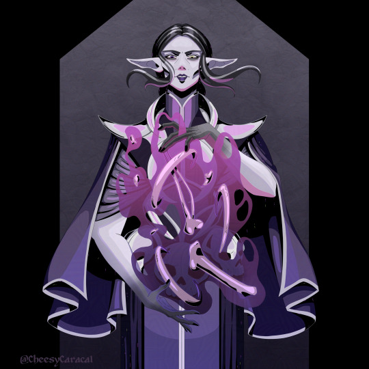
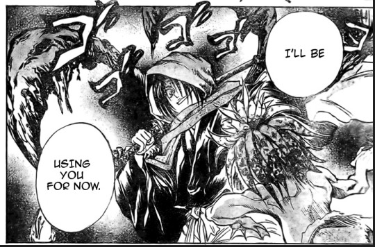
Ladies, lekkus and their clones 💜
Characters belong to @capricornrabies who kindly commissioned me for these two pices 💜
#my art#commissioned art#star wars ocs#other's ocs#clone oc#clone trooper oc#star wars clone wars#togruta#togruta oc#twilek#twilek oc#star wars oc#jedi oc#artists on tumblr#I am sooo very fond and proud of Hathor's purple colours#that gradient just came out so so pretty I'm so happy with it!
113 notes
·
View notes
Text
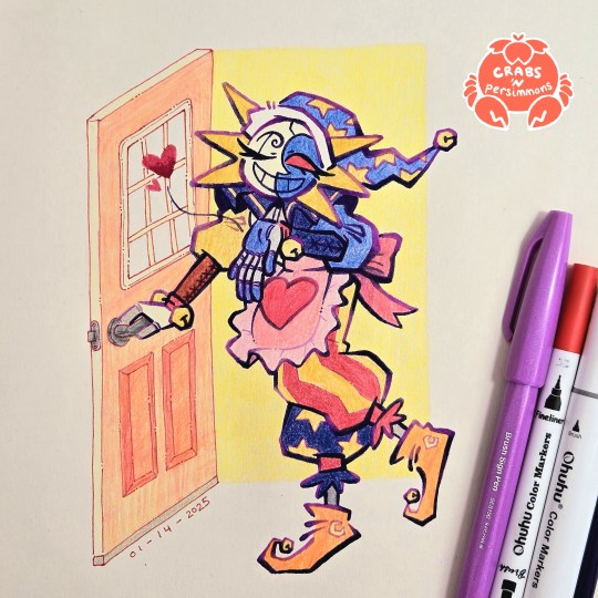
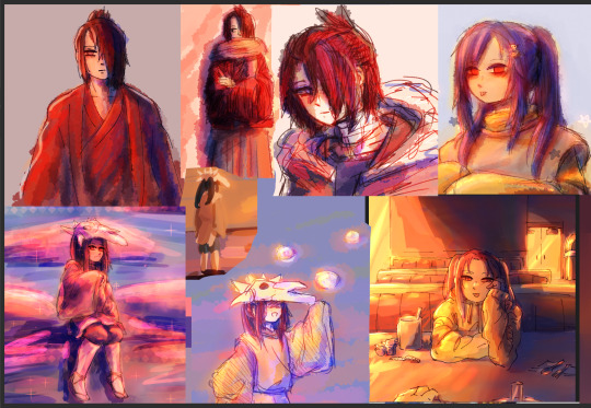
"Do your best today! I'll be waiting here when you get home, starlight~💕"
had two busy days of work outside of my cave and the only thing that kept me going was the sight of my housewife/househusband Eclipse waiting for me at home
that is, the sketch of him waiting for me to finish drawing him 😂
starring @starriegalaxy's Eclipse from her Fear Factor AU/House Husband AU
#fnaf eclipse#fnaf dca#dca fandom#crab art#traditional art#bright colours#fear factor au#fear factor eclipse#all i need is a pretty househusband to come home to#is that so much to ask?#my headcanon for this AU is that Eclipse just collects frilly aprons#every time y/n comes home he's wearing a different one#i'm both happy and frustrated with this one#happy - because i'm glad i finished it and it looks nice#also i feel accomplished since it's the most ambitious illustration i've done during this exercise to get out of artblock#but also frustrated with some small things#most of it is chalked up to me not planning things head of time#namely the door#that's why the perspective is off and the colours aren't great#for some reason my focus was on the handsome apron-clad robot instead of the door no idea why#also this illustration also taught me a lot about this new lineart style i've been using#it needs more careful planning if it's going to be used as part of a larger illustration#the gradients help suggest some lighting and shading#but if it's going to be used in an illustration with a background then it needs to adjust to the lighting of the background#my previous drawings had simple shapes as a background so it didn't matter as much#but here the open doorway suggests light coming from behind Eclipse#so there are dark parts of the lineart that should be lighter#all in all i need to do more planning#but besides that this was really fun#love how chunky his pants and sleeves came out
344 notes
·
View notes
Text
Tea and Mooncakes With You

Happy Mid-Autumn Festival!
I had this KorrAsami piece sitting in my WIPs for a little over 2 years and I finally went back to finish it. There's still a few things off about it but I'm pretty happy with how the moon door came out although I wish the camera angle was just a smidge higher. All things considered, Clip Studio has a really handy perspective tool which made drawing this a breeze! I'm kind of kicking myself for not drawing this in a higher resolution though, but I know better nowadays.
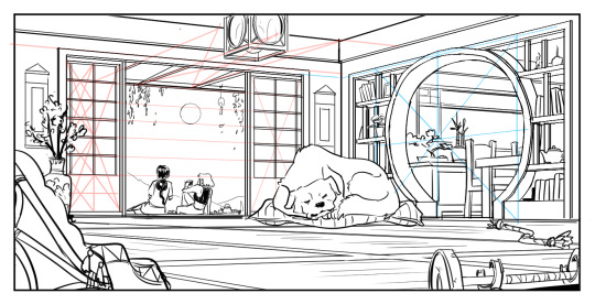
I also tried out gradient maps for this and did my best to push the colors a bit more than usual, but ended up toning it down a lot. I'm not very confident when it comes to colors and color harmony, so I played it safe, pushing the shadows more warm and the highlights more cool. I overlayed a little bit of color on the wisteria and on Korra and Asami to help them pop more, trying to center the most detail + contrast around them.

Thumbnailing helps a ton with environment stuff like this and I really should get back into the habit of doing it more. I tend to enjoy just diving in, but looking back at my old art, I'm noticing that my composition skills are pretty weak.
#art tag#korrasami#korra#asami#Naga#moon festival#the legend of korra#legend of korra#tlok#avatar academy#yes i'm applying to the avatar academy program#trying to keep expectations low because I know so many amazing people are applying#gave it a good 'ol college try
253 notes
·
View notes
Text
I did it!
This has been sitting in my WIP folder for months... since November, to be precise.
It all started in July, with a dress I sewed for myself (which I am extremely proud of as well). Then, in August, someone took some picture of me in it. One of them was of me very awkwardly sitting in an office chair. The posture was super weird. But by then, I had finally watched Good Omens, and by late August/early September, I had gotten into looking at fanart on ig. That's where I saw a lot of fem Ineffables, and in October, I thought, wait, I've got this dress. And this photo that could work as a Crowley pose reference.
So, I did what any sane person would do, which is draw a demon in this dress (took way too many layers to get the different fabrics right), then add the chair (screw that chair in all its detailed glory, who came up with that), then add an angel (she's fine. I'm not upset with her. Her dress is also based on one of mine, though by that point I was out of patience and refused to draw lace. So, just a little shimmer it is.), then add a blue gradient as a background and call it done.
Then, of course as any normal person would, I decided that simple blue would, in fact, not suffice. So I started on a proper background, and then promptly abandoned the project.
But then I saw @mrghostrat 's post about that one ask on drawing Crowley in a pretty dress, and I thought, wait, this thing still exists!
And well, here we are. I'm super happy with how it came out!
#good omens#crowley#aziraphale#crowley and aziraphale#fanart#digital art#screw backgrounds#why is satin so hard to draw#why is fabric so hard to draw in general#my art#haemey draews
34 notes
·
View notes
Text
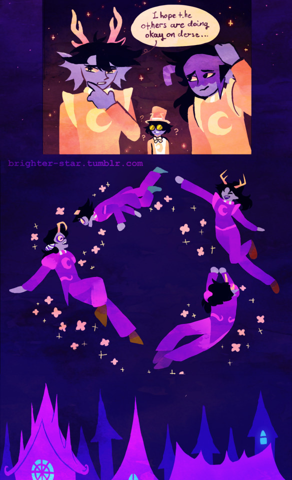
A mass attack I made for artfight that I sadly didnt get to upload in time before submissions closed after midnight :,) Thats what I get for procrastination I suppose but I pmed it to the people involved and they really like it so that's a win there ^^ gonna post it here since I'm still pretty happy with how it came out especially since this was my first genuine crack at lineless in a WHILE with most of the forms being defined by gradients and shadows Here's links to the people involved if you want to see more of their characters or are just curious as to where they came from ^^ @therealfroggymagician @courtofthecorpseking @scotties-great-ass @vriskaxsans
#homestuck#derse#prospit#prospit dreamers#derse dreamers#trollsona#troll ocs#fantroll#violetblood#seadweller#bronzeblood#tealblood#fuchsia blood#goldblood#lunar sway#comic#hs#ocs#artfight#mass attack#af 2024#team stardust
14 notes
·
View notes
Text
After I established the flat colors, it didn't take too long to paint the shadows, mainly because I had a confidence boost. I still had trouble with the background though - ideally I would have painted something similar to the Hades maps, but I had no idea what kind of environment I should use and why. In this case a top down view of the character would have been nice too with the protag talking to Alicia, sooo...
Nah, it seemed to much work for an already difficult style challenge, so I just decided to add a textured bg with black frame around it. I was thinking about adding some shapes in the frame to make it a bit more interesting, but once I tried, it was pretty distracting and it felt messy as well. The character is already detailed enough, and I wanted the focus to stay on my menacing child.
During the coloring, another issue arose - the bones between her hands made a lot of visual noise. The shapes were extremely confusing with her torso that also has a ton of parts, and on top of that there was the magic blob too. At first it felt overwhelming and I didn't know how to approach the problem. I didn't want to hide everything behind the effect, making it too plain, but if I made it too transparent, it became unreadable. Dealing with the right color was also an issue because of the different tones on the clothes, but gradient came to the rescue. With the right opacity and right colors in the gradient, my problem was solved. After that I adjusted the shades of the bones to somewhat reflect they are affected by the magic.
I'm extremely happy how this one turned out. Probably this is the best one about my necromancer so far, and I really wanted to draw her more after this experiment. I won't say I succeeded, because... Well, I have a ton of other sketches, waiting for me, but at least she's got some love this time :D
#hadesgame#stylechallenge#digitalart#originalcharacter#speedpaint#digitalartist#illustration#artwork#characterart#timelapse#necromancer#elf#fantasycharacter#characterartwork#characterartist#oc#ocdrawing#artchallenge#artistoninsta#artistofinsta#instaart#digitalillustration
2 notes
·
View notes
Text
lo: the two shots I made for the short film project 'pathfinder' directed by NAZ NXT (ناز ) for a little contest that a certain animation discord was running.
the film was planned to be a 2D-in-3D project, but the 2D animators all ended up dropping out in the end. the main thing I worked on was sculpting and painting this mountain, and doing the lighting and broader environment.
here are some still shots of the mountain under more naturalistic lighting (some WIPs from earlier in the project):


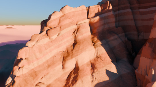
the main ridge in the foreground here involved a massively complicated UV unwrap as I tried to get the texture coordinates even and non-overlapping everywhere. later I simply resorted to projecting the texture along the axis of the syncline-anticline fold system (I decided 'oooh what if there was an anticline fold' when I was texture painting), which actually worked just fine! because that's how geometry works! if I'd done it that way on the other ridge, and done a separate unwrap for the details texture, I could have saved myself a lot of trouble. lesson learned lmao!
geologically this is a tad questionable - this isn't really how sandstone strat would tend to erode. when I was sculpting, I hadn't really decided on the underlying geology, so I couldn't really take that into account. that said, for a first time making a sandstone mountain entirely by hand, I'm pretty happy with how it came out! if I were to do a project like this again, I would probably create a worldspace shader to show the rock strata so I could see them while sculpting.
the images above use a Nishita sky, but Naz wanted something more dramatic, so for the final film, I made this wonderful sphaghetti of a shader:

which essentially maps the sky into polar coordinates and creates the sun, and the glow around it, using various combinations of noise and gradient maps. I'm really happy with how it came out.
for the contest Naz edited together a trailer as our submission - not sure if he's planning to upload it anywhere. in any case, though we didn't manage everything we set out to do, this project was still a lot of fun and I'm very happy with the bit I did.
12 notes
·
View notes
Note
Came right here to complain about that figure because oh my god 200+ for something of THAT quality?
Well you came to the right place to complain bc I don't like it either. And I'm happy to see most other people don't like it bc that means I'm not just a nitpicky bitch.
Like, everything on the store is overpriced, but 250+ Euro for THAT? I'm starting to wonder if the entire merch store is just a money laundering scheme at this point.
For reference, the Unlocked figures from lol are about 80 Euro each and are WAY better quality. And the Unlocked figures are the budget versions. The more high-quality ones are way more expensive. The Skul figure is worth 50 at most. And that's only bc of the novelty of it.


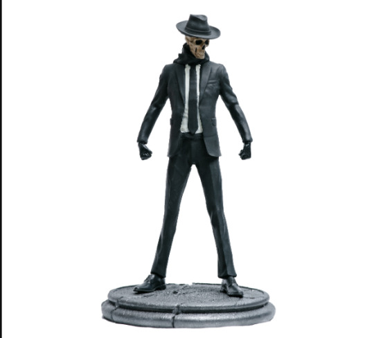
The sculpt is decent at a distance but closer up it looks really dirty.
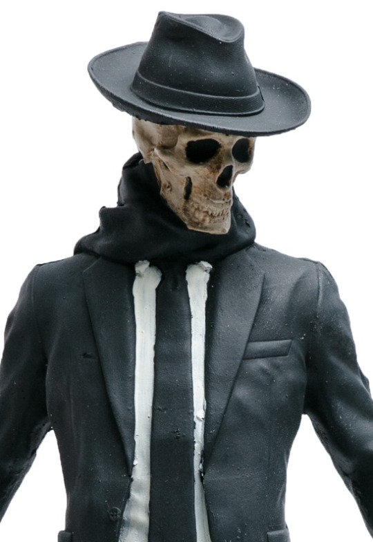
The paint job is dirty too and so basic. Like, just black and white, no gradient, not even accent colours.
Neither the sculpt nor the paint job is professional.
Even ignoring that, the pose is stiff and boring. Couldn't even add a scarf flowing in the wind. A gun or a flame like the OG figure had. And the OG one captured the OG books cover vibes perfectly and this one is... pretty generic. Honestly, eventho the OG one is cheaper in material quality, I actually like it more than the new one.
This is so the result of nepotism and that's the first thing I thought when Landy said his brother did the figure. At one glance I can tell he wasn't hired for skill. If you look at his Instagram and Artstation, you can tell he has potential, but he just switched from another profession to sculpting in 2022 and you can tell.
He probably went with his brother so he can financially support him/help him with his new career. But also bc it's easier and cheaper than doing it the proper way. Hire a concept artist, hire sculptor, hire a 3d printing company, hire painter and optionally hire someone for the box art. (A mini painter YouTuber did it this way and the result was AMAZING!)
Or just collab with a company that does figures like Youtooz. Everyone who is someone is doing a collab with them right now. First4Figures is like topnotch but can get REALLY pricey, especially with LED stuff. Or McFarlane Toys also got pretty good stuff. Their black light stuff would be so cool for China's tattoos.
So many good options and instead he chooses to use his brother and his brother's 3D printer. I have a 3D printer too, so I can tell the resin costs for each sculpture is very likely less than 5 Euro. The slicer tells you the material costs when exporting the print file. At least the Lychee Slicer does which is the one I use.
The expensive part is the colour. But they only used 4 different colours. And one of those colours is gonna be either black or white primer. Like, that's such a lazy paint job it looks like they only applied the base, no layering, no shade, no dry-brushing, no nothing.
TL;DR: the Skul figure is an overpriced scam, don't buy it. But we both know these figures will sell out eventho by what I've seen the fandom as a whole doesn't like it and thinks it's too expensive. Which it is.
#skulduggery pleasant#rant#art rant#sp merch#ngl I already bitched a lot about this on reddit so this is a copy and paste hack job
10 notes
·
View notes
Text
It’s time to talk about the cover of volume 34.... I love it, it’s probably my favorite cover so far, everything related to the third year cultural festival is awesomee, I wonder why... And it’s not every day that I have my 3 favorite characters on the same cover...

The flyer team!!!! The best!! I understand well why they did not have a dedicated chapter, Oda was going to give them the cover (and it is a very good choice). It also proves that the preparation of the festival is the most important part of the arc, and few people seem to have understood it.

Little thing I noticed: each of the secondary characters represented here had their moment of glory during this volume or shortly before. Ogiya was on the cover of volume 32 so Emoyama unfortunately could not appear. Nanoda became way more important these last chapters (Oda had to find a wife for Kori after all) and Shiina and Sukida had their own chapter. I have nothing against the covers showing only Komi and Tadano, but this manga is primarly all a celebration of unusual secondary characters, and this cover is a perfect example.
And I also think that the characters represented here are Oda’s favorites in this class, it's alway funny how Oda does not hide his favorites.
I especially like how Shiina seems to see the «hidden camera», it confirms even more her status as a character different from others…
Okay, now let’s talk about the most important part:

THEY MATCH EACHOTHER’S FREAK SO WELL IT’S UNREAL ODA WHAT ARE YOU WAITING FOR OH MY GOD MY CRACKSHIP IS ON A FUCKING VOLUME COVER DURING PRIDE MONTH WHEN ARE THEY KISSING !!!!!!!
At this point I praise for Oda to actually consider their alchemy and start doing more manga club chapters… Emoyama turning her laptop to ask Sukida about Shiina’s flyer… A good way to force your clubmate to learn how to communicate... (they are meant for each other it's crazy)

And the drawing? Official yamanaka art on the cover AND in thevolume?? Lily drawing tiny purple hearts is just so adorable, the fact that the drawing is Yamai and Nakanaka kissing each other on the lips is even crazier. I know it’s pretty unhealthy to ship two real people. But this volume proved that Yamai and Nakanaka are what gives Lily the courage to come to school every day, to continue drawing, which gives meaning to her life. She’s just a fan who loves Perro Rabioso, you know what I’m saying? The hearts are also there to represent the affection she has for these two girls. The further we learn about her, the more I think I know how Komi and Lily will become friends, and it will have a connection to the relationship between Yamai and Nakanaka. I would have more time to talk about it one day during another one of those times where I say to much things about something simple (like here).
Okay now let’s talk about the REAL most important thing (notice how I avoided it from the beginning)

For real? I like it, I admit that on my favorite drawing (the only one that I find pretty well done and I do not want to delete on a blow of frustratio) I made the hair a little more «brown» by putting a touch of orange for the reflection of the light. To have this color of reflection, I was inspired by Kim pine from Scott pilgrim, the brown used was kinda similar and I was thinking that the hair color from theofficial anime was too pale (why all modern anime are so desaturated? it’s super depressing).

And to bring out the purple, what better than… Orange! Don’tlaugh, but my gradient came from a very simple and special idea…

I'm serious DON'T LAUGH !
For the other drawings after this one, I went back to the purple hair shade because I didn’t want to get too far away from the source material, but I’m rather happy to draw a character with a unique hair color. This is the first time I color a redhead lol, it’s up to me to do my best! I would like to add discreet freckles, but really hidden to avoid having the comparison with Inaka. And no matter the hair color, it remains adorable. I hope that no one will be too disappointed to know that I will use this new hair color. On the cover the color detonates enormously and even it seems strange to see Sukida like that two years after the anime with the "outdated"official hair color and my hard work to be the only person in the world to make so much fanart of the same character, That’s why I apologize too, all my drawings will change because of it. When i woke up this morning and turned on my phone, I was skeptical about the color choice (I was rather screaming with joy when I discovered the cover) but after a few hours, I think the orange color is right and Lily is really pretty with it…

Finally, this hair color reinforces what I talked about last time, Lily is not originally from Japan, this hair color is very rare, but way more present in America and, most of all, in Europe (especially in Ireland, Scotland, Ireland... but it's very present in all the other countries). But even with this in mine, she is half japanese, so it's probably one of her parents (one of her two moms I mean ;) ) who is from Europe.
Since we already have Rei and Mira who are American, I think Lily has a good chance of being European. And I even think that the 3rd year school trip will be in Europe (Japan (Asia) -> America -> Europe)! It would make here even more unique.
Redhead can be from anywhere in the world, but if she is European and French (the name being a reminder to the fleur de lys) I would lose my mind and shout "she is just like me fr" and I would apply to be her Japanese, English and French voice in the anime...
I think I'm going insane, it's better to stop yapping here, hope you liked witnessing me talking about my obsession for a background character !

4 notes
·
View notes
Text
part 2 of this ask
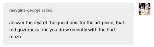
📝Process for hurt mezu drawing
here are the steps i dug out of an art server's wips channel lol
1. initial sketch
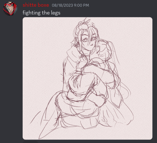
2. refine sketch. thats lines now babey. (omitted "the sleeves are KILLING ME WAHHH" stage that led to this)
3. grayscale, to use with gradient map (this is a more polished grayscale than I started with, i dug the working file out to get better images)
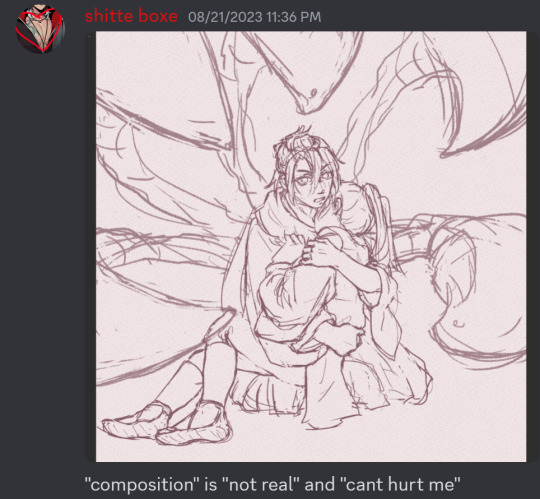
4. find nice gradient map (ended up being the same one I'd used for the piece i made right before. the goal is to make what's essentially an underpainting, not to color the whole thing with one map)
5. tweak and add colors that arent in the map with hard light layers & also sneak in a layer for special effect and atmospheric/ scenic perspective while you're at it
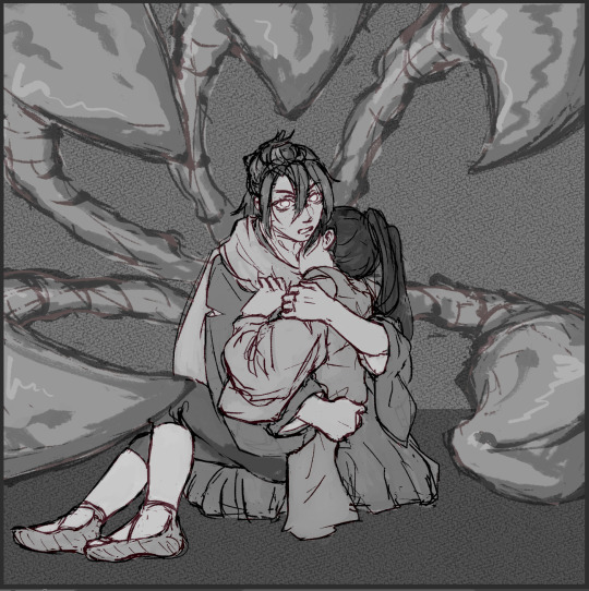
6. shading & more finishing effects. pretty much all of the shading was done with hard light layers! the only non-hard light layers I used for the shading were the particle effect layers & like one faint glow layer to fix some values. blood was done with linear burn
✨Inspiration for hurt mezu drawing
the coloring method (grayscale -> saturated gradient map underpainting -> additive color adjustments) is something I tried out with the piece i'd made right before (the one where gozu is holding mezu from behind) & turned out really well, so I wanted to keep going with it
I also wanted to draw them angstily again because it'd been a very long time. like half a year at least. angsting them is very enriching for my soul so I try to do it regularly, this one was overdue
subconsciously referenced the poses in the initial sketch from this old thing (feb 2021). i love doing this. all my for-fun works recycle old elements in some way. my favorite game is "what old art reminds me of what im doing rn" im so good at digging stuff out of my archives for it. everyone loves when i do this
the gangi-kozou panel also
i went through a "shade in bold red-orange & dark blue with hard light layers" phase in like..april/may of 2021. i still like that stuff a lot so I wanted to revisit it
💚Things you like about hurt mezu drawing
repasting the link there but the sixth image in the process is essentially the final so you can just look at that
the colors are nice!! I'm real happy with using more saturated colors n I think the warm vs cool balance works really well
the sleeves (man being dramatic on the sand meme)
no like fr look at the 2021 piece's kimono sleeves vs the one I just did 2.5 years later. so satisfying
Gozu's expression came out nice
i think the claws and flash lines successfully added Emphasis to Gozu's expression & the piece overall
the poses … the drama …. the brush textures are also good
⏳Things you’d do differently with hurt mezu drawing
add in a liiitle more contrast...aka use a wider range of values. Some lighter lights and darker darks. I miss my 2021 hard neon lighting
a bit more distinction between the characters and the background also
the composition isn't bad but it could be better. Should've thought more about the way the eye would flow around the image in the drafting stage (solid b&w color block thumbnails are good for this)
Moar Sparkles. (I put a solid amount of large & low opacity light bubbles in there & some finer brighter dots especially around the claw stems, but I think more clusters of tiny bright lights on the characters themselves would've gone hard)
💌Some favourite feedback on art
as the wise man Austin Kleon once said: keep a "praise file" of all the positive feedback you get (if you've never read "Steal Like an Artist," you must). so. i am prepared for this question hold on
tastes like sugar glass
multiple people have told me my art is soft & dreamlike
jayce you reblogged my touchstarved art with nice tags on april 10th ive got that saved love uou
umm theres a lot...anytime someone keysmashes or feels emotional because of my art i get happy ,,, lys messaged me about the hurt mezu piece that made me happy also,,,,,there is so much joy in the world
#shitboxposting#asks#shitbox drawn#JM SORRY I FEEL LIKE THE FORMATTING ISNT EASY TO READ NO MATTER WHAT I DO....AUGH#all my class work with actual conecptual meaning is monochrome what am i doing...man.......#i need to post more art and i also need to make more art. aghhh. boots up ultrakill and magical drop again#im actually Not sure how im going to afford the next few years of my life 😭😭 a bitch gotta have time to do fuck all but i need money..!!!!#whatever its fine. i have time to do fuck all right Now and thats what matters
5 notes
·
View notes
Text
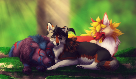
Aaaaaaaand since I started this drawing yet another of the wolves in it seems to have died. Whoops. *sobbing*
Okay so I follow a lot of Warriors and Lion King fan comics and I've made fanart for them before, but I also follow a few original animal comics, and I don't think any of them have made me feel so emotional and hit me so hard in the heart (except for maybe What Lurks Beneath, but that's less straight-up sad and more complicated political stuff) as To Catch a Star by SleepySundae on DeviantArt. If you haven't read it, you can check it out here: To Catch a Star Cover by SleepySundae on DeviantArt but as warned this description is gonna have heavy spoilers for the recent pages.
That said, with the recent death of Ash, and now Shadow while I was in the process of drawing this (I assume she's dead anyway, with her closing her eyes), I just knew I had to draw our favorite trio back when they were happy, when Ash was finally growing big and strong and well-fed, when everyone had worked through a lot of their trauma and come out of the other side of it happier and healthier, when they were just traveling together as a pack of oddities and misfits - Backlash the underfed and abused Dusky, the dark-pelted rebel Nova with no memory of who she was, and the emotionless and nameless mortal form of the sun - who came together as wary allies and eventually became a family - Ash, Shadow, and Lupi. SleepySundae has created some truly memorable characters and made us love them and the bonds between them. My heart is broken for what they've been through and lost, and I can only hope that we can somehow snatch some semblance of a happy ending out of all of this tragedy.
I was originally going to only loosely pull from multiple image references, but then I found one photo that perfectly captured the exact vibe I was going for, so I ended up referencing it pretty heavily. ^^ You can see it here. I had a lot of fun trying to blend my realistic style with the more stylized designs and colors of these characters. I'm not totally happy with how Shadow turned out, but I'm super super proud of how Ash and Lupi turned out. :D I referenced the QnA's for an idea of how to draw their eyes with just the iris colors, though I did kind of a combo of both that and the main comic style for Lupi by including white, yellow, and the orange pupil color as sort of a gradient? I dunno, I think it works. They're hanging out in some random forest in the upper sunny islands, just taking a moment to chill together in the warmth of the sun's rays on a couple of mossy rocks. Not sure if there's any location that looks like that in their world, but I remember seeing some foresty areas in the upper islands when Lupi first brought Ash there, so hopefully that works. ^^
2 notes
·
View notes
Note
🔥 + anything tekken/FGC related that's got y' out for blood
unpopular opinions from the mun // accepting !

Can't say I'm particularly out for blood when I say this but...
TK5 opening overrated.
I'll even say
My Last Stand > Sparking
TK4 opening > TK5 opening
When people say Tek5 has the best opening, I thought they were solely referring to the Heihachi & Kazuya vs the Jacks scene. Which yeah, when referring to that - I can say it is def one of the most badass openings and probably one of the most iconic scenes on the PS2 and in Tekken. It ending with "Heihachi Mishima... is dead" is such a raw delivery. But I didn't realize that people... thought what came after it was that good LOL. Like sorry, but me and my brother joked that the best opening is followed by an AMV. I mean, there's nothing particularly special about the characters just... doing shit. Or dancing in front of a gradient background. But then I was surprised when people were happy that TK8's opening references that, and I was like "that's... not even the good part of the TK5 opening, is it???"
Which is why I think the TK4 opening is better than the second part of the TK5 opening. TK4's opening may have been similar, but "A Fist for a Fist" had music that sounds so chaotic and fits buildup to the excitement of Kazuya's return. Kazuya saying he'll take back everything, and Heihachi going "you deluded fool..." is more cooler and impactful than DJ screaming in the forest sorry lol.
Also, as I've pretty much made clear - I don't really care for Sparking as a song either. I mean, I like it fine, but it's far from my favorite Tekken track. I like the remix used in the first part of the opening, the Heihachi and Kazuya fight. But the actual song? Nah. Don't care for it much. It just feels all over the place, and not in a good way. My Last Stand gets me way more hype. And as I said, I even prefer A Fist for a Fist. Yes, My Last Stand has some ... weak lyrics. But I just prefer the music, how its sung, and well ... it's not like Sparking had the strongest lyrics, either.
Anyway, the first part of the TK5's opening is not overrated, but the second part definitely is. I don't see what's special about it.
2 notes
·
View notes
Text
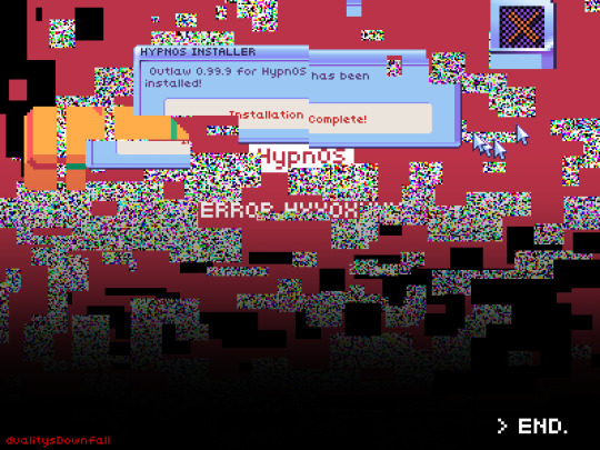
happy one year to my hypnospace comic!
(and one day, just pretend i had this up yesterday shhhhh)
here's a little series of fun facts about making it
- started as a poem. i wanted to make a Millenium Anthem animatic and/or write a fic (i ended up doing the latter) but this came to me in the meantime and, being hyperfixated and eager to make something about it, it developed into a comic.
- that said, i was deep in the throes of an art burnout. i tend to make a lot of art around the new year, usually due to being in multiple gift exchanges, as well as working on my own things during winter break since i don't usually have the time to during school, and that wears me out. both this year and last i struggled with having energy to draw. however, i'd just recently found out a style that was pretty easy to work in even in that state: polygonal! so the comic is pixel polygons.
- the comic actually sort of ties into (and is directly quoted in the summary of) the aforementioned fic i wrote—which is called "do(n't) be afraid"—as evidenced by the focus on the HSPD badge as well as the Enforcer being almost a self-insert
- the typography is done by hand. i looked at the game's font file for the standard font and copied it. to this day i can pretty reliably just. handwrite in hypnospace font with the pixel pen. and i do! it's very space efficient!
- the dithering is also done by hand, because i'm a madlad. well, for each pattern i did like a portion by hand and then copy-pasted it until i covered as much area as i needed to, because i'm a madlad but i'm not a masochist. and then when i needed it again i just copied and pasted the layer and used a clipping mask to change its color. now though i have that big pixel brush pack on clip studio paint. so i won't be needing to do that again anytime soon.
- in panel 3 we see the Enforcer's face as well as glasses on their desk. like i said. pretty much a self insert. we also see their computer and hypnospace headband; i studied that intro video for this but between not seeing it a whole lot and the artstyle i was using being really simplified, i'm probably missing something lol
- in panel 4 we see dylan merchant at his desk. there's a calendar behind him. i actually looked up what day of the week was december 31, 1999 so i could circle it. it was a friday.
- the girl in panel 5 is supposed to be rebekah, the girl who likes squisherz and won the fan art contest but didn't get to find out because her dad took away her hypnospace headband. there's only one small picture of her to go off of, though.
- panels 7 and 8, which can also go together as one tall panel, were fucking FUN. what i did for the glitchy static bits was i made various clusters of black rectangles, each cluster on a different layer so i could copy and rotate them to fill more space. then on a clipping mask i used airbrush without antialiasing in white, RGB, and CMY. boom, static pattern. the elements from the game (the error message window, the cursors, the car) i had to copy by hand. see, the wiki doesn't have many screenshots, and if you try to screenshot the game or a video of it then it scrungles your image clarity. so i had to take those screenshots, eyedrop the colors from there, and then do such riveting and time efficient (that's a joke, it took forever) tasks as Count Pixels So Everything Is The Right Size. which for the shiny new HypnOS 2000 look was painstaking. look at those gradients. gradients everywhere. it was worth the work because it looks fantastic but man. and then to scrungle those elements i just used the rectangular selection tool, grabbed arbitrary bits and pieces of the things and Moved Them Elsewhere.
oh yeah babey
12 notes
·
View notes
Text


Been in a little bit of a next-gen mood lately for some reason, so here's two new concepts I was thinking about! :3 I made these using this picrew, mainly to test out colors and some design ideas, but I do want to sketch/draw these two myself someday! As for these characters, they are the daughters of Meredith/Adrien and Damini/Apollo, respectively. I had the idea to create the Mere/Adrien girl because I wanted to play around with the concept of giving them a daughter(since they only have sons), whereas for the Mini/Polly girl I just randomly had the idea for her(maybe because they are a main ship in my brain right now), but she also serves as a "big sister" figure to Mira.
Here's some more info on both of them! ^w^ I'm putting these under a 'readmore', just in case you haven't seen any of the related next-gen posts/don't want any potential spoilers(albeit, minor ones at this point)!
================================================
* Nerissa Alagona
Daughter and youngest child of Meredith and Adrien, younger than Wade by 1 year. Princess of Mareas. Shoulder-length and straight navy blue hair(with an aqua tint) and side-bangs, pale skin, light green eyes, light blue markings on her joints, ears pierced, and glasses. She came as a surprise for her parents as they did not expect to have another child so soon after Wade, but were excited to have their daughter. Many expect her to be like the classic "fairytale" example of a princess, and while she is a genuine sweetheart, she is not really much of a proper princess. Finding both her brothers to be a little bit annoying at times, Dallas for being too much of a stickler for following rules and Wade for being too mischievous, she is always snarking with them though they do have their moments of getting along. Even though she sees herself as the more rational, down-to-earth sibling, she is more of a shut-in and has her own nerdish or "weird" interests that make her more wary of interacting with her peers. Despite not having many friends, she much prefers the company of her family and is close with all of them. Particularly, her dad whom she has tea parties with all the time, and her cousin Mira, as they are the same age and bond over many things, such as not feeling like "proper" princesses and sharing some "unusual" interests that others don't understand. Although not that interested in becoming a full-fledged witch herself, she does find some rituals and practices fascinating from what she has learned about from her uncle Brooke, and she enjoys seeing how Mira practices her own craft, even if this has gotten them into some trouble and mishaps as she's not that experienced or in-control yet.
* Elora Koeler
Daughter and only child of Damini and Apollo. Part of Feor's noble class. Medium-length and fluffy/messy medium-brown hair(with a light-brown gradient) with long bangs in a shag/wolf-cut style, tan skin, silver eyes, a mole on the right side of her chin, several ear piercings, and a right eyebrow piercing. She was born a little earlier in her parents' marriage than they were expecting, but both felt absolutely blessed and happy to have her. In both of their eyes she is their little princess, as they love to spoil her but also teach her the importance of remaining humble and working hard for yourself. She takes a lot after Apollo as she was always inspired by her dad's more alternative and "flashy" style growing up, and has taken a big interest in music thanks to him, too. Though their tastes and style in genre differ, she loves singing and getting the chance to do father-daughter duets with him. She also takes a lot after Damini, being a little more chill and down-to-earth but still friendly like her, and with the combined fiery-and-metal-bending magic she was born with, she often helps her mother in the forge for her jewelry business. She's also pretty close with her aunt Brigit, who always supports and encourages her niece to be her true self, and her uncle Nate, as she always found him so cool and who also inspires more of her alternative-punk style. Although she always appears so confident, she deals with a lot of self-esteem and mental health issues she doesn't always share with others, with her only having two friends she feels the most comfortable opening up with. Oriane Brand, one of her besties since they were young that always understood her and knew the best ways to comfort her, and Princess Mira, as they both are only half-Feorian and can have those conversations of stigma they feel and experience about their respective other heritage.
#the lost rainbow#sequel ideas#future characters#next generation#character refs#picrew#mareas#feor#royalty#princess#noble#nerissa alagona#elora koeler#nerissa#elora#I actually struggled on what to do for elora's surname#as I couldn't decide between her parents' respective ones or if I should do both and hyphenate them#but I decided on damini's because she is technically a part of feor's noble class#also I kind of designed/envisioned these two here with the '20 years later' story in mind#so rissa is about 13 and ellie is about 16 here
1 note
·
View note
Text
Week 8: Illustrator

Drawing some sketches of silhouettes I think i'm capable of making in illustrator, I chose the dragon for have a lot of curves and being an interesting shape to work with, the deer for a bit of a challenge around the antlers, and the cat because its my go to animal.

Added where I think the anchor points would go. I decided the deer head would get very tedious around the antlers, I like the dragon for the amount of curves, but I also think the cat would have more broken and hybrid points which I have struggled with and it would give me a challenge. For the first silhouette I will just need the pen tool and make the stroke and fill black. The second one will be a bit trickier since i'm not that great with colours but I'm hoping that with the knowledge from the penguin illustration it will be at least decent.

I've scanned in my sketch and put it in illustrator, I decided the cat should be the 1st graphic and the silhouette. The second graphic and the one that will get colour will be the dragon, because I really don't want to draw those antlers and because I feel it looks the most interesting


After drawing the cat I found I was right with it having some broken and hybrid points, the curves were a lot trickier than I anticipated and I feel I may have used more anchor points than needed but overall I'm very happy with how it came out and how

My directional handles are pretty long and i'm not sure if thats a bad thing.
Onto the dragon

Before I colour I will use the same techniques as the first graphic and make it a silhouette using the pen and fill tool, the reason i'm also using the fill is so I can see if there are any mistakes I wouldn't see with just the outline


I nailed guessing the anchor points so i'm pretty happy about that. This one was really fun I enjoyed the broken points used to make all the curves but keeping the wings points

I may have gone a little extreme with the lengths of my handles but it was needed I swear.

Testing how it would look with a gradient and I don't hate it I just feel I could add more

Using pathfinder to cut out a fire pattern


Adding the gradient to the flames on the bottom and a solid colour to the top

And its done! i'm still bad with colours and the design is basic but it's done
0 notes
Text
Entry 6 - 7:29am (Sunrise...i woke up early for this pls apprieciate)

As someone who has class till 2:30am, waking up at 7:30am to do a watercolor study borders on deliberating causing brain damage to myself. Well, with my brain sufficiently fried from this study, let's talk about it.
This is the most beautiful image out of all the studies so far, and it is not up for debate. I have a brain boner for any sunrise/sunset color harmony/theme. Soft sunlight is very therapeutic for my chaotic brain and I could look at it for hours too bad it doesn't actually last very long.
As I have understood from my previous studies, my camera loves to pick on areas with disproportionate light and darkness and undoubtedly, the sky is once again the main victim today. When observed, there is definitely a more vibrant glow coming from the right but the camera can't necessarily pick up a "glow", it just sort of averages out the light with the clouds.

I started by swatching the main hues of the sky which for once include tinted yellow-orange and also blue/purple-blue tones. I feel that I've gotten pretty good at swatching colors so I'm happy to report that it took very little time as I was able to understand the main element to adjust was adding scarlet lake (orange) into my cadmium yellow and adding ultramarine blue, alizarin crimson, and burnt sienna to create the blue tones, then mixing lots of water to tint the hue I got.
Next came the gradients again, and I don't know if it was the 7:30am brain but I had a lot of trouble with them. My first attempt at the top took the tints I mixed together to create the gradient but the blue tones were darkening the yellow and weren't allowing me to create a smooth gradient to the bright yellow tint that I was observing in the sky. It felt like the blue was muddying the yellow and I decided to try again.
My second attempt, I felt started out wrong in the hues. I had to re-mix the colors the blue went too blue and the yellow was too saturated. It had the same problem where I wasn't able to create a blend between the 2 colors and the blue just muddied the yellow. Looking back at it now though, it has a sort of..." van Gogh" feel to it. It gave "The Starry Night" vibes and I'm intrigued by it despite the failure.
My third attempt just took the issues of the second attempt and reversed them. My blue tone is now too purple and my yellow tone is too orange. Strange that I told you I was improving. But again, I sort of enjoyed the colors I was getting in the gradient but this is a color observation exercise, not a "make your own colors and smile about it" exercise.
The last attempt I felt was more accurate, I got the blue just right, and the yellow, while a bit too orange in retrospect, still created a gradient that I felt was interesting and satisfactory. The intermediate tones were what interested me as again I wouldn't have mixed these intentionally myself but observing the sky and looking at what I had, I felt that it was somewhat accurate to how it transitions from the light side (yellow) to the shadow side (blue). I then mixed those tones individually and then adjusted it with more blue or yellow to create a color temperature change.
I was dead tired by this time so I stopped here and promptly went back to sleep. Reflecting on the study now, there were a lot of interesting elements and once again, gradients seem to be working for me to understand the colors I'm observing and how they transition. But I probably won't be waking up at 7:30am for this again.
0 notes