#thank you linear burn on procreate
Explore tagged Tumblr posts
Text

21 notes
·
View notes
Note
Hello Botanica I admire your art so much ❤️ do you mind giving tips on how you improved your art over the years? I would also be delighted if you could show us what your drawing process is like a little bit, if not thats cool too🤗 have a great day!!✨
Hey there! (*waves*) Thank you so much for the love <3 I'd be happy to share some insights on the topics you mentioned! (Sorry that it took a while.)
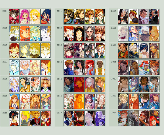
I think I’ve been drawing for almost 20 years now (Whoa!). Honestly, I don’t even know how I made it through, but ever since I was a kid, I knew art was a necessary part of my life. Looking back now, I’m just glad I stuck with it!
This piece is like a visual timeline of my art evolution. It’s wild to think I went from those super basic kid doodles to the style I have now. Growth is real, y’all!
So the tips! (They are mainly for those hobbyist artists, since I don’t have the luck to make it as my career.)
Keep your eyes and mind open to learn from different fields. It’ll spark fresh ideas and enrich your art, but always double-check when diving into unfamiliar territory.
Find tutorials that vibe with you, and collect references IRL.
Use primary sources to avoid distorted or AI-altered refs.
Take your own photos as ref.
Use 3D websites like Sketchfab, Blender for 3D assistance, and posing apps or manikins to help with your art.
Practice consistently. Balance your time between quick sketches and more polished pieces.
Accept where you are now and improve from there. Don't let others' opinions or other artists’ activities throw you off your path.
If art’s your hobby, the goal is to have fun! No pressure to push boundaries unless you’re feeling it.
Let’s move to drawing process. I’ve been doing hand-drawn art for more than a decade, but had to fully switch to digital media after 2016. Now I usually use Procreate for sketches and lines, then use Clip Studio Paint and Photoshop for colors and adjustments.
I’m gonna share two sets of process. One is for generic character art, and the other one is for pieces influenced by environment.
So character art is like:
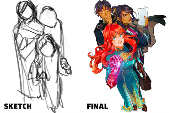
(More under the break.)
Do some (very) rough sketch to locate the characters → Line art
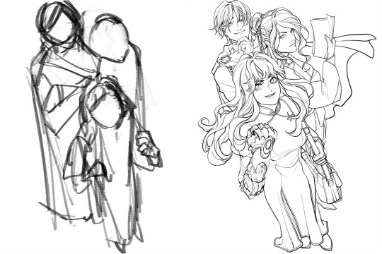
Define coloring section → Do flat basic colors, adjust the tone via gradient map, change line color
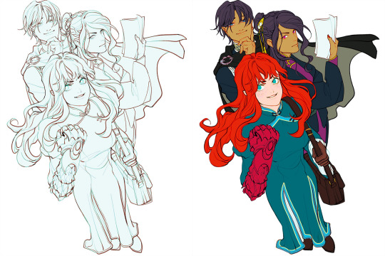
Add more details, use airbrush to shape the volume → Rendering (layer mode: multiply, linear burn)
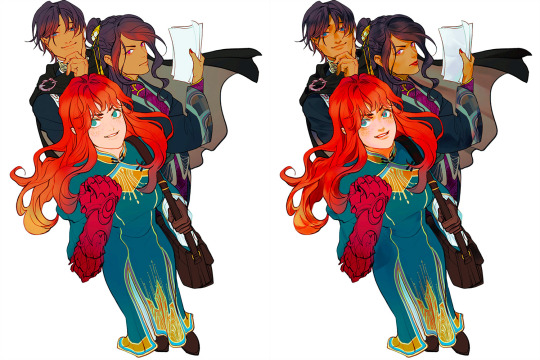
More rendering (layer mode: screen, overlay, soft light) → Post effects
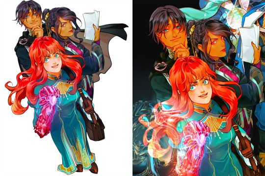
Done!
The next is art influenced by environment:
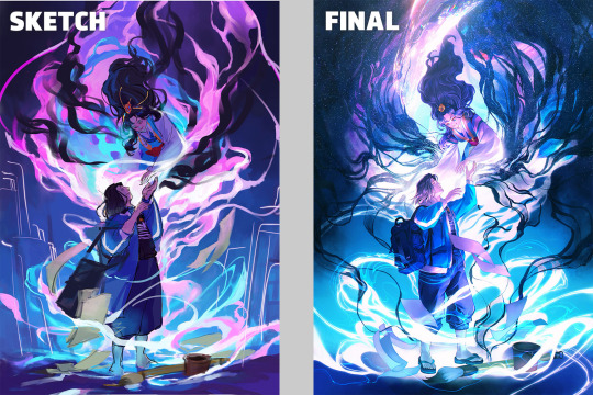
Make a color sketch to set the general tone → Line art
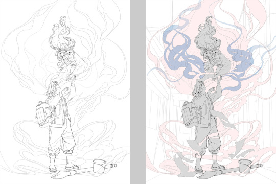
Flat basic colors (background & characters) → Darken the art (layer mode: multiply), add more details
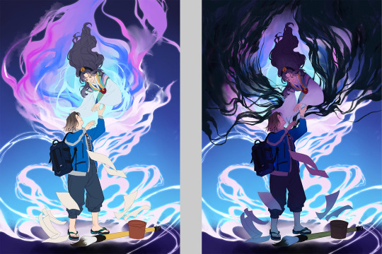
Add more details and begin rendering → More rendering, lighten some parts (layer mode: screen)
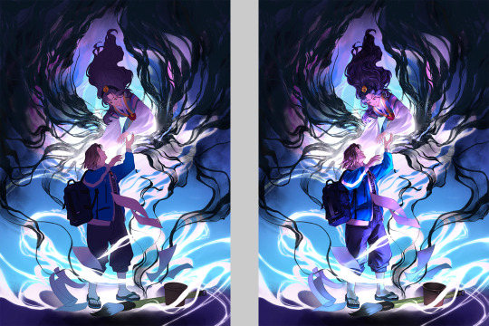
More rendering, use gradient map to adjust the tone → Post effects
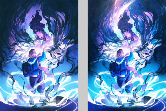
Done!
Wow, this turned into a long post! Hope you found something useful here! Thanks for sticking around till the end! 🙌✨
38 notes
·
View notes
Note
In love with the final look of your illustrations … correct me if I’m wrong but you use lighter colour/linear burn with gaussian blur? As well as noise? What I’m curious about is how you go about first picking your colours. (Your compositions and themes are very cool too, big fan)
heya thanks! I think digital programs offer all kinds of tools that make fussing with colors like a magic trick. Unless I already have a strong color palette in mind, I usually just color flats pretty basic and play with the many tools Procreate gives me. I also like using various effects and layer types such as overlay, linear burn, etc like you mentioned. I’m continuously inspired by photography/cinematography and my fellow peers for color ideas. I’ve circled what you can usually catch me using below

#I’m sorry the answer is ✨vibes✨ but it’s the truth#sketching is where I like to live color is fun but in a haha what does cranking this saturation all the way up look like kinda way
36 notes
·
View notes
Note
im curious about you doing lineart, how you do it? you use a multiply layer or something?
Hello hello!
I usually draw with the brush Dry Ink which is one of procreate’s default brushes, but in my most recent post i use the brushes from this pack
I use a dark brown color (#816833 (hexidecimal)) that when im done coloring, i put the layer on Linear Burn 👍
Thanks for the ask!
50 notes
·
View notes
Note
Hey I really love your artwork, it looks like it was drawn traditionally and I was wondering how you're able to achieve that aesthetic. Do you use any specific programs or is it actually drawn on paper?
Hello!!! Thank you SO much.
I use procreate!
The first step i use is to put a paper texture over the entire background, and set that layer to multiply. All other layers are drawn beneath this one.
I use the peppermint brush in the sketching category for just about everything. Its a pencil brush i with a really nice texture to it.
Ive found that the trick to getting digital art to look traditional, is to use the same techniques i use when i do traditional art. Which means i often use an eraser at a lowered opacity instead of the undo tool, and i never have my pencil size set to more than 10% (tho i fiddled with the brush size settings so that may be larger or smaller for you) and its opacity is like 67% percent
This includes coloring. insert peter griffin death pose. It really does make a difference tho. Doing tiny little circles like you would traditional colored pencil gives it little gaps of less color that really makes it look real
As for my line work, im not sure this adds to the traditional illusion, but i duplicate that layer at set it to linear burn. Gausian blur the linear burn layer 2% and clipping mask a warm and saturated color
Also, i dont actually do ink. I just clean my sketch
Also also!! Above the multiply paper texture (sorry i lied earlier) if you do a fully white overlay layer at 20-22% opacity. If you add 167-169% noise, set the setting to multi and turn off additive, it gives the texture of noise without changing your colors!!
#not art#shy speaks#asks#art help#art resources#im more than happy to share my techniques i wish i had a resource like this when i was trying to get my art to look the way it does#also#if you sketch traditionally and put the picture in ibis paint#if you put a layer above it to color and set it to color burn it looks like you colored it traditionally with markers#secret exra tip#im so so glad im actually to the point i can trick people into thinking my art is traditional i love the look of traditional art sm#<333
16 notes
·
View notes
Note
IM SO OBSESSED WITH YOUR ART If I may ask, how do you color your line art? How do you choose the colors, since it's always so vibrant!
I often use a blend mode on the lineart layer called color burn or linear burn (on procreate) to help me to choose the colors I will use, or sometimes I do it manually with colors I think look good :]
and thank you sm!!!!! ^D^
10 notes
·
View notes
Note
hii if you don’t mind my asking, what pens do you use to line/color in procreate? your art is really beautiful!
thanks! narinder pencil or more recently a (downloaded) drawr brush (just a flat circle with variable opacity), then color over on a layer with linear burn.
#fsr i cant handle having line width variation but im starting to enjoy lining with transparent brushes#ask
5 notes
·
View notes
Note
Oh my goodness, I have to know, how do you go about making your art look almost lineless? I love the look of your recent post, it's so smooth!
Thank you! In a sense it is lineless but done in a way where you actually do line art if that makes sense. I'll post a little process breakdown below but basically...
First I have a sketch prepared and set it on linear burn at a low opacity setting like around the 30s or so

And then in layers below I'll start blocking out colors by line art with a textured pen and then filling it in.
I like using pen brush ♡ from the csp asset store but some of those drawings were also done in procreate that gives it the more textured look for those is use the dry ink brush
Example of how it looks when im doing it
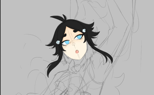
Basically a lot of layering of like head - eyes - hair on layers under your sketch to use and a guide and once you do all that you can get more into details
I hope this helps! \(٥⁀▽⁀ )/
1 note
·
View note
Text
no worries about how amateur it seems! i like seeing other artists' processes, and you were very clear. thanks for the clarifications!
and here's what i know about layer/blend modes!
blend modes tend to be pretty complicated since they have a bunch that seem to do the same thing. the procreate handbook has really good descriptions for what every mode does, but to put it simply, most can be categorized by whether they lighten or darken.
multiply, darken, color burn, linear burn, and darker color will darken the layer underneath with them varying in how they affect mid tones and highlights
lighten, screen, color dodge, add, and lighter color will lighten the layer underneath and they vary based on how blown out the highlights will be and the effect on the mid tones
overlay, soft light, hard light, vivid light, linear light, and pin light are mix since they depend on the value of the color used on the blend layer. ie darken colors below 50% gray brighten colors above 50% gray. in all of these a 50% gray is invisible. how drastic the effect is depends on the blend mode
and the rest are the weird ones. hard mix will flatten everything to black, white, red, blue, green, yellow, cyan, and magenta. i still don't understand difference, exclusion, subtract, and divide other than they have a kinda invert effect? hue, saturation, color, and luminosity will change the layer to match the property of the blend layer while preserving the rest (ie. gray on hue would make everything below black and white, a light color on luminosity will make everything that light in value)
other than using multiply, overlay, and add i just mess around and if it looks cool it looks cool XD
@littletroggo to answer your question…… (colouring my drawings)
so… I don’t know if this will be much in the way of explanation because for the most part I do a lot of fucking around, for want of a better term lol
now that I’ve done a few I do have a clone colour palette, which is this:

top left is just background, sketching colour and line art colour.
top right skin stuff, in order: lips, highlights, base colour, and then shadows — I do shadows on an ‘overlay’ layer with greys rather than using multiply cause I think it makes the colours more uniform maybe? like they go together well because they’re the same level of saturation or something (I really don’t know, it’s just the product of messing around). something I don’t have saved to the palette is a blush colour, I just do a bit on the cheeks, nose bridge and maybe forehead, just to give their skin a tiny bit of life lol
middle left is hair, although because fox has the grey I did it more like the skin for this one — using an overlay layer and to do both highlights and shadows
middle right is eyes, in order: reflection, white of the eye, shadow for the white, inner colour of the iris, and outer colour. I also just find a darker colour on lower opacity to do a shadow for the iris but I haven’t saved that here, probably should lol
my favourite thing to do which probably largely goes unnoticed is the eye reflection, which ends up looking something like this

tiny bit of chromatic aberration and gaussian blur, makes it look quite fun I think
anyway then the bottom left of the colour palette is ‘lighting’ I guess: shadow, highlight, and then the yellow glow from behind
i don’t know if any of that is informative at all, but here’s the time-lapse of my colouring it:
any people who use procreate pls tell me if there’s something I could do better/easier lol, I’m still super new to digital art and probably don’t understand it very well
16 notes
·
View notes
Note
Dude we gotta know, are your doodles traditional or digital cause
I CANT TELL LIKE IT LOOKS LIKE MARKER OR WATERCOLOR BUT LOOKS LIKE A DIGITAL LINE ART??? HUHH?????
What filters are you using, what programs, what markers, PKEASE EXPLAIN
OMGGG HAIII!!! **waves at you** okeoke so i assume that this ask is only for my most recent poast. bc also i sometimes rarely post my traditional doodles too lol dis blog is a mixed bag but my latest post IS all done digitally and heres what i did!!
the programs i usually use are procreate and/or ibis paint (for the ipad) and my latest post was made from procreate


as u can see.. i used different brushes in both drawings lol. i change the brushes i use a lot because i get bored of one brush and sometimes just choose random shit from procreates default brushes. abbie's watercolor brushes are a free to download brush pack though that you can find with this link below!!
for the extra paper texture for le drawings i looked up a picture of paper online (this one was used below)
and then i put it on top of all the layers and set it to multiplay and changed the opacity to what looked good to me. sometimes ill instead make the paper layer darker color or linear burn. it all just depends on what i toggle and looks good to me!


and then my lines were done with procreate default brush gel pen

i hope this was thorough enough........ and if it was too lengthy well.. its better to explain too much than too little ^_^ THANK U SO MUCH FOR LIKING MEIN DRAWINGS UWAAAA!! >u< ai hope this helps!!
12 notes
·
View notes
Note
What’s your favorite brushes + coloring process on procreate? I love your palettes! They’re so vibrant! and how smooth the blending/layering is! I’m not exactly new to digital but my first program was painttol sai and making the switch to procreate has been so difficult... pls don’t feel obligated to answer this! I just really love your style and you seem like you won’t mind me asking! Love your art so much btw hshshsh zukka rights!!
The brush I use are basically all Procreate default, mostly the hard edge airbrush for lineart and coloring, the ink studio pen for base colors (and sometimes shading), and the fine line ink pen for tiny details. As for the coloring 1) thANK YOU??? And 2) like literally everything I do, it’s mostly fooling around and finding out, i think for me something that really smoothed my coloring process is adding a low opacity layer above the base colors in a bright-ish shade and set it to either linear burn, color burn or multiply (depending on the vibes). And yeah I totally feel you, I switched to procreate about a year ago and I STILL find out new stuff about that app on the daily ((there are a lot of good tutorials on YouTube tho if you have the patience to watch them …which I don’t lmao))
42 notes
·
View notes