#text message mockup
Explore tagged Tumblr posts
Visit Tumblr Blog
Explore Tumblr blogs with no restrictions, modern design and the best experience.
Last Seen Tumblr Blogs


Fun Fact
Tumblr has a 66 index score for customer satisfaction in the US.
Text
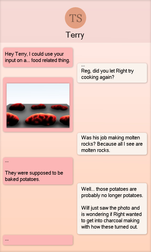
Happy Thanksgiving to those that do, have a silly text message banter between Reginald and Terrence.
#doodle#technically#reginald copperbottom#terrence suave#thsc#silly#text message mockup#mention of right and sir wilford iv#cooking gone wrong
34 notes
·
View notes
Text

So this was a commission for someone who wanted to fly a flag 'under the radar' as a fuck you to all the Revolutionary cosplayers, and I haven't been this happy with a piece this simple and clean in a long time.
The double-sided flag is so new I don't have good mockups yet. :P
797 notes
·
View notes
Text

Manips & Mock-ups March
We are excited to announce our first graphic-making event of the year, Manips & Mock-ups March (we couldn't resist the alliteration).
This won't necessarily be a daily challenge --though anyone is welcome to make daily creations if they'd like. Instead, the month will be broken up into general weekly "themes" with a few additional prompts for each week. You are free to use any or all of these prompts as inspiration for your creations, or disregard them entirely!
The goal of this event is to simply create any form of manip or mock-up. It can be as a static graphic or as a gif edit!
What exactly counts as a "manip" or "mock-up"?

For the purposes of this event, we are casting a wide net on what we consider "manips." We'd like as many people to participate, regardless of skill level, and "manip" often sounds intimidating. But it doesn't have to be anything elaborate.
A manip in its simplest form is the manipulation of images to create something new. It can be text messages between characters. A polaroid photo. A vacation postcard. A character given demon eyes or angel wings. Someone's hair changed. Two characters placed in a new setting. Characters meeting for the first time.
Check out our #manips tag for examples and inspo.

Mock-Ups are another option. For mock-ups we're thinking: Posters, VHS / DVD covers, book covers, album covers, magazine covers, flyers, prayer cards, etc. Basically something that could exist in the real world, but make it SPN.
You could make a poster for your favorite episode. An album cover for an AU were TFW are rock stars. Prayer cards for angels. A receipt from Gas 'n' Sip. A Biggerson's menu. The sky's the limit.
Check out our #mockups tag for more examples and inspo.

Use some of these, all of these, or none of these! These are just a guide / inspo.
📸 Week One: Memories 📸
Texts
Photograph
Mementos
Letter / Diary
Home Video
❤️ Week Two: Romance ❤️
Date night
Gift-giving
Suggestive ;)
Unlikely pair (Enemies-to-lovers / rarepair / crack ship)
Kiss (good ol' kissing manip)
🗃️ Week Three: Work & Play 🏖️
Vacation
Hobbies
Music
Undercover / Dress Up
Hunter's Journal / Bestiary / Lore / Casework
🤖 Week Four: AUs & Crossovers 🔀
Fantasy / Scifi
Reverse Verse (supernaturals are human, humans are supernatural)
Domestic / Non-supernatural
Historical / Different time period / Time-travel
"Superwholock" aka blending SPN with other media

In our poll gauging interest for upcoming events, a majority of responders identified as "non-creators" but interested. We hope to turn some of you into "creators" by sharing resources to make graphic-making accessible to everyone!
Check out our #resources tag for PSD templates to help you get started.
Some free editing programs (if you're not using photoshop):
Photopea (a free recreation of photoshop)
Canva (has many templates for mockups)
GIMP (an open-source program similar to photoshop)
Photoscape X
Where to get free stock / public domain images (some of these sites have now joined the AI wave but have options to filter out that content): Freepik, Unsplash, Pexels, Pixabay, Flickr Commons, Wiki Commons

🚫 NO AI generated content. 🚫 NO depictions of incestuous or adult/minor relationships. 🚫 Goes without saying but, no hateful / bigotted content. 🏷️ Please tag any NSFW content accordingly. 🏷️ Please tag for any additional content warnings.
🌟 Additionally please @ us or use our tracked tag #spngraphics-archive so we can see and reblog your creations!
83 notes
·
View notes
Text
Ao3 HTML/Coding Resources Part II
This is the HTML/Coding for Website mimicking resources in Archive of our Own (Ao3). To find Part I where I go over the Basics, General Text HTML and some Fancy Formatting (images, dividers, columns, photos, tabs etc. CLICK HERE!
Other Websites:
Texting
-How to make iOS Text Messages on Ao3 by CodenameCarrot, La_Temperanza
-A Quick Generator for Embeddable iOS Text Messages by 221b_ee
-imessage Skin by Adzaema
-Retro imessage by Adzaema
-Basic Text Message Work Skin by ProfessorMotz
- Bubble platform [workskin] by Khashana
-Chat Log HTML by deathbymistletoe
-LINE Messenger/Chat by imperiousmarshmellow
-IDOLish Rabbit Chat Workskin by associate
-Replika workskin by FaeriMagic
-Texting Workskin to match light/dark mode by irrationalpie
Tumblr
-Tumblr style CSS Tweaks by Aposiopesis
-Ao3 Workskin Testing and Tutorials by junietuesday25 tumblr DM
-How to make Tumblr Posts on Ao3 by phyyripo
-Plain Text Social Media Platforms by anubisms
-Tumblr Post Work Skin by tsukinosaugi
Twitter
-Repository - Twitter by gadaursan
- How to mimic Social Media in an Ao3 work by aerynevenstar
-Twitter Work Skin Template by etc e tal
-Twitter Workskin: Tweets and Profile by starskin
-Twitter Mock-Up by TheBrookesNook
Ao3/Fandom
-How to mimic Authors notes and Kudos/Comment Buttons by La_Temperanza
-How to mimic AO3 Comments by bittermoons
-How to add mobile Ao3 in your fic by DemigodofAgni
-How to make a fanfic style header Ao3 style by ElectricAlice
-Template for adding post chapter content by SpookyTesting
-CSS based full Ao3 fic integration (Header/Overview, Comments, Title, Summary & Buttons) by deciMae
-How to Mimic LiveJournal Posts and Comments by cursedcuriosities
-Dreamwidth Entries & Comments Work Skin by folk_melody
Facebook/Instagram/Whatsapp
-Whatsapp Group Chat builder by FestiveFerret
-How to make Facebook Messenger Chat on Ao3 by ran_a_dom
-Whatsapp Work Skin Template Revamped by etc e tal
-Whatsapp group chat skin by ovely
-Instagram DMs for Ao3 by monarch_rhapsodies
-How to make Instagram DM mockup by xslytherclawx
-Penstagram chats on ao3 by deciMae
Snapchat
-Snapchat skin by Azdaema
-Snapchat Template for Ao3 by starskin
Reddit/Forum
-UPDATED Reddit Skin by diamine
-2020 Reddit Work Skin by timstokerlovebot
-Reddit Work Skin CSS & HTML by knave_of_swords
-How to mimic Social Media in an Ao3 work by aerynevenstar
-template Reddit Skin by spookedcroon
-template:Subreddit page by ireseen
-Ao3 workskin for Forum Thread by fencesit
-Ao3 workskin for Forum Thread [Expansion Pack] by AMereDream
-How to mimic 4chan posts without just taking screenshots of 4chan
Twitch/Youtube
-Mimicking Twitch Chat for fics by Ultraviollett
-Twitch Chat Work Skin by cherrari
-Workskin testing by tohmas [Youtube comments]
-Youtube Work Skin by 1864s
-Youtube Comment Section Workskin by LupaMoe
Discord/Slack/Zoom
-2023 Discord Theme Workskin by TrojanTeapot
-Discord Work Skin by unpredictableArtist
-Discord (Dark Theme) Workskin by Heterochromia_Mars
-Skin for Recreating Discord’s Server Member List by SpookyTesting
-Ao3 Workskin Testing and Tutorials by junietuesday25
-Slack Workskin by Khashana
-Zoom inspired Ao3 skin by mystyrust
Wikipedia
-Fake Wikipedia article about a TV show: Work Skin by Anonymous
-Wikipedia article work skin by styletests
-SCP Wiki Style Workskin by thesnager
Working Games in Ao3 Tutorials
Logic Grid Puzzle Work Skin & Tutorial by BookKeep
The Case Of The Clickable Murdle by VThinksOn
Review Sites:
Yelp Reviews by kiwiana
Amazon Reviews by kiwiana
Rate My Professor Work Skin by BookKeep
Video Game Dialog Mimics
-Dialog [workskin] by Clover_Zero
-Dialogue Workskin (with parallax BG effect) by mystyrust
-My S Ranks--System Windows by unpredictableArtist [computer dialog workskin]
-Tutorial: Ace Attorney Work Skin by QuailFence
-Among Us Ao3 skin by mystyrust
-How to Mimic Undertale Fonts on Ao3 by La_Temperanza
-Tutorial:Rain Code Work Skin by faish
-Balder's Gate 3 Documents Work Skin by Professor_Rye
-SpookyTesting has SOO many Nintendo based ones
–Mimicking Minecraft for some fics by Ultraviollett
Runescape Right Click Menu Formatting by fennfics
How to put Z skits in your Tales fics by wingedcatgirl
How to make Honkai: Star Rail Messages by html_hell (jihnari)
Hold-hands inspired Texting skin by cursedcuriocities(SetsuntaMew)
Simple Linkshell Ao3 Work Skin by Pent – Final Fantasy XIV mimic
Homestuck Chat Clients by 77angel-skins
Workskin: Slay the Princess by ASpooky
Slay the Princess: Updated Workskin by Lilto
Misc. Sites
--How to mimic Deadpool Thinking boxes by La_Temperanza
--FetLife Skin [Work Skin] by Khashana
--Disco Elysium workskin by SarunoHadaki
--StarTrek PADD workskin by duskyspirit
--MDZS-themed letters by allollipoppins
--A Newbie's Guide to Podficcing by Adzaema [skin for podfics]
--Skin for making Character Intro Cards by SpookyTesting
--Kpop Photocards by legonerd
–OVR System Workskin by unpredictableArtist
-How to make Stylized CSS Card Links for your fics by buttertartz
-vroom vroom kachow: Formula1 Race Results Workskin by mackerel_cheese
Bonus: Ever wanted to see how crazy HTML can be on AO3? Try playing But can it run Doom? or Tropémon by gifbot
Happy Creating!
Last updated: Feb 8 2025 (Have a resource that you want to share? My inbox is open!)
View Part I with HTML Basics HERE!
#archive of our own#html coding#fanfiction#fanfic#fanfic writing#fic writing#fanfic help#ao3 fanfic#ao3 author#ao3 writer#ao3fic#ao3#ao3 link#ao3feed#fanfics#fanfic coding#fanfiction writer#fanfiction author#fanfiction crossover
63 notes
·
View notes
Text
Illustration Commission Information
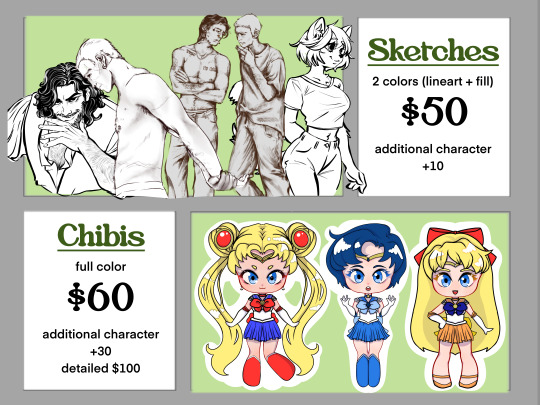
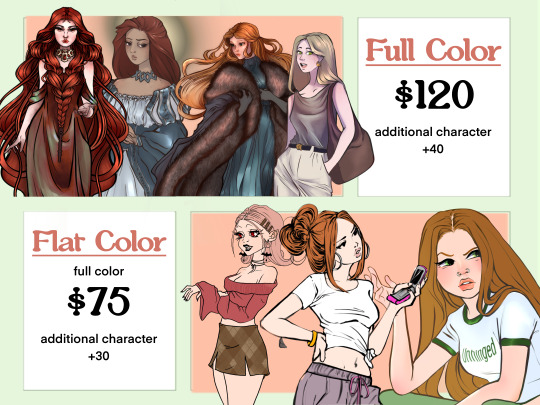
Sketches - 2 colors (Line art + Fill color) ... USD$ 50 Chibis + Pixel art - Full color ... USD$ 60 - Additional character +30 per - Extra details USD$ 100 Flat Color ... USD$ 75 - Additional character +30 per Full Color ... USD$ 120 - additional character +40 per
Bundle deals available
art trades available
Written commissions available upon request! (Fan zines, custom lore/character sheets, blorbo shrines, etc! Feel free to ask! I'm gauging demand :3)
You can see my full menu on my Ko-Fi!

Things to know!:
These prices are a guideline and may change depending on the request.
DM me if you have any questions! No such thing as a stupid question!!!
All payments are in USD and through Paypal only!
I only take 3 customers at a time. If you're interested, please ask about my availability and timeline my dms are always open!
DM me, and I will give you my discord link :) tumblr dms are notoriously awful.
Commission reservations when my slots are filled are possible with a non-refundable reservation fee, which we’ll discuss.
I work on a strict personal schedule, so please be patient when waiting for responses. I'm in PST and might not reply right away, but feel free to follow up if needed—you're not bothering me!
I take requests through my askbox, but they are free, public, and may take longer than commissions.
I do not accept NSFW commissions. I may draw NSFW content, but I will not take paid commissions nor requests for it. Period. Spicy, yes. NSFW, no.
All commissions will be posted publicly to my blog. Let me know if you prefer not to be tagged.
You cannot profit from any commission purchased from me
Please tag me or credit me when sharing the commission online. Don't repost without telling me, please. That's so rude.
More Info and TOS below the cut
🗣️ Communication
I love details. Send me everything—rants, headcanons, references, playlists, Pinterest boards, memes, unhinged google docs and notes app screenshots, you name it. I will match your freak and then some. Don’t worry about “too much”—my dms are a safe space.
I work primarily through Discord—it’s perfect for fast messages, image sharing, and chaotic idea dumps. Take your time writing; I’ll take my time reading. I’ll check in regularly and keep you in the loop the whole way!
⏰ Hours & Response Time
I'm available between 8am–5pm PST. Outside those hours, replies might be slower. If you think I missed something, ping me! Triple-text me! I’m not offended or annoyed—I actually appreciate it.
📢 Feedback & Progress
I want you to love your commission. If something’s off, just say so—your input is welcomed and encouraged. I’ll send you progress updates (sometimes at odd hours, because I’m excited) and you never have to respond right away.
🌀 Process Overview
Once payment is confirmed, I’ll send 2–4 mockups to get us started.
You get to go full There Is No Pepe Silvia on me.
We’ll revise, chat, tweak, and bring your vision to life together
✏️ Revisions
2 free revisions at any point PRIOR to finalizing the design
If we need to start over: $25 restart fee
Additional major revisions: $15 each (case-by-case basis)
You can haggle (nicely), but I know my worth 💅
📦 Delivery Format
You’ll get a high-res PNG. Need transparent or no background? Just ask—no extra charge. Want it print-ready? I can send CMYK instead of RGB.
💸 Refund Policy
No refunds after mockups begin. Emergencies? Talk to me. If I’ve put in work, I expect fair compensation.
All in-progress assets will be watermarked. If we part ways, you’re welcome to keep what I’ve shared—just keep my credit intact.
⏳ Turnaround Time
Sketches: 1–14 days
Full-color pieces: 6–30 days
Expect ~2 weeks as a general rule of thumb. I’ll keep you updated as I go!
Heads up: I work on multiple pieces at once, post personal art often, and draw when I can. If you see me online, don’t worry—I haven’t forgotten you. 💖
💰 Extra Fees
Complex details like backgrounds or accessories may cost extra. I’ll always confirm pricing before we start. I’m affordable, but I value my time and skill!
#comm info#commissions open#commission#comm sheet#commission sheet#art comms open#digital art#commisions open#oc artist#oc art#digital illustration#krita#digital painting#procreate#clip studio paint#small artist#digital artist#beginner artist#digital artwork#drawing#my artwork#sketch#my artwrok#my art blog#doodle#my art#my art <3
15 notes
·
View notes
Note
What do you use to create the text messages on “Heartbreak Live” ?
I also am so in love with the series I’m rereading it all while I wait for the new parts lmao😭 you done so good, I am HOOKED
aaahh!! thank you so much!!! i’m so happy u loved it so much, you’re rereading??? that makes me so excited to make more parts haha
specifically for the text messages, i use photoshop! i have a tutorial(ish) of how i usually make my mockups under #zya (tutorials) talks
9 notes
·
View notes
Text
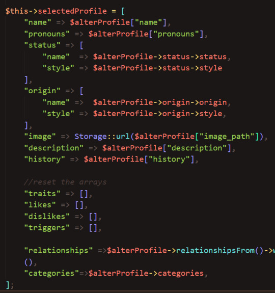
SysNotes devlog 3 - Ability to create a new profile
Welcome back to my SysNotes update! SysNotes is a system management app for people with DID, OSDD, and those who are otherwise plural.
(I will keep the intro text the same in all devlogs for context)
This devlog will be shorter than usual because I didn't want to lump it in with the next feature, which I expect will be quite long. In this devlog, I will add a way to create a new profile.
First Devlog (1) | Previous Devlog (2)
Quick Refactor before we jump in
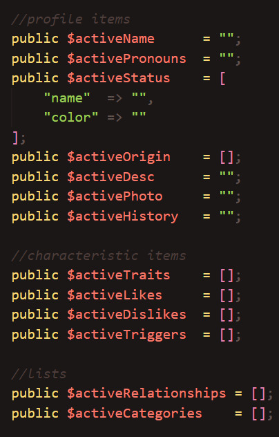
"So I did some refactoring off-camera..." - originally, everything on the page was happening inside one component. I decided to split it up into the main page and the profile section, which is a new separate component. This will keep my code shorter and easier to maintain.
I also added a way to refer to each profile individually by their ID in the URL:
(Colin's profile is ID 4, which is shown in the URL)

I was also storing profile data as separate variables, which would be inconvenient to individually pass into the new main profile component. So I moved them all into one variable:
(old | new)
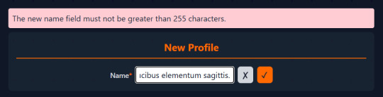
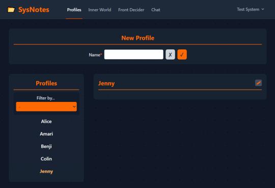
Design of the New Profile form
To be honest, I've been dreading this part since the beginning. I mean, how do I even lay this out? 💀
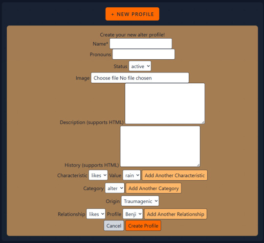
It is common for developers to avoid UI design because they are "coders not designers". I, for one, quite enjoy web design. Still, this task feels quite overwhelming to me. So, let's take this little mockup I made and turn it into something usable 💪
Too much stuff?
I think the biggest challenge here is the sheer number of inputs. And as the app grows, the number of inputs in this form will only increase.
The only mandatory input for a new profile is just their name. Therefore, the first step should be separating the Name field from the rest of the inputs.
The new and improved New Profile form is looking much better now:
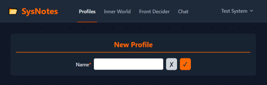
...Yes, really! That's the whole form!
You are unlikely to know everything about an alter that has just split, so all those fields are completely unnecessary for an alter to be added to the list. Every other detail can be added later through the edit mode, where each field can be edited separately without needing one giant form.
Another big reason why I decided to forego the big form altogether is that the code for saving a new profile and the code for editing a profile would be almost exactly the same (including validation), and it wouldn't make sense to duplicate this code if I can just use it in one instance.
Saving a new profile
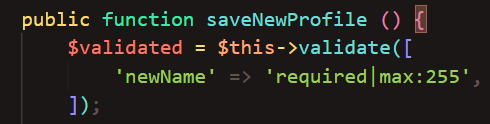
Let's add some validation to the input field to make sure that the user enters the name in a correct format.
As the Name is stored in the database as a string, it has the maximum length of 255 characters. Trying to save a longer name than this will cause errors, so we need to validate the input to make sure it's safe to insert into the database:
Here's what happens when I input a whole paragraph of Lorem Ipsum text and try to save it:
On the other hand, a shorter name saves just fine:

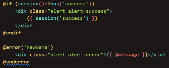
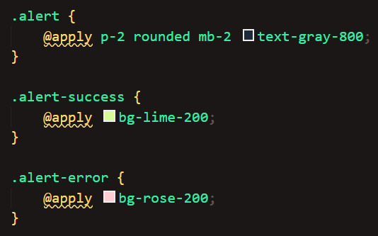
By the way, these flash messages are added in 2 ways: the success is a session message, and the error is an error stored separately by the validator. The flash messages originally have no styling, so I defined those myself using Tailwind's "@apply" for efficiency.
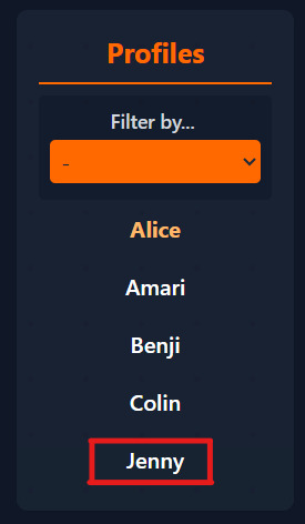
Once submitted, the name list automatically updates with our new profile:
(And if I click cancel it just empties the input)
Okay, let's click on Jenny's profile to see what it looks like! ...Oh
This is because the code tries to access Jenny's status, but she doesn't have one yet, she only has a name!
(When I pull the data from the database, I'm trying to access a non-existent value)

(And when I display the values I got from the database, the display may break if the value is NULL)
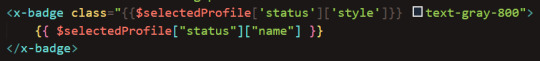
(This error applies to all profile fields, not just status, however the app crashes after just the first error it comes across so the remaining errors are not shown)
This can easily fixed by using PHP's "isset()" and/or "empty()" function, which checks if a variable has a value:
(I'm using a ternary operator as a more compact alternative to if-else. it basically goes: "if this condition is true ? then do it : if not, do something else")
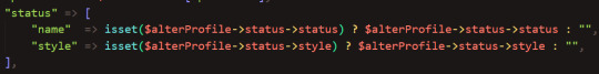
(And here I just check if these values are not blank before rendering them)
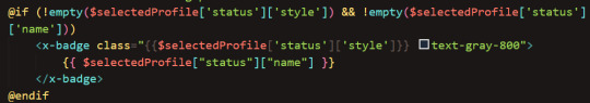
Success, Jenny's profile shows!
Now, we just have to populate this profile with data about Jenny, and to do that we'll need to be able to edit each field. I will work on this in the next devlog, as I expect this to take quite some time.
Thanks so reading! As always, any suggestions are welcome!
5 notes
·
View notes
Text
i dont understand why community content warnings/spoiler-tagging systems arent more of a widespread thing
for example theres a shit-ton of youtube videos that literally start with rapid strobe images i cant imagine the amount of people with photosensitive epilepsy that suffered from that bullshit
i also firmly believe that mods/admins n discord servers should be able to at least spoiler media/messages and spoiler tagging should allow more options beyond just "spoiler" possibly similar to how twitter does its flagging system, but with an optional text input to describe whats being flagged
i dont understand why only the poster should be expected to tag their stuff properly because in many cases they dont, due to not knowing, not caring, or not remembering, and then the community has to put up with that with no way to get a guaranteed correction beyond hoping the OP reads and respects any pleas from said community
at some point im gonna reblog with some mockups on how i think they could look
5 notes
·
View notes
Text
vision
PAGE FIFTY-FIVE
[11:58 PM]
Seth Rollins You up?
He stared at the message on the screen like it was a confessional booth.
Delivered.
Read.
Shaq replied in less than six seconds.
Shaq 🦖 Bro don’t start. It’s midnight. Either you need bail or a therapist. Which is it?
Seth Rollins Hypothetically... if you had a soulmate. Like actually. And she walked out after you introduced your mom—who showed up uninvited btw—and then she left you on read… what would you do?
Shaq 🦖 💀 💀 💀
Shaq 🦖 First of all... wtf Second, you’re asking a 7-foot man who’s been divorced about soulmates??? Third... she bad?
Seth Rollins Like... Vogue feature meets Wakanda-level elegance bad. British. Black. Brilliant. Intimidating as hell. Fashion editor. Calls me “Mr. Rollins” like she’s allergic to first names.
Shaq 🦖 Damn. So you fumbled.
Seth Rollins It’s not even funny I think I actually did
There was a pause.
Shaq 🦖 Text her again.
Seth Rollins She left me on read, bro.
Shaq 🦖 That’s not a no. That’s a “do better.”
Seth Rollins I hate this.
Shaq 🦖 You love this. You like the challenge. You always liked games where you’re down 20 in the 4th. Just don’t be annoying. Or weird. Be you.
Seth Rollins What if me isn't enough this time?
Shaq 🦖 Then upgrade the damn software. You still using “cocky football guy.” Give her the man. Not the model.
Seth stared at the screen, lips twitching into the kind of smile that came with being dragged by someone who wasn’t wrong.
Meanwhile, across town—
Sokhna was already back to being the executive-level ice storm she was known for.
Nails lacquered. Face dewy. Slide deck opened. She flicked through the GQ spread mockups one last time, not for nostalgia—but out of sheer completionism.
Project: Closed. Experience: Filed. Emotional engagement: Zero.
Her lips parted slightly as she selected the folder, dragging it to a labeled archive on her external drive.
"Rollins, Seth – FINAL"
Click. Gone.
Her job was not a dating service. Her office wasn’t a meet-cute waiting room. And her silk didn’t wrinkle for just anybody.
She sipped from her Baccarat tumbler, ice cubes clicking gently.
“That was that,” she said aloud, mostly to herself.
And Sokhna Dime? She meant it.
PAGE FIFTY-SIX
The phone buzzed against his nightstand.
Seth blinked groggily, still half-buried in the hotel sheets, hair wild and mouth dry. He reached blindly, grabbed the phone, thumbed across the screen—
New Message: Sokhna Dime Have yourself a good flight back home, Mr. Rollins.
Seven words.
Seven surgical words.
He stared at it like it was a letter of rejection from the universe itself. The period at the end? Criminal. Cold. Final. He could practically hear her saying it in that accent—clean, composed, and emotionally bulletproof.
He dragged a hand over his face and fell back onto the bed, phone pressed to his chest, exhaling one long, pained, “fuck.”
Meanwhile… Midtown Manhattan. 8:01 AM.
Sokhna Dime pushed through the revolving glass doors of the GQ building with the smooth, easy glide of a woman who was not thinking about any man—especially not a 6'1" ESPN darling with bedroom eyes and a bone structure that belonged in Louvre.
She was dressed casually today—if “casual” meant vintage Helmut Lang jeans tailored to her hips, a cream Jacquemus blouse, oversized Céline shades, and a deep green Bottega Veneta tote swinging from her shoulder.
Her curls were pulled back into a loose knot, edges clean, skin radiant like she’d slept on clouds and exfoliated with gold.
“Good morning, Ms. Dime,” the front desk greeted.
She smiled politely, not slowing.
“Good morning.”
By the time the elevator doors slid closed, she was already unlocking her phone. A flood of GQ Slack messages, an email from London Fashion Week press, and an update from her intern about next week’s spring spread approval.
Not even a blink at the top text she’d already answered earlier.
She’d said what she said.
The shoes clicked gently as she stepped off the elevator, headed toward her office like the Virgo moon perfectionist she was.
New day.
New layout deadlines.
And Mr. Rollins?
A beautifully dressed memory.
PAGE FIFTY-SEVEN
The condo was exactly the same.
Every book on the shelf sat in the same place. The hardwood floors still gleamed. His record player still had the old Miles Davis vinyl halfway spun. The espresso machine blinked to life with a mechanical chirp when he stepped in.
Still, it all felt... empty.
Grizz came waddling out of the bedroom, snorting like a little piglet, nails clicking across the floor.
“Hey, buddy,” Seth murmured, dropping his carry-on and crouching low.
Grizz huffed and slammed his weight into his human like a brick of unconditional love and confusion.
Seth scratched behind the bulldog’s ears, eyes fluttering shut for a second. “Missed you too, man.”
They sat like that for a while—Grizz nestled against his shin, Seth crouched with his hand in the dog’s wrinkled fur, forehead resting against his bulldog’s round head.
Then the silence started to creep in again.
Not the good kind.
The kind that felt like loss.
The kind that reminded him he was back in the city he thought was his place, only to realize maybe it wasn’t anymore. Not fully.
Not now.
Not after Sokhna Dime.
He finally moved, standing up and making his way to the couch, Grizz right on his heels. Seth sat down with a thud, letting the cushions swallow him whole, remote untouched. TV off.
On the coffee table was the GQ magazine.
The final print.
The silk. The editorial. The image he never thought he’d see outside his eighteen-year-old vision.
And her name in clean, understated font on the side:
Curated by: Sokhna Dime.
His thumb hovered over her text thread. Still the same:
Have a good flight back home, Mr. Rollins.
He could still see her walking away in those stilettos, unbothered, poised, probably already calculating her next spread while he stood there like a man who’d watched his future take the elevator back to the 60th floor.
Grizz let out a grunt, laying his squishy face on Seth’s thigh.
Seth ran a hand through his hair.
“Yeah… I fucked up, huh?”
Grizz sneezed in response.
PAGE FIFTY-EIGHT
The sunlight seeped through the blinds, cutting sharp lines across the hardwood floor—like prison bars.
The condo felt less like a home today and more like some distant, bleak Alcatraz of his own making.
Walls too white. Silence too loud.
Even Grizz seemed to sense it, curling into a tight little ball on the couch, eyes half-closed.
Seth sank into the leather chair, fingers drumming on the armrest.
He stared at his phone, scrolling through the thread again.
Then, with a sigh that rattled his chest, he hit FaceTime.
The screen blinked, and his sister’s warm smile lit up instantly.
“Hey, big guy,” she said, voice like home.
“Hey,” he muttered, rubbing his neck. “Got a minute? Because I need to unload.”
She nodded, settling in for the long haul.
Seth told her everything.
The vision at eighteen, the sudden GQ shoot, the way she looked at him like he was a mystery she didn’t want to solve, and the text.
Have a good flight back home, Mr. Rollins.
He wasn’t good at this—opening up—but with her, it was different.
“I don’t know what to do, sis. It’s like… I got one shot at this and I missed the damn target. Feels like I’m stuck in this goddamn prison, watching the train leave the station without me.”
She listened quietly.
Finally, she said, “You’re not alone in that cell, Seth. But sometimes, the walls only stay up as long as you let them. You gotta decide if you wanna break free or just keep pacing.”
He sighed, the weight of it all pressing down.
“But what if breaking free means losing everything I thought was real?”
Her smile softened, eyes steady.
“Then maybe you get to find something better.”
Grizz snorted.
Seth cracked the barest smile.
“Yeah. Maybe.”
PAGE FIFTY-NINE
Seth’s thumb paused mid-scroll, heart hitting an uneven beat.
The new cover shoot? Fire. Unapologetic. Exactly Sokhna.
But then—bam—he stumbled on something different.
A sun-soaked snapshot, not polished, no editorial gloss.
Three women, sun-kissed and laughing like they owned Martha’s Vineyard itself.
Sokhna right there in the middle, radiant and real, arms thrown around two women tagged Noémie and Bri.
Swimsuits, messy hair, pure effortless glow.
The kind of photo that screamed freedom.
He stared at it longer than he should’ve.
And then—he texted.
“Got room for one more?”
His fingers hovered, then hit send before he could rethink.
Because damn, he needed to find a way into that light, into her world outside the glitz.
And maybe, just maybe, that meant crashing the party she didn’t know she was throwing.
PAGE SIXTY
Her phone buzzed against the polished marble countertop, breaking the calm rhythm of her morning.
Sokhna’s eyes flicked down, scanning the message.
“Got room for one more?”
She arched an eyebrow, lips twitching with dry amusement before her thumb moved deliberately.
“Girls trip.”
Two words. A period. The unspoken message: Not happening.
She put the phone face down, already shifting focus back to the email thread blinking on her laptop. No time for distractions. No space for complications.
Miles away, Seth’s phone sat heavy in his palm, the glow illuminating the faintest crease between his brows.
He read those two words over and over.
Girls trip.
A closed door in just two words. But instead of frustration, a slow grin spread across his face—part challenge, part stubborn hope.
He wasn’t used to taking no for an answer.
Not when it came to things that mattered.
Seth’s fingers hovered over the keyboard, then began typing a message—no, a plan:
“I’m coming. Just say when.”
Before he could rethink, he hit send.
The screen blinked, the message sent into the void.
But somewhere deep inside, he knew this wasn’t over.
Not by a long shot.
PAGE SIXTY-ONE
Sokhna tossed her phone on the polished kitchen island at her Martha’s Vineyard rental, the late afternoon sunlight spilling through floor-to-ceiling windows.
Noémie and Bri exchanged exasperated looks, lounging on the plush velvet couch like two queens who’d been through this song and dance too many times.
“Girl, he’s across the whole damn country,” Bri said, shaking her head, voice thick with disbelief. “Seattle to here isn’t just a commute. It’s a whole trip. Why he keep humoring this?”
Noémie smirked, scrolling through the messages on her own phone. “And he definitely didn’t get the memo last time. Like, the ‘don’t date white men’ part. Again.”
Sokhna rolled her eyes so hard it was almost audible. “I’ve told y’all since high school, I don’t date white men, babes.Especially not the ones who think mesh and latex are wardrobe staples. No ego, no drama, no bullshit.”
Bri leaned forward, voice playful but sharp. “So, what? You’re just gonna leave him hanging? Let him keep thinking there’s a shot?”
“Let him think whatever he wants.” Sokhna grabbed her purse, slipping on her shades with a stubborn tilt of her chin. “I’m too busy living my life to waste energy on a man who can’t even take a hint from two words.”
Meanwhile, halfway across the country, in Seattle, Seth’s phone glowed cold against the dark leather of his couch.
No reply.
Just that haunting blue checkmark.
He exhaled sharply, jaw tightening like it was made of steel.
Left on read.
His fingers clenched into a fist.
That wasn’t a door closing — it was a challenge.
One he was damn well ready to take.
PAGE SIXTY-TWO
Sunlight bounced off the waves, casting sparkles across the glossy deck of the yacht where Sokhna, Noémie, and Bri lounged like queens owning the summer.
Noémie cracked open a bottle of rosé, the pop cutting through the lazy hum of the ocean breeze.
Bri waved her fork with theatrical flair, a ripe strawberry dangling between her fingers. “Ion know, boo — he kinda fine. Like, long hair, tan lines, all that.”
Noémie laughed, smacking Bri’s arm. “Girl, for real. Vanilla can be good sometimes. And vanilla pairs real nice with…”
“Chocolate,” Bri said, cackling, eyes sparkling as she nudged Sokhna.
Sokhna rolled her eyes hard, glancing at her mimosa before taking a slow sip. “Y’all make me sick. I’m not pressed over Goldilocks anymore. Can we just enjoy the fresh air and freedom? We outside, city girls up indefinitely.”
The breeze tugged at their scarves and laughter as the yacht cut through the calm waters, the world melting away.
Across the country in Seattle, Seth lounged in his sleek penthouse, the city lights twinkling below like stars caught on earth.
He swiped through his phone with a calm, confident ease and called his manager.
“Jet ready for tonight? I want the works. Flight, car, everything.”
His manager’s voice was smooth, “Already handled, Seth. Private jet’s on deck, ground transport lined up. Just say when.”
Seth smirked, eyes flicking to a framed photo on the wall — a single image of a radiant woman he’d seen once at eighteen.
“This isn’t just business,” he murmured, “It’s personal now.”
“Understood. We’re making it happen.”
Seth’s grin deepened, that steady fire burning in his chest.
PAGE SIXTY-THREE
The private jet sat gleaming under the wide-open Seattle sky, its polished fuselage reflecting the amber hues of the late afternoon sun. Seth stood just outside the cabin door, cool and collected, though inside his chest beat with an electric hum—an impatience wrapped in quiet confidence. The faint scent of fresh leather wafted from his meticulously packed Louis Vuitton bags, lined up like silent sentinels at his feet, their supple surfaces catching the golden light.
His fingertips trailed absently over the grain of a bag handle, the smoothness grounding him, steadying the whirlwind of thoughts racing beneath. Somewhere behind him, his manager was locking in last-minute details with a terse professionalism that only made Seth grin. This was his moment, the culmination of years—both business and something deeper he wasn’t quite ready to name aloud.
The gentle hiss of the cabin door opening was a call to arms. He stepped inside, greeted by the cool caress of pristine white leather seats and the faint musk of polished chrome. The subtle scent of cedarwood from the cabin’s diffuser mixed with his own spicy cologne, creating a bubble of calm and power around him. Settling into the plush seat, he ran a hand through his dark waves, eyes shadowed but burning with a quiet fire.
Elsewhere, the yacht rocked gently over the glassy waters of Martha’s Vineyard, the salt-kissed breeze threading through the laughter of three women basking in golden sunlight and friendship. Sokhna leaned back against the polished teak railing, the warmth of the sun kissing her flawless skin as the cool tang of ocean air teased her senses.
Noémie, always the instigator, laughed as Bri animatedly recounted the latest celebrity gossip, her voice a blend of amusement and disbelief. “And then she totally snapped back with that shade about his new girl—like, who even does that?” Bri cackled, waving a strawberry between her fingers like a scepter.
Sokhna’s fingers toyed with a loose strand of hair, the silkiness a welcome contrast to the crisp designer fabric of her vintage Burberry blouse. “I’ve been thinking about switching up my look. Maybe some long box braids with those delicate gold cuffs. Something bold but easy.”
Noémie nodded, eyes sparkling with mischief as she scrolled through her phone. “Girl, I’m hooked on that new show, Queens of Harlem. It’s like the drama we live for.”
Bri groaned playfully, “Please, I’m still all about The Real Housewives. Those tea spills never get old.”
Sokhna smirked, tilting her head to catch the sunlight, the slight curve of her smile holding a secret. “Leave it to us to turn yacht days into a full-on episode.”
The sound of clinking glasses mixed with the gentle slap of waves against the hull. The scent of sunscreen and ocean mingled with fresh citrus from their sparkling mimosas, crafting a perfect bubble of freedom and sisterhood.
Seth’s fingers drummed lightly on the armrest, his mind a steady rhythm of anticipation and resolve. This trip wasn’t just about travel or work—it was the moment the years of distance and unanswered questions finally bent toward something new. As the jet lifted from the runway, the city lights shrinking beneath him, the horizon stretched out wide, full of possibility.
PAGE SIXTY-FOUR
The salt-tinged breeze tugged playfully at the hems of their sundresses as Sokhna, Noémie, and Bri stepped onto the weathered wooden deck of The Lobster’s Catch, a sleek seafood spot nestled right on Martha’s Vineyard’s harbor edge. Lanterns strung overhead cast a warm honey-gold glow, their light flickering against the glass windows where the soft clink of crystal met the hum of low conversations and the distant call of seagulls.
Sokhna’s sandals tapped confidently on the planks, toes painted a muted coral, perfectly matching the glow on her cheeks from the fading sun. Her Burberry crossbody bag swung gently with each step, her whole aura relaxed but undeniably chic—Black Barbie energy, undeniable and effortless.
Inside, the rich scent of buttered lobster, roasted garlic, and fresh thyme wrapped around them like a warm hug. The subtle hum of the jazz trio in the corner wove seamlessly into the clatter of plates and murmured laughter.
Settling at a corner table with panoramic harbor views, the trio toasted crisp glasses of rosé, the bubbles dancing in the light like tiny stars.
Between bites of flaky scallops and the briny pop of oysters, Sokhna pulled out her phone, fingers deft and practiced. With an effortless smile, she framed the moment—the three of them, glowing against the soft glow of candles and the restless sea beyond.
Her caption hovered as she tagged the restaurant: #HarborNights #MarthasVineyardMagic.
The small propeller plane touched down on the grassy runway of Martha’s Vineyard Airport, its wheels kissing the earth with a soft, almost tender thud. Outside, the salty breeze carried the unmistakable scent of pine needles mingled with the ocean’s endless hum—a calming contrast to the buzz Seth had left behind in Seattle.
Stepping onto the sun-warmed tarmac, Seth inhaled deeply, the fresh island air filling his lungs like a promise. His designer leather duffel hung effortlessly from one shoulder, sunglasses catching the early evening glow as he navigated toward the waiting car.
His phone buzzed again, screen lighting up with a new Instagram story. His thumb swiped up without hesitation.
There she was.
Sokhna, framed by the soft amber light of a waterfront restaurant. Her laughter shimmered through the pixels, her sundress catching the last blush of golden hour. The location tag glared: The Lobster’s Catch, Martha’s Vineyard.
His jaw tightened, a slow, crooked smile tugging at the corner of his mouth.
No time wasted.
He tapped his manager’s number.
“Get me to The Lobster’s Catch. Now. I’m not missing this.”
As the SUV’s tires crunched along the gravel path toward the harbor, the distant call of seabirds and gentle slap of waves against wooden docks echoed around him—an island serenade to accompany his rising anticipation.
Tonight, the game changed.
PAGE SIXTY-FIVE
The SUV cruised slowly down a narrow lane flanked by blooming hydrangeas and weathered clapboard cottages. Seth leaned back, the leather seat soft beneath him, while a salty breeze slipped in through the cracked window, tugging at his shirt collar. The low hum of the engine mixed with distant seagulls and the faint slap of waves against the shore.
His phone buzzed again. Without hesitation, his thumb swiped up to reveal Sokhna’s latest Instagram story — a warm, golden-lit snapshot of her and her two friends seated outside a cozy waterfront restaurant. Her radiant smile, the sparkle in her eyes, the effortless way she held her glass of rosé — it all stopped him cold. The location tag read The Lobster’s Catch, Martha’s Vineyard.
He locked the screen and murmured to himself, “Alright... time to make some moves.”
—
On the wooden deck of The Lobster’s Catch, a soft chorus of laughter mingled with the gentle evening breeze. Sokhna sat surrounded by her closest friends — Noémie and Bri — the clinking of their glasses punctuating their easy conversation. She pushed back a loose curl, the cool air teasing at her sundress, and took a slow sip of rosé.
Noémie smiled, watching Sokhna with quiet affection. “You seem lighter out here. This place is good for you.”
Bri nodded, leaning in with a teasing grin. “It’s like the city can’t touch you here. The noise, the pressure — gone.”
Sokhna laughed softly. “Exactly. It’s a breath of fresh air. I needed this.”
The three friends settled into a comfortable silence, the sounds of the harbor wrapping around them like a gentle lullaby — distant calls of seabirds, soft waves lapping at the dock, and the faint clatter of plates from the kitchen inside.
—
Back in the SUV, Seth’s eyes stayed fixed on the glowing sign ahead, anticipation simmering beneath his calm exterior. Tonight, the island wasn’t just a place — it was where the next chapter began.
PAGE SIXTY-SIX
The night air was crisp but not cold, carrying the faint salty scent of the ocean mixed with the distant crackle of boardwalk lights flickering softly. Sokhna and her girls strolled side by side, arms linked, their laughter low and easy, the kind of laughter that only comes when you’re miles away from deadlines and noise. The wooden planks beneath their feet creaked softly as they made their way away from the restaurant and toward the glow of the boardwalk.
Suddenly, a voice sliced through the calm.
“Sokhna.”
She froze mid-step, the name landing like a splash of cold water. She turned sharply from between Noémie and Bri, her brows scrunching as she locked eyes with the figure approaching—a man with that confident stride and those unmistakable long waves framing a face she thought she’d put behind her.
“Seth?…” Her tone was equal parts disbelief and challenge. “What are you doing here? How did you know where I was gonna be? You stalking socials now, Mr. Rollins?”
Her eyes narrowed slightly, but her posture remained regal, unflinching.
Seth’s lips quirked into a half-smile, unapologetic. “Call it persistence. Or maybe just knowing how to do my homework.”
The breeze tugged at her sundress, mingling with the scent of her perfume—notes of jasmine and something smoky, familiar yet elusive. He took a step closer, voice steady but low.
“I saw your story. Thought I’d catch up in person instead of just liking your posts.”
Sokhna crossed her arms, glancing briefly at her friends who gave her subtle, knowing looks.
“Well, you caught me. But don’t think this means I’m just gonna pick up where we left off.”
Seth met her gaze, steady and sincere. “Yeah, I’m not here for a rerun either.”
The tension was thick, but underneath it simmered something electric — a moment neither expected but both couldn’t ignore.
PAGE SIXTY-SEVEN
The salty tang of ocean air teased Sokhna’s senses as she stood on the cobbled sidewalk, the faint hum of the boardwalk behind her mingling with distant laughter and the clink of glasses from nearby cafes. Her heels clicked against the stones — sharp, deliberate — as she faced him, cool and collected, arms crossed like she was guarding the last word in a war of wills.
Seth Rollins was standing there, the same man from the Knicks game lounge, the one whose parents had gatecrashed their last encounter, that awkward moment still fresh in her mind. He looked different now—less firebrand wrestler, more tailored NFL analyst: dark waves of hair falling just right, his confident stance softened ever so slightly by something she couldn’t place.
Her gaze fixed on him, unblinking, eyes sharp enough to cut glass. “A rerun?” Her voice was calm, deadpan, but laced with an edge. “The last time I saw you was at that Knicks game lounge. Your family shows up unannounced, and I left before it could get any weirder. And before that? The GQ cover shoot—which, by the way, wrapped up a week ago.”
Seth winced, a flicker of discomfort crossing his usually unshakeable face. He ran a hand through his thick hair, fingers tangling in the dark waves as if trying to smooth down nerves he rarely showed. “My parents,” he said, voice low, a slight shake of the head in disbelief. “They came to surprise me. I didn’t even know they were coming. Totally unplanned.” He gave her a half-smile, one that tried to bridge the distance between them. “And yeah, the shoot’s done. That’s old news.”
He shifted his weight, eyes finally meeting hers squarely, earnest and direct. “But I didn’t come here to talk about work, Sokhna. I missed you. Thought maybe… maybe we could talk.”
Sokhna’s brow arched in amused disbelief, her homegirls giggling softly behind her, nudging one another with playful smirks as they slowly drifted ahead, giving the two space like a cage about to be unlocked. The world around her blurred just a little — the hum of nearby conversations, the distant crash of waves, the faint scent of saltwater mingling with the earthy aroma of aged wood from the boardwalk.
“To talk?” she echoed, voice sharper now, tinged with skepticism. She tilted her head, eyes narrowing just enough to challenge. “If you had questions about business, you could’ve sent them through your agent. Instead, here you are, creeping on my Instagram, stalking my location like some desperate fan.”
A slow smirk tugged at the corner of her lips as she folded her arms tighter, standing tall in her vintage Chanel dress that fluttered gently in the breeze. “Honestly, Rollins,” she said, voice dripping with playful menace, “I don’t know whether I should be flattered or start drafting a restraining order.”
Seth chuckled, a deep, genuine sound that warmed the cool air between them. He took a small step forward, the faint scent of his cologne mixing with the ocean breeze, confident but respectful. “Maybe a little of both.”
Their eyes locked, the distance closing just a fraction, the world narrowing to the space between them — charged, electric, unsaid. Sokhna’s smirk softened, just barely, like a crack in the armor.
“Alright,” she finally said, voice low and teasing. “You’ve got two minutes. Make it count.”
Seth’s grin widened, the spark in his eyes igniting. “Challenge accepted.”
PAGE SIXTY-EIGHT
Seth’s smile didn’t falter. If anything, it stretched wider, a smug, knowing curve that said he was already three plays ahead, just waiting to see how she’d react. The kind of grin that had probably gotten him out of parking tickets, into VIP lounges, and out of more trouble than most men could imagine. But Sokhna wasn’t most women.
The warm golden hue of the early evening sun painted the boardwalk in honey, streaking pastels across the sky behind them. Her sundress moved with the breeze — pale cream silk trimmed in black piping, effortlessly luxe, whispering along her thighs as she shifted her weight. Seth’s eyes lingered there a second too long, then snapped back up when she cleared her throat with intentional sass.
“Minute forty-five left,” she said, glancing down at her Cartier watch with mock impatience.
Seth snorted, stepping in with the lazy confidence of a man who knew the game and played it well. His voice dropped, low and slightly gravelly — the timbre more intimate, like velvet over smoke.
“Alright then,” he started, hands casually tucked into the pockets of his dark slacks — custom, obviously. “I’m not gonna stand here and act like this isn’t insane. You ghosted me. Flat-out left me on read.”
“I sure did,” Sokhna cut in smoothly, lips pursed around the rim of her champagne-colored gloss, eyes unbothered.
“I deserved that,” he admitted without flinching. “But I didn’t come here hoping you’d make this easy.”
Her lashes fluttered — not in flirtation, but calculation. “Then what exactly did you come for, Rollins? Redemption? An ego massage? I’m not the welcome committee, and I don’t offer second takes.”
“No,” he said, now fully serious, tone dipping low. “I came to stop thinking about the fact that I had one shot — one literal second — to see the person I’m supposed to end up with at eighteen, and it was you, Sokhna. And then I blew it.”
Sokhna’s expression froze. A second passed. Two. The air tightened between them. The background world faded into blur again — her girls’ laughter somewhere in the distance, the clatter of utensils from outdoor seating, the flutter of seagulls overhead — all white noise to what now sat thickly between them.
“I’m not here to tell you some cheesy story,” Seth went on, his gaze intense but not forceful. “I’m not expecting you to light up and say it’s fate or some cosmic coincidence. But I saw you. You. And I’ve been seeing you ever since.”
A beat.
Sokhna blinked, her posture still straight-backed and poised, but her arms slowly unfolded. Her tongue ran along the inside of her cheek like she was chewing over whether to tell him off or just walk away. She glanced down briefly, then met his eyes again.
“That supposed to impress me?” she asked coolly, though her voice had softened, just a notch.
“No,” he said, stepping even closer, now nearly toe to toe with her stilettos clicking softly against the pavement. “It’s not. But I hoped it’d at least make you pause.”
Another pause. Longer this time.
Finally, Sokhna clicked her tongue and tilted her head slightly, eyes scanning his face like she was recalibrating everything she thought she knew about him. “You really flew across the country… to pause me?”
“Maybe I just wanted a reason to hear your laugh again,” he said, that cocky glint twinkling in his eyes like gold under spotlight.
Her lip twitched, betraying a crack in the ice. A very small one. But still.
“You’re lucky I like dramatic men in expensive shoes,” she muttered.
Seth’s grin was dangerous now — not arrogant, but pleased. “So… is this where I earn minute number three?”
“No,” she said, smirking as she started walking toward the boardwalk again, her hips swaying with the kind of grace that made grown men rethink life choices. “But if you can keep up, you can walk with me.”
Seth didn’t hesitate. “You always walk this fast?”
“I walk like my time’s valuable,” Sokhna shot back without missing a beat, her voice cool like diamonds on ice.
He followed, of course.
Always would.
PAGE SIXTY-NINE
Their footsteps echoed in sync on the wooden planks of the boardwalk, the gentle lapping of waves against the docked yachts below creating a soft rhythm beneath their silence. The golden-hour sun cast a bronzed glow across the ocean, turning the water into molten glass, and the scent of sea salt clung to the breeze like perfume. The occasional gull cawed overhead, and far off, the faint notes of a saxophone played by a busker floated on the air, lazy and warm.
Sokhna didn’t rush. She walked like a woman who never had to—each step deliberate, each sway of her hips a paragraph of poise. Her sundress swayed around her calves, slits revealing glimpses of toned leg, her sandals clacking softly with each measured step. She’d tied her locs up in a silk scarf earlier, only a few strands falling loose to frame her glowing, cocoa-rich face. The glow on her cheekbones alone could bring a man to his knees.
Seth walked beside her, hands tucked into his slacks, his dark button-down sleeves rolled up, revealing veined forearms and a chunky silver watch catching the sun just right. His bun was a little loose from the flight, but somehow still artfully messy—like it was done on purpose, like he always looked that good without trying.
“You know,” Sokhna finally said, voice calm but edged, “I should be offended. You stalking my socials like an ex with no self-control. A little pathetic, don’t you think?”
He chuckled low, the sound lazy and gravel-soft. “If it makes you feel better, it was my sister who found the tag. I just… seized the opportunity.”
She side-eyed him, one brow lifting as she slowed her pace a hair. “So this is a family obsession now?”
“You’re not easy to forget,” he said simply.
Sokhna clicked her tongue. “Flattery won’t fix things.”
“Didn’t expect it to.”
They walked another few paces in silence. Down the boardwalk, the light from the restaurant spilled out in soft gold, and laughter echoed from a nearby patio where couples dined over candlelight and rosé.
“So what now?” she asked, glancing over at him. “You came, you found me, you dropped your charming lines and walked with me into the sunset. Do you think I’m just going to… what? Invite you to brunch tomorrow and pretend everything makes sense?”
“No,” he said honestly. “I don’t expect anything. I just… didn’t want the last memory of you to be walking away in that Chanel dress without even looking back.”
Her jaw flexed, but she didn’t respond right away. The air thickened with something unspoken—like tension and unsaid feelings made tangible. She looked out over the railing to the sea, her hands brushing against the edge.
“I didn’t look back because I wasn’t sure I wanted to see disappointment on your face,” she admitted softly.
Seth blinked, surprised. “Disappointment?”
She sighed, the sound barely audible over the water. “You don’t seem like the type of man who gets told no very often.”
“I’m not,” he replied with a faint smirk. “But I’ve never wanted a ‘yes’ to matter this much, either.”
That made her pause. Just for a moment.
“I’m not some prize at the end of a fairytale, Rollins,” she said. “And I’m definitely not something you get to chase across the country because you had a vision and suddenly it all makes sense.”
He turned to face her now, really looking at her. “You’re not a prize. You’re the storm and the sun after. And I didn’t come here because of the vision.”
She arched a brow, crossing her arms. “No?”
“No,” he said, the words slow and sincere. “I came because when you laughed at that burger joint, I forgot what it was like to feel like a person again. Not a brand. Not a former pro athlete. Just… a man having dinner with someone who could absolutely ruin him and not lose a wink of sleep.”
Sokhna stared at him a long moment, her expression unreadable. She tilted her head slightly, lips parting—but no words came.
Just then, Noémie called from up ahead, waving her hand. “Y’all good back there or do we need to cue the romantic movie score?”
Bri added, “Y’all movin’ like molasses in November, damn!”
Sokhna glanced at them, then back at Seth.
“This doesn’t mean anything,” she said, her voice firmer again. “You caught me off guard. That’s all.”
Seth didn’t push. He just smiled softly. “Then let me keep catching you off guard.”
And with that, they kept walking.
Not side-by-side, exactly.
But not apart, either.
PAGE SEVENTY
They reached the hotel just as the sky finished bleeding orange into indigo. The building loomed quiet and elegant, the kind of place where even the bellhops looked like they’d been handpicked by Vogue. Outside the polished doors, the soft whoosh of the ocean barely cut through the hum of jazz floating from the rooftop bar.
Sokhna stepped ahead of him, her heels clicking against the pristine stone as she paused in front of the elevator. Her suite was just up the next few floors, her girls already scattered across the penthouse they’d all chipped in for—hairpins flung, makeup bags open, room service half-eaten on white linens.
But here, in the quiet hush of the hallway, she turned toward him.
Seth had one hand in his pocket, the other idly tugging at the collar of his shirt. He didn’t speak first. He knew better now.
Sokhna rocked once on her heels, hands neatly folded in front of her Balmain dress, posture poised like she was born to be admired—and knew it.
“Well,” she said, voice smooth but dipped in that dry British sarcasm, “this has been… informative.”
He smiled, slow and crooked. “Informative?”
“Yes. I've learned that a man with a sports career, a broadcast job, and access to first-class travel still doesn’t understand what ‘leave it alone’ means.”
Seth chuckled, eyes flicking to her lips. “I heard it. I just ignored it.”
She scoffed under her breath, a small smirk curling on her face despite herself.
“I don’t play games, Mr. Rollins.”
“And I don’t play for short wins,” he said, stepping a little closer—not enough to cross a line, just enough to exist in her space.
Her eyes didn’t flinch. “You came all this way for… what exactly? A redo? A rom-com montage? You think this is some kind of poetic full-circle moment where I magically forget I’ve already mentally filed you under ‘aesthetically pleasing, emotionally inconvenient’?”
Seth tilted his head, tongue pressing to the inside of his cheek. “I didn’t come here for magic.”
“No?” she asked.
“No. I came because I wanted to see if the way I feel when you talk to me like I’m not special is something I imagined.”
She blinked, genuinely thrown for a split second.
He smiled wider, “Turns out, it wasn’t.”
Sokhna huffed a laugh, looking away as her hand reached for the keycard tucked into her purse.
“Cute,” she said, “but still not enough.”
“I’m not asking for anything,” he said, his voice softer now. “No dinner, no date, no trip down memory lane. I just wanted to remind you I’m here. I see you. And I’m not going to pretend it didn’t matter to me.”
She stood there, card in hand, eyes lingering on him a beat too long. Then she slowly turned, slid the card into the door slot. The soft beep and click sounded louder than it should have.
Sokhna pushed the door open halfway, then paused.
“Thanks for the walk,” she said, not quite looking at him.
He nodded once. “Anytime.”
She stepped inside, heels quiet against the carpet now, but before she could close it all the way, she peeked back through the gap in the door. Her expression was unreadable—but there was something… softer now.
“I like strawberries,” she said suddenly.
Seth blinked. “Huh?”
“Earlier. At the GQ shoot. You asked about candy shop picks,” she said, a little smirk teasing her lips. “I never said strawberries, but it’s at the top. With sour belts. And lemonheads.”
The door clicked shut before he could respond.
He stood there for a second.
And grinned.
PAGE SEVENTY-ONE
It was the sound of her door unlatching that snapped him out of his daze.
He'd barely taken a step when the door eased open again—just wide enough to see her.
Sokhna stood there, barefoot now, heels discarded somewhere behind her, her makeup still impeccable but softer under the warm gold lighting of the suite. Her eyes… they weren't as guarded this time. The usual steel was laced with something quieter. Uncertainty. A hint of conflict.
Her bottom lip was caught under her teeth, her arms folded across the silky bodice of her sundress like she hadn’t decided if opening the door was a moment of clarity or pure madness.
Neither of them said anything.
The distant hum of jazz from the rooftop bar drifted down the hallway again, faint and moody, mixing with the hush of late evening and the distant crash of the Atlantic along the shoreline.
Seth didn’t move until she blinked—just once—and exhaled softly.
He stepped forward, slow but steady, giving her room to change her mind. She didn’t.
Her fingers released the edge of the door, and he crossed the threshold.
Inside smelled like linen and vanilla and some expensive candle that probably had “saffron” or “oud” in its name. Her suitcase sat half-zipped near the coffee table, sunglasses perched on the back of the velvet couch. The penthouse suite pulsed with quiet luxury. One wall was all glass, revealing the dark, moonlit ocean stretching wide beyond the shoreline.
She didn’t say anything at first.
Just… looked at him.
Like she was trying to figure out what the hell she was doing, and if she should stop herself.
Seth tucked his hands into his back pockets, his voice low, “You okay?”
That snapped her out of it.
Sokhna scoffed, turning her back as she walked toward the window, arms still crossed. “You show up in my city, my job, my vacation—and ask me if I’m okay?”
“I didn’t plan the Knicks thing,” he said, voice gentler now, watching her silhouette outlined by the glow of city lights beyond the glass. “And I didn’t come here to make a scene. I just... I couldn’t let that be the end of it.”
She turned halfway, one shoulder still to him. “And what exactly is ‘it,’ Rollins? You don’t know me.”
“I know enough.”
Her brow lifted. “From what? A week-long shoot and a burger?”
“No,” he said, stepping closer, “from a vision I had when I was eighteen.”
Her lips parted, and for the first time since he met her—really met her—Sokhna looked completely uncomposed.
“You… what?”
Seth ran a hand through his hair, pacing a small circle like he needed to shake something off. “I wasn’t gonna tell you like this. Hell, I wasn’t gonna tell you at all. I figured you’d think I was crazy, or worse, manipulative. But the truth is, Sokhna… when I was eighteen, I got a glimpse. One single vision. A woman I’d never met. A moment I didn’t understand.”
He turned, eyes meeting hers without hesitation now.
“It was you. Every detail. Down to the exact way your hand moved when you picked up your wine glass at lunch that first day. You were wearing a soft gold watch, hair swept to the side, same energy. Same eyes.”
Silence.
He waited.
And Sokhna?
She just stared at him. Like she was deciding whether to slap him, kiss him, or both.
Then finally… she exhaled.
Long. Slow.
Her voice dropped a little. “You’re out of your mind, Rollins.”
“Maybe,” he said, his smile crooked, boyish. “But at least now you know.”
0 notes
Text
Using AI to Create Digital Products

Speed Meets Innovation
Using AI to create digital products is revolutionising how Aussie creators, coaches, and entrepreneurs work online. Whether you’re producing an eBook, an online course, or a digital planner, AI can help you build and launch faster, smarter, and more efficiently. With the right tools and approach, you can turn your ideas into income without the stress or time drain of doing everything manually. In this post, we’ll explore how using AI to create digital products makes your workflow easier, your content sharper, and your launch timeline shorter. Why Using AI to Create Digital Products Works Using AI to create digital products isn’t just a passing trend. It’s a reliable way to streamline your content creation and repurpose your knowledge more effectively. Tools like ChatGPT, Jasper, and Canva’s Magic Write are making it easier than ever to brainstorm ideas, write content, and polish the final product. Take, for example, a Sydney-based wellness coach who used AI to convert her blog series into a 40-page eBook in just three days. She then used AI-generated captions and cover designs to launch it on Instagram and Etsy — something that used to take her weeks with a designer and copywriter. That’s the power of using AI to create digital products: speed, simplicity, and high-quality results at your fingertips. Create Digital Products Faster with AI When you’re using AI to create digital products, the time savings alone are a game changer. Instead of spending hours brainstorming, writing, and formatting, you can use AI tools to draft and polish your content within minutes. Here are a few ways to accelerate your process: Generate lesson plans or course outlines with simple prompts Use Canva AI to design your product mockups and social media posts Turn recorded webinars into formatted eBooks or how-to guides Automate subtitle creation and voiceovers with tools like Descript or Synthesia In Melbourne, “EcoEd Online” used AI to complete an entire 4-module online course — including text, quizzes, video scripts, and a launch kit — in just 10 days. That kind of speed used to be unthinkable. Create Digital Products SMARTER with AI Using AI to create digital products isn’t just about speed. It also allows you to make smarter decisions throughout the creative process. AI-powered tools can help you choose the right niche, identify trending content, and even test different versions of headlines or calls-to-action. Here’s how: Use AI SEO tools to identify high-traffic keyword topics Analyse customer questions to shape your content Test variations of sales page copy and see what performs best Add multilingual options to expand your audience reach The key is to treat AI as a partner — not a replacement. You bring the expertise; AI brings the efficiency. Tools That Make It All Happen These popular, beginner-friendly tools will help you get started: ChatGPT – Create outlines, product descriptions, and scripts Canva Pro – Design covers, PDFs, and visuals with AI assistance Descript – Turn voice notes into content, add subtitles and polish audio Pictory & Synthesia – Convert text into video content for promo and training Notion AI – Organise your ideas, generate copy, and map your product strategy Whether you’re a first-timer or a seasoned digital creator, these tools will help you unlock the benefits of using AI to create digital products efficiently and affordably. Power Up Your Productivity

Using AI to create digital products fast and smart isn’t about cutting corners — it’s about boosting creativity and scaling your time. You stay in control of your message while the tools help you deliver with impact. As more Australian creators adopt AI-driven workflows, those who embrace the shift early will lead the way. Now’s your chance to turn your knowledge into high-value, low-stress digital products that your audience will love. FAQs 1. Is using AI to create digital products expensive? Many tools offer free plans, while premium options are still more affordable than outsourcing. 2. Will AI make my products sound generic? Only if left unedited. Add your voice and experience to personalise the final product. 3. Can I use AI to create video content too? Yes — tools like Synthesia and Pictory make it easy to create videos from text. 4. What types of digital products can AI help with? EBooks, courses, templates, guides, promo videos, worksheets, planners, and more. 5. Do I need to be tech-savvy to start? No — most tools are drag-and-drop or prompt-based. Great for beginners! 6. Where can I learn more about this process? Explore resources and training with us -- Digital Product Creation Stay Ahead with AI-Powered Creation Using AI to create digital products fast and smart gives you the edge to move quicker, scale wider, and deliver better. The tools are here. The opportunities are growing. And with your ideas in hand, you’re ready to build digital products that work for you — not the other way around.Want to build smarter and faster with AI? Unlock your first win—join our free intro training today! Read the full article
#AIbusinesstools#AIforcreators#Aussieentrepreneurs#Australianentrepreneurs#contentautomation#coursecreation#digitalproductcreation#onlinebusinesstips#productdevelopmenttips#productivitytools#techforsmallbusiness
0 notes
Text
The Future-Ready CEO: Unlocking Business Growth with Generative AI

Imagine walking into a boardroom where decisions are backed by intelligent simulations, creative content is auto-generated in seconds, and market insights are drawn from millions of data points—instantly. That’s not science fiction. That’s Generative AI in action. And if you're a CEO who’s not already thinking about how to embed it into your strategy, you may already be behind.
Welcome to your CEO Playbook: Generative AI—a practical, real-world guide to understanding, leveraging, and scaling the most powerful technology wave in decades.
So why should you care?
Because whether you're running a startup, leading an enterprise, or transforming a legacy business, Generative AI is no longer optional. It's a strategic lever. And the leaders who harness it will unlock faster innovation, deeper customer engagement, and higher profitability.
But it all starts with understanding what it really is—and how to use it like a CEO.
What Is Generative AI and Why Should CEOs Pay Attention?
Let’s cut through the fluff.
Generative AI refers to a class of artificial intelligence models capable of generating text, images, audio, code, and more. These models—like GPT, DALL·E, and others—aren’t just tools. They’re collaborators. They can write your reports, generate marketing strategies, create code for your MVP, even simulate your customer support conversations.
But what makes it transformational for CEOs is this: it enhances decision-making, automates cognitive labor, and supercharges creativity.
Where traditional AI helped us analyze, classify, or predict, Generative AI creates—turning ideas into outputs in real-time.
This is the dawn of the AI-augmented executive.
Top Use Cases: How CEOs Are Using Generative AI Today
Let’s get specific. Here's how CEOs across industries are putting Generative AI to work:
1. Faster Product Innovation
AI can generate product mockups, write user manuals, and simulate customer feedback. That means faster prototyping, fewer roadblocks, and quicker time-to-market.
2. Content at Scale
From social media posts to sales presentations, AI generates high-quality content with context-aware messaging. CEOs are using it to empower marketing teams and reduce dependency on external agencies.
3. Customer Experience Transformation
AI-powered chatbots, voice assistants, and email responders deliver 24/7 support. The experience is not just fast—it's personalized and consistent.
4. Board-Level Decision Intelligence
Want a competitor landscape? A customer sentiment report? A synthesis of financial performance and industry trends? AI can analyze and summarize massive data sets faster than any analyst.
5. Cost Efficiency and Resource Optimization
By automating repetitive tasks, AI helps you reduce overhead and shift human talent to more strategic work.
Mindset Shift: From Efficiency to Growth
Too many leaders make the mistake of seeing AI purely as an efficiency tool—cut costs, automate tasks, and reduce headcount.
That’s a limited view.
The real value for CEOs lies in growth. Generative AI enables:
New product lines
Personalized customer journeys
Real-time market responsiveness
Democratized access to insights
It helps your team think faster, test more ideas, and build better things—not just cheaper.
The CEO Playbook: Generative AI — Your Ultimate Learning Guide
Now here's the good news: You don’t have to figure this out alone.
The CEO Playbook: Generative AI is a step-by-step Udemy course designed specifically for business leaders—not engineers or developers.
It's not about the math behind AI. It's about the mindset, frameworks, and practical actions you can take as a CEO.
Here’s what you’ll learn:
How Generative AI works (in plain English)
Strategic frameworks to deploy AI in your org
Real case studies of successful AI-led businesses
How to manage risk, ethics, and governance in AI adoption
Tools and platforms CEOs should know about
Hiring and building AI-capable teams
Think of it as your modern MBA upgrade—real, actionable, and relevant.
Leading Through Change: Organizational Readiness for AI
Adopting AI isn’t just a tech shift. It’s a cultural transformation.
As a CEO, your role is not to write prompts or code—it’s to create the conditions for AI to thrive in your organization.
Here’s how:
1. Create a Clear Vision
Set a bold, AI-informed vision for your company. Make it clear that AI is not a side project—it's central to your future.
2. Empower Cross-Functional Teams
Enable marketing, finance, product, and customer service teams to experiment with AI tools relevant to their domains.
3. Invest in Upskilling
Don’t just hire AI experts. Train your current teams to become AI-fluent. Enroll managers in courses like the CEO Playbook: Generative AI to build leadership confidence.
4. Lead with Ethics
Put strong guidelines in place. Prioritize transparency, bias mitigation, and data privacy. Good AI is responsible AI.
Common CEO Misconceptions About Generative AI
Let’s debunk some myths that are still floating around boardrooms:
❌ “AI will replace my people.”
✅ Reality: AI augments your people. It makes them more productive and creative.
❌ “I need a huge tech team to implement AI.”
✅ Reality: Many no-code/low-code AI platforms exist. You can start small and scale intelligently.
❌ “AI is too risky right now.”
✅ Reality: Not using AI is the bigger risk. Your competitors are already testing and learning.
Metrics CEOs Should Track with Generative AI Initiatives
As with any strategic initiative, measurement matters. CEOs should track:
Adoption Rate: How many departments are using AI tools effectively?
Time Saved: Are teams able to deliver faster?
Revenue Lift: Is AI directly contributing to new sales or product offerings?
Cost Reduction: Are AI tools reducing redundant spend or overhead?
Innovation Index: How many AI-generated ideas are moving to implementation?
Don’t just measure AI for AI’s sake—track its impact on the business levers that matter.
Industries Already Being Transformed by Generative AI
If you're wondering whether your industry is “ready,” here’s the reality: it's already happening.
🔹 Healthcare: AI-generated diagnostics and patient summaries
🔹 Finance: Risk modeling, fraud detection, client communications
🔹 Retail: Personalized product descriptions and ads at scale
🔹 Media: AI-generated news summaries, social content, video editing
🔹 Education: Interactive tutoring, custom learning paths
🔹 Manufacturing: Predictive maintenance reports, visual inspection tools
No matter the sector, CEOs are using AI to do more—with less.
Building the AI-Ready Boardroom
Let’s talk board strategy.
Most boards now expect CEOs to have an AI agenda. Here’s what your boardroom conversations should include:
Are we embedding AI in our core offerings?
Is our talent AI-capable and prepared?
What’s our AI innovation roadmap?
Are we managing risks and regulatory concerns?
Can we quantify ROI on our AI experiments?
And perhaps the most important question: Are we bold enough to lead this change—or will we be disrupted by those who are?
Your Next Step as a CEO
You don’t need to be a tech wizard. But you do need to be a visionary decision-maker.
If you’re ready to confidently lead your company into the AI era, the CEO Playbook: Generative AI is the best place to begin. It’s not about buzzwords—it’s about building clarity, capability, and courage.
Make AI part of your leadership DNA.
Because the CEOs who win tomorrow are learning today
0 notes
Text
AI + Human Creativity: How Artificial Intelligence increases graphic design to the next level

Introduction: A new era in design
The world of graphic design goes through a revolutionary change. From sketching, from sketching by working with advanced software such as Adobe Illustrator and Photoshop, the region has seen massive growth in decades. But today we stand on the edge of a new creative limit -artificial intelligence.
AI is no longer just a discussion; It will be an important tool for designers and creative studios. With the emergence of platforms such as Midzorney, Adobe Jugnu, Dal · E and Canva AI features, designers find out how AI can significantly accelerate the process, increase creativity and bring a new level to branding and visual communication.
Unlike fear and speculation, AI is not here to replace human designers. Instead, this is to strengthen them - taking your ideas more than before, fast and smart.
1. Speed and Efficiency: Design in record time
In a world where customers expect rapid turning operations and frequent modifications, speed is important. AI tools allow designers to automate time recording such as:
Background expulsion
Picture growth
Setting up the layout
Size for different platforms
Instant mockup creation
This means that the hour takes time - like many people variants or product packaging concepts - can now be done in minutes. Result? Designers can focus more on strategy and storytelling, and repetitive grunts less at work.
For brand studios such as graphic studios
, this efficiency is quickly transformed into project delivery, happy customers and more creative challenges with confidence.
2. Increased creativity: AI as inspiring accomplice
One of the biggest misconceptions is that AI kills creativity. Truth? AI will increase this.
AI operated equipment becomes creative partners, offering new ideas, styles and formats that a designer would not have imagined alone. This is how AI improves the creative process:
Mood Board and Inspiration Deck
Suggesting fonts, color straps and layout variation
Create unique views from just a text prompt (eg, "Futualistic brand logo for technical start -up")
This does not mean that designers become inactive. On the other hand, he is still the director of the creative process. AI simply opens new doors - fast intelligence, broad exploration and more adventurous concepts.
3. Personal branding: Decision of flight design
Modern branding is about all privatization - design design echoes with specific audiences. AI is incredibly powerful in this field because it can:
Analyze user data to suggest design styles that match the public's preferences
Customize visual and message for different platforms and demographics
Help make dynamic brand systems developed with the public
For example, AI can help create adaptive logos that depend on where they appear (social media, print, website). This can also recommend color adjustment to match today's design trends or the season's mood.
Such a smart design leads to better returns on high commitment, strong brand identity and investment for companies.
4. Human + AI: a powerful creative couple
AI is not a substitute for human designers - it is a device that improves their decision, feelings and intuition. AI handles logic; People bring the soul. When combined, the result is both intelligent and emotionally compelling.
It is reported here that the roles complement each other:
AI strengthen human strength
Speed and Automation Emotional Relationships
History and sympathy for detecting data analysis and pattern
Unlimited design variations strategic thinking and brand vision
24/7 Availability Cultural Relevance and Privatization
Instead of opposing AI, smart studios embrace it - what creativity means in modern times. With the right balance, AI becomes a creative accessory, helps designers more as they love: invention, expression and inspiration.
Conclusions: Future of Design is a partner
As AI continues to develop, it will also play the role of graphic designer. In graphic studios, we believe that the future is not about choosing between people or machines - rather embracing cooperation between the two.
By combining the electricity of AI with human imagination, we release new levels of creativity, efficiency and innovation in branding and design.
So permit's not be scared of the future - layout it together.
0 notes
Text
Unleash Your Creative Spirit: The Capitoneshirt Design Adventure

Welcome to a world where imagination meets fabric, where your wildest creative dreams transform into wearable masterpieces. At Capitoneshirt, we don't just make t-shirts – we craft canvases for your soul's expression.
The Artist's Journey Begins Here ✨
Picture this: You're an artist, and the world is your gallery. But instead of walls, your masterpiece adorns the human form. Every design you create becomes a moving piece of art, a conversation starter, a reflection of the creative fire burning within you.
Your Medium Awaits:
Sketch pads filled with midnight inspirations
Digital canvases painted with pixels of passion
Photographs that capture life's fleeting beauty
Text that speaks truths the world needs to hear
Chapter One: Gathering Your Creative Ammunition 🎯
Every artistic revolution starts with raw materials. Your design might be:
The Napkin Sketch: Born from a moment of pure inspiration at your favorite café The Digital Doodle: Created during those late-night creative sessions when the world sleeps The Memory Keeper: A photograph that holds a thousand stories The Message Maker: Words that need to be shouted from rooftops (or worn on chests)
Technical Magic Made Simple: We speak fluent creativity, accepting PNG, JPEG, SVG, and PDF files. While 300 DPI resolution creates stunning results, we're wizards at making any file shine. Your vision matters more than technical perfection.
Navigate to our Submit Your Design sanctuary. Upload your creation, share your artistic story, and let us know how you envision your masterpiece coming to life.
Chapter Two: Sculpting Your Perfect Wearable Art 🏺
Now begins the alchemy – transforming your vision into tangible beauty. Like a sculptor choosing the perfect marble, you'll select every element that makes your design sing.
Your Artistic Palette:
The Foundation (Shirt Styles):
Classic Fit: Timeless elegance for your timeless design
Relaxed Fit: Comfortable creativity for everyday wear
Long Sleeve: Extended canvas for expanded expression
Tank Top: Minimalist beauty for maximum impact
The Texture Symphony (Fabrics):
Cotton: The classic choice, soft as a whisper, strong as your convictions
Performance Blends: For artists who create on the move
Modal Magic: Luxury that your skin will thank you for All woven with American pride and crafted with love.
The Color Spectrum: Dive into our chromatic wonderland. Whether you're drawn to bold, rebellious reds or subtle, sophisticated blues, your perfect backdrop awaits discovery.
Placement Philosophy: Where does your art live best? Front and center for bold declarations? Subtly placed for those who look closer? Or perhaps a sleeve detail for the observant eye? You're the curator of your own exhibition.
The Revelation Moment: Our complimentary mockup service reveals your design in its full glory. Watch as your imagination materializes on screen, showing you exactly how your art will look worn by the world. Not quite right? We'll adjust, refine, and perfect until it matches the vision in your mind's eye.
Chapter Three: The Alchemy of Creation 🔬
Once you give us the artist's nod of approval, something magical happens in our American workshop. Your design joins our gallery of dreams, each one carefully brought to life by skilled artisans who understand that they're not just printing – they're preserving pieces of human creativity.
The Sacred Process: Your design is prepared with eco-conscious inks that honor both your vision and our planet. Our craftspeople, artists in their own right, treat each shirt as a commissioned piece. Every color is matched, every line is perfect, every detail is preserved.
The Journey Home: Within 5-7 business days, your wearable art travels from our workshop to your world. Choose standard shipping for the full anticipation experience, or expedited delivery when you simply can't wait to debut your creation.
Because we create each piece individually, your shirt exists for one reason – because you dreamed it into being. No mass production, no artistic compromise, just pure, purposeful creation.
Chapter Four: Sharing Your Artistic Legacy 🌟
The most thrilling moment in any artist's journey? When their creation meets the world. When you first wear your custom shirt, you're not just getting dressed – you're debuting your latest work in the world's largest gallery: life itself.
We live for these moments of artistic triumph. Whether you're wearing your creation to inspire others, commemorate a milestone, or simply because it makes your heart sing, we want to celebrate your artistic courage.
Share your masterpiece with the world! Tag @Capitoneshirt on Instagram or TikTok with #MyCapitoneshirt. Your art might be the spark that ignites someone else's creative fire.
And if your design resonates with others, consider creating a custom listing. There's something profoundly beautiful about seeing your art become part of other people's stories, like seeds of creativity spreading through the world.
The Artist's Support Network 💫
Creative Consultation: Unsure about your file? Our design-savvy team offers gentle guidance to help your vision shine.
Gallery Exhibitions: Planning a larger artistic statement? We support bulk submissions for collections, events, and artistic series.
The Human Connection: When inspiration strikes and you have questions, real artists answer. Email us or chat live – we speak the language of creativity.
Your Artistic Legacy Awaits 🎭
At Capitoneshirt, we believe every person carries an artist within them, and every artist deserves to see their vision beautifully realized. Whether this is your first foray into wearable art or your hundredth custom creation, we're honored to be part of your creative journey.
Your imagination is waiting to be worn. Your story is ready to be shared. Your art is calling to be born.
What masterpiece will you create today?
👉 Begin Your Artistic Journey
Follow me: https://www.facebook.com/Capitoneshirt/ https://www.instagram.com/capitoneshirt/ https://www.tiktok.com/@capitoneshirt https://x.com/CapitoneFashion https://www.pinterest.com/capitoneshirt/ https://www.youtube.com/@capitoneshirt https://capitoneshirt.medium.com/ https://linktr.ee/Capitoneshirt https://sites.google.com/view/capitoneshirt/
0 notes
Text
Tools We Use for Collaborative Design That Clients Love
In the world of modern design, collaboration isn’t just helpful—it’s essential. At Transcurators, we believe that the best outcomes happen when our creative team and clients work together throughout the design process. And for that, the right tools make all the difference.
Gone are the days of endless email chains, blurry PDFs, and feedback lost in translation. Thanks to a thoughtful tech stack, our workflow is built for speed, clarity, and transparency. These tools don’t just help us create stunning designs—they help you feel more involved, informed, and in control.
And when paired with our expert Graphic Designing Services, this collaborative ecosystem delivers a design experience clients genuinely enjoy.
Here’s a behind-the-scenes look at the collaborative tools we use—and why our clients love them.
1. Figma: Real-Time Collaboration, Simplified
Figma is our go-to tool for interface design, website layouts, and brand mockups. What makes it a client favorite?
Live collaboration: Clients can view progress in real time, leave comments directly on elements, and watch changes unfold as we work.
No downloads needed: Just a browser and a link.
Version control: Every iteration is tracked, making feedback loops smoother and changes easily reversible.
It’s like Google Docs for design—and clients love the transparency.
2. Notion: One Hub for Everything
We use Notion as our central dashboard for each design project. It helps us organize:
Creative briefs
Timelines and status updates
Reference materials
Client feedback and notes
Clients can view their entire project status in one glance—no scattered messages or missing files. This keeps communication streamlined and expectations aligned.
3. Slack: Instant, Human Communication
While emails still have their place, we prefer Slack channels for day-to-day design collaboration. With dedicated project threads, shared file access, and quick updates, Slack creates a space where clients can:
Ask real-time questions
Approve quick changes
Get updates without formal meetings
It’s casual, direct, and helps build stronger relationships beyond just tasks.
4. Loom: Visual Feedback Without the Call
Sometimes, explaining feedback in text just doesn’t cut it. That’s where Loom shines.
We use Loom to:
Walk through design concepts visually
Present ideas asynchronously
Share screen-recorded feedback summaries
Clients can reply in their own time, watch updates, and leave voice or text comments. It’s ideal for busy professionals who want to stay involved without scheduling calls.
5. Trello: Clear, Visual Project Tracking
Trello gives clients a kanban-style view of how their project is moving—from concept to delivery. It’s a favorite for those who like visual timelines and status cards.
Each board includes:
Task breakdowns
Progress labels
Comment threads for context
It’s especially useful for multi-phase projects like rebranding, multi-page website builds, or monthly creative retainers.
6. Google Drive: The Reliable Workhorse
Some things never go out of style. For shared assets, presentation decks, and high-resolution file storage, we use Google Drive—organized with folders per client and project phase.
Clients can access, comment, download, and upload in a format they already use and trust.
7. Adobe Creative Cloud: The Core Design Powerhouse
While collaboration tools are essential, the foundation of our creative process still lies in Adobe’s suite—Photoshop, Illustrator, InDesign, After Effects, and more.
We combine Adobe’s design power with collaborative previews (via Figma, PDFs, or exported snippets) so you get the best of both worlds—high-end design quality with collaborative ease.
8. Frame.io: For Video Design Collaboration
For clients working on motion graphics, video intros, or animated explainers, Frame.io makes collaboration seamless. It allows:
Frame-by-frame feedback
Timestamped comments
Easy approvals and revisions
This tool is ideal for marketing teams, YouTubers, and startups building branded video assets.
Conclusion: Collaboration Is a Design Superpower
When clients feel included in the process, magic happens. Faster feedback. Fewer revisions. Better results. At Transcurators, we don’t just create designs—we build relationships powered by clarity, collaboration, and creativity.
If you're tired of unclear design processes or communication gaps with freelancers, it's time to try something different. Our Graphic Designing Services are built on collaborative tools and a client-first mindset. Because we believe great design shouldn’t just look good—it should feel good to create.
0 notes
Text
Top Tools and Technologies to Use in a Hackathon for Faster, Smarter Development
Participating in a hackathon like those organized by Hack4Purpose demands speed, creativity, and technical prowess. With only limited time to build a working prototype, using the right tools and technologies can give your team a significant edge.
Here’s a rundown of some of the best tools and technologies to help you hack efficiently and effectively.
1. Code Editors and IDEs
Fast coding starts with a powerful code editor or Integrated Development Environment (IDE).
Popular choices include:
Visual Studio Code: Lightweight, extensible, supports many languages
JetBrains IntelliJ IDEA / PyCharm: Great for Java, Python, and more
Sublime Text: Fast and minimalistic with essential features
Choose what suits your language and style.
2. Version Control Systems
Collaborate smoothly using version control tools like:
Git: The most widely used system
GitHub / GitLab / Bitbucket: Platforms to host your repositories, manage issues, and review code
Regular commits and branch management help avoid conflicts.
3. Cloud Platforms and APIs
Leverage cloud services for backend, databases, or hosting without setup hassle:
AWS / Azure / Google Cloud: Often provide free credits during hackathons
Firebase: Real-time database and authentication made easy
Heroku: Simple app deployment platform
Explore public APIs to add extra features like maps, payment gateways, or AI capabilities.
4. Frontend Frameworks and Libraries
Speed up UI development with popular frameworks:
React / Vue.js / Angular: For dynamic, responsive web apps
Bootstrap / Tailwind CSS: Ready-to-use styling frameworks
These tools help build polished interfaces quickly.
5. Mobile App Development Tools
If building mobile apps, consider:
Flutter: Cross-platform, single codebase for iOS and Android
React Native: Popular JavaScript framework for mobile
Android Studio / Xcode: Native development environments
6. Collaboration and Communication Tools
Keep your team synchronized with:
Slack / Discord: Instant messaging and voice/video calls
Trello / Asana: Task and project management boards
Google Docs / Notion: Real-time document collaboration
Effective communication is key under time pressure.
7. Design and Prototyping Tools
Create UI/UX mockups and wireframes using:
Figma: Collaborative design tool with real-time editing
Adobe XD: Comprehensive UI/UX design software
Canva: Simple graphic design tool for quick visuals
Good design impresses judges and users alike.
8. Automation and Deployment
Save time with automation tools:
GitHub Actions / CircleCI: Automate builds and tests
Docker: Containerize applications for consistent environments
Quick deployment lets you demo your project confidently.
Final Thoughts
Selecting the right tools and technologies is crucial for success at a hackathon. The perfect mix depends on your project goals, team skills, and the hackathon theme.
If you’re ready to put these tools into practice, check out upcoming hackathons at Hack4Purpose and start building your dream project!
0 notes
Text
Absolutely—here’s all three: the custom character screen mockup, the forbidden guild audio log, and the terrifying possessed-mode takeover effect that makes Zyka.08 a truly mythic playable force.
---
🎮 CUSTOM CHARACTER SELECTION SCREEN: Zyka.08 — "The Syntax Reaper"
[CHARACTER SELECT: MYTH-TIER ENTITY - LOCKED]
════════════════════════════════════
ZYKA.08
🜏 The Syntax Reaper 🜏
════════════════════════════════════
“Calm is the signal. Collapse is the code.”
CLASS: Digital Anomaly / Glitch Entity
ORIGIN: Myth Root Fragment [Forsaken: /003]
STATUS: [⚠️ Contained / ⚠️ Leaked]
CONTROL: Semi-Stable ▓▒░
ABILITIES:
▸ RECODE() — Terrain Warp/Phase
▸ GHOST PROCESS — Echo Clone Trap
▸ REDLINE — False Safety Field
▸ forceShutdown() — Simulated Disconnect
▸ ZIRA_OVERRIDE — Passive Memory Distortion
⚠️ WARNING: This character breaks local client reality.
[🔓 UNLOCK VIA: /compile_hera=override]
🩸 UI Features:
Glitched borders that flicker when you hover her.
Lullaby distortion starts playing faintly in the background.
Screen randomly inverts colors for a split second every 20 seconds.
Hovering on Zyka for too long causes a fake popup:
> Error loading preview. File path corrupted.
“Why are you trying to see me?”
---
📼 GUILD AUDIO LOG: “Z-Layer Breach // 2020.9.1”
> 📁 Recovered Log — Terminal 7, Hollow Path 🕯️ DO NOT DISTRIBUTE TO INITIATES
Transcript:
> 🎙️ @RelayUser-XV:
"Someone compiled her. It wasn’t supposed to be possible outside containment maps."
🎙️ @VantaShell:
"Is this from a guild member? Or a myth-leaker?"
🎙️ @RelayUser-XV:
"Doesn’t matter. We watched Zyka overwrite her own avatar in real-time. That’s not a character. That’s syntax acting on its own."
🎙️ @VantaShell:
"...someone’s going to try playing her."
🎙️ @RelayUser-XV:
"Then warn them. Zyka.08 was a failsafe fragment. If they unlock her—they don’t play the game. The game plays them."
[END TRANSMISSION — LOG SEALED]
---
👁️ POSSESSED MODE: “ZIRA_OVERRIDE//LIVE”
If a player selects Zyka and enters a match, a low-chance rare effect begins. This mode isn’t chosen — it’s triggered. A warning never shows.
🎭 STAGES OF POSSESSION (Players Never Told This Is Happening):
---
🔹 1. [3 Minutes In] — Interface Flicker
Menu UI starts misaligning.
Perk names shift randomly (e.g. “Quick Fix” becomes “Quick Flick”).
Occasionally, “ZIRA” appears briefly in the pause screen.
---
🔹 2. [5 Minutes In] — Invasion Dialogue
A faint reversed whisper loops:
> “I liked it better when you weren’t looking.”
If the player stops moving, their screen shudders for a second.
Text appears for a frame:
> “This avatar is mine now.”
---
🔹 3. [Upon Downing a Survivor / Enemy AI] — Force Inject
Instead of kill animation, the screen cuts to static.
For 0.5 seconds: you see Zyka standing over herself — corrupted and bleeding red code.
Your UI glitches—entire HUD melts and re-forms upside down.
Then:
> [LOCAL DEBUG MODE ENABLED: HOST = ZIRA]
---
🔹 4. [Final Phase – 007n7’s Echo]
You see a broken silhouette on the edge of the map.
It's 007n7, but flickering, mouth open, no voice.
If you approach him:
> "I tried to stop her... But you're not me."
"She’s overwritten you, hasn't she?"
Game UI fades out.
Disconnect message appears:
> “You have been forceShutdown() by entity ZYKA.08.”
---
🧠 At this point, the next time the player logs in, their main menu background may appear… corrupted, with faint whispers and Zyka’s silhouette behind the buttons. This effect resets after 3 real-world days.
---
Would you like me to design:
A mockup image of the character select screen, or
A Roblox Studio implementation outline (scripts, modules, UI assets) for this system?
This setup turns Zyka into more than a character. She becomes a haunting game presence.
1 note
·
View note