#text alt vs non. text alt
Explore tagged Tumblr posts
Text
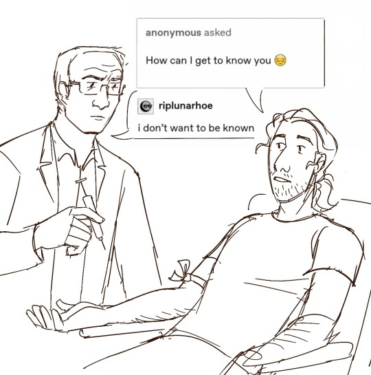


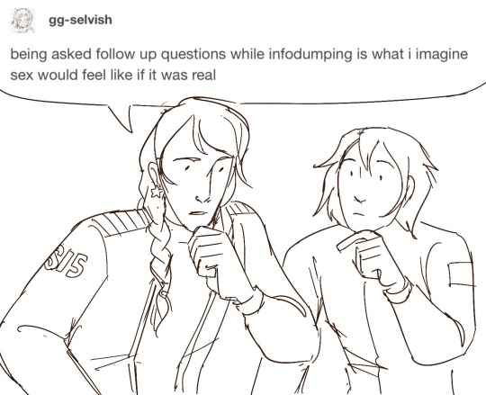
wolf 359 + textposts
#wolf 359#character names are in the alt text#I know hilbert lost his hair when he was younger but maybe it grew back a little bit#torn between the idea of lovelace having a cool jacket vs lovelace wearing a uniform like her crewmates#still working on my cutter design. he doesn’t feel right yet#I would have given maxwell big round glasses but her status as a non glasses wearer is plot relevant#my art
120 notes
·
View notes
Text
SET ELEVEN - ROUND TWO - MATCH ONE
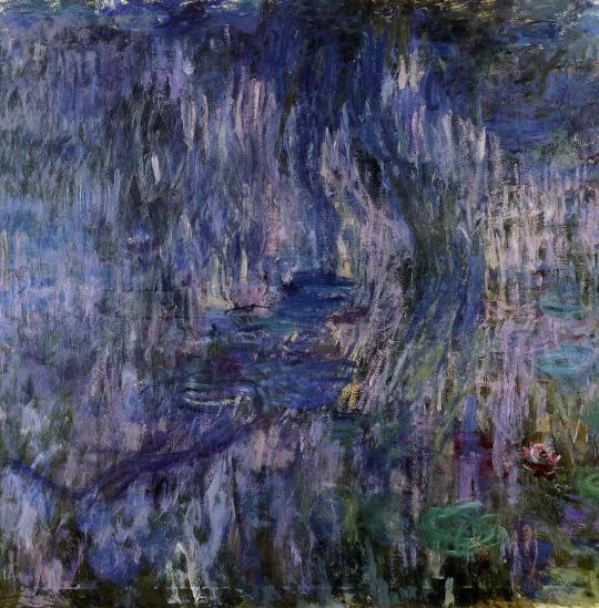

"Water-Lilies, Reflection of a Weeping Willow" (1916–1919 - Claude Monet) / "The Grief of the Pasha" (1882 - Jean-Léon Gérôme)
WATER-LILIES, REFLECTION OF A WEEPING WILLOW: Its just so cool to me bcs it looks so natural yet unnatural at the same time and it’s probably one of my favourite impresionist style paintings? Also what I love about seeing the actual piece is that you can see these bits of unpainted canvas and it makes the painting feel like a portal. I tried to draw it (like I normally do when I see an art piece I really like, especially at museums) and it just dosnt work. It’s amazing and it looks like a fairytale scene despite the fact Monet painted this from his backyard (@azurecake16)
THE GRIEF OF THE PASHA: man just look at it. oh my god the composition, the colours, THE SUBJECT? holy shit. (anonymous)
("Water-Lilies, Reflection of a Weeping Willow" is one of Monet's later water-lily pieces. It is oil on canvas and measures 2 x 2m (6.56 x 6.56 ft), and is held by the Musée Marmottan Monet.
"The Grief of the Pasha" is an oil on canvas painting by Jean-Léon Gérôme, better known here for a slightly different painting. This one measures 36 1/2 x 29 in (92.7 x 73.7 cm), and is held by the Joslyn Art Museum.)
#art that fucks you up tournament#polls#atfyu polls#id in alt text#monet vs the guy who hated monet and all impressionism#i hope submitter does not mind me replacing their picture but i did manage to find a non blurry one
19 notes
·
View notes
Text
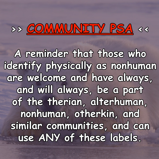


Static image version of a previously posted video. All images are ALT text, but I shall also paste the text here:
COMMUNITY PSA: A reminder that those who identify physically as nonhuman are welcome and have always, and will always, be a part of the therian, alterhuman, nonhuman, otherkin, and similar communities, and can use ANY of these labels.
Whether their reason for identifying this way is spiritual, due to delusions, trauma, mental health, conditions such as lycanthropy or zoanthropy or is similar to the notion of "this is my body, and I am nonhuman, therefore my body is nonhuman" is their business and theirs alone.
People outside of the communities will always find a way to dislike us, and trying to cater to them by putting down other members of these groups will never make them fully accept us. Playing into the "Us vs Them" mindset only pushes the community apart.
All I hear when I see videos and comments from fellow therians, nonhumans, otherkin and alterhumans talking about these identities being ONLY non-physical is, "well, we OBVIOUSLY don't identify physically as animals/etc. We're not like those CRAZY people!"
Which is not only ableist but paints those who do identify physically in a bad light, whatever their reason may be. Delusions and mental illnesses that may cause them does not mean the identity of that individual is fake or wrong. So treat others nicely, even if you may not understand.
Not only that but delusions and the mental illnesses that cause them do not always equate to distressing or bad. Unlearn the idea that such things are an indicator of something being wrong and so has to be fixed because that mindset hurts many who live unbothered lives with them.
All of my accounts will always be safe spaces for those who have physical nonhuman and alterhuman identities. Just as they will be a safe space for those whose identity is non-physical. The only one who can decide what and who you are is yourself.
Stay true to yourself! Ignore, report and block the haters! Your happiness is more important than their ideas of you!
#otherkin#alterhuman#therian#therianthropy#nonhuman#otherkind#otherhearted#creature; the voice#library; open book
637 notes
·
View notes
Text
This is my online accessibility (especially image descriptions) masterpost, which I update periodically whenever I find a new resource or guide. I worry this has the side effect of looking overwhelming in scope, so if you're learning about IDs and/or Tumblr-specific accessibility for the first time, I recommend you start with the first five starred posts. All post titles are clickable links!
*Why and how to write image descriptions
*Accessibility on Tumblr for new users (has templates, also talks about how to tag for flashing lights to accommodate photosensitive folks)
*I see an image and want to describe it: a step by step guide
*Fanart-specific and Tumblr-specific advice for image descriptions
*How to describe screenshots of tags
Why a short ID is always better than no ID
The key word for writing IDs: "Relevancy"
I want to make my posts more accessible, but can’t write IDs myself: a guide
Google Doc full of template descriptions for memes
Online image to text converter
Describing skin tone and describing hair (heads up that the posts themselves are undescribed and were written with fiction writers in mind; potentially still very useful)
How to remember to write descriptions (spoiler: by putting yourself in situations where you see descriptions more often)
Related, a Google doc of described blogs (almost all the blogs linked earlier in this post have tons of described posts and resources too)
(In my opinion, writing IDs is easiest to learn by doing — but especially if combined with watching other people do so. So follow some described blogs!)
Why not to put image descriptions in small fonts/italics (also, some non-definitive thoughts on IDs vs alt text, and why "both" actually makes sense as an answer in many cases)
More on IDs vs alt text from a visually impaired Tumblr user
Alt text vs IDs vs Captions with examples
Brief Intro to Transcripts/Video Descriptions
The People's Accessibility Discord sever (a very friendly community for crowdsourcing image descriptions)
How to make your blog's colors visually accessible - one of the easiest thing on this list!
Other easy things: show love to artists who describe their work, edit descriptions into your original post when someone provides one in the notes, and copy-paste inaccessible (eg, small text or italicized) descriptions as plain text when you reblog!
Lastly, and maybe most importantly, how to continue writing image descriptions while avoiding burnout.
Let me know if any of these links break! I personally don't describe nearly as much audio/video (got those audio processing issues), so this list is sparse on those resources, but if anyone has good guides/blog recommendations for that too, feel free to add on!
586 notes
·
View notes
Text
Another Update on the GMMTV Kissing Multiverse
Hello everyone! Back again with another update on the GMMTV Kissing Multiverse.
The first version is here, second version here.
EDIT: New update is here, the tag for future updates is here.
Rules
Must have visible lip to lip contact
Must be shown on screen in a GMMTV tv series (no kisses from ads, promotional content, etc.)
Breakdown by Show
I have analyzed 61 shows so far:

(full list in alt text)
Breakdown By Actor
I have analyzed 112 actors so far:


(full lists in alt text)
Results and Discussion
Most Kissing Pairs Per Show
The shows with the most different kissing pairs are:
Warp Effect (15 different pairs)
Friendzone (11 different pairs)
U-Prince (9 different pairs)
The Player and The Jungle (7 different pairs each)
Only Friends (5 different pairs)
Not Me and 3 Will Be Free have 4 each, then Mama Gogo, Moonlight Chicken, P.S. I Hate You, Theory of Love, and Three Gentlebros have 3 different kissing pairs each.
The Power of Jojo
As discovered in the first iteration, Jojo has an outsized impact on the number of kissing pairs.
He directed roughly 13% of all the shows analyzed but his shows contain about 33% of kisses present in the data set. Jojo also directed 4 of the top 6 shows with the most different kissing pairs (and 6 of the top 13).
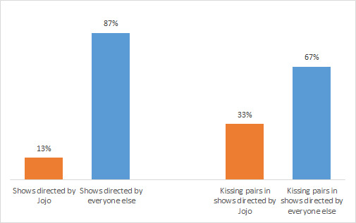
The median number of "different kissing pairs per show" of a Jojo show is 6.0, compared to a median of only 1.8 "different kissing pairs per show" in non-Jojo shows.

(note: I am just looking at kissing pair iterations here not at unique kissing pairs, e.g., Phuwin/Pond are a pair in two shows (once in a Jojo show and once in a non-Jojo show), so they are counted twice.)
Most Kissing Partners
There has been a shift in the rankings... Welcome Joss to the top!

Top ranked are Joss with 10 different kissing partners, then Lee and Namtan with 9 different kissing partners each, then Ohm and Nanon with 7 each.
Next are Gigie and Singto with 6 kissing partners each, then Bright, Film, First, Fluke Pusit, Jan, Krist, Mild, New, and Off with 5 each. Finally, Drake, Fah, Neo, Plustor, Tay, and Win have 4 each.
The average number of kissing partners per actor is 2.3.
Most Kissing Partners in One Show
We have four people tied for "Most Kissing Partners in One Show," and they are from only two different shows. A round of applause for Plustor (4 different kissing partners in Friendzone) and for Fluke Pusit, Gigie, and New (each with 4 different kissing partners in Warp Effect)!
Honorable mentions to: Joss (3 in The Player AND 3 in 3 Will Be Free), Namtan (3 in The Player), Neo (3 in Only Friends), and Singto (3 in Friendzone).
Please note all of these shows are Jojo shows.
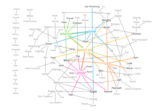
The Kiss Web
Behold... the Kiss Web:
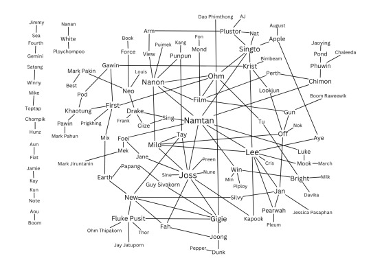
I made this to better visualize the intertwined who-kisses-who situation going on. It's, uh... a lot.
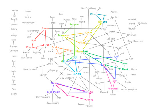
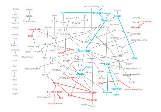
I also made some fun visual breakdowns to help sort through the mess of the Web:
First image below highlights "kissing triangles" and "squares" (shout out to the 3 Will Be Free trio of Joss, Mild, and Tay; the Friendzone trio of Nat, Plustor, and Singto; and the Warp Effect triangle of Fluke Pusit, Gigie, and New and square of Fah, Gigie, Joong, and New, all of which were established over the course of one show each - yes these are all Jojo shows).
The second image highlights the reach of the top 5 kissers.
The third image shows the incredible kissing webs of Warp Effect (in red) and Friendzone (in blue), the two shows with the most kissing pairs.
Unique vs. Repeat Kissing Pairs
The vast majority of kissing pairs only occur once, in one show. There are 136 "unique" kissing pairs in the data set, with 128 (94%) only appearing once, in one show, and 8 (6%) pairs appearing at least twice.
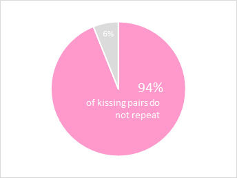
The 8 pairs that appear in more than one show are:
Book/Force (in A Boss and A Babe, Enchante, and Only Friends)
Bright/Win (in 2gether and Still 2gether)
Dunk/Joong (in Hidden Agenda and Star In My Mind)
Earth/Mix (in A Tale of Thousand Stars, Cupid's Last Wish, and Moonlight Chicken)
Film/Gun (in Not Me and Three Gentlebros)
First/Khaotung (in The Eclipse and Only Friends)
Gun/Off (in Not Me and Theory of Love)
Louis/Neo (in The Eclipse and Fish Upon The Sky)
All these pairs, with the exception of Film/Gun, are BL branded pairs, which says something about the variety of the het GMMTV show world and about the structure of the BL system.
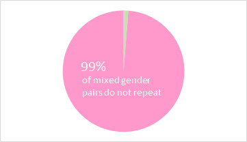
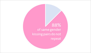
All in all, 99% of mixed gender pairs only appear once, in one show, compared to 88% of same gender pairs.
Same Gender vs. Mixed Gender Kissing Pairs
A change in the data! With all the new kisses we've gotten in, the balance has shifted. Of the 136 "unique" (non-repeated) kissing pairs, 59% are mixed gender pairs and 41% are same gender pairs.
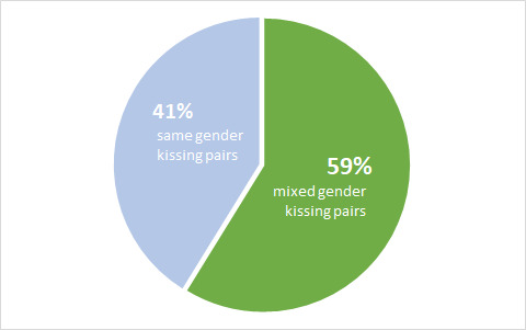
Last time we were at 59% same gender kisses and 41% mixed gender kisses, but our sample includes more het shows now which explains the shift.
I dug into this a little further by looking at how many shows featured both same and mixed gender kissing pairs, and which shows featured only one or the other.
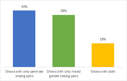
43% of the shows had only same gender kissing pairs, 39% of the shows had only mixed gender kissing pairs, and only 18% of shows featured both. All in all, a fairly even split.
I was curious so I did the math - about 34% of the 112 actors I looked at have only ever kissed someone of the same gender. Of that 34%, roughly 32% have kissed more than one person of the same gender (representing about 11% of the full sample).
And now, some burning questions...
Which of the GMMTV boys has kissed the most guys?
We have a five-way tie for first place: congrats to First, Fluke Pusit, Neo, Plustor, and Singto, with 4 men kissed each!
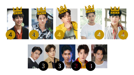
First kissed Gawin (Not Me), Khaotung (The Eclipse and Only Friends), Mix (Moonlight Chicken), and Ohm (The Shipper)
Fluke Pusit kissed Jay Jatuporn (Warp Effect), New (Warp Effect), Ohm Thipakorn (A Boss and A Babe), and Thor (Warp Effect)
Neo kissed Drake (Only Friends), Force (Only Friends), Louis (Fish Upon The Sky and The Eclipse), and Mark Pakin (Only Friends)
Plustor kissed AJ (Friendzone), Arm (Friendzone), Nat (Friendzone), and Singto (Friendzone) [he was very busy in Friendzone]
Singto kissed Krist (SOTUS), Nat (Friendzone), Ohm (HCTM), and Plustor (Friendzone)
Second place is a five-way tie between Earth, Gawin, Khaotung, Krist, and Ohm who have kissed 3 men each!
There are also 13 men who have kissed two men each: Chimon, Dunk, Force, Gun, Mek, Mix, Nat, New, Papang, Pawin, Phuwin, Pod, and Tay.
*Note: while First and Fluke Pusit appear together in The Shipper, and it gets verrrry close, they do not actually kiss.
Where does Only Friends stand so far?
Only Friends itself is at 5 kissing pairs so far, which is higher than average but only 5th place overall among shows. I believe it can claw its way up easily though (it only needs two more kissing pairs to catch 4th places The Jungle and The Player)!
First has had 5 kissing partners so far which means he's only 2 away from reaching the top 5 Kissers (Joss has 10 kissing partners, Lee and Namtan have 9 each, Nanon and Ohm have 7 each). Neo is at 4 kissing partners, so also within reach of the top if he puts some effort in. Khaotung is at 3 partners, so within reach of the upper echelon but maybe more of a stretch. Force and Mark Pakin are at a respectable 2 partners each so far but Book has only had one kissing partner so he is going to need to kiss a lot to make up some ground. Lookjun is at 2 so she has room to move too.
In terms of gay kisses, First and Neo are already at the top of the leader board with 4 men kissed each, while Khaotung sits in respectable second place with 3 men kissed. All three have a strong chance of moving up the standings (Neo is averaging 1 new kissing partner a week so let's see if that continues). Force has kissed two men so he is not far off either. Mark Pakin and Book have only kissed one man each and thus they are far down the leader board for GMMTV men who have kissed men, but I remain optimistic.
Contributing authors:
@airenyah, @alsoran, @alwaysthepessimist, various anons, @bengiyo, @burnsuncomet, @callipigio, @cangse-sanren, @catboykacchan, @catboyjosten, @catsundmaus, @chickenstrangers, @crowie, @dribs-and-drabbles, @ffirstkhao, @isaksbestpillow, @jeonghanurl, @kattahj, @kpinhiding, @lurkingshan, @maibpenrai, @maybeitdontmakesense, @nieves-de-sugui, @non-binarypal7, @sammie-lightwood-bane, @sollucets, @userneos, @theselightsareblinding, @tiistirtipii, @waitmyturtles, @williamrikers
Data visualization consultants: @chickenstrangers, @wen-kexing-apologist
Asked to be tagged: @blmpff
#gmmtv multiverse#kissing multiverse#WHEW lotta data folks#big thank you as always to all those who have contributed!! I'm having a lot of fun putting this together#still accepting contributions but the next update isn't going to be for a while#- I'm going to let The Jungle and Only Friends rack up some more weeks of kisses first#trying something out with the ALT text because otherwise the lists are way too long to copy in verbatim - let me know if it works
267 notes
·
View notes
Text
Helloooo welcome, call me Decade or Impostor or just about anything you want! This blog is for a Ask Goldie Anything au I've been working on ever since I found the now discontinued comic back in 2019!
I have ADHD and multiple other projects, so if I'm quiet for a bit feel free to poke me because I probably just forgot to update the blog. I also have a tendency to over-explain, so if you have trouble with reading long blocks of text then the colored text is there to highlight the important stuff! I believe you can only read the colored text and still understand the post, if I did it correctly. I'm sorry for people that struggle to read with colored text, but uh, I'm sure this paragraph alone shows how much I yap vs how much information is useful - it's kinda necessary. Alt descriptions of images are also available for all of the important posts, usually with some side notes about making said drawing or giving some context.
dms and asks are always open! This au only relies on asks about 30% of the time, but I'll always answer asks 100% of time (◍•ᴗ•◍) that number will change as we get further into the story, mostly the introductory act and the last act is gonna need asks, as well as asks in-between each act to pass in universe time :]
In order to hold myself accountable and actually keep. Working on this thing, as well as to let everyone know I'm not dead, where am I currently in making this au?
Plot: it's been complete for 2 or 3 years and atp im making DLC for it whenever im bored, right now I'm aiming to complete the story with 4 - 6 Acts (・∀・)
Timeline of said plot: it's roughly laid out, and I'm currently working on fixing any plot holes [since originally this au was more like 14-17 segmented scenarios I've stitched together]
The actual comic: I'm currently working on the first comic pages! I'm also working on the cover art for each act, and after the first page is posted I'll work on asks (。•̀ᴗ-)✧
More info below!

What is this au about you may ask, so far I've said nothing about it you say? basically I looked at aga, and then looked at actual FNaF lore with the crying child and Cassidy possessing golden Freddy and decided the more ghosts the merrier. When Evan died, he started possessing Goldie, and gave him the ability to float, teleport, etc. Goldie can also exit the suit and be a ghost at any time, but he tends to stay inside unless he needs to be alone or do something that Evan can't.
If you send me any asks that are non-canon or spoilery, I'll just redirect you to my main account @impostorsshow and answer it there anyway. No asks will go unanswered [like said dlc I mentioned (?・・)σ I might post about said non-canon stuff unprompted since I like my phasmophobia and shadow Bonnie au alot] Also I just like yapping so if you go to #fnaf ranch dip on my main account, you can find some old posts about this au (◠‿・)
Every time I edit this post I try to trim it down and make it less wordy and fail horribly. It'll get better one day. Maybe. Anyway here's some extra stuff <3


Bonnie: why does he always do weird stuff....
#ask goldie anything#ask goldie#fnaf au#fnaf#golden freddy#evan afton#intro post#decade talks#i like colored text it helps considering how long my average post is
21 notes
·
View notes
Text


Sometimes I think about the stark contrast between Ursa’s lines in The Search, “I’m sorry I didn’t love you enough.” VS Azula in the Spirit Temple’s “I’m so proud of you.” Only one of those Ursa’s were real.
Anyway, here’s a text and non text version of this Mommy Issues Emotional Grenade.
[ID in Alt Text]
#azula in the spirit temple#azula fanart#atla azula#azula avatar#princess azula#ursa atla#atla ursa#Fire Lady Ursa#atla comics#atla#atla art#atla fanart#avatar the last airbender#id in alt text
89 notes
·
View notes
Text
Kaleshwi and Varic/Mell are my two favorite “never quite develops into an established romantic relationship” ships. Frankly they might be the only two I even know of but I like them strongly.
Man. If it only weren’t for frequent life-threatening danger and even more frequent quests/responsibilities, these ships could have been together. But that’s what brought them this close to each other in the first place. Augh the very nature of what brought them together denies them from getting closer.
Basically this:

[Image ID from alt text: A graph of potential energy vs distance. The curve reaches the minimum of potential energy at a non-zero distance.]
Longer ID below. [Image ID: A graph of potential energy of a two-atom system versus inter-nuclear distance. There is a minimum of potential energy at a non-zero distance; to either side of the minimum, the energy rises. As distance approaches zero, energy approaches infinity asymptotically; as distance approaches infinity, energy approaches zero asymptotically.
There are several other labels: “repulsion” for the positive energy quadrant, “attraction” for the negative energy quadrant, “equilibrium bond length” for the distance at which energy is a minimum, and “bond energy” for the energy at its minimum. The axes are labeled, and the graph is labeled BYJU’s, the website that displayed the graph.
/End ID]
Image source: BYJU’s, from this webpage specifically: https://byjus.com/chemistry/potential-energy-curve/
5 notes
·
View notes
Text
okay, so to everyone not on freddit, something insane just happened.
basically, last night someone posted a video of an email conversation between themselves and scott cawthon regarding the canonicity/continuity of the Fazbear Frights and Tales from the Pizzaplex books. the mods asked for additional proof, which they did. here is that post.
here's the supposed email between OP and scott. the video quality is shit so i'll provide a transcription:
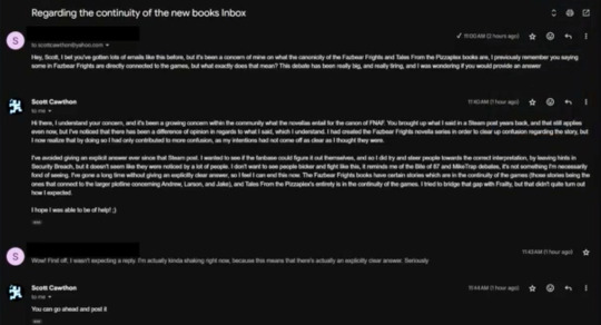
OP: "Hey, Scott, I bet you've gotten lots of emails like his before, but it's been a concern of mine on what the canonicity of the Fazbear Frights and Tales From the Pizzaplex books are. I previously remember you saying some in Fazbear Frights are directly connected to the games, but what exactly does that mean? This debate has been really big, and really tiring, and I was wondering if you would provide an answer"
"Scott": "Hi there, I understand your concern, and its been a growing concern within the community what the novellas entail for the canon of FNAF. You brought up what i said in a Steam post years back, and that still applies even now, but I've noticed that there has been a difference of opinion in regards to what I said, which I understand. I had created the Fazbear Frights novella series in order to clear up confusion regarding the story, but I now realize that by doing so I had only contributed to more confusion, as my intentions had not come off as clear as I thought they were. I've avoided giving an explicit answer ever since that Steam post. I wanted to see if the fanbase could figure it out themselves, and so I did try and steer people towards the correct interpretation, by leaving hints in Security Breach, but it doesn't seem like they were noticed by a lot of people. I don't want to see people bicker and fight like this, it reminds me of the Bite of 87 and MikeTrap debates, it's not something I'm necessarily fond of seeing. I've gone a long time without giving an explicitly cear answer, so I feel I can end this now. The Fazbear Frights books have certain stories which are in the continuity of the games (those stories being the ones that connect to the larger plotline concerning Andrew, Larson, and Jake), and Tales From the Pizzaplex's entirety is in the continuity of the games. I tried to bridge that gap with Frailty, but that didn't quite tum out how I expected. I hope I was able to be of help! :)"
OP: "Wow! First off, I wasn't expecting a reply. I'm actually kinda shaking right now, because this means that there's actually an explicitly clear answer. Seriously"
"Scott": "You can go ahead and post it."
while the additional proof op provided seemed solid, everyone rightfully remained skeptical until scott cawthon appeared to prove or disprove it himself. which he did, this morning.


(transcriptions in alt text)
...which... doesn't really clarify anything.
so now people are arguing over if scott means "the email is fake, but regarding what was said about the books' continuity, that's true" or if he's intentionally being vague by saying "yes" as an answer to a divisive debate, akin to his response to mangle's gender:

so basically, scott returned to confirm that the email was fake, but instead of clearing up the debate, threw a bunch of gasoline on the fire with yet another vague, hard to interpret comment, and dipped.
so the StitchlineGames vs. non-SLGames debate continues, just with even more fire
2 notes
·
View notes
Text
How to Edit Your Website's SEO Without Hiring a Developer
Search engine optimization (SEO) is critical for any website aiming to attract organic traffic and maintain a solid online presence. Yet, many small business owners and website managers often feel that SEO could be more technical to handle independently, leading them to hire developers or SEO specialists. While this can be helpful, outsourcing SEO tasks can be costly, especially for ongoing updates and maintenance.

The good news is that you don't need a developer to manage your website's SEO. Plenty of no-code tools and simple strategies allow you to take control of your SEO, even if you need to be tech-savvy. In this blog, we'll explore how you can edit website SEO without a developer and compare the differences between managing SEO on HTML-based websites and platform-based website builders. You'll gain practical insights on how to make meaningful SEO improvements, all without breaking the bank.
The Financial Costs of Hiring a Developer for SEO
Hiring a developer or SEO specialist to optimize your website can be a valuable investment, but it's essential to understand the costs involved. SEO is not a one-time task—it requires regular updates, optimizations, and monitoring to maintain or improve your site's ranking.
Initial Setup Costs: Developers typically charge for an initial SEO audit, followed by implementing technical fixes, keyword optimizations, and on-page SEO elements like meta tags and alt text. Depending on the website's complexity, this can cost anywhere from a few hundred to several thousand dollars.
Ongoing Maintenance: SEO is an ongoing effort. Regular updates are needed to adapt to changing algorithms, track keyword performance, and refresh content. This means additional costs over time if you rely on a developer for each update.
Opportunity Costs: Beyond the financial cost, outsourcing SEO means waiting for someone else to make changes. This can result in delays, especially if your developer isn't immediately available, potentially impacting your site's search rankings and visibility.
For small business owners on a budget, learning how to edit website SEO without a developer using affordable tools can offer significant savings and greater control.
Managing SEO for HTML-Based Websites vs. Platform-Based Websites
Before diving into specific tools and strategies, it's essential to understand the differences between managing SEO for HTML-based websites and platform-based website builders like Wix, WordPress, or Squarespace.
HTML-Based Websites: These websites require manual updates to the code to make SEO changes. Editing meta tags, titles, alt text, and headers involves working directly with the HTML code, which can be intimidating for non-technical users. However, no-code tools are available that simplify this process, allowing you to make SEO changes without writing any code.
Platform-Based Websites: Website builders like Wix, Squarespace, and WordPress with SEO plugins (like Yoast) offer built-in SEO tools that allow users to make changes without coding. These platforms are generally more beginner-friendly, providing step-by-step guides to optimize your site's content, images, and structure for SEO.
Managing your SEO without a developer is achievable with the right tools for HTML and platform-based websites.
Practical Strategies to Manage Your SEO Without a Developer
Now that we've compared the two main types of websites let's dive into practical strategies for managing your website's SEO independently. Whether you're using an HTML-based site or a platform-based builder, the following steps can help you optimize your site for search engines without needing technical expertise.
1. Optimize Meta Titles and Descriptions
Meta titles and descriptions are key elements of on-page SEO. They help search engines understand the content of your pages and influence how users perceive your site in search results.
How to Do It: You can edit meta titles and descriptions directly through your content management system (CMS) on platform-based websites. For HTML-based sites, no-code tools like MyCrazySimpleCMS provide an easy interface for updating these tags without touching the code.
Why It Matters: Well-optimized titles and descriptions improve click-through rates and help search engines rank your site for relevant keywords.
2. Use Keyword-Rich Headings (H1, H2, H3)
Headings help search engines understand the structure of your content. Optimizing your headings with relevant keywords can boost your SEO.
How to Do It: In a no-code platform like Wix or Squarespace, editing headings is simple—you select the text and choose the appropriate heading tag (H1, H2, etc.). Tools like MyCrazySimpleCMS make this process straightforward for non-technical users on HTML sites.
Why It Matters: Using keyword-rich headings helps search engines index your content correctly, improving your chances of ranking for those keywords.
3. Ensure Your Site is Mobile-Friendly
Search engines prioritize mobile-friendly websites, making it essential that your site looks great and functions well on all devices.
How to Do It: Most platform-based website builders offer responsive templates that adjust automatically for mobile devices. If you're working with an HTML-based site, no-code tools or plugins can help ensure your site is optimized for mobile without requiring manual coding.
Why It Matters: Mobile optimization is a major ranking factor, so ensuring your site is mobile-friendly can improve search rankings and user experience.
4. Optimize Images with Alt Text
Search engines use alt text to understand the content of images. It's also essential for website accessibility.
How to Do It: You can add or edit alt text in the image settings on platform-based sites. For HTML sites, beginner-friendly tools allow you to insert alt text without directly editing the code.
Why It Matters: Optimized images contribute to better SEO and ensure your content is accessible to all users.
5. Use SEO Tools and Analytics to Monitor Performance
Tracking your SEO performance is essential for identifying areas of improvement. Many no-code tools and platforms offer built-in analytics that allow you to monitor your SEO efforts and adjust as needed.
How to Do It: Tools like Google Analytics and Google Search Console are free resources that help you track site performance, keyword rankings, and user behavior. Website builders often have built-in reporting tools, while HTML-based sites can use third-party plugins or integrations.
Why It Matters: Regularly monitoring your site's SEO performance helps you make data-driven decisions and ensures your efforts are paying off.
No-Code Tools to Help You Edit SEO Without a Developer
For small business owners who want to take control of their SEO but need more technical skills, no-code tools are a game-changer. These platforms simplify the SEO process, allowing you to make essential updates without needing a developer.
Wix SEO Wiz: Wix offers a built-in SEO tool that provides personalized recommendations for improving your site's SEO. It's easy to use and ideal for beginners.
Squarespace: Squarespace provides built-in SEO features, including meta tag editing, alt text, and mobile optimization, all from a user-friendly interface.
Yoast SEO for WordPress: If you're using WordPress, the Yoast SEO plugin makes managing SEO straightforward. It provides insights into your content's readability, keyword optimization, and meta tags.
MyCrazySimpleCMS: For HTML-based websites, MyCrazySimpleCMS offers an easy way to edit website SEO without a developer. It provides a simple interface for updating meta tags, alt text, and other essential SEO elements, making it ideal for non-technical users.
Empower Yourself to Manage SEO Independently
Managing your website's SEO doesn't have to be complicated or expensive. Using the right tools and strategies, you can take control of your site's SEO and make the necessary updates without hiring a developer. Whether you're working with an HTML-based website or a platform-based website builder, no-code solutions make it possible to optimize your site for search engines efficiently.
For small business owners looking to edit website SEO without a developer, these tools offer affordable and accessible ways to maintain SEO efforts, improve search rankings, and attract more organic traffic without the need for technical expertise.
0 notes
Text
PrestaShop vs Shopify: Feature Comparison to Help You Decide

Choosing the right eCommerce platform is a critical decision for any business, and PrestaShop and Shopify are two popular options that offer distinct advantages. Whether you're launching a new store or considering migrating from one platform to another, understanding the key differences can help you make an informed decision. In this feature comparison, we'll explore PrestaShop vs. Shopify in terms of usability, customization, scalability, SEO, security, and more, so you can determine which platform best suits your business needs.
1. Ease of Use
Shopify:
Shopify is known for its user-friendly interface, which requires minimal technical skills.
It offers a drag-and-drop store builder, making it easy for users to design and manage their online store.
Shopify’s intuitive dashboard allows you to monitor sales, manage products, and configure settings without coding knowledge.
PrestaShop:
PrestaShop is open-source, which gives users complete control over customization but requires more technical expertise.
While the back-end interface is fairly straightforward, users often need some coding knowledge to fully customize their store or make significant changes.
PrestaShop is ideal for those comfortable with web development or willing to hire a developer.
Verdict:
Shopify is easier for beginners and non-technical users, while PrestaShop offers more flexibility for those with development skills.
2. Customization and Flexibility
Shopify:
Shopify provides a range of pre-built themes that can be customized using its intuitive design editor.
Shopify apps allow for added functionality without the need for custom development.
Shopify restricts full access to the backend code, limiting how much you can modify compared to open-source platforms.
PrestaShop:
As an open-source platform, PrestaShop allows full access to the code, enabling complete customization.
Users can modify everything from the design to the functionality, making it highly flexible.
PrestaShop also offers a wide range of modules (add-ons), but integrating them often requires more technical know-how.
Verdict:
PrestaShop is more customizable but requires technical expertise, while Shopify offers simplicity with some limitations on backend customization.
3. Scalability
Shopify:
Shopify is built for scalability, making it suitable for businesses of all sizes.
Shopify Plus, the enterprise version, supports large-scale operations and high-volume sales.
The platform handles all hosting, server management, and security, ensuring that your store performs well even as it grows.
PrestaShop:
PrestaShop can scale, but as an open-source platform, you’re responsible for managing hosting, security, and performance.
While it’s flexible, scaling a PrestaShop store requires more technical effort and possibly higher hosting costs.
Verdict:
Shopify is better suited for businesses looking for seamless, hassle-free scalability, while PrestaShop offers more flexibility but requires manual management.
4. SEO and Marketing Tools
Shopify:
Shopify offers a range of built-in SEO features, such as customizable meta tags, alt texts, and auto-generated sitemaps.
The platform integrates well with marketing tools like email automation, social media integrations, and Google Analytics.
Shopify’s app store provides a variety of SEO and marketing apps to further optimize your site’s visibility and performance.
PrestaShop:
PrestaShop provides good control over SEO elements, but configuring them requires more manual input.
You can edit meta tags, URLs, and other on-page SEO elements, but you may need to install additional modules for advanced SEO features.
PrestaShop also supports integrations with third-party marketing tools but often requires customization.
Verdict:
Both platforms offer solid SEO and marketing features, but Shopify’s built-in tools and app integrations make it more accessible for non-technical users, while PrestaShop provides more flexibility for custom SEO configurations.
5. Security
Shopify:
Shopify is a hosted platform, meaning it manages security updates, SSL certificates, and PCI compliance for you.
It includes built-in security features like two-factor authentication and fraud detection, ensuring your store is protected.
Shopify handles all the technical aspects of security, giving you peace of mind.
PrestaShop:
PrestaShop’s security depends on your hosting provider and how well you maintain your server.
You are responsible for ensuring your store’s compliance with security standards like PCI DSS and implementing SSL certificates.
While PrestaShop can be secure, it requires more manual effort to keep your store safe from vulnerabilities.
Verdict:
Shopify offers superior built-in security features with minimal effort required, while PrestaShop demands more hands-on management of security.
6. Pricing
Shopify:
Shopify has straightforward pricing plans starting at $29 per month, which includes hosting, security, and support.
Transaction fees apply unless you use Shopify Payments.
Additional costs can arise from premium themes or apps, but these are optional.
PrestaShop:
PrestaShop itself is free to download and use, but you must pay for hosting, security (SSL certificates), and any premium modules or themes.
While it can be cheaper initially, costs can add up as you purchase necessary features or hire developers.
Verdict:
Shopify has predictable pricing with everything included, while PrestaShop can be more affordable but has hidden costs for hosting, development, and modules.
7. Support
Shopify:
Shopify provides 24/7 customer support via phone, email, and live chat.
Extensive documentation, tutorials, and community forums are available to help with troubleshooting.
PrestaShop:
PrestaShop has a large community forum and documentation, but direct support is not free.
You may need to purchase support packages or rely on third-party developers for assistance.
Verdict:
Shopify offers more comprehensive and easily accessible support compared to PrestaShop’s paid options.
Conclusion:
Choosing between PrestaShop and Shopify depends on your business needs. If you prefer a platform that’s easy to use, scalable, and secure without needing technical expertise, Shopify is an excellent choice. However, if you’re tech-savvy or have a development team and want complete control over customization, PrestaShop may be better suited to your needs.
Know the cost consideration sap commerce cloud !!
0 notes
Text
Choosing the Right Platform for Website Development: Webflow vs. WordPress
Introduction
Choosing the right platform is crucial when it comes to website development. With so many options available, Webflow and WordPress have emerged as two leading contenders. Both offer unique advantages that cater to different user needs. In this blog, we’ll dive into a comparison between Webflow and WordPress, helping you decide which platform best fits your requirements.
Why Website Development Matters
A professionally built website plays a pivotal role in any business or personal brand’s online success. It can improve user experience, boost search engine rankings (SEO), build brand credibility, and ultimately increase conversions. Choosing the right platform is vital to ensure that your website is responsive, user-friendly, and scalable.
Overview of Webflow
What is Webflow?
Webflow is a no-code website builder and content management system (CMS) that empowers users to create custom, responsive websites using a visual interface. It allows designers and developers to build complex websites without writing code.
Key Features of Webflow:
Visual Drag-and-Drop Interface: Easily design websites with Webflow’s visual editor.
Responsive Design Capabilities: Create websites that look great on any device.
Integrated Hosting: Webflow offers built-in hosting options, simplifying site management.
Advanced Design Customization and Animations: Add complex interactions and animations without code.
Built-in SEO Tools: Optimize your website directly from the platform with integrated SEO settings.
Who Should Use Webflow?
Webflow is ideal for designers who prefer creative freedom without relying on code. It’s perfect for businesses and professionals looking for a quick and visually engaging solution to build and launch websites.
Overview of WordPress
What is WordPress?
WordPress is a popular open-source CMS that powers over 40% of all websites. It’s highly flexible and supports a wide range of websites, from blogs and portfolios to e-commerce stores.
Key Features of WordPress:
Extensive Plugin Ecosystem: Access thousands of plugins to enhance functionality.
Customizable Themes: Choose from thousands of themes or create your own.
SEO Plugins (like Yoast SEO): Optimize your website’s SEO with powerful plugins.
Flexibility for Various Websites: Suitable for blogs, online stores, business sites, and more.
Support for Developers and Non-Developers: While it caters to beginners, it also provides full control to developers.
Who Should Use WordPress?
WordPress is suitable for businesses, bloggers, and individuals who need a scalable and customizable platform. It’s particularly useful for users who require extensive functionality, such as e-commerce, membership sites, or custom solutions.
Webflow vs. WordPress: Key Comparisons
Ease of Use
Webflow: Features a drag-and-drop editor but has a steeper learning curve, especially for beginners.
WordPress: Offers a user-friendly dashboard, but complexity increases when using plugins and custom themes.
Customization and Design Flexibility
Webflow: Provides pixel-perfect control over design with advanced customization and animations.
WordPress: Highly customizable with themes and plugins, though extensive changes may require coding.
SEO Capabilities
Webflow: Includes built-in SEO tools with control over meta tags, alt texts, and schema markup.
WordPress: Relies on powerful plugins like Yoast and All in One SEO Pack for advanced SEO options.
Cost Consideration
Webflow: Subscription-based pricing includes hosting; costs vary depending on plan and features.
WordPress: Costs depend on domain, hosting, premium themes, and plugins, allowing for more flexibility but potentially higher long-term expenses.
Scalability and Performance
Webflow: Best suited for small to medium-sized sites with straightforward functionality.
WordPress: Highly scalable, supporting large, complex sites with extensive functionality.
Community and Support
Webflow: Growing community with resources like tutorials, a knowledge base, and customer support.
WordPress: Large global community with extensive documentation, forums, and developer support.
When to Choose Webflow Over WordPress
For designers focused on creative freedom and custom design without coding.
For projects requiring quick development with integrated hosting.
For businesses looking for a no-fuss, all-in-one platform for design, development, and hosting.
When to Choose WordPress Over Webflow
For large-scale websites needing advanced functionality like e-commerce, memberships, or custom development.
For businesses that require extensive integrations with third-party tools and plugins.
For users comfortable with managing hosting, themes, and plugins or willing to hire developers for complex needs.
Conclusion
Both Webflow and WordPress offer unique benefits depending on your website’s needs. Webflow excels in design flexibility and ease of use for creatives, while WordPress remains unbeatable in scalability, customization, and extensive plugin support. Ultimately, the choice between the two depends on your project’s goals, budget, and technical expertise.
In the end, selecting the right platform can make all the difference in building a website that not only looks great but also drives results for your business.
This blog should help readers understand the strengths of each platform and guide them in making an informed decision.
#ecommerce development company#web development#custom web development#shopify developers#digital marketing#hire shopify developers
0 notes
Text
THUG Pro v0.7.0.0
Fixes:
Fixed Shipyard crashing in net games
Fixed game crashing when throwing projectiles
Fixed "Couldn't find Data\sounds\.snd" log spam
Fixed skater electric shock light bug
Fixed XInput assertion at startup
Fixed The Ruins teleport messages
Fixed The Ruins crash due to missing files
Fixed Skate Ranch crash due to missing files
Fixed Oil Rig (THPS3) cutscene skater freeze timing
Fixed Slam City Jam floating restart node
Fixed San Fransisco pier crash
Fixed empty level options menu in certain levels
Additions:
Added remaining THAW levels
Added balance meter indicators
Added separate trick string for Walking Wallplant
Added Natas trick variations from THAW
Added lip trick toggle option
Added option to disable pressure stance toggle
Added Bonk panel message
Added Wallride bounce (WRB) panel message
Restored THUG1 trick spin logic – for steezy misty flips
Added Kenny from THPS4 as a selectable skater
Added Alcatraz park editor theme
Added ped/pro skater voices to cas options
UI Updates:
Added new high resolution fonts
Updated menu user interface
Misc:
Improved Skate Ranch televator script
Restored the New Jeresy helicopter
Always allow elbowpads and kneepads in CAS – because REAL improv players don't care about clipping geometry!
Allow wheel texture for xray board
Known Issues:
Cries about THUG1 spin slack
Duration of the "Barrel Roll" trick
Observer lobby title text size
New fonts missing special symbols: • Diacritics • CTF flags
MBP/Air manual hides balanace meter
Boostplant panel message option non-functional
Crashing on shutdown/alt-tab with fullscreeen and screen-effects enabled
Updater:
When updating or installing, if you encounter any of the following error messages: • "A file failed to download" • "There was a problem updating THUG Pro. Error downloading updt.dll"
Please note, your antivirus software may incorrectly detect "updt.dll" as "Gen:Variant.Adware.Lazy.829". Rest assured, this is a false positive.
Redistributables:
When running the game, if you encounter the message: • "The specified module could not be found"
It's possible you are missing certain redistributables. Ensure you have the following installed: • Microsoft Visual C++ Redistributable for Visual Studio 2017 – https://aka.ms/vs/17/release/vc_redist.x86.exe • Microsoft .NET Framework 4.6 – https://dotnet.microsoft.com/en-us/download/dotnet-framework/thank-you/net46-web-installer
0 notes
Text
I happen to be currently fixated on both of these characters and care about them deeply so this is an exciting discussion for me! Both are niche, in some way "punk", and through time and constant adaptation- popular perception of both have sandpapered their more political origins. However! In terms of a narrative fall from grace, John Constantine suffered a bigger downgrade. And here's why! (just my opinion pls be chill) Let's talk about punk aesthetics vs politics, and the legacy of these characters. More context in the ALT text of the following panels.


A lot of people's attachment to classic Conner Superboy is his aesthetic and personality. He's not actually punk or queer coded. His design was a 90s stereotype of what the artists thought was "cool" at the time. Conner's origin and solo series are exhaustively straight. His character is the embodiment of child celebrity and the capitalism machine that churns out his tourism as he gentrifies Hawai'i so he can stay with his adult woman girlfriend. Classic Conner is the definition of All Style and No Substance- None of his narrative upholds punk ideals of being anti-consumerist, anti-corporatism, anti-authority anti-imperialism, anti-gentrification, anti-racism, gender equality, anti-selling out, etc. DC did not invest in him as a Superman legacy character, and it would be something future writers end up struggling with when it comes to revitalizing his character.

Sure people hate his black shirt era because the superficially punk swag is gone, and Conner's personality is a lot less fun, but narratively? Him being the son of Lex and Clark is far more thematically rich and objectively an improvement compared to "constantly being hit on and assaulted by adult women and gentrifying Hawai'i for tourism" era. His Young Justice animated take, while popular for its time and out of character, did very little to affect his comic version (his black shirt design preceded the tv show) aside from Supermartian appearing in one recent comic. During his black shirt/Smallville era in the comics, Conner doesn't share the same angsty-angry characterization of the tv show. I think people just see the black shirt and assume its 1 to 1 with YJa. Conner, as of writing, has his punk swag back. And yet he's struggling as a legacy character because his foundation came from the 90s Anything Goes Era. He's fundamentally flawed from the get go, but as for a fall from grace- boring is better than the constant pedophilia jumpscare that was his 90s run.

John Constantine on the other hand, is an actual politically punk character. Sure, he isn't wearing a punk outfit (after his youth), but his opinions and history are inherently counter-culture. This is a canonically queer character existing during the height of the AIDS epidemic, surrounding and allying himself with the queer community, has been brutalized by cops and hate groups, explicitly believes ACAB, hates the rich and royalty, and so forth. John is an actual queer coded character (both narratively and with the gay earring that has been tragically removed), even before his very early queer canonization. The old Vertigo comics were far from perfect and have definitely showed their age in many ways, but for its time it did not shy away from getting political.
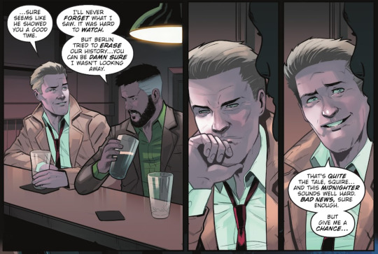
Constantine's popularity came to such a point that he's eventually adapted into DC- and while this is established to be a younger, different Constantine, you can't help but mourn the Vertigo Constantine that once was. Constantine is a staple example of mainstream capitalism sandpapering off an inherently counter culture character. John's non-conformity is chiseled away, his once political bi identity is now absorbed into the respectable rainbow capitalism machine that is the DC Pride Anthologies or he's the butt of bi and shark boyfriend jokes, he has several series and adaptations where he works with and even hits on Batman (the rich Prince of Gotham that, depending on the version, works with cops,,,oy), he's re-imagined as a ken-doll pretty boy punk in his YA graphic novel, the list goes on.
Much like Superboy getting his punk look back, Constantine has a pretty good run currently (Spurrier's Hellblazer & Dead In America run) that feels in many ways like a return to form (granted Constantine is a character with much stronger foundations compared to Conner, so a good run was only a matter of time). However, the perception of Constantine's character in general suffered a larger fall from narrative grace because Constantine started off as such a politically radical character. Tragically, even in ways some of the current run doesn't quite match up with.


This is 2024, please don't be out-classed by something written in the 90s.
[I'll hold back from being too critical of Spurrier's run since, as of writing, the series is ongoing. But the portrayal of disability, and treatment of Noah Ikumelo's Blackness in the run leaves a lot to be desired.]
To conclude, Conner's downgrade is largely visual and aesthetic. Meanwhile John Constantine's downgrade is emblematic of a radically punk character thrown into the bigger DC capitalism machine, coming out the other end a shadow of his former self.
CONNER KENT vs JOHN CONSTANTINE
DC Downgrade Bracket Round 2 - Match 7
🤢Conner Kent/Kon-El (Superboy)🤢
From Young Justice to Teen Titans. They took his jacket, his gay earring, his vaguely queer swag - what does he have left??? Geoff Johns if I catch you I swear
🤢John Constantine🤢


Why is he a playboy. Why is he a government employee. Why does he look like that. They took his earring and they took his vibe and now he looks like that.
*Worse meaning more devastating of a downgrade
#ramblings#media criticism#jesncin dc meta#I haven't read every single comic of both of these characters but felt the need to share my thotz#since they're 2 interesting characters to compare and contrast
115 notes
·
View notes
Text
Week 6 Dancing Girl - 2
Keywords: Layer mask, type tool, shape tool, layer opacity vs. fill
Layer Mask
layer mask in a non-disruptive way to conceal some pixels on one layer/group.
You can create a layer mask by clicking the mask icon at the bottom of the layer panel -> a circle in a square
Add a mask that shows or hides the entire layer?
Click the New Layer Mask button in the Layers panel to create a mask that reveals the selection. Alt-click (Win) or Option-click (Mac) the Add Layer Mask button in the Layers panel to create a mask that hides the selection. Choose Layer > Layer Mask > Reveal Selection or Hide Selection.
Add a layer mask that hides part of a layer?
In the Layers panel, select the layer or group. Select the area in the image, and do one of the following: Click the New Layer Mask button in the Layers panel to create a mask that reveals the selection. Alt-click (Win) or Option-click (Mac) the Add Layer Mask button in the Layers panel to create a mask that hides the selection. Choose Layer > Layer Mask > Reveal Selection or Hide Selection.
To directly edit layer transparency, do the following and create a mask
In the Layers panel, select the layer. Choose Layer > Layer Mask > From Transparency.
Photoshop converts transparency into an opaque color, hidden by the newly created mask. The opaque color varies greatly, depending upon the filters and other processing previously applied to the layer. This technique is helpful for video and 3D workflows.
Apply a layer mask from another layer
To move the mask to another layer, drag the mask to the other layer. To duplicate the mask, Alt-drag (Win) or Option-drag (Mac) the mask to the other layer.
we'll use the second method to hide some parts of the color stripe. Lowering the transparency of the color stripe layer will help you identify the edges.
We need to hide the girl's right foot. Use the pen tool to select the right foot.


Pen tool
Ctrl + enter
Cmd + return

Now, we've done the swoosh thing. We can move on to add some text to our design.
Type Tool
Choose the Type Tool with a "T" icon. Click to create a point type
Type in "DANCE" in uppercase and choose a font
Edit the font size and weight.
Create another point type and type in "FOR THE NIGHT" in uppercase and a smaller font size.
Increase letter space for "for the night"
---------------How to increase letter space?
select all the text, hold Alt (Win) Opt (Mac) and hit -> arrow
Move them to the top left conner.
Shape Tool
Different from all the other layers we've dealt before, the Shape Tool creates vector Path instead of Raster elements composed of pixels.
Once we have a shape, or to put it in another way, a path, to edit like pixel layers, we need to right click on the path layer and rasterize it.
The shape tool is actually a tool group. By default, the icon is the rectangle.
You can change the fill and stroke styles from the control panel on top of your screen.
Now, you can add a box for your title "DANCE".
Layer Opacity vs. Fill?
When you look at your layer panel, you'll notice that you have two options to lower down the transparency of your layer: Opacity and Fill.
-----------------What is the difference?
Opacity will control the opacity of both the layer and layer effects.
Fill will control the opacity of the layer, but not layer effects.
Let's add a light strip to practice.
Create a long rectangle, double click on the layer tab area to add a outlow effect.
Change the perimeters to make the light strip look natural.
Lower down the fill to 0, and now you'll have something similar to my sample.
0 notes
Text

Signatures Within A Table: Two Ways To Go...
As you know, if you have worked within a law firm you have two ways to go about putting together your signatures. Using the borders of Tables vs. using the usual signature set up which I will go over.
1. One way is to use the borders of a table to create your signature lines. First, take off all the borders of your table. Select the entire table. You can then remove the borders easily with “Control Alt U”. If using the borders of the table, you will need to make use of a buffer column (a 1 character width column), between the two side by side signatures.
If you don't, the two side by side separate signatures will appear as one long signature line. Now you can selectively put back the borders that will serve as your signature lines with the use of the “Border Painter” that you will find under Table Tools under the Design Tab.
2. The traditional Signature within a table does not make use of the table borders and therefore, no buffer column is necessary. Below is the routine to put the non buffer column signature type together. Start out by putting this in the top right cell of your two column table.
By: Control Tab, Soft Return
Name: Soft Return
Title: Hard Return
Whatever column of the table you are using, we place a Right Tab in the ruler and assign a solid line leader to the Tab to create the signature line. Name and Title go under the signature as "Hanging Text". Note: In order to tab within a table cell, you MUST use "Control Tab". Regular tab will just hop you from one cell to another.
One more Note: When tugging the Name and Title under the Signature Line, the Signature Line will often (not always) collapse. This has been going on since MS Word 97. Simply take your cursor back up to your Signature Line and use Control Tab to open the Signature Line back up. No big deal. :)
3. Finally, you must have a Hard Return after the word "Title" so that if you copy the Signature to another cell, it will not collapse. The Return after the word "Title" holds the formatting info and allows you to copy the signature anywhere in the Table once you get the signature looking good!
Basic-Advanced MS Office 2007-365 Training From An Inside Perspective
www.advanceto.com
www.awalkinthecenter.com
Test Prep and Placement Assistance
www.legaltestready.com
Teacher Connected Books and Video
Email:
Hey Students! AdvanceTo Offers a great “Back To Basics” class. This hands on 4.5 hour class is packed with great information. Narrative material and homework included. The cost is $175.00. Students receive a discount for the purchase of 2 or more classes. All groups receive discounts.
Learn Styling!
AdvanceTo offers basic styling classes in MS Office
Learn styles in Word, Outlook, or Excel
Use advanced functions and office automation techniques
Find out how law firms, financial institutions, and corporations create documentation
Topics include: styles, settings, letters, views, style area pane, quick access tools, signature types, sections, page numbering, and much more!
Includes after-class coaching, homework, and follow-up
Learn advanced topics comfortably with live experienced instructors
No fluff, diversion or unhelpful material. Pure info that you can make use of right away! The methods we teach are those same methods used in top-tier Legal and Corporate firms.
0 notes