#terje ekstrom
Explore tagged Tumblr posts
Text

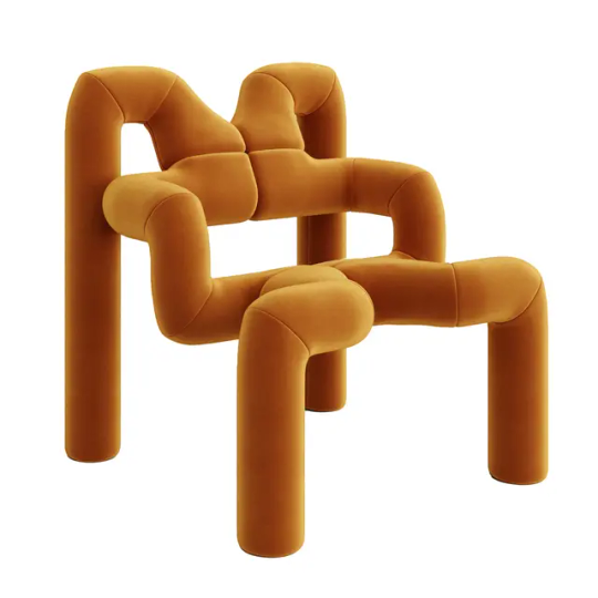


"Ekstrem" by Terje Ekstrøm, 1984,
Ekstrem™ is not merely a chair, but rather a stand-alone object. It represents one of Norway’s first postmodern designs. The chair’s playful and unapologetic appearance is adorned by design enthusiasts and children alike.
Designed with ergonomic intention, Ekstrem™ is a functional sculpture with a soft and inviting surface which offers comfort and support.
Ekstrem™ is an open framework constructed of fabric-covered foam over a steel frame. The chair consists of two identical mirror-facing steel frames which are covered by polyurethane foam. This provides a soft support layer covering all surfaces of the chair.
The upholstery fabric is then manually fitted to the intricate cylinder forms. Finally, the two parts are carefully assembled together resulting in an extraordinarily eye-catching piece of furniture.
W 72 cm x D 70 cm x H 79 cm. Seat height 43 cm
#art#design#sculpture#furniture#seat#chair#minimal#abstract#forms#ekstrem#foam#steel#terje ekstrom#1980s#fun#iconic
19 notes
·
View notes
Photo


Ekstrem Chair designed by Terje Ekstrom for Stokke 1972
Terje Ekstrom was a Norwegian industrial designer and pioneer of Norwegian postmodernism. His Ekstrem chair was designed in 1972 and produced in the 1980′s for Stokke. It was used in the Voyager episode, “Caretaker,” on the Ocampa home world.
Source: Ex Astris Scientia
6 notes
·
View notes
Text

#interior design#interiors#modern design#bedroom#bedding#zen#luxury apartments#apartment#room design#room#ekstrem lounge chair#terje ekstrom#bold side table#destroyers#alvar alto#altek#diana zibrova#zakhar zibrov#architect#architecture#@z.river.studio
15 notes
·
View notes
Photo

Ekstrem Chair, Terje Ekstrom, Norway, 2010s
4 notes
·
View notes
Text
Sources:
1- 3D projects by Barcelona-based artist, Andres Reisinger.
2- chair from Transforming the White Cube by Erika Emerén.
3- 1972 Ekstrem chair, designed by Terje Ekstrom.
4- https://www.1stdibs.com/amp/furniture/seating/settees/
5- I couldnt find the source ☹️
6-https://www.are.na/block/2080205
7- I couldnt find the source ☹️
8- by Humberto and Fernando Campana
9- https://stylink.nl/interieur/febrik-wint-eigenhuis-interieur-pin-2016
(If anyone knows the source of the ones that I’m missing please tell me so I can add them!)
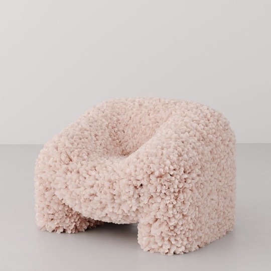
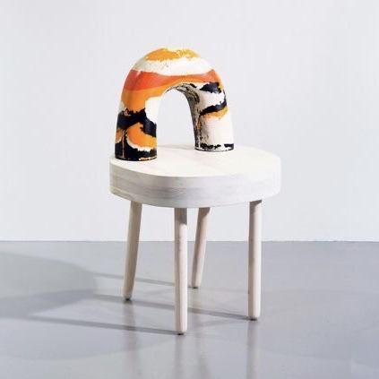
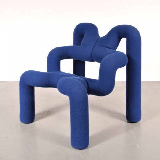
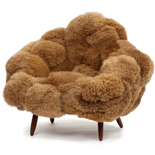
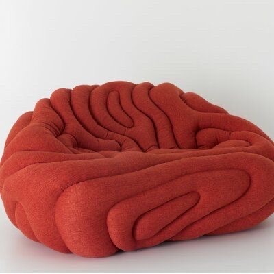
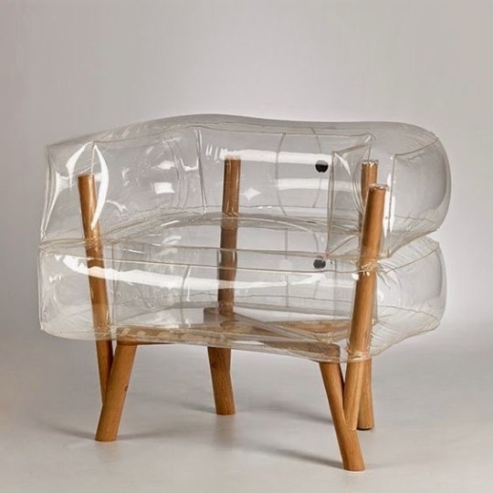
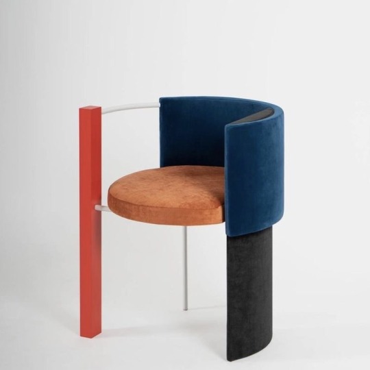
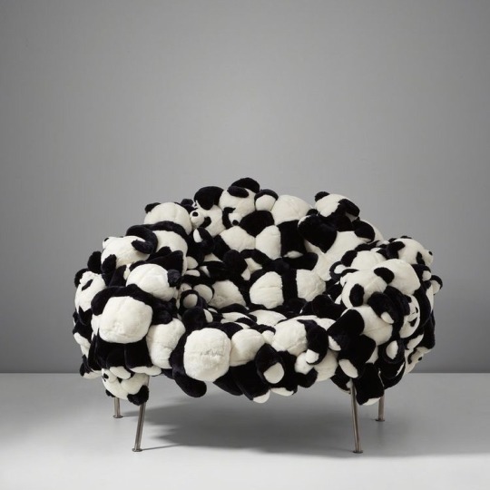
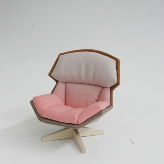
Chairs. A random chair moodboard because I want all of these in my house.
23K notes
·
View notes
Text

Terje Ekstrom
Pair of “Ekstrem” chairs
designed 1972
Fabric, polyurethane foam. Manufactured by Hjellegjerde Møbler, Norway (2).
Each: 31 in. (78.7 cm) high.
1 note
·
View note
Photo

Terje Ekstrom | Norway | Furniture Design via @form.spraket
106 notes
·
View notes
Photo

Stuhl Ekstrem by Terje Ekstrom
Marco likes to watch
7 notes
·
View notes
Text
K916 and K907 are a pair of pared-back holiday apartments in Warsaw
https://static.dezeen.com/uploads/2020/05/k916-apartment-interiors-thisispaper-a-place-warsaw_dezeen_sq-1-852x852.jpg
Boxy timber volumes tuck away the beds and bathrooms of these minimal holiday apartments designed by Thisispaper Studio, which lie at the heart of the Polish capital.
The two flats – named K916 and K907 – are set within an old print warehouse in Warsaw’s Praga district that was originally built in 1903, but has since been converted for residential use.
They come as part of Thisispaper Studio‘s A-Place hospitality concept, which launched back in 2018 with the opening of a rentable holiday apartment in a former vodka distillery nearby.
K916 and K907 have both been finished with sparse interiors, reflecting the minimalist aesthetic that the studio says is “in the core” of its design process.
“We always have a desire to bring about a sort of quietness – I’m afraid that human species are overloaded with information, events and visual distractions,” the studio’s co-founder, Zuzanna Gasior, told Dezeen.
“What we miss during everyday travels is a peaceful moment to unwind, relax or simply pause for a while. Therefore we decided to go for an ultra-minimal look.”
A boxy volume made from slats of pine plywood is one of the few fixtures to appear in K916.
“[Wood] warms up the interior,” explained Gasior. “The existing structure of the concrete ceiling and flooring made an autonomous and raw character, so in order to bring balance we use more familiar human materials.”
The box was purposefully designed to sit just below the ceiling, drawing attention to the lofty dimensions of the apartment.
Inside, it accommodates a bathroom with a large mirror vanity cabinet and a sink basin that runs the full length of the wall.
The top of the volume has been made into a mezzanine level bedroom, accessed by a short flight of steps also crafted from pine plywood.
Guests can alternatively sleep on the pull-out bed that extends from the bottom of the staircase.
On the idea side of the rooms lies a kitchenette, complete with mauve-coloured cupboards.
A handful of furnishings have been dotted throughout, including an armchair by Norwegian designer Terje Ekstromfor with a wobbly tubular frame, and geometric dining seats by Hayo Gebauer.
Circular brass sconces have also been mounted on the walls, while shiny chrome pendant lamps dangle from above.
The K907 apartment is similarly dominated by a box-shaped volume, but this is instead made from plain panels of pine plywood.
It also has a square-cut out that peeks through to the mezzanine bedroom, while below there are wash facilities and an in-built kitchen suite.
A towering gridded shelf features in the adjacent living room, which displays various black ceramic ornaments.
The space is otherwise dressed with a woven rug, chunky coffee table by Philippe Malouin and a dark-grey sofa by local designer Maja Ganszyniec, which appears to be split in half.
“These are objects which we desire to constantly look at, we highly appreciate their form and how they function,” added Gasior.
Thisispaper Studio was established in 2011 by Zuzanna Gasior and Alexander Zakharov. Back in 2016, the studio converted a Soviet-era dental clinic in Warsaw into its own design store where it sold an array of books, Japanese tea and lifestyle products.
Its interior featured resin flooring, birch plywood furnishings and a floor-to-ceiling shelving unit composed of stacked hollow boxes.
Photography is by Maja Wirkus.
The post K916 and K907 are a pair of pared-back holiday apartments in Warsaw appeared first on Dezeen.
Source link
from http://www.houseoffashion.co.za/k916-and-k907-are-a-pair-of-pared-back-holiday-apartments-in-warsaw/
0 notes
Text
What’s the Least Material You Can Use for a Lamp, Bench or Chair?
We have to acknowledge the apparent contradiction that being a part of Milan Design Week entails — after all, the act of participation in itself contributes to increased production
JOIN by Norwegian Presence opens with the question of whether, for all the sustainable concepts that designers tout through their products, exhibiting in Milan is overall just detrimental to the environment and produces more waste. Their answer: “We believe in the power of this platform to build awareness and influence the industry…there is no better in the world to make our case.”
This culminated in JOIN, a self-reflective exhibit of objects curated by Oslo-based creative studio Kråkvik & D’Orazio. With sustainability at the forefront, the curators—Italian-born Alessandro D’Orazio and Oslo native Jannicke Kråkvik—united 21 designers and seven furniture manufacturers to contribute products that further their vision of a shared, sustainable future.
In selecting for sustainability, Kråkvik said, “The items we have chosen must give something in return through longevity, decomposability or through the way in which they are produced.”
“We have also considered aesthetics in combination with commercial value. Unique objects are juxtaposed with products we believe can compete in an international market,” D’Orazio continued.
Here are some highlights:
Slurp Bench by Henrik Oedegaard—An exploration of how much matter is required, and how much we can actually leave out, Odegaard made a pine bench lacquered in blue, with holes indicating the knots and weaknesses in the raw material.
Spenn by Noidoi—A table lamp with form-pressed oak veneer and brass, captures the tension between a down facing light and arc. The design brings the amount of material in a lamp to a minimum and cuts a clean image similar to that of a bow.
Strand by Vera and Kyte—The Bergen-based design studio created deep green baskets in anodized aluminum to give shape and color to a storage unit.
The Half Moon Table by Tron Meyer—Made in stainless steel and neon acrylic, the folded table uses the visible surface of polished steel to mirror itself.
Cyclop by Tron Meyer—The collection consists of a table in anodized aluminum and a set of chairs in anodized aluminum and larvikite (a feldspar found in the Fjord region in Norway) with a Dinesen Douglas finish. The legs’ rectangular surfaces have circular holes that mirror the shape of the chair seat. These legs have a simple locking mechanism to reduce weight and produce the shape of an eye or “Cyclop.”
Balans and Ekstrem by Varier—Varier, the furniture brand inspired by movement, crafts pieces that invent new ways of sitting and give you freedom to move. They presented their Balans chair by Peter Opsvik and Ekstrem by Terje Ekstrom.
Local by Martin Høgh Olsen—Small powder coated and sandblasted aluminum tables with tops in 3 colors: blue larvikite, oiled walnut and natural oak. They can be used as side tables or stacked as storage modules.
Reflecting on how JOIN speaks to the state of Norwegian design, Kråkvik said:
[Norwegian contemporary design is] at a very high level. Norway doesn’t have the same design traditions as the other Scandinavian countries, and Norwegian designers are generally very free in their approach. This playfulness shines through in this selection. Also, there are a lot of new names this year, which is always fun to see.
via http://design-milk.com/
from WordPress https://connorrenwickblog.wordpress.com/2019/05/02/whats-the-least-material-you-can-use-for-a-lamp-bench-or-chair/
0 notes
Photo

New Post has been published on http://www.lifehacker.guru/12-of-the-most-incredible-royal-wedding-cakes-of-all-time/
12 of the most incredible royal wedding cakes of all time
We Summary:
Royal wedding cakes have been enormous over the years, with multiple layers weighing hundreds of pounds.
At the wedding, the first piece is often cut with a ceremonial sword.
Here are 12 incredible wedding cakes from royal weddings around the world.
Royal weddings are extravagant affairs— Prince Harry and Meghan Markle’s nuptialsare expected to cost $45 million— and the cakes are no exception. Baked by hardworking teams of the finest chefs, they’re often made of multiple layers weighing hundreds of pounds, decorated with intricate flowers and delicate swirls of icing, and displayed on artful stands.
We’ve already looked at how gorgeous royal wedding dresses look around the world. Now, here are 12 of the most incredible royal wedding cakes.
View As: One Page Slides
Royals definitely don’t skimp on any aspect of their weddings — including the cakes.
Prince Charles and Princess Diana’s wedding cake.
AP
Prince Charles and Princess Diana’s wedding cake, which was five feet tall and weighed 225 pounds, on July 29, 1981.
Queen Elizabeth II and Prince Phillip’s wedding cake in 1947 weighed 500 pounds, stood at nine feet tall, and took two weeks to make.
Queen Elizabeth and Prince Phillip’s wedding cake.
AP Photo
Two London constables stand guard over the official wedding cake of Queen Elizabeth II and Prince Phillip, Nov. 16, 1947.
Prince William and Kate Middleton’s cake was a little more understated, but no less intricate.
Prince William and Kate Middleton’s wedding cake.
John Stillwell/Pool/Reuters
Fiona Cairns poses for a photograph with the wedding cake she and her team made for Prince William and his wife Catherine, the Duchess of Cambridge, April 29, 2011.
Prince Joel Dawit Makonnen Haile Selassie and Princess Ariana’s Ethiopian royal wedding featured a cake with six layers.
Prince Joel Dawit Makonnen Haile Selassie and Princess Ariana Makonnen of Ethiopia’s wedding cake.
Dotun Ayodeji
Prince Joel Dawit Makonnen Haile Selassie and Princess Ariana Makonnen of Ethiopia kiss as they enjoy a slice of wedding cake on September 9, 2017.
Crown Prince Haakon and Crown Princess Mette-Marit of Norway had a seven-layer wedding cake.
Crown Prince Haakon of Norway and Crown Princess Mette-Marit’s wedding cake.
Scanpix/Pool/Terje Bendiksby/Reuters
Crown Prince Haakon of Norway and his new wife Crown Princess Mette-Marit cut their seven-layer wedding cake during their wedding reception at the Royal Castle in Oslo August 25, 2001.
Prince Albert II and Princess Charlene of Monaco’s cake was topped with a cornucopia, flowers, and an explosion of stars.
Prince Albert II and Princess Charlene of Monaco’s wedding cake.
Eric Mathon/Palais Princier/Getty Images
Prince Albert II and Princess Charlene of Monaco cut the cake during the religious ceremony of the royal wedding, in the main courtyard at Prince’s Palace on July 2, 2011 in Monaco.
Royals also really like cutting their wedding cakes with swords.
Crown Prince Hamzeh bin Hussein and Princess Noor of Jordan’s wedding cake.
Stringer/Reuters
Jordan’s Crown Prince Hamzeh bin Hussein and his bride Princess Noor cut their wedding cake at a gala dinner in the Red Sea port of Aqaba late May 28, 2004.
It definitely adds a certain flair.
Dutch Crown Prince Willem-Alexander and Princess Maxima’s wedding cake.
Joroen van der Meyden/Handout Royal Palace/Reuters
Princess Maxima and Dutch Crown Prince Willem-Alexander prepare to slice the wedding cake at the royal palace in Amsterdam, February 2, 2002. Some 1,750 guests attended the marriage of Queen Beatrix’s eldest son in the 600-year-old Nieuwe Kerk church.
Because a towering edible masterpiece clearly isn’t magnificent enough.
Jordan’s Prince Rashid bin El Hassan and Princess Zeina’s wedding cake.
Yousef Allan/Royal Palace Handout/Reuters
Jordan’s Prince Rashid bin El Hassan and his bride Princess Zeina cut their wedding cake during a ceremony at the Bassman Palace in Amman July 22, 2011.
Might as well use the ceremonial sword for something.
Prince Daniel and Crown Princess Victoria of Sweden’s wedding cake.
Jonas Ekstromer/Pool/Getty Images
Crown Princess Victoria of Sweden and Prince Daniel, Duke of Vastergotland cut their wedding cake during the Wedding Banquet at the Royal Palace on June 19, 2010 in Stockholm, Sweden.
The cake stand can also be a work of art.
Prince Carl Philip and Princess Sofia of Sweden’s wedding cake.
Anders Wiklund/TT News/Reuters
Swedish Princess Sofia and Prince Carl Philip cut the wedding cake during their wedding in the Royal Palace in Stockholm, Sweden, June 13, 2015.
Hopefully, they taste as good as they look.
Ari Behn and Princess Martha Louise of Norway’s wedding cake.
Lise Aserud/Scanpix/Pool/Reuters
Norway’s Princess Martha Louise and her husband Ari Behn share the first piece of wedding cake May 24, 2002.
(C)
1 note
·
View note
Photo

Ekstrem chair by Terje Ekstrom c.1980's
3 notes
·
View notes
Photo

Ekstrem Chair - Terje Ekstrom - Mid Century Modern - Lounge - Eames Danish $400.00 via eBay http://ift.tt/2k506IV
0 notes