#tachist
Photo
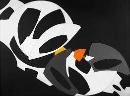
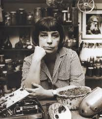
Elsa Gramcko (1925–1994) was a Venezuelan artist, known as an abstract sculptor and painter. Her earlier works, which date from 1954, were geometric paintings, while her later works were more tachist in nature. While her earlier works consisted of mostly paintings, she expanded into sculpture and assemblage in the 1960s and 1970s.
7 notes
·
View notes
Video

flickr
fredy-holzer #fredyholzer por fredy holzer
Por Flickr:
#intothewoods#trees#bisterink#woodsstain#bisterinkdrawing#bisterart#stains#artexperiment#inkprocess#tachist#inkstain#mountaintrekking#nature#trekking#stainsart#proofplusplus#stainsexperiment#fredyholzer#圧倒的小鳥遊める#gallery#arte#colorschallenge#おうち時間#abstract#芸術同盟#線画ギャラリー#uverworld好きと繋がりたい#doodle#イラスト好きさんと繋がりたい#jwave
11 notes
·
View notes
Photo

424 mountain trekking Mixed Media 100x70cm #intothewoods #trees #bisterink #woodsland #bisterinkdrawing #bisterart #rocks #artexperiment #inkprocess #tachist #inkstain #mountaintrekking #nature #trekking #stainsart #proofplusplus #stainsexperiment https://www.instagram.com/bypyk/p/ByvYxGsilKG/?igshid=1vk1vy7e7v8m0
#intothewoods#trees#bisterink#woodsland#bisterinkdrawing#bisterart#rocks#artexperiment#inkprocess#tachist#inkstain#mountaintrekking#nature#trekking#stainsart#proofplusplus#stainsexperiment
0 notes
Photo
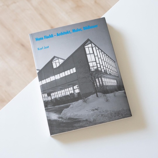
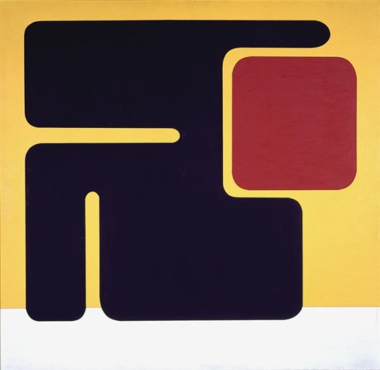
„The era of the building artist is over“ remarked Hans Fischli once and replaced artistry with solid craft. This notion is even more astounding in view of Fischli’s dual career as architect and artist. But for him architecture was about rationality, fulfilling functions and the best possible quality. From these convictions speaks Fischli’s brief but ultimately formative study visit at the Bauhaus, a sojourn of a mere year but which left a deep impression on the young architect. Consequently Fischli’s architectural oeuvre is characterized by good proportions, rationality, functionality and structural stringency. Already his first work, the „Schlehstud“, a multigenerational house built for himself, his parents and his aunt in Obermeilen in 1933, displays these qualities: with its steel-frame construction, a flat roof, large windows and wooden lagging it is both crafted and rational, open and where privacy is needed closed. The „Schlehstud“ consequentially opens up Karl Jost’s examination of Fischli’s architectural oeuvre in the former’s fundamental monograph „Hans Fischli - Architekt, Maler, Bildhauer“, published by GTA Verlag in 1992. Organized along the architect’s major tasks workers’ housing, factory and apartment buildings as well as buildings for young people and single-family houses Jost analyzes Fischli’s built work and carves out the fundamentals of his architecture as described previously. The result is the portrait of an architect at the service of occupants, irrespective of whether they were working-class families, industrialists or orphans.
Interestingly his artistic oeuvre initially took a different direction as Karl Jost explains: Fischli started out as creator of organic, cell-like forms that developed into Tachist abstractions that in his late work rigidified and became increasingly geometric. These tendencies also showed in his sculptures carried out from the 1960s on which before consisting of basic geometric forms went through a period of amorphous forms.
As demonstrates the above sketch of book and artist, Hans Fischli‘s oeuvre is very diverse and through Jost’s detailed and readable exegesis takes clear shape in the readers’ minds. A milestone!
#hans fischli#modernism#modernist#architecture#switzerland#gta verlag#architecture book#book#architectural history
28 notes
·
View notes
Text
Michaux è un uomo molto molto intelligente e consapevole, che sa esattamente dove si trova. I migliori segni tachistes o liberi, per me li ha fatti lui. In questo è superiore a Jackson Pollock.
Francis Bacon
34 notes
·
View notes
Text
JEUNES ORAGES - 1970
JEAN MESSAGIER
( 1920 - 1999)
Gravure E A - 90 x 65 cm
galerie-guigon.com
Rattaché à l'École de Paris d'après-guerre, on qualifie Messagier, confusément, d'abstrait lyrique, de nuagiste, de tachiste, de paysagiste abstrait. Lui-même n'a jamais voulu se définir, il a toujours renoncé à la dualité abstraction – figuration.
voir aussi : "Les gels de Jean Messagier et les taches d’Alexander Cozens : la conviction de la nature, l’incertitude du paysage" par Alexandre Rolla ( https://journals.openedition.org/)
2 notes
·
View notes
Text
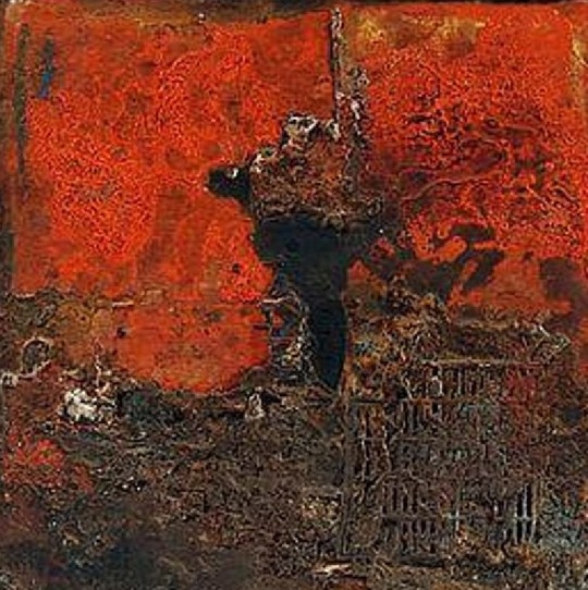
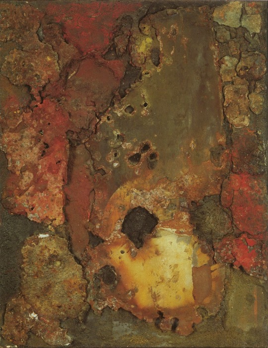
Exposition Art Blog Elsa Gramcko - Abstract Sculpture and Painting
Elsa Gramcko (1925 - 1994 ) was a Venezuelan abstract sculptor and painter. Her earlier works, which date from 1954, were geometric paintings, while her later works were more tachist in nature.While her earlier works consisted of mostly paintings, she expanded into sculpture and assemblage in the 1960s and 70s. In 1959, José Gómez Sicre curated her first solo show at the Art Museum of the Americas in Washington D.C. She represented Venezuela in the 1959 São Paulo Art Biennial and in the 1964 Venice Biennale. In 1968 she was awarded the National Art Prize at the Official Salon of Venezuelan Art and in 1966 she became the first woman to obtain the first prize at the D'Empaire Salon held in Maracaibo, Zulia State, Venezuela. Her work is held in various private and public collections throughout Latin America and worldwide.
More
#Elsa Gramcko#art#artistic#artists#Venezuelan artist#fine art#artwork🎨#sculpture#painting#abstract sculpture#abstract painting#abstract artworks#mixed media art#contemporart art#visionary art#culture#art blog#exposition art blog
10 notes
·
View notes
Text
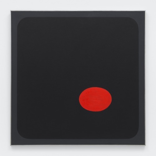
Grandezza e limiti di Roman Opalka
“Il Detail dipinge il tempo, la carta di viaggio lo disegna, la fotografia lo scolpisce”: in questa frase di Roman Opalka la chiave della sua poetica e i limiti della stessa.
Che il tempo avesse bisogno del lavoro di un artista come lui per entrare definitivamente e irreversibilmente nel mondo chiuso dei così detti “valori plastici”, non c’è alcun dubbio. L’assolutezza, la minimalità, l’estremo rigore con cui lui ha affrontato la questione dell’importanza del tempo in arte ha raggiuto una chiarezza assoluta. Che la quarta dimensione faccia parte anche della poetica di artisti come Anselmo, Beuys, Mauri, Horn e altri è indubbio, ma che solo il Tempo occupi quella di O lo è altrettanto. L’incisività della sua poetica ne è una conseguenza.
Come tutti gli estremisti (uso questa parola con prudenza e ne cito un altro a cui lui fa spesso riferimento, Marcel Duchamp), anche O tende a fare il vuoto intorno a sé.
Ma il tempo non è l’unica dimensione dell’arte. Introdurre qui ora, tout court, lo spazio sembra meccanico e riduttivo. Diciamo piuttosto ‘varietà del mondo’. Sì, di quello stesso mondo etico che attraverso il suo lavoro è rientrato prepotentemente nella questione dell’arte, della pratica artistica, che non può assolutamente essere separata dalla vita e quindi dalla varietà del mondo: mi siedo su una seggiola e medito sulla morte di mia mamma, tanto per fare un esempio sintetico. Chi ha fatto la seggiola e come è morta la mia mamma?
La decisione (1965) di dipingere su una tela di determinate dimensioni (dipendenti evidentemente dalle quelle del suo corpo in piedi di fronte ad essa e quindi da un certo spazio) la progressione di numeri a partire dall’1 comportava come conseguenza di chiudere la propria pratica per il resto dei propri giorni, fino all’inevitabile e indeterminata fine. L’accento quindi veniva posto fin da subito e in maniera assoluta sul fattore tempo, sia nell’implicito riferimento alla sua inevitabile interruzione (siamo mortali), sia in relazione a ciascun Detail. Che poi la pittura dei numeri comportasse una serie di altri problemi spaziali, legati al colore, all’emozione dipendente dal suo esaurimento sul pennello, alla fine del campo di stesura (tela) ecc, è scontato e prevedibile, ma rientra nella problematica affrontata anche da altri pittori contemporanei a lui (per esempio i Tachistes e gli Action painters) e non è un caso che a più riprese O si occupi di Pollock, per puntualizzare le differenze della propria pratica da quella dell’americano. Più debole tutta la sua argomentazione a proposito dell’installazione dei suoi Details e delle sue Carte di viaggio in determinate mostre. Qui O tradisce la debolezza del suo concetto di spazio, limitato a quello delle gallerie e dei musei.
“Dipinge, disegna, scolpisce” sono termini che non appartengono a O, ma all’arte. La scoperta del tempo la dobbiamo a Rembrandt, O non ha fatto che assolutizzarla, eticizzarla, riportarla alla dimensione necessaria perché sia acquisita definitivamente dalla contemporaneità, ma la vita non si riduce semplicemente alla coscienza della morte, del limite: è anche, come dice lui stesso, “apprendimento, adattamento, radicamento, riflessione e infine saggezza. La coscienza si installa in questa dinamica dell’esistenza, ne percepisce i limiti; la saggezza è l’incontro con i limiti.” Perfetto Roman! Ma la saggezza è anche la vita in tutti i suoi aspetti e per quanto attiene al nostro lavoro è anche spazio: su cui sedersi a meditare sulla sua varietà e sulla propria mamma (e ogni tanto, aggiungo, ‘dimenticare’ che siamo mortali). Per questo la fotografia non scolpisce un bel niente: fissa certo in maniera esemplare quanto Rembrandt aveva affidato a una quarantina di autoritratti, che non sono solo la presenza dell’avanzata inesorabile delle sue grinze, ma anche, per esempio, la diversità dei suoi copricapi. Tanto per intenderci: la varietà del mondo. La tua camicia, sempre la stessa, la luce, sempre la stessa, che capta la tua espressione impassibile, sempre la stessa, assolutizzano lo scorrere del “tempo irreversibile”, quello saturnino che appartiene alla morte, come ben sapevano gli antichi indagatori e numeratori delle stelle del nostro firmamento; ma noi umani cerchiamo quello reversibile, eternizzabile: il tempo 0 dell’istante o quello della composizione musicale, cui non puoi togliere una nota senza farlo precipitare nell’irreversibile.
Farsi coinvolgere totalmente dal messaggio di O è fuorviante, come è stato fuorviante con Duchamp: la dimensione etica del loro lavoro non deve farci dimenticare quella est-etica. Questa rientra nel grande fiume del nostro linguaggio: nessuno lo inventa, al massimo tutti possono aggiungere le pietre delle loro eresie alla costruzione della sua cattedrale. Quella di O è indubbiamente angolare, ma non l’unica.
FDL
1 note
·
View note
Text
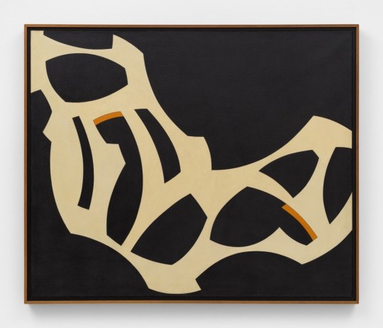
ARTIST RESEARCH
HENRI MICHAUX
1899–1984
“Henri Michaux was a Belgian-born French poet, writer and painter. Michaux is best known for his poetry and prose, especially his texts chronicling his psychedelic experiments with LSD and mescaline which include Miserable Miracle and The Major Ordeals of the Mind and the Countless Minor Ones, as well as his idiosyncratic travelogues and books of art criticism” - Tate
After trips to Japan, China and India in the early 1930s, Asian culture became one of his biggest influences and inspirations. Buddhism and calligraphy also became some of his biggest influences for his poetry and paintings.
“Michaux was an idiosyncratic visual artist, associated with the Tachiste movement in the 1940s and 50s. His work often makes use of dense, suggestively gestural strokes that incorporates elements of calligraphy, asemicwriting, and abstract expressionism” - Wikipedia

^ Untitled Chinese Ink Drawing 1961
I love this painting, it feels like I’m looking at a picture but I’m not too sure what the picture is depicting. It feels like something is hiding behind it and it’s just out of reach - I can’t quite touch it. Maybe I’m looking at the light reflections off the ocean and waves? Maybe I’m not? I also love the black and white - these 2 colours can create such depth.

^ [no title] 1975–6
This painting has a bit more movement to it compared to the one above - to me it feels like a river or a swell. This one also feels more limited between its space.

^ To me this one feels like little people or crocodiles crawling over the paper even though it’s just the way the ink has fallen / been placed onto the paper. I’m also unsure if it’s the image or if the paper is actually slightly off white but I really like it - also makes me connect my practice to it through my use of raw canvas which has a similar colour.


^ These all look like cave drawings / characters (both made up people and language characters). They all feel like they’re part of a narrative / story. I think he’s also very good and knowing when enough is enough, while there’s a lot going on in the works, they don’t feel like ‘too much’ or overwhelming.


^ I feel the biggest connection to these works. I think they’re also where I draw a big connection to my own practice. They just have a very raw and honest feeling to them and they’re very direct. They are what they are and they don’t need anything added to them or taken away from them. They’re final.


^ Again these feel very mindless and intuitive. They are what they are. I like the different weights he incorporates into the drawings. Might be made out of the same media but it’s used differently.


^ Some poems by Michaux. I’ve never really enjoyed writing, while i write essays for other classes and I they’re often good, I don’t think I have the knack for it and I don’t particularly enjoy it. The last few paintings I’ve done do have some hidden works or sentences in them though… but I’ve always painted over the top of them. Maybe I look into having some text accompanying them? Maybe not?
1 note
·
View note
Text
ARTIST RESEARCH
HENRI MICHAUX
1899–1984
"Henri Michaux was a Belgian-born French poet, writer and painter. Michaux is best known for his poetry and prose, especially his texts chronicling his psychedelic experiments with LSD and mescaline which include Miserable Miracle and The Major Ordeals of the Mind and the Countless Minor Ones, as well as his idiosyncratic travelogues and books of art criticism" - Tate
After trips to Japan, China and India in the early 1930s, Asian culture became one of his biggest influences and inspirations. Buddhism and calligraphy also became some of his biggest influences for his poetry and paintings.
"Michaux was an idiosyncratic visual artist, associated with the Tachiste movement in the 1940s and 50s. His work often makes use of dense, suggestively gestural strokes that incorporates elements of calligraphy, asemicwriting, and abstract expressionism" - Wikipedia

^ Untitled Chinese Ink Drawing 1961
I love this painting, it feels like I'm looking at a picture but I'm not too sure what the picture is depicting. It feels like something is hiding behind it and it's just out of reach - I can't quite touch it. Maybe I'm looking at the light reflections off the ocean and waves? Maybe I'm not? I also love the black and white - these 2 colours can create such depth.

^ [no title] 1975–6
This painting has a bit more movement to it compared to the one above - to me it feels like a river or a swell. This one also feels more limited between its space.

^ To me this one feels like little people or crocodiles crawling over the paper even though it's just the way the ink has fallen / been placed onto the paper. I'm also unsure if it's the image or if the paper is actually slightly off white but I really like it - also makes me connect my practice to it through my use of raw canvas which has a similar colour.


^ These all look like cave drawings / characters (both made up people and language characters). They all feel like they're part of a narrative / story. I think he's also very good and knowing when enough is enough, while there's a lot going on in the works, they don't feel like 'too much' or overwhelming.


^ I feel the biggest connection to these works. I think they're also where I draw a big connection to my own practice. They just have a very raw and honest feeling to them and they're very direct. They are what they are and they don't need anything added to them or taken away from them. They're final.


^ Again these feel very mindless and intuitive. They are what they are. I like the different weights he incorporates into the drawings. Might be made out of the same media but it's used differently.


^ Some poems by Michaux. I've never really enjoyed writing, while i write essays for other classes and I they're often good, I don't think I have the knack for it and I don't particularly enjoy it. The last few paintings I've done do have some hidden works or sentences in them though... but I've always painted over the top of them. Maybe I look into having some text accompanying them? Maybe not?
0 notes
Photo
Le mouvement pictural des Macchiaioli s’est développé à Florence puis en Toscane au milieu du xixe siècle et regroupe des peintres originaires de l'ensemble de l'Italie. Ces artistes sont considérés comme les initiateurs de la peinture moderne italienne. Le terme est inventé en 1862 par un critique anonyme de la Gazzetta del Popolo qui qualifiait ainsi, dans un sens péjoratif, ces peintres (littéralement les « tachistes », de l’italien macchia, en français « tache ») qui s'opposent à l'académisme. À l’origine, ce mouvement, aux alentours de 1855, marque un renouveau réaliste de la peinture italienne et est profondément lié au Risorgimento. https://www.instagram.com/p/Ce6eJDDI7ht/?igshid=NGJjMDIxMWI=
1 note
·
View note
Video

flickr
fredy-holzer por fredy holzer
Por Flickr:
#nature #abstract #gallery #art #fredyholzer Fredy Holzer
#intothewoods#trees#bisterink#woodsstain#bisterinkdrawing#bisterart#stains#artexperiment#inkprocess#tachist#inkstain#mountaintrekking#nature#trekking#stainsart#proofplusplus#stainsexperiment#fredyholzer#Fredy#Holzer
1 note
·
View note
Photo

423 mountain trekking Mixed Media 100x70cm #intothewoods #trees #bisterink #woodsland #bisterinkdrawing #bisterart #rocks #artexperiment #inkprocess #tachist #inkstain #mountaintrekking #nature #trekking #stainsart #proofplusplus #stainsexperiment https://www.instagram.com/bypyk/p/BxaivrQBwT0/?utm_source=ig_tumblr_share&igshid=f5ylcvl3vo1q
#intothewoods#trees#bisterink#woodsland#bisterinkdrawing#bisterart#rocks#artexperiment#inkprocess#tachist#inkstain#mountaintrekking#nature#trekking#stainsart#proofplusplus#stainsexperiment
0 notes
Text
à lire :
Tillion - Ravensbrück
Le stéréoscope des solitaires (Lo stereoscopio dei solitari) (1972)
La synagogue des iconoclastes (La sinagoga degli iconoclasti) (1972)
Barthes - Carnets du voyage en chine
Barthes - Journal de deuil
https://fr.wikipedia.org/wiki/Pirah%C3%A3_(langue)?fbclid=IwAR1U_qwgLxTqNJjDUZOBagYlvmtCFH_SceBkTUmDZP_a3nz4RsUYGp31rz4#Bibliographie
Paulina 1880 de Pierre Jean Jouve
LE SYSTÈME AMAZON - UNE HISTOIRE DE NOTRE FUTUR
à écouter
1952 Sidney Bechet - La nuit est une sorcière
1953 Francis Poulenc - Les mamelles de Tirésias
1954 Emy de Pradines - Voodoo
1955 Jean Cocteau - Poèmes dits par l'auteur
1956 Henry Cowell, Charles Ives, Alan Hovhannes
1957 Edgar P. Jacobs - La marque jaune
1958 Thelonious Monk - Misterioso
1959 Michel Magne - Musique tachiste
1960 Charles Mingus - Pre Bird
1961 Léo Ferré - Les chansons d'Aragon
1962 Edgar Varèse - Arcana Déserts Offrandes
1963 Eric Dolphy - Music Matador
1964 Claude François - à l'Olympia
1965 Beatles - Help!
1966 Harry Partch - Delusion of The Fury
1967 Jimi Hendrix - Are You Experienced
1968 Mothers of Invention - We're Only In It For The Money
1969 Archie Shepp - Blasé
1970 Soft Machine - Third
1971 Carla Bley - Escalator Over The Hill
1972 Colette Magny - Répression
1973 Roland Kirk - Prepare Thyself To deal With a Miracle
1974 Robert Wyatt - Rock Bottom
1975 Birgé Gorgé Shiroc - Défense de
1976 Michael Mantler - The Hapless Child
1977 Ilhan Mimarogl? - Agitation
1978 Francis Poulenc - Mélodies
1979 Michael Jackson - Off The Wall
1980 The Residents - The Commercial Album
1981 Hal Willner - Amarcord Nino Rota
1982 Charlie Haden - The Ballad of The Fallen
1983 Tom Waits - Swordfishtrombones
1984 Giovanna Marini - Pour Pier Paolo Pasolini
1985 Lester Bowie - I Only Have Eyes For You
1986 Grieg, Mahler, Scriabine, Saint-Saëns, Reger, Ravel, Debussy, Strauss - Welte-Mignon
1987 John Zorn - Spillane
1988 Michael Mantler - Many Have No Speech
1989 Steve Reich - Different Trains
1990 Fred Frith - Step Across The Border
1991 Conlon Nancarrow - Studies for Player Pianos
1992 William Burroughs - Spare Ass Annie
1993 Frank Zappa - The Yellow Shark
1994 Kronos Quartet - Night Prayers
1995 Björk - Post
1996 Collectif - Buenaventura Durruti
1997 Wyclef Jean - The Carnival
1998 Massive Attack - The Singles Collection
1999 Arto Lindsay - Prize
2000 Bang On A Can - Lost Objects
2001 Noir Désir - Des visages des figures
2002 Joni Mitchell - Travelogue
2003 Fausto Romitelli - Professor Bad Trip
2004 Miles Davis - The Complete Jack Johnson Sessions
2005 Philippe Katerine - Robots après tout
2006 Scott Walker - The Drift
2007 René Lussier - Le trésor de la langue (coffret)
2008 Portishead - Third
2009 Das Kapital - Ballads & Barricades
2010 Kronos Quartet - Rainbow
2011 Shabazz Palaces - Shabazz Palaces
2012 Edward Perraud - Synaesthetic Trip
2013 David Lynch - The Big Dream
2014 Robert Wyatt - Different Every Time
2015 Den Sorte Skole - III
2016 Ursus Minor - What Matters Now
2017 Chinese Man - Shikantaza
2018 Ambrose Akenmusire - Origami Harvest
2019 Daniel Erdmann's Velvet Revolution - Won't Put No Flag Out
2020 Söta Sälta - Comme c'est étrange
2021 Jo Berger Myrhe - Unheimlich Manœuvre
2022 Kendrick Lamar - Mr Morale and The Big Steppers
1 note
·
View note
Text
“I don’t portray anything. I paint”.
Text by Andrea Bellini
Born in Turin in 1936, Giorgio Griffa is now ranked as one of Italy's most important abstract painters of the Twentieth Century. He began to paint when he was very young, just 10 years old, and for two decades his work was figurative, fairly traditional in subjects and style. His mature work developed later, in the mid Sixties, in the context of the abstract-expressionist and tachiste movements, which based their language on a concept of painting as a sequence of actions, like a repeated sign or form of writing. Rather than a representation, painting became the direct expression of a mental state, a precise psychic temperature, an internal beat.Historically, his work has been classified as part of this "analytical painting" movement, which concentrated on analysing itself and its internal mechanisms: surface, substrate, colour and sign. However, Giorgio Griffa's work seems to stand apart from that of his fellow artists, and nowadays it is difficult to place it firmly within the historic analytical and conceptual painting movements. His abstract works, consisting of simple signs repeated on the canvas, seem to be not so much an analysis of the act of painting as a homage to painting itself and its history. And this is one of the delightful, central paradox's of Griffa's work: in spite of their conceptual approach, his paintings have a fascinating lyrical component, a radiant musicality, very different from the cold, unemotional mood of the neo-avantgardes.
In this sense his works are something of a mystery for the art world, as lovely as they are indefinable, because in them everything seems to be at once both simple and complex. The types of canvas the artist uses (jute, hemp, cotton or linen) are simple. His painted signs are also simple, or even anonymous: a series of vertical or horizontal lines and - only from the Eighties onwards - stylised floral motifs, friezes and spirals. Yet Griffa entrusts this apparent simplicity with the task of saying what is unsayable by its very nature; of plumbing the depths of the mystery of creation and the unknown. Seemingly banal and obvious at first glance, Griffa's work is actually layered with references to the history of art, Stone Age painting, Zen philosophy, music and – as we have seen – the artistic avantgarde of his own age.All these characteristics are very much to the fore in the artist's works for CEDIT Ceramiche. For this historic brand, Griffa has created five works involving a series of lyrical, minimalist signs, which recall the motifs current in the late Sixties and Seventies. The range of colours in which these signs are presented, with complementary colours and half-tones, seem to be drawn from the Renaissance and the art of Venice and its region in the Sixteenth and Seventeenth Centuries. The other fundamental point of reference is Matisse, the painter who rejoiced in colour and in whose images signs and colours are nicely balanced.
Griffa's collection for CEDIT sets out to use modular repetition of signs to build up genuine spatial environments for everyday living. The partnership with a ceramics manufacturer is a particularly fertile one for the Turin-born artist. In fact, his pictorial language – based on the concept of an anonymous sign open to potentially infinite repetition – seems to be ideally suited to large-scale reproduction and the decoration of entire interiors. The concepts of fragmentation and incompletion can be easily applied to the decoration of living-spaces of varying sizes, as if they were "portions" of a larger whole, an expanding universe. All Griffa's works use a repertoire of timeless signs, actions repeated over the millennia, on a complex trajectory that combines art, craftsmanship and decoration. In the project for CEDIT, this ancient story of experimentation with the potentialities of sign, colour and matter comes to a kind of natural, fascinating fruition.
2 notes
·
View notes
Text


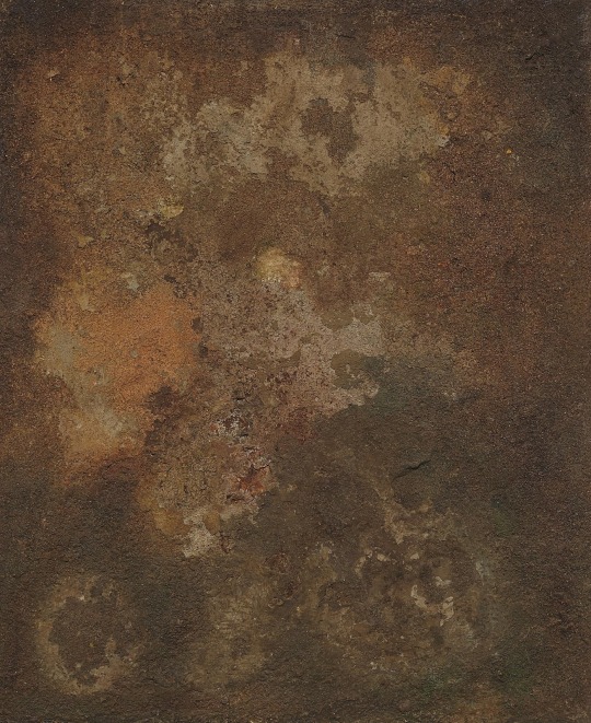
Exposition Art Blog Elsa Gramcko - Abstract Sculpture and Painting
Elsa Gramcko (1925 - 1994 ) was a Venezuelan abstract sculptor and painter. Her earlier works, which date from 1954, were geometric paintings, while her later works were more tachist in nature.While her earlier works consisted of mostly paintings, she expanded into sculpture and assemblage in the 1960s and 70s. In 1959, José Gómez Sicre curated her first solo show at the Art Museum of the Americas in Washington D.C. She represented Venezuela in the 1959 São Paulo Art Biennial and in the 1964 Venice Biennale. In 1968 she was awarded the National Art Prize at the Official Salon of Venezuelan Art and in 1966 she became the first woman to obtain the first prize at the D'Empaire Salon held in Maracaibo, Zulia State, Venezuela. Her work is held in various private and public collections throughout Latin America and worldwide.
More
#Elsa Gramcko#Venezuelan painter#artist#painters#art#artistic#fine art#artworks#sculpture#painting#abstract artworks#abstract sculpture#abstract painting#contemporart art#visionary art#culture#art blog#exposition art blog
7 notes
·
View notes
Last Seen Blogs
ccyuepaowaiwei
Cc约炮外围群

prairiekrafts-blog
PRAIRIE KRAFTS

aerithmybbgmypookiemywife
ynatyong

sonrisasdepyl
Hapiness