#studiopractice2
Explore tagged Tumblr posts
Photo
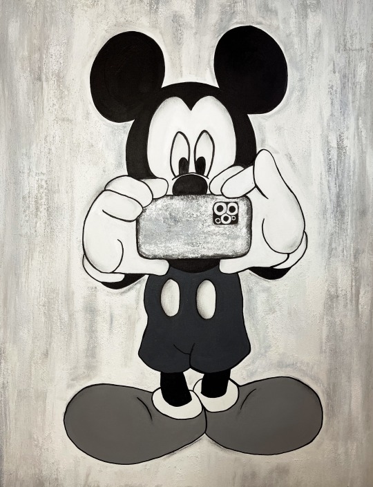
80cm x 100cm canvas.
Looking at Art Appropriation and feeling extremely demotivation, I decided to paint this large Mickey on canvas. I needed something fun and playful to motivate me and cheer me up during this lockdown. I started to think about how we rely so much on technology these days especially our phones. I wanted to add the iPhone to portray this message but always still give off this playfulness. I used acrylic paint and sand texture gel on the background to add a little dimension.
15 notes
·
View notes
Text
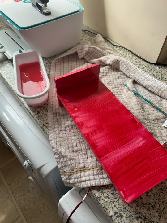
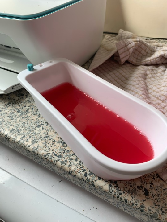
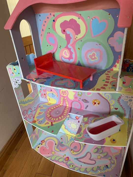
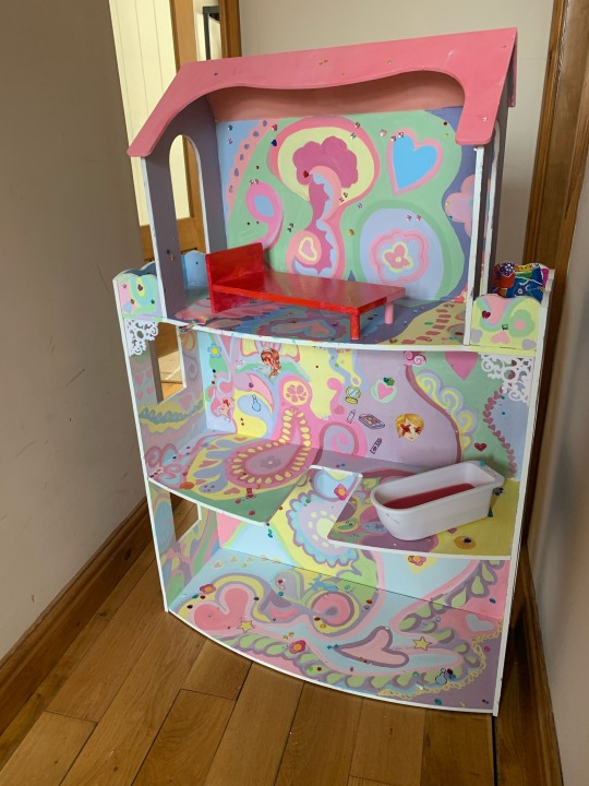
The Final Product
I am happy with the final product as i think it does overall what i wanted it to. The girly symbols are the main focus of the piece and yet are offset by the bright red bed and bath filled with red liquid. I added sticky gems onto the piece to add to the overwhelmingly girliness of the piece and stuck them on haphazardly in the vein of Sebastian Masuda's messily childlike compositions, which evoke youth and therefore 'girlhood' in the way that a child may put things together. Overall this makes the piece look more handmade almost and like it could've really been used by girls. This makes the piece hit home a little more as by making it look as though it was made by girls, the theme of the piece, it evokes more emotion in the viewer as the implied child is inflicted by the darker meanings behind the pice.
3 notes
·
View notes
Text
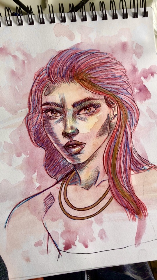
A little experimental piece I did the other day, I didn’t take the face too seriously I just wanted to test out different pens and paints and shading techniques to capture he way the light hits the face. It turned out in a comic style I think because I’ve got so used to drawing on the graphics tablet.
3 notes
·
View notes
Text
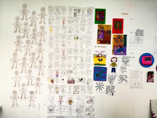
My wall!! Look at all that work!!
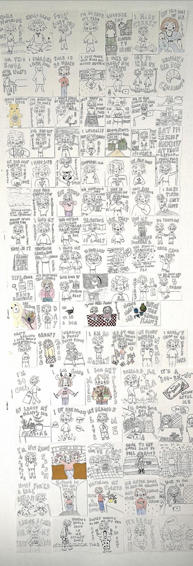
I set all of my illustrations out in rows of seven, ordering them by each week, 16 weeks in total. I am amazed by the amount of work I have produced and how cohesive it looks as a whole. It is just like a diary on my wall, a complete insight into who I am, how I feel and what I've spent the past semester doing. I hope those who view it will enjoy scanning through every image and understanding every aspect of my personality.
4 notes
·
View notes
Photo
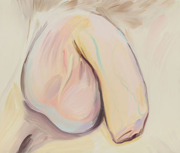
Celia Hempton Eddie 2017
Thinking about ideas of blatant representation of males led me to the work of Celia Hempton. The colours are gentle and serene, combined with fluid brushstrokes, the image is pleasant to look at. ironic since genitalia is rarely described in this way. often genitalia within art is presented as sensual or erotic. often with male genitalia, it is displayed as dominance. Sometimes genitalia is even displayed as grotesque. This however, is different. There is an innocence. simply, it is what it is.
https://www.artsy.net/artist/celia-hempton
24 notes
·
View notes
Text
Realistic clouds
This artwork was created over several days. As this took longer to create than I thought it would to create. As there was many different shades of colours that had to be blended and colour picked so then the piece would make sense.

This is the picture that is half way done.

This is the completed version of the picture.
I had to edit the picture at the end after I had taken this picture as when I removed the white background colour, there was many gaps left behind as the white colour helps fill out some of the gaps. So then I needed to go back in and recolour some of the gaps.
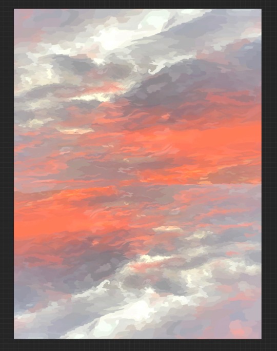
For this picture I created this art work I used the whole final finished painting and then I duplicated the image and rotated it 180 degrees, so the colours are diagonally placed from eachother. I then moved the top image to cover the whole top of the canvas to make the top of the sky straight but not slightly diagonal. Then I pulled the sides out to cover all the sides fully as to then get the full effect out of the canvas. Then when the sides were completely filled, I had to stretch out the top and bottom to allow them to meet in the middle and then the canvas would be completely covered.
With creating this art work it was very therapeutic for me as it was like a adult paint by numbers. It seemed to calm be and then it released my stress that I was feeling.
I would like to try this again and see how easy it is to create and see if could do it any faster.
1 note
·
View note
Text
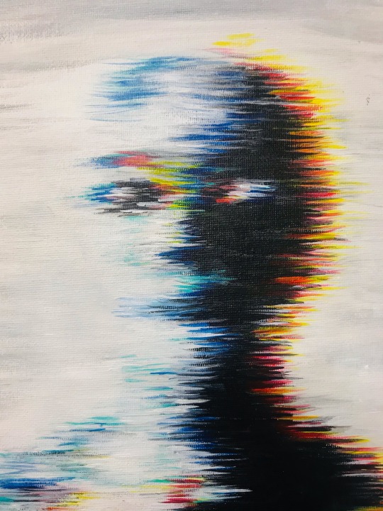
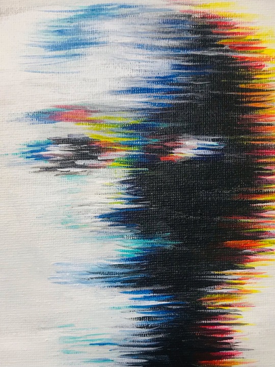
This is a painting inspired by my photoshop edits. I wanted to see if I could recapture the glitch effect with I small paint brush. I feel like the small paint brush was perfect for this but because the canvas was quite small the lines don’t look sharp. I Found it quite difficult to keep the lines straight and fine as the paint would get dry. Maybe I might repaint this image but with out the lines and just a simple glitch so the picture stands out more.
1 note
·
View note
Text
Planning and preparation
When I was in my 1-2-1 meeting with Laura. We were thinking of ideas of knowing how to stay on top of my work and knowing what to do on my days where I have more time, as I do also work a part time job.
The idea of creating a wall chart came up in the conversation and I really liked this idea as it is something that I can put up on my studio wall, so I know what work I need to create for all three of my subjects this semester.
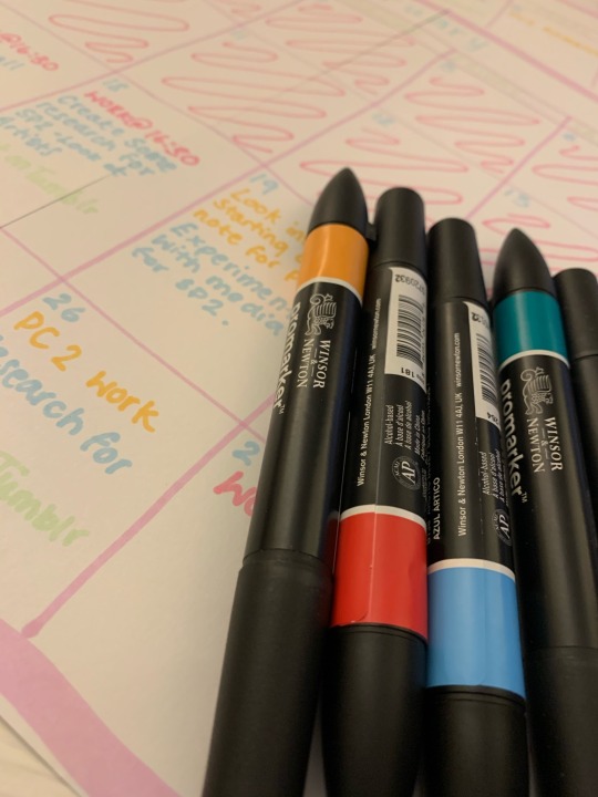
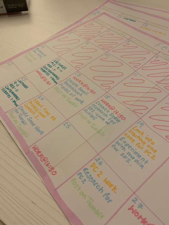
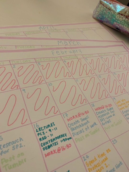
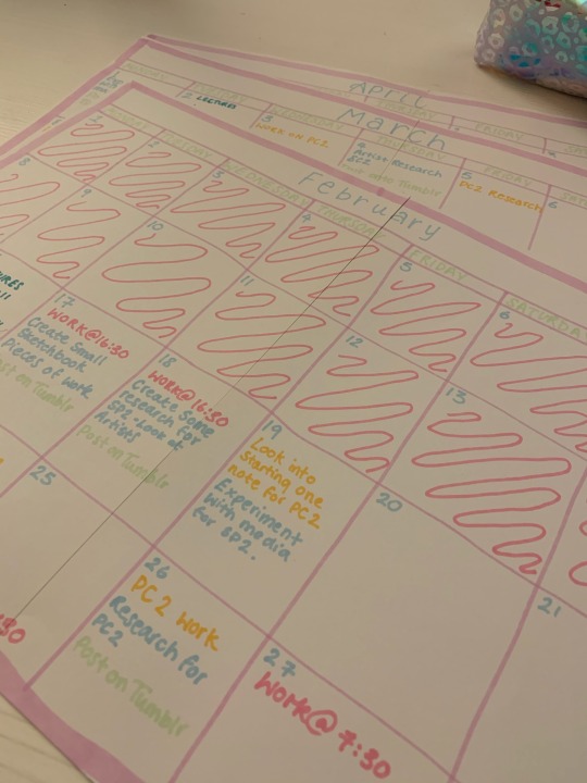
By creating this wall chart, I really put into perspective as to how short this semester really is and the amount of hard work that I will be putting into this semester as I really want to gain more marks and improve with my work.
1 note
·
View note
Photo
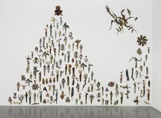


Mary Beth Edelson - ‘Selected Wall Collages’
‘Selected Wall Collages’ is a wall-based installation of 146 collages that explores the representation of women across time and culture. The collages, which vary in size, were made between 1972 and 2017. The collages depict imaginary beings derived from a range of different sources that include ancient mythology, art history, popular culture, nature and photographs of the artist and her peers. Many of the images come from Edelson’s career-long research into the figure of the goddess as a bridge between nature and humanity.
Most of the works were made in 1972, at around the same time that Edelson created her best known work ‘Some Living American Women Artists / Last Supper’ 1972. A number of the figures that were in that collage appear in ‘selected wall collage’ but other additions include Grace Jones, Uma Thurman in the film ‘Pulp Fiction’ (1994), Madonna and the former First Lady of the United States Michelle Obama.
I like how Mary Edelson uses her collages to bring the past and the present together exploring the meaning of feminist thought and representation. Also i like how Edelson brings singular small collages together to create an overall collage/piece because it is different to how a lot of collage artists do the process as they usually create one overall piece. This is something I will think about further in my practice and see if it could become relatable to my project. I also think her work is relatable to my project because she represents feminism through her collages and even though mine is not, at the moment, intentional it also is seen as representing feminism.
6 notes
·
View notes
Text
Studio Practice 2


“Imagination is Everything”, 46cm x 62cm x 53cm. Wood, polystyrene foam, mod-rock, plaster, spray paint.
I have finally finished my sculpture and I can say I’m really happy with how it turned out. I had a picture in my head of how I wanted it and this is even better than how I had imagined. I had a few problems along the way but overcame those and learnt from it. If I had to change one thing it would be to let the spray paint dry first before layering it as it had cracked a little. I love the detail and the texture on it. I like how it isn’t completely smooth. I wanted to name it “Imagination is Everything” because I felt this really worked with the sculpture. Inspired by my childhood memories and looking at how everything in society is a perception, I felt as though this was relevant. Along with the concept, artists that inspired me were, Jeff Koons and Mr Brainwash. The more I worked on it, the more I could see where my inspiration had come from. When I first had the idea in mind to create this sculpture, my inspiration was taken from Leblon Delienne and the spray paint had come from my love of Pop Art.
To take these photos I used my iPhone 12 Pro Max using portrait mode. I took them in the photography studio and used a plinth in front of the white wall. Originally I wanted to make my own plinth and paint it black but I didn’t have time so I used the plinth available. I would like to learn how to take professional photos using my Cannon EOS next year so I can take better photos of my work.
1 note
·
View note
Text
The ‘Girly’ Aesthetic
I’ve decided I want my art to be about the abstraction of ‘girly’ magic tropes that were aimed at many girls in childhood through marketing and media. Though it is true that strictly binary representations of gender are fed to us in our childhood, and a failure to swallow these tropes are often met with distaste and shame (even in childhood), the ‘girly’ is something that sits precariously in our culture. ‘Girly’ tropes have a negative stereotype attached to them, with many passing them off as lacking in substance or intellect of some kind, and being silly and frivolous. Young girls in our culture are in a catch-22, as they are encouraged to be girly in youth and later in adolescence when this mindset continues, ‘girly’ things are suddenly shamed and judged for their interests.
Music acts, certain films and shows aimed at girls, even so far as makeup and feminine ways of presenting are judged harsher by society, particularly in comparison to similar media types aimed at boys. Examples of subjects of this ridicule are the twilight movies, acts like Justin Bieber and One Direction , and negative connotations of makeup being ‘fake’ and phrases like ‘take a girl swimming on the first date’ that demonstrate these attitudes.
Therefore, I think it an empowering stance to celebrate the femininity that many people in our culture have related to from an early age. This media, because of the strict divide in binary, was often made in the absence of the male gaze and was more emotion driven . This ‘culture’ relates to films, shows, toys, website design, clothing and more, and something to notice is that much of it shares a particular aesthetic style.
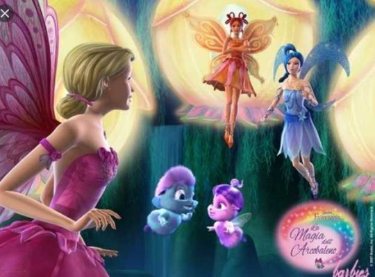
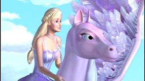
The ‘Barbie’ movies were female led films driven by a female perspective. The movies, have light pastels, soft warm yellows and oranges and lilac in their overall aesthetic. The characters wore dresses that young girls would love to wear and didn’t cater to what a male audience would call ‘sexy’. In the design of the cartoon, there often featured elaborate swirls and tiny white stars or dots that would represent a ‘sparkle’. A soft, hazy fade is also employed to show the glow of light. Across the board, pink and purple are used heavily which makes sense when you consider these were the ‘girly’ colours in society at the time.

Here, in the Polly-pocket game website, (a toy marketed to girls but was expanded into an online game) we can see a very similar colour palette. A mixture of bright, sunny colours and pastels, with a heavier focus on pink and purple. It’s also worth noting that the protagonist, as with the barbie movies, is Caucasian, and presents as feminine, meeting all the beauty standards inflicted on girls at the time. Both Barbie and Polly Pocket have blonde hair and blue eyes, which caters to the standard of western beauty that has been popular since the golden age of Hollywood. Design of the room incorporates florals and bold pattern into it’s design and furniture is rounded and soft looking.
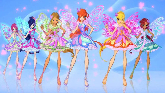
The Winx show was a main inspiration for my early pieces in this vein. The show had a heavy focus on fashion and individual style, features the same colour palette as aforementioned and heavily relied on the white dot ‘sparkle effect’ to animate their ideas of magic and fantasy. The ensemble of girls had different styles, ranging from hyper-feminine to tomboyish and sporty. In the cast it is also important to note that more diversity was present, there being a black, hispanic and East Asian members. However the protagonist of the show was style caucasian, and in the latest reboot of the show, two of the POC characters were actually white-washed and stripped of their cultural back-story.
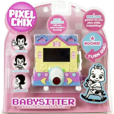
Pixel Chix were popular toys around the time I grew up. The ever-present ‘girly’ colour palette still features. I think it is note-worthy that these toys were built in the shape of a home, and the character moved around this domestic sphere as part of the game. The games also encourages girls to nurture and mother the character in the toy, which can be seen as another way society inflicts this expectation of women to carry children on cis women.
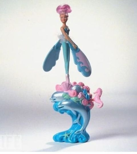
Here is a good example of the sprawling swirls and shapes included in the girly aesthetic. The ocean wave curls under at the bottom, and is adorned with swirly shells and creatures. A chrome sheen is applied to the dolphins in this picture, showing a favouring of light reflection like sparkles, chrome shine and metallics in the girly aesthetic.
My intention in my practice is to further explore and emulate the girly aesthetic in order to celebrate the feminine culture aimed at children that was unabashedly feminine and did not cater to the male eye, as a way of reclaiming ‘girly’ culture from the society that shames it.
9 notes
·
View notes
Photo
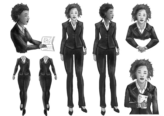
Blake character board
Blake is a sensitive character with a strong intuition. She is confident in her actions and judgement. She wears a smart suit but keeps it more ‘layed back’ with her buttons undone. Blake was my favourite character to design, I really like how her outfit and face turned out. Since this is a new style for me it was fun to create these designs. It was difficult using the graphics tablet that I have since I’m still new to that to. It would have been great to do this project after I had a lot of experience.
1 note
·
View note
Text
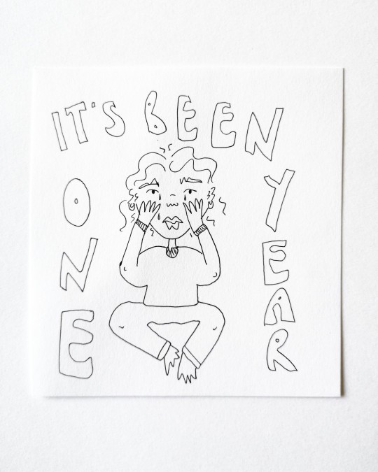
"It's been one year"
It has been a year, over a year now, of lockdowns, anxiety, worry, loss, stress, everything we never thought we'd ever have to face. And it feels appropriate to remind myself of that, to remind my viewers how long it's been, one whole year. How strange. Who would ever have predicted this would be our lives now, so strange and uncertain, like something out of a Hollywood movie. How words like; lockdown, covid, pandemic, would all just become part of our daily dictionary. This work has allowed me to keep track of days that I probably would have otherwise forgotten and lost, it has been my covid diary.
2 notes
·
View notes
Photo
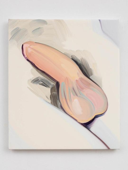
Cecilia Hampton BEN, 2016, OIL ON POLYESTER, 35 X 30 CM, COURTESY OF THE ARTIST AND SOUTHARD REID (PHOTO: LEWIS RONALD)
https://www.vice.com/en_uk/article/jm9a4p/art-changes-celia-hempton
16 notes
·
View notes
Text
Square canvas - glitch effect
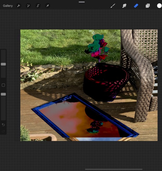
This is original image that is created using the original photo and an edited image. The edited image that is on the top of the original photo image, the edited image has only the mirror and the flower in the pot all the background and the rest in between i erased to make the original photo poke through.
The only problem that i have with this picture is that the pictures dont overlap. If i overlap the flower pots then the mirror frame doesn’t line up and if the mirror lines up then the flower pot is off to the right and it doesn’t look right. I decided to line up the flower pot, as the major part of the mirror that doen’t line up was the frame but it majorly showed up at the bottom of the canvas. If the bottom of the original photo wasn’t there and it ended at the end of the edited picture then the frames would look like they match up. I believe that the stem of the flower of the original image can still be seen slightly on the right side under the edited image, so I believe the edited image could be moved over, moving it over wont change the way that the frame of the mirror is positioned actually it would help make the frame more lined up, unless moving the edited image over would reveal the colour of the flower underneath then i wouldn’t move it.
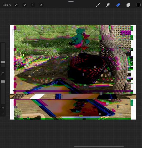
This is an edited version of the first picture, i edited it using the glitch effect, the artifact section of the effect makes blocks and the occasional line. I love the green and the purple effect of the top of the edit. It doesn’t destroy the visibility of the flower too much but it adds the effect to the image. I dont like the bottom half of the edit, the bar just cuts the image in half.
The green line helps camouflage the original image at the bottom of the canvas.

This image is the same edit but it just has an extra layer of an edit over it. The edit i chose to do was the liquify effect.
The liquify effect helps camouflage the bar effect that i hate in the 2nd photo. The liquify effect the section that i used called crystal, changes the smooth lines of colours to wobbly shaky lines. This makes the purple and the green lines on the top section more sunken in but it makes the ones that were hidden in the bottom come out more. I love the idea of this piece.
1 note
·
View note
Text
Abstract glitch art through Photoshop
I uploaded any picture I had on my laptop at the time into Photoshop as I wanted to create an image that is full of glitches and just experiment with all the distort edits within Photoshop. With this piece I didn't want to worry about keeping the original image because i wanted it to be abstract. I really like when I separate the RGB to create a glitch. After doing this I make whole image black and white and separate the RGB again to create another layer of glitches on top of the image. I used the pixel edit to create big pixels so the image wasn't full of tiny pixels. I also used the diffuse glow on the filter gallery to make it look like static on Tvs. I enjoyed making this piece as was able to fully experiment with all the edits not worrying if it looked too edited.


1 note
·
View note