#sticking with the limited colour palette was fun too
Explore tagged Tumblr posts
Text
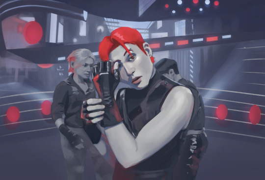
#ateez fanart#artists on tumblr#my art#another sketch from late march I ended up revisiting this week#noticed actual improvement to my observation skills after plein airpril with this one#this time wooyoung looks a bit more like himself too#also fixed that overlong upper arm#had a bit too much fun trying to capture the shapes of the stage#sticking with the limited colour palette was fun too#does this qualify as fanart
8 notes
·
View notes
Note
hello hello there!! always nice to find a new kin help blog :]
may i please have a simple doodle for a qsmp!tommy? i was technically one of the eggs , though we were all just dragon hybrids. i had small red horns, the left one was kind of cracked, red wings, and a red tail with pale yellow underside scales. uhh, i had lots of freckles, tan skin, and blue eyes!! also curly blonde hair with a streak of brown. :]
i mainly wore a red puffy jacket, a white shirt, and a blue bandana. i also had a torn piece of wilbur's yellow sweater tied around my right arm.
thank you, mate!
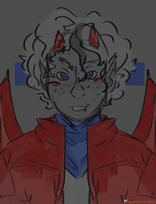
Here you go, Tommy ! Thank you for all the detail you gave, I appreciate it greatly! I hope I did you and your description justice, my friend.
#🏁 CHECKERED FLAG — REQUEST DONE !#🏎️ — SKETCH !#Working out how I'd do a more limited colour palette with this one was interesting. Considering how much I had to work with.#I don't know if it's what I'll be sticking with. But it was at least fun this time around!#Your jacket was fun to mess around with too. If I may say.
1 note
·
View note
Note
Hi I just wanted to say your art is so gorgeous and I’m obsessed with your colours- do you just eyeball it when colour picking or do you have certain palette you stick to?
hi! thank you so much I'm really happy to hear you like it ! :D
I talked about it a little bit the other day but yeah I think the tldr is a bit of both! it's either something like just trial and error (the example is not all too important but this ask made me remember I do have a bit of examples saved haha. I also do a lot of colour picking from previous pieces here bc I was doing a set at the time and I enjoy reusing colours for consistency within pieces or sets!) or I use a palette and pick from there.
I think both have their merits, like I find using a palette to be a lot easier and faster and sometimes more fun, but the limitations uuh idk definitely feel like limitations sometimes! I think I might eventually make my own edits to the tegaki palette and use that as a base, bur I'm also careful of not falling into that as a permanent habit. I like the colours I get from it but I don't want to fall into the habit of never making my own choices if that makes sense! but yeah I definitely mostly just fuck around and find out! :)

speaking of fucking around and finding out here's an old doodle where I fucked around and found out!
again thank you <3
#ask#after answering that last ask I instantly realized I could've just said one quick thing instead of all my yapping but I already forgot#what that was supposed to be... really goes to say idrk what I'm doing I just keep putting down colours until it looks niceish aaaaaa#honestly I think my only drive is that uuuh bright colours make me happy :') I wanna learn to draw duller stuff though! for variety!#nothing like a grey rainy day vibe... one of my big art dreams is to recreate that feeling but greys are my nemesis#anyway what I found out with that doodle was nothing actually#I'm very dedicated to posting art for asks though even if I don't have time to doodle and gotta find smth old...
97 notes
·
View notes
Note
Haii!! I love your works and was wondering if I could request underfell sans and horrortale sans (if horrortale is okay) with a goth reader? Nothing in particular really! (Sorry if this is bad English isn't my first language 😅)
Hi thanks for requesting! This request came in perfect timing I had actually just decided today I was gonna start writing the HorrorTale bros as I finally feel I have a decent grasp of how I want their personalities! Also your English was great and I could understand perfectly, thanks so much for requesting hope you enjoy!

Undertale:Sans
•Upon first meeting he isn't phased he's a little intrigued and definitely lays the dark and gothic puns on heavy hoping to get a reaction.
•He thinks the makeup style is interesting and likes seeing what you can pull off with the limited colour palette.
•He also thinks some of the dances are pretty goofy and some are sexy. He loves watching you dance around to your music though. Please do and he might get you to try and teach him some of the ones he thinks are goofy.
•He doesn't mind the music it's not his favorite genre but he won't complain when it's on. Overtime he actually finds a few favorite songs and mumbles along to the lyrics when they're played.
•He loves walking around in public when you're all dressed up. This walking smoking hot dark and mysterious person and then there's him in house slippers and a hoodie that hasn't been washed in weeks. Definitely makes the scary dog privilege joke quite a bit.
HorrorTale: Axe
•Upon first meeting he's super quiet and doesn't talk much as he's a tad anxious around new people but your style makes you stick out to him so he starts to remember you faster.
•He digs the makeup style thinks it's the perfect mix of sexy and spooky. He likes to watch you put it on as it's sort of soothing to him and he thinks the process is neat.
•Loves goth music, the instruments normally used in it are pleasing to his non-existent ears and he really likes when you play some. He's sensitive to certain sounds and certain music gives him headaches.
•He likes the outfit style too and likes to help you pick out accessories and outfits if you want his opinion on such, he's a quiet guy so it's mostly gonna be three word sentences occasionally but you can trust him to be honest about his opinion.
•Out in public you're a power couple walking down the street both dark and mysterious looking. The weak of heart steer clear of you guys when you're out and about having fun that's for sure.
#undertale fandom#undertale fanfiction#sans undertale#sans x reader#sans x you#horrortale#horrortale sans#undertale au#goth#goth aesthetic#gothic#gothcore#goth vibes#sans headcanons#undertale headcanons#headcanon#headcanons#my headcanons#Horrortale sans x reader#HT sans x reader#UT Sans x reader#UT Sans#undertale sans#sans au#au sans#requests open
89 notes
·
View notes
Note
i really want to ask how do you draw sayaka and the others like that?? (the style)
Oh, hello. I think my style is generally too broad and inconsistent for me to give a visual guide on [unless you point out a specific piece that you wish to know how it came about, and if you do feel free to let me know] since a style can cover a lot of things, but the core elements of it are:
1) Using a textured brush, especially pencil-based ones. Or anything that allows you to freely sketch and has more shading opportunities. Then you fill in your works like you’re using a coloured pencil. The trick is to have fun with it.
2) The eyes are a crucial component to the character.
Sayaka’s eyes should have a tired weight to them, or look like a fish-eye. Or anything bleak and dead, because she seems to think she is like that. Madoka’s eyes are wide and round like the tbh creature. Homura can have similar eyes to Sayaka, but I like to give the former swirly patterns in her pupils if she’s feeling particularly devilish that day. Kyoko’s eyes are sharp and cutting. Sometimes I like to mix all of them together and break my own guidelines [Sayaka can look cutting, Kyoko can look tired]. You can draw them however you like since a style is personal, but that’s just the way I draw The Gang [yet to figure out how to draw Mami properly].
3) Have a bunch of different inspiration ideas and source materials. Sometimes style is more than visuals, it’s also feeling. Drawings are typically based on “sentiment” anyways. Have a Pinterest board if you want a more organised collection that you can tangibly revisit from time to time.
My main inspirations for the style are the titular Gekidan Inu Curry, but I also generally like looking at the illustrations for children’s story books and artistic posters. I think at one point I was inspired by a PowerPoint presentation of all things. I also like a lot of “childlike” things such as dolls and toys. You can take a lot of different things you like and blend them together to achieve a large variety of results. I have a laundry list worth of muses to learn from.
4) Colour choices and shapes. The oddity of some Madoka Magica scenes is how the colour pops out in nonsensical ways that capture your attention. Of course, mixed media has a hand in it, but it rarely sticks to one consistent colour palette. There’s black and red, green and pink. I like using blue, green and red for Sayaka, purple, black and white for Homura…It’s also important to play around with the shapes and patterns you can present in the overall composition. You can always go for a less chaotic and harmonic piece with balanced colours, but I like to push contrast to the limit and flash bang every user who has the misfortune of scrolling through my gallery.
That’s really about it for “style” I think…I’m aware it’s not exactly the clearest explanation a person can give…if it’s too vague for a post, maybe I’ll make an actual visual guide if others also want it…u_u
Thank you for the ask!
29 notes
·
View notes
Text
Basic Info
Of Fire and Flesh is an AU set in modern times, but wow!! zombie apocalypse !! all the characters were in the same big city when the break out happened, so they're all in the same vague area and cross paths.
This is primarily a horror survivial AU, and to be blatant and open about it, apocalypses are my special interest and I despise the genre for its impracticality, lack of focus, and male power fantasy; this AU is not that. it's about survival, trusting in each other, and creating a future humanity can thrive in again. Even if it takes time to get to that point.
The story isn't necessarily told in a linear story and may jump around based on what I wanna do lmao. If you're confused on the timeline don't be afraid to ask!

the colour palette;
For the sake of the more dark and gritty vibes as well as a fun challenge for myself, I use a very limited colour palette in this AU across the entire cast and any backgrounds. If you'd like to draw anything for this AU you don't have to follow it by any means !!!
shipping;
There is linkshipping in this AU. What's canon and not canon will be very spotty, but you can go ahead and ship anything you want.
Since it's lozverse and not just linkverse, there's also possibility for wacky crossover ships of different kinds~
Just as a note because I don't talk about it much, in general with my AUs while I might write characters with my own gender and sexuality headcanons in mind, you can think whatever you want of the characters, and I'll indulge any hcs.👍I'm here to have fun this is a big part of that to me.
This is an aggressively transgender and gay and queer as fuck space. Queerphobes can fuck off kindly!
me;
My main is @slaingelo if you like the four swords manga and want to see more from me! I use it/she/he pronouns.
Because this AU started on my main as an FSA au, you can find some old posts and a ficlet in the tag over there. I'm unsure if I'll move them to this blog or not; I might edit the fic to repost it, I dunno, we'll see! If I get into writing enough for this au I also might just make a collection on ao3. Shrug!
The program I use is clipstudio paint and I tend to just stick with the default pen real g-brush for my lines.
inbox;
If you have questions or comments about the AU feel free to shoot them at me! Whether I'll do art suggestions is very on and off depending on whether or not it fits what I have going on for the characters in question in terms of plot, but even if I reject a suggestion I prommy I won't be mean so don't be scared. I'm not scary !!! I'm just fluffy wolfgirl ok?
Also since this isn't like a comic or a coherent single fic, you're free to just ask about plot related stuff and I'll ramble about it lmaoo I have too much on my plate with another AU I'm making a fancomic for to worry about keeping this one's story hush hush before I find some way to finish it.
9 notes
·
View notes
Text
discussion of P-2, so uh y'know spoilers
took me about three weeks but I have now P ranked P-2 on violent and I have some thoughts
firstly that P-2 looks gorgeous and is Peak Heresy Aesthetic, I'm glad we got to see one more level of Heresy since the art direction and colour palette is so strong The music rips but that's a given for Ultrakill
As for the level itself it's fuckinn mean lmao, those enemy arrangements are deadly
like the sentries for example, normally I don't think they're that difficult to deal with - sure they hurt but they're a non issue a lot of the time
that is until you pack four of them in a large open room with one in each corner
To me P-2 showcases that the dev team understand very well what makes enemies tick and how to play to their strengths - the gameplay of P-2 feels more puzzle like than anything else in the game
rather than testing what you've learned, it's taking something away from you and seeing how well you do - like how are you going to survive when the biggest threat in the room is invulnerable or sticking you in cramped rooms, severely limiting your movement
I think the best example of this is the two tunnels of blood, knockback in Ultrakill is mainly for feedback for when V1 gets hit or an enemy dies I think is safe to say - so here's a bunch of enemies that cause knockback in some way in tunnels with damaging walls and ceilings, suddenly something inoccuous is now the biggest threat to you in that moment
(I'm glad they changed it so it only damages you rather than treating you like you fell out of bounds, I found it pretty diorientating to be knocked into a wall suddenly to be right in front of something else then immediately die) as for the bosses, Flesh Panopticon is fun and I enjoy how hectic it is - possibly one of my favourite designs in Ultrakill too I love how its teeth chatter
I also enjoy that Sisyphus Prime just bursts right out of it too, that was a really cool introduction - I thought it was gonna be a repeat of Flesh Prison and Minos Prime where you had to defeat their prisons before fighting them
Sisyphus is also this reason it took me like three weeks to P rank this level, he does not fuck around. Sisyphus is relentless and is pretty much on top of you the entire fight with nearly no down time, especially in his second phase
(speaking of his second phase, I'm glad they changed it so his attacks are actually parriable, I think they just tried to repeat Minos Prime for the second phase forgetting the reason Minos Prime being unparriable in his second phase works is because he has projectiles - Sisyphus doesn't really have any projectiles to parry)
I think what makes Sisphyus Prime as a boss such a challenge is that he announces attacks as he does them and a couple of his attacks predict the player's movement which makes them hard to avoid - on top of his ground slam being unannounced and directly above the player
His design rips, especially for his first phase I love the sun head with vague facial features
15 notes
·
View notes
Text
Get Perfect Print With 8 Easy Tips for Awesome T-Shirt Printing in Singapore
Do you want to get t-shirt printing in Singapore for an event or business? Printing t-shirts is easy and fun. But you need nice, clear prints that last. How do you ensure the t-shirt prints turn out awesome? Read this blog to learn easy tips for perfect tshirt printing in Singapore every time.
Choose Good Quality T-Shirts
Nice, soft cotton t-shirts show off prints better. They hold shape after multiple washes too.
Pick the Right Print Location
Where you place the print matters. Chest prints catch the eye. Full front prints make bold statements. Back prints are great for sports teams.
Keep Designs Simple
Simple text and shapes reproduce cleanly as prints. Too complicated designs look messy.
Limit Color Palette
Stick to one or two colours for the best prints.
Check Dimensions
Scale images correctly so prints do not look squished or blurry.
Vectorize Artwork
Convert text and images into vectors before printing. Vectors resize without losing quality.
Work With a Reputable Printer
Find a t-shirt printer with good reviews for colour accuracy and print longevity.
Feel Sample Tees
Ask to see sample printed teas before your full order. Check print quality.
More T-Shirt Printing Tips
When designing t-shirt prints, you can create your unique illustrations and graphics using software like Adobe Photoshop or Illustrator. Or choose from thousands of printable images available online. Just ensure any images used are copyright-free.
In terms of print placement, centre chest prints provide maximum visibility and impact. Full-front prints can make powerful stylish statements. Upper-back prints are great for sporting jerseys while mid-back prints enable quirky and creative designs. Shoulder, sleeve and side prints also work for alternative aesthetics.
Design Your Prints
Create original illustrations or graphics on software like Photoshop and Illustrator
Download copyright-free images online for unique prints
Place prints centrally on the chest for maximum visibility
Print Placement Ideas
Full-front prints make bold fashion statements
Upper-back prints work for sports jerseys
Midback prints enable quirky, creative designs
Shoulder, sleeve and side prints provide alternatives
Printing Methods
DTG or direct-to-garment printing best shows off complex multi-color designs vividly
Heat transfer vinyl works great on dark-coloured shirts
Conclusion
You can now get awesome t-shirt prints made right in Singapore. Just start with good-quality shirts and pick the right placement for your prints. Keep designs relatively simple and limited to one or two colours. Make sure you check the dimensions and convert the artwork into vectors. Then work with a reputable t-shirt printing Singapore partner. Ask to see sample prints before your full order.
Want to get t-shirt printing Singapore? If yes, Lovelypears Pte Ltd is a T-shirt printing consultancy that has catered for the printing needs of Educational Institutes. You can contact us at +65 9069 6468 (Xin Mei), +65 6570 8880 (Myra). +65 8380 8880 (Hannah), or Email us [email protected].
#singapore shirt printing#t shirt printing in singapore#personalized t shirt singapore#custom tshirt singapore#tee printing singapore#corporate t shirt printing singapore#customized t shirt singapore#t shirt printing sg#custom t shirt printing singapore#tshirt printing singapore
0 notes
Text
Rationale
For my final ever project I want to avoid placing limitations on myself and avoid trying to do something that I’m not good at in order to improve and instead go as far as I possibly can in my own specialisms with an idea that I love to create something that I truly believe reflects my expanding ideas, technical skill within unreal and the way I approach projects. In many of my previous projects I’ve had ideas that I love but have often not managed to bring them up to my desired end goal, mostly because I lose time trying to improve in areas that I’m lacking in, which works for shorter projects with less impact but this is my final project and I want to have as much fun with it as possible, putting the areas that I know I’m strong in like unique environments and use of dialogue as the main focus as that's how I can guarantee that I make something truly reflective of myself.
Concept
My FMP project is going to have a strong narrative focus with it being centred around an elderly space travelling wizard dressed like a cowboy telling his life story to an author. The game will jump between scenes of the wizard and the author talking over a game of chess and the main levels of the game where the player gets to play through the wizards stories from the wizards perspective. The player will get to traverse through these stories, engaging in various different over the top set pieces using sets of spells that they can unlock and then apply different skills too by levelling up. Within those stories the player can make some changes, some minor, some major which will affect the wizards narration of those stories and how he talks about them to the author. This all leads into a book the author is writing which the player will be able to read at the end of the game with it taking into account the choices that the player made. The game's visuals will be reflective of the narrative side of the game with relatively simple models and strong colour palettes to make it seem like the imagery has jumped right out of an illustrated children's novel. The main idea behind this concept is that it gives me the opportunity to be really creative and show off in areas that I enjoy the most and think I am the best at with long dialogue sections and unique set pieces, while still being structurally different to the rogue-like template many of my ideas follow.
Evaluation techniques
Throughout the entire project I’m going to be writing up both daily and weekly plans as well as both daily and weekly evaluations as this allows me to keep a very clear view of my own progression through the project. Frequent reflective posts means I can very quickly spot areas where I think I’m falling behind so that I can then put plans into place to help myself catch up. For any ideas I have and any things I make I will be asking a small sample of people for thoughts and feedback so that I don’t always stick to what I personally think is best.
0 notes
Note
hihihi !! came across your tumblr while looking at hermitcraft/life series art (your art is lovely by the way, definitely going into my cool people with cool art collection) , and saw that you use/used krita !! as a krita user, i would love to know your main brushes and canvas sizes, and art process too :D would love to get into things like illustration but no clue where to start ,,
hello! since i get asked about stuff like that relatively often and i'm usually too lazy to answer properly everytime i'll use this ask to answer all of those in one big post :D
Brushes

i don't think i have main brushes? i jump from style to style quite frequently and i love love love trying out new stuff so the set of brushes i'm using for any given drawing can change drastically but there're a few that came to my mind

i've been vibing with the first brush the most lately! it's kinda has spray paint feel to it?? but not really? idk but it's fun to make messy sketches with :D 2nd and 3rd are probably the brushes i find myself coming back to most often bc they're just really basic lol
all of the brushes ^ are default krita brushes bc i dont like downloading brushes from the internet so if you wanna find cool non default krita brushes you'll need to ask sm1 else sorry
(btw my advice: don't care about brushes. limiting oneself to a certain set of brushes can also limit the creativity so don't do that)
Canvas Size

my default canvas size is 2000 x 2000 px and it usually goes up from that if i need other proportions for a piece - basically that means that the shortest side of (almost) any of my drawings is minimum 2000px (2000 x 3000, 2500 x 2000, etc). for pixel art it's the same rules but for minimum of 200px!
social media eats the quality of images really hard so i usually don't see the point of drawing on bigger canvases than that ¯\_(ツ)_/¯
Art Process

there isn't much to say about the art process for me bc i'm sure my process is not too different from everyone else's process lol for lineart stuff it's the usual:
super messy, super quick sketch
cleaner sketch (depending on the art style and the vibe i'm going for this step can be skipped)
messy colouring (also can be skipped sometimes; this step is just for myself to find the colour palette i wanna use and to determine whether i like the drawing so far or not so i can change the idea or completely abandon the piece)
clean lineart
flat colouring + shading
adding small details, colouring the lineart, making lighting prettier, etc. (this one cannot be properly described bc for me it's usually a mess of tweaking everything and nothing until i like the final product)

for lineless stuff i don't have a process - i put pretty colours on the canvas and just,, Pray for the best or smth lmao
it most likely won’t be helpful but i do have youtube channel where i (once in a blue moon) post speedpaints! they might help in understanding what my art process is
and that's it i think? i hope this was useful at least in some way :D it's not the best idea to ask me about any of art related things bc my approach to art can be summarised with throwing stuff at the wall until smth sticks lmao
#asks and stuff#this is a Mess#i got very sick exactly on january 1st (good start of the year) and i'm still sick#and bc of that my brain is slow at times so#if anything is incomprehensible i'm sorry
49 notes
·
View notes
Text
How to use GameMaker's filters for lighting!
Got a new lighting system for ProtoDungeon 3. Take a look!
I had a similar effect in 1 and 2:
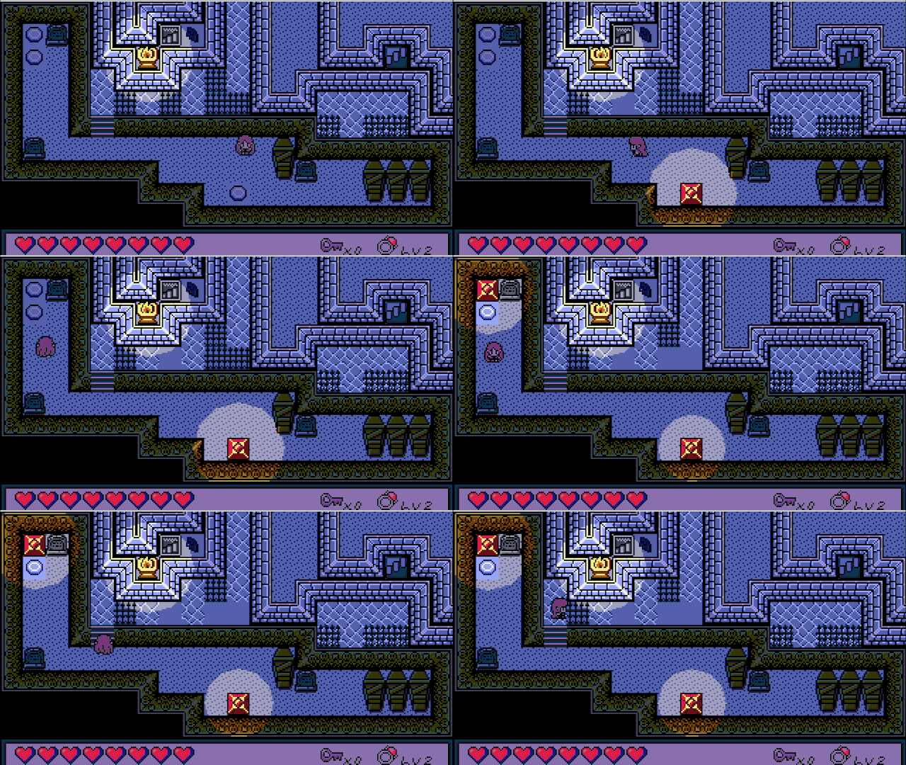
The difference? Now I'm using GameMaker's new filter system, and it seems to make things run much more performantly. I wanted to share with you how it was done!
First, a little on how the effect works:
Behold a daytime scene from ProtoDungeon 3!

For a cool nighttime effect, instead of just making things darker, let's employ a Hollywood trick and shift everything blue:
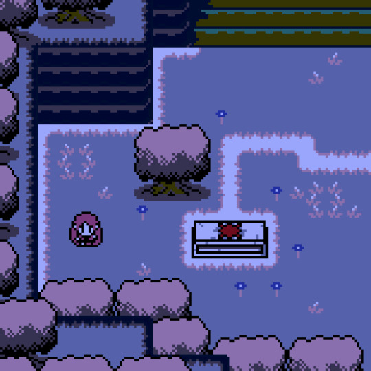
Okay and now the fun part: lighting! For that we just don't do the blueshift in a particular area (if you've tried this before, you know it's easier said than done)

Here's how it's done!
Part 1 - The Filter
ProtoDungeon and The Waking Cloak already use palette shifting to represent nighttime thanks to Pixelated Pope's excellent palette swap shader, (which I still highly recommend for individual layers or sprites!), but there are some limitations when trying to apply a palette swap effect to the entire game, and I kept bumping up against those limitations.
Cue GameMaker's new filter layers! Filter layers are basically just built-in shaders that apply to everything below them.
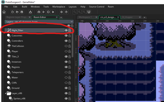
There's a lot of kinds of filters. Here's an example of a Contrast/Brightness filter (which I will eventually be using to replace my existing janky shader):

So how did I get Night_Filter working? What I've got above isn't an out-of-the-box filter
I tried a few methods here. Color Balance, Color Filtering, and Colorize all do neat things and are more than capable of making a nice "blueshift" (and I may still use them for tweaks later). However, I wanted to stick strictly to my palette, meaning when I blueshift the daytime colors to nighttime colors, all those nighttime colors are also in my palette. Very recently, the LUT Color Grading filter was added to GameMaker, and this provided a perfect opportunity.
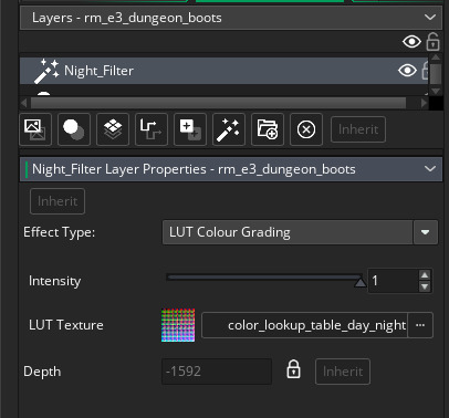
Okay, so what is LUT Color Grading? LUT stands for "lookup table." You have an image, the LUT Texture, that contains a HECKTON of colors--in this case our table is 512x512 pixels = 262,144 colors. Each color maps via its RGB values to a specific location on the table.

There are a lot more than 262,144 colors (RGB supports 16.7 million), but the filter's shader handles the "in between" colors too. It looks up the color's position on the table and changes it to whatever color is actually there. If we used the table above, it wouldn't actually do anything, because when it looks up the position of each color, it finds... that color. What we need for a palette swap is something more like this:

This is what I made by taking the original LUT image (which I found in a secret GameMaker folder), opening it up in Aseprite, selecting the colors I wanted to change, and then doing a color replace at about 30% tolerance:
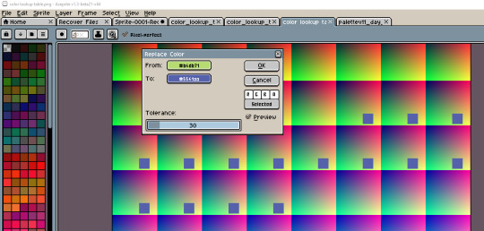
And then did that for all the colors!
You could use any image editor if you wanted to do a simple palette swap this way. (Also, technically, it doesn't have to be at 30%. It can be much lower, but I found it could be a little finicky for some colors.)
Once you're done, you add it as a sprite in GameMaker, then select that sprite in the LUT Colour Grading filter, and voila.
Part 2 - The Lighting
Okay, so that works! Now for the lighting! Remember above where I mentioned not doing the blueshift in a particular area?

Well, the issue is... you can't punch holes in layers for the lighting (I tried). I also tried a similar method to what I had before: each light is an almost-invisible, translucent circle that alters the colors just enough to not trigger the palette swap. Unfortunately, with the color lookup table, this was finicky and unreliable.
The answer? Don't do any of that. Use surfaces instead! (It's always surfaces, somehow)
So the basic idea: copy the lighted (unfiltered) areas below the LUT Color Grading filter layer to a surface before the filter is applied, then paste that surface after the filter is applied.
I know that sounds wild but bear with me.
We'll need a few things for this.
2A - Light Objects
Mine are a fair bit more complicated since I have a state machine and all kinds of activation/deactivation code. The main thing we'll be using for this is pretty simple though: keeping track of a radius and having a position (with x, y position being built in, of course).
I called it obj_light. If you wanted, you could just have the Create event do "radius = 16;" (or whatever number) and just put one of them wherever you want light to show up.
For an extra flicker effect, I use random_range every five frames between radius - 0.5 and radius + 0.5, but I'll let y'all figure that out.
2B - Light Manager
Next, we'll create an object to kinda just set stuff up. We'll call it obj_light_manager. I made it visible and persistent. In its Create event, we'll create two surfaces, one for lighting and one for masking (I'll explain that in a bit). Initially, I just made them both the same size as my base resolution (320w, 180h).
global.lightingSurface = surface_create(320, 180); global.maskLightingSurface = surface_create(320, 180);
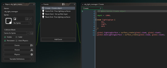
Then we'll add a few cleanup events (always clean up your surfaces so you don't have memory leaks). I put this in both Room End and Game End events:
if (surface_exists(global.lightingSurface)) surface_free(global.lightingSurface);
if (surface_exists(global.maskLightingSurface)) surface_free(global.maskLightingSurface);
Now for the magic part: in the Room Start event, we'll hook into the layer's events with layer_script_begin and layer_script_end.
var _nightFilterLayerID = layer_get_id("Night_Filter"); layer_script_begin(_nightFilterLayerID, lights_surface_create); layer_script_end(_nightFilterLayerID, lights_surface_draw);
2C - Layer begin/end scripts
Alright let's make those scripts now, lights_surface_create and lights_surface_draw. I'll drop these in pastebins with some comments since they're a bit lengthy and tumblr's code formatting is nonexistant:
lights_surface_create
lights_surface_draw
The explanation for how they work is all in there. Basically, we'll copy the light areas (not filtered yet) to a surface before the night filter takes effect in lights_surface_create, and then in lights_surface_draw we'll paste them on top of the night filter, and voila, lights!

Note: since I'm using subpixels, this method produced non-subpixel lights, which was pretty jarring. In order to make this work with subpixels, I made the lighting surface the base resolution multiplied by the zoom factor, 1280x720 with a 4x default zoom. When I draw the mask surface to the lighting surface, I have to use draw_surface_stretch. Finally, instead of using layer_script_end, I had to draw global.lightingSurface stretched in the Post-Draw event after the application_surface is drawn.
Let me know what you think! Thanks for reading!
#GameMaker#tutorial#lighting#pixel graphics#ProtoDungeon#the waking cloak#game development#pixel art#gamedev#indiedev#zelda#surfaces#shaders#filters
119 notes
·
View notes
Note
Whaaa??? You don't get tons of asks? Your stuff is so rad I just kinda assumed but if you don't mind... how do you come up w your color palette? They're so cool and poppy! And the shading/ texture of the pieces are so cool, is there any other artists or pieces that inspire you?
Yeah I doooon't, a lot of my audience left during the NSFW ban a few years ago (even tho I don't post nsfw art here??) and I never left! I kinda hate twitter and tumblr is the most tolerable social media imo. I just like it here best! Oh man I'm honestly thinking basic colour theory, primary colours esp tend to stick in the mind most and give a visual punch so I used those for the first little bit with a rich black being my silhouette. I changed things up this year having my main form (the rabbit) being the most colourful in the image. Because the posters are highly graphic in concept, I wanted to really limit my detail and colour options (hence the stick to the primary colours and overall maybe 3 colours tops). So simple palettes with high graphical effectiveness was my goal! It's hard to restrain myself for these as I'm usually a high detail painter and use a ton of colours haha;; I like old slavic advertisement sensibilities and definitely looked to those for my typeface, spacing and themes. I also just love animal anatomy, I think their flowing lines are the most fun to draw! I try not to look too much at other artists as I don't want to erase my initial ideas, I'm influenced easy and sometimes my first thought really is the best one for me? When I have an idea for an art piece, it's usually pretty clear in my mind already. I try to translate it best I can and then tweak and refine to what I think is the best ver it can be within my time and skill restraints. In general tho I love the work of Joy Ang, Joe Sparrow, SAPRO, jothelion and imugarou (although I can't find them anymore, idk their twitter handle and I can't find them anymore *sobs*)
#ohhh my god#this is so nice#i haven't experienced getting to talk like this in ages#thank you wonderful anon!#asks#anon#risky rambles
12 notes
·
View notes
Text
So, it’s #SavifrostWeekend and a theme for day 1 is ‘Battle couple,’ which I hope to post a gifset for tomorrow, but I want to do a lil appreciation post about in the meantime (with credited gifs from the gif search to accompany 💙).

There’s a number of reasons I enjoy Savifrost but certainly them working together with their opposing powers is one (similar to FlashFrost when both of them are heroes). The fact that they could basically end each other with their diametrically opposed powers playing into the others weaknesses, should they decide to double cross, makes their choice to stick together for most of S3 (and longer in that original timeline ala 3x19) more meaningful.

Generally, there’s so much potential there as villains with only a little seen on the show with how compressed the timeline for their episodes together were. Canon didn’t really explore the more extreme ways either of them could use their powers either, probably mainly due to the sfx budgets being limited, so it’s wonderful fodder for cool action sequences and witty team-ups. I always wished we got more of them working together and it’s great when fanfic etc explores that.

I love the idea that Frost gets the behind the scenes look at Savitar’s tech, and evolved abilities as the future Flash, and behind the visage of a wannabe God he presents too. Also, seeing as she suddenly has a villain getup soon after they team-up I don’t think it’s so weird to think Savitar, as the one planning things, provided the S3 nifty costume for her, and it’s satisfying they have a complementary colour palette in battle with the white, blues and grays to visually solidify their team-up.
I tend to headcanon her and Savitar training together, pitting their powers against the other as a thrilling competition and so that Frost is fully prepared for facing another speedster when the time comes.

It was a fun evil team-up and was interesting to see how facing a known enemy, that Barry and co. don’t want to hurt, went. Part of it felt more psychological on that, strategic in a way since Frost is one of the few people capable of stopping Savitar (like she did with Black Flash in 3x23), but they both have such potential without the constraint of being heroes, that the other sees and accepts despite that it comes with darkness, which I find an interesting parallel to look at for them.
21 notes
·
View notes
Text
her style (seven categories)

— daily wear (casual wear)
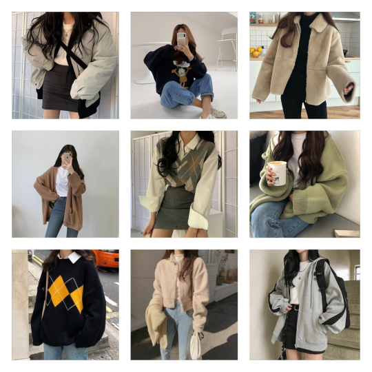
lian’s entire wardrobe is the definition of ulzzang fashion. she loves loves loves the korean style !! lian can get cold really easily, and so she tries to incorporate some sort of long sleeve into all her outfits.
it works out perfectly as well because when i tell you she’s obsessed with cardigans and jeans- lian owns SO MANY JEANS like half her closet is just jeans and it’s scary :0
she doesn’t normally gravitate towards layering clothing, but i promise that when she does, it looks so so good.
she has no problem layering a simple sweater vest or putting on a thick sweater over something thin, but she’s expressed how she finds it to be uncomfortable if she layers a bunch of thick clothing on top of each other.
lian also really loves skirts !! her legs have never really been the target of cold weather, so wearing skirts in the fall (or even winter at times) has thankfully never been a problem for her. she particularly loves mini skirts with a solid colour or a plaid design.
her colour scheme consists of neutral colours, black and whites and occasional pops of pastel!
— formal wear (meetings, company dinners, etc.)

there’s a rule in sm that states: the idols aren’t to wear anything denim or “lazy looking” while attending important events within the company or meeting new people in public because it’ll set a good first impression.
lian makes sure not to go overboard when dressing formally, but she’d get scolded if she were to underdress. and so that leaves her with a limited amount of options when choosing what to wear.
she tends to go with the simple blouse paired with a mini skirt, or if she doesn’t have the energy to try, she’ll throw on a pair of trousers with a solid coloured top and call it a day.
whereas if she were to be attending a company gathering with her seniors, she’ll wear a pretty dress or expand her “blouse + mini skirt” outfit into something a little more extravagant!
again, her formal colour scheme sticks to a neutral palette with black and whites. it’s rare to see any sort of colour if she hadn’t decided to wear something plaid.
— comfy wear (lounging, hanging out at home, etc.)

as much as lian wishes she could just stay in her pyjamas all day long when they’re off schedules, she knows that’ll do her no good. forcing herself to get up every morning and change also gives her the motivation to brush her teeth and wash her face like she needs to.
that being said, if she has to change so early in the morning, then she’s sticking with something incredibly comfortable.
tons of oversized shirts and baggy pants—the shirts normally belonging to the boys. no joke, johnny has lost over fifteen sweaters to lian, and they’re definitely not going back to him.
like his shirts basically go all the way down to her knees and so there’s no need for pants to keep her legs warm. a random pair of shorts and she’s good to go!
all of her comfy clothes are super soft and fluffy and perfect for sitting around to do nothing! she practically swims in all of these clothing items, but that’s part of the fun :D
she doesn’t really care about the colour, but she does have to match the pants with the shirt because if she doesn’t, then that’s just wrong, guys.
— sleep wear (pyjamas)

the fifth floor’s heating system has been broken for like the past three months and nobody has fixed it yet, so the dorm is constantly cold.
but lian does this thing where she freezes herself before she goes to bed because “it’ll feel nice when i sleep.”
the boys always tell her to go put on a sweater or change into a longer pair of pants because her sleep wear is literally the thinnest material ever—and not to mention, she’s wearing short sleeves most of the time!
lian seriously despises going to sleep in long pants because they make her overheat and it’s all uncomfortable when she’s under her thick ass duvet, so her pyjamas are normally short.
again, lian doesn’t really care about the colour because they normally come in sets and everything matches anyway. she definitely prefers to have a thin and soft material!
— award show wear (first row: while performing, second row: red carpets)
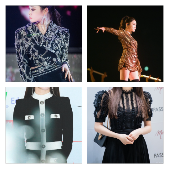
okay say it with me: LIAN PRETTIEST GIRL !! the stylists absolutely love love love lian, and they make sure to show it when putting her outfits together. whenever lian is performing on stage, she’s always decked out in a glitter filled outfit so that she shines even brighter than she already does—especially if she’s with the boys.
it’s no secret that lian is rather ... vertically challenged, and the stylists want to make sure she’s not completely enveloped into them to the point where she can’t be seen. they make sure her outfits a little more sparkly so she’s able to be seen well, but they always have to match with what the rest of of them are wearing.
if she doesn’t match, she’ll looks like a random girl just following them everywhere they go, and that’s something nobody wants!
while walking the red carpet, lian literally looks a million dollars. all her outfits are personally made just for her so they fit perfectly! unless it comes from a designer brand, of course.
she’s obviously had a little bit of malfunctions because the “too short for their body type dress” has happened once or twice despite having all her outfits custom made. make that make sense tbh ??
the colour scheme is super colourful and diverse! like stated before, the stylists love to have her stand out and shine, so they love to take risks while creating her outfits :)
— jewelry (necklaces, rings, earrings, etc.)
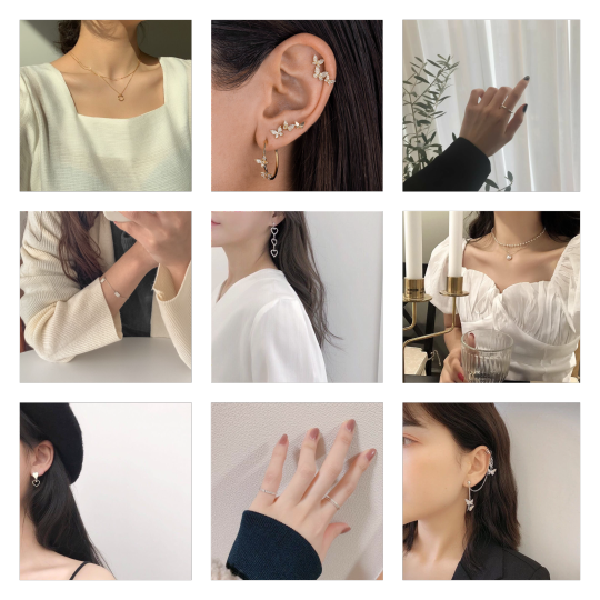
lian loves her jewelry! she’s always seen wearing pretty necklaces, shiny bracelets and gorgeous, dangly earrings :) but she has a very strong love-hate relationship with rings.
there are only certain rings she’s able to wear because bulky and chunky ones make her very uncomfortable. she leans more towards the dainty and thin style.
for earrings, she really goes all out with them. her earrings are always dangly and shiny, and super extravagant! she has a lot of piercings as well so she’s able to wear several earrings at a time.
her necklace preference is fairly basic; just the simple dainty chain with a diamond on the end or a trail of pearls.
— head wear (hats, headbands, hair clips, etc.)
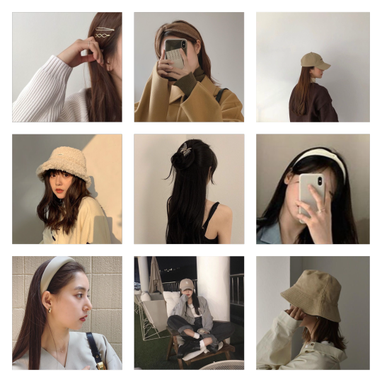
lian honestly doesn’t care for hats that much. she prefers having her hair flow nicely with a couple of hair pins to keep it in place, but it’s necessary to have a hat on while dancing because her hair will go EVERYWHERE everywhere if it’s not secured in some way.
she only likes bucket hats and baseball caps because she believes that the other ones are ugly. no offence to beanie wearers, it’s just not her style!
headbands aren’t something she’s too into either, she’ll only wear them if she believes that it’ll go well with her outfit. she’ll also wear them if she has to keep the front pieces of hair out of her face for the day.
lian’s hair clips are like her children. she’s always wearing some sort of pin and they’re literally so beautiful and match her outfits so well!
not only does lian absolutely love the way her hair clips look on herself, but she likes how the boys look with them in their hair as well. when yuta still had his long hair, she would constantly be styling it for him.
he would be adorned in golden bobby pins and sparkly clips basically 24/7 :D
majority of lian’s clothing sticks to a neutral colour palette, so she buys hair accessories that match well!
#lian: get to know her!#nct addition#nct female member#kim chungha#nct 127#nct#nct dream#wayv#lianna bae#nct 127 added member#nct 127 female member#nct dream female member#nct dream added member#nct 22nd member#nct 24th member
66 notes
·
View notes
Note
i love the hc that sonia and nagito r related. like as soon as i saw it i looked back at their character designs and just ??? THEY LOOK SO ALIKESJDNDNDN and their colour schemes r identical??? white, green, n red– and nagito's colour palette is just extra washed out. like they literally are. so alike its unbelievable (in terms of visual design)
and they sort of speak the same way?? like nagito's speech is more languid and stuff but they speak very similarly and it just. it makes so much sense 2 me
which brings me to my hcs,,,, which include, but are not limited to: nagito speaking french. idk why it hits a good part of my brain. also; nagito knowing the violin + piano and sonia knowing it too. like as his motor skills get worse with his illness it gets a bit tougher but he can still play rlly well. and also they have portraits of each other in sonia's family's home lined up next to each other and one of an old ball in sonia's kingdom where they're in the background as young teenagers laughing together. just v good cousins. v good. nagito deserves good family
yessss nagito sonia cousin hours!!!!!!!!! in a perfect world he’s taken in by his aunt and uncle when his parents die and he gets to be raised alongside sonia and they stick together even if nagito’s luck makes it harder
i think sonia was raised stricter since she was the crown princess, but like. i think nagito would do his best to help her relax whenever she gets a break. i think he’d bring her books he gets from the royal library and they could just talk about them and have fun with trying to guess what happens next.
also?? nagito playing the piano and violin??? i’m in love????? hhh i want them to play a duet together!!! it’d be so fun pls........i like to think sometimes, when they were kids, they would sneak into one of the ballrooms and nagito would play while sonia danced and they would have fun trying to match each other’s rhythms. it was like a competition to see how long sonia could keep up with nagito always turning up the tempo and then when it was sonia’s turn, nagito would have to keep up with her constantly slowing down and speeding up. they probably got caught a lot bc they kept laughing and making noise, but i think the castle staff would let them off the hook a few times if they didn’t have anywhere to be.
17 notes
·
View notes
Note
I genuinely dont understand how is it that your fusion comic doesnt have more notes. I very, genuinely dont get it.
Its impressive how simply using two colours, black and white, you're able to create such amazing illusions by using contrast. Also? The idea in itself? Also amazing. Ive been following each chapter since I discovered it, and its honestly amazing! You dont use many brushes either, it looks like just stick to one and take advantage of what you've got with very little. That's amazing, I actually have tried to take example of your art style before, its simplistically impressive.
I'll be around when the next parts come along, but no pressure, just do it whenever you feel like to. Good work, yeah? You're doing amazing, all your projects are really cool.
Good luck!
Thank you so much!! This made me really happy to read :D I’m honestly surprised it even gets as much attention as it does ^^ I’m glad you like the style of the comic, being black and white and all. It’s a fun sort of puzzle, drawing and then picking what should be black and what should be white in order to keep certain objects separate from each other or make a large amount of lines more cohesive. Crazy coloring is a lot of fun too but limiting palettes makes the design part of drawing interesting when coming up with different ways to solve a visual problem.
I think Haruko Ichikawa was a great influence for that one.
Hopefully you like the next parts too!
29 notes
·
View notes