#sorry the images aren’t that high quality
Explore tagged Tumblr posts
Text
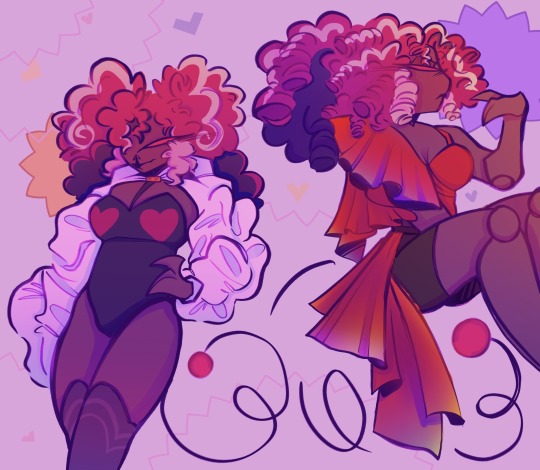
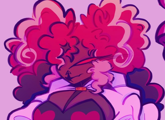
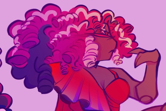
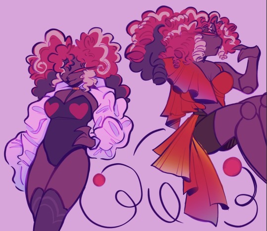
Other close-ups below the cut
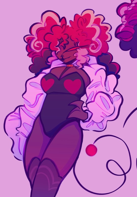
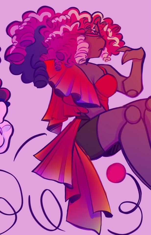
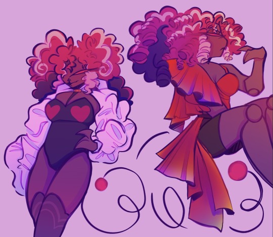
#reblogs would be very appreciated btw#artists on tumblr#I love drawing clothes#my art#digital art#hazbin hotel#hazbin hotel fanart#hazbin hotel velvette#hazbin velvette#velvette hazbin hotel#hazbin hotel vees#favs#sorry the images aren’t that high quality#I was working on csp doodle mode
78 notes
·
View notes
Text
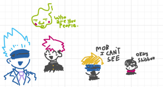
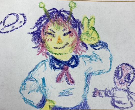
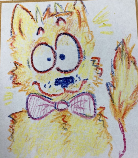
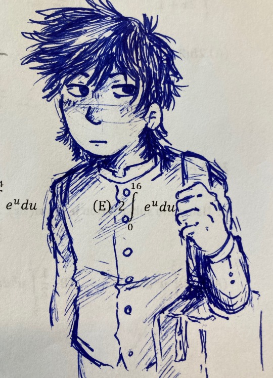
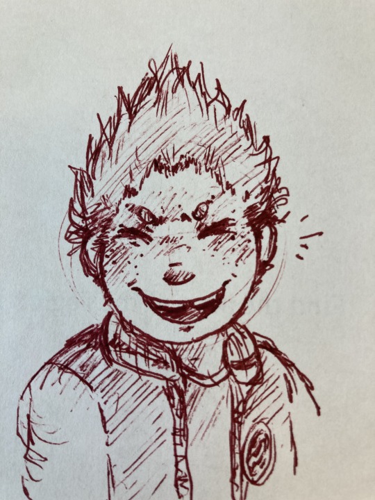
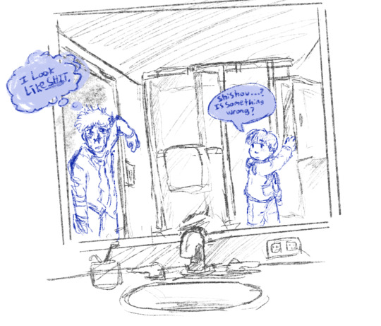
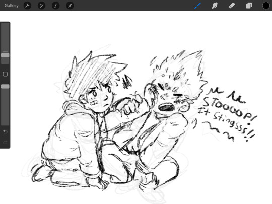
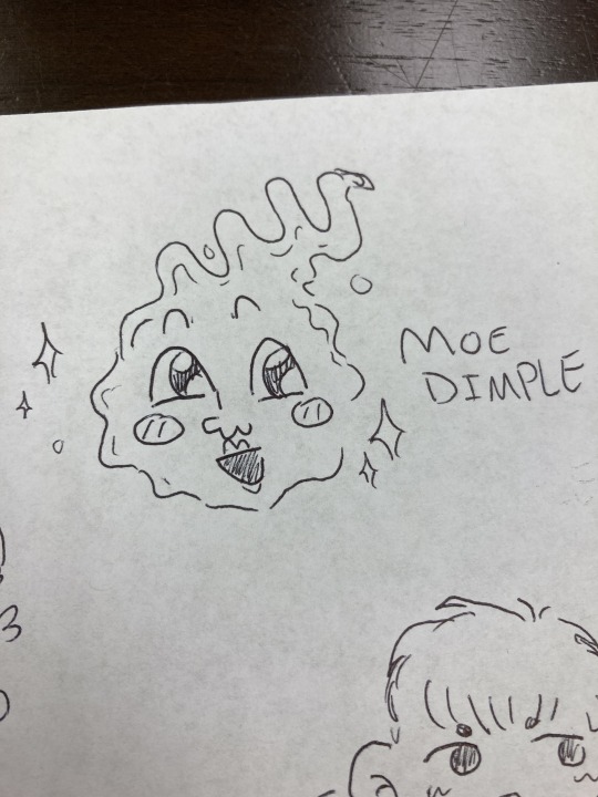
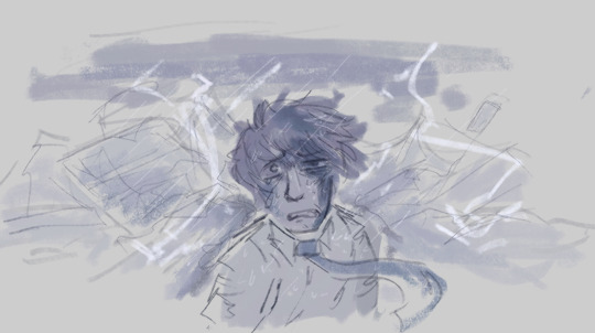
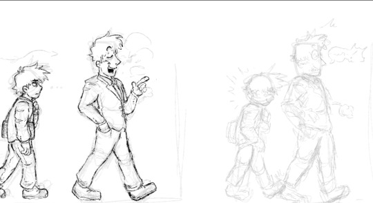
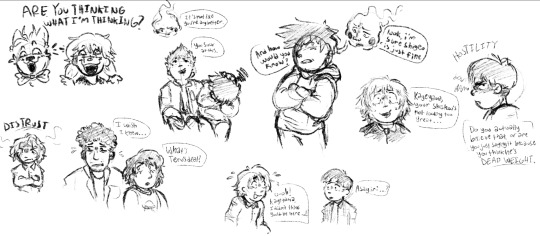
It’s doodle dump time again!
#mp100#cowardly draws#feeling a little self conscious about these bc they aren’t as high quality as most of my doodles I’d say#some explanations: image 2 is tome but with my hair#Image 6 is reigen BUSTED UP but you get no context for that one#And the last image is some concept I’m thinking about and would absolutely appreciate curiosity about (inbox is always open :3c)#oh and there’s a bonus Mahito doodle in that one sorry#mob psycho 100#im not gonna tag everyone. You’re free for now
48 notes
·
View notes
Text
˖⁺‧₊˚ ˚₊‧⁺˖✮-------------------✮˖⁺‧₊˚ ˚₊‧⁺˖
just count your stars i’m home again
izzy calls you after an argument.
warnings: i don’t think there is any? drunkenness? being high?
a/n: this took forever cuz my phone has been glitching super bad recently (this is why the banner is low quality). also while i was writing this it was called ‘izzy stradlin is adam levine confirmed?’

it was late. the sun had set hours ago, casting los angeles in a deep black shadow with the city lights peeking through the darkness. the tv was on, and you flicked through every channel in search of something to take your mind off things. but it didn’t work. in fact, it made things worse, as you turned on MTV and were met with the ‘patience’ music video staring you in the face. you went to change the channel, but before you could, izzy showed up on screen. his gentle strumming of the guitar made you have to look away. you loved him, but he worried you so much.
you went on to the next channel, a shitty auctioneer’s show they only played in the late hours of the night. “this’ll have to do.” you said out loud, knowing there was no around to hear you. a bottle of jack stood on the kitchen counter. you hadn’t touched it since izzy had left, the image of him taking a swig right before he left burned into your memory. you tossed the idea of having some about in your head, but decided against it. who knows how he’d react?
hours passed, and izzy still hadn’t came home. you were about to give up hope for the night and go to bed when the phone rang. oh god. what’s happened this time? is izzy in trouble? did he caught with his drugs? has he been arrested? the questions ran through your mind a mile a minute. you practically jumped at the phone, scared to know what awaited you on the other end of the line.
“hey baby.” that low voice you loved so much greeted you.
“izzy? what the fuck? where the fuck have you been?” you interrogated him, a mix of anger and relief coursing inside you.
“jeez, you seem scared,” he laughed. “i’ve just been with the guys. writing and shit.”
“and getting high, i’m guessing?” you retorted. did he not care that he’d left you alone for two days, with no word of where he’d gone to?
“i’ve missed you baby.”
“seriously? you left me on my own for two days. i had no clue where you are. i still don’t!”
“i’m… at the whisky right now.”
of course he was.
“are you drunk?”
“does it matter..?”
you scoffed. that was all the confirmation you needed.
“i bet you’re high too, aren’t you?”
“look, babe, i’m sorry.”
“i don’t care if you’re sorry. that doesn’t change the fact you fucking walked out on me!” you snapped. you were relived to know he was okay, but god were you pissed off. there was no sincerity in his voice.
the line was silent for a moment. you waited.
“can you pick me up?”
“none of the guys can drive you home?”
“they’re all too drunk.”
“right,” you sighed. “be there soon.”
you got into your car and started driving to the Whisky A Go Go. It wasn’t very far away, but it felt like an eternity. you pulled up close by and saw izzy sitting by the payphone he had called you from, back pressed up against its stand. you sighed.
you got out of the car and walked up towards him. stopping just a bit in front of him, you said “cmon. get up.”
izzy looked up, staring at you with glassy eyes. clearly, he was too drunk and high to notice you before you started talking.
“huh?”
“i said get up. i’m taking you home.”
“oh… ok.“
that was all it took. izzy got up, albeit with difficulty, and walked over beside you to the car. he stumbled into the passenger seat and gave you a smile when you got in. despite his inebriated state, he was happy to see you. he always was.
as you drove home, he sobered up. and as he sipped on the week old bottle water that had been rattling away in the floor of the passenger seat, izzy realised what a complete dick he’d been. regret crept in quickly. he turned to look at you. through your peripheral vision, you saw him. izzy took a final sip of the water, and cleared his throat.
"hey, uh…”
you kept your eyes focused on the road. "what is it?”
"i’ve been an asshole. i’m really sorry.” izzy spoke. he actually seemed apologetic this time.
all you managed to say was "oh.”
"i feel really bad. it’s just- after our argument i was pissed off. and i know i coulda handled it better. sorry.”
you looked at him quickly. he seemed genuine, regret etched on his face. "it’s ok.”
"so you forgive me?”
"i do. just don’t try that shit again.”
"wanna go get takeout?”
"are you paying?”
"of course.”
#ignore the ending i lowk hate it but i did not know how to end this at all#my writingg 😚#izzy stradlin#gnr#guns n roses#ignore the spacing too i can’t get it to work
79 notes
·
View notes
Note
I hope you don’t mind asking but you consistently have some of the best 911 gifs. How are your gifs so sharp? And the coloring so good? Could you do a little tutorial about your giffing?
omg thank you!!! this gets pretty long so i’m putting the tutorial under the cut
so firstly, i use kmplayer to screencap. the most important part though is the quality of the episode you have. you always want to work with 1080p, and my file is around 2gb. that is how my gifs always turn out ‘the best’ as you say 🤗 of course, colouring and sharpening help a lot, but if you don’t have a good download, your gifs can be helped but won’t be the best possible.
this is the gif i’m making having only been cropped and sharpened. i’m gonna show you how i make a gif and my colouring process (which, for this one, is admittedly pretty short and simple compared to what i usually do.) as you can see, it’s dark and pixelated and doesn’t look that appealing, no matter how handsome they both are.

also, i forgot to screenshot this before i started but the screenshot below shows the action i use to basically get all my screencaps organised to make one gif. this is after you’ve got the screencaps into photoshop in a stack.
i can’t find the original post with the action, and i’m not sure how to share it on this post… but if it’s not that important in the scheme of this post, there are many other posts out there with actions you’ll be able to easily find and download.
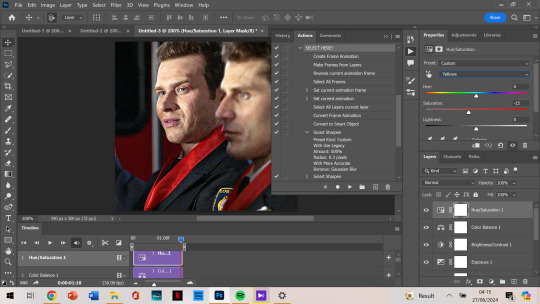
anyways. so this is gonna go through the process of making a gif assuming you’ve done the process of importing the frames and sharpening. (i would normally cut out my taskbar but there are so many screenshots, it would take foreverrrr)
the next step would be cropping. this is the original:
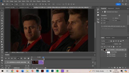
and i’m doing a 540 x 500 gif. i like mine to be bigger so i can only get the person/people i want in the gif (sorry eddie) but sometimes if i want that it’ll be smaller, usually 540 x 400.
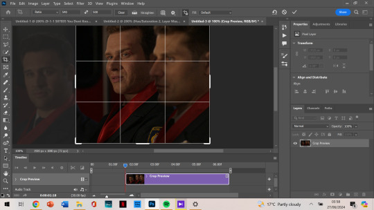
anyways, i crop from the edge and make it a little smaller so i don’t get the white border around it. and then i move the gif away from the top and right edge of the gif just by 3-5 pixels. which i already did here and then zoomed in:
next, image size. i honestly didn’t know about cropping it and then using image size for a few months when i started giffing (i don’t even know what i did back then not knowing that.)
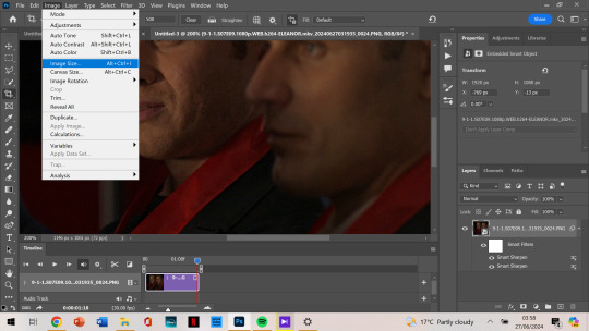
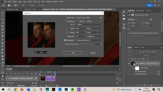
then as you can see, it’s 540 x 500. if you’ve cropped it to the size you want beforehand, it’ll be automatically those dimensions.
next, we’re finally starting on colouring. i always tend to start with curves and use the middle brush on the left. the top one you use to make it darker, and the bottom you find the whitest point on the gif to make it a lot brighter. but i find the middle one colour corrects too, so it’s not too bright or dark, and is less yellow or whatever colours you don’t want.
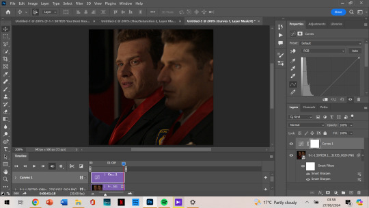
it depends on where you click to get this result, i’m not sure how to explain what i do but i just click all over and try to get the yellows off and the skin colour to look generally the same as what they have. most of the time, if i get this accurate enough, the rest of the colouring process is just to brighten up the gif.
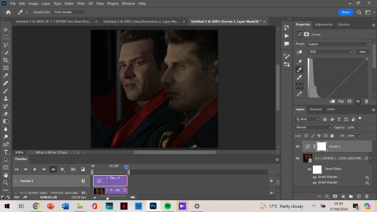
so, then after i got my desired result, we’re brightening it up because you can’t really see them all that well. i use brightness/contrast but i tend to use exposure the most.
as you can see, i am at +2.78 exposure which is crazy high (imo). but as that and the curves layer did a lot of the work for me, i mostly have the colouring i want.
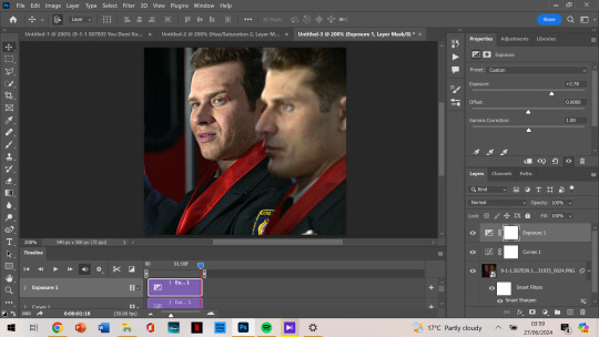
although i think it could be a little lighter, so i add a new layer of brightness and contrast this time. i don’t brighten it all that much after that. i want to make it so that either one of their faces aren’t shining, and with too much of the exposure, it can make that happen.

next, i notice that tommy is kinda green/yellow, so i want to fix that up and make him more natural. i go to colour balance for that this time. most of the time i go to selective colour -> yellow or red, depending on how much i want to change. with selective colour, it gives you a few options in shades: cyan, magenta, yellow and black to alter, all for your specific colour.
meanwhile, colour balance changes the whole thing. since i wouldn’t mind that in this instance, i just go with colour balance.

tommy is looking less yellow and green, but still, he’s not where i want him to be. (plus oliver’s scruff area is naturally ginger so it shows up as yellow, and i want to decrease that a little.) so i go to hue/saturation, choose yellow, and decrease it a little more.
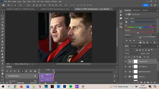
now, after this, i messed around with selective colour as i mentioned earlier and with the colour yellow and red specifically. but after comparing where i was at before, vs with those selective colour layers, i just liked that previous one more. so my last layer is the hue/saturation one. and i’m done colouring!
next, i go to my trusty camera raw filter to make them stand out more and be a little crispier.
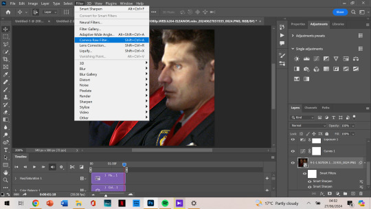
i tend to stick to + 10 up to 30, somewhere in that range. sometimes the texture and clarity match, sometimes they don’t. it’s all up to you, but for this one, i knew it would end up a little too crispy so i didn’t go too high.
i also like to add some grain so that it’s less pixelated (it admittedly annoys me a lot when it’s got those visible square pixels all over.) i never go higher than 5 in grain, it does the job well.
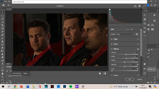
after that, i’m finished with my gif!

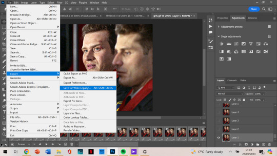
next, we want to export the gif.
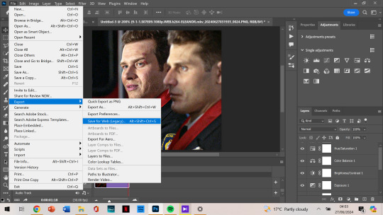
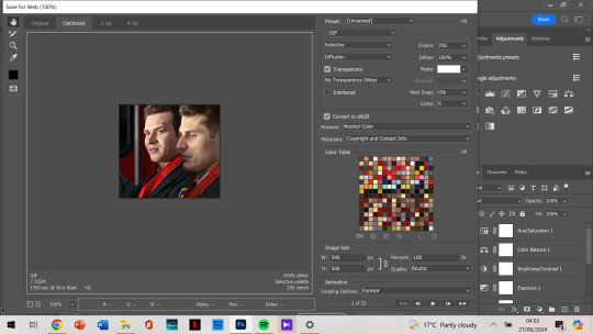
as you can see, the gif is less than 10mb, is set to loop for forever, and is made with selective diffusion. admittedly, i don’t think about that setting that much, but sometimes if it’s a lower quality gif, i’ll change it to selective/adaptive pattern instead. but that’s not relevant here.
after that, we open our gif that we just made into photoshop again. this time we want to select all frames:
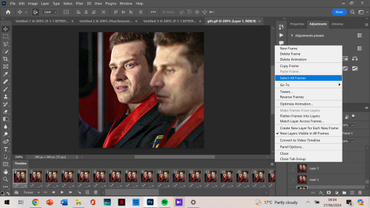
and change the frame delay so it’s not as jumpy. for some reason, it automatically changes so that they alternate in frames from 0.03 to 0.07, but i want them all to be 0.05.
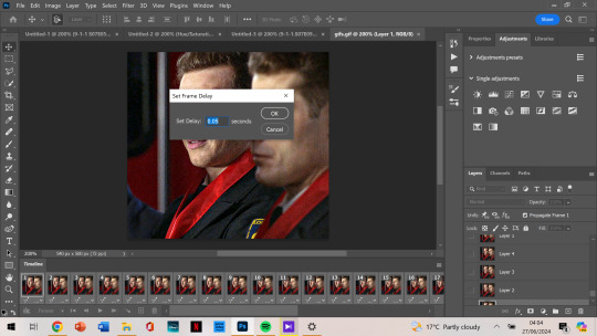
now that’s the last step and you just export the gif again!
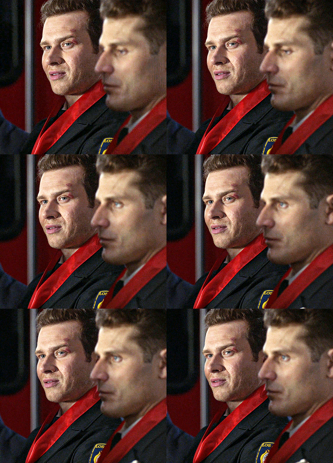
this is the final gif!!!
i hope this was easy to understand! thank you for the kind words, and for asking me about my process because i’ve honestly always wanted to make a tutorial. if you have any more questions, or want to see my process colouring something more difficult to work with, let me know! 🫶
90 notes
·
View notes
Note
Hi, you are more than welcome to ignore especially if you have answered before and I missed it/it's elsewhere on your blog but can I please just ask how you get your CAS photos to look so incredibly clean? Especially around the edges, they're so smooth it's incredible. Thank you in advance, I really appreciate it! You inspire me so much tbh, everything you post is so beautiful. (Also also also the eyebags you released recently are my new gold standard and I use them for everything now tysm for sharing them) 🖤
thank you!
ok so here are a few tips, you don’t need to follow all of them, but if you like exactly my cas style, maybe some of them will help
1. edge smoothing. sorry for being obvious, but use either in-game anti-aliasing, or a smaa shader if you’re a reshade/gshade user, or you’ll get a pixelated staircase for the edges that will be hard to fix. if your PC doesn’t handle high graphics well and you play without edge smoothing, you can toggle it on temporarily just for taking a few good cas pictures and then turn it back off.
2. use MXAO. if you use reshades, use mxao shader for pictures, it's really a life changer. though i don't use it during the regular gameplay and only turn it on when i take pictures, because moving a lot with it slows down your game and is a visual overload for me.
3. but don’t overdo it with MXAO. seriously, don’t go all out with mxao. for a cleaner look shadows need to be delicate, just to overline shapes and give your sim more dimension. every time i tweaked my reshade presets, i made mxao even more thin and gentle and realized that it only got better.
4. background makes a huge difference. solid colors. in my personal opinion, grey gives the "cleanest" look (i said while still using my old dirty yellowish that i'm too lazy to find a replacement for). also, if i want to use black or white background, i make it a little darker than white and a little lighter than black, they look pretty much the same but will attack your eyes less (especially the white one).
5. CAS lighting makes a huge difference. maxis light isn't that bad, but cc lighting definitely give you more clean, crisp image. my personal favorite neutral one that i use by default is v2 by helgatisha. sometimes i use lightings with side highlights for more “rendered” look, but they aren’t always comfortable for everyday use and i only use them for specific pictures and then get back to my default neutral one.
6. shadow overlays. i mean cc that imitates shadows on sim's face, it gives sim's face so much dimension. there are spotlight v1 and v2 by simandy and lighting overlay v1 and v2 by joshseoh. i'd say josh's overlays are for fancy portrait pictures (they imitate a very strong light source from different angles, very cool for sim photographers but not for regular gameplay), and simandy's are more neutral and are very gameplay-friendly on lower opacity. personally, i only use v2 by simandy now, it's my holy grail and i don't take sim's pictures without it.
7. SRWE. it's a program that emulates having a bigger display resolution than your monitor can afford, meaning much better screenshot quality and cleanliness for small details. srwe can be a bit of a hassle to use for a lot of pics and most of the time i’m too lazy to use it and just take my regular small pixelated screenshots, but sometimes i want just one, but extra clean picture.
8. Topaz Clean 3 (photoshop). i don't usually edit my pictures and just drop them like whatever, mostly because i don't know how to do it, but sometimes i make them sharper and cleaner with a gentle touch of topaz on very low strength.
57 notes
·
View notes
Text


(I know they’re shitty images, we aren’t exactly working with a wealth of high quality photos of bleeding-edge, immensely closely guarded prototype next-gen Chinese aircraft I’m sorry)
I even included answers for the pussies in our midst who don’t find cutting edge lethal technologies cool.
12 notes
·
View notes
Text
Ezra - Rebooted Design

my protagonist! Sorry if tumblr crunched the image quality ;D
lore dump under the cut
Color in Wars: Soldiers, civilians, and PMCs use different colors to represent their role in wars. Civilians wear bright headscarves with glow in the dark patterns as any reasonable soldier doesn’t want their head to be seen like that. Doctors were white and grey and overall just kinda look like em. Medics (that are in the fighting) keep their GEAR white, but they don’t dress in white, so its more a headsup like “Hey! Im a medic! Think twice before you shoot”. Ezra’s final version more a sniper than a medic, hence why they dont really dress in white. Soldiers wear their combat gear (varies) with a small teal emblem on the underside of the wrist. (Thereby making them the obvious combatants) PMC’s use dark/murky teal or light tan gear as their color. Their gear can get confused with Militaries but most PMCs stay out of warzones anyways. Most who ARE there are actively in the fight Snipers are mostly grey/blue. They’re very common in civilian areas where evacuations are taking place so they can fire warning shots so unless they’re actively in a warzone, they aren’t high priority targets.
7 notes
·
View notes
Text
Translation of two magazine spreads
“Revenge to You” is an illustration with some description while “Love, Hate” is an interview with Sakurai and Matsukaze.
I have been dying to read them for a while now and I finally found ones that are high enough quality to read. Also I was desperate enough. I wasn’t able to find any translations online, so I’m assuming there aren’t any. My Japanese is kind of terrible so any corrections are welcome. Enjoy!
Image source is @/ydotome thank you for the scans!

Revenge to You
Gaelio Bauduin
Taking off his mask, he returns to the battlefield. To vanquish McGillis, he stands up before (McGillis’s) ambition.
McGillis Fareed
With the [unintelligible] Gundam Bael at his hand, he lights the fire that signifies revolution. But destiny has more trials awaiting him.
Text on the right:
Despairing betrayal and farewell to his dearest friend. Even ideals called “revolution” cloud before such hopelessness. The man who fell suddenly into the depths of dejection borrows the name of “Vidar” who continues the bloodline of the god of war and giants, and rises to his feet again. In his chest is not hate, nor justice. Only the anger to completely reject all of McGillis’s actions. The scar carved deep inside the mask is a reminder to himself that he failed to protect those important to him. With thoughts of all that he has lost in his heart, Gaelio returns to the battlefield again.
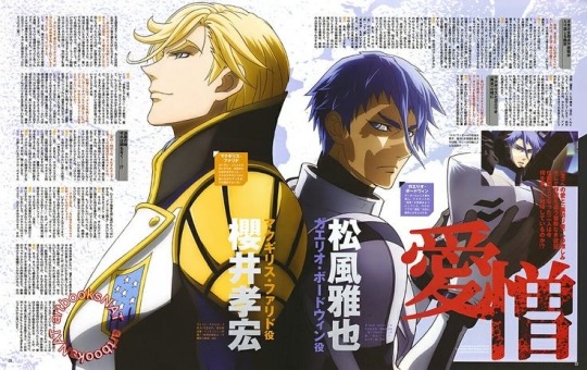
Love, Hate
With love for a “friend” and hate for a “traitor”, and the unrelenting desire to pursue ambition, what are the two who have become nemeses thinking as they oppose each other?
Finally removing Vidar’s mask, showing his wounded bare face. What sort of determination did Gaelio have then?
McGillis Fareed/Sakurai Takahiro
[Not translating the actor bios because 1) too blurry 2) I don’t care about Sakurai]
With acquiring Gundam Bael, the world should’ve bowed down before him. Although he is driven into a corner by Rustal and Gaelio, he isn’t giving up just yet.
Gaelio Bauduin/Matsukaze Masaya
He concealed himself as Vidar to witness McGillis’s “true intentions”. Now he stands coldly in front of his past “best friend”.
Things heat up as all kinds of viewpoints and emotions mix
[Really could not read the question on this one. Sorry]
Matsukaze: I’ve been so excited ever since then!
Sakurai: Especially Gaelio.
Matsukaze: That’s because I loved the audition, and when I talked about “[unintelligible]” with Mr. Sakurai (and other members), I never thought I’d get a role like this. Of course, I never thought that I would be betrayed and get beaten up by McGillis, or that I would reappear wearing a mask.
Sakurai: It was rather confusing to begin with, I’d always looked up to the Gundam franchise, so at the start I was excited like a child about details like “can I pilot a Gundam?” or “will I wear a mask?” But now that feeling’s almost entirely gone…
Matsukaze: Now things like getting in a Gundam or not for us, is [unintelligible]. Gundams have a lot of screentime, so wouldn’t we worry about dying? Something like that (laughs). Meaning now it feels unbelievable, as an audience and as an actor, and the subjectivity of [unintelligible], lots of different point-of-views are mixed together.
Sakurai: Not only that, but isn’t the show too powerful? Even when dubbing it for real, with all the actors together, a lot of things are mixed together and hard to separate, so I feel what it’s like to struggle with acting for once. But then I felt everyone’s determination and focus, and the atmosphere that a lot relied on finishing the project.
Matsukaze: And of course, “death” really grips your heartstrings. Because “death” is “[unintelligible]”, although “acting a character that dies” is hard, it’s the people around that really make you feel the impact of “death”.
Sakurai: Yeah, you’re right.
Matsukaze: For actors that act as a dying character, of course you’d shout and yell at the moment of death, but it’s impossible to do that after death. It’s the people around that have to bear the emotional fallout of that death. I’ve talked about it with Mr. Kawanishi (Kengo) [Mikazuki’s VA] and Mr. Hosoya (Yoshimasa) [Orga’s VA]. For the deaths of other people, whether it be Carta or Ein, the feeling of those who haven’t died…
Sakurai: He’s bearing all that, Gaelio is.
Matsukaze: It’s so painful! (Laughs bitterly) And although the ending of Season 1 was rushed, as the role of a “rival” that can’t win or lose, I thought it was “[unintelligible]”. If I won I’d overact, and I’m bad at acting the loser, so it wouldn’t work either way…Looking back it was really hard, because the rival is too strong, and the story and drama are so powerful, I was really conflicted about what sort of acting would be fitting.
McGillis and Gaelio’s “reunion”
In episode 43 McGillis’s past is revealed, and his objective becomes clear. And then Vidar - Gaelio took off his mask. It was a turning point for the two.
Sakurai: Announcing the ambition he’d never told anyone about all at once, and then piloting Bael, McGillis had revealed all the cards in his hand, so now all he can do is head towards his goal no matter what.
What did it feel like for McGillis to face Gaelio again?
[This whole next paragraph is very blurry. I am as frustrated as you are]
Sakurai: About that, it’s like getting to the other side of a mist [?], and it’s a straightforward impression. McGillis already has the attitude of “getting[?] everything”, but he shows an ambiguous expression unable to say anything, was he surprised? And [unintelligible] feelings, it’s like, not [unintelligible], but it’s a bit of a [unintelligible] reaction. As I thought, when it comes to things about Gaelio, there might be something unlike with anyone else.
And Gaelio also said that he thought that the McGillis of the past “took off his mask in front of him only”.
Matsukaze: Well, I might be biased because I’m acting as Gaelio [?] (laughs). It might have just been an instant, but I think that instant surely existed. Which is why Gaelio probably also read Agnika Kaieru’s works at least once…he probably didn’t read them very closely, though (laughs).
Sakurai: Hahaha (laughs).
Matsukaze: He definitely asked “what are you reading?” Judging from Gaelio’s personality, if McGillis had the same interests with Gaelio or Carta, he wouldn’t have just used them but worked together with them, is what I think. McGillis who crawled up from the depths and Gaelio who was born into and grew up in a privileged family, they see different worlds.
When Mr. Matsukaze acted as Vidar, did you proceed as if it were Gaelio, or did you change it into something a little like a remake?
Matsukaze: When I heard he hadn’t actually died, but was going to reappear wearing a mask, I asked Director Nagai (Tatsuyuki) “to put it simply, did he become a ghost of revenge?” And then, it wasn’t quite like that, but he was still Gaelio as a human. So for myself personally, being betrayed by your best friend and tossed aside by your childhood friend [osananajimi], after experiencing these emotions he can’t control, changes of that level, and people he talks to changes, for example he talks differently with Rustal to some degree, but the baseline is that I still acted as Gaelio.
The moment of conclusion is approaching…?!
In episodes 45 and 46, there were the direct fights between Gundams.
Matsukaze: For me, it was really interesting that Isurugi was also there in between. It was just like how it was with Carta. Even though the source of the conflict is McGillis, he has to persuade Carta and Isurugi first. Because this is the second time…For Gaelio, there is a theme where he instantly becomes furious. Like “See? You’re being deceived by McGillis!!” (laughs)
Sakurai: Like “Again?!” (laughs)
Matsukaze: I acted like I was an Osaka mom, and it passed on the first take.
[Note: apparently Osaka moms are known for being bossy and yelling at their kids or something.]
Sakurai: (Laughs) But because McGillis is McGillis [?], I do think Isurugi’s last words did hurt a lot for him.
Matsukaze: But McGillis is the kind of person to do it by himself in the worst case scenario. He hasn’t changed from when he was a child and hit someone with a chair.
Sakurai: McGillis has no expectations for anyone. I feel that strongly.
Matsukaze: Even Agnika Kaieru, whom he was so infatuated with, seems to have done everything on his own. Something like “Agnika Kaieru’s three musketeers” probably never existed (laughs).
Sakurai: Right (laughs). He just projects himself onto Agnika, and he’s dedicated to his ambition about power. What an unbalanced guy. If he was cleverer he might have been able to find a different way, with more time, there could have been a more cautious way…
Then what sort of drama will the two have from now on?
Sakurai: I think McGillis and Gaelio will arrive at a final outcome soon. If not, there is no meaning for Gaelio to live for. A reconciliation like “Gaelio, I was wrong!” or “I…forgive McGillis!” probably won’t happen…
Matsukaze: Yeah…(laughs bitterly)
Sakurai: It’s certain that there’s going to be some sort of resolution, but what will it be?
Matsukaze: No matter what, McGillis will be McGillis, and Gaelio will be Gaelio, and they’ll both act out their wills. I think it’s important that they do what they want to [?]. Which is to say, that’s where it’s very “Gundam-like”. All sorts of reasons to fight, important things, there’s things you want to protect, and the conflict that arises from these differences. Not just us but Tekkadan as well, everyone with completely different positions are trying to carry it out.
Sakurai: Yes, once I became aware of this structure, it became a whole lot more interesting. For the inner conflict of Gjallarhorn, that survived the history of the universe, Tekkadan is a very small organization, but their rebellion has connected McGillis and Tekkadan deeply. For example, Shino’s death might just be “the death of one soldier”, but he is one of the mental supports of Tekkadan, so he actually changed the battle at least a little bit…it might be a grown-up way of seeing it, but I think knowing that made the drama much more interesting.
14 notes
·
View notes
Text
RECENT ECOMMERCE NEWS (INCLUDING ETSY), March 2024

Since I wrote so many articles on Etsy in the past 2 months, it took longer than usual for me to get the full ecommerce update out. Sorry about the delay, but here it is!
For fresher and more frequent updates, please follow me on Bluesky or on LinkedIn, or become a member of my Patreon.
TOP NEWS & ARTICLES
Etsy’s fourth quarter 2023 financial results came out February 21; I did a deep dive into all the announcements here. In short, there are a lot of new things coming, and some changes that may have affected some sellers already, including:
plans for more predictable shipping costs for buyers and sellers (what does that mean?)
Etsy Ads are now localized outside of the United States
search will be shifting to boost "high quality" items, going from highlighting what shoppers are most likely to buy to what shoppers are most likely to love
a buyer loyalty program is coming
the goal of “shortening our estimated delivery dates this year by at least 2 days”
This recent post on Bluesky indicates that Etsy is surveying buyers on what they would pay for shipping, which could be related to the “predictable shipping costs” mentioned. A recent Etsy presentation at an investor conference provided a few clarifications on points discussed during the 4th quarter call, and in previous interviews and announcements.
“Our research showed that 10% off is a waste in this market. It's not enough to drive an incremental conversion, so all you did is give up margin. So recently, you've seen us both change the default and talk to sellers about how if you're going to put something on sale in this environment, it needs to be at least 25% off.” [my emphasis] Silverman has previously mentioned that buyers want discounts these days.
Since the information sellers provide when listing (i.e., titles, tags, descriptions, attributes) “is not always very reliable”, Etsy uses image recognition to classify items as well
They are working on improvement for international fulfillment
Most orders on Etsy aren’t impulse buys; 70% involve 2 or more visits, and 50% involve 4 or more visits
“only one out of every three women in the United States bought something on Etsy last year…. only one out of every 10 men bought something on Etsy last year.”
Etsy’s use of AI in places such as Gift Mode is not in-house. (We already knew they used OpenAI’s GPT-4 for Gift Mode.)
eBay increased the transaction fee from 30 to 40 cents as of March 15, for all orders over $10.
An Etsy fee increase of some sort is likely coming soon, as Etsy has surveyed sellers on which options they would most prefer. While I was not picked to take the survey, a few people who did have contacted me with screenshots and details, which I wrote about in some detail.
Packaging laws are becoming quite onerous for some ecommerce microbusinesses, but fortunately the Etsy forum crew has helped out with a recent summary of which countries in Europe require registration or payment to ship into the jurisdiction. Thanks to Claudia of https://www.etsy.com/no-en/shop/DoceVikaVintage for doing most of the legwork.
ETSY NEWS
Etsy is once again changing some sellers’ processing days, adding Saturday or Sunday into the mix when the shop owner only selected Monday to Friday. Some are seeing a notice on their dashboard, while others received an email.
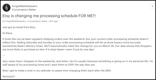
Remember, in the 4th quarter 2023 earnings report, Silverman said “shortening our estimated delivery dates this year by at least 2 days” was a goal, and unilaterally changing your processing times is one step towards that goal. Please check your shipping settings, as this could mean you need to ship earlier than you realize, and Etsy could put you on reserve, remove your Star Seller badge, and deny you Seller Protection when you ship later than Etsy thinks you should.
If that wasn’t bad enough, some sellers are reporting that Etsy has changed the timing of sending the Abandoned Cart discount to almost immediate, and changed the official Help file on the topic to say the coupon was sent just 2 hours after the listing was carted, down from 24 hours. Others say they can no longer deactivate these coupons, and that Etsy Support told them it was a known bug.
If you want to learn how Etsy's algorithms work and what they favour, the company has added more details on "recommendations" modules we see all over the site to the legal policy page. I've written a short piece highlighting what sellers should pay attention to if they want visibility on Etsy.
Etsy is adding Regulatory Operating Fees to orders in India (0.29%) and Vietnam (1.24%) as of April 1, 2024. On the same day, the Regulatory Operating Fee in Spain will increase to 0.72% (from 0.4%), and the fee for Türkiye goes up to 2.27% (from 1.1%).
The Prohibited Items Policy has been updated in several places, as of March 5 2024. Some of the new sections are covered in this article. As always, the most important parts of these changes will be how Etsy chooses to interpret them, so for the moment I don’t have any further comment, other than to say these types of changes are sometimes driven by law, and sometimes by previous incidents in which Etsy is unhappy with the outcome.
Looks like businesses in China will soon be able to use Etsy Payments, meaning new shops in China may be able to open for the first time since 2021. (It's not unusual for Etsy to beta test new countries before announcing them officially; it’s hard to say if that is what is happening here or not.)
Etsy's forum restrictions - requiring a signed-in seller account to view most posts - will start on March 26. Only posts in the Announcements and Technical Issues sections will still be visible to everyone.

There has been some speculation that this is to reduce spamming of Etsy sellers after they post, but the change will also have the bonus of journalists, investors and others not being able to read Etsy sellers' complaints about the platform.
It’s possible to have your product photos featured on the persona page of Etsy's Gift Mode but not have the product available for sale in Gift Mode. I’ve checked several times, and have never seen that seller’s embroidery piece in the featured listings. If you missed my blog post on Gift Mode, check it out here. Note that Etsy seems to have made some changes since I originally released the post. Among other Gift Mode promotions, Etsy employees rang the opening bell at Nasdaq the day after the Super Bowl. Did you know that this year’s Super Bowl was the most watched show in the US since the 1969 moon landing? Etsy hired Drew Barrymore to promote the corporation's new gifting push, which will continue all year. And the company has also released a new “gift teaser” email that buyers can have sent to recipients, which is useful for last-minute shoppers.
Elliott Management now owns 13% of Etsy shares and options - making it the largest investor - and now has a board member at the corporation. Known as activist investors, they usually force companies to cut costs ; for example they pressured “Salesforce, in which it has a multibillion-dollar investment, to harsh new policies for engineers and salespeople aimed at reducing headcount.”
Newly-opened Etsy shops will soon be subject to stricter ID requirements, a $15 fee, and longer holds on their early sales; I covered the details we know on LinkedIn.
If you use the new listing form, you may see a new pricing tool pop up. (It’s not on the old listing form.) Ridiculously, Etsy calls it an “estimated profit calculator”, when really, it’s just an Etsy fee calculator, and not a good one at that. It includes the lowest processing fee possible (some countries have a range of processing fees) and also excludes taxes you may pay on your fees. I don’t know if it includes country-specific fees such as regulatory fees, as Canada does not currently have those.

Etsy has several sales events coming up, including the “spring refresh” which has already started and continues until April 15.
There are reports of Etsy now advertising its commercials in Canada, which is a first as far as I know.
Struggling to update your tax information on Etsy? One tip is to use a different link to enter the updates. Another is to use a pdf or png file, not a jpg, when uploading documents, and to combine multiple documents into one. If Etsy is asking your LLP/LLC or corporation to upload ID, I’ve had multiple people report that personal ID should work, even if the wording of the page says it won't.
If you are frustrated by the recent Etsy test removing the total number of items in a search, I explained here how to determine the exact number of results if there are less than 16,000 listings. Also, you can just try another browser or device because it is a test (I do not have it on desktop).
Remember when The Smiley Company sued tons of small sellers for trademark infringement, and asked for damages? Some Etsy sellers fought back - and won.
Who is removing Taylor Swift-themed items from Etsy - the artist, or the marketplace? Swift has sent cease and desist letters to Etsy shops in the past.
The articles about Etsy being awash with non-handmade and counterfeit goods never end. Here’s one from Australia. Here’s one about Etsy sellers publishing fan fiction that is already free on the web and charging a huge amount. And the media attention to deepfake porn on Etsy also continues. AI use is also subject to media scrutiny.
TikTok’s push to attract more sellers apparently involves approaching Etsy shop owners. [soft paywall; Modern Retail]
Josh Silverman has sold off most of his remaining Etsy stock.
I did a short report on who Etsy laid off in December.
The scammers advertising a fake Etsy customer support phone number on Google are catching buyers too - why can't this be stopped? "Anyone looking to contact Etsy for customer service issues should be aware that there is no phone number to contact for Etsy support." It’s a big problem that Google seems unable to control, given this study on other fraudulent Google Ads.
Speaking of scammers, there is a new version of fake copyright takedowns affecting numerous sellers; the person who files the DMCA then offers to remove it for a fee, or even file takedowns against your competitors for a bigger fee. Etsy did fix the first round after 3-4 days, but the perpetrator then filed new DMCAs from a different email address.
ECOMMERCE NEWS (minus social media)
General
Michael’s Makerplace is beta testing selling third-party items in Michael’s brick and mortar stores. “Michaels says that MakerPlace garnered interest from thousands of sellers during its initial beta period, mainly through word-of-mouth. The company declined to disclose how many sellers are on the platform currently and is now focused on growing customers for those vendors to sell to. Buchanan says the next month will be "critical to make sure [the platform gets] some mass engagement from a buyer perspective."
Some Depop sellers had issues with deposits recently, with the money never being sent to their bank accounts, and instead the deposit was continually rescheduled for the next day. This may or may not be related to similar issues on Etsy. Depop is also immediately scrapping seller fees for the UK (as long as the account sells in GBP), but is adding a 5% fee for buyers in the UK as of April 15. Clearly the site thinks it has more UK demand than UK inventory, and that at least some of those buyers will pay for the ability to buy second-hand. Depop press release.
Beni is a new “secondhand search engine” that pulls up used apparel from multiple different marketplaces such as eBay, Poshmark, and ThredUp. It offers an app and a Chrome browser extension.
Temu is subject to a class-action lawsuit claiming that the company’s app is highly intrusive and can read "literally everything on your phone." Also, businesses in the United States can now sell on Temu.
There are many different platforms and marketplaces to sell digital products such as ebooks, templates and courses; here are 20.
Amazon
If you sell on Amazon, make sure you have 2-factor authentication set up, as it will be a requirement starting March 28th. Users will need a mobile number or authenticator app.
Amazon is using generative AI to create new listings for merchants who enter a link of the product on another site. “The goal is to help sellers reduce the time it takes to bring the product from a different website onto Amazon.”
If you don’t use at least 3 images per product page, Amazon will now add in photos from other merchants on the site.
Amazon had a strong fourth quarter in 2023, beating all estimates. Amazon Lending has been discontinued, but existing loans do not change until the term ends.
eBay
eBay agreed to a $59 million settlement in the US Department of Justice’s case regarding the selling of tools to make counterfeit drugs. The company must also modify its restricted items policies.
eBay joined the layoff race on January 23 when it let go 9% of its staff (~1000 people). Those layoffs were spread throughout the company, including plenty of engineers, legal and PR staff, and several recruiters, as well as authentication staff. The company also made upper-management changes.
eBay’s 4th quarter financial results were up a bit, but active buyers keep dropping.
Jewellery sellers in the UK faced an across-the-board fee hike as of March 7, adding 2% to the final value fee. This appears to be related to covering the authenticity process, which only applies to certain items above £500.
Be careful when you confirm your Promoted Listings Standard campaign on eBay - a few sellers report accidentally upgrading to a far more expensive Advanced Cost Per Click campaign.
Walmart
Walmart is offering discounts for new sellers, covering part of fees for up to 90 days.
If you sell on the Walmart marketplace, beware of the new rules on making authenticity claims.
Payment Processing
Klarna is now offering a monthly subscription to be able to use it at brick and mortar retailers without additional fees. The Verge speculates this may be related to Klarna’s rumoured pending IPO. The company has also employed an AI chatbot to do the work of 700 customer support employees.
A US study reports that at least 20% of US consumers have used buy now, pay later options at least once.
PayPal joined the tech layoff trend, getting rid of 9% of staff in January.
Venmo settings are public by default; here’s how to change that. [Washington Post gift link]
Shipping
Is “free shipping” becoming less common? It appears so. [soft paywall: Business Insider]
Apparently USPS has significant delays in the Atlanta area, leaving packages in limbo for weeks. (Strangely, I had a shipment held up in Atlanta in late January even though the new processing centre did not open until February 24, and that package was finally delivered last week.)
Good basic post on return policies (from a Canadian perspective). Note that half of those surveyed say that return policies affect their purchase decisions.
Canada Post has sold its logistics and IT companies as it struggles to become profitable, and may be looking towards more ecommerce options.
UPS will be laying off 12,000 employees this year, to save around $1 billion. The company is also starting to deliver to homes on Saturdays in major Canadian cities by March.
That's it for now! I hope to have the full SEO & marketing report out next week.
4 notes
·
View notes
Text
Lacey: Chapter 13
Lacy’s Diaries: August 17, 2023
Dear Diary,
No soiled children at daycare today, so that’s great.
I went to Dina’s apartment after work. We had some tea together and talked about work. Turns out, Dina had to deal with a ridiculously long line of tired customers at the grocery store today. It was…less than pleasant, according to her. But she laughed about it.
“At least they weren’t creeps or racists,” she snarked. “That would be so bleh.”
After that, I went back to my place. Also an apartment, if more soundproof than Dina’s or Otto’s. I logged into some of my socials to check for posts and pieces to read over for Music Refined. While going through my emails, I stumbled on one from the latter’s editors.
As it turned out, they did catch on to Oscar’s draft being tampered with thanks to him sending the original one in. Why he would do that when it was laden with multiple errors, I don’t know. Regardless, the editors were now side-eyeing both Archie and me.
I went into my “Lacey Hannah” Discord account. Lo and behold, the Music Refined people threw me into a group chat consisting of me, Archie, and Micah. I was now forced to explain why the draft I sent over to them was decidedly not Oscar’s pure creation.
Micah Turner (08/17/23, 8:09 PM): Hello,
I checked over the draft from Lacey sent over to us. As outlined in the email Theodore sent to you both, it’s not the original. Let me remind you two: tampering with a writer’s draft as a beta reader is forbidden. Explain to me what happened here.
Archer J (08/17/23, 8:11 PM): It’s disappointing to hear that has happened, but why am I in here?
Oh my God, I thought, he’s so full of bullshit right now.
Micah Turner (08/17/23, 8:13 PM): The revised draft has your style written all over it. The prep school wit, the obsession with complex-compound sentences.
Archer J (08/17/23, 8:14 PM): Can you give me an example?
Micah Turner (08/17/23, 8:18 PM): https://medium.com/draft/kakqiqiiqiqoqkqkqkqk
Compare these two. Tell me these aren’t eerily reminiscent, I dare you.
Lacey Hannah (08/17/23, 8:22 PM): You do have a point. But if I may ask you, why does it matter?
Micah Turner (08/17/23, 8:25 PM): Because it is glaringly obvious that you used Archer to modify Oscar’s draft so we could approve it for further editing. Remember, the other editors and I all have enough experience in this space to know when things don’t add up.
Archer started to type out something, but he stopped after a few minutes.
Oh God, I panicked, what do I do now?
I then realized something. Archer and I were friends now, and he was a lot more popular than I. If I could leverage this to allow the editors to make an exception, we’d both be off the hook. Oscar would also be able to get his article published.
Lacey Hannah (08/17/23, 8:33 PM): I wasn’t asking how the article similarities proved mine and Archer’s tampering. That’s fairly clear. What I want to know is why it matters in the first place that we gave Oscar a chance.
Micah Turner (08/17/23, 8:35 PM): Publicity, Lacey. We don’t want amateur writers who write in a beginner style to drag down the high-quality image of our publication. You’ve seen Oscar’s piece, right?
Lacey Hannah (08/17/23, 8:37 PM): I’d have to disagree on your last point. I completely understand your desire to keep Music Refined’s good name. It sets you apart. But Oscar Winters is not an amateur. He knows how to whip up a good article 90% of the time.
Micah Turner (08/17/23, 8:39 PM): I’ll be the judge of that.
Micah Turner added oscar winters to the group. (08/17/23, 8:41 PM)
Micah Turner (08/17/23, 8:44 PM): @oscarwinters Send me a portfolio of your writing.
oscar winters (08/17/23 8:45 PM): I don’t have a portfolio for my pieces though, sorry
Micah Turner (08/17/23, 8:46 PM): Then please send me your Medium profile link.
oscar winters (08/17/23, 8:47 PM): Alright, here:
Micah spent some time going through the profile. After he finished, Micah let us all go with a warning.
Micah Turner (08/17/23, 8:55 PM): If I see you guys pulling this off again, you’re all removed. Understood?
We all answered yes.
August 18, 2023
I had a hard time sleeping last night. Even though my day job wasn’t too stressful, the recent fiasco with Micah certainly didn’t help. So I ended up waking at about 4:00 AM today.
I checked my Discord DMs around 6:00 AM. Carolina left me a message.
Artsy Carolina (08/17/23, 9:31 PM): Hey Lacey, you good?
I told her I was doing fine, but she didn’t seem too convinced.
Artsy Carolina (08/18/23, 6:34 AM): I heard about the showdown between you and Micah yesterday. That’s why I got a little worried.
Showdown. What an overstatement. It was a civil conversation that ended with no one getting in trouble. Of course, I didn’t want to argue with her after what happened last night.
Lacey Hannah (08/18/23, 6:37 AM): You know about it?
Artsy Carolina (08/18/23, 6:39 AM): A lot of people do.
Lacey Hannah (08/18/23, 6:42 AM): How???
Artsy Carolina (08/18/23, 6:43 AM): Word travels around pretty fast. If you stick around the bigger publications a bit longer, you’ll notice more.
Lacey Hannah (08/18/23, 6:45 AM): Did someone tell you?
Artsy Carolina (08/18/23, 6:48 AM): Lovergirl did. She hangs around Tate sometimes. Believe it or not, she actually told me she likes you
Oh, I thought. The ultra-feminine rich girl on TikTok. Her face looks plastic around the edges like her public persona.
Lacey Hannah (08/18/23, 6:49 AM): Surreeee.
Artsy Carolina (08/18/23, 6:51 AM): Don’t believe it? I’ll add you to a group chat with her if you want.
Lacey Hannah (08/18/23, 6:52 AM): Ok…
Artsy Carolina (08/18/23, 6:56 AM): I’m not sure if I believe it myself 100 percent. But she’s been nice to me, and my publication only gets 1.5K followers tops. Who knows?
Lacey Hannah (08/18/23, 6:57 AM): Alright then. Feel free to add me.
Artsy Carolina (08/18/23, 7:00 AM): Good. Be careful around her, and you could be well on the road to popularity.
I’m still not sure what she means by that. Is Lovergirl secretly a bitch like her surface vapidness suggests? Or is she just out of my league, which I already knew anyways?
(Wattpad version: https://www.wattpad.com/1497939802-lacey-chapter-13)
#creative writing#story#storytelling#tumblr#tumblr stuff#writing#wattpad#inspired by#loosely#lacy olivia rodrigo#lacy#folklore love triangle#folklore taylor swift#folklore album#folklore#fiction#original characters
0 notes
Text
🌱 My Watch Collection (Of Only Sub $100 Watches)
And my wife’s way nicer collection
Even though I like tech, and Apple gear, I don’t have smart watch. And the main reason I that I like (mostly mechanical) watches too much. But even though my dream watch is an old Explorer with faded Tritium, I only own very cheap watches. And I’ve greatly enjoyed finding bargains that still looks good and works well - several of them from Russia/USSR.1
Casio A500WGA-9DF
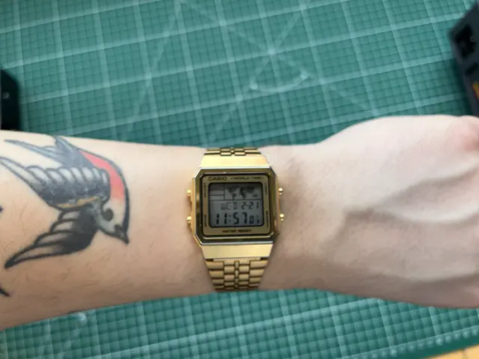
Every watch collection, no matter the budget, needs a digital Casio. And to me, this (and its silver sister) is, by far, the coolest.
Raketa Copernicus
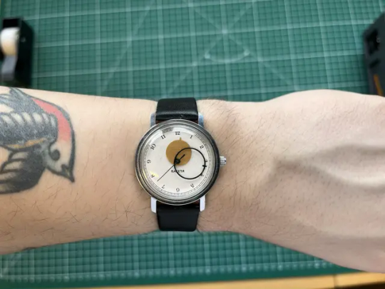
This hand-wound beauty has some really unique hands, and a pleasing dial. And it comes in several (more or less original) dial and colour variations. As will become apparent, I really like smaller watches like this!
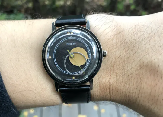
I also bought it in black, back in the day. But it was dead-on-arrival - which I guess is part of the joy of ordering old, cheap watches on EBay.
Poljot De Luxe
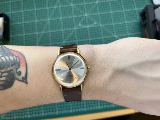
Another hand-wound watch Made in USSR. After about a year, I usually swap the straps on these two!
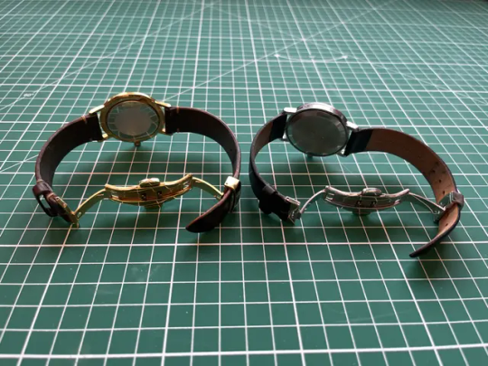
The watches are bought on Ebay. The butterfly clasps are the best ones I've found on AliExpress, and the straps are high-quality ones from Etsy. Still a very affordable package!
Vostok Amphibia x2
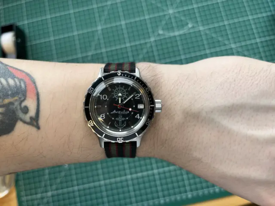
If you’ve ever seen the Wes Anderson film The Life Aquatic with Steve Zissou, this quirky Russian watch is the one worn by the main character. And actually with this specific dial as well!
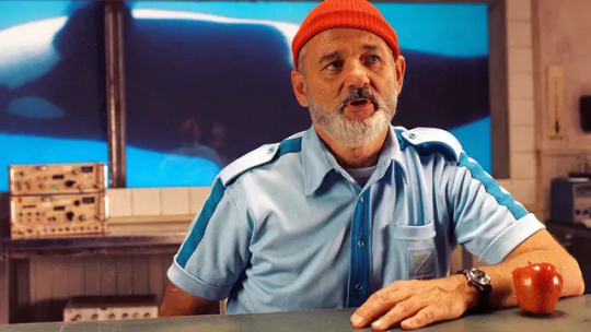
I think he might have the blue version of the dial, though.
These automatic watches are very fun, cost “nothing”, and loves to be modded. And it can still go diving, if need be - even though the bezel is pretty shabby.
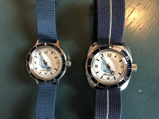
My first Vostok was the one on the right — but I found the cushion case too large, so bought the one on the left, and sold the first one. It bums me out that I don’t want to order from the factory anymore - because you could pick-and-choose the bezel, hands, crown, etc. on their site, and they would put it on before shipping! Because the stock options don’t look too great…
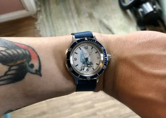
I don't have a current picture of this, as I'm trying to get the bezel repaired.
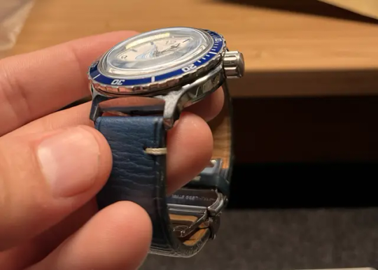
I currently have this leather strap on it!
My wife’s (way nicer) collection
As she’s a teacher, she also wears a watch every day. And while she doesn’t care as much as me about watches, she still has an opinion of what she wears. So these are some gifts and some “guide purchases”.2
Apple Watch Series 9
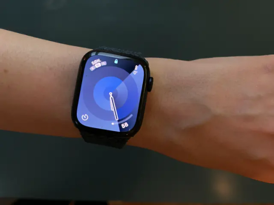
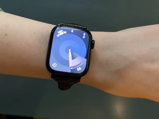
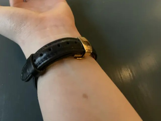
She prefers the analog watches - so this is mostly used for sleep tracking and workouts at the moment. She has a Solo Loop, and a more dressy leather strap.
Poljot De Luxe
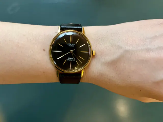
Of course she also has a Russian watch…
Marathon General Purpose Mechanical
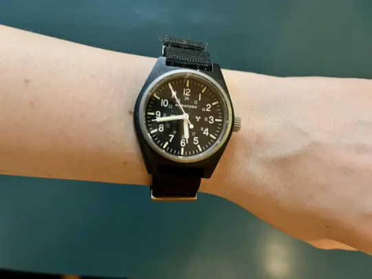
She likes to hike (often spending the night in the forest alone), and then this 34 mm army watch, is her companion. Enough water resistance for swimming, tritium lume, and small and light. 👌🏻
Nomos Tangente 33
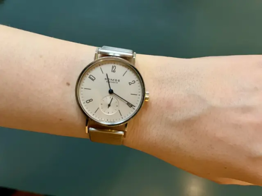
When I wanted to ask her to marry me, I didn’t like the idea of spending tons of money on a diamond ring (for several reasons). So instead, I bought a vintage emerald ring and a really nice watch she could use every day. I also got in engraved with “for eternity”, which in Norwegian is a pun, as it directly translates to “for eternal time”.
I’m not blaming the Russian watch makers for the war — but I still don’t want any more of my money to go in that direction, sadly. ↩︎
She really didn’t want to model the watches — but she did it when I asked her nicely. So when I saw, just now, that the focus aren’t the best on the images, I didn’t want to ask again. So sorry about that! ↩︎
0 notes
Note

Some of my favorites are:
- Rate images appropriately. If you wouldn’t look at it in front of your family then it’s probably not safe.
I… I mean this is a porn site, right? I would assume none of the content on here is family friendly.
- If you are a minor, then you will not use the site
Big fan of the threatening undertones here. This is not a „people under 18 aren’t allowed here, sorry buddy“ rule. This is a „if you even think about opening this site before you turn 18 we will send assassins after you“ rule.
- Please only upload high quality art that is finished and published, please no new artists […] this is not a place for new artists to get critique on their art […]
The rule is actually written in bold like this on the website. It’s the only rule that’s bold like this. I have questions. They apologized for this rule.
I still don't know anything about Octopath but Throne seems like the type of character who has a very big and dedicated Rule 34 tag to her name.
Wait hang on a second Anon I’ll be right back. I need to check something.
45 notes
·
View notes
Text
FOR THE LOVE OF GOD PLEASE STOP REPOSTING GIFS.
“bu…bubu- but they’re just wittle pixels and digital images rwight 🥺” no. we spend hours on gifs or even one singular gif to make edits for FREE on tumblr dot com. name a person who asked us to do this. no one!! exactly!! we make gifs bc its enjoyable and fun but people like reposters suck the fun out of it!!! and do NOT go and tell us that “gifs aren’t that hard to make” baby girl what do u think we do? go online and search for a video downloader and download it at like a crappy 720p and go to like literal ezgif dot com and all the gifs just MAGICALLY have their effects, typography, colouring, blending, animation, quality all up and ready? why dont u try and make a gif. hm.
and also, @ all of you “gif collectors” or some fanfic writers. lemme tell u a secret. an itty bitty secret. did u know… theres this really cool thing called PROPERLY CREDITING? im not talking about a stupid “credits to the owners” no. it isn’t that hard to properly source the creators or accounts.
that wasn’t so hard, hm?
also oh my god, do NOT go around saying you made these gifs when it is so obvious you didn’t. no bff, it isn’t a coincidence we have the same sharpening AND colouring settings.
and hey, i’ll stop my angry typing for a minute and just say that if you wanna learn how to make gifs there are plenty of amazing accounts and tutorials that are incredibly detailed. here are a few i recommend:
how to: make high quality gifs by sith-maul
giffing 101 by cillianmurphy
giffing and colouring tutorial by sashafierce
how to fix and avoid orangewashing characters by maxchapman
how to fix and avoid white/pink/yellowwashing by jeonwonwoo
how to: colouring east & southeast asians by blueshelp
pastel gifs: a tutorial by completeresources
how to fix and avoid whitewashing in pastel gifs by fadenet
and for those who don’t want to pay/ t*rr*nt photoshop:
free giffing tutorial by ashleysolsen
photopea gif tutorial by lacebird
and @usergif has a bunch of directories and navigation for tutorials and inspiration!
again, there are so many useful tutorials if you’d just look.
i know this probably won’t stop all reposters (unfortunately) but i hope those reposters that are reading this realise how messed up stealing gifs are. it isn’t funny or cool to see gifs that you’ve spent so much time on only to be reposted here or on other sites without credit or being claimed as someone elses.
we’re just asking for a proper credit on your post or maybe even stop reposting in whole. im sure you had good intentions in making those posts, but you have to understand how much it hurts. at this point, we have to put our watermarks in the middle of our gifs to avoid people cropping them out.
and please, PLEASE reblog edits. you have no idea how diminishing it is to see such a crappy like to reblog ratio. remember this hellsite has such a crappy algorithm so reblogging is essentially one of the only ways to give posts more traction
AGAIN. dont repost gifs. dont steal gifs without credit. dont belittle gifmakers. just stop being so disrespectful and rude and have a brain for once. thank you for reading.
edit: ive noticed ppl asking why i kinda like insulted those who use 720p and ezgif, im really sorry if i made it sound like a bad thing !! i was just very angry writing this aaaadjskdks gifmaking, HQ or not is valid and nobody deserves to get their creations stolen !
2K notes
·
View notes
Photo

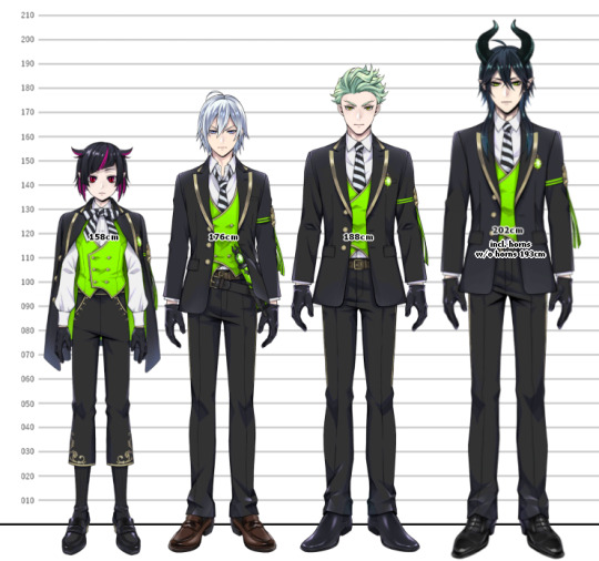
TWISTED WONDERLAND HEIGHT CHARTS (STAFF + STUDENTS)
more info + full res below the cut :,)
EDIT: Hello! I’ve completely remade the height chart and its better quality and in high order! You can find the full res here. And you can find more notes about this particular height chart below!
Below you can also find the staff and individual dorms!
Any striked out text below was in reference to the original image.
sooo, i tried to combine screenshots of the original height chart i made so i can post it here, not sure if tumblr is going to absolutely destroy the quality or not (if it does, i’ll probably edit this with a link to imgur or smth, sorry if you cant read it hgfdh)
EDIT: I’ve updated it with Malleus’s correct height! Sorry about you malleus simps thinking he was like 8 foot lmfao
anyway i’ve got a little bit to say about this since,,, this was a mess to make (also im sure someones probably done this already, but i havent seen one yet)
This was a personal project of mine and I wasn’t originally going to post it, but I felt like it would be useful to some people,, please lmk if I messed anything up or made any mistakes because I 100% did not do this perfectly.
You’re welcome to reference all you want, but please don’t reupload it anywhere without my permission since i took way too long making this ;v;(referencing it in other posts or linking to it is fine!)
It should be obvious, but these are just the official sprites from the game and I did not draw them.
THE HEIGHT CHART
(In regards to the way I measured) Grim and all the Savanaclaw boys are measured by the top of their heads, NOT by the tip of their ears/horns. The official heights don’t specify what they measured to so I decided measuring by the top of their heads like the rest of the students makes sense. These ones are pretty much the only characters I had problems calculating their height with.
However, this makes me run into a problem such as Grim looks abnormally tall/large, but that’s probably because he’s got a chunkier body type. (we love you bby,,)
All characters are lined up by their heels, with the exception of Ortho. I measured him by the bottom of his foot because he’s a robot, and I’d imagine the platform-looking bits of his feet are connected. I believe Ortho also canonically floats slightly off the ground, but I didn’t bother accounting for that since,, I’m measuring the length of his body in comparison.
The original models are not perfectly accurate height-wise to each other, so I had to resize them. Proportions also may look slightly off because of that.
Heights are not pixel perfect, and may be slightly off.
Malleus has the tallest listed height (202cm) and that includes his horns. As such, Malleus is 193cm without his horns. Of course, proportions aren’t perfect so he looks a bit off.
INDIVIDUAL DORMS + STAFF
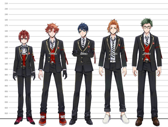


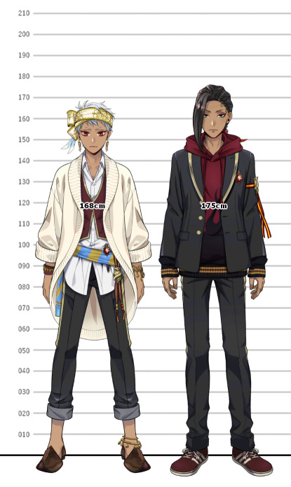
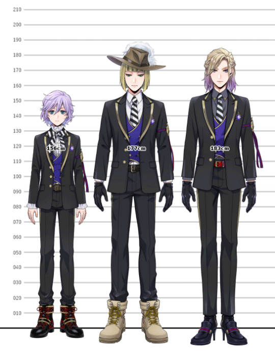

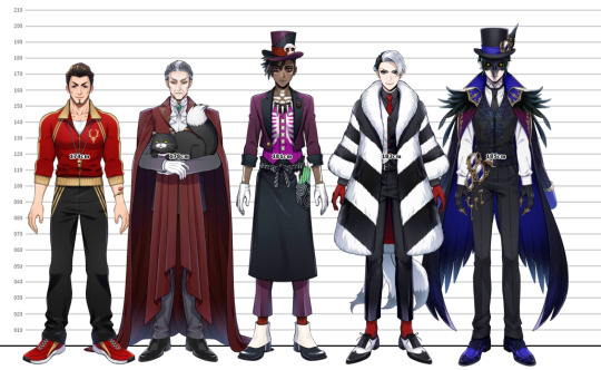
FULL RES: Heartslabyul / Savanaclaw / Octavinelle / Scarabia / Pomefiore / Ignihyde / Diasomnia / Staff
MY THOUGHTS
Dear lord why do you have to be wearing a hat rook
malleus is (no longer) absolutely massive
azul is so tiny??? (in comparison to the tweels at least lmfao, silver is also pretty small too but with malleus next to him ig thats not surprising)
this took way too long to make because i ended up realizing i calculated every single character’s heights incorrectly and made them significantly shorter than i meant so I had to go back and resize everyone lmfao (the heights should be correct now tho!!)
POST-EDITS (Theres going to be a lot of these,,)
There’s a typo on Silver’s height. It say’s 5′2, but he’s actually 5′9 jgfd
Malleus’s height actually includes his horns,, according to the official guidebook, malleus is 193cm without his horns. He’s pretty much the exact same height as Jack. (thanks to @/pocasu for letting me know ^^) (to be completely honest i thought it was extremely absurd that he was 6′7 without his horns but i had no frame of reference fghdgf) (EDIT: i’ve fixed his height!! For reference, Malleus is 202cm including his horns!)
Completely updated and remade the height chart! She’s pretty now haha. Thanks for the overwhelming support on this, it was fun to make and I appreciate those pointing out any mistakes i made!
#twst#twisted wonderland#disney twst#disney twisted wonderland#riddle rosehearts#ace trappola#deuce spade#cater diamond#trey clover#leona kingscholar#jack howl#ruggie bucchi#azul ashengrotto#jade leech#floyd leech#jamil viper#kalim al asim#ortho shroud#idia shroud#vil schoenheit#rook hunt#epel felmier#malleus draconia#lilia vanrouge#sebek zigvolt#divus crewel#dire crowley#ashton vargas#twst sam#twst silver
2K notes
·
View notes
Text
Okay I’ve learned a cool trick well enough to share it now
So I’ve been trying to do a lot of like physical manipulation to make cool digital effects for ttrpgs so I wanna show folks how to go from like this

to this

Using a combo of physical and digital manipulation. You’ll need a printer, a scanner, and something to cut with; and then I used the Affinity Suite for digital (especially photo), but you can probably do some similar shit with Adobe
The big things in here are “fucking up text with the scanner” and “creating threshold maps for texture and to hide issues”
so here we go
Okay so you’re gonna need a scanner I’m so sorry, but just print out whatever text (or images! It works on images too!) you can as big as your scanner bed will allow. You can go smaller, but you’ll lose a lot of sick texture on the way, and we don’t wanna do that tbh
The short version of this tutorial is “now drag it funny as the scanner goes down the page” but I’m gonna explain longer how that works practically haha
So print it out, cut off the white space on the left and right of the text to make it easier to work with (and I did under as well, but that’s less important). On the back of the paper with a pencil, mark the lines where you want the text to drag. For me that was above the midline on the E, but below the bottom of the top line

Like roughly here?
Set your scanner at a decent DPI, but beware the higher the DPI the harder this gets to do, because the super slow moving scanner light thing really highlights any amount of shaky. For my scanner the sweetspot is like 400 for good texture, but you’re gonna fuck up a lot doing it tbh so trial and error.
As the scanner comes though, keep the light between those lines, and drag it and wiggle it around! Just try to keep a consistent speed and have fun. After a number of scans you’ll pull something like this, there is a weird grey bit I don’t love and it’s gonna fuck us up just a little, but I’m gonna go over how I dealt with it as well~
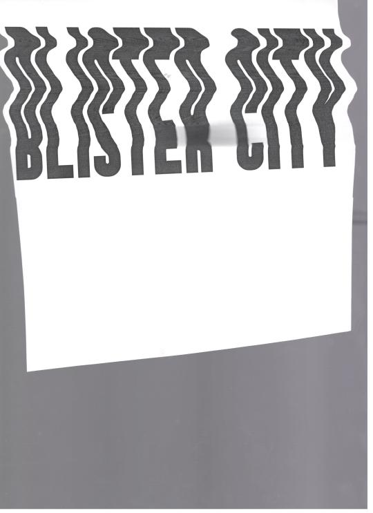
Pull it into Affinity! If you have Publisher open it here, even if we are planning to work in Photo mostly, because the Persona manager is a life-saver when you’re doing cross program work.
So I first cut out the text, you don’t need to be super exact, but you only want the white paper, and the black text, not the grey of the scanner bed.
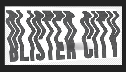
I usually then slap this text into a new document, because cropping is for idiots
then lets hop over to the Photo Persona~
Duplicate the layer that is just the text, lock it, and hide the bottom layer because we’re gonna start destroying shit and we want old copies that aren’t fucked up. With your fresh layer, hop into Adjustments>Threshold at the bottom of the Layers Menu, and drag around the preset until the text looks how you like. This gets us cool texture, but also hides that weird grey blob on the page from where I squeeze the paper during the scan and fucked it up some. For me that’s around here, but obv ymmv
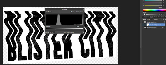
After doing this right click and rasterize your later
Now at the top of Affinity go into Filters > Colors > Erase White Paper

Where this leaves you might be perfect on it’s own! For me there are some areas I don’t love, so now we’re gonna texturize the whole thing. I circled the areas that I don’t love, but the tldr is I need to hide my sins where I had fucked up the scan some, and as a result have no texture

So if we zoom in on the gain some it is strongly vertical instead of just square
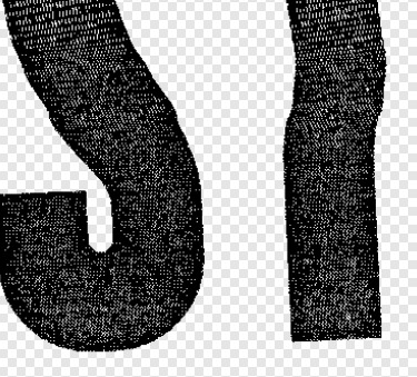
If your grain is a different shape you’ll wanna find different stock for this, but this looks a lot like denim to me? So I’m going into the Stock screen (View>Studios>Stock will bring it up if you don’t have it enabled already, but it just goes to Pexels and Pixabay to grab images for you is the tldr) and grabbing a high quality scan of some denim. You’ll wanna resize it so the fabric texture is around the same size as what’s here already. This might mean making it smaller than the whole page and that’s fine, for me I just duplicated it till I had enough to cover the whole image, but the tldr here is “cover the whole page in denim or concrete or whatever texture you’re using”
If you used multiple images group them, rasterize the entire group, tldr make it one big image. Afterwards hop back into the Threshold page, and try to replicate the grain pattern! You’re gonna slap it over the whole image so don’t worry about getting it perfect. You want the image to be mostly white, with black as a the textured bits, BUT if you can only get it to mostly black with good white texture? Totally fine, you’ll just want to inverse the image at the end (I personally find this way easier, but like ymmv)
anyway for me we ended up here
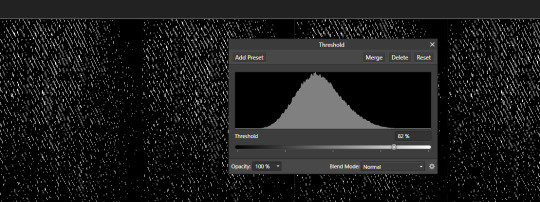
Because it’s mostly black we are gonna want to Adjustments>Invert on this. Same as before now we want to rasterize the image, and go to Filter>Colors>Erase White Paper. Set the blending mode to Erase
This whole thing requires a lot of patience, and a lot of trial and error, but eventually you’ll land on something like this
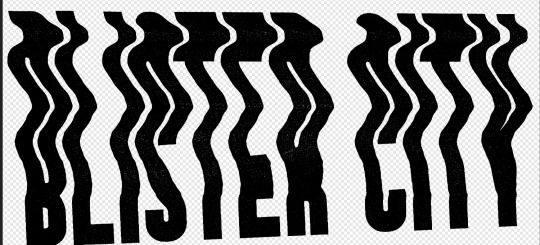
We aren’t going for a ton of texture, just enough hide some of our mistakes along the way
Group the whole thing, duplicate it, lock and hide the original again
Now on one group go ahead and rasterize it again, slap some color under it (or idk a book cover? That’s what this is for) and you’re good to go!
Anyway hope this is helpful, I do a lot of threshold maps on stock photos to get cool texture so I can zoom through this pretty quick, but like it takes some time and effort!
#uhhhh I need a skill share tag so im gonna make it#skillshare#yeah that'll do it#its nice not being on twitter because I can just do something like this without making a thread of it now
128 notes
·
View notes
Text
Miles // :
“Ffffff…” No, kid’s voice, kid’s voice, you cannot do this. The fox took a deep breath and quickly fixed his hairdo, before turning around. One glance at the timid expression on the girl’s face and recognition came to his eyes. To think this girl still remembered him after this much of a while. True, the mage had a presence, but children aren’t supposed to have this good of a memory, right? Miles was surprised that he even remembered her name…

“Demo. You should not just approach enraged people like this or you might get hurt.” Prower spoke through his teeth. His eyes drifted down towards the crystals in her hands and two fluddy ears perked up.
“Oh? Hmmm, this quality… Incredible… Pardon.” The moebian carefully picked up one of the crystals and carefully examined it. “These are pretty much impossible to find normally! They are charged with the world’s inner deep natural magic! How did you?..” Unusually for the hardass fox, Miles gave Demo a look of pure shock.

Is there a warm feeling in her chest at seeing him recognize her, even after all this time? Maybe -- yes. From what she remembered, Miles had..a very select amount of people that he tolerated, and even fewer that he was nice to. Some people were rude and mean to him, and sometimes the things they said or did would make him angry. Anger was a quick way to make an impression on someone -- make yourself be remembered -- but the little things she’d done hadn’t been anything of the sort, or really what she’d consider particularly remarkable at all.
He, on the other hand, had made a different kind of quick impression on her. From how she’d seen it, he’d been helpful and kind to her -- offering words she’d taken as genuine advice, giving a different perspective on life she’d never thought to consider, before. He’d offered explanations to phenomena she’d never thought possible -- things that, had she not heard of it from him, might have one day landed her in a truly terrifying situation.
Then, one day, she wasn’t able to talk to him. For some reason, she just couldn’t reach him -- though she never did forget him or the things he’d shared with her. And now, finally, they were once again getting the chance to connect and speak. That someone as good of a friend as Miles hadn’t forgotten someone like her in all this time truly made her happy. And, as if reconfirming the image of him she’d had in her mind, his first words to her are more advice -- a perspective she hadn’t considered.
“ Oh -- I..hadn’t even thought of that.. I’m sorry! I’ll be more careful, next time! ”
But..the crystals were rare -- normally impossible to find? Bright eyes glance to the remaining crystal in her hands before meeting his gaze, again, surprise matching his shock. “ They are? ”

How did she..find them? “ I -- well, I went out to explore, this morning, and -- um, when the sun started getting too high up it got hard to see, again, so.. I just kinda ended up ducking into a cave, and..well, I got curious because I could feel that there was something deeper in it, so I made a marker to find the entrance again and then followed the pull and -- well, these were where the pull was coming from! ”
She hadn’t thought about it at the time..were these really that great? “ There was some more of them growing and charging, but..I thought if I disturbed it too much, I’d break something or cause a cave-in.. But..if these are really good, then! I’m really glad I brought them to you!! ” If you think her tail is wagging while she beams at him, yes it is. How great that her little surprise was turning out so well, this was wonderful!
#[ ALL THESE FEELINGS DANCE IN MY HEART / LIKE TWINKLING STARS IN THE NIGHT SKY ] ; DEMO#[ HOW CAN WE FAKE IT ? SHOULD WE EVEN TRY ? ] ; DEMO MAIN VERSE#twoeviltails#two evil tails#// THANK YOU TO SEIKO FOR TEACHING ME HOW TO USE THE NEW XKIT OH MY GODDDDDDDDD
8 notes
·
View notes