#something about the black and white brings out more of the texture of the art style
Explore tagged Tumblr posts
Visit Tumblr Blog
Explore Tumblr blogs with no restrictions, modern design and the best experience.
Last Seen Tumblr Blogs


Fun Fact
The most popular pages on Tumblr are about Minecraft, GIFs, and David J. Peterson.
Text
#i highly prefer it in black and white tbh#i feel like sometimes the colors in certain scenes are just too bright?#i think black and white fits the vibe of the story so much better#id much rather read it in black and white so im gonna reread it that way#something about the black and white brings out more of the texture of the art style#like the cross hatching and stuff#shine speaks#shadows house
24 notes
·
View notes
Text

Mundane Aching (Platonic!Grian x reader)
Due to some soreness, you're unable to help Gem like you said you would. Grian helps you out and soothes some of your worries.
A/N : Sickfic I wrote because my period was killing me T-T and also the first thing I've actually posted on this account! A win for the slayers of perfectionism. This was meant as a platonic fic but I'm sure you could read it as romantic if you want. Also, reader is an avian as well. (1018 words)
Art by @applestruda and divider by @saradika-graphics

There's still so much to be done, and here you are, still under the sheets. You spent the first half of the day trying to manage a creeping pain in your back right where skin meets the base of your coal-black wings. Ache spreads in waves from the limb and into your vertebra, as if something alive is puppeteering the sinews under your skin.
Despite the guilt, you've resigned yourself to your bed; due to an enormous nap, you missed your afternoon plans with Gem. Being an avian means you were much more used to flying than she was, and the new nether build she was planning required some tight maneuvering. Days like these are some you look forward to, holding onto the back of her chestplate, hovering over lava lakes and bastions.
The trust she has in you, feeling safe even if dangling over potential death, is special in its own right. The friendship you've cultivated and the idle conversations had midair are among your most treasured memories. So, when the exhaustion from carrying materials to and from your shop finally made itself known, you groaned as you curled up on your bed, trying to push away the pain and at least pass by Gem's to apologize for your absence. Maybe sweeten the deal with a nice cake and evening tea.
A sudden flash of crimson outside your window makes you stop in your tracks, feet just inches from touching the cool floor. A single moment of silence is had before Grian pulls himself back up onto the windowsill with a mischievous smile.
"Did I scare you?" He asks, shuffling inside and closing the window behind him with a soft click.
"Oh yeah," you start, closing your eyes and breathing deeply as a particularly sharp stab rolls from your back and claws at your ribs. "Only if being worried you were going to cut your wings on the bars outside counts as scared."
"Excuse me, I'm very skilled! I could probably dodge like five of those in a row." He speaks with a smile, but, to your dismay, he's seen through your teasing and into the discomfort below.
"Gem's been looking for you," he says, aligning some of the trinkets on your shelf and picking your work clothes off the floor. "Sent me here to check while she continued working."
"Shit," you sigh and drape your arm over your eyes, blocking the light crawling in from outside. "I'm having a bad day, I guess. Must've overworked myself last week, and now my wings are killing me."
"Have you had something to eat?" You hear your closet door creek open and Grian looking for something between clothes and towels.
"Not exactly. I had a snack before midday, but I slept through lunch." You open your eyes to see him bring a nice blanket over your shoulders. It doesn't ease the pain, but the soft texture makes existing a little easier.
"Well, just about time for some tea then." You grimace, remembering your promise to Gem. Grian moves to close the room door behind him when you groan out a protest, wrapping the woolen quilt around yourself and finally standing up.
"I'll join you. If I lay here any longer, I'll sleep the entire day away," Grian snickers, but walks in sync with your lethargic steps down the stairs and into a quaint kitchen.
Plopping down on a stool, you watch Grian clack on the stove and place a ceramic kettle on top. It was a birthday gift from Ren. A painted flock of dark birds contrasts the white background alongside some fleuron details.
"Grian, mate, it's you," you point to a particularly wonky bird.
"Absolutely not, look at him! He's your splitting image." He gestures to the dark wings behind you.
"You know what else is splitting?"
"Your head?"
"My head."
You rest your temple on the wooden table and furrow your eyebrows. You could probably make the journey over to Gem's by now; despite the headache and muscle cramps, you're feeling well enough to stand, and you could chance flying the short way over.
With a crack, you stretch your wings entirely; they spasm a bit before reaching their full length; you pay no mind. What was once a terrible tendon-deep flare has resided to a burning soreness; you've done more than travel a couple hundred blocks in worse conditions.
Grian pours the water into two mugs, each with a homemade teabag flopping loosely off the side. You take the smaller mug, lifting it to say 'cheers,' and sip on the sweet berry. You begin putting on your boots when Grian finally lets concern wash over his face.
"You should rest a bit more. Gem's fine. Her garden's turning out really nice." You hesitate a tad bit before tying the laces together.
"I promised her I'd help you know. I'm sure she understands, but I want to make good on my word." You don't register Grian setting down his mug and tilt your head in confusion as he kneels and pulls your boots to his thigh, unlacing them.
"You sound like a knight going to war," he cracks a tiny fond smile. "I know it's your nature, but these things aren't that serious. Your 'word' is still good even if you don't put your own health on the line." Silence follows.
"You're sure she doesn't need me?"
"Positively." He stalks off to line your shoes up by the door and then returns, sitting next to you on the couch and letting his wing curl around you.
"You need to relax. No wonder you're having a bad time when your muscles are that tense." He teases, and you scoff, taking back the mug and continuing to drink.
"Can you tell Gem I won't be making it then, please."
"Yeah, course," he says, knocking his shoulder with yours and hopping to his feet.
"I should tie a letter to your leg and throw you out of the second-story window." You say into the mug as he turns the knob on the front door.
"Hey! I am not a pigeon!"
198 notes
·
View notes
Text
⛧ WIP Wednesday ⛧
Hopefully the last time I will post about this before finishing the actual fic. I am not sure if I'll post it as a long one-shot or split it, we're looking at... a lot of words lol, it's at 12k right now with a bit more than two more parts to go. content: secondo x fem!reader, toys, oral sex demonstration, dom/sub, 1.4k words, pov third person 18+ MDNI
excerpt from: III – Dried Tears
After two weeks of this sluggish routine he’s had enough. He’s toyed with the idea, surprising her in her quarters on a night she’s not with him, to see what she would do, but it takes him a week to finally follow through. He knows where they are, naturally, though he never usually steps foot inside the dorms. It is an exception, he tells himself, freshly showered, neatly shaved, an extra spritz of cologne, even used that damned moisturiser Terzo keeps pushing into his hands, made sure his cheeks aren’t dry when she kisses them.
She opens and he thinks she’ll slam the door back into his face. He’s assertive, doesn’t let her surprise affect him, though for a moment he wonders if he did overstep, the other man suddenly not so fake anymore, that short flash fear that he’s with her right now. But no, she recovers and lets him in, and he surveys her small bedroom with a quick glance when he leans in to press that much desired kiss to her cheek. Empty, no signs of a male presence, and she still smells like shower gel and shampoo, wearing sweats under a plain white shirt, no bra.
“I didn’t expect you, Papa,” she says, picking up items from the countertops of her kitchenette, “or I would have prepared something. A drink or–”
“No need,” he interrupts, noting that she is nervous for nothing. Her small accommodation is tidy enough, that same order she so easily brings into his collection, a logic that somehow works for them both, and he thinks it suits her, a comfortable bed with a plethora of differently textured pillows, a bookshelf that despite some overflow is neatly sorted. “It is best if we are sober. For now, at least. I am not intruding?”
“No, not at all. I was about to settle in for the evening, nothing special.” She eyes him and he knows he must look out of place in his usual black slacks and button-down, the black leather gloves, an overdressed man in her safe, comfortable space like an alien presence. “Would you like anything else? A glass of water?”
He nods, though all he wants is to stall, take a better look at her environments. A small television with a handful of DVDs, a table she seems to use both as a desk and to eat at. The closed door to her small bathroom, a wardrobe. Then, a stack of library books on her nightstand. He remembers her shouldering that heavy briefcase a few weeks ago. The secrets to pleasure. Sexual practices and their history. The art of oral. Yes, she is eager to learn, no half-hearted efforts.
“Have you been practicing, my dove?” he asks with a smug grin, tracing the image of a man and woman nakedly intertwined on the cover of one of the books.
When she joins him she’s back to her bashful self, as though she hasn’t had his cock in her mouth multiple times by now. “I have tried.”
“That is all I ask,” he reassures. “How have you been doing it? Your fingers?”
She hands him the glass and he takes a performative sip, then sets it down, thinks that she might need it later. Her crouching down in front of her nightstand is more interesting, the drawer she opens revealing a handful of toys. Nothing he hasn’t seen before – two different size dildos, a suction vibrator, a bottle of lube, a disinfectant – but he is pleased to see that she is taking her pleasure seriously.
When she takes out a simple black silicone dildo, ergonomically shaped, he notes that it is not quite as big as his cock. “I used this.”
“Show me.”
Her eyes widen. “Papa–”
Secondo ignores it, sits down on her bed, perhaps a little impolitely leaning back, making himself comfortable amongst her pillows, shoes still on the floor. She stands there, stares at him, and her expression alone is enough to have him raise his brows, begging her to disobey. She won’t, he knows she won’t, she is so eager to please. And she doesn’t, kneels down, placing the dildo upright on the mattress, both hands around the silicone. He has to fight off an amused smile, the way she sits there, like a little girl praying to her Lord before bedtime.
When her lips finally wrap around the toy she averts her gaze, as if to get it over with. But his goal is not to humiliate her, though she might feel differently about it. He wants to reassure her once again that she does not need to be ashamed in front of him, that her trust is not misplaced.
“Look at me, cara,” he orders. “I want to see your eyes.”
She blinks, slowly bobbing her head, leaving a glistening trail on the black silicone. He doesn’t bother to observe her technique, it’s not about that. When their eyes meet he reaches for her hair, angles her head to make sure she sees him palming at his cock through his pants. He pretends not to see her hard swallow at the visible bulge already there, the way her hips shift in aroused discomfort.
“You are doing well,“ he says. “I am very pleased with you. But you can take more, hm?”
She always soaks up his praise, his soft reassurances, like a flower raising her head towards the sun, unfolding in its light. It is rare, for someone to react this strongly to so little, almost innocently, though he knows she is not truly a clueless little lamb, that she is aware of their game and participates with purpose. It is enjoyable, for once doesn’t feel like he is taking on a role, no, she willingly submits to him the moment their interaction becomes sexually charged, as though it’s the nature of things. Otherwise, their relationship hasn’t changed, not when they work, not when he sees her around the abbey. He is glad of it, that she treats him like she did before.
She takes the dildo deeper into her mouth, then, cautiously, and he opens his belt, the button of his slacks, unzips them. Her eyes never leave his hand where it’s fisting his cock, getting himself ready for her, that phantom feeling of her lips around him ever present.
“Eyes on me,” he says and she blinks up at his face. “Have you been thinking about my cock when you took this into your mouth, hm? Did you want it to be me?”
She nods, a moan low in her throat. There is no room for anyone else in the way she looks at him, the way she reacts. He’s not sure why, even now, he still feels that simmering jealousy, that urge to erase anyone else from her mind, even when that someone might not even exist.
“I think it is my turn now,” he decides, aching to feel her mouth.
It is amusing how fast she discards the dildo, crawls over between his legs, resting her cheek against his thigh. He’d feel flattered but he’s too distracted by the way her breasts move underneath her flimsy shirt, the outline of her hard nipples pressing against the fabric. It is getting harder and harder to stick to their routine, to limit their lessons to this one simple thing. But he’s not sure if he can allow himself to go further yet, not when he just crossed another bridge of her safety, encroaching on her space. Her comfort sits above all else, especially above his own whims.
“Will you take off my shoes before we start?” he asks, stroking over cheek with a gloved finger. She is all bare-faced, her hair still a little damp, beautiful and so trusting, letting him see her like this. He can allow himself to feel tender for her but only when he pretends that he is the man she spoke about in the confessional. How else would he be here, with her eyes staring at him all adoringly? Him, of all people?
And she does move down to his feet, no question. When her fingers fiddle with the laces he notices how shaky she is. So far, he blamed it on the novelty of their setting, the way she seems to crave reassurance even more than usual, but now he is not certain anymore.
Even so she is gentle when she removes his black leather shoes, sets them neatly aside. Her hands come to rest on his ankles, stroking up his socks until she meets bare skin, looking up to await further instruction. He can’t hide the shiver that runs through him at her touch, subconscious as it might be, goosebumps creeping up his whole body, and for a moment they just stare at each other while he tries to find his bearings.
“Papa?”
“You can start, cara,” he says, swallowing over a lump in his throat.
─── ⛧ ✦ ⛧ ───
thank you for reading and being so supportive of this one, i am still super into this fic and excited to hopefully share it soon <3
54 notes
·
View notes
Note
Hello!!! I love your art so much, especially the way you render!! Do you have any tips, tutorials, etc on rendering?? Be as detailed or curt as you like, I'm just hoping to improve my skills -- and I hope to see more art from you, in any form!!! You're a fantastic artist !!!! Have a good day :)
Sorry for the delay in answering this, I wanted to answer it well!!!
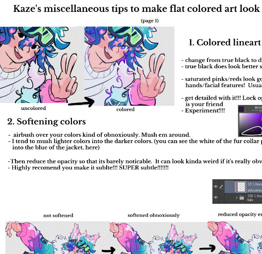
Here's my typical 5-step process:
flats
he has been flatted. You'll notice I also colored the lineart at this stage as well! Also, I do work with the background at the same time, but I have hidden it here for simplicity.
2. Cell shade shadows

I used to skip cell shading and just ball with my rendering, but I have found starting out like this is much faster!!
3. Airbrush shadows and colors
I did two things here, one is just a touch of airbrushing the colors into eachother, to help make everything more harmonious. The other is to airbrush colors onto my shadows! I set that layer to multiply, and mess around until something looks a little like I want.

4. Painting

This is the time sink - there's no getting around it, it just takes forever!! It's a lot about making the dark areas darker, and artifically injecting some color diversity - I like to diversify shades, and just slap on slight hue shifts as i go, and if it sucks I just paint over it some more. I draw different colors into eachother (look at the black shirt above, see how i bring in the tan and whites into the grey?) and add detail and texture. It's a little hard to explain beyond that, hmm... Do let me know if you have specific questions about it!
5. bedazzle and effects
I add extra highlights to the highlights, maybe a sparkle or two on a hard edge, hash lines for texture, and occasionally I also do screentones in shadows. Also, importantly, i blur things that shgould be out of focus! See on the arms and legs here - the bottom image has them blurred more intensely the further they are from the focal point. It's a small thing, but this effect goes a long way!
Annd done!

It's the little things that make a rendered piece sing! A balance between detailing and speed is a tricky one to figure out - I'm still working on that myself!
Also, there's two different ways I render at the moment, one is the quick-messy for sketches, which is what I've done for most of my fanart lately, but I assumed that you were asking about my full process so I went into detail on that. Tho if you're curious about my sketch rendering, anyone is welcome to ask me about that as well!
(there is little method to this madness though, haha)
Omg wait I had forgotten, a few months ago i was making a mini art guide about some tips and tricks
I lost motivation but if anyone is actually interested do let me know and maybe i'll finish it hjsdhjfghjs
Anyway, thank you so much anon!!!!! wah!!!!!!! Your kind words mean the world to me ;w; They fill me with strength and joy1!!!!!! thank you so much!!!!!!!!
54 notes
·
View notes
Text
I got quite a few DMs over the weekend on twitter asking about my brushes, and as with anything, your mileage may vary, and digital art isn’t made or broken by brushes, but having them never hurt! Talking about how you use your tools is just as important as talking about what tools you use, so consider this a small breakdown of my process for digital sketching.
First thing’s first, I avoid sketching on an untextured canvas. If you like to have a flat, solid canvas, I recommend working at 50% grey, or adjusting your canvas to be slightly off-white. The harshness of black on pure-white can be a hang-up for many people, including myself.
I sketch on paper textures sourced from my own old sketchbooks and papers. The one I use most frequently is available in my Sketchbook Paper Pack, and named Off White.
While a true-to-life pencil look is not what I’m actively going for with my sketches, these papers certainly help achieve it.
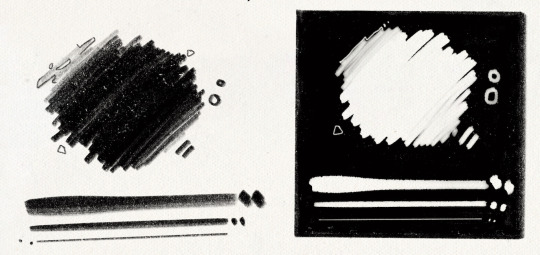
I do almost all of my work in Procreate, but learned digital art first in Photoshop. Anything I share here in regards to how I use brushes can be applied to any brush, I’m certain!
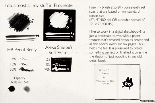
For my sketches, you’re seeing the work of one brush and one eraser.
For my brush, I use an altered version of Procreate’s native HB Pencil brush that I’ve named HB Pencil Beefy. It’s available in my 2021 Brush Pack.
For my eraser, I use Alexa Sharpe’s Soft Eraser. It’s available in their Eraser Brush Pack.
I use my brush at pretty consistently set sizes that are based on my standard canvas size, which is 6″ x 9″ 400 dpi or I use a double spread of 12″ x 9″ 400 dpi.
(If you work in pixels that’s 2400x3600 at 400 dpi and 4800x3600 at 400 dpi)
HB Pencil Beefy I use at 4%, 15%, and 50% size, with the brush’s opacity set to either 60% or 15%.
I set the brush to 15% opacity when I want to go in very softly with lots of that pencil texture. I use this when I need to scale back and really rough something out, or if I’m trying to get a sense of volume with some shadows or contours.
With Alexa Sharpe’s Soft Eraser, I use the eraser set at 2%, 10%, and 25% size. I only scale back the opacity on the eraser if I want to take something back to nearly gone, but still want those lines, faint, there as a guideline.
Jumping back to my file setup really quick, I like to work in a digital sketchbook! It’s just a procreate canvas with a paper texture that’s creased down its center, and all the added layers are my pages. This helps me feel less pressured to create something perfect or finished; It gives me the illusion of just noodling in any old sketchbook.
Okay. Back to the pencil. Below, I have a small idea of my process in sketching and drawing. This is not a how-to-draw demo, and it’s definitely not an anatomy demo – it’s just how I approach drawing using this brush. The page below, and the one above, were both done on a 9″x 6″ canvas at 400 dpi.
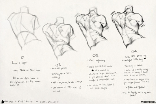
01.
Loose and light
using brush at 50% size
this brush does have a tilt dynamic, but I’ve never used it
02.
Nastiest phase
building up a little opacity
still only using brush at 50% size
use eraser at 25% size, if at all
03.
start refining
come in with 15% sized brush
at no point do I abandon larger brushwork, it just becomes about more careful and purposeful use
use eraser to hatch and cut back roughs
04.
hello 4% brush my beautiful little boy ♡
hatching in detail
build up opacity, using eraser to bring it back and to carve volume
jump back to larger sizes for larger forms and volumes
fiddle until “finished”
P.S. the liquify tool is my best friend
186 notes
·
View notes
Note
Hi, idk if you’ve answered this before but may I know what program u use and which brushes? Ur art is breathtaking.
Thank you ❤️😭 that’s sweet
I use a combination of Procreate and Photoshop. I render everything in black and white in Procreate and then bring it into Photoshop to add color and noise effects.
For my X-Files stuff, the main brush that I use is called Sugar, and it’s from this Gal Shir texture pack. It’s really good for building up values with pressure, and it’s very soft. Usually I sketch things out with the one of the basic pencil brushes and then render everything over that sketch with that Sugar brush.
There’s also a good default Procreate brush that I like called Lightleak, which is good for adding bursts of light behind heads to make them stand out more, etc.
I also put some texture layers on low opacity over that sketch. The main one I use is a default Procreate brush called Plimsoll. I put it on top of my artwork in black and then bring down the opacity really low so that it makes things look less digital.
Then I bring the black and white artwork into Photoshop and add color. I don’t really like to think about color that much so I usually just put a Gradient Map over it and play with the blending modes and opacity until I get something I like. Then I might go in with a standard round brush and fill in specific areas (like skin) that might need to be a different color and set those as a blending mode (whichever looks best). I also always add noise in Photoshop to add more texture. And then sometimes effects like Diffuse Glow to bring out light areas more.
20 notes
·
View notes
Text
¡WARNING!: VERY long post ahead!
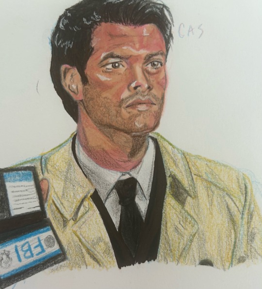
I was recently asked to do a tutorial for two friends, and I figured I’d share it here! It’s on how I personally use markers and colored pencils for portraits, so if that’s something you’re interested in then this is for you!
I must preface by saying this is my first tutorial/guide thingy and I’m no professional, but hopefully it helps some! This is only one way of going about it, don’t worry if it’s not your way!
Without further ado, let’s do this! And remember: Trust the process!!!
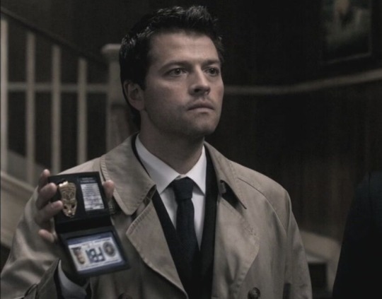
First, the angelic (😏) reference:
Now, we all see tones differently. I also am using the Art Alternatives Portrait Set, which is limited in tones. So, this won’t be completely picture accurate- which is okay! Essence over accuracy!
Alright! Here we go!
Step One: the sketch!
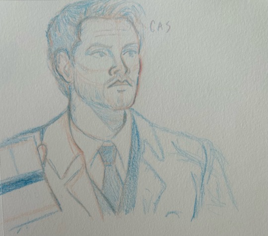
Typically I do the sketch in the person’s undertone, usually pinks or purples. However, for whatever reason I was compelled to try blue on this one, and hey- what is art if not random attempts at creating beauty?
And just like the color scheme, the sketch isn’t 100% accurate. But again, it’s all good!
But anyways, the reason I do my sketches in colored pencil is because it doesn’t smudge like graphite does, and it actually blends into the marker. I feel it’s smoother, and it provides some undertones as you start layering with marker.
Step Two: base tones
This is where you wonder if you just destroyed the entire drawing. I promise you that you didn’t! Basically what I do here is I put pinks down wherever I see pinks in the reference and lay down where the skin is the darkest. I find that it blends better when it’s underneath the base layer.
Step Three: the base layer
Here, all you do is throw down the skintone over the entirety of where it goes, in this case the face. I typically try to leave out highlights, but sometimes the marker bleeds and covers things I didn’t ask it to. In this case, that was the eyes. Oh well!
One thing to notice here is how you can still see the colored pencil beneath the sketch. That’s a very useful guide for when you begin detailing.
Step 3.5: uh
This isn’t necessarily a marker step, it’s just me letting the ink dry and working on other spots with pen and colored pencil. Also, I do like to go over the pink areas a few times to make them less stark.
Step Four: beginning detailing
Now, black is a tricky color on the face, because it can either smudge on everything and turn it gray, or work really well. I used a colored pencil here, and began going over the blue colored pencil spots and lines that were visible under the marked, which started to bring out his face. I also covered the highlight on the nose that had been left alone thus far.
Step Five: THE™️ details
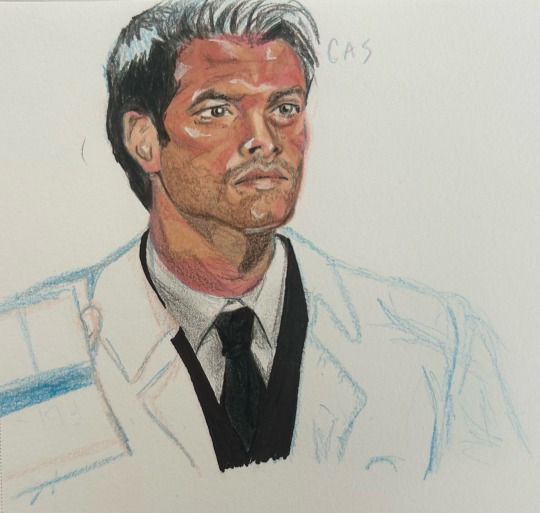
If there’s anything I’ve learned in my five years of drawing, it’s that the highlights and darkest points are what really make the piece. Pure white, bright highlights (like the ones in the eyes) are awesome, but lately I like smudging them out a little bit so that they’re gentler.
If there’s anything you want to hit, it’s the whites of the eyes with the white gel pen, and the pupils + nostrils with the black fineliner.
I have shaky hands, but I use them to my advantage in stippling the darkest part of the eyebrows and in the line of the lips with the fineliner- it just adds a little bit more depth :)
Hair is its own thing, I just sort of wing it. Black hair especially is not the easiest for me, just because I find it difficult to bring out the shades in it. It’s not done at this step as I was trying to figure out how I was going to finish it.
I will also blend things out with both the skintone marker and a pink colored pencil just to get stuff to be smoother. If you’re going for semi realism/realism like me, I highly recommend taking a reddish brown to do some freckles/skin texture with. You can’t see it too much in this picture, and I didn’t want to overdo it since Cas/Misha doesn’t have that many freckles as far as I can see, but it does make a difference.
Step Six: everything else
I did the jacket in colored pencil as well as the fake id!
If you have any questions let me know, I’m happy to help!
Hope this is a decent guide :)
#castiel#castiel fanart#supernatural#supernatural fanart#spn#spn art#spn fanart#cas#tutorial#guide#art#art tutorial
27 notes
·
View notes
Note
How do you decide what to draw, and when it's done?

Text: "This is a great question! I usually "wing it" when it comes to deciding when my drawing is done. (More below)" "Finding ideas...? It kind of depends! Sometimes I'll get a strong picture form in my head while I'm doing something else. Other times I just sit and draw whatever."
Now to elaborate on my process for deciding when to stop, how far to go with shading, etc. Most of it has to do with how I feel about drawing something, but also to do with keeping things visually appealing. Here I've laid out each general step of my drawing process from start to finish:
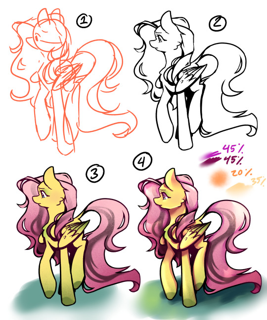
1. Sketch, Meant to be quick and generally convey the subject. I will sometimes draw and post things just as cleaned up sketches if just adding visuals to a text post, for shit-posting, or just if I'm not too interested in what I'm drawing.
2. Line art, I almost never post *just* line art, but i will occasionally post line art with one color to fill in the silhouette to help with contrast and character recognizability.
3. Flat color, I often post ask responses at this stage (maybe with simple hard-edged shadows here or there), but outside of ask responses I only leave character reference art at this stage just because the colors are purest for the character. I don't usually leave it without simple shading because it can be hard to read the subject's form, and its not my cup of tea. I lightly airbrush a warm color over the line art so that the harsh black doesn't contrast too much with the bright colors.
4. Shaded, a step up from simple hard edge shading I'll layer more than one shading color (layer set to multiply and lowered opacity) and blend out the edges in some places to soften the form. Then I add lighting and highlights - first using a textured soft airbrush over a large area, then use a round airbrush with hard edges for the highlights, blending out the edges in some areas to soften the form. This is usually where i stop for simpler character pieces, either for ask responses or for personal art. (Highlight layers are set to "add-glow")
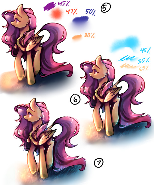
5. Atmosphere, or adding additional shading elements to engage the subject with an environment or specific lighting condition. Here I've done a sunset lighting condition - I put a purple color over the whole subject set to multiply and opacity lowered, then airbrushed a reddish orange tone (on a separate layer, set to add-glow and opacity lowered) over the highlighted areas to bring warmth back to the lit spots. Then deepened the shadows using the hard edge airbrush again, a dark blue color (multiply layer, lower opacity), and then blending some of the edges out to show the form better. This is where I'll merge the line-art layer with what i now have of the coloring and shading, if i didn't already do so prior. Last I went back over the highlights with the orangey color (add glow, lower opacity). Once I get to rendering like this, I don't often stop here because by this point I'm likely hyper fixated and will keep pushing the values and adding details until I get to 6.
6. Details and bounce light. I texture-airbrushed a blue bounce light color, erased some hard edges in using that hard edged airbrush and then blending some of the edges out. This then gave me a guide to add in bounce-highlights with a hard pen, that i blended out in some places. I then further pushed the main highlights using a hard pen and again, blended out the edges. All layers set to add glow and opacity lowered. This is where I'll usually stop for finished rendered pieces, because I struggle to find other things to add or change, and the hyperfixation is thinning out and caving into my hunger/sleepiness. Might add hard white highlight details, but those are the finishing touches.
7. Wtf details. Added in hair strand details and fly-aways, blades of grass, I'm up way too late and struggling to end the drawing process - Or im just enjoying rendering the hair. I almost never add in stray hairs like this, but it's something i enjoy visually.
Again, a lot of where I stop comes down to my energy, time, and the vibes I'm going for. Hope this answers your question!
#mlp ask blog#mlpfim#mlp art#art#mlp fim#mlp ask oc#digital aritst#mlp fan art#digital art#mlp oc#art tutorial#art tumblr#rendering practice#process#art process#drawing process
34 notes
·
View notes
Note
how do you get your colors in your art to look so good?
gonna resist the urge to say my colors aren't that great, and i'm gonna try and think about how i do color seriously.... also thank you for the compliment! i've always felt like i struggle with color but maybe i can still be helpful :B if this stuff is all super basic, apologies in advance
ig i already love bright colors, especially warm colors, but i feel like a lot of making visual art is bringing out the contrasts between colors, light and dark, textures, movement, saturation, curves and straight lines, etc., so that just means i usually try to think about the relationships between the colors a little more than the colors individually.
i also don't usually start with a solid color palette defined beforehand. i usually know the basic colors i want, but i don't typically choose them before i start bc that's too rigid for me, and i want to be able to adjust things or throw things out without worrying that i'm messing up the balance of a palette i already committed to.
so for this one
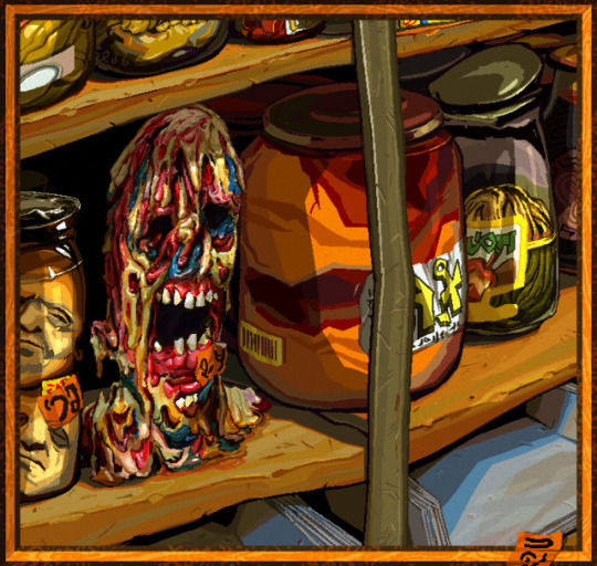

i used a lot of warm colors bc i loove earthy yellows and oranges, but i think it can make colors feel more vibrant if they're next to colors that contrast w/ it (warm and cool, or complementary colors).
the "gray" metal parts of the picture like the shelf stile coming down vertically, and the jar lids behind it, are green to contrast w the oranges and reds in particular, and there's some blue popping up in the zombie head and the shadows on the bottom shelf for the same reason, altho the blue is a touch on the greener, cooler side of blue (as opposed to the purpler, warmer side).
usually if i use a color in one place, i try to pull it into the rest of the picture for better balance unless maybe if it's the focal point. so i'm doing that with the blue, and the orange stickers to spread the bright orange from that big jar around more.
also i don't usually use straight gray/white/black, 99.9% of the time i'll use something tinted like that green metal stile, or the pinkish gray in the jar on the far right.
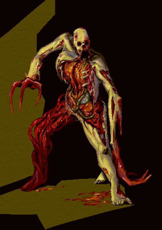
same here: it's mostly green and red bc i like that combo & they're complementary, but i did try to pull a little blue in as well through the shadows on the right ribcage and that one mystery organ under the green intestine, nd in the back of the leg.
that being said tho, it's not really "blue", it's more like nearly gray-purple that looks blue bc it's next to such bright warm colors. that's the magic of gray lol, it's very useful bc it's easy to make it look as if it's warm/cool depending on what colors it's surrounded with.
ig color for me is mostly about color relationships and saturation... the gray can look like blue if it needs to, and it can make the colors next to it look even more vibrant so the skin of this necromorph dude looks sickly and dead but the organs look pretty lively.

when i shade something i always try to use a color that's at least a little bit different from whatever the base color is. so in this case the base color was that kind of pale orange and the orange-ish gray, but the shadows are both super saturated & one is leaning more toward a sienna/orange (on the left side of the pic on the arm and ribs) and the other one is leaning a lil more toward a berry purple/red & i think that usually adds some nice depth to the color. also don't be afraid to add reeeally dark darks and really light lights, but imo the darks give colors the most life by contrast.
since this was a limited palette & not that detailed, i didn't worry about pulling that aquamarine anywhere else.
other than that, i just try to be bold with colors, and go for something exciting & not worry too much about whether it looks naturalistic. plus there's tons of colors you can pull out from regular objects/lighting/whatever else. this isn't specific to color, but the other thing i try to do is practice seeing what colors/forms are really there, not what i expect to be there.
a super basic example would be if i want to draw a banana, i don't want to just automatically reach for yellow bc bananas are yellow, i want to either look closely at the real banana i want to draw, and really try to see what colors are really there (which can be surprising tbqh), or if i'm not actually looking at a real one, then just try to pull in more color for the fun of it, like shading it with purple or blue maybe idk go nutso!
tl;dr i think i usually try to keep in mind
warm/cool color balance
complementary colors (altho tbh you can make any color combo look good, esp if you mess with warm/cool balance)
saturation (i keep a lot of things saturated, but also the contrast between saturation/desaturation can make the colors look more intense)
light and dark contrast
using tinted grays to imply a warmer/cooler color that contrasts with the main palette
color depth (shading with cooler and/or warmer variations of similar colors)
go nutso
#ask#anonymous#cyrsed art#i hope this wasn't completely unhelpful lol i don't know how much of this is just super common sense stuff#but ty for asking it was interesting to try and actually put the process to words
5 notes
·
View notes
Text
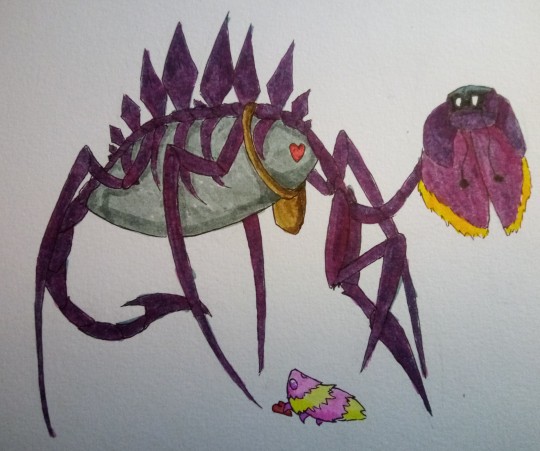
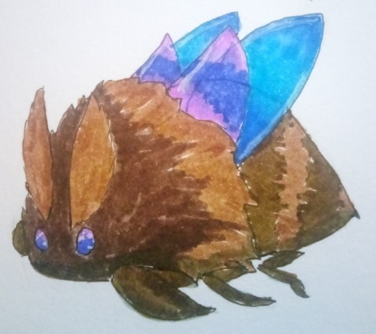
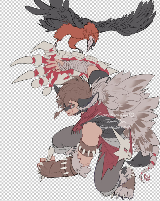
With the @bug-oc tournament still ongoing, Round 2 drawing to an end in favour of Round 3, another handful of bugs are knocked out of the competition, who will of course arrive home safe and...
Well, differently-shaped. Marigold's been busy! An unusually fast round, here, we got a decent burst of inspiration while procrastinating on packing chatting with some friends and - what? Other contestants? What other contestants? You must be mistaken, of course there were only seven bugs lost this round. It's not like we would lie about that, right? Clearly, if anyone else was transmuted, you'd see them right here. With the rest of Marigold's successful experiments. It's not like we've got any more to do... right?
(Names and owners of transmuted OCs below the cut, in order of pictures here - no group picture for this one, sadly, since we still have more to do here. Hopefully, we pass Round 3 - we really want to draw some transmutations for the other bugs in this round, and the narrowed competition means we can bring out some of the fancier paper we'e got rattling around! Vote for Marigold so we can do more of these - and, of course, for her many natural good qualities.)
First up is Fahris from @tetraterantula, as a Kingsmould! Though tampering with Void isn't precisely advisable, and going from a normal bug to an artificial one is jarring at the best of times, he at least has hands - better than most of this batch can say! This one was fun to do, and we tinkered with a lot of things - the side effects being, of course, that we're tinkering with things we don't already know how to do well. We did make some mistakes here - we are not, admittedly, an expert in humanoids, and long straight lines are the absolute bane of us, but we did our best!
The dark gray used here is starting to fray, which we can unfortunately do little about, as we're out of replacement nibs for our pens at the moment, but which might have caused some interesting texture. We defined the boundary between the lighter cape and the darker one with a white gel pen because our black and dark gray proved to be a bit too close in color to tell at a glance - the pains of traditional art, we suppose. Still turned out fairly well! We wonder if the color palette would interfere with his ability to stroll into the White Palace...
Next up is Cici from @mimicspider, as a Giraffe Weevil. Probably not doing anything for her clumsiness, and definitely not doing anything for her number of hands - the neck is a lot to get used to, even without getting into the whole set of bauplan changes going on here. At least she's probably faster like this? Once she gets used to the legs, at least.
Though we've technically already made her into a Lightseed, double transmutation is fair play... probably? Lightseed Cici was less than a centimeter of our paper, so obviously we had to do something bigger. We modelled this one in particular after the Grimm Troupe steeds - the clown theme fits, and we wanted to toy with the... cloak-looking bits? The polka-dots were a fun challenge, and we definitely think the abdomen came out well. One of the more successful transmutations here, we'd say!
Next are Willow and Lily from @razs-archetype, with Willow as a Moss Knight and Lily as a Belfly. Y'know when you take just a few seconds to yourself, take just a quick nap, and next thing you know you've woken up and the moss has grown over you and your hands have been turned to strange talons reminiscent of a god's dream? Yeah, happened to us too. Awful time. At least their partner's here to- ah, shit. At least this one comes with flight? Probably a damn hard sell of a consolation prize, but...
Not as much to say with the choices here - the Moss Knight felt like a natural choice, and the Belfly just... clicked? We had fun with Willow's moss - the highlights here actually use the same white gel pen as was used with Fahris, since it's got a nice semitransparent thing that we particularly like. We think the style conversion for Lily's face worked out particularly nicely, here. The piece as a whole turned out as one of the best of the batch, as far as we're concerned. Was nice to draw them!
Next, of course, are Drya and Tel from @enbeemerang, with Drya as a Tiktik and Tel as a Nosk - we predict strange waters ahead for them, relationship-wise. Two bugs, and not a single pair of opposable thumbs. The economy is clearly in shambles. At least they've still got each other?
Tel here specifically is actually inspired by a fic that Cog himself wrote - would it surprise you to know that we know them outside of this tournament? They've actually been handed over to us for transformation practice once before, in a sequence that we... might post as propaganda, later. Drya, we deliberated on a few options before settling on a Tiktik - it just seems to fit!
Last but not least, Sehra from @shiningnightstars as a Hive Soldier. It's probably better than it could be, here - at least bees are a bit familiar to Bugaria! This particular variant, admittedly, might not be. Again with the hands, and this time with the looking like an unawakened bee - it might mean a bit of trouble for her, but we're sure she can power through.
The wings here were particularly fun to do - again, we're doing blending tricks here, and we think that the purples turned out particularly well! Sehra's palette is quite pretty, and the gel pen on the eyes wound up looking amazing. Though "soldier" probably doesn't fit too much for what Sehra... is, it felt like the closest to her as far as aesthetics go. The Hive Guardian is a bit too big for a moth like her, the Hiveling feels a bit too far in the other direction, and the Hive Knight... we're actually avoiding bosses and more sapient-looking folk here when possible. Hopefully, it's to your liking!
#our art#finished#bug fables#hollow knight#ocs#other peoples ocs#kingsmould#troupe steed#giraffe weevil#moss knight#belfly#nosk#tiktik#bee#hive soldier#the two left are To Be Seen for... well. youll see :)
48 notes
·
View notes
Text
How to Capture The Perfect Black and White Portrait
© David Schmid
Black-and-white photos, while widely known, are often misunderstood. Some view them as an afterthought — a way to edit a color picture we’re not fully happy with.
With that mentality, we miss the true beauty that black-and-white portraiture can bring. From evoking emotion to highlighting certain features, there is a lot you can do with a black-and-white portrait.
This article will discuss the whys and hows of capturing beautiful black-and-white portraits. So get your camera ready, find your muse, and let’s see how you can bring your black-and-white photography to the next level.
Color vs. Black-and-White Portraits
This might be a matter of personal preference or pure practicality. Black-and-white typically leads to more dramatic portraits.
With portraiture, there are specific considerations to bear in mind when making this decision. The first one is your subject and whether the use of color is essential. Is their hair a vibrant shade of color or do they wear clothes that stand out?
Secondly, consider the setting or backdrop. Does the color scheme play a significant role in the shot you're capturing?
Black-and-white portraiture could be an option for you if you answered no to these questions. Most importantly, this is because it eliminates background noise. Additionally, black-and-white portrait photography brings out the subject's best features.
Lastly, the significance of mood and ambience is another key factor to think about. Although black and white portraits are commonly thought of as having a somber or depressing tone, that is not necessarily the case.
6 Tips for Capturing a Beautiful Black-and-White Portrait

© David Schmid
A lot must be considered with black-and-white images, and these are my top six tips for you when shooting a portrait.
1. Make Black-and-White Your Mindset
Using black and white as a post-production experimental decision is something that many photographers incorrectly do. Black-and-white portraits have their own particularities, therefore it is important to start your photoshoot with black-and-white in mind.
Rather than treating black-and-white as an afterthought, adopt a perspective that is consistent with black-and-white portraiture. Think ahead and choose if you'll be shooting in color or not. When you go into making an image with the intention of turning it black and white, you can ensure it has all the makings of a great monochrome shot before you even click the shutter.
You have to change your strategy when dealing with black-and-white images because they are distinct from color photos. For example, the most striking black-and-white pictures often showcase striking lighting, distinct facial expressions, and a wide range of tonal contrasts.
For the greatest effects, plan to shoot in black and white ahead of time because these elements are hard, if not impossible, to adjust after the fact.
2. Set Up Proper Lighting
Lighting matters a lot in black-and-white portraits. It's not just about brightness; lighting shapes how the picture looks and feels. Light and shadows highlight the face, making features more noticeable.
When done right, it also brings out textures and gives the photo a timeless quality. In black and white, there's no color to grab attention, so lighting becomes crucial. It sets the mood and captures emotions, making the photo more about the person.
Without good lighting, a black-and-white photo might look flat or dull. It's like the secret ingredient that turns a regular picture into fine art.
3. Choose The Right Pose
When experimenting with black-and-white portrait photography, it could be tempting to go for a more dramatic and atmospheric approach. But there is an option to get a more candid shot of your subject if you choose.
Black and white doesn't have to be all film noir; in fact, it may bring forth humor and enjoyment. Just as much as color portraits may bring out a subject's smile, black-and-white photography can do the same.
4. Use Tethering
Simply said, tethering is the process of linking your camera to a mobile device or computer. With this easy setup, you can view your images on a bigger screen right away, giving you a better idea of what the final image will be like.
Tethering is a lifesaver when shooting with a camera that doesn't have an electronic viewfinder with a high pixel density. The large screen allows you to see the exact effects of your black-and-white settings as they happen. Instead of winging it, you may now make calculated modifications while shooting.
5. Use a Wide Aperture
Using a wide aperture, such as f/1.4 to f/2.5, in black-and-white portrait images will create a bokeh effect and draw attention to the subject's eyes or other focus points.
With a wide aperture and a sharp focus on the subject's eye, you can also blur their facial characteristics. This can also be striking in monochrome, which forces the viewer to actively choose how to distinguish between foreground and background elements in the absence of color.
6. Consider High ISO
Generally speaking, you should aim to avoid using a high ISO setting. At extremely high ISO settings, it can also reduce an image's sharpness, contrast, and clarity by producing noise.
Nevertheless, when shooting black-and-white portraits, using a high ISO isn't necessarily an issue. It may even be something you decide on. Changing a noisy, high-ISO color image to black and white can make it easier to work with. It has the power to transform an ordinary photo into an artistic masterpiece.
Final Thoughts
As any portrait photographer will tell you, when done right, black-and-white portraits can convey much more than you’d first expect. By following these tips, you can shoot your own black-and-white masterpieces.
If you’d like your black-and-white portraits shot professionally, don’t hesitate to contact me about your photoshoot!
2 notes
·
View notes
Text
An IRL Update!
Just a general update on things, and some fun life hacky adjacent type things!
It's been a busy summer for sure, been trying to find something fun to do every weekend so I can hibernate guilt free in the winter. Some highlights:
Concerts! Including Styx in the rain, which was very fun! Learned that earplugs at concerts are 100% a must for anything inside, if only for the crowd noise. We used cheap Harbor Freight ones, like $5 for 100, worked pretty good!
Camping! which was delayed due to a combo thunderstorm/flood. We made hobo pies! Recipe: 1 cast iron pie iron (~$20) 2 slices of Hillbilly (TM) Bread, or similar soft wheat/white bread (think wonder bread texture) Fillings (i highly recommend PBJ for sweet, or cheese and pepperoni for savory, melty is ideal) Optional: Non-stick cooking spray (Spray inside of pie iron), put bread in each side, add filling. Clamp pie iron. Place in hot coals for about 5-10 minutes each side, flipping once. The edges should be dark, but not actively on fire. Remove iron from fire and unclamp, turn pie out onto plate and let cool until heat comfort level is reached. Eat!
Gardening! My lobelia, obedient plant, vervain, verbena, harebell, and anise hyssop flowered! I picked blueberries! My petunias have lived! I successfully transplanted lemon balm from cuttings (to a pot, the stuff is very aggressive and I'd like to bring it inside in the winter)/I somehow kept the "finicky" plants alive, but killed a nanny-berry (a notoriously hardy viburnum variety). The squirrels keep digging up my wild bergamot! But a 100% increase in bees and bugs, as was the goal! We have fireflies in our 1/4 acre city lot, which is very nice! (to see more bugs/birds, find out your city's grass cut limit and hang tight to it. Where we live it's a pretty generous 10", so lot's of "weed" plants can come up. We actually need to remove a lot of the beech and maples that are growing in places they really shouldn't (like 6" from the house foundation), but we've let all the clovers/violets/asters hang out. We also use a push reel mower and an electric weed whip instead of a normal two stroke mower, which both do a worse job of mowing grass but a better job of not annihilating the things we want growing!
Art fairs! I bought so many mugs, I'm going to need a second mug hutch! (My first mug hutch was the first piece of furniture I bought because I wanted it, not needed it. It is red, with dark green insides. The doors stick and the glass is cracked, but I adore it!). I collect mugs, but I may need to purge if I keep this up. I also bought a "rice vest". It's like a hot sock, but a vest. It has a bunch of little sections full of rice so the weight is evenly distributed. You can microwave it or freeze it. Great for my tense shoulders! I love it so much, I attached a picture!
Art classes! I took multi-media storytelling, which was basically working with collages! I made some pretty cool pieces, and it inspired me to start cleaning my side of the basement for an art studio. I'm going to sign up for more classes in the fall, see if I can get into the pottery courses (our local art center has all sorts of classes for adults, but the pottery ones are the most popular and actually have an order you need to take them to unlock them in). 100% recommend, it was nice doing something creative with other people.
Birding! Not too seriously, but I got a pocket guide and Miles bought some nice binoculars (the lad loves optics and lenses, it's the fun part of photography for him) and we take 'em on hikes! Highlights so far are some cedar wax wings (not uncommon, but not something we see a ton around where we live), a bald eagle, several great blue herons (the nature center by us is a big river/wetland, so lots of birds stop over), and a black crowned night heron. We also got caught in a surprise thunderstorm while looking at some red-winged blackbirds, which was an experience!
That's really for it, it's just been a busy time and I wanted to share! Have a wonderful day!
2 notes
·
View notes
Text
Top trends: Men’s gold, wedding, engagement rings
When it comes to symbolizing love, commitment, and timeless style, nothing speaks louder than a well-crafted ring. Whether you are planning a proposal, your big day, or simply searching for a statement piece, staying on top of the latest ring trends is essential. In this article, we’ll explore the top trends in engagement rings, wedding rings, and gold rings for men, helping you make the perfect choice for any occasion. At Gold Plus, we blend craftsmanship, elegance, and innovation to bring you designs that suit every personality and preference.
Minimalist Gold Rings for Men Gone are the days when men’s rings were just plain bands. One of the top trends today is minimalist gold rings for men with subtle design elements—think matte finishes, soft curves, and light engravings. These rings offer a clean, contemporary look without overpowering your style. Yellow gold remains a classic, but rose and white gold options are gaining popularity for those who want something modern yet refined.
Why it’s trending: Men are now choosing rings that align with their personal style and everyday wear, rather than traditional designs that felt obligatory.
Mixed Metal Wedding Rings Wedding rings today are all about individuality. Couples are embracing mixed metals to add a personal touch. For instance, combining yellow gold with white gold or rose gold creates a unique contrast that reflects the union of two personalities. Gold Plus offers customizable options so you can design your own mixed-metal wedding band.
Pro Tip: Mixed metal rings also match a wider range of accessories and outfits, making them more versatile for everyday wear.
Diamond-Embedded Engagement Rings When it comes to engagement rings, diamonds are still the preferred choice—but how they are set is evolving. Halo settings, where smaller diamonds encircle a central stone, are making a strong comeback. Oval, pear, and cushion-cut diamonds are trending due to their elegance and brilliance.
For men who are proposing, Gold Plus recommends choosing a ring that not only dazzles but also tells a story. Our expert jewelers help you select a design that matches your partner’s taste and lifestyle.
Black and Textured Gold Rings for Men Another major trend in gold rings for men is the use of black finishes and textured surfaces. Black gold, though not naturally occurring, is created by alloying or plating gold with darker metals to create a bold, masculine appearance. Textured designs—such as hammered, brushed, or wood-grain finishes—add a rugged yet sophisticated feel.
Who it’s for: Men who want something different from the traditional polished look but still classy enough for formal settings.
Custom Engraving on Wedding and Engagement Rings Customization is a trend that’s here to stay. More couples are choosing to engrave initials, dates, or even short messages on their wedding rings and engagement rings. At Gold Plus, we offer advanced laser engraving services so you can personalize your ring inside and out.
Why people love it: Engravings make the ring even more meaningful and unique. It’s a subtle but powerful way to carry a piece of your story with you.
Stackable Engagement Rings Stackable rings are a hot trend for those who want more than one design on their finger. These are especially popular among women, who often combine an engagement ring with a matching wedding ring and additional bands. Stackables allow for creative combinations, from plain gold bands to diamond-studded pieces.
Design tip: Gold Plus offers sets designed to stack perfectly, allowing you to build your ring story over time—ideal for anniversaries, milestones, or family gifts.
Vintage Revival Classic styles from the past are making a comeback with a modern twist. Art deco, Victorian, and Edwardian styles are being reimagined for today’s couples. Think floral engravings, milgrain detailing, and colored stones.
Whether you’re choosing a wedding ring, an engagement ring, or a gold ring for men, vintage-inspired designs offer timeless charm with unique character.
Sustainable and Ethical Gold Eco-conscious consumers are now asking where their gold comes from. One of the top trends is the demand for ethically sourced and recycled gold. At Gold Plus, we are proud to offer sustainable options for engagement rings, wedding rings, and gold rings for men that don’t compromise on quality or ethics.
Bonus: You get to wear a beautiful ring that also supports responsible mining and environmental care.
Bold Center Stones for Engagement Rings While traditional diamonds are timeless, colored gemstones like sapphires, emeralds, and even black diamonds are gaining popularity in engagement rings. These bold center stones add a unique flair and help express individuality. At Gold Plus, you can choose from a wide variety of precious stones and settings to create something truly one-of-a-kind.
Dual Finish Gold Rings for Men A standout trend in gold rings for men is the use of dual finishes—combining polished and matte textures in a single band. This modern style adds depth and visual interest without going over the top.
Why it works: It offers a balanced look that’s both elegant and masculine, making it perfect for formal and casual occasions alike.
Choosing the Right Ring with Gold Plus Finding the perfect engagement ring, wedding ring, or gold ring for men is more than just picking a piece of jewelry—it’s about capturing a memory, a promise, and a personality. At Gold Plus, we make this journey easier with:
Expert guidance and personalized consultation
Custom design and engraving options
Ethically sourced, certified materials
A wide variety of timeless and trending styles
Whether you’re ready to pop the question, exchange vows, or just treat yourself or a loved one, Gold Plus is your destination for meaningful, lasting craftsmanship.
Conclusion
As tastes and preferences evolve, so do the trends in engagement rings, wedding rings, and gold rings for men. From minimalist designs to bold gemstones and sustainable materials, today’s options are more diverse and expressive than ever. At Gold Plus, we stay ahead of the curve to offer you pieces that are as unique as your story.
0 notes
Photo

Nail art isn’t just a trend—it’s a full-on vibe, a powerful form of self-expression that starts at your fingertips. There’s something transformative about a fresh mani. Suddenly, your hands talk first, and every gesture becomes a statement. As we step into a new month, these May nail designs are here to showcase your baddie energy loud and clear. Whether you’re a bold mani girl who lives for drama or just unapologetically extra, loud and chic nail art couldn’t represent you better. And if you’re more of a minimalist? Don’t worry—being spoiled for choice is the only dilemma you’ll face. Simply put, there’s a nail look out there that speaks your language. Photo: @cinsclaws/Instagram So this month, ditch the basics. Step outside your comfort zone and let your hands do the talking. From high-shine chrome to playful, personality-packed designs, these nail designs for May will have everyone asking, “Where did you get your nails done?” Time to flex, bestie. These May nail designs will slap without much fuss… #1. Chrome flex Photo: @nailsxbellaelyse/Instagram High-shine, mirror-finish nails are still very much having their moment—and honestly, they’re not going anywhere. The liquid metal effect delivers a futuristic, almost sci-fi allure that instantly elevates your look. Whether you opt for classic silver, dreamy rose gold, or a moody sapphire chrome, these nails radiate main character energy. Pair them with stacked rings, and just like that, your hands are the headline. #2. Aura for aura Photo: @santamarianailss/Instagram Few nail trends feel as personal—or as enchanting—as aura nails. These soft, blended gradients mimic the subtle glow of an aura, often featuring dreamy color pairings like lavender fading into baby blue or fiery orange melting into neon pink. The effect is equal parts spiritual and stylish, adding an ethereal touch that’s surprisingly wearable. Amp up the impact with a high-gloss finish to let those luminous shades truly shine. #3. 3D textures Photo: @glamnailsbykayla/Instagram Flat nails? So last season. This is the era of texture, where every manicure becomes a mini masterpiece. From pearls and raised squiggles to molten drip effects and sculptural details, textured nail art is all about turning your fingertips into conversation starters. It’s giving high fashion, art gallery energy, and serious “don’t touch, just admire” vibes. Go all in with a bold monochrome set or soften the edge with pastel hues for a playful, tactile twist. #4. Micro french Photo: @finorabeauty_/Instagram French tips are officially back—but with a twist. Enter the micro French: ultra-thin, barely-there lines that bring a sleek, understated elegance to your nails. This modern update feels both timeless and trend-forward, offering endless ways to make it your own—think neon accents, metallic finishes, or a mismatched rainbow of tips. It’s minimalist nail art with major personality. These May nails aren’t just cute—they’re conversation starters. Don’t be surprised when people start asking for your nail tech’s number. #5. Cartoon core Photo: @jark.nails/Instagram Ever wish your nails looked like they leapt off the pages of a comic book? Enter cartoon nails—a bold, outlined mani trend that brings animated charm to your fingertips. With graphic edges, vibrant color-blocking, and a nostalgic wink to pop art, this look turns your nails into mini masterpieces. Whether you go all in with bright hues or keep it chic in black and white, one thing’s for sure: these May nails don’t just make a statement—they shout it. #6. A latte party Photo: @beautique_kent/Instagram Nothing beats a flawlessly blended neutral mani—and latte nails are serving that creamy perfection. Inspired by the rich hues of your favorite coffee order, this trend swirls together warm beige, caramel, and mocha tones in a soft, high-gloss finish. The result? A subtle yet undeniably luxe vibe that’s perfect for the minimalist with a taste for quiet sophistication. #7. Holographic glaze Photo: @vivianmariewong/Instagram We’re talking fairy dust meets futuristic glam. Holographic glazed nails bring a pearlescent sheen that shifts beautifully in the light, giving off an almost otherworldly glow. A sheer base layered with iridescent chrome powder creates that glazed-donut effect—mesmerizing, elegant, and low-key magical. Perfect for May, these nails strike the ideal balance between ethereal and wearable, effortlessly complementing every outfit. #8. Metal magic Photo: @clawsbyjulie/Instagram Molten metal nails are taking center stage this May, turning fingertips into statement pieces. Think drippy silver, melted bronze, and gold foil accents that look like liquid jewelry. The result? A luxe, high-fashion manicure that feels more like wearable art. Style them with sleek, neutral fits to let the nails steal the spotlight. It’s bold, it’s edgy, and it’s giving runway-ready energy. #9. Abstract swirls Photo: @norush.nailart/Instagram Swirl nails are the ultimate way to add movement and personality without doing the most. Whether you opt for soft pastels or bold, clashing hues, these fluid designs bring a playful edge to your mani. Each swirl is like a tiny abstract painting—no two are alike, and that’s exactly the point. It’s a low-effort, high-impact look that’s equal parts artsy and chic. #10. Y2K butterfly Photo: @by.lucyrose/Instagram The early 2000s are back in full swing, and butterfly nails are leading the charge. Whether you go for intricate hand-painted designs or subtle decals over a glossy base, these nails radiate peak Y2K nostalgia. Soft baby pinks, shimmering purples, and playful glitter accents bring a dreamy, whimsical vibe. For the ultimate Y2K moment, add rhinestones for that extra touch of sparkle. Nail trends today are all about embracing creativity, self-expression, and unapologetic fun. Whether you’re flaunting something sleek and sophisticated or going bold with a statement-making design, the secret lies in wearing your nails with confidence. Because, let’s be honest—there’s nothing better than looking down at your hands and thinking, “Yep, these are fire.” Featured image: @indiastyledyou/Instagram For the latest in fashion, lifestyle, and culture, follow us on Instagram @StyleRave_ —Read also !function(f,b,e,v,n,t,s) if(f.fbq)return;n=f.fbq=function()n.callMethod? n.callMethod.apply(n,arguments):n.queue.push(arguments); if(!f._fbq)f._fbq=n;n.push=n;n.loaded=!0;n.version='2.0'; n.queue=[];t=b.createElement(e);t.async=!0; t.src=v;s=b.getElementsByTagName(e)[0]; s.parentNode.insertBefore(t,s)(window, document,'script', ' fbq('init', '496558104568102'); fbq('track', 'PageView'); !function(f,b,e,v,n,t,s)if(f.fbq)return;n=f.fbq=function()n.callMethod? n.callMethod.apply(n,arguments):n.queue.push(arguments);if(!f._fbq)f._fbq=n; n.push=n;n.loaded=!0;n.version='2.0';n.queue=[];t=b.createElement(e);t.async=!0; t.src=v;s=b.getElementsByTagName(e)[0];s.parentNode.insertBefore(t,s)(window, document,'script',' fbq('init', '1453079628754066'); fbq('track', "PageView"); Source link
0 notes
Text
Top 3 Small Undermount Vanity Sinks Recommended for Dallas Homes

In Dallas, where home design blends luxury with smart functionality, even the smallest spaces deserve special attention. Bathrooms — especially powder rooms, guest baths, and secondary suites — are no exception. One of the best ways to maximize design and efficiency in these compact areas is by installing a small undermount vanity sink.
Stylish, space-saving, and easy to maintain, small undermount vanity sinks have become a go-to choice for Dallas homeowners looking to upgrade their bathrooms without sacrificing square footage or aesthetics. If you’re remodeling or building a new home, here are the top 3 small undermount vanity sinks we recommend for Dallas homes.
1. Ceramic Rectangular Undermount Sink — Minimalist Classic
Best for: Modern townhomes and high-rise apartments in Downtown Dallas
This clean-lined small undermount vanity sink is a favorite among Dallas interior designers for its timeless appeal and compatibility with a wide range of vanity styles. Crafted from durable ceramic, it’s easy to clean, resists stains, and works well with quartz or marble countertops.
Its rectangular shape provides a sleek, tailored look that fits especially well in modern bathrooms, creating a seamless finish that complements floating vanities or narrow countertops.
Why Dallas homeowners love it:
Compact footprint with ample depth
Matches a variety of faucet finishes
Resistant to chipping and discoloration
Offers a high-end look at an affordable price
2. Granite Composite Oval Sink — Durable & Designer-Friendly
Best for: Family homes in Frisco, Plano, and Highland Park
Looking for something more unique and durable? Granite composite is a standout choice. This small undermount vanity sink offers a softer, oval shape that’s ideal for bathrooms where curves and contrast play a central role in the design.
The granite composite material is resistant to scratches, heat, and impact, making it ideal for high-traffic bathrooms in family homes. The matte finish gives it a designer touch that works beautifully with both wood and stone vanities.
Why it stands out in Dallas homes:
Long-lasting, durable surface
Matte texture hides water spots
Sophisticated look without the upkeep of natural stone
Pairs well with earthy or neutral color palettes
3. Stainless Steel Undermount Sink — Modern Industrial Edge
Best for: Urban homes, loft conversions, or luxury remodels in Bishop Arts or Deep Ellum
For Dallas homeowners looking to make a bold design statement, a small undermount vanity sink made of stainless steel is a modern, edgy alternative to the usual white ceramic. It brings an unexpected yet sleek look to bathroom spaces, particularly in industrial or contemporary design schemes.
With a brushed or satin finish, this sink resists stains and corrosion while adding a commercial-style touch that feels upscale and intentional. It’s a favorite among designers working on custom builds and artistic spaces in the city’s trendiest neighborhoods.
What makes it unique:
Ultra-modern appearance
Easy to pair with black or chrome fixtures
Scratch-resistant finish with long-term durability
Works well in minimalist or masculine-themed interiors
What to Consider When Choosing a Small Undermount Vanity Sink
Before you make your final selection, think about the following factors to ensure your sink is the right fit for your Dallas bathroom:
Countertop material: Undermount sinks pair best with solid surfaces like granite, quartz, or marble
Bowl depth: Choose a bowl deep enough for function, but shallow enough to preserve storage space
Shape & style: Match the shape with your bathroom’s overall design — oval for softness, rectangular for modern lines
Fixture compatibility: Make sure your faucet placement and finish complement the sink’s style
Where to Buy the Best Small Undermount Vanity Sinks in Dallas
At Splendor Sink, we carry a curated collection of small undermount vanity sinks tailored for Dallas homes — from compact condos to custom builds. Our team can help you find the perfect fit for your bathroom based on your style, space, and budget.
We work with trusted manufacturers to ensure all of our sinks are crafted from high-quality materials and built to last.
Final Thoughts
If you’re designing or upgrading a Dallas bathroom, a small undermount vanity sink is more than just a functional feature — it’s a design opportunity. Whether you want the crisp look of ceramic, the strength of granite composite, or the bold edge of stainless steel, there’s a perfect sink to elevate your space.
Ready to upgrade your bathroom with smart style? Explore our top-rated small undermount vanity sinks at Splendor Sink and let our team help you modernize your space with confidence.
#ceramic lavatory sink near you#granite composite sink in dallas#black and stainless steel sink#small undermount vanity sink#stainless steel sink in dallas#black stainless kitchen sink#black stainless sink#bath lavatory sink in dallas#composite farm sink
0 notes