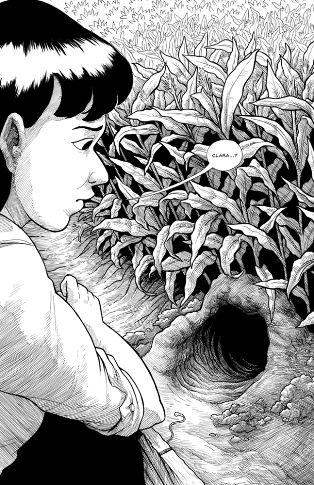
#someone help me to simplify my art style
Explore tagged Tumblr posts
Visit Tumblr Blog
Explore Tumblr blogs with no restrictions, modern design and the best experience.
Last Seen Tumblr Blogs


Fun Fact
The most popular pages on Tumblr are about Minecraft, GIFs, and David J. Peterson.
Text

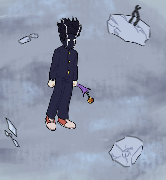
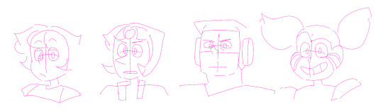
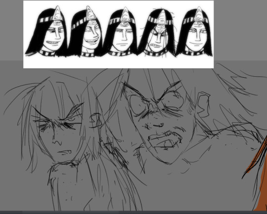
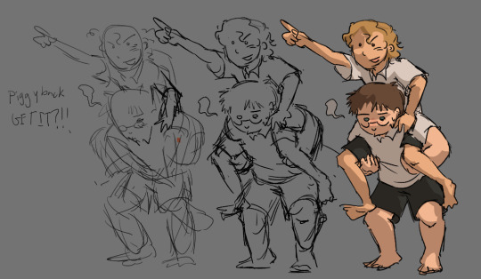
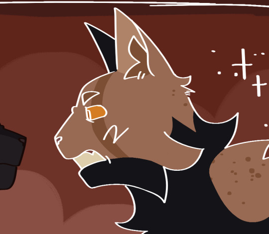
Happy birthday, Caly! My little 4-year old baby celebrated on April 23. She wanted a Disney Princess themed party and Rosaline made sure everyone dressed the part. This is also a great look at height-accuracy for my OCs (except Caly, who is kneeling on a chair).
#infamous sparks#infamous ocs#conduit ocs#birthday party#disney princesses#Rosaline as Merida#Benji as Moana#Caly as Rapunzel#Makayla as Tiana#Makayla also has a sparkler#Lucky as Anna#Orion as Belle#These are my babies and I love them very much#This took me 3 days to do#I put in too many details#someone help me to simplify my art style
5 notes
·
View notes
Text

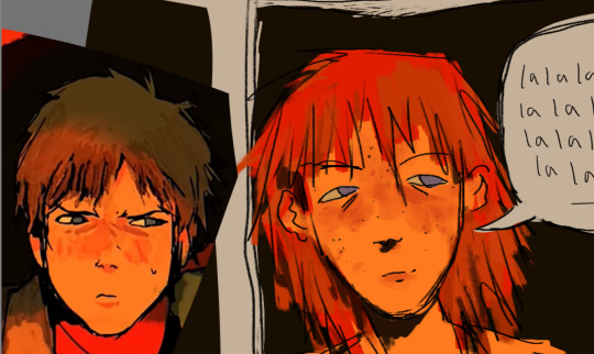
"🎶You can make it different 🎶"
"🎶You can make it right 🎶"
[this is a reference to the Steven Universe movie- the song being "Change", i think is what it's called :P]
#yeah i'm months late to a tiktok trend that i am now posting on tumblr what about it?#i'm relaxing by simplifying my art style#it actually really helps you should try it lol#mp100#mob psycho 100#mp100 reigen arataka#reigen arataka#cole's art#shigeo kageyama#Kageyama “Mob” Shigeo#steven universe reference#what was this arc called?#confession arc#or something- right?#i didn't remember literally anything about mob in the finale- i literally just guessed most of what he looked like lmao#this isn't original#if someone else did this first but better tell me and i'll link it i guess
69 notes
·
View notes
Note
I'm going to be asking a lot of artists I follow this question, but how did you develop your style? It SEEMS like most people find their style and stick with it forever, just making improvements and iterations. I tend to work in a lot of different styles because I enjoy doing that, though I know there are things I gravitate towards as well. But I wonder what your journey was and how you got feedback and improved while staying true to what you enjoyed?
Hi there!
I definitely wouldn't say that I've found my style and stuck with it forever-- I feel like each of my projects has asked for a certain kind of art, and has presented new challenges that push me in new directions.
Some of that comes from seeing someone else's work and having something click into place that might fix errors/faults in my own, and then I might try to incorporate that, such as bigger outlines on my characters to help distinguish them from the background, or maybe a way someone else simplifies eyes that can help make mine look less weird.
When I first started drawing, I can see where I encountered certain influences because my sketchbooks suddenly switch to incorporating some new stylistic element that I liked from whatever I was reading/watching at the time. But it was never QUITE right, it was never just copying, there was always something ~wrong~ with it. And that wrongness was my style! As much as I hated it, that was what distinguished my art from being just a copy of someone else's. I hate it less now, and understand that other people see something there that maybe I don't, because it's just what happens when I filter other people's work through my head. My soul, if you will.
There are definitely through-lines with my work, driven by what I like drawing and what comes easily to me-- hatching is almost always a major component, and I like making expressive characters. Here's some of my earliest available stuff, from my old webcomic:

Then not long after that, I started The Last Halloween, which pushed me to challenge myself in both layout and style:

And here's the same comic, years later:

And here's a series I did for kids, where I had to use full color and lay off on the hatching, as well as learn how to reconstruct animals that we have no photo references for, which is definitely a place where style comes majorly into play, whether I wanted it to or not:
Then there was the horror book I did, where I tried to push my work to be less cartoony overall, and to work very hard on improving my hatching:
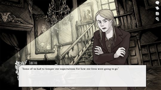
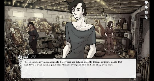
Then I started work on Scarlet Hollow, where I incorporated a limited/muted palette and had to once again push myself to make less-cartoony art, as well as learn more consistency so I could draw sprite sets. This was a big challenge for me, and has helped me grow as an artist so much!
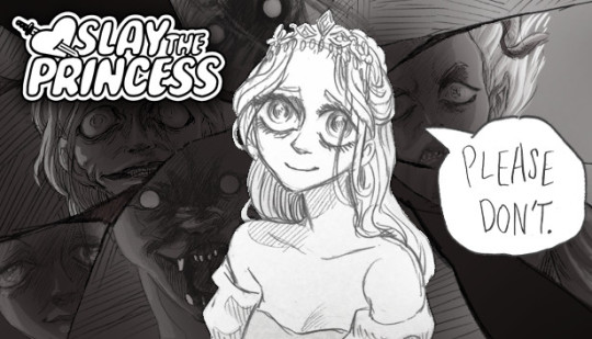
And most recently, I wrapped up work on Slay the Princess, which required that I go back in the cartoony direction, but in a very different way than I was used to. This took a lot of sketching to figure out, and there's still a decent amount of artistic stumbling in Chapter 1 while I settled into it.
She's drawing on anime/Disney influence, but each Princess required a bit of stylistic variability. Some are more anime, while some are more realistic than even the Scarlet Hollow characters.
So I wouldn't worry too much, honestly! A person's style is often something that reveals itself over the course of their career, rather than something they choose and then try to stick to forever.
Even if you don't think you have a style, you do. It might vary a lot piece by piece, especially if you're trying to closely imitate another person's art, but the more work you do, the more you'll figure out your own strengths and interests!
#long post#my art#junior scientist power hour#the last halloween#abby howard#scarlet hollow#slay the princess#once you work long enough on art#style starts to feel more like modes you switch in and out of#all based around a core of what you're good at and what you can do#which in itself will change sometimes!#and of course your style with different mediums is gonna be different too#like slay the princess is pencil which is why it looks more distinct from my other work#never forget that at its core art is about messin around#wait shoot i should've put all this in the post#but it's long enough as it is
454 notes
·
View notes
Note
Hello! I really love your art! I was wondering if you have any tips on how to capture the person the facial features of the person you are drawing so well?(!) Your Billy and Stu are is amazing! Although it is in your style (which I absolutely adore) you still keep their likeness/resemblance which is very hard for me to do when trying to draw them in my style! (Sorry if the wording is confusing, any tips?) Thanks!
Ah thank you so much and sorry for taking so long to reply, but I needed to figure out how to answer this.
I have put some general tips together, but I need to point out that none of these replace the time investment of learning art. It is merely a suggestion of direction for practice, and I don’t want anyone to feel discouraged if any of these tips don’t immediately make them into a master of arts. Art practice is not easy and it can be frustrating to not be up to your own standards yet, but you will get there! :) In the meantime: be kind to yourself!
That said, let’s get to the tips I can share:
1) Use references!
I usually create a reference sheet for any character I want to draw more often, with their face in lots of different angles. Being able to know how, for example, someone’s nose looks like from the side and from the front can be essential when it comes to recognition. You basically want to be able to create a 3 dimensional object with these references. I tend to need the references less the more I draw the character, after a while i just memorise their key aspects for drawing them from most angles :)
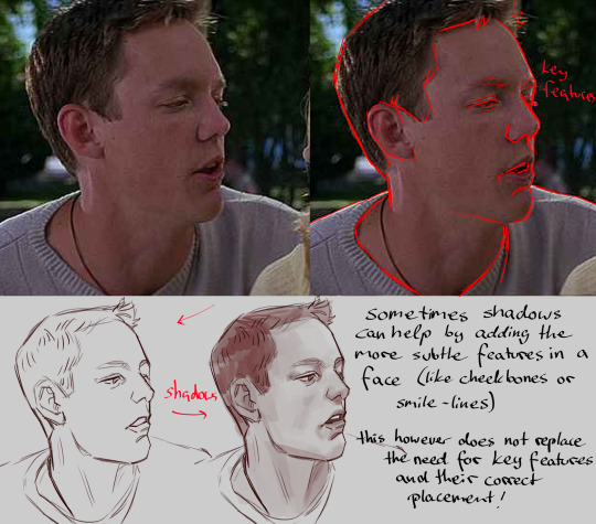
2) Figure out key-features of a person
Try to figure out how to simplify someone in a drawing. What are their most striking features that NEED to be included? Sometimes it helps when you try to think of what features a caricaturist would accentuate in a caricature of them. Here you have some features that I personally try to focus on when I draw billy:

As mentioned in the bottom right corner, the placement of these key-features is also important. Try to figure out where things are placed in relation to other facial features and mind their size as well. this becomes easier the more you do it!
If you struggle to find out what features are important you can also look up other fan-artists stylised work you like and try to see what they chose to highlight :)
3) Do studies!

4) focus on values and contrast before considering color
doing a study without a sketch by blocking in shapes can help you figure out the planes of a characters face
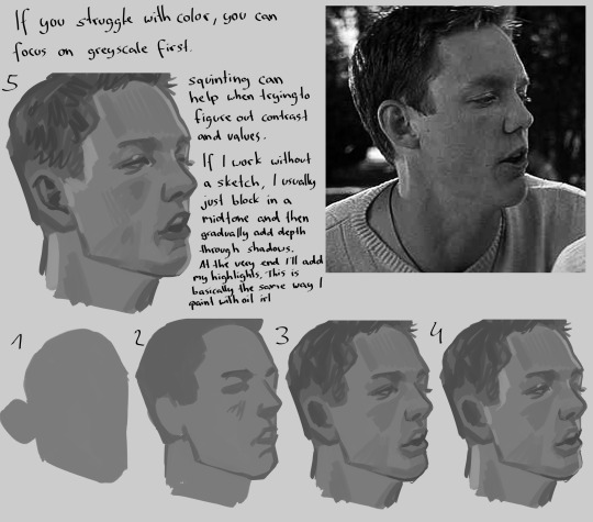
as you can see here, stu’s eyebrows kind of blend in with the shadows of his brow bone, which is why I usually draw his eyebrows pretty light/in a color that doesn’t have high contrast with the skin tone, it makes him instantly more recognisable in my opinion
5) Draw (a lot)
I have been drawing basically every day since I was a child, but my ability to actually draw someone recognisable has only developed in the recent years. And I don’t think I’m done with learning. In the undying words of Bob Ross: “Talent is a pursued interest. In other words, anything that you’re willing to practice, you can do”.
I hope my tips can help a bit and and perhaps lend you some motivation for the never ending practice that every artist has to face :’) <3
#ask#art tips#i guess lol#my teaching style is a bit all over the place lol. i should work on that… i do want to become a teacher after all#using billy and stu as examples is vey funny to me btw#i feel like both are a bit harder to stylise than other people but both for different reasons
223 notes
·
View notes
Note
Hi there!
I really really love your TF2 comic work. You manage to capture the style of the comics and still mix it with your own style to give it a unique identity.
I’m making a TF2 comic myself, but I’m self-taught when it comes to making art and comics. Do you have any techniques that have helped you develop your style and comic-making?
Thank you and have a nice day!
I don't know about others, but for me, finding the goal of 'what you want to be' is the first priority.
for example
I go on social media, read comics, and watch movies. If I feel a spark, thinking "I LOVE THIS ART!" I'll try to analyze why I like it. Is it because of the way they make sharp line art? Is it because of the color?
Then, I'll continue to analyze the tools they use. Is it because they're using a G-pen, which makes their line art look so sharp? Then, I will try using a G-pen.
Here comes the problem part. Even if I try using the same G-pen, my art still doesn't flow. Why? I question myself and look at many other artists who also use G-pens and find out that it's about movement and flow! I don't have that in my work, which is why it looks so stiff! Later, I'll practice movement until I get it.
Even though many people say I captured the TF2 art style well, I feel I didn't study the TF2 comics that much. I love how Makani simplifies the characters, but my style is actually inspired by a lot of different comic artists, such as these:


I simply try to study various comic artists' styles to see which suits me best. I didn't aim to replicate the TF2 art style specifically. Instead, I use a sharp cel-shading style and simplify to make drawing easier, which is also a technique used in the TF2 comics. That's why my art might feel similar to that style.


But in the end, remember to be yourself. Don't try to become someone else; instead, draw things the way you'd like to see them in your work. Draw in a way that makes you feel happy. That's it!
387 notes
·
View notes
Text
I had someone DM me recently asking for tips for creating an SU sona and drawing in the style, which is one of my favorite topics to think about and discuss!! I'm definitely not the end-all-be-all of SU style replication and have so much to learn, but I wanted to share my method for anyone interested in creating SU art! So here's a Steven Universe Style Replication guide!
Before you start:
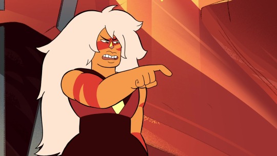
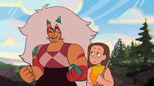
Gather LOTS of references. references EVERYWHERE. I have a google drive folder specifically for Jasper references, but I plan on having folders for each character as well. If you know you're going to draw a specific character a lot, gather references!!!
also, gather references of characters you base your S/I on physically. my sona has traits from both Steven and Connie's body types, so I used photos from their references when creating mine - I specifically used Connie's turnaround as inspiration for the height/posing of mine!
((you don’t HAVE to create a turnaround ofc, but thinking of your sona as one that needs to “follow the rules” of the other characters’ designs can help creating something that looks proportional and accurate!))
Colorwise, it’s fun to consider your f/o or the characters you interact with before creating an outfit palette -> I specifically use yellow as a base color because of the way it meshes with Jasper’s orange pallet, as well as being complementary to Steven’s pink and Connie’s blue
Drawing:
SU has the benefit (and curse) of inconsistent style and size references. it's partially proportions to the other characters, yea, but it's more in the shape language you use when drawing in the style, which is why references are so helpful!

(unrelated but I love how this shows how much I still struggle drawing jasper.... even after six months straight of exclusively drawing her. sigh.)
take these drawings I threw together! these are four completely different characters, but they all feel different because of the shape language used:
even with my own style bleeding in, really focusing in on what their core body is expressing is what demonstrates the character.
this translates to creating your own sona, too - think about how your sona would fall into the shape language. my sona is similar to Connie, but a bit curvier and stockier, which shows especially in the core of the character design!
I know the "belted shape" concept has gone around this fandom for years, but I'd recommend not depending on it as in my opinion it doesn't translate nearly as well as just a general concept of the form - like how it doesn't work as well with Peridot when she becomes tiney

[obligatory PSA that anatomy knowledge/practice helps so much here - I've been drawing SU for YEARRSSSSS but my understanding of the forms got so much better when I started practicing gesture drawing/anatomy practice]
Expressions/facial anatomy:
so again, SU has so much style inconsistency that the way you draw expressions will vary based on the boarder - this EXCELLENT because this means expressions are really easy to pass in the style! but some visuals anyway:
most of the time, faces are extremely simplified with one guideline across the face, a little bit higher than where the "cheek" starts if the character has a cheek
if more masculine, the guideline will be a bit higher and the eyes will be shorter
an interesting note with Spinel specifically is that her eyebrow expression is done through her hairline, which is part of her really fun 20s inspired look!
Lineart:
i feel like if anything really makes something look "canon", it's how the lineart is done in a finished piece. if I compare with a couple fake screens/edits I've attempted:
the lineart makes all the difference here!!!!
for specs reasons if you're curious, I use procreate with the "baskerville" brush on a higher stream line setting. I do not have pressure sensitivity, so all of my lines are hand-weighted, but if you have pressure sensitivity you might have an easier time here!
facial details tend to be slightly thinner. eyes tend to be a little bit thicker on either the top/bottom or sides, although it depends
outer borders, major clothing, outer hair tufts and other major features are the thickest lines
sometimes lines aren't used at ALL for various features (gem facets, some more minor clothing details, like the bottom of Lapis' top or the waistline on Jasper's uniform)
[random screenshots I pulled as examples]
the key part with lineart and style replication, though, is that is varies WILDLY by style. as long as you have some line weighting it's really easy to get it to pass as SU style

lastly I HIGHLY recommend practicing screenshot edits or fake screenshots if you can!!! I feel like the silly edits I do really help emphasize my understanding of what it takes to make something look like the style, and my little journey into making fake screenshots/"canon" screenshots is a big part of how I've learned to draw in SU style!!!
That's all I have for y'all, make all the SU art in the world!! 2025 will be the Year of Steven Universe Art!!!!
#steven universe will never be over so long we have Fake Screenshots under our belts......#I hope this was helpful!!!#silver's art#steven universe#su fanart#tutorial#art tutorial#self ship#fictional other#steven universe self ship
51 notes
·
View notes
Text
Nemi’s 100 followers Art Raffle!
I’m holding this event as a way to thank you all for getting me to 100 followers :D
I’d like to give a special thanks to: ( @loser-jpg @spookyavenuestreet, @lemonchuu @artistnettles, @nyx-of-night, @celestcelest, @vauxxnm (and so many more i cannot @ in one go due to the tag limit but you know who you are!! I'll be tagging more ppl in the reblogs!) for supporting me on my journey all the way to 100 followers! Thank you for always interacting with my posts <3
EVENT RULES:
No harassment is allowed. You will be taken out of the raffle and blocked.
If you have multiple accounts, be sure to link your other account(s) in your bio or intro post.
Do not ask me when I will be starting the pieces. I have a busy schedule and do not know when I will have the time.
No NSFW & suggestive requests allowed!! No furry & mecha requests, I do not have the skillset to draw these.
The winners must send me(preferably multiple) references and or descriptions of what they want drawn. Any overly complicated details and or clothes will be simplified.
The winners will be allowed 2 changes when I check in with them with their pieces.
GUIDELINES + INFO:
This event will be held for a week from (July 23 12:00 am - July 30th 11:59pm est time) and I’ll randomly select the winners at the end of the week via the wheel of names (https://wheelofnames.com/)
To enter, all you need to do is to reblog this post with the tag “nemi 100 followers event”! Each username will apply as an entry. While multiple reblogs are appreciated, you’ll only receive one entry to give everyone a fair chance! Any follows during this event are greatly appreciated
There will be 5 winners selected in total
The 1st & 2nd place winners get to choose one of the options I've given and the rest of the winners will get their respective prizes. Once the 1st & 2nd place winners have selected their choice, it cannot be changed.
I will be tagging & DMing the winners so make sure you have your dms opened! If there is no communication from the selected winners within 24 hours, I will select someone else for that slot.
Prizes:
1st place: (choose only one of these options!)
Full body colored/rendered piece w/ a simple background
2 characters simple interaction bust shots in one drawing sketch/clean lineart (can be characters or ocs but no color!)
one character colored bust shot w/ simple background
examples below!:


first piece(from left -> right) is full body example, 2nd one is of the bust shot, 3rd one is the type of rendering I'll be doing, 4th one is an example of the sketch I will be doing
2nd place: (choose one only)
a full body sketch/lineart piece w/ no color & background
one character bust shot w/ no color & background
examples below!:


ignore the doodles around the first piece, but that will be somewhat what a full body no color will look like, 2nd piece is closer to what the style might be in & is also what the bust shot looks like.
3-5th place: one character bust shot w/ no color & background
If you're curious on what my current art style looks like, go through my recent posts or master list! The examples I gave aren't 100% accurate to how my art looks like right now.
link to masterlist: here
I would like to give another special thanks to @/celestcelest @glidiaxoxo @raguiras @twistedwonderlandshenanigans for helping me with this event. Go show these people some love!! This event would not be possible without their help!!
Good luck to everyone and thanks for participating!!
#art raffle#nemi 100 followers event#twisted wonderland#twst#twst art#twst fanart#twst wonderland#art#raffle#art event#100 followers event#nemi rambles#nemi draws
86 notes
·
View notes
Text
♥️ Art resources ♥️
Hey I put together a beginner art resource list! Feel free to share, save, etc. but a lot of people don’t know where to start:
Man is this a holy grail it includes free programs, online courses, tutorials, and scholarships (us based):
A big thing you are taught early on is just hand/eye coordination. Speed drawing, or “gesture drawing” if you’re fancy, is the best practice you can do on a regular basis.As much as you hate hearing “just practice”- it matters.
The best online art course I can think of. It will literally go step by step in teaching you commands and digital painting:
YouTube anatomy holy grail:
The Loomis method for the construction of the head is very popular because it is easy to learn and remember and can be applied to any drawing of the head.
Loomis also has many published books under his name. I’m not saying you can get free books here but if you could well. Careful of fake links with this site, if you don’t see the single login.re it’s the wrong one.
If loomis method books aren’t your style and you are more of a video person try this (this is the first on a short series):
youtube
If you know me I’m barely cracking the surface with digital art but I’m actually trained in professional forensic art and hyper realistic portraits , so here is info on traditional art by media.
Little proof of some training, but if you like this, this is woodless graphite pencils on vellum- just a slightly better quality than a pencil and paper :)
Finally here are some amazing pose references. Adorkastock had moved from Pinterest and is working on their own website so check them out here:
Taco is single handed my my go to for simplified anatomy and it goes my section of the body (people have made Pinterest copies that is separated by parts of the body) but I highly recommend buying it if you’re able!
I hope that this helps at least someone find a resource they needed or wanted! Feel free to dm me or repost with comments or more resources!
#artistsoninstagram#artofinstagram#my artwork#my art#artwork#art#artists on tumblr#digital art#artfight#traditional art#art fight#art reference#art resources#art related#youtube#books#loomis method#art and design#art anatomy#anatomy#art help#resources#gesture drawing#practice#blah#mine#blah blah blah
53 notes
·
View notes
Text
How to make a good character reference

First and foremost, a good character reference is one that clearly and concisely tells you about an OC. Not only are they helpful to keep your art or descriptions of them consistent but if someone else will be drawing or writing about them, then a reference is typically a necessity so they can draw the character accurately. I’ll be going into how to make both a good visual and written reference, as well as tips that apply to both of them.
Special thanks to Lotus and Calico for giving some additional perspectives for me to think about, as well as anon for suggesting this topic!
Good Visual References
A reference sheet is a way for artists to easily see a character’s design for drawing them. At its simplest, this can be a simple, full-body illustration with little embellishment but some people will do full turnarounds (front, side and back views) or additional outfits for a character with props and other illustrations for a more artistic reference sheet. Regardless of your approach, your reference should clearly show a character’s basic features and, typically, the clothes they most often wear (whether that is a single outfit or multiple).
Adding notes to the sheet can be very helpful, such as a character’s height, specific facial features or a description of the kind of clothes they wear (like colours, aesthetics, fashion style and clothing preferences). If a character is often seen with a prop or item (such as weapons or mobility aids), then it’s important to also include those in your reference and make a note on the frequency of their use. Finally, if your design has pieces of clothing or props that have specific terminology, it can be helpful to include that terminology so it’s easier for others to search for more references.
Flat Colours vs Shaded/Rendered: I’ve seen some people complain about references that are shaded or rendered as it can often make it hard to colour pick from the reference. This can easily be remedied with a colour palette that is clearly labelled for what colour is used for what part. Using two of my own references as an example, you can see that my reference sheet for Eren doesn’t have any shading, making colour-picking easy. Comparing that to my reference sheet for Vex, the art for him is shaded but this is remedied with a clear colour palette on the left with labels saying what that colour is primarily used for. As a final comparison to a reference sheet that I feel fails in this regard, my sheet for Eris (nudity warning) has several outfits that are fully shaded but do not have a full colour palette outside of their basic features. However, since this character would be drawn in many other different outfits and the sheet was for personal use only, this doesn’t bother me too much.
Complicated designs: For designs with complex elements such as lots of accessories or intricate tattoos, it can be helpful to draw a larger version of these on the reference. This makes it a lot easier to draw them consistently in future as they’ll be clear and you won’t need to spend time zooming in or around your design. Additionally, if you character has a tattoo or very specific fur markings then it can also be helpful to create a transparent version of them. This way, anyone drawing your character can use that transparent version rather than drawing it by hand or, for those that do want to draw it by hand, they again have a very clear design to reference. Also, it can be helpful to have a simplified design for people with art styles that work better with less detail or for animating purposes.
Mannerisms: This is more so for references that will be sent to other artists for commissions, requests, gifts, etc. It can be helpful to have a small section on what a character’s mannerisms or way of holding themselves is like. This gives artists a jumping off point for ideas on poses or character interactions as a blank slate can be hard to come up with ideas for. It’ll also mean that if, for example, you have a shy character then they won’t be mischaracterised in art by being drawn with an overconfident posture. It’s best to use simpler words (such as annoying vs vexatious) as it can become confusing for people for who English is not their first language.
Good Written References
A good written reference can be split into two types.
The first is for describing their appearance, typically used for sending to artists when you don’t have an existing visual reference. For this, it can be helpful to go over the points of what I wrote for a visual reference and just translate that to a written description. Bullet points are the easiest way to do this as it gives artists something quick and easy to reference but it can also be helpful to link to images to give a better idea of what you want.
Pale skin with light freckles.
Lavender hair that gets slightly lighter at the tips and slightly darker at the roots. It is mostly-straight, shoulder-length and covers some of the face. Two small horns poke out of the top of his head.
Grey-blue eyes. Should look sleepy or lidded.
Thin-framed glasses with a simple, silver glasses chain (optional)
Black cassock with a black pellegrina and white collarino/tab collar.
For formal occasions, Vex may wear a purple ferraiolo with black, embroidered trim.
Purple stole with a symmetrical design.
At the bottom of the stole is the Leviathan cross.
Around the chest, there are the five alchemical symbols for fire, air, spirit, earth and water (in order from top to bottom).
Has a rosary with dark, wooden beads and small ivory beads in an alternating pattern that ends with an inverted cross (also known as the St. Peter’s cross).
Wears platform boots with metal toe caps.
Without the boots, Vex comes to 5’3”. The boots make him a lot taller, around 5’6”.
Sometimes wears half-palm gloves made of black leather.
This is the basic written reference that I had for Vex before I drew him a reference sheet. It makes it clear what they look like and any artist working with the description would be able to draw him semi-accurately from this alone. It can be hard to balance the necessary amount of detail with keeping things concise - large paragraphs can be overwhelming and even off-putting to others.
The second type of written reference is a reference specifically used when writing. While a lot of the same principles apply, you’ll often want to go into more detail regarding the character’s mannerisms, way of speech and dynamic with other characters. There are numerous great guides on how to write a good character reference or profile, all using different approaches. Personally, I like to use these five categories for writing a character’s reference.
Basic Details: This includes a basic description of a character, as well as their name and any other surface-level details about them such as age, date of birth, gender and sexuality, basic personality traits, etc. If the setting is fantasy or sci-fi, then I would also include anything that would fall under this category in-universe, such as species or magical alignment. This section is not for digging deep but more to give an overview on the character.
Personality: It can be really easy to boil down a character’s personality to a few simple traits like in the first section. However, characters will often act differently in different scenarios and have specific reasons as to why they act a certain way. How do they act when they’re alone vs when they’re around others, both those they trust and those they do not? Do they mask certain parts of their personality? What fears does the character have and how does that impact how they go through life? These are all things that can heavily influence how a character behaves and talks.
Mannerisms: Here, you’ll want to describe your character’s body language and demeanour such as how they walk and carry themselves, as well as first impressions from strangers. You can also go into any habits a character has, including whether they are aware of those habits and perhaps try to hide or overcome them.
History: A character’s past will usually define a lot of how they conduct themselves in the present. Here, you’ll want to include information on their upbringing, influential moments (or “canon-events”) in their life and their caregivers, if applicable. This can add context to certain behaviours or actions from the character.
Relationships: Finally, go into important relationships for the character. When I say important, I mean write about relationships to characters that are either contextually relevant (such as to the current scene or overall plot/story) or characters that have had a large impact on them. For example, the barista that you character always gets coffee from probably isn’t going to be relevant… unless you’re writing a coffee-shop romance where the barista is likely to be a recurring character. A character’s family that doesn’t appear in the story may not be relevant now… but the way that they influenced the character’s upbringing is relevant when it comes to establishing their backstory and foundational relationships.
General Tips
Non-human/original species: If your character is not human or is an original species, make sure to include any key features that are unique to that species and link to any relevant design documents for them. It’s a lot easier for someone to use your reference than it is to go searching for that information themselves.
What actually makes your reference good? This is hard to answer because what I think is good is probably contradicted by countless other people. Also, some advice for one kind of reference won’t necessarily be helpful for a different kind of reference. A good foundation for a reference will always be what you find helpful.
Keep it concise: Oftentimes, there’s so much information that we hold about an OC in our heads and it can be tempted to include absolutely everything into their reference. But remember that the key purpose of a reference is to make it easy to understand the main points about a character or design. Regardless of if you go further in-depth, always make sure to have a clear overview of them at the very beginning that can be easily referenced.
#oc#oc posting#character development#character reference#sorry this is a little later than planned! the insomnia-hypersomnia-hormonal-seasonal affective disorder was going WILD
41 notes
·
View notes
Note
Hi! I really really like your art. The way you stylise it is just so cool. Do you have any art advice for someone without a lot of experience?
thank you so much this is like the biggest compliment ever!! I wasn't sure how to answer this so i tried just to write a lot and give examples i hope this works
i remember obsessing over sinix's anatomy quick tips series
might be too much info i just like to pause and copy the sketches
basic things about the face i always use as reference when drawing
exaggerate/loosen up -
I redrew some old character interactions so u can see what I mean. Making characters lean and squash their faces together makes poses less stiff and more interesting I GUESS. Pic 2, different angle made it way more aewesomeness
and don;t be afraid to exaggerate expressions just because they make you characters look ugly
steal from other artists -
The biggest way I improved was just copying ppls artstyles.. in pic 1 I tried to copy the expression by taking my fave traits like the dark eyebags and whatever theyre doing with the mouth and eyebrows. pic 2 i stole rendering style and eyes
studying from life is good of course too. but i feel like it can be too mych and you just dont know where to start and it can be real boring so referencing other artist style can really help figure out how to stylize and simplify and its more fun...........
artists i referenced are Narantaran on twt and mean.velvet on insta
here's some process stuff. I like to look at peoples art process so maybe you do too
last things to sayyy um
dont stress so hard on each piece, zoom out to the big picture no need to obbsess over one mistake no ones gonna notice anyway.
avoid doing the same boring 3/4 busts over and over again.. experiment, but dont take expirimenting so seriously that you get overwhelmed
More on avoid doing the same boring thing having an intention b4 i start drawing makes me draw more and the end product is cooler. Like i write down a bunch of ideas in my notes and now the next time i sit down to draw i have somewhere to start. Sounds like a small thing but now i draw less to doodle and more to make cool projects
biggest thing don't lose your passion.. get artist friends to inspire u, draw your self indulgent stuff because it will probably be your coolest and most creative, andd don't get caught up in what other poeople would want you to draw
19 notes
·
View notes
Text
So Chapter 150 is twice the length as a usual chapter because that’s been my tradition for the multiples of 50 (chapters 50 and 100 were the same), along with being a very important scene in the story.
Well that last part isn’t relevant to this post; basically, ever since I finished making that chapter, the pain in my wrists (that used to come and go) flared up and hasn’t gone away.
It was really bad for a few days and I couldn’t draw much at all. But over the past few weeks, the pain has appeared in different areas of my wrists. First it was the outside of both hands, then my right hand it’s been on the inside, and now has moved to both my thumb and below my pinkie. I still can’t put weight on my hands while bending them backwards for too long or it’ll get worse again.
I made a short comment about this in the authors notes of 149 (which goes up tmrw), but I’m going into more detail here ig to explain further.
More below.
I’ve already been using wrist braces, and now have compression gloves, which have been helping so far. I’m trying to be as careful as possible and not draw for too long at a time.
But ultimately, I’m trying to reduce the time it takes to draw chapters without sacrificing the art style too much. My lineartist has been a big help with this, so it pretty much comes down to my coloring and background work.
I want to deliver this story in a way that is still just as meaningful, and not feel cheap or rushed, but I also can’t afford to take a hiatus until season 1 ends later this year.
When planning the composition of panels, I’ll plan it so I can reuse old backgrounds as much as possible. The shading will also gradually get a bit more simplified—which has already been happening, but in a good way! It’s feeling a lot more crisp now.
Anyway I’m not really sure where I was going with this. If I had to end this with some kind of message, I’d say two things:
To aspiring comic artists: make sure whatever art style you use for your comic doesn’t have you drawing for 5+ hours in one sitting multiple days in a row. It won’t hurt at first, but over time it will. There’s no avoiding it. It’s just a matter of how long you can keep it up until it ultimately does.
To readers that understand how much work we do: the best messages of support are not the ones telling us we can take a break. While this is nice for those who only make comics as a hobby, it doesn’t really mean anything when it’s our job and pays our bills. In those cases, we can’t put it aside or take a break whenever we want. So instead, the best messages of support (at least for me) are ones that express appreciation for the comic/work, what you like about it, details you noticed, how much it means to you, etc.
Those sort of comments are the biggest reason I love creating and sharing TMP, and fuel my motivation to keep going. I love hearing how a character made someone smile, (or cry), or how they relate to something in the story.
So yeah, keep that shit up. While having wrist pain sucks ass, it’s worth it when I see how much joy my work adds to people’s lives.
20 notes
·
View notes
Note
Related to FallenClan designs! All your designs are super amazing, what’s your simplifying process/how do you decide design for cat pelts? Cause I always struggle with simplifying/deciding how they look especially bengals and cats with white patches… thanks if you respond!
I’m ADHD and struggle with consistency and simplifying lol, though more complex designs are pretty, I lean more towards what you do w/ you’re cats as they are simple but still super pretty + it makes it easier to consistently draw them all for stuff like this! (These comic like moon updates :])
(Also hope none of this came off as offensive, it’s all meant positively! I really really admire you and your designs :])
ty for the compliments!!! very sweet ask and I shall do my best to give a good response o7
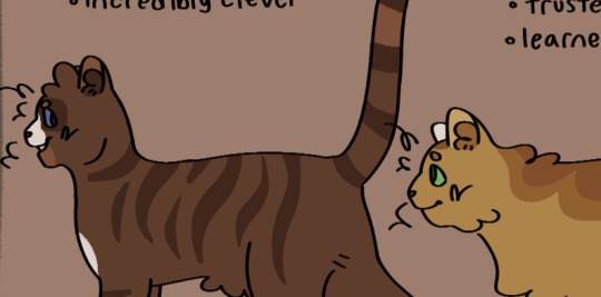
generally my method with designing characters/drawing is to just wing it. fuck it we ball basically. but i DO take a lot of inspiration from other people's warriors art, taking the time to analyze what i like about their styles and what different sorts of patterns i can use
(i also regularly consult the Clangen Sprite Guide for better looks at white patches/tortie patterns and such, highly recommend)
the first thing i decide when i'm designing a new cat is what fur texture i want them to have. i have four that I pick from (pictured below, in order), wavy, spiky, curly, and square.
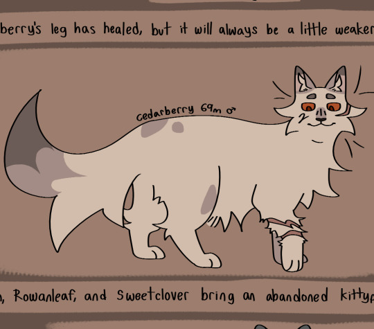
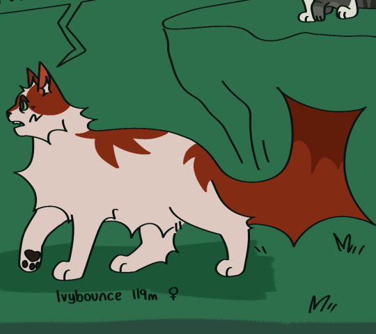
i decide the fur pattern based on the cat's personality (a more stoic cat might have square fur, while someone more bubbly might have curly, or someone more excitable have spiky, so on and so on), and also based on their parents/how many cats i've designed with that fur pattern recently.
after that is snout shape, which is probably my favorite part. i love to draw cats with a very pronounced snout, not unlike an oriental shorthair, but i generally slide around between that and a more typical, stubby snout, occasionally veering off into the very square snout of a maine coon. this is also a great spot to determine how sharp you want their jaw to be, which is something that can really help set a design apart! (a couple of snout examples below)
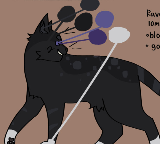
then i usually move onto colors. i like to pick an undertone for the cat first, so i know what sort of pallate to work with. as you can see in the pictures below, ravenstar has a purple/blue undertone, and toadbelly has orange/red undertones
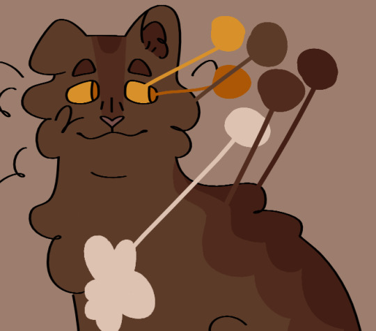
this helps me make all the colors look nicer together, so i don't end up doing something like making a very warm colored cat with blue-toned white patches (which would make the white patches look super cold/too bright), which can be a really cool stylistic choice, but isnt what i tend to go for
once i've drawn out the cats fur shape and picked my colors, i'll move onto the base coat. over my time of having the fallenclan blog i've discovered that having a very simple pattern underneath the normal pattern can add a lot of visual interest to a cat, and make them look less plain.
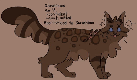
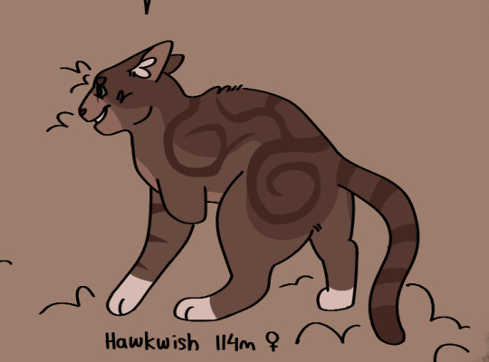
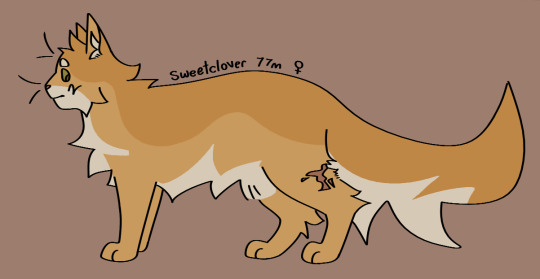
here's a good example! one of the first cats i designed, oaktuft. their pattern was super basic--one base color, plus the inside of the ears, and then the color of their patterns.
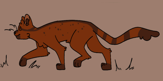
and here's another cat that i designed a little more recently--Shiverspots! you can see that even just the small change of adding a bit of a lighter color to her underbelly made a world off difference. plus my style got a lot more defined lol
i have a couple of different base patterns that i use. here's a few more examples. i've even started to experiment with more than two colors!
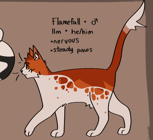
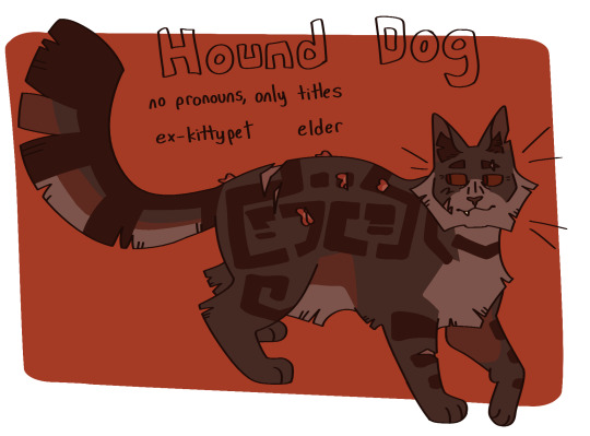
once i've got the base done i move onto patterns. this part can definitely be tricky; trying to make a dozen brown tabbies with short fur be distinct can be . a challenge. i like to follow the steps of what i've already designed--a cat with spiky fur might have very sharp, angular stripes, and a cat with curly fur might have much rounder ones.
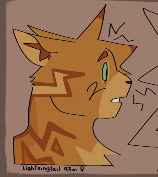
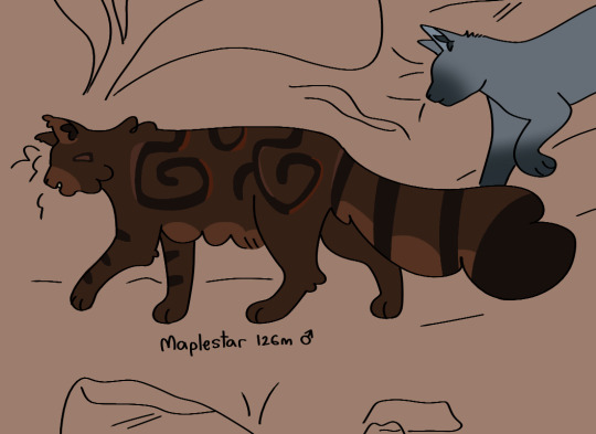
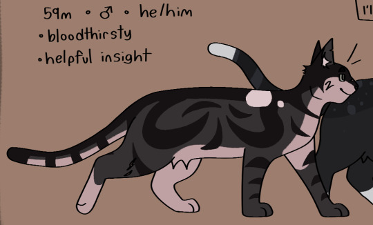
i think a good rule of thumb for if your pattern feels a little too basic is just to throw some more colors in there. another shade of orange, a more pale tint to some of them, whatever. and don't be afraid to erase it and start again! sometimes a design just won't work, and thats fine :)
the final thing i do is to add little design quirks. a particularly sharp jawline, downturned eyes, a crooked smile or a gap tooth, whatever! little things can really give your cats character.
i really hope that this helped!!!
#fallenasks#fallenreferences#<new tag i guess???#looking back at this i suppose i lied at the beginning . i do have somewhat of a method
65 notes
·
View notes
Note
I really, really want to be able to draw like you. Do you have any tips from someone trying to develop an artstyle with some similar qualities to yours?
Other artists have probably explained this better then I could when it comes to art styles but I'll speak from my personal experience lol
So I use to struggle a lot with finding my art style and my best advice when it comes to it, is to not stress out over it. The reason being is because art styles are a constant changing thing, we're always learning and improving our art skills. As we continue to learn, what inspires us and makes us passionate also changes over time as it integrates into our art.
On top of working on your fundamentals, such as doing your warm ups, figure drawing, anatomy etc, study various artists and tv shows/movies that you love and inspire you. Study how an artist pushes expressions and poses, study how they draw hands, how they paint and draw backgrounds.
Is there an animated show you like? draw the characters you like and push those characters poses/expressions while adhering to the shows style. Learn how board artists shorthand the characters, how they break down a character and their poses into simple shapes.
When you do these studies, you'll find that you start to naturally incorporate pieces of those inspirations that you like, into your own art while you're developing your core skills.
A lot of what I learned is through drawing a lot of fanart and observing other artists that inspire me. For example, when I first started drawing Sasha Waybright from Amphibia, I didn't just pull up screencaps, I looked at how other board artists like Inbal Breda and Jenn Strickland (who are both a huge inspirations to me) draw her.
Board artists are a great source of inspiration to study from because we have to simplify the characters, via short hand, to help get the point across through thumbnails. Also, despite having to adhere to the show's style, you'll find that each board artists take on a character will be different and unique to their style. ( You can see this in Steven Universe, Amphibia, Adventure Time and Owl House etc)
Below is some examples as to how I break down characters in general, whether its fanart or my original work. The same principles applies.


I really hope this answers your question and was helpful lol. In general, don't be afraid to move out of your comfort zone and experiment. More importantly, keep up in doing figure drawing as well as practicing your fundamentals.
I recommend following and studying from Will Weston's Instagram if you haven't already. I learned a lot about simplifying and breaking down the body into simple shapes. The same principles also apply when drawing backgrounds as well.
Line of Action - Another brilliant resource for figure drawing, drawing hands/feet, faces/expressions and animals.
I also recommend the Drawn To Life: 20 Golden years of Disney Master Classes: The Walt Stanchfield Lectures for figure drawings.
#long post but I hope this makes sense and was helpful anon#sorry this took awhile to answer#art advice#art tips#amphibia
15 notes
·
View notes
Text
Poking at the dinosaur project thingy, this time with some production technicalities point of view.
Here be musings.
I originally thought of the project as a calendar, then a series of calendars that could be collected into an art book once enough art had been made for it, and at some point I thought of just skipping the calendar part and going straight for art books.
I've been going back and forth between those options multiple times over the years, and it's still kinda open. Like on one hand a simple calendar with just thirteen illustrations (twelve months plus cover) is the easiest and cheapest option, though pretty limited (what to do once the year presented in the calendar ends, and you still got unsold leftover stock?), and the other hand art books are big projects requiring lots of work, even more money, but be a lasting and very satisfying thing to have.
Maybe I should take a middle road and make a zine instead?
Maybe.
Though, this is where the shape of the actual project comes in.
I've always planned the project as having a slice of life style format, with little story and more focus in exploring the setting. Kinda just looking in and enjoying the view while you go. But I've noticed that keeping the "narration" as illustrations kinda keeps the immersion at arm's length too. While that is fine and dandy for a calendar where the space for any narrative would be very limited anyway, if I was going to do more with the setting, I kinda need something deeper. Even if the audience is fine just looking at pretty pictures, with ADHD it would be better to have something deeper to help keep me personally invested enough to actually plan, plot and produce the materials needed.
Should I make an actual story, with plot and stuff? Feels kinda unnecessary for a thing focusing on just illustrations, and I don't know if I really "click" with a text heavy picture book format. I kinda feel it would make comic as the best option, though that has its own downsides. I've always wanted to do full colour paintings of the dinosaurs, yet going comic it would have to simplify a lot and make it grayscale just to keep me sane. And, as someone who has done well over 250 pages of a long form comic, that's still a HUGE commitment I don't think I have the resources - mental, physical nor financial - to pull off.
I also kinda feel having a plot story would sort of detract from the "exploring the world" aspect and put more heavy focus on characters, which. Well, it's not *bad* exactly, just not quite what I want.
(Also I am aware the dinosaur clan I have has a kid character, and I don't want to make her the point of view character for the story. I have no interest doing a childrens' book. I mean, I am perfectly fine if kids do eventually end up liking my stuff, but I don't consider them my target audience. My target audience is me, an adult person in their later 30s, and a handful of nerds I consider friends and/or mutuals.)
Another option I've been toying with is kind of a double edged sword.
Those who got the Almost Real speculative evolution zine volume 5 got a bit of a taste of this, as I kinda tried it out there.
So... I've gone to pretty great lengths as a layperson to work in the setting of the project thingy. It's always bothered me when dinosaurs get just dumped into a story with no regards to when and where they actually lived, making for an anachronistic hodgepodge of what's popular forming into a mismatched fantasy setting, usually with throwing humans into the mix. I don't like that. I'm more interested in seeing the actual animals as they were, when they were and where they were, where the focus is in the dinosaurs themselves. Thus the limit to Two Medicine formation (with some of the surrounding areas included too, though still keeping to the same time period).
I do not want humans in my dinosaur stories. Period.
But what if...
So, imagine a research journal. There's a scientist visiting the clan of Singing People the project focuses on, with the mission of studying them, their life and their world. The book or zine or whatever could be a story of the dinosaur clan introducing themselves and their life to this person. An outsider point of view to excuse learning about them by them teaching this POV person how their world works. There could be some interaction and maybe interviews, and of course illustrations because you need to document your subjects after all.
Like, I'm kinda excited about the idea. It would let me get into the details I want to picture without getting too into the heads of the characters to limit the chances of artistic exploration. You gotta document the surroundings your study subjects live in after all! But you'd still get to know the characters because it's the job of the POV person to learn about them. Win win!
It's just that I don't want to put too much attention on this hypothetical scientist. Like I said before I don't want to mix my settings. The dinosaur project thingy's world IS Laramidia in the Campanian period of late Cretaceous, it's not meant to be a scifi setting, nor do I want to have any focus on any time travel.
Wonder if it would be possible to leave the scientist character vague enough to never actually get explained? They're just nameless outsider from undetermined time and place who's interviewing some dinosaurs. Maybe with some peronal opinions or musings but no anecdotes about their own life or themself. And whenever there's interactions between the scientist and any of the Singing People it just gets handwaved away. (Of course the Singing People are curious about them too, but that's not the point of the study so it just doesn't get documented or something?)
I don't know. Could that work?
41 notes
·
View notes
Note
hello iz ik it's such a cliche question and idk if you've already answered that but- how do you learnt drawing humans??? like everyone says practice but i don't know how and i struggle so much :( thanks already for answering!! i really really love your art
hi!
the very regulated, academic, objectively correct bs answer: learn the fundamentals, study and practice!
the unhinged, off-the-counter, cool uncle from your dad's side of the family answer:
Imo, the best way to learn how to draw on your own is to reference and study other people's art. There is no need for you to reinvent the wheel, and if you are a beginner and have no idea what you're doing, tackling multiple fundamentals at once can overwhelm and demotivate you quite a lot. So, for your morale and motivation, I think it is totally okay to just observe multiple artworks from multiple artists and engage with them critically ( * N.B. : artistS - plural; by referencing multiple works, you lower the risk of accidentally becoming a copycat or locking yourself into an art style that will never be as good as the original because it was not yours)
What I mean by critically engaging with an artwork is to analyze how they're tackling difficult body parts that you struggle with. For example, let's say you can't/don't know how to draw legs. Look at a picture of a real human leg, observe how someone else has simplified that leg form and anatomy, and then try to recreate it. Don't just copy their linework 1 to 1. That is not the point. Do it your own way, incorporate aspects of others' art that you like, and make them yours. You should have 5++ references of that leg from 5++ different artists. There are maany people out there who post their studies online, raw sketches or structural drawings (TB Choi comes to mind for example). Look for people like them, and if you can't find someone, then Pinterest is your bff. When learning how to draw, hunting the internet for how people sketch >>> rendered art. If speedpaints are more your thing, then youtube has you covered. Personally, I've learned more from a 20 min speedpaint with nightcore bgm and zero annotations from some guy that doesnt even speak english that has 300 views than I've learned from 10 min long art tutorials from fluent english speakers with 1 mil views. At the end of the day, we can yap and theorise as much as we want, but it's the act of drawing that brings results and seeing how other people draw is sometimes worth a thousand words.
> References in general also help a lot. I can't tell you how many times I was too lazy to look something up and spent 14235 hours trying to draw it off the top of my head only to have it done in 10 minutes once I finally gave in and pulled up a reference. So yeah, always use references. Don't be like me this is actually a bad habit
Okay, but how to /use/ that reference if you're a beginner? Very simple: draw on top of it ( *Do Not trace the outlines, that's pointless if you actually want to learn something). Draw guidelines over the body parts, deconstruct and simplify the ref into just boxes and lines ( always think in 3D ). This will help a lot with keeping the proportions in check. You can start by drawing those guidelines first and then get into details. Kinda like in sculpture: you start with a big block of a rock, and then you slowly carve and build form and then detail. The more you draw, the less you will need those guidelines as you get a feeling for the proportions yourself and will no longer need this step.
Once you become more confident in your skills or have a "sense" for drawing and you are in too deep to just give up after hitting your first wall, then you can tackle the scary intimidating stuff that is art fundamentals ( or you can do them simultaneously, all I'm trying to say is to never forget that you are not the only drawer in the world; looking in your neighbor's yard is totally okay within the reasons of common sense ). You don't have to raise and milk a cow it to make butter, you can just buy it from the store. If you want to bake a cake, a beginner chef will use store-bought cake mix because they have no idea how to cook. Once they learn the science behind baking (because it really is a science) they will buy their own ingredients and then improve or personalize the cake with better, well-researched ingredients, they will add their own twist, flavours, adjust the macros, perfect the technique and so on.
This is how I've personally learned how to draw by myself bc I'm self-taught and didn't care for formalities as it's just a hobby of mine that I do for fun. If you want proper advice you should probably listen to more qualified people but I can only preach what I practice.. Anywayssss hope it helped!!
#Believe it or not I've initially written out this super long answer but I realized it was too much and went off tangent#so this is a condensed version#i should tag art-related asks so you can find them better....#ok new art tips slash disscussion tag#ask iztea: art talk#ask iztea#i don't know why you'd ask me of all people for tips but#here are my two cents#i'm always hesitant with these things#i mainly focus on vibes and concept not accuracy
32 notes
·
View notes
Note
do you have any advice for aspiring author-artists who already work full time (40 hrs per week) day jobs?
i straight up don’t have time for anything outside of work, taking care of my pets, general housekeeping, feeding myself, and sleep. i’d have to sacrifice time for one of those categories to do anything outside of them. and i frequently do sacrifice that time. usually sleep and housekeeping.
(i am looking for part-time work that would let me bring in the same amount of income per month, but i would have to sacrifice my current health care while im in the middle of trying to address my own medical needs)
Our work-life balance episode has some good thoughts we definitely recommend you check out, because we struggle with this too! It can be tough depending on your energy levels, and sometimes the answer really is to wait for a season of your life where things are less busy before you jump into a large comic project.
But it's still possible to make progress at your own pace. Here are some things that help us:
Keep something you can draw or take notes with on you when you have a bit of downtime in your day. You can use a notes app on your phone to document an idea or edit an outline when you have something come to you, or keep a sketchbook at your desk depending on your set up. Depending on your transit options, sometimes you can also draw on a bus or train.
Team up! If you have art friends in your neighborhood, consider starting or joining a club or meet up to draw after work (this also has the much-needed benefit of social time). You may also be able to hire art assistants to help with flatting or another part of your page-making process.
Reclaim some of your time if you can. Get someone else who wants to watch the animals once a month and go on a weekend art retreat to focus (large or just hanging out in a library or someplace where you can concentrate - going to be different for different people). You may find some other ways to simplify your daily routines or multitask to get some time back in your day for comic-making.
Set realistic expectations and don’t compare your results with someone who works on a comic full time. This may mean scaling back the scope of your story, simplifying the art style, or working at a slower schedule. However you make your comic, it still matters, and it should be an activity that brings you joy, not stress!
We wish you the best of luck!
16 notes
·
View notes