#so the blue drawing was me doing that normally like my line art was normal
Explore tagged Tumblr posts
Text
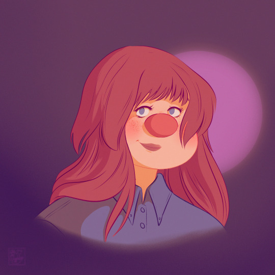
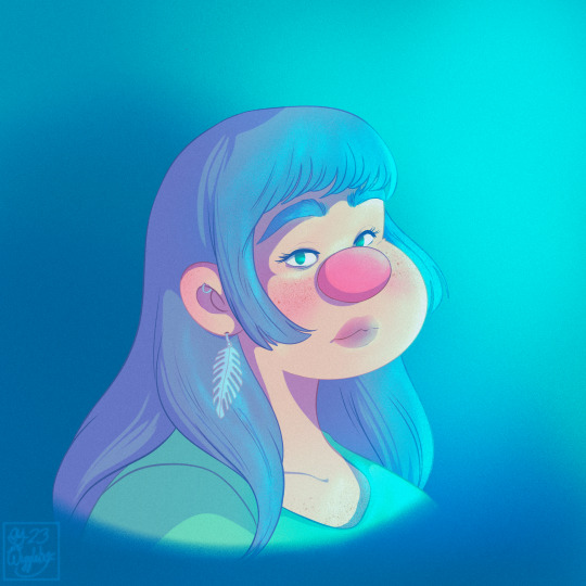
Testing
#wiggleart#digital art#artblr#I saw a TikTok video about coloring with the line art doubled and the top one is set to overlay#however I think that method worked better with styles that paint kinda all at once#which I don’t do I do layered coloring and I use clip layers with multiply for shadows and highlights#so the blue drawing was me doing that normally like my line art was normal#and then the line art itself was a warm gray and then I did a clip#layer over it and colored it using overlay blend mode and used the colors that were in the drawing in the area#and I liked it a lot more#I like this method a lot more than the method I usually used which was guessing the colors I’d color the line art lol#it looks way more cohesive
15 notes
·
View notes
Note
puts bocchi under ur pillow

What's that I see?

My, my. How did such a cute little thing get in here?
#I'll take good care of her~#*ahem*#the stuff in caps is from me earlier when i first had the idea#she wanted that to be the text but didnt think i might want to.. talk about the drawing process. thats why this awkward transition is here#anyway.. when drawing characters simply i like to draw them like little miis or perhaps teru teru bōzu#thats why her skirt is longer and why she doesnt have arms#also.. i dont use colored pencils often. and while i do have quite a few this is the closest i could get to the Bocchi the Hot! Pink#(or should it be Bocchi the Hot Pink! ?)#anyway.. i also only wanted to use the Bocchi the Hot! Pink and her blue and yellow.. so no brown for her shoes.#to make the pink more striking#anyway i said i dont use colored pencils often.. you can tell. i made a mistake boldening the line work before colouring..#cus the pink mixed with the lead more than it would have otherwise.. making it darker#o well#also.. i added a little colour around the clover as a oneshot reference. pink yellow and cyan where the red green and blue are normally#its meant to be subtle#unfortunately it mixed with the lead too so it looks more sloppy than anything#anyway um#my art#communication#my actual posts lol#bocchi the rock!#bocchi#bocchi the rock#bocchi fanart#hitori gotou#i think this ask was meant to bug me to watch bocchi#its working in a roundabout way#also.. u can see my niko oneshot plush and focks *cough* i mean fox tunic plush in the background of the first image
27 notes
·
View notes
Note
Hi !
Your Leshy and Shamura comic left me in absolute shambles- I adore those two so much, they’ve been on the brain for so long- Shamura in your style also gave me brain worms. I just adore your art style so much-like AAAAA??? It reminds me of 90s Retro and I loveee ittt-
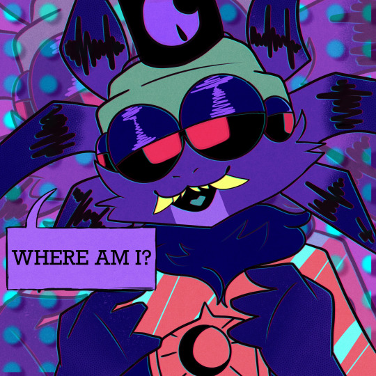
Little Shamura fanart for you ! <3 The brains worms you gave me are so intense and I love it- the little details- UGGHSHBDBDBD I’m so normal-
WAARHRGAHGRBELljdhsfsja
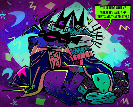
YOUR ART IS SO CUTE WTFFF. I WAS NOT EXPECTING THIS BUT I'M SO HERE FOR IT, I did the soyjak point at my screen even though I'm just like alone in my room and nobody's awake yet. As a token of my appreciation I drew a little continuation to your art cause you mentioned the shamura + leshy comic specifically and I feel like giving them a healing moment before the unending anguish inevitably returns. Leshy is not usually this succinct when it comes to responses to shamura's boomer moments so I'm assuming he rehearsed with heket and kallamar lmao
It's always funny to me when someone says my art has a 90s vibe cause I was not alive for the 90s BUT a lot of my influence comes from the cartoons back then, so I'm happy my art can still evoke the era!! Actually I'm just very happy about your drawing in general because I'm noticing little things like, their blue tongue and big neck fluff and crunchy speech bubble lines so I'm punching my desk irl. IN A GOOD WAY. I JUST DO THAT WHEN I'M REALLY EXCITED LIKE WHEN HYMNS OF THE UNHOLY DROPPED. I know shamura is not my character but I'm kinda overjoyed seeing the way I draw them as drawn by someone else just because you wanted to do it........thank you so much for this!! I'm having a weird time rn so this was the best possible start to my day
#cult of the lamb#cotl bishops#shamura#leshy#EVERYBODY LOOK!!!!!!!!!!#THEY'RE EVEN SAYING THEIR FAMOUS LINE 'WHERE AM I'#CLASSIC MURA
166 notes
·
View notes
Text
Part one of combining every version of PJO characters :)))
Percy and Annabeth!


[tap/click for better quality] It’s pretty self explanatory. Read below the cut for my nerdy art processes.
So obviously, I’m referencing and color-dropping their old official art, new official art, movie, musical and tv show appearances.
Percy’s-
All of the Percy’s seem to have pretty well defined jaw lines and soft cheek bones. Most of them have square or diamond shaped faces, so I leaned into that more. I also realized they have wider nose bridges in addition to the slightly upturned nose so I went with that as well. Pretty much all the Percys’ have thick eyebrows, especially in the front, so I went with more of a taper and more down turned. The eyes pretty consistent. The hair was pretty easy, the textures kind of canceled out back into the his original description of having wavy, despite the OG art not really conveying that at all. Was kind of surprised that Walker’s hair didn’t lighten the combined colors more, as well as his and Logan’s eye color not making the color more blue.
Annabeth’s-
Annabeth’s was pretty interesting, just cause I’ve always associated her with having sharper and more angular features even though all her actresses and official art works have softer and more rounded features. Especially the nose.
Either way most of the annabeth’s cheek bines are lower and softer. She pretty much always has a flat and narrow nose bridge that’s usually much wider at the bottom. Her skin tone ended up being close to what I already use when I draw her- I was pretty shocked it wasn’t darker, but none of the official art shows annabeth as being as tan as she’s described to be. Her hair color was pretty much what I expected, same with her eye color. The hair texture was a little weird for me, cause Leah’s curl pattern is very different from the curl pattern Kristen has when she portrays Annabeth, which are both different from the curl pattern in Viria’s art. Alexandra’s hair is pin straight and OG official art annabeth’s hair is pretty limp except for a few half hearted curls at the bottom. So the hair texture you see was my best attempt at combining them all. Also I put a little braid in her hair to represent her braids in the show. Her eyes, much like all her other features, were a lot more soft and round than I usually draw her as having. I normally picture her with narrow, intense, diamond shapes eyes. A lot of her appearances, despite her description in the books, have big, soft, round eyes- which I thought was actually kinda cute cause she’s so smart and clever and observant that her having these big, round, curious eyes was made sense too.
But yeah. That’s about it. This was really fun and I plan on doing more :)
#percy jackson#fanart#rick riordan#pjo#heroes of olympus#annabeth chase#fan art#percy jackon and the olympians#percy jackson and the olympians#art by muclunga#walker scobell#leah sava jeffries#logan lerman#alexandra daddario#kristen stokes#chris mccarrell#the lightning thief musical#tlt musical#the lightning thief
377 notes
·
View notes
Note
I noticed when looking super close at your line art that the there's slight red green and blue on the sides of the lines like an old 80s anime and i think that's super cool! How do you do it?
oh, that's chromatic aberration! i guess you could say its a kind of colour/visual distortion.
it's pretty simple to do, but i usually just use a csp auto action to do it for me to make things go quicker, but i can teach you how to do it manually in most programs.
i'm going to use this silly doodle of me as pompompurin as an example lol
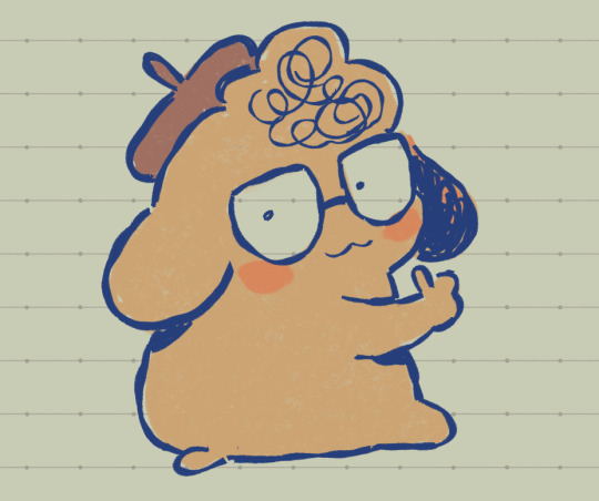
youre gonna wanna merge everything onto a single separate layer first and then we're gonna work with that merged layer. make two copies of that merged layer so you have three of them in total.
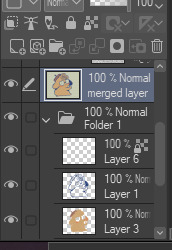
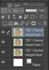
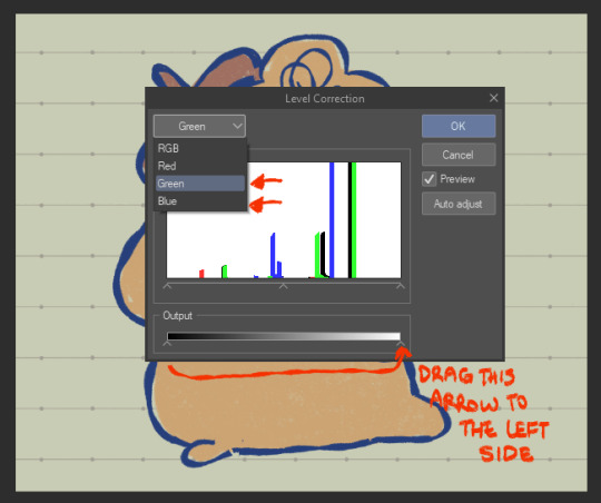
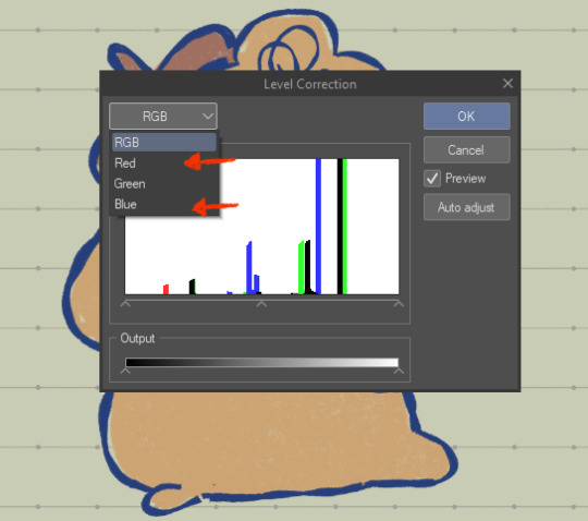
the top merged layer will be our red layer, so youre going to want to got to EDIT > Tonal Correction > Level Correction
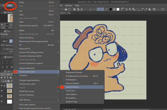
the level correction graph will pop up. since the top layer will be our red one, select the green level and drag the rightmost arrow on the Output scale all the way to the leftmost side. do the same for the blue level.
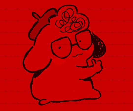
the image should be red like this afterwards.
the middle layer is going to be our blue layer so do the same thing we did for the top layer except youre going to reduce the green and red levels instead, and the middle layer should be all blue like this.
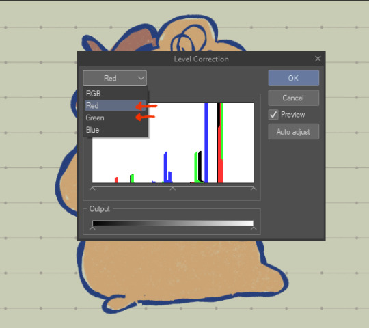
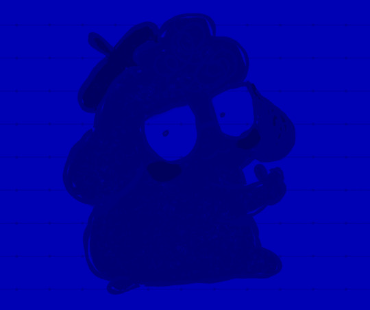
for the bottom layer, it will be our green layer. same process as before, reduce the red and blue levels so its all green.
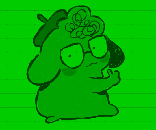
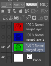
your layers should be looking like this now
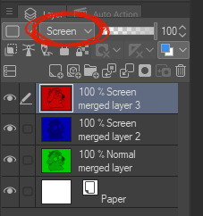
from here, you want to set the layer modes of the red and blue layers to Screen, DON'T do the same for the bottom green layer though. you'll notice once you've done that, the image will look normal again!
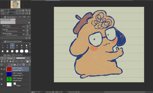
from here, all you need to do is shift the red layer in one direction, and the blue layer in another, to as much of an extent you want. the further they are from each other, the more drastic the effect will be
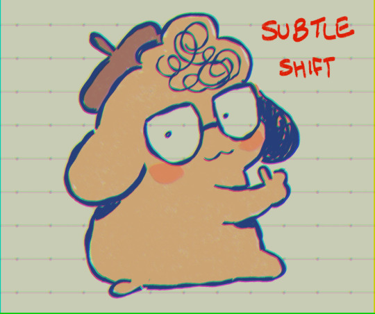
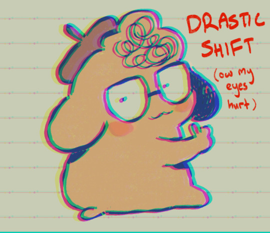
and that's how you do it! my other personal tip would be to add a layer of noise set to Overlay or Soft Light at a lowered opacity over the drawing bc it goes well with the aberration, or even sharpen the image.
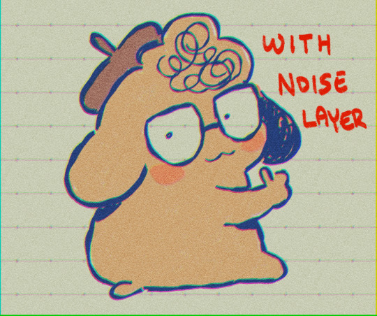
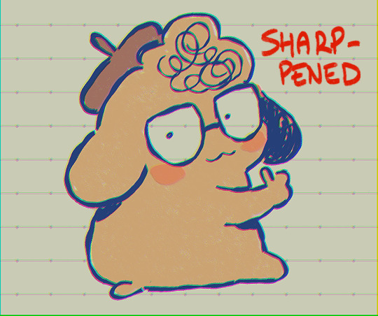

if you dont want to do all that hard work though and you happen to have clip studio paint, just use an auto action, like this one!:
https://assets.clip-studio.com/en-us/detail?id=1713222
anyway i hope that helps? ^^;;;
726 notes
·
View notes
Text
Coloring tutorial I guess
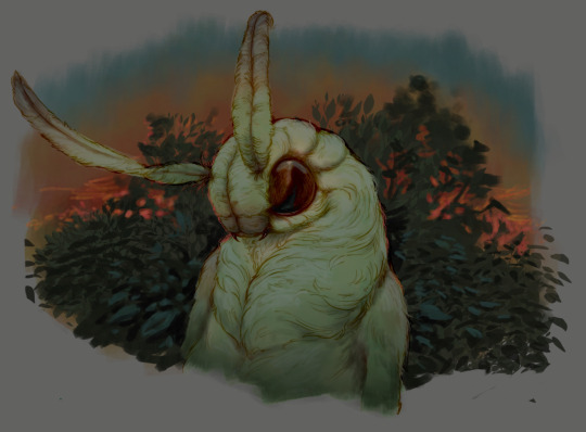
That's my most default shading style, a hybrid of line drawing and painted shadows, and I'll tell you exactly how to get this look. But before we start, you need a weapon This is my main brush for basically anything, including line art on days when I don't feel like switching to something actually intended for inking. It's a lightly textured square brush with color variation on every stamp. Intended for Procreate but you can always just rip the alpha texture out of the file and use it for a brush in any drawing program. That out of the way, let's go. I'll use the same line art as the one in fluff tutorial. Set the line layer to ~60 or so opacity and get to blocking in the base colors of your character. The jitter brush will introduce some color variation on it's own, but changing the color occasionally will add more visual interest.
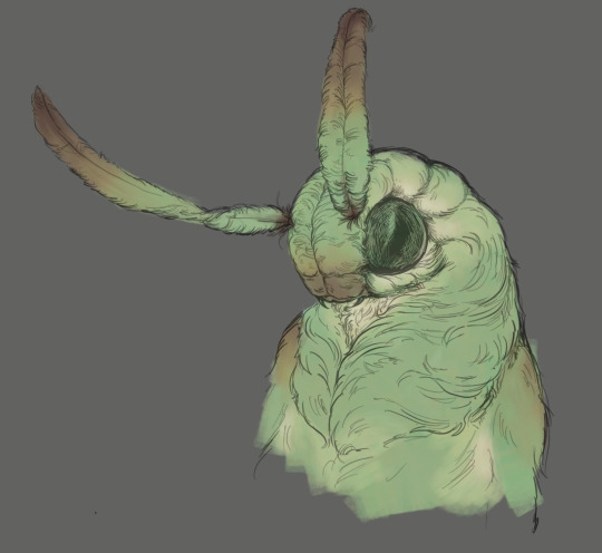
After this I add a multiply layer on top and dab orange or red in places where we might be able to see the base of the hairs or peek at the carapace underneath.
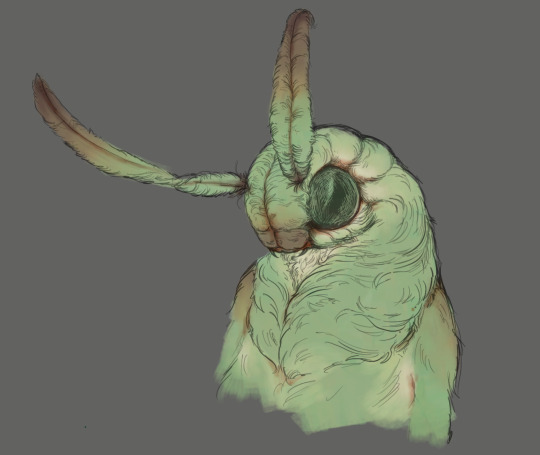
It's places where hair parts and where it's shorter. This accent color works great on joints as well. Example of the thing I'm going for in real life:
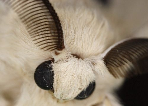
Especially visible behind the head. It's not present on every moth to be fair, but I like to add these accents even where it wouldn't make sense, just because it looks nice. Even on insects without hair. Block in the eyes and mandibles now, best if it's on separate layer.
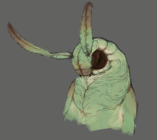
Now, the actual funny tricks begin. If you're one of the people who only use multiply or add blend modes, stop it, get some help Understanding the math behind blend modes is gonna get you a long way. My lineart is set to subtract more often than not. I find it produces juicier and more colorful results than multiply. I want to give this picture a warm orange feeling, so the color of my lines should be the opposite - blue.
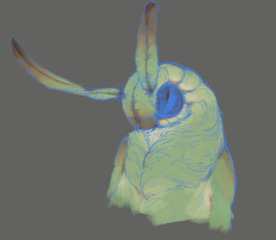
And, subtract.
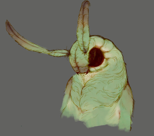
Perfect, but not quite. We can push the lines to an even softer feeling. Take the line layer, copy it, invert the color and set to multiply. I then throw gaussian blur on the resulting copy and reduce opacity until the lines bleed into the surroundings just a little bit.
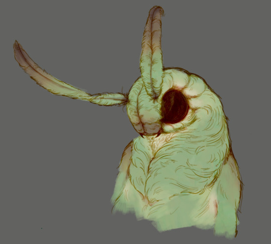
On to actual shading. People who shade without getting in some background first scare me, so let me throw something together real quick.
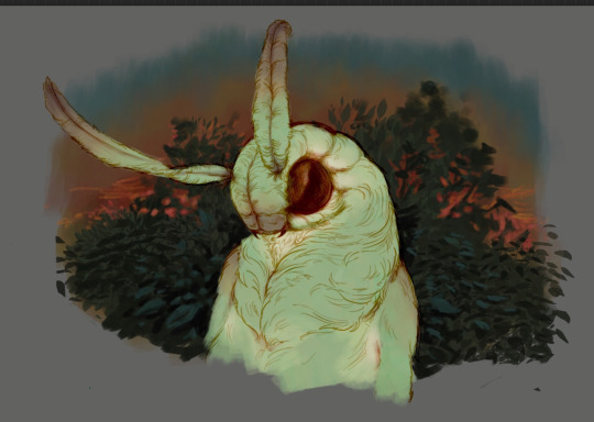
A simple gradient will also suffice for this use. We just need some information on which colors are present in the surroundings. Copy your background, bring it on top of your character layers and gaussian blur it real hard. Set it to multiply, remove all parts of the layer that go beyond the pixels of the base color layer. Adjust opacity until the character fits in the background.
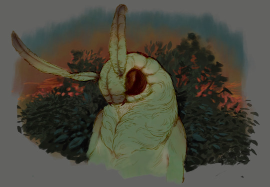
Let's identify the light sources. In this case it's only the sky, but it produces two distinct colors - soft blue lighting comes from the top, slightly stronger red comes from behind. The blue light I set to exclusion blend mode because it felt most appropriate in this case. Both add and screen looked too strong to be the light coming from such dark sky.
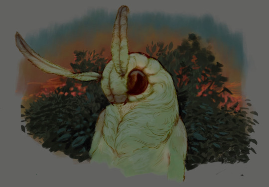
In this lighting context the lower part of the body will receive less light that the upper part. I use the green of the bushes set to multiply to darken the bottom.
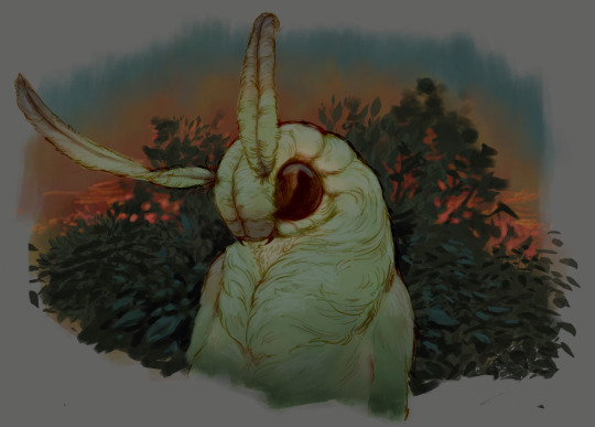
The character is surrounded by all kinds of soft light, but it can't get everywhere. It's time to add ambient occlusion, or contact shadows, for those without a 3d background. Anywhere where there is a crevice or surfaces almost touch, a soft shadow will form.
I do it on a multiply layer with a neutral gray-green color. Gray because any color light isn't really getting in there and green because the fluff is somewhat transparent and whatever light does pass through it gains a greenish hue.
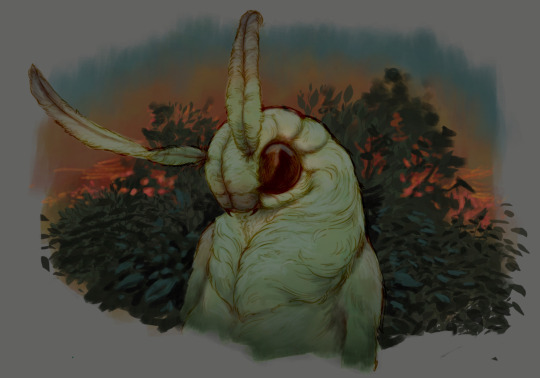
Last step, red rim light from the fading sunset behind the character.

Since it's rim light I just work with normal blending mode. Setting it to add or something of the sort would make the rim light brighter than the source of the light. And it'd be odd.
And that's it. I usually throw on some post processing in Snapseed. Pull some curves, throw on a bit of grain, etc. But it's a topic for another time.
In conclusion, try to think about the environment more when shading. What route does light go through to reach where you're coloring? Did it reflect off of any colored surface? Did it pass through something transparent to gain a different hue? What color shadow would this ambient lighting produce? Go have fun with your colors now.
248 notes
·
View notes
Text
Tutorial: How I Render Accents
PART 2: COLORS
I usually do not recommend 'pixel hunting' aka going over your work with a fine tooth comb and picking out stray pixels to erase. However, for setting up a proper base layer for accents it is imperative to do so.
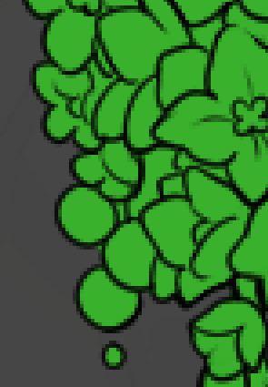
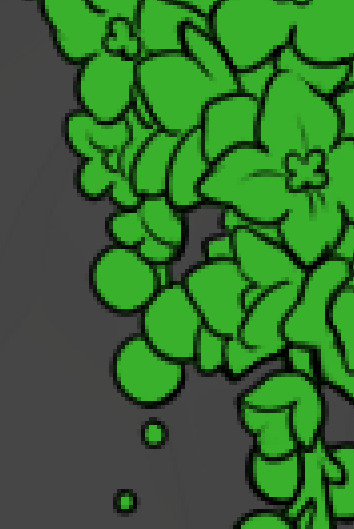
To explain my method of color blocking: I select everything outside of the lines, invert that selection, then fill in. This does a more accurate job than going into each and every section and filling them all in individually, and is also significantly faster. Only downside is small sections like above where you can see bits of the green (which I use bright green against a dark grey background to contrast the base color, lines, and background) poking out, as well as the inner section where it filled in a spot I did not want filled in. Getting all of this right in this stage will make your life easier as you go. (It's also the method I use to color block all my work, even beyond accents)
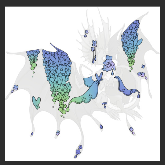
Now this where my style of rendering color may come off intimidating and, tbh it might be. I do gradients first and then I color over them with "normal" blend layers. I typically don't use multiply layers unless I'm shading something that has a lot of textures. If this scares you, it's okay I'll keep walking you through it. Here, my gradient goes from a pastel but deep periwinkle, to a soft more cyan blue, then to a lighter pastel green. Skipping steps and going from the periwinkle to green will give it a different look. There's also hints of a pinkish tone as an accent color.
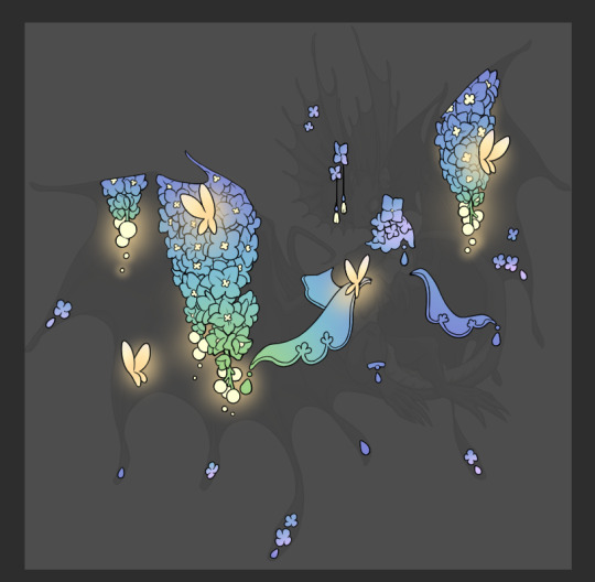
So as I said, these additional layers are done with regular "normal" blend mode layers. I've placed one in between the butterfly line art and the line art for the rest of the flowers, and then an additional layer under everything else. This allows me to create a glow effect specifically around the butterflies, and then specifically under the flowers. Going back and forth with the proper amount of opacity (by using the airbrush transparently) helps to make it glow but not be Too Loud. Also checking it against a dark background can help to check for spots where it spills past the borders, as well as really gauge how Bright it is. I've also color matched the butterflies with the flower pits and the bulbs. This adds extra cohesion and makes them all look uniform but different enough with the gradients.



The stages of how I render gems/dew drops. Take the base color, make it a bit darker and less saturated (as well as changing the hue a bit depending on what the default color is. For yellows I go more orange/red, for blues I go more purple or even pink. It depends), add a small drop light at the bottom thats a fairly saturated version of the base color, and then a stark white/ near white highlight. That's it. Don't over complicate it, it will not matter when it gets shrunk down. Note that I do not use multiply/overlay/screen layers for these types of things as it adds too much bulk to the files and doing it manually helps to strengthen your color theory skills.
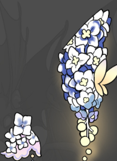
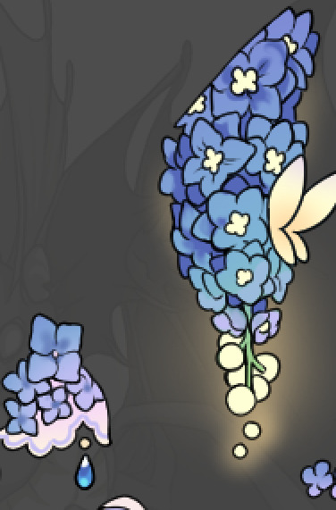
For shading and rendering, again, I create a "normal" layer and simply. Draw over what exists. Color picking and hand blending allow me to create the exact shades and effects that I want that multiply/screen/overlay layers may not be able to achieve. (which isn't to say I dont use them! i just don't use them for the main meat and potato part of my coloring) All of what is shown here is also achieved with the CSP asset SOIPEN (which can be found for free in the asset store)
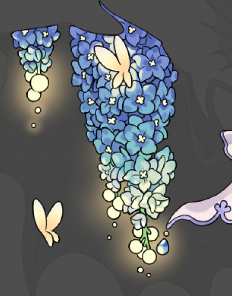

another example. The one on the right is showing how the layer looks without the gradient base layer under it. All of this is rendered by hand. I also specifically put a highlight color around where the butterfly is sitting to give a better illusion that it is properly sitting on the flowers rather than just in front of them.
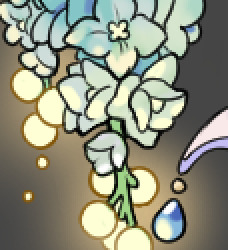
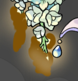
Next is changing the color of the lines, if needed. A method i'll use is I color just the sections I want (on a separate clipping layer) then lock that layer's alpha setting to them add in a gradient. It's a small and subtle effect that adds more depth without doing a lot of effort. (work smarter not harder)
Now we get to the Polish Layers!
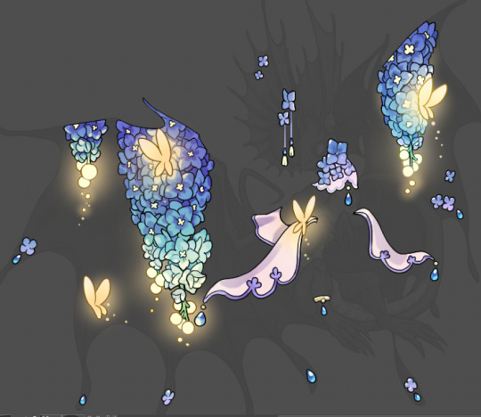
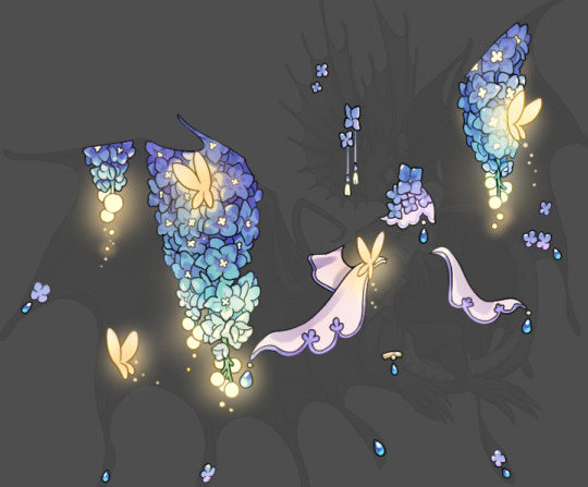
first image is how it looks as a base. second image is with an overlay layer applied. I've used some dark purples and mid tone desaturated greens to push the values a bit further (especially evident on the top left wing) Third image is with a screen layer applied, highlighting the inner most part of the flowers and adding some additional bounce light.
An important thing to note about making accents vs making full coverage skins: OPACITY AND LAYER TYPES MATTER OVER TRANSPARENT SPOTS. What I mean by this is that if you use a soft, light grey to shade with a multiply layer, don't clip it to anything, and have it go outside the lines - that will no longer appear as a 'shadow' when it comes to the final result. Instead you will have a section of soft light grey that is simply laid on top of whatever the image under it is. The same applies for overlay/screen/add layers and so on. If i use a very dark color on a screen layer (to give a soft highlight) and airbrush it over a bunch of stuff and don't clip it, it will end up with this horrible dark splotch over everything that isn't opaque. To this end, mastering normal layers is imperative to having well rendered and convincing accents.
Another thing of note: when it comes to sparkles/small details, note how 'large' the sparkles behind the butterflies are. They seem a bit chunky, yeah?
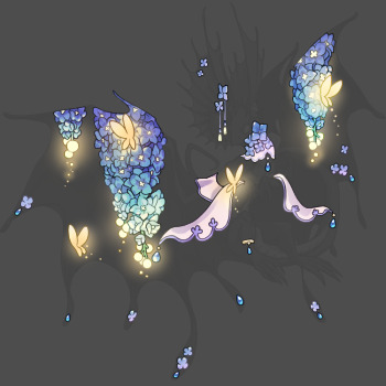
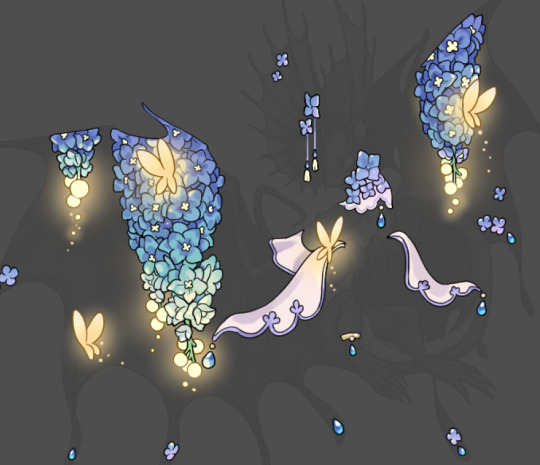
this is what they look like at proper size. If anything, I could have gone larger on the small metal beads connecting the dew drop jewels to the lace.
Another trick I also like to do is this:

a slight hint of transparency! It's just enough to let the dragon's lines underneath show through but not enough to be super noticable. I like to do this a lot when it comes to sparkly and magical effects.
Next is the worst part of all: destroying all that beautiful hard work with the shadow and line art layers! (sobbing)
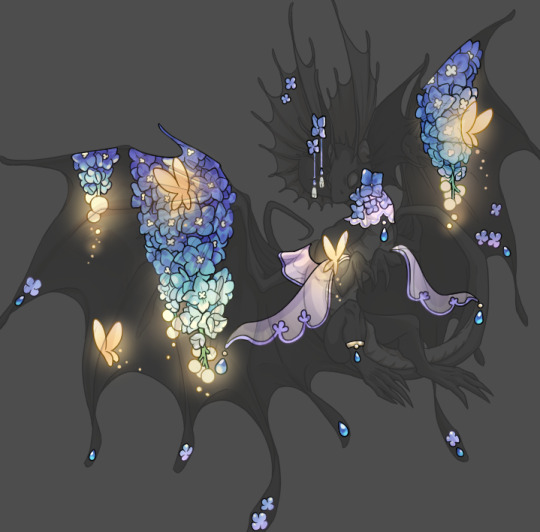
This stage always agonizes me. This is my first pass of the shadow/line layers and let's hope it's dark enough.
But yeah that's a start to finish look at how I create my accents. Unfortunately a lot it devolves into needing to know, yknow, line weight and silhouette importance, color theory and the ways that drawing applications actually apply color to a png vs how its rendered in app. All of these things impact the finesse of the accent, and are things you do have to learn gradually over time, but hopefully this has given yall some additional insight and perhaps some helpful tips.
And this should also explain why I get so mad when people go 'hey can I get this accent in another color' no! no you literally can't!
153 notes
·
View notes
Note
I want to know how you render.
A lot of people seemed to be oddly interested in how I render so...
Shape first
I use solid brush or lasso to block in the light and shadow first.
You can see this in the Till drawing because it's all hard edges


2. Add high saturation colour in the area where the light turns into shadow.
I like to do this cause it gives a glassy transparent feeling to my drawing.
like these:


3. Cause most of my drawings are 70% in shadow + 30% in light, i will render the shadow
that means, adding another "light" to the shadow, like reflective light or so. For the till drawing, its a blue light from the left

However, we need to make sure the secondary light doesn't destroy the main light source, so this secondary light will only cause hue and or saturation changes instead of value changes
...
Above are the logic for my doodle drawings, but if i want to continue, i will do the following:
4. Separating more forms
ie, for the till drawing
if the form faces left, it will be affected by the blue light.
if the form turns away from camera and not affected by the blue light, it will be redish
if the form is hard, shape will have hard edges
if the form turns, shape will have soft edges
5. Separate space
Things in front are solid and things in the back are blurry


---
Well, in my art logic, i think "rendering" is separating more layers of information, ie
separating form's plane (via lighting, edges etc)
separating space (via blurriness and light decay)
separating material (e.g. if hair strip is thin, it will be more transparent etc)
oh and i usually add gradients, so it contrasts with the hard blocks i make ✌
---
hope this helps
I posted some of my drawing process on Bilibili @356Migoro, if anyone is interested.
---
🤔Actually, I intended to make a YouTube channel to share my art shenanigans, but I'm just a bit too busy lately, let me know if there's anything else you are interested✌
---
also, normally I don't paint in a solid step-to-step process, its usually i realise that after i have done something, there's still not enough information, so that i "add logic" to my drawing. (e.g. adding the blue light for the till drawing)
---
and since people asked before:
i use CSP to paint everything
I only use 5 type of pens, they are my main partners in crime✌✌✌ (1) lasso and Default G-pen to line and block in hard edges, (2) Transparent pens for mixing colour (3) Blur tool, (4) Gradient (5) texture pen

glhf
#art tutorial#digital art#art process#thanks for having me lols... have a good day#and the reason why my art style changed a lot after my Slow Damage period#is that i traveled to a mountain in China to seek art knowledge from Ale-sensei#(its actually a proper art training institution in China called Magic Leaders but I'm just trying to be funny here)#so yea I am still trying to find my balance between what i already knew and what i learnt there...#and there's a period where i learnt too much and i became really confused so my art style is not very consistant
78 notes
·
View notes
Text
Eggtober 4th, 2024
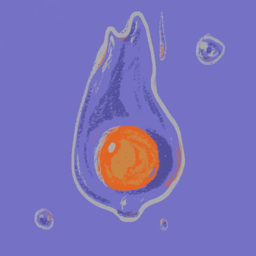
"Tears" Raw Egg on a Field of Blue.
(Krita, Chalk Detail Default Brush, 10 minutes, 6 colors.) Slapping the @quezify right up front for a change. Egg king showing off everyone's amazing egg art is really nice and I look forward to all the new eggs every day.
I also actually really like how this brush handles, where more pressure smooths out the lines and less pressure gives you that lovely texture.
Regarding life kicking my ass recently, I had a cry about it today. More accurately it was difficult to do much except cry. But maybe saying that already gives too much away. I'll be okay eventually. But for a good long while, I'm going to be a bit of a mess. But that's alright. It's part of being alive. At least I hope I believe that at the end of all this. Once again, if you know me and know why, keep that in your heart and keep supporting me through this. It means more than you guys know. And if you know me and don't know the specifics, know that it's not because I don't trust you. It's half because I don't want to burden you all with it and half because you guys being normal is so fucking good for my head right now. It really helps having some of you in the dark and just treating me normally for the most part.
I'm doing my best to take care of myself, so just keep being absolutely amazing people, all of you. It really helps so much just having y'all here while life is being an absolute rat bastard. I hope everyone having a rough time enjoys the eggs. When I get my brain to behave, I find drawing eggs really soothing. If Eggtober somehow ever stops being a thing, I might still keep drawing eggs by default as a casual doodle. Eggs and Polwigles are just really nice to draw...
If you would like to support me in this time of ass-kick and suffering, please continue sending me lots of things that you enjoy, cute animal videos, funny youtube shorts, cute art, whatever. Or feel free to join me in Eggtober and draw some eggs with me.
I may be off my game for a while yet, but I am going to keep on chugging. I adore you all. Like all things, even difficulties in life must pass. Even if I have trouble believing it right now. As long as everyone else out there believes it for me when I can't, I know I'll be okay.
#my art#art by GKD#Eggtober 4 2024#Eggtober 2024#raw eggs#I hope I'm not being too much of a downer#being able to yell into the internet void at strangers helps
60 notes
·
View notes
Note
I wanna know about your art style. How you draw like that??
i tried putting down considerations as well as a (very) general step by step of what i do; if there's anything more specific you want me to explain lmk i guess?
first off, general (self imposed) constraints / purpose of project -- this informs what i draw & how i draw it
i.e. "kuradex" is pretty different from my normal art (my 5 latest rough illustrations):

or my monster hunter charms:
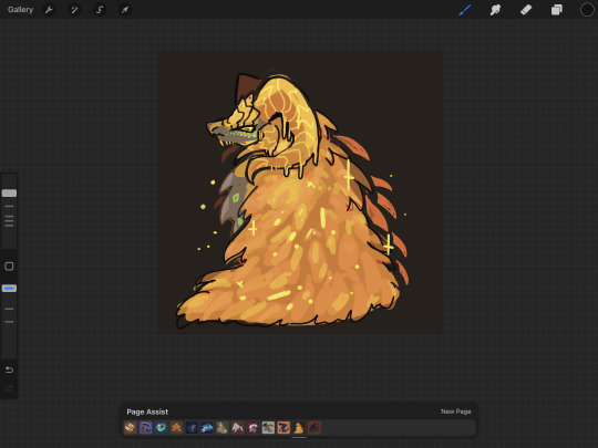
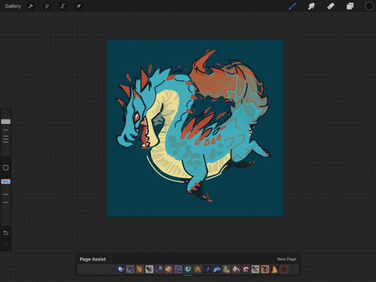
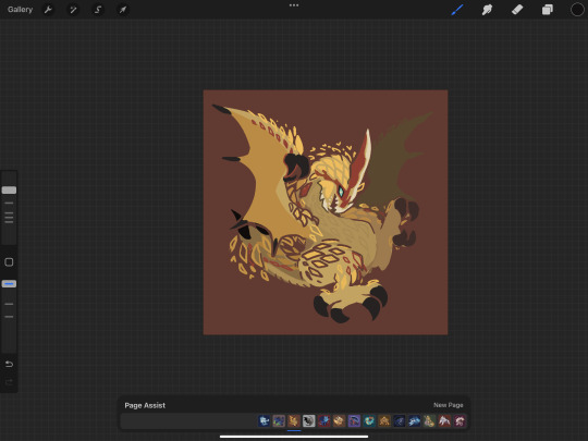
or my pokemon tcg contest illustrations that im not allowed to show until june (😉):

although i've said its for merch purposes, ive started drawing these because i wanted to practice conveying "liveliness" and noticing key features / nuances of a given design, but i didn't want to spend a large amount of time on each one.
so what i came up with is
i want to draw things on-model in terms of proportions ( + take note of weight / tapering of shapes / etc )
no backgrounds & minimal "props"
experiment with / practice line/texture/color/flow/rhythm/etc
spend <1 hr on each pokemon on average (this is a bit more difficult for me to track, but for example, the cyndaquil line took me less than 42min to color, combined, and means at some point in time instead of focusing on cleaning up the art as much as i can, i stop after cleaning up most of it)
that said, the pose & the rhythm/flow of lines are key in conveying liveliness, and if i have a concept in mind i usually end up going with it, but i may go thru a few if i dont.
i consider pokemon origin / lore or a key point in its design, and if i'm particularly stuck, i try looking up pokemon card illustrations for inspiration. (i noticed the research i do is essentially a truncated version of how Atsushi Furusawa does research before doing an illustration.
(& even despite all this i do get stuck sometimes and don't exactly understand a pokemon and just opt for "as cute or cool as i can make it i guess?", but i think it's part of the process...?) (theoretically things that are A Shape should be really easy to draw but with what i want to practice in perspective i find them difficult...)
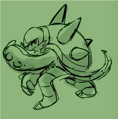
this is from my latest paid req but these are my first sketches of chesnaught -- i was thinking of how one of its inspirations is a warrior / tanker from RPGs, so i drew a pose where it's shielding its face.

i do another pass and take note of details.
in general i draw overlapping shapes and erase (it's a bit visible on one of the spikes)
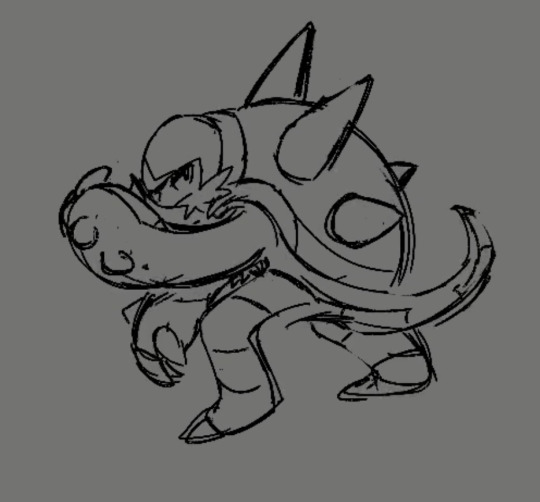
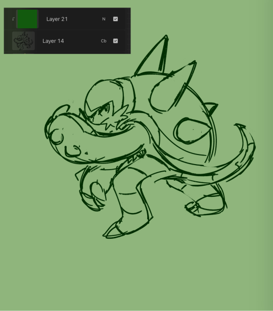
because i opt for quickness i start coloring at this point -- i just use a colored "color burn" sketch layer for the "lineart" & colorpick official art & lay down messy flats & set the color layer to 60%
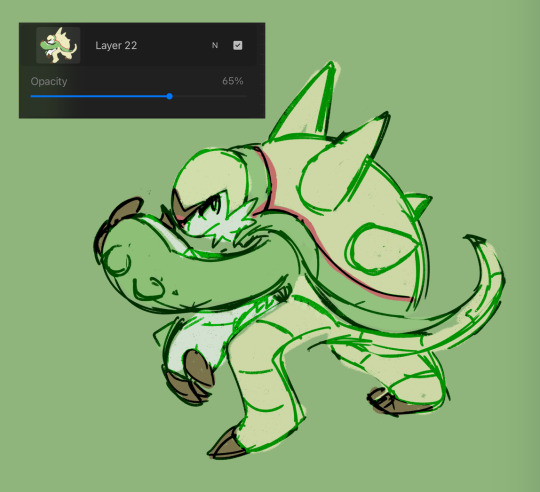
60% multiply layer for shadows. i tend to use both hard and soft brushes
for bigger projects i would use 2-3 shadow layers to create more "layered" shadows
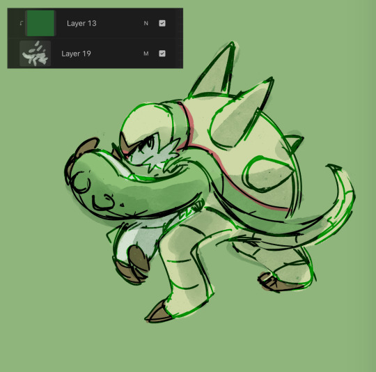
here i use overlay layer (60%). this is just throwing colors at it and seeing what works and doesn't work. i personally prefer to throw red under the eye and a yellow or blue near the top of the head. this is mostly done with a soft brush

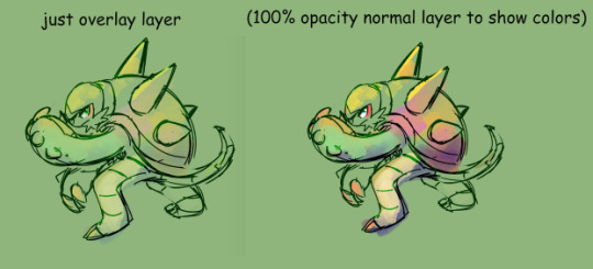
before this point, everything is under the rough lines, but now i start drawing/painting over it
i just color pick the colors that have been laid down from the previous steps and clean up / render textures (making the green on its arms look fuzzy) / fixing anything that i forgot or looks too off (i.e. the spike on its shoulder and the way the tail curves)

I could potentially keep cleaning this up, but this is where i usually stop 🫡
126 notes
·
View notes
Text
Mw3 spoilers (just a long personal ramble)
Hiii. So
As soon as the pre-release came out on, I hunted down spoilers, because I know myself and knew that if someone died and I got that information out of the blue, I wouldn’t take it well. Jokes on me, because I still haven’t been taking it well lol
I won’t talk about how Soap’s death was handled or the quality of the game. Plenty of smarter people are doing so.
I try not to talk a lot about myself and irl stuff on here, but will just say: I am very unwell, mentally. (Cue silence because that’s not surprising at all) Something I am very aware that I do, is that I latch onto fiction with my whole being, usually one specific character. For some reason, I always latch onto the character that ends up dead, usually in a way that make them only exist to further the motivations of other characters. It sucks.
So my hope for Soap has never been great, but for some reason I was still so shocked?? I don’t know, I tricked myself into thinking this time was different. Such an iconic character with so much good setup for great character development. I knew someone would die, but ow. To me, he was the element that made 141 seem more like family than coworkers. Soap’s interactions with the rest just livened up the games so much and made them all shine. Especially Ghost. Their dynamic, man.
Soap was the character that intrigued me enough to jump into the cod rabbit hole. It feels very hollow without him.
I keep telling myself that it’s silly to be so hurt over something fictional, and that I can just treat it as a mcd fanfic and move on, but nope. Brain’s stuck in the bad stuff. It’s a bad habit of mine to let something like this affect me so much, but well. Logic vs feeling and all that.
I really did find so much comfort in Soap this last year, that I severely needed. It feels a little like losing someone I know, someone who helped me through a rough time. I related to something in him and felt inspired. I only started writing after getting into ghostsoap, I started working out and I got back into art after a very long burnout. It may be fiction, but the impact is not.
So that was pretty much the worst case scenario of what mw3 could be to me. I always knew the risk, but, once again, ow. But there also seems to be plenty of good stuff in the game that I enjoy. I’m happy with the Ghost and Soap dialogue, the whole team working together and seeing Laswell and Farah and Alex and Nik. I hope I can be inspired by some of the new content once I’m calmer.
And I was worried they would ignore Ghost and Soap’s relationship after their development in mw2, but they genuinely seem to have gotten real close. It’s nice. I thought the shipping might scare the game devs into never having them appear in a scene together again, so that’s a plus.
Bottom line to all this is: I probably need a little break to get my head sorted. The grief is surprisingly real, it’s triggered some old stuff for me (haven’t been sleeping or eating, been stuck in some old thoughts). I’ll need to calm down and become a bit more normal about this again. Part of the grief isn’t so much about Soap himself, but also just the safe space that this account has been. The very nature of how the fandom is going to interact with Soap and Ghostsoap is going to change now, and man… I liked how it was, y’know? Could’ve used a little longer in that bubble. There’s going to be plenty of new fics and art, lovely stuff as always, but many of them will be tinged with grief, and I’m not in a place where that won’t break me a little.
I will hopefully come back to posting and making stuff once my brain settles down. I have so many drafts for fics and ideas that I hope I can return to. I’ve gotten so used to drawing these lads that I doubt I can stop tbh
The version of Soap that we love is already evolved from the games due to all the time and care the community has put into the character. The games may have killed him, but luckily, he’s fictional. We can do what we want, same as before.
I’m not even saying that I wish they hadn’t killed him. The games are crafting a story that fits their audience. It makes sense.
But I will choose to live in one of the many universes we’ve created for Soap, where he is alive and cared for, with a found family and a spooky lieutenant with a soft spot for him. Good for him.
Hope you’re all taking care of yourselves. RIP canon Soap (again). Thanks to Neil for a wonderful portrayal. And no matter where we go from here, thanks for a wonderful year of creating with you lovely folks. Seriously, some of the kindest people I’ve met in fandom. <3
Lastly: fuck you Kevin O’Reilly, but more importantly, sincerely thank you. (CallMeKevin video about mw2 got me into this mess. Otherwise I was keeping cod at an arm’s length, but he’s my fav youtuber, so I watched it. And here we are!)
#if u don’t wanna read: I’ll be taking a small break for mental health reasons but expect to be back and creating for this fandom again <3#mw3#mw3 spoilers#cod mwiii#mwiii spoilers#call of duty mwiii#ghostsoap#wispy update#always feel anxious posting anything emotional but feel like this one deserved a proper update#you’re all wonderful ppl ily#hopefully see you soon !
166 notes
·
View notes
Text
Book of Memories ~ Chevalier and Licht ~
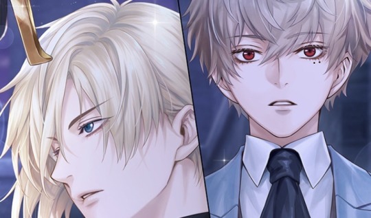
Card story
As usual, can’t guarantee 100% accuracy on this.
While taking a walk around court, I noticed that the training hall was unusually lively.
My instincts screamed that things were getting oddly heated and my curiosity made me go over to check it out—
I came across a suspicious figure hiding behind a pillar near the entrance, peering in.
Emma: Prince Licht, what are you doing here?
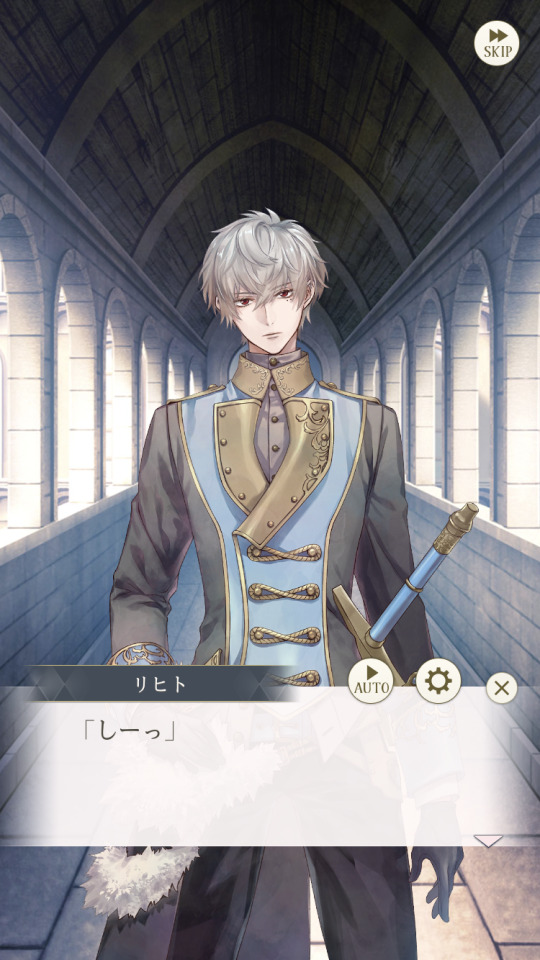
Licht: Shh.
With a single glance, Prince Licht gestures for me to hide.
When I obediently lined up beside him, his garnet eyes returned to the training hall.
Licht: If you’re here to watch, it’s better if you don’t get caught. Because he might charge you an observation fee later.
(What’s happening inside…?)
Like Licht, I peeked inside.
The large space was filled with knights belonging to the foreign affairs faction.
In the center was not Nokto, Clavis, or Luke, but Prince Chevalier.
The crowd watched as Prince Chevalier swung his sword against a knight.
The heat in his eyes was so intense that even I could feel it from the outside.
Emma: I’ve had the chance to observe some of the foreign affairs faction’s training sessions… I feel like it’s rare to see Prince Chevalier here.
Licht: Normally, this is either the head knight’s or Clavis’ job. But on rare occasions, Chevalier will take part.
Emma: To exercise?
Licht: No, I think it’s to boost morale. Chevalier’s the strongest knight on the battlefield, so all soldiers admire him. In fact, knights from the foreign affairs faction often assemble here for Chevalier. While many fear the brutal beast, his exceptional strength maintains high morale. It’s a different kind of charisma from Leon’s.
(...I’ve never seen Licht be this talkative)
As he spoke, his gaze remained fixed on Prince Chevalier.
Emma: …Do you admire him too, Prince Licht?
Licht: …
Emma: You do, don’t you?
Licht: Stop grinning.
Emma: I’m calm.
Licht: …You could say that.
Emma: By the way, may I ask what you admire about him?
Licht: Why?
Emma: I’d like to use this as reference when choosing a king as Belle.
Licht: … ..As you can see, every one of Chevalier’s movements with his sword is calculated. Not a single pointless movement, no hesitation, and no gaps.
His swordsmanship itself is a national treasure-level work of art.
(Certainly…Even the untrained eye can see that Prince Chevalier’s swordsmanship is beautiful)
(Rather than a technique for killing, it’s a martial art that captivates people)
Licht: Only Chevalier, or perhaps the legendary Knight of Roses in the past, can draw such refined swordsmanship. It’s not the sort of thing that comes from hard work or anything like that.
It’s natural talent.
Emma: But aren’t you similar, Prince Licht?
Licht: …How so?
Emma: I don’t know how to explain it, but…the swordsmanship, footwork… Look, I’ve also observed the domestic affairs faction’s training. For some reason, I feel as if you’re making similar movements.
Licht: That’s because… I’m imitating him.
Emma: Imitating?
Prince Licht sighed in resignation after a moment of hesitation.
Licht: I saw it by chance, a long time ago. In the training hall at midnight, I saw Chevalier swinging his sword…
~~ Flashback ~~
Licht: …
The scene was like stepping into a world of art painted by a master artist.
Every time the blond-haired, blue-eyed young man swung his silver sword, it drew a line in the empty air.
The repeated swings drew beautiful, overlapping arcs with ease, leaving afterimages.
That was when a younger boy first learned the true meaning of “art”.
Chevalier: What do you want, shut-in?
Licht: …That was how I was a few years ago
Chevalier: You’re not that different now.
Licht: I’m…fine with swords now.
Chevalier: You seem to be avoiding people.
Licht: …
Chevalier: If you have nothing to say then get out of my way. Leave.
Licht: …No. Just let me stay for a little longer. I’ll be quiet.
Chevalier: Your staring is annoying.
Licht: Then I’ll close my eyes too.
Chevalier: …
Licht: Hey…
Chevalier: Aren’t you supposed to stay quiet?
Licht: I just want to ask you a question.
How can I become as skilled with a sword as you, brother?
Chevalier: Don’t ask worthless questions. No one swings a sword for the sake of improvement.
Licht: Then, for what reason?
Chevalier: For a good cause. On the battlefield, the weak die and only the strong survive. If you can’t handle a sword, you won’t accomplish anything.
Licht: What’s your cause?
Chevalier: What a foolish question.
Licht: …To protect the country?
Chevalier: …
Licht: I see… I never thought about that.
Chevalier: Of course you haven’t. You’re narrow-minded. This is a problem to address before skill.
Licht: …

Chevalier: If you’re also royalty then think on it. What do you want to accomplish next, now that you can keep yourself from killing your other half.
Licht: …
Chevalier: Then we’ll continue this discussion.
~~ Flashback ends ~~
Licht: —I’ve been thinking about that ever since. I’ve always been watching Chevalier’s sword like this.
Emma: Prince Licht…
Licht: That’s why I think the only similarity is movement.
But actually, it’s not the same at all, just an imitation… But, yeah…That’s why they look similar in your eyes.
Those garnet eyes shrouded in darkness seemed to soften a little.
Emma: You look a little happy.
Licht: I admire him…Is that bad?
???: It seems the domestic affairs faction has plenty of free time.
Emma and Licht: ?!
Suddenly, a chilling voice rings out and we turn our heads at the same time.
At the entrance of the training hall stood Prince Chevalier with his arms folded and not even out of breath.
(We got too caught up in our conversation!)
Chevalier: You outsiders are in the way. Leave.
Licht: Come on, just a little more.
It seemed like Prince Licht became defiant, stepping out from behind the pillar and brazenly confronting Prince Chevalier.
Licht: Let her watch. Emma wants to see.
Emma: Prince Licht, too, right?
Licht: I’m escorting…
Emma: Ah, you sneak.
Chevalier: I don’t care. But if you don’t want to be kicked out—
Icy blue eyes turned to the knights standing in line, led by a red-haired knight.
Chevalier: You’ll have to go against them and win.
Licht: Easy…
Prince Licht drew his sword and headed toward the center of the training hall without a moment of hesitation.
I felt the foreign affairs faction’s knight’s enthusiasm rise.
Emma: Prince Licht’s also very popular.
Chevalier: …
Emma: …He says he admires you, Prince Chevalier.
Chevalier: What nonsense. To think so highly of me… Beautiful swordsmanship means you don’t hesitate to kill. My swordsmanship is not human. If he does not want to become a beast, then stop imitating me.
(...This is what Prince Chevalier thinks)
Prince Chevalier leaned against the wall and began to watch Prince Licht swing his sword against a knight.
I stood beside him and followed his movements, which were as refined as a sword dance.
Chevalier: In that sense, I don’t believe Mime will ever catch up to me. It’s too much of a “waste”.
Emma: That sounds like a compliment…
Chevalier: …
Emma: By the way, I heard something from a maid. In the castle, there’s this debate about who among you, Prince Leon, and Prince Licht is the best swordsman.
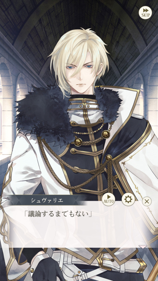
Chevalier: A pointless discussion.
Emma: It’s you, isn’t it?
Chevalier: No, the one who serves the greatest cause is the strongest.
Emma: I see…
Chevalier: If that one finds a cause, he will become better than he is now.
(Prince Licht respects Prince Chevalier, but…)
(It seems as if Prince Chevalier expects a lot from Prince Licht)
Emma: Are you looking forward to that day?
When I asked that probing question, he just laughed scornfully like usual.
(Thought so…)
(I’ll let Prince Licht know first thing when he comes back)
(No doubt he’ll be really pleased)
123 notes
·
View notes
Text
Ok-
So-
hypothetically…
If I were to make a Noah Diaz x Black!Chubby reader would y’all read it…? 👀👀
Scene Idea:
The cardboard portfolio you carried tipped in your hands as you kept the end pressed against the plush of your tummy to keep your drawing papers from falling out. Thick fingers curling against the back of the board you huffed silently as your feet fell into a steady rhythm against the sidewalk. Your drawing studio classes ended unexpectedly early today and I suppose you’d be happy for that, except you had a tight schedule that involved one car you had to share with your mother. And since she’s still working, clocking out as soon as your classes would normally end, she’d pick you up and you’d head home but now you had no choice but to walk. The black strap of your tote bag digging into the creasing of your shoulder. Filled with drawing pads and other art material you wouldn’t be surprised if you opened your bag right now and a pile of bricks would be waiting for you.
Walkman headphones snug on your ears Sade sang beautifully making your walk a little less crummy as the lyrics of ‘The Sweetest Taboo’ put your mind at ease. The sky was a dewy blue, spirits of purple danced around pink clouds as the day welcomed night. Your gaze shifted to the stars above, missing the colorful Porsche rolling up beside you. “Now how come whenever I see you, you got a frown on?” The sudden voice makes you jump, clumsily flicking your headphones off you turn with a scowl, ready to throw a line of insults before you bit your tongue.
“Noah?” You raised a brow, a grin tugging into the corners of your round cheeks as he eased on the breaks. “What are you doing here hm? And where’ve you been man? You go M-I-A-“
He scoffs at the joke.
“Don’t call, don’t page and then you roll up on me with a Porsche?” As of que said, Porsche rumbles lightly in a manner similar to a chuckle. You squint and Noah swallows and with a forced chuckle he drags his tongue across his bottom lip, pinching the peach fuzz of his beard as his other hand toys with the steering wheel of the car. “Yea, I uh” his eyes dart to yours before he looks down. “I was..uh in Peru for a business trip”
“You? Go on a business trip? Yo boss trust you enough for that?”
“Aye now,” He chuckles lightly. “Do you uh, want a ride?” The question made you remember where you were, standing on the side of the road, portfolio gripped in your doughy arms. You almost question why he decided to change the subject but the signaling of his thumb pointing over his shoulder and down the street catches your attention. “I was driving down here when I seen you, was wonderin’ if you needed a ride or sum..” He shrugs his shoulders and you can tell he’s trying to be as nonchalant as possible, his eyes easing back onto the road. Chewing on the inside of your cheek you look ahead of the road. “I don’t know..” He almost dreads the next words from your mouth. “I don’t wanna owe-“ So he cuts you off. “You won’t owe me anything (Nickname), think of it as a ‘thank you’ for the last time you babysat Kris.”
He hears you scoff, his shoulders involuntarily sagging in relief when you shuffle over to open the back door. Relieved you were taking his offer. You spoke, voice soft, and dripping in affection that has the older Diaz melting when you mention the latter. “You know I don’t mind babysittin’ Kris, love the lil stinker,” You grin, plopping into the passenger side after securing your bag and portfolio in the back seat.
———
This is all I’ve got, it’s something that’s been marinating in the back of my brain since the movie came out—lowkey thinkin’ about makin the reader be related to Reek but ion know yet-but on another note can we like stop pretending like this man is not fine??? 😭 don’t get me wrong Mirage is bby girl but I love me some Noah whew 😩
#noah diaz#transformers#transformers rise of the beasts#transformers 2023#mirage#bumblebee#Noah#Noah Diaz x reader#mirage x reader#anthony ramos#transformers rise of the beast#Noah Diaz X Black Reader#I LOVE YOU NOAH DIAZ#trotb#arcee#transformers arcee#optimus prime#scourge
66 notes
·
View notes
Text


PART 1 of ART TRADE
I am doing a trade with my buddy @tepidti and I decided to do a little more for him than just a simple exchange of oc x canon digital drawing(s). I decided to make Shrinky Dink keychain charms for him as a little extra bc he is my oldest online buddy, and he deserves a lot of nice things uwu
Disclaimer: Plz do NOT request art trades with me. Trades are exclusive to my friends. If you would like art from me then plz check out my pinned post for commissions. That would be greatly appreciated :')
DETAILS / PROCESS
Sooo, I was there for the conception of Dragonsteel (OC featured above), thus he holds a very special place in my heart. I LOVE how beautifully disastrous MegaSteel is... I cannot get enough... They are just SO CUTE and HILARIOUS.
As for the process, I am gonna make posts about each one I do, that way everyone can see the WIP... this is also so my buddy knows my process without me text dumping on him in our DM LOL
Redesign - I tried not to change too much on him. All I really changed was the positioning of his horns slightly, as well as some details on the helm itself, but other than that, I wanted the silhouette to be roughly the same. Dragon's art is a pretty simplistic style already so he was really easy to adapt into another style.
Color - I leaned closer to a more purple primary on Dragonsteel. I added some blue in and blended it to give it a more cool undertone, as well as to better shade the piece (dunno bout you guys but shrinky dinks are really hard to shade with pencils on qwq). I also opted to make the glass on his chest pink like his optics to balance and diverse the colors a bit more. I think the touch of yellow in the pink optic really help balance the look too. (I actually hadn't noticed the yellow in his ref sheet until I started to REALLY analyze his design and colors. I worked so seamlessly o.o)
Technique! Technique! - So I basically just started on normal printer paper for the sketch, and then transferred it to tracing paper, and lined/traced that onto the Shrinky Dink sheet.
NOTE: You can technically line with permanent marker on the slick/glossy side of the shrinky dink sheet, and it gives you a really NEAT look of 3D when it comes out cleanly, but it's such a risky process bc even the perm. marker wipes off/smears too damn easy. Doing it on that side will likely ruin the design altogether, so I suggest lining on the rough side.
Colored pencils grip to the rough side excellently, but once you start adding layers of color, it proves to be quite challenging because of how smooth the surface gets. It's easy to erase the colored pencil on them though, so mistakes are easily remedied in that regard.
#transformers one#transformers#tf one#tf#transformers art#maccadams#maccadam#my art#art commisions#commissions#tf one 2024#dragonsteel#tf one oc#transformers oc#art for tepedti#tf1#my traditional art#traditional art#art trade#artists on tumblr#not my oc#shrinky dinks
20 notes
·
View notes
Text
im so sorry it took me so long to answer these oml but YES i'd be happy to show how i draw and color :)
— SKETCHING
please note that i almost always sketch traditionally first lol it's just a lot easier for me to determine how the drawing is placed that way, but i always go over and re-sketch it digitally
for magolor i always start with a basic egg shape (lmao) and then i add his ears. then I draw the scarf; it's easy to determine the shape and dynamicism based on where the bottoms of the ears are located
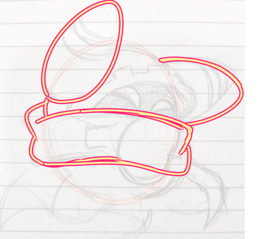
then i usually add the cape and hood together. where and how these are placed and what these look like in general are very important because they're the main area that perspective is directed to (the ears and everything else is important too ofc!! but the hood and cape usually help demonstrate where he is looking and how he is moving the most). then i add everything else, usually his hands last!
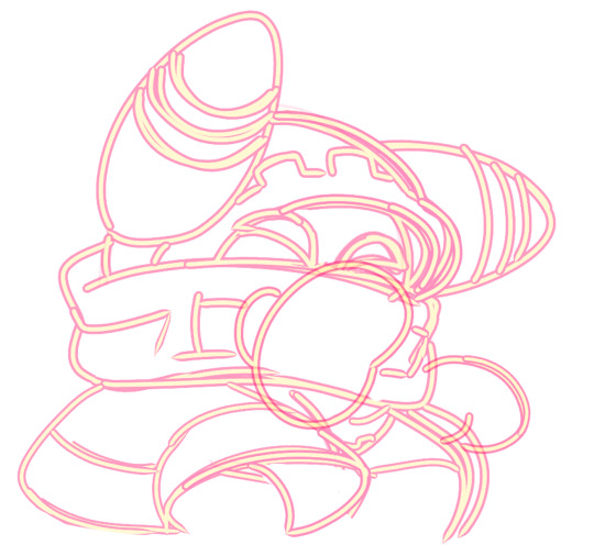
— LINEART
ohhhhhh god my worst enemy. Hope youre sitting down because this will be embarrassing LMAO
lineart is easily what i struggle with most and is more often than not the most time consuming and grating step for me. If i had a choice i would drop it in a heartbeat, but my style is so dependent on thick lines and shapes that it's difficult to 😭 a hole i dug myself into unfortunately ITS FINE THOUGH. ANYWAYS I'm getting sidetracked
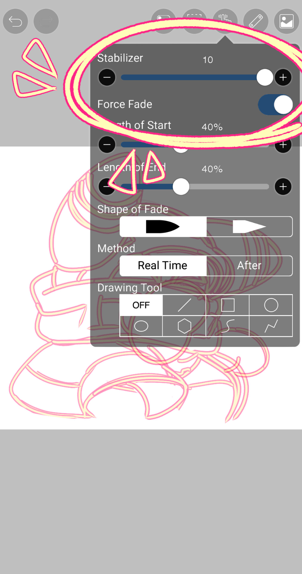
i use my finger to draw all my digital art, which means i usually have to use a Heavy stabilizer to avoid shakiness and staggered lines. Unfortunately ibis paint's stabilizer is actually dog water and doesn't even stabilize more than half the time (in which case i have to repeat lines over. And over. And over again until i get it right) but when it does like me and works properly it's very helpful!
i always use the soft school pen bleed brush as my main tool for lineart. This brush has been my best friend for everything, i even use it for sketching idk it just really like the way it looks lol. sometimes i change the aspect if i want the lines to look more ,, chalky?? or smoother depending on the work

i don't really use this tool much but for this specific piece, force fade was my partner in crime
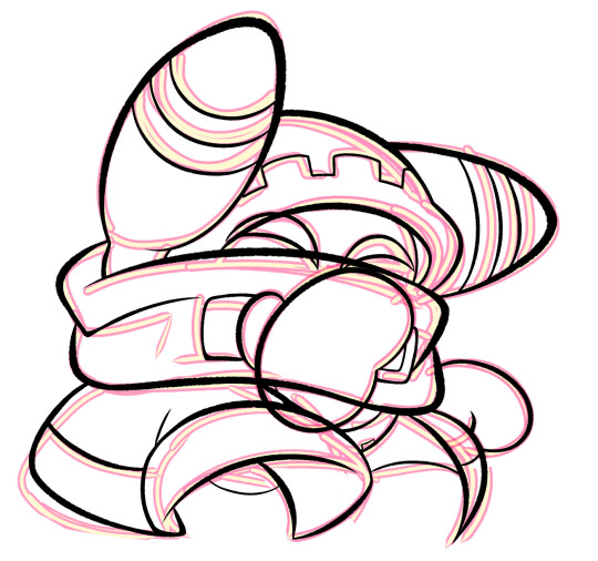
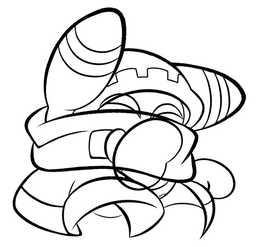
also i think i need to mention that i use so many layers for this. So many layers lol like to the point it's embarrassing. and at the end i merge most of them (except for the gear patterns, rings on his ear, and eyes + hands, which usually need to be by themselves as they're colored separately) Thank you for layers
and i end up with this!
— COLORING && SHADING
yippee yahoo the fun part !!! the part that i love the most
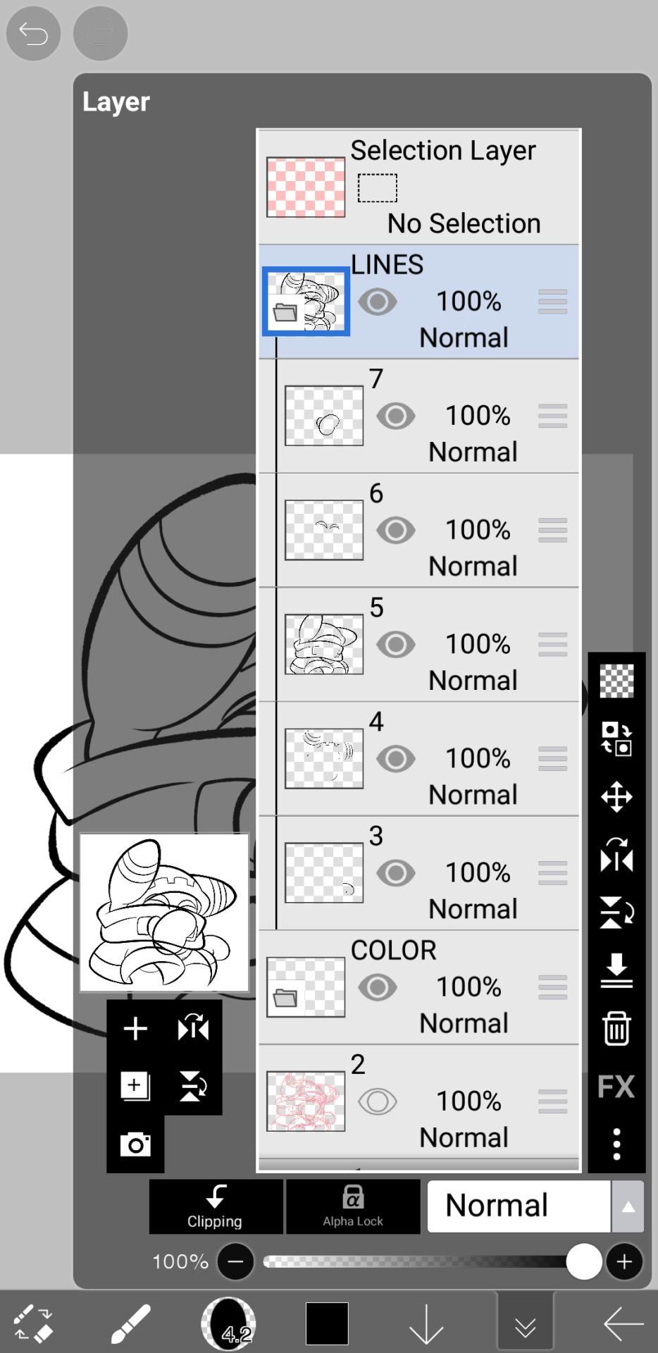
at this point, if i havent already, i always create a folder for convenience in organization because this is the part that i stress the most about what details are on which layers lmao
then i add ANOTHER layer below that for the color, then i put every single color used on their own separate layer!
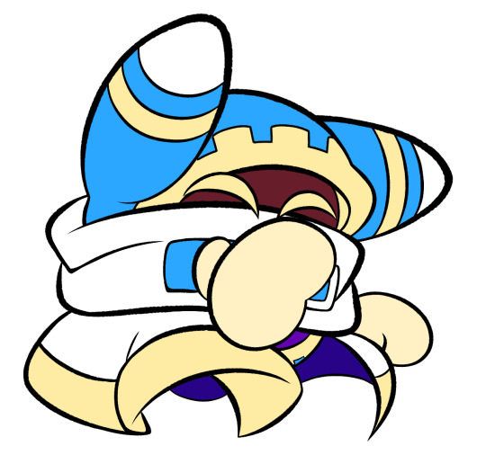
now, for shading, if im working on larger pieces with more complex shading, i'll usually plan it all out. normally when just drawing magolor, i don't really need to do this anymore because i'm so used to it lol, but for funsies i did it here anyways
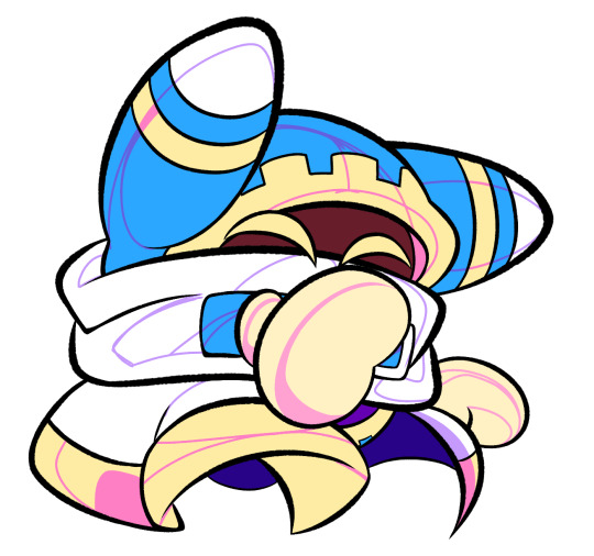
then i use the bucket tool to fill them all in
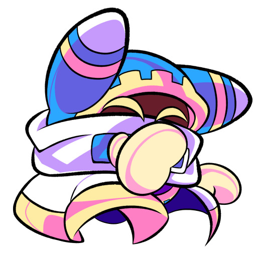
i usually have a set color palette for all the characters i draw (though the way i shade white differs. A lot between my work as you can probably tell fhdfgf). For every color, i have two specific tones that are associated with the shading. for example, indigo + violet are shaded with my blue, pink + light orange (or lighter pink depending on my mood lol) are shaded with yellow, etc.
so, i shade the other areas with the 2nd shading color

a big tip i can give for coloring is to look at a color wheel when you draw. i know that sounds like. Such basic advice LMAO but that seriously was a huge help for me when developing my shading and something i learned while studying — if you notice, in all of the shading in my work, all of the colors used are analogous on the color wheel. note that not ALL combinations will work together like others obv !! but it's a huge step in knowing where to go with it
then i add other extra details like extra lighting, halftones (if i feel like it // if it fits the work), glow to his eyes, and color the lines and ta-da!

another tool i use a lot especially with my more recent art are blending modes, especially multiply. i use a clipping layer to add a dark color (usually a dark blue or purple) and set it to multiply, then erase the areas that emit light

and this is the end result! this is a very very basic demonstration of it fhdjg i was a pretty messy with the lighting and erasing in this example but you get the general idea right

and that's how i draw :) i hope this was helpful, and thanks for asking and being so patient with the response!
#ask#magolor#kirby#macdraws#ive wanted to make a tutorial for So long and finally found a bit of time to do it lmao
142 notes
·
View notes
Text

Raren demonstrating a suspicious spell in front of the royal court.
visual storytelling notes:
The bg was left blank until I started painting and the elements added to the bg were designed around the character. I didn't go into this with a little synopsis of what I wanted to convey. Only an abstract idea that Raren was going to be talking to someone, figure it out later. I decided he'd be presenting a new spell in front of a political chamber because he wears a crown and a blue crystal. So he has to be of some form of nobility and magical prowess. He also has blue eyes meaning he is an ice dragon and thus its a blue spell wow. The monarchs he's addressing are left dark and disapproving in the corner while Raren powers a statue beneath them. He could be demonstrating how the spell effects the world around them, maybe it freezes the stone? maybe it brings the statue to life? Either way its primed to eat Raren's opposition. Two of the bg guys are red one is blue maybe he's an arch nemesis who knows.
Art process and wips under the cut
I'm trying and failing to get better at visual story telling while keeping things simple. My long term goal is to have a frequent and consistent posting schedule. Most of the art would be stylized and simple like this and the rest could be fully rendered.
Art has been more of a "draw what's in you head and make it look pretty/ cool to hang up later" thing to me w/ the benefit of being a good source of self reflection as I create. Writing has more so been my go to for expressing that meditation. Writing I don't share because im unnecessarily cagy abt my emotions and my harshest critic lol. I want to tell stories with my art , convey tone, feeling, etc. and right now my paintings don't do that. I don't have the technical skill yet. This painting is the first of many to come that will hopefully change this.


The texture in this is chaotic and the line work is rough. Raren is the only part of this with a full sketch. All other line art was added to create the illusion of detail. There is less attention on rendering each section and more being put into the placement of characters and props. I had hoped this would make the painting go faster and...it has the potential to do so in the future. Sooo a piece that could have taken a couple hours took a whole day.
While im not overly thrilled with the final image im still happy about the process. Normally the dragon would be the only real focal point in my painting with the bg being a gradient, or a simple theme added last second. Conveying a message is more work but it gives more cool things for the eye to look at and the mind to ponder. So in theory even if the final result is aesthetically unappealing the theme can still salvage the work a bit.
what this taught me:
sketchy line work is passable in the final image
it can even add character to the art
plants are a great way of filling space without actually doing so
(hence the wip of the room looking empty af with out them)
the more clothing and eye candy you put on your character the more clutter you have to add to the bg to balance it out
the main oc was sketched the bg was painted on the fly
doing so saved time but harmed the natural flow of the piece
all of the storytelling is happening in quarters and it is almost abrasive to look at
what ill try in the next piece:
perspective guides
less shading and rendering
find a color palette to stick to
or work in greyscale first
write a little picture synopsis
or pick a theme
just find something that acts as a story guide
sketch out bg elements
toy around with the sketch more before moving to painting
#flight rising#artists on tumblr#fantasy#digital art#oc#flight rising art#imperial dragon#my art#photoshop#dragon#dragon art
26 notes
·
View notes