#so iPhone image editor it is
Explore tagged Tumblr posts
Text
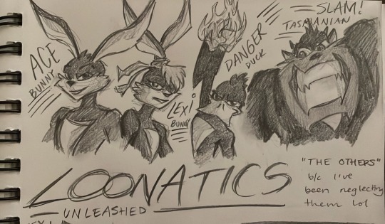
Finally drew the rest of the team!
As well as some mutated Loonatics. They’re having a Normal time:
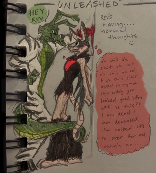

*click for better quality*
#I was too lazy to get out my watercolorssss :)#so iPhone image editor it is#works pretty well ngl#loonatics unleashed#rev runner#tech e coyote#tech x rev#lexi bunny#ace bunny#danger duck#slam tasmanian#mutated loonatics#my art#I actually can’t get over how adorable mutated rev’s design is#I gotta draw more of him
158 notes
·
View notes
Text


#Is this funny or do i have brain damage#i encourage someone to make this more legible using something other than the iphone image editor but I only have so many fucks to give
182 notes
·
View notes
Note
Hey, what programs do you use for your art? For drawing, editing, collages and stuff? 🤍
- For my art I use ‘Procreate’ on my iPad.
- For collages I make them often on my phone so I use ‘PicCollage: Photo Video Editor’. I literally only use the app for the section called freestyle, it’s just a white background that you can drop images on (sometimes I do it on my iPad with Procreate too.)
- I also use an app called ‘Magic Eraser Background Editor’ if I need to get rid of the background of objects/clothes etc, to make it a transparent background.
- I don’t really utilise other editing apps that much, any sort of editing I tend to just use the built in iPhone photo tools.
11 notes
·
View notes
Note
How did u put the gif in ur home page? i mean the moving stars. P.s do not mind the font
the font is my fave part!! so i actually did that on the app, when you go to your tumblr page in the app and enter appearance editing mode (click the lil painter’s palette 🎨 icon at the top right) you can click on your header and it gives you the option to choose an image. i have a folder for gifs on my phone, so i picked from there. if you’re an iphone user, there’s a built in folder titled animated and all of your gifs will automatically populate there even if you don’t intentionally have a gif folder set up. this gif in particular is transparent so it sits on top of whatever bg color i chose for my whole blog. when you first select the gif, it might not start playing the animation until after you save all your changes and go back to viewing outside the editor. you should also be able to re size it and move it around however you like (depending on the image size).
i think all of these same steps apply if you’re on a computer! hope this helps 💖
4 notes
·
View notes
Note
hiiii mel <3 i’m.. thinking of starting to write for nct.. mostly jaemin.. and i more or less have an idea for formatting but it’s been a really long time since i’ve had to do graphics for fic’s (like the banner and stuff!) and i was wondering if you had any tips for that? like where to find good pictures (solid backgrounds seem like the best choice for not clashing with the lettering, a problem i ran into unfortunately…) and also is there any particular place you get your fonts from? if you aren’t comfortable answering that (or any of this!) then that’s totally ok and feel free to just give general advice or ignore this completely :]
now i leave you with renjun… https://www.instagram.com/reel/C117-m9JGuo/?igsh=aXI1YmZ6M2YycHg1
hiii! under the cut!
so you've already got a good idea with using solid backgrounds for fic headers to make it easier for the text to show up! i source pretty much all my images from the groups/idols' official social medias. i just caution you not to take screenshots of say, instagram uploads, because this will degrade the quality of the image. either download it from twitter or wherehaveyou, or from an updates account like neocatharsis or wayvment here on tumblr! another word of caution: DO NOT DOWNLOAD TEASER IMAGES/PHOTOSHOOT IMAGES FROM CONTENT CREATORS WHO MAKE EDITS TO THE IMAGES, SUCH AS CHANGING THE COLORS, UN-WHITEWASHING, ETC., WITHOUT THEIR PERMISSION. THAT IS THEFT FROM OTHER FANS. updates accounts like neocatharsis and wayvment simply reupload the original images posted by the entertainment company/idol in the exact same form without making changes to them. editors make alterations to the image and that new image is their own creative work, separate from the original one posted. you need the editor's explicit permission in order to use their edited version as a fic header.
i do all of my editing on my phone for my fics (except for the thin section dividers that i use, which i make in pirated photoshop cs6 so i can get specific dimensions, 540x2 pixels, and make the gradients super quick in a way that i know how to do. there may be a super easy way to do this w an app on ur phone too, that's just how i know how to)
anyway, if i have a photo that i really like, that i just knowwwww matches with the image of the guy in the fic in my head or smth, that i just rlly want to use but has a busier background, sometimes i'll use the portrait editing settings on my phone to blur the background a little bit and that makes the text a lot more legible (i have a samsung but im 99% sure iphones can do this too)
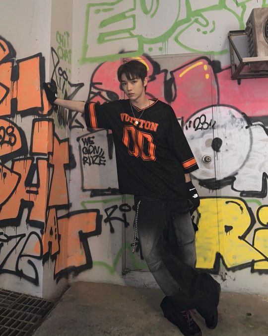
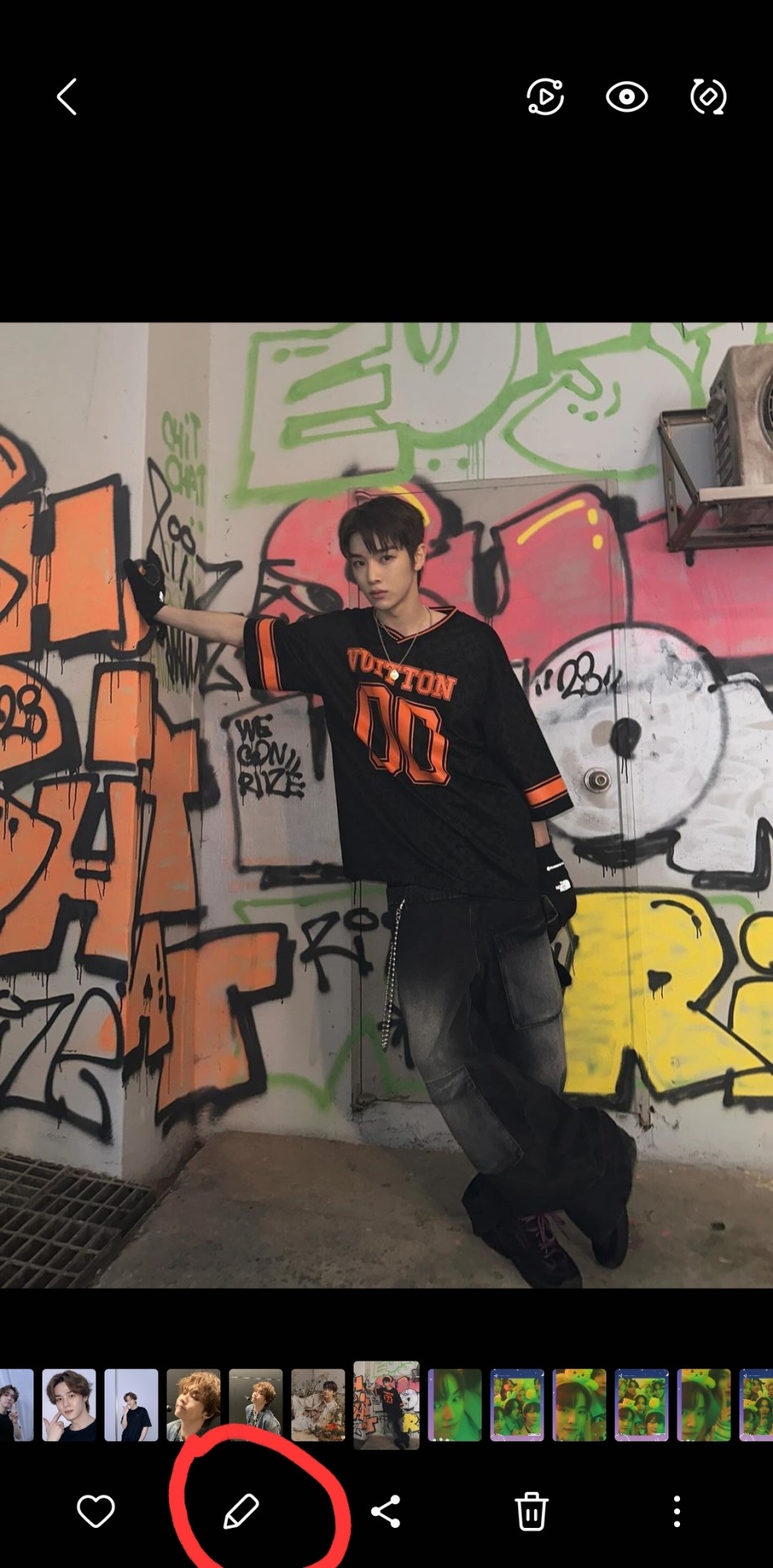
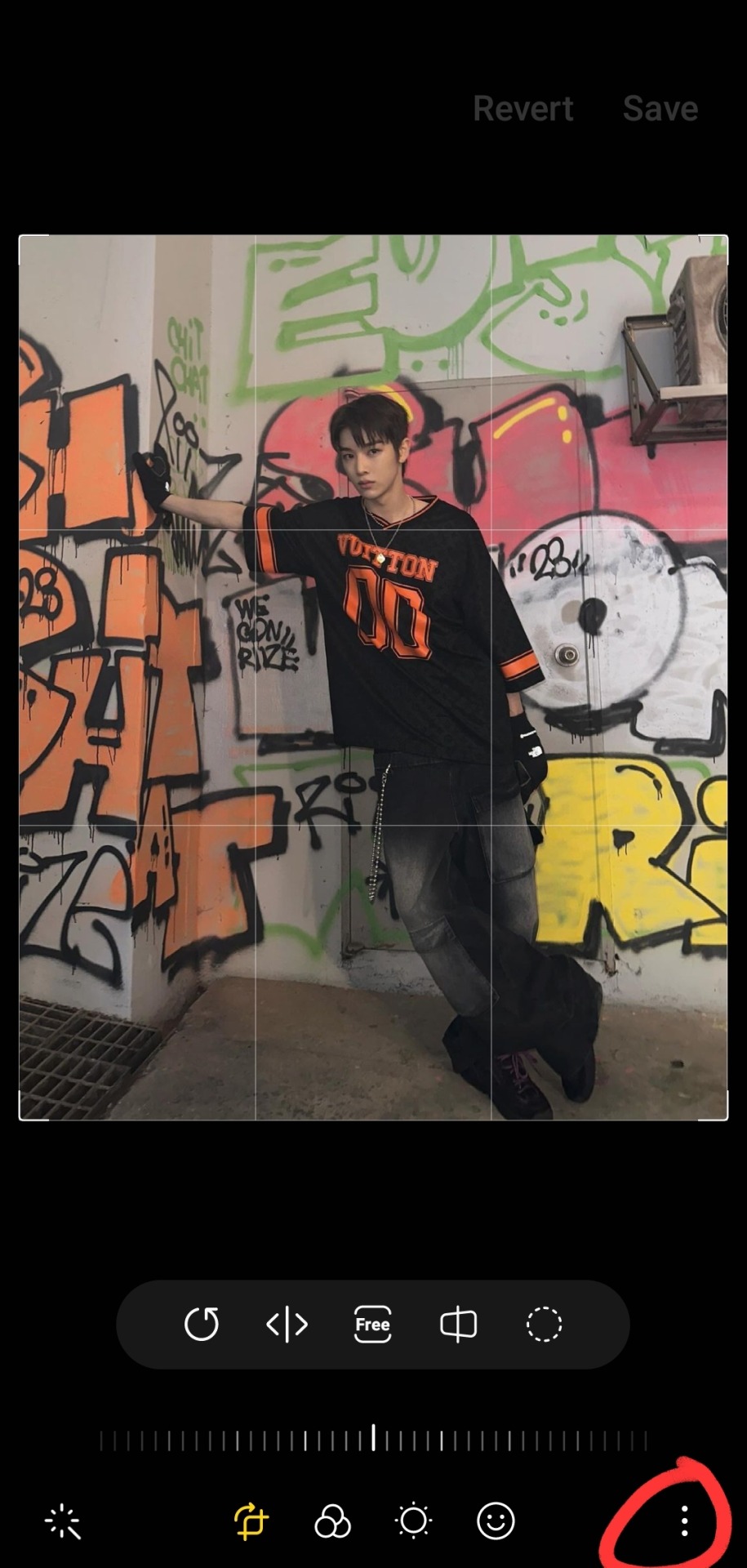
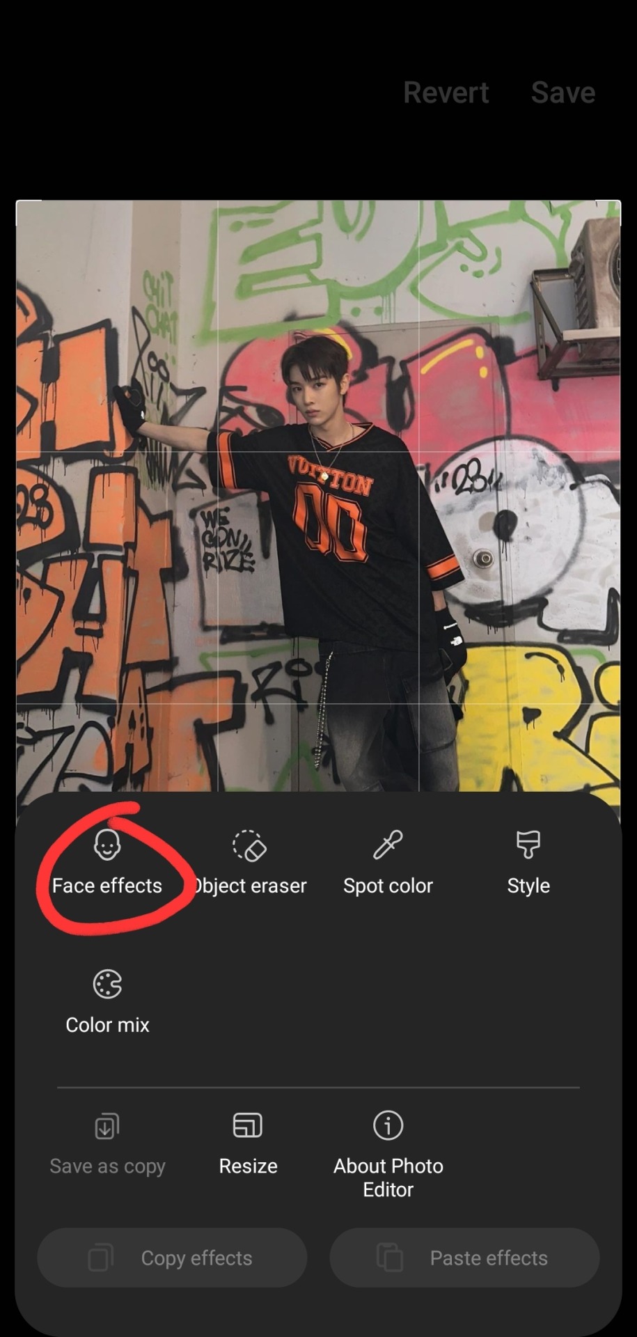
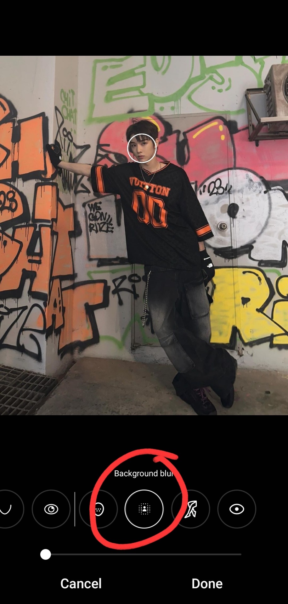

i typically don't bump it past 1 or 2, or the edges of the blur start looking a bit harsh, and i find that i don't really need more than this for the text to pop against the background anyway!
as for putting the text on the photos, i've the used the app phonto for years! it's completely free, doesn't put any watermark on your photos, comes with a bunch of fonts pre-installed, isn't super ad-heavy (it has a rlly small banner ad all the time at the top, and only shows u a skippable 10s ad when u save a finished photo), and you can download fonts from the internet to install straight into the app!

my favorite free font website is dafont.com, i literally will spend hours just browsing on there looking at fonts to download lmao. anyway here's how i find fonts for stuff and download, install, and use them with dafont and phonto:
once you have phonto downloaded, open dafont.com
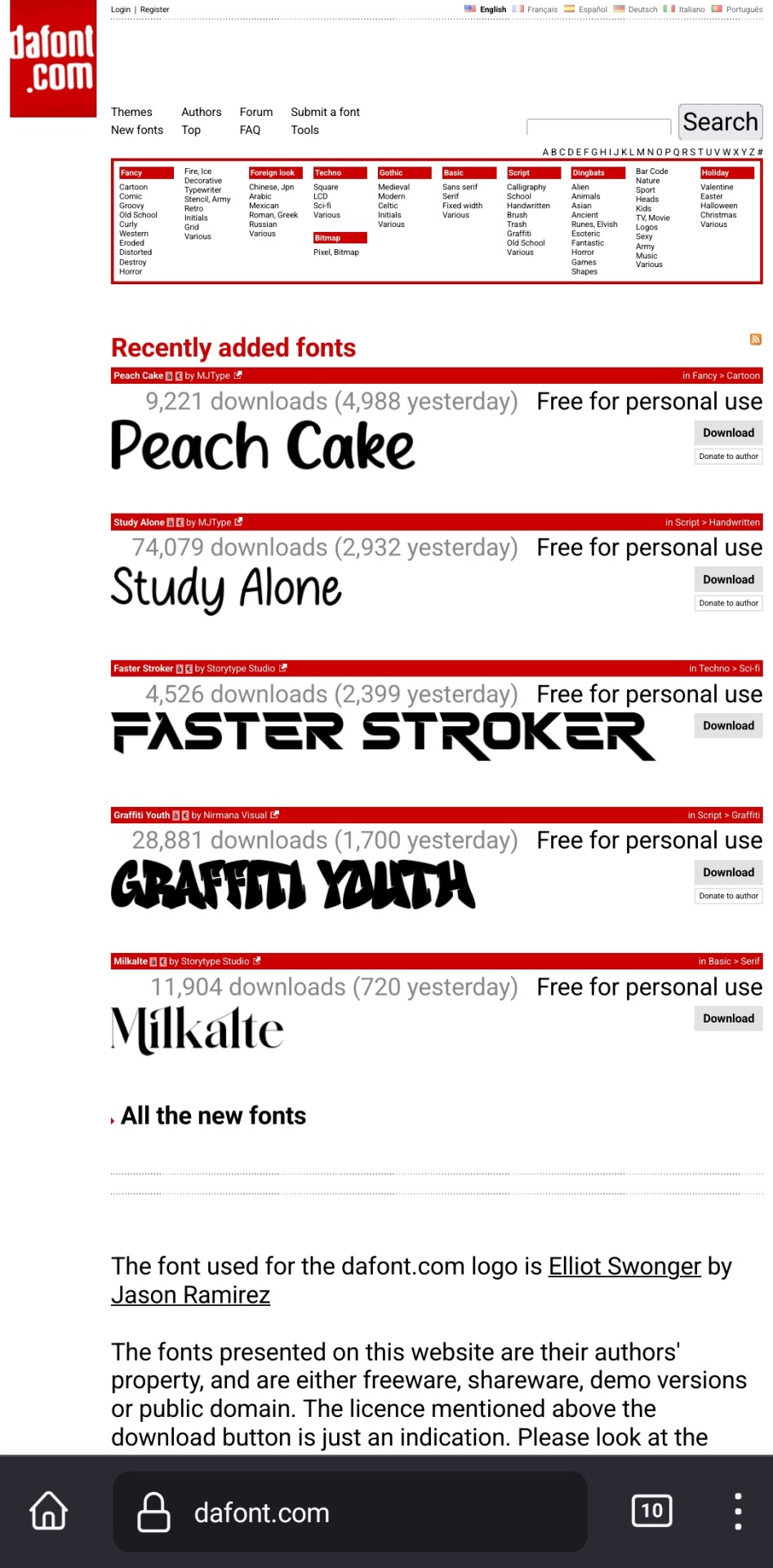
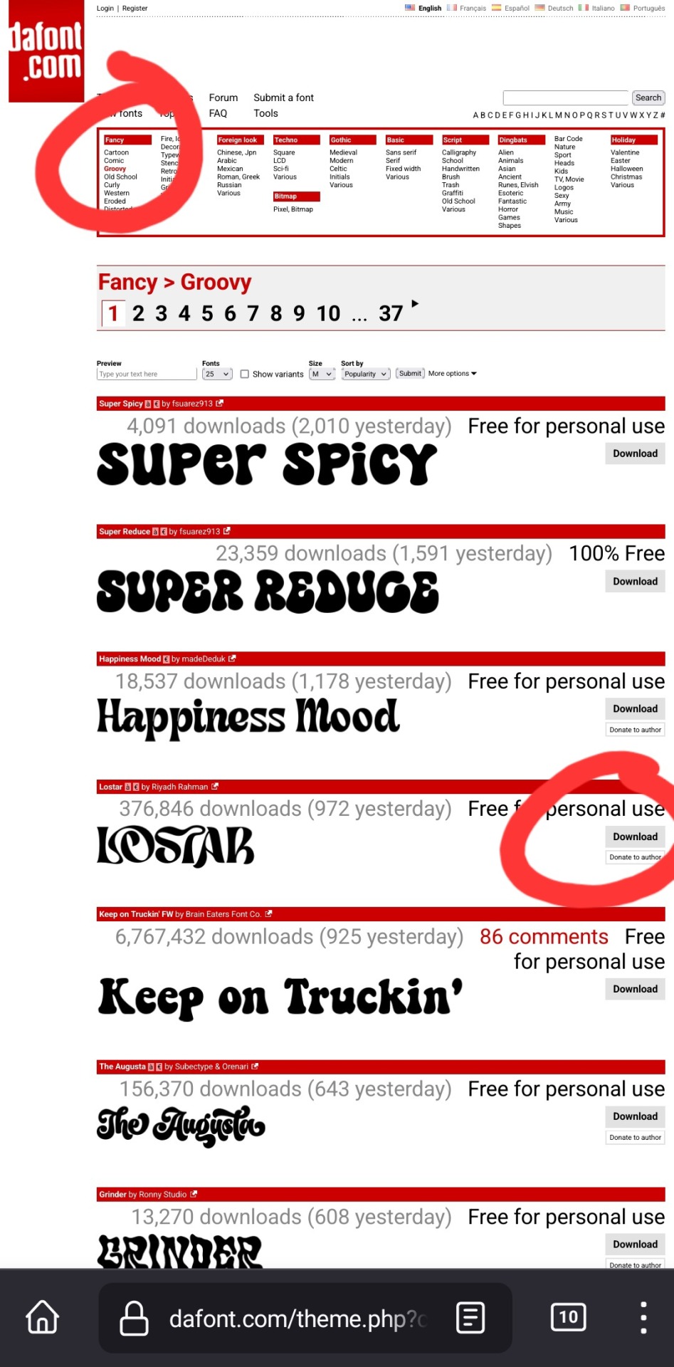
up at the top, it has a bunch of different categories of fonts. for this example, i chose fancy > groovy, and then on this first page, i liked this font called "lostar" (there's also a search bar up there, but it only searches font names, not kinds of fonts, so if you're looking for a groovy-feeling font and you searched "groovy," only fonts with the word "groovy" in the name would come up)
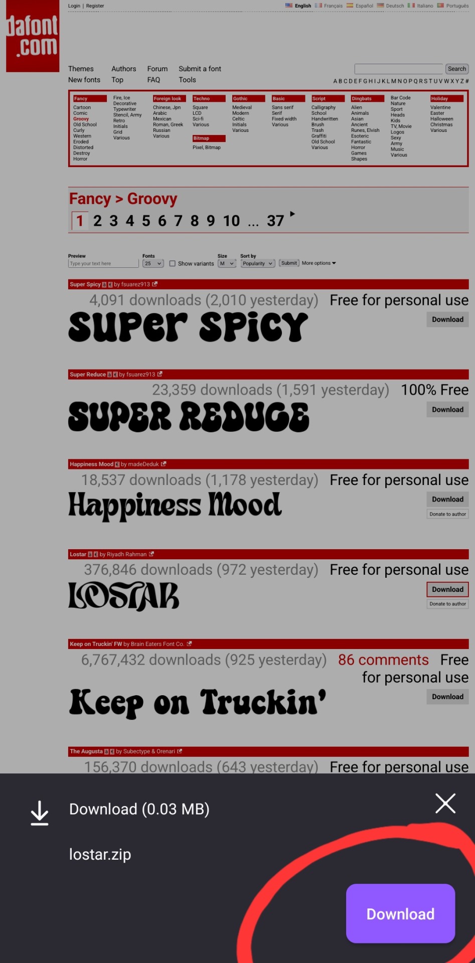
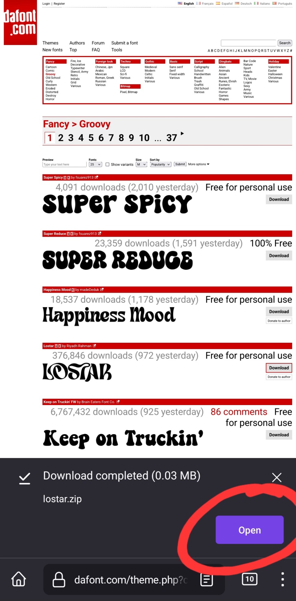
i then press download, and open in my browser (i use firefox btw, which is why it looks like this lol). make sure you're opening the .zip file with the phonto app (it opens directly into into phonto on my phone, you may have to choose to open the .zip file using the phonto app from several options, instead of your phone's file explorer or some other app on your phone)


in the phonto app, you have to click install, then install again (it gives you the option to rename it, but i just keep the original font name bc why would you rename it?).
that READ THIS.txt file is a message from the font maker, it's the personal use license for the font (most of the fonts on dafont.com are free for personal use ONLY, and these .txt files that are contained in the .zip files are notes from the font makers telling u what u can and can't use the fonts for. generally, as long as ur not a business, u should be good this is not legal advice, please read them. also there's usually little thank you notes from the font makers in here as well!)

click ok.


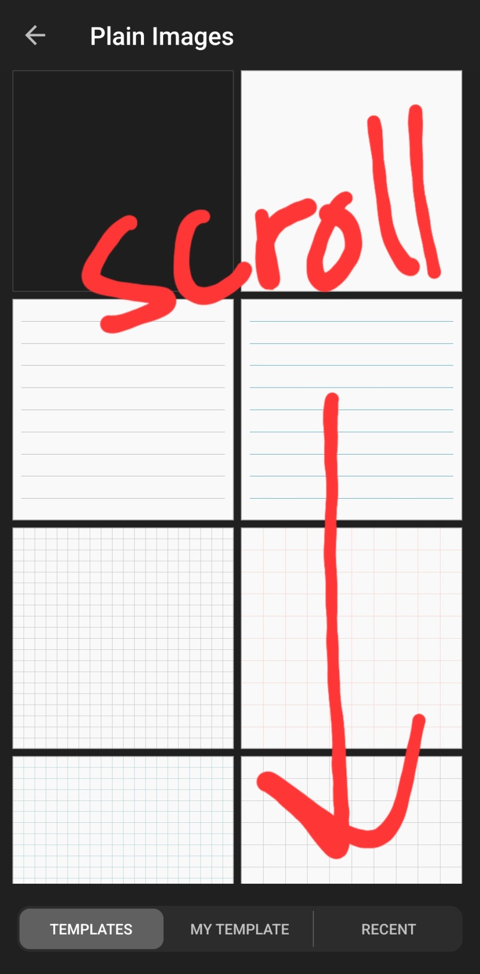

then you've got to slap some text on an image. you can choose an image from your camera roll, use one of their plain images, or open a pre-saved work-in-progress. for this example i used one of their premade gradients to make it easy
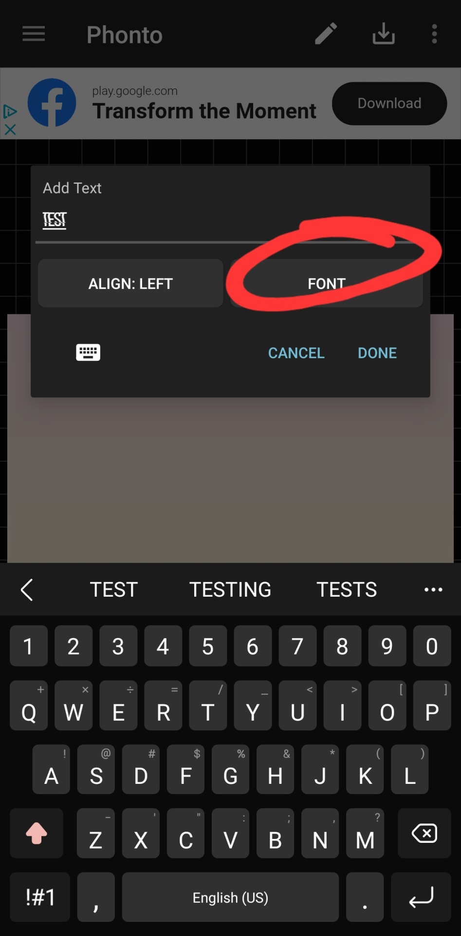
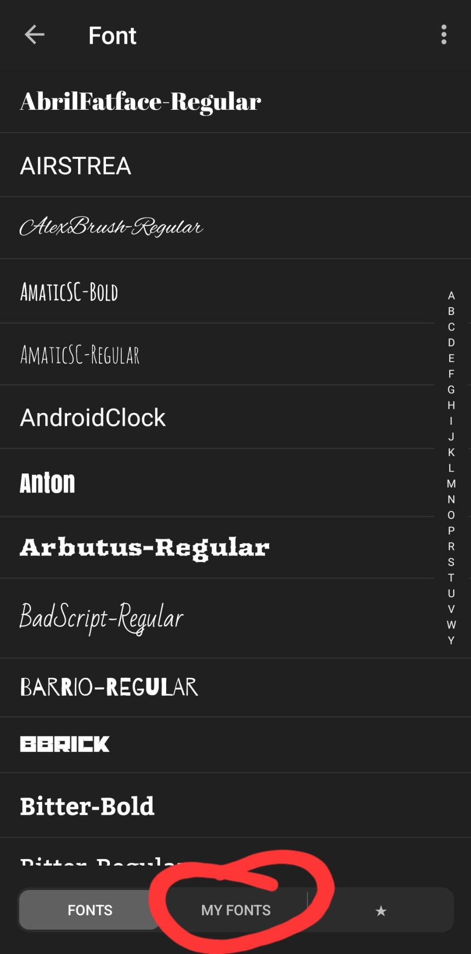
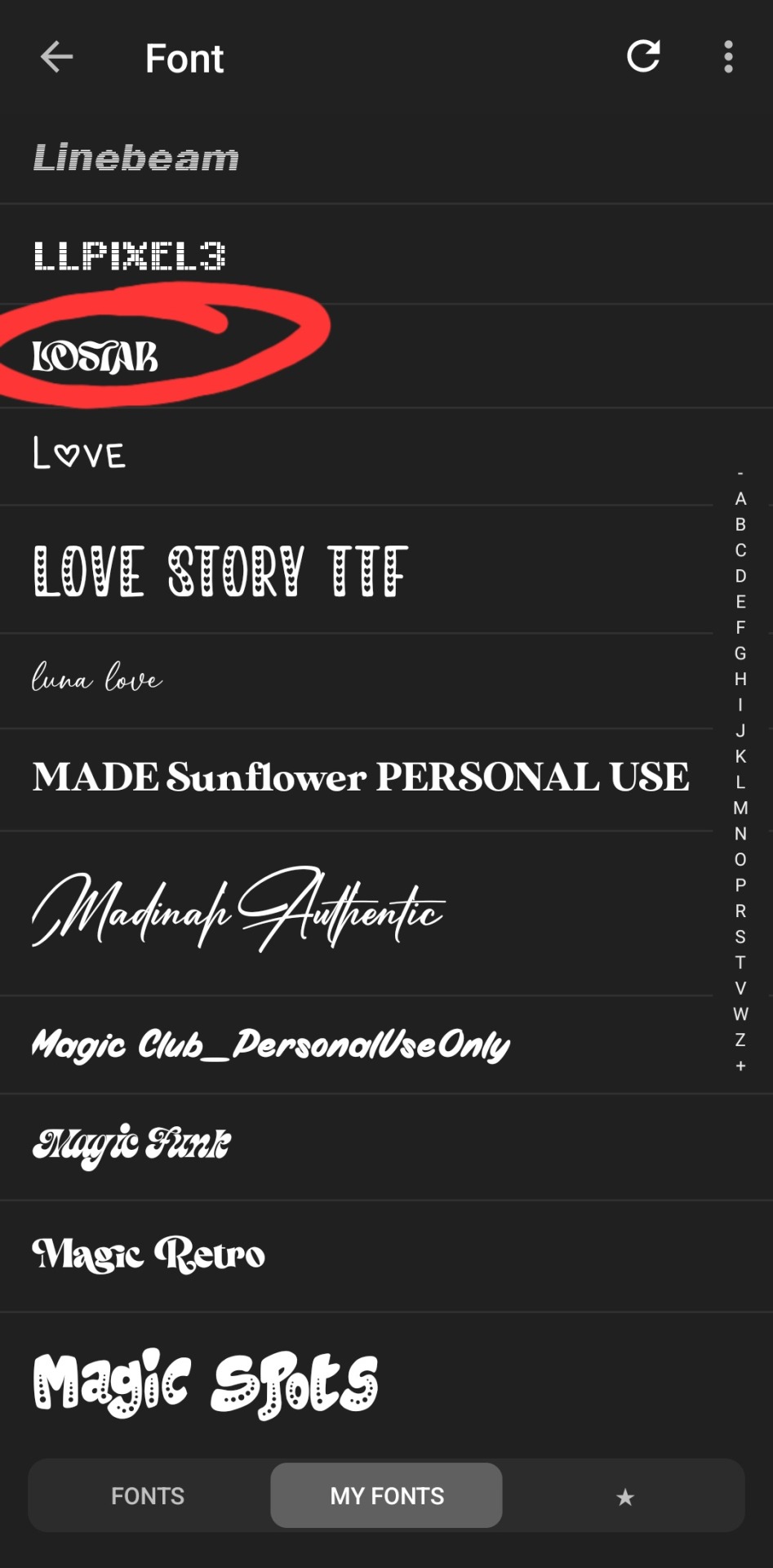
type whatever it is you want, click font. the left tab is the pre-installed fonts, the middle tab is the fonts that you've downloaded from elsewhere. here's the lostar we just got!

oh can't see it.
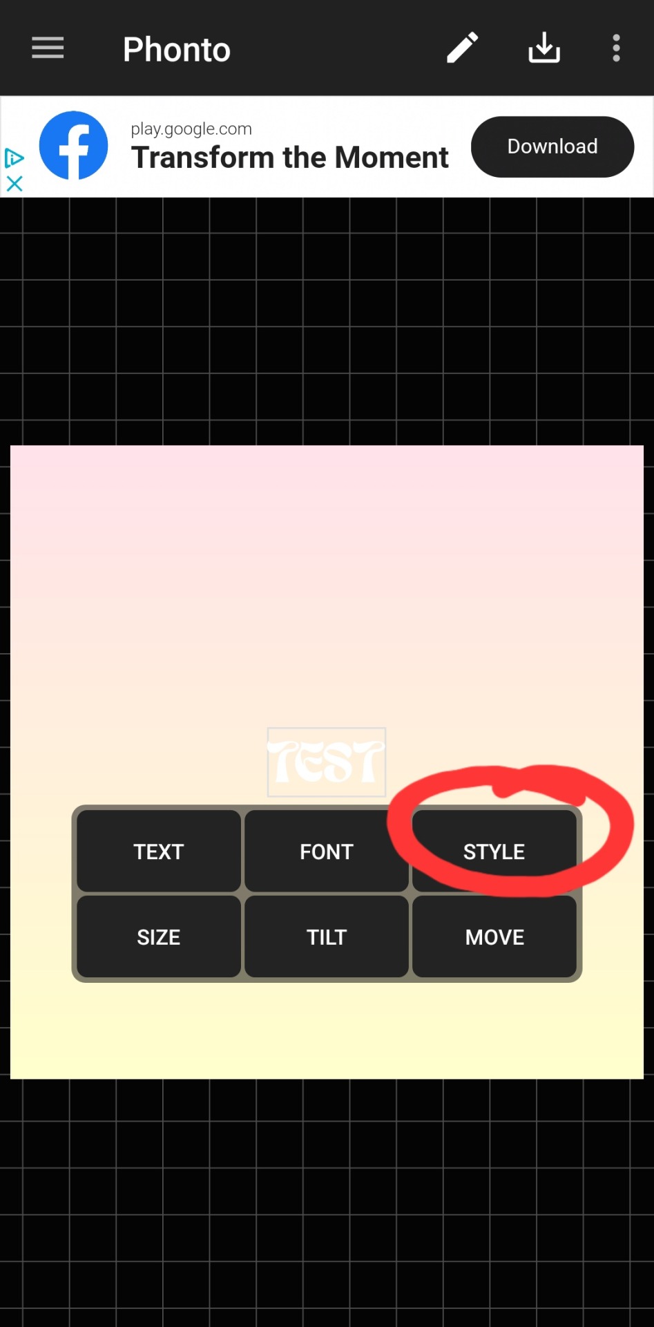
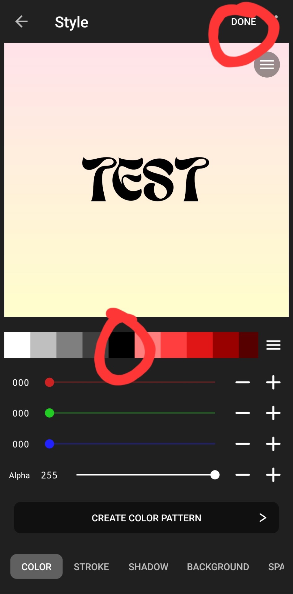

there we go! how fun! i'll probably use this in a fic header in the future. download button in the top right.
#hope this was helpful!#i don't mind sharing this stuff#i didn't invent fic headers or dividers or literally any of this lmao#answered#anonymous#talk#text#mine#writing tag#i suppose.....since its about my fics.........sorta...idk dude#also the renjun cheekies 😭😭 thank youuuu
3 notes
·
View notes
Text
CPC WIKI NEWS (reality check, basically)
We're the cpc wiki editors all over the place that gathered in CPC wiki server has things to pointing out I guess
First about naming conventions for images, I am still not sure how... but if relating to Frederick, I think we could find some ways... My idea of delegations based on likability is sound fire suggestions ^^ it's slow job but now not impossible to do! Also I am honestly in lose about naming as it's politic xD
I always hate politic stuff, I prefer to be biologist nerdy :3
I am very happy for the return of Peri, which gives light at the tunnel that we won't doomed for the Daily Pass! @cpcwiki
Hey, sorry I fell off the face of the earth for a few months… Life got busy and unfortunately some stuff happened that’s left me unable to really edit anymore, completely wrecking my plans of expanding more pages. I do wanna say, I know there’s been some concern about screenshooting Daily Pass being illegal? I wouldn’t be too worried about that. I think it’s more of a gray area thing, AFAIK it says that if you screenshot any episode in the app, even non-daily pass, and I’ve seen wikis for Daily Pass series that have uploaded screenshots post-series ending and they haven’t gotten in trouble. -> it's more about once series in DP, for most case of people (like me who using android phone, or accessing CPC on website as eben thou my PC is MAC...) - they can't screen shooting any panels of CPC webtoon anymore
DP does not prevent screenshotting -> for Apple only, likely
In the worst scenario as CPC truly goes DP and we can't do these impossible tasks.. At least people with iphone could still screenshooting CPC panels that necessary for wiki stuffs
So in nutshell, this gives some breathes for CPC wiki staffs to not obsessed with reaching the impossible task of images
Major character page editing espc about relationships basically the whole Plaids, then Pastel - thus the CPC
Leland is the hardest because he shrouded with the mystery and even the recent FP ep still not make sense of things - it seems if the CPC decide to make prequel story, I am gonna to hope it's Leland (fans in the past like it to be Aurelia, but she essentially a minor villain-turned to be supporter midway which her story likely only about her blood father and how exactly she got cursed) - that's not many engaging story for prequel unlike Leland - despite all the flashbacks so far and his interactions with everyone possible, he still shrouded with mystery. Yes, me and many others like @the-giggling-guava makes so many HC about Leland backstory but at the end it is just fanon theories that could be debunked ig
Close to the series finale, refreshment and transformation!
In the way of changing image and article preview there
Frederick

There's so many quotes in Frederick's page - but this one imho fitting the most as depicting him to be "the narrator"
"Just a few months ago, I would have never wished to encounter any cursed people outside of a story book. And when I did, I thought they were monsters at first. To be fair, they were attacking me... And yet here I am now... really happy to get to be their friends... I don't think any of that would have ever happened if I hadn't met Gwen..."
Prince Frederick of the Plaid Kingdom, also known as many aliases including called as "Sunflower" by his bullies, is the third prince of the Plaid Kingdom which formally engaged with the third princess of Pastel Kingdom - Gwendolyn. Initially against the idea of getting marrying with Gwendolyn because he both disappointed (as he mistaken Gwen with Jamie from the portrait, thoughts Gwen as haunted spirit instead) and scared (his first thought over Gwen is thinking her as a witch that will poisoned him with apple pie that she bakes after meeting with the real witch that poisoning Jamie) - to the point screaming in frustation to his oldest brother about his thought that Gwen is ugly. Gwen that overhears him feels so hurt and then running to the haunted forest which lets her to meet the CPC, the cursed royals that later on as the story progress - helps both Gwen and Frederick to healing from their trauma as living in their extreme abnormal family while having romantic relationship together.
this, I've shown in bare how flawed Frederick is - but he just human. I dislike anyone that can't understand that his mistake in the past which depicting clearly of his 'shallow' judgemental ice-cold Plaid Prince is just a mask. The mask that everyone in the CPC actually have, not only Blaine. Even sweet Gwen, the cinnamonroll sweet protagonist in her wrong take of selfishness - she hopes that she can skip to her happily-ever-after without the pain of hurt... When in reality, there's always gonna be "earn your happy ending". To anyone that wondering about what's CPC actual message is.. the means actually not simple notion of "Self-Love" - is always about the mask, our 2 faces
This page trivia literally the thing that make me fighting for the nail of preventing any character bashings in the fandom while stopping the infantilized of any characters espc the princesses... Everyone has flaws, mistakes, sins, shameful dark pasts or embarassed current self (like getting cursed) - but none depicted the character fullfily, it's more than that
this the hard job for us wiki editor, to put everything as objectively as possible - but I know I could manage! I just need more knowledges about things and understandings
I'm ceritified CPC deranged with no one yet breaking my record of rereading CPC... as rereading is so fun, on certain episode or scenes that we see again from another's person perspective.. we could get understandings of things. Nice example is Prez' backstory of getting cursed VS Whitney's backstory of nearly killed by someone that he accidentally cursed and meeting 'healer' like people which transform him

The Closing, new image for "featured image" - Whitney!
there's so many contrasting groups of the CPC fandom regarding Whitney which in nutshell : I am simping for Whitney so hard as he's so hot which also I want him to be happy so please LambCat make WhitPelnia canon so this make ZuTara ship-like to be canon in the story VS are you guys are blind? He's literally the person that cursing Prez which makes her miserable to transformed as werespider every month.. Prez never entitled to returning his feeling after all, and Prez clearly never wants romance w anyone
Both of the 2 groups are valid tbh, in extreme 'ship wars' of wanting Prez with Whitney VS Prez as a true single girlboss
^^ but no matter what, let's love Whitney as a character and a justiable hunk to be simping as that image for feature? Dang so hot as he embracing his curse of tiger stripes (followed with tiger hoodie) while putting one of his leg in bossy pose. Whitney is so fine and as he's truly redeemed - anyone that simping him won't be part of hypocrite dual standards that put "still in villainy role era but put on pedestal" + "infantilized the main characters and believe they won't do any wrongs"
IMHO in the engaging retelling of Fairy Tales as CPC is... Whitney, the ultimate villain in his story at the past that didn't care of anyone as long as he could get what he wants... Also ultimate perfect example of the heel-to-face turn (is a group of trope, as Leland the secret fairy tale lover know tropes) as from villain role in the past he becomes the good guys allies - the main supporter for the hero wannabe role, Frederick. In the awkwardness of him, he's the catalyst for Frederick to transform to be a better person (that he knows he can, but just not sure how) - in the name of him getting healed from his past trauma(s) that solidified as his inner child, make self-questioning about himself espc his relationships with his brothers, and the most important one to realizes that he likes Gwen - as it's become the rationale depiction of the strongest power in the fairy tales stories.. the power of love
All of that just from one meditation session from Whitney! Although like Whitney say, it's need to be repeated ahahah.
I like to expand CPC wiki pages by taking deeper about physchology, as boy it's giving birth of so many things! Plaid Royals Family dynamic for example, is easily an example of abused family that could happen to anyone and anywhere - but most didn't notice, espc the victims
There's so many great quotes in the CPC but imho Whitney's quote to Frederick, my fave ever quote in the series.. Is basically telling the life message for everyone.
"Pain is not a competition. The painful emotions you feel are valid, Frederick. But you do get to choose when you’re ready to heal from them and change your story."
literally just ep 145 of Frederick's monologue...
"...I wasn't the hero at all. I was the one responsible for all for all of her sadness... ...and all of her pain ...But now, it seems like I've been on the wrong side the entire time. --Except I can't really say that either, ...because even they didn't want me!!" When will I stop deluding myself with these stories... I'm not a hero or a villain. I'm nothing but a loser. Just like Blaine said."
"If I just sit here... ...that means I don't get to see her again. And I don't want that!!"
"I get to choose my story! And in my story, I AM the hero, and I'm gonna pull myself out and reach Gwen!!"
this such a strong (shounen) protagonist moment from Frederick, which make me thinking that CPC delivered as shounen manga which making him as the protagonist (MC, ML) with Gwen as his destined love interest (FC).. nothing change from the overall story? It's also checking out itself as anti-mainstream shounen by making following things:
debunked protagonist trope to be an orphan, and gives interesting plot twist that the main bad guy is his father all along with his mother is the red herring villain
make the love interest role to be more powerful as to not make her just standing there awaiting for the protagonist to come - but her mere existence is the motivator for MC
..etc xD
3 notes
·
View notes
Text
I’m an art student, animation second year. We just finished projects about AI and we’ve had many meaningful and insightful conversations, lectures and even debates on the subject. I have a lot to say so forgive the long text.
The TLDR is that AI in itself is not unethical. It’s the background it comes from (as mentioned), mainly what data sets it uses. It’s not wrong to make or use an AI, so the debate shouldn’t focus around the question of whether or not AI should exist, which is something I’ve seen a lot.
The longer story is that the world of AI is… complex. Shocker, I know. And I often see people debate the wrong subjects as well.
The way you use AI matters - learning how to formulate your prompts is an art in itself, and some very talented people create incredible artwork with prompts that run hundreds of words long, and take week if not months of iterations. The human factor is still there, and a redditor typing in ‘Superman’ into mid journey isn’t the same as someone using an essay to generate a complex and detailed image, and doing that over and over until they have the result they wanted. So it isn’t a question of being lazy or uninspired or unoriginal.
AI art is also not only visual. As animation majors we obviously spoke about the possibility for the Everyman to use AI to make their own show without the monopoly Disney has on the market, speaking about possibilities for inclusivity and representation the likes you’ve never seen before, but we also mentioned royalty free and personalized music you can use in your YouTube videos, or generated inhuman movement that can be utilized in horror, or how inbetweening can be a thing of the past with a good AI. The one big thing I took from these classes is that AI art has the potential to shatter the well guarded gates of the beginner-unfriendly art world and open up new media for people without experience, just as photoshop allowed many inexperienced users to draw or edit pictures in a near professional manner, or how iPhones let you take very good photographs without an additional load of expensive equipment.
The big issue that everyone seems to not be fully understanding is where the data comes from. If you download someone’s art without their consent and feed it to AI, that’s infringing on their intellectual property. If you feed the entire discography of Michael Jackson to an AI to generate a new song of his, that’s also a question of ethics surrounding a deceased artist, but it won’t harm his income obviously. A smaller artist with no legal team has no way of defending themself when their work gets stolen. If the AI gets their art as data, their style is now replicable with a simple click, negating the need for payment for commissions and thus denying them their rent, bills, groceries.
Of course the question of ‘what if the wrong people use it for the wrong reasons?’ has to have come up here for the reasons mentioned above. And that is a concern that’s been present since… well, forever. Stealing work is a cultural issue, not an AI issue. Movies or games or paintings or songs that are derivative of one another, stealing each others concepts and design choices, are a thing that has been happening for years. And we can all unanimously agree that stealing someone’s idea is wrong. When you see on Spotify that has a beat from someone else’s song you get mad if the original has less clicks.
But being inspired isn’t wrong itself; and neither is decoupage, which is what AI art, especially visual, truly is. You wouldn’t be mad at BBC for making a Sherlock Holmes show because it’s ‘too close to the source material’ (it’s just an example. Don’t come at me tumblr) and the source character is in the public domain anyway. Nobody is being harmed by the network’s choice of inspiration. You also wouldn’t scream at a stay at home mom that’s journaling for fun, and you wouldn’t argue that her cutting out pieces of magazine pictures are her stealing the work of the magazine’s editors, photographers, writers. She isn’t profiting from that work, and she’s also not taking the money away from the magazine.
The approach of the non-art public to how artists use reference is also skewed, but that’s a whole new conversation for another day.
With both of those ideas in mind (the data sets can consist of material that wasn’t taken consensually thus harming the artist, and AI art itself isn’t necessarily lazy or bad) I feel like the debate on AI art should in general shift to legality. Most other art forms like drawing or movies or dancing or music have rather obvious, but still often blurry, lines that shouldn’t be crossed, and more importantly, court cases that you can reference. You’ve had musicians suing each other over stolen songs before and you have an idea of what would be considered stealing here. AI needs to be debated with the question of ‘what data set did this program use and was the idea for the work original enough by this and other industries’ standards’. This entire section of the art world doesn’t have that quite yet, but we’re getting there, with recent developments in the suings of multiple AI’s.
This is not a settled matter, and I don’t think we should be treating it as such, nor as if it’s the end of the world. To be entirely clear, just two months ago I thought AI was the devil also. It was these classes and word from people that are considered professionals in multiple mediums and art circles that changed my mind and opened me to the actual problems of the situation. My lesson was that I jumped to conclusions too fast. I now like to equate this problem to (even though I’m aware it’s not the same) the birth of photography, or photoshop or blender/3D. Painters were worried photographs would put them out of jobs, and sometimes that was true, but that just means the painters could use photographs for their own work as well, capturing more detailed reference, or choose to deviate their art from photography with style choices not present in the realism of photos. When 3D started being introduced people were scared animators would lose jobs, because why would you hire a team of people for a complex shot when you can render it out with one person putting key frames in instead? Well because knowing how to use that program is fucking hard, and there is a charm to the style of a 2D animated rotating camera instead of a 3D shape.
Think of how you can use AI ethically and without stealing someone’s food money, while still doing your thing and committing to your style. Sometimes it won’t be possible, because there is no AI that would be usable for your purposes, because the data set is always limited and focused on a specific purpose. Sometimes the idea that you have is just not possible to generate. That proves that AI won’t ruin the world, because it can’t do anything without human input, and it can’t make what it doesn’t know. It’s not a scary boogeyman and we should all remember that.
watching the AI art debate thing on twitter is a special kind of torture if you’ve ever attempted any irl political action in your entire life because it’s a train wreck of people trying to enact a movement against something and methodically picking every worst possible argument you could hope to make, constantly shifting the battleground from concrete territory you can actually Win into highly subjective areas that nobody in the conversation can ever decisively win
“all AI art is ugly” is a pointless cul de sac you have to re-argue whenever anyone makes even a half-decent picture, “any commercial art AI should have to demonstrate that it’s only working from public domain artworks” is material, practical and doable. “all AI artists have no passion” is a great way to give those people an avenue to argue you’re just being cruel and bitter (or for AI artists who also use traditional mediums to flat-out refute), “any art produced commercially by an AI should have its prompts recorded so we know they didn’t invoke another artist/their IP to make it” is a thing you can make laws and regulations about. “AI art is soulless fake art unlike Real art from Real artists” gives your opponents the easy opportunity to paint you as a backwards out of touch academic snob disconnected from everyday people (and uh, as an academic snob myself, good luck decisively solving the “what is real art??” debate for the first time in human history), “an AI can’t have any kind of conversation with the commissioner to understand their vision, it can’t truly understand what its making so feedback and precision won’t be on par with a real human, so if you want something accurate and personal it could be an inferior service for your money” is a tangible concern that anyone looking to buy art should be aware of, whether or not an AI can make a pretty picture is less important in practical terms than whether it can make the exact picture the person buying wants
you can spend all day arguing that as a human artist you have Soul and that your work has Life, or you can argue that as a human artist if the client wants their fursona’s right arm a little more to the left or for their expression to have more sassiness in it then you can just do that for them instead of arguing with a robot over what an arm is or the complexities of anthro marmoset facial features
#essay moment#ai art is complicated and I have feelings about it#I still hate ai art bc data sets stealing waah#and often the style just isn’t my thing#but that’s my choice#I don’t want romcoms because I don’t like the style it doesn’t make the genre evil#I understand I kinda strayed from the point of the original post but this is a complex issue I think so. ya
20K notes
·
View notes
Text
Apple is well known for its simple design and excellent performance. Simplicity and high performance are the main reasons that all web designers prefer MACs as their working computer. They are many tools that are built to stay entertained and being highly productive. Mac acts as a great platform for making a great development because of its popular apps that are easily available to download. Here is a list of some popular applications that are beneficial for web designers and developers. Streamline Your Workflow With Must-Have Mac OS X Applications Website development is a time taking process, and creating even a single one requires dedication and time. And so, web developers offering iPhone Application Development Services usually have to make more deliberate efforts and spend a lot of time, in order to successfully complete the development process. Fortunately, there are numerous applications available on the web that help web developers to better web development productivity for every platform. In this post, we will discuss some of the must-have OS X Applications that developers should consider adding to their web development toolbox. Xcode Xcode has everything that you'll need to build great applications for Apple's devices. You can download it for free from the Mac App Store. It's a must-have application for developers who're serious about app development. Xcode enables developers to design, code, test and debug their apps in a unified workflow. It boasts exemplary features Xcode IDE, Swift language, iOS Simulators and many more. Espresso Whether you're working on a small or a large-scale project, Espresso can boost your workflow with the help of its rich set of features. It's a web editor that provides developers with a better development environment. It boasts a Navigator that sketch out your documents hierarchical structure. No matter, how complex your code may be Espresso can help you manage it without any hassle. This application comes packed with several programmer-centric features that helps web professionals to have better control over complicated documents. It's available for a 15 day trial period, and after the trial period is over you can choose to purchase it for $75. Sequel Pro MySQL is one of the most popular open-source database, which is used by a number of websites for storing their databases. In case you're a MAC OS X developer and want to manage databases in MySQL (on your local or remote server), then Sequel Pro is the right application for you. This is an easy-to-use, native Mac OS X application, built with Cocoa. Inlets you create, export, import, filter databases, and execute MySQL queries via your app. ImageOptim Sometimes the size of your app can become pretty heavy – when it comprises of plenty of images. ImageOptim is a great application that makes it easy for the developers to cut down the app's size. Additionally, you can also use ImageOptim to shrink down the size of your images. This will eventually help to lessen the time that images take to load. Cloud If you're a developer and working on any project, then you might want to share your work with your team. Cloud application makes it extremely easy for web professionals to share their files online in the fastest way. Once you've uploaded this application, you can easily share anything like the screenshots, documents, code snippets and so much more for free. It even helps you keep a track of how many people have viewed your file. Firebug While working on your site's web page design, Firebug renders the ability to make changes to your code and view what happens once the changes are made instantly. With the Firebug extension added into your browser, you can find the defined elements, style them and then tweak them to perfection. Dropbox Next on our list is Dropbox, an ideal application for storing or keeping a backup of your files. Often when working on Mac OS X web development project, there are chances that you might accidentally modify or delete a file.
But, what if you need the file for reference again? A viable option is to sync your documents and files with Dropbox. And so, in case you got any of your file or document deleted, you can easily restore it (remember that the deleted files are kept for 30 days). Keka Most of the file packages that we want to download are often compressed either in zip, or rar formats. Though Mac system comes with a built-in feature that helps extract the different file formats, it is limited. Keka is an open-source Mac OS X app – that can be used for the compression and extraction of any files. It primarily supports three main file formats such as zip, rar, and tar. Other than that, the Keka application also compresses several other file formats like Gzip, DMG, ISO, etc., and can extract EXE, PAX and ACE file formats as well. IPhone Emulator Nowadays, the need for developing a mobile-optimized website has become inevitable. More and more people today are using their mobile devices to access the web, and thus you certainly require some tool that tests your site optimization on mobile platforms. You can test your site by accessing it via a mobile phone and tablet or just use a simulator application such as the iPhone Simulator. Alfred If you're a developer and want to save your time that you otherwise spend on finding files and information on your Mac, then Alfred is the perfect application for you. It's a highly recognized Mac OS X productivity app that makes finding files and information become a breeze. That's not it! It even helps to make you more productive, by bringing up hotkeys, and several essential file actions easily accessible. Developer Color Picker Every web project involves a lot of work, and thus remembering color values may make you rack your brains, especially when you're using different color schemes in your project. This is where Panic’s developer color picker comes to your rescue. It lets you copy the declaration of color in formats such as “NSColor” and “UIColor”. Coda Coda is the major reason for web designers to switch over to Mac. This intuitive app of Mac makes the web development workflow to move like a breeze. The main purpose of this application is to partition the website building process for better team collaboration. This comes for an affordable cost only. TextMate This broad text editor application is purposely designed for Mac Computers. This clearly explains the working functionality of text editors. It is the must-have the application of all web designers. Think This remarkable application let to focus on the task that is in the current process. The “Illumination Panel” of this application replaces Mac OS dock by creating a numerous application, which is preferred by the user to focus on. This is a perfect application for those who get easily distracted by other applications like Facebook, Twitter, Emails, Instant messaging, Instagram. Paparazzi This basic tool of Mac OS X enables the user to capture screenshots of whole web pages without any external editing. Paparazzi rely on Webkit Framework and Cocoa API and written in C. This application acts as a great tool for web designers who frequently need to seize the web page for representing design mockup presentation or to fix simple web graphics on the web page they are crafting. Aquamacs Emac Aquamacs Emac is a robust text editor of Emac and also an extended version of Original Emac text editor. This comes with a new look of Aqua and renders a look-and-feel comfort in order to make the application blend right into Mac OS UI (User Interface). This Aquamac Emac editor is great to the web designers who repeatedly work with HTML, Java, Python, C, C++, PHP, Ruby, Perl, LaTeX and many more. Nvu This is a high-performance WYSIWYG editor, which offers better What You See Is What You Get effect. This application is built around rendering engine of Mozilla based browsers called Gecko. Also, this application runs over Mac X 10.2.8 and other higher versions which can make the web design even better for beginner level web designers.
Smultron This gratuitous text editor is the best substitution for a default text editor that comes along with Mac OS in default. Smultron is easy to use and also this text editor is versatile. This application is meant to use in Mac OS X Leopard 10.5 and can also be used as a basic text editor to complete Script and HTML editors. Scribus This is the open source application for crafting high-quality page layouts for Linux and Mac users. Scribus is the most intensive aspect set of impressive and clean GUI. The publishing features of this colossal application includes Editing, Separations, CMYK color, ICC Color Management, and stretchy PDF Authoring characteristics. Legacy Apps: Not Available Anymore Xee This straightforward Mac application let people browse images directly with ease. This is the best replacement for existing Image viewer applications that are pre-installed on Mac Operating system. It works in a smooth and fast manner by using very little system resource as well. The application offers a load of shortcuts and also a streamlined user interface to represent the list of available features. Seashore This is the most popular image editor that completely uses Mac OS X's Cocoa Framework. This fully fledged image editor, which offers Photoshop a run to for gaining money, renders loads of features to all its end users. The characteristics include Gradient, Textures and other anti-aliasing options for tools like brush and text. Other than those options, it also supports the alpha channel and editing over multiple layers. This impressive image editor is on the budget for all Mac users. Wrapping Up! If you're a developer and looking for Mac OS X applications that enables you to streamline your workflow and increase your productivity, then the aforementioned list of top Max OS X applications will definitely help you accomplish your objectives. Do you have any Mac application that you can’t live without? Have you tried any of the above-listed applications? Please do share your experience with us! We would love to hear your comments!! This is article is contributed by Addison Cohen & Raji Chidu. Addison Cohen is a blogger cum iPhone app developer. At present, he is employed with Appsted Ltd, a renowned company delivering top-notch mobile apps development services. He loves sharing the latest information on mobile app development processes. Raji Chidu is a web content writer in ChennaiWebDevelopment and all time blogger who loves to expose her thoughts and information founded by her day to day life as well as surfing from the internet. She enjoys writing content for famous blogs. Article Updates Updated on June 2019: Fixed broken links and updated to HTTPS links.
0 notes
Text
My Biggest Small Gripe With Apple Notes
And (Obviously) Objectively Correct Principles for Paragraph Spacing
I think Apple Notes might be one of the best pieces of software Apple ships. They’ve nailed creating a simple app, with great ease-of-use, that still has more powerful features hidden, for those who want it. There are a couple of reasons why I don’t use it much, though:
In general, I like to rely on third-party services.
I also like the portability of Markdown, and being able to use several apps on the same files.
I like that, in NotePlan, I can use the same app for notes and tasks.
However, Notes has numerous nice features, like:
Good apps on both Mac, iPad and iPhone, while also being accessible on the web
Pretty good collaboration features, with shared notes and folders
More than enough options for formatting

In addition to these, you have to-dos (that can sort) and tables.
Collapsible headings
Embedding of files, photos, and illustrations (especially good with PDFs)
Audio recordings
Links between notes (no backlinks, though)
Tagging and smart folders
Quick notes (which Apple, selfishly, reserves for itself)
Math notes.
So I’ll gladly recommend it to most people!
However, as most Apple software, Notes is pretty inflexible. If you don’t like their choices, you’re out of luck. And I really don’t like their choices when it comes to paragraph spacing.
My paragraph spacing commandments
Have a look at this screenshot from Notes:

I really don’t like the lack of spacing around the headings, and that it’s difficult to tell that there are two separate paragraphs below Heading 1.

A way to fix this, is by adding newlines before headings and between paragraphs. But I think this both looks a bit inelegant, and is annoying to have to do.
So, I’ve made four commandments, that I think every text editor should adhere to. (And one extra, for Markdown editors.) Apple absolutely isn’t the only sinner. But most(?) other apps can at least customise these things!

The image above, is an example of what I want to see in terms of spacing1 – and none of it is created with newlines.
1) Paragraph spacing must be larger than the line height
This makes it easy to see that there are two separate paragraphs below Heading 1. To avoid complexity, if the app has an option for adjusting line height, you could have the paragraph spacing be a multiple of the line height.
2) There must be a separation between hard and soft returns
Many text contexts on our computers distinguishes between hitting Shift+Return or just Return. For instance, in some chat apps, Return will send the message, while Shift+Returns creates newlines.
In most text editors, Return creates a new paragraph – and usually a new regular body paragraph. (So if you were writing a heading, the next one would not be a heading.) However, if you are writing a list, it creates a new list element. This is a hard return.
However, if you hit Shift+Return (or Ctrl+Return in some contexts), you will create a new line within the same paragraph. This is a soft return. It can be used like this:
This is the first list element.
This is the second, which goes over two lines.
If I had made a hard return after “second”, I would have created a new list element (3.) instead of just a new line. This also works in headings, etc.
Adhering to the first commandment can be annoying if your app doesn’t support soft returns. Because occasionally, you want a new line without the extra paragraph spacing. For instance, while writing things like this great pop song by the Norwegian artist Astrid S:
From everything to nothing at all. From every day to never at all. And everyone says that I should be sad. Is it normal that
I don’t feel sorry for myself, care if your hands touch somebody else. Wouldn’t get jealous if you’re happy. It’s okay if you forget me. I don’t feel empty now that you’re gone. Does that mean it did mean nothing at all? But I’ll tell you what the worst is: It’s the way it doesn’t hurt, when I wish it did.
You need soft returns to be able to separate between line changes and new parts. Supporting these on mobile apps is a bit more complicated – but as not everyone needs it, I like the approach by the excellent app Paper:

The toolbar is totally customisable, so you can add the soft return if you'd like to, and place it wherever.
Apple Notes does have this distinction. But you require a keyboard to type soft returns – and it’s less useful when they don’t have paragraph spacing.
3) Scale paragraph spacing to heading level
To help with distinguishing heading levels, it’s a good idea to give more paragraph spacing to level 1 than level 2, etc. Here’s my example from earlier, but with added pixel values:

In this example, I’ve used 16px between regular paragraphs, and also below headings.2 And this leads me to the next commandment:
4) Make sure headings are closest to the content it applies to
Notice that I’ve added the scaled spacing above the headings, while keeping the spacing below them the same.

This screenshot is from Ulysses. As you can see, they do allow for spacing scaled to headings, but they make a different mistake: They apply the same spacing above and below. This doesn’t make sense, as headings explicitly apply to content below it. So standard information hierarchy theory dictates that it should be closer to that paragraph than the one above.
However, Ulysses does adhere to a bonus commandment, only relevant to Markdown editors:
5) Align Markdown headings, by putting the syntax in the margin
I prefer having the Markdown syntax being shown, but muted, as I don’t like it when the text jumps around (when showing/hiding automatically). But if you don’t put the # symbols in the margin, the headings won’t be aligned with the rest of the text:

However, as this takes up extra horizontal space, I like that I, in Paper, can align the headers on Mac and iPad, while not doing it on mobile.


With and without aligned headers. It takes up far too much space – especially on my Mini phone. As it doesn't look optimal without the aligned headers either, I often use the (great) preview mode while editing on mobile. This makes it, more or less, a rich text editor (while the file remains .md).
Fixing Apple Note’s spacing
I’ve made a mockup, where I’ve adjusted the spacing in Apple Notes. I’ll show the default spacing, my adjustments, and default spacing with added newlines.
In general, think the default line height in Notes is too tight, and this also makes the visual difference between the latter two smaller. So keep in mind that the middle option would also be functionally easier to use, as you don’t need to add space yourself.

In addition to higher line height, I'd also increase the difference between the headings a bit!
Defaults and customisability
Now, I’m not saying everyone has to have the same preferences as me – so lots of customisability, like in Paper, of course has its value. And I also genuinely understand if many just don’t care! But I really think adhering to these commandments makes for the best default.
What do you think? Could it be that the world-renowned design company is correct, and I (a nobody, who’s not even a designer) am wrong? 😲
But I’m not saying proper designers can’t make it look better than I can! ↩︎
Technically this is done by saying that everything should have 16px margin below (and nothing above), and then giving the headers different top margins. ↩︎
0 notes
Text
Google Pixel 9 — Done right again?
The Google Pixel 9 is a straightforward choice — it’s a phone that’s simple to understand. When you purchase the Pixel 9, you’re essentially getting the best features of the Pixel 9 Pro, but at a lower cost. It shares the same processors, two of the same cameras (with the Pro having an additional one), and the latest AI features, all without compromising on the essentials just because it’s not the Pro model. No other phone manufacturer offers such a clear progression from the base model to the top-tier option.

With the enhanced durability comes a completely refreshed appearance for the Pixel family. The previous camera bar has been removed and replaced with what I call a ‘camera pill,’ which doesn’t span the entire width of the phone’s back. In person, it looks much better than it did in the early leaked images. The Pixel 9 still maintains its unique design, standing out from the asymmetrical, corner-positioned cameras commonly found on iPhones or Galaxy phones. However, this is the most significant style change in years since the Pixel 6 introduced the current Pixel design language.

What do you miss out on if you opt for the Pixel 9 instead of the Pixel 9 Pro? The Pixel 9 comes with 12GB of RAM, which is the same as what you’d find in a Samsung Galaxy S24 Ultra, but the Pixel 9 Pro bumps that up to 16GB. With the increasing importance of AI features in new phones, having extra RAM could be crucial. These AI capabilities likely require a substantial amount of RAM, potentially more so than an ultra-powerful processor.
The Pixel 9 also lacks a zoom lens in its camera array, unlike the Pixel 9 Pro. However, it still includes the same 50MP wide and 48MP ultra-wide cameras as the Pro version. You’re not just getting the same pixel count; you’re getting identical sensors. This is something neither Apple nor Samsung provide, as their base models don’t share the same cameras as their top-tier versions.
The Pixel 9 isn’t just about its cameras, although they do appear to be a significant upgrade from the Pixel 8. This device also highlights Google’s latest AI initiatives, with Google Gemini looking particularly ambitious. Should you be concerned about AI on your phone? Not just yet, but the possibility is approaching.
Google Gemini on the Pixel 9 represents Google’s first attempt at multimodal AI. This means it won’t only respond to your voice commands or typed inputs; it will also analyze images and audio, answering questions based on what it sees and hears. For instance, Google claims you can snap a photo of your fridge’s contents, and Gemini will suggest recipes using the ingredients you have on hand.
Similar to earlier Pixel models, the Pixel 9 can modify your photos. Some new features, like the Add Me function in the Pixel camera, seem particularly useful. As a parent, I often found myself missing from photos because I was the one behind the camera. With Add Me, the photographer can take a picture, then hand the camera to someone else and step into the frame. The other person takes another shot, and the Pixel seamlessly merges you into the original image, as if you were all together from the start.
Some of the new features border on dubious AI. The Magic Editor now includes a ‘reimagine’ tool, along with a Pixel Studio image generator. While these tools make it easy to alter images or create entirely new, artificial photos, their usefulness is questionable at best, and they could potentially be misused in harmful ways.

Is the Pixel 9 worth purchasing? That largely depends on the camera’s image quality and how much you value new AI features. AI is already deeply integrated into this phone and is only going to play a bigger role. Initially, the new Pixel-exclusive Screenshots app doesn’t seem appealing to me, but if it turns out to be useful, I might find myself taking more screenshots and increasingly relying on AI for solutions.
But why limit it to screenshots? Why stop at phone calls? Eventually, Gemini AI could expand its understanding to much more of the world around you, especially as it has become a multimodal tool. Over the next seven years, Google promises major Android OS updates, Pixel feature drops, and security patches for the Pixel 9. I expect that the most compelling and practical AI tools of today will evolve to become integral components of the entire Android ecosystem in the future.
0 notes
Text
The Cut: The Social Lives of the Teens Who Don't Have Phones
SUBSCRIBE
Menu
PARENTING MAY 30, 2024
The Last Kid in Ninth Grade Without an iPhone
They’re not in the group chat. But they’re not social pariahs either.
By Liz Krieger, freelance writer and editor

Photo-Illustration: The Cut; Photos Getty Images
This article was featured in One Great Story, New York’s reading recommendation newsletter. Sign up here to get it nightly.
Greta always knew she would have to face her first year of high school without a phone. Her parents made their stance clear back when she was in elementary school, then banded together with a handful of other families in the neighborhood to stand firm.
“I know I missed out on hanging out with friends because I just didn’t know or wasn’t able to coordinate. And there were conversations I was not a part of,” says Greta, who is now 17 and finishing her senior year in Richmond, Virginia. Her parents finally relented the summer before Greta began tenth grade. “It was actually a huge deal, in junior year, when I was finally able to get added to this text thread that a group of girls had all started many years before. Getting added to an established group chat can be really hard.” Feeling clueless about viral videos and memes was also deflating. “Sometimes I pretended to know, although that can be embarrassing too. But honestly, my friends usually just explained it all to me, then they sometimes joked that ‘I live under a rock.’”
Waiting is far from a popular choice (more than 90 percent of American teens have a phone by age 14), but it is in the Zeitgeist. In social psychologist Jonathan Haidt’s buzzy new parenting book, The Anxious Generation, he suggests that age 16 be the “new norm” for introducing social media and argues that delaying smartphone use to high school could be the solution to the mounting teen-mental-health crisis. Greta, of course, was barred from phone life well before The Anxious Generation became a micro-phenomenon. But her experience could be a case study straight out of Haidt’s playbook.
Greta told me she’s happy she muddled through middle school and ninth grade without a phone, even if it wasn’t what she wanted at the time. “I developed the ability to make fun for myself, to be curious about the real world, and I got extra time with my family. I think I’m better adjusted,” she says. These days, Greta is often the slowest to respond to text messages in her friend group. She once misplaced her phone at school on a Friday and didn’t notice it was missing until Monday. Her cool, composed, almost take-it-or-leave-it feelings about smartphones mirror the responses I heard from the dozen or so other kids I interviewed who were forced to wait.
Clare, Greta’s mom, explains why she set the limit: “Not having a phone helps kids reduce their reliance on immediate gratification. You can’t act on every impulse or get quick responses or answers.
0 notes
Text
Apple News+ Upgrades with Quartiles, Offline Mode, and More

Apple News+ added Quartiles, an original spelling game, and Offline Mode, which automatically provides recent and personalised News articles when subscribers are offline. News+ members get both features with iOS 17.5 or later.
“News+ subscribers’ experience is continuously being improved, said Apple News editor-in-chief Lauren Kern. Apple new daily word game Quartiles is a fun complement to their crosswords. Offline Mode makes it easy to access News+’s hundreds of periodicals, newspapers, narrated articles, and more anywhere.
Quartiles requires players to build words from two- to four-letter tiles and score points for word length. Each day brings new Quartiles puzzles, which can be shared with News+ users.
The iPad (10th generation) displays Quartiles, a spelling game.
A Quartiles-spelled word appears on an iPad (10th generation).
An iPad (10th generation) displays Apple News+ Puzzles’ scorecard.
Image credit to apple
Updated Puzzles for News+ subscribers include Quartiles. Apple launched a daily crossword and small crossword puzzle for U.S. and Canadian News+ customers with iOS 17. A new Puzzles Scoreboard shows News+ subscribers their solve rate and longest streak for each puzzle.
Crossword Mini in Apple News on iPhone 15 Pro.
An iPhone 15 Pro displays Apple News+ Crossword.
Image credit to apple
Offline Mode on iPhone and iPad lets Apple News+ users download Top Stories, Apple News Today audio briefings, whole magazine issues and narrated pieces from News+ publishers, and puzzles to play offline. The device will automatically update downloaded content and optimise downloads to maximise space when it returns online.
Revenue Generation
A Brief Overview of Apple News+ Quartiles
Digital publishing is constantly changing, so staying current is crucial. Apple News+ Quartiles, Apple’s latest product, is revolutionising how content providers make money. However, what are Apple News+ Quartiles precisely, and what effect do they have on the monetization of articles? Let’s examine this innovative feature and consider what it means for publishers all across the world.
Recognising Quartiles in Article Marketing
Within the framework of Apple News+, “quartiles” are discrete portions or segments of an article where advertisements can be positioned strategically to maximise visibility and revenue creation. Achieving greater control over ad placement and optimising user engagement while maximising monetization prospects is possible for publishers when they divide an article into quartiles.
Improving User Experience with Well-Placed Advertising
The capacity of Apple News+ Quartiles to improve user experience is one of its main advantages. Publishers are able to guarantee a smooth reading experience for their audience by carefully scheduling advertisements at the times where an article naturally breaks. The days of obtrusive advertisements interfering with content flow are long gone; with quartiles, adverts are incorporated effortlessly and benefit both publishers and viewers.
Optimising Income Possibilities through Tailored Promotion
Apple News+ Quartiles not only enhance the user experience but also enable publishers to optimise their revenue streams by employing targeted advertising. By strategically placing advertising in suitable article areas, publishers may boost ad income and click-through rates. A tailored strategy makes ads more meaningful to readers, benefiting publishers and advertisers.
Putting Apple News+ Quartiles into Practice
After learning about quartiles, let’s investigate how publishers can take advantage of this cutting-edge feature to improve their article monetization tactics.
Integration of Apple News Publisher with ease
For publishers using the Apple News Publisher platform, implementing Apple News+ Quartiles is a simple process. Publishers may easily identify quartiles within their articles through a straightforward interface, indicating the best area for advertising to maximise engagement and revenue.
Options for Publisher Customisation
News+ on Apple With Quartiles, publishers have a great level of customisation at their disposal. They can adjust ad placement to suit their audience’s preferences and unique content. Publishers are able to fine-tune their monetization tactics for best outcomes, including choosing the number of quartiles per piece and specifying ad layouts.
Apple News+ Quartiles’ Effect on Publishers
With the launch of Apple News+ Quartiles, publishers should expect a revolution in how they monetize their articles. Let’s examine the main ways that this ground-breaking feature is changing the publishing scene.
Enhanced Sources of Income
Apple News+ Quartiles provide publishers more flexibility over where ads are placed, which creates additional opportunities for generating income. Publishers may optimise their revenue while providing value to their audience by taking use of strategic ad placements.
Increased Interaction with Users
Apple News+ Quartiles guarantee a smooth reading experience, which opens the door to increased user engagement. Reader interaction with content is increased when advertising are positioned strategically at natural breakpoints within articles, increasing engagement metrics and cultivating audience loyalty.
In conclusion, Apple News+ Quartiles: A Step Forward for Article Monetization
In summary, Apple News+ Quartiles are a game-changer for article monetization because they give publishers unmatched control and flexibility over where ads appear. Publishers may generate additional revenue streams and provide value to their audience by effectively integrating advertisements into their articles and optimising the user experience. To stay ahead of the curve and maximise monetization potential, it’s critical to embrace technologies like Apple News+ Quartiles as the landscape of digital publishing continues to change.
Read more on govindhtech.com
#applenews#ios17#iPhone15Pro#GameChanger#quartiles#news#technews#technologynews#technologytrends#govindhtech
0 notes
Text
VidMails AI Review – Send Unlimited Text, Voice & Video Emails + Lifetime Access
VidMails AI Review
World’s First Video & Audio Email Marketing App

Welcome to my VidMails AI Review, Today I will discuss about the features, demo, price, upgrades, free booster bonuses, and how VidMails AI can benefit you. This brand new Google and Yahoo-friendly AI autoresponder sends unlimited text, Voice and video emails to unlimited subscribers with built-in FAST servers and a guaranteed 99.4% inbox delivery rate, boosting your sales and conversion rate by 10x.
Audiences have shorter attention spans and are constantly bombarded with information. But creating high-quality videos can be a time-consuming and expensive endeavor, requiring specific skills and resources. This is where VidMails AI steps into the spotlight, promising an innovative solution. VidMails AI boasts the power of artificial intelligence to transform video marketing. It caters to a broad audience — marketers, entrepreneurs, and anyone seeking to create professional videos without the complexities of traditional editing software. This introductory section sets the stage, highlighting the growing importance of video marketing and introducing VidMails AI as a potential game-changer.
VidMails AI Review: What Is VidMails AI?
VidMails AI is a cloud-based software application designed to revolutionize video marketing through the power of artificial intelligence. It caters to marketers, entrepreneurs, and anyone seeking to create professional-looking videos without the need for extensive design or editing expertise.
The software’s core functionality lies in its ability to convert text content into engaging videos. Simply provide your script or message, and VidMails AI utilizes AI to generate a corresponding video. It offers a library of pre-built templates encompassing various styles and themes, allowing you to choose a starting point that aligns with your video goals. VidMails AI goes beyond basic text-to-video conversion. It boasts an AI-powered voiceover artist feature, eliminating the need to hire external voice talent. You can select from different voices and intonations to narrate your script, adding another layer of professionalism to your videos. The software even offers a basic drag-and-drop editor, allowing you to personalize your videos further by incorporating your own images, videos, and music.
VidMails Ai Review 2024 — What is it?
VidMails AI is an online tool that works on any device, be it Windows, Mac, iPhone, or Android. It’s the first of its kind globally, allowing you to send unlimited text, voice, and video emails to as many subscribers as you want, thanks to its super-fast servers.
Plus, it boasts a 99.4% inbox delivery rate with its user-friendly AI autoresponder. This innovative email service lets you embed videos and voice messages directly into your emails, skyrocketing your sales and conversions by 10 times with just three easy steps:

Simply click on any button on the page to get VidMails AI, then log in to the dashboard.
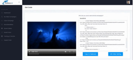
Pick a pre-made email template or craft your own using the intuitive drag-and-drop editor.
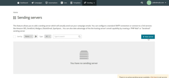
Select your recipients and hit ‘send’ to start boosting your sales. Enjoy the results!
VidMails AI Review 2023 — Features and Benefit

VIDMAILS AI OTO – IS IT WORTH BUYING?
VidMails AI is so powerful.
Unlimited Imports You can import as many lists as you’d like at once. This is helpful for segmentation, and emailing to lists in different niches.
Unlimited Campaigns Construct infinite campaigns using our drag-and-drop editor, or edit our beautiful done-for-you templates
Unlimited Contacts Whether you have 100, 1000, or 100,000 contacts, your email list can be uploaded to VidMails AI. There are no limits.
Unlimited Broadcasters Send out & schedule as many broadcasts as you’d like with VidMails AI.
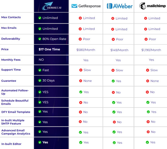
1. VIDMAILS AI WEB APP
You can send emails from any device that’s connected to the internet, such as Windows, Mac, Android, and iPhone
2. VIDMAILS AI EMAIL BUILDER
Put together beautiful emails for your subscribers using the drag-and-drop email builder inside of VidMails AI. You’re getting all the tools you need to blow away your subscribers.
3. VIDMAILS AI SMART SENDER
This is the secret sauce of VidMails AI. It lets you go under the radar, and bypass the spam filters of Google, Microsoft, Yahoo, and more
4. VIDMAILS AI DFY TEMPLATES
Don’t have much time on your hands? No problem! Tweak our wide collection of done-for-you email templates to your liking, and hit send
5. VIDMAILS AI SUPPORT
If you have any questions or have any issues, you can contact our support. We will be more than happy to quickly assist you

0 notes
Text
Adobe Background Removal& Top 5 Free Tools for Seamless Editing

Whether it's a video or an image, Background is the foundation of every media you plan to upload. A good background can put the cherry on your cake, while an inappropriate background may disturb the whole engagement. From product photographs to social media posts, every image and video seeks an appropriate background to grab the target audience's attention. That’s why we consider background removal or alteration as one of the most important elements of image editing. Now, as we thrive on editing the media, you might have the Adobe Background Remover in your mind. If so, we brought you an exclusive guide to uncover the potential of Adobe BG Remover and travel you through some exciting alternatives. Let’s make image background removal count!
What is Adobe Background Remover?
Adobe Background Remover is one of the exclusive features of Adobe Express, known for brilliant templates and media editing capabilities. It's a free BG remover that takes just a few clicks to remove, add, or edit the Background of your image. When you click 'Remove Background,' all you see is a loading process and the final output in a few seconds. But if we look around behind the scenes, technologies like color-based segmentation, thresholding, clipping paths, AI, and Mask R-CNN are the actual players. Let's pick AI and Deep Learning algorithms for a better explanation! These algorithms work with Convolutional Neural Networks (CNNs) to classify each foreground pixel and differentiate it from the Background pixels. So, you can alter, add, or remove the Background without any noise and duplicate effects.
How do you remove the background with Adobe Background Remover?
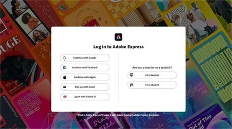
Navigate to Adobe Express As discussed above, Adobe Express is the platform to utilize Adobe Background Remover. It's an ultimate image editor designed for high-end content creation and editing. Meanwhile, we need one feature, which is the BG remover, so let's stick to it. Download Adobe Express on your Desktop, Android, or iPhone, or visit the official website of Adobe Express. Regardless of the platform, it will ask for a quick signup that can be done using your Google, Facebook, Apple, or Adobe ID.
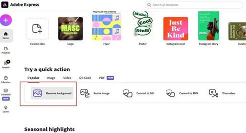
Try a Quick Action The background feature falls under the quick actions of Adobe Express. Navigate to the “Try a Quick Action” section, where you will see five subsections: Popular, Image, Video, QR Code, and PDF. Keep the navigation bar on the 'Popular' tab featuring 'Remove Background' as the first option. If you can't locate the option, you can effortlessly search it in the search bar on the top right corner. Thanks to an interactive UI, Adobe Express makes everything quite convenient, so it will be easy for you to navigate the options.
Upload the Desired Photo Once you navigate the Remove Background option, click on it and unlock the new portal to upload the image. Adobe Express supports Drag & Drop and Browse on Your Device features for a smoother experience. Choose the most convenient way for you and upload the best image quality for background removal. If you upload a blurred image, it may not recognize the pixels, resulting in poor edge detection.

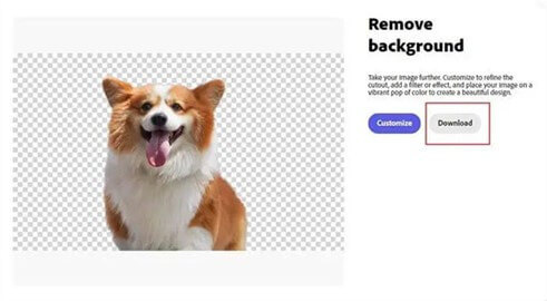
Review and Download All set. You uploaded the image you want to edit, and it's time to hit the Remove Background button. It may take a few seconds to remove the Background and process your image to its original quality. After that, you can expect and review the output for proper background removal. If everything is good to go, navigate to the Download button in the Gray color and get the image on your desktop for further use. Besides the Download button, you may see the Customize button in blue, capable of additional optimizations and edits.
Free Alternatives to Adobe Background Remover
Undoubtedly, Adobe Background Remover is a capable option to remove Background and edit images. But it's not the only option you have! Here’s a quick list of free background removers you can use instead of Adobe Express. iFoto Snap Background Remover As the technology develops, AI adds precision and convenience to every digital task. iFoto Free Background Remover implies the technology to its best for background removal and edits. Despite being free software, it allows you to erase the background accurately and replace it with a more appealing one. With industry-leading algorithms, iFoto Snap Background ensures instant isolation and flawless precision. Whether it's hair or any fussy element, you can expect precise edge detection without compromising the quality.
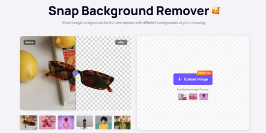
Pros: - Isolate backgrounds instantly - Flawless precision for every type of image - Optimized for e-commerce - Cross-platform compatibility Cons: - Require signing in - Limited features under the free version Pricing: Free Trail with 400 credits, $29.99 per month for 5000 credits Unscreen Unscreen tails the iFoto AI as one of the best alternatives to Adobe Express Remove Background feature. Not only does it remove backgrounds from the photos, but you can also use it for video and gif background removal. The software supports formats such as mp4, .webm, .ogg, .ogb, .mov, and .gif; you can even paste the video URL. Surprisingly, Unscreen is 100% free and requires no technical knowledge for expected outcomes.
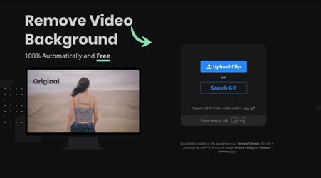
Pros: - Versatile compatibility with formats - Direct recording feature - Easy-to-use interface Cons: - Lacks editing features - Loading may consume more time than expected - Full HD resolution and audio support need a subscription - The free version includes a watermark Pricing: Free, Subscription from $1.7 per minute Fotor Here comes another free alternative to Adobe BG Remover with more features and better algorithms. The Fotor holds pride in being an all-in-one design tool with an AI one-click background removal feature based on remove.bg. In addition to BG removal, the software features various exclusive image background templates available for further customization. Whether it's your ID photo or a product image, you can easily alter the Background of your desired image for free.
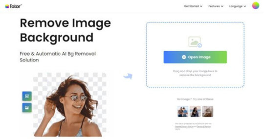
Fotor Pros: - Well-implemented AI algorithms - Rich in professional features - No signing is required - Upgraded Remove.bg Cons: - Slow image rendering - No support for video background removal Pricing: Free TouchRetouch Despite being cross-platform compatible, most background removers don’t have any official app for iOS. That’s why we brought TouchRetouch software on the list specifically for iOS users. Fortunately, the software is available on the App Store as 2nd best app in the Photo & Video category. With a 4.8/5 star rating, TouchRetouch is an incredible background remover and image editor. You can erase elements and backgrounds and crop the foreground or main image according to your needs. However, you may experience some ads and in-app purchases in the free version of the software.
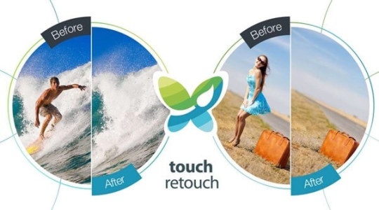
Pros: - Available on the Apple App Store - All-in-one image editing software - Extraordinary capabilities to erase and edit elements Cons: - Too many ads and in-app purchases in the free version - Restricted features for subscription Pricing: Free, in-app purchases Erase.bg Well, we understand that only some are iOS users, and Android users also deserve an ultimate background remover. Although there's a glut of background removers on the Google Play Store, Erase.bg holds a separate reputation for its AI algorithms and ease of use. It's a free image background remover available on the Play Store and App Store and also as a web app for desktops. Unlike most alternatives, Erase.bg offers free credits monthly and allows you to export images of the highest quality without any subscription.
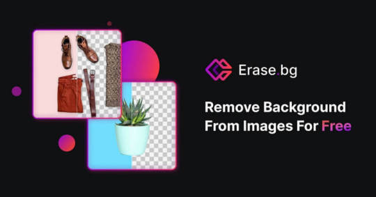
Pros: - AI implementation - Supports up to 5000 x 5000px images - Multi-platform support - High-quality output - No sign-in is required Cons: - Slow image processing - Ads in the free version Pricing: Free, Premium Plans from $0.10 per credit
How to Remove Background with iFoto AI?
In the above list, we have unveiled the features of the top 5 free alternatives to Adobe Background Remover. If we look at the pros, cons, and features, iFoto AI has the most justifying functionality for a free AI background remover. Let's see how you can remove Background using the software! Step 1: Visit iFoto AI Start by visiting the iFoto app using Free Background Remover, which will take you to the BG Remover. Whether you're on mobile or desktop, the web app is highly accessible on every platform.

iFoto free background remover Step 2: Start Free Trail As you visit the web app, you will encounter the "Start Free Trail Now" button at the first tab. Click the button, and it will open a signup window for you. Regardless of the type of account, it takes just a few seconds to sign in to Snap Background Remover. Step 3: Access the Dashboard Once you complete the sign-in process, you will get access to the exclusive iFoto AI dashboard. The dashboard possesses five different editing modules, including Fashion Models, Models Background, Recolor Clothing, Products Background and Remove Background. While you can use any of the features, click on the Remove Background tab to access the background remover designed to serve your purpose.
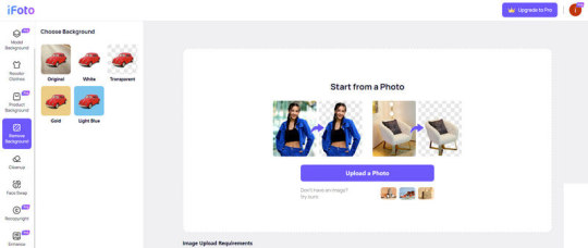
Step 4: Select a Photo In the Remove Background tab, you will see the "Upload a photo" button, allowing you to upload the image you want to edit. Not to mention a drag-and-drop feature is also provided for your convenience. Upload the desired image using the method you find more accessible and let it process for better quality. Step 5: Review and Download No more wasting time! It automatically removes the image's Background and provides you with a high-quality output in a few seconds. It's your turn to review the output and ensure it meets your requirements. Additionally, iFoto online background changer offers different background options just a click away from you.
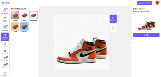
Everything looks good? That's the power of AI! Just click the Download button on top to get your image in your device storage.
Final Thoughts
Conclusively, the developers came up with competent tools to make ai background removal hassle-free. You have explored the process of Adobe Background Remover and five different alternatives to it, free of cost. While Adobe Express is free and capable of BG Remover, you can go for AI-powered tools to generate better results. The best example is iFoto AI, which is designed for flawless precision and high-end background removal without breaking the bank. No matter which software you use, always look for the value for money and the features before investing. Who knows, you get the best tool for free? Read the full article
0 notes
Text
AI NextSite Review – Create & Sell Professional Websites In Any Niche Just 60 Seconds
Welcome to my AI NextSite Review, This is a real user-based AI NextSite review where I will focus on the features, upgrades, demo, pricing and bonus, how AI NextSite can help you, and my opinion. The Most Powerful and Easy-to-Use AI Website Builder That Creates Beautiful Websites in Any Niche Using Just A Single Keyword or Using HTML-Zip Imports in Just 60 Seconds
Are you ready to build professional starting a website can be hard, whether you’re an aspiring business owner, an experienced one, or just someone who wants to be online. Then along comes AI NextSite, a new website builder that uses AI to give people of all technical skills more power. AI NextSite has a simple drag-and-drop system that lets anyone make a website, even if they don’t know how to code. However, what really makes it stand out are the AI-driven components. As your clever co-pilot, AI NextSite guides you through the process of making a website and unlocks its full potential. It does this by offering content and styles and optimizing to make $300-$500 a day in sales.

>> Click Here to Get AI NextSite + My $15000 Special Bonus Bundle to Boost Up Your Earnings More Traffic, Leads & Commissions >>
AI NextSite Review What is AI NextSite?
AI NextSite is a cloud-based website builder that positions itself as an all-in-one solution for building and managing websites. It caters to individuals and businesses of all technical skill levels, boasting an intuitive drag-and-drop interface that eliminates the need for complex coding. This user-friendly approach empowers users to visually design and manage professional websites without prior coding experience.
However, AI NextSite goes beyond mere simplicity. The platform incorporates AI-powered features that act as your virtual design assistant. This innovative technology suggests layouts, content, and images based on your preferences and industry best practices, streamlining the design process and potentially sparking creative ideas.

AI NextSite Review: Overview
Creator: Anthony Ikebuna
Product: AI NextSite
Date Of Launch: 2024-Mar-02
Time Of Launch: 11:00 EST
Front-End Price: $17
Official Website: Click Here
Product Type: Software (Online)
Support: Effective Response
Discount : Get The Best Discount Right Now!
Recommended: Highly Recommended
Required Skill: All Levels
Refund: YES, 30 Days Money-Back Guarantee
AI NextSite Review: Key Features of AI NextSite
Just 3 easy clicks to create your very own website in any niche imaginable
Newbie Friendly Drag & Drop 1-Click Website Editor
50 Done-For-You Website Templates in Different Niches
1200+ Different Websites has been successfully launched using AI NextSite
Start Your Very Own Website Agency Today & Start Profiting Like Never Before.
100% Blazing Fast & Reliable Web Hosting For A Lifetime To Your Websites
SEO Optimised To Rank Your Sites On The First Page Of The Google.
Connect Your Own & Your Clients Domain
Lifetime hosting
Free Lifetime SSL
Website Revision & history
Deep Analytics
Site Traffic Real-Time Chart
All your sites GDPR-compliant
Commercial Licence Included
No hidden Fee or any extra expenses
Iron-clad 30 day money-back guarantee
>> Click Here to Get AI NextSite + My $15000 Special Bonus Bundle to Boost Up Your Earnings More Traffic, Leads & Commissions >>
AI NextSite Review: Benefits of Using AI NextSite
Brand New System: AI NextSite is a brand new system with no competition. It creates mind blowing websites in a blink of any eye, in any niche imaginable. That means you can easily create and sell websites make some serious money today.
50 DFY Templates: Okay, so this is the most important part of AI NextSite. Choose from our 100 DFY templates and instantly depoy them to your site.
Mobile EDITION: This will allow you to also operate AI NextSite, even from your mobile phone. Whether it’s an Android, iPhone, or tablet, it will work.
Lifetime Sub-domain And Hosting: 1-click hosts your websites on our dedicated and ultra blazing fast servers. You don’t need to do anything, everything has been done from our end.
270+ Different Niche Options For You: Create your Dream Site in any niche. AI NextSite lets you create websites in any niche imaginable & drives a boatload of views and traffic.
SEO Optimised Websites: AI NextSite ranks your sites on google’s first page with it’s A.I driven SEO system. Imagine how much money could be made ranking on the first page of the google.
DFY Business Agency: AI NextSite lets you start your very own done-for-you website making agency in no time. Charge your customers monthly or yearly and enjoy the laptop lifestyle.
Lifetime FREE Updates: To make sure AI NextSite keeps its users making money, we release new updates and unique features every month. (these features automatically gets dropped in the software)
24*7 Support & 100% Uptime Guaranteed: We have a dedicated support team that works non-stop to answer any question related to AI NextSite software.
Step-By-Step Training Videos: In the unlikely event where you have trouble setting anything up, we have a series of step-by-step training videos that give you detailed instructions from A-Z.
AI NextSite Review: How Does It Work?
You’re Just 3 Clicks Away From Creating Your Very Own Website From Scratch That Gets Your FREE Traffic 24*7 And $300-500 Sales.


AI NextSite Review: Is AI NextSite for You?
Create Website In Any Niche With Just 1-Click: Use our drag and drop website builder and create your desired website in any niche with just a single keyword.
Create Your Personal Branding & Skyrocket It: Create your own personal branding with your own website & skyrocket it.
Earn Easy Affiliate Commissions: Promote offers from Warriorplus, Jvzoo, Clickbank, etc to your websites & make some easy money.
Sell Your Own Products: It’s easy to sell any kind of product or Services (Ecommerce, Ebook, Software, etc on your very own website.
Grow A Large Following: With all the features included inside, you’ll be able to grow a huge following.
Save Your Time & Money: Save Your Time & Money On web hosting or hiring video editors for your channel..
All The Websites Are SEO Optimised: Auto-rank your website on google with our advanced SEO optimization technology
ZERO Work Required To Profit: AI NextSite automatically updates website with new blogs & articles daily…
Advertise Your Businesses With Google Adsense: AI NextSite lets you place advertisement banners on the websites that helps you making more commissions.
AI NextSite Review: Who Should Use It?
Affiliate Marketers
CPA Marketers
Freelancers
Blog Owners
Content Creators
Product Creators
Marketers
Small Business Owners
eCom Store Owners
Local Business Owners
Website Owners
Agency Owners
AI NextSite Review: OTO And Pricing
Front End Price: AI NextSite ($19)
OTO 1: AI NextSite Pro ($37)
OTO 2: AI NextSite Unlimited ($47)
OTO 3: AI NextSite DFY ($97)
OTO 4: AI NextSite Template ($37)
OTO 5: AI NextSite Agency ($97)
OTO 6: AI NextSite Reseller ($97)
OTO 7: AI NextSite Whitelabel ($197)
>> Click Here to Get AI NextSite + My $15000 Special Bonus Bundle to Boost Up Your Earnings More Traffic, Leads & Commissions >>
AI NextSite Review: User Opinion


AI NextSite Review: Free Bonuses
FREE BONUS #1: Site Speed Secrets (WORTH- $997)
Get access to the top secrets from us that increases the site’s speed by 10X. And most important part this helps to boost the rankings on the google along with solid conversions and sales.
FREE BONUS #2: WP Secure Website Plugin (WORTH- $1997)
This is the world’s first A.I powered software that lets you keep your site 100% secure form hacker and spamming by auto-detecting new malwares, virus and so much more.
FREE BONUS #3: WP Site Transfer Guide (WORTH- $1997)
This bonus lets you successfully transfer the domains from one site to other in just a matter of seconds. Transfer your sites to new domains and save a lot of time.
FREE BONUS #4: AdSense 100K Blueprints (WORTH- $1997)
Discover how to scale your sites business to 100k a month by using this special one-time bonus. It teaches you all the hidden secrets of the top AdSense earners.
FREE BONUS #5: Commercial License Included (WORTH- $1997)
Start your very own website creation agency at a blink of an eye using our commercial license. This allows you to create and sell websites to your clients with any restrictions.
SPECIAL BONUS OFFER: (Honest To God Value: $1997)
FREE GIFT: First 150 Smart Action Takers Gets Access To AI NextSite “5 Done-For-You” Websites + 100 Reseller License.
AI NextSite Review: My Special Bonus Bundle
My Special Bonus Bundle will be visible on your access page as an Affiliate Bonus Button on WarriorPlus immediately after purchase.
And before I end my honest AI NextSite Review, I told you that I would give you my very own unique PFTSES formula for Free.
AI NextSite Review: Pros and Cons
Pros of AI NextSite:
User-Friendly: The platform prioritizes accessibility with a drag-and-drop interface, making it an attractive option for beginners and those lacking coding knowledge.
AI-Powered Assistance: AI NextSite utilizes artificial intelligence to provide valuable assistance in the design process. It can suggest layouts, content ideas, and even optimize your website for conversions.
Conversion Optimization Tools: The platform offers tools like heatmaps, A/B testing, and lead capture forms, empowering users to improve website conversion rates and lead generation.
Mobile-Responsive Design: All websites built with AI NextSite automatically adapt to different screen sizes, ensuring optimal viewing across desktop, mobile, and tablet devices.
Cost-Effective: Compared to hiring a web developer or utilizing complex website creation platforms, AI NextSite offers a more cost-effective solution for building a professional website.
Cons of AI NextSite:
You cannot use this product without an active internet connection.
AI NextSite Review: Money Back Guarantee
100% Risk-FREE, Iron-Clad 30 Days Money Back Guarantee
The deal is, if you purchase AI NextSite and don’t feel you are getting at least five times what you paid for it, then we don’t want your money. We’re on a mission to deliver a quality product to zero unhappy customers. And if we fall short in any way, then we don’t deserve your money. Well, if we don’t meet your expectations, then just let us know within 30 days for a full refund. Heck, as a kind gesture, we’ll even send you $200 for wasting your time. So either way, you only win.

Frequently Asked Questions
Q. What exactly is AI NextSite?
It’s the world’s first system that lets you create & host websites in any niche of your choice with out 100 done for you templates…
Q. How long does it take to see results with AI NextSite?
Although it’s illegal to promise results, we can say that most users make their first profits right after selling the websites created by AI NextSite.
Q. What happens if I don’t see results?
We’ve got you covered… If you don’t make money with AI NextSite, just let us know within the next 30 days and we’ll refund you every penny.
Q. What if I get confused along the way?
Don’t worry we have exclusive detailed video training for you that shows all the required steps.
Q. Is This Compatible On Both PC, Mac, Android And iOS?
It works on any device.
Q. How Do I Lock-In My Discount?
Click the button below to get the AI NextSite at the lowest price.
AI NextSite Review: My Recommendation
AI NextSite provides a user-friendly and cost-effective platform for crafting professional websites. The AI features can significantly streamline the creation process and offer valuable suggestions. However, consider your specific requirements. If extensive customization, advanced SEO tools, or numerous integrations are crucial, explore alternative platforms. Ultimately, carefully evaluate your needs, technical skills, and budget to determine if AI NextSite unlocks your website creation potential.
>> Click Here to Get AI NextSite + My $15000 Special Bonus Bundle to Boost Up Your Earnings More Traffic, Leads & Commissions >>
See my other reviews: Ecco Review, WP Host Review, Orion Review, NITRO AI Review, ClipFuse AI Review, AI Platform Creator Review, FunnelBuddy AI Review.
Thank for reading my AI NextSite Review till the end. Hope it will help you to make purchase decision perfectly.
Note: Yes, this is a paid tool, however the one-time fee is $17 for lifetime
#AI NextSite#AI NextSite Upgrades#AI NextSite Overview#AI NextSite Features#AI NextSite Review#AI NextSite Works#What Is AI NextSite#Buy AI NextSite#AI NextSite Price#AI NextSite Demo#AI NextSite Discount#AI NextSite Honest Review#AI NextSite Pricing#AI NextSite FE#AI NextSite Software Review#AI NextSite Pros#AI NextSite OTO#AI NextSite Preview#AI NextSite Scam#AI NextSite Software#Get AI NextSite#AI NextSite Reviews#Purchase AI NextSite#AI NextSite Legal#AI NextSite By Anthony Ikebuna#Artificial Intelligence#AI#AI NextSite Benefits#AI NextSite Bonus#AI NextSite Bonuses
0 notes
Text
Research: Photo to Manga AI

14 February 2024
I experimented with a few AI apps this morning to see if any would give me something resembling a manga image.
I'm not planning to use them for my finished art but if I find something good I may use it as a reference for my own drawings.
The iPhone apps that I tried didn't have anything like what I wanted, which was this.
iPhone AI Apps
The photo to manga apps produced a coloured image like anime, which wasn't what I was after so I didn't bother with them.
Instead, I tried two apps that output pencil-like drawings. I figured this would be closer to what I was looking for. Neither was very good - at least the free versions weren't. I tried the Pencil Sketch Photo Editor + and Sketch Me apps.

Website AI: Tech Lagoon
The most successful result I got was with an AI website, Tech Lagoon.
I used this reference image.

And I got this output I got.
It isn't what I'm looking for though. I want it to look more comic-like and this look quite life-like. But the website is a great resource though.
Maybe if I search more I'll find what I'm after.

This is the link to Tech Lagoon.
0 notes